| Layer | Description |
|---|---|
| Data | The data to be plotted. |
| Aesthetics | The mapping of variables to elements of the plot. |
| Geometrics | The visual elements to display the data -- e.g., bar graph, scatterplot. |
| Facets | Plotting of small groupings within the plot area -- i.e., small multiples. |
| Statistics and Transformations | Additional statistics imposed onto plot or numerical transformations of variables to aid interpretation. |
| Coordinates | The space on which the data are plotted -- e.g., Cartesian coordinate system (x- and y-axis), polar coordinates (pie chart). |
| Themes | All non-data elements -- e.g., background color, labels. |
PSY 652: Research Methods in Psychology I
Creating charts with ggplot2
Kimberly L. Henry: kim.henry@colostate.edu
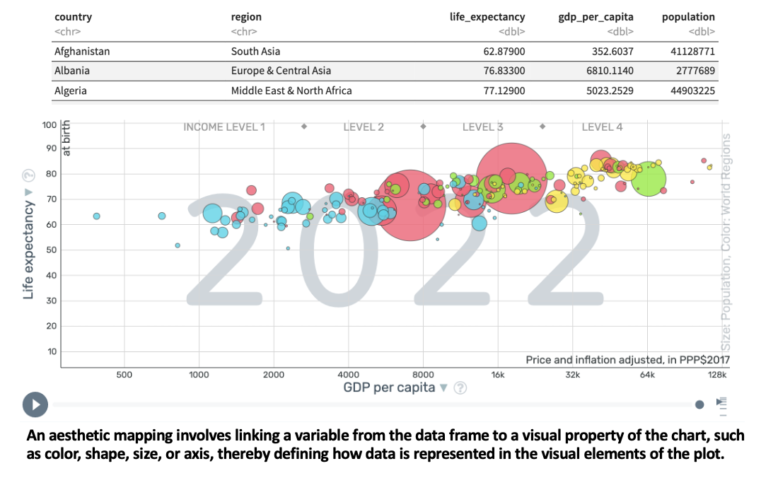
Hans Rosling’s 200 Countries, 200 Years
Explore the gapminder data
To access the interactive graphic, press and hold control, click the link below, and choose “Open Link in New Tab”.
Explore the graphic
- Take a moment to familiarize yourself with the various elements and tools available on the graph.
- Drag the year slider (at the bottom of the chart) back to 1800 and then press play. Let it run until it gets to 2023 and then leave the slider there.
- Click on the down arrow beside GDP per capita. Read the description of the variable, and then toggle between the log option and the linear option. What differences do you notice?
- Find the USA. What is the GDP per capita and the life expectancy for the USA in 2023?
- Drag the slider back to 1800. What was the GDP per capita and the life expectancy for the USA in 1800?
Please answer these questions
What variable is on the x-axis?
What variable is on the y-axis?
What does each bubble represent?
What do the colors of the bubbles represent?
What do the sizes of the bubbles represent?
Let’s replicate the 2022 data ourselves
The World Bank DataBank is an online platform that allows users to access and explore a vast collection of economic, financial, and social data frames. The DataBank offers free access to data from various sources within the World Bank, including the World Development Indicators (WDI) which we’ll explore today.
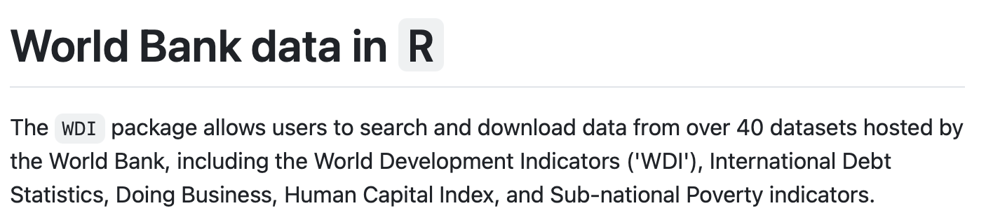
The WDI package for R
This package for R is a tool that provides an interface to the World Bank’s World Development Indicators (WDI) database directly from R using the World Bank’s Application Programming Interface (API).
Let’s import data using the WDI package
Please press Run Code on the code chunk in order to create our desired data frame.
Consider a generic case
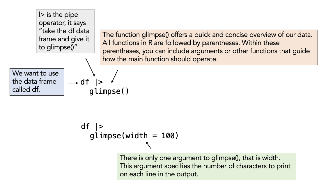
Take a glimpse() of our data
Press Run Code on the code chunk to display the data using the glimpse() function.
If you want to explore, you can add the width argument to the code below. Put your cursor inside the parentheses after glimpse then type: width = 100. Remember that R is case sensitive. Press Run Code again to see the result.
If you want to reset the code chunk to the original state, click on the Start Over button.
Variable descriptions
country: The names of the countries included in the data frame.
region: The regional grouping of each country.
life_expectancy: The average life expectancy at birth, measured in years, for each country in 2022. It reflects the average number of years a newborn is expected to live under current mortality rates.
gdp_per_capita: The Gross Domestic Product (GDP) per capita for each country in 2022, measured in current US dollars. It represents the average economic output per person and is an indicator of the country’s economic health.
population: The total number of people living in each country in 2022.
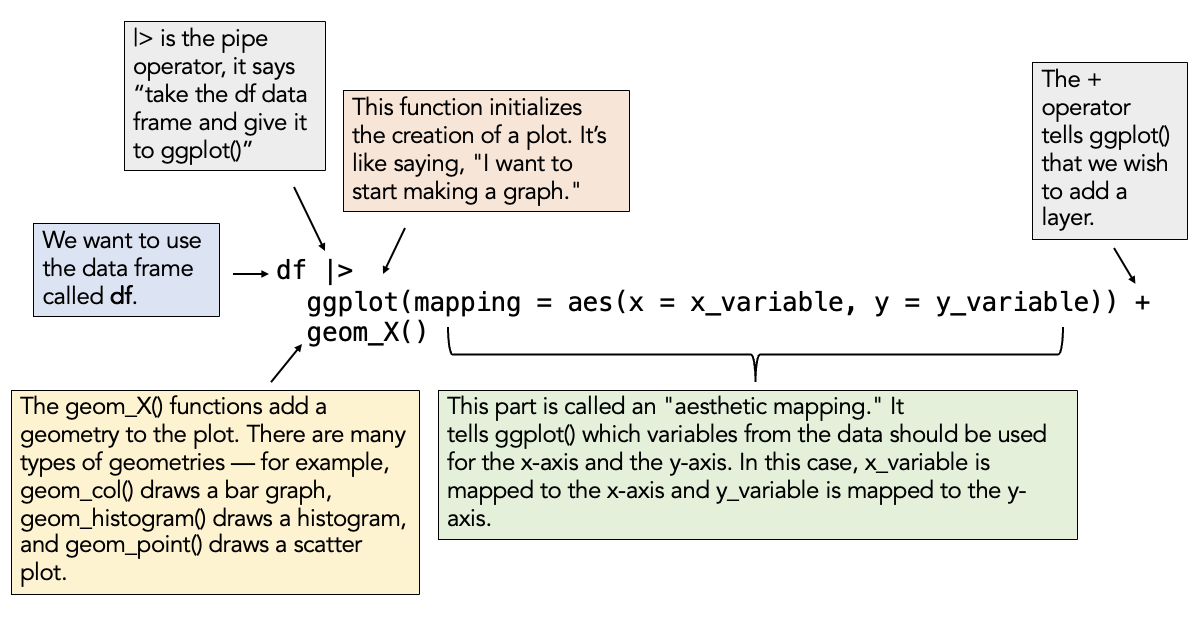
Mapping variables to elements of the graph
The Grammar of Graphics
Let’s focus on the first 3 layers to begin! These are ALWAYS required.
The basic syntax
A basic chart with the WDI data
Using the wdi_2022 data frame, aesthetically map gdp_per_capita to the x-axis and life_expectancy to the y-axis. Request a scatter plot for the geometry type.
Replace the blanks/underscores (i.e., ___) with the correct code to accomplish this task. Then press Run Code to create the plot.
If you are stuck, click on the “💡 Hint” tab, and if you’re really stuck, click on the “👀 Spoiler” tab.
Replace “x = ___” with x = gdp_per_capita. Similary, add life expectancy to the y-axis. The geometry for a scatter plot is geom_point().
Map additional aesthetics
Building on our code, let’s map population to the size of the points, and region to the color of the points.
Please add these elements to the aes() function call, then press Run Code to create the updated plot.
Fill in the underscores with the appropriate variable names.
Add additional layers
| Layer | Description |
|---|---|
| Data | The data to be plotted. |
| Aesthetics | The mapping of variables to elements of the plot. |
| Geometrics | The visual elements to display the data -- e.g., bar graph, scatterplot. |
| Facets | Plotting of small groupings within the plot area -- i.e., small multiples. |
| Statistics and Transformations | Additional statistics imposed onto plot or numerical transformations of variables to aid interpretation. |
| Coordinates | The space on which the data are plotted -- e.g., Cartesian coordinate system (x- and y-axis), polar coordinates (pie chart). |
| Themes | All non-data elements -- e.g., background color, labels. |
Add a facet
Rather than putting all countries on one plot, perhaps we’d prefer to have a separate plot for each region. We can use the facet_wrap() function to accomplish this. This is an example of a Facet layer. To use the function, be sure to add a + sign at the end of the last line of code, return to a new line, and then list the function name. Inside the parentheses, list a tilde (~) and then the variable you want to facet by (region). Additionally, use the ncol and nrow arguments within the facet_wrap() function to request 2 columns and 4 rows.
Fill in the underscores with the appropriate values.
A transformation for GDP
GDP has a vast range ($259 for Burundi to $187,267 for Lichtenstein), with most countries stacked toward the lower end of GDP. As you’ll learn about in Module 15, it’s often useful to apply a non-linear transformation to these types of heavily skewed variables. This is a form of a Statistics/Transformation layer.
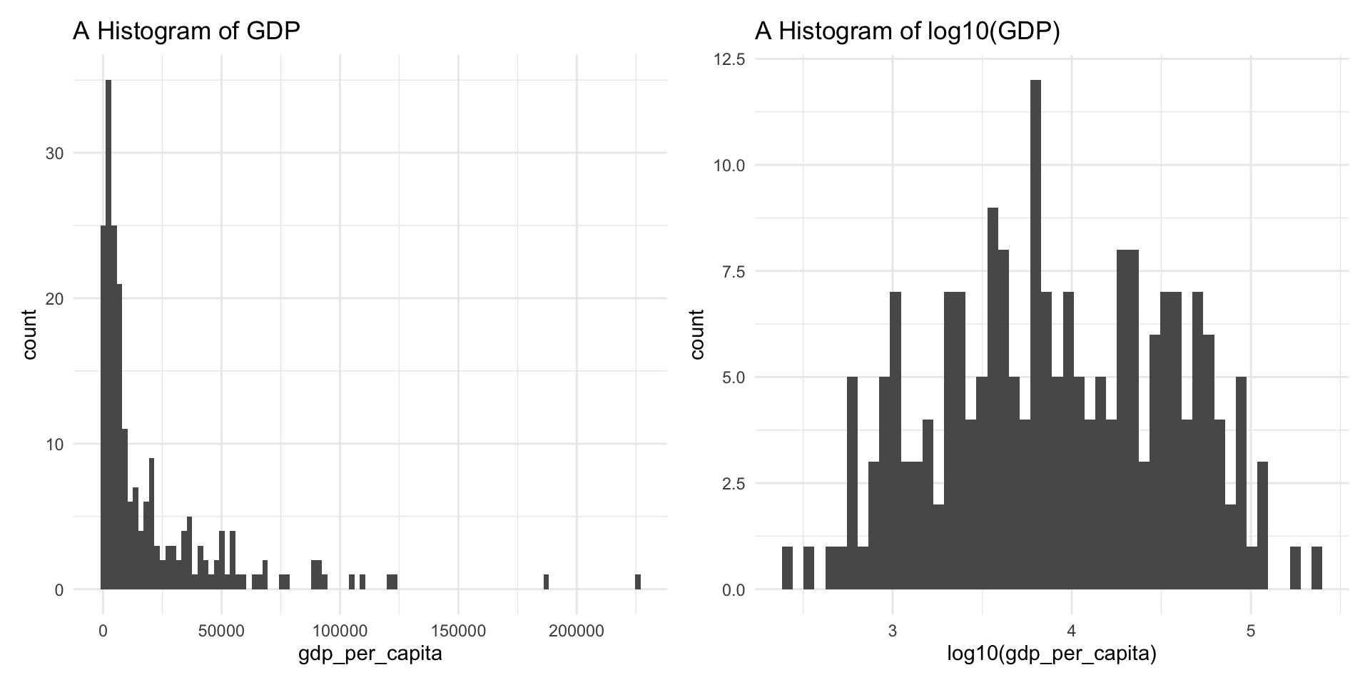
Add a transformation layer
The scale_x_log10() function in ggplot2 is used to transform the x-axis of a plot to a logarithmic scale with base 10. To take the log base 10 of GDP, add a layer (remember to put the + sign at the end of the last line of existing code), then apply the transformation function.
Explore coordinates
If we wish, we could zoom into a certain part of the graph — for example, to focus on countries with a GDP between 1 and 25,000 USD. We can use the coord_cartesian() function for this — which is an example of a Coordinates layer.
The argument to the function needed here is xlim for x-axis limits. To restrict the graph to x scores between 1 and 25,000 we use:
coord_cartesian(xlim = c(1, 25000))
Put a + sign at the end of the last line to add an additional layer, return, and then set the x-axis limits to 1 to 25,000.
Add themes: Labels
Let’s style our graph a bit. Here we’ll add labels. Namely a title, and x- and y-axis labels. The labs() function is used to add this theme layer.
The labs() function is where you add labels to your plot. Inside the parentheses, you set arguments like title =, x =, and y = to control what appears on the graph. For example, title = "my title" adds a title above the plot. You separate multiple labels with commas.
We can also add labels to the legends (for color and size), as well as a caption to give the data source. Check out the additions to labs() below.
Add themes: Change overall theme
We can also change the overall theme of the graph. There are several built in themes to choose from. Let’s look at a few.
Your turn #1
Create a density graph of life expectancy. Enhance and style it as you like.
The geometry for a density plot is geom_density().
Your turn #2
Create a box plot of life expectancy by region. Enhance and style it as you like.
The geometry for a box plot is geom_boxplot().