PSY 652: Research Methods in Psychology I
Introduction to Data Visualization
What is a visualization?
“A visualization is a representation designed to enable exploration, discovery, or communication.” – Dr. Alberto Cairo
Why create visualizations?
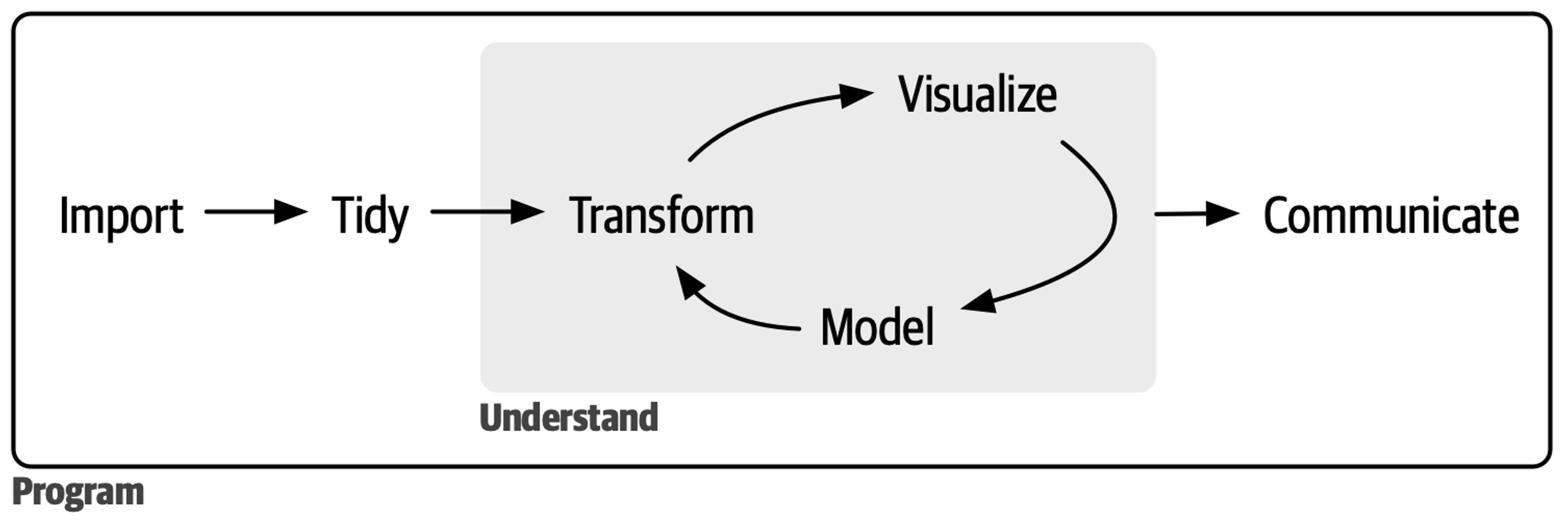
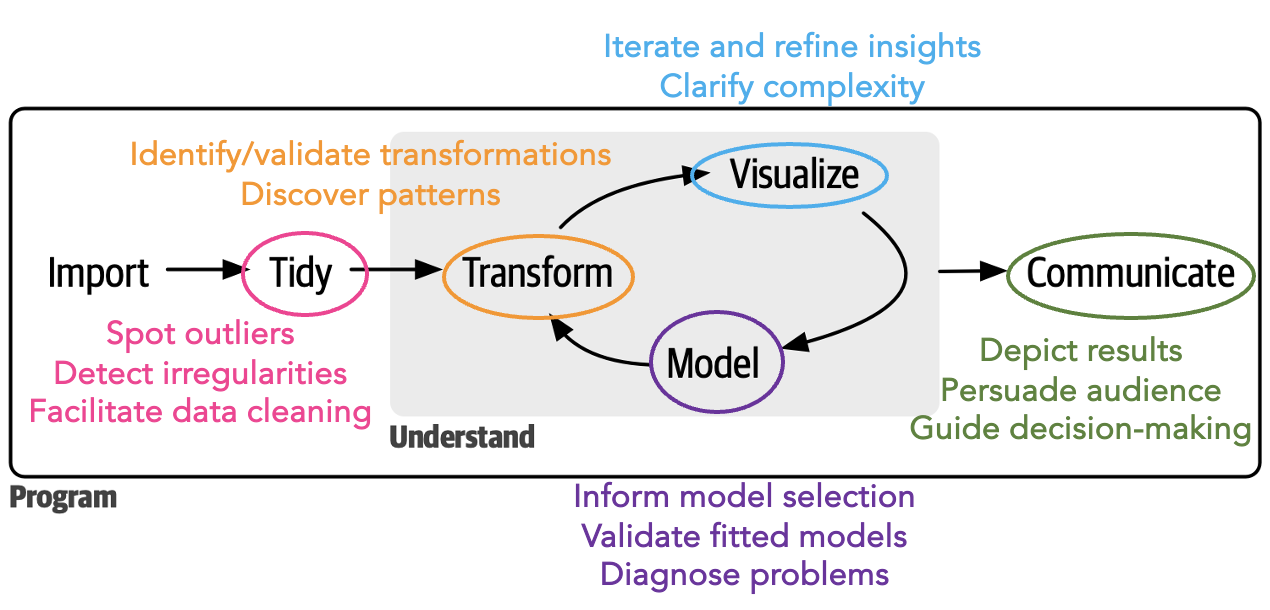
Why create visualizations (the data science pipeline)?
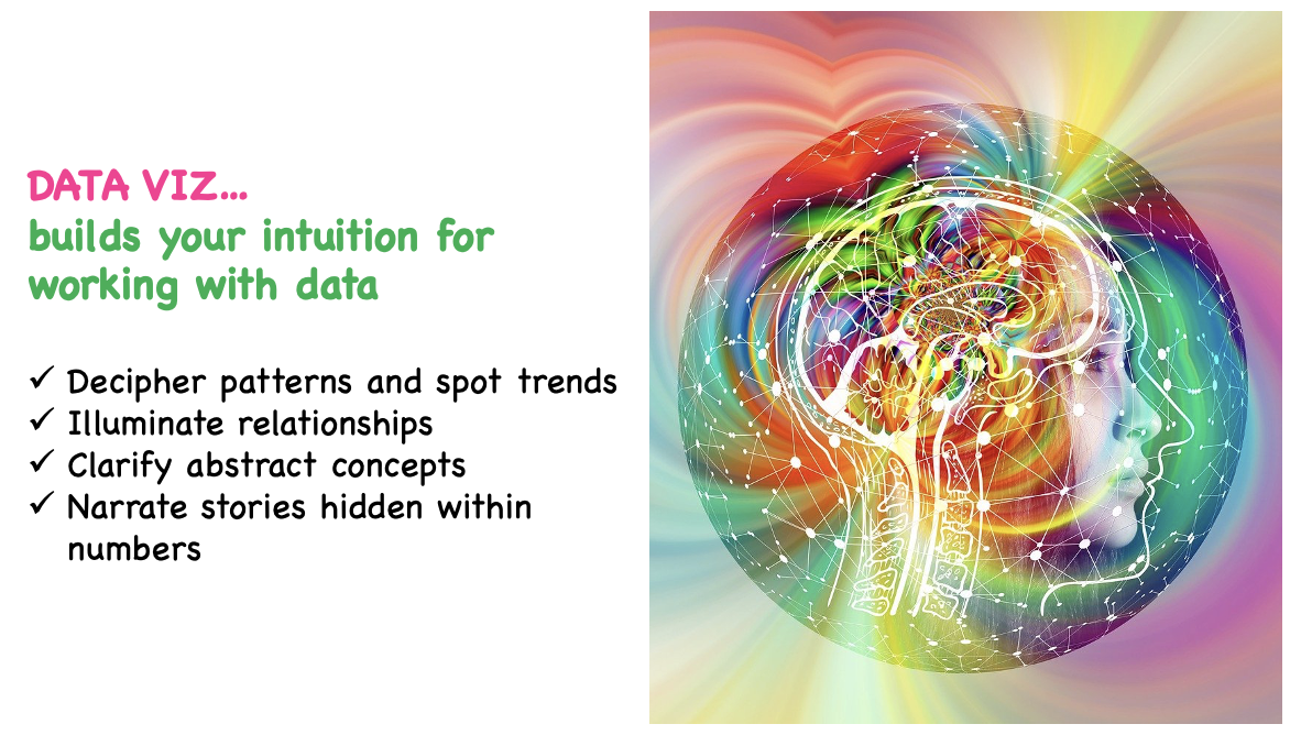
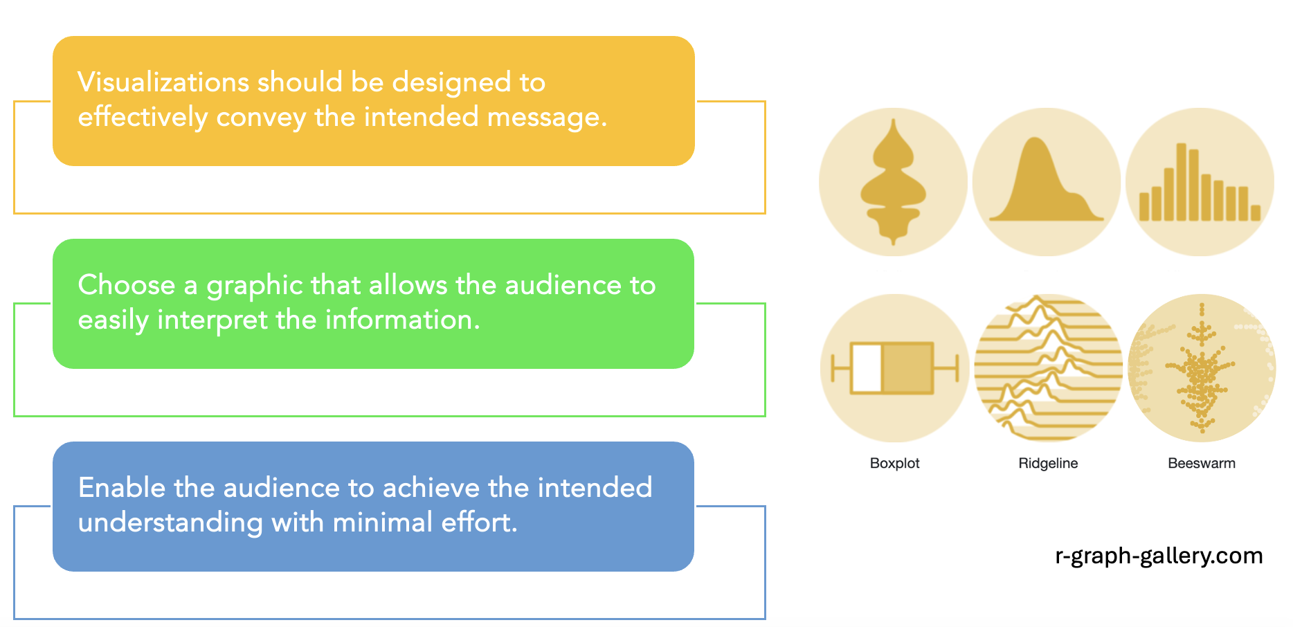
Good Reason #1
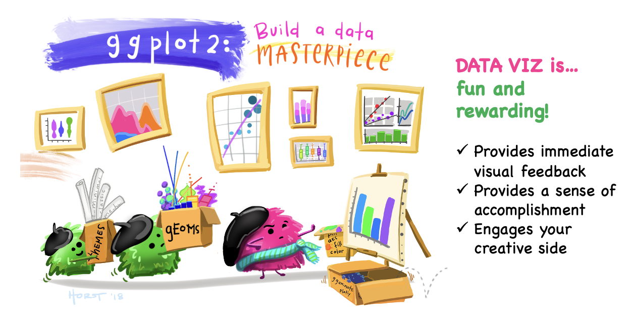
Artwork by @allison_horst
Good Reason #2
Good Reason #3
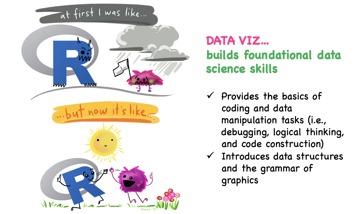
Artwork by @allison_horst
Great potential for harm (part 1)

Great potential for harm (part 2)
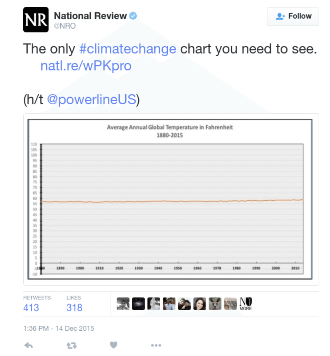
Great potential for harm (part 3)
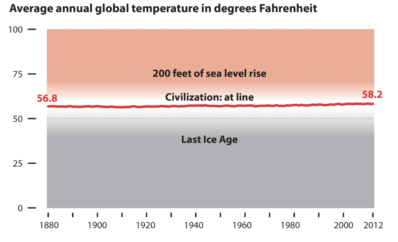
Great potential for harm (part 4)
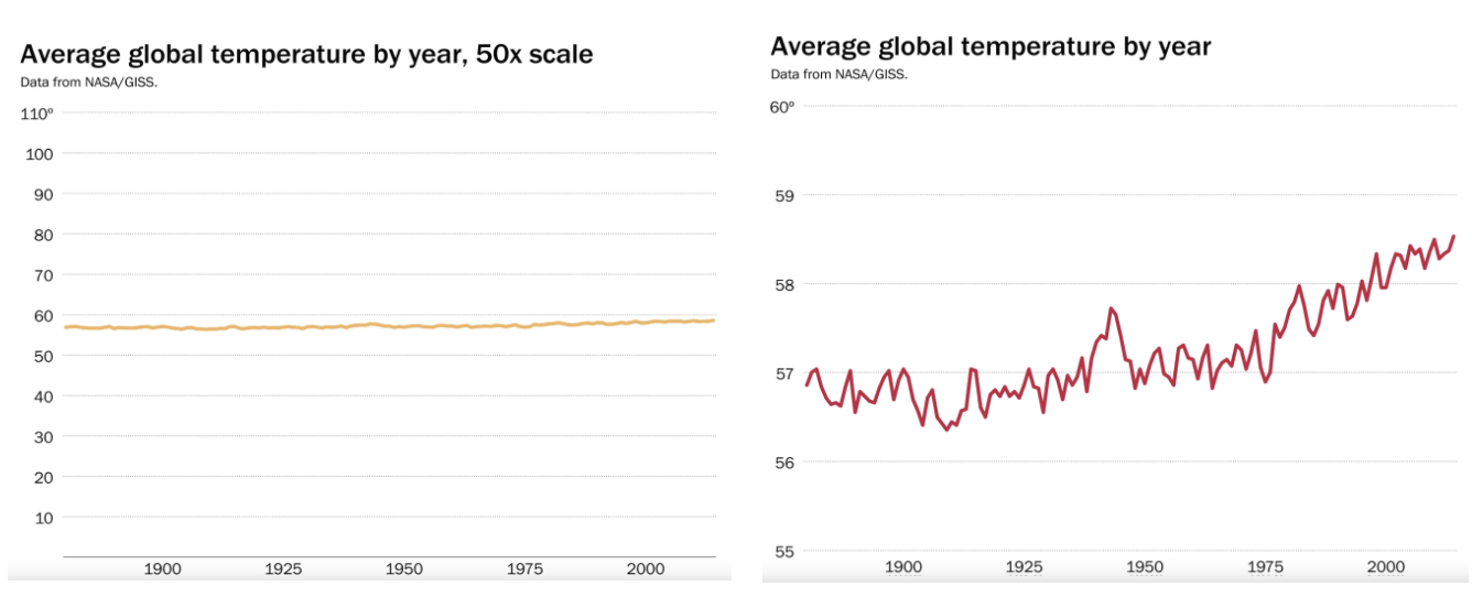
Two charts from the WAPO article mentioned previously.
But also, a great potential for positive impact
Variations of Earth’s surface temperature:
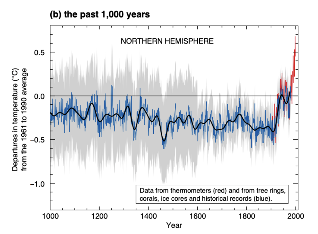
Michael Mann, Ph.D., a Climate Scientist, created this graph in 1999. It is believed by many to be one of the most influential charts ever produced.
The “hockey-stick” chart embodies Alberto Cairo’s 5 key principles of an effective visualization

- It is truthful, as it’s based on thorough and honest research.
- It is functional, as it constitutes an accurate depiction of the data, and it’s built in a way that lets people do meaningful operations based on it (seeing change in time).
- It is beautiful, in the sense of being attractive, intriguing, and even aesthetically pleasing for its intended audience—scientists, in the first place, but the general public, too.
- It is insightful, as it reveals evidence that we would have a hard time seeing otherwise.
- It is enlightening because if we grasp and accept the evidence it depicts, it will change our minds for the better.
Truthful
Functional
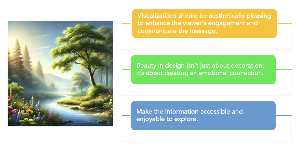
Beautiful
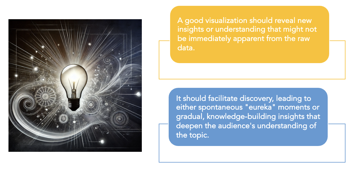
Insightful
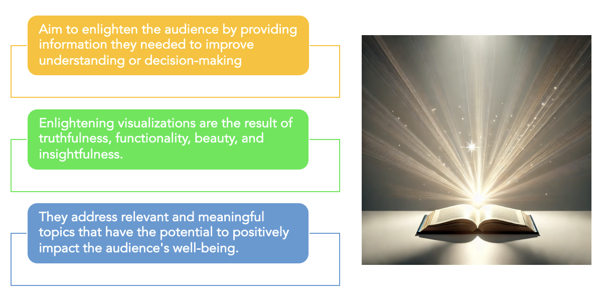
Enlightening
The steps
- Understand the context
- Choose an appropriate display
- Eliminate clutter
- Draw attention where you want the audience to focus
- Think like a designer
- Tell a story
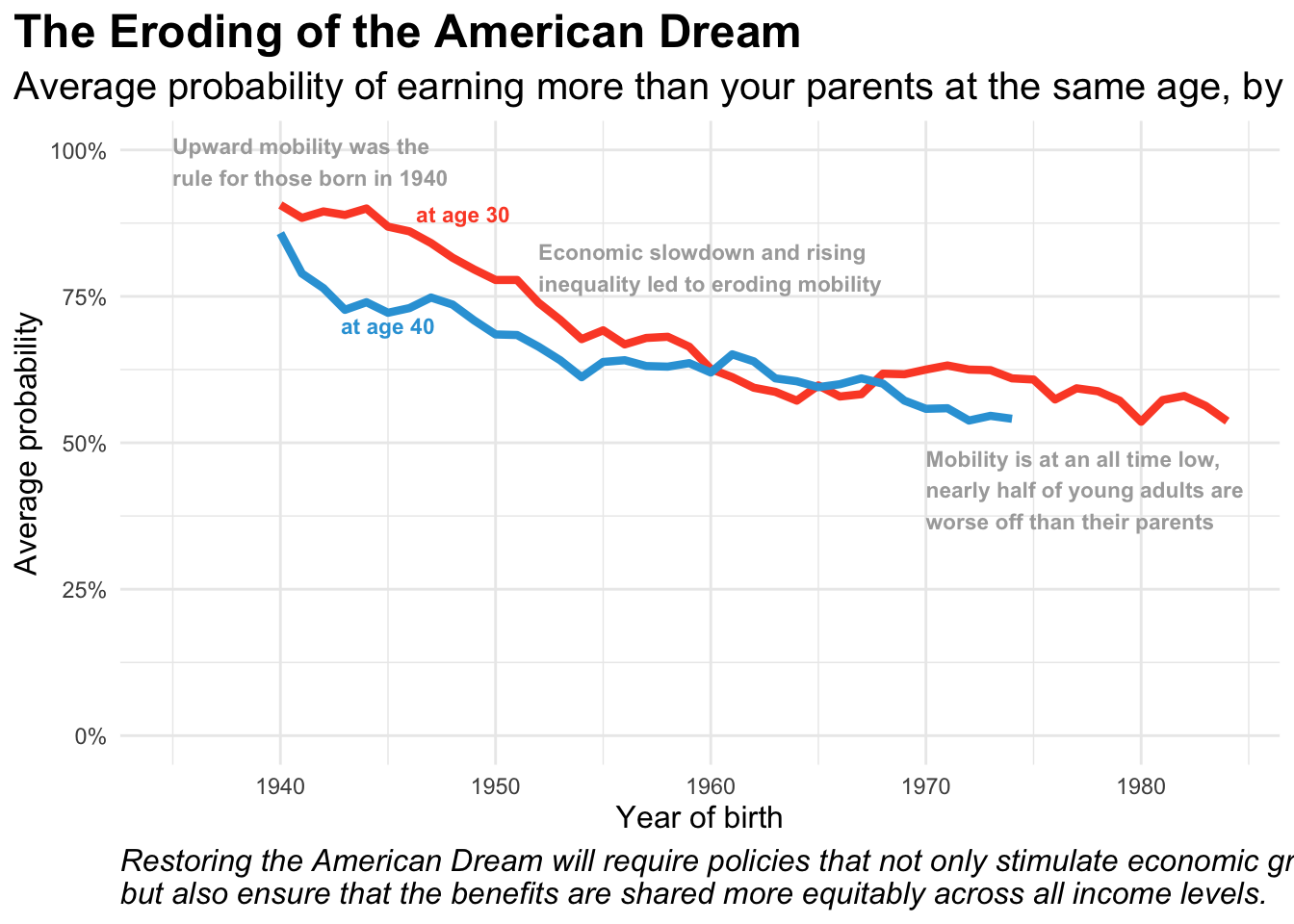
An example
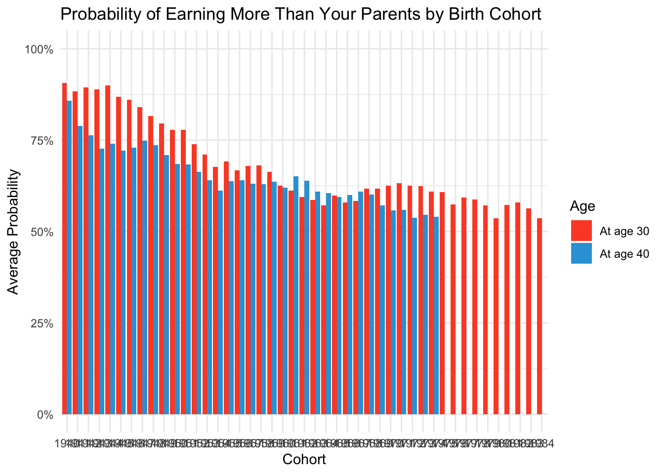
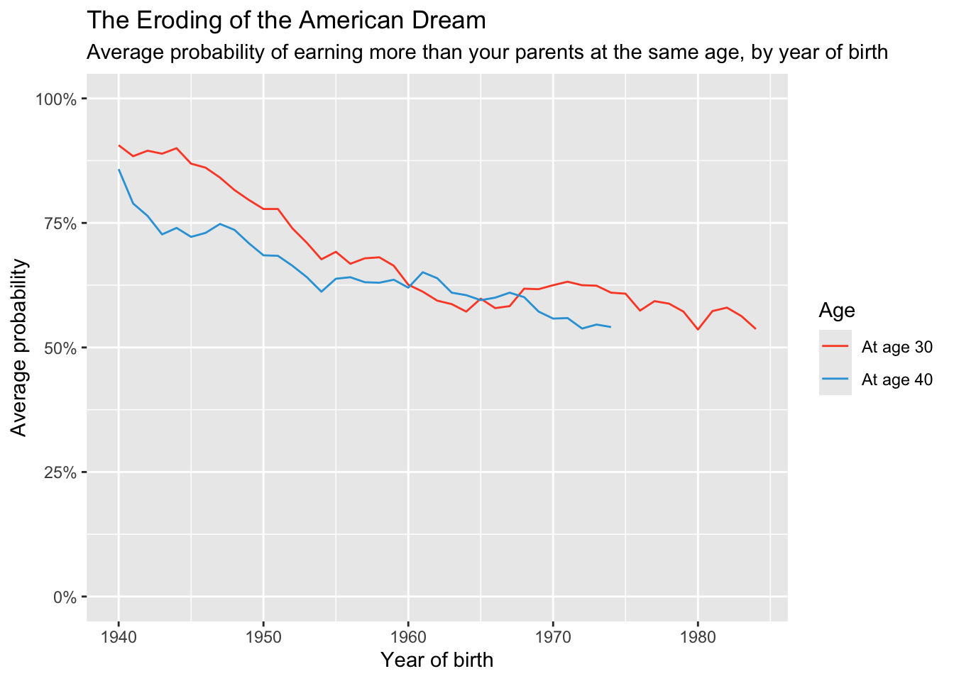
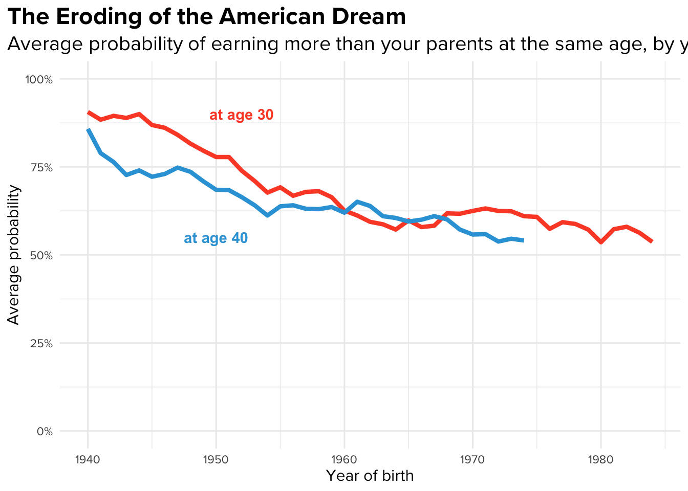
Decades of rising income inequality and slowing economic growth have significantly eroded a core element of the American dream: the belief that each generation will fare better than the one before.

Our goal: To visually illustrate the dramatic decline in economic mobility in the United States over time. That is, to highlight how, over the past several decades, the likelihood of children earning more than their parents has sharply decreased, signaling a significant shift in the economic landscape.
A bar chart 🙁
A line graph 🥰
Remove the legend, annotate instead
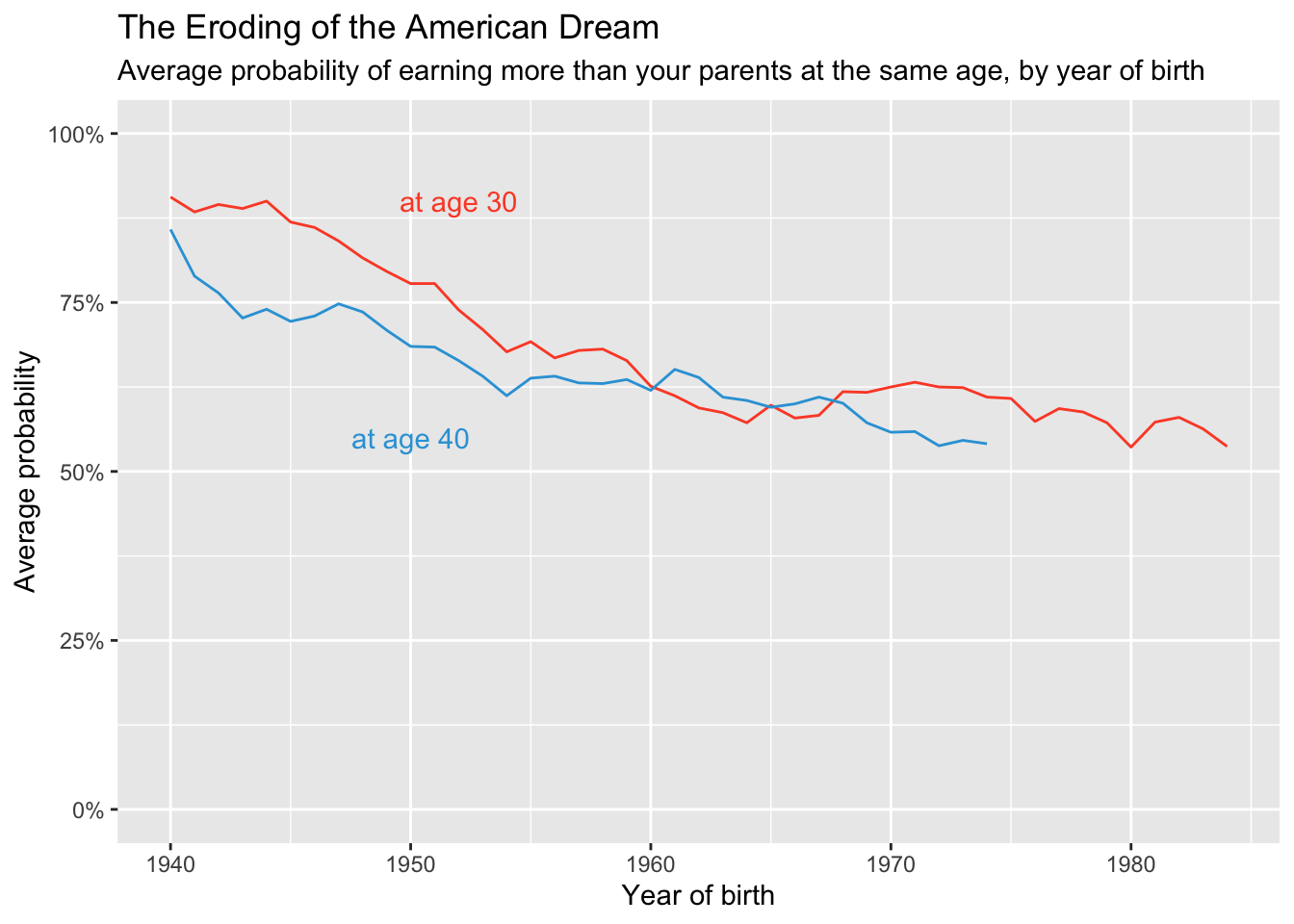
Bold lines and text, use a minimal background
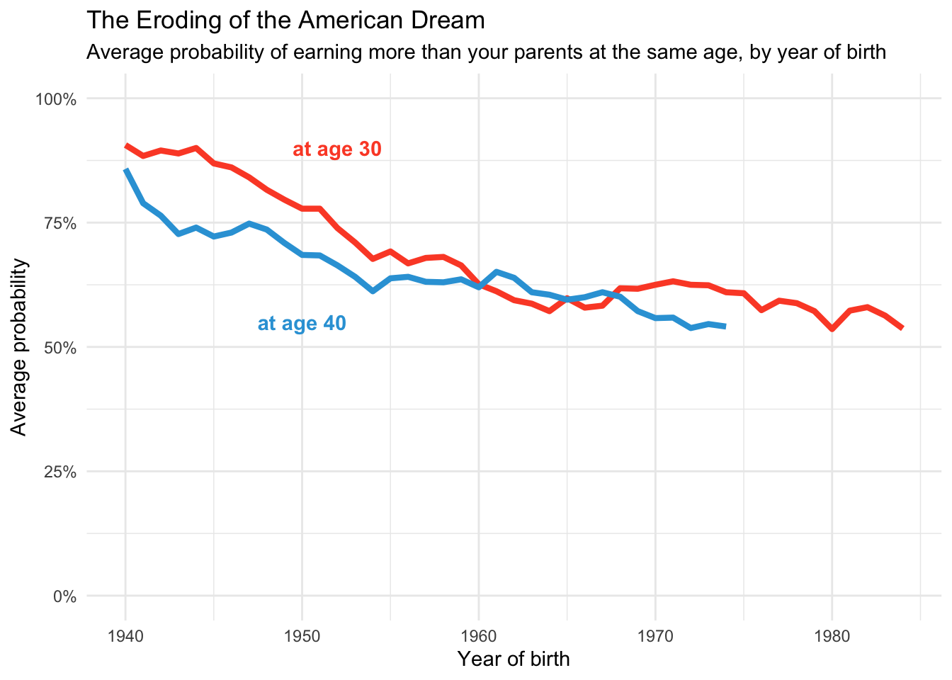
Left align the title and try a different font
Addition of narrative elements