Tally your results
An example data table
| 28 |
fake |
| 80 |
real |
| 101 |
fake |
| 111 |
fake |
| 137 |
real |
| 133 |
fake |
| 144 |
fake |
| 132 |
fake |
| 98 |
fake |
| 103 |
real |
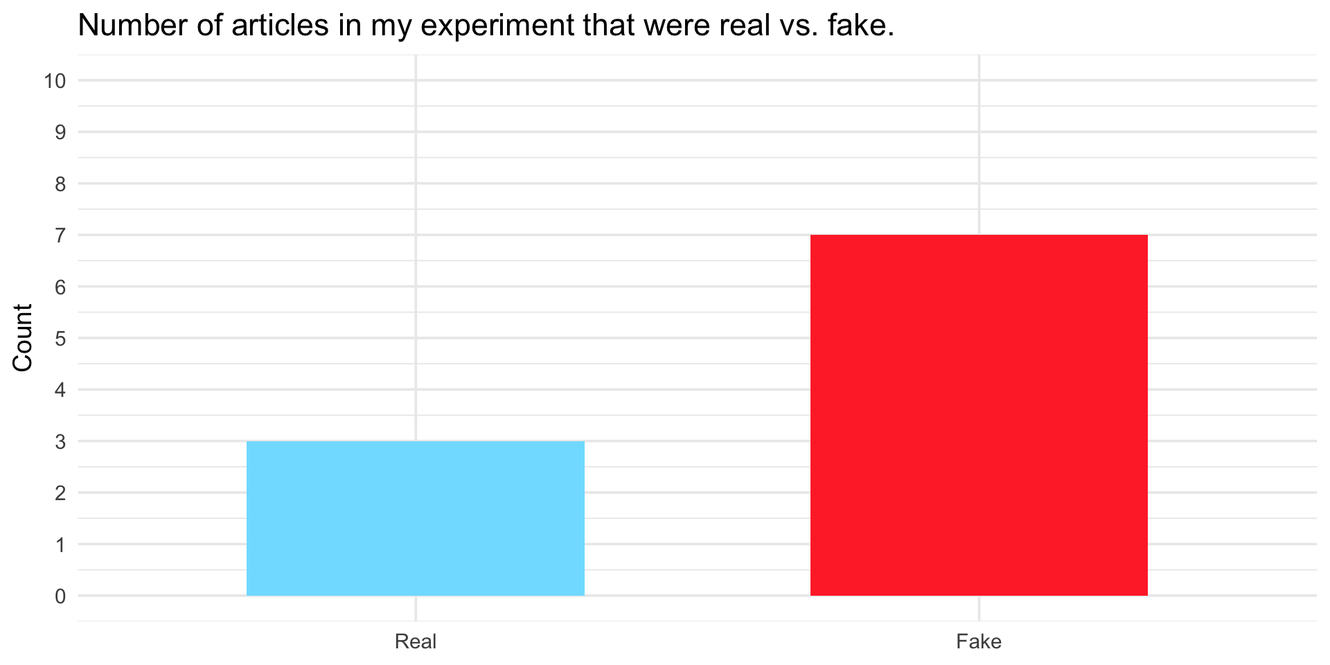
Number of real articles: 3
Number of fake articles: 7
Proportion that are fake: 0.70
On your worksheet:
- Compute the number of articles that are real,
- the number that are fake, and
- the proportion that are fake across your 10 trials.
Create a bar chart
On your worksheet, create a bar chart to represent the number of articles you selected that were real and fake.
![]()
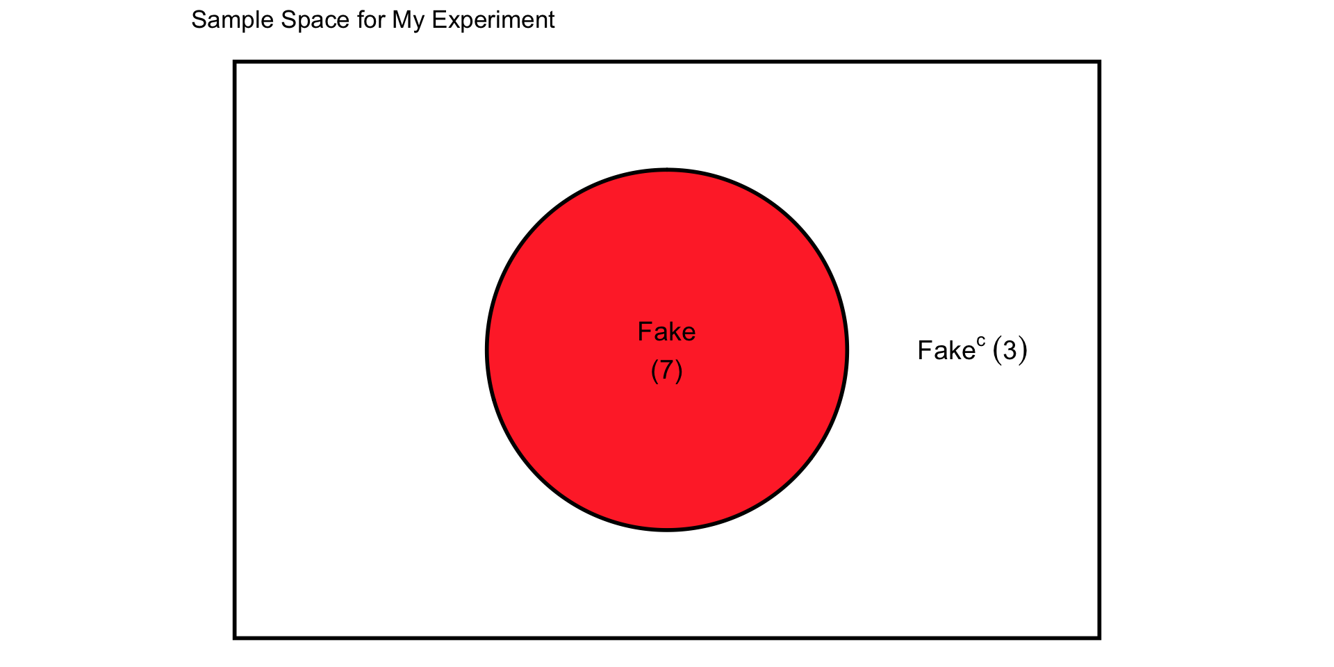
Create a sample space chart
Represent the same information in the sample space diagram on your worksheet. A sample space is the set of all possible outcomes of a random experiment (here: Real or Fake). Write the number of your drawn articles that are Fake inside the bubble. Write the number of your drawn articles that are not Fake (the complement of Fake — in other words, Real) outside the bubble but still inside the rectangle.
![]()
Bernoulli trials → Experiment → Binomial distribution:
Each trial is Bernoulli (i.e., a Bernoulli trial).
Each experiment (10 trials) produces one Binomial outcome (i.e, the number of fake articles that you drew).
The class’s results across many experiments form the empirical distribution of that Binomial random variable.
Link to theoretical probabilities
Now that we’ve built an empirical distribution from our class experiments, let’s compare it to the theoretical probabilities we would expect if each trial were truly a Bernoulli draw with probability (\(p\)) of being Fake.
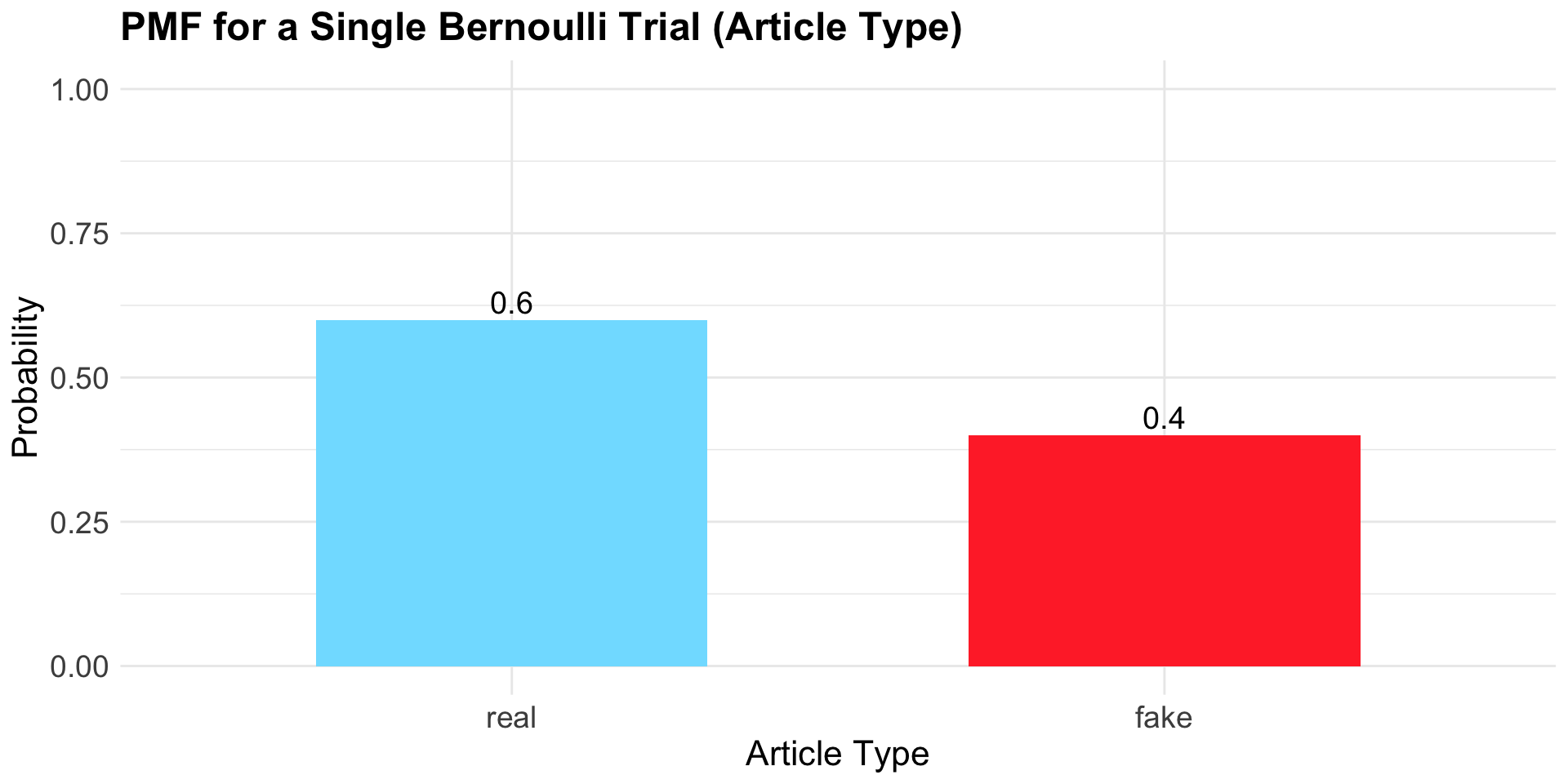
The Probability Mass Function (PMF) for a Single Bernoulli Trial
In the study from which these data were drawn, 40% of the articles were classified as fake. This means the probability that any single article is fake can be modeled as \(p =0.40\).
A Bernoulli trial is a random experiment with exactly two possible outcomes (here: Fake or Real).
These outcomes follow a Bernoulli distribution with parameter:
- \(p = 0.40\): the probability that a single article is Fake.
- \(1 - p = 0.60\): the probability that a single article is Real.
The Bernoulli PMF gives the probability of each possible outcome (Fake or Real) in a single trial.
The PMF for our example Bernoulli distribution
![]()
By the Law of Total Probability, the sum of the probabilities of all possible outcomes equals 1. \[P(\text{Fake}) + P(\text{Real}) = 0.40 + 0.60 = 1.0.\]
The Probability Mass Function (PMF) for a Binomial Distribution
When we repeat a Bernoulli trial \(n\) times (say, drawing 10 articles), the random variable is no longer “Fake or Real,” but rather the number of Fake articles out of 10.
These outcomes follow a Binomial distribution with parameters:
- \(n = 10\): the number of trials, and
- \(p = 0.40\): the probability that any single article is fake.
The Binomial PMF gives the probability of observing exactly \(0, 1, 2, \dots, 10\) Fake articles across those 10 trials.
The PMF for our example binomial distribution
The function dbinom() in R calculates probabilities from the Binomial distribution. It answers the question: What is the probability of getting exactly k successes in n independent Bernoulli trials, each with success probability p?
Explore
Take a few moments with a partner to change the values of n_trials and p_success — notice how the graph changes.
There are a couple of new functions in this code. First, data.frame(k = 0:n_trials) creates a quick dataset with all possible outcomes (k = 0, 1, 2, …, n_trials) — all the values we could possibly observe. Second, dbinom(k, size = n_trials, prob = p_success) inside aes() computes the probabilities on the fly (no need to create a data frame first, as we did previously). Last, glue() (from the glue package) is used to insert variable values directly into text strings. So if you change n_trials or p_success at the top, the labels automatically update — no need to edit the title by hand.
In this version, the x-axis is treated as continuous (the factor(k) argument is removed). We make this trade-off in this exploration graphic because using a truly discrete scale becomes unreadable with larger numbers of trials, as every single integer value would need to be labeled on the axis.
Things to note when changing p (probability of success)
The center of the distribution shifts:
If p < 0.5, the distribution leans to the left (more weight on smaller counts).
If p > 0.5, it leans to the right (more weight on larger counts).
If p = 0.5, it’s symmetric around \(n/2\).
The spread also changes: values of p closer to 0 or 1 make the distribution more concentrated at the edges, while p near 0.5 gives the widest spread.
Things to note when changing n (number of trials)
The x-axis range expands: with larger n, there are more possible outcomes (0 all the way up to n).
The distribution looks smoother: for small n (like 5 or 10) it’s jagged, but as n grows, the bars form a more bell-shaped curve.
For large n, the distribution begins to resemble a normal distribution — even when the probability of success is far from 0.5.
Theoretical Binomial Cumulative Distribution
Now, let’s consider two events
Exclamation points in the title
In the fake news study, a second variable considered by the researchers was whether or not the article had an exclamation point in the title.
Through the study, the researchers determined that:
The probability that an article was fake, \(P(\text{Fake}) = 0.40\).
The probability that an article had an exclamation point in the title, \(P(\text{With !}) = 0.12\).
That these two events were not independent:
- \(P(\text{With !} \mid \text{Fake}) = 0.267\)
- \(P(\text{With !} \mid \text{Real}) = 0.022\)
The joint probability
The joint probability — the probability that both events occur (an article is Fake and has an Exclamation point in the title) — for dependent events is given by the multiplication rule:
\[
P(\text{Fake and With !}) = P(\text{Fake}) \times P(\text{With !} \mid \text{Fake})
\]
\[
= 0.40 \times 0.267 \approx 0.11
\]
A Cross-Tabulation/Contingency Table
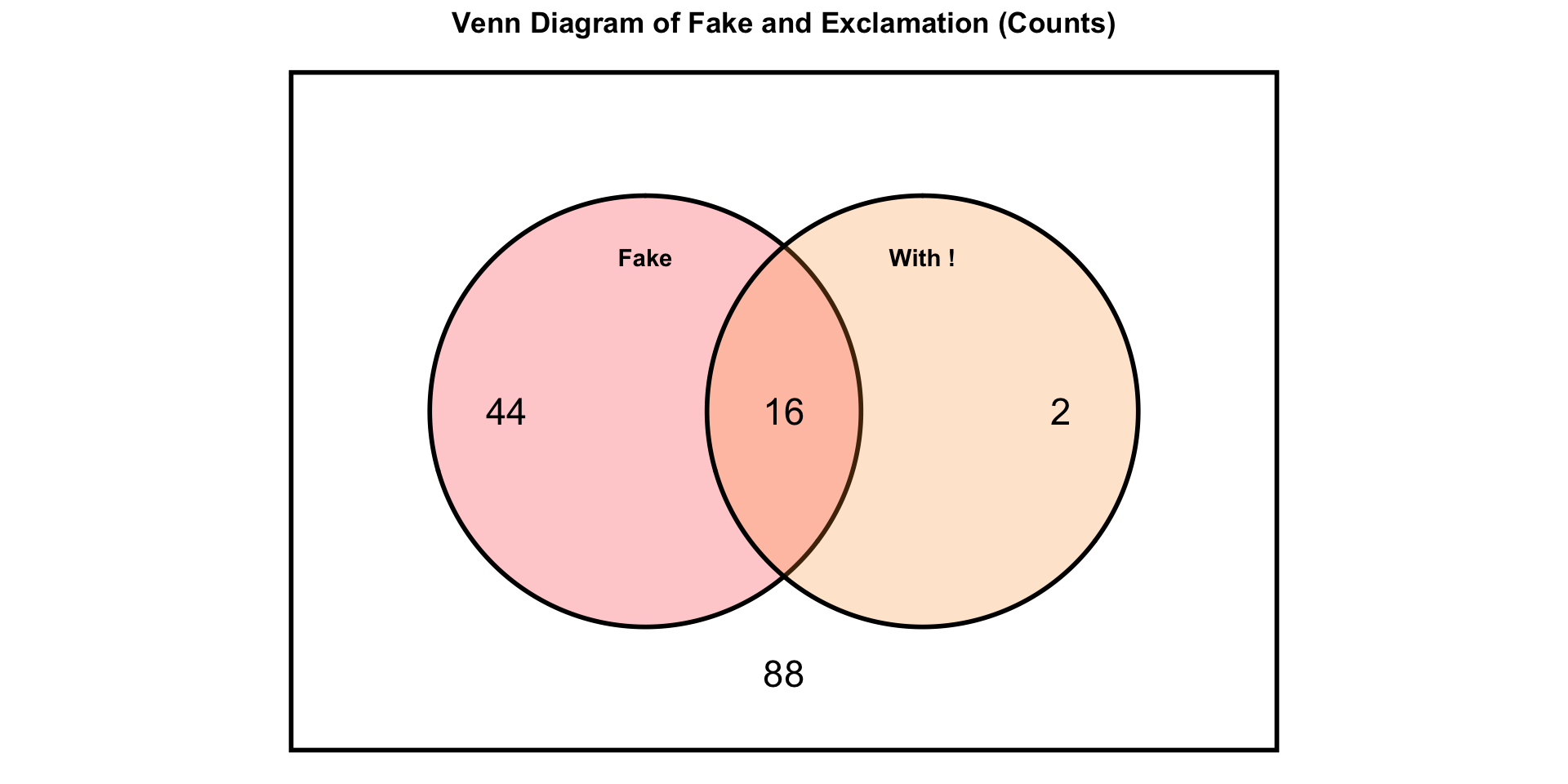
How can we represent this in the sample space diagram?
A sample space diagram
![]()
16 articles were fake and had an exclamation point, 44 were fake but didn’t have an exclamation point, 2 were real but had an exclamation point. The remainder (88) were real and didn’t have an exclamation point.
Add row and column margins
Translate raw counts to proportions/probabilities
Divide every cell (including the margins) by the grand total (N).
| Cell proportions |
| without ! |
0.587 |
0.293 |
0.880 |
| with ! |
0.013 |
0.107 |
0.120 |
| Total |
0.600 |
0.400 |
1.000 |
Raw counts are frequencies, proportions are relative frequencies, probabilities assume the data represent the whole population.
Conditional probabilities: columns
|
type
|
Total |
| exclamation |
|
|
|
| without ! |
88 |
44 |
132 |
| with ! |
2 |
16 |
18 |
| Total |
90 |
60 |
150 |
- Example:
- \(P(\text{With !} \mid \text{Fake})\) = 16/60 = 0.267
Conditional probabilities: rows
|
type
|
Total |
| exclamation |
|
|
|
| without ! |
88 |
44 |
132 |
| with ! |
2 |
16 |
18 |
| Total |
90 |
60 |
150 |
- Example:
- \(P(\text{Fake} \mid \text{With !})\) = 16/18 = 0.889
Bayesian updating: what does seeing an “!” tell us?
Prior belief: \(P(\text{Fake}) = 0.40\).
Evidence observed: Title has an exclamation point (\(\text{With !}\)).
- Known quantities: \(P(\text{With !}\mid \text{Fake}) = 0.267\) and \(P(\text{With !}) = 0.12\).
Bayes’ Rule: \(P(\text{Fake}\mid \text{With !}) \;=\; \dfrac{P(\text{With !}\mid \text{Fake})\,P(\text{Fake})}{P(\text{With !})}
\;=\; \dfrac{0.267 \times 0.40}{0.12} \; 0.889.\)
Interpretation: seeing “!” updates belief from \(0.40\) to about \(0.889\) that the article is fake.