Your First Chart, End to End
Lab · Module 3 · Wed Sep 2
Welcome to the Module 3 lab
Last week was about getting the tools up and running — R, RStudio, Quarto, and the course project. Today is about putting those tools to work. By the end of class you will have built and rendered your first complete chart-from-scratch report: data you typed yourself, imported into R, visualized with ggplot2, assembled into a polished, reproducible lab report.
In the M03 pre-study you built a bubble chart in the browser sandbox. Today you use the same vocabulary in RStudio, on a dataset you create yourself.
What you’re building
Know where you’re headed before you start. Everything today builds toward one chart: how the share of each platform’s users who regularly get news there changed from 2020 to 2025, for Facebook, Instagram, TikTok, and Reddit.
The finished chart puts:
- Years left to right along the bottom — 2020 at the left edge, 2025 at the right
- Percentage climbing up the side — the share of that platform’s users getting news there
- Four lines, one per platform, each in its own color so you can tell them apart
Those three sentences are the three aesthetic mappings you will write in Step 4. Every ggplot starts this way: decide what goes where, then name it in aes().
They are also most of your Introduction. In Step 3 you will write a short intro paragraph for your report, and it needs exactly what is above — what the data are, who collected them, what span they cover, and what question the chart asks. Come back and re-read this box when you get there; you will find you have already been told what to say.
How the code boxes on this page work
From Step 4 on, each thing you build appears in a sandbox with three tabs:
- ✍️ Your Code — where you try it yourself. This is the tab that does the learning.
- 💡 Hint — the function names and arguments you need, without the answer.
- 👀 Spoiler — the complete working code.
These boxes run R in your browser, so nothing you type in them touches your notebook — experiment freely, get it working, then type the working version into the matching chunk in RStudio.
Work ✍️ first, and give it a real attempt. If you have been stuck more than a few minutes, open 💡; if that is not enough, open 👀 — then close it and retype the code yourself rather than pasting it. Opening the Spoiler is not failing at the lab; staring at a blank box until the session ends is.
What you’ll leave with
- A 24-row Excel dataset you created and saved into PSY652_project’s
data/folder - A rendered HTML report containing a polished line chart built in four stages
- A self-critique of your chart written against Cairo’s five qualities
- One concrete revision applied to your chart based on that critique
- Hands-on experience with the full R + RStudio + Quarto workflow you’ll use every week this semester
Step 1 · Get set up
Start in GitHub Desktop, not RStudio. This is the pull half of the pull → edit → commit → push loop you set up in M02, and from here on every lab begins with it:
- Open GitHub Desktop and select PSY652_project in the repository list
- Click Fetch origin
- If it changes to Pull origin, click it — someone (or you, on another machine) has pushed work you don’t have yet
There will usually be nothing to pull while you are the only person committing. Do it anyway — it is the habit that keeps you from overwriting a teammate’s work once your Project 1 team forms.
Now open the project: navigate to your PSY652_project folder (stored on your laptop) and double-click PSY652_project.Rproj. RStudio opens with its four panes — the Source pane (top-left), the Console pane (bottom-left), the Environment pane (top-right), and the Files/Plots/Help/Packages pane (bottom-right).
Keep the project where it is for the semester — and never move individual files or subfolders out of it.
In the Files pane (bottom-right), you should see four folders: data/, documentation/, output/, and programs/.
Open the M03 lab skeleton
Today’s lab uses a pre-built skeleton .qmd file that lives inside your project. In the Files pane, click into programs/ and then click m03_lab.qmd. This will open the file in the Source pane. It’s a Quarto Markdown file with some YAML front matter at the top and empty code chunks waiting for you to fill in.
Take a moment to scroll through it without typing anything yet. You’re looking at:
- The YAML header at the top (between the two
---lines) — title, author, format options - A
# Setupsection with a code chunk that loads packages - A
# Introductionsection with a single italicized placeholder paragraph you’ll replace with your own description of the data and question - A
# Datasection with three pre-populated code chunks — one reads your Excel file, one runs glimpse() on it, and one under## Check your typingvalidates what you keyed in - A
# Chartsection with four stage sub-sections (Stage 1 → Stage 4), each containing an empty code chunk with a TODO comment - A
# Self-critique with Cairo's 5 qualitiessection at the bottom listing the five qualities with “Your answer:” placeholders you’ll replace, followed by a## Revised chartchunk and a one-line summary placeholder
YAML, chunks, and Markdown — a quick refresher
- The YAML header sits between two
---lines at the very top. It tells Quarto how to render your file — what title appears, what format the output is, what theme to use. - A code chunk is a fenced block that starts with
```{r}and ends with```. Everything inside is R that runs when you click play or when you render. Everything outside is prose (Markdown), which renders as text. - Chunk options — lines starting with
#|at the top of a chunk — control how it behaves.#| label: setupnames the chunk, which is how Quarto refers to it in an error message; names are optional but must be unique. Leave the skeleton’s other options (#| message: falseand friends) as they are.
Step 2 · Create your dataset in Excel
You’re going to build a small dataset by hand and save it into your project’s data/ folder. The dataset is real — drawn from the Pew Research Center’s Social Media and News Fact Sheet. It compiles annual estimates from 2020 through 2025; the 2025 figures come from a survey of U.S. adults conducted Aug. 18–24, 2025. Today’s question:
Among users of Facebook, Instagram, TikTok, and Reddit, how did the percentage who regularly got news on each platform change from 2020 to 2025?
Keep the denominator in view
Read that question again, because the wording is doing real work. Each value is the percentage of that platform’s own users who say they regularly get news there. The TikTok number isn’t “% of all U.S. adults” — it’s “of the people who already use TikTok, what fraction get news there?”
That means the four lines do not share a denominator. The Facebook percentage is computed among Facebook users, the TikTok percentage among TikTok users, and so on. Pew only asked the news question of respondents who said they used that site. And because who uses each platform shifts over time, the chart compares repeated platform-specific survey estimates — it does not follow one fixed group of people from 2020 to 2025.
Hold onto this when you write your title in Stage 3. A title like “Among U.S. social-media users, news consumption climbed” would be wrong: there is no single population of social-media users behind these four lines.
One row per observation · long format
You’ll enter this dataset in long format — one row per (year, platform) combination. That means each row contains exactly one percentage value, and the columns name what that value is (year, platform, percentage).
Long format is the natural shape for ggplot2: when you map color = platform later, ggplot2 groups by whatever’s in the platform column. There’s no “TikTok column” — there’s a platform column that contains “TikTok” in some rows and “Facebook”, “Instagram”, or “Reddit” in others.
You’ll learn the formal vocabulary for long vs. wide format in M04 next week. For now, just type the data as you see it in the table below — one row per observation.
Open Excel and key in the data
Open Excel (or Numbers on Mac, or Google Sheets — any spreadsheet program that can export or save .xlsx). Create a new blank workbook.
In row 1, type the three column headers exactly as shown:
| A | B | C |
|---|---|---|
| year | platform | percentage |
The dataset itself is the table below. Each cell holds the % of that platform’s users who say they regularly get news there for that year. It’s a wide-format display — 4 platforms × 6 years = 24 cells:
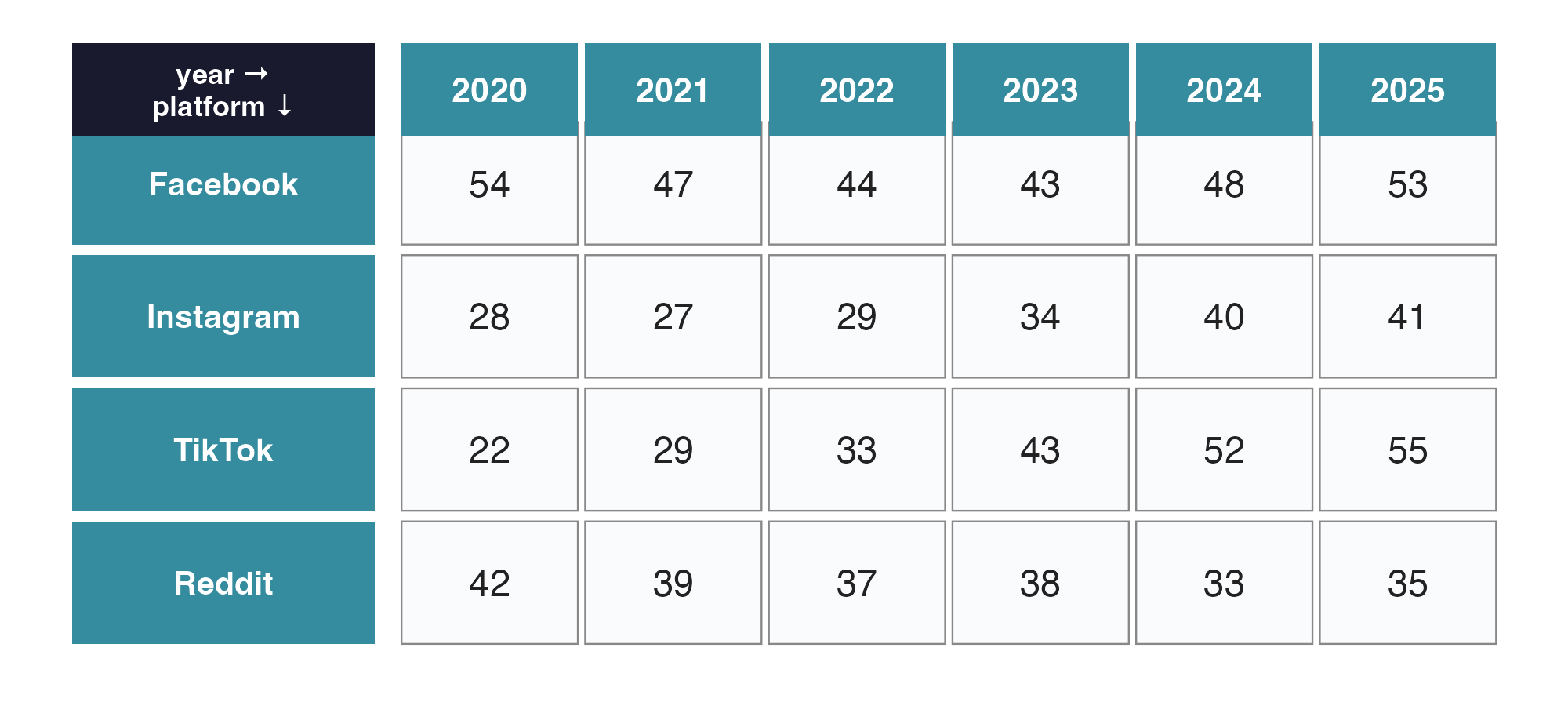
Now transpose into long format · one cell of the image = one row in Excel
The image shows the data in wide format (4 platform rows × 6 year columns). ggplot2 needs it in long format — one row per cell in the image. So 24 cells in the image = 24 rows in Excel.
For each cell, type one row built from three pieces: the column header above it (the year), the row label to its left (the platform), and the value in the cell (the percentage).
Your first three Excel rows should look like this:
| A | B | C | |
|---|---|---|---|
| Row 2 | 2020 | 54 | |
| Row 3 | 2021 | 47 | |
| Row 4 | 2022 | 44 |
Before you type · watch out for autocorrect
Excel sometimes “helpfully” reformats what you type. Read these three before you start — each one is easier to avoid than to undo:
- In the percentage column, type just the number —
54, not54%. If you include the%, Excel stores the value as0.54and formats it as a percentage. Nothing will error, but every chart you build later will silently run from 0 to 1 instead of 0 to 100 — a confusing bug with no error message to point at it. - Type platform names exactly as in the image (
Facebook,Instagram,TikTok,Reddit) — capitalization matters. Excel may try to lowercaseTikToktoTiktok. If it does, click into the cell and re-type. - Rarely, a year cell may pick up date formatting (showing something like
1/1/2024). If that happens, right-click the cell → Format Cells → Number → Number (0 decimal places) and re-type the year.
Now type it in, working platform-by-platform. Start at the Facebook row in the image. Reading left-to-right (54, 47, 44, 43, 48, 53), type six Excel rows: 2020/Facebook/54, then 2021/Facebook/47, 2022/Facebook/44, 2023/Facebook/43, 2024/Facebook/48, 2025/Facebook/53. Then drop down to the Instagram row in the image and repeat the same left-to-right scan (six more Excel rows). Then TikTok, then Reddit. When you finish the Reddit row, you’ll have entered all 24 cells.
Save the file into your project’s data folder
When all 24 rows are typed:
- File → Save As…
- Navigate to your
PSY652_projectfolder, then into thedata/subfolder - Name the file
social_media(Excel will add the.xlsxextension automatically) - Make sure the format is
Excel Workbook (.xlsx)— not.xls, not.csv, not anything else - Click Save
Using Numbers or Google Sheets instead?
Those steps are Excel’s. If you built your sheet somewhere else, the menu path differs — but the destination is identical: a file named social_media.xlsx sitting in PSY652_project/data/.
- Numbers (Mac): plain Save writes a
.numbersfile, which R cannot read. Use File → Export To → Excel… → Next → name itsocial_media→ save it intoPSY652_project/data/. - Google Sheets: there’s no Save-As dialog. Use File → Download → Microsoft Excel (.xlsx). The file lands in your Downloads folder — drag it into
PSY652_project/data/and confirm it’s namedsocial_media.xlsx.
Checkpoint 1 · Data file is saved
Back in RStudio, look in the Files pane (bottom-right). Click into the data/ folder. You should see social_media.xlsx listed alongside the other data files (mostly .Rds files).
If it’s not there: you saved it somewhere else by accident. Re-do File → Save As… from Excel, this time navigating carefully to PSY652_project/data/.
Step 3 · Import your data into R
Switch back to RStudio and click on the m03_lab.qmd tab in your editor.
Run the setup chunk
The skeleton’s setup chunk already loads tidyverse, here, readxl, and scales — that last one supplies the label_percent() axis formatter you’ll reach for in Stage 4. (scales installs with the tidyverse but is not attached by library(tidyverse), so it needs its own line.) Take a look at the chunk — the line library(readxl) is what makes the read_excel() function available to your notebook. Click play on this code chunk (i.e., the green triangle at the top right of the chunk) to load the packages.
readxl · the bridge from Excel to R
readxl is a small, sturdy tidyverse package that does exactly one thing: it reads Excel files into R as data frames. Its main function is read_excel(), which you give a file path and it returns a tibble. A tibble is the tidyverse’s flavor of data frame — same idea (rows of observations, columns of variables), with friendlier printing: only the first ten rows show in the console, column types appear under each name, and wide tables don’t run off the screen. For everyday purposes, you can treat “tibble” and “data frame” as the same thing.
Every import you write has the same three pieces: a name for the object, the assignment arrow <-, and a reading function pointed at a file path. Only the reading function changes with the file type — read_rds() for .Rds (you met it in M02), read_excel() for .xlsx.
Run the import code — and unpack what it does
Scroll to the # Data section. The first code chunk already contains:
social_media <- read_excel(here("data", "social_media.xlsx"))This line is doing three things at once:
- here("data", "social_media.xlsx") — builds a portable file path. Because you opened the project (not just the app), here() knows the project root is
PSY652_project/— so this resolves to wherever that folder lives on your machine. - read_excel(…) — reads the
.xlsxfile into memory as a data frame. social_media <-— assigns the data frame to an R object named social_media, which then lives in your environment until the session ends.
The second chunk pipes social_media to glimpse(), which prints a one-line-per-column structural summary:
social_media |> glimpse()Click play on both chunks to run them. After running the first chunk, you should see social_media appear in your Environment pane (top-right). After running the second chunk, the glimpse() output appears below the chunk or in the Console, depending on your RStudio settings — 24 rows, 3 columns, and the column types.
Check your typing
Scroll down one section in your skeleton to ## Check your typing. There is already a chunk there; run it now.
You are not expected to understand this code yet — just run it. It uses group_by(), summarize(), and friends, which are the whole subject of M04 next week. Read it if you’re curious, but the only thing you need today is what it prints.
glimpse() confirmed the shape of your data — 24 rows, 3 columns. It cannot tell you that you typed 5 where you meant 55, paired a value with the wrong year, or spelled TikTok two different ways. A chart renders perfectly from wrong numbers, and it looks exactly as convincing as a chart built from right ones. You typed these 24 rows by hand twenty minutes ago; this is the only step that checks them.
Every value it prints should match:
| Check | Expected |
|---|---|
rows |
24 |
platforms |
4 |
years |
6 |
earliest_year / latest_year |
2020 / 2025 |
percentages_in_range |
TRUE |
duplicate_platform_years |
FALSE |
If platforms is 5, you have a spelling inconsistency — Tiktok and TikTok count as two platforms. If duplicate_platform_years is TRUE, you typed the same platform-year twice and are missing another. Either way: fix it in Excel, save, and re-run the import and this check before you go on. Every chart you build today rests on these 24 numbers.
Check the file before you trust it
Assume nothing about a file, including one you made yourself. How many rows? How many groups? Anything outside the possible range? Any duplicates? Six one-line questions just caught errors that a beautiful chart would have hidden completely — and you write your own in M04.
Write a brief introduction
Now that you’ve imported the data and seen its structure, scroll up to the # Introduction section in your .qmd and replace the italicized placeholder paragraph with your own. Two or three sentences is plenty — name the data (Pew Research Center, four platforms, six years, 2020 to 2025) and state the question your chart will explore. This is the discipline behind every research write-up: tell the reader what you’re looking at and what you’re asking before you show them the picture.
Render the document
You’re going to render the document now — even though you haven’t added any of your own code yet. The reason: render early, render often. If something goes wrong, you want to catch it after one change, not after twenty.
To render: click the Render button at the top of the editor pane, or press Cmd + Shift + K (Mac) / Ctrl + Shift + K (Windows).
A new HTML preview pane opens. Look at it. You should see:
- A title at the top: “M03 Lab — Data Visualization”
- A
# Setupsection - An
# Introductionsection carrying your own paragraph, not the italicized placeholder - A
# Datasection with the glimpse() output showingRows: 24andColumns: 3, and below that, the column types
Checkpoint 2 · Import works and you can see your data
Your rendered HTML’s # Data section shows:
Rows: 24Columns: 3- Three column lines, one per variable: year (
<dbl>), platform (<chr>), percentage (<dbl>). read_excel() reads numeric Excel cells as doubles, so both numbers come in as<dbl>— not<int>.
If glimpse() shows the wrong row count, you have either too few or too many rows in your Excel file — check it. If it shows more than 3 columns (often a stray ...4 column full of NAs), you have data or leftover formatting somewhere outside columns A–C — clear it in Excel, re-save, and re-render. If the column names are wrong, fix them in Excel, re-save, and re-render.
Error: cannot open the connection or path does not exist
Did you get one of these errors?
Here are some common causes:
- File saved in the wrong folder. Most common. Open the Files pane in RStudio and confirm
social_media.xlsxis insidedata/. If not, re-save from Excel. - Typo in the path. here() takes the folder name first, then the filename. If you wrote
here("social_media.xlsx", "data"), swap them. Order matters. - You forgot to run the Setup chunk. The
library(readxl)line only helps once it has actually run in this session. Run the chunk now (click the green play arrow at the top right of the chunk, or Cmd/Ctrl + Shift + Enter while inside it), then re-run the import.
Step 4 · Build your chart, one stage at a time
Now for the main event. You’ll build the chart in four stages, each adding one ingredient on top of the previous one.
Run each stage inline (the green ▶ in the chunk) so you see the result immediately, and render the whole document three times as you go: once after Stage 2, to confirm it still builds; again after Stage 4, to see the finished chart in your report; and once more in Step 5, after you make your one revision. (The skeleton’s # Chart section says the same thing.)
Each stage corresponds to one of the empty code chunks under # Chart in the skeleton. You can work each stage out in the sandbox below first and then type your working code into the matching chunk — or write it straight into the chunk in RStudio and run it there. Either way, the finished code belongs in the chunk, and you render from RStudio.
This is where the three-tab sandboxes begin — ✍️ first, then 💡, then 👀 if you need it. Before Stage 1, scroll back to What you’re building at the top of the page: those three bullets are the three mappings you are about to write.
Stage 1 · The bare-bones line chart
Your task: four blanks. Match each column to the role the description above gives it — one column runs along the bottom, one climbs the side, one splits the data into separate colored lines — then name the geom that draws a line.
Your dataset has exactly three columns to choose from: year, percentage, and platform.
- The axis that runs left to right is
x; the one that climbs isy. color =takes the grouping variable — the column whose values become separate lines. You have four platforms, and you want four lines.- Geoms are named for what they draw. You used geom_point() in the pre-study; the one that draws lines follows the same pattern.
You’ve seen the ggplot() + aes() + geom_* pattern many times by now. Notice that the three mappings are just the three columns your data has — nothing was invented.
color = platform is quietly doing two jobs. It gives each platform its own color, and — because platform is a discrete variable — it tells ggplot2 that rows from different platforms belong to different lines. Without some grouping aesthetic, geom_line() would connect all 24 points into one zig-zag in year order. If you ever want separate lines without separate colors, map group = platform instead.
Run the chunk. You should see four colored lines, one per platform. It’s not pretty — no axis units, no title, no theme — but the bones are right.
Stage 2 · Add the data points
Right now the chart connects each pair of annual estimates with a straight segment, which can make the path look more continuous than the data underneath it. You have exactly six observed annual survey estimates per platform. Marking them makes that honest.
Your task: one blank — the layer that draws a dot at each observation.
Same naming logic as geom_line(). It goes after geom_line() with a +, so the dots draw on top of the lines rather than under them.
Render the document now (Cmd/Ctrl + Shift + K) — the first of your three full renders, just to confirm it still builds.
Each year’s value is now marked with a dot, making the six annual survey estimates visible. The lines still connect them — but a reader can now see which values are observed estimates and which parts are just segments drawn between them.
Stage 3 · Add labels — and write your title as a finding
Now the labels — all five of them. The trick with the title: it should state your finding, not just describe what’s on the axes. “Social media news consumption, 2020 to 2025” tells a reader nothing they can’t see. A title that says what changed does real work.
If you feel stuck, ask: what is the single thing I would most want a reader to notice first? Your title should answer that.
Your task: write all five labels yourself. Every one of them is a decision, not boilerplate — a reader who sees only your chart depends entirely on what you put here.
What each label is for
| Argument | What it should say | The mistake to avoid |
|---|---|---|
title |
Your finding — one declarative sentence | Describing the axes instead of the trend |
x |
What the horizontal axis measures | Leaving the raw column name (year) |
y |
What the vertical axis measures — with its units | Omitting the unit; “percentage” of what? |
color |
A human-readable header for the legend | Leaving the column name (platform) |
caption |
Where the data came from | Omitting it — the source must be documented on the figure or in a note beside it |
The y-axis is the one people get wrong most often. “Percentage” alone doesn’t say percentage of what; your reader needs to know it’s the share of each platform’s own users.
Work through them in order:
x— the years. Short is fine here; the numbers speak for themselves.y— say the unit and the base. Something like “% of platform’s users who regularly get news there”.color— what distinguishes the four lines, in a word a reader would use: “Platform”.caption— the source: Pew Research Center’s Social Media and News Fact Sheet.title— last, because you write it by looking at the finished chart. Which platform’s line climbs fastest? Which has flattened? Which is falling? Name one of those movements in a sentence a reader could verify.
Some titles that would qualify:
"The share of TikTok users who regularly get news there\nrose from 22% to 55% between 2020 and 2025""Among these four platforms, the share getting news there rose most\non TikTok and Instagram, and fell on Reddit""By 2024, TikTok had passed Facebook in the share\nof its own users who regularly get news there"
Note the \n in each one. A finding-style title is a sentence, and a sentence long enough to state a finding is usually too wide for the figure — it gets silently cut off at the edge rather than wrapping. \n starts a second line. As a rule of thumb, break anything past about 60 characters.
Pick a version that speaks to you.
If your title runs off the edge of the chart, break it yourself. A title-as-finding is a whole sentence, so it’s often wide — and ggplot2 will not wrap it for you. It prints the title on one line and lets it run past the plot edge, clipping whatever doesn’t fit. The fix is to say where you want the break, using \n — as the spoiler above does, breaking after “news there” so neither line runs past the panel edge.
Inside a quoted string, \n is not the two characters backslash and n — it’s R’s way of writing a newline, an instruction meaning “start a new line here.” ggplot2 obeys it and draws the title across two lines. Put it right where a reader would naturally pause, and don’t leave a space on either side of it. This works in any labs() text — subtitles, axis titles, and captions all take \n the same way.
Run the chunk. The title sits on top, the axes are labeled with units, the legend has a clean header, and the caption credits the source.
Stage 4 · Deliberate scales and a theme
Two things finish this chart off. The first — deliberate scales — is already written for you. The second is the theme, your one blank below.
ggplot2 picks axis breaks for you, and on the x-axis it does fine here. Writing scale_x_continuous(breaks = 2020:2025) anyway says what you mean: hand the same code eleven years instead of six and the automatic version labels the axis 2015.0, 2017.5, 2020.0 — half-years, on a variable where half-years cannot exist.
The y-axis is where the default costs you something. Left alone it runs from about 20 to 57 and labels ticks as bare numbers. label_percent(scale = 1) makes percentages read as percentages, and the fixed 0–60 range keeps the four lines in proportion to the full scale. That range is a choice — defensible here because the outcome is a bounded percentage — not a rule. Choose the scale deliberately and be able to say why, rather than “always start at zero.”
The theme
theme_minimal() strips away the default gray background and gives the chart a cleaner look. The base_size = 14 argument bumps every text element up proportionally, which matters more than it sounds — default ggplot text is small enough to be hard to read in a rendered report.
ggplot2 ships with several complete themes, and swapping one for another is a one-word edit:
| Theme | What it looks like |
|---|---|
| theme_minimal() | No panel border, light gray gridlines on white — the course default |
| theme_bw() | Like minimal, but adds a border around the panel |
| theme_classic() | No gridlines at all; just x and y axis lines, like a journal figure |
| theme_light() | Thin border and very light gridlines |
| theme_gray() | ggplot’s default — the gray panel you have been looking at |
| theme_void() | Strips everything: no axes, no gridlines, no background |
Try a few in the box below — it takes two seconds each. For the version you render, use theme_minimal(base_size = 14) unless you have a reason to choose otherwise (full list).
Your task: one blank — the theme that strips ggplot’s default gray panel.
Its name says what it does to the chart’s furniture — and “minimal” is the look you’re after.
Render now — the second of your three full renders. You should see a clean, communication-oriented chart. This is the first complete version you’ll evaluate and revise in Step 5.
One thing this chart does not show
Every point on it is a survey estimate, not an exact population percentage. Pew asked a sample, not everyone. This chart displays no sampling uncertainty — you’ll learn to compute and show it in M07 — so interpret small year-to-year wiggles cautiously. TikTok’s climb from 22% to 55% is a finding you can defend. A two-point dip in one platform’s line between two adjacent years is not.
Checkpoint 3 · Chart is built
Your # Chart section contains all four stage chunks, and they run without errors. Stage 4 should show a polished line chart with:
- Four colored lines (one per platform)
- Points marking the data values
- A title that states a finding
- Axis labels with units (
%for the y-axis, justYearfor x) - A caption crediting Pew Research
- A theme of your choosing
Step 5 · Self-critique with Cairo’s 5 qualities
In the M03 lecture you met Alberto Cairo’s five qualities for an effective visualization. Your chart is “done” in the sense that it renders without errors — but is it good? Let’s examine that question using his five qualities as a checklist.
Cairo’s 5 qualities
- Truthful — the data, source, scale, and context are represented honestly, and the figure doesn’t hide a limitation or invite a claim the data can’t support.
- Functional — the design lets the intended reader do the intended task: compare platforms, or trace change over time.
- Beautiful — visually coherent and readable, without decoration getting in the way of understanding.
- Insightful — makes a pattern easier to see than it was in the 24-cell table.
- Enlightening — taken together, the other four deepen what a reader actually understands about the subject.
Answering “is my chart truthful?” in the abstract is hard. Answer these instead — one per quality, each pointed at your chart:
Five questions to answer
- Truthful — Does your title preserve the denominator (users of that platform)? Is your y-axis range defensible? What limitation is not visible in the figure?
- Functional — Can a reader compare all four trajectories without bouncing back and forth to the legend?
- Beautiful — Are the colors, line weights, and text size readable at the size this will actually be viewed?
- Insightful — Name one thing your chart makes easy to see that the table of 24 numbers did not.
- Enlightening — What should a careful reader conclude from your chart — and what should they not conclude?
Scroll to the # Self-critique with Cairo's 5 qualities section in your m03_lab.qmd. Under each quality, you’ll see an italicized “Your answer:” placeholder — replace it with one or two sentences answering for your chart. Be honest — most first drafts can be improved on at least one of the five.
Then make ONE revision
Based on your critique, identify one change your chart needs. A useful rule here is: pick the revision that most directly addresses the weakest quality. Examples of common first-chart fixes:
- A colorblind-safe palette — scale_color_brewer(palette = "Dark2") or scale_color_viridis_d()
- Bigger text for a chart that will be projected (base_size
= 16or larger) - Heavier lines or larger points —
geom_line(linewidth = 1),geom_point(size = 2.5) - A subtitle that carries the denominator your title can’t fit: “Among users of each platform”
- A different y-axis range, if you can say why yours is the honest one
- Moving the legend —
theme(legend.position = "bottom")— to give the panel more width - A sharper caption naming the survey dates, not just the source
Each of these is one line you can already write.
Scroll to the ## Revised chart sub-section. Three things, in this order:
- Copy your Stage 4 code into the
chart-revisedchunk. Copy it — do not move it. Stage 4 stays where it is, so the before-and-after is visible in your rendered report. - Make exactly one deliberate change to the copy. One, not several — the point is to trace a single revision back to a single critique.
- Render.
Below the revised chart, replace the italicized “What you changed and why” placeholder with one or two sentences explaining your revision and linking it back to the Cairo quality that flagged the need.
Checkpoint 4 · Critique + revision are in
Your rendered HTML now has, at the bottom:
- A written response under each of Cairo’s 5 qualities
- A revised chart (Stage 4 + your one change)
- A short paragraph explaining the revision and which quality drove it
Lab debrief · 5 minutes
Before you do the final render, save your work and look up. We will spend the last five minutes pulling the lab together.
Take one quiet minute to skim the questions below, then we’ll discuss as a group.
Lab debrief · what did we learn by doing?
The sticking point. What was the single hardest moment in today’s workflow — the place where you got stuck the longest? What helped you move forward, or what would have helped?
Data shape. You first saw the data in wide format: 4 platforms by 6 years. Then you typed it in long format: 24 rows by 3 columns. Which format felt more natural to read with your eyes? Which format felt more natural for ggplot2 to work with? Why might those be different?
Title-as-finding. Look at the title you wrote for your chart. If a colleague saw only your title and your chart, would they walk away with the right takeaway? What is the smallest revision that would make the message clearer?
Cairo’s qualities. Which of Cairo’s five qualities was hardest for your chart to satisfy — truthful, functional, beautiful, insightful, or enlightening? Why?
Final render and submit
You’re done with the analysis. One last loop to lock it in:
- Add your name to the YAML’s
author:field — replace"Your Name"with your actual name - Do a final render. Click Render or Cmd/Ctrl + Shift + K
- Open the rendered file — it renders right next to your
.qmd, atPSY652_project/programs/m03_lab.html - Read it end to end — open it in your browser (right-click → Open With → your browser of choice) and read the whole report as if you were encountering it for the first time
- Submit it to Canvas under “Lab 3 — Data Visualization”
- Commit and push your work. Switch to GitHub Desktop. Your
m03_lab.qmdis waiting in the Changes tab — write a one-line summary of what you did (Add M03 line chart and Cairo critique), click Commit to main, then Push origin. (If GitHub Desktop says it can’t find the repository, you moved or renamed the project folder — use its prompt to relocate it to the folder’s current spot.)
That last step closes the pull → edit → commit → push loop you opened at the top of this lab, and every lab from here runs the same circuit. When your Project 1 team forms in Week 5, this is how you’ll trade work with them, so the repetitions between now and then are the point.
Notice what GitHub Desktop is not offering you. social_media.xlsx and m03_lab.html are missing: your .gitignore keeps the data/ folder and rendered output local. The HTML regenerates from the .qmd, so losing it costs nothing — but the Excel file does not regenerate, and nothing in your repository could rebuild it. Whatever Git ignores needs its own backup plan.
Double check
Before you leave today:
What you just did, in research terms
Today’s workflow — data entry → import → analysis → polished output — is the exact pipeline every quantitative research paper sits on top of. The dataset was small and the chart was simple, but the loop you ran is the same loop for the larger projects you will complete throughout the course (and beyond). Substitute a 200,000-row National Survey on Drug Use and Health file for the 24-row Pew table, swap a line chart for a hypothesis test, and the structure stays identical: open the project, load the data, do the work, render the report.
The reason today felt slow is that you were learning the loop itself. From M04 on it fades into the background and the statistics take the foreground.
Going further. The canonical reference for ggplot2 and the broader tidyverse workflow you used today is R4DS — free online. Chapters 1 and 9–11 cover data visualization; Chapter 7 goes deeper than read_excel() into the broader set of data-import techniques. Treat the website materials as the gentle introduction; R4DS is where you go to become fluent.