Does the normal model actually fit? Two visual checks
Self-paced bonus activity · density overlay and Q-Q plot
Optional — after the M06 lab, any time. Nothing here goes into your lab notebook.
In the M06 lab you fitted a Normal(\(\hat{\mu}\), \(\hat{\sigma}\)) model to the depression-severity composite and then used it to make probability statements. This page is the step that belongs between those two — checking whether the model actually describes the data. The lab lets you skip it to keep moving; do it now, either on the way past Step 8 or afterwards, and see whether that shortcut was safe.
Two standard tools, one page. The subset, the composite score, and mu_hat / sd_hat are already built and loaded — you can run every chunk below straight away.
Fit check #1 · histogram plus theoretical normal curve
The fastest way to see whether a normal model fits your data is to overlay a normal density curve on top of the observed histogram, using the \(\hat{\mu}\) and \(\hat{\sigma}\) you just estimated. If the curve tracks the bar heights, the normal model is describing your data well. If the curve floats above, below, or to one side of the bars, the model is missing something.
Rather than have you guess at unfamiliar functions, here is the whole plot. Run it in the sandbox below — then we’ll unpack each piece underneath.
What each piece is doing:
aes(x = severity_scale)puts the composite score on the x-axis; both layers below read from it.- The histogram —
geom_histogram(aes(y = after_stat(density)), …)draws the observed distribution. The important part isafter_stat(density). A histogram normally plots counts up the y-axis, but a normal curve is measured in density — the area underneath it sums to 1.after_stat(density)rescales the bars so that their total area is also 1, which puts the bars and the curve on the same y-axis so they can be compared directly. (binwidth = 0.5makes each bar half a scale-point wide; thefill,color, andalphaare cosmetic.) coord_cartesian(xlim = c(xmin, xmax))widens the viewing window to \(\hat{\mu} \pm 3.5\hat{\sigma}\). Your data stop at 0 and 10, so by default the panel would stop there too and slice the normal curve off at both ends. Widening the window lets you see the whole model — including the part of it that predicts scores above 10 and below 0, which no respondent can actually have. That overhang is not a plotting glitch; it is the model making impossible predictions, and it is the point of the caveat at the end of this step.- The curve —
stat_function(fun = dnorm, args = list(mean = mu_hat, sd = sd_hat))draws the model. stat_function() takes a mathematical function and plots it as a smooth line: here it evaluates dnorm() — the normal density — all the way across the x-range, using the exact \(\hat{\mu}\) and \(\hat{\sigma}\) you estimated in Step 7 (handed to it through args). This is the curve your data would trace if the normal model were exactly true.
Put simply, the two layers together answer one question: does the smooth teal curve follow the tops of the red bars?
Look carefully at where the curve and the bars agree and where they don’t.
Say it out loud, or jot it down — two or three sentences describing: (a) which region of the x-axis the normal model tracks well, (b) where it diverges, and (c) what kind of miss it is — does the curve predict more density than you see (bars shorter than the line), less (bars taller than the line), or does it put the peak in the wrong place?
A built-in limitation to keep in mind. severity_scale is bounded between 0 and 10, but a normal curve runs from \(-\infty\) to \(+\infty\) — so the fitted model always assigns some probability to impossible values below 0 or above 10. That doesn’t make the exercise wrong, but it’s one more reason to check the model before trusting tail probabilities, and it helps explain some of what you’ll see at the ends of the Q-Q plot next.
You should now have · the density overlay
You now have the severity histogram (in density units) with the fitted normal curve overlaid in teal, plus your two-to-three sentences on where the curve tracks the bars and where it misses.
Fit check #2 · the Q-Q plot
A quantile-quantile plot (Q-Q plot) is the other standard tool for checking distribution fit. It compares observed quantiles against the theoretical quantiles a normal model predicts. Here’s how to read one:
- x-axis: theoretical quantiles from a standard normal distribution (if your data were perfectly normal, these are the z-scores each observation “should” have gotten)
- y-axis: observed quantiles of severity_scale, in the scale’s original 0–10 units
- Each dot is one observation plotted as (theoretical-z, observed-value)
- Perfect fit: dots fall exactly on a straight diagonal line
Departures from that line are easier to recognize than to describe, so here they are. Each panel below is 400 simulated values from a distribution whose shape we know, plotted the same way you are about to plot yours. Learn these four signatures and you can read almost any Q-Q plot you meet.
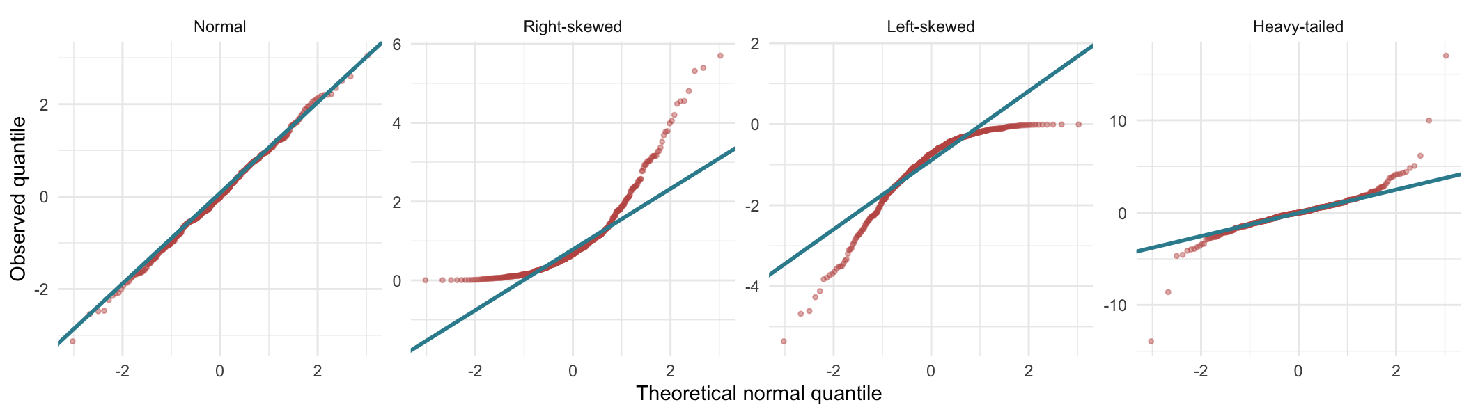
Reading the four signatures:
- Normal — the dots track the line along its whole length. Note that they still wander a little at the extreme left and right: out there you have only a handful of observations, so some wobble in the tails is expected even when the data really are normal. Do not call a distribution non-normal on the strength of the last two or three points.
- Right-skewed — the dots form a curve that bows upward. They sit above the line at both ends, and at the right they pull away from it dramatically: the largest observed values are far larger than a normal model predicts for them. The left end flattens because this variable cannot go below zero.
- Left-skewed — the mirror image, bowing downward. The dots sit below the line at both ends, dropping steeply away at the left, and flattening at the right against the variable’s upper limit.
- Heavy-tailed — the two ends leave the line in opposite directions: below it on the left, above it on the right. That is the classic S-shape. The middle of the distribution fits perfectly well; it is the extremes that are too extreme.
Two of these are easy to confuse at a glance, so it is worth naming the difference precisely: skew bows, heavy tails snake. A skewed variable gives you a curve bending consistently one way, with both ends on the same side of the line. Heavy tails give you an S, with the ends on opposite sides. If you could lay a gentle arc over the dots, think skew; if you would have to draw an S, think tails.
Two more patterns to watch for in your own plot. In both skewed panels one end goes flat — a horizontal run of dots where the variable has hit a hard limit and cannot go further; severity_scale is bounded at 0 and 10. And a variable with few distinct values climbs in stair-steps rather than a smooth line — expect that too, since a mean of four integers can only land on quarter-points.
As before, here is the complete plot — run it, then read the breakdown below.
What each piece is doing:
aes(sample = severity_scale)— a Q-Q plot uses a special aesthetic called sample rather than the usualxandy. You hand the raw variable to sample, and the two stat_qq layers do all the coordinate work for you: sorting the values and matching each one to the theoretical normal quantile it “should” have landed on.stat_qq()draws the points — one per observation, each plotted at (theoretical normal quantile, observed value).stat_qq_line()draws the reference line the points would follow if the observed shape were normal. Worth knowing: this line is fitted through the 25th and 75th percentiles of the data — it is not drawn from the mu_hat and sd_hat you estimated in Step 7.
That gives the two plots a clean division of labour, and it is why the lab asks for both:
| Plot | Question it answers |
|---|---|
| Histogram + fitted curve (fit check #1) | Does my specific fitted model, Normal(\(\hat{\mu}\), \(\hat{\sigma}\)), track this data? |
| Q-Q plot (fit check #2) | Does the shape of this distribution depart systematically from normality at all? |
The dots are your 2,066 observations. Read the plot using the guide above.
Say it out loud, or jot it down — one or two sentences describing what pattern you see: is it a straight line? An S-curve? Does it bend off at one or both ends?
Stop and synthesize
Look at the density-overlay plot and the Q-Q plot side by side.
Say it out loud, or jot it down — 3–5 sentences answering:
- Where does the normal model fit the observed severity distribution well?
- Where does it clearly fail?
- If you had to describe the shape of the observed distribution in plain English, what would you say? (Right-skewed? Bimodal? Bounded? Clumpy at the low end?)
- Would you trust a probability statement built from this normal model? Partially? Not at all?
These are the kinds of judgments researchers make whenever they use a theoretical distribution to approximate the spread of individual observations. In M09 the considerations behind a t-test will be related but not identical — the raw outcome does not simply have to “pass a normality check.” The goal isn’t to get the “right” answer; it’s to build the habit of looking before believing.
You should now have · the Q-Q plot
You now have the Q-Q plot of severity_scale against the theoretical normal line, plus your one-to-two sentence read of the pattern (straight line, S-curve, or a bend at one end).