Confidence Intervals for Proportions: Reproducing Daly (2022)
Lab · Module 7 · Wed Sep 30
Welcome to the Module 7 lab
This lab lands in the middle of confidence-interval week. The M07 Module and pre-study built a 95% CI for a mean — the average of institutional median earnings across the 2,199 U.S. colleges in Chetty et al.’s mobility data — and built it twice, once by bootstrap resampling and once with the parametric formula \(\bar{x} \pm t^* \cdot s/\sqrt{n}\). Today the estimate changes but the structure does not. You swap the mean for a proportion, \(s/\sqrt{n}\) for the standard error of a proportion, and \(t^*\) for \(z^*\) — leaving the same estimate ± critical value × standard error skeleton underneath. The question is one that matters clinically:
What fraction of U.S. adolescents had a past-year major depressive episode (MDE) in each year from 2009 to 2019 — and how precisely can we pin down each of those figures?
You’ll reproduce the core finding of Daly (2022) in the Journal of Adolescent Health — the paper you met briefly in M05 — and you’ll do it with 95% confidence intervals, which we set aside in M05. By the end of the lab you’ll have built your own version of his trend graph with CI error bars added.
The rise across those eleven years will be plain to see. Whether it is more than sampling noise is a different question, and a confidence interval for each year separately cannot settle it — that takes an interval for the difference, and a hypothesis test to read it. M08 is where that arrives. Today’s job is the estimate and its uncertainty: get those right, and the test in M08 is a short step.
What you’ll leave with
A single .qmd file that, when rendered, becomes the HTML report you submit, containing:
- A descriptive table of the NSDUH sample by year × sex (Table 1 from Step 2).
- A prevalence table with year, sex, \(\hat{p}\), SE, and 95% CI bounds for all 22 cells (the all_cells tibble from Step 5).
- A trend graph with 95% CI error bars (Daly Figure 1B, from Steps 6–7).
- Prose interpretation between each output — what it shows, what it tells the reader.
How the time works. You’ll do the analysis — Step 0 setup through Step 7 — and rough out your notebook in class, then we’ll pause for a short group debrief. The write-up (the interpretation prose, the final render, and submitting to Canvas) is yours to finish at home. Plan for that split, and don’t rush the prose in the room — it’s the part that takes the most thought.
The sandboxes on this page are your scratchpad; the notebook you build in RStudio is the deliverable. They use the same three tabs as the M06 lab — work ✍️ Your Code first from its Targets list, with 💡 Hint and 👀 Spoiler as the net if you’re stuck more than a few minutes. (The M06 lab’s Step 0 has the keystrokes for inserting and labelling a chunk, if any of that is hazy.)
Step 0 · Get set up
Six things, then you are analyzing. Everything after this step just tells you what to drop into the notebook you build here.
Start in GitHub Desktop, before RStudio. Select PSY652_project, click Fetch origin, and click Pull origin if it appears. That is the pull half of the
pull → edit → commit → pushloop — the same loop you’ll close at the end of today’s lab.Create the file. In the Files pane, open
programs/lab_template.qmd. Use File → Save As… to save a copy insideprograms/namedm07_lab.qmd— the same move you made in the M06 lab. The template opens with three stock sections —# Setup,# Import Data(which readsnhanespurely as a worked example), and# Glimpse. Delete all three. You are replacing them with the YAML, structure, and setup chunk below, and building the rest yourself as the lab proceeds.Set the YAML. Two changes to the header you just copied — the title, and the TOC depth this report needs:
title: "Reproducing Daly (2022): Past-Year MDE Prevalence in U.S. Adolescents, 2009–2019"
toc-depth: 5
Leave everything else as the template has it. (The M06 lab’s Step 0 covers what the other lines do, and
lab_template_annotated.qmdin yourprograms/folder annotates every one of them.)Give the notebook a structure a reader can follow. A reader who opens your report wants to know, in order: what question are you answering, what data are you using, what did you do, what did you find, what does it mean. That ordering should map onto your top-level headers:
# Introduction
# Data
# Methods
# Results
## Sample composition
## Prevalence by year and sex
## Trend over time
# Discussion
Use
#for top-level sections,##for subsections,###only when you need a third level. Each section should have at least one paragraph of prose — even short ones. A document that’s all code and no prose isn’t an analysis notebook; it’s a code dump.Write the
setupchunk — you deleted the template’s, so this one is yours. It sits above# Introduction, not inside it, and keeps the label the template used:#| label: setup library(tidyverse) library(here) library(gtsummary) library(gt)Fill the
import-datachunk under# Data. It reads the file — already in your project’sdata/folder, nothing to download — and trims it to the three variables this analysis uses:#| label: import-data nsduh_20092019 <- read_rds(here("data", "nsduh_20092019.Rds")) |> select(year, sex, mde_pastyear) |> filter(!is.na(mde_pastyear), !is.na(sex))
Render now. If it renders clean, you are set up and the rest of the lab is analysis.
Note Headings need a blank line above them
This report runs long enough that a mis-rendered heading is easy to miss, and this is where nearly everyone meets the rule once. A # heading only becomes a heading if there is a blank line before it. Written straight underneath a line of prose, it renders as ordinary text with a stray # in front:
Some prose about the data.
# Methods            <- renders as plain text, NOT a heading
Some prose about the data.
# Methods <- renders as a headingIf a section is missing from your table of contents after you render, this is almost always why. The same rule applies above and below code chunks — when in doubt, leave a blank line.
Part 1 · The data behind Daly (2022)
Before we can put a confidence interval on anything, we need the data and the raw prevalence estimates. This Part loads the NSDUH adolescent file, documents who is in the sample, and computes the point estimates we’ll wrap in intervals in Part 2.
Step 1 · Meet the data
nsduh_20092019 · 167,783 observations · 3 variables · SAMHSA NSDUH 2009–2019
A projection of the full NSDUH adolescent file you first met in the M05 Module — the M06 lab used its 2019 wave alone; today you get all eleven waves back — narrowed to the three variables you need:
- year integer — Survey year
- sex factor — Respondent’s sex as recorded by NSDUH
- mde_pastyear factor — Whether the respondent experienced a major depressive episode in the past 12 months
The dataset is already loaded in your sandbox as nsduh_20092019. Confirm it with glimpse():
Full codebook for nsduh_20092019 — values, levels, missingness, and how the file was prepared.
Check a factor’s levels before you compare against them. Several steps below count MDE-positive adolescents with mde_pastyear == "Positive", and R matches that text exactly — a wrong capital returns zero with no error. As in the M06 lab, ask the data rather than guessing:
Swap in sex or year to check those. Counting a factor before you use it is a three-second habit that catches misremembered spellings and unexpected NAs before they become a silent zero.
Checkpoint 1 · Data loaded
Your import-data chunk holds the load you wrote in Step 0, and your glimpse() output shows nsduh_20092019 with three columns — year, sex, and mde_pastyear — and the row count in the header. That projected file is what every sandbox chunk below draws on.
In your notebook — nothing new to add: the import chunk you wrote in Step 0 already covers this step, and the glimpse() and count() checks are scratchpad work you don’t need to keep.
Step 2 · Document the sample
Before we touch any prevalence numbers, let’s get a feel for the sample we have to work with: how many adolescents were surveyed at each wave, broken out by sex. The standard tool for a descriptive table like this is tbl_summary() from the gtsummary package — it ingests raw data and produces a publication-ready table in a single call. We pipe its output through as_gt() and add a header for a polished title. If you need a refresher on creating publication-ready tables in R, revisit the prerequisite M05 material.
Targets. Build a table of sample composition, then title it.
- Start from nsduh_20092019 and select() just year and sex.
- Pipe into tbl_summary() with by set to sex, so the table splits into a Female column and a Male column.
- year is stored as a number but you want counts per wave, not a mean — so force it to be treated as categorical with the type argument.
- Relabel year to something a reader would want to see.
- Convert to a gt table and give it the header “Table 1. Number of participants by year and sex”.
- The two-level demographic axis (the same one you’ll put in group_by() next) is the column grouping.
- year is stored as integer, so by default tbl_summary() would treat it as continuous and report a mean/median across years — which makes no sense for our purposes. Declaring its type as the quoted string
"categorical"forces a row-per-year breakdown. - Both type and label use the same formula style:
type = list(year ~ "categorical")andlabel = year ~ "Year of Survey".
What you should see: two columns (Female with its total N · Male with its total N) and 11 rows under Year of Survey, each showing the count and within-column percent of adolescents surveyed in that year × sex stratum. This is the who’s-in-the-data documentation that pairs with the prevalence estimates we’ll compute next — together, they’re the demographic backdrop and the substantive headline of the analysis.
Checkpoint 2 · Sample documented
Your Table 1 renders with two columns (Female and Male, each with its total N) and 11 rows under Year of Survey — the count and within-column percent surveyed in each year × sex stratum.
In your notebook — this is a deliverable. Add a Sample composition subsection with this Table 1 and a sentence describing who’s in the data (years, sexes, total N).
Step 3 · Point estimates of prevalence
With the sample composition documented, let’s now compute the point estimates Daly reports — the raw prevalence of past-year MDE by year and sex. This is Panel B of his Figure 1. The recipe is the standard tidyverse “group, then summarize” pattern: group by the two demographic axes, then in one summarize() call compute the cell sample size, the count of MDE-positive cases, and the proportion.
Targets. Produce one row per year × sex combination, holding the point estimate.
- group_by() year and sex.
- Inside summarize(), build three columns: the number of adolescents in the cell, the number who were MDE-positive, and the proportion — your \(\hat{p}\).
- Name that proportion column p_hat; Steps 4–7 all refer to it by that name.
- Set
.groups = "drop"so the result comes back ungrouped — a grouped tibble will quietly change what your next summarize() does. - Assign the whole thing to raw_prev and print it.
- group_by() takes both grouping columns at once, separated by a comma — that is what produces one row per year × sex combination rather than one row per year.
- n_total is the cell sample size — n() counts the rows in each group.
- n_mde is the MDE-positive count —
sum(mde_pastyear == "Positive")counts rows where the condition isTRUE. Look at the mde_pastyear factor levels:"Positive"is the one that indicates the adolescent had a past-year MDE. - p_hat is the proportion — the positive count divided by the cell total:
n_mde / n_total.
You should see 22 rows — one per year × sex combination — each with n_total (cell sample size), n_mde (MDE-positive count), and p_hat (the proportion, \(\hat{p}\)). This long-format tibble is what we’ll pipe into Step 5 to compute a CI for every cell.
Checkpoint 3 · Point estimates computed
Your raw_prev prints a 22-row tibble — one row per year × sex — with n_total, n_mde, and p_hat columns.
In your notebook — optional. raw_prev is a stepping stone to the CI table in Step 5; include it only if you want to show point estimates before intervals. (Step 5 recomputes everything, with CIs added.)
Before adding any uncertainty, look at the 22 estimates as a reader would — as a trend. Run this one; you don’t have to write it.
The rise is plain. But every point is one sample’s estimate, and nothing here says how precisely any of them is pinned down — that is what the rest of the lab adds.
In your notebook — optional. This preview gets superseded: Step 6 rebuilds the same graph with error bars, and that version — customized in Step 7 — is the figure your Trend over time subsection needs. Keep this stripped-down one only if you want your report to show the before-and-after.
Part 2 · Put an interval on every estimate
Part 1 produced 22 point estimates. This Part wraps each one in a 95% confidence interval — first one cell, slowly, so the formula is yours; then all 22 at once; then the figure Daly published, with the uncertainty finally drawn on it.
Step 4 · A 95% CI for one cell (females, 2019)
Step 3 gave us the point estimates — single numbers that hide their own precision. A 22% prevalence built from a few hundred females and a 22% built from a few thousand aren’t the same finding, even though the point estimate is identical. So before reading anything off the table, we want a 95% CI around each cell. Before scaling up to the full table in Step 5, let’s get the mechanics right on one cell: females in 2019.
The recipe should feel familiar. The pattern is exactly the one from the pre-study’s Activity 3.2 — compute every piece inside a single summarize() call, naming each piece (estimate, SE, critical value, lower, upper) as its own column. What changes is the SE formula — because we’re now estimating a proportion of a binary outcome rather than a mean of a continuous variable.
For a proportion, the SE has its own closed form — known as the Wald standard error:
\[\text{SE}_{\text{Wald}}(\hat{p}) = \sqrt{\frac{\hat{p}(1 - \hat{p})}{n}} \qquad\quad \text{95\% CI} = \hat{p} \;\pm\; z^* \cdot \text{SE}_{\text{Wald}}(\hat{p})\]
That formula isn’t arbitrary — it falls out of the variance of a Bernoulli random variable, which is \(p(1-p)\). Divide that by \(n\) and take the square root and you have the Wald standard error of \(\hat{p}\): an approximation to the SD of the sampling distribution of the sample proportion. (“Approximation” because it plugs the sample \(\hat{p}\) in for the population \(p\) — fine when \(n\hat{p}\) and \(n(1-\hat{p})\) are both at least ~10. NSDUH cells with thousands of observations clear that bar comfortably.)
One more thing to notice: we’re using \(z^* = 1.96\) for a 95% CI (equivalently, qnorm(p = .975)), not a \(t\)-critical value. The \(t\)’s heavier tails in the Module were there to absorb uncertainty in \(s\) as an estimate of \(\sigma\). For a proportion, the SE formula already uses \(\hat{p}\) directly — there’s no separate spread parameter wobbling independently — so the normal approximation works without the \(t\) correction. (We’ll unpack that in the summary box just below the activity.)
Targets. Build one row holding a point estimate and its interval.
- filter() to 2019 females.
- In a single summarize(), build six named columns, in this order — each one able to refer to the ones above it:
- p_hat — the share MDE-positive,
mean(mde_pastyear == "Positive")(a mean of TRUE/FALSE is a proportion) - n — the number of adolescents in the cell
- se — the Wald standard error, from the formula above
- z_star — the critical value, from qnorm() rather than typed as 1.96
- lower and upper — the interval bounds
- p_hat — the share MDE-positive,
- Assign it to one_cell and print the six columns.
Building se out of p_hat and n inside the same summarize() that created them is the move worth noticing — later columns can use earlier ones.
- p_hat — the fraction MDE-positive: a
mean()of themde_pastyear == "Positive"condition (the mean of a logical vector is the share that areTRUE). - n — the cell size, via n().
- se — the Wald SE from the formula above, \(\sqrt{\hat{p}(1-\hat{p})/n}\).
- z_star — the 95% critical value: qnorm() at the 97.5th percentile (2.5% in each tail).
- lower / upper — the estimate ± the margin, \(\hat{p} \pm z^* \cdot \text{SE}\).
With the bounds in hand, let’s pause to interpret the point estimate and 95% CI for females:
“In 2019, an estimated 23.6% of U.S. adolescent females had a past-year major depressive episode (95% CI: 22.6%–24.7%).”
Two things worth pausing on before we scale this up:
- The point estimate matches Daly’s headline of “about 23%” for 2019 — a sanity check that the pipeline is doing what we think it is. (At the end of this lab, you’ll have an opportunity to re-calculate the estimates using the NSDUH sampling weights, which will get you precisely to Daly’s numbers.)
- The CI is narrow — only about two percentage points wide — because \(n\) is in the thousands. With this much data, the population proportion is pinned down precisely.
What just changed from the Module?
The Module’s parametric CI for a mean was \(\bar{x} \pm t^* \cdot s/\sqrt{n}\). The proportion CI is \(\hat{p} \pm z^* \cdot \sqrt{\hat{p}(1-\hat{p})/n}\). Two differences:
- \(z^*\) instead of \(t^*\). The \(t\)-distribution’s heavier tails were there to account for uncertainty in \(s\) as an estimate of \(\sigma\). For a proportion, the SE formula uses \(\hat{p}\) — which is itself the quantity we’re estimating — so there’s no separate spread parameter to wobble. Normal is fine.
- \(\sqrt{\hat{p}(1-\hat{p})/n}\) instead of \(s/\sqrt{n}\). The Wald SE for a proportion has a closed form that depends only on \(\hat{p}\) and \(n\), not on a computed \(s\).
Everything else is the same: you have a point estimate, you add and subtract a margin of error, you get an interval.
Checkpoint 4 · One CI computed
Your one_cell prints a single row with p_hat \(\approx\) 0.236, se, z_star = 1.96, and a 95% CI of roughly 22.6%–24.7% in the lower/upper columns.
In your notebook — this single-cell walk-through is for understanding the formula — don’t include it. Step 5 computes all 22 cells at once, and that table is what goes in your report.
Step 5 · CIs for all 22 cells
Now we scale Step 4’s pipeline up. Instead of computing one \(\hat{p}\) and one CI, we compute 22 of them — one for each combination of year (11 levels) and sex (2 levels). The code is the same; we just add a group_by() at the top.
Targets. This is Step 4’s pipeline with one structural change.
- Write out the whole Step 4 summarize() again — all six columns, same names.
- Replace the filter() with a group_by() on year and sex. That single swap turns one interval into 22.
- Add
.groups = "drop", then select() down to year, sex, p_hat, n, se, lower, upper. - Assign to all_cells and print it.
Yes, you are retyping most of Step 4 — deliberately. Writing the interval formula a second time from memory is how it stops being something you copy and starts being something you know. It should come faster this time.
Two grouping variables — year and sex. Order doesn’t matter for the statistics, but putting year first makes the resulting table easier to read.
You should have a 22-row tibble: one row per (year, sex) cell, each with \(\hat{p}\) and its 95% CI bounds. Take a second to scroll through. Notice that male CIs are tighter than female CIs — even though cell n’s are similar (all in the 6K–10K range). That’s the SE formula at work: the \(\hat{p}(1-\hat{p})\) term in \(\sqrt{\hat{p}(1-\hat{p})/n}\) is largest at 50% and shrinks as the proportion moves toward 0 or 1, and male prevalence (~5–9%) sits much farther from 50% than female (~12–24%). So in this dataset, \(\hat{p}\) drives most of the width differences; the modest n variation across years matters far less.
Checkpoint 5 · All CIs computed
Your all_cells prints a 22-row tibble with a lower and an upper column — the 95% CI bounds for every year × sex cell.
In your notebook — this is a deliverable. Add a Prevalence by year and sex subsection with the all_cells table (p̂, SE, and 95% CI bounds) and a sentence interpreting it.
Step 6 · Reproduce Daly’s Figure 1B with CI error bars
Now we have all the pieces to embellish the trend graph from Step 3 with the 95% CI error bars that should have been there all along. The code is almost the same as the stripped-down version, with two changes: we pipe in all_cells (which carries the CI bounds) instead of raw_prev, and we add a geom_errorbar() layer that pulls in the lower and upper bounds you computed in Step 5. The result is what Daly published in his Figure 1B.
Targets. One new layer on a graph you have already built.
That graph is given below, redrawn from all_cells — rebuilding it is not what this step is testing. Your job is the error bars:
- Add a geom_errorbar() layer.
- Inside its own aes(), map ymin and ymax to the interval columns you computed in Step 5.
- Leave
width = 0.25andlinewidth = 0.9as they are — they are tuned so 22 bars stay readable at this figure size.
Then look at what you have made: the same 22 points as before, now each carrying its own precision.
The error bar needs the lower and upper CI bounds for each row — the columns you computed in Step 5 are called lower and upper.
You should see two clearly separated trend lines — female prevalence climbing steeply from ~12% to ~24%, male prevalence climbing more modestly from ~5% to ~9% — with tight error bars that do not overlap between sexes in any year. That non-overlap is informal visual evidence that the sex difference in each year is “real” (not sampling noise) — a claim we’ll formalize in M08.
Checkpoint 6 · Figure 1B reproduced
Your graph shows two non-overlapping trend lines with 95% CI error bars on every point — the female intervals visibly wider than the male intervals. That’s Daly’s Figure 1B, rebuilt from your own all_cells tibble.
In your notebook — this is a deliverable. Add a Trend over time subsection with this figure (label the chunk fig-trend and give it a caption) and a sentence on what the non-overlapping error bars do — and don’t — tell you.
What the CI error bars add
- Precision across years. Within each sex, the intervals stay similar widths from year to year — NSDUH’s per-cell n’s are all in the 6K–10K range, so n-driven width differences are small. Every year’s prevalence is pinned down to within a percentage point or two.
- Precision across sexes. The female and male intervals do not overlap, providing strong visual evidence of a sex disparity, while the male intervals are visibly narrower. The narrower male intervals arise partly from the prevalence estimates themselves, not just \(n\): the standard error of a proportion, \(\sqrt{\hat{p}(1-\hat{p})/n}\), is largest near 50% and decreases as the proportion moves toward 0 or 1. Thus, at similar \(n\), a prevalence of 5% has a smaller absolute SE than one of 22%.
- What CIs don’t tell you. Whether the rise over time is statistically significant is a different question — it’s about the CI for the difference between 2009 and 2019 within a sex, not about the CIs for each year separately. (Two non-overlapping CIs do signal a reliable difference, but overlapping CIs do not guarantee the difference is unreliable.) M08 gives you the logic behind such a test, and M09 gives you the one this question needs: with a categorical outcome (had MDE or not) compared across groups (2009 vs. 2019), that is a chi-square test of independence.
Step 7 · Make the figure your own
You’ve faithfully reproduced Daly’s Figure 1B — now make it yours. A strong final figure does more than reproduce the numbers; it lets a reader absorb the finding in seconds. For your last move, take the Step 6 graph and make at least one deliberate improvement. Here’s the figure again as a starting point — experiment right here, then carry your favorite version into your notebook.
Pick at least one direction:
Three ways to level up the figure
1 · Cosmetic polish (quick wins).
- Rewrite the title as a takeaway a reader remembers — e.g. “Depression among adolescent females nearly doubled, 2009–2019” — and demote the plain description to the subtitle.
- Add a
caption = "Source: SAMHSA NSDUH, 2009–2019."so the figure stands on its own. - Try a different
theme_*()or bump the base font:theme_minimal(base_size = 14).
2 · Design-principle refinements (from M03). Apply what you learned from Alberto Cairo and Cole Nussbaumer Knaflic (Storytelling with Data):
- Declutter — strip nonessential gridlines and borders so the data carries the eye, not the frame.
- Direct-label the lines instead of using a legend: place “Female” and “Male” at the right end of each line with annotate() or geom_text(), then drop the legend (
theme(legend.position = "none")). Less eye-travel between key and plot. - Focus attention with color — if your story is about females, draw the male series in gray and keep only the female series in color, so the reader’s eye lands where your sentence points.
- Encode honestly (Cairo) — you already anchor the y-axis at 0, which keeps the rise from looking exaggerated; consider annotating the single comparison your text actually makes.
3 · Go design-based (the version you’d actually publish). Rebuild the figure with the survey-weighted, design-adjusted CIs — the correct approach for complex-survey data. The full pipeline is at the bottom of this page, in Design-based CIs with the survey package; swap weighted_prev in for all_cells.
Checkpoint 7 · Figure customized
Your notebook’s trend figure is now your version — at least one deliberate improvement over the raw reproduction — with a sentence explaining what the customization does for the reader.
In your notebook — this is a deliverable: replace your Step 6 figure with your customized version, and add a sentence naming the change you made and what it helps a reader see (or noting that you switched to design-based CIs).
Lab debrief · 5 minutes
That’s the analysis done. With a few minutes left in class, save your work and look up — we’ll pull the key ideas together as a group before you head off to finish the write-up at home.
Take one quiet minute to skim the questions below, then we’ll discuss.
Lab debrief · what did we learn by doing?
The sticking point. Where did the proportion CI trip you up the most — the Wald SE formula, choosing \(z^*\) over \(t^*\), or wiring geom_errorbar() to the lower/upper columns? What finally made it click?
The trend. If you had to write one sentence about “the trend” from your Figure 1B, what would you say? Does Daly’s headline — females roughly doubled, males rose modestly — match the point estimates you computed?
The female/male gap. The female and male error bars never overlap in any year. Does that non-overlap license the claim that the sex difference is “real,” or is there a question the CIs don’t answer? What would a formal hypothesis test add?
What drives the width of a CI — \(n\) or \(\hat{p}\)? Two things sit inside the SE formula: the cell’s \(n\) and the value of \(\hat{p}\). In this dataset, which one drove the bigger differences in bar width — the modest year-to-year variation in \(n\), or the much larger variation in \(\hat{p}\) between females and males? How can you tell from your graph?
Final render and submit
This is the take-home half of the lab. You did the analysis in class; now assemble it into a report a reader could follow cold. There are no new statistics here — it’s about finishing. Give the prose the time it deserves; it’s the part that turns your output into a claim.
What your finished report must contain — every section, every piece of prose
You built the Results subsections in class. Three sections are still empty, and they are the ones a reader hits first and last. Here is the whole report in one table, so nothing gets discovered at 11pm.
| Section | Code in it | Prose you must write |
|---|---|---|
# Introduction |
none | 1–2 paragraphs. The research question, why it matters, and what Daly (2022) found. Not yet written — write it now. |
(above # Introduction) |
your setup chunk — the library() calls |
none; it sits under the YAML, before the first heading |
# Data |
your import chunk | 1 paragraph describing nsduh_20092019: what survey, which years, which variables, how many respondents. |
# Methods |
none | 1 paragraph saying in words how you computed the intervals — a Wald interval, \(\hat{p} \pm 1.96 \times SE\), with \(SE = \sqrt{\hat{p}(1-\hat{p})/n}\), computed separately for each year-by-sex cell. Not yet written. |
## Sample composition |
your Step 2 Table 1 | The sentence you drafted in class, expanded — who’s in the data, and anything a reader should notice. |
## Prevalence by year and sex |
your Step 5 all_cells table | The sentence you drafted in class, expanded — what the point estimates and intervals show. |
## Trend over time |
your Step 7 figure | The sentence you drafted in class, expanded — the trend, the sex gap, what the non-overlapping intervals do and don’t establish, plus what you changed about the figure and why. |
# Discussion |
none | 1 paragraph. Do your numbers reproduce Daly’s headline? Where do they agree or differ, and what are the limits of what these intervals can settle? Not yet written. |
On the in-class sentences: what you wrote during lab is a draft, not a finished deliverable. Expand each one — a single sentence under a table is a caption; a reader needs to know what it means.
Code chunk hygiene
Every chunk in your report should follow these conventions:
- Label every meaningful chunk with #| label: descriptive-name. Labels show up in error messages (so a broken chunk tells you which one), and as filenames for any figure that gets written to disk.
- Number and caption your table and figure. Give the chunk a label starting with
tbl-orfig-plus a caption, and Quarto auto-numbers it and lets you cross-reference it. For the trend graph,#| label: fig-trendwith#| fig-cap: "Past-year MDE prevalence by year and sex, 2009–2019, with 95% CIs."renders a numbered Figure with that caption; use#| label: tbl-prevalencewith#| tbl-cap: "..."for the prevalence table. - Don’t suppress code output unless you have a reason to. A reader looking at your report wants to see the all_cells tibble, not just the figure built from it. Show your work.
Don’t title the same table twice
There are two ways to put a title on a table, and using both gives you the title twice, in two different fonts:
- tab_header(title = …) draws the title inside the gt table (that’s the Step 2 code).
- A
tbl-chunk label plus #| tbl-cap: makes Quarto number and caption it above the table.
Worse, a tbl- label with no tbl-cap still prints a bare “Table 1” — so a chunk labelled tbl-sample sitting on top of a gt table that already has its own header renders “Table 1” and then “Table 1. Number of participants by year and sex” immediately underneath.
Pick one. The simplest route for this lab: keep the tab_header() from Step 2 and label that chunk plainly (#| label: sample-table, no tbl- prefix). Use the tbl-/fig- prefix only where you actually want Quarto’s automatic numbering and cross-referencing — which for this report is the trend figure, since your prose refers to it.
Two kinds of prose — and both belong in the report
This trips people up, so it’s worth naming. Your report needs prose in two different places, doing two different jobs:
| Where | What it does | Example |
|---|---|---|
| Before a chunk, at the top of a section | Frames what’s coming — one line telling the reader what this section is about to do and why | “To estimate how precise each prevalence figure is, we compute a 95% confidence interval for every year-by-sex cell.” |
| After a chunk that produced a result | Interprets — what the output actually shows | the paragraph below |
Neither replaces the other. A section that opens with a code chunk makes a reader guess why they’re looking at it; a section that ends with one makes them guess what it meant.
The interpretation half is the single biggest difference between a code dump and an analysis notebook. After every code chunk that produces a result, write one or two sentences that tell the reader what the result shows.
In 2019, an estimated 23.6% of U.S. adolescent females had a past-year major depressive episode (95% CI: 22.6%–24.7%) — about 2.6 times the prevalence among adolescent males (9.2%; 95% CI: 8.5%–9.9%). This sex disparity is consistent with Daly’s headline finding and persists across all 11 survey years.
That kind of sentence is what a reader carries away. The CI bounds came from your code; the interpretation came from you.
Render, review, refine
Click Render in RStudio (or Cmd/Ctrl + Shift + K). Open the resulting HTML file. Read it from top to bottom as a reader would, not as the author. Ask yourself:
- Does the TOC let me navigate without scrolling?
- Does each section start with prose that frames what’s coming?
- Are tables and figures well organized and labeled (with no titles, labels, or captions cut off)?
- Does the prose interpret the numbers, or does it just describe what the code does?
- If I sent this to my advisor, would I be proud of it?
Iterate until the answer to the last question is yes.
Then commit and push. Once you’ve submitted, switch to GitHub Desktop, commit your new .qmd with a one-line summary, and click Push origin. You built this notebook’s structure yourself today, which makes it exactly the kind of work you don’t want living in only one place.
Double check
Before you leave today:
What you just did, in research terms
You took a real, public-use national survey — SAMHSA’s NSDUH, 167,783 adolescent records across eleven waves — and reproduced the headline finding of a published Journal of Adolescent Health paper: past-year MDE among adolescent females roughly doubled between 2009 and 2019. But you did more than redraw Daly’s point estimates. By wrapping every prevalence in a 95% confidence interval, you turned a set of dots into a set of claims with stated precision — the difference between “prevalence rose” and “prevalence rose, and here is how sure we are.” That is the whole job of an interval estimate, and you just did it on real data with the proportion machinery, not the mean machinery from the Module.
The error bars answered “how precise is each estimate?” — but they only gesture at a question they can’t settle on their own: is the 2009-to-2019 rise, or the female–male gap, actually real, or could it be sampling noise? Two non-overlapping intervals hint at “real,” but that’s a sideways argument, not a direct test. M08 gives you the logic of that test — what a null value is, and what a p-value does and does not say. M09 gives you the test this particular question needs: a categorical outcome (had MDE or not) compared across groups (2009 vs. 2019, or female vs. male) calls for a chi-square test of independence. You’ve built the estimate; next you’ll learn to test it.
Going further (optional) · Design-based CIs with the survey package
Read this one even if you skip everything else optional — especially if you will ever work with survey data.
Steps 4–6 built Wald CIs assuming simple random sampling. NSDUH is actually a stratified, clustered, weighted sample, so those CIs understate the true uncertainty. Below is the design-based approach — the one Daly used, the one every published NSDUH analysis uses, and the one a reviewer will expect. The code is right here rather than behind a link, because this is the pattern you will reach for the first time you a complex survey sample.
Nothing here goes into your lab notebook. Read the output; if you want to modify and explore, open a new script inside your PSY652_project (the here() paths below resolve from the project root, so they only work there).
Why the simple-random-sample assumption isn’t enough
Everything in Steps 4–6 of the lab assumed simple random sampling. NSDUH is instead a stratified, clustered, weighted probability sample:
- Stratification — the country is divided into sampling strata (vestr) and respondents are drawn from each stratum.
- Clustering — within each stratum, primary sampling units (verep, typically census tracts or similar) are drawn, and adolescents within those clusters are interviewed.
- Weighting — each adolescent carries a sampling weight (adol_weight) that tells you how many unsampled adolescents in the U.S. population that respondent represents. Weights correct for NSDUH’s deliberate over-sampling of adolescents and young adults relative to older adults (the design allocates disproportionately by age group and by state), and for non-response.
The Wald formula \(\sqrt{\hat{p}(1-\hat{p})/n}\) quietly assumes simple random sampling, so it understates the true standard error. Clusters and weights together introduce design effects1 — the real variance is somewhat larger than the unweighted formula suggests. For descriptive work that’s comparing your numbers to a published analysis, this probably doesn’t matter. For a manuscript, it does.
The survey package handles all three in one pipeline
Daly (2022) did this; any NSDUH report does this; so should any serious secondary analysis of complex-survey data. (The survey package is heavy, which is why this runs as a static example rather than in a live sandbox.)
library(tidyverse)
library(survey)

# Step 0: Import data — the same nsduh_20092019.Rds that's in your project's data/ folder.
nsduh_20092019 <- read_rds(here("data", "nsduh_20092019.Rds"))

# Step 1: Build a survey-design object that tells R about the sampling structure.
# We keep the full year range (2009–2019) and add a numeric 0/1 version of
# mde_pastyear so svymean() can compute a proportion.
nsduh_for_survey <- nsduh_20092019 |>
  select(year, sex, mde_pastyear, adol_weight, vestr, verep) |>
  mutate(mde_positive = case_when(
    mde_pastyear == "Positive" ~ 1,
    mde_pastyear == "Negative" ~ 0
  ))

nsduh_design <- svydesign(
  id = ~ verep, # primary sampling unit
  strata = ~ vestr, # stratum
  data = nsduh_for_survey,
  weights = ~ adol_weight,
  nest = TRUE
)

# Step 2: Compute weighted proportions + design-based SEs by year × sex.
weighted_prev <- svyby(
  formula = ~ mde_positive,
  by = ~ year + sex,
  design = nsduh_design,
  FUN = svymean,
  na.rm = TRUE
) |>
  as_tibble() |>
  mutate(
    lower = mde_positive - 1.96 * se,
    upper = mde_positive + 1.96 * se
  )

weighted_prev
What’s different from your unweighted table.
- mde_positive (the weighted \(\hat{p}\)) will be close to the p_hat from Step 5 but not identical — the weights shift the estimate toward the population composition rather than the sample composition.
- se in weighted_prev is the design-based standard error. It is materially larger than the Wald SE — across these 22 year-by-sex cells it runs from 1.05× to 1.61× the naive value (about 1.3× on average), because clustering and unequal weighting cost you effective sample size. CI bounds built from it are wider by the same factor. “Slightly” would undersell it: treating this design as a simple random sample would overstate your precision by about 31%.
The plot from Step 6, rebuilt with weighted_prev instead of all_cells:
weighted_prev |>
  ggplot(aes(x = year, y = mde_positive, color = sex)) +
  geom_line(linewidth = 1) +
  geom_point(size = 2.5) +
  geom_errorbar(aes(ymin = lower, ymax = upper),
                width = 0.25, linewidth = 0.9) +
  scale_color_manual(values = c(Female = "#C05852", Male = "#348C9E")) +
  scale_y_continuous(labels = scales::percent_format(accuracy = 1),
                     limits = c(0, 0.30)) +
  scale_x_continuous(breaks = 2009:2019) +
  theme_minimal(base_size = 14) +
  labs(
    title = "Past-year MDE in U.S. adolescents, 2009–2019",
    subtitle = "Reproduction of Daly (2022) with 95% CIs (design-adjusted)",
    caption = "Estimates and CIs adjusted via the `survey` package.",
    x = NULL,
    y = "Prevalence of past-year MDE",
    color = "Sex"
  )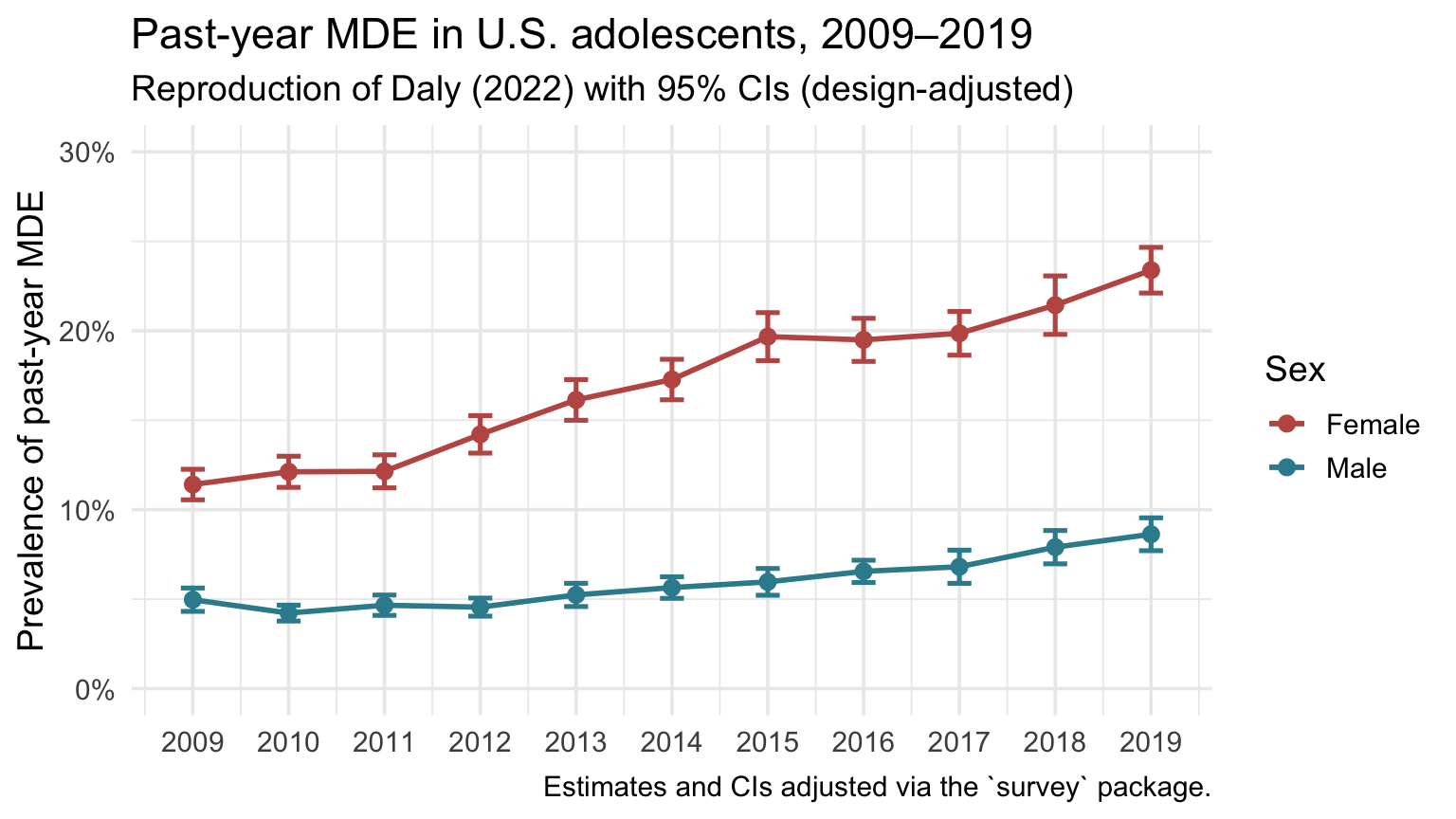
The takeaway. The trend doesn’t change; the precision claim sharpens. For work you’d submit for publication with NSDUH (or any complex-survey) data — the design-based approach is the correct one, and a reviewer or editor will expect it. The unweighted approach in the lab’s Steps 5–7 is a valid teaching simplification for learning the CI machinery; it is not a valid analytic choice for survey data in applied work.
For more on the survey package, see Thomas Lumley’s book Complex Surveys: A Guide to Analysis Using R — the canonical reference.
Footnotes
Design effects are the increase in sampling variance caused by a complex survey design compared with a simple random sample of the same size. Here, clustering makes observations within a cluster more similar, reducing independent information, while weights make some observations count more than others. Together, they mean the true standard errors are usually larger than those from an unweighted simple-random-sample formula.↩︎