From Test to Manuscript
Lab · Module 8 · Wed Oct 7
Welcome to the Module 8 lab
This week, you have been breaking hypothesis testing down to its essential components.
In the Module reading and pre-study, you studied the logic of NHST and built a null distribution by hand, one resample at a time. Today, you will do what researchers actually do after they understand the logic: run the test, inspect the result, draw the figure, and write it up.
That last step matters. A hypothesis test does not end with a p-value. It ends with a sentence that another person has to read, evaluate, and trust.
By the end of this lab, you will have produced a short APA-style manuscript — with a title page, abstract, results section, numbered figure, in-text citation, and reference list — built the same way you will build a thesis, report, or journal article.
The running data come from Hofman, Goldstein, and Hullman (2020) — a study of whether the way a figure displays uncertainty changes what readers conclude from identical data, played out in a fictional boulder-sliding game where every judgment has a knowable right answer. Everything you need about the study — what your participants saw, and why the benchmark is the number it is — is in The study and today’s question just below. The paper is How visualizing inferential uncertainty can mislead readers about treatment effects in scientific results (CHI 2020); a copy lives in the course readings folder.
What you’ll leave with
Two files, and the second one is what you submit:
m08_lab.qmd— your analysis notebook, rendered to HTML: the import, the t test, the effect size, and a saved results figure.m08_paper.qmd— a short APA manuscript, rendered to.docx: title page, abstract, Method, Results, figure, in-text citation, reference list. This.docxis your Canvas submission.
Every number in the manuscript is computed by the notebook rather than typed — which is the whole point of building it in two pieces. More on why, just before you start writing code.
The study and today’s question
blorg_exp2 · 1,830 participants → 231 analyzed today · Hofman, Goldstein, & Hullman (2020), Experiment 2
Participants played a fictional boulder-sliding competition against an opponent named Blorg, with a 250 Ice Dollar prize for the farthest slide. Each participant could rent a “special boulder” for one use. They saw a graphic comparing it to the standard boulder, then reported how much they would pay for it and their perceived probability that it would win.
The experiment was a 4 × 2 between-subjects factorial, so every participant saw exactly one combination of:
- graph_type factor — Which of four uncertainty displays the participant saw
- effect_size factor — Which underlying effect size the participant’s scenario used
and reported two outcomes:
- superiority numeric — Participant’s estimate of the probability that the special boulder out-slides the standard one
- wtp numeric — Willingness to pay to rent the special boulder, in Ice Dollars, entered on a slider
Full codebook for blorg_exp2 — values, levels, missingness, and how the file was prepared.
Today we use one cell and one variable: the superiority ratings from the Large-effect × 95% CI group — 231 of the 1,830 participants.
What your participants actually saw
Your cell is the Large-effect × 95% CI group. After reading the game’s rules, each of these 231 participants studied a chart very much like this one — a recreation, drawn from the paper’s published stimulus parameters:
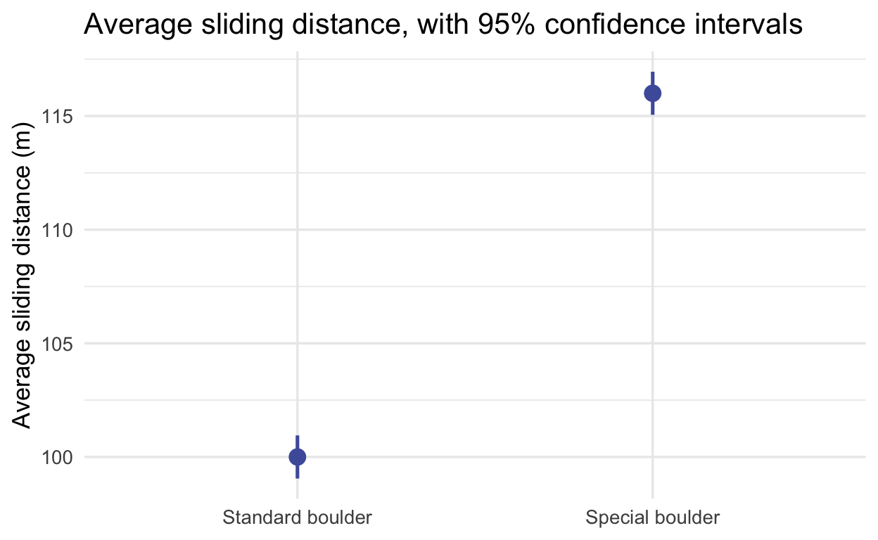
Two things to notice about that picture, because together they are the whole setup for today’s test:
- The intervals are tiny, and far apart. Each boulder’s mean is estimated from 1,000 simulated slides, so its 95% CI spans less than a meter in each direction — and the chart practically shouts the special boulder is in a different league.
- The chart says nothing about single slides. A CI pins down each boulder’s mean; a contestant plays a single slide. M07’s CI-vs-PI section drew exactly this distinction — and handed you the display that answers it: when the target is one future case, you want a prediction interval.
So here are the same two boulders redrawn the M07 way — 95% prediction intervals, the range where individual slides land. (Because the stimulus was simulated, its spread is known exactly, so these are simply mean ± 1.96σ — a touch simpler than the sample-based prediction interval M07 built, which carries an extra term for not knowing the mean.)
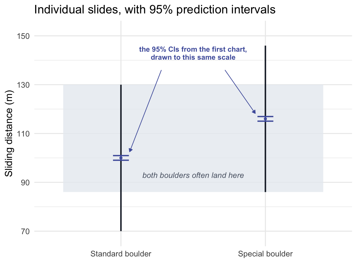
This is what the first chart hides: on any single matchup the special boulder wins only about three times in four — a real edge, nothing like the chasm the first chart suggests. (The two small indigo marks the arrows point to are the first chart’s confidence intervals, unchanged.) Precision about the means is not the same thing as separation of outcomes — that is M07’s distinction, and it is exactly how a CI display could inflate a reader’s confidence.
After studying the chart and its caption, each participant answered two questions: how much they would pay to rent the special boulder (a slider), and the probability that the special boulder would out-slide the standard one — typed as a number from 0 to 100, stored in the data as a 0–1 proportion. That second judgment, the superiority column, is today’s outcome variable.
The research question
Hofman and colleagues wanted to know whether the choice of uncertainty display changes what readers conclude from identical data. It’s not a cosmetic worry: if a standard way of drawing uncertainty leads readers to systematically misjudge how much better one option is than another, then every paper, dashboard, and clinical report using that display is quietly misleading its audience. (If you read M07’s optional box on Zhang et al. (2023) — physicians and professors making exactly this misjudgment — this is the earlier study in the same research line, by two of the same authors.)
You have just seen why theory predicts trouble for the 95% confidence interval, the most common uncertainty display in science: it shows uncertainty about means, readers tend to read it as the spread of individual outcomes, and in this stimulus those two readings are worlds apart. A reader who mistakes separation-of-means for separation-of-outcomes should overestimate how often the special boulder wins. And because the game is simulated, there is a right answer to be wrong about: by design, the special boulder wins 76% of individual matchups.
Our question today: When people see a 95% confidence interval display of a large effect, does their perceived probability of winning depart from the true probability of .76 — and specifically, are they overconfident?
What today’s test can — and cannot — show
Worth being exact about this before you run anything, because it is the difference between a defensible claim and an overreach.
Today you analyze one cell of the experiment: the participants who saw a 95% CI at the large effect size. A one-sample test compares that group’s mean to a fixed benchmark. So it can establish:
- Can show: participants in this condition were, on average, miscalibrated — their mean judgment differed from the design-implied .76, and in which direction.
It cannot, on its own, establish any of these:
- Cannot show: that the CI display caused more overestimation than another uncertainty display (e.g., PI, CI-rescaled or HOPs display — the other three cells in the experiment).
- Cannot show: that the choice of display matters
- Cannot show: that participants would have been accurate had they seen something else
Every one of those is a claim about a difference between conditions, and answering it takes a test that actually compares conditions — which is where M09 picks up. The full experiment was designed to support those comparisons; today’s slice of it is not.
Keep this in view when you write. Put the two sentences side by side. The first describes; the second claims a cause:
- ✅ “Participants shown a 95% CI overestimated the probability of superiority.” Descriptive. It reports how one group’s judgments compared with a benchmark — exactly what your test measures.
- ❌ “The 95% CI display misleads readers.” Causal. It says the display made them wrong, which means asserting they would have judged differently had they seen something else. You have no such group today.
That is the description / prediction / causal inference distinction from the opening lecture, showing up in the middle of a real analysis: the design you have determines the verb you are allowed to use.
To see why the causal verb overreaches: the overestimate you are about to find is equally consistent with a misleading display, with a stimulus that is simply hard to judge, and with plain optimism about prize games — and observing it cannot tell those stories apart. Telling them apart takes a group that saw a different display, and because participants were randomly assigned to displays, that comparison is what licenses the causal verb. It is built into the full experiment, and M09’s two-sample test is where you run it.
Where does .76 come from? From the stimulus design you saw above: two Normal distributions with the same spread, centered 16 m apart, overlap by a fixed amount. 76% is the figure the authors report for this condition and analyze against, so it is the benchmark we test.1
Why this null is unusual — and worth noticing
You have already worked with a \(\mu_0\) that wasn’t zero. The Module tested college-attendee earnings against $32,000 — the NCES figure for a typical worker with a high school diploma and no college — and argued at length that a good benchmark is a defensible, interpretable reference value, not a reflexive zero. Today’s benchmark is chosen on exactly those grounds, so this is the same move, not a new one.
What differs is where the benchmark comes from, and therefore what rejecting it means.
- $32,000 is an externally sourced threshold — an NCES figure we take as a fixed reference point. Rejecting says the college mean sits somewhere other than that threshold.
- .76 is a correct answer — the probability the stimulus actually produces. Rejecting doesn’t say these participants differ from some other group; it says their average judgment is miscalibrated relative to the truth.
That is why “significant” reads differently here. It means miscalibrated, not merely different from a reference.
Written out, our hypotheses are:
- \(H_0: \mu = .76\) — the mean perceived probability is calibrated to the benchmark
- \(H_1: \mu \neq .76\) — the mean perceived probability differs from the benchmark
Read those carefully: both are statements about μ, the population mean of this condition, and nothing else. A mean of exactly .76 would not tell you individual participants were accurate — large overestimates and underestimates can average out to a correct-looking number.
Our alternative is two-sided (\(\neq\)) even though we predict overestimation — the Module’s convention, because an unexpected under-estimate would also be worth seeing. The directional prediction still does interpretive work: rejecting with a sample mean above .76 points specifically to average overestimation in this condition, not just “a difference.”
One caution, though it won’t bite today: fail to reject is never accept — a non-rejection would not have shown participants to be calibrated, only that we did not detect a departure.
With the setup and context behind us — let’s move to the business of estimation. The sandboxes on this page are your scratchpad; the notebook you build in RStudio is the deliverable. They use the same three tabs as the M06 and M07 labs — work ✍️ Your Code first from its Targets list, with 💡 Hint and 👀 Spoiler as the net if you’re stuck more than a few minutes. (The M06 lab’s Step 0 has the keystrokes for inserting and labelling a chunk, if any of that is hazy.)
Why the work splits into two files
Both files must be clear and organized. What differs is the job each one does:
m08_lab.qmd — notebook |
m08_paper.qmd — manuscript |
|
|---|---|---|
| Its job | the record of what you did and how | the account of what you found and why it matters |
| Organized by | the stages of the analysis | the scientific argument: Introduction → Method → Results → Discussion |
| Contains | everything — data checks, intermediate steps, verification | only what a reader of the study needs |
| Audience | you, your collaborators, an auditor | readers of the finished research |
| Renders to | HTML | APA-formatted Word, via apaquarto |
In M07 a single file did both jobs — your notebook wore Introduction/Data/Methods/Results/Discussion headings because the notebook was the report being read. Today the two roles separate, and that separation supports reproducibility: the notebook records and regenerates the analysis, while the manuscript consumes its saved outputs rather than retyping results.
The practical rule: compute, check, and save results in the notebook; the manuscript uses those saved outputs. Never hand-edit a number the analysis can regenerate.
How today divides: Steps 0–6 — the notebook, through the saved figure — happen in class. The manuscript’s prose, citation, and Word render happen at home. Each step ends with an In your notebook note saying exactly what to add to m08_lab.qmd.
Step 0 · Get set up
- Start in GitHub Desktop, before RStudio. Select PSY652_project, click Fetch origin, and click Pull origin if it appears. That is the pull half of the
pull → edit → commit → pushloop — the same loop you’ll close at the end of today’s lab.
You have built a notebook this way since M06 — this is the quick version. (If any piece below is unfamiliar, the M06 lab’s Step 0 unpacks every line.)
Create the file. In your
PSY652_project’sprograms/folder, openlab_template.qmdand File → Save As… a copy namedm08_lab.qmd— the same move as M06 and M07. The template opens with three stock sections —# Setup,# Import Data(which readsnhanespurely as a worked example), and# Glimpse. Delete all three: you replace them with the setup and import chunks below, and two chunks with the same label stop a render.Set the YAML. You copied the template, so its header is already there. Change the title, and bump
toc-depth: 3totoc-depth: 5so this report’s##subsections reach the table of contents:
title: "Are Readers Shown a 95% Confidence Interval Overconfident?"
toc-depth: 5
Leave the rest of the template’s header alone. (The M06 lab’s Step 0 explains it, and lab_template_annotated.qmd in programs/ annotates every line.)
- Give the notebook this section structure — the skeleton you fill in as the lab proceeds:
# Setup
# Import and inspect the data
# Prepare the analysis sample
# Conduct the test
# Effect size
# Results figure
# Save the outputs- Add the setup chunk — packages only. Notice what is not here: the data load lives under
# Import and inspect the data(note the path differs there:here::here("data", "blorg_exp2.Rds"), not the sandbox’sshared_data/), and the filtering lives under# Prepare the analysis sample. Keeping those apart is what makes the audit trail readable — a reader can see exactly where the data came from and exactly what you did to it, without hunting through a single overloaded chunk.
```{r}
#| label: setup

library(tidyverse)
library(here)
library(infer)
library(effectsize)
```
Step 1 · Import the data, and look before you test
First, import and inspect. Load the full file and see what arrived before you cut it down.
glimpse() confirms you loaded what you meant to: 1,830 participants, 4 columns. The count() shows you the study’s shape — four display types × two effect sizes, eight cells, each with between 209 and 238 people. Today’s question concerns exactly one of those eight cells.
In your notebook — this is a deliverable: put the read_rds() and both inspection lines under # Import and inspect the data, with a sentence naming the dataset and its source. The sandbox path won’t work in your notebook — the sandbox mounts shared_data/, but your project keeps its copy in data/, so write blorg_raw <- read_rds(here("data", "blorg_exp2.Rds")).
Now prepare the analysis sample, and look at it before you test it. The only way to catch a problem is to look first.
Two views of the same 231 numbers, and each answers a different question. The summary gives you the center and spread you’ll compare against .76. The histogram shows you the shape — which no summary statistic can, and which is where surprises live: a second hump, a pile-up at a scale boundary, an outlier dragging the mean.
Look at that shape before you assume anything
Your histogram is emphatically not a bell curve. The outcome is a probability, so it is trapped between 0 and 1 — which is why the plotting code sets boundary = 1, lining a bin edge up with the ceiling so that no bar spills past it into territory no response could occupy. And 57 of the 231 participants — about 25% — answered exactly 1.0. That stack against the right edge is a ceiling: they could not have gone higher even if they wanted to.
So is a t-test still legitimate? This is exactly the moment to walk the Module’s three assumptions, in order — and note that the answer turns on the one students least expect.
1. Independence — ✅, supported by the design. Each participant contributes one response to this analysis, with no repeated observations and no known clustering across participants, so we treat participants as independent sampling units. (Random assignment matters too, but for a different job: it is what would license comparing the display conditions — it isn’t what makes these observations independent.) This is the assumption more data cannot rescue, so confirm it first.
2. Normality of the sampling distribution of the mean — ✅, and notice what that does not say. It does not require these 231 scores to be Normal, which is fortunate, because they are emphatically not. What has to be well behaved is the distribution of \(\bar{x}\), and M07’s Central Limit Theorem says that steadies as \(n\) grows. Here the conditions are about as favorable as they get: the outcome is bounded between 0 and 1, and 231 is a large sample. The t approximation should hold up well despite the skew and the ceiling.
3. Representativeness — not a box to tick, but a scope statement. This one is different in kind from the first two: it isn’t a mathematical condition the arithmetic needs, it’s the question of whom your \(\mu\) describes. These were U.S. MTurk workers with high approval ratings — not a random sample of anyone. So \(\mu\) means “the average judgment among people like these,” and that limit belongs in your Discussion rather than in a box you tick.
The lesson to carry: “is my outcome Normal?” is usually the wrong question. “Is the mean of my outcome well estimated at this sample size, are my observations independent, and whom does this sample represent?” is the right one.
Checkpoint 1 · You’ve seen the data
Your summary shows 231 participants, a mean near 0.89, and an SD near 0.15 (printed as R prints them — you’ll drop the leading zeros when you write up). Your histogram shows the bulk of the distribution piled up well to the right of the gold line, with a heavy stack against the 1.0 ceiling — participants are, on average, putting the special boulder’s chances far above the truth. That is the overconfidence we predicted.
Notice you already know the direction of the answer. That’s normal, and it’s why the test still matters: your eye can see a shift, but it cannot tell you whether a shift that size would be surprising in a sample of 231, nor how large it is in standardized terms.
In your notebook — this is a deliverable: put the filter(), the summary, and the histogram under # Prepare the analysis sample, with a sentence naming the filter and how many of the 1,830 participants survive it.
Step 2 · Run the test
Before you run anything — write it down. In your notebook, under # Conduct the test, state the hypotheses in your own words and in symbols, and say precisely what \(\mu\) refers to. Not “the perceived probability” — whose, and in which condition? Two lines is plenty. Do this before you look at the box above again; the point is to be able to produce it yourself.
Then run the test. One call: t_test() takes the data, the variable, the null value, and the direction, and hands back a one-row tibble — seven columns, for the call we are making here.
Targets. Run the one-sample t-test and keep the result.
- Start from blorg_exp2 and pipe it into t_test().
- Set response to the column holding each participant’s perceived probability.
- Set mu to the true probability from the dataset box — the benchmark you are testing against.
- Set alternative to
"two-sided". - Assign the whole thing to res and print it. Steps 3 and 4 both call it by that name, so the name matters.
- The outcome is superiority — the perceived probability each participant gave.
- The benchmark is
0.76, the true probability from the dataset box. It is a design constant from the study, not something you compute from the data. - t_test() takes the data frame first, which the pipe supplies — so inside the call you only name response, mu, and alternative.
Interpret it before you read on. Look at your output and write one or two sentences covering all three pieces: the estimate, the confidence interval, and the p-value. Then check yourself against the Checkpoint below.
Checkpoint 2 · The test is run
Your res is a one-row tibble with seven columns: statistic ≈ 12.77 (that is \(t_\text{obs}\); R, like APA style, drops the subscript), t_df = 230, p_value ≈ 1.4e-28, alternative, estimate ≈ 0.887, and the two CI bounds, [0.867, 0.906].
Read two things off it. \(t_\text{obs}\) is positive — the sample mean sits above the benchmark, the direction we predicted. And the 95% CI excludes .76 entirely, sitting well above it. That second fact is exactly equivalent to \(p < .05\) for this two-sided test — decide by the interval or decide by the p-value, and the verdict is always the same. The interval also tells you by how much, which the p-value never does.
That p-value deserves a comment. It is not “zero” — it is about 1.4e-28, and R shows it in scientific notation. In a paper you would never print it: in APA-style reporting, values smaller than .001 are written as p < .001 rather than rounded to .000.
Why a tibble and not a printed block? Because you can pull from it. For example, res$statistic is a number you can drop into a sentence — which is exactly what you’ll do at home.
In your notebook — this is a deliverable: add the t_test() call under # Conduct the test. Assign it to res — you’ll need it by name later.
Step 3 · How big is the effect?
The p-value describes how incompatible your data are with the null model. It says nothing about how big the departure is. That is a separate question needing a separate number — which is why reporting one without the other is how a trivial difference gets written up as a discovery.
There are two ways to express the size, and you should know both:
- In raw units — how far the mean sits from .76, in probability points. Directly interpretable by anyone.
- In standardized units — Cohen’s d, the same gap expressed in standard deviations (here the standardizer is the sample’s own SD — name your standardizer whenever you report d). That can aid comparison across studies using different measures — though d still depends on how variable the group you sampled happened to be.
Neither one tells you whether the difference matters. That is a judgment about context — the stakes, the field, the decision being made — and no statistic settles it for you.
Targets. Put the same departure on a standardized scale.
- Start from blorg_exp2 and pull() out the outcome column — cohens_d() wants a plain vector, not a data frame.
- Pipe that into cohens_d(), setting mu to the same benchmark you just tested against.
- Assign the result to d and print it.
- pull() takes one column out of a data frame and hands back the bare vector inside it — the same function you used in the M06 lab.
- Cohen’s d measures distance from the same benchmark the test used:
0.76. Give it a different number and you are answering a different question.
Checkpoint 3 · Effect size in hand
Start with the raw units, because they need no translation. Participants shown a 95% CI judged the special boulder’s chances at about .89 against a benchmark of .76 — a mean roughly 12.7 percentage points above it, with 79.2% of this group judging above the benchmark.
Now the standardized version. You should see Cohen’s d ≈ 0.84, 95% CI roughly [0.69, 0.99]. Cohen’s conventions (0.2 small, 0.5 medium, 0.8 large) would call that large — but treat those labels as what they are: context-free rules of thumb, useful for orientation and no substitute for knowing your field.
The two are separate claims — p speaks to incompatibility with the null model, d to size — and they need not agree: with enough people, a trivial departure can earn a tiny p.
Note the CI on d excludes zero and is nowhere near it. Even so, it is fairly wide: with 231 people, values from about 0.69 to 0.99 remain compatible with the data.
The take-home message. Participants shown this display overestimated the winning probability on average. That is what you tested. Whether this display misleads more than another one is a comparison you have not made.
In your notebook — this is a deliverable: add the cohens_d() call under # Effect size, plus one sentence stating the departure in raw probability points and one saying what the standardized value means here in plain language.
Step 4 · Build the figure your paper will use
You already drew most of this figure in Step 1. That one was for you — a quick look to catch problems before testing. This one is for a reader, and the difference is what you add to it.
A reader who never took a statistics course should be able to look at a results figure and see what you found. That takes three things: the data, the benchmark you compared them to, and the uncertainty in your estimate. Step 1’s histogram had the first two. Now add the third — your sample mean and its 95% CI, layered on top.
One contrast worth naming: null distributions and shaded tails are figures about the method — they explain how a test works. A results figure reports the finding. The question to ask of any figure is what is it for — explaining machinery, or reporting what you learned?
Notice where the estimate goes. It sits in its own strip below the data, not as a band drawn across it. That separation is deliberate: the spread of the histogram is variation between people, while the interval is uncertainty about the average. Those are different quantities on the same axis, and laying one on top of the other invites precisely the confusion this study is about.
The base figure is given. It is Step 1’s histogram with the axis and labelling work already done — rebuilding that is not what this step is testing. Run this box as it stands, then build on top of it in the next one.
Targets. Layer the estimate and its interval onto that base, in the empty strip below the data.
- Start from base_plot and add three annotate() layers with
+. - A
"segment"layer spanning the confidence interval aty = -7(andyend = -7, so it draws flat):xis the lower bound,xendthe upper. Pull both from res rather than typing the numbers — that way the figure updates itself if the data ever change. - A
"point"layer at the sample mean, also aty = -7. - A
"text"layer aty = -19reading"sample mean\nand 95% CI"— the\nstarts a second line. - Give all three
color = "#C05852"so the strip reads as one object. Assign the result to results_plot — Step 5 saves it under that name — and print it.
- Look at the column names in res from Step 2: the bounds are
lower_ciandupper_ci, and the mean isestimate. Reach them withres$lower_ciand so on. - In annotate(“segment”, …),
xis where the line starts andxendis where it stops — so the lower bound goes inx, the upper inxend. - A segment needs
yandyend. Setting both to-7draws a horizontal line. - Useful sizes if you want them:
linewidth = 1.2on the segment,size = 2.5on the point, andsize = 3.3, lineheight = 1.15on the text.
Checkpoint 4 · A figure a stranger could read
Your plot shows the distribution of participants’ answers, a gold dashed line at the true .76, and — in its own strip below — the sample mean with its 95% CI. That interval sits entirely to the right of the gold line, which is the same conclusion as the p-value, now visible in one glance.
Look at how much narrower the interval is than the histogram is wide. That gap is not a drawing quirk. Individual participants disagree enormously — answers run from 0.01 all the way to 1, with 57 of them at the very top — yet the mean is estimated with a margin of error of only about 2.0 percentage points. Individual responses vary widely, but the sampling variability of their mean is much smaller: with 231 participants, the standard error of the mean is roughly the individual-level SD divided by \(\sqrt{n}\) — M07’s point, now visible in one figure.
This is also why the interval sits in its own strip rather than being drawn as a shaded band stretching across the histogram. Drawn that way, it looks like a statement about where participants’ answers fall, when it is really a statement about how precisely we know their average. Confusing those two is the mistake this entire study is about — so the figure keeps them apart.
Notice what is not on this figure: no null distribution, no shaded tail, no p-value. Those describe how you got here. This figure describes what you found.
In your notebook — this is a deliverable: the plot code under # Results figure. The two-object split here was a teaching device for the sandbox — in your notebook, write it as one pipeline ending in results_plot, so the next step can save it by that name.
Step 5 · Save the outputs — both of them
This is the last of the seven headings you sketched back in Step 0 — Setup, Import and inspect, Prepare the analysis sample, Conduct the test, Effect size, Results figure, and now Save the outputs. It is also the handoff between your two files. The sandbox can draw a figure but can’t write to your hard drive, so these lines run in your own notebook:
The two lines that connect your files
ggsave(here("output", "m08_results_figure.png"),
       results_plot, width = 6.5, height = 3.6, dpi = 300)

write_rds(list(res = res, d = d), here("output", "m08_results.Rds"))
The first line you’d expect — it writes your figure to disk as a .png.
The second is the one that matters most, and it’s the one people skip. It saves the numbers. write_rds() can store any R object, and here we hand it a list holding both of your results objects at once — res from the t-test and d from the effect size — bundled into a single file.
What is actually inside that file
m08_results.Rds is not a spreadsheet. It is your two result objects, frozen exactly as R made them:
list(
  res = # the one-row tibble from t_test():
        #   statistic  t_df  p_value  alternative  estimate  lower_ci  upper_ci
  d = # the one-row output from cohens_d():
        #   Cohens_d  CI  CI_low  CI_high   (CI is the confidence level, 0.95)
)
Nothing has been rounded, reformatted, or retyped. Every digit the test produced is still there — which is the entire point.
Why saving objects beats writing numbers down
Fix one line upstream next week — a wrong filter, say — then re-run the notebook and re-render the paper, and every number (\(t_\text{obs}\), the df, the p, the interval, the d) updates itself. Retype them by hand instead, and each one is a chance to drift.
Note the middle step. The workflow protects you provided you re-run the notebook and resave both outputs whenever the analysis changes. It removes the transcription risk; it does not remove the need to actually rerun the pipeline.
There is a second payoff that’s easy to miss: the manuscript renders without the raw data. Hand a co-author the paper, the .Rds, and the .png, and they can build the document — genuinely useful when data are restricted. That is renderability, not full reproducibility: re-running the analysis still takes the data and the notebook.
Run both lines before you start writing at home, or the paper will have nothing to read. Step 6 is the other end of this handoff — you’ll open the manuscript and watch it read these two objects back.
Checkpoint 5 · The handoff is done
Render your notebook, then open your output/ folder. Two new files are there: m08_results_figure.png and m08_results.Rds. If either is missing, the manuscript will fail at home — and this is the moment to catch it, while there’s someone in the room.
Your notebook now runs top to bottom, raw data to saved outputs. That is the whole job of an analysis file.
In your notebook — this is a deliverable: both the ggsave() and write_rds() lines under # Save the outputs.
Step 6 · Meet your manuscript
Open programs/m08_paper.qmd. You didn’t write this one — it’s waiting for you, and it is a real APA template.
Scroll through it before you touch anything. Four things are worth finding now, while there’s someone in the room to ask.
The four moves that make it a paper
1. The YAML is different. Under format: it says apaquarto-docx: default — that one setting is what produces a title page, APA headings, and automatic figure numbering. It also carries fields an ordinary report doesn’t: shorttitle, abstract, keywords, and bibliography: ../documentation/references.bib. That last one tells the renderer where your references live. Open that file now: it is empty except for comments. You will fill it in tonight without typing any of it.
While you are in the YAML, read the title: line and apply the verb test from the scope box. Does it describe what one group did, or does it claim the display made them do it? A title that says the confidence interval makes readers overconfident is the causal sentence — the one your design cannot support — and it belongs to a paper with a comparison group. Rewrite it as a description before you submit.
2. Numbers are computed, never typed. Start at the setup chunk: three lines undo the bundle you saved in Step 5.
results <- read_rds(here("output", "m08_results.Rds"))

res <- results$res   # the t_test() output
d   <- results$d     # the cohens_d() output
Now res and d exist inside the manuscript, holding exactly what they held in your notebook. Scroll to the Results section to see what that buys: the sentence reporting the test contains no typed result values. You will see two kinds of digits in it, and neither is a finding — "%.2f" and "%.3f" are formatting instructions meaning show this many decimal places, and .76 is the benchmark, a fixed design constant rather than something your analysis produced.
*t*(`r res$t_df`) = `r sprintf("%.2f", res$statistic)`, Cohen's *d* = `r sprintf("%.2f", d$Cohens_d)`Each `r ` is a small piece of R that runs when you render and leaves its answer behind: `r res$t_df` reaches into res, pulls out the degrees of freedom, and prints 230; the sprintf("%.2f", ...) wrapper just says show two decimal places. Rendered, that line reads:
t(230) = 12.77, Cohen’s d = 0.84
That is the whole chain: your notebook computed them → saved them → the paper reads them → the sentence prints them.
And a third thing that is not a finding: a missing zero. Look at the p-value line and you will see sub("^0", "", ...) wrapped around the formatting. That call deletes the leading zero — 0.001 prints as .001. It is there to satisfy an APA convention: drop the leading zero from any quantity that cannot exceed 1 — a probability, a proportion, a correlation, a p-value — and keep it for anything that can. That is why Cohen’s d keeps its zero at 0.84: a d can exceed 1.
Now look one line down, at the confidence interval — and fix it. That interval is on a probability, so the same rule applies: it should read [.867, .906] — the same two numbers your test produced, printed by R as 0.867 and 0.906, with the zeros dropped for the write-up. But the template formats it with sprintf() alone, so it will print its leading zeros. Wrap each bound the way the p-value line already does:
95% CI [`r sub("^0", "", sprintf("%.3f", res$lower_ci))`, `r sub("^0", "", sprintf("%.3f", res$upper_ci))`],Two things worth carrying away: R always prints the leading zero, so removing it is a decision you make when writing up rather than something the output hands you; and this is a disciplinary convention, not a statistical rule — APA drops the zero, while some medical journals — NEJM and The Lancet, for example — keep it.
3. The figure is imported, not drawn. The manuscript does not rebuild your plot. Its figure chunk is one line:
knitr::include_graphics(here("output", "m08_results_figure.png"))It simply places the .png your notebook saved. Its chunk options do the rest:
#| label: fig-results— names the figure. Thefig-prefix is required; it is what tells Quarto this is a figure worth numbering.#| fig-cap: "..."— the caption printed above it.#| echo: false— show the figure, not the line of code that fetched it.
Because it has that label, you can write @fig-results anywhere in your prose and Quarto replaces it with “Figure 1” — and if you later add a figure above it, the numbering fixes itself. You never type a figure number.
One thing that will look wrong the first time you render. The figure does not appear inside the Results section. It sits by itself on the last page, after the References. Nothing is broken. APA 7 permits figures either embedded in the text or gathered at the end after the references, and apaquarto defaults to the second — the traditional manuscript-submission layout. (To embed them instead, add floatsintext: true to the YAML. Either is acceptable; leave it as it is today.)
4. There are XXX markers where citations go. Two of them, both in the Introduction. Those are yours to replace tonight.
Run it once now, before you leave. Click Render. If a Word document appears with a title page, real numbers in the Results sentence, and your figure numbered as Figure 1 on the final page, your setup works and the rest is writing. If it errors, this is the moment to catch it.
Don’t expect a References list yet. The two citations are still XXX placeholders, and a bibliography only appears once something in the document actually cites a source. It will show up at home, the moment you insert the first one.
Checkpoint 6 · The manuscript renders
m08_paper.docx exists and opens. It has a title page, the result sentence with real numbers in it — read straight out of the m08_results.Rds you saved a moment ago — and your figure, numbered Figure 1, on the last page (APA allows either placement; apaquarto defaults to the end).
If the figure is missing entirely, or the render errored looking for a file, you skipped the ggsave() or the write_rds() in Step 5. Go back and run them.
In your notebook — nothing: this step’s work lives in m08_paper.qmd, not m08_lab.qmd. Your notebook was complete at Step 5; the manuscript is what you finish at home.
Lab debrief · 5 minutes
That’s the analysis done. With a few minutes left, save your work and look up — we’ll pull the ideas together before you head off to write.
Lab debrief · what did we learn by doing?
The sticking point. Where did today trip you up most — the t_test() arguments, pulling values out of res, or getting the manuscript to render? What finally made it click?
Two numbers, two jobs. Your test gave p < .001 and d ≈ 0.84. One says the data are highly incompatible with the benchmark model; the other describes the standardized magnitude of the departure. They agreed here — but what would a reader conclude if you reported only one of them, in a study where they disagreed? Which one gets misused more often in the literature?
Method figures vs results figures. Monday’s lecture was full of null distributions and shaded tails, and none of them earned a place in today’s paper. What is the actual difference between a figure that explains a method and one that reports a finding — and can you think of an analysis where a distribution is the finding, and so belongs in the Results?
Why two files? Your analysis notebook can carry far more computational detail; your manuscript stays focused on the scientific argument. What does that separation buy you six months from now, when a reviewer asks where a number came from?
Final render and submit
This is the take-home half of the lab. You have a working analysis and a saved figure. Now turn the result into something a reader could pick up cold.
Work through m08_paper.qmd in order:
Make it yours. In the YAML, replace
YOUR NAME HERE, your email, and the three placeholder keywords.Write the abstract. It is an
abstract:field in the YAML, near the top — not a section in the body. Replace the placeholder text with one paragraph, ~150 words, in your own words: what you asked, what data, what you found, what it means.Insert the citations. This is the part worth slowing down for. You are not going to type a reference — you are going to let RStudio fetch it and file it for you.
a. Switch to the visual editor. At the top-left of the document toolbar there is a two-way toggle reading Source | Visual. Click Visual. (Keyboard: Cmd/Ctrl+Shift+F4.) The document will suddenly look like a word processor. Nothing has changed in the file — you are just seeing it formatted rather than as markup.
b. Find the first
XXXin the Introduction. It sits at the end of a sentence that does not name the authors. DeleteXXX, but leave your cursor exactly where it was.c. Open the citation dialog with Insert ▸ Citation…
d. Choose “From DOI” in the left-hand sidebar. You will also see Crossref, DataCite, PubMed, and your own Bibliography. Paste in the DOI of the Hofman and colleagues paper:
10.1145/3313831.3376454e. Check the citation key before you insert. RStudio looks the paper up and shows it with a suggested key — the short name you’ll use to cite it. You can change it using the edit button beside the entry. Set it to
hofman2020, so it matches the second step below. Confirm the “Add to bibliography” dropdown readsreferences.bib, then click Insert.Two things just happened:
[@hofman2020]appeared in your text, and RStudio wrote the full reference intodocumentation/references.bib. Open that file and look. It was empty this morning; it now holds a full BibTeX entry you did not type. Give it a quick read — DOI lookups are usually right, but check the authors, year, title, and venue before you trust one.f. Now the second
XXX. That sentence already names the authors in the prose, so a normal citation would print their names twice. Two things to fix. First, APA 7 abbreviates a work with three or more authors to “Hofman et al.” from the first mention, so edit the sentence’s “Hofman, Goldstein, and Hullman” to “Hofman et al.” Then delete theXXXand type the author-suppressed form yourself, so only the year is added:[-@hofman2020]The minus sign is the whole trick: it tells the renderer print the year, not the names. You don’t need the dialog this time — the reference is already in your bibliography.
Why “From DOI”? Because we have the DOI, and it is exact — no search, no risk of picking the wrong paper. Crossref would also find this one — it registers DOIs for most journal and conference literature (DataCite is a separate agency, covering datasets and similar outputs). PubMed is not the natural route: it is designed primarily for biomedical and life-science literature, and this is a human–computer interaction conference paper. Choosing the right source is half of making the lookup work.
And note what you never do: type a reference list, or format one. Every entry you cite lands in
references.bibautomatically, and the References section at the end of the paper is generated from exactly the works you actually cited — nothing missing, nothing left over.And you never hand-format a reference. The apaquarto extension applies APA style for you — author order, the ampersand, italics on the journal or proceedings title, the hanging indent, alphabetical order, and the
(Author, Year)form in the text. You supply the DOI; it supplies the formatting. Cite ten more sources tomorrow and they arrive styled and sorted the same way. Read the finished list once to be sure each entry is right — but you will not be formatting it by hand, which is the whole reason to cite this way.Write the Introduction paragraph. Right below the two sentences you just added citations to, there is a
REPLACE THIS PARAGRAPHplaceholder. Replace it with 2–3 sentences in your own words: why does it matter whether people read a 95% confidence interval accurately, and what would it mean if they systematically got it wrong?Write the Method paragraph. Same deal — a
REPLACE THIS PARAGRAPHplaceholder under the design description. Describe the design and the benchmark, and say where the comparison value of .76 comes from — it is not an arbitrary number. Then state the scope: this is one condition of a larger between-subjects experiment, so it speaks to calibration within that condition, not to comparisons between display types.Write the Results paragraph. Replace the placeholder. Describe the finding the way a journal article would: the test, the numbers (use the inline-R values already there), the effect size, and a reference to
@fig-results. Say what the result means — not just that it was significant.Write the Discussion. Two or three sentences on what it means, and one named limitation. Be careful with the language: a small effect that is statistically significant is not a large effect.
Improve the figure, if you see a way to. The version you built in class is a starting point, not a fixed requirement — and now that you’ve written the Results paragraph, you may well see what the figure should be doing for the reader. Sharpen the title so it states the finding, relabel an axis, annotate the benchmark line, adjust the bin width, rework the caption. Go ahead.
Where the change has to happen matters. The figure lives in
m08_lab.qmd, not in the paper — the manuscript only imports whatever.pngyour notebook last saved. So the loop is: edit the figure chunk in the notebook → re-run it so ggsave() overwrites the file → re-render the paper. Change the paper alone and nothing happens; that’s the same handoff you built in Step 5, now working for you.Two things to keep whatever else you change: the benchmark line at .76, since the whole claim is about distance from it, and a caption that tells a reader what they are looking at.
Render and check. Click Render, then read the
.docxfrom the top and verify all five: the title page carries your name and email; everyREPLACE THISplaceholder is gone; both citations appear in the text, one as “(Hofman et al., 2020)” and one as just the year; a References section now exists with the full entry; and Figure 1 sits on the final page with its caption, referred to as@fig-resultsin your Results prose.
TipGoing further — your paper has no table (correctly) — but here is how you would add one
Today’s result is a single test: one \(t_\text{obs}\), one p, one interval, one d. For a single result like this, prose is clearer than a one-row table and avoids presenting the same information twice. The principle to carry: use a table when it improves communication, not by default.
You’ll want this when you write a manuscript of your own — a thesis or a journal article — where a Table 1 describing your sample (the M05 skill) is close to universal and a table of model results is common. This box is the reference to come back to then. (Project 2 doesn’t need it: its report is HTML, and its required tables compare the paper’s numbers with yours. The label-and-caption habit in the last bullet does carry over.)
Which package does what. You already know gtsummary from the M05 Table 1 — that’s what builds the table. What renders it is a second package, and you get a choice:
- gt is the default. It’s what makes those polished HTML tables, and current versions write Word tables too.
- flextable does the same job and generally gives more direct, predictable control over Word-specific formatting — and it carries theme_apa().
That theme is the reason to switch. A default gt table tends to arrive in Word heavily gridded — closer to a spreadsheet than a journal table. APA asks you to omit vertical borders and keep horizontal rules to those needed for clarity, typically at the top, at the bottom, and beneath the column headings. (Note what APA does not require: a serif font. APA 7 permits Calibri 11 and Arial 11 alongside Times New Roman and Georgia — the rule is legibility and consistency, not serifs.) theme_apa() applies that treatment, and as_flex_table() is the bridge that hands your gtsummary table over to it:
blorg_exp2 |>
  filter(effect_size == "Large") |>
  # All four display arms are present in the data. If an analysis of yours ever
  # drops one, that is a design decision -- say so in your Methods rather than
  # letting a filter() make it quietly.
  select(graph_type, superiority) |>
  tbl_summary(
    by = graph_type,
    label = list(superiority ~ "Perceived probability")
  ) |>
  as_flex_table() |>
  flextable::theme_apa() |>
  flextable::align(part = "footer", align = "left") |>
  flextable::align(j = 1, part = "body", align = "left")
Three things worth noticing:
tbl_summary()is the M05 skill, unchanged. Only the last two lines are new.- theme_apa() applies APA table formatting — chiefly which lines are ruled and which are not.
- The two align() lines fix a quirk in the theme. Look at theme_apa()’s source and you’ll find a single line,
align(x, align = "center", part = "all"). Centering is reasonable for column headers and numeric cells — butpart = "all"catches the table note and the row-label column too, and APA wants both flush left. gtsummary hands them over correctly aligned; the theme re-centers them; you set them back. Worth knowing generally: a convenience theme is a set of defaults, not a guarantee of correctness. - The chunk needs a
#| label: tbl-somethingand a#| tbl-cap:, exactly like your figure. Then@tbl-somethingin prose renders as “Table 1”, and apaquarto numbers and places it for you.
flextable is already installed — it came with the M02 package list — so you can try this in your own notebook whenever you’re curious. Nothing today depends on it.
Today’s paper uses a deliberately small slice of what apaquarto can do — one figure, one citation, no tables. The package’s own writing guide documents the rest, and it’s the reference to keep open when you write your thesis rather than a lab exercise.
Worth knowing it covers:
- The five APA heading levels, with the title-case and formatting rules for each
- Tables — built from a code chunk or written directly in Markdown, with captions and the general / specific / probability notes that go beneath them
- Citation variations you’ll eventually need: narrative vs parenthetical, page numbers, multiple sources in one set of parentheses, possessive forms, and masked citations for anonymous peer review
- Appendices, with automatic numbering
- Cross-references to tables as well as figures
You need none of it today. Bookmark it for the first time a manuscript asks you for something this lab didn’t.
Then commit and push. Once you’ve submitted, switch to GitHub Desktop. You changed three tracked files today, not two — programs/m08_lab.qmd, programs/m08_paper.qmd, and documentation/references.bib, which RStudio wrote for you when you inserted the citation. Leave all three ticked, write a one-line summary, and click Push origin.
That third file is easy to overlook precisely because you never typed in it — and it is the one that makes your reference list reproducible on anyone else’s machine. Clone the repository without it and the manuscript still renders, which is what makes the failure sneaky: Quarto emits a quiet Citeproc: citation hofman2020 not found in the log, prints (hofman2020?) in the text where the citation should be, and leaves the References section empty.
Double check
Before you submit:
What you just did, in research terms
You ran a hypothesis test, sized the effect, drew a figure a stranger could read, and wrote the whole thing up in the format your field publishes in — with the numbers wired to the data rather than typed in by hand.
That last detail is the one worth keeping. Many reporting failures are not fraud; they are a number that was correct when it was typed and stale by the time it was published. A manuscript wired to generated outputs is far less likely to drift that way — as long as you re-run the pipeline whenever the analysis changes.
Where this goes next. You will see this analysis again immediately: M09 opens with it. The on-ramp of that Module runs the very test you just ran, on the very sample you just built — deliberately, so that the new thing on the page is the seven-step template every test in M09 follows, rather than a new dataset to learn. It also opens up the machinery this lab kept closed: where the statistic comes from, how the degrees of freedom are counted, why the critical value is what it is. From there M09 extends that template to the tests you’ll actually meet in the wild — two-sample comparisons, ANOVA across several groups, chi-square for categorical outcomes — and you’ll write those up the same way. Then Project 2 asks you to do the whole thing on a paper of your own choosing. Today was the small version of that.
Footnotes
The paper describes this condition two ways — means of 100 m and 116 m with \(\sigma = 15.3\) m, and a Cohen’s d of about 1.0 — and the two don’t reconcile to the last decimal: the distances imply .77, while \(d = 1.0\) implies .76. We use .76 because it is the value the authors themselves treat as the right answer. Published stimulus parameters are often rounded like this; noticing it is a good habit.↩︎