From Probability to Inference
Lecture · Module 6 · Mon Sep 21
Where we are: from probability to inference
Today’s throughline
Part 1 of the course asked: What do the data show?
Part 2 asks a harder question:
What can one sample tell us about something we cannot see directly?
Today has two ideas.
First, a sample result is not fixed. If we repeated the same study again, we would get a different answer. Those possible answers form a sampling distribution.
Second, to decide whether a result is surprising, we need a model of what chance alone would produce. That model gives us a reference distribution.
Both ideas use the same object:
a distribution of what could have happened
The difference is the question we ask of it.
| Activity | The question | The object we build |
|---|---|---|
| 1 · Sampling | How much does an estimate move from sample to sample? | The sampling distribution |
| 2 · Detective | Is this result more than chance would produce? | A reference distribution |
Same machinery, two jobs. By the end of Activity 2 you will have computed a p-value with your own data — before we give it that name.
Activity 1: Sampling from the fake news population
Here is our question for the next half hour: what proportion of news articles are fake?
Imagine you wanted to determine the proportion of news articles shared on a certain social media site that were fake. To answer this question — you’d define a social media platform, collect a random sample of shared articles, classify each one as fake or real, count the fakes, divide by the total.
In research you see one sample, but what you want to know is about the whole population (i.e., all articles shared on the platform).
So for the next half hour, let’s play make-believe.
Pretend the fake_news dataset from the Module 6 reading is the whole world of news on the platform. All 150 articles, every one already labelled Fake or Real. That pile is our population now, and we will reach into it for samples exactly the way a researcher reaches into the world.
Here is why the pretending is worth it: because we made the world up, we get to look behind the curtain. We already know the true proportion — so every time a sample hands us a number, we can see exactly how far off it landed. That is the one thing no real study ever gets, and it is what makes today work.
fake_news · 150 articles · treated as the full population for today
60 of the 150 articles are Fake, so the true population proportion is:
\[p = 60 / 150 = .40\]
In actual research, we do not get to see that value directly. We only get a sample. Today’s setup lets us watch the gap between the truth and one sample’s estimate.
Step 1 — Each student draws one article
Imagine reaching into the 150-article pile, pulling one article, recording Fake vs Real, then putting it back before the next draw. Replacing after each draw keeps the probability fixed at \(p = .40\), which matches the binomial model we use below. The chunk does one such draw — slice_sample() grabs one random row from the dataset.
Everyone in the room will run this chunk once. I’ll ask for a show of hands: who pulled a Fake? If the population really is 40% Fake, roughly four out of every ten hands should go up.
One draw is almost uninformative on its own — you either got a Fake or you didn’t. But across the full classroom, the pattern of Fakes and Reals starts to reveal the population’s 40/60 split.
Step 2 — Each student draws a sample of 10
Actual research doesn’t rely on one observation. Now each of you runs a tiny study: pull a sample of 10 articles at random from the 150-article pile, and count how many are Fake.
Your n_fake will be something like 4, or 5, or maybe 2, or maybe 8 — and so will everyone else’s, all from the same 150-article population with the same underlying \(p = .40\). The p_fake column is just n_fake / 10.
Let’s see how much the number of Fakes varies across the room.
Pool the class’s results
- Call out your n_fake when I point at you.
- As the numbers come in, type them into the chunk below, replacing the ones already there. (I’ll write them on the board, so you can copy if you fall behind.)
- Run it. You’ll get a picture of every study the room just ran.
- Wider than anyone expects. In a room this size the extremes are usually something like 2 and 8 — so one classmate would be telling you 20% of news is fake and another 80%, from the same population, both having done the study correctly.
- The gold line is the truth, .40 — visible only because we are pretending to hold the whole population. Most of the room missed it. Nobody made a mistake. That is the part worth sitting with: every one of those studies was run properly, and most of them still landed somewhere other than the right answer.
- Usually yes. Averaging everyone’s estimates tends to land closer to .40 than most individual students’ numbers do — though not necessarily closer than yours. Pooling does something no single study can do for itself — which is exactly the thread M07 picks up.
That spread is sampling variability — the signature of doing research with finite samples. It never goes away entirely; the job of inference is to reason carefully in spite of it.
Step 3 — Simulate 1,000 studies with rbinom()
The histogram you just built is the right idea at the wrong scale: one bar per student is enough to see that the estimates scatter, but not enough to see the shape they scatter into. What if we could run the same 10-article study 1,000 times? Since there aren’t 1,000 students in the class, let’s simulate the data instead. rbinom() does exactly that — each number it returns is one complete 10-article study.
The bars pile up around 4 — that’s \(n \cdot p = 10 \cdot 0.4\) — because 4 is the most likely count in this setup. Counts of 3 and 5 are common too. Counts like 0, 8, 9, or 10 can happen, but rarely.
Now connect this back to the room. Your class histogram was a small, noisy version of this same shape. Same population, same 10-article study, same possible counts. The room was drawing from this distribution all along.
This thing has a name
A sampling distribution is the distribution of a statistic across repeated samples of the same size from the same population.
Here is the chain:
| Estimand | The quantity we want to learn: the proportion of articles in this population that are Fake |
| Population parameter | The true value: \(p = .40\) |
| One study | Gives one statistic: \(\hat{p}\) = n_fake / 10 |
| Repeated studies | Give a whole distribution of those answers — that is the plot above |
The parameter did not move. The statistic did.
Step 4 — From simulation to exact probabilities: dbinom()
rbinom() drew a histogram by simulating. dbinom() draws the same shape by computing — it returns the exact probability of each possible count under the binomial model (independent draws with constant \(p = .40\)). That bar chart has a name you met Friday. Do you remember the name?
If you re-ran Step 3 with 10,000 studies, then 100,000, the histogram would settle down onto exactly this shape.
It is the probability mass function (PMF) — one bar per possible count, each bar a real probability, all eleven summing to 1.
Same shape as Step 3 — but now the bar heights are exact probabilities, not jiggly counts. rbinom() draws samples from this distribution; dbinom() gives the exact probability attached to each possible value of it. This is the landscape every one of your individual samples came from.
One label is worth a second look. The bar over 10 reads <0.001 — not zero. Drawing ten Fakes in a row is perfectly possible; it is \(0.4^{10}\), which works out to about 1 in 9,537 studies. Rare is not the same as impossible, and that distinction is the hinge the whole second half of today turns on.
Step 5 — What if each study were bigger?
So far, each study has drawn 10 articles. That was our choice. A researcher could choose a bigger study.
The question is simple:
If the truth stays at 40% Fake, what changes when each study draws 100 articles instead of 10?
Let’s compare the two sampling distributions directly. One change to the picture: a count of Fakes is no longer comparable across the two — 4 out of 10 and 40 out of 100 are the same answer — so this plot shows the proportion each study reported. The truth sits at .40 on both panels.
- Did the truth change? No. Both panels were drawn from the same 40%-Fake population.
- Did the center move? No. Both sampling distributions are centered near .40.
- What changed? The spread. The 100-article studies cluster much more tightly around the truth.
That is the key lesson. Bigger samples are not aimed at a different target. They are less likely to miss the target by a lot.
The lever you actually control
You cannot change the truth, and you cannot make any single study land on it. What you can change is how much your study’s answer varies from one sample to the next — how wide the sampling distribution is — and, holding everything else fixed, the way you change it is sample size.
That spread is the most useful number in all of inference, and it has a name: the standard error. Pinning it down, and building it into an honest statement of what your one study can support, is what M07 does next.
Key take-homes — from one sample to inference
- Every research sample is one draw. If you ran the same study again, you would get a different estimate.
- Repeated samples form a distribution. That distribution is centered on the truth, but any one sample can miss.
- Sample size controls spread. Holding everything else fixed, bigger samples still vary, but they vary less.
- Real research runs the logic backward. Everything we did today ran forward — the Module’s word for it: we knew the truth, and watched what data came out of it. Real research only ever has the backward direction. One sample in hand, the population value out of sight. “We observed 4 fake articles in our sample of 10. What does that tell us about the true rate of fake news?” — that question is the rest of this course.
Activity 2: The fake news detective
You are about to play fake news detective.
I will show you 10 article titles — some Fake, some Real — and your job is to classify each one. Use whatever cues you notice: writing style, punctuation, topic, gut feel.
I am also handing everyone a penny. We need it in a few minutes, and you will see why.
Step 1 — The detective experiment
- I will display 10 actual article titles, one at a time.
- For each one, tick either the Real box or the Fake box in the tally below.
- No discussion during the guessing phase — chatter contaminates the data.
- Leave the Correct column empty. We won’t reveal the answers until we’ve built the benchmark for judging your score.
Detective tally
Title 1
Title 2
Title 3
Title 4
Title 5
Title 6
Title 7
Title 8
Title 9
Title 10
Number correct
out of 10
Proportion correct (divide by 10)
This is your detective score. Keep it — you will put it into
my_score in Step 5.So how good were you?
Do not go looking for the answers yet. Here is why.
Say you got 7 out of 10. Is that impressive?
It sounds like it. But picture someone who read nothing at all — who just flipped a coin on every title. That person would not score 0. They would score about 5. And every so often, by luck alone, they would score 7 too.
So until you know what pure luck actually produces, your 7 tells you nothing. You cannot tell a good detective from a lucky one.
That is statistical inference in one sentence:
Work out what chance alone would produce, then compare your actual result against it.
Which is why we are doing this in a deliberate order — guesses committed first, benchmark built second, your score revealed last:
- If your score lands where pennies land easily → your score gives no real evidence that you did better than guessing.
- If your score lands where pennies almost never reach → you are picking up something real in the titles.
Sitting on an unscored tally for a few minutes is part of the point. Now take out your penny.
Step 2 — Null simulation: what pure coin-flipping produces
Before we can tell whether your detective score is good, we need a benchmark. What does the score distribution look like for someone whose cues don’t work — a pure coin-flipper? Let’s find out by simulating it in the room.
Penny-flip simulation
The checklist below has ten numbered slots. These are not the ten articles — a slot has no title and nothing to read. Each one simply has a Fake/Real answer I set in advance, unrelated to the articles you just judged.
Work through it on your own, at your own speed:
- Flip your penny.
- For slot 1, tick H if it came up Heads, T if it came up Tails.
- Repeat for slots 2 through 10 — flip, tick, move on. Ten flips, ten ticks.
- Leave the Correct column empty. Stop when every slot has an H or a T, and wait.
The rule we are using is Heads → Fake, Tails → Real, so your penny is a detective whose cues carry no information at all.
When everyone is done I will put the ten slot answers up on the screen. Then tick Correct wherever your flip matched (H on a Fake slot, T on a Real slot) and count your Correct boxes — that is your null-simulation score.
(Your detective answers stay sealed. We get to those in Step 4.)
The ten slots
Slot 1
Slot 2
Slot 3
Slot 4
Slot 5
Slot 6
Slot 7
Slot 8
Slot 9
Slot 10
Number correct
out of 10
Proportion correct (divide by 10)
This is your null-simulation score — what a pure coin-flipper produced.
Where did your coin-flip score land?
By show of hands: how many of you got 0–3 correct? 4–6? 7–10?
This is what pure-chance performance looks like in one room. Notice that nobody in the room used any information — and yet the scores are not all 5.
Step 3 — From coin flips to a null distribution
Your penny just produced a handful of scores from a world where the titles tell you nothing. A handful is a glimpse. To judge your detective score we need the whole picture — every score that world can produce, and how often.
The null model, stated exactly
Each answer is an independent guess with a .50 chance of being correct.
That is all the penny was doing: Heads for Fake, Tails for Real, one flip per title, no flip affecting the next. (The ten titles are five Real and five Fake, so answering “Real” every time would also score 5 — no better than the coin.)
Your penny score was one draw from that model. Now imagine the room’s penny experiment repeated thousands of times. The scores would pile up into a definite shape: most at 5, plenty at 4 and 6, a few at 7 or 8, and 0, 1, 9, or 10 possible but rare. That shape is the Binomial(10, 0.5) distribution — its PMF, exactly like the one in Activity 1, but with \(p = .5\) because now we are counting correct guesses rather than Fake articles:
Hold this next to the show of hands from Step 2. The room gave you a few draws; these bars are the full pattern those draws came from.
This distribution has a name
A null distribution is the distribution of a statistic we would expect across repeated studies if the null model were true. It is the reference distribution for this test — the thing we hold your score up against.
Here the statistic is number correct out of 10 and the null model is independent 50/50 guessing, so this distribution answers one concrete question:
If the titles gave us no useful information, what scores would guessing alone produce?
Same machinery, different question
You have already seen this idea once today.
In Activity 1, we knew the population truth was \(p = .40\) and asked:
If we repeatedly sampled from that population, how much would our estimate vary?
That produced a sampling distribution.
Here, we do not know that the null model is true. We temporarily assume independent guessing with \(p = .50\) and ask:
If that were the world we lived in, what scores would repeated detectives produce?
That produces a null distribution.
A null distribution is a sampling distribution built under an assumed null model.
Same machinery. Different purpose.
Next we finally reveal your detective score and ask whether it looks at home in this null world — or unusually far out in its tail.
Step 4 — Reveal the answers and score your detective tally
Now we are finally ready to look at your detective score.
I’ll reveal the Fake/Real truth for the 10 titles from Step 1. On your Detective tally, tick Correct wherever your guess matched, then count your Correct boxes.
That number — your detective score — is the result we actually observed.
You now have everything you need:
- Your detective score: what actually happened
- The null distribution: what scores we would expect if the titles carried no useful information
The question is no longer simply:
Did I score above 5?
The better question is:
How unusual is my score compared with what pure guessing can produce?
Here is the null distribution again. Find your score on the x-axis.
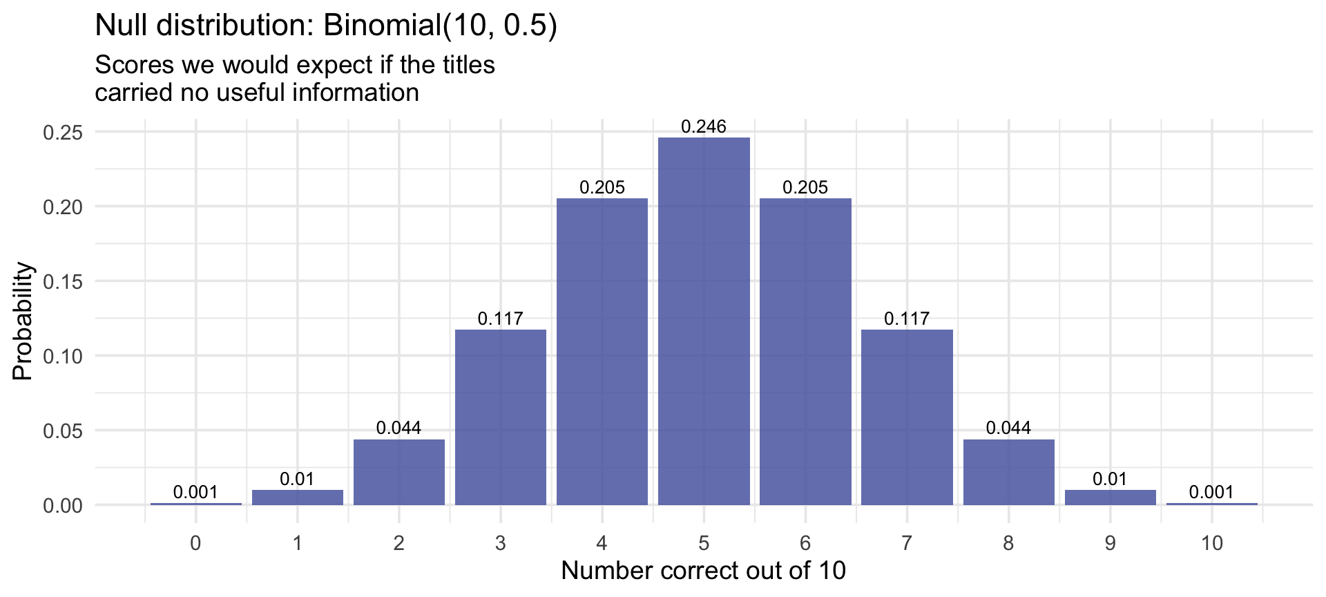
- Near the middle (4–6): scores like that are common under pure guessing, so yours is compatible with the null model. It does not show you were reading anything — and it does not show you weren’t.
- Out in the upper tail (8, 9, 10): chance alone produces scores like that rarely. How rarely is exactly the question — and Step 5 puts a number on it.
Step 5 — Your score on the null distribution
Let’s make this concrete. The plot below is the same Binomial(10, 0.5) reference from Step 3, but now it highlights the tail that matters for you — every score at least as high as the one you got.
Change my_score to the number you got in Step 4 (your detective score), then run the chunk.
One thing to notice about the shading: it runs up the upper tail only. We chose that before anyone had a score, because our question was directional from the start — can you classify the titles better than chance? M08 will make a lot of that choice.
Look at the rose-shaded bars. Their total height — the number in the subtitle — is the probability, computed under the null of pure coin-flipping, of scoring at least as high as you actually did. That one number is the whole question:
If the titles really told me nothing, how often would luck alone hand me a score at least this high?
- If that number is large, someone reading nothing into the titles would routinely score at least this high. We have insufficient evidence to reject the claim that the titles tell you nothing. (That is not the same as showing the claim is true — it means your score does not rule it out.)
- If that number is small, a person reading nothing into the titles would rarely score this high. We reject that claim: your score is evidence that there is something in these ten titles you were able to use.
Key message — you just computed a p-value
The rose-shaded area is the probability of getting your score or a higher score if the titles carried no useful information.
That is the p-value.
For this activity:
p-value = probability that pure guessing would do at least this well
- If the p-value is large, your score is the kind of thing guessing can produce.
- If the p-value is small, your score is unusual under guessing, so guessing becomes a weak explanation.
For this one-sided activity, we will use .05 as the cutoff for “unusually high.” That cutoff is a convention, and it must be chosen before seeing the score.
Why it matters: Every statistical test you’ll meet this semester has this shape. Define what “nothing interesting” looks like → locate your observation → measure how far into the tail it landed → decide whether that tail probability is small enough to reject the null. M08 gives this framework a name and formal notation: Null Hypothesis Significance Testing.
So how unusual is your score?
Here are the three scores that matter in this room. The middle column is the tail probability. The third is that same number turned upside down — \(1 \div p\).
| Detective score | \(P(X \geq \text{score})\) | How often luck alone does this | Below .05? |
|---|---|---|---|
| 7 or better | .172 | about 1 in 6 | no |
| 8 or better | .055 | about 1 in 18 | no |
| 9 or better | .011 | about 1 in 90 | yes |
Read the third column, because it is the whole point. Seven out of ten feels like you were good at this. But about one coin-flipper in six scores 7 or better — it is the kind of thing chance does all the time. Even 8 out of 10 happens about one time in eighteen — uncommon, but its tail probability of .055 lands just above the .05 cutoff we fixed in advance. So we do not reject the null model, and we notice how close a call that is.
Only 9 or better falls below .05. That is the score a coin-flipper reaches about once in ninety tries — rare enough that “they just got lucky” stops being a comfortable explanation.
The gap between what feels impressive and what is statistically unusual is large, and it does not shrink with practice. That gap is why we compute the number instead of trusting the feeling.
Wrapping up
What we built today
Two activities, one object — a distribution of what could have happened — pointed at the two questions that organize the rest of Part 2:
Sampling (Activity 1): Repeated samples from the same population can give different estimates. The estimates cluster around the truth, but any single one can be far off. How far? is the question M07 answers with the standard error and the confidence interval.
Detective (Activity 2): To judge whether a result is surprising, you need a reference distribution — a model of what chance alone would produce — and then you measure how far into its tail your result landed. Is this more than chance? is the question M08 answers with the null distribution and the p-value.
The big idea
Your sample is one of many possible samples, and each would have given a slightly different answer. Every method in the rest of this course is a way of reasoning carefully about that variation — its shape, its size, and what it does and does not let you claim.