Creating, interpreting and utilizing confidence intervals
Lecture · Module 7 · Mon Sep 28
A hypothetical research scenario
Imagine that, for the next three lectures, we are the public-health research team for a Colorado county. A recent community needs assessment flagged a concern: many adults are stuck on a serious interpersonal hurt — a betrayal, an estrangement, a friendship that ended badly — and unresolved hurts like these are linked to depression and anxiety. Forgiveness looks like a promising target. A large randomized trial at six sites in five countries, the REACH trial (Ho et al., 2024; course PDF), found that a brief, self-directed forgiveness workbook increased it.
Before the county adopts that workbook, the board needs three answers, and each lecture takes one:
- Is forgiveness actually low here? (today) The needs assessment raised the concern; a survey can measure it, in two halves: how many county adults are carrying a serious hurt, and how low forgiveness is among them. Today we plan the second half: where those adults start, on average, and how precisely a survey we can afford could pin that down.
- Could the workbook work here? (M08) A small pilot measures county adults before and after the workbook and checks whether their scores change.
- Does the workbook cause the improvement? (M09) A randomized trial, with a comparison group measured at the same time, gives the county its cleanest basis for answering that causal question.
Today is question 1, and we have no county data yet. So we will use numbers from Ho and colleagues’ trial to build a plausible simulated county, rehearse the survey, and find out whether 40 interviews would be precise enough — before we collect a single real observation. Our simulated results are planning tools, not findings about Colorado.
Today’s story unfolds in five parts:
- Three ideas we’ll need. You’ll recall them out loud: sample means vary; confidence intervals account for that variability; and 95% describes the long-run performance of the method, not the probability attached to one finished interval.
- The county’s first question. Is forgiveness actually low here? We’ll define the population and the outcome, decide what the scale’s numbers mean, borrow a mean and SD from the trial, and ask whether those international numbers are reasonable planning assumptions for Colorado.
- A dress rehearsal for our survey. Starting with the report the board needs, we’ll construct a simulated county, draw one 40-person sample (the number we can afford with current funds), calculate a confidence interval, and repeat the whole survey 1,000 times to see how precise 40 interviews usually are. When 40 falls short, we’ll find how many interviews the board’s target needs. Three pictures then pull the ideas together, and we close with three misleading ways to read a confidence interval.
- Your personal study plan. Start a plan for one study of your own: find a published mean and SD for an outcome and population you care about, and record your sources and assumptions. The plan gains a section in each of the next two lectures.
- Your study: how precise, and how many people? Set a precision target for your own study, find the sample size it needs, and check that size by rehearsing your study 1,000 times. Then we turn to the board’s second question — could the workbook work here? — which is where our next class begins.
Part 1 · Three ideas we’ll need
Three ideas from the Module and Friday’s pre-study become our research team’s tools today. You met them in a different example; today each one returns exactly when the county needs it. Before we start, answer each question with your neighbor, then check the answer in the notes.
Part 2 · The county’s first question
What would “low” look like? We measure forgiveness with the benevolence subscale of the Transgression-Related Interpersonal Motivations (TRIM-18) Inventory, where each item runs from 1 (strongly disagree) to 5 (strongly agree). Benevolence is one side of forgiveness: goodwill toward the person who caused the hurt. (Ill will, such as avoidance or a wish for revenge, is measured by the inventory’s other subscales.) An average near 3 is the scale’s midpoint: on average, people neither agree nor disagree with the goodwill statements.
What the survey can and can’t tell the board. The needs assessment identified a concern. Before choosing a response, the board wants a reliable estimate of how much benevolent motivation these adults currently report: where the population starts. Whether that level signals a need for a program is a further judgment, informed by earlier research, community priorities, and the expected benefits of the program. The board’s first question, in the form a survey can answer, is:
Among adults in our county who report a serious unresolved interpersonal hurt, what is the mean benevolence score — and how precisely can we estimate it?
The outcome: the six-item benevolence subscale of the TRIM-18. Respondents think of the person who hurt them and rate each statement on that 1-to-5 scale:
- Even though his/her actions hurt me, I still have goodwill for him/her.
- I want us to bury the hatchet and move forward with our relationship.
- Despite what he/she did, I want us to have a positive relationship again.
- I have given up my hurt and resentment.
- Although he/she hurt me, I put the hurt aside so we could resume our relationship.
- I have released my anger so I could work on restoring our relationship to health.
A person’s benevolence score is the mean of their six ratings, so it also runs from 1 to 5, and higher scores mean more benevolent motivation toward the person who caused the hurt.
The design: screen, then measure. A short screening question asks county adults whether they are carrying a serious, unresolved interpersonal hurt; only those who say yes go on to the benevolence items. For today’s precision calculations, we treat the adults who screen in as an independent random sample of that target population; a clustered, weighted, or otherwise complex sample would require a different SE calculation. (A bigger sample also doesn’t fix selection bias: if the wrong people screen in, more of them just gives a narrower interval around the wrong answer.) The constraint: the budget covers 40 completed interviews with adults who screen in. The requested precision: a 95% confidence interval with a margin of error of no more than ±0.25 scale points. Recall that the margin of error is the CI’s half-width, how far the interval reaches on either side of the estimate. So ±0.25 means the whole interval spans at most half a point.
Why ±0.25?
How precise does our estimate need to be? That depends on how big a difference the board would consider meaningful. Suppose the board decides that a difference of half a point on the benevolence scale would matter. For example, it would see an average of 2.5 quite differently from an average of 3.0. A reasonable planning choice is to aim for a margin of error of half that amount: ±0.25. That means our 95% confidence interval would extend no more than 0.25 points on either side of the estimated mean. A narrower interval gives the board a clearer picture of where the county stands.
Our question is now concrete: Can we achieve that level of precision with just 40 interviews?
What if no one can name the difference that matters? There is a rough fallback, with an important caveat.1
Our borrowed planning numbers
We do not yet have any county data. Ho and colleagues’ (2024) multisite randomized REACH trial enrolled adults who had experienced an interpersonal hurt; each was asked to recall someone who had “deeply hurt or offended” them. We can borrow the trial participants’ baseline, before treatment, to form a provisional picture of our target outcome. Our course-prepared analytic file provides the baseline values used below:
| Source | Participants | Baseline mean benevolence | Baseline SD |
|---|---|---|---|
| REACH trial, analytic sample | 4,598 | 3.14 | 1.04 |
Our planning assumptions: a typical benevolence score of 3.14 and an SD of 1.04. These numbers describe the trial sample, not our county. They are inputs to the rehearsal, not verified local estimates.2
reach_analysis · Ho et al. (2024)
Our course-prepared trial dataset (shared_data/reach_analysis.Rds) contains 4,598 participants, randomized condition, study site, and baseline and follow-up TRIM-18 scores. No individual participant data are placed into today’s browser exercises: we use only the baseline summary statistics. We will return to the trial data for the later intervention analyses.
Source: Ho et al. (2024), BMJ Public Health, doi:10.1136/bmjph-2023-000072 · Course PDF. Trial registration NCT04257773.
Part 3 · A dress rehearsal for our survey
Step 1 — Start at the finish line: write the sentence you’ll report
Why a researcher does this: decide what the finished result looks like before touching any data, so every later step has a target.
The board wants one understandable sentence and a precision target. We write the sentence before collecting data so the study has a clear estimand and the analysis has a clear finish line:
In our simulated survey of 40 county adults dealing with a serious hurt, mean benevolence was ___ (95% CI: ___, ___).
The requirement: the interval reaches no more than ±0.25 either side of the estimate.
The blanks are our reporting template, not a claim about real county residents. Every remaining step will either fill them with simulated results or show us what to change before fieldwork.
Step 2 — Build a simulated county, and check it against the trial
Why a researcher does this: a simulation is only useful if it looks like the data you will actually get. Benevolence scores cannot follow an unrestricted smooth Normal curve. The scale stops at 1 and at 5, so no one can score below 1 or above 5. Build that limit in, then check the simulated county against the trial’s numbers.
Starting point
You have two borrowed numbers — a mean and an SD — and you want 10,000 simulated scores that look like the real measure, not like a textbook curve.
What the code does
rnorm() draws 10,000 values from a Normal curve with the mean and SD you name. scales::squish() pushes anything below 1 up to 1 and anything above 5 down to 5, so no score leaves the scale. The histogram shows the shape of the simulated scores and what the limits at 1 and 5 do. The last lines compare the simulated county with the source.
The new idea: across()
The last line uses across() to do the same thing to several columns at once. Read it from the inside out:
everything()picks the columns: here, all four of them,mean,sd,share_at_1, andshare_at_5.\(x) round(x, 3)is the job to do.\(x)is R’s shorthand for “a small function ofx,” so read it as “take each column, call itx, and round it to 3 decimals.”- mutate() writes the rounded columns back over the originals.
Without across(), you would write the same instruction four times: mutate(mean = round(mean, 3), sd = round(sd, 3), share_at_1 = round(share_at_1, 3), share_at_5 = round(share_at_5, 3)). Both versions give the same result; across() is shorter and harder to get wrong. Later steps use the same pattern with other column choices: mean:max in Step 3 picks a range of columns, and where(is.numeric) in Step 4 picks every numeric column.
Key functions
| Function | What it does |
|---|---|
| rnorm(n, mean, sd) | Draws n random values from a Normal distribution. The population you don’t have, in one call. |
| scales::squish(x, range = c(1, 5)) | Moves any value below 1 up to 1 and any value above 5 down to 5: a floor and a ceiling. The scales:: prefix borrows this one function from the scales package, which installs along with the tidyverse. |
| across(cols, fn) | Applies the function fn to every column in cols. Used inside mutate() or summarize(). |
everything() |
Selects every column. |
\(x) round(x, 3) |
A small function written on the spot: take x and round it to 3 decimals. \(x) is short for function(x). |
The mean lands on target, but the SD comes out 0.99, not the trial’s 1.04. The walls at 1 and 5 catch the people in the tails and pull the spread in — a detail the simulation makes visible.
The fix is to set the dial a little wider than the target, so that what comes out approximately matches.
- Change
mean = 3.14to3.15andsd = 1.04to1.10, and run it again.
You should get about 3.14 and 1.03, with about 3% of simulated adults at the floor and 4% at the ceiling — close to the trial’s own 2% and 5%. From here on, the simulated county uses those dials. You don’t need to change anything else: every later chunk already uses 3.15 and 1.10. These two numbers are only settings on the simulation: they describe the latent column, before the scale’s limits apply. We turn the SD up to 1.10 so that, after the limits trim the tails, the scores a survey would record (ben) come out with an SD of about 1.03, close to the trial’s 1.04. So whenever a calculation needs the spread of actual scores, as Step 6’s sample-size formula does, we use the trial’s 1.04.
One simplification, stated plainly. A real benevolence score is the average of six whole-number ratings, so real scores move in steps of 1/6 (1, 1.17, 1.33, and so on). Our simulated scores can land anywhere between 1 and 5, so the simulated county is an approximation of the real instrument. It is a close one: rounding the simulated scores to the real steps changes the SD by about a thousandth, and changes Step 6’s answer by less than a percentage point.
Step 3 — Simulate one sample of 40 adults and summarize it
Why a researcher does this: simulate one sample of 40 adults from the simulated county, the survey the county can afford, and examine it the way you will examine the real data: a histogram first, then summary numbers.
Step 2’s 10,000 adults were there to show what the county looks like. From here on, each simulated sample is a fresh draw from the same recipe (rnorm(), then scales::squish()), not a set of rows picked from those 10,000.
Starting point
You have the simulated county from Step 2, and you want one sample from it: 40 adults, examined the way you will examine the real data.
What the code does
set.seed() with your own number makes your sample reproducible, and different from your neighbor’s. rnorm() and scales::squish() work as in Step 2, now with the widened settings and 40 adults, and select() keeps only the score. The histogram shows the 40 scores. summarize() reduces them to one row, and the last line rounds that row’s numbers so they are easy to read.
across() again, with a different column choice
The last line uses across(), which Step 2 introduced, but picks its columns differently. mean:max means every column from mean through max, which here is mean, sd, min, and max. It skips n, a count that needs no rounding. Then \(x) round(x, 2) rounds each of those columns to 2 decimals.
Key functions
| Function | What it does |
|---|---|
mean:max |
A range of columns: from mean through max, in the order they sit in the data. |
Why set a seed? A simulation is part of the plan, and a plan has to be reproducible: a teammate who reruns your chunk should get your numbers, and so should you next month. set.seed() fixes the random draws. Each of you has your own seed, so the room holds many different simulated samples. To watch the wobble yourself, put a # in front of set.seed(my_seed) and click Run a few times — every click is another sample the county might get. Put the # back before you move on.
Step 4 — Write the analysis now, so it’s ready when the real data arrive
Why a researcher does this: the code that produces the county’s interval can be written — and debugged — today, on simulated data. When the real data arrive, you change one line, the one that says where my_survey comes from, and run the rest unchanged. Nothing in the analysis assumes 40 people, so it works at whatever sample size the plan settles on. Deciding the analysis before seeing results is also the best protection against bending it to fit them.
Here is the parametric interval from the Module, worked by hand with the numbers from the default sample in Step 3 (seed 1). If you used your own seed, your numbers will differ, but the steps are the same.
\[\begin{aligned} \bar{x} &= 3.259, \qquad s = 0.955, \qquad n = 40 \\[2pt] \text{SE} &= \frac{s}{\sqrt{n}} = \frac{0.955}{\sqrt{40}} = \frac{0.955}{6.325} = 0.151 \\[2pt] t^* &= 2.023 \qquad \text{for 95\% confidence with } df = n - 1 = 39 \\[2pt] \text{margin of error} &= t^* \times \text{SE} = 2.023 \times 0.151 = 0.305 \\[2pt] \text{95\% CI} &= \bar{x} \pm \text{margin of error} = 3.259 \pm 0.305 = [\,2.95,\ 3.56\,] \end{aligned}\]
\(t^*\) comes from qt(p = 0.975, df = 39): the number of standard errors that captures the middle 95% of a t curve with 39 degrees of freedom. The code below runs the same steps, and t_test() confirms them. The code carries every digit instead of rounding each step, so its output can differ from the hand calculation in the last decimal place:
The half-width of an interval — how far it reaches either side of the estimate — is its margin of error, and the board’s ±0.25 is a target for exactly that number. This sample’s margin is ±0.31, wider than the board wants. Whether that is bad luck or the usual result of 40 interviews is Step 5’s question. (The Module’s other route to an interval, the bootstrap, waits for the bonus page at the end of Part 5.)
Now fill in the sentence from Step 1, and label it simulated: “In our simulated survey of 40 county adults dealing with a serious hurt, mean benevolence was 3.26 (95% CI: 2.95, 3.56).” These numbers describe our simulated county.
Step 5 — Rehearse the survey 1,000 times: how precise will 40 interviews be?
Why a researcher does this: this is the question a planner needs answered before spending money. How precise will a 40-person survey be? One simulated sample cannot say. A thousand can: run the whole survey over and over, and look at how far the estimates wander and how wide the intervals come out.
Starting point
You have the code for one simulated sample, and you want to know what the survey plan delivers: not just one sample’s result, but the whole range of results the county could get.
What the code does
n_adults <- 40 stores the sample size in one place, so you can change it later with a single edit; Step 6 does exactly that. target <- 0.25 does the same for the board’s margin of error. Every number on the two graphs, including their titles, is computed from these two lines, so the graphs stay correct whatever sample size you try. replicate() then draws a fresh simulated sample 1,000 times and keeps two numbers from each: its estimate (the mean) and its half-width (the ± of its 95% CI). t() and as_tibble() turn those 1,000 pairs into a data frame with one row per rehearsal. The next lines pull out the two columns and compute the numbers the graphs will label: where the middle 95% of estimates fell, their SD (the standard error), the typical margin of error, and the share of samples that met ±0.25. Then come the two graphs: the sampling distribution of the estimates, and the widths of the intervals.
New syntax: the braces { }
This is the first time braces appear. It’s an advanced move that you don’t need to fully digest now, but may be useful in your future work. They wrap several lines into one block of code, so that replicate() can run the whole block as a unit. Read everything between { and } as “one simulated sample, start to finish”:
- simulate 40 scores,
- keep them between 1 and 5,
- hand back two numbers.
A block hands back whatever its last line produces; here, that is the pair of numbers made by c(). replicate() runs the block, collects the pair, and starts over, 1,000 times. Inside the block, x is just a scratch name for the current sample’s scores; each new rehearsal replaces it.
Key functions
| Function | What it does |
|---|---|
| replicate(1000, { … }) | Runs the block inside the braces 1,000 times and collects what each run hands back. A room of 1,000 researchers, in one call. |
| c(estimate = …, half_width = …) | Combines two numbers into one small, named set: the block’s answer for one sample. |
| t() then as_tibble() | Turns the collected results on their side so each rehearsal is a row, then makes a data frame. |
| median(), quantile() | The middle value, and the values that cut off the lowest and highest 2.5%. |
mean(widths <= target) |
The share of samples that met the target. Each TRUE counts as 1 and each FALSE as 0, so their mean is a proportion. |
sd(estimates) |
The SD of the 1,000 estimates: the standard error, explained just below. |
| annotate("label", …) | Writes a label onto a plot. y = Inf puts it at the top; x = Inf with hjust = 1 tucks it against the right edge, so it fits whatever sample size you try. |
| paste0() | Glues text and numbers into one label. |
How to read output
Two labelled graphs. The sampling distribution shows the 1,000 estimates: the dashed lines mark the middle 95%, and the label gives that range and the distribution’s SD, the standard error. The widths graph shows how wide each sample’s interval came out: every bar to the right of the gold line is a sample whose margin of error is larger than the board wants. Its subtitle gives the typical margin of error and the share of samples that met ±0.25.
The first graph is the sampling distribution of the mean: the pile of means Part 1 asked you to imagine, now simulated. Each bar counts the rehearsed samples whose mean landed there, and the county’s real survey will be one draw from this distribution. Its SD, 0.165, is the standard error. With 40 interviews, the middle 95% of estimates ran from about 2.83 to 3.48, so a single survey could easily report 2.9 or 3.4 just by chance. The second graph, the widths, shows what that wobble does to the intervals. Almost every bar sits to the right of the gold line: the typical interval reaches about ±0.33, and only 0.5% of the 1,000 rehearsed samples met the board’s ±0.25.
Why the intervals in the widths graph come out about ±0.33. Each interval reaches about \(t^*\) standard errors on each side of its estimate, and \(t^*\) is about 2: 2.023 × 0.165 ≈ 0.33, right where the widths graph’s bars cluster. That is the link between the two graphs: a wider sampling distribution means wider intervals. A real team never sees the sampling distribution; it estimates the standard error from its one sample as \(s / \sqrt{n}\), which is exactly what Step 4’s hand calculation did.
This is precisely the warning our team wants before spending its budget. It is a prediction conditional on our simulated county, not a finding about actual county residents. Step 6 finds how many interviews would deliver ±0.25.
Step 6 — Find how many interviews it takes to meet the board’s ±0.25
Why a researcher does this: 40 interviews fall short. Before going back to the board for a bigger budget, the team needs a number it can defend: how many interviews would make ±0.25 dependable?
Why more people help, but slowly. The SE is the SD divided by \(\sqrt{n}\), so precision grows with the square root of the sample size, not with the sample size itself. Using the county’s planning SD of 1.04:
\[\begin{aligned} \text{SE}_{n=10} &= \frac{1.04}{\sqrt{10}} &&= \frac{1.04}{3.16} &&= 0.329 \\[2pt] \text{SE}_{n=40} &= \frac{1.04}{\sqrt{40}} &&= \frac{1.04}{6.32} &&= 0.164 \\[2pt] \text{SE}_{n=160} &= \frac{1.04}{\sqrt{160}} &&= \frac{1.04}{12.65} &&= 0.082 \\[2pt] \text{SE}_{n=640} &= \frac{1.04}{\sqrt{640}} &&= \frac{1.04}{25.30} &&= 0.041 \end{aligned}\]
Quadruple the sample and the SE halves; doubling it is not enough.
A shortcut: the sample-size formula. Solve the half-width formula for \(n\) and you get an approximate starting sample size: roughly where a typical interval reaches a target half-width \(E\):
\[n \approx \left( \frac{1.96 \cdot \sigma}{E} \right)^2\]
(This first-pass formula uses the asymptotic3 \(z^* = 1.96\). A more refined plug-in calculation can iterate using \(t^*\), but if you want a specified probability of actually achieving the target width, you must also account for sample-to-sample variation in the sample SD, \(s\), which is what the rehearsal does below.)
For the county, \(\sigma\) = 1.04 and \(E\) = 0.25:
\[n \approx \left( \frac{1.96 \cdot 1.04}{0.25} \right)^2 \approx 67.\]
Check it with a rehearsal, and decide how sure to be. The formula aims at the typical sample: at 67 interviews, about half of all samples would meet ±0.25 and half would miss. The county gets only one survey, so a coin flip is too risky, and the board’s “no more than ±0.25” leaves one decision open: how sure does the team want to be? The team chooses 8 in 10: at least 8 of every 10 rehearsed samples should meet ±0.25, which means accepting a 1-in-5 chance that the real survey falls short. Where does 80% come from? It is the usual target for power, which you’ll meet next week. For an interval’s width there is no settled convention, so the team borrows the same 80%: a reasonable choice, not a rule. When falling short would be costly, a team would raise the bar to 9 in 10 and pay for the extra interviews. To see what each bar costs, the team reran Step 5’s rehearsal with one change, n_adults set to 67, then 75, then 80. Here are all four sample sizes side by side:
| Interviews | Typical half-width | Samples that met ±0.25 |
|---|---|---|
| 40 | ±0.33 | 0.5% |
| 67 | ±0.25 | 48.5% |
| 75 | ±0.24 | 80.2% |
| 80 | ±0.23 | 92.7% |
And here is every size from 10 to 200, rehearsed the same way. Read it like the table, stretched out: the solid line is the typical sample’s margin, and the dashed line is the margin that 8 in 10 samples come in under.
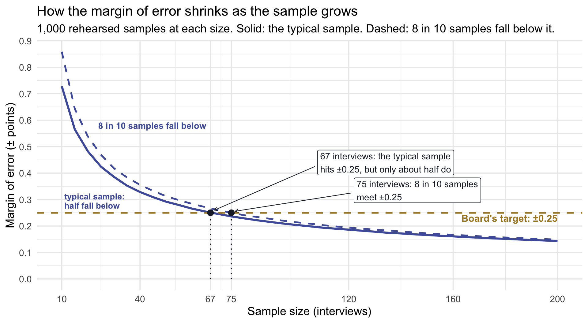
The margin falls fast at first and then slowly, the \(\sqrt{n}\) pattern again: going from 10 to 40 interviews cuts the typical margin from about ±0.73 to ±0.33, but going from 75 to 200 only takes it from ±0.24 to ±0.14. At 67 interviews, the typical sample hits the target, but only 48.5% of the rehearsals do: a coin flip. At 75, where the dashed line dips under the target, 80.2% do. So the team can go back to the board with a clear request: about 75 interviews gives an 8-in-10 chance of meeting ±0.25, if the planning numbers hold. That is 35 more than the current budget covers, and the rehearsal is the evidence for asking. If the board wants 9 in 10 instead, the table’s last row gives the price: about 80.
Two percentages, two different jobs
95% confidence is about where intervals land. If we drew sample after sample and built an interval from each, about 95% of those intervals would contain the true mean. Picture 2, at the end of Part 3, shows it.
80% assurance is about how wide intervals come out. If we ran the planned survey again and again, about 80% of the intervals would have a margin of error no larger than the board’s ±0.25.
The two are separate. An interval can contain the true mean and still be too wide for the board, and a narrow interval can miss the true mean. Next week adds a third percentage, 80% power: the share of studies that would detect a real effect. Same 80%, a third job.
Formula or simulation?
The formula and the rehearsal agree about the typical sample: both say about 67 interviews for a typical margin of ±0.25. The formula is a fast, transparent first answer, and it is the kind of calculation many research proposals report. But it answers a narrower question than a planner needs, and the rehearsal fills the gaps:
- The formula treats the SD as fixed; real samples don’t. Each sample’s own SD comes out a little different, so its margin comes out a little different too. The formula’s \(n\) gives roughly the typical margin, so in the county’s model about half of real samples would miss the target. The rehearsal shows the whole spread and lets you choose how sure you want to be. (Formulas that account for this exist, but they get complicated quickly.) This gap belongs to precision formulas like this one, which aim at the typical sample. Next week’s power planning is different: its 80% target already says how sure you want to be.
- The formula can’t see what makes real samples less precise; a rehearsal can build it in. The formula needs the sampling distribution of the mean to be roughly Normal, not the scores themselves, so it works for many outcomes. But it can’t see a shape that makes each sample’s SD wobble more (skewed scores, scores piled against a limit), people clustered in schools or clinics, or people who drop out. Here, the 1-to-5 limits mattered only a little. In other studies the difference can be large.
- A rehearsal tests your whole plan, not just one number. The same simulated data already tested your analysis code, before any real data exist.
- It works when there is no formula. Many real designs have no simple sample-size formula. A simulation needs a realistic description of how the data will be generated, and a clear definition of what counts as success.
Use the formula for a quick first estimate and a sensible range to try; use the rehearsal to choose the final number.
Putting it all together
The county’s rehearsal is done. Before you turn to your own study, three pictures pull the key ideas together.
Three pictures to remember
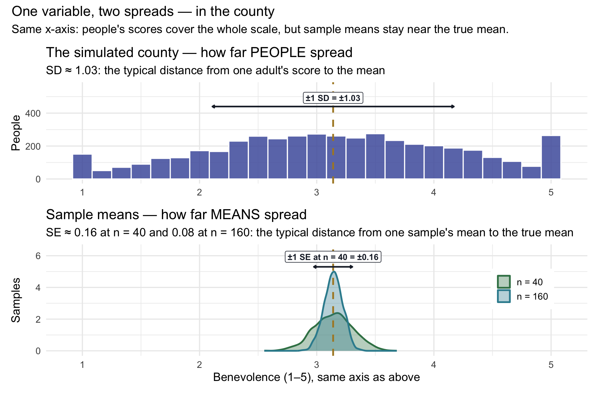
Picture 1: people spread widely; sample means barely spread. Both panels share one number line. The top panel shows every adult in the simulated county: their scores cover the whole 1-to-5 scale, and the arrow marks one SD, about 1.03 points, on each side of the mean (close to the trial’s 1.04). The bottom panel shows the sampling distributions of the mean for samples of 40 and of 160. They huddle close to the true mean, because averaging lets high and low scores partly cancel out, and quadrupling the sample size makes the sampling distribution half as wide. The standard deviation of the sampling distribution is the standard error, and it is the key to how wide a sample’s interval comes out.
Picture 2: what the 95% is about. Each of Step 5’s 1,000 rehearsals, every one a sample of 40, also produced an interval. Real researchers never learn whether their interval caught the truth. In a county you simulated, you can check: the simulated county’s true mean is 3.14, computed exactly from the model, and it exists only because we built the simulated county. Here are the first 100 rehearsed intervals, each from a sample of 40, with that truth as a gold line:
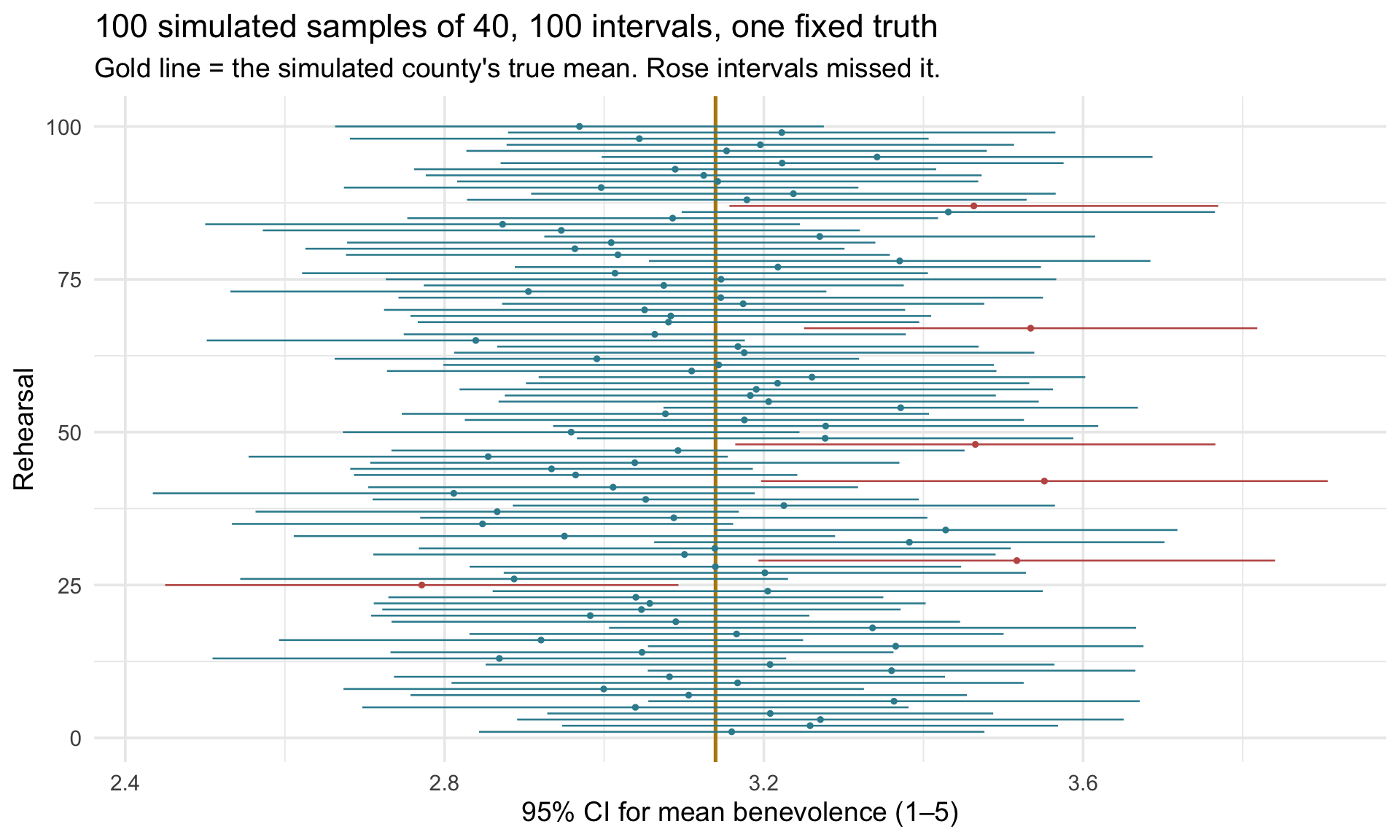
In this run, 6 of the 100 intervals missed. Notice what moves from row to row and what does not: the gold line never moves; the intervals jump, because each came from a different sample. Any one of them either caught the truth or did not, and a real team cannot tell which row it is on — which is exactly why the confidence statement is about the procedure. Across all 1,000 rehearsals, 95% caught it. That is also a check on the method: the t-interval assumes a smooth bell curve, the county’s scores are lumpy and walled in, and its simulated coverage is close to its nominal 95% under these particular assumptions. This is a check on this scenario, not a guarantee for every real survey or sampling design.
Picture 3: how many interviews the board’s ±0.25 takes. This is Step 5’s widths graph again, now at three sample sizes: the same 1,000 rehearsals at each size that fill Step 6’s table. Each histogram shows how wide the intervals came out. The gold line is the board’s target, and the dark bars are the samples that met it:
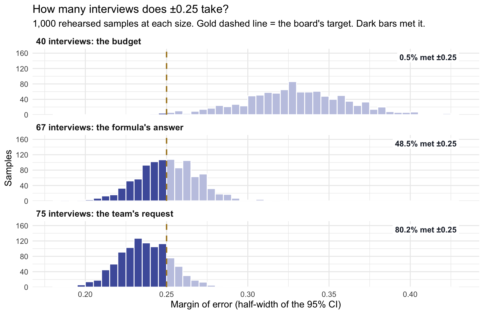
At 40 interviews, the budget, almost the whole histogram sits to the right of the line: only 0.5% of samples met the target. At 67, the formula’s answer, the line cuts the histogram down the middle: a coin flip. At 75, the histogram has moved far enough left that 80.2% of samples meet it. Notice that the histogram also gets narrower as it moves: with more people, each sample’s SD, and so its margin, varies less from one sample to the next. That is the picture the team takes back to the board: about 75 interviews for an 8-in-10 chance at ±0.25.
What a CI is not
Three sentences, each one something a real researcher has written about an interval like the one the team reported in Step 4.
Part 4 · Your personal study plan
You just watched the whole workflow on the county’s question: a plan, two borrowed numbers, a simulated survey, an interval, a thousand rehearsals, and a sample size. Now the same thing for a study of your own. For the rest of this lecture and the next two, you will follow the county’s path with a variable from your own research: estimate a starting level today, test a before-and-after change in M08, and design a comparison that can address causal claims in M09. We’ll call that thread your personal study plan, and each lecture adds a section to it.
Your personal study plan · Section 1: where people start
Pick a continuous outcome from your own research area and the population you care about. Fill in the six rows below; the literature search fills in what you don’t know yet. The M08 and M09 lectures return to these numbers, and each one adds a section.
| Element | Your value | Where it came from |
|---|---|---|
| Outcome variable (units, and the scale’s range) | ||
| Population — who, and where | ||
| Typical mean in a population like yours | ||
| SD of the outcome \(\sigma\) | ||
| A feasible sample size \(n\) | ||
| The precision your reader needs \(E\) — and who the reader is |
Sections to come. M08 adds an intervention, the change you expect it to produce, and your decision rule. M09 adds a comparison group and the sample size a trial would need. One number to watch for now: M08 needs the SD of change scores (after minus before), which is usually not the same as the SD you record today. Note it if your source reports it; M08 shows what to do if it doesn’t.
As a refresher, for the county forgiveness example, the outcome = benevolence (1–5); population = adults in the county dealing with a serious interpersonal hurt; typical mean 3.14 and SD 1.04, from REACH’s baseline (with a limitation noted); \(n\) = 40; precision = ±0.25, half the half-point difference that matters to the board.
5-10 minutes in the literature
Two of those rows are numbers you should not invent: the typical mean and the SD. They live in published work, and finding them is a research skill in its own right. While you are there, note a third number you will need in two weeks: how much an intervention like yours has moved the outcome.
Finding your numbers
What you are looking for. Numbers in the outcome’s own units: a typical mean in a population like yours, its SD, and — for later — the size of an effect a comparable intervention produced. Note the \(n\) each source used, too.
Where to look, fastest first.
- Table 1 of any paper that used your measure on a population like yours. Descriptive tables report \(M\), \(SD\), and \(n\), often by group. A baseline or control-group mean is a typical level.
- The measure’s manual or validation paper. Norms by population are exactly the mean and SD you need. Search “[measure name] norms” or “[measure name] psychometric properties”.
- A meta-analysis of interventions on your outcome. It gives a pooled effect, usually as Cohen’s d. Convert it: effect = d × SD, using the SD the study standardized by (a baseline SD and an SD of change scores are not interchangeable). Save it for M08 and M09.
- A registered trial’s protocol or preregistration. Authors must state the SD and the effect they assumed for their own sample-size calculation — often in a single sentence you can quote.
Guardrails.
- Match the units. A raw score, a change score, and a standardized score are three different variables with three different SDs. Pick one and stay in it.
- If you only find an SE or a CI for the mean, recover the SD: \(SD = SE \times \sqrt{n}\). A 95% CI’s half-width is \(t^* \times SE\) (close to \(2 \times SE\) when \(n\) is large), so \(SE\) = half-width ÷ \(t^*\). This works only when the SE or CI is for the raw mean itself, not for a difference or an adjusted estimate.
- Write down the citation in the third column. Your future self, writing a grant, will thank you.
Open Google Scholar or our library’s database and fill the source column of your study plan. Time-box it: five minutes, ten at most. If you haven’t found your numbers by then, take a fallback scenario from the table below and come back to your own outcome this week — the rest of the lecture works either way.
Once you fill in the values, take a screenshot of your study plan and save it on your desktop. We’ll revisit it in the next two lectures.
Fallback scenarios, ready to use
| Scenario (population) | Outcome (units) | Typical mean | SD | Precision target \(E\) | For M08–M09: an intervention, and its plausible effect | Where the numbers come from |
|---|---|---|---|---|---|---|
| Adults recalling a serious interpersonal hurt (the REACH trial’s own participants) | Avoidance, 1–5 (higher = a stronger wish to keep away from the person) | 3.36 | 1.20 | ±0.33 | The same forgiveness workbook, about −0.67 | REACH trial data (Ho et al., 2024; course file): baseline, and the two arms at follow-up (completers) |
| Adults who sleep too little | Sleep duration, hours per night | 6.0 | 1.0 | ±0.25 hours (15 minutes) | Sleep-hygiene program, about +0.5 hours | Illustrative planning values — replace with your own |
| Staff in high-stress workplaces | Burnout score, points (a hypothetical 0–60 scale) | 30 | 10 | ±2.5 points | Supervisor-support program, about −5 | Illustrative planning values — replace with your own |
Each precision target is half the intervention’s plausible effect, the same planning choice the board made in Part 2. If you know a smaller difference that would matter to your reader, use half of that instead.
Part 5 · Your study: how precise, and how many people?
The county has its answer: about 75 interviews for an 8-in-10 chance at ±0.25. Now the same questions for the study in your plan:
If I get one shot at collecting data, how large does my sample need to be so that the interval I report for my population’s mean is narrow enough to be useful to the reader who will act on it?
How much precision do you need?
The right half-width depends on the decision your interval is supposed to support, and so on who is reading it. Aim for an interval narrow enough to help your reader tell apart values that would lead to meaningfully different decisions: decide first what difference matters, then choose a margin of error that gives useful precision. A practical rule is the board’s from Part 2: half the smallest difference that would matter to your reader. If no one can name that difference, a quarter of your SD is a rough fallback (see the footnote in Part 2).
Activity 1 — The \(n\) for the precision your reader needs
Enter your study plan’s four numbers here, once: your typical mean, your SD, your feasible sample size, and your target half-width. The chunk starts with the county’s numbers, so you can see the worked answer; then overwrite them with yours. The last line puts your SD and target into Step 6’s formula, and Activity 2 reuses all four numbers by name.
Remember what Step 6 showed: this \(n\) gives roughly a typical interval of ±\(E\), which is about a coin flip. For a dependable ±\(E\), plan for more. In the county, going from 67 to 75 interviews raised the chance from about half to about 8 in 10.
Activity 2 — Check your \(n\) with a rehearsal
This is the county’s Step 6 check, run on your numbers. The chunk rehearses your study 1,000 times at n_try people, draws the sampling distribution and the widths, and ends with the typical half-width and the share of studies that met your target. The first run uses your feasible \(n\) (my_n), just as the county started with its budget of 40. Then change n_try to Activity 1’s answer and run it again, and keep raising it until about 8 in 10 studies meet your target, or 9 in 10 if your study is high-stakes. That size is the one to plan for.
With the county’s numbers still filled in, the first run (n = 40) looks like Step 5: a typical margin of about ±0.33, and almost no studies meeting ±0.25. At 67, a little under half meet it, close to Step 6. At 75, though, only about 72% do, not Step 6’s 80.2%. That is because this chunk leaves out the county’s 1-to-5 limits. The limits keep scores from straying far, so each county sample’s SD, and so its interval, varied a little less. With a plain bell curve, it takes about 78 people to reach 8 in 10. The numbers also shift a little from run to run, because each run is a fresh set of 1,000 studies.
Using your own example, how large of a sample do you need to report a mean with the precision you specified? That is, what is the minimum sample size required so that “share_met_target” is greater than or equal to 0.80?
What does 0.80 mean? Of the 1,000 imaginary studies at that size, at least 800 produced an interval as narrow as your target, or narrower. You will run your real study only once, so that is about an 8-in-10 chance, if your planning numbers hold, that the one interval you report will be as precise as you planned. It is the same bar the county used in Step 6, and on Step 6’s precision curve it is the point where the dashed line crosses the target. If your study is high-stakes, raise the bar to 0.90 and plan for the larger sample it needs.
Bonus: your study, the full rehearsal
Today you ran two of the county’s six steps on your own numbers. The bonus page runs all six: a simulated population with your scale’s limits built in, one sample and the data checks that will guard the real one, the interval by code and by bootstrap, a thousand rehearsals, and a precision curve built by simulation rather than by formula, with a closer look at when the two disagree. Optional and ungraded; about an hour for the county walkthrough and more for your own study, and worth it if you are planning a thesis. Your study, the full rehearsal →
What sets an interval’s width
If the \(n\) your rehearsal settled on is realistic, you have a starting point for a defensible design. You still need to consider recruitment, nonresponse, selection bias, and whether the borrowed SD is transferable. If not, the formula shows you the three things that set an interval’s width: \(\sigma\), \(n\), and the multiplier. The mean you assume isn’t on that list: it sets where the sampling distribution sits, not how wide the intervals come out (in a plain bell curve; near a scale’s limit, the mean can squeeze the spread too). Reducing unnecessary measurement error can shrink \(\sigma\); more people shrink the wobble; a lower confidence level shrinks the multiplier at the cost of a weaker claim. For precision in estimating a mean, these are the central ingredients. Next week, when we begin evaluating an intervention, the half-point difference that set today’s target returns with a new job: it becomes the change a pilot must be able to detect.
Wrapping up
Four things to carry into M08
- One variable, two spreads. People vary by \(\sigma\); means vary by \(\sigma / \sqrt{n}\). Inference is always about the narrow curve.
- The 95% belongs to the procedure. Your interval either caught the truth or it did not. What you know is that the recipe catches it about 95% of the time — the Module showed it on the colleges, and Picture 2 showed it on the simulated county.
- Simulate before you collect. Write the sentence you’ll report, build a simulated county that approximately matches the numbers you borrowed, write the analysis on simulated data, and rehearse the study a thousand times — all before the first interview. rnorm() builds the simulated county; replicate() reruns the survey.
- Precision improves with \(\sqrt{n}\), so quadrupling \(n\) halves the SE and therefore approximately halves the CI’s margin of error — and the \(n\) you need comes from the precision your reader’s decision requires, not from convention. The formula gives the \(n\) for a typical interval; a rehearsal tells you how sure you can be of hitting it.
Footnotes
A rough fallback, not a rule. Research on health-related quality-of-life measures found that a change of about half a standard deviation is often the smallest change patients notice (Norman et al., 2003). Some planners borrow that when no one can name a meaningful difference: with an SD of about 1, half an SD is about 0.5, which again gives a margin of error of ±0.25. But the finding is about changes in quality-of-life scores, not about differences between groups on the TRIM-18, so treat it as a last resort, not an established threshold for benevolence.↩︎
Borrowed numbers bring their source’s strengths and limits. A simulation is only as good as the numbers you feed it. Whenever you borrow a mean and SD from an existing study, weigh what makes them trustworthy against what makes them a poor fit for your setting.
What the trial gets right: the same measure, a related inclusion criterion (adults who had experienced an interpersonal hurt; our county screen adds “still unresolved”), and a large sample of 4,598 adults across six sites.
What could differ in our county. The two numbers do different jobs. The mean answers the board’s question, so anything that shifts it changes the answer, not the plan. The SD sets how many interviews we need, so anything that changes the spread can quietly break the plan:
- A larger SD makes the plan too optimistic: 40 interviews would deliver less precision than we expect. Trial participants were recruited through campuses, churches, war-survivor groups, and the general public, and agreed (for a small payment) to try a forgiveness workbook, while a county screen also reaches people who would never sign up for one, including some who may not want to forgive. And each of the trial’s countries had recently experienced civil conflict or unrest, so a county screen will turn up a different mix of hurts.
- A smaller SD makes the plan too conservative: we would pay for more interviews than we need. A stricter screen narrows the scores. So does nonresponse by the most hurt adults, which biases the mean as well.
- Culture and response style can push either way. A group that tends to avoid the ends of the scale shows a smaller SD.
The number of interviews grows as the standard deviation increases. A careful planner reruns the calculation with a pessimistic SD, and replaces borrowed numbers with local ones as soon as they exist.↩︎
In statistics, an asymptotic result is one that becomes approximately true as \(n\) approaches infinity. For example, an estimator may be asymptotically normal, meaning its sampling distribution becomes closer to a normal distribution as the sample size gets larger.↩︎