The Logic of NHST
Lecture · Module 8 · Mon Oct 5
How today works
Today’s class, in order:
- Warm-up — your interval, from your plan. Last Monday we ran out of time before you could run your own numbers; you run them now. Then you rehearse it 100 times and see what the 95% promises.
- Rehearse the pilot — the warm-up’s sampling distribution again, now for each person’s change.
- The skeptic’s question — is the average change different from zero? The null hypothesis.
- Turn last week’s picture around — the one move that carries estimation into testing: how unusual would our pilot be in a world of no change?
- A world where the null is true — we run pilots in a world where the true average change is zero, and count how many come back significant anyway.
- A world with a real change — how often do pilots detect a change that really exists, and what makes them miss it?
- The county’s power — the simulation the room just ran, written as one R function; then the four things that move power.
- Your pilot — the same steps on your own numbers, your choice of α, and your study plan’s section 2. If we run out of time, this part is yours to finish before next Monday.
Warm-up · Your interval, from your plan
Last Monday we worked the county’s rehearsal together and set you loose on Parts 4 and 5: find a published mean and SD for an outcome you care about, and bring the numbers. Those numbers go to work right now. Type yours into the top of the chunk (the county’s are filled in as the fallback) and run it. It does two things:
- Step 1 runs one rehearsed study of your own plan: one simulated sample, one mean, one interval.
- Step 2 draws your sampling distribution: the means of 1,000 rehearsed studies of your plan, with the mean you typed in marked in gold. In this simulation, that is the true mean, and the sampling distribution is centered on it. Dashed lines bracket the middle of the study means at your confidence level: the 2.5th and 97.5th percentiles for 95%, the 10th and 90th for 80%.
- Step 3 runs Step 1’s study 100 times and draws all 100 intervals against that same gold line. It’s last Monday’s Picture 2, this time built from your plan.
If you couldn’t find a mean or an SD this week, run the county’s numbers today, and after class pick one of the Fallback scenarios, ready to use in Part 4 of last week’s lecture.
Rehearse the pilot · the same picture, now for change
Last week the team took on the board’s first question — is forgiveness actually low here? — and planned a survey to estimate where county adults start: a mean benevolence of about 3.14. Now the board’s second question: could the workbook work here? It funds a pilot. Forty adults dealing with a hurt complete the benevolence items, work through the forgiveness workbook, and complete the same items two weeks later. For each person, the team computes a change score: after minus before. The pilot’s outcome is the average change.
Before anyone asks a test question, the team rehearses the pilot the way you just rehearsed your own study: under the plan. The plan borrows from the REACH trial’s workbook arm. Those who completed follow-up changed by 0.55 points on average, so the team plans for a true average change of 0.5: a little less, because a pilot in a new place often comes in a little lower than the original. Their benevolence scores had an SD of 1.04, and their before and after scores correlated at r = .47. The team rounds these to 1.0 and .5, and the chunk below simulates each person’s before and after scores from them. Together they make the SD of the change scores 1.0 as well (Part 4’s note on r explains why), so a change in points is also a change in SDs.
Three steps, in the same order as your warm-up: one rehearsed pilot with its average change and interval, a look at that pilot’s 40 people before and after, and then the pilot’s sampling distribution, the average changes of 1,000 rehearsed pilots.
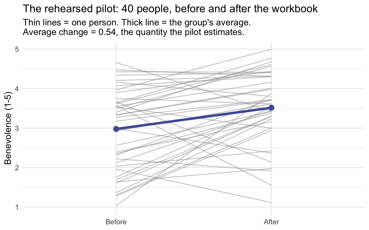
See the quantity the pilot estimates. Here are that rehearsed pilot’s 40 people, before and after the workbook. Each thin line is one person; the thick line is the group’s average. The pilot’s question is about the thick line: on average, how much did people change? That average change, 0.54 here, estimates the true average change, which the plan puts at 0.5. (The chunk simulated each person’s before and after scores; their change is after minus before.)
Then step back to all the pilots that could have happened. The chunk below rehearses the pilot 1,000 times under the same plan and keeps each one’s average change: the pilot’s sampling distribution.
The same moves as your warm-up; only the outcome is new. The rehearsed pilot changed by an average of 0.54, interval [0.22, 0.86]. Read it the M07 way: the plausible values of the true average change run from about 0.22 to 0.86. Its sampling distribution sits on the plan’s true average change, 0.5, just as your warm-up’s sat on the mean you typed in. Hold on to that 0.54: it’s about to meet a skeptic.
The skeptic’s question · did anything change?
The board has a skeptic, and the skeptic asks a sharper question than “how much?”: on average, did anything change at all? In the form a test can answer:
After the workbook, is the pilot group’s average change different from zero?
Zero is the benchmark here: no change. We call it the null value, \(\mu_0\), and the claim that people end where they started, on average, is the null hypothesis. This is the Module’s one-sample t-test, run on change scores. In the Module, the benchmark was a number someone chose from outside the data; here it is the claim that, on average, nothing changes. (Measuring the same people twice is called a before-and-after, or paired, design. Analyzed through change scores, it is just a one-sample test.) Today we build two worlds, run many pilots in each, and count what happens.
- Part 1: a world where, on average, nothing changes. The true average change is exactly zero. Any pilot there that still gets p < .05 has been fooled: it reports a change that isn’t there. We count how often that happens.
- Part 2: a world where the change is real. The true average change is above zero. A pilot there that gets p < .05 correctly sees the change; one that doesn’t, misses it. We count how often a pilot like this one sees it.
The county’s plan, in seven rows. The outcome is still benevolence (1–5), measured on the same 40 adults before and after. To build both worlds, the team writes down seven things. You’ve already met all but the null value:
| Element | The county’s value |
|---|---|
| The intervention | the forgiveness workbook, two weeks |
| Where people start: the typical before score | 3.14, last week’s estimate from the REACH trial’s baseline (it sets where the before-and-after lines sit; the test uses only the changes) |
| The null value \(\mu_0\) | 0 (no average change) |
| The average change expected after the intervention \(\mu\) — and its source | 0.5, planned from the REACH trial’s workbook arm |
| Benevolence’s SD at each time point | 1.0, rounded from the REACH trial’s 1.04 |
| How closely before and after track each other, r | .5, rounded from the REACH workbook arm’s .47 |
| The SD of the change scores \(\sigma\) that these imply | 1.0 (the REACH workbook arm’s own: 1.04) |
Turn the picture around
Everything new today is one move, so let’s make it in the open.
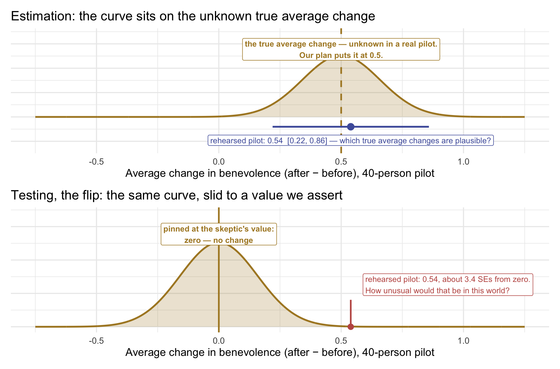
Start from the picture you just drew. When you rehearsed the pilot, its sampling distribution of average changes sat centered on the truth: the true average change in the population, which the plan puts at 0.5 (the top panel). Its width, \(\sigma/\sqrt{n}\) (the standard error of the mean), says how far pilots’ average changes wander from that center.
Now we turn the question around. Instead of asking where the center is, we assert one. The skeptic’s claim gives us an assertion: on average, nothing changes, so the true average change is zero. Slide the same curve over to zero, keep its width, and it shows every average change a 40-person pilot could produce in a world where the true average change is zero (the bottom panel). For the first time, we know exactly where the curve’s center is, because we put it there. The question becomes: how unusual would our pilot’s average change of 0.54 be, if that world were true?
What moved: only the anchor
Compare the two panels. The curve keeps its shape and its width, \(\sigma/\sqrt{n}\); only its center moves. In the top panel it sits on the truth, wherever that is, and the interval asks which truths remain plausible. In the bottom panel it sits on a value we assert: zero, no change. The pilot’s 0.54 doesn’t move at all. On top it sits comfortably near the curve’s center; below, it sits out in the tail, about 3.4 standard errors from zero. Estimation asks “where is the truth?”; testing asks “could it be this one?” Same machinery, turned around.
Now look again at the rehearsed pilot’s 95% interval, [0.22, 0.86], with the new question in mind: is the skeptic’s value, zero, inside it? It is not: the whole interval sits above zero. So zero is not among the plausible values for the true average change. Even before we compute a p-value for the null hypothesis significance test, this one rehearsed pilot gives us evidence against the claim of “no change.”
Part 1 · A world where the null is true
Here is a world where the true average change is zero. It is built with the line you learned last week — rnorm() with two numbers — set to the null world: the population’s true average change is zero, so each person’s change score comes from a world centered on 0, with SD 1. Some people rise a little, some fall a little, and on average nothing moves. Every “pilot” below draws 40 people’s changes from that world and tests whether their average change differs from 0.
The null hypothesis is not approximately true here. It is true by construction. We built the world; there is no population-level average change to find.
So: how many of us will find one?
Set your seed to a number of your own. Pick any number you’ll remember — your favorite number, a random four-digit number, anything. Then run it.
Read your picture. Each row is one pilot: its average change and its 95% interval. Every pilot was drawn from a world where the true average change is exactly 0, so the gold line is the truth. A pilot comes back significant exactly when its interval misses 0. The number printed under the picture is how many of your rows are rose.
Collect the room
Go around: how many of your 20 were significant? I’ll put them on the board and total them.
Most of you will say 0 or 1. Someone will say 2. Occasionally somebody says 3 — and that person, in a real career, would be writing up a finding right now.
With 12 people × 20 studies = 240 studies, we expect about 12 false positives, and an observed rate near 5%. A false positive is a study that rejects the null when the null is true: here, a pilot that reports a change (p < .05) in a world where, on average, nothing changed. The test is built to do that about 5% of the time, by our choice of α, and 5% of 240 is 12. (Part 3 gives this mistake its formal name, a Type I error.)
Now a thought experiment. Imagine that researchers are much more likely to submit significant results, and journals more likely to accept them:
Of all the studies this room just ran, which ones become visible?
If the dozen significant results are the ones that surface while most of the ~228 null results stay in file drawers, the visible record shows a dozen “effects” — and every one is a false positive by construction: we know the null is true here, because we built the world.
What just happened
Nobody made a mistake. Nothing was coded wrong. The test worked exactly as designed: a level-.05 test is built so that, when \(H_0\) is true and its assumptions hold, it rejects about 5% of the time across repeated studies. Those rejections are Type I errors.
Notice the parallel with last week. M07’s 95% described what the interval procedure does across repeated samples; this week’s 5% describes what the testing procedure does across repeated studies when the null is true. Both are promises about a procedure — never about one finished result. The 5% isn’t a flaw to be fixed; it’s the price the procedure states up front. What makes it dangerous is selective visibility: when significant results are far likelier to be seen than null ones, the visible literature over-represents exactly these 5%.
That’s the file-drawer problem.
Standardize: the null world in standard-error units
Your interval picture showed each pilot’s average change on the raw change-score scale: benevolence points, after minus before. The test first standardizes it, the same change of ruler you saw in the pre-study’s Video 3: subtract the null value, then divide by the pilot’s standard error. The result is \(t_\text{obs}\), the pilot’s average change in standard-error units. In symbols, for a pilot whose average change is \(\bar{D}\) and whose change scores have SD \(s_D\):
\[t_\text{obs} \;=\; \frac{\bar{D} - \mu_0}{SE} \;=\; \frac{\bar{D} - \mu_0}{s_D / \sqrt{n}}\]
For the rehearsed pilot, that is \((0.539 - 0) / (0.999 / \sqrt{40}) = 0.539 / 0.158 \approx 3.41\): the pilot sits about 3.41 standard errors above zero, the same number One quantity appears in both found. On that scale, the reference distribution is the t distribution with 39 degrees of freedom. Here it is, with the default seed’s 20 pilots marked on it:
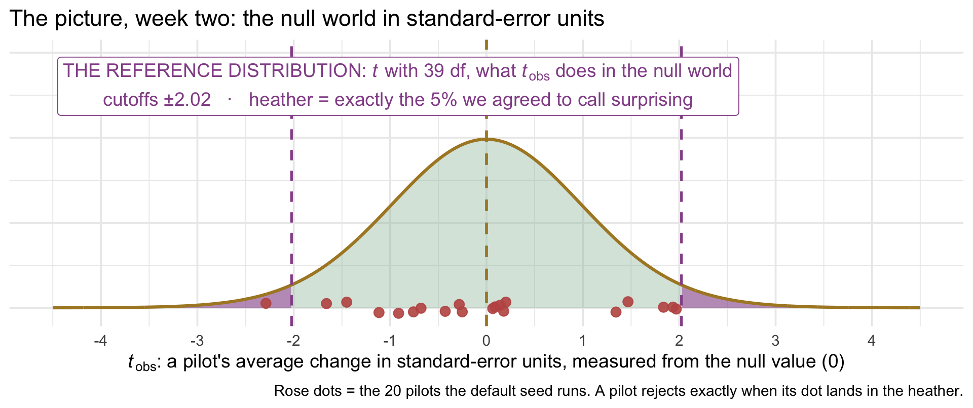
Why standardize? On the raw scale, a 40-person pilot’s average change wobbles about 0.16 benevolence points: the standard error \(\sigma / \sqrt{n}\), where \(\sigma\) = 1.0 is the SD of the change scores and \(n\) = 40. But each pilot has to estimate that wobble from its own 40 people, so every pilot’s standard error comes out a little different. Standardizing puts every pilot on one universal scale, where a single reference distribution serves them all. It’s the same count you made in One quantity appears in both: \(t_\text{obs}\) = 3.41 meant the rehearsed pilot sat 3.41 standard errors above zero. Two things to see:
The heather. Before any study ran, we fixed the rule: α = .05, so a pilot counts as surprising when p < .05. On this scale, that is the same rule stated as a distance: a \(t_\text{obs}\) beyond ±2.02, more than \(t^{\star}\) estimated standard errors from zero. (You met 2.02 once already today, as the interval’s multiplier; it is the same number doing the same job.) The cutoff ±2.02 is the critical value \(t^{\star}\), the region beyond it is the rejection region, and on this curve it holds exactly 5% by construction. A false positive is simply an honest study whose \(t_\text{obs}\) happened to land in the heather.
As a reminder from the Module, R finds the critical value with qt(), the t curve’s quantile function. Ask for the point with 97.5% of the curve below it, which leaves 2.5% in each tail:
The rose dots. These are the default seed’s 20 pilots. One sits in the heather: the one whose p fell below .05, and the one rose interval in the default seed’s picture. Your own rose intervals are your pilots whose \(t_\text{obs}\) landed out there.
Part 2 · A world with a real change: how often do pilots detect it?
In Part 1 the true average change was exactly zero, so every significant result was a false positive. Now switch worlds: the true average change is above zero, so there is a real change to find. Each of you runs four scenarios in that world, 100 pilots each. A pilot detects the change when it comes back with p < .05; otherwise it misses a change that is really there. The question is how often the pilots in each scenario detect it, and what makes the difference.
Four scenarios
| Scenario | Sample size | True average change in benevolence |
|---|---|---|
| A | n = 12 |
+0.2 points (planned standardized effect \(\Delta/\sigma\) = 0.2) |
| B | n = 80 |
+0.2 points (planned standardized effect \(\Delta/\sigma\) = 0.2) |
| C | n = 12 |
+0.8 points (planned standardized effect \(\Delta/\sigma\) = 0.8) |
| D | n = 80 |
+0.8 points (planned standardized effect \(\Delta/\sigma\) = 0.8) |
Because \(\sigma = 1\), the numerical change in points equals the standardized effect built into the simulation. The sample Cohen’s d you calculate Wednesday estimates that quantity. The half point the county plans for sits between the two.
You will run all four. The chunk below does it in one go and hands you a 2 × 2 table of your own.
Fill in the grid
First, check your two guesses against your own table. Then pool the room: for each scenario, average everyone’s share_detected (12 people × 100 pilots = 1,200 pilots per cell) and write the four percentages on the board. Your own four will wobble around these; the room’s average should land close:
| true change 0.2 (small) | true change 0.8 (large) | |
|---|---|---|
| n = 12 | ~10% | ~71% |
| n = 80 | ~42% | ~100% |
Those percentages have a name: power. Power is the share of studies that reject the null when the null is false: here, a pilot that reports the change (p < .05) in a world where the change is real. A pilot that fails to reject a real change is a false negative, a miss. (Part 3 gives a miss its formal name, a Type II error.) The next section shows where these percentages come from.
Three things to pull out of the grid:
- In scenario A, your 100 pilots studied a real effect and missed it roughly 90 times. Nothing was wrong with the effect. Nothing was wrong with the test. There just weren’t enough people.
- Scenario D probably never missed. Same test, same α — but under these planning assumptions its power is essentially 100%, so a single miss would be a genuine surprise.
- Compare A to B (same effect, more people) and A to C (same people, bigger effect). Both raise detection, and both are partly in your hands. Sample size is the lever you set most directly: decide on more people, and you get them, budget permitting. The effect is harder to move, but design can move it: a stronger or longer intervention, better adherence, or a population with more room to change. And a more reliable measure shrinks σ, which raises the signal-to-noise ratio the same way a bigger effect does.
The picture your four numbers live on
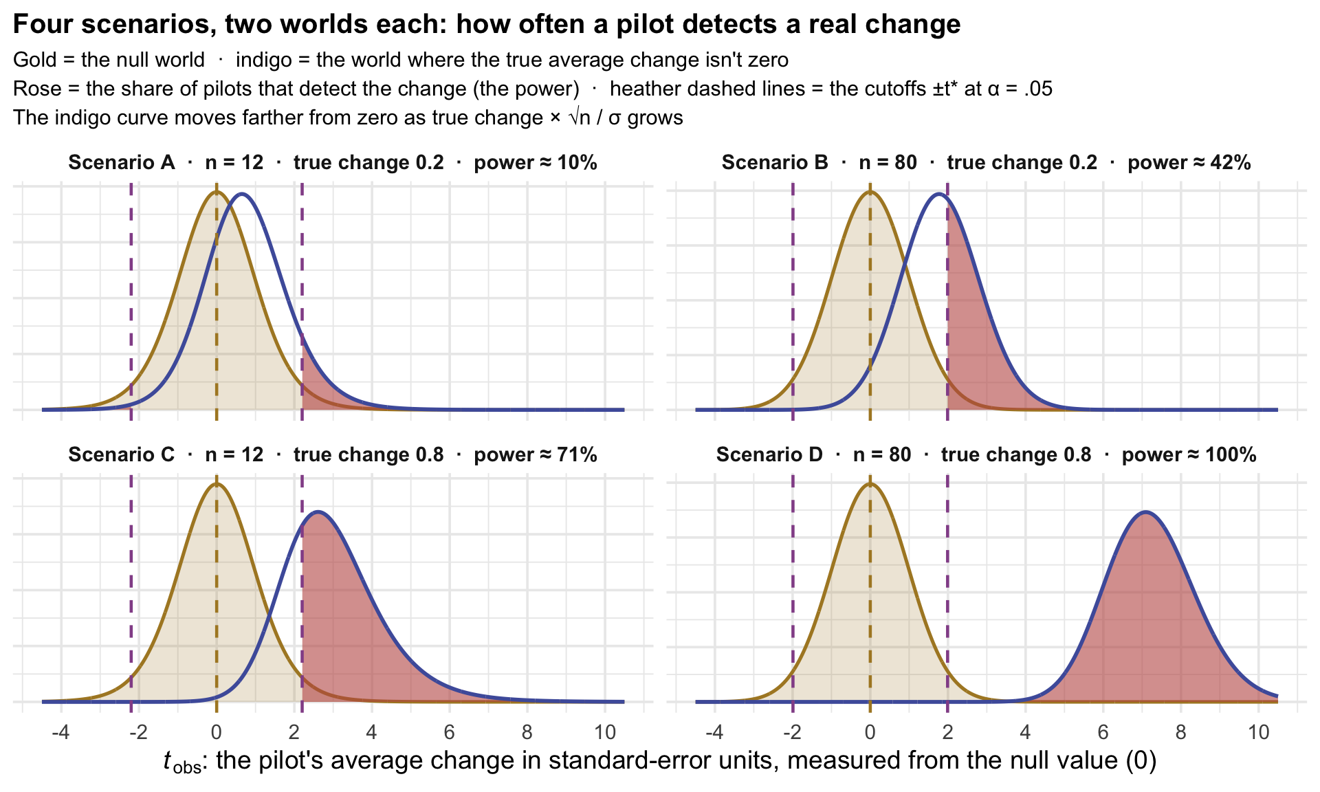
Here is Part 1’s reference distribution, the t distribution in standard-error units, drawn for each of your four cells, with a second curve added in indigo: what \(t_\text{obs}\) does in a world where the true average change is not zero. Call it the real-change curve. The heather cutoffs belong to the null curve. The rose is the share of the real-change curve that lands past them — the pilots that detect the change. That share is the power you just estimated in the grid, exactly.
Your grid has four points in it. Here is the whole curve they came from — power against sample size, for each true change — with your four cells marked.
Show the code that built this figure
# The curve comes from R's exact power formula, power.t.test(), so it is smooth. This course plans
# power by simulation; the Going-further box later in this lecture shows power.t.test() itself.
power_curve <- expand_grid(n = seq(5, 250, by = 5), true_change = c(0.2, 0.8)) |>
  mutate(
    power = map2_dbl(n, true_change, \(n, true_change)
               power.t.test(n = n, delta = true_change, sd = 1, sig.level = .05,
                            type = "one.sample", strict = TRUE)$power),   # strict: count both tails, like t.test()
    effect = factor(true_change, labels = c("0.2 (small)", "0.8 (large)"))
  )

our_cells <- tibble(n = c(12, 80, 12, 80), true_change = c(0.2, 0.2, 0.8, 0.8),
                    group = c("A", "B", "C", "D")) |>
  mutate(
    power = map2_dbl(n, true_change, \(n, true_change)
               power.t.test(n = n, delta = true_change, sd = 1, sig.level = .05,
                            type = "one.sample", strict = TRUE)$power),   # strict: count both tails, like t.test()
    effect = factor(true_change, labels = c("0.2 (small)", "0.8 (large)"))
  )

# The sample size where a small effect (0.2) first reaches 80% power
n_80_small <- ceiling(power.t.test(delta = 0.2, sd = 1, power = 0.80, sig.level = .05,
                                   type = "one.sample", strict = TRUE)$n)

power_curve |>
  ggplot(aes(x = n, y = power, color = effect)) +
  geom_hline(yintercept = 0.80, linetype = "dashed", color = "#C05852") +
  # A true change of exactly 0: power is flat at alpha, because every rejection is a false positive
  geom_hline(yintercept = 0.05, linetype = "dotted", color = "#6E7681", linewidth = 0.9) +
  annotate("text", x = 40, y = 0.05, label = "true change = 0: 5% still reject (the Type I rate)",
           hjust = 0, vjust = -0.6, color = "#6E7681", size = 3.5) +
  geom_vline(xintercept = n_80_small, linetype = "dotted", color = "#AD872B", linewidth = 0.9) +
  annotate("label", x = n_80_small, y = 0.62, label = paste0("small effect reaches 80%\nat n = ", n_80_small),
           color = "#AD872B", size = 3.5, fill = "white") +
  geom_line(linewidth = 1.1) +
  geom_point(data = our_cells, size = 4) +
  geom_text(data = our_cells, aes(label = group),
            vjust = -1.2, fontface = "bold", show.legend = FALSE) +
  scale_y_continuous(labels = scales::percent, breaks = seq(0, 1, by = 0.2),
                     limits = c(0, 1.1)) +   # headroom above 100% so scenario D's label shows
  scale_color_manual(values = c("#AD872B", "#348C9E")) +
  labs(
    title = "Where our four scenarios sit on the power curve",
    subtitle = "Rose dashed line = the 80% convention\nGold dotted line = where the small effect reaches it\nGray dotted line = a true change of 0, where 5% still reject",
    x = "Sample size", y = "Power", color = "True average change"
  ) +
  theme(legend.position = "bottom")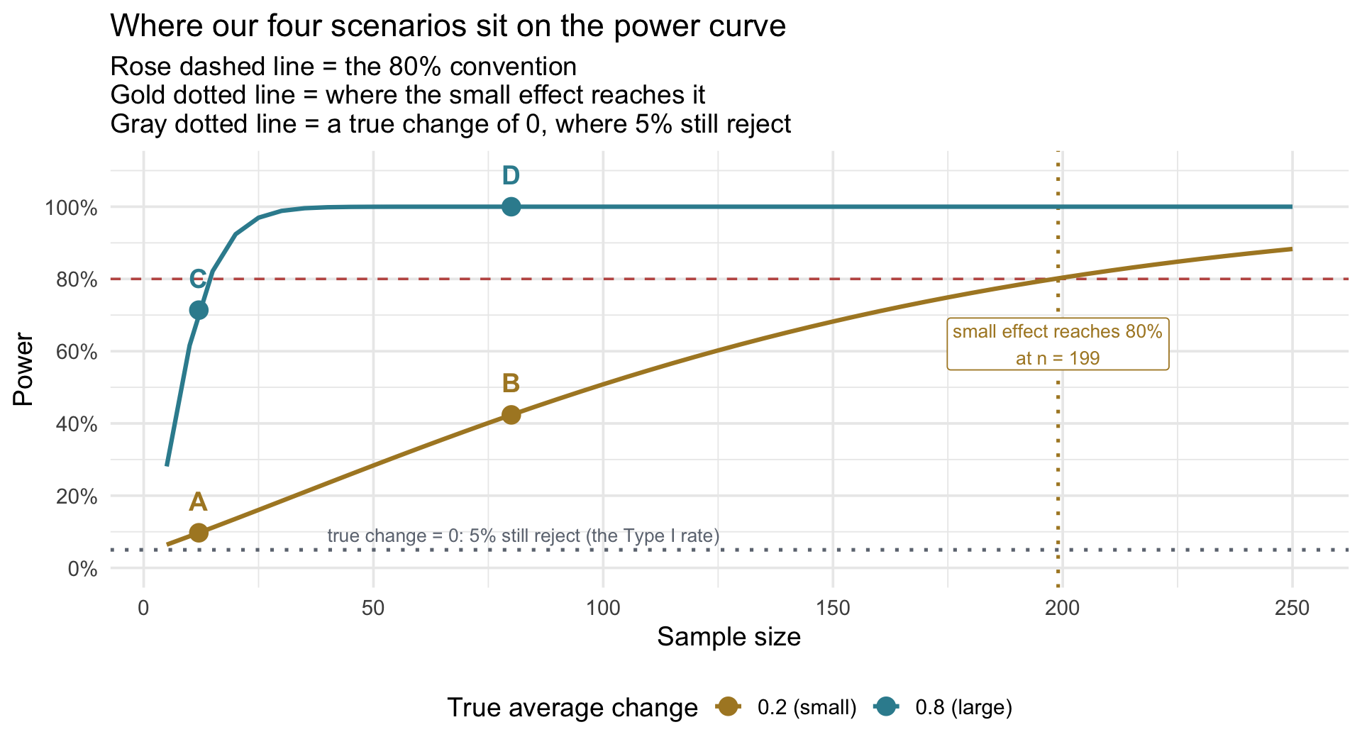
Two things the curve adds. Where the curves start. As the true effect shrinks toward zero, the share of studies that reject falls toward α: at exactly zero effect, 5% still reject — Part 1’s Type I rate, the gray dotted line. The small-effect curve starts just above that, about 6% at n = 5, because a true change of 0.2 is close to nothing for a study that small. And the gold curve climbs slowly: a small effect stays under 80% power at \(n = 100\) (about 51%), and first reaches 80% at about \(n\) = 199, roughly five times the county’s 40. To study a small effect properly you need a sample far bigger than most of us casually assume — a common reason otherwise well-designed studies fail to detect real effects.
Why 80%? It is a common planning convention: if the assumed effect is real, the study has a 4-in-5 chance of rejecting \(H_0\). Jacob Cohen popularized it (Cohen, 1988, Statistical Power Analysis for the Behavioral Sciences) as a working heuristic — it doesn’t follow mathematically from anything. Higher-stakes or hard-to-repeat studies often plan for 90% or more; the right target depends on what missing a real effect would cost and what the study can afford, which you’ll weigh for your own study in Part 4. Last week the county used this same bar for precision: it planned for 8 in 10 rehearsed surveys to produce an interval as narrow as the board’s target.
The two ways to be wrong, both now felt
- In Part 1 the null was true and we rejected it anyway — a Type I error, rate α, the price you set. On the picture: a null-world \(t_\text{obs}\) in the heather.
- In Part 2 the null was false and we failed to reject it — a Type II error, rate β. On the picture: a \(t_\text{obs}\) from the real-change curve that fell short of the cutoff. Its complement is power = 1 − β. The rose corresponds to the probability beyond the cutoffs — the power. Scenario A had little of it.
Notice the asymmetry in how you control them. You choose α outright. You buy power — with sample size, with better measurement, or by studying a bigger effect.
Scenario A is what underpowered research looks like from the inside: you run a real study of a real effect, get p = .31, and may be tempted to conclude there is nothing there, even though that conclusion is not warranted. A non-significant result means the study didn’t detect a change; it doesn’t show that no change exists.
Part 3 · The county’s power
Everything the room did today was one line of R, run twenty times. Here it is wrapped in a function, so you can point it at any world: today, the county’s; in Part 4, yours. It takes the study (n), the world (mu, sigma), the null value (mu0), and returns the share of imaginary studies that rejected \(H_0\). When the world has a real change, that share is the test’s power: the proportion of studies that would detect the change (come back with p < α), given that a change of that size really exists.
Starting point
You have the numbers from a study plan — a null value \(\mu_0\), an SD \(\sigma\), a plausible true average change \(\mu\) for the pilot group, and a feasible \(n\) — and you want two rates: how often a study in the null world rejects (Type I), and how often a study in the plan’s world rejects (power).
What the code does
Inside replicate(), each rehearsal draws n change scores from a Normal world with mean mu and SD sigma, runs a one-sample t-test against mu0, and returns TRUE if p fell below alpha. The function’s last line is the mean of those TRUE/FALSE values — the proportion of studies that rejected.
Set mu equal to mu0 and it reports the Type I rate; set mu to the average change your plan expects and it reports power.
Key functions
| Function | What it does |
|---|---|
| rnorm(n, mean, sd) | The world you don’t have, in one call — the same line as last Monday. |
| t.test(x, mu = mu0)$p.value | Runs the one-sample t-test and pulls out the p-value. |
| replicate(n_sims, { … }) | Runs the study n_sims times and stacks the results. |
| mean(rejected) | The proportion of TRUEs: the rejection rate. |
How to read output
The result is the power of the county’s 40-person before-and-after pilot, near 0.87.
See the power, not just the number. The function prints one share. Here are the 1,000 rehearsed pilots behind a share like it, shown the way M07’s precision picture showed which rehearsed surveys met the board’s target. Each pilot is drawn from the county’s plan, where the true average change is 0.5.
The rose bars are the pilots that detected the change; the gray bars missed a change that is really there. Try n <- 20 and then n <- 80: the histogram slides left or right, and the rose share falls or rises with it.
The same power, seen through intervals
Here’s another way to view the same concept. Fifty rehearsals of the pilot at each of five sample sizes, every one drawn from the plan’s world, where the true average change is 0.5. Each interval is for one pilot’s average change. It is rose if it excludes 0 — “no change” sits outside it — and gray if it still covers it.
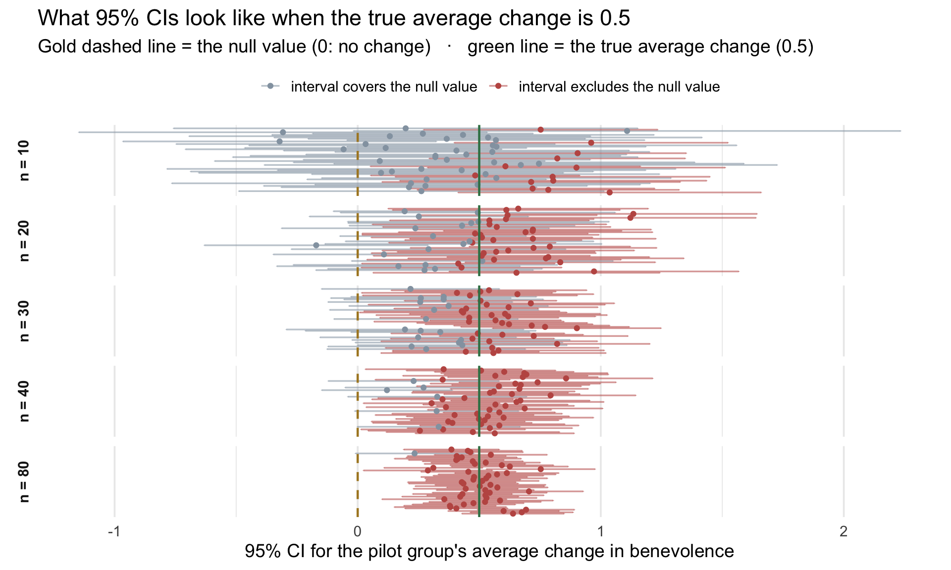
Power is the share of rose intervals in a panel. Count them at \(n = 40\): 44 of 50, or 88%, close to the share the function just printed from its 1,000 simulated pilots. At \(n = 10\) only a minority clear zero: 13 of 50, or 26%. Most intervals that wide cover both 0 and 0.5. At \(n = 80\) almost all clear it. Each panel shows only 50 rehearsed pilots, so its share bounces a few percentage points from one set of 50 to the next; the function’s 1,000 pilots give a steadier estimate. This is the bridge between last week and this one, and it is exact: for a two-sided test at α = .05, the 95% CI excludes \(\mu_0\) precisely when \(p < .05\). The interval and the test are one decision, written two ways. Last week you asked whether an interval caught the truth; this week you ask whether it rules out the null.
TipGoing further — a shortcut for simple designs:
power.t.test()
This course plans power by simulation, because simulation shows what power is and works for any design you can describe in code. For simple designs like the county’s pilot, base R also has a shortcut, power.t.test(). It computes the same share directly from the t distribution, with no simulated studies and so no run-to-run wobble.
- delta is the true average change in the outcome’s own units, and sd is the SD of the change scores.
type = "one.sample"matches the one-sample t-test on change scores.strict = TRUEcounts both tails, matching the two-sided t.test().- The first call returns a power of 0.869, close to the share simulate_study() printed. The second returns n = 198.15, which rounds up to 199: the dotted line in Part 2’s power curve.
Two cautions. First, the shortcut is only as good as its planning numbers, just like a simulation, and it also assumes the change scores follow a bell curve. A simulation can build in what real data do: skew, a 1-to-5 scale’s limits, dropouts. Second, a power calculation is not a precision calculation. Power asks how often a study will reject \(H_0\) when a specified real change is true; when solving for sample size, we set 80% as the planning target. Last week’s first-pass margin-of-error formula instead found the sample size where the typical interval met the width target. The county then went one step further and enlarged \(n\) until 8 in 10 rehearsed intervals met it. Use the tool that matches your question.
Four things that move power
Is 0.87 enough? If a design’s power comes back short, there are four things that move power, in rough order of how realistically a researcher can act on them:
- Sample size (\(n\)). Tunable but expensive: the standard error shrinks with \(1/\sqrt{n}\), so quadrupling \(n\) halves the standard error.
- Measurement and design precision (\(\sigma\)). A more reliable measure, or a design that removes irrelevant person-to-person variability (such as repeated measures), can shrink the standard error. The gain from repeated measures depends on how strongly the two measurements track each other — the M09 bonus activity meets a case where they barely do.
- Effect size. A more potent intervention or a more responsive sample. You cannot will a bigger effect, but you can sometimes design for one.
- α itself. Loosening it buys power at the price of more false positives — Part 4 asks what that price would be for your study.
Notice they are not equally yours to move: \(n\) is the one clean planning dial; \(\sigma\) and the effect you can influence only partly; and α is a promise you make in advance, not a knob to turn until a result appears.
Part 4 · Your pilot: the same steps, on your numbers
Everything since the warm-up ran on the county’s pilot. This part runs the same steps on yours, in the order the county did them. If we reach it in class, great; if not, work through it on your own before next Monday, because next Monday’s lecture builds on what you write here.
Step 1 · Your plan, in seven rows
Your study plan, section 2 · Your intervention and your numbers
Pull up the screenshot of your personal study plan from last week.
Its first section described your outcome in your population: a typical mean, an SD, a feasible \(n\). Today the plan gains a second section: these seven rows first, then five more below. They are the county’s seven rows from The skeptic’s question, for your own study. Only one of them needs a search; the rest you already have, choose, or let the chunk compute.
| Element | Where it comes from | Your value |
|---|---|---|
| Your intervention (one line) | you | |
| Where people start: the typical before score | copy from section 1 | |
| Your outcome’s SD at each time point | copy from section 1 | |
| The average change you expect after the intervention, \(\mu\) — and its source | look this one up: a published study of your intervention (or one like it), in your outcome’s units | |
| Your null value, \(\mu_0\) | for a before-and-after study, 0: no average change | |
| How closely before and after track each other, r | optional: leave it at .5 unless you found one (see the note) | |
| The SD of the change scores, \(\sigma\) | computed for you: Step 2’s chunk prints it. Write it down — next week’s trial uses it |
A note on r. r is how closely people keep their place from before to after: near 1, everyone stays in rank; near 0, where someone starts says little about where they end up. It matters because it sets how much the change scores spread, and that spread is what your power depends on. When the before and after scores have approximately the same SD, the formula simplifies to \(SD_D = SD\sqrt{2(1-r)}\). (In general, \(SD_D = \sqrt{SD_b^2 + SD_a^2 - 2r \, SD_b \, SD_a}\), where \(SD_b\) and \(SD_a\) are the before and after SDs.) At \(r\) = .5 the change scores spread exactly as much as the scores themselves. That is the county’s situation (REACH’s workbook arm: \(r\) = .47, change-score SD 1.04 against the outcome’s 1.04), which is why the county could plan with one SD. It is not a rule: at \(r\) = .8 the SD of the change scores is only about 0.63 times the outcome’s SD, and at \(r\) = .2 it is about 1.26 times as large, a big difference for power. Here is why: the test divides your pilot’s average change by its standard error, and that standard error is the SD of the change scores divided by \(\sqrt{n}\). A smaller SD of the change scores gives a smaller standard error, so the same average change produces a larger \(t_\text{obs}\), clears the cutoff more often, and the power goes up; a larger SD of the change scores does the reverse. If you can’t find an r, leave it at .5: a middle value, and the county’s own. If you can find one, a test–retest correlation from a comparable population and a similar time interval can be a rough planning stand-in; label it as an assumption. Step 2 prints the SD of change scores your SD and r imply, and lets you watch what r does to the picture.
Step 2 · Rehearse your pilot
The county’s chunk again, with your numbers at the top. This time it simulates each person’s before and after scores, so you can see your pilot the way the county’s appeared in its line graph. One rehearsed pilot, its picture, then the sampling distribution of 1,000 of them:
Now change my_r. Rerun the chunk with 0.8, then with 0.2, and watch the line graph. At 0.8 the lines run close to parallel: people keep roughly their place, so the change scores vary little, the interval narrows, and Step 3’s power rises. At 0.2 the lines cross every which way: where someone starts says little about where they end up, so the change scores vary a lot. Then set my_r back to the value you’ll plan with, and record the SD of the change scores it prints.
One caveat. This is a simple Normal planning model. If your outcome has hard limits (a 1–5 scale, a score that can’t go below 0), some simulated values may fall outside them; treat the rehearsal as an approximation unless you explicitly build those limits into the data-generating model.
Check your one pilot against the skeptic, as the county did: is your null value inside your rehearsed pilot’s 95% interval? If it isn’t, this one pilot already gives evidence against “no change.” Step 3 asks how often a pilot like yours would.
Step 3 · Your Type I rate and your power
Part 3’s function, pointed at your world. Run it twice: once in the null world, once in your plan’s world.
Your Type I rate should sit near 0.05. If your power came back below 0.80, Part 3’s four things that move power are what you have to work with. Write down which one you would act on. To find the n for 80% power, raise my_pilot_n in Step 2’s chunk, run it, and run this chunk again until your power clears 0.80. For a quick cross-check on a simple design like this one, the folded Going further box in Part 3 shows a shortcut, power.t.test(), which should land close to your simulated answer.
Step 4 · Your α, and the rule
α is a decision, and it’s yours. We’ve been writing α = .05 all week as if it were a fixed rule. It isn’t: .05 is a convention, not a law of nature. α is your pre-specified tolerance for a Type I error. Holding the design fixed, lowering α makes false positives rarer, but it pushes the cutoffs outward, so you lose power. So the right α depends on what each mistake would cost, and that depends on what you study. A cheap, low-risk school program, where a significant result would only trigger a larger follow-up trial, might reasonably accept a higher α. A pivotal trial for a treatment with serious side effects would want a lower one.
Answer three questions for your study:
- If you got a false positive, and you publish it and it isn’t real, what does that cost? Who’s affected?
- If you got a false negative, and the effect is real but you miss it, what does that cost?
- Which would you rather risk? Does .05 sit in the right place for you?
Your study plan, section 2 · Write the rule before you look
Here’s the habit that makes all of this honest, and it takes thirty seconds. Before you see your data, write the rule down. Then follow it. Fill in the last five rows of section 2:
| Element | Your value |
|---|---|
| α — and one sentence on why that level, given what each error costs you | |
| The decision rule | |
| What I will do with either answer — reject and fail to reject | |
| Type I rate and power at my n — from the two runs above | |
The approximate n for 80% power — if your feasible n fell short, raise my_pilot_n as Step 3 describes until the second share clears 0.80 (with 1,000 simulations the Monte Carlo SE is about .013 near 80% power, so repeated runs can differ by a few percentage points; treat the resulting n as approximate) |
Why it matters: once you’ve seen the data, every choice is shaped by knowing what would help. Dropping two outliers, switching to one-tailed “because the direction was predicted,” collecting twenty more participants because p = .07 — each can be defensible when it is specified in advance, for a principled reason. Made after seeing which choice helps, they become researcher degrees of freedom, and they compound: in one well-known simulation, combining four such flexible choices raised the false-positive rate from 5% to about 61% (Simmons, Nelson, & Simonsohn, 2011).
You’ll do this formally in Project 2, where reproduction-plan.md asks you to write down your analysis plan before you run the target test. That file is what lets your result mean what you say it means — and it’s a habit that will serve your own research well.
Once both of today’s tables are filled in (this one and the seven rows at the start of Part 4), take a screenshot of them and save it with last week’s. We’ll use all of it next Monday.
Wrapping up
The question the pilot cannot answer
Suppose the county’s pilot comes back with an average change near 0.5 and p < .05. The board’s next question writes itself: did the workbook do that? The test cannot say. It says the pilot group’s average benevolence changed — not why. Measuring the same people twice removes stable person-to-person starting differences from each change score. But it cannot tell us what these same people would have done over those two weeks without the workbook. Improvement can happen with no treatment at all: among the REACH trial’s waitlist completers, benevolence rose 0.06 points over the same two weeks. And if people are especially likely to enroll when a hurt feels unusually raw, regression to the mean can add apparent improvement of its own. So the pilot provides evidence against \(H_0: \mu_D = 0\); what we actually need is the change that would have happened anyway. Where could we get it? From a comparison group, measured over the same two weeks, with chance deciding who gets the workbook. Next Monday the county plans that trial.