Two Groups, One Logic
Lecture · Module 9 · Mon Oct 12
How today works
Two lectures ago the county’s team asked whether forgiveness is low here and planned a survey to find out. Last week it rehearsed a before-and-after pilot and wrote its decision rule. Today opens with the question the pilot cannot answer — and the real number that proves it can’t — and then the team plans the study that can. Last week’s pilot compared people with themselves. Today the comparison is a second group, measured alongside the first — and it wobbles too.
Today’s class, in order:
- The pilot looked great — until the waitlist showed up. The reveal that makes today necessary.
- Two wobbles — the room draws two groups from one no-effect world and finds out what a difference does.
- The room shuffles — rehearse the county’s trial on REACH’s real change scores, 40 per arm; build the null world by dealing the labels out at random; then meet the same verdict through Welch’s t.
- The county’s trial — last week’s simulation function gains a second group, and you find out what a comparison group costs in participants.
- Beyond two groups — six sites, a yes/no outcome: the same three steps, a new statistic.
- Your study — your own comparison group, then your design in six sentences. If we run out of time, this part is yours to finish before next Monday.
The pilot looked great — until the waitlist showed up
Last Monday’s rehearsed pilot came back the way the team hoped: 40 adults, two weeks of workbook, an average change of +0.54 points, 95% CI [0.22, 0.86] — zero nowhere in it, p < .05.
Vote
Does the workbook work? Thumbs up, thumbs down, or thumbs sideways for “something’s missing.” Hold your vote up and look around before anyone speaks.
Here is the number the pilot cannot see. REACH also followed 2,057 people who spent those same two weeks on a waitlist and completed follow-up — measured twice, exactly like the pilot group, but with no workbook at all. Their benevolence also changed: by +0.06 points on average.
The sentence of the day
Change is not an intervention effect. An intervention effect is the change beyond what would have happened anyway.
Here the waitlist barely moved, so the subtraction barely mattered — this time, over two weeks. But nothing guaranteed that, and you only know +0.06 because the trial measured a group that waited. If people enroll when a hurt feels unusually raw, regression to the mean can add apparent improvement on its own; other things change over the same weeks too, and a second sitting with the same questionnaire is not quite the first. In a longer study or a different population, that natural change could be far larger than 0.06 — and a pilot with no comparison group can never tell the workbook from it. No statistic computed on one group’s change can split them apart. What splits them is a second group, measured over the same weeks with the same instrument, where chance decides who waits. Today the county plans that trial.
Recap · where we are
Three things from the Module and pre-study, before we start:
- The question comes before the test. Four questions about the design — outcome type, how many groups, independent or paired, which parameter — and the decision map hands you the test. That choice is yours to make; the software will run whatever test you ask it for.
- Two groups, one fraction. \(t_\text{obs}\) is the observed gap between two means divided by the standard error of that gap, \(SE_\text{diff}\). You built both pieces by hand on the Hofman data.
- Three readings, one decision. Statistic against \(t^\star\), p against α, interval against zero. They agree by construction, so if they ever seem to disagree, that’s a helpful signal that something in the setup is mismatched — worth tracking down before you report.
- And from last Monday. Estimation asks where is the truth?; testing asks could it be this one? The test standardizes the estimate into \(t_\text{obs}\), its distance from the null value in standard-error units, and compares it with the critical value \(t^\star\); the rejection region beyond it holds α. Power is the share of studies that detect a real change of a given size.
And the bridge from the opening. The outcome stays what it was last week — each person’s change, after minus before. What’s new is that the trial measures that change in two groups: workbook now, or waitlist, with chance deciding. The waitlist’s average change is also a sample mean, so it wobbles too. Two wobbles instead of one. Everything today follows from that.
The planning numbers come from the trial that has done this already. In REACH, the waitlist’s average change was +0.06 (SD 0.81) and the workbook arm’s was +0.55 (SD 1.04). The team plans with tidy versions: a waitlist change of 0, a workbook change of 0.5, and an SD of change of 1.0 — so the effect the trial is powered for is δ = 0.50, the gap between the two changes. (File away that the two arms’ SDs differ, 1.04 against 0.81; it comes back when we run the test.)
The county’s plan for the trial
Your study plan has two sections so far: where people start (a typical mean, σ, n), and a before-and-after pilot (an intervention, your null value, the change you expect, the SD of the change scores, α, your decision rule, and your power). Today it gains a third, a comparison group, which you’ll fill in during Part 5.
The county’s plan for the trial: waitlist change 0, workbook change 0.5, SD of change 1.0 — all anchored in REACH’s two arms — and, new today, 40 people per arm, because that is what the budget covers.
Part 1 · Two wobbles
Here is a null world we don’t have to build at all, because it already exists in the trial’s own data. Take only REACH’s waitlisted participants who completed follow-up — 2,057 adults, measured twice, and none of them ever saw the workbook, so whatever their changes are, the workbook had nothing to do with any of them. Draw 80, deal the first 40 to a group you call “workbook” and the rest to “waitlist,” and the true difference between your two groups is zero by construction — the labels are just names.
Collect the room
Call out your difference — sign and all. One number per person goes into the chunk below. Every dot is one two-group study of a world where the labels mean nothing.
Across repeated studies, these differences should have an SD of about 0.18 — wider than one mean’s 0.13 by a factor of \(\sqrt{2}\). With only a dozen room draws, our observed spread may land somewhat above or below that, so compare the two numbers the chunk just printed. (The waitlist’s real changes have an SD of 0.81, a touch under the plan’s 1.0, so these numbers run a touch under the plan’s too.) That is the pre-study’s formula doing exactly what it says:
\[SE_\text{diff} = \sigma\sqrt{\frac{1}{n_1} + \frac{1}{n_2}} = \sqrt{SE_1^2 + SE_2^2}\]
For independent groups, variances add. A difference carries the wobble of both independent means it was built from. You cannot subtract away uncertainty; subtracting two uncertain numbers gives you a number that is more uncertain than either. Hold onto that — it is why a comparison group is expensive, which Part 3 puts a number on.
The picture, week three
Two populations now, and the thing we care about lives on a new axis: the difference.
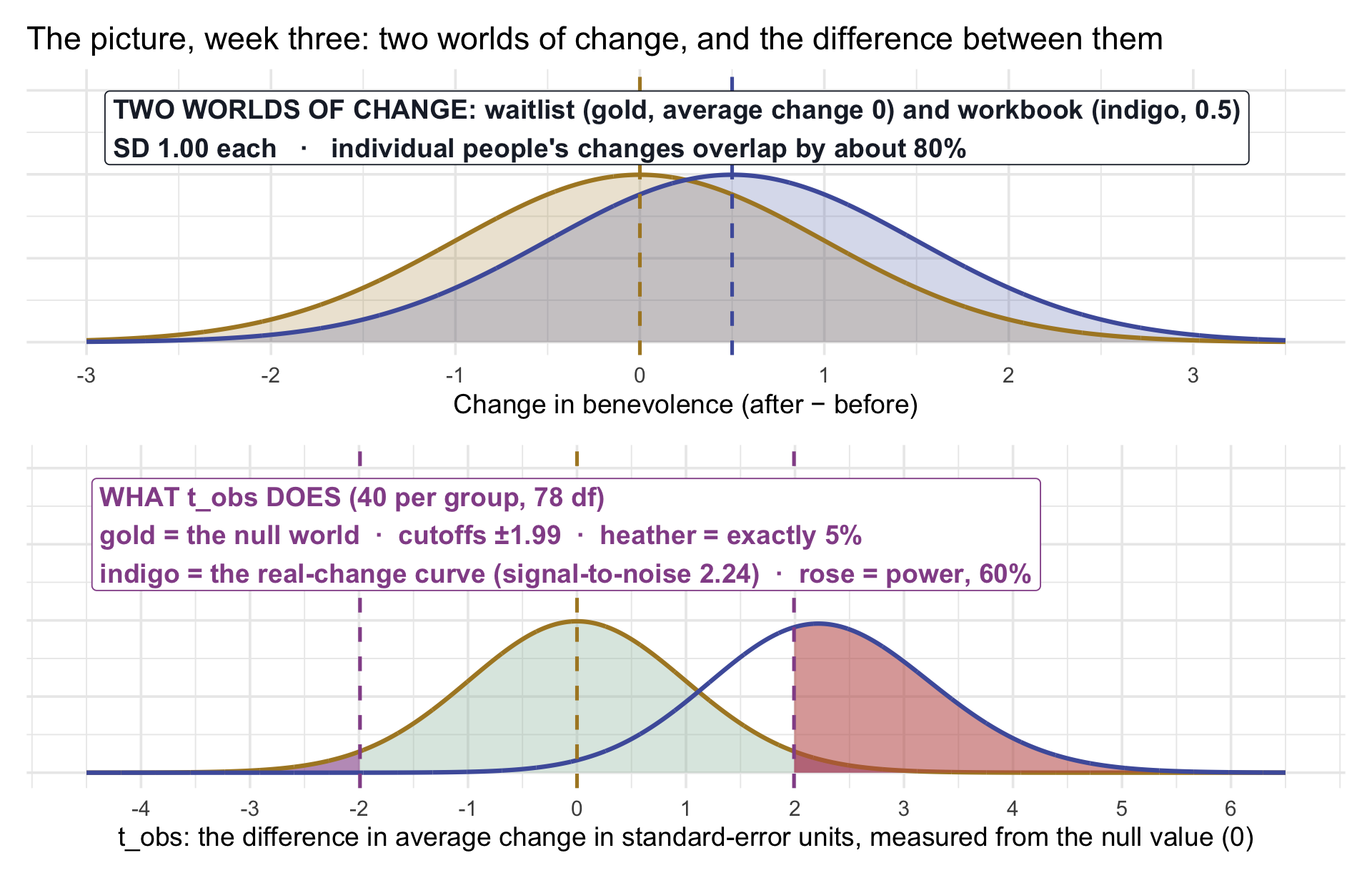
Read it top to bottom, and notice the axes are different. The top panel is people: two worlds of change half a point apart, whose members overlap by about 80% — plenty of waitlisted people will out-change workbook people. The bottom panel is differences in average change: what the room just made. The bottom panel uses last week’s reference distribution in standard-error units: \(t_\text{obs}\) is the difference in average change, counted in its own estimated standard errors (about 0.22 points each at the plan’s numbers). The gold curve is the null world’s t curve; the heather beyond ±1.99 holds exactly 5%. The indigo curve is last week’s real-change curve: the signal-to-noise quantity, δ divided by \(SE_\text{diff}\) (about 2.24), pushes it away from zero. Only about 60% of it clears the cutoff. Last week the same 40 people gave 87% against a null value that never wobbled. The comparison group adds a second source of wobble: the difference has a larger SE than one group’s average change, so the signal-to-noise quantity is smaller and the real-change curve sits closer to zero. (For planning we use the tidy equal-SD world the county specified — σ = 1 in each arm — which gives this exact noncentral-t picture. The real trial’s arm spreads differ, so when data arrive we analyze them with Welch.)
Part 2 · The room shuffles
Now rehearse the county’s trial. Instead of manufacturing it, borrow the real thing: REACH holds 3,965 completers’ change scores, in both arms, and a random 40 from each arm is a useful empirical rehearsal of the data the county might see if its arms’ changes resembled REACH’s. Draw your trial.
See what the trial estimates. Each thin line below is one person in your trial: their benevolence before the two weeks and after. The thick line is each arm’s average. The trial’s question is about the two thick lines: how much more did the workbook arm’s average change than the waitlist arm’s? That difference in average change is the quantity the trial estimates.
Your observed difference, and the test the Module runs on it:
Report two things
Your difference, and whether your p_value is below .05. Keep both — we come back to them.
Build the null world by hand
You already own the null world. It is your own 80 people with the labels dealt out at random: if the workbook changed nobody’s outcome, then which 40 got called “Treatment” is an accident of the random assignment, and every other way of dealing the labels was just as likely. So deal them again. And again.
Collect the room
Call out that last number — how many of your 20 shuffles beat your real difference. Most of you will say 0 or 1. A few will say 4, 6, 9.
Twenty shuffles are enough to feel the null world, but far too few to estimate a precise p-value. So now run 1,000 shuffles of your own study; the instructor projects one. Everyone’s histogram will look a little different, because everyone’s 80 people are different, so judge your difference against your own shuffles only.
Your permutation p is in the subtitle. Now look back at the p_value you reported from t_test() and count the hands that were below .05: roughly two in three of you rejected — and the rest ran a real effect, a real half-point gap in the trial’s own data, and missed it. That is Group A from last week, and it is the county’s budget talking. The plan’s picture put power at about 60%; drawing from the real changes lands a little higher, near 67%, because the waitlist’s changes wobble less than the plan’s σ = 1 assumed. Either way, at 40 per arm roughly a third of honest studies miss. Nothing was wrong with those studies. There just weren’t enough people to see past two wobbles. And a p above .05 in one of those studies doesn’t show that the workbook does nothing; the study simply didn’t detect a change that was really there.
From the shuffle to Welch’s t
What you just did by hand has a name — a permutation test — and it is one honest way to finish the analysis. The other is the model-based route the Module runs and Wednesday’s lab reproduces: compare your standardized difference with a t reference distribution. Scroll back to the t_test() output you printed when you drew your trial, and read it in the Module’s order: estimate (your difference in average change, in points), lower_ci/upper_ci (the interval around it — zero in or out?), statistic (\(t_\text{obs}\): that difference in SE units), p_value.
Set the two p’s beside each other: your permutation p from the 1,000 shuffles, and the p_value from the t curve. They are two closely related routes to inference, but they are not identical tests. The shuffle uses the randomized design itself and asks what assignment alone could produce under the sharp claim that the workbook changed nobody’s outcome. Welch’s t uses a model-based reference distribution to ask whether the two population mean changes are equal, while letting their spreads differ. In this example they usually point the same way, but they need not give identical p-values. That is the difference between design-based and model-based inference.
And look at your two SD columns. In most draws the waitlist arm’s changes spread visibly less than the workbook arm’s — across all REACH completers, 0.81 against 1.04. With spreads that differ noticeably, there is no reason to impose a common variance, and t_test()’s default — Welch’s version — doesn’t: it lets each arm keep its own spread and blends the degrees of freedom (that is the fractional t_df in your output). The Module’s Test 1 shows Welch beside the standard version; the guidance is the one from Friday — Welch’s version gives up very little when the spreads happen to match and protects you when they don’t, which makes it a sensible default.
Two routes to one question
The shuffle needed no formula and no curve — only the design: if the workbook changed nobody’s outcome, the labels are arbitrary, so deal them again. Randomization doesn’t just license the causal comparison; it also hands you a reference distribution built from the design itself. The t curve is the model-based route, and it asks a slightly different question: are the two population means equal? When the two routes disagree badly, look into why before trusting either one; here they agree directionally: both provide evidence against their respective nulls — no effect for anyone, and equal mean changes.
Part 3 · The county’s trial: what a comparison group costs
Here is last week’s simulate_study(), with one line added. Two rnorm() calls now, one per group, and the test compares them to each other instead of to zero change. Today it runs on the county’s trial; in Part 5, on yours.
Starting point
Your study plan now names two worlds of change — a comparison group whose average change is mu_control and an intervention group whose average change is mu_treat, sharing an SD of change sigma — and you want the power of a trial that measures n_per_group people in each.
What the code does
Inside replicate(), each rehearsal draws two samples with rnorm(), runs a two-sample t-test between them, and returns TRUE if p fell below alpha. The mean of those TRUE/FALSE values is the share of rehearsals that rejected: power.
Set mu_treat equal to mu_control and the same function reports the Type I rate, exactly as last week’s did.
Key functions
| Function | What it does |
|---|---|
| rnorm(n_per_group, mean, sd) × 2 | Two manufactured groups — the second line is the only thing new this week. |
| t.test(treat, control)$p.value | Welch’s two-sample t-test (R’s default; the Module’s Test 1 shows it beside the standard version), with the p-value pulled out. |
| replicate(n_sims, { … }) | Runs the study n_sims times and stacks the results. |
| mean(rejected) | The proportion of TRUEs: the power. |
How to read output
Two numbers. The first is the power of the county’s trial at 40 per arm, near 0.60. The second is near 0.80 — 64 per group is roughly where the county’s trial reaches the 80% convention.
See the power, not just the number. The function prints one share. Here are the 1,000 rehearsed trials behind a share like it, shown the way M07’s precision picture showed which rehearsed surveys met the board’s target. Each trial is drawn from the county’s plan, where the workbook really does change people more.
The rose bars are the trials that detected the change; the grey bars missed a change that is really there. Change n_per_group to 64 and run it again: the whole histogram moves to the right, and about 8 in 10 trials turn rose.
What the comparison group costs
Same effect, same σ, same α. Only the design changed.
| Design | Power at n = 40 | n for 80% power | People measured |
|---|---|---|---|
| One group’s change against zero (last week’s pilot) | 0.87 | 34 | 34 |
| Two groups compared with each other (today) | 0.60 | 64 per group | 128 |
Under these planning assumptions, answering the two-group question takes nearly four times as many participants as detecting a 0.5-point change from zero in one group: twice as many per group, because the difference carries two wobbles, and then two groups. What those extra participants give you is the thing last week’s pilot could not — a comparison measured the same way, at the same time, on the same kind of people, with chance deciding who got the workbook. That randomized comparison is what gives the board a basis for a causal claim about the average difference.
Power for a two-group trial, at a glance
Your own study may well have this shape: two groups, a continuous outcome, a comparison of means. Here is the planning picture for that design, a worked example you can read your own study off. Each curve shows the power of a two-sided two-sample t-test at α = .05 for one standardized effect size, Cohen’s d: the true difference between the two groups’ means divided by the SD within each group. For the county, that is δ = 0.50 divided by σ = 1.0, so d = 0.50.
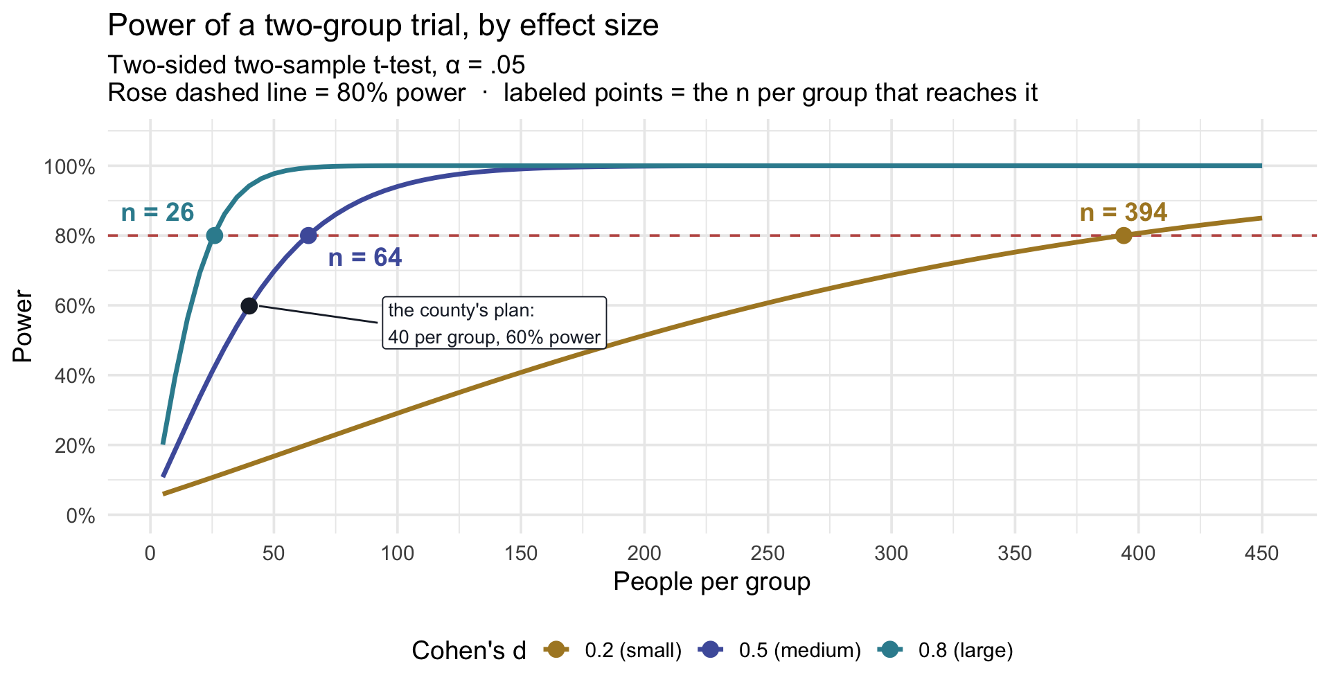
Read it the way you read last week’s power curve. A large effect (d = 0.8) reaches 80% power with about 26 people per group. A medium effect (d = 0.5), the county’s, needs 64 per group, and the county’s planned 40 per group sits at about 60%. A small effect (d = 0.2) needs about 394 per group, 788 people in all. Two things to carry into your own planning: the n on this axis is per group, so double it for the total; and a modest drop in the effect you expect raises the n a lot, so choose a realistic d. If your expected effect comes from one small published study, plan for a somewhat smaller one.
TipGoing further — draw this curve for your own study with
power.t.test()
The curves above come from base R’s power.t.test(), the shortcut from last week’s Going-further box, which computes power directly instead of by simulation. For a two-group design like this one it agrees closely with simulate_two_groups(). Set my_d to the effect sizes you want to compare and run it:
- delta is the true difference between the groups’ means, and sd is the SD within each group. Setting
sd = 1makesdeltaa Cohen’s d; to work in your outcome’s own units instead, use your planned difference and your SD. type = "two.sample"is the two-group design, and n is the number per group.strict = TRUEcounts both tails, matching a two-sided test.- Like a simulation, it is only as good as its planning numbers, and it assumes roughly Normal outcomes with equal SDs in the two groups. When your design differs (unequal spreads, clustering, dropouts), simulate it instead.
Part 4 · Beyond two groups: other designs, same logic
Everything so far compared two means. The Module covers more designs, and the decision map’s four questions tell you which test fits: what outcome, how many groups, independent or paired, which parameter? Change an answer, and the statistic changes — but the three steps stay the same. Two quick what-ifs, on the whole trial.
What if there were six groups?
REACH ran at six sites. Did people’s benevolence change by the same amount, on average, at all six? Six groups, so the gap-over-SE fraction no longer fits: there is no single gap. ANOVA’s statistic, \(F\), is still a ratio of signal to noise — how far the six sites’ average changes spread apart, relative to how much people’s changes spread within each site.
\(F_\text{obs}\) is about 4.3 on 5 and 3,959 degrees of freedom; the cutoff \(F^\star\) at α = .05 is about 2.22. Under \(H_0\), \(F\) averages about 1 — Friday’s Activity 4.1 built that fraction by hand — and this one sits well past the cutoff. The sites’ average changes differ. Which sites differ, \(F\) cannot say; that is the omnibus caveat, and the Module’s Test 2 shows the follow-up.
What if the outcome were yes-or-no?
Suppose the question were not how much did people change but did the person end up forgiving — a follow-up benevolence score of 4 or more. Now the outcome is categorical, and the parameter is a proportion in each arm. The statistic becomes \(\chi^2\): observed counts against the counts independence predicts.
28% of the waitlist arm crossed the line; 47% of the workbook arm did. \(\chi^2_\text{obs}\) ≈ 152 on 1 df, against a cutoff of 3.84. The same three steps: a statistic, the world where the arm makes no difference, and how far out ours falls. (And a caution the Module repeats: cutting a continuous score in two throws information away. We did it here to show how the test works, not to recommend splitting the score.)
One logic, several statistics
| The design question changes to … | The statistic becomes … | The null world is built from … |
|---|---|---|
| two independent groups | \(t_\text{obs}\) — a gap over its SE | randomized labels under a sharp no-effect null, or a t curve for a zero mean difference |
| three or more groups | \(F_\text{obs}\) — between-group spread over within-group spread | the F curve |
| two categorical variables | \(\chi^2_\text{obs}\) — observed counts against expected | the \(\chi^2\) curve |
| a continuous predictor | a slope — next Monday, M10 | the t curve again |
Every row is: pick a statistic, build the world where the null hypothesis is true, and ask how far out yours falls. The Module carries each test in full — assumptions, effect size, APA sentence, scope. Today’s job was the picture behind all of them.
Part 5 · Your study: a comparison group, and your design in six sentences
Everything since the opening ran on the county’s trial. This part gives your study a comparison group, then turns your three-section study plan into six sentences. If we reach it in class, great; if not, finish it on your own before next Monday. If you didn’t finish last week’s self-paced Part 4 (Your pilot), do that first: this part builds on its section 2.
Step 1 · Your comparison group, rehearsed
Part 3’s function, pointed at your study. Enter your numbers and run it:
To find the n per group for 80% power, raise my_n_per_group and run the chunk again until the share clears 0.80. For a quick check, find your Cohen’s d (your δ divided by your SD of change) on Part 3’s power curve.
Your study plan, section 3 · Your comparison group
Use the numbers you just ran. Fill in the new rows — and notice what the second one does to your δ:
| Element | Your value |
|---|---|
| The comparison group — who they are, and what they get (waitlist, usual care, an active control) | |
| The change you expect in the COMPARISON group — drift, regression to the mean, practice | |
| The effect your trial is powered for: δ = your change − theirs — the difference between the two expected changes; for the county it is smaller than last week’s workbook-arm change | |
| Power at your feasible n per group | |
| The approximate n per group for 80% power — and whether you can afford it (with 1,000 simulations the Monte Carlo SE is about .013 near 80% power, so repeated runs can differ by a few percentage points; treat the resulting n as approximate) |
If you cannot afford it, last week’s four things that move power are what you have to work with. And notice the design is already helping: each arm is measured before and after, so the outcome is a change score. The M09 bonus activity shows when that within-person step helps and when it doesn’t.
Step 2 · Your design in six sentences
Your study plan now has three sections, and together they describe a design. Turn the plan into six sentences a colleague could act on.
Six sentences
Six sentences, in this order. Use the numbers in your study plan.
- The outcome, in its units, and the scale it lives on.
- The comparison and assignment — who is compared with whom (one group before and after, or two groups measured alongside each other), whether observations are independent or paired, and, for a causal trial, how participants are assigned to conditions.
- The world — the change you expect in each group, the SD of change, and where each number came from.
- The sample — n (per group), and the power that n gives you against the effect you expect.
- The rule — α, two-sided or not, and what you will do with each of the two possible answers.
- Which of the four things that move power you would act on if the reviewer says the sample is too small.
Talk your partner through your six sentences and check one thing: could they reconstruct your statistical design and analysis plan from those six sentences alone? If not, the missing sentence is the one to fix before you leave.
Wrapping up
Three lectures, one picture
- One variable, two spreads (M07). People vary by σ; means vary by σ/√n. Every question in this arc was about the narrow curve.
- The null world and its cutoffs (M08). Build the world where the population’s true average change equals the null value, agree in advance what counts as surprising, and count how often that world fools you. Then build a world with a real change and count how often a study detects it: its power.
- Two wobbles (today). A comparison group is a second measured mean, and the estimand becomes the difference between the two groups’ average changes — the change beyond what would have happened anyway. Its wobble adds to yours, the difference lives on its own axis, and the null world can be built from your own data by shuffling the labels. A comparison group costs more participants; in return, it gives an estimate of the missing counterfactual mean.
- The simulation. Two numbers build a world with rnorm(); a test judges it; replicate() runs it a thousand times. Add a line for each group. That one skeleton rehearsed every study plan in this room.
And the three questions in one table — notice what stays fixed:
| The estimand | The question | |
|---|---|---|
| M07 | \(\mu\) | Where do people start? |
| M08 | \(\mu_D\) | Did they change? |
| M09 | \(\mu_{D,\text{workbook}} - \mu_{D,\text{waitlist}}\) | Did they change more than they would have anyway? |
For the mean questions that carried M07–M09, the same skeleton kept returning:
\[\frac{\text{estimate} - \text{null value}}{SE}\]
The tests in Part 4 use different statistics — F and \(\chi^2\) — but the deeper logic stays the same: define the null world, measure how far the observed data depart from it, and judge that departure against the right reference distribution. You have not learned three unrelated procedures; you have learned one way of reasoning, pointed at increasingly ambitious questions. In M10, the estimate-over-SE skeleton returns as the t-test on a regression slope.
What’s next.
The county’s story ends here — for now. In Part 3 of the course you will analyze the real REACH trial, the study whose numbers the team borrowed all along.
Wednesday’s lab is a computational reproduction: Zhang et al.’s illusion-of-predictability study, with the two-sample Welch’s t you just ran — rebuilt end to end on a published paper’s own data, an estimation plot beside it, and your numbers checked against the printed ones.
Friday’s pre-study opens M10. The two-group comparison you made today becomes a slope — the difference between two group means, written as the rise of a line — and the t statistic on that slope is the one you already know. From there the predictor can be continuous, and the separate tests become one model.
Footnotes
For teaching we use the change scores of the 3,965 participants who completed follow-up, out of the 4,598 in the trial’s analytic sample. (The authors kept everyone, using an intention-to-treat analysis with multiple imputation.) A real trial’s analysis also has to handle missing follow-up and its prespecified primary estimand, because analyzing only completers can weaken the protection randomization provides.↩︎