library(tidyverse) # ggplot2, dplyr, tidyr, readr — plotting and wrangling
library(here)      # robust file paths for loading the data
library(scales)    # axis-label formatting (label_dollar(), label_percent())
library(patchwork) # place two ggplots side by sideData Visualization
Learning Objectives
By the end of this Module, you should be able to:
- Explain what visualization is for — exploratory data analysis, model checking, and communication of findings — and why plotting comes before summarizing
- Decompose a figure into the components of the Grammar of Graphics, and recognize which of them a published chart is using
- Build a plot from the three required pieces — data, an aes() mapping, and a geometry — and read the three equivalent syntactic forms you’ll meet in published code
- Distinguish variable mappings from fixed settings — anything driven by data goes inside aes(); anything constant goes in the geom
- Choose a chart that matches the question — distributions of one variable, comparisons across groups, relationships between two variables, and change over time
- Apply scales, trend lines, and facets when they clarify a research question — including scale_x_log10() for variables spanning orders of magnitude, geom_smooth() for a fitted trend, and facet_wrap() for small multiples
- Evaluate a figure for accuracy, readability, and purpose, using Wilke’s ugly / bad / wrong taxonomy to separate aesthetic problems from perceptual ones from mathematical ones
- Polish, save, and debug a plot — titles that state the takeaway, deliberate color, ggsave(), and the handful of errors that break most beginner ggplot code
Overview
In one of his best-known data presentations, Hans Rosling used a simple but powerful visualization to show how countries changed over time in wealth, health, and population. The chart mapped gross domestic product (GDP) per capita to the x-axis, life expectancy to the y-axis, population to bubble size, and world region to color, then animated those patterns across years. As time moved forward, the display made a complex historical pattern visible: many countries moved toward longer life expectancy and higher income, but they did so at different speeds, from different starting points, and with important regional variation.
The value of the visualization was not that it replaced statistical analysis. It was that it made the structure of the data easier to see.
This is the central role of data visualization in applied research. A dataset can be complete in spreadsheet form — rows, columns, values, labels — and still be effectively invisible to inspection. A well-designed plot makes that structure visible: it reveals clusters, gaps, trends, outliers, the shape of a distribution, and the way two variables move together. Once those structures are visible, they shape the next analytic question: which relationships look strongest? where are the unusual observations? does the pattern look linear, curved, or group-specific? what model would be appropriate? Visualization isn’t decoration added at the end of an analysis. It is part of the analytic process itself — the step where you turn a spreadsheet into a picture you can think about. Before you compute confidence intervals, fit regression models, or interpret a p-value, the picture comes first.
This Module introduces the grammar of graphics through ggplot2, the main plotting package we will use throughout the course. We begin by rebuilding a Rosling-style bubble chart layer by layer. The purpose is not to copy a famous visualization, but to understand how plots are constructed in R. As the chart develops, you will meet the major components of a ggplot2 figure: the dataset, aesthetic mappings, geometric objects, scales, labels, and themes. We then use the same grammar to build several other chart types commonly used in behavioral-science research.
The ideas you learn here will return throughout the course. The same grammar underlies the point-range plots for confidence intervals, the histograms of sampling distributions, the scatterplots and fitted lines in regression, and the diagnostic plots we use to evaluate model assumptions. Once you understand how ggplot2 works, later charts become variations on the same underlying structure.
Before reading further, take four minutes to watch the video below. As you watch, focus on the structure of the visualization: what is mapped to each axis, what bubble size represents, what color represents, and how the meaning of the plot changes when time is added.
This is “200 Countries, 200 Years, 4 Minutes” from the BBC, presented by Hans Rosling. The interactive version is available at gapminder.org/tools.
How to use this page
This Module is both a guided introduction and a reference you’ll come back to all semester. It is long. On a first pass, prioritize four ideas:
- Every ggplot connects data to visual properties through aes().
- A property driven by a variable belongs inside aes(); a fixed property belongs in the geom.
- Choose the geometry that matches the comparison you want the reader to make.
- Build exploratory plots freely; polish only the figures you intend to communicate.
The sections on alternative log bases, facet_grid(), custom palettes, annotation details, saving, and extended debugging are reference material. Skim them now, and come back when you need them — you are not expected to hold them in memory on a first read.
Why start with data visualization?
Three connected reasons make ggplot2, the tidyverse’s primary data-visualization package, the right place to start writing code.
The first is feedback. Visualization gives an immediate visual response to every code change: you write a few lines and see a meaningful graphic, then adjust one argument and watch the picture move. That code–run–inspect–revise cycle is the core rhythm of data science. You’ll feel it on every chart in this Module, and you’ll feel it again in every M04 wrangling step, every M05 descriptive table, and every M10 regression check.
The second is consistency. ggplot2 is part of the tidyverse, a family of R packages whose grammar carries through the rest of the course — the pipe operator |>, multi-line function calls with named arguments, and the layered composition style you’ll learn here all reappear in M04 (data wrangling), M05 (descriptive statistics), and every analysis Module after.
A third reason is transferability. The layered Grammar of Graphics that powers ggplot2 is a mental model that travels with you. Once you can decompose a chart into data + aesthetics + geometry + everything else, you can read a wide range of published visualizations and roughly reproduce their structure in code — even if you’ve never seen that exact chart type before.
A figure must be accurate, readable, and purposeful
In this Module, we will learn how to create visualizations with code and how to evaluate whether a figure communicates the data clearly and honestly. A useful framing comes from Claus Wilke’s Fundamentals of Data Visualization: data visualization is part science and part design. The scientific responsibility is accuracy — the figure must represent the data faithfully. The design responsibility is clarity — the figure should make the important pattern easier, not harder, to see.
A polished figure can still be misleading if the visual design distorts the quantitative pattern. At the same time, a technically correct figure can still fail if it is cluttered, hard to read, or visually confusing. Good scientific visualization requires both commitments at once: represent the data honestly and make the representation clear enough to interpret.
The goal of this Module — and of every chart you make in PSY 652 — is to build figures that are accurate, readable, and purposeful. Later in the Module, we will use Wilke’s three-word vocabulary — ugly, bad, and wrong — to diagnose common ways figures fail.
Your canonical reference for data visualization
The most important book for data visualization in R is Wickham, Çetinkaya-Rundel, and Grolemund’s R for Data Science (2nd ed.) — which we’ll call R4DS — free online at r4ds.hadley.nz. This Module is a gentle introduction designed to get you up and running with the core ideas. R4DS is what you’ll reach for as you develop expertise — a much broader treatment of options, edge cases, and advanced techniques.
For this Module specifically, four chapters in R4DS are your canonical references:
- Chapter 1 · Data visualization — the introductory tour through ggplot
- Chapter 9 · Layers — the formal treatment of the Grammar of Graphics
- Chapter 10 · Exploratory data analysis — the look-first / question-first workflow
- Chapter 11 · Communication — every polish topic we touch lightly (annotations, scales, themes, palettes, saving plots) treated comprehensively
Packages used in this module
ggplot2 does all the plotting in this Module and loads with library(tidyverse), so you don’t attach it separately. scales does not load automatically with the tidyverse, so we attach it separately here; it formats axis labels (dollars, percents). patchwork also loads separately and places two plots side by side for the exploratory-vs-communication comparison.
Meet the data
All examples in this Module use data from the World Bank’s World Development Indicators (WDI) database — a public source of international development statistics that lets us build a Rosling-style chart using real country-level data. The WDI is the World Bank’s primary collection of international development statistics, with indicators spanning population, health, education, infrastructure, environment, and economic development. The data are publicly available and are updated regularly.
In R, the WDI package (by Vincent Arel-Bundock) provides a convenient way to pull World Development Indicators directly from the World Bank’s API. The two datasets we use throughout this Module — wdi_2022 and wdi_trends — were retrieved this way and prepared as .Rds files for you. You won’t call WDI() yourself in this Module; the data are already in your project’s data/ folder. If you’d like to pull your own indicators later, the WDI package is how. It’s the same one-liner whether you’re requesting five countries or all 207.
wdi_2022 · 207 observations · 5 variables · World Bank via WDI package · data/wdi_2022.Rds
This dataset contains one row per country for 2022, covering 207 countries. Each row summarizes a country’s health, economic, and demographic profile for that year.
- country character — Country or territory name as supplied by the World Bank
- region character — World Bank region the country is assigned to
- life_expectancy numeric — Life expectancy at birth, in years, for the total population
- gdp_per_capita numeric — Gross domestic product per capita, in current US dollars
- population numeric — Total population
A note on that “current US$”. It means the values are nominal — 2022 dollars converted at market exchange rates, not adjusted for inflation and not adjusted for purchasing power. Within a single year that is mostly harmless, but it does mean a dollar of GDP per capita buys very different amounts in different countries, and it is why these figures are not directly comparable to the purchasing-power-adjusted series you’ll see on Gapminder and in much of the development literature.
wdi_2022 |> glimpse()Rows: 207
Columns: 5
$ country <chr> "Afghanistan", "Albania", "Algeria", "American Samoa", "Andorra", "Angola", "Antigua…
$ region <chr> "South Asia", "Europe & Central Asia", "Middle East & North Africa", "East Asia & Pa…
$ life_expectancy <dbl> 65.61700, 78.76900, 76.12900, 72.75200, 84.01600, 64.24600, 77.48300, 75.80600, 74.7…
$ gdp_per_capita <dbl> 357.2612, 7756.9619, 4960.3033, 18017.4589, 42414.0480, 3682.1132, 20105.1989, 13962…
$ population <dbl> 40578842, 2451636, 45477389, 48342, 79705, 35635029, 92840, 45407904, 2969200, 10731…The 7 World Bank regions represented in this dataset are:
wdi_2022 |>
  count(region) |>
  arrange(desc(n))
The region variable groups countries into 7 geographic-economic clusters. You’ll see these groupings appear as the color aesthetic on the Rosling-style bubble chart we build in Part 1.
One feature of gdp_per_capita is worth pausing on now, because it will motivate one of this Module’s most important concepts. The range of GDP per capita across countries is enormous:
wdi_2022 |>
  summarize(
    min_gdp = min(gdp_per_capita, na.rm = TRUE),
    max_gdp = max(gdp_per_capita, na.rm = TRUE),
    median_gdp = median(gdp_per_capita, na.rm = TRUE)
  )
The observed range runs from about $302.99 (the countries with the lowest observed GDP per capita) to about $226,052 (the highest). This ratio of roughly 746-to-1 means that on a linear axis the vast majority of countries are crammed into a narrow strip on the left side of any chart — making the variation among lower-GDP countries, where most of the world’s people live, very difficult to see. We will return to this problem — and its solution — in detail in Step 6 of the Rosling chart.
Full codebook for wdi_2022 — values, levels, missingness, and how the file was prepared.
wdi_trends · 2,477 observations · 6 variables · World Bank via WDI package · data/wdi_trends.Rds
We also have a companion dataset, wdi_trends, that contains the same variables (country, region, life_expectancy, gdp_per_capita, population) plus a year variable. It spans 14 time points — 1960, 1965, 1970, 1975, 1980, 1985, 1990, 1995, 2000, 2005, 2010, 2015, 2020, and 2022 — at approximately five-year intervals for 211 countries.
- country character — Country or territory name as supplied by the World Bank
- region character — World Bank region the country is assigned to
- year integer — Calendar year of the observation
- life_expectancy numeric — Life expectancy at birth, in years, for the total population
- gdp_per_capita numeric — Gross domestic product per capita, in current US dollars
- population numeric — Total population
⚠️ One caveat that only bites in this file. gdp_per_capita is in current US$ — each year’s figure is in that year’s dollars, with no adjustment for inflation. That is harmless in wdi_2022, where every value shares one year. It is not harmless here. A country whose GDP per capita went from $1,000 in 1960 to $8,000 in 2022 did not become eight times richer; a large share of that gap is six decades of price inflation. Comparing countries within a year is fine. Comparing years in current dollars measures two things at once. (The World Bank publishes constant-dollar and purchasing-power-adjusted series for exactly this reason — they aren’t in this file.) Every chart we build from wdi_trends in this Module holds the year fixed or plots life expectancy, never GDP over time.
wdi_trends |> glimpse()Rows: 2,477
Columns: 6
$ country <chr> "Afghanistan", "Afghanistan", "Afghanistan", "Afghanistan", "Afghanistan", "Afghanis…
$ region <chr> "South Asia", "South Asia", "South Asia", "South Asia", "South Asia", "South Asia", …
$ year <int> 2015, 2010, 2005, 2000, 2022, 2020, 1980, 2010, 2015, 2005, 2022, 1995, 2000, 1990, …
$ life_expectancy <dbl> 62.270, 60.702, 58.247, 55.005, 65.617, 61.454, 69.903, 78.414, 78.358, 76.427, 78.7…
$ gdp_per_capita <dbl> 565.5697, 560.6215, 254.1842, 174.9310, 357.2612, 510.7871, 590.6077, 4149.1447, 419…
$ population <dbl> 33831764, 28284089, 24404567, 20130327, 40578842, 39068979, 2671997, 2913021, 273129…wdi_trends |> count(year)We’ll use wdi_trends when we build the line chart later in the Module, because a line chart requires data from multiple time points. The single-year wdi_2022 can only show a snapshot; wdi_trends shows the movie.
Full codebook for wdi_trends — values, levels, missingness, and how the file was prepared.
Why plot first?
Before fitting a model, computing a summary, or interpreting a p-value, start by looking at your data. Visualization is not decoration added after the analysis is finished. It is part of the analytic process itself.
Plots help you see structure that can be hard to notice in rows, columns, or summary statistics alone. They reveal the shape of a distribution, the strength and form of a relationship, the presence of unusual values, differences between groups, and changes over time. They also help you notice when something does not look right — a coding error, an impossible value, a subgroup that behaves differently than expected, or a pattern that a single summary number would hide.
This is why plotting belongs at the beginning of an analysis. A good plot does not replace careful statistics, but it helps you decide what statistical questions are worth asking. It gives you a first view of what the data contain, what needs checking, and what patterns may deserve closer attention.
You will also use tabular look-first tools — glimpse(), summary(), skim(), and count() — alongside plots. Those tools are developed more formally in M04 and M05. For this Module, the central rule is simple: whenever you meet a new dataset, plot it before you summarize it. The rest of the Module teaches you what to plot and how.
Exploratory data analysis: variation and covariation
The look-first habit is the entry point to a broader workflow that Wickham, Çetinkaya-Rundel, and Grolemund’s R4DS Chapter 10 calls exploratory data analysis, or EDA.
EDA is not a rigid procedure. It is a way of approaching data with curiosity and care. You generate questions, look for answers by visualizing and transforming the data, and use what you learn to refine your questions and ask better ones. EDA is iterative, creative, and often full of dead ends. That is part of the process. At the beginning of an analysis, you usually do not yet know what is interesting, so you try many small investigations and pay attention to what they reveal.
But EDA is not about hunting around until you find a result you like. The goal is not to “prove” a claim by trying enough charts or comparisons. The goal is to understand the data: what values are common, what values are unusual, which variables seem related, where patterns appear, and where your first assumptions may need to change.
Two foundational questions drive almost every EDA session:
What kind of variation occurs within each variable? Histograms and bar charts help you see typical values, spread, and unusual observations, such as outliers, structural zeros, or possible data-entry errors. This is the first half of looking at your data.
What kind of covariation occurs between variables? Scatterplots, boxplots, and stacked bars help you see which variables move together, which move in opposite directions, and where interesting subgroup differences may appear. This is the second half of looking at your data — and many of the chart types you meet in Part 3 are tools for answering this question.
The rest of this Module gives you the tools to act on whichever EDA question you are chasing: chart types, scales, themes, statistical layers, and small multiples. Part 1 develops the Grammar of Graphics so you can build charts from scratch. Part 2 introduces charts for distributions — one variable at a time. Part 3 introduces charts for relationships and group comparisons, including boxplots, stacked bars, scatterplots, line charts, summary bars, trend lines, and facets. Part 4 focuses on polishing your visualizations for communication, and Part 5 collects the problems that most often go wrong — and how to debug them.
Part 1 · The grammar of graphics, and building the Rosling chart
Part 1 has two halves. The first three subsections lay out the conceptual framework — the seven-layer Grammar of Graphics that ggplot2 is built on — and demonstrate how that framework lets you decode any published research figure. The remaining seven subsections — the Rosling-chart build — put every layer to work, one at a time, until you have constructed Hans Rosling’s famous bubble chart from scratch using nothing but the grammar you just learned.
How to read what’s coming
We’re starting with the big picture — the full Grammar of Graphics framework, plus a real research-style figure decomposed into all seven layers — before we build anything ourselves. That’s intentional. Seeing the destination first makes the journey there feel structured rather than mysterious. Architects sketch the whole building before pouring a single foundation; we’ll do the same.
Don’t try to absorb every detail on first read. Skim the seven layers, get a feel for the framework, and trust that the second half of Part 1 will walk you through each layer one piece at a time — empty canvas, then axes, then points, then size, then color, then a log-scale transform, then a polished title. By Step 7, the framework will feel obvious rather than overwhelming. Keep going.
The layers
Most software for making charts — Excel, for example — presents you with a menu of chart types: bar chart, pie chart, line chart, scatterplot. You pick a type from the menu and configure it. This approach is fast for simple cases but becomes limiting quickly. What if you want a chart type that isn’t on the menu? What if you want to combine elements from two types? You’re stuck.
ggplot2 takes a different approach. It is built around a theoretical framework called the Grammar of Graphics, developed by statistician Leland Wilkinson in his 1999 book of the same name.1 The central idea is that a wide range of statistical graphics can be decomposed into a small set of fundamental components, just as sentences can be decomposed into nouns, verbs, and adjectives. Once you can see any chart that way, you can build it — and many variations of it — from the same skeleton.
In Wilkinson’s framework, a graphic is built from a set of layers that stack on top of each other. (A note on the word, because you’ll meet it used two ways. ggplot2 reserves layer in its strict technical sense for the objects created by geom_*() and stat_*() functions; scales, coordinates, facets, and themes are plot components that are added with the same + syntax but are not layers in that narrow sense. We’ll use “layer” in the looser, everyday sense throughout — the seven-part framework below is a way of taking a chart apart, not a claim about ggplot2’s internals.) The data provides the raw material. The aesthetics define the mapping from data variables to visual properties (x, y, color, size, fill). The geometry defines what shapes are drawn. The remaining layers — scales, facets, statistics, coordinates, labels, themes — refine and polish. Crucially, the grammar is completely general: you don’t pick a “scatterplot mode” or a “line chart mode.” You pick a geometry — geom_point() for points, geom_line() for lines — and everything else (axes, colors, labels, facets) works the same way regardless of which geometry you chose.
In code, the layers are connected by the + operator. You can read it as “add this layer to the plot” — and you’ll use it many times in every ggplot2 call. The + is different from the pipe operator (|>) you’ll use elsewhere in R: |> passes data from one function to the next, while + stacks visual layers on top of an already-initialized plot object. You’ll use both together — |> to feed data into ggplot(), and + to stack everything else on top of the result.
The seven layers of ggplot2
Every data plot you make in this course needs the first three layers. Without data, a mapping from data to visual properties, and a geometry that says what shapes to draw, ggplot2 has nothing to render.
1 · Data
The dataset to be plotted.
ggplot(data = ...) or data |> ggplot()
2 · Aesthetics
Map variables to visual properties.
aes(): x =, y =, color =, size =, fill =
3 · Geometry
The shapes drawn on the plot.
geom_point(), geom_line(), geom_bar(), …
Four optional layers, used often:
- Facets — small multiples, one panel per group. facet_wrap() (
~variable), facet_grid() - Statistics — summaries or model-based layers. geom_smooth(), stat_summary()
- Scales — how aesthetics translate to axes, colors, sizes, breaks, and labels. scale_x_log10(), scale_color_brewer()
- Coordinates, labels, and themes — orientation, zooming, titles, captions, fonts, backgrounds. coord_flip(), labs(), theme_minimal()
A gapminder-style figure, decomposed
Abstract frameworks become concrete when you apply them to a real chart. The figure below is the kind of visualization you’d find in Our World in Data, Hans Rosling’s gapminder.org project, or The Economist’s globalization coverage — a multi-panel scatterplot showing the relationship between national wealth and life expectancy, broken out by world region, with a best-fit ordinary least squares (OLS) regression line2 in each panel. Take a careful look — we’ll map each part of it to one of the seven layers of the grammar.
wdi_2022 |>
  ggplot(mapping = aes(x = gdp_per_capita, y = life_expectancy)) +
  geom_point(alpha = 0.55, color = "#4E5EAA", size = 1.6) +
  geom_smooth(
    method = "lm",
    formula = y ~ x,
    se = TRUE,
    color = "#C05852",
    fill = "#C05852",
    alpha = 0.15
  ) +
  facet_wrap(~region) +
  scale_x_log10(labels = label_dollar(scale_cut = cut_short_scale())) +
  labs(
    title = "Higher GDP per capita generally accompanies higher life expectancy across world regions",
    subtitle = sprintf(
      "%d countries · 2022 · one panel per region · rose line is a within-region OLS fit",
      n_countries_2022
    ),
    x = "GDP per capita (log scale, current USD)",
    y = "Life expectancy at birth (years)",
    caption = "Source: World Bank World Development Indicators, retrieved via the WDI package for R"
  ) +
  theme_minimal(base_size = 12)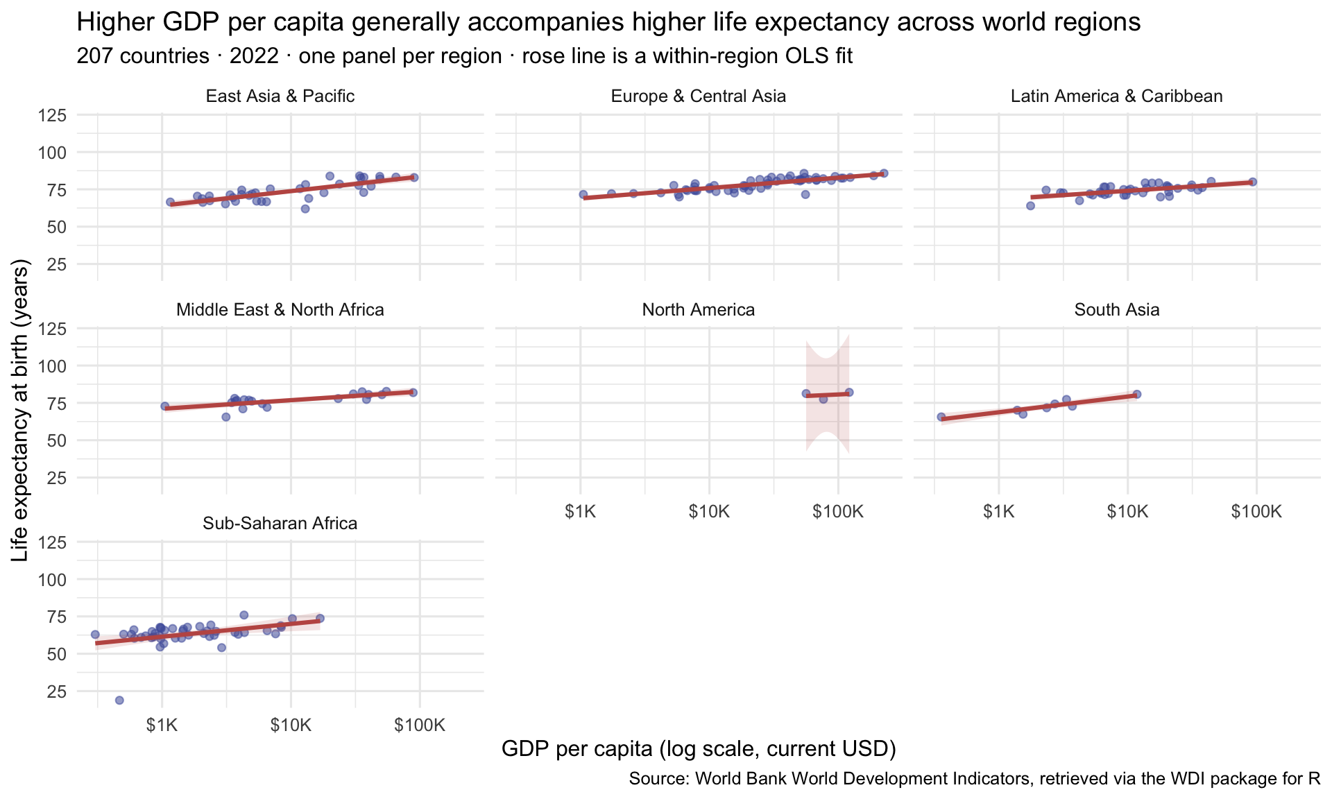
You’ll spot color codes like #4E5EAA or #C05852 in the code above — those are hex codes, an exact way to name a color (#4E5EAA is the muted indigo of the points here, and #C05852 is the rose color of the lines). Don’t worry about the details yet; we unpack how they work below, where we start styling charts on purpose.
Now let’s map each of the seven Grammar of Graphics layers to what we see in this figure:
| Layer | Description | In the figure above |
|---|---|---|
| 1. Data | The dataset to be plotted | wdi_2022 from the World Bank's World Development Indicators (via the WDI R package) |
| 2. Aesthetics | Mapping variables to visual properties | GDP per capita → x-axis; life expectancy → y-axis. Region is implicitly mapped via faceting (subsequent layer). |
| 3. Geometry | The type of mark drawn | Points (geom_point) for each country, plus an OLS line (geom_smooth with method = 'lm') for each region's trend. |
| 4. Facets | Small multiples by group | facet_wrap(~ region) — one panel per world region, axes shared so panels are directly comparable. |
| 5. Statistics | Model-based layers on top of the data | An OLS regression line (the rose line in each panel) with a shaded 95% confidence ribbon. |
| 6. Scales | How aesthetics map to axes, colors, sizes, breaks, and labels | scale_x_log10() respaces the x-axis so equal distances represent equal proportional differences; y-axis uses default linear spacing. |
| 7. Coordinates, labels, and themes | Orientation, titles, captions, fonts, backgrounds | labs() supplies the title, subtitle, axis labels, and source caption; theme_minimal sets the clean visual style. |
This figure uses three observed variables (GDP per capita, life expectancy, region) plus a fitted statistical layer (the within-region OLS smooth), across two geometries (points and smooths), uses faceting to handle the regional comparison without color-overload, and transforms the x-axis to a log scale so the rich within-region structure stays visible at both ends. All of that comes from the same seven layers — and you’ll use exactly these tools to build the Rosling chart in the seven steps that follow.
One more thing worth seeing in this picture: the grammar scales. A simple scatterplot (df |> ggplot(aes(x, y)) + geom_point()) is the same seven-layer skeleton as this gapminder-style multi-panel comparison — it just has empty optional layers. Once you understand the grammar, unfamiliar chart types become easier to learn because they are usually new combinations of familiar pieces.
The anatomy of a ggplot2 call
Before we build the Rosling chart step by step, let’s examine the general structure of every ggplot2 call. Understanding this structure will help you write code from scratch, debug errors, and read other people’s code with confidence.
Here is a minimal working ggplot2 example:
wdi_2022 |>
  ggplot(mapping = aes(x = gdp_per_capita, y = life_expectancy)) +
  geom_point()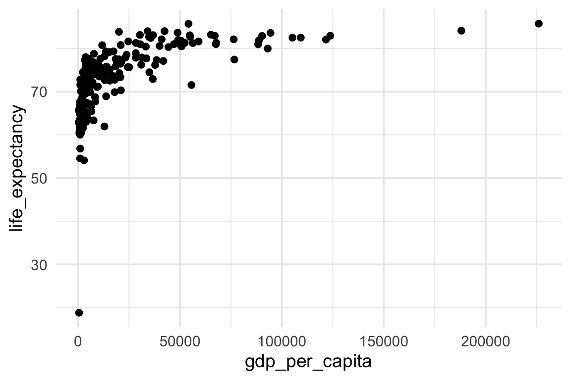
This is only three lines, but every element has a purpose. Let’s go through them one by one:
Line 1: wdi_2022 |>
This is the data layer. We start with wdi_2022, the data frame we want to plot, and pass it forward using the pipe operator (|>). You can read |> as “and then.” So this line says: “Start with wdi_2022, and then…”
Line 2: ggplot(mapping = aes(x = gdp_per_capita, y = life_expectancy))
This is the initialization and aesthetics layer. The function ggplot() creates a new (initially empty) plot object. Its argument mapping = tells ggplot() how to connect variables in the data frame to visual properties of the plot.
For now, we’re using the fully explicit teaching form — ggplot(mapping = aes(...)) — because it makes the structure easier to see. Later you will often see the shorter form ggplot(aes(...)) without mapping =; the two are equivalent. We’ll come back to that shorthand in a moment. For now, the important idea is simply that ggplot() sets up the plot and aes() tells it which variables to map.
Inside mapping =, we call aes() — short for aesthetics.3 Inside aes(), we specify:
x = gdp_per_capita— map the variable gdp_per_capita to the horizontal axisy = life_expectancy— map the variable life_expectancy to the vertical axis
Notice that variable names inside aes() are written without quotes. That is because they refer to column names in the data frame — they are variable names in R’s environment, not character strings. Writing x = "gdp_per_capita" (with quotes) would not just relabel the axis; it would tell ggplot2 to use the literal text "gdp_per_capita" as the x value for every row, collapsing all 207 country points into a single column on a categorical x-axis.
The + operator
After line 2, we use + instead of |>. This is because we are now in ggplot2’s layer system. The + means “add the following layer to this plot.” It does not pass data — it adds a visual component. Every additional layer (geometries, scales, labels, themes) is added with +. The + must appear at the end of a line, not at the beginning of the next line.
Line 3: geom_point()
This is the geometry layer. geom_point() draws a point (dot) at the x-y coordinate specified by the aesthetics for each row in the data. Because we mapped gdp_per_capita to x and life_expectancy to y, each country becomes one dot at that country’s GDP and life expectancy values.
Every geometry in ggplot2 starts with geom_. There are dozens of them — geom_line(), geom_histogram(), geom_boxplot(), geom_col(), and many more. You will meet the most commonly used ones in this Module.
This minimal three-line structure — pipe data in, call ggplot() with aesthetics, add a geom — is the skeleton of every ggplot2 plot you will ever write. Everything else in Part 1 is an extension of this skeleton.
Three equivalent ways to write the same plot
R4DS Chapter 1 makes a small but useful point: the same ggplot call can be written in three equivalent forms, and you’ll see all three in published code:
# Form 1 — fully explicit (R4DS uses this in §1.2 as a teaching default)
ggplot(data = wdi_2022,
       mapping = aes(x = gdp_per_capita, y = life_expectancy)) +
  geom_point()

# Form 2 — drop the `data =` and `mapping =` names (positional)
ggplot(wdi_2022, aes(x = gdp_per_capita, y = life_expectancy)) +
  geom_point()

# Form 3 — pipe data in (used throughout this Module)
wdi_2022 |>
  ggplot(aes(x = gdp_per_capita, y = life_expectancy)) +
  geom_point()
Form 1 is the verbose teaching version — every argument is named. Form 2 drops the argument names; the first argument of ggplot() is always the data and the second is always the mapping, so the names are usually redundant. Form 3 — what we use throughout this Module — pipes the data in. The pipe form composes naturally with dplyr verbs (you’ll see why in M04 when we wrangle data before plotting): data |> filter(...) |> mutate(...) |> ggplot(aes(...)) + geom_*(). We tend to use Form 3 in our own code because it reads more like a narrative: “take the data, and then make a plot with these aesthetics and this geometry.” But all three forms are correct and produce the same result. Use whichever you prefer, but be consistent within a script or project. This is also a good reminder that there is no single “right way” to write code — there are often multiple valid styles, and the best choice depends on context and personal preference. When you’re first learning, it can be confusing to see different styles in different places, but as long as you understand the underlying structure, you can read and write all of them. And, with time, you’ll develop your own style that feels natural to you.
With the grammar in hand and the minimal call as the anchor, we’re ready to build the Rosling bubble chart from scratch — one layer at a time. At each step, we’ll explain what the new code does and why, and a static rendered figure will show the cumulative result.
Step 1 · The empty canvas
Every ggplot2 plot starts with ggplot(). The function’s job is to initialize a plot object — to create an empty coordinate space that subsequent layers can be added to. At this stage, we supply the data (by piping wdi_2022 into ggplot()), but we haven’t told ggplot2 anything else yet. There are no axes, no points, no lines — just a blank gray rectangle.
This blank canvas step might seem trivial, but understanding it is conceptually important. ggplot2 builds plots as objects — an R object that accumulates layers. When you call ggplot(), you create that object. Each subsequent + call adds a layer to it. The final object, when printed or evaluated, displays the plot. This object-oriented approach is what allows ggplot2 to be so composable — you can build a plot in pieces, save intermediate versions, and add layers programmatically.
wdi_2022 |>
  ggplot()
We told ggplot() which data to use, but nothing else. R doesn’t know yet what to draw. The gray box is the result: a plot object with data attached, waiting for instructions.
Step 2 · Map variables to axes
Now we add the aesthetics layer. The aes() function tells ggplot2 which variables to map to which visual properties. At this step, we map two variables to the two axes — that’s enough to establish the coordinate space and add axis labels, even before we’ve specified what geometry to draw.
Notice that the aes() call sits inside ggplot() itself (as mapping = aes(...)), rather than inside a specific geom. This means the mapping applies to all subsequent layers, not just one — any geom we add later will inherit these mappings by default. This is called a global aesthetic mapping, as opposed to a local mapping that applies only to one layer (which you specify inside the geom’s parentheses instead).
wdi_2022 |>
  ggplot(mapping = aes(x = gdp_per_capita, y = life_expectancy))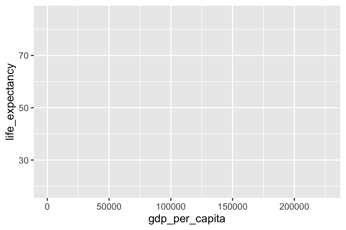
The axes now appear with labels taken directly from the variable names, but the plot body is still empty — we told ggplot2 where to put things, but not what to draw. The x-axis spans from near 0 to about $226,052 (the range of gdp_per_capita in the data) and the y-axis spans the range of life_expectancy. This is progress.
Step 3 · Add a geometry
Now we add the geometry layer. By appending + geom_point() to the plot, we instruct ggplot2 to draw one dot (point) for each row in the data, positioned at the x-y coordinates defined by our aesthetic mapping. Each country becomes a single dot.
Geometries are the visual marks that actually appear on a plot. Every geometry function in ggplot2 begins with geom_. There are geometries for points (geom_point()), lines (geom_line()), bars (geom_col(), geom_bar()), histograms (geom_histogram()), smooth curves (geom_smooth()), text (geom_text()), and many more. In each case, the geometry consumes the aesthetic mappings and draws the appropriate shape. When we write geom_point(), we are saying: “For each row in the data, draw a point at the (x, y) coordinate specified by the aesthetics.”
Inside geom_point(), we can supply additional arguments that are not aesthetic mappings — they are fixed visual properties that apply to all points equally. For example, alpha = 0.5 sets the transparency of every point to 50% opacity.4 This is useful when points overlap, because it lets you see the density of the data rather than having all overlapping points appear as a single solid dot.
wdi_2022 |>
  ggplot(mapping = aes(x = gdp_per_capita, y = life_expectancy)) +
  geom_point(alpha = 0.5)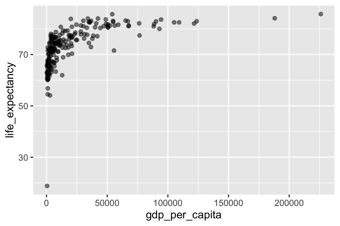
We have a scatterplot. You can see the general upward trend: wealthier countries tend to have higher life expectancy. You can also see the bunching problem — most countries are crammed together on the left side of the x-axis, and a few wealthy countries stretch it to the right. We’ll fix that in Step 6.
Step 4 · Map size to population
So far we’ve used aesthetics to map gdp_per_capita to x and life_expectancy to y. But aesthetics are not limited to position. We can also map data variables to the size, color, shape, and fill of the points. This is how a scatterplot becomes a bubble chart: by mapping a third variable to the size of the dots.
In the Rosling chart, each bubble’s size represents the country’s population. Large bubbles are large countries. This immediately draws the eye to the most populous countries, especially China and India — their bubbles carry much more visual weight than those of smaller countries, reminding us that countries are not equally large in population terms.
To add this, we include size = population inside aes(). Because we are mapping a data variable (population) to a visual property (size), it must go inside aes() — not outside it.5 When ggplot2 sees size = population inside aes(), it looks up each country’s population, scales those values to a range of point sizes, and draws each point accordingly. It also automatically adds a size legend to the plot.
wdi_2022 |>
  ggplot(
    mapping = aes(x = gdp_per_capita, y = life_expectancy, size = population)
  ) +
  geom_point(alpha = 0.5)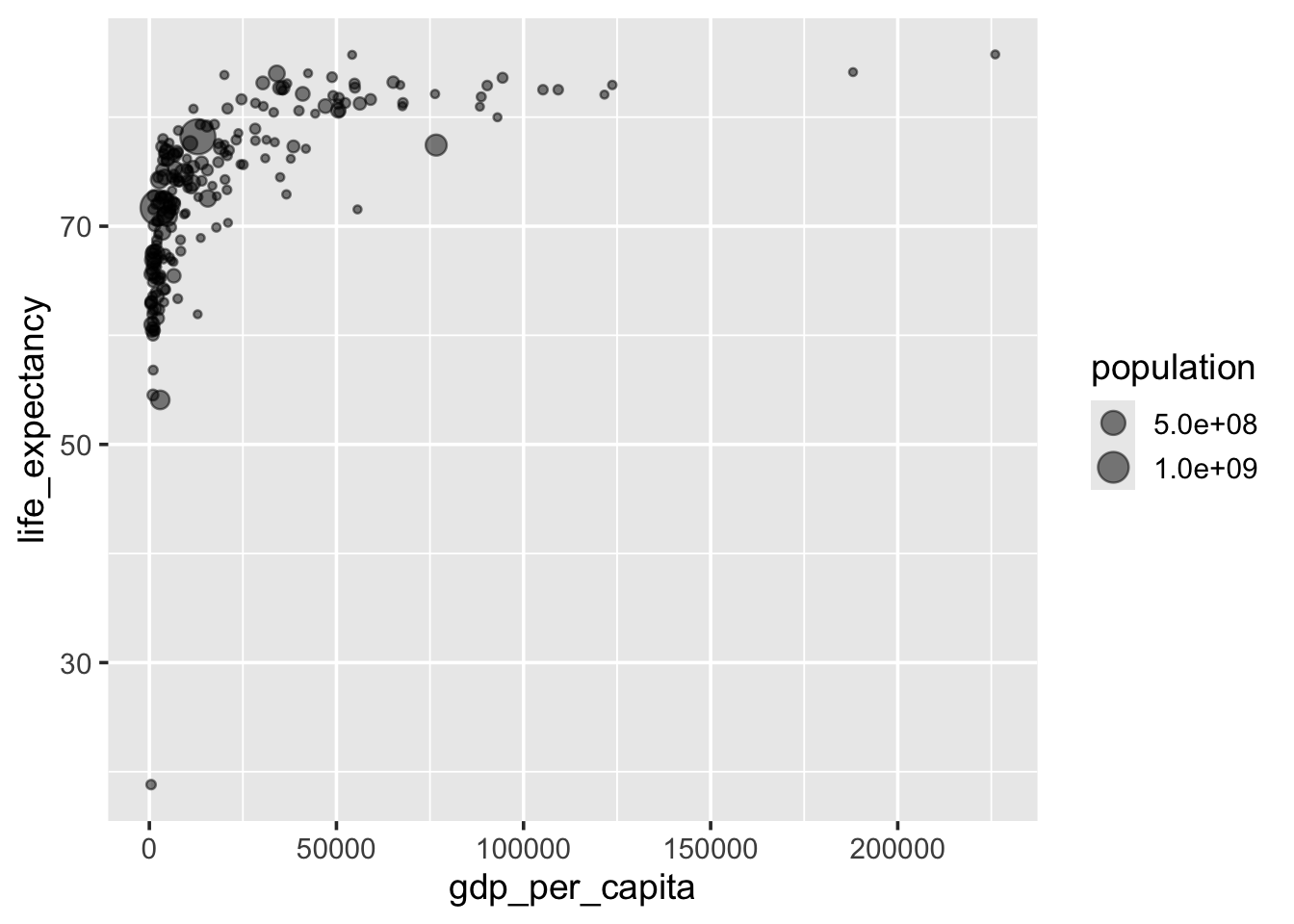
Now the bubbles vary in size. The largest bubbles (China, India, the United States) are immediately visible. Notice that alpha = 0.5 is still in geom_point() — not in aes() — because we want all points to be equally semi-transparent (a fixed property), regardless of their population.
Step 5 · Map color to region
We now add a fourth variable dimension by mapping color to region. This is a categorical variable (7 world regions), so ggplot2 will automatically assign a distinct color to each category and add a color legend.
There is an important distinction between mapping color to a categorical variable (as we’re doing here) and mapping it to a continuous variable. For region, ggplot2 chooses a set of discrete, visually distinct colors — one per category. For a continuous variable like life_expectancy, it would produce a color gradient, with values blending smoothly from one color to another. We want distinct colors here because the 7 regions are categories with no inherent ordering, not points along a spectrum.
With this step, each country’s bubble now encodes four variables simultaneously: x-position (GDP), y-position (life expectancy), size (population), and color (region). This is exactly what makes the Rosling chart so information-dense and yet readable — the visual channels (position, size, color) carry distinct information that the human perceptual system can process in parallel.
wdi_2022 |>
  ggplot(
    mapping = aes(
      x = gdp_per_capita,
      y = life_expectancy,
      size = population,
      color = region
    )
  ) +
  geom_point(alpha = 0.5)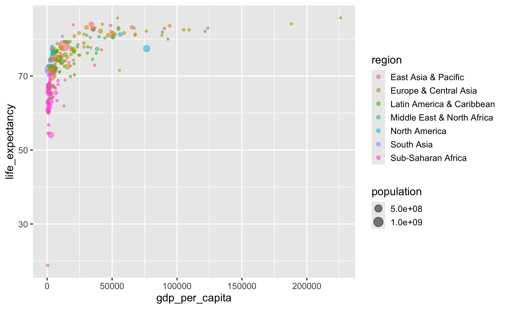
Now we can see the regional structure clearly. Sub-Saharan African countries cluster in the lower-left — lower GDP, lower life expectancy. European and Central Asian countries cluster in the upper-right. South Asian countries sit in the middle range. This is the story Hans Rosling was telling.
Pause · what just happened
We’ve stacked four aesthetic mappings so far: x, y, size, and color. Without scrolling back, see if you can answer:
- Which two variables are mapped via position (x and y)?
- Which variable is mapped via size?
- Which variable is mapped via color?
- The
alpha = 0.5in geom_point() is outside aes(). Why?
If you can answer these without looking back, the aesthetic-mappings-vs-fixed-properties distinction is sticking. If not, scroll up to Step 4 and re-read the footnote.
Step 6 · Log-transform the x-axis
This is one of the most consequential design choices in building the Rosling chart, and it generalizes well beyond this example.
Look at the scatterplot from Step 5 and notice the x-axis problem. GDP per capita ranges from a few hundred dollars to about $226,052 — a roughly 746-fold difference, well over two orders of magnitude.6 A small number of very high-income countries stretch the axis, leaving most countries crowded into the left side of the plot. The substantive variation among lower-income countries, where most of the world’s people live, becomes hard to read.
A log transformation of the x-axis7 changes the visual spacing so that equal distances represent equal proportional differences rather than equal absolute differences. On a log scale, the distance from $500 to $1,000 (a doubling) is the same as the distance from $25,000 to $50,000 (also a doubling). For income, that’s often the right ruler: the difference between earning $500 and $1,000 a year matters far more in material terms than the difference between $50,000 and $50,500, even though both are $500. A linear scale treats those two differences as equal; a log scale does not.
One subtle but important point: a log scale does not magically make every relationship linear. What it does is put multiplicative differences on an appropriate ruler. If the underlying relationship is more nearly linear when you think in proportional terms than in absolute-dollar terms, a log scale can reveal that structure more clearly.
In R, scale_x_log10() applies this transformation. We also format the axis labels using label_dollar() from the scales package, which adds the $ prefix, and scale_cut = cut_short_scale(), which swaps trailing zeros for short-scale suffixes — K for thousands, M for millions, B for billions. So 10000 displays as $10K rather than $10,000 — much cleaner when several large numbers share an axis. The side-by-side comparison makes the difference vivid:
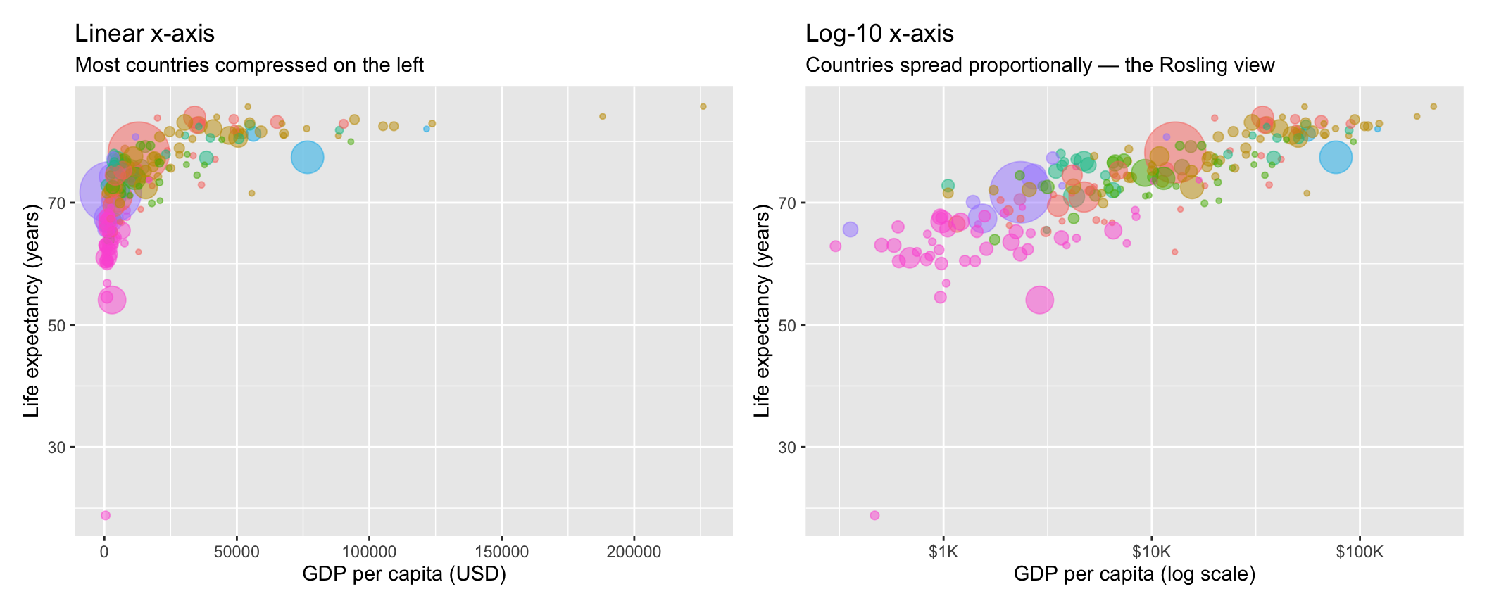
On the linear scale (left), the relationship is hard to see — most countries are crowded into the left side. On the log scale (right), countries spread out proportionally and the positive association between GDP and life expectancy becomes much easier to see. In this dataset, the pattern also looks closer to linear on the log-scaled axis, which is one sign that proportional differences may be the more informative way to view income here. The tick labels read $1K → $10K → $100K with equal visual spacing, because each tick step is a ×10 jump, not a fixed dollar increment. This is the visual Rosling used.
Why log scale?
- Linear scale: equal distances = equal absolute differences. $1,000 → $2,000 is the same distance as $49,000 → $50,000.
- Log scale: equal distances = equal proportional differences. $1,000 → $2,000 (×2) is the same distance as $25,000 → $50,000 (×2).
Reach for a log scale when:
- The variable spans several orders of magnitude (income, GDP, population, prices)
- The underlying process is multiplicative (growth, decay, fold-change)
- The relationship looks easier to interpret on a proportional scale than on a linear one
scale_x_log10() (and scale_y_log10() for the y-axis) transforms the axis only — the underlying data values are unchanged.
Going further · other log bases
scale_x_log10() is one of three log bases you’ll meet in this course. All three share the multiplicative-spacing property described above; they differ only in what one unit on the transformed axis represents:
| Base | One unit on the axis = | Where you’ll see it | R syntax |
|---|---|---|---|
| log₁₀ (base 10) | ×10 (a decade — one order of magnitude) | Income, GDP, populations, prices — anything spanning orders of magnitude. The scale used in the Rosling chart above. | scale_x_log10() |
| ln (natural log, base e ≈ 2.718) | ×e ≈ ×2.72 | Common in regression and growth-rate modeling. Log-transforming a predictor or outcome lets coefficients be read in proportional terms; the exact interpretation depends on which side is logged. | scale_x_continuous(transform = scales::transform_log()) |
| log₂ (base 2) | ×2 (a doubling) | Genomics (fold-change in gene expression), audio (one octave is one log₂ step), psychophysics work involving doublings of stimulus intensity. | scale_x_continuous(transform = "log2") |
Pick the base that matches the natural unit your audience thinks in: decades for economic data, doublings for fold-change work, e for regression interpretation. All three convey the same shape of the data; the tick positions and labels ggplot2 draws on top are picked separately and can be customized via the breaks = and labels = arguments to the scale.
Here is the updated code with the log transformation:
wdi_2022 |>
  ggplot(
    mapping = aes(
      x = gdp_per_capita,
      y = life_expectancy,
      size = population,
      color = region
    )
  ) +
  geom_point(alpha = 0.5) +
  scale_x_log10(labels = label_dollar(scale_cut = cut_short_scale())) +
  scale_size(range = c(1, 18))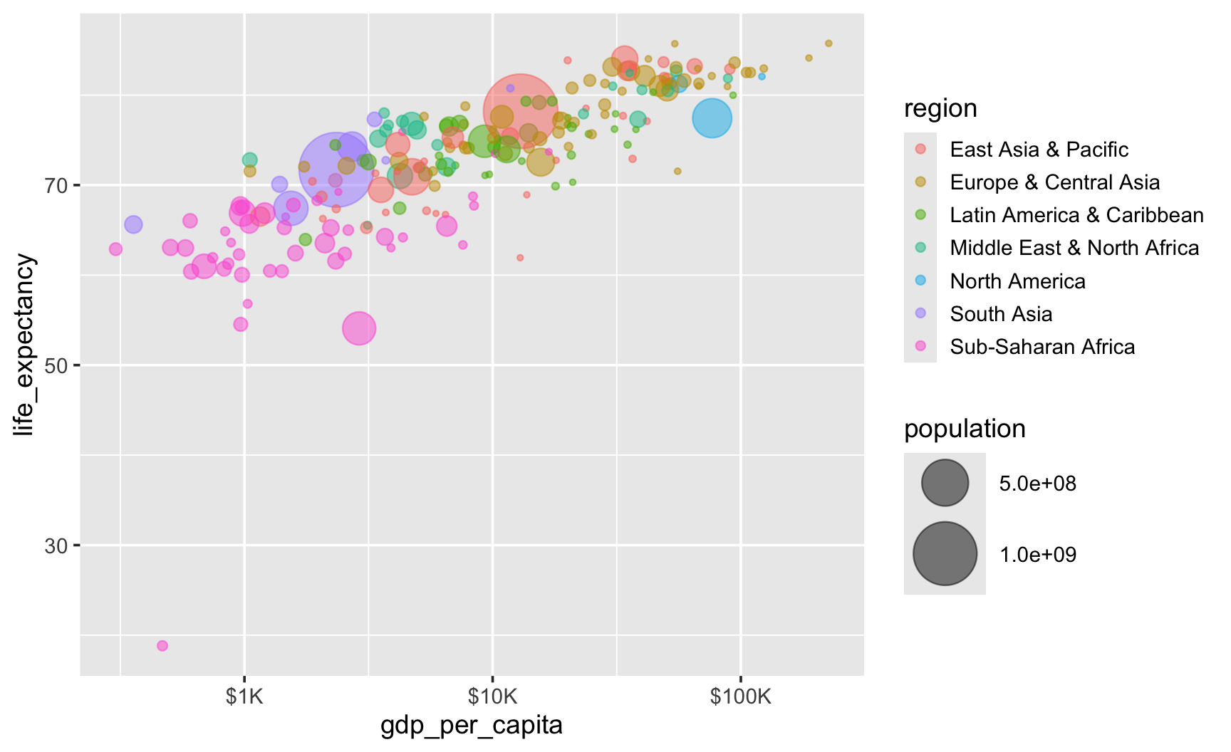
The x-axis now shows $1K, $10K, and $100K as equally spaced tick marks. The countries spread out across the full width of the plot. Sub-Saharan Africa fills the left side; high-income countries fill the right.
Step 7 · Labels and theme
The plot is analytically complete, but it is not presentation-ready. The axis labels still show raw variable names (gdp_per_capita, life_expectancy) instead of human-readable descriptions. There is no title. The default ggplot2 gray background, while useful for drafts, is not ideal for final figures.
In this final step, we add two things: labs() to provide human-readable labels, and theme_minimal() to apply a clean visual style. These fall under the themes layer of the grammar of graphics.
The labs() function — short for “labels” — accepts named arguments corresponding to each aesthetic mapping, plus additional slots for title, subtitle, and caption:
title =— the main chart title, displayed at the topsubtitle =— a secondary line below the title, useful for method notesx =— the label for the x-axisy =— the label for the y-axiscolor =— the label for the color legend (replaces the variable name “region”)size =— the label for the size legend (here we suppress it withguide = "none"in the scale)caption =— a note at the bottom of the plot, often used for data source attribution
You’ll often see subtitle = sprintf(...) in the code chunks below — sprintf() is R’s string-formatting function. It takes a template string with placeholders — %d for an integer, %s for a string, %.2f for a number with two decimals — plus one value per placeholder. So sprintf("%d countries · 2022", n_countries_2022) returns the string “207 countries · 2022”: the value of n_countries_2022 fills the %d slot. This is how we drop computed values into a title or subtitle without hard-coding numbers that might go stale if the data ever changes. You don’t need to worry about this for now — just know that sprintf() is a convenient way to build strings with dynamic content that you can reach for when you are ready.
Title the takeaway, not the plot
The title should summarize the main takeaway, not merely describe the plot. This is one of R4DS Chapter 11’s most useful rules. A title like “Scatterplot of life expectancy vs GDP per capita” tells the reader something they already see — it’s pure description, doing no work. A title like “Life expectancy rises sharply with income, then plateaus” (for the graph without the log transformation) or “Higher-income countries tend to have longer life expectancy” (for the graph with the log transformation) tells the reader the substantive takeaway and frames how to read the figure. Communication-quality titles tell the reader what pattern the figure is meant to highlight, not just what’s on the axes. The subtitle is the natural home for method-and-scope notes (sample size, year, transformation), freeing the title to deliver the takeaway.
The theme_minimal() function applies a clean, minimal visual style: white background, subtle gray grid lines, no axis tick marks, no border. The base_size = 12 argument sets the baseline font size for all text elements in the plot. Increasing it makes the plot more legible when rendered at small sizes (e.g., embedded in a document); decreasing it can fit more information in a constrained space.
A personal note on this theme. theme_minimal() is our favorite of the built-in ggplot2 themes — clean enough for publication, crisp enough for slides, and free of the distraction that ggplot2’s default gray panel background introduces. We’ve set it as the default for every chart on the course website, via a theme_set(theme_minimal(…)) call in each Module’s hidden setup chunk. That’s why almost every chart you’ll see from this point forward in the course already looks minimal — even when the visible code doesn’t include + theme_minimal(). The seven-step build above is the one deliberate exception: we temporarily turned the default off so that Step 7’s + theme_minimal() would produce the visible gray-to-clean transformation you just saw. If you copy a chunk of Module code into your own fresh R session and your chart comes back looking gray instead of minimal, that’s why — the website’s default isn’t your default. The fix is either to add + theme_minimal() explicitly to that chart, or to run theme_set(theme_minimal()) once at the top of your script to adopt the same default for yourself.
wdi_2022 |>
  ggplot(
    mapping = aes(
      x = gdp_per_capita,
      y = life_expectancy,
      size = population,
      color = region
    )
  ) +
  geom_point(alpha = 0.5) +
  scale_x_log10(labels = label_dollar(scale_cut = cut_short_scale())) +
  scale_size(range = c(1, 18), guide = "none") +
  labs(
    title = "Higher-income countries tend to have longer life expectancy",
    subtitle = sprintf(
      "%d countries · 2022 · bubble size = population · x-axis on a log scale",
      n_countries_2022
    ),
    x = "GDP per capita (log scale, current USD)",
    y = "Life expectancy at birth (years)",
    color = "Region",
    caption = "Source: World Bank World Development Indicators (2022) via the WDI package for R"
  ) +
  theme_minimal(base_size = 12)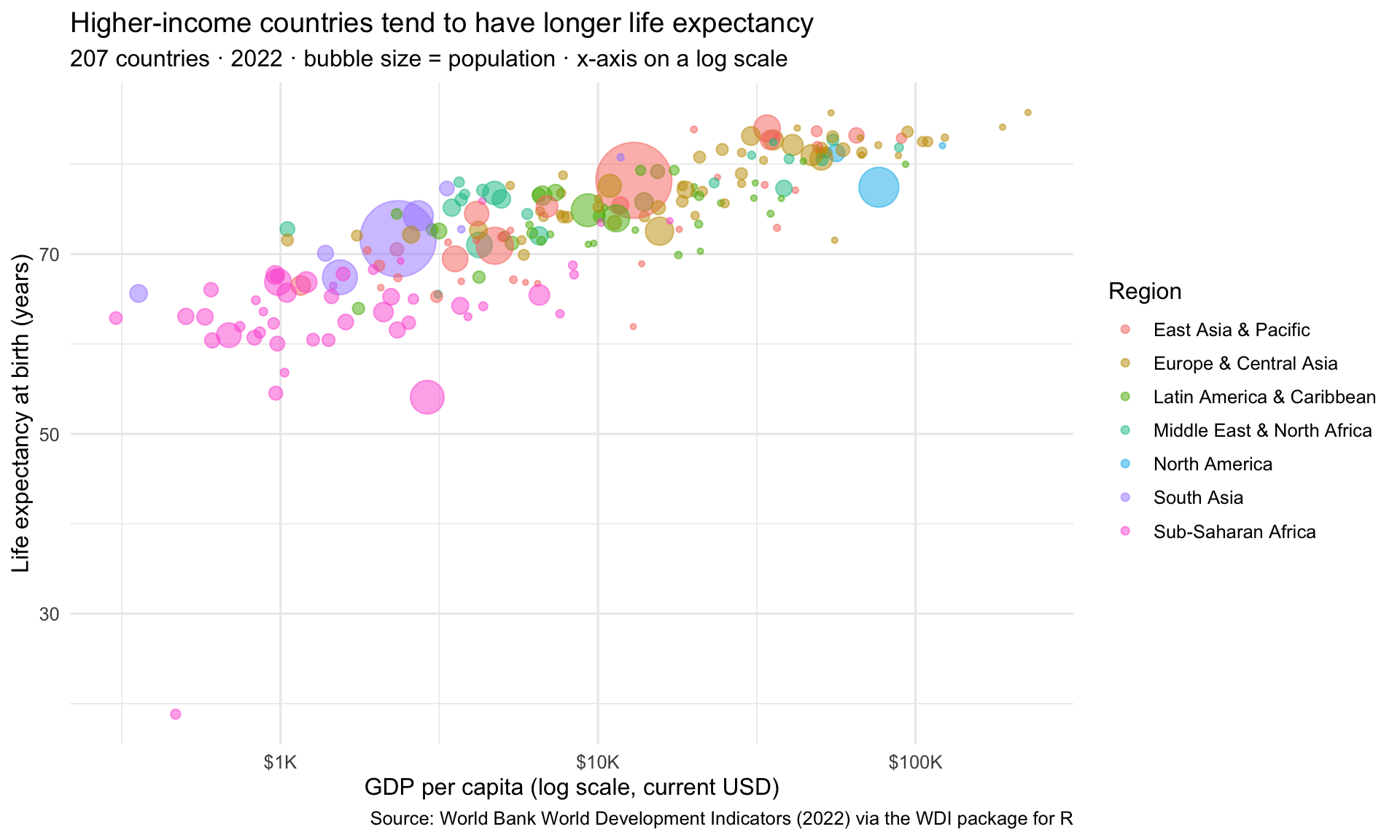
At this point, the plot contains the essential components of the Rosling-style chart: mapped positions, population-scaled bubbles, region colors, a log-scaled x-axis, and communication-oriented labels. More importantly, each part of the figure corresponds to a specific part of the ggplot2 grammar. The pipe feeds the data in, aes() maps variables to visual channels, geom_point() draws the marks, scale_x_log10() spaces the x-axis proportionally, scale_size() controls bubble sizing, labs() provides human-readable annotations, and theme_minimal() sets the visual style.
Note the title we chose: it’s not a description of what the chart shows (“Life expectancy and wealth across countries, 2022”) — it’s the main takeaway the chart is meant to highlight. The subtitle then carries the scope and method notes so the title can stay focused on the takeaway. This is the title-as-finding rule in action — a habit you’ll apply on every chart in Part 4 and beyond.
Part 2 · Visualizing distributions
Earlier we introduced the two foundational EDA questions: what kind of variation occurs within my variables? and what kind of covariation occurs between my variables? This Part takes the first question seriously. Each subsection here answers a different version of “what does this one variable look like?” — for one categorical variable, then for one numerical variable in two complementary ways.
The grammar carries through: each new chart type is just a different geom_*() on the same data → aesthetics → geom → labels → theme skeleton you used to build the Rosling chart. The only thing that changes from chart type to chart type is the geometry.
One categorical variable: bar charts of counts
A bar chart of counts is the simplest distribution chart for a categorical variable. It answers “how big is each group? Are they balanced, or are some categories much rarer than others?”
For our WDI data, a research question of this flavor is: how many countries are in each World Bank region? The dataset has one row per country, so counting rows per region gives us a bar chart of region size. We’ll build it in two stages: first the basic version, then a small tweak to make it more useful.
A first version
We map y = region (rather than x = region) to get horizontal bars — long region names are easier to read horizontally than rotated on an x-axis.
wdi_2022 |>
  ggplot(aes(y = region)) +
  geom_bar(fill = "#4E5EAA") +
  labs(
    title = "Country counts by World Bank region, 2022",
    x = "Number of countries",
    y = NULL
  )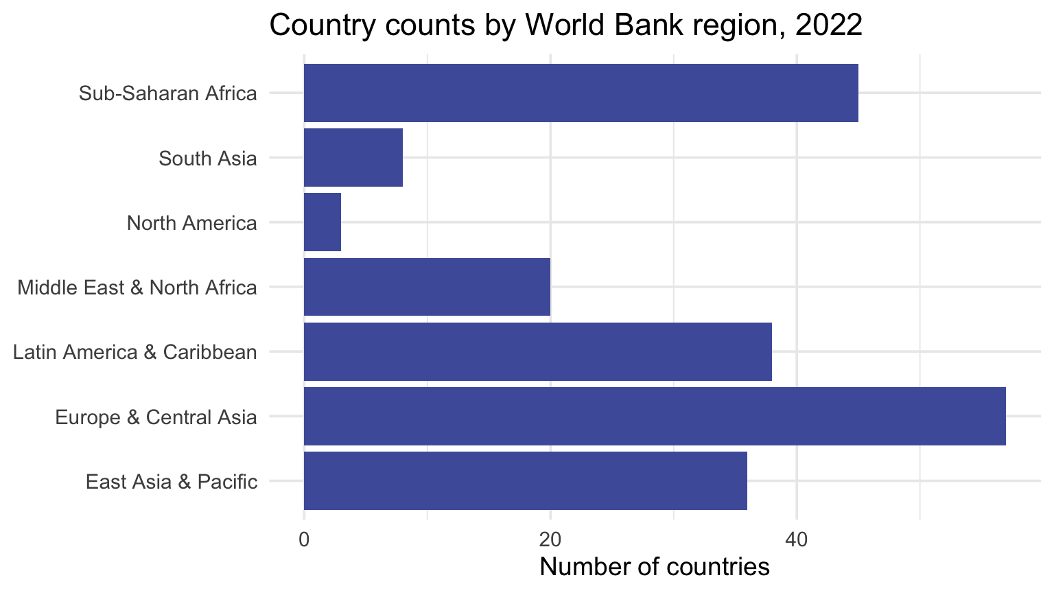
Three things to notice in this code.
First, fill = "#4E5EAA" sits outside aes(), inside geom_bar() directly.8 This is the fixed-property rule from Step 4: because we’re applying the same color to every bar — not mapping color to a data variable — fill is a fixed property, not an aesthetic mapping. If you wanted bars colored by some variable (say, income tier), you’d write aes(fill = income_tier) instead — ggplot2 would assign a different color to each level and generate a fill legend automatically. Here, the bars are visually uniform because the region labels already identify them; adding a per-region color would be perceptual noise.
Second, geom_bar() automatically counts the number of rows in each category and uses that count as the bar length — the stat = "count" statistic runs under the hood. When you have a pre-computed count or summary, use geom_col() instead (we’ll do that in Part 3 for “group summary” bar charts).
Third: y = NULL in labs() — this removes the y-axis label entirely (since the region names are self-explanatory).
Reordering the bars to surface the pattern
The chart above works, but the bars appear in their default factor order — which doesn’t carry any meaning for the reader. To make the chart immediately scannable, we can reorder the factor levels by their frequency so the bars come out in size order. If the word factor still feels hazy, that’s okay for now: you can think of it simply as R’s way of storing a categorical variable with an order attached to its levels.
wdi_2022 |>
  ggplot(aes(y = fct_infreq(region))) +
  geom_bar(fill = "#4E5EAA") +
  geom_text(
    aes(label = after_stat(count)),
    stat = "count",
    hjust = 1.3,
    color = "white",
    fontface = "bold",
    size = 3.5
  ) +
  labs(
    title = "Country counts vary widely across World Bank regions",
    subtitle = sprintf(
      "%d countries in 2022 · regions sorted by count",
      n_countries_2022
    ),
    x = "Number of countries",
    y = NULL
  )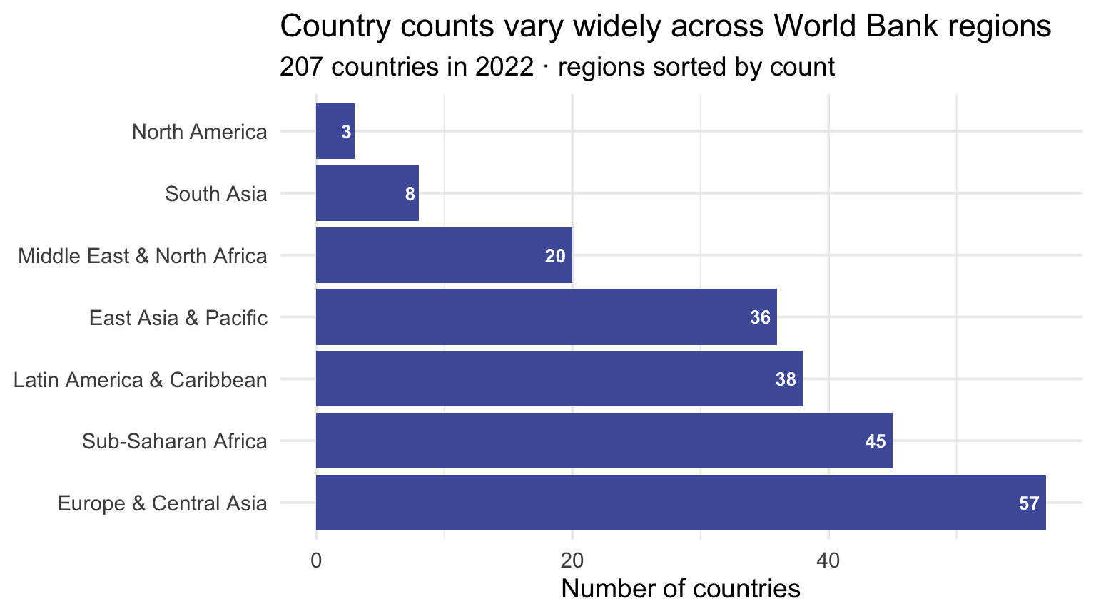
The function fct_infreq() from the forcats package (loaded with tidyverse) reorders the factor levels by their frequency, with the most-frequent level first in factor order. With y =, the first factor level lands at the bottom of the y-axis — so on this chart the most-frequent region appears at the bottom, and counts decrease as you move up. If you’d rather have the most-frequent region at the top, wrap with fct_rev(): y = fct_rev(fct_infreq(region)). You can see other methods of reordering factor levels in the forcats documentation.
We’ve also added a geom_text() layer to print each bar’s count inside the right end of the bar. This is the first time we’re using a layer-specific aesthetic mapping: aes(label = after_stat(count)) applies to the text layer only, not to the whole plot. If that feels like a small jump in complexity, that’s normal. The key idea is just that each bar gets a different label, so the label has to be mapped from data rather than fixed once for all bars. The argument stat = "count" tells geom_text() to compute the per-region count the same way geom_bar() does; after_stat() then references that computed count as the label value. The other arguments are fixed properties: hjust = 1.3 tucks the text just inside the right end of each bar (rather than floating past it, where white text would disappear against the page); color = "white" and fontface = "bold" keep the labels legible against the indigo fill.
Notice that the title also shifts from a descriptive “Country counts by World Bank region, 2022” to a finding-oriented “Country counts vary widely across World Bank regions.” This is the title-as-finding rule from Step 7 applied to a chart whose ordering now actually supports the finding — once the bars are sorted, the variation in counts is visible at a glance.
One numerical variable: histograms
A histogram is the most fundamental tool for exploring the distribution of a single continuous variable. It divides the range of the variable into equal-width intervals called bins, counts how many observations fall in each bin, and draws a bar whose height corresponds to that count. The resulting picture shows you the shape of the distribution: where most values are concentrated, how wide the spread is, whether the distribution is symmetric or skewed, and whether there are any unusual values (outliers) far from the bulk of the data.
Before running any statistical model on a continuous variable, you should almost always look at its histogram. It answers basic questions that summary statistics can mask: Are the values roughly bell-shaped, or are they skewed? Is the distribution bimodal — does it have two humps, suggesting the data might contain two distinct subpopulations? Are there impossible values (like negative ages) that signal data errors? The histogram is one of the most useful tools you have for a first look at a continuous variable.
Research question: What does the distribution of life expectancy look like across countries in 2022?
wdi_2022 |>
  ggplot(aes(x = life_expectancy)) +
  geom_histogram(binwidth = 5, fill = "#C05852", color = "white") +
  labs(
    title = sprintf(
      "%d%% of countries are above 70 years, with a\nthinner tail running toward lower values",
      pct_le_above_70
    ),
    subtitle = sprintf(
      "%d countries · 2022 · 5-year bins",
      n_countries_2022
    ),
    x = "Life expectancy at birth (years)",
    y = "Number of countries"
  ) +
  theme_minimal(base_size = 13)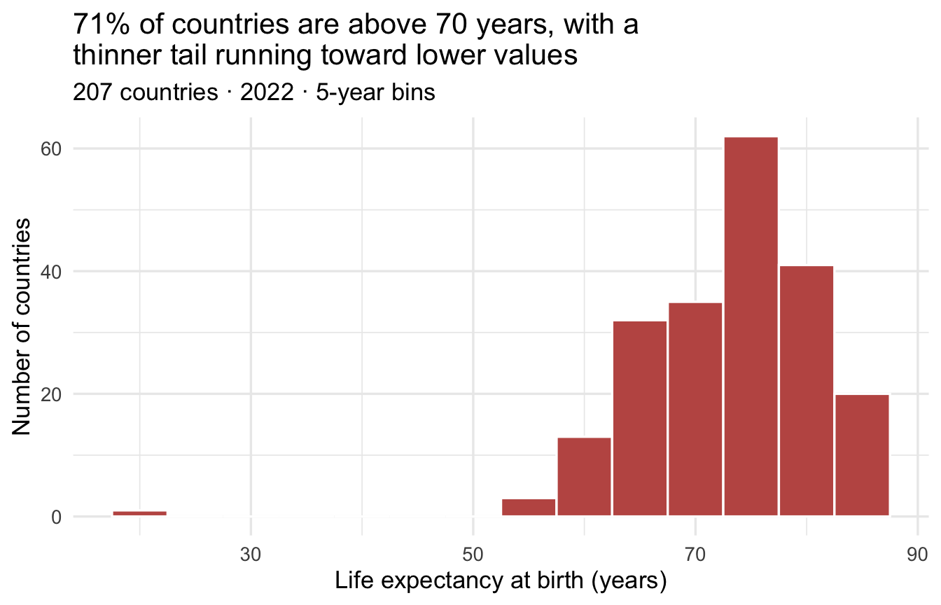
The geom_histogram() function takes a single aesthetic — x — and bins the values automatically. The binwidth = 5 argument sets each bin to span 5 years of life expectancy. A wider binwidth produces fewer, broader bars and reveals the overall shape; a narrower binwidth shows more detail but can make the histogram jagged and noisy. There is no single correct binwidth — you should try several values and choose the one that best communicates the distribution to your audience. The fill = "#C05852" and color = "white" arguments (outside aes(), and therefore fixed for all bars) control the fill color of the bars and the outline color between bars, respectively.
Looking at this histogram, you can see that the distribution of life expectancy across countries is left-skewed: most countries cluster in the 70–85 range, with a thinner tail running down through the 60s and 50s (largely Sub-Saharan Africa).
How skewed, though, is almost entirely down to one point. Including the lone value near 19, the skewness is about -1.8; drop that single country and it falls to about -0.4, which is close to symmetric. One observation out of 207 is doing nearly all of the work in that number — which is a useful thing to have seen before you ever quote a skewness statistic. The plot showed you that; the number on its own would not have.
You may also notice a lone bar far to the left, near 19 years, detached from the rest of the distribution. The isolated value belongs to the Central African Republic. Although it initially appears implausible, it is not a coding error in this dataset. A nationwide household survey conducted during 2022 estimated that approximately 5.7% of the country’s population was dying annually — more than four times the contemporaneous UN estimate, and well above the threshold used to identify a humanitarian emergency.9 The current UN population estimates assign CAR an exceptionally low period life expectancy in 2022, followed by a sharp rebound in 2023. The abrupt change should therefore be interpreted cautiously: it may reflect a genuine mortality crisis, but it also illustrates the difficulty of estimating annual mortality in a conflict-affected country with sparse routine data.
An unusual observation is not automatically an error. Plotting brought the value to our attention; source investigation showed that deleting it would conceal an important — and deeply consequential — feature of the data.
Reading a histogram: four things to check
- Center — Where is the typical value? What life expectancy would you predict for a randomly chosen country?
- Spread — How wide is the distribution? Are most countries similar, or is there extreme variation?
- Shape — Is the distribution symmetric? Skewed to the right (long tail on the right, most values on the left — like GDP per capita)? Skewed to the left (long tail on the left)? Bimodal (two humps)?
- Outliers — Are there any values far from the bulk of the distribution that might warrant investigation?
Comparing distributions across groups: density plots
A density plot is a smoothed version of a histogram. Instead of bars, it draws a smooth curve that represents the estimated probability density of the variable. In a density plot, the total area under the curve is scaled to 1.10 Density plots are particularly useful when you want to compare distributions across multiple groups — you can overlay several density curves on the same plot, and overlapping regions are handled gracefully with the alpha transparency argument.
The key aesthetic for geom_density() is fill (the color of the inside of the curve) rather than color (the outline). When you map a categorical variable to fill and add alpha for transparency, each group gets a semi-transparent colored curve, and you can immediately see where distributions overlap, which groups are shifted left or right, and which groups have more spread.
Research question: Does the distribution of life expectancy differ across world regions?
wdi_2022 |>
  filter(region %in% c(
    "Europe & Central Asia", "Sub-Saharan Africa",
    "Latin America & Caribbean", "East Asia & Pacific"
  )) |>
  ggplot(aes(x = life_expectancy, fill = region)) +
  geom_density(alpha = 0.35) +
  labs(
    title = "Life expectancy distributions are sharply stratified across\nWorld Bank regions, 2022",
    x = "Life expectancy at birth (years)",
    y = "Density",
    fill = "Region"
  ) +
  theme_minimal(base_size = 13)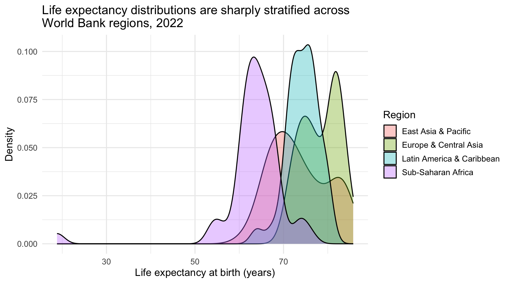
The overlapping curves reveal the story quickly: Sub-Saharan Africa peaks around 62–66 years with a long tail running down toward lower values, Europe & Central Asia peaks near 82, and East Asia & Pacific (around 70) and Latin America & Caribbean (around 75) sit in between. Latin America & Caribbean is the narrowest of the four — its countries cluster tightly — while East Asia & Pacific is the most spread out. The alpha = 0.35 makes the overlapping areas visible — without it, curves in front would completely hide the ones behind them.
Note that we plotted 4 of the 7 regions, not all of them. North America has only 3 countries in this dataset and South Asia only 8, and — for the reason given in the caution just below — a smooth density curve drawn through a handful of points implies far more precision than the data can support. Dropping them applies the same judgment the caution recommends to our own chart rather than to someone else’s.
Notice the difference between fill and color in density plots. fill = region colors the interior of each density curve. color = region would color only the outline (the border). When curves overlap heavily, fill with transparency is usually more informative than color alone, because you can see the full shape of each distribution.
A caution: density plots are less reliable for groups with very small sample sizes. If a region has only a few countries, the smooth curve can look more precise than the data justify. When some groups are small, a boxplot, a jittered scatter, or a small table of counts can be a more honest visualization.
Part 2 in one breath · the bridge to Part 3
Part 2 was about looking at one variable at a time — a count of categories, a histogram of a single numeric, the shape of a single distribution. Three geometries did almost all of the work: geom_bar() for categorical counts, geom_histogram() for numeric shapes, and geom_density() for the smoothed version of the same idea.
Density plots already started bending the rules: the moment you map a second variable to fill, color, linetype, or facets, you’ve stepped from “visualizing a distribution” to “visualizing a relationship.” That step is what Part 3 develops systematically, with one chart type per kind of comparison you might want to make.
Part 3 · Visualizing relationships
Part 2 answered “what does this one variable look like?” Part 3 answers the second foundational EDA question: “how do these variables relate to each other?” Covariation between variables is where many substantive research questions begin — participants who started lower showed larger pre-to-post changes, each 10× rise in income corresponds to about a decade of additional life expectancy, students who completed the prep showed steeper score gains. Every claim of the form “X is associated with Y” is a covariation claim, and there’s a chart type that visualizes it.
A note on the divide between Parts 2 and 3
These categories aren’t airtight. The density-by-region chart you just saw in Part 2 is technically about a relationship — how a numerical variable (life expectancy) varies across a categorical one (region) — even though it looks like a “distribution” chart. The bar charts that appear in both Parts share a geometry but answer different questions (counts of countries in Part 2; mean GDPs by region in Part 3).
Don’t get stuck classifying charts. The question is always: what comparison am I asking the reader to make? Whether you label the resulting chart a “distribution chart” or a “relationship chart” matters less than whether it answers your question clearly.
The chart-type tour in this Part is organized by the kinds of variables you’re relating.
- One numerical, one categorical → boxplot (or per-group density)
- Two categorical → stacked or grouped bar chart
- Two numerical → scatterplot (the Rosling chart already showed you this)
- One numerical, one time-like numerical → line chart
- A summary of one numerical across one categorical → bar chart with
geom_col() - Three or more variables at once → color, shape, faceting, or some combination
Each section below introduces the geometry, shows it on WDI data, and explains the most common variants. Statistical layers (geom_smooth() for trend lines) and small multiples (facet_wrap()) extend the toolkit further; they’re treated in their own subsections later in this Part.
Numerical × categorical: boxplots
A boxplot (also called a box-and-whisker plot) is an efficient way to show the distribution of a continuous variable across multiple groups simultaneously. Each box summarizes five numbers: the 25th percentile (the bottom of the box), the median (the line inside), the 75th percentile (the top), and the two whisker ends. The whiskers reach the most extreme observations lying within 1.5 × IQR of the box edges — so they are usually not the minimum and maximum of the data. Individual points beyond them are flagged as potential outliers.
Boxplots are especially valuable for comparing center and spread across groups. A box positioned high on the numerical axis indicates a group with a high median. A box that is long along that axis indicates a larger IQR — the box’s width in the other direction is arbitrary and carries no information at all. An off-center median or unequal whisker lengths may suggest asymmetry, but a boxplot compresses the distribution and cannot show its full shape: a bimodal group and a symmetric one can produce nearly identical boxes. Points beyond the whiskers flag individual observations worth investigating.
One practical issue with boxplots is that when the group names on the x-axis are long (as world region names are), they overlap and become unreadable. The standard solution in ggplot2 is coord_flip(), which rotates the entire coordinate system 90 degrees — what was the x-axis becomes the y-axis, and the long category labels now read horizontally from left to right on the rotated y-axis. The data and the relationships are unchanged; only the orientation flips. This is a good example of a broader principle: sometimes the clearest fix is not a different chart type, but simply a more readable orientation.
Research question: How does life expectancy vary within each world region?
wdi_2022 |>
  ggplot(aes(x = region, y = life_expectancy)) +
  geom_boxplot(alpha = 0.6, show.legend = FALSE, fill = "lightgray") +
  coord_flip() +
  labs(
    title = "Within-region life expectancy spread ranges from tight clusters\nto decade-wide variation, 2022",
    x = NULL,
    y = "Life expectancy at birth (years)"
  ) +
  theme_minimal(base_size = 12)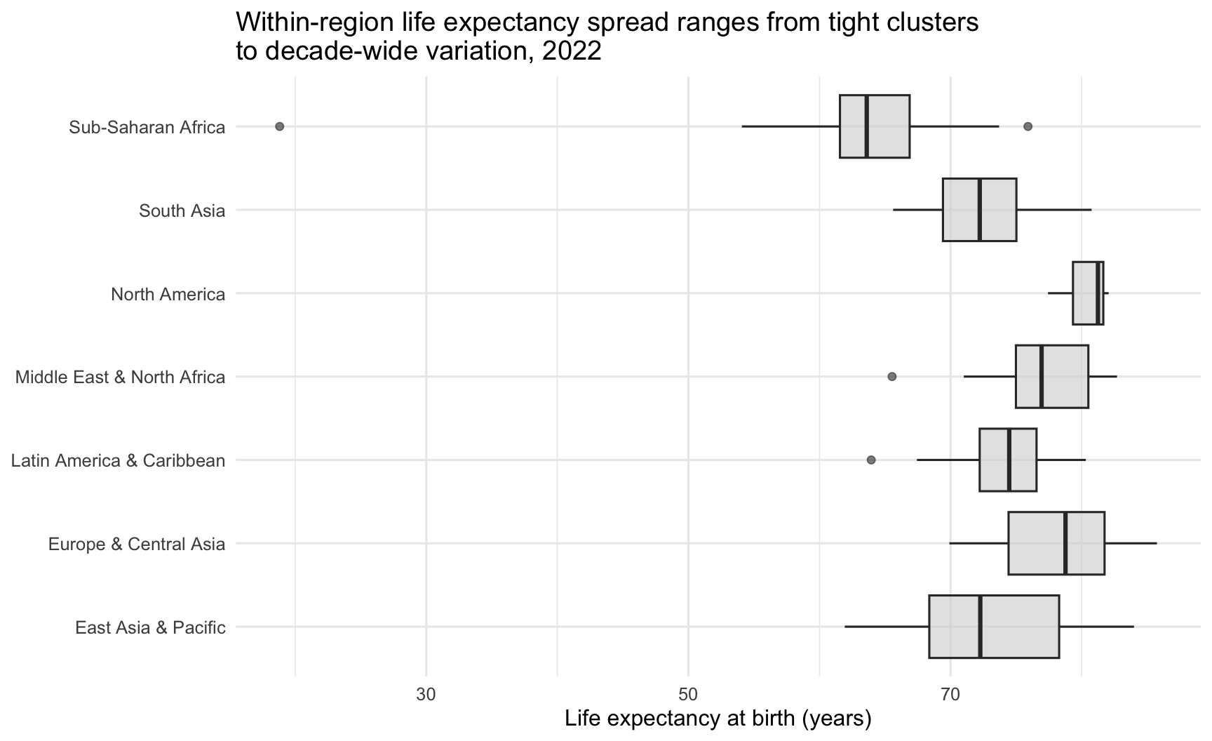
Note x = NULL in labs() — this removes the x-axis label entirely (since the region names on the flipped axis are self-explanatory). Because fill = "lightgray" is set outside aes(), all boxes use the same fixed fill color and no fill legend is generated. The show.legend = FALSE argument is harmless here, but it isn’t doing much because no fill variable has been mapped.
Also notice the \n tucked inside the title string. \n is the newline character — when R encounters it inside a string, it inserts a hard line break at that point. Without it, this long finding-as-title would run off the right edge of the plot or get truncated by ggplot’s auto-wrapping. Inserting \n after “clusters” lets us control exactly where the title breaks. The same trick works in subtitle, caption, and axis labels — and you’ll see it again on several charts below.
Anatomy of a boxplot
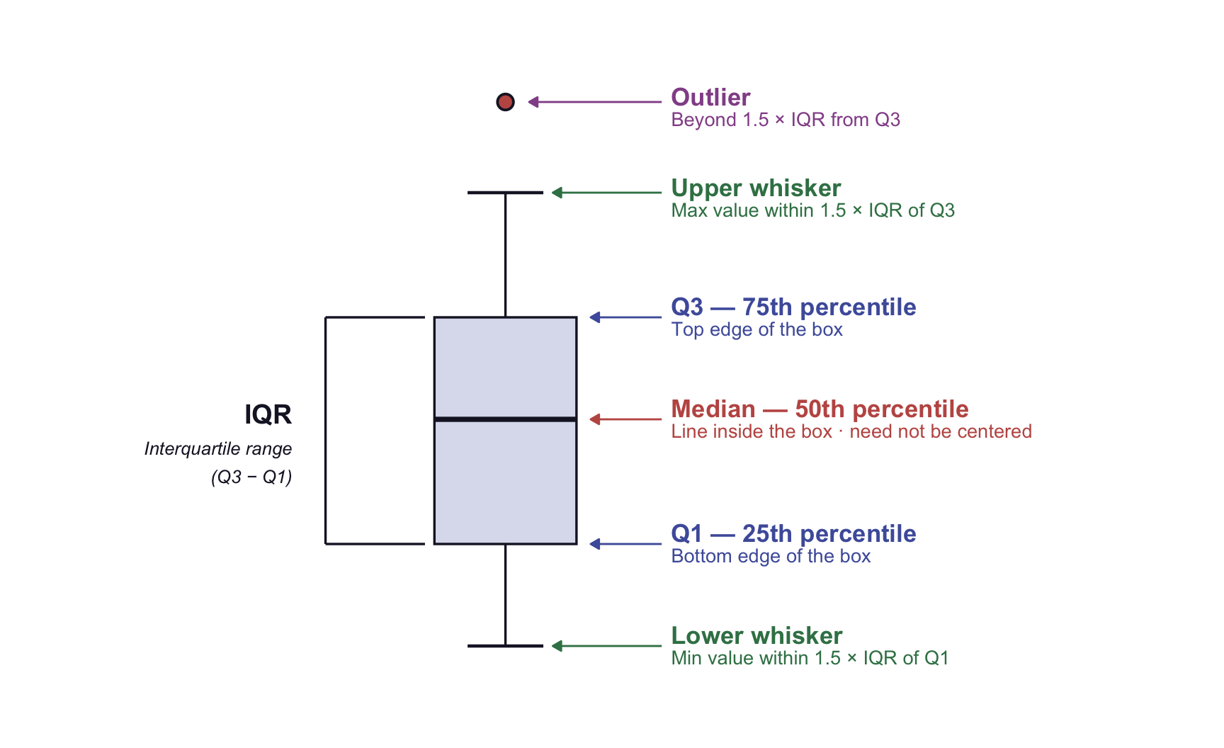
- Box spans Q1 to Q3 — this range is the IQR (interquartile range).
- Median line divides the box; it can sit anywhere inside, not necessarily centered.
- Whiskers extend to the most extreme non-outlier value — specifically, the farthest value within 1.5 × IQR of the box edge.
- Dots beyond the whiskers are flagged as potential outliers for individual inspection.
A longer box along the numerical axis means a larger IQR. A median line sitting closer to one edge of the box suggests asymmetry within the middle 50% of the observations — which is not the same as establishing that the full distribution is skewed. Check a histogram, a density plot, or the raw points before concluding anything about shape.
Pause · which chart for which question?
You’re about to meet four more chart types. Before you do, here’s a question you can answer right now with the charts you’ve already learned: if a reviewer asked you to show how household income varies across four neighborhoods in your data, what chart would you reach for?
The question is comparison across groups (neighborhoods), and within each group the quantity of interest is a distribution (income spread + center). Several charts you’ve already met would work: a boxplot per neighborhood (compact summaries side by side), overlaid density curves (full shape), or small-multiple histograms (most honest about raw counts). Each gains something and gives up something.
This question-first habit — what comparison am I asking the reader to make? — is more useful than memorizing chart types. The subsections below walk through five more research-question-to-chart-type pairings; keep asking yourself which question is being answered as you read each one.
Group summaries: bar charts with geom_col()
A bar chart is one common way to display zero-based counts, totals, proportions, or pre-computed summaries across groups, with each bar’s height encoding the value. It is among the most-used chart types in social science and public health reporting.
It is worth knowing, though, that bars are not automatically the best choice for means. When the quantity of interest is an estimate rather than a total, a dot plot — often with an interval attached — is frequently more informative, because the position of the estimate is what the reader needs and the bar’s filled area encodes nothing extra. Bars of means also hide the within-group distribution entirely. We use geom_col() here because it is the cleanest way to teach the geom_bar() / geom_col() distinction; treat it as a choice, not the choice.
In ggplot2, there are two geometry functions for bar charts: geom_bar() and geom_col(). Understanding the difference is essential.11 When you have already computed the summary statistic you want to display (as we will by using group_by() |> summarize()), use geom_col() — it draws bars whose heights come directly from a variable in your data. When you want ggplot2 to count rows for you (e.g., count how many countries fall in each region), use geom_bar().
A key technique for bar charts is sorting the bars by their value, rather than plotting them in alphabetical order of the category names. fct_reorder(region, mean_gdp) reorders the region factor levels so that the bars appear in ascending order of mean_gdp. Combined with coord_flip(), this produces horizontal bars sorted from smallest to largest, which is very easy to read.
Research question: Which world region has the highest average GDP per capita in 2022?
To answer this we first need a region-level summary — one row per region with the mean GDP per capita computed across the countries in it. The pipeline below uses two dplyr verbs you haven’t formally met: group_by() and summarize(), which M04 will study in depth. For now, read the chain as: “start with wdi_2022, then split it by region, then within each region compute a single number — the mean of gdp_per_capita — and call that new column mean_gdp.” The output is a tiny data frame with 7 rows (one per region) and two columns (region and mean_gdp) — ready to feed into ggplot().
wdi_2022 |>
  group_by(region) |>
  summarize(mean_gdp = mean(gdp_per_capita, na.rm = TRUE)) |>
  ggplot(aes(x = fct_reorder(region, mean_gdp), y = mean_gdp)) +
  geom_col(fill = "#3A8055", alpha = 0.85) +
  coord_flip() +
  scale_y_continuous(labels = label_dollar(scale_cut = cut_short_scale())) +
  labs(
    title = "Mean GDP per capita spans more than an order of magnitude across world regions, 2022",
    x = NULL,
    y = "Mean GDP per capita (current USD)"
  ) +
  theme_minimal(base_size = 12)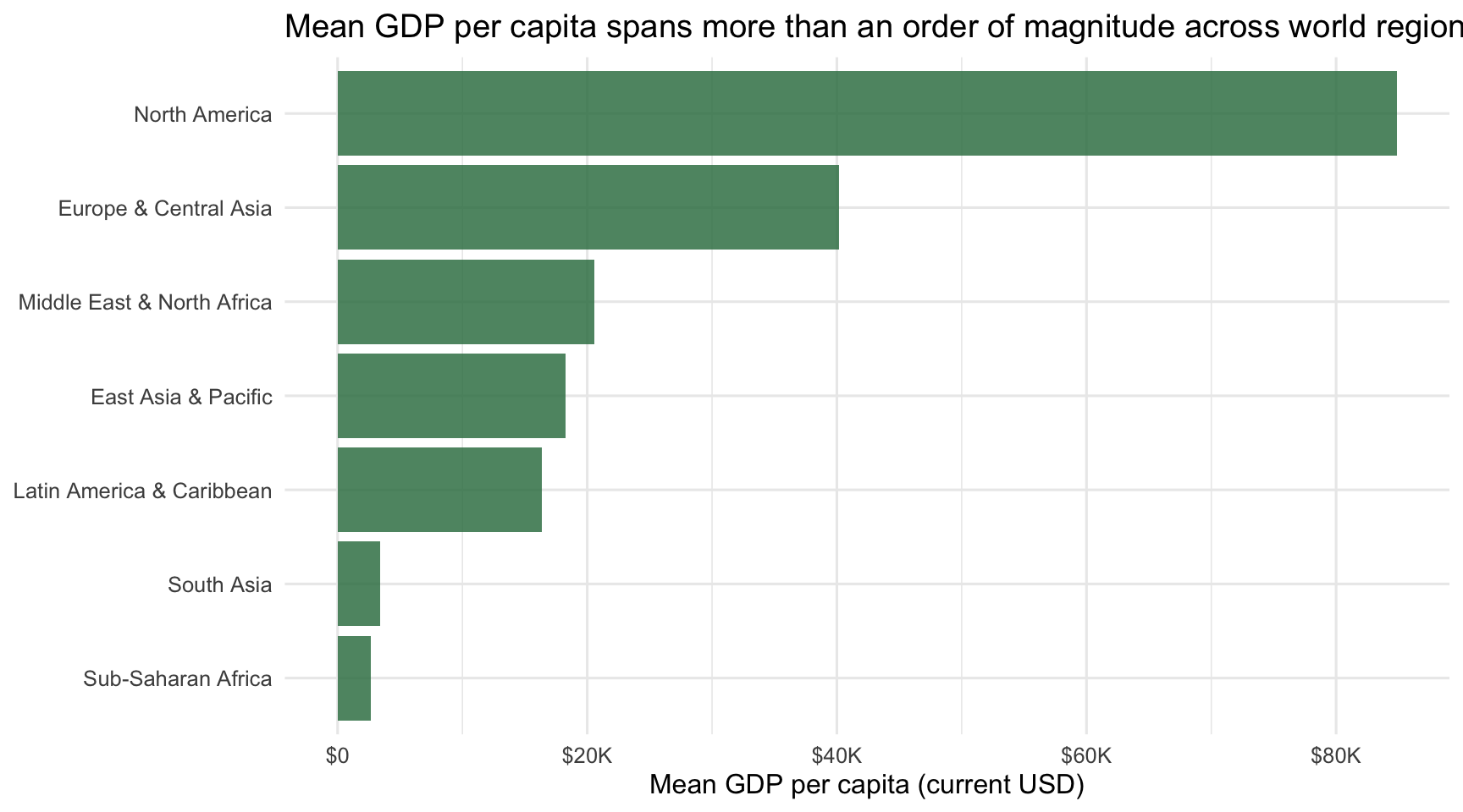
Let’s walk through every component of this code:
wdi_2022 |> group_by(region) |> summarize(mean_gdp = mean(gdp_per_capita, na.rm = TRUE))— the dplyr pipeline previewed above. It collapses wdi_2022 from 207 country rows down to 7 region rows, computing the mean GDP per capita within each region. Thena.rm = TRUEargument tells mean() to drop missing values before averaging. M04 formalizes this whole pattern — for now, the takeaway is that this is how you get from country-level data to region-level summaries before plotting.ggplot(aes(x = fct_reorder(region, mean_gdp), y = mean_gdp))— map the reordered region to x and the computed mean to y. fct_reorder(region, mean_gdp) from forcats (the same family as fct_infreq() you saw earlier) sorts regions by mean_gdp in ascending order. After coord_flip(), this places the smallest mean GDP at the bottom of the chart and the largest at the top — the easiest reading direction.geom_col(fill = "#3A8055", alpha = 0.85)— draw bars of height mean_gdp, all filled with the course’s spruce color (#3A8055). Because fill is set as a fixed property (outside aes()), every bar gets the same color — no fill legend is generated, and no perceptual noise competes with the bar lengths. The y-axis labels already name each region; the bar lengths carry the information.alpha = 0.85gives the bars slight transparency.coord_flip() — rotate the chart so bars are horizontal and region names read left-to-right.
scale_y_continuous(labels = label_dollar(scale_cut = cut_short_scale()))— format the (now-horizontal) axis as currency abbreviations using the same label_dollar() + scale_cut pattern we studied earlier. With mean GDPs in the tens of thousands, the short-scale suffixes ($10K, $20K, …) keep the axis labels readable.
Two categorical: stacked and grouped bars
When you have two categorical variables and want to see how they relate, the workhorse chart type is the stacked or grouped bar chart. The classic version maps one categorical to x and the other to fill, then either stacks or dodges the bars.12
The WDI data only has one categorical variable (region), so to demonstrate this we’ll construct a second: a rough GDP-per-capita tier for each country. The cut points below are inspired by World Bank income classifications, but official World Bank income groups are based on GNI per capita, not GDP per capita. Here we use them only as a teaching device — the spirit is right, the numbers are not the official thresholds. This step uses mutate() and case_when(), which you’ll study properly in M04. For now, you do not need to master the wrangling syntax; just keep your eye on the outcome: we are creating one new categorical variable called gdp_tier_demo — named to keep it clearly distinct from the World Bank’s official income groups. With both variables in hand, we can ask: how are GDP-per-capita bands distributed within each region?
wdi_2022 |>
  mutate(
    gdp_tier_demo = case_when(
      is.na(gdp_per_capita) ~ NA_character_,
      gdp_per_capita < 1135 ~ "Low",
      gdp_per_capita < 4465 ~ "Lower-middle",
      gdp_per_capita < 13845 ~ "Upper-middle",
      gdp_per_capita >= 13845 ~ "High"
    ) |>
      factor(levels = c("Low", "Lower-middle", "Upper-middle", "High"))
  ) |>
  filter(!is.na(gdp_tier_demo)) |>
  ggplot(aes(y = fct_infreq(region), fill = gdp_tier_demo)) +
  geom_bar(position = "fill") +
  scale_fill_manual(
    values = c(
      "Low" = "#C05852",
      "Lower-middle" = "#AD872B",
      "Upper-middle" = "#4E5EAA",
      "High" = "#3A8055"
    )
  ) +
  scale_x_continuous(labels = label_percent()) +
  labs(
    title = "High-income countries dominate Europe & North America;\nlow-income countries cluster in Sub-Saharan Africa",
    subtitle = sprintf(
      "GDP-per-capita band composition within each World Bank region · %d countries · 2022",
      n_countries_2022
    ),
    x = "Share of countries in the region",
    y = NULL,
    fill = "GDP-per-capita band (illustrative)"
  )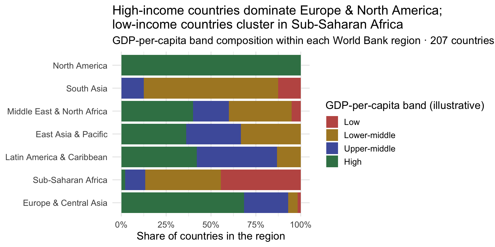
Each horizontal bar represents one of the 7 World Bank regions, and each bar’s full length stands for 100% of the countries in that region. The colored segments inside show what proportion of countries fall into each band — Low (rose), Lower-middle (gold), Upper-middle (indigo), High (spruce). That’s what the subtitle means by “GDP-per-capita band composition within each World Bank region”: rather than asking how many countries are in each region? (the Part 2 bar-chart question), we’re asking within this region, what share of countries falls into each band? Reading the chart left-to-right shows the answer: North America is entirely spruce (High-income) and Europe & Central Asia predominantly so; Sub-Saharan Africa is dominated by rose and gold (Low and Lower-middle); the other regions show varying mixes in between. Because every bar is rescaled to 100%, you can compare composition across regions directly without being misled by the very different region counts (Sub-Saharan Africa has 45 countries, North America only 3).
Three design choices worth noting. First, position = "fill" is what produces the rescale to 100% just described — it lets us compare composition across regions even though the regions have very different counts. The alternative position = "stack" (the default) keeps absolute counts visible but makes proportional comparison harder. Second, the scale_fill_manual() call assigns a specific color to each band rather than trusting ggplot’s default factor ordering. Be honest about what that palette does and doesn’t do: rose → gold → indigo → spruce distinguishes the four bands, but it does not visually order them — nothing about spruce reads as “more” than rose. When a variable is genuinely ordered and you want the reader to see that order, reach for a sequential light-to-dark palette (ColorBrewer’s "Blues" or "YlOrRd", or scale_fill_viridis_d()) instead of a set of unrelated hues. Third, the \n inside the title string is the same hard-line-break trick we used on the by-region boxplot — placing it after the semicolon puts the “what” on one line and the “where” on the next.
Stacked bars are powerful and easy to misuse — see “Diagnosing failed figures” at the end of this Part for the most common traps (especially: more than four segments stacked together becomes unreadable).
Two numerical: scatterplots
You’ve already built the canonical two-numerical visualization: the Rosling chart is a scatterplot of life expectancy vs GDP per capita. The minimal form is just ggplot(data, aes(x, y)) + geom_point(). Everything else — colors mapped to a third variable, sizes mapped to a fourth, log-scaled axes, smooth fit lines, faceting by group — is a layered addition to that two-line skeleton.
Whenever you have “how does X relate to Y, where both are numeric?”, a scatterplot is your starting move. Trend lines (next subsection) and small multiples (later) extend the scatterplot to multiple groups; with that toolkit you can answer almost any two-numerical research question.
Change over time: line charts
A line chart is the natural choice when your x-axis represents time and you want to emphasize continuity — the idea that the values are changing along a continuous dimension rather than being discrete, separate measurements. The connecting lines communicate that there is a trajectory, a story of change, not just a collection of isolated snapshots.
The critical requirement for a line chart is that your data must have multiple observations per group over time — one point per time step per group. Because wdi_2022 is a single-year snapshot, we switch to wdi_trends here, which covers the years 1960–2022 at approximately five-year intervals. This data frame has the same variables as wdi_2022 plus a year column.
Research question: How has the average country-level life expectancy changed over time, by world region?
To answer this, we first need to compute the regional average life expectancy for each year. This requires group_by() and summarize() from dplyr — which you will study in depth in M04. For now, you can read this pipeline as: “Group the data by region and year, and then compute the mean life expectancy within each group.”13
wdi_trends |>
  group_by(region, year) |>
  summarize(
    mean_life_exp = mean(life_expectancy, na.rm = TRUE),
    .groups = "drop"
  ) |>
  ggplot(aes(x = year, y = mean_life_exp, color = region)) +
  geom_line(linewidth = 1.1) +
  geom_point(size = 2) +
  labs(
    title = "Average country-level life expectancy was higher in 2022 than\nin 1960 in every world region",
    subtitle = "Unweighted means across countries reporting in each region-year",
    caption = "Source: World Bank WDI · 1960–2022",
    x = "Year",
    y = "Mean life expectancy at birth (years)",
    color = "Region"
  )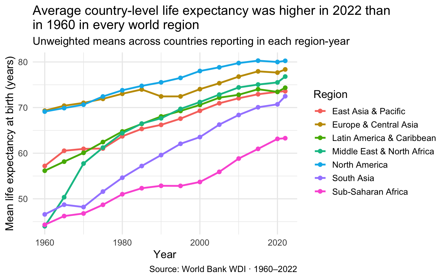
One caveat before reading too much into the slopes. These are unweighted means across whatever countries reported a life-expectancy value in each region-year, and coverage grows substantially over the period — Sub-Saharan Africa goes from 32 countries in 1960 to 45 in 2022, East Asia & Pacific from 13 to 36. Some of each line’s movement therefore reflects a change in which countries are represented, not a change in the countries themselves. Note too that “higher in 2022 than in 1960” is not the same as “rose steadily”: 5 of the 7 regional lines dip at least once along the way.
The new geometry here is geom_line(). It connects data points in order of the x variable and draws a continuous line. The linewidth = 1.1 argument sets the thickness of the line (the default is 0.5, which can be hard to see). We also add geom_point() on top to mark the individual observation years — this is an example of layering two geometries in the same plot, which is perfectly legal and very common.
The color = region aesthetic inside aes() serves two purposes: it assigns each region a distinct color, and it tells geom_line() to draw separate lines for each region. Without a color or group aesthetic, geom_line() would try to connect all points into a single zigzagging line, which is rarely what you want when you have multiple groups. This is one of the most common beginners’ errors with line charts.
Adding trend lines: geom_smooth()
A scatterplot shows you the cloud of (x, y) values. A trend line added on top quantifies the relationship that the cloud hints at: linear, curved, flat. geom_smooth() is the ggplot2 function for adding fitted curves to plots. It is the visual form of regression — the same machinery you’ll meet formally in M10–M12, expressed as a single layer.
The two arguments that matter most are method = (which determines what kind of curve is fit) and formula = (which describes the model). For an OLS regression line — a straight line of best fit — use method = "lm" (for “linear model”) and formula = y ~ x:
wdi_2022 |>
  ggplot(aes(x = gdp_per_capita, y = life_expectancy)) +
  geom_point(alpha = 0.5, color = "#4E5EAA") +
  geom_smooth(
    method = "lm",
    formula = y ~ x,
    color = "#C05852",
    fill = "#C05852",
    alpha = 0.15
  ) +
  scale_x_log10(labels = label_dollar(scale_cut = cut_short_scale())) +
  labs(
    title = "Life expectancy rises nearly linearly with log GDP per capita, 2022",
    subtitle = "Rose line: best-fit OLS regression · shaded ribbon: 95% confidence interval",
    x = "GDP per capita (log scale)",
    y = "Life expectancy at birth (years)"
  )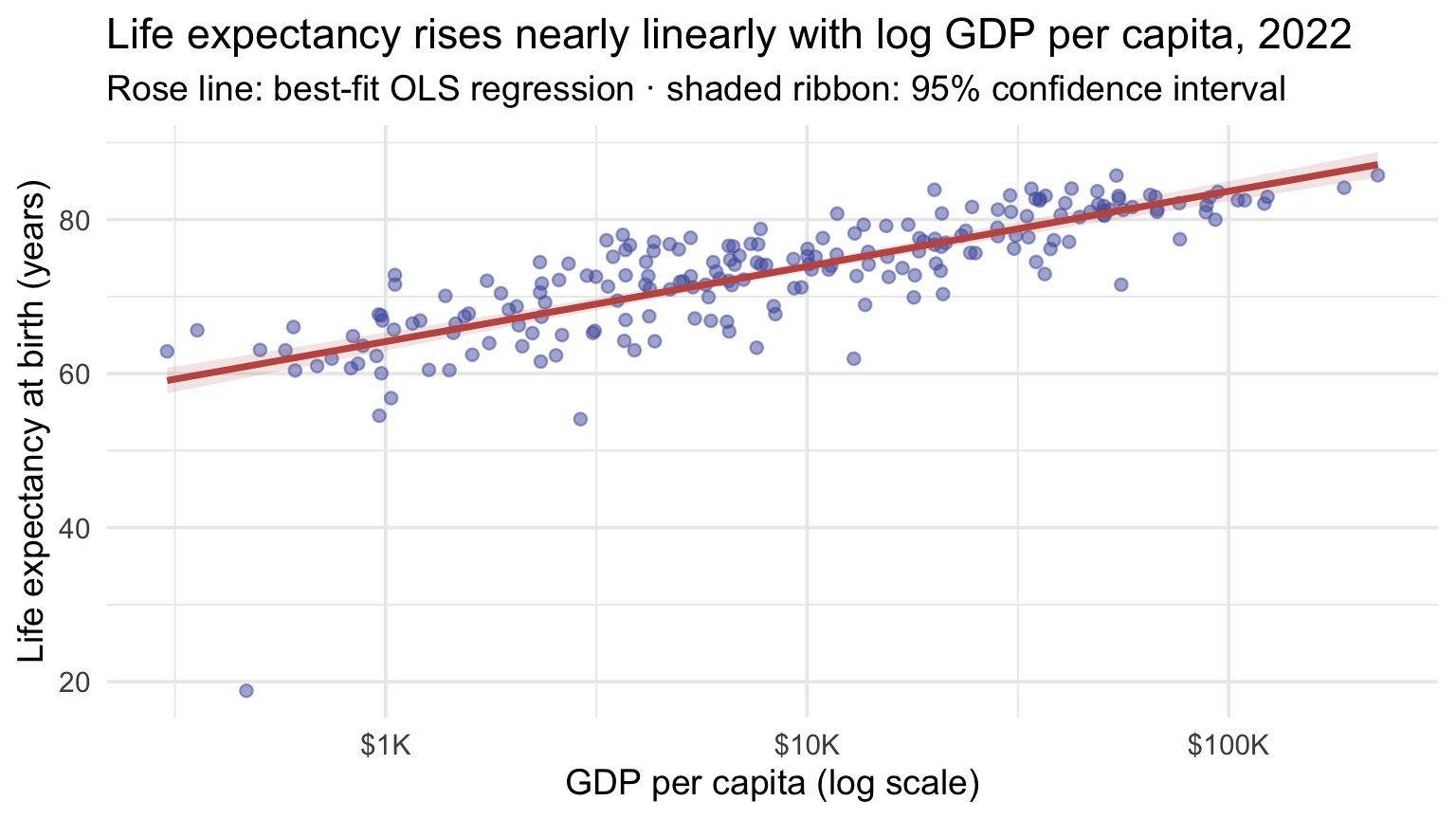
Two things happen visually:
- The rose line is the OLS fit — the line that minimizes the sum of squared vertical distances from the points to itself. Because the x-axis is log10-transformed, the slope is best read as the expected change in life expectancy for a one-unit increase in log10 GDP per capita — that is, for a 10-fold increase in GDP per capita. If that interpretation feels a bit advanced right now, that’s okay; the main visual point is simpler: the line summarizes the overall upward trend.
- The shaded ribbon around the line is a 95% pointwise confidence band for the estimated mean life expectancy at each GDP value. Two things it is not: it is not the range containing 95% of countries, and it is not a simultaneous guarantee about the entire line at once. It expresses uncertainty in the estimated conditional mean. Where the ribbon is narrow the mean is well estimated; where it widens (typically at the ends, where there are fewer points) there is more uncertainty.
In a report, geom_smooth() helps you visualize a model-like pattern. It does not replace fitting and reporting the actual regression model when inference is the goal — that work happens in M10–M12.
You can also fit separate trend lines per group by mapping color = (or group =) inside aes(). ggplot2 fits one line per category automatically:
wdi_2022 |>
  ggplot(aes(x = gdp_per_capita, y = life_expectancy, color = region)) +
  geom_point(alpha = 0.5) +
  geom_smooth(method = "lm", formula = y ~ x, se = FALSE, linewidth = 0.9) +
  scale_x_log10(labels = label_dollar(scale_cut = cut_short_scale())) +
  labs(
    title = "The country-level association is positive in every region — but \nnot to the same degree everywhere",
    subtitle = "One OLS regression line per world region · 2022",
    x = "GDP per capita (log scale)",
    y = "Life expectancy (years)",
    color = "Region"
  )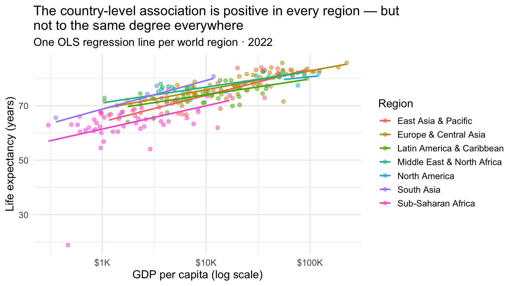
Here we set se = FALSE to suppress the confidence ribbons (multiple overlapping ribbons would clutter the plot). Each colored line is the OLS fit within that region — which lets us see whether the GDP–life-expectancy relationship holds uniformly across regions or varies. If the lines have noticeably different slopes or vertical positions, that is evidence that the relationship may differ by region. In a later regression course, you would connect that visual idea to an interaction; for now, it is enough to notice whether the lines look similar or different.
The other common method = values are "loess" (a flexible local-regression smoother that follows curves in the data — useful when you don’t want to assume linearity) and "gam" (a generalized additive model — even more flexible, with the smoothness controlled automatically). For a first-pass exploratory plot, method = "loess" is the most common choice; for confirming or visualizing a fitted regression, method = "lm" is the right tool.
Three or more variables: small multiples with facet_wrap() and facet_grid()
When you have several groups to compare and the colors-in-one-plot approach gets crowded, small multiples are the answer. The idea is simple: instead of overlapping all the groups in a single panel, give each group its own little subpanel arranged in a grid. The eye can then compare panel-to-panel without the visual interference of overlap.
facet_wrap() is the most commonly used faceting function. It splits the data by one variable and arranges the resulting panels into a grid that wraps automatically:
wdi_2022 |>
  ggplot(aes(x = gdp_per_capita, y = life_expectancy)) +
  geom_point(alpha = 0.6, color = "#4E5EAA") +
  geom_smooth(
    method = "lm",
    formula = y ~ x,
    color = "#C05852",
    se = FALSE,
    linewidth = 0.8
  ) +
  facet_wrap(~region) +
  scale_x_log10(labels = label_dollar(scale_cut = cut_short_scale())) +
  labs(
    title = "Life expectancy vs GDP per capita, by world region (2022)",
    subtitle = "Each panel shows one region with its own OLS fit",
    x = "GDP per capita (log scale)",
    y = "Life expectancy (years)"
  )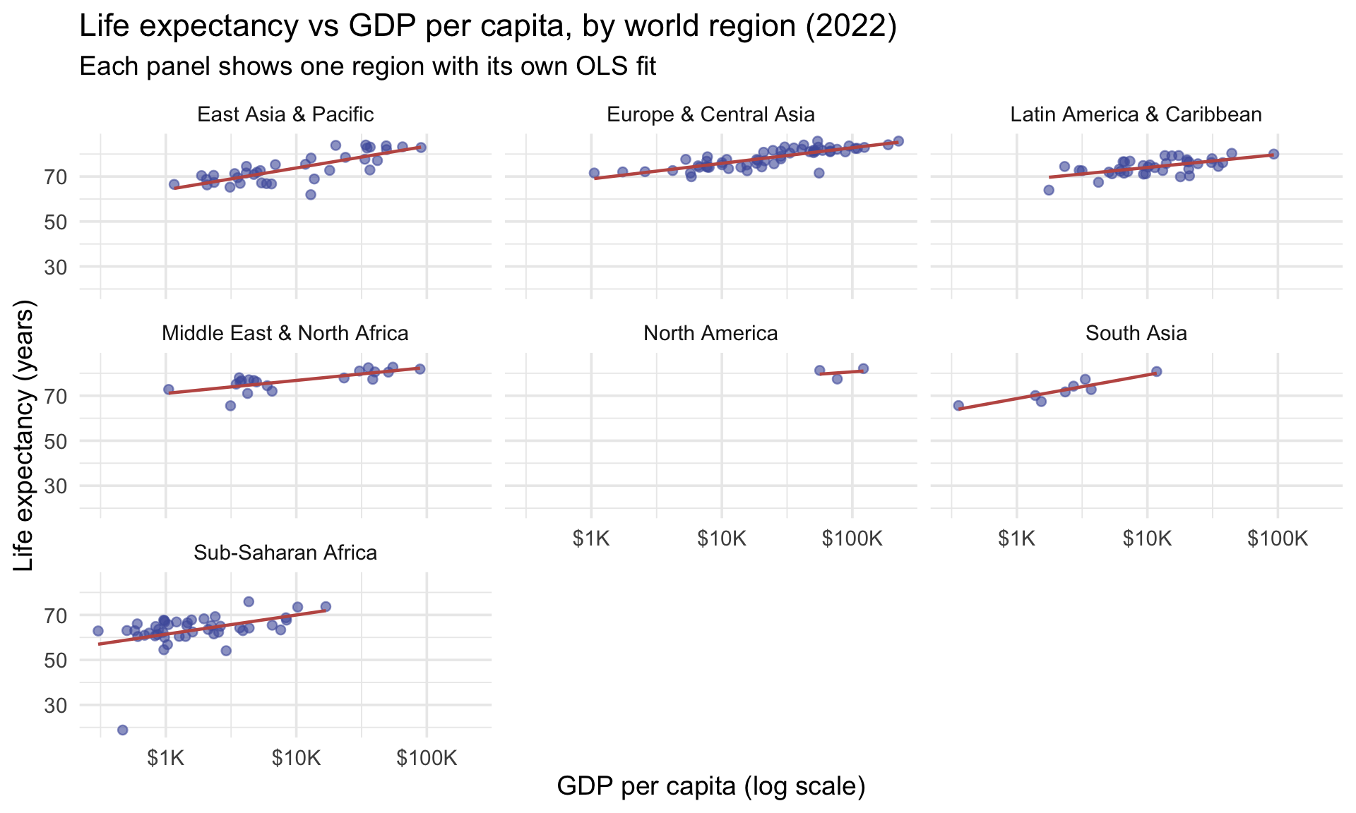
The single argument ~ region is a formula — the tilde-prefix syntax R uses generally for “the thing on the right is what we’re splitting by.” facet_wrap() automatically arranges the resulting panels in a roughly square grid; you can override that with ncol = or nrow =.
Notice how much more readable this is than the colored-by-region scatterplot above. Each region gets its own clean panel, the OLS line within each region is unambiguous, and the eye can step from panel to panel. Use small multiples when you have more than three or four groups, or when overlap makes a single-panel view hard to read.
For two-way faceting — splitting by two variables at once — use facet_grid(). The formula syntax is row_variable ~ column_variable, which produces a panel for each combination of the two splits:
# A two-way split — for illustration we'll create two binary groupings
wdi_demo <- wdi_2022 |>
  mutate(
    pop_group = case_when(
      population > median(population, na.rm = TRUE) ~ "Above-median pop",
      population <= median(population, na.rm = TRUE) ~ "Below-median pop"
    ),
    region_group = case_when(
      region %in% c("Sub-Saharan Africa", "South Asia") ~ "Sub-Saharan Africa & S. Asia",
      !region %in% c("Sub-Saharan Africa", "South Asia") ~ "Other regions"
    )
  )

wdi_demo |>
  ggplot(aes(x = gdp_per_capita, y = life_expectancy)) +
  geom_point(alpha = 0.6, color = "#4E5EAA") +
  facet_grid(pop_group ~ region_group) +
  scale_x_log10(labels = label_dollar(scale_cut = cut_short_scale())) +
  labs(
    title = "Life expectancy vs GDP, split by population size and region grouping",
    x = "GDP per capita (log scale)",
    y = "Life expectancy (years)"
  )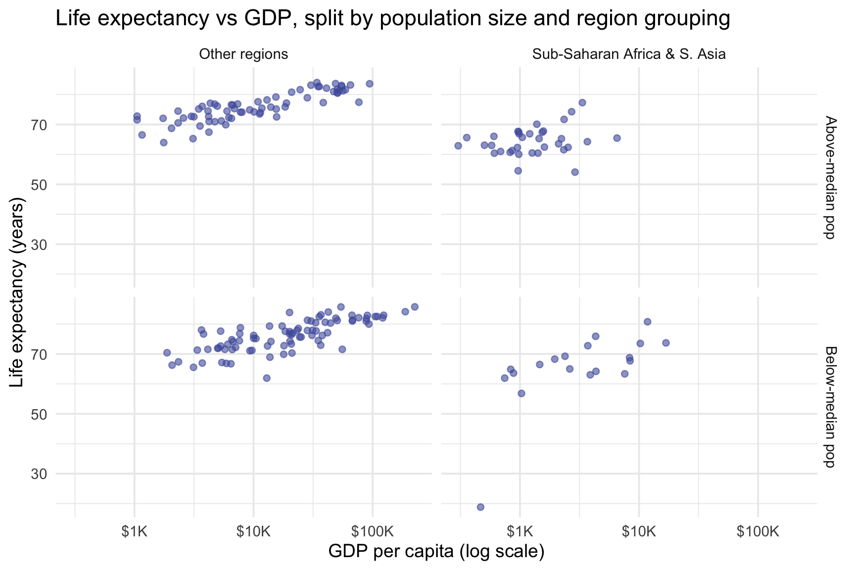
The pop_group ~ region_group syntax says “rows split by pop_group, columns split by region_group” — producing a 2 × 2 grid where each panel shows the countries falling into one combination of the two groupings. The result reveals patterns that are invisible in a single-panel scatter: countries in Sub-Saharan Africa & S. Asia (left column) sit at noticeably lower life expectancies than Other regions (right column), and within each region group, Above-median pop (top row) and Below-median pop (bottom row) track each other closely. That comparison is descriptive only: faceting splits the data into panels, it does not statistically adjust for region or estimate an independent effect of population. Reading a facet as a statistical control is one of the most common inferential mistakes made with small multiples.
You can also facet on only one dimension by putting a . on the other side: pop_group ~ . gives stacked rows only; . ~ pop_group gives side-by-side columns only. These are equivalent to facet_wrap()-style splits but with strict-grid placement instead of auto-wrapping.
facet_wrap vs facet_grid
- facet_wrap(~ var) — one variable, panels auto-wrap into a grid. Use when you have one grouping with many levels and you don’t care about the layout’s exact rows/cols.
- facet_grid(row ~ col) — two variables crossed. Each cell is the intersection of a row-level and a column-level. Use when both variables genuinely matter and you want to see every combination.
- facet_grid(row ~ .) or facet_grid(. ~ col) — one variable but using
facet_gridfor the strict-grid layout (no wrapping).
Common gotcha: by default, every panel uses the same x and y axis ranges (scales = "fixed"), which is what you usually want for cross-panel comparison. If panels have very different ranges and you want each panel to use its own scale, set scales = "free", scales = "free_x", or scales = "free_y" — but this should be a deliberate choice, because shared axes are what make small multiples comparable.
Choosing the right chart for your research question
You now have a working vocabulary of seven chart types and the two extensions (smooth lines + facets). The most important practical skill is matching the chart type to the question your data is meant to answer. The table below is the quick reference; it’s organized the way R4DS and Wilke both recommend — by the question being asked, not by the type of variable in your data.
Research question → chart type
| If your question is about… | Use… | Key geom |
|---|---|---|
| The distribution of one continuous variable | Histogram or density plot | geom_histogram(), geom_density() |
| The distribution of one categorical variable | Bar chart of counts | geom_bar() |
| Comparing a numerical distribution across groups | Boxplot or per-group density | geom_boxplot(), geom_density() |
| Composition of one categorical across another | Stacked bar with position = "fill" |
geom_bar(), geom_col() |
| Comparing a summary statistic (mean, median, total) across groups | Bar chart of pre-computed values | geom_col() |
| Relationship between two continuous variables (and maybe a third for size or color) | Scatterplot / bubble chart | geom_point() |
| Trend in the relationship above | Add a smooth or OLS curve | geom_smooth() |
| Change over time in one or more groups | Line chart | geom_line() |
| Three or more variables at once (after exhausting color and shape) | Faceted small multiples | facet_wrap(), facet_grid() |
When you’re starting an analysis, write the research question out as a sentence first; the chart type usually falls out of the wording. “How is X distributed?” → histogram. “How does X relate to Y?” → scatterplot. “How does the relationship between X and Y differ by Z?” → scatterplot faceted by Z. The chart type is downstream of the question.
Diagnosing failed figures — Wilke’s ugly / bad / wrong
You’ve now built — or seen built — bar charts, histograms, boxplots, scatterplots, line charts, stacked bars, and small multiples. That’s enough of a chart-type vocabulary to apply a diagnostic vocabulary on top: a way to name what’s wrong when a figure fails. Claus Wilke (whose Fundamentals of Data Visualization shaped the Overview’s art-and-science framing) offers a three-word taxonomy you can keep in mind every time you build a chart and every time you read one in a paper. The point is not to memorize labels for their own sake; it is to get faster at asking, is this figure merely plain-looking, hard to read, or actually misleading?
Wilke’s evaluative vocabulary: ugly, bad, wrong
| Label | What’s wrong | Fix |
|---|---|---|
| ugly | The figure is technically correct but aesthetically off — jarring colors, mismatched fonts, prominent gridlines that compete with the data, an unhelpful theme. The reader can still extract the right answer; it just hurts to look at. | Lighter touch on theme, palettes, and decoration. |
| bad | The figure is perceptually misleading — overly complicated, hard to decode, encourages a wrong inference. Pie charts with many slices, dual-axes, 3-D bars, and stacked bars with too many segments are classic bad figures. The reader is likely to walk away with the wrong impression. | Redesign — usually by switching to a different geometry or by simplifying. |
| wrong | The figure is mathematically incorrect — the bars are drawn at proportions that don’t match the numbers, the y-axis baseline is missing or truncated in a way that distorts comparison, the scale doesn’t match what the legend says. The reader cannot recover the right answer from the figure at all. | Fix the chart before doing anything else. A wrong figure is never publishable. |
The boundary between ugly and bad is fluid — sometimes poor aesthetic choices interfere with perception enough that a figure crosses from one category into the other. The boundary between bad and wrong is harder: “wrong” is reserved for figures that fail the mathematical accuracy test — quantities are literally misrepresented by the visual encoding. A bar chart whose y-axis starts at 95 making a 1-unit difference look enormous? That’s wrong, not bad. A pie chart with twelve slices in similar colors? That’s bad, not wrong.
With the vocabulary in hand, here is the trap list — the most common ways charts you’ll meet in journal articles, conference talks, and supplementary appendices go wrong. Most are bad (perceptual problems) or wrong (mathematical problems), not just ugly:
- Pie charts with many slices — bad. People are poor at comparing angles. A pie can work for a simple part-to-whole comparison with a small number of clearly distinct slices; beyond that, a sorted horizontal bar chart usually supports far more precise comparison.
- Dual y-axes — bad. Putting two variables on different y-axes lets you strengthen or weaken their apparent visual correspondence just by changing the scales. (The numerical correlation between the two series doesn’t change — only how aligned they look, which is exactly what the reader reads off the chart.) Reviewers in your field will rightly be suspicious. Use small multiples or two adjacent plots instead.
- 3-D effects — ugly veering into bad. 3-D bar and pie charts distort visual proportions for the sake of decoration. Stick to 2-D.
- Stacked bars with many categories — bad. When a stacked bar has more than three or four segments, the eye often loses track of where one segment ends and the next begins. That cutoff is a rule of thumb, not a law of nature, but it is a useful warning sign. Use grouped bars (
position = "dodge"), small multiples, or a different chart type altogether. - Missing or truncated zero baselines on bar charts — wrong. A bar chart whose y-axis starts at, say, 95 makes a 1-unit difference look enormous. Bar lengths are proportional only when the axis starts at zero. This is mathematically misleading, not just aesthetically poor — it’s a wrong figure in Wilke’s vocabulary, and it should be corrected before the figure is submitted or published. Note that this warning is specific to bar charts and other length encodings: line charts, scatterplots, and interval plots do not generally require a zero baseline.
- Color choices that fail on grayscale or for colorblind viewers — ugly to bad depending on severity. Test with a colorblindness simulator, and prefer the viridis family or ColorBrewer’s colorblind-safe palettes.
Hold this list in mind when you read other people’s figures — and when you create your own.
Part 4 · Polish for communication
R4DS Chapter 11 draws a sharp distinction between two kinds of plots, and it’s worth holding in mind every time you sit down to make one:
- Exploratory plots are quick, rough, and disposable. You make them to understand — to see whether a relationship is linear, whether a distribution is bimodal, or whether an outlier is a typo or a real extreme. In any real analysis you’ll produce dozens or hundreds of these, glance at each for a few seconds, and discard most of them. The default ggplot2 output is usually fine here — clean enough to read, fast enough to iterate on.
- Communication plots are slower, more polished, and more self-explanatory. You make them at the end of an analysis to show something to a reader who does not share your background knowledge and may spend only thirty seconds with the figure. Communication plots earn their polish because the reader can’t ask you questions. Every choice — the title, the axis labels, the color palette, the annotations — is doing work the reader cannot do for themselves.
Most real work includes plots that fall somewhere between these two extremes, so treat this as a useful contrast rather than a rigid binary. The customization tools in this Part — palettes, the color-to-highlight pattern, labels, and annotations — are the toolkit for moving an exploratory plot closer to a communication plot. Most of them have appeared already, scattered through Parts 1–3; this Part collects them, demonstrates the moves that pay off most, and points you at R4DS Chapter 11 for the finer-grain detail when you need it.
To make the contrast concrete, here is the same scatterplot rendered in both modes — first as a quick exploratory look (the kind of figure you’d glance at for three seconds during analysis), then as a polished communication version (the kind that ends up in a paper, slide deck, or report):
# Exploratory: defaults everywhere, no polish
# (theme_grey is ggplot2's actual default — the site-wide theme_minimal
#  would otherwise undercut the contrast we're trying to show.)
p_exploratory <- wdi_2022 |>
  ggplot(aes(x = gdp_per_capita, y = life_expectancy, color = region)) +
  geom_point() +
  scale_x_log10() +
  labs(title = "Exploratory") +
  theme_grey(base_size = 11)

# Communication: titled, captioned, themed, custom palette
p_communication <- wdi_2022 |>
  ggplot(aes(x = gdp_per_capita, y = life_expectancy, color = region)) +
  geom_point(alpha = 0.75, size = 2.2) +
  scale_x_log10(labels = label_dollar(scale_cut = cut_short_scale())) +
  scale_color_manual(
    values = c(
      "East Asia & Pacific" = "#348C9E",
      "Europe & Central Asia" = "#4E5EAA",
      "Latin America & Caribbean" = "#C05852",
      "Middle East & North Africa" = "#AD872B",
      "North America" = "#945297",
      "South Asia" = "#3A8055",
      "Sub-Saharan Africa" = "#1A1A2E"
    )
  ) +
  labs(
    title = sprintf(
      "Countries with higher GDP per capita have higher life expectancy —\na tenfold difference is associated with about %.0f more years",
      gdp_le_slope
    ),
    subtitle = sprintf(
      "%d countries · 2022 · GDP on a log scale",
      n_countries_2022
    ),
    x = "GDP per capita (current USD)",
    y = "Life expectancy at birth (years)",
    color = "World region",
    caption = "Source: World Bank WDI via the WDI package"
  ) +
  guides(color = guide_legend(ncol = 2, byrow = TRUE)) +
  theme_minimal(base_size = 11) +
  theme(
    plot.title = element_text(face = "bold", size = 12),
    plot.subtitle = element_text(size = 10),
    legend.position = "bottom",
    legend.text = element_text(size = 9),
    legend.title = element_text(size = 10),
    legend.box.margin = margin(t = 6, b = 4)
  )

# Print side-by-side with patchwork
p_exploratory + p_communication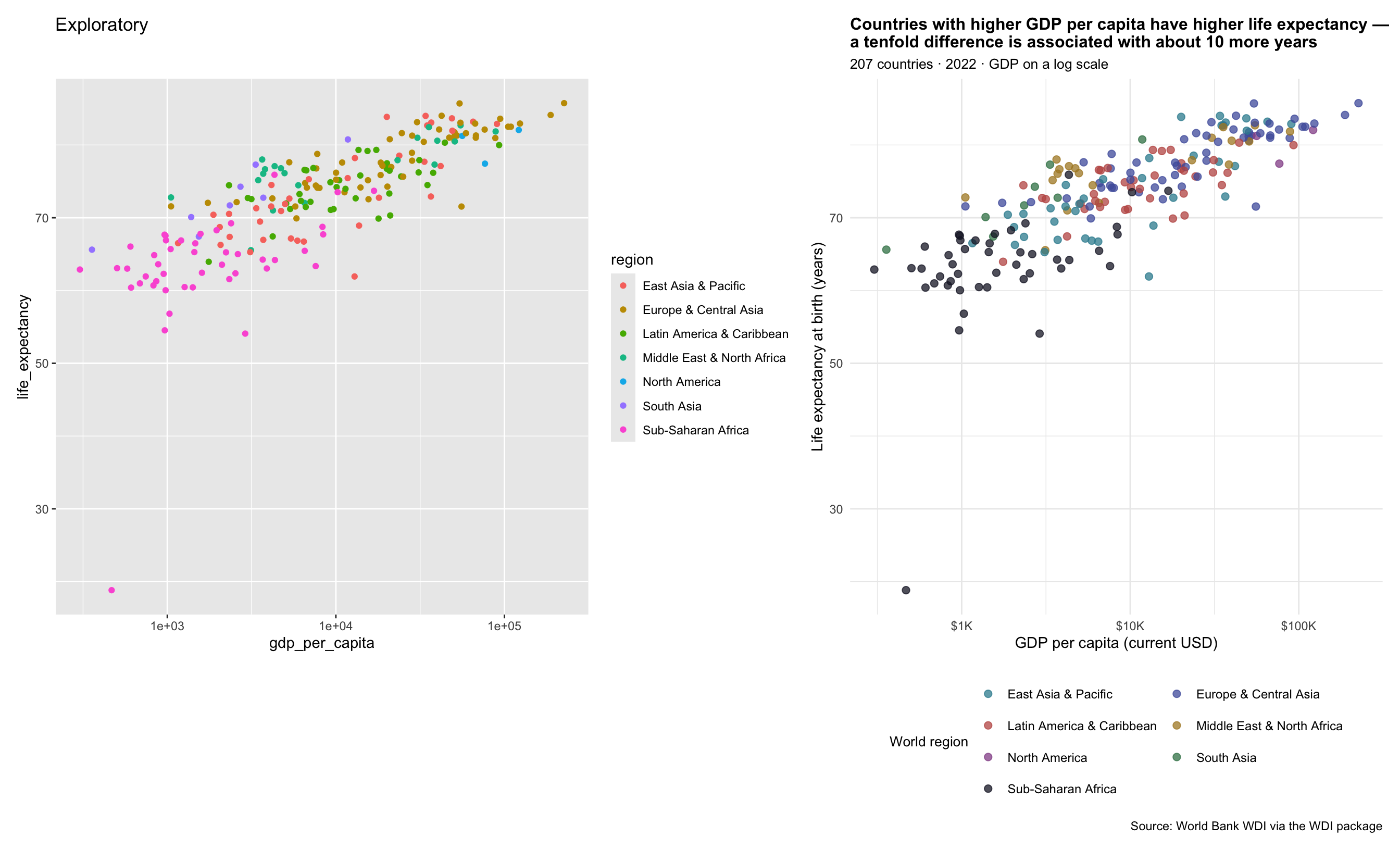
Both charts show the same data. The version on the left is honest about what it is — a quick check that the relationship is monotone, that there are no obvious data-entry errors, that the log-x transformation looks right. The version on the right is doing work the reader can’t do for themselves: the title states the finding, the subtitle scopes it, the axis labels read in plain English with units, the legend is at the bottom (out of the data’s way), the palette uses meaningful colors instead of ggplot defaults, and the caption credits the source. Everything in this Part is a tool for moving from the left version to the right one.
Colors
By default, ggplot2 uses a built-in color palette. This is fine for exploratory work but can be improved for communication. The following five functions from the scales and ggplot2 packages cover the most common needs:
| Function | When to use |
|---|---|
| scale_color_brewer(palette = 'Set2') | Categorical color from a ColorBrewer qualitative palette. Check how many categories your palette supports — Set2 tops out at 8. See colorbrewer2.org. |
| scale_fill_brewer(palette = 'Blues') | Same as above but for fill aesthetics (histograms, bar charts, density plots). |
| scale_color_manual(values = c('#E41E1C', ...)) | Specify exact colors by name or hex code. Full control. |
| scale_color_viridis_d() | Colorblind-friendly discrete palette. Use for categorical variables. |
| scale_fill_viridis_c() | Colorblind-friendly continuous gradient. Use for continuous variables mapped to fill. |
Here is the default palette versus a ColorBrewer palette, side by side:
p_default <- wdi_2022 |>
  ggplot(aes(x = gdp_per_capita, y = life_expectancy, color = region)) +
  geom_point(alpha = 0.6, size = 2) +
  scale_x_log10(labels = label_dollar(scale_cut = cut_short_scale())) +
  labs(
    title = "Default ggplot2 palette",
    x = NULL,
    y = "Life expectancy (years)",
    color = NULL
  ) +
  theme_minimal(base_size = 11) +
  theme(
    legend.position = "bottom",
    legend.text = element_text(size = 8),
    legend.key.size = unit(0.4, "cm")
  ) +
  guides(color = guide_legend(ncol = 2))

p_brewer <- wdi_2022 |>
  ggplot(aes(x = gdp_per_capita, y = life_expectancy, color = region)) +
  geom_point(alpha = 0.6, size = 2) +
  scale_x_log10(labels = label_dollar(scale_cut = cut_short_scale())) +
  scale_color_brewer(palette = "Set2") +
  labs(
    title = "ColorBrewer Set2",
    x = NULL,
    y = "Life expectancy (years)",
    color = NULL
  ) +
  theme_minimal(base_size = 11) +
  theme(
    legend.position = "bottom",
    legend.text = element_text(size = 8),
    legend.key.size = unit(0.4, "cm")
  ) +
  guides(color = guide_legend(ncol = 2))

p_default + p_brewer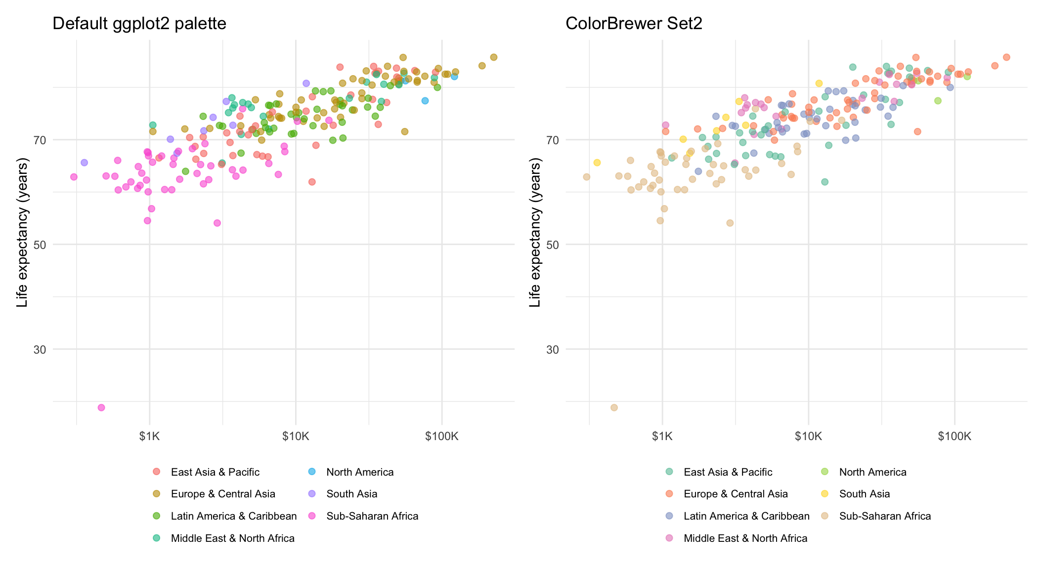
On the left, the ggplot2 default palette assigns the 7 regions a set of evenly spaced hues from a uniform color wheel. On the right, scale_color_brewer(palette = "Set2") swaps in a palette that was designed (by cartographer Cynthia Brewer) to maximize perceptual separation between adjacent categories. The change isn’t dramatic for 7 regions, but it scales much better — and many ColorBrewer palettes are also colorblind-safe (see the accessibility note below). There are many different palettes to choose from: ColorBrewer website.
A practical note on accessibility: approximately 8% of men and 0.5% of women have some form of color vision deficiency. Some palettes are easier to read for those readers than others. The viridis family (scale_color_viridis_d(), scale_fill_viridis_c()) is specifically designed to be perceptually uniform and colorblind-friendly. ColorBrewer also identifies palettes that are marked colorblind-safe. When your figure will be published or widely shared, choose an accessible palette deliberately rather than relying on the default — and check your work with a color-blindness simulator. The viridis vignette describes the options in more detail.
Using color to highlight, not decorate. One of Wilke’s most useful principles is that color should do work — it should draw the reader’s eye to the thing the figure is about, not just decorate every category equally. When your finding is about one specific group (“Sub-Saharan African countries cluster at the low end of both axes”), it’s often more effective to render that group in a saturated color and let every other group fade into a neutral gray:
wdi_2022 |>
  ggplot(aes(
    x = gdp_per_capita,
    y = life_expectancy,
    color = region == "Sub-Saharan Africa"
  )) +
  geom_point(alpha = 0.7, size = 2) +
  scale_x_log10(labels = label_dollar(scale_cut = cut_short_scale())) +
  scale_color_manual(
    values = c("TRUE" = "#C05852", "FALSE" = "grey75"),
    labels = c("TRUE" = "Sub-Saharan Africa", "FALSE" = "All other regions"),
    name = NULL
  ) +
  labs(
    title = "Sub-Saharan African countries cluster at the low end of both axes",
    subtitle = sprintf("%d countries · 2022", n_countries_2022),
    x = "GDP per capita (log scale)",
    y = "Life expectancy at birth (years)"
  ) +
  theme_minimal(base_size = 12)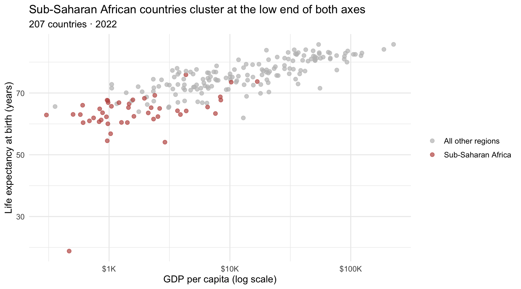
The trick is to create the highlight grouping inside aes() itself, using a logical expression like region == "Sub-Saharan Africa". That produces a TRUE/FALSE variable on the fly — no need to add a column to the data. If this feels slightly clever, that is because it is: you are asking ggplot to build a temporary grouping just for this plot. Then scale_color_manual() assigns rose to TRUE and a neutral gray to FALSE. The result reads at a glance: the eye lands on the rose points first, the gray points provide context without competing for attention. Compare this to the multi-color legend you’d get by mapping all regions individually — that version makes the reader work to find Sub-Saharan Africa among the other regions.
This same pattern works for any kind of highlight — a specific country, a date range on a time series, an outlier worth calling out. Whenever your finding is about one thing, prefer a one-color-plus-gray palette over rendering every category as a peer.
For palette options beyond what we’ve shown here — exact colors via scale_color_manual() with named vectors, the full ColorBrewer catalog, the colorblind-safe viridis family, and the paletteer package’s hundreds of curated palettes — see R4DS Chapter 11 · Communication. The book covers every palette mechanism in detail when you need finer-grain control.
Labels
Good labels do the same kind of work that color does — they guide the reader’s eye to what matters and make a plot self-explanatory. We covered the labs() function and the title-summarizes-the-finding rule in Step 7 of the Rosling build (Part 1); that rule applies to every chart you’ll make for communication. The core elements:
title =— the takeaway the figure is meant to highlight, not just a description of the axes.subtitle =— scope and method notes (sample size, year, transformation).x =,y =,color =,size =,fill =— human-readable variable descriptions with units in parentheses when they exist (“Life expectancy at birth (years)” beats “life_expectancy”).caption =— bottom-right text for provenance. By convention, captions begin with"Source: "followed by the dataset name and source.
Here is a fully labeled scatterplot with all four labeling jobs in use:
wdi_2022 |>
  ggplot(aes(x = gdp_per_capita, y = life_expectancy, color = region)) +
  geom_point(alpha = 0.7, size = 2) +
  scale_x_log10(labels = label_dollar(scale_cut = cut_short_scale())) +
  labs(
    title = sprintf(
      "Countries with higher GDP per capita have higher life expectancy —\na tenfold difference is associated with about %.0f more years",
      gdp_le_slope
    ),
    subtitle = sprintf(
      "%d countries · 2022 · GDP on a log scale",
      n_countries_2022
    ),
    x = "GDP per capita (current USD)",
    y = "Life expectancy at birth (years)",
    color = "World region",
    caption = "Source: World Bank World Development Indicators"
  )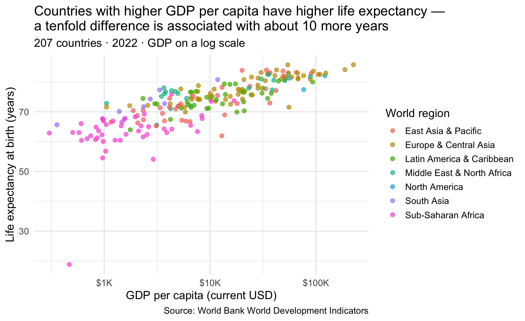
For deeper label-design treatment — including mathematical notation in labels (e.g., \(\sigma\), \(R^2\)) via quote() and ?plotmath — see R4DS Chapter 11 · Communication.
Annotations
Where labels frame how to read the whole plot, annotations do surgical work — they mark up specific points or regions to call out an outlier, highlight a baseline, or draw the reader’s eye to a particular finding that might otherwise be missed.
A good rule of thumb is this: label the whole plot with labs(); label specific features with annotations.
The workhorse tool is geom_text(): it adds text at the (x, y) coordinates of every row in the data. Combined with a filter() of the data first (a function you’ll learn more about in M04), it’s the cleanest way to label just the points you care about:
# Pick five interesting countries to label
to_label <- wdi_2022 |>
  filter(country %in% c("United States", "China", "India", "Norway", "Nigeria"))

wdi_2022 |>
  ggplot(aes(x = gdp_per_capita, y = life_expectancy)) +
  geom_point(alpha = 0.4, color = "#4E5EAA") +
  geom_text(
    data = to_label,
    aes(label = country),
    color = "#1A1A2E",
    size = 3.6,
    fontface = "bold",
    hjust = -0.15,
    vjust = 0.5
  ) +
  geom_point(data = to_label, color = "#C05852", size = 3) +
  scale_x_log10(labels = label_dollar(scale_cut = cut_short_scale())) +
  labs(
    title = "Identify specific countries on the Rosling scatter",
    subtitle = "Five named countries highlighted in rose",
    x = "GDP per capita (log scale)",
    y = "Life expectancy (years)"
  )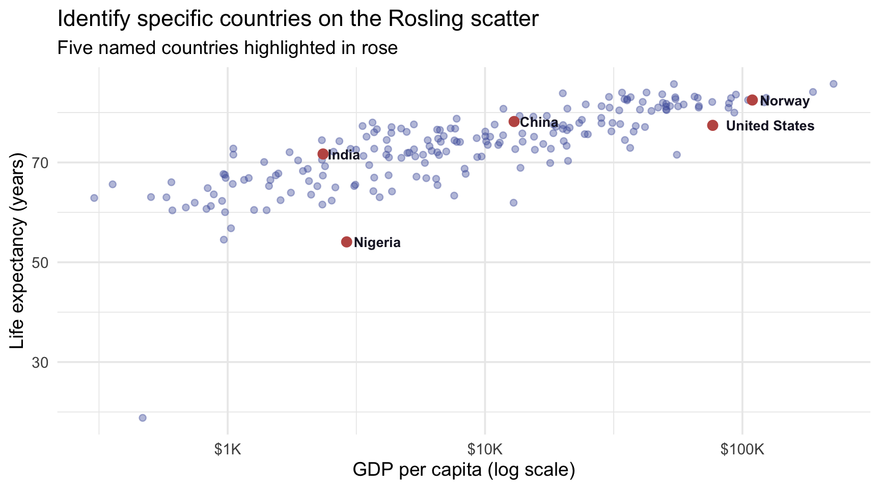
Notice that we’re passing data = and aes() directly inside geom_text() — this is the local aesthetic mapping introduced in Part 1. The text layer overrides two defaults: it uses its own five-row data frame (to_label) instead of wdi_2022, and adds a label = country mapping on top of the inherited x and y. This is a slightly more advanced pattern, but the underlying idea is simple: the full dataset draws the background cloud, and the smaller filtered dataset draws the labels. The second (rose) geom_point() does the same data override without adding a new mapping.
A second annotation tool — annotate() — places one-off text, labels, arrows, and shapes that are not tied to any data row. Use it when you want to call out something the reader might otherwise miss: a region of interest, a turning point, a reference value, or the correct way to read a visual pattern.
Here is the same WDI data on a raw GDP axis. Compared with the log-axis chart, the relationship looks much more curved. The annotation helps the reader understand why: the axis scale has changed.
wdi_2022 |>
  ggplot(aes(x = gdp_per_capita, y = life_expectancy)) +
  geom_point(alpha = 0.55, color = "#4E5EAA", size = 1.8) +
  geom_smooth(
    method = "loess",
    formula = y ~ x,
    se = FALSE,
    color = "#3A8055",
    linewidth = 0.9
  ) +
  annotate(
    "label",
    x = 80000,
    y = 63,
    label = "The curve looks flatter at high GDP partly because\nthis axis uses raw dollars. Lower-GDP countries\nare squeezed into the left side of the plot.",
    hjust = 0.5,
    fill = "#FCFDFD",
    color = "#1A1A2E",
    fontface = "bold",
    size = 3.6,
    label.padding = unit(0.4, "lines")
  ) +
  scale_x_continuous(
    labels = label_dollar(scale_cut = cut_short_scale())
  ) +
  labs(
    title = "The same GDP–life expectancy pattern looks curved on a raw GDP axis",
    subtitle = "Loess smoother in spruce · annotation helps explain how to read the scale",
    x = "GDP per capita (current USD)",
    y = "Life expectancy at birth (years)",
    caption = "Source: World Bank WDI · 2022"
  ) +
  theme_minimal(base_size = 12)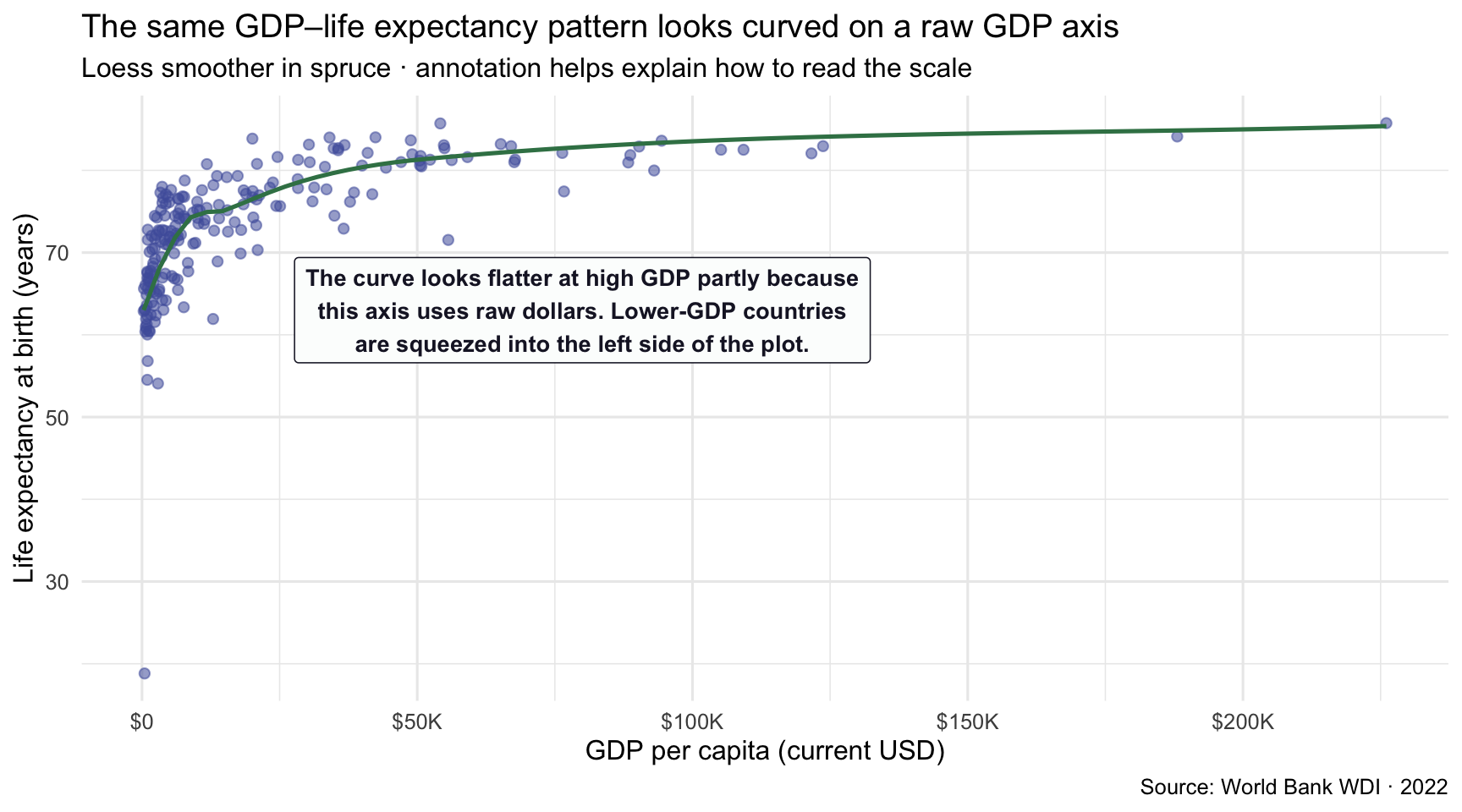
Three things are worth noting. First, the annotation is not connected to a specific country. It is a one-off explanatory label placed at a fixed location on the plot. The x and y values inside annotate() are raw coordinates on the chart, not variables from the data frame.
Second, the annotation has a specific job: it helps the reader interpret the visual pattern. Without the label, a reader may notice that the curve flattens but may not understand that the raw GDP axis is partly responsible for that appearance. The annotation gives the reader a simple interpretation cue at the moment they need it.
Third, annotations should be used sparingly. A good annotation does not explain everything in the figure. It points the reader toward one important feature of the plot and helps them read it correctly.
For the rest of the annotation toolkit — ggrepel for auto-positioned non-overlapping labels, geom_hline() / geom_vline() for reference lines, and geom_rect() for shaded regions — see R4DS Chapter 11 · Communication. The book also develops the strategy of what to annotate, which is at least as important as the syntax.
Themes, scales, and saving — the R4DS handoff
This Module introduces three more polish topics and shows what they’re for; R4DS Chapter 11 · Communication develops each one comprehensively. Once you have the foundation here, the reference chapter will make immediate sense the moment you reach for it.
Where to go in R4DS for finer-grain control
Themes control every non-data visual element of a plot: backgrounds, gridlines, axis text, title formatting, legend placement, fonts. Built-in themes like theme_minimal() (used throughout this Module), theme_classic() (good for APA-style figures), and theme_bw() (more formal, journal-style) handle most cases. The theme() function lets you override any individual element — e.g., theme(legend.position = "bottom") to move a legend.
Scales control how data values map to axes, colors, sizes, breaks, and labels. Use breaks = to choose where ticks appear and the scales package’s formatters (label_dollar(), label_percent(), label_comma()) to format tick text. The same machinery suppresses legends with guide = "none" inside a scale call.
Saving plots to a file uses ggsave():
ggsave("my_chart.png", width = 10, height = 6, dpi = 300)The file format is inferred from the extension (.png, .pdf, .svg, .jpg); width and height are in inches by default; dpi = 300 is print-quality (use 72 or 96 for web).
Two refinements you will want almost immediately. First, name the plot and hand it to ggsave() explicitly, rather than relying on it to grab the last plot drawn — that way the code says which figure it saves, and reordering your chunks cannot silently save the wrong one. Second, build the path with here() so it resolves from the project root and works unchanged on a collaborator’s machine:
my_plot <- wdi_2022 |>
  ggplot(aes(x = gdp_per_capita, y = life_expectancy)) +
  geom_point(alpha = 0.6) +
  scale_x_log10() +
  labs(
    title = "Higher-income countries tend to have longer life expectancy",
    x = "GDP per capita (log scale, current USD)",
    y = "Life expectancy at birth (years)"
  )

ggsave(here("output", "fig1-life-expectancy.png"),
       my_plot, width = 6.5, height = 3.6, dpi = 300)
Note what each piece buys you. here() means the path is the same string for everyone on the project — no setwd(), no absolute path with your username buried in it. Passing my_plot by name makes the line self-documenting. And setting width and height at save time, rather than resizing the image afterwards, is what keeps text legible: enlarging a small .png blurs it, while re-saving at the size you actually need re-renders the text crisply.
A figure saved this way is a deliverable, not a leftover. Most of your charts will simply appear in a rendered document and never need a file of their own. Reach for ggsave() when a figure has to travel somewhere the document cannot follow it — a slide deck, a poster, a manuscript submission, a collaborator’s email.
→ R4DS Chapter 11 · Communication covers every option for all three topics in detail.
The pattern: as you develop charts beyond this Module, treat R4DS Chapter 11 as your manual. When you need to control a specific visual element — change a tick label, suppress a legend, customize a font, save a high-resolution figure for a manuscript — the chapter will be faster than searching the ggplot2 reference documentation directly. The website is the gentle introduction; R4DS is where you go to become truly fluent.
Part 5 · Common problems and debugging
Real talk: your code will break. It will break the first day you write it, and it will break in week fifteen of the course, and it will break when you’re publishing your dissertation. This is not a sign that something is wrong with you. It’s a sign that you’re writing code. R4DS Chapter 1 ends with this same observation — even the R4DS authors, who have been writing R for years, still write code that doesn’t work on the first try every day.
What separates working coders from frustrated coders is not writing fewer bugs. It’s having a small set of debugging moves that you reach for automatically when something breaks. This Part covers the half-dozen most common ggplot beginner bugs and how to fix them — five minutes of reading here saves five hours of frustration later.
The + operator at the start of a line — the #1 ggplot beginner error
R will read this code:
ggplot(wdi_2022, aes(x = gdp_per_capita, y = life_expectancy))
+ geom_point()
as two separate statements. The first line is already a complete, valid R expression, so R evaluates it and stops; the leading + on the next line then begins a brand-new expression. The usual result is that ggplot() renders on its own — an empty gray rectangle with no geom — and no error is raised at all.
The fix is to put the + at the end of the previous line, not the start of the next:
# WRONG — R sees two separate expressions
ggplot(wdi_2022, aes(x = gdp_per_capita, y = life_expectancy))
+ geom_point()

# RIGHT — R sees one expression continued onto the next line
ggplot(wdi_2022, aes(x = gdp_per_capita, y = life_expectancy)) +
  geom_point()
This is R’s syntactic rule for every +, |>, and any other operator: the operator goes at the end of the line so R knows the expression continues. If your ggplot mysteriously refuses to render, the first thing to check is whether you’ve got a + at the start of any line.
Unmatched parentheses, brackets, and quotes
ggplot(wdi_2022, aes(x = gdp_per_capita, y = life_expectancy) +
  geom_point()
Look closely — there’s one open ( in ggplot( and one open ( in aes(, but only one closing ) before the +. The aes() call is closed, but the ggplot() call isn’t, so R is still waiting for you to finish it when the + geom_point() arrives. R’s error message will be confusing because it’s looking at a half-finished expression.
The trick: when you’re typing, get into the habit of typing both halves of every paired delimiter immediately, then move your cursor inside to fill in the middle. So when you start ggplot(, immediately type ggplot() and arrow-key back to between the parens. You’ll find RStudio does this automatically. If you have lots of nested parens, the editor highlights the matching one when your cursor is on either side — use this!
Unquoted vs quoted variable names inside aes()
# WRONG — maps every row to the same literal text value
ggplot(wdi_2022, aes(x = "gdp_per_capita", y = "life_expectancy")) +
  geom_point()

# RIGHT — no quotes; refers to columns in wdi_2022
ggplot(wdi_2022, aes(x = gdp_per_capita, y = life_expectancy)) +
  geom_point()
If you wrap a variable name in "..." inside aes(), ggplot2 treats the value as a literal string (“the letter g, the letter d, …”), not as a column reference, and you’ll get a single point at that arbitrary location instead of a scatter. This is one of the most confusing beginner errors because the plot renders — it just doesn’t look anything like what you expected.
The rule: when you refer to a column directly by name inside aes(), don’t put it in quotation marks. It names a column in the data, not a character string. (Advanced tidy-evaluation code can legitimately pass strings, but that is a different construction and you won’t need it here.)
A fixed color inside aes() — the phantom legend
The mirror-image mistake is putting a fixed value inside aes(). Say you want every point red:
# WRONG — "red" is inside aes(), so ggplot2 treats it as a one-level variable to map
ggplot(wdi_2022, aes(x = gdp_per_capita, y = life_expectancy, color = "red")) +
  geom_point()

# RIGHT — "red" is a fixed setting, so it goes OUTSIDE aes(), in the geom
ggplot(wdi_2022, aes(x = gdp_per_capita, y = life_expectancy)) +
  geom_point(color = "red")
Like the last one, the wrong version renders — but the points come out a salmon-pink, not red, and a stray legend titled “red” appears beside the plot. Here’s why: anything inside aes() is a mapping from data to a visual property. By writing color = "red" inside aes(), you’ve told ggplot2 to treat the literal string "red" as a one-value variable — so it maps that single “category” to the first color in its default palette (which happens to be salmon) and adds a legend to explain the mapping it thinks you asked for. The fix is the inside-vs-outside rule from Part 1: a color that varies with your data goes inside aes(); a single fixed color goes outside, in the geom. (The same trap turns up with fill, size, shape, and linetype.)
“Removed N rows containing missing values (geom_point())” — the friendly warning
You’ll see this warning all the time:
Warning: Removed 2 rows containing missing values or values outside the scale range (`geom_point()`).It is not an error — your plot rendered fine. It’s ggplot2’s polite way of telling you that some rows had NA values in one of the aesthetics, so they couldn’t be drawn. If you only had a few NAs and the warning is just noise, suppress it by adding na.rm = TRUE to the geom:
geom_point(na.rm = TRUE)If you’re seeing a lot of “Removed” warnings, that’s a signal to go back to summary() on your data and figure out why so much is missing — almost always more important than the plot itself.
A column reference outside aes() — “object not found” and “Aesthetics must be either length 1” errors
When you write a column name outside aes(), R doesn’t know to look for it in your data frame. Depending on whether that name also happens to exist somewhere else in R, you’ll see one of two errors:
Error: object 'region' not found— the most common case. R looked in the global environment forregion, didn’t find a non-data object by that name, and gave up.Error: Aesthetics must be either length 1 or the same as the data— if the column name clashes with a base R function (e.g.,class,data,df) or with a global variable you’ve already assigned, R might find something but it’s the wrong length for the geom to use as a fixed property.
Both errors point at the same mistake and the same fix: you wrote a column reference where ggplot expected either a constant value or a column mapping. Two ways out:
# WRONG — region is a column name; outside aes(), R can't find it
ggplot(wdi_2022, aes(x = gdp_per_capita, y = life_expectancy)) +
  geom_point(color = region)   # → "object 'region' not found"

# RIGHT — put color INSIDE aes() (as a mapping)
ggplot(wdi_2022, aes(x = gdp_per_capita, y = life_expectancy)) +
  geom_point(aes(color = region))

# OR fix the color to a constant for all points
ggplot(wdi_2022, aes(x = gdp_per_capita, y = life_expectancy)) +
  geom_point(color = "purple")   # a string, not a column reference
The rule (which we developed in Part 1): if a visual property varies by data, it goes inside aes(). If it’s constant, it goes directly in the geom — and if it’s a color, it’s a string in quotes (or a hex code).
Reading R error messages — they’re worse than they look
R’s error messages are notoriously cryptic. A few survival tips:
- Read the first line of the error closely, not the wall of traceback below. The first line usually names the function and the actual problem.
- Look for the word “expected” — R often says “expected X but got Y”, which is the direct clue.
- When in doubt, paste the error into Google. Verbatim. Someone else has had this exact error and someone else has answered it on Stack Overflow.
- Reduce to a minimal example. If your plot has fifteen layers and you can’t tell which is broken, comment out everything below
geom_point()until the plot renders. Then uncomment layers one at a time until it breaks. That’s the layer with the bug.
When in doubt: glimpse() + minimal example
Two debugging moves are worth almost any amount of intermediate suffering:
glimpse(your_data)— if your plot looks weird (empty, scrambled, surprising), the first thing to check is that your data actually contains what you think it contains. Column types? Number of rows? Unexpected NAs?- The minimal-example move — strip your code down to the smallest possible thing that still produces the error. Sometimes this means rewriting
ggplot(big_df_with_many_columns, aes(x = ..., y = ...)) + ... fifteen layers ...asggplot(big_df_with_many_columns, aes(x = ..., y = ...)) + geom_point(). If the minimal version works, you know the bug is in something you stripped out. If the minimal version also fails, you’ve found the bug at the level where you can actually see it.
The deepest lesson about debugging
The deepest lesson about debugging is that broken code is the normal state of code. Programmers don’t write code that works — they write code that eventually works, after lots of iteration with the error messages. Welcome to writing code. This is what it actually looks like.
Looking ahead
The toolkit you just built carries you through almost every chart you’ll make for the rest of PSY 652. The grammar of graphics is the same whether you’re sketching a quick exploratory histogram in M05 or producing the regression-diagnostic plots of M12 — all of it is the same data → aesthetics → geometry → (optional layers) pipeline.
The Modules that come next rest directly on what you learned here:
- M04 (Data Wrangling) introduces dplyr and tidyr — the pipe-and-verb workflow that produces the data frames you’ve been plotting. Every group_by() |> summarize() chain you saw in this Module’s bar chart and line chart is M04 territory; the wrangle-then-plot pipeline is the next thing you’ll write fluently.
- M05 (Describing Data with R) quantifies what your charts hint at — central tendency, dispersion, group comparisons — using skimr and gtsummary. You’ll often produce a chart and a descriptive-statistics table together as the opening of any report.
- M06–M09 (statistical inference) bring confidence intervals and hypothesis tests. Every inferential result has a natural visualization — a CI is a geom_pointrange(), a sampling distribution is a geom_histogram(), a null-vs-observed comparison is a shaded region on a density curve. You’ll layer the ggplot2 machinery on top of the inferential machinery throughout.
- M10–M12 (regression) treat every regression diagnostic as a ggplot2 construction. M12 in particular builds the residual–fitted plot, the Q–Q plot, the scale–location plot, and the added-variable plot — each is a particular configuration of the grammar you learned here. The geom_smooth() layer you used in Part 3 of this Module is a regression fit — the same OLS line that M10 builds out from the underlying algebra.
The picture-thinking habit transfers: every quantitative claim in the Modules ahead has a picture-of-the-idea that lives somewhere inside ggplot2, and you can now build all of them.
Summary
Core ideas in data visualization
EDA is a state of mind. Two foundational questions drive almost every EDA session: what variation occurs within each of my variables? (histograms, bar charts) and what covariation occurs between them? (scatterplots, boxplots, faceted comparisons).
A figure must be accurate, readable, and purposeful. Accuracy is non-negotiable — the visual must represent the data honestly. Readability comes from thoughtful design choices: color, layout, labels. Wilke’s ugly / bad / wrong taxonomy gives you a diagnostic vocabulary for what fails: ugly = aesthetic problems only; bad = perceptually misleading; wrong = mathematically misrepresents the data. Wrong figures must be corrected.
The grammar of graphics is the conceptual backbone. Every figure decomposes into seven layers — data, aesthetics, geometry, facets, statistics, scales, and coordinates–labels–themes. The first three are required; the other four are optional but used often. The minimal ggplot2 call has three required pieces: pipe data in, call ggplot() with an aes() mapping, add a geom_*(). Once you understand the grammar, unfamiliar chart types become easier to learn because they are usually new combinations of familiar pieces.
Two syntactic rules to internalize. (a) If a visual property varies by data, it goes inside aes(); if it’s constant, it goes directly in the geom —
aes(size = population)vsgeom_point(size = 3). (b)|>passes data from one function to the next;+stacks layers onto an already-initialized plot — and+always goes at the end of a line, never the start of the next.Choose the chart by the question, not the variable type. Distributions of single variables → bar, histogram, density. Relationships between variables → boxplot, stacked bar, scatterplot, line, geom_col() for summaries.
Consider a log-transformed axis when the variable spans orders of magnitude. scale_x_log10() re-spaces the axis so equal distances represent equal proportional differences. For income, population, GDP, and other multiplicative quantities, a log scale is often the most informative default — but the choice should still match the research question.
Extend the toolkit with trend lines and small multiples. geom_smooth(method = "lm") fits an OLS regression line with a 95% CI ribbon — the visual form of the regression machinery you’ll meet in M10–M12 (use
method = "loess"for an exploratory flexible smoother). facet_wrap() and facet_grid() replace overplotting with side-by-side panels when a color-mapping approach is past three or four levels.Exploratory vs communication plots — and titles that summarize the finding. Exploratory plots are quick, rough, and disposable; you make hundreds. Communication plots are slow, polished, and self-explanatory; you make a few at the end of an analysis. The polishing tools in Part 4 — palettes, the color-to-highlight pattern, labs(), and geom_text() / annotate() annotation — move a plot from one to the other; R4DS Chapter 11 covers every finer-grain polish topic comprehensively. Title the takeaway, not the plot: “Higher-income countries tend to have longer life expectancy” beats “Scatterplot of life expectancy vs GDP.”
The grammar generalizes; broken code is the normal state of code. Every figure in every paper you’ll read is some configuration of the same seven layers — the Rosling chart you built is a template, not a one-off. When code breaks, the bugs are usually the same handful:
+at the start of a line, unmatched parens, unquoted variable names insideaes(), color set as a variable name instead of a hex string. Reduce to a minimal example, paste the error into Google, and keep going.
Going further
There are many ways to extend the toolkit you built in this Module. These are listed here to give you a sense of the breadth of the ggplot2 ecosystem; you don’t need to learn them now, but you can come back to these references when you need them.
Labeling individual points: geom_text() adds text at the (x, y) position of each point. For complex plots where labels overlap, use ggrepel::geom_label_repel() from the ggrepel package — it automatically repositions labels to minimize overlap.
Interactive plots: plotly::ggplotly(p) converts almost any ggplot2 object to an interactive HTML chart with tooltips, zoom, and pan — requiring no additional code beyond the original ggplot. Check out the plotly website for more advanced interactivity options.
Maps (choropleths): A choropleth shades geographic regions — countries, states, counties — by the value of a variable (a world map colored by life expectancy, say, or a U.S. map colored by county income). You draw one in ggplot2 with geom_sf(), which plots the simple-features geometry from the sf package: join your data to a boundaries object, then map fill to your variable. The region boundaries themselves come from packages like rnaturalearth (countries of the world) or tigris (U.S. states, counties, and census tracts). The grammar is exactly the one you learned in this Module — a new geometry with a spatial fill aesthetic, nothing more.
More factor-reordering tools: Beyond fct_reorder() and fct_infreq() (which you used in this Module), the forcats package also offers fct_lump() (collapse rare levels into “Other”), fct_relevel() (manually place specific levels in your chosen order), fct_rev() (reverse the level order — useful with
y =mappings to put the top category at the top), and fct_inorder() (use the order of first appearance in the data, useful when you’ve already arranged the data the way you want it ordered). Together these cover essentially every factor-reordering question you’ll meet.
Resources
- R for Data Science, 2nd ed. — Chapter 1 — Wickham, Çetinkaya-Rundel, and Grolemund. Chapters 1 and 9–11 cover the data-visualization track in depth. The framings used in this Module — variation vs covariation, exploratory vs communication plots, the title summarizes the finding — all come directly from R4DS.
- Fundamentals of Data Visualization — Claus O. Wilke (free online). The source of the art-and-science and ugly / bad / wrong framings. The chapter on directory of visualizations is a useful quick reference when you’re not sure which chart type fits your question, and the chapter on color use is the best single treatment of palette choice we know.
- The Truthful Art — Alberto Cairo. R4DS Chapter 11 recommends this as the best general-audience book on thinking about visualization (as opposed to mechanics of producing it). Worth working through if you want to deepen your design sensibility.
- The Science of Visual Data Communication: What Works — Franconeri, Padilla, Shah, Zacks, & Hullman (2021), Psychological Science in the Public Interest. The cognitive-science substrate behind the design choices Cairo and Cole Nussbaumer Knaflic (Storytelling with Data) recommend. Not light reading, but the most rigorous synthesis available on what actually works in data communication.
- ggplot2: Elegant Graphics for Data Analysis (free online) — Wickham’s comprehensive reference book on the package itself. Use when the cheat sheet isn’t deep enough.
- R Graph Gallery — hundreds of chart examples with complete code; excellent for finding inspiration and copying starting templates
- ggplot2 cheat sheet — a two-page summary of all major functions and arguments; print it and keep it at your desk
- colorbrewer2.org — interactive tool for exploring ColorBrewer palettes with colorblindness and print simulation
Credits
- This Module’s framings — variation vs covariation, exploratory vs communication plots, the title summarizes the finding, the three equivalent forms of a ggplot() call — come from Wickham, Çetinkaya-Rundel, and Grolemund’s R for Data Science (2nd ed.) — Chapters 1, 9–11.
- The art-and-science contrast and the ugly / bad / wrong diagnostic vocabulary are drawn from Claus Wilke’s Fundamentals of Data Visualization.
- The Rosling story and the gapminder-style chart that anchor the entire Module are inspired by Hans Rosling’s “200 Countries, 200 Years, 4 Minutes” and the broader Gapminder Foundation — both of which built a generation of statisticians’ visual intuition about international development data.
- Leland Wilkinson’s The Grammar of Graphics (1999) is the original theoretical framework Hadley Wickham implemented as ggplot2.
Footnotes
Wilkinson, L. (1999). The Grammar of Graphics. Springer. The ggplot2 package was written by Hadley Wickham, who adapted and implemented Wilkinson’s framework in R beginning in 2005. See Wickham, H. (2010). A Layered Grammar of Graphics. Journal of Computational and Graphical Statistics, 19(1), 3–28.↩︎
We’ll dig into the details of this type of model fit in Part 3 of the course.↩︎
The term “aesthetics” in ggplot2 is borrowed from visual design, where it refers to the perceptible properties of a visual element — color, shape, size, position. In ggplot2, aesthetics are specifically the mappings from data variables to those perceptible properties. Something that is mapped inside aes() is driven by data. Something specified outside aes() (directly in a geom) is a fixed property, not driven by data.↩︎
The alpha argument controls transparency. It ranges from 0 (completely invisible) to 1 (completely opaque).
alpha = 0.5, as used above, means 50% opaque — each point lets half the color of anything beneath it show through. Here we use it as a fixed argument; Step 4 below develops the broader distinction between fixed geom arguments and aesthetic mappings.↩︎This is the critical distinction between aesthetic mappings and fixed properties.
geom_point(size = 3)sets all points to the same fixed size of 3.geom_point(aes(size = population))maps point size to the population variable — each point gets a different size based on data. The rule: if a visual property varies by data, it goes inside aes(). If it is constant, it goes directly in the geom.↩︎An order of magnitude is a factor of 10. One order of magnitude = a 10× difference; two orders = a 100× difference; three = a 1,000× difference. Equivalently, each order of magnitude corresponds to one tick step on a log10 axis. So when we say GDP per capita “spans more than two orders of magnitude,” we mean the largest values are more than 100× the smallest.↩︎
The transformation here is the base-10 logarithm (log₁₀), which is what scale_x_log10() applies. Each tick on the transformed axis is a successive power of 10 — $1,000 = 10³, $10,000 = 10⁴, $100,000 = 10⁵. One tick to the right multiplies the underlying value by 10. The raw data values are unchanged; only the spacing of the axis changes.↩︎
A hex code like
#4E5EAAis a 6-character string (after the leading#) encoding the red, green, and blue components of a color as pairs of hexadecimal digits 00–FF (which represent 0–255 in decimal). For#4E5EAA:4E= 78 (red),5E= 94 (green),AA= 170 (blue) — a muted indigo. Hex codes let you specify any of the 16.7 million possible RGB colors, where R’s named colors like"blue"or"firebrick"cover only ~650 options. Tools like coolors.co and ColorBrewer generate hex codes for any palette you like.↩︎The survey by Gang et al. (2023), published in Conflict and Health, included 699 households across 70 clusters in 14 of the Central African Republic’s 17 prefectures. The sampling design divided the country into government-controlled and largely non-government-controlled strata. The researchers estimated a crude mortality rate of 1.57 deaths per 10,000 people per day — equivalent to approximately 57 deaths per 1,000 person-years — above the widely used humanitarian-emergency threshold of 1.0 death per 10,000 people per day. The current World Bank series reports a 2022 crude death rate of 55.1 deaths per 1,000 people, within about 4% of the survey’s annualized estimate. Importantly, this is a later revised estimate: the official UN figure available when the researchers conducted their study was only 12 deaths per 1,000 people per year. The sources nevertheless diverge sharply on life expectancy. The current World Bank series reports 18.8 years for CAR in 2022, whereas the Gapminder series reports approximately 54.6 years — a difference of nearly threefold. Gapminder constructs its post-2019 estimates by extending an IHME-based life-expectancy series using rates of change from UN projections, rather than adopting the UN estimate’s absolute level. The discrepancy therefore appears to reflect differences in source data, estimation methods, and revision vintages in a conflict setting where mortality is exceptionally difficult to measure — not an arithmetic error in the dataset or code.↩︎
To say the area under the curve is 1 is the calculus-flavored way of saying the whole curve represents 100% of the data. The important contrast with a histogram is this: histogram bars show counts (or, sometimes, densities, depending on how you set them up), whereas a density curve is normalized so that the full area adds to 1. In other words, the y-axis of a density plot is not “number of countries”; it is a scaled quantity that helps you compare shapes across groups.↩︎
geom_bar() uses
stat = "count"by default — it counts the number of rows in each group and sets bar height to that count. geom_col() usesstat = "identity"— it takes a pre-specified y variable and uses its value directly as bar height. Callinggeom_col()is exactly equivalent togeom_bar(stat = "identity"). For pre-computed summaries, geom_col() is cleaner and more explicit.↩︎To dodge bars is to place them side by side within each x-axis group instead of piling them on top of one another. In ggplot2 you ask for this with
position = "dodge"(orposition_dodge()) inside the geom — each fill category then gets its own adjacent bar (a grouped bar chart), whereas the defaultposition = "stack"sums them into a single bar.↩︎group_by() splits the data into groups defined by one or more variables. summarize() (or equivalently summarise()) collapses each group into a single summary row. Together, group_by() |> summarize() is the workhorse of grouped data analysis in R.↩︎