library(tidyverse)   # dplyr, ggplot2, tidyr — wrangling and plotting from M03 and M04
library(here)        # project-root file paths
library(scales)      # number formatting (percent_format, comma)
library(skimr)       # one-line dataset overviews (skim())
library(labelled)    # variable labels (set_variable_labels(), look_for())
library(gtsummary)   # publication-ready summary and cross tables
library(gt)          # the underlying table-rendering engine
library(patchwork)   # combine multiple ggplots into one figure
library(DT)          # interactive searchable tables (datatable())
library(corrplot)    # visual correlation matrices (corrplot.mixed())
library(survey) # complex-survey design for weighted estimates (Part 5)Describing Data with R

Learning Objectives
By the end of this Module, you should be able to:
- Distinguish between a population and a sample, and explain the role of random sampling in descriptive research
- Recognize common challenges of survey research (non-response, sampling bias, item-level missingness)
- Apply skimr, labelled, and gtsummary to produce publication-ready descriptive tables — the “Table 1” of every quantitative paper
- Compute central-tendency and dispersion summaries for numeric variables, and counts/percentages for categorical variables
- Visualize distributions with histograms and density plots, and decide when each is appropriate
- Construct cross-tabulations and choose the right percent flavor (row, column, cell) for the research question
- Construct composite scores by row-wise averaging — including the “respondent must have answered ≥ k items” rule — and check a composite against the instrument’s own published scoring rule
- Rebuild the descriptive findings of a published paper (Daly, 2022) and recognize when survey weighting is needed for accurate population-level estimates
Overview
Nearly every quantitative paper has a Table 1 — this Module shows you how to make it
Open most quantitative research papers and you’ll find the same artifact near the front: a Table 1 — the participant-characteristics table — that describes the sample. Who is in this study? How old were they? How many were in each group? What proportion met the criterion? What was the mean and SD of the outcome at baseline? Before any reader can interpret a treatment effect, a regression coefficient, or a p-value, they need to know what kind of sample produced it.
M04 taught you how to turn messy data into clean data frames. M05 asks the next question: now that the data are clean, what do they show?
That is the job of descriptive statistics. Before we test hypotheses, build models, or make claims about populations, we first need to describe the data in front of us: Who is in the sample? What values are typical? How much do people vary? How common is each category? Do patterns look different across groups?
In this Module, you’ll learn the R toolkit for answering those questions — skimr for quick overviews, labelled for readable variable labels, gtsummary for polished tables, and the dplyr summaries you already know from M04. Together, these tools turn clean data frames into the tables, plots, and prose that fill the Methods and Results sections of quantitative papers.
Description, prediction, and causal inference
Scientific research typically aims at one of three goals — description, prediction, or causal inference. Each goal calls for distinct methods (Hamaker et al., 2020).
Description characterizes phenomena as they naturally occur, without attempting to influence outcomes. “What is the prevalence of major depressive episodes among U.S. adolescents in 2019, and how does it differ by sex?” is a descriptive question. Descriptive analysis displays observed patterns and group differences but does not imply causation.
Prediction forecasts future outcomes from existing data — “Which adolescents are most likely to develop depression over the next two years?” A strong predictor is not necessarily a cause; you can predict outcomes well without understanding mechanisms.
Causal inference seeks the causal effect of one variable on another — “Does this intervention reduce depression severity?” Causal claims demand designs that control for confounding, with randomization providing especially strong grounds for a causal reading when it is available.
What each goal is actually trying to estimate
Each of those three questions points at a different kind of number, and it pays to name the number before you choose a method. The estimand is the specific quantity in the population that a study aims to estimate. It is not your hypothesis, and not your research question in words — it is the actual value you would get if you could measure the whole population, before any sampling enters the picture.
| Goal | Question | Estimand |
|---|---|---|
| Description | What is the prevalence of major depressive episodes among U.S. adolescents in 2019? | \(p\) — the proportion of that population with a past-year MDE |
| Prediction | Which adolescents are most likely to develop depression over the next two years? | Out-of-sample predictive performance — how accurately a model would classify new adolescents drawn from the same population |
| Causal inference | Does this intervention reduce depression severity? | \(\beta\) — the causal effect of the intervention on severity |
The first is a population proportion; the second is an expected performance on future cases (predictive estimands are usually metrics such as classification accuracy, AUC, or \(R^2\) on held-out data — they describe how well a model would do if it were deployed, not a parameter of any one fitted model); the third is a population causal effect. Notice that all three are population quantities. They exist in the world independent of whatever sample you happen to collect, and your job is to design a study that gets you a trustworthy estimate of the one you are after.
This Module is firmly in the descriptive territory. Every chart, table, and number you’ll produce here characterizes a sample. The inferential and causal machinery starts in M06 (probability), M07 (confidence intervals), and M10 onward (regression).
How this page is organized
This Module is anchored end-to-end in NSDUH data on U.S. adolescent depression (2009–2019) — the same dataset analyzed in a Journal of Adolescent Health paper by Daly (2022). After two short context sections (Survey research & sampling, Meet the data), the Module unfolds across five parts:
- Part 1 — Looking at your data. skim() and variable labels — the moves you make before you start describing.
- Part 2 — Describing one variable. Counts and percentages for categorical variables; mean, median, SD, IQR for numeric variables; histograms and density plots.
- Part 3 — Describing two variables. Building a composite score from the Sheehan items, then group summaries and boxplots (numeric × categorical), cross-tabulations (categorical × categorical) with the row / column / cell percent decision, and scatterplots + correlation (numeric × numeric).
- Part 4 — Publication-ready tables with gtsummary. Why gtsummary beats base R for reports; customization of labels, statistics, and footnotes; APA-style reporting.
- Part 5 — A worked case study: reproducing Daly (2022). Reproducing the paper’s sex-specific prevalence trend across years, and (advanced-box) adjusting for the complex survey design.
Two chapters of R for Data Science map onto this Module. Chapter 10 (Exploratory data analysis) is the conceptual twin of Parts 2–3 — it frames description as variation within a single variable and covariation between two, exactly the split this Module uses. Chapter 13 (Numbers) covers the dplyr side of the numeric summary functions. Read both alongside this Module.
How to read a page this long. This Module is deliberately both a guided first pass and a reference you will come back to all semester — which makes it longer than a single sitting. On your first pass, prioritize these seven things:
- Distinguishing the sample you have from the population you want to describe
- Tracking the denominator, and asking why a value is missing before acting on it
- Choosing counts and percentages for categorical variables, center and spread for numeric ones
- Plotting the distribution before committing to a summary
- Matching the two-variable display to the pair of variable types
- Reading and building a basic gtsummary Table 1
- Telling an unweighted sample summary apart from a survey-weighted population estimate
Everything else is depth you can return to: the shaded advanced boxes (missing-data mechanisms, correlation-vs-slope algebra, complex-survey code) are enrichment by design. Skim them now, and come back once the seven moves above feel automatic.
Packages used in this module
The new packages this week — skimr, labelled, gtsummary, and survey — are the descriptive-statistics workhorses, joined by corrplot for one figure. Everything you learned in M03 (ggplot2) and M04 (dplyr, tidyr) still applies; this Module layers polished-table tooling on top.
Survey research & sampling
Many population-level descriptive questions in behavioral and public-health research are answered with survey research — collecting data from a sample to characterize a population. (Not all: experiments, clinical records, administrative data, and intensive longitudinal designs all produce descriptive statistics too. But when the question is “how common is this in the population?”, a survey is usually the instrument.) Before the data arrive on your desk, decisions about who got sampled and how shape what you can honestly say.
Five major U.S. national surveys
Several large, publicly available national surveys are workhorses of behavioral and public-health research. They are also excellent training data — well-documented, large enough to be analytically interesting, and rich in substantive content.
- National Health Interview Survey (NHIS) — Annual since 1957. CDC’s main vehicle for tracking illness, chronic conditions, healthcare access, and health behaviors via in-person household interviews.
- Health and Retirement Study (HRS) — Biennial longitudinal survey of ~20,000 U.S. adults aged 50+, sponsored by the National Institute on Aging. Tracks health, retirement, cognition, family dynamics, and well-being.
- National Survey on Drug Use and Health (NSDUH) — The dataset this Module uses. Annual, run by SAMHSA. Adolescents and adults aged 12+ on substance use, mental health, and treatment.
- National Health and Nutrition Examination Survey (NHANES) — Combines interviews with physical examinations. ~5,000 persons per year, providing the broadest picture of population health and nutrition.
- Monitoring the Future (MTF) — Annual since 1975, sponsored by NIDA. Tracks substance use and related attitudes among U.S. 8th, 10th, and 12th graders. A companion study, Our Youth Our Future (OYOF), applies the same methodology to schools on or near American Indian reservations and is run by Colorado State University’s Tri-Ethnic Center for Prevention Research.
These surveys provide the descriptive backbone of much U.S. public-health policy. They are also great possibilities for your own work (e.g., thesis, dissertation, papers to build your vitae before you have your own funding).
Population, sample, and random sampling
The first move in survey research is to define the population of interest — the entire group about which you want to draw conclusions. NSDUH defines its population as U.S. residents aged 12 and older. Monitoring the Future defines its population as U.S. 8th, 10th, and 12th-grade adolescents. A school-district evaluation might define its population as every K–12 student in the district.
Because surveying an entire population is rarely feasible, researchers use sampling to select a subset. The gold standard is probability sampling — every eligible member of the population has a known, nonzero chance of being selected. In the simplest case, simple random sampling, everyone has the same chance; large national surveys often use more elaborate designs that deliberately over-sample some groups and then apply sampling weights to recover population-representative estimates (the move we make in Part 5). What probability sampling buys you is a principled link from the sample back to the population: because every member’s chance of selection is known, weights can correct for unequal selection and the uncertainty in an estimate can itself be estimated. If the design is sound and non-response is handled well, a sufficiently large sample should also tend to resemble the population on key characteristics — so if the population is 51% female, a large probability sample should come out close to 51% female too, up to ordinary sampling variability. What it does not do is guarantee that the people who actually responded mirror the population: coverage gaps in the sampling frame and patterned non-response still bite, which is exactly what the next section is about.
The Pew Research Center’s short video below is a clean, quick introduction to random sampling.
Common challenges of survey research
It is tempting to assume description is the “easy” kind of research and causal inference is the “hard” kind. This is a mistake. Description looks easy because its estimand is often a simple quantity — a mean, a proportion, a count. But getting a trustworthy estimate of that simple quantity is not easy at all.
Take the descriptive question this Module is built around: what proportion of U.S. adolescents experienced a past-year major depressive episode in 2019? To land a number you could defend in a paper, you need three things, and none of them is trivial.
A sharply defined population. “U.S. adolescents” has edges. Ages 12–17 or 13–18? Including youth in juvenile detention? Youth who are unhoused? Youth who have dropped out of school? Each choice defines a different population and therefore a different estimand. You do not get to skip this: the number you report is only meaningful relative to the population you defined.
A sampling strategy that reaches all of it. Recruit only through schools and you miss the youth who dropped out and the ones who are homeschooled. Recruit only through clinics and you over-represent youth who already have a provider. Recruit only through social media and you miss youth without smartphones. NSDUH spends millions of dollars per year on multi-stage probability sampling precisely because even a “simple” descriptive estimand is not worth much without it.
Honest handling of nonresponse. Even with a careful sampling frame, some invited participants decline — and there is no guarantee the decliners are a random subset. If willingness to participate is related to symptom severity, the observed prevalence will be biased for the population figure you meant to estimate. That is why the number a survey reports is almost never the raw proportion from the raw sample.
Prediction stacks another layer on top of all three (out-of-sample generalization, drift over time, fairness across subgroups), and causal inference stacks yet another (counterfactual reasoning, confounding, domain knowledge about the mechanism). None of the three goals is easy. They are each hard in a slightly different way, and the first discipline of applied research is recognizing which flavor of hard you are up against — then doing the work that flavor demands.
The rest of this section is the survey-specific version of that problem. Drawing a useful sample is not just a matter of getting “enough people.” Two separate questions matter.
First, is the sample accurate — does it represent the population we want to describe, or is it systematically tilted toward some groups and away from others? This is the problem of bias.
Second, is the estimate precise — how much might the estimate wobble simply because we observed a sample rather than the entire population? This is the problem of sampling variability, and it is where sample size matters most.
Four common survey problems can introduce bias if they are not handled well:
Sampling frame — the list from which the sample is drawn. If the frame is incomplete or outdated, the sample inherits that bias. For example, a phone list that excludes mobile-only households will under-represent people who cannot be reached through landlines.
Unit non-response — selected respondents who refuse, cannot be reached, or do not complete the survey. If respondents differ from non-respondents in ways related to the outcome, the estimate can be biased. For example, if adolescents with greater mental-health burden are less likely to participate, depression prevalence may be underestimated.
Item non-response — respondents who participate but skip specific questions. This can bias one variable without biasing the whole survey. For example, if adolescents with more severe depression are more likely to skip depression-severity items, the severity distribution in the data may look artificially mild.
Misreporting — inaccurate answers, intentional or unintentional. Social-desirability bias is the classic example: under-reporting stigmatized experiences or behaviors, such as substance use or mental-health struggles, and over-reporting socially approved ones, such as voting or exercise.
Notice that none of these problems is fixed automatically by a large sample. A bigger sample can make an estimate more precise, but it cannot rescue a biased sampling frame, patterned non-response, or systematic misreporting. That is the key distinction: larger samples generally reduce sampling variability; design and adjustment are what address bias.
The Monday lecture takes up the precision side of the story: how much a survey estimate can vary because we sampled some people rather than everyone, and why larger samples usually produce less noisy estimates. This section focuses on the accuracy side: the design and response problems that determine whether a survey estimate is aimed at the right target in the first place.
For this Module, the practical takeaway is simple: descriptive statistics are only as honest as the data they describe. When we summarize NSDUH, we will keep three questions in view:
Who is the target population? NSDUH is designed to describe U.S. adolescents, not just the adolescents who happen to appear in our data file.
Who is included in this particular analysis? Missing data, filters, and subgroup analyses can change the denominator. A percentage is only interpretable when we know what group it is a percentage of.
Are we describing the sample or estimating the population? Early in the Module, our tables and plots are unweighted descriptions of the analytic sample. In Part 5, we return to the survey weights, strata, and primary sampling units that allow NSDUH estimates to better represent the U.S. adolescent population.
Those three habits — name the population, track the denominator, and distinguish sample summaries from population estimates — are what make descriptive statistics trustworthy.
Despite the challenges, well-designed survey research is irreplaceable. This Module focuses on a survey-based descriptive finding that has shaped U.S. mental-health policy: the documented rise in adolescent depression between 2009 and 2019.
Meet the data
The dataset for this Module is the National Survey on Drug Use and Health (NSDUH), conducted annually by SAMHSA. NSDUH uses a multistage area probability sample — face-to-face interviews in respondents’ homes, with Audio Computer-Assisted Self-Interviewing (ACASI) for sensitive items. The target population is the U.S. civilian, non-institutionalized population aged 12 and older.
We focus on the adolescent subsample (ages 12–17) across 11 survey waves (2009–2019). The motivating reference is Daly (2022) in the Journal of Adolescent Health:
Depression is a leading cause of impairment and disability globally and a major contributor to suicidal behavior. The prevalence of fatal suicide among U.S. adolescents and young adults increased by 57.4% between 2007 and 2018. … Of particular concern is a rise in the prevalence of major depression reported by U.S. adolescents since 2010. … This study drew on nationally representative data to estimate temporal trends in the prevalence of past-year major depressive episode (MDE) across sex, race/ethnicity, and household income groups between 2009 and 2019.
By the end of Part 5 you will have rebuilt the sex-specific trend graph from this paper — first as an unweighted analogue, then with the survey design switched on so the numbers line up with the published ones. Before then, you’ll use the same data to learn every descriptive move.
nsduh_20092019 · 172,183 observations · 16 variables · SAMHSA NSDUH 2009–2019 · data/nsduh_20092019.Rds
Adolescent (ages 12–17) respondents to the National Survey on Drug Use and Health.
- record_id character — Unique identifier for one adolescent respondent, built as year plus the NSDUH questionnaire ID so that records stay distinct when waves are stacked
- year integer — Survey year
- sex factor — Respondent’s sex as recorded by NSDUH
- age integer — Age in completed years
- raceeth factor — Race and ethnicity as classified by NSDUH’s recoded race variable
- mde_pastyear factor — Whether the respondent experienced a major depressive episode in the past 12 months
- mde_lifetime factor — Whether the respondent has ever experienced a major depressive episode, using NSDUH’s DSM-based classification
- mh_sawprof factor — Whether the respondent saw or talked to a professional about depression in the past year
- severity_chores numeric — Sheehan Disability Scale rating of how much past-year depression interfered with household chores, where 0 is no interference and 10 is very severe interference
- severity_work numeric — Sheehan Disability Scale rating of interference with school or work, 0 to 10
- severity_family numeric — Sheehan Disability Scale rating of interference with family relationships, 0 to 10
- severity_social numeric — Sheehan Disability Scale rating of interference with social life, 0 to 10
- mde_pastyear_severe factor — Whether the respondent had a past-year major depressive episode with severe role impairment
- adol_weight numeric — Person-level analysis weight
- vestr numeric — Variance estimation stratum
- verep numeric — Variance estimation replicate, the primary sampling unit within a stratum
Full codebook for nsduh_20092019 — values, levels, missingness, and how the file was prepared.
Part 1 — Looking at your data
Before you describe a dataset, you have to know what’s in it. This Part covers two steps you should take every time you load a new dataset: a structured overview with skimr, and labelling your variables so every downstream table is readable.
A richer overview — skim()
M03 introduced glimpse() — one line per column, type and first few values. skim() from the skimr package goes deeper: counts, missingness, distributional summaries, and (for numeric variables) tiny inline histograms.
nsduh_20092019 |> skim()| Name | nsduh_20092019 |
| Number of rows | 172183 |
| Number of columns | 16 |
| _______________________ | |
| Column type frequency: | |
| character | 1 |
| factor | 6 |
| numeric | 9 |
| ________________________ | |
| Group variables | None |
Variable type: character
| skim_variable | n_missing | complete_rate | min | max | empty | n_unique | whitespace |
|---|---|---|---|---|---|---|---|
| record_id | 0 | 1 | 13 | 13 | 0 | 172183 | 0 |
Variable type: factor
| skim_variable | n_missing | complete_rate | ordered | n_unique | top_counts |
|---|---|---|---|---|---|
| sex | 0 | 1.00 | FALSE | 2 | Mal: 87806, Fem: 84377 |
| raceeth | 0 | 1.00 | FALSE | 7 | Non: 95659, His: 35044, Bla: 23082, Mul: 8677 |
| mde_lifetime | 3731 | 0.98 | FALSE | 2 | Neg: 140838, Pos: 27614 |
| mde_pastyear | 4400 | 0.97 | FALSE | 2 | Neg: 148956, Pos: 18827 |
| mde_pastyear_severe | 4465 | 0.97 | FALSE | 2 | Neg: 154332, Pos: 13386 |
| mh_sawprof | 144086 | 0.16 | FALSE | 2 | No: 18742, Yes: 9355 |
Variable type: numeric
| skim_variable | n_missing | complete_rate | mean | sd | p0 | p25 | p50 | p75 | p100 | hist |
|---|---|---|---|---|---|---|---|---|---|---|
| year | 0 | 1.00 | 2013.60 | 3.15 | 2009.00 | 2011.00 | 2013.00 | 2016.00 | 2019.00 | ▇▅▃▅▃ |
| age | 0 | 1.00 | 14.56 | 1.69 | 12.00 | 13.00 | 15.00 | 16.00 | 17.00 | ▇▅▅▅▅ |
| severity_chores | 153531 | 0.11 | 5.18 | 2.69 | 0.00 | 3.00 | 5.00 | 7.00 | 10.00 | ▅▅▇▆▃ |
| severity_work | 153507 | 0.11 | 5.54 | 2.75 | 0.00 | 4.00 | 6.00 | 8.00 | 10.00 | ▅▅▇▇▅ |
| severity_family | 153488 | 0.11 | 6.03 | 2.78 | 0.00 | 4.00 | 6.00 | 8.00 | 10.00 | ▃▅▇▇▆ |
| severity_social | 153494 | 0.11 | 6.11 | 2.75 | 0.00 | 4.00 | 6.00 | 8.00 | 10.00 | ▃▅▇▇▇ |
| adol_weight | 0 | 1.00 | 1586.47 | 1425.59 | 1.04 | 571.59 | 1222.21 | 2150.64 | 22959.61 | ▇▁▁▁▁ |
| vestr | 0 | 1.00 | 34782.51 | 4991.52 | 30001.00 | 30029.00 | 30058.00 | 40024.00 | 40050.00 | ▇▁▁▁▇ |
| verep | 0 | 1.00 | 1.50 | 0.50 | 1.00 | 1.00 | 2.00 | 2.00 | 2.00 | ▇▁▁▁▇ |
A few things to notice in the skim() output:
- Two tables, one per variable type (factor, numeric, character).
- n_missing — count of NA values per variable. Critical to inspect before you summarize, because every aggregation has to decide how to handle missingness.
- top_counts for factors — the most common levels, displayed compactly.
- Numeric summaries — mean, SD, quartiles, plus a Unicode mini-histogram of the distribution.
Get into the habit of running skim() as the first move on any new dataset. It catches half the surprises (mis-typed columns, unexpectedly high missingness, factor levels you didn’t anticipate) before you waste an hour on a question that turned out to be ill-formed.
Not every NA means a respondent skipped a question
Look at the n_missing column you just printed and you will find some alarming numbers — several variables are missing for the large majority of rows. Before you conclude this is a badly damaged dataset, ask the question that always comes first: why is the value missing?
Two very different situations both show up as NA, and this file contains both.
- Missing by design — the question was never asked. The four severity_* items were administered only to adolescents who met past-year MDE criteria. For everyone else there is nothing to record. The value is not unknown; it is not applicable. (Note what this is not: the severity block runs in every wave from 2009 to 2019. It is a skip pattern, not a year restriction — a distinction worth holding onto, because they look identical in a missingness count.) mh_sawprof has its own screen, and is blank for roughly four rows in five.
- Item nonresponse — the question was asked and not answered. A small share of adolescents have no value for mde_pastyear itself. That is genuine missing data, and it is the kind that can bias an estimate.
These call for completely different responses. Structural missingness is a filter you have already applied without realizing it: summarize the severity items across the whole file and you have quietly computed a statistic about MDE-positive adolescents while labelling it as though it described everyone. Item nonresponse is a threat to validity, and the advanced box in Part 3 works through what it costs you.
The habit to build: inspect missingness, then interpret its source before acting on it. skim() tells you how much is missing. Only the survey’s documentation — the codebook, the questionnaire, the skip logic — tells you why, and the why is what determines whether you filter, report, or worry.
Data dictionaries and variable labels — labelled
By default, R column names are short and machine-friendly: mde_pastyear, severity_chores, adol_weight. These are great for typing but terrible for reading — a reader of your output sees mde_pastyear and has to look up what it means. The labelled package fixes this by letting you attach a human-readable label to each column. Once attached, those labels are used automatically by label-aware tools: gtsummary tables inherit them with no extra work, and — as of ggplot2 3.5.0 — a plot’s axis and legend titles default to the label too (so a bare plot shows Age rather than age). We still write axis titles explicitly with labs() throughout this Module, but that’s a stylistic choice — to add units, a scale range, or a reframed question — not a workaround for a missing feature.
The workhorse function is set_variable_labels(). You list each column with = and a string label:
nsduh_20092019 <-
  nsduh_20092019 |>
  labelled::set_variable_labels(
    record_id = "Participant ID",
    year = "Data collection year",
    sex = "Sex",
    age = "Age",
    raceeth = "Race/ethnicity",
    mde_lifetime = "Lifetime Major Depressive Episode",
    mde_pastyear = "Past-year Major Depressive Episode",
    mde_pastyear_severe = "Past-year severe Major Depressive Episode",
    severity_chores = "MDE interference with doing home chores",
    severity_work = "MDE interference with school/work",
    severity_family = "MDE interference with family relationships",
    severity_social = "MDE interference with social life",
    mh_sawprof = "Saw a mental health professional in past year",
    adol_weight = "Sampling weight",
    vestr = "Sampling stratum",
    verep = "Primary sampling unit"
  )
Once labels are attached, you can produce a searchable data dictionary with look_for() — and pipe it into DT::datatable() so you (or a reader of your analysis notebook) can search by keyword:
nsduh_20092019 |>
  labelled::look_for() |>
  select(variable, label) |>
  DT::datatable(
    options = list(
      columnDefs = list(list(className = "dt-left", targets = "_all"))
    )
  )
Try the search box in the upper right of the table above. Type “severity” — you’ll see all four severity items. Type “mde” — you’ll see the lifetime, past-year, and severe MDE indicators. That kind of on-demand lookup is exactly what a data dictionary is for, and is the reason to bother with variable labels at the start of every analysis.
Add labels once, at the start of the analysis, and your downstream tables and plots will be readable without extra work. This is a small upfront investment that pays off every time you summarize the data.
Take a moment
Skim the data dictionary above and locate three variables that will be central to the rest of the Module: mde_pastyear (the outcome), sex (the main stratifier), and adol_weight (the survey weight we’ll use in Part 5). Knowing what’s in your dataset is the foundation for everything that follows.
Part 2 — Describing one variable
Categorical variables are described by counts and percentages; numeric variables are described by central tendency (mean, median) and dispersion (SD, IQR). Both get visualized differently — bars for counts, histograms or density plots for distributions.
What kind of variable is this? — the levels of measurement
Before you pick a summary, name the level of measurement of the variable. M01 introduces the four levels in detail; the short version is that every variable in a dataset lives at one of these levels, and the level determines which summaries are meaningful.
- Nominal — categories with no natural order. Examples in nsduh_20092019: sex, raceeth, mde_pastyear. Binary variables are a special case — exactly two categories (Negative / Positive).
- Ordinal — categories with a meaningful order, but the distance between categories isn’t necessarily equal. Examples: the four severity_* items measured on a 0–10 Sheehan Disability Scale (the items have a natural ranking, but a one-point increase from 2 to 3 isn’t necessarily the same impairment-distance as 8 to 9). Scales like this — many ordered points, no guaranteed equal spacing — sit right on the blurry line between ordinal and interval. In practice, behavioral scientists routinely treat multi-point rating scales as interval so they can report a mean, and that’s exactly what we do with these items in Part 3 — both the averaged interference score and the group-mean comparisons. More on that gray zone just below the table.
- Interval — numeric, with equal-spaced units, but no meaningful zero. Textbook example: temperature in °C — the gap from 10° to 20° is the same size as the gap from 20° to 30°, but 0° isn’t “no temperature” and 20° isn’t twice as warm as 10°. In behavioral science, the closest thing to a clean interval variable is a standardized / normed score (e.g., an IQ score scaled to a mean of 100), which is treated as equal-interval on the strength of the measurement model and validation work behind it — not merely because the raw score was rescaled. That distinction matters: converting a raw score to a standard score is a linear transformation, and a linear transformation cannot manufacture equal intervals that the original measure did not have. It relabels the scale; it does not upgrade it. (Note that a raw self-report scale is really the same ordinal-treated-as-interval gray zone as the severity items above — not a clean interval variable.)
- Ratio — numeric, equal-spaced, with a meaningful zero such that ratios are interpretable. Examples: age in years, or a count like number of days a substance was used in the past month.
In practice — and very much in practice for behavioral science — interval and ratio variables get treated the same way, and we’ll often call both “continuous numeric.” The distinction matters when you want to compute a ratio (e.g., “this adolescent used on twice as many days as that one”) that only makes sense with a true zero.
Pick your summary by level of measurement
| Level | Primary summary of center | Other numerical summaries | Standard visualization |
|---|---|---|---|
| Nominal | Mode (most common) | Counts and proportions | Bar chart |
| Ordinal | Median or mode | Counts and proportions; sometimes IQR or range | Bar chart, ordered |
| Interval / Ratio (symmetric) | Mean | SD | Histogram, dotplot |
| Interval / Ratio (skewed) | Median | IQR | Histogram or boxplot |
Read the third column carefully. For the two numeric rows it holds a genuine measure of spread — SD and IQR both answer “how far apart are these values?” For the nominal row it does not. Counts and proportions describe the frequency distribution — how the cases are divided among the categories — which is a different thing. There is no ordering among "Asian", "Black", and "Hispanic", so there is no distance between them to spread out. Saying a nominal variable has a large SD is not a hard claim to check; it is a claim that doesn’t parse.
One honest caveat about this table. The ordinal/interval boundary is genuinely blurry for multi-point rating scales — Likert items, multi-point disability or symptom scales, and the like. Strictly they are ordinal, so the row above says median/mode. But with enough response options, behavioral scientists routinely treat them as interval and report a mean, and parametric summaries hold up well when they do (Norman, 2010). The severity_* items are exactly this gray zone: ordinal in principle, analyzed as interval throughout Parts 3 and 5. When you meet a rating scale, the useful question isn’t “which box is it really in?” but “does treating it as interval — computing a mean — mislead here?” For a multi-point scale averaged across items, the answer is almost always no.
The rest of Part 2 walks through each row of this table on real NSDUH variables. When in doubt about which row your variable belongs to, the safe move is to visualize first — a histogram immediately tells you whether to report mean+SD or median+IQR.
Counts and percentages — categorical variables
The dplyr move you already know from M04 is count(). It tells you the number of rows at each level of one or more grouping variables:
nsduh_20092019 |>
  count(year)
In 2009, 17,527 adolescents took the survey. Across all 11 years, the total is 172,183.
Add a second grouping variable to break the counts down further:
nsduh_20092019 |>
  count(year, sex)
For example, in 2009, 8,650 female and 8,877 male adolescents participated.
Counts also hand you the mode — the most frequent category, and the standard summary of center for a nominal variable. Sort the counts in descending order and read the top row:
nsduh_20092019 |>
  count(raceeth, sort = TRUE)
The category in the first row is the mode. (One trap to avoid: base R’s mode() function returns a variable’s storage type — e.g., “numeric” — not its most common value. For the statistical mode of a categorical variable, use count(sort = TRUE) as above.)
These outputs are perfect during analysis but not yet publication-ready. For that we reach for gtsummary’s tbl_summary() — introduced briefly here and explored fully in Part 4.
nsduh_20092019 |>
  select(year, sex) |>
  tbl_summary(
    by = sex,
    type = list(year ~ "categorical"),
    label = year ~ "Year of survey"
  ) |>
  as_gt() |>
tab_header(title = md("**Participants by year and sex**"))| Participants by year and sex | ||
| Characteristic | Female N = 84,3771 |
Male N = 87,8061 |
|---|---|---|
| Year of survey | ||
| 2009 | 8,650 (10%) | 8,877 (10%) |
| 2010 | 9,049 (11%) | 9,345 (11%) |
| 2011 | 9,383 (11%) | 9,881 (11%) |
| 2012 | 8,613 (10%) | 8,786 (10%) |
| 2013 | 8,617 (10%) | 9,119 (10%) |
| 2014 | 6,690 (7.9%) | 6,910 (7.9%) |
| 2015 | 6,677 (7.9%) | 6,908 (7.9%) |
| 2016 | 6,984 (8.3%) | 7,288 (8.3%) |
| 2017 | 6,672 (7.9%) | 7,050 (8.0%) |
| 2018 | 6,501 (7.7%) | 6,786 (7.7%) |
| 2019 | 6,541 (7.8%) | 6,856 (7.8%) |
| 1 n (%) | ||
The table shows the count and the column percent — for each year, the share of that year’s column-total (female or male) it represents.
That last line — as_gt() |> tab_header(title = md("...")) — is worth decoding, because it quietly hands off to a second package. tbl_summary() builds a gtsummary object; as_gt() converts that object into a gt table; and tab_header() and md() — both from the gt package — add the title, with md() letting you write markdown like **bold** inside it. That is why the setup chunk loads gt alongside gtsummary: gtsummary builds the table, gt polishes it. Drop library(gt) and tab_header() fails with “could not find function.”
One framing to keep in mind throughout. Every count, percentage, mean, and table in Parts 1–4 describes the analytic sample — the adolescents who happen to be in the data, each counted equally (unweighted). Because NSDUH uses a complex survey design, accurate population-level estimates require sampling weights. We keep everything unweighted until Part 5, where we switch the weights on and watch the headline numbers shift.
Central tendency and dispersion — numeric variables
Numeric variables get described by two numbers: one for the center of the distribution (central tendency) and one for the spread (dispersion).
- Central tendency: the mean (arithmetic average) and the median (the value at the 50th percentile)
- Dispersion: the standard deviation (SD; the square root of the average squared deviation from the mean — so it describes the typical size of variation around the mean in the variable’s own units) and the interquartile range (IQR; the spread of the middle 50%)
The square root in that definition is doing real work. Squaring the deviations is what stops positive and negative distances from cancelling, but it also leaves the result in squared units — that quantity is the variance, and for age it would be in “years squared,” which nothing intuitive corresponds to. Taking the square root returns the summary to years, which is why SD rather than variance is what you report in a Table 1. R gives you both: sd() and var(). (R’s sd() divides by n − 1 rather than n — the sample standard deviation. M07 explains why that correction is there.)
The dplyr way, using group_by() + summarize() — the same pattern you learned in M04, applied here to produce per-group descriptive statistics rather than per-group counts:
nsduh_20092019 |>
  group_by(sex) |>
  summarize(
    n_participants = n(),
    mean_age = mean(age, na.rm = TRUE),
    median_age = median(age, na.rm = TRUE),
    sd_age = sd(age, na.rm = TRUE),
    iqr_age = IQR(age, na.rm = TRUE)
  )
Mean ≈ median, SD ≈ 1.7 years, IQR ≈ 3 years — the age distribution is fairly symmetric and tight (which makes sense: by design, adolescents 12–17).
Mean or median? Which to report
Both summarize the center. They differ in how they handle skew and outliers.
- Mean is sensitive to extreme values. Half a dozen unusually high salaries can pull the mean income well above what most people earn.
- Median is resistant to the magnitude of extreme values. The 50th-percentile income is the same whether the top earner makes $200,000 or $200,000,000 — moving one value further out doesn’t move it. That is resistance to how extreme the outliers are, not immunity to the data: change enough values, or change which side of the middle they fall on, and the median moves.
Rule of thumb: for symmetric-looking distributions, report the mean (and SD). For skewed distributions or distributions with outliers — income, length-of-stay, time-on-task — report the median (and IQR). And whenever you’re unsure, plot the distribution first.
Visualizing distributions — histograms and density plots
Numbers are not always the right description of a numeric variable; sometimes the shape matters. Two ggplot geoms produce the shape: geom_histogram() (raw counts in bins) and geom_density() (a smoothed curve whose area integrates to 1).
We’ll demonstrate on the four MDE severity items, restricted to adolescents in 2019 who met past-year MDE criteria. First, the histogram (we’ll use the pivot_longer() move from M04 to facet by item):
severity_long <- nsduh_20092019 |>
  filter(year == 2019, mde_pastyear == "Positive") |>
  select(record_id, sex, starts_with("severity_")) |>
  pivot_longer(cols = starts_with("severity_"),
               names_to = "variable", values_to = "score") |>
  drop_na()

severity_long |>
  ggplot(aes(x = score, fill = sex)) +
  geom_histogram(binwidth = 1, position = "identity", alpha = 0.7) +
  scale_fill_manual(values = c("Female" = "#C05852", "Male" = "#4E5EAA")) +
  facet_wrap(~ variable) +
  labs(title = "More female than male adolescents report impairment across all four MDE domains",
       subtitle = "2019 NSDUH · adolescents with past-year MDE",
       x = "Interference rating (0 = no interference, 10 = very severe)",
       y = "Number of adolescents",
       fill = "Sex")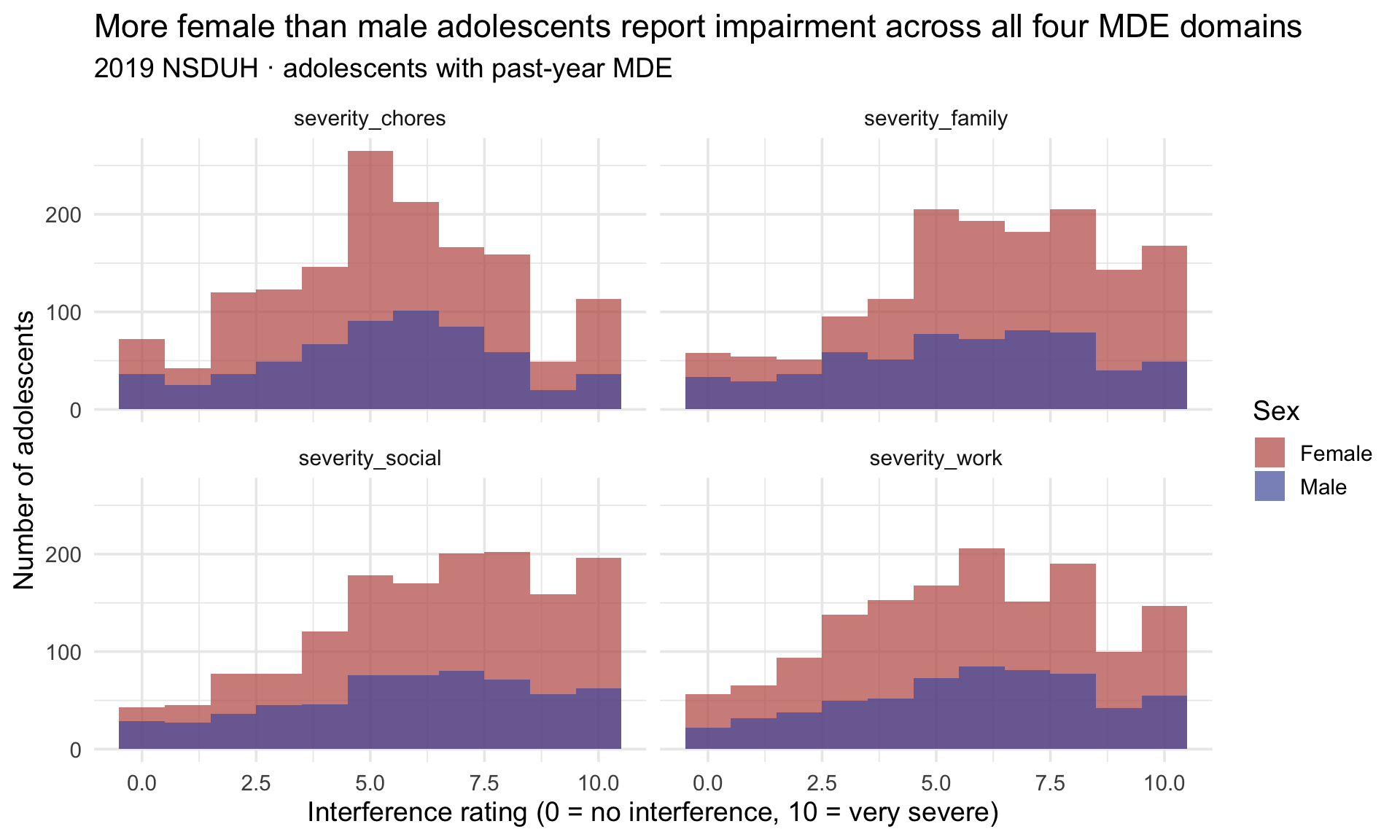
Now the density plot:
severity_long |>
  ggplot(aes(x = score, fill = sex)) +
  geom_density(alpha = 0.5) +
  scale_fill_manual(values = c("Female" = "#C05852", "Male" = "#4E5EAA")) +
  facet_wrap(~ variable) +
  labs(title = "The shape of impairment is similar for males and females",
       subtitle = "2019 NSDUH · adolescents with past-year MDE",
       x = "Severity score",
       y = "Density",
       fill = "Sex")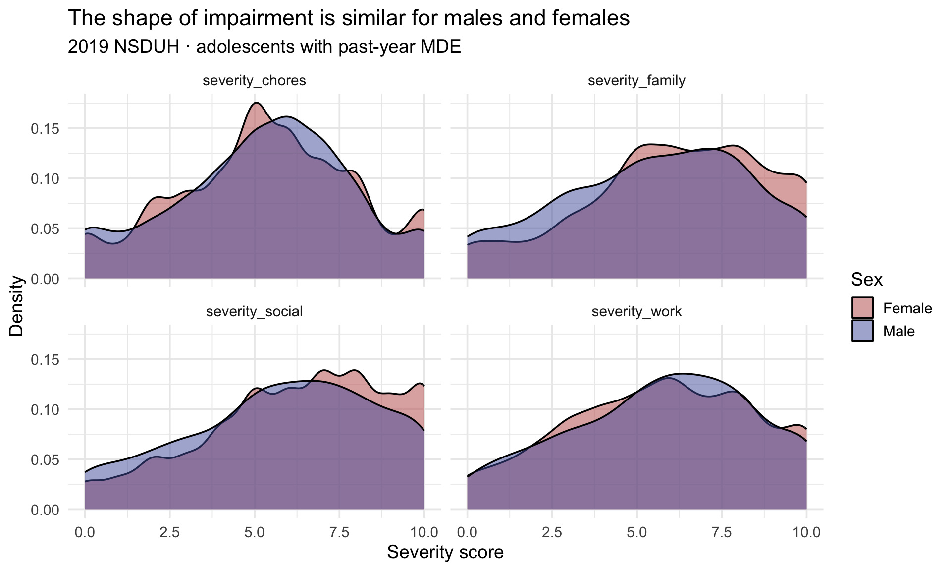
Because these severity scores are discrete 0–10 ratings, read each density curve as a smoothed approximation of the distribution’s shape — not as a literal, point-by-point picture of how the scores fall.
Histogram vs density — the trade-off
Look carefully at both plots. In the histogram, the female bars are much taller than the male bars — because the plotted data are already filtered to adolescents with a past-year MDE, and roughly two and a half times as many female as male adolescents met those criteria, so females contribute roughly two and a half times as many rows to each bin. The histogram reflects both the shape of the distribution and the number of cases contributing to it. (That taller-female pattern is a count difference within this filtered analytic sample — the underlying prevalence difference that drives it is computed directly in Part 5.)
In the density plot, the curves for males and females look much more similar — because geom_density() normalizes each curve so the area under it sums to 1. The density plot reflects only the shape, regardless of how many observations contributed to each.
Which do you want? That depends on the question.
- Histograms make group differences in counts visible. Use them when sample-size differences across groups are part of the story.
- Density plots make group differences in shape visible. Use them when you want to ask whether the form of the distribution differs across groups, independent of how many fall into each.
Both have a place. Often the answer is to show both, which we’ll do in Part 3 using patchwork.
Part 3 — Describing two variables
When the research question crosses two variables, the approach to describing the data changes:
- Numeric × categorical → boxplots for the picture; group means (and SDs, medians, etc.) via group_by() |> summarize() or tbl_summary(by = …) for the numbers.
- Categorical × categorical → cross-tabulations — a two-way table of counts and percents.
- Numeric × numeric → scatterplot for the picture; correlation coefficient for the number.
All three are descriptive. They establish that X looks different across levels of Y; they do not establish that X differs because of Y. The inferential machinery that turns a descriptive group difference into a hypothesis test lives in M09.
This three-way split is not ours alone: it is exactly how R for Data Science organizes covariation in Chapter 10 (Exploratory data analysis) — a categorical and a continuous variable, two categorical variables, two continuous variables. Read §10.5 alongside this Part for a second pass over the same three cases.
Before those comparisons, one setup step. Several of them lean on a composite score built from the four Sheehan items, so we construct that first — combining several items into one score is a common, reusable data-prep move — and look at its distribution before comparing it across groups.
Building a teaching composite — the mean of the four Sheehan items
The four severity items (severity_chores, severity_work, severity_family, severity_social) measure functional impairment from depression across four life domains, each scored 0–10 on the Sheehan Disability Scale — where 0 means no interference at all and 10 means very severe interference. A common research move is to combine several items into a single composite score; here, the average across the four. (Strictly, each 0–10 item is ordinal; averaging them treats the scale as interval — a standard, defensible simplification once a rating scale has enough response options, as these do. The classic defence of that move is Norman (2010), Likert scales, levels of measurement and the “laws” of statistics, which shows that means, SDs, t-tests and regression hold up well on rating-scale data.)
This composite is ours — it is not NSDUH’s scoring rule
The score built below exists to practice row-wise scale construction. It is not how NSDUH scores role impairment. NSDUH classifies overall impairment from the highest rating across the four domains — not their average — and we will verify that claim against the data ourselves at the end of this section.
Keep that caveat attached to the name. We call the column severity_scale because it is short and it is what you will type — but what it actually holds is the mean of four interference ratings. So describe it that way in prose and figure captions, not as “severity.” A convenient variable name is not a claim about what a measure is, and the gap between the two is where a reader gets misled.
Before you average: do these four items belong together?
Averaging four columns into one is a claim, not just an arithmetic step. It says the four items are tracking a single underlying thing closely enough that one number can reasonably stand in for four. That claim is checkable, and the check costs one line — so make it a habit to look before you average rather than after.
The question to ask is whether the items move together: if one adolescent reports more interference with chores than another does, do they also tend to report more interference with work, family, and social life? A correlation matrix answers that for every pair at once. (You met the correlation coefficient in M01, and cor() gets its own treatment later in this Part — here we only need the numbers it returns.)
severity_r <- nsduh_20092019 |>
  filter(year == 2019, mde_pastyear == "Positive") |>
  select(starts_with("severity_")) |>
  cor(use = "pairwise.complete.obs")

severity_r |> round(2)
severity_chores severity_work severity_family severity_social
severity_chores 1.00 0.49 0.43 0.41
severity_work 0.49 1.00 0.49 0.46
severity_family 0.43 0.49 1.00 0.52
severity_social 0.41 0.46 0.52 1.00use = "pairwise.complete.obs" tells cor() to compute each pair from the respondents who answered both of those two items, rather than throwing out anyone who missed any item. The diagonal is 1 by construction — every item correlates perfectly with itself — so the six numbers off the diagonal are the whole result.
The same six numbers as a picture, which is easier to scan once a scale has more than a handful of items:
severity_r |>
  corrplot.mixed(
    lower = "number",
    upper = "circle",
    tl.col = "black",
    tl.cex = 0.9,
    lower.col = "black",
    upper.col = colorRampPalette(c("#B5698A", "#F3F5F8", "#2E7D7B"))(200)
  )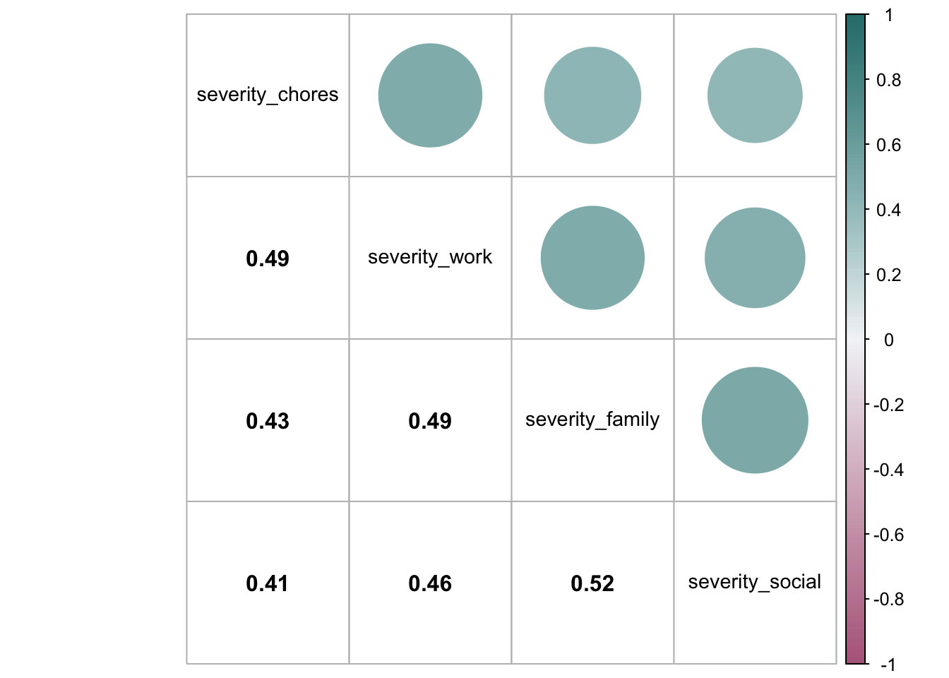
Every pair is positive and moderate — between 0.41 and 0.52. That is the pattern you want before averaging, and it is worth naming both halves of why. The correlations are high enough that the items plausibly track a common construct, so collapsing them loses little. They are also not so high that the items are redundant — four correlations of 0.95 would mean you had asked one question four ways and could have saved your respondents the trouble. Here the items agree about how much they should: an adolescent whose depression disrupts school tends to report disruption at home too, but not identically, because these really are four different parts of a life.
Notice also that no single item is the odd one out. If severity_chores had correlated near zero with the other three, averaging it in would be burying information rather than summarizing it — the composite would be part impairment and part something else, with no way for a reader to tell which.
What a correlation matrix does — and does not — license
Positive, moderate correlations are preliminary evidence that an average may be a useful summary. They are not evidence that the four items measure one underlying dimension, that the composite is reliable, or that weighting all four equally is the right way to combine them.
Establishing those is the work of psychometrics — the science of measurement — which adds reliability coefficients, factor analysis, and validity evidence on top of what you just did. You will take that up properly in your Measurement course; inter-item correlation is the crudest first look.
What the check buys you here is smaller but still worth having: it would have caught the case where averaging is clearly wrong, and it lets you write “the four items were positively inter-correlated (r = 0.41–0.52)” in a methods section instead of hoping no one asks.
Now, before you run the code below, predict: what should happen to an adolescent who answered only two of the four severity items — should they get a score, or not? Hold that thought; the next two chunks put your answer to the test.
Building the score
The cleanest way to average across columns in dplyr is with rowMeans() + pick():
mde_severity_2019 <- nsduh_20092019 |>
  filter(year == 2019, mde_pastyear == "Positive") |>
  mutate(severity_scale = rowMeans(pick(starts_with("severity_"))))

mde_severity_2019 |>
  select(sex, starts_with("severity_")) |>
  head()
By default, rowMeans() returns NA for any row with even one missing item. That’s safer than silently dropping items, but stricter than most research practice — papers commonly allow the score to be formed if a minimum number of items were answered, on the theory that 3 out of 4 items still captures most of the construct.
A common scoring-rule pattern is “form the score only if the respondent answered at least k of the n items.” Computing the item count once, into its own column, keeps the rule readable:
mde_severity_2019 <- nsduh_20092019 |>
  filter(year == 2019, mde_pastyear == "Positive") |>
  mutate(
    n_answered = rowSums(!is.na(pick(starts_with("severity_")))),
    severity_scale = case_when(
      n_answered >= 3 ~ rowMeans(pick(starts_with("severity_")), na.rm = TRUE),
      n_answered < 3  ~ NA_real_
    )
  )

mde_severity_2019 |>
  count(n_answered)
The case_when() arm says: if the respondent has at least 3 non-missing items, take the mean of whichever items they did answer; otherwise, return NA.1 The choice of k = 3 (out of 4 items) follows a common rule of thumb in scale construction — require at least 75% of items before forming the scale, on the reasoning that 3 of 4 items still captures most of the underlying construct while keeping enough respondents in the sample to make the analysis worthwhile. Other common choices are k = ⌈n/2⌉ (require at least half) for short scales and k = n (require all items) for very short scales where one missing value substantively changes the score. The right threshold for your scale should come from the measure’s documentation or your team’s pre-registered analysis plan, not from default behavior.
Why na.rm = TRUE appears in the second version and not the first
The two chunks differ by more than the case_when(). Look at the rowMeans() calls side by side:
rowMeans(pick(starts_with("severity_")))                 # first version
rowMeans(pick(starts_with("severity_")), na.rm = TRUE)   # second version
na.rm = TRUE tells rowMeans() to drop the missing values and average whatever is left, instead of refusing to answer. That is exactly what the k = 3 rule needs. A respondent who answered three items and skipped one should get a score — the mean of their three answers — and without na.rm = TRUE that row would come back NA no matter what the case_when() said. The two pieces work together: case_when() decides who is eligible for a score, and na.rm = TRUE makes it possible to actually compute one for them.
Now run the thought experiment in reverse. What if you had put na.rm = TRUE on the first version, with no eligibility rule at all?
mutate(severity_scale = rowMeans(pick(starts_with("severity_")), na.rm = TRUE))Everyone would get a score — and that is the problem. An adolescent who answered all four items would be averaged over four. One who answered a single item would get that one item’s value back, presented in the same column, formatted identically, and indistinguishable from the others in any table or plot. A one-item “average” is not a composite; it is a single rating wearing a composite’s name. Worse, na.rm = TRUE is silent about it — nothing warns you, and the only trace is a distribution that quietly mixes four-item means with one-item stand-ins.
That is the whole reason the eligibility rule comes first. na.rm = TRUE is not a fix for missing data; it is an instruction to ignore it. Ignoring it is the right call once you have decided how much information a score must rest on — and the wrong call before you have.
Be honest about how much the rule actually did. The count above shows why: nearly everyone who answered any of these items answered all four, so the k = 3 rule rescues only a handful of respondents that rowMeans() would have dropped. That is a perfectly ordinary result, and it is worth reporting rather than glossing. A scoring rule earns its place by being specified in advance, not by changing a lot of scores — and you only know which it did by looking.
Checking our composite against the instrument’s own rule
We built a mean. NSDUH scores role impairment from the maximum across the four domains, treating a rating of 7 or higher in any single domain as severe impairment. Those are genuinely different rules: an adolescent reporting 10 on school/work and 0 on the other three domains averages 2.5 — mild by our composite — but scores 10 on NSDUH’s, which is severe.
We can check that claim directly, because the dataset already carries NSDUH’s own classification in mde_pastyear_severe. If the max-domain rule really is what produced it, rebuilding it by hand should reproduce that column exactly:
mde_severity_2019 |>
  mutate(
    max_domain = pmax(severity_chores, severity_work,
                      severity_family, severity_social, na.rm = TRUE),
    severe_by_max_rule = case_when(
      max_domain >= 7 ~ "Severe (max ≥ 7)",
      max_domain < 7  ~ "Not severe (max < 7)"
    )
  ) |>
  drop_na(max_domain, mde_pastyear_severe) |>
  count(mde_pastyear_severe, severe_by_max_rule)
Look at the shape of that table. Every respondent falls on the diagonal — the off-diagonal cells are empty. Our hand-built max-domain rule agrees with NSDUH’s official severity flag for every single adolescent, which tells us we reverse-engineered the scoring correctly.
This is the section’s real lesson, and it is worth more than the composite itself. Two defensible summaries of the same four items — a mean and a maximum — answer different questions and classify different people. Our severity_scale asks “how impaired was this adolescent across life domains, on average?” NSDUH’s rule asks “was this adolescent severely impaired in at least one domain?” Neither is wrong. But only one of them is what the instrument’s documentation specifies, and only one of them will match what a published paper using this variable reports.
So use mde_pastyear_severe when you want NSDUH’s severity construct, and reserve severity_scale for what it is: a teaching example of row-wise scale construction, which is what we use it for in the plots below.
Visualizing the composite
A histogram + density side-by-side, using patchwork from M03:
Show the code that built this figure
hist <- mde_severity_2019 |>
  drop_na(severity_scale) |>
  ggplot(aes(x = severity_scale, fill = sex)) +
  geom_histogram(binwidth = 0.5, position = "identity", alpha = 0.7) +
  scale_fill_manual(values = c("Female" = "#C05852", "Male" = "#4E5EAA")) +
  theme(legend.position = "none") +
  labs(title = "Histogram",
       x = "Mean interference across 4 items (0-10)",
       y = "Count")

dens <- mde_severity_2019 |>
  drop_na(severity_scale) |>
  ggplot(aes(x = severity_scale, fill = sex)) +
  geom_density(alpha = 0.5) +
  scale_fill_manual(values = c("Female" = "#C05852", "Male" = "#4E5EAA")) +
  labs(title = "Density plot",
       x = "Mean interference across 4 items (0-10)",
       y = "Density",
       fill = "Sex")

(hist + dens) +
  plot_annotation(
    title = "Distribution of the composite interference score among adolescents with a past-year MDE",
    subtitle = "Histogram (left) reflects raw counts; density (right) reflects shape only"
  )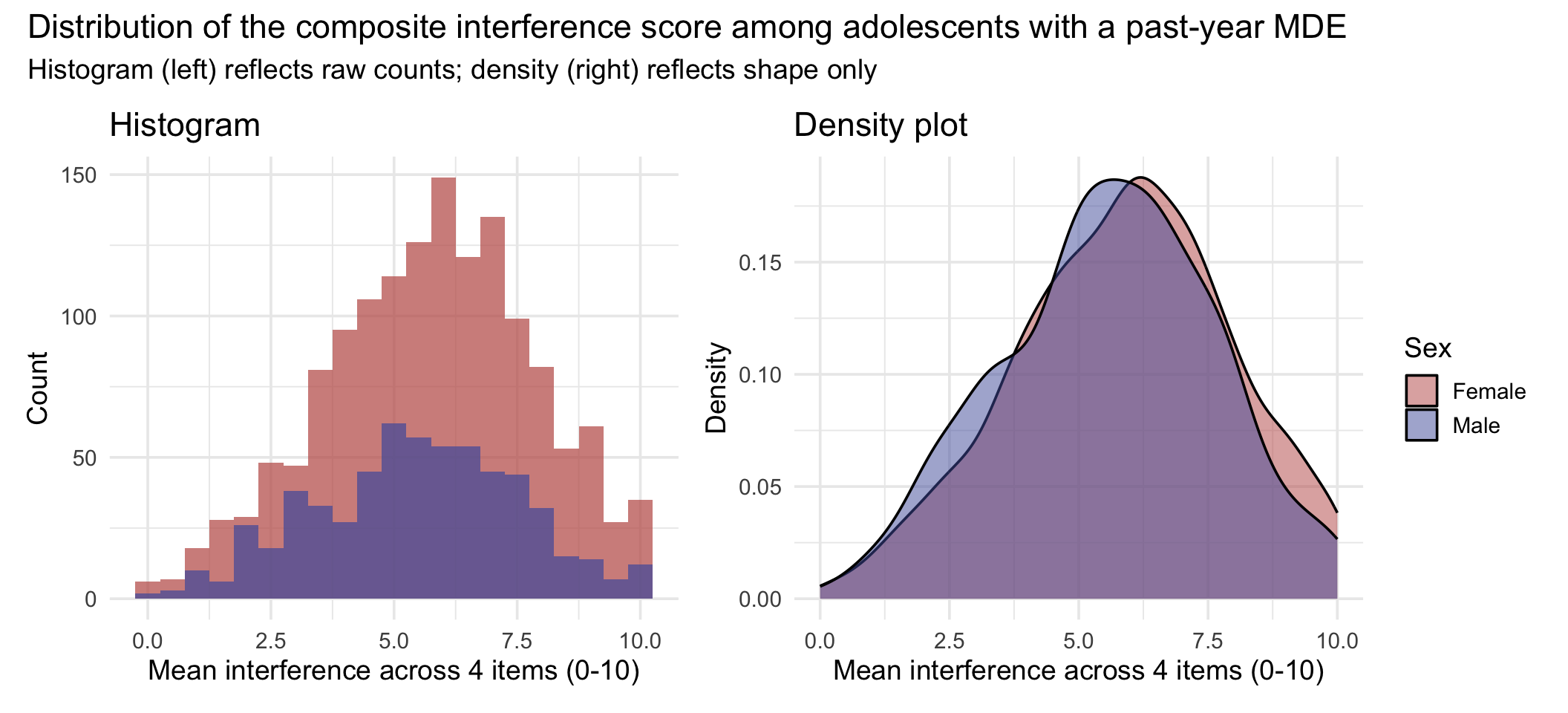
The histogram makes the count difference visible (many more females contribute scores, because more were MDE-positive); the density makes the shape comparable (the two distributions have similar shape). Both views matter; show both when you can.
Numeric × categorical — boxplots
The workhorse picture for “how does a numeric variable differ across the levels of a categorical variable?” is the boxplot (also called a box-and-whisker plot). M03 introduced the geom and walked through the anatomy diagram — to recap briefly: the box runs from the 25th percentile (Q1) to the 75th percentile (Q3), with the median drawn as a line inside it. The whiskers reach out to the most extreme values that still lie within 1.5 × IQR of the box, and any observation past those limits is drawn individually as a potential outlier.
That whisker rule is worth stating precisely, because it is easy to misremember. The whiskers do not automatically extend to the sample minimum and maximum — they stop at the furthest observation inside the 1.5 × IQR fence, and anything beyond becomes a point. So the tips of the whiskers are the min and max only when there are no outliers at all.
Boxplots compactly compare distributions across groups — the median, the middle 50%, any asymmetry between the halves, and the observations beyond the whisker limits, all on one axis. They do not show everything: a boxplot cannot reveal whether a distribution is bimodal, because two clusters and one broad spread can produce the same five numbers. That is what the histogram and density views are for. Using the severity_scale we just built, we can compare it across sex among 2019 adolescents with a past-year MDE — a numeric variable against a categorical one:
Show the code that built this figure
mde_severity_2019 |>
  drop_na(severity_scale) |>
  ggplot(aes(x = sex, y = severity_scale, fill = sex)) +
  geom_boxplot(alpha = 0.7, width = 0.5) +
  scale_fill_manual(values = c("Female" = "#C05852", "Male" = "#4E5EAA"),
                    guide = "none") +
  labs(
    title = "Among adolescents with a past-year MDE, severity is comparable across sex",
    subtitle = "Each box shows median, Q1, Q3, and 1.5-IQR whiskers; points lie beyond the whisker limits",
    x = NULL,
    y = "Mean interference across 4 items (0-10)"
  )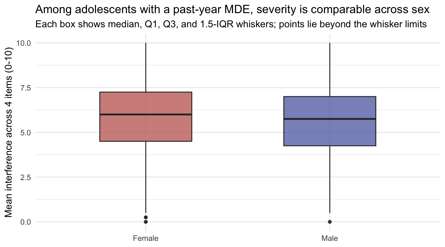
Reading the picture: the median lines sit at similar levels, suggesting that among adolescents who meet past-year MDE criteria, the typical interference score is comparable across sex. The boxes (Q1 to Q3) are similar in width, suggesting comparable spread in the middle 50% of each group. So the more pronounced sex difference in these data is in how many adolescents meet MDE criteria at all — the prevalence question Part 5 takes up — rather than in the degree of impairment reported by those who do. Note what this plot can and cannot settle: it describes only the adolescents already inside the MDE-positive group, so it is silent on prevalence by construction.
When the categorical variable has many levels — race/ethnicity groups, U.S. states, hospital sites — pair geom_boxplot() with coord_flip() (as M03 did) so the long category labels read horizontally.
Boxplot vs histogram — when does each win?
You’ve now met three pictures of a numeric distribution: histogram, density plot, and boxplot. Each shows a different aspect.
- Histogram — preserves counts, so bar heights combine the shape of the distribution with how many observations contributed. Best for one group at a time, or for showing that group sizes differ. It is not a prevalence plot: comparing prevalence needs the group’s own total in the denominator, which a raw-count histogram never shows.
- Density plot — normalizes to area 1; shape only. Best for comparing the shapes of distributions across groups when you want to ignore sample-size differences.
- Boxplot — summarizes each group with five numbers + outliers; very compact. Best for comparing many groups at once (the histogram becomes unreadable past four or five facets; the boxplot scales gracefully).
In practice, exploratory analyses often use density plots or histograms to choose summaries; final published “Figure 1” panels use boxplots to display many group comparisons compactly.
Numeric × categorical — group summaries
The pipeline you used in M04 — group_by() + summarize() with n() — is the same one you use here.
nsduh_20092019 |>
  filter(year == 2019, mde_pastyear == "Positive") |>
  group_by(sex) |>
  summarize(
    n = n(),
    n_nonmissing = sum(!is.na(severity_chores)),
    mean_chores = mean(severity_chores, na.rm = TRUE),
    sd_chores = sd(severity_chores, na.rm = TRUE),
    median_chores = median(severity_chores, na.rm = TRUE)
  )
Notice the two count columns. n() counts every adolescent in the group; sum(!is.na(severity_chores)) counts only those who actually answered the chores item — the number the na.rm = TRUE mean and SD are computed from. Whenever a variable carries missingness, reporting both makes explicit how many cases each summary actually rests on.
When you want the same numbers in publication form, tbl_summary(by = sex) does the work for you:
nsduh_20092019 |>
  filter(year == 2019, mde_pastyear == "Positive") |>
  select(sex, starts_with("severity_")) |>
  tbl_summary(
    by = sex,
    statistic = list(starts_with("severity_") ~ "{mean} ({sd})"),
    missing = "no"
  ) |>
  as_gt() |>
tab_header(title = md("**MDE severity by sex — 2019 adolescents with past-year MDE**"))| MDE severity by sex — 2019 adolescents with past-year MDE | ||
| Characteristic | Female N = 1,4871 |
Male N = 6111 |
|---|---|---|
| MDE interference with doing home chores | 5.3 (2.6) | 5.3 (2.6) |
| MDE interference with school/work | 5.66 (2.76) | 5.69 (2.73) |
| MDE interference with family relationships | 6.11 (2.70) | 5.52 (2.79) |
| MDE interference with social life | 6.29 (2.70) | 5.80 (2.82) |
| 1 Mean (SD) | ||
Two gtsummary arguments worth noting here:
- statistic = overrides the default (median + IQR for numeric) with the mean + SD in parentheses
- missing = "no" suppresses the otherwise-default missingness row, which declutters the table
We’ll come back to tbl_summary() customization in detail in Part 4.
Categorical × categorical — cross-tabulations
A cross-tabulation is a two-way frequency table — one categorical variable on the rows, another on the columns, counts (and percents) in the cells. It answers questions like “What share of adolescents with past-year MDE also have a substance use disorder?”
A new dataset for this question
Answering it takes a dataset that measures both conditions on the same respondents, and that is a different file from the one we have been using. Here we use a new NSDUH dataset that includes only data for 2019.
nsduh_2019 · 13,397 observations · 17 variables · SAMHSA NSDUH 2019 · data/nsduh_2019.Rds
Adolescent (ages 12–17) respondents to the 2019 National Survey on Drug Use and Health, carrying depression, impairment, mental-health-care, and substance use disorder measures for each respondent.
- record_id character — Unique identifier for one adolescent respondent, built as year plus the NSDUH questionnaire ID so that records stay distinct when waves are stacked
- year integer — Survey year
- sex factor — Respondent’s sex as recorded by NSDUH
- age integer — Age in completed years
- raceeth factor — Race and ethnicity as classified by NSDUH’s recoded race variable
- mde_pastyear factor — Whether the respondent experienced a major depressive episode in the past 12 months
- mde_lifetime factor — Whether the respondent has ever experienced a major depressive episode, using NSDUH’s DSM-based classification
- mde_pastyear_severe factor — Whether the respondent had a past-year major depressive episode with severe role impairment
- mh_sawprof factor — Whether the respondent saw or talked to a professional about depression in the past year
- severity_chores numeric — Sheehan Disability Scale rating of how much past-year depression interfered with household chores, where 0 is no interference and 10 is very severe interference
- severity_work numeric — Sheehan Disability Scale rating of interference with school or work, 0 to 10
- severity_family numeric — Sheehan Disability Scale rating of interference with family relationships, 0 to 10
- severity_social numeric — Sheehan Disability Scale rating of interference with social life, 0 to 10
- substance_disorder factor — Whether the respondent met criteria for a past-year alcohol or illicit-drug use disorder (abuse or dependence)
- adol_weight numeric — Person-level analysis weight
- vestr numeric — Variance estimation stratum
- verep numeric — Variance estimation replicate, the primary sampling unit within a stratum
The last three — adol_weight, vestr, and verep — are the survey-design variables. You can ignore them until Part 5, where they turn sample summaries into population estimates.
Full codebook for nsduh_2019 — values, levels, missingness, and how the file was prepared.
nsduh_2019 <- read_rds(here("data", "nsduh_2019.Rds"))

nsduh_2019 |>
  select(mde_pastyear, substance_disorder) |>
  glimpse()
Rows: 13,397
Columns: 2
$ mde_pastyear <fct> Negative, Negative, Negative, NA, Negative, Negative, Negative, Negative, Negativ…
$ substance_disorder <fct> Negative, Negative, Negative, Negative, Negative, Negative, Negative, Negative, N…Because this file measures depression and substance use on the same adolescents, it can answer the comorbidity question — which is exactly what a cross-tabulation is for.
Building the cross-tab
gtsummary produces them with tbl_cross():
nsduh_2019 |>
  select(mde_pastyear, substance_disorder) |>
  drop_na() |>
  tbl_cross(row = mde_pastyear, col = substance_disorder)
Past-Year Substance Use Disorder
|
Total | ||
|---|---|---|---|
| Negative | Positive | ||
| Past-Year Major Depressive Episode | |||
| Negative | 10,460 | 392 | 10,852 |
| Positive | 1,856 | 242 | 2,098 |
| Total | 12,316 | 634 | 12,950 |
The cells show raw counts. For example, 10,460 participants were negative for both past-year MDE and past-year substance use disorder. But percentages can be added. First, we must decide which percent flavor to add. There are three options, each answering a different research question. Before running each version below, predict which cells will sum to 100% — locking in that prediction is the fastest way to internalize the row / column / cell distinction.
Row percent — “of those with X, how many also have Y?”
Setting percent = "row" makes each row sum to 100%:
nsduh_2019 |>
  select(mde_pastyear, substance_disorder) |>
  drop_na() |>
  tbl_cross(row = mde_pastyear, col = substance_disorder, percent = "row")
Past-Year Substance Use Disorder
|
Total | ||
|---|---|---|---|
| Negative | Positive | ||
| Past-Year Major Depressive Episode | |||
| Negative | 10,460 (96%) | 392 (3.6%) | 10,852 (100%) |
| Positive | 1,856 (88%) | 242 (12%) | 2,098 (100%) |
| Total | 12,316 (95%) | 634 (4.9%) | 12,950 (100%) |
Read this version as “of adolescents with past-year MDE, what proportion also have a substance use disorder?” — the conditional distribution of the column variable within each row.
Column percent — “of those with Y, how many also have X?”
percent = "column" makes each column sum to 100%:
nsduh_2019 |>
  select(mde_pastyear, substance_disorder) |>
  drop_na() |>
  tbl_cross(row = mde_pastyear, col = substance_disorder, percent = "column")
Past-Year Substance Use Disorder
|
Total | ||
|---|---|---|---|
| Negative | Positive | ||
| Past-Year Major Depressive Episode | |||
| Negative | 10,460 (85%) | 392 (62%) | 10,852 (84%) |
| Positive | 1,856 (15%) | 242 (38%) | 2,098 (16%) |
| Total | 12,316 (100%) | 634 (100%) | 12,950 (100%) |
Read this version as “of adolescents with a substance use disorder, what proportion also had a past-year MDE?” — the conditional distribution of the row variable within each column. Note that this is a different question from the row-percent version, and gives a different answer.
Cell percent — “of the whole sample, how many are in this category combination?”
percent = "cell" expresses each cell as a percentage of the grand total:
nsduh_2019 |>
  select(mde_pastyear, substance_disorder) |>
  drop_na() |>
  tbl_cross(row = mde_pastyear, col = substance_disorder, percent = "cell")
Past-Year Substance Use Disorder
|
Total | ||
|---|---|---|---|
| Negative | Positive | ||
| Past-Year Major Depressive Episode | |||
| Negative | 10,460 (81%) | 392 (3.0%) | 10,852 (84%) |
| Positive | 1,856 (14%) | 242 (1.9%) | 2,098 (16%) |
| Total | 12,316 (95%) | 634 (4.9%) | 12,950 (100%) |
The number in the MDE-positive + substance-positive cell is the unweighted joint prevalence within this analytic subset — the share of the 2019 adolescents observed on both variables who are positive for both. Note the careful wording. The pipeline applied drop_na() before the table, so the denominator is not the full 2019 sample; it is the complete-case subset. Calling this figure “the comorbidity prevalence among U.S. adolescents” would inflate its reach twice over — once past the complete-case filter, and once past the fact that these counts are unweighted.
Which percent flavor answers which question?
The three flavors of percent = in tbl_cross() answer three genuinely different questions. Pick the one that matches your research aim.
| You want to ask… | Use percent = |
Each total sums to |
|---|---|---|
| Of those with X, how many also have Y? | "row" |
100% per row |
| Of those with Y, how many also have X? | "column" |
100% per column |
| What share of the whole sample is in this category combination? | "cell" |
100% across the table |
A common pitfall: writing prose that says “12% of adolescents had both MDE and a substance use disorder (SUD)” when the number actually came from a row-percent calculation (“12% of MDE-positive adolescents had SUD”). These are very different claims. Always state the conditioning variable explicitly in your prose.
We’ll formalize the test that turns this descriptive cross-tab into a hypothesis (“is the association statistically significant?”) in M09.
Numeric × numeric — scatterplots and correlation
When both variables are numeric, the best approach is a scatterplot for visualization and a correlation coefficient (Pearson’s r) for a numeric summary. M01 introduced both at the conceptual level; here we operationalize them in R — and tie the move directly into the headline research question Daly (2022) studied: did past-year MDE prevalence rise across NSDUH survey years?
Whole-sample trend: year × MDE prevalence
The research question gives us two numeric variables: year (2009–2019) and the proportion of adolescents in that year who met past-year MDE criteria. To get the proportion per year, we use the same group_by() |> summarize() engine from Part 3 — one row per year, with n() alongside the proportion to keep an honest record of each estimate’s sample size. The expression mean(mde_pastyear == "Positive") is worth pausing on: the comparison == "Positive" produces a TRUE/FALSE vector, and the mean of a logical vector is just the proportion that are TRUE — so this one line computes the yearly MDE rate. (R for Data Science Chapter 12 (Logical vectors) covers this TRUE-as-1 trick in full; it powers every prevalence calculation in Parts 3 and 5.)
mde_by_year <- nsduh_20092019 |>
  drop_na(mde_pastyear) |>
  group_by(year) |>
  summarize(
    n_adolescents = n(),
    prop_mde = mean(mde_pastyear == "Positive")
  )

mde_by_year
11 rows — one per year — with two new numeric variables.
Notice what the denominator just became. drop_na(mde_pastyear) removed the 4,400 respondents whose MDE status is missing, so these prevalences — and every trend figure built from them, including the Daly graph in Part 5 — rest on 167,783 adolescents, not the 172,183 in the file. That is why each figure’s subtitle reports the analytic count rather than the file count: the n you print should be the n the estimate actually used. (Keep that number in mind. It reappears in Part 5 for a reason worth waiting for.)
Before we scatterplot them, a quick but important aside on the drop_na() we just used:
Missing data and drop_na()
The code above used drop_na(mde_pastyear) to remove rows where the outcome variable is missing. That move has a name in the methodological literature: complete-case analysis, often called listwise deletion. It’s the default missing-data strategy in PSY 652 and most introductory courses, but it is not a methodological null — it’s a choice with consequences, and you should know them.
Those two terms mean the same thing. Complete-case analysis and listwise deletion are two names for one practice: keep only the rows that are complete on every variable the analysis uses, and drop the rest. You will meet both names in the literature — “complete-case” is more common in the statistics literature, “listwise” in psychology and in SPSS output — so it is worth recognizing them as synonyms rather than hunting for a difference that isn’t there.
The term they do contrast with is pairwise deletion, also called available-case analysis: instead of one subset for the whole analysis, each individual statistic uses every case that has the data it needs. In a correlation matrix, that means each correlation may rest on a different set of respondents — so the n changes cell by cell, and the matrix can even come out mathematically impossible. Complete-case analysis costs you power; pairwise buys some of it back at the price of a table whose entries no longer describe the same people. PSY 652 uses complete-case throughout, and asks you to report the n it rests on.
What listwise deletion does. Drops any row that’s missing a value on a variable you reference. Here we dropped rows missing only the outcome (mde_pastyear); more generally, a complete-case analysis drops any row missing any variable the analysis needs. Simple, transparent, and easy to describe in a methods section — which is not the same as automatically unbiased or substantively justified.
What it costs you. Two things:
- Power. Every dropped row is data you can’t use. If 15% of rows are missing on the outcome, you’ve lost 15% of your effective sample size for that analysis.
- Bias — possible only if the missing data are not missing completely at random (MCAR). MCAR rules bias out; data that aren’t MCAR can produce bias, but don’t always. The full taxonomy comes from Rubin (1976):
- MCAR (Missing Completely At Random) — missingness is independent of everything observed and the missing value itself. An example for NSDUH: a random handful of ACASI tablets glitch mid-interview and drop the depression items — the malfunction has nothing to do with who the adolescent is or whether they were depressed. Listwise deletion is unbiased under MCAR; you’re just left with a smaller random sample.
- MAR (Missing At Random) — missingness depends on observed variables but not on the missing value itself. An example for NSDUH: suppose the youngest adolescents (age 12–13) skip the depression items more often because they find the wording confusing — so missingness depends on age, which we observe, but within a given age, who skips is unrelated to whether they were actually depressed. Complete-case estimates may be biased under MAR. Conditioning the analysis on the observed variables that drive the missingness (here, age) can help, but it is not automatically sufficient for every quantity you might want to estimate.
- MNAR (Missing Not At Random) — missingness depends on the missing value itself. An example for NSDUH: adolescents in the middle of a severe depressive episode are the most likely to decline the depression items — so whether mde_pastyear is missing depends on the very value we’re trying to record, even after accounting for age, sex, and raceeth. Listwise deletion is biased under MNAR — and MNAR generally cannot be resolved from the observed data alone, because the information needed to correct it is precisely what is missing.
Real psychological survey data are rarely MCAR. So listwise deletion’s bias-free guarantee usually doesn’t apply.
What the alternatives are. Two main ones, both more sophisticated than listwise deletion and both built into modern statistical software:
- Multiple imputation (MI) — generate several plausible complete datasets by drawing missing values from a model of the observed data, run your analysis on each, combine results. Implemented in R via the mice package. Best general-purpose tool for MAR data.
- Full-information maximum likelihood (FIML) — estimates parameters from the observed portion of each record within a specified likelihood model, without imputing anything. Not limited to SEM, but that is where you will meet it most often (e.g., lavaan).
Both can be valid under MAR when the missingness and analysis models are specified appropriately. Neither rescues MNAR on its own; that requires additional assumptions, an explicit MNAR model, or a sensitivity analysis showing how much the conclusion could move.
What we do in PSY 652. Listwise deletion via drop_na(), with the caveats above explicitly named in your prose. When you write up a descriptive analysis, say “complete-case analysis (listwise deletion); the n missing for each variable is reported below.”
What’s coming. M10 revisits missing data in a regression setting, where a randomized trial adds a specific danger — differential attrition between the treatment and control arms, and why it threatens a causal reading. PSY 653 then develops the full methodological toolkit (the MI workflow via mice, FIML for SEM, sensitivity analyses, missing-data diagnostics) so you can ship a paper with state-of-the-art handling.
Why we don’t teach MI here. Imputation requires a model. Modeling requires the inferential machinery you’ll get in M06–M12. Once you have that, MI is one chapter of new R code away. The path is sequential.
Now, the scatterplot:
Show the code that built this figure
mde_by_year |>
  ggplot(aes(x = year, y = prop_mde)) +
  geom_point(size = 4, color = "#4E5EAA") +
  geom_smooth(method = "lm", formula = y ~ x, color = "#C05852", se = FALSE) +
  scale_x_continuous(breaks = year_min:year_max) +
  scale_y_continuous(labels = scales::percent_format(accuracy = 1)) +
  labs(
    title = "Past-year MDE prevalence rose across NSDUH survey years",
    subtitle = sprintf("%d points · one per year · %s adolescents with past-year MDE observed",
                       n_years, n_mde_analytic),
    x = "Survey year",
    y = "% of adolescents with past-year MDE"
  )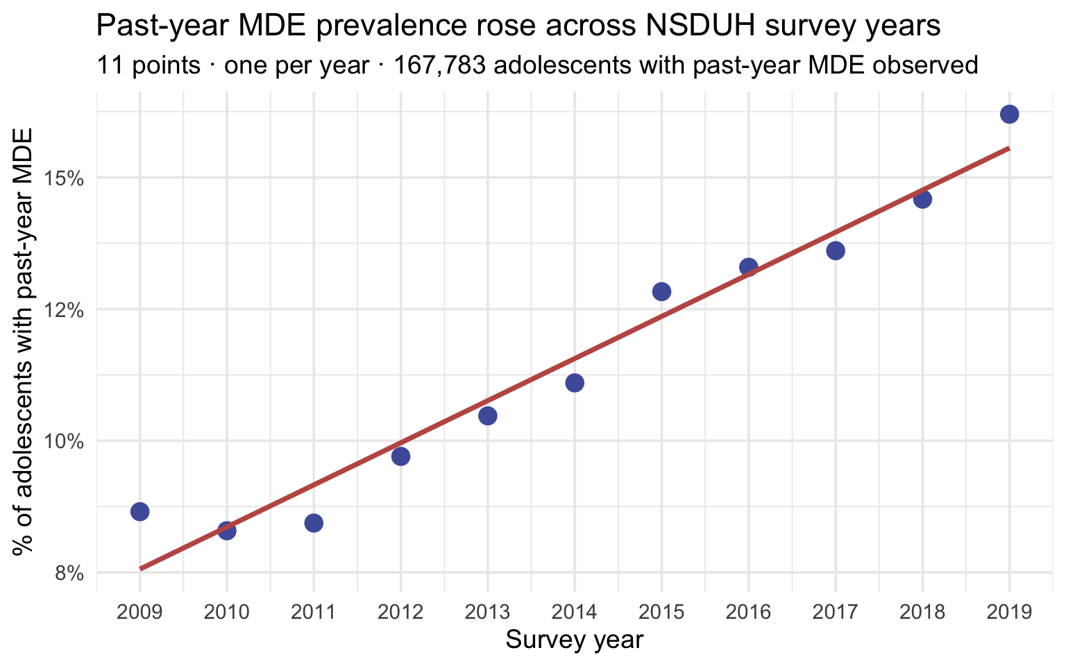
The picture is clear: the year-by-year prevalence rises steadily over the decade. The rose line is the ordinary least squares (OLS) line of best fit — the straight line that makes the total squared vertical distance between the points and the line as small as possible. M10 develops it formally; for now, read it as “the line that best summarizes this trend.”
The correlation coefficient (introduced in M01) gives one number behind the picture. Pearson’s r lives between −1 and +1. Its sign gives the direction of the relationship (positive or negative), and how close it sits to ±1 gives the strength — how tightly the points cluster around a straight line. Values close to ±1 mean the points hug the line; values close to 0 mean no linear pattern. But strength is only half the story: it says nothing about how big the trend is — the rate of change — which is the slope’s job, and the box below draws that line sharply. Base R computes r with cor():
mde_by_year |>
  summarize(r_year_mde = cor(year, prop_mde))
An r this close to +1 means the 11 yearly prevalence estimates fall very tightly around a straight line — the linear trend is a good fit to the data.
Foreshadowing M10 — strength vs. magnitude (r is not the slope)
Notice that r tells you how tightly the points cluster around the line, not how steep the line is. Those are two genuinely different questions, and conflating them is one of the most common bugs in descriptive prose. It helps to give them separate names — strength and magnitude:
- Strength — Pearson r. Unit-free, between −1 and +1. How consistently does y track x — do the points hug the trend line, or scatter around it? This is the fit of the relationship: a strong association has little scatter, a weak one is noisy. Strength is capped — it can’t pass ±1 no matter how dramatic the trend.
- Magnitude — the slope (\(b_1\)). In real units — here, percentage points of MDE per year. How much does y move for each one-unit increase in x? This is the size of the relationship: a large-magnitude trend has a steep line, a small-magnitude one is gentle. Magnitude is unbounded — a slope can be any size.
The crucial point: strength and magnitude are independent. All four combinations occur — a trend can be strong and large (tight points, steep line), strong but small (tight points, gentle line), weak but large (scattered points, steep line), or weak and small (scattered and flat). Knowing one tells you nothing about the other. The by-sex panel coming next is a clean case of same strength, different magnitude: the female and male trends are about equally strong (both r near +1 — each sex’s points hug its own line), but the female slope is several times steeper — a much larger magnitude.
The algebraic bridge is slope = r × (sd_y / sd_x), and M10 develops it formally. Squaring the correlation also gives you something useful — the proportion of variance in Y explained by X, which M10 calls R² and notes that r² = R² for one predictor. The habit to build now: report a trend’s magnitude (the slope — the rate of change clinicians and policy-makers act on) separately from its strength (r — how tightly the points track a line). They answer different questions.
Is the trend the same for males and females?
The whole-sample correlation is informative, but Daly (2022) reports that the trend is concentrated among female adolescents. We can ask the same numeric × numeric question separately for each sex by adding sex to the group_by() call:
mde_by_year_sex <- nsduh_20092019 |>
  drop_na(mde_pastyear) |>
  group_by(year, sex) |>
  summarize(
    n_adolescents = n(),
    prop_mde = mean(mde_pastyear == "Positive"),
    .groups = "drop"
  )

mde_by_year_sex
22 rows now — one per year × sex combination. Scatter it with color = sex:
Show the code that built this figure
mde_by_year_sex |>
  ggplot(aes(x = year, y = prop_mde, color = sex)) +
  geom_point(size = 3.5) +
  geom_smooth(method = "lm", formula = y ~ x, se = FALSE) +
  scale_color_manual(values = c("Female" = "#C05852", "Male" = "#4E5EAA")) +
  scale_x_continuous(breaks = year_min:year_max) +
  scale_y_continuous(limits = c(0, NA), labels = scales::percent_format(accuracy = 1)) +
  labs(
    title = "The rise is concentrated among female adolescents",
    subtitle = sprintf("%d points (one per year × sex) · %s NSDUH adolescents with past-year MDE observed",
                       n_years * 2, n_mde_analytic),
    x = "Survey year",
    y = "% with past-year MDE",
    color = "Sex"
  )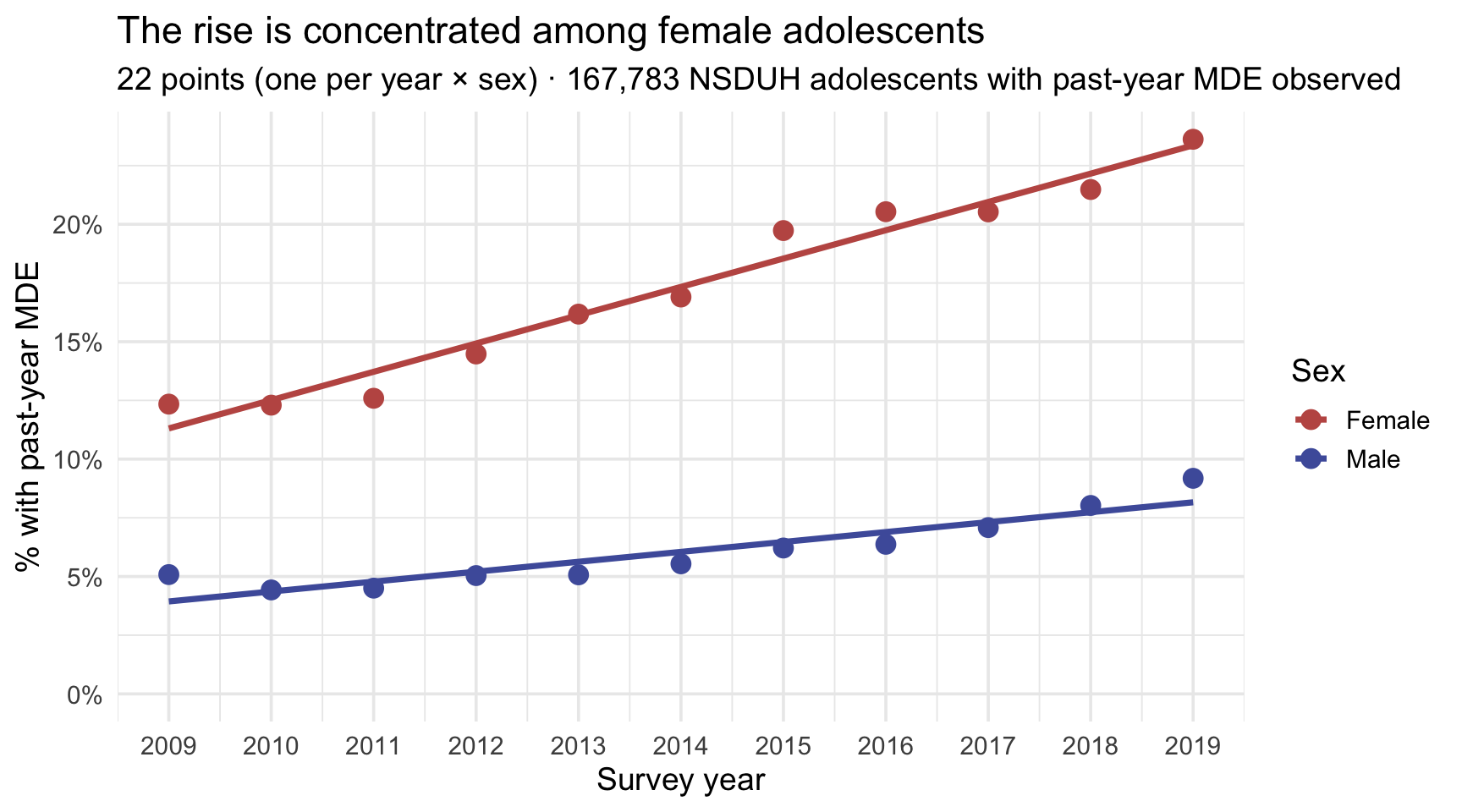
The two lines tell different stories — the female line climbs steeply, while the male line rises much more gently. Resist the temptation to call the male line “flat”: it is shallow next to the female line, but male prevalence still rose across the decade, and we are about to put a number on exactly how much. That difference is about slope (steepness), and per the foreshadowing box above, slope is a different descriptive quantity from r (tightness of fit). It’s worth computing both, side by side, so we can see clearly that they answer different questions:
mde_by_year_sex |>
  group_by(sex) |>
  summarize(
    sd_year = sd(year),
    sd_prop = sd(prop_mde),
    r_year_mde = cor(year, prop_mde),
    slope_pp_per_year = r_year_mde * (sd_prop / sd_year) * 100  # convert to percentage points
  )
Two findings to read from this table:
- The two r values are both close to +1 — similar strength. In both sexes, prevalence rises consistently with year: the year-by-year points fall tightly around a straight line, so the fit is similarly good in both groups.
- The two slopes differ by a large factor — very different magnitude. For females, MDE prevalence rises by roughly a percentage point each year; for males, by a fraction of that. The substantive disparity Daly (2022) flags as concerning lives in the slopes (the magnitude), not in the r values (the strength).
If you reported only r — “in both sexes the trend is well-described by a line” — you’d correctly describe the fit but completely miss the gap. The slope tells you the size of the rise per year, in the units that policy-makers and clinicians actually care about. Always report both when you have them — and watch for descriptions in published papers that confuse “strong correlation” with “large slope” — that is, strength with magnitude. They are different things.
One more thing to name before you write any of this up: what is a data point here? Each dot in that scatterplot is a year-level prevalence estimate, not an adolescent. The correlation is computed across 11 yearly summaries, so it describes how closely aggregate annual prevalence tracks survey year — it says nothing about individual adolescents, and an n of 11 is what the r actually rests on, not 167,783. Whenever you report a correlation, state the unit the rows represent. A reader who assumes these are individuals would badly misread how much evidence is here.
You’ll build the polished version of this trend graph in Part 5, where the focus shifts from quantifying the relationship to communicating it for a Results section.
Practical notes about cor()
A few moves to carry forward:
- cor() requires no missing values. Chain drop_na() before cor() (as above) or pass use = "complete.obs" inside the call — or you’ll get NA back.
- The default is Pearson’s r — appropriate for linear relationships between interval-or-ratio variables. For ordinal variables or non-linear monotonic relationships, pass method = "spearman".
- Correlation is descriptive: it summarizes the linear association in the data at hand. cor() on its own returns no p-value, confidence interval, or causal claim — cor.test() adds the inferential layer once M07 and M09 have given you the machinery to read it. M10 (Simple Linear Regression) develops the inferential layer; the descriptive r is the input.
- When you have many numeric variables, cor() on the data frame returns the full correlation matrix — every pair at once. This is the descriptive precursor to factor analysis and structural equation modeling in PSY 653.
Part 4 — Publication-ready tables with gtsummary
Up to now we’ve used tbl_summary() and tbl_cross() on the fly. Part 4 is the deep dive — why gtsummary is the right tool, and how to customize its output for a report or a paper.
The package has unusually good documentation, and it is worth bookmarking now rather than later: the gtsummary website carries a function reference for every argument below plus an Articles section of worked customization examples. Most table-formatting questions you hit this semester are answered there.
Why gtsummary
You could build a Table 1 from scratch with group_by() |> summarize() and some pivot_wider(). People did exactly that for years. The reasons to use gtsummary instead are:
- The defaults are report-ready. tbl_summary() chooses sensible defaults for each variable type (categorical → count + percent; numeric → median + IQR), formats numbers correctly, and aligns columns. Journals still differ in what they require, so treat the defaults as a strong starting point rather than a finished submission.
- The output is a structured object, not a data frame. That means you can pipe it into as_gt() and add titles, footnotes, and column-spanning headers. It also means the same table object can be rendered to Word, PowerPoint, or PDF through output-specific backends, though the appearance may still need adjusting for each.
- Variable labels are respected automatically. If you used labelled::set_variable_labels() in Part 1, those labels populate the table — no manual relabeling.
- Statistical comparisons are one argument away. tbl_summary() can add a p-value column with add_p() — useful once you’re in M09 territory and want to attach hypothesis tests to a descriptive table. Available is not the same as advisable: whether a Table 1 should carry tests depends on the design and the purpose. Baseline tables in randomized trials are the standard example of where they do more harm than good, since a significant baseline difference in a properly randomized trial is by construction a chance finding.
For first-pass exploratory tables, count() and summarize() are still fastest. For anything destined for a report, paper, or thesis, switch to gtsummary.
Customization — labels, statistics, footnotes
tbl_summary()’s key arguments
A handful of arguments do almost all the work — worth knowing by name:
- by = — split the summary into columns by a grouping variable (e.g.,
by = sex). This is what turns a one-column summary into a real Table 1. - type = — override gtsummary’s guess of a variable’s summary type (
"continuous","categorical", or"dichotomous"). It guesses from the number of distinct values, so a numeric variable with only a few — like age (12–17) — is treated as categorical unless you writetype = list(age ~ "continuous"). - statistic = — choose which statistics appear, via brace templates:
all_continuous() ~ "{mean} ({sd})",all_categorical() ~ "{n} ({p}%)". The default is median (IQR) for continuous and n (%) for categorical. - label = — set a variable’s display label inline (or attach labels upstream with set_variable_labels()).
- digits = — control decimal places per variable or statistic.
- missing = — whether to show a missing-count row:
"ifany"(default),"no", or"always". - percent = — for categorical variables, which percent to show:
"column"(default),"row", or"cell"— the same three flavors you met with tbl_cross().
Here is a polished Table 1 for the 2019 NSDUH adolescents. Two decisions in it are worth more attention than the formatting, and we’ll take them in turn after the code.
nsduh_2019 |>
  select(sex, age, raceeth, mde_lifetime, mde_pastyear, mde_pastyear_severe,
         substance_disorder) |>
  tbl_summary(
    by = sex,
    type = list(age ~ "continuous"),
    statistic = list(all_continuous() ~ "{mean} ({sd})",
                     all_categorical() ~ "{n} ({p}%)"),
    missing = "ifany"
  ) |>
  add_overall() |>
  as_gt() |>
  tab_header(
    title = md("**Table 1. Characteristics of the 2019 NSDUH adolescent analytic sample — unweighted**"),
    subtitle = "Stratified by sex; values are n (%) for categorical and mean (SD) for continuous variables"
  ) |>
  tab_footnote(
    footnote = "MDE = Major Depressive Episode (DSM-5 criteria).",
    locations = cells_title(groups = "title")
)| Table 1. Characteristics of the 2019 NSDUH adolescent analytic sample — unweighted1 | |||
| Stratified by sex; values are n (%) for categorical and mean (SD) for continuous variables | |||
| Characteristic | Overall N = 13,3972 |
Female N = 6,5412 |
Male N = 6,8562 |
|---|---|---|---|
| Age (Years) | 15 (2) | 15 (2) | 15 (2) |
| Race/Ethnicity | |||
| Asian | 550 (4.1%) | 272 (4.2%) | 278 (4.1%) |
| Black | 1,781 (13%) | 897 (14%) | 884 (13%) |
| Hispanic | 3,186 (24%) | 1,584 (24%) | 1,602 (23%) |
| Multiracial | 747 (5.6%) | 352 (5.4%) | 395 (5.8%) |
| Native American | 206 (1.5%) | 100 (1.5%) | 106 (1.5%) |
| Native Hawaiian/Pacific Islander | 64 (0.5%) | 29 (0.4%) | 35 (0.5%) |
| Non-Hispanic White | 6,863 (51%) | 3,307 (51%) | 3,556 (52%) |
| Lifetime Major Depressive Episode | |||
| Negative | 10,146 (78%) | 4,352 (69%) | 5,794 (87%) |
| Positive | 2,869 (22%) | 1,994 (31%) | 875 (13%) |
| Unknown | 382 | 195 | 187 |
| Past-Year Major Depressive Episode | |||
| Negative | 10,852 (84%) | 4,808 (76%) | 6,044 (91%) |
| Positive | 2,098 (16%) | 1,487 (24%) | 611 (9.2%) |
| Unknown | 447 | 246 | 201 |
| Past-Year Severe Major Depressive Episode | |||
| Negative | 11,439 (88%) | 5,212 (83%) | 6,227 (94%) |
| Positive | 1,497 (12%) | 1,072 (17%) | 425 (6.4%) |
| Unknown | 461 | 257 | 204 |
| Past-Year Substance Use Disorder | |||
| Negative | 12,741 (95%) | 6,187 (95%) | 6,554 (96%) |
| Positive | 656 (4.9%) | 354 (5.4%) | 302 (4.4%) |
| 1 MDE = Major Depressive Episode (DSM-5 criteria). | |||
| 2 Mean (SD); n (%) | |||
The new arguments used here:
- add_overall() prepends an “Overall” column for the full sample alongside the by-group columns
- statistic = list(…) sets
{mean} ({sd})for all continuous variables and{n} ({p}%)for all categorical — overriding the median/IQR default that’s rarely what behavioral-science papers want - tab_footnote() attaches a footnote anchored to the title — perfect for citing definitions or instruments
Decision 1 — what belongs in this table
Notice which variables are not here: the four severity_* items, and mh_sawprof. Both were tempting to include — they are interesting, and select() would have taken them happily. Both would have made the table wrong.
Go back to the structural-missingness box in Part 1. The severity items were asked only of adolescents meeting past-year MDE criteria, so they are observed for roughly one in seven of this sample. Drop them into a table headed “Characteristics of the adolescent sample” and the mean that appears underneath describes a different, much smaller group than every other row around it — while looking exactly as authoritative. mh_sawprof has the same problem for its own reasons: about four out of five rows are blank.
A Table 1 is a claim that every row describes the same people. Variables observed on a subgroup belong in a table about that subgroup, which is the one built below.
Decision 2 — showing the missingness rather than hiding it
The missing = argument defaults to "ifany", which adds an “Unknown” row for any variable that has missing values. It is tempting to set missing = "no", because the table looks tidier without those rows.
Resist it. Suppressing the row does not remove the missing data — it removes the reader’s ability to see it, while every percentage silently switches its denominator to the respondents who answered. "ifany" keeps the table honest and costs you a line. Reach for "no" only when you have already reported the missingness somewhere the reader will actually find it.
The subgroup table — severity, where it belongs
Now the severity items, in a table that says up front whom it describes:
nsduh_2019 |>
  filter(mde_pastyear == "Positive") |>
  select(sex, starts_with("severity_")) |>
  tbl_summary(
    by = sex,
    statistic = list(all_continuous() ~ "{mean} ({sd})"),
    missing = "ifany"
  ) |>
  add_overall() |>
  as_gt() |>
  tab_header(
    title = md("**Table 2. Role impairment among 2019 NSDUH adolescents with a past-year MDE — unweighted**"),
    subtitle = "Sheehan Disability Scale items, 0 (no interference) to 10 (very severe)"
  ) |>
  tab_footnote(
    footnote = "Restricted to respondents meeting past-year MDE criteria, the only respondents asked these items.",
    locations = cells_title(groups = "title")
)| Table 2. Role impairment among 2019 NSDUH adolescents with a past-year MDE — unweighted1 | |||
| Sheehan Disability Scale items, 0 (no interference) to 10 (very severe) | |||
| Characteristic | Overall N = 2,0982 |
Female N = 1,4872 |
Male N = 6112 |
|---|---|---|---|
| Severity: Interference with Chores | 5.3 (2.6) | 5.3 (2.6) | 5.3 (2.6) |
| Unknown | 25 | 19 | 6 |
| Severity: Interference with Work/School | 5.66 (2.75) | 5.66 (2.76) | 5.69 (2.73) |
| Unknown | 23 | 19 | 4 |
| Severity: Interference with Family | 5.94 (2.74) | 6.11 (2.70) | 5.52 (2.79) |
| Unknown | 25 | 20 | 5 |
| Severity: Interference with Social Life | 6.15 (2.74) | 6.29 (2.70) | 5.80 (2.82) |
| Unknown | 25 | 18 | 7 |
| 1 Restricted to respondents meeting past-year MDE criteria, the only respondents asked these items. | |||
| 2 Mean (SD) | |||
Same data, same package, same three arguments — and now every number in the table refers to the same clearly-named group. That is the whole fix, and it is worth internalizing as a rule: the title of a table and the denominator of its numbers have to agree.
This is the canonical gtsummary workflow: build the descriptive Table 1 now; once you know the hypothesis tests of M09, the same table can carry them via add_p(); and regression results format the same way via tbl_regression(), which you meet in M11. The package is designed to grow with the analysis.
Reporting it in APA style
A polished table is only half the report. The other half is the prose that summarizes its key features — what does this table actually say? Behavioral science writeups follow conventions for how descriptive group differences get reported in a Results section.
APA-style descriptive reporting
A worked example of how this Module’s 2019 descriptive results might appear in a Results section — the sample, a group comparison, and the Part 3 comorbidity cross-tab:
Sample. The analytic sample comprised 13,397 adolescents aged 12 to 17 surveyed in the 2019 National Survey on Drug Use and Health. The sample was approximately balanced by sex (Table 1). Percentages below are unweighted and describe the analytic sample; population estimates require the NSDUH survey weights.
Past-year major depressive episode. Past-year MDE was reported by 23.6% of female adolescents and 9.2% of male adolescents — an absolute difference of 14.4 percentage points.
Co-occurring substance use disorder. Among the 12,950 adolescents with both measures observed, 11.5% of those meeting past-year MDE criteria also met criteria for a past-year substance use disorder, compared with 3.6% of those without a past-year MDE.
Read that third paragraph carefully — it is the cross-tab, written out. Every number in it names the group it is a percentage of: “of those meeting past-year MDE criteria,” “of those without.” Those are row percentages from the Part 3 table. Had we used column percentages instead, the same table would have supported a different and equally true sentence — “of adolescents with a substance use disorder, X% had a past-year MDE” — which answers a different question. This is the pitfall Part 3 warned about, and the fix is entirely in the prose: state the conditioning group every time. A reader cannot recover it from the number alone.
APA-style conventions worth noting — drawn from the APA Style Numbers and Statistics Guide (Publication Manual, 7th ed., §§6.32–6.45):
Report the sample size early, in plain English, with the inclusion criteria.
Put the
%symbol on the numeral (23.6%); use the word “percentage” when no number is attached.Let precision decide the number of decimal places — not a fixed count. APA’s overarching rule is “round as much as possible while considering prospective use and statistical precision.” The specifics (§6.36): means and SDs from integer scales (surveys, questionnaires) → one decimal; other means and SDs, correlations, and proportions → two decimals; exact p → two or three decimals, and
p < .001below that. The upshot for a percentage:23.6%is defensible here, and there is a way to check that rather than guess.A rule you can actually compute: divide 100 by your sample size. That is how much one respondent moves a percentage — the smallest step your data can take. Report at a precision coarser than that step, because digits finer than one person are describing nobody.
Run it on both cases. Here, 12,950 adolescents means one case shifts a percentage by 0.008 points — far finer than a tenth, so
23.6%is comfortably supported and even a second decimal would be defensible. In a 30-person study, one case is 100/30 ≈ 3.3 percentage points: reporting23.6%there implies you can resolve differences a tenth the size of a single participant, which you cannot. Whole numbers are the honest choice, and23.6%would be false precision — a claim to knowledge the sample size cannot back.What the rule does and doesn’t do. It gives you a floor: a hard limit below which digits are certainly meaningless. It does not certify everything above the floor as trustworthy, because sampling variability is wider than one respondent. Once you reach M07 you will have the honest instrument — the confidence interval. If a 95% CI runs from 21% to 26%, the second decimal was never real regardless of what 100/n allowed. And in a complex survey like this one, weighting, clustering, and stratification all affect precision too, so the raw n is only a serviceable stand-in. Use 100/n until you have an interval; use the interval once you do.
Leading zeros track whether the number can exceed 1. Keep the zero for values that can (M = 0.42); drop it for values that can’t — proportions, correlations, and p values (r = .28, p = .004). The reasoning is that the zero carries no information: a correlation, a proportion, and a p value can never exceed 1, so nothing but 0 could ever have sat to the left of that decimal point. Two practical notes. First, R will always print the leading zero (
0.004), so this is a formatting choice you make when writing up, not something the output hands you. Second, this one is a disciplinary convention, not a statistical rule — APA requires dropping the zero; many medical journals (NEJM and The Lancet, for example) and most of the natural sciences keep it. You’ll meet both forms in the literature; in psychology, follow APA.Say “percentage points,” never “percent,” for an absolute difference. Concrete check: a rise from 10% to 20% is +10 percentage points (additive) and +100% (relative — the rate doubled). Both are correct; they are not interchangeable.
Lead with the descriptive claim; the inferential test follows. Don’t mix them up.
You’ll see this rhythm in every Results section you read — and M09 will give you the inferential statistics that complete the report.
Part 5 — A worked case study: reproducing Daly (2022)
Daly (2022) used the same 2009–2019 NSDUH data to document a substantial rise in adolescent depression prevalence, with the increase concentrated among female adolescents. The graph in Figure 1B of the paper is the headline visual:
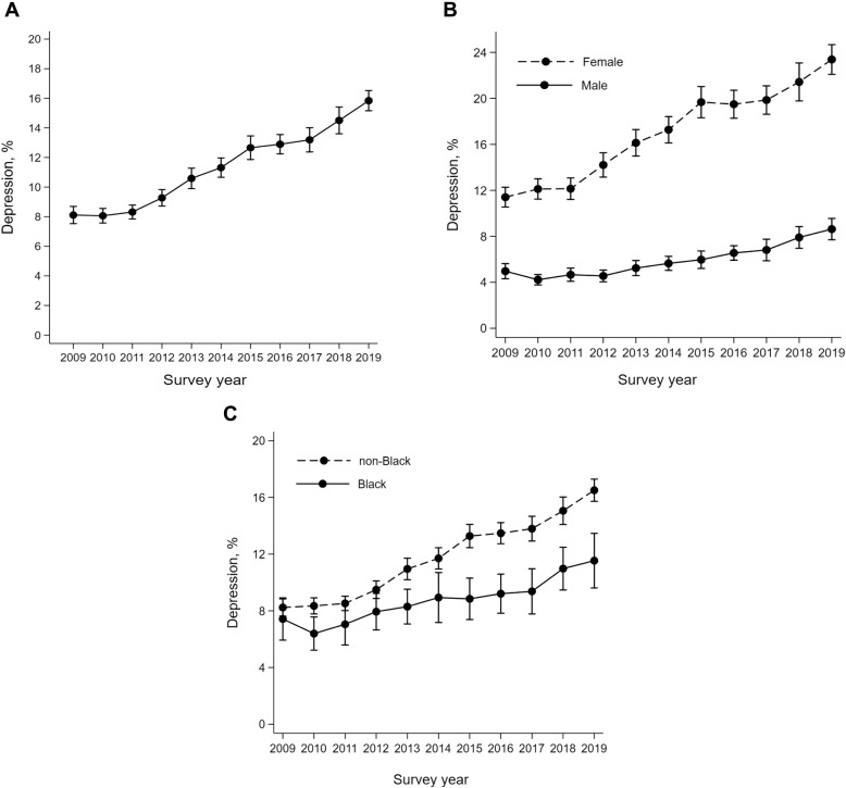
By the end of this Part you will have produced your own version of Figure 1B from the data — and seen exactly what survey-design weighting adds to the descriptive estimate.
The Daly reproduction — past-year MDE prevalence by sex over time
Now for the headline graph. The recipe reuses the logical-mean trick from Part 3: group_by(year, sex), then take mean(mde_pastyear == "Positive") — the proportion of TRUEs, which is the prevalence — carrying n() alongside as always, and chart with geom_line() + geom_point().
daly_summary <- nsduh_20092019 |>
  drop_na(mde_pastyear) |>
  group_by(year, sex) |>
  summarize(
    n_adolescents = n(),
    prevalence = mean(mde_pastyear == "Positive"),
    .groups = "drop"
  )

daly_summary
A row per year × sex combination, with the unweighted prevalence in each cell. Now the line graph:
Show the code that built this figure
daly_summary |>
  ggplot(aes(x = year, y = prevalence, color = sex, group = sex)) +
  geom_line(linewidth = 1.5) +
  geom_point(size = 3) +
  scale_color_manual(values = c("Female" = "#C05852", "Male" = "#4E5EAA")) +
  scale_x_continuous(breaks = 2009:2019) +
  scale_y_continuous(labels = percent_format(accuracy = 1)) +
  coord_cartesian(ylim = c(0, 0.25)) +
  labs(
    title = "Past-year Major Depressive Episode prevalence rose sharply for female adolescents",
    subtitle = sprintf("%s adolescents with past-year MDE observed · NSDUH %d to %d · unweighted",
                       n_mde_analytic, year_min, year_max),
    x = "Survey year",
    y = "% with past-year MDE",
    color = "Sex",
    caption = "Unweighted analogue of Daly (2022), Figure 1B"
  )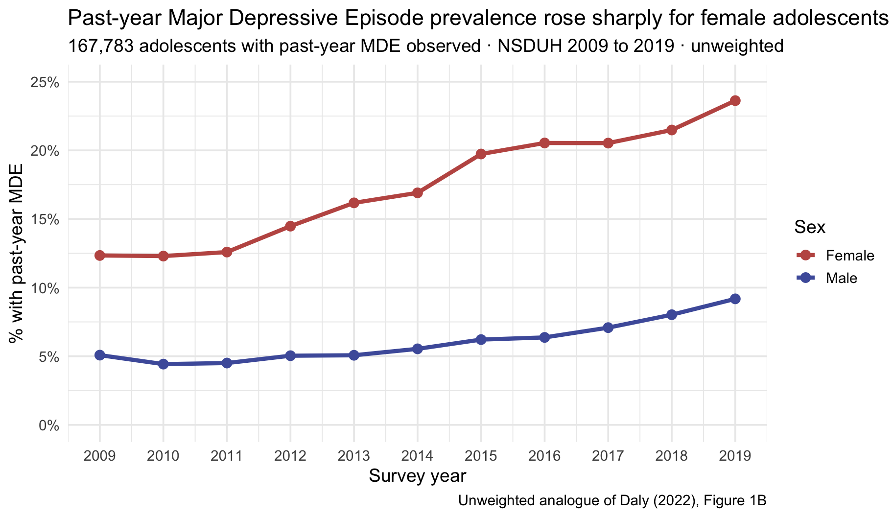
This is an unweighted analogue of Figure 1B in Daly (2022) — same data, same grouping, same picture, but with every respondent counted equally rather than weighted to the population. The female prevalence line rises from roughly 12.3% in 2009 to 23.6% in 2019; the male line rises more modestly, from about 5.1% to 9.2%.
The denominator check that confirms you’re in the right place
Daly (2022) reports an analytic sample of 167,783 adolescents. Our drop_na(mde_pastyear) pipeline — the one from Part 3, applied to the same 2009–2019 waves — leaves 167,783.
Not approximately. Exactly.
That is worth pausing on, because it is the single most reassuring thing that can happen in a replication. Two people, working independently, applied the same inclusion rule to the same survey years and arrived at the same number of respondents — which means the analytic sample is not a judgment call you got lucky on. It is determined by the data and the rule. Had we printed the full 172,183 rows in the file instead, that check would have been unavailable: the number would have looked close enough to be reassuring and been wrong.
This is why tracking the denominator earns its place among the three habits. It is not bookkeeping. It is the first thing that can confirm — or quietly refute — that your analysis and someone else’s are describing the same people.
Daly (2022) describes the findings as:
Depression levels among female participants increased by 12 percentage points (95% CI 10.4–13.5) between 2009 and 2019, from 11.4% to 23.4%. This increase was 8.3 percentage points (95% CI 6.2–10.4) larger than the increase experienced by males over the same period (3.7%, 95% CI 2.5–4.8).
The CIs in Daly’s report come from the analytic machinery we’ll meet in M07. The point estimates are close to but not identical to ours — the difference is the survey weights, which the next subsection turns on. Notice that the paper’s male figure is +3.7 percentage points, not zero: the male trend is much shallower than the female one, but it is a real rise, and describing it as “flat” would misreport it.
Survey-design weighting — getting population-level estimates right
NSDUH uses a stratified multistage area probability sample. That means: the country is divided into geographic strata; within strata, primary sampling units (counties or groups of counties) are sampled; within those, households are selected; within households, individuals.
Crucially, that sample is not allocated in proportion to the population. NSDUH deliberately samples disproportionately by age group and by state: adolescents aged 12–17 and young adults aged 18–25 are selected at far higher rates than older adults, precisely so there are enough of them to estimate youth prevalence with reasonable precision. (That is why this Module has a 172,183-row adolescent file at all — 12–17-year-olds are a small slice of the U.S. population and a large slice of NSDUH.) The sampling weight is what undoes that deliberate imbalance: it records how many population members each respondent stands in for, so an over-sampled adolescent counts for proportionally fewer people than a rarely-sampled older adult would. Final weights also absorb adjustments for nonresponse and for known population totals.
For unweighted estimates (what we computed above), every respondent counts equally. That is fine for describing the sample — but for accurate population-level prevalence we need to use the weights. The survey package provides the tools.
Three NSDUH variables carry the design information:
- vestr — sampling stratum
- verep — primary sampling unit (cluster)
- adol_weight — final analysis weight (how many population members this respondent represents)
The workflow has two steps. First, declare the design with svydesign():
library(survey)

design_data_2019 <- nsduh_2019 |>
  select(starts_with("mde_"), sex, adol_weight, vestr, verep)

design_2019 <- svydesign(
  id = ~ verep,
  strata = ~ vestr,
  weights = ~ adol_weight,
  data = design_data_2019,
  nest = TRUE
)
Then summarize via tbl_svysummary() — the survey-design-aware version of tbl_summary():
design_2019 |>
  tbl_svysummary(
    by = sex,
    include = c("mde_lifetime", "mde_pastyear"),
    label = list(
      mde_lifetime ~ "Lifetime MDE",
      mde_pastyear ~ "Past-year MDE"
    ),
    digits = all_categorical() ~ c(0, 1)
  ) |>
  as_gt() |>
  tab_header(
    title = md("**Weighted MDE prevalence by sex, 2019**"),
    subtitle = "Adjusted for the NSDUH complex sample design"
  ) |>
  tab_footnote(
    footnote = "Estimates use NSDUH sampling weights and account for stratification and clustering.",
    locations = cells_title(groups = "title")
)| Weighted MDE prevalence by sex, 20191 | ||
| Adjusted for the NSDUH complex sample design | ||
| Characteristic | Female N = 12,222,9892 |
Male N = 12,682,0502 |
|---|---|---|
| Lifetime MDE | ||
| Negative | 8,130,293 (68.6%) | 10,776,797 (87.4%) |
| Positive | 3,728,867 (31.4%) | 1,556,756 (12.6%) |
| Unknown | 363,829 | 348,497 |
| Past-year MDE | ||
| Negative | 9,019,046 (76.6%) | 11,252,466 (91.4%) |
| Positive | 2,752,836 (23.4%) | 1,062,285 (8.6%) |
| Unknown | 451,107 | 367,298 |
| 1 Estimates use NSDUH sampling weights and account for stratification and clustering. | ||
| 2 n (%) | ||
The weighted prevalences shift the unweighted numbers by 1–2 percentage points each — and now they match Daly’s reported figures (23.4% for females in 2019) to the published decimal. Compare your unweighted line graph to the weighted estimates: the story doesn’t change, but the numbers do, and the paper’s headline percentages are the weighted ones.
The same machinery extends to the full 2009–2019 trend graph via svyby(), and to regression in M10 via svyglm(). The full methodology of complex-survey analysis is beyond M05’s scope, but you now have the operational moves: declare the design, swap in the svy* versions of the summary functions, and report the result with a footnote noting the adjustment.
Reading the result back to Daly’s paper
Daly (2022) frames the finding as concerning and argues it warrants additional intervention investment:
This prolonged rise in MDE is concerning because adolescent depression tends to persist into adulthood and forecasts adverse health and socioeconomic consequences throughout life. […] In the current study, the gender disparity in depression more than doubled (from 6.4 to 14.8 percentage points) between 2009 and 2019 driven by a substantial rise in the prevalence of MDE among females over this period. […] Potential reasons for this increase are manifold and include increases in bullying and victimization and use of social media and technology which may have been more impactful for girls than boys.
Daly is also honest about study limitations:
The current study is limited in its reliance on self-reports of depressive symptoms that may differ from clinical evaluations and could be subject to recall bias. This study utilized repeated cross-sectional data and it remains possible that the surveyed populations differed over time, though the NSDUH’s high response rate, consistent sampling design, and use of survey weights safeguards against this possibility.
The full machinery you used — descriptive table, time-trend plot, survey-weighted adjustment — is what the published descriptive analysis runs on. This is real, replicable behavioral-science research, and you can now produce it.
For those interested, here’s a short documentary from the New York Times on the ongoing adolescent mental-health crisis:
Looking ahead
Every Module from M06 onward leans on descriptive statistics — either as a starting point or as the anchor for an inferential test.
- M06 (Probability and distributions) introduces probability distributions; the mean, SD, and shape concepts you used here are the language M06 uses for describing them.
- M07 (Confidence intervals) builds the uncertainty layer onto the point estimates you produced (e.g., a 95% CI around the 23.4% prevalence in 2019). The descriptive table is the input; the interval is the output.
- M08–M09 (NHST) turns the cross-tabulations you built in Part 3 into hypothesis tests — the chi-square test of independence is exactly the inferential test for a two-way table.
- M10–M12 (Regression) extends bivariate description to multivariable models. Every regression paper’s Table 1 looks like the one you built in Part 4; the regression table follows it.
The descriptive moves are the foundation. Every analysis you’ll ever do passes through them on the way to the inferential claim.
Cheat sheet — every move from this Module
The descriptive toolkit at a glance
Looking at your data
- glimpse() — one line per column, type and first values (from M03)
- skim() — richer overview, missingness, quartiles, mini-histograms (skimr)
- count(col, sort = TRUE) — frequency table for a categorical column
Variable labels and data dictionaries
- set_variable_labels(col = "label") — attach human-readable labels (labelled)
- look_for() — searchable data dictionary; pair with DT::datatable()
Numeric summaries
- mean(x, na.rm = TRUE), sd(x, na.rm = TRUE) — symmetric data
- median(x, na.rm = TRUE), IQR(x, na.rm = TRUE) — skewed data or outliers present
Distribution visualization (one variable)
- geom_histogram() — preserves counts; group differences in how many observations contribute are visible (not prevalence — that needs a denominator)
- geom_density() — normalizes to area 1; group differences in shape visible
Bivariate visualization (two variables)
- geom_boxplot() + coord_flip() — numeric × categorical; five-number summary per group; scales to many groups
- geom_point() or geom_jitter() — numeric × numeric; scatterplot
- cor(x, y) — Pearson’s r; pair with drop_na() or use = "complete.obs"
Publication-ready tables
- tbl_summary(by = group) — the canonical Table 1 (gtsummary)
- tbl_cross(row, col, percent = "row"|"column"|"cell") — two-way descriptive
- as_gt() |> tab_header() |> tab_footnote() — titles and footnotes for reports
Composite scales
- rowMeans(pick(starts_with("…"))) — average across multiple item columns
- case_when(rowSums(!is.na(…)) >= k ~ …) — require minimum non-missing items
Survey-design adjustment
- svydesign(id, strata, weights, data) — declare a complex-survey design (survey)
- tbl_svysummary() — design-aware Table 1
Summary
Core ideas: Describing data with R
Nearly every quantitative empirical paper includes a participant-characteristics table — the “Table 1” that anchors the Methods and Results sections. M05 is how you make it.
Descriptive statistics is the bridge between wrangled data (M04) and inferential analysis (M06+). The descriptive moves establish what’s in the sample before you ask whether differences are statistically meaningful.
skim() is the right first move on any new dataset — richer than glimpse(), it surfaces missingness, distributions, and unusual factor levels in one call.
Label your variables early with labelled::set_variable_labels(). Labels propagate automatically through gtsummary tables, making every downstream output readable.
Name the level of measurement first. Every variable is nominal, ordinal, interval, or ratio (M01). The level decides which summaries are meaningful — counts and proportions for nominal; median or mode for ordinal; mean+SD for symmetric interval/ratio; median+IQR for skewed interval/ratio.
Visualize distributions to choose the right summary. A histogram or density plot reveals shape; the shape decides whether mean or median is the right central-tendency report.
Histograms and density plots tell different stories. Histograms preserve sample-size differences across groups; density plots normalize them away. A raw-count histogram shows how many observations contributed, not prevalence — prevalence needs an explicit denominator. Show both when the audience needs both.
Boxplots are the workhorse picture for numeric × categorical. The box spans Q1 to Q3 with the median inside; the whiskers reach the furthest observations within 1.5 × IQR, and anything past them is drawn as a point. Scales to many groups in a way histograms and density plots don’t — but it can hide multimodality. Pair with coord_flip() when category labels are long.
Group summaries via group_by() |> summarize() are the engine of bivariate description — the same pattern you used in M04. tbl_summary(by = …) produces the publication-ready version.
Three cross-tab percent flavors answer three different questions. Row percent: of those with X, how many have Y? Column percent: of those with Y, how many have X? Cell percent: what share of the whole sample is in this combination? Pick the one that matches the question, and state the conditioning variable in prose.
For two numeric variables, the descriptive moves are a scatterplot plus the correlation coefficient. cor() returns Pearson’s r — between −1 and +1 — capturing how tightly the points cluster around a straight line. r is not the slope of that line. The slope tells you the rate of change in original units; r tells you how tightly the points track a line. Two trend lines with very different slopes can both have r near 1. Always name what a row represents — a correlation across yearly summaries is not a correlation across people. M10 develops the algebra and the inferential layer.
gtsummary removes most of the repetitive work of building tables by hand — sensible defaults, automatic respect for variable labels, and structured output that can be rendered to Word, PDF, or PowerPoint rather than rebuilt for each.
APA-style descriptive reporting has conventions worth absorbing now. Sample size in plain English, percentages to one decimal with the % sign on the number, “percentage points” never “percent” for absolute differences, descriptive claim before inferential test.
Two R for Data Science chapters map onto this Module. Chapter 10 (Exploratory data analysis) is the conceptual twin of Parts 2–3 (variation within a variable, covariation between two); Chapter 13 (Numbers) covers the dplyr side of the numeric summary functions.
Going further
Beyond the M05 toolkit
- The full survey package. What we showed in Part 5’s advanced-box is the surface — survey handles weighted regression (svyglm()), weighted ratio estimates, reproduce weights, and more. The Columbia Mailman School has an excellent online tutorial if you want to go deeper on complex-survey analysis.
Resources
R for Data Science (2e), Chapter 10 — Exploratory data analysis. The conceptual backbone of Parts 2–3: variation within a single variable and covariation between two, with histograms, boxplots, count/tile plots, and scatterplots.
R for Data Science (2e), Chapter 12 — Logical vectors. Why
mean(x == "value")returns a proportion — theTRUE-as-1 trick behind every prevalence calculation in Parts 3 and 5.R for Data Science (2e), Chapter 13 — Numbers. Numeric summary functions and the dplyr side of central tendency / dispersion.
The gtsummary package website. https://www.danieldsjoberg.com/gtsummary/. Function reference with worked examples; Articles section covers customization in depth.
The labelled package website. http://larmarange.github.io/labelled/. The full API for variable and value labelling.
The skimr package website. https://docs.ropensci.org/skimr/. Customization, theming, and printing.
APA Style — Numbers and Statistics Guide (7th ed.). American Psychological Association (2024). The one-page reference behind the APA-box: numerals vs. words, decimal places and the round-to-precision rule, leading zeros, and how to report M, SD, p, and percentages.
Footnotes
The guard sidesteps a subtle edge case, too. If a respondent answered no items at all, rowMeans(…, na.rm = TRUE) would be averaging an empty set — the mean of no numbers — and R returns
NaN(“not a number,” the result of0/0) rather thanNA. Because a row with zero answered items never clears the three-item threshold, that degenerate case never arises here. And even when you do see aNaN, it means the same thing asNAfor your purposes — no usable value — and is.na(), drop_na(), and tbl_summary() all treat the two identically. The distinction:NaNcomes only from a numeric operation with no defined answer (0/0,sqrt(-1)), whileNAis R’s general marker for missing data of any type.↩︎