library(tidyverse)
library(here)
library(infer)
library(scales)Confidence Intervals
Learning Objectives
By the end of this Module, you should be able to:
- Explain why two random samples from the same population produce different sample means, even when the sampling procedure is perfect
- Define the sampling distribution and standard error in plain language
- Distinguish a population parameter (\(\mu\), \(\sigma\)) from a sample statistic (\(\bar{x}\), \(s\)), and use hat notation (\(\hat{\mu}\), \(\hat{\sigma}\)) when emphasizing that a sample statistic is being used as an estimate
- Use rep_slice_sample() to simulate a sampling distribution from a known population
- Construct a 95% bootstrap percentile confidence interval for a population mean
- Construct a 95% parametric confidence interval for a population mean using the t-distribution, and recognize when this approach is appropriate
- Explain why the t-distribution — not the normal — is the correct tool when \(\sigma\) is estimated from the sample
- Interpret degrees of freedom (\(n - 1\)) as the number of deviations free to vary after the sample mean is fixed
- Interpret a 95% CI in terms of long-run coverage — the procedure is designed to capture the parameter about 95% of the time across repeated samples, not to give the probability that this particular interval contains it
- Distinguish a confidence interval (uncertainty about the mean) from a prediction interval (uncertainty about a new single observation) and explain why, for the same model and confidence level, PIs are wider
- Recognize that CI-only displays of scientific results can lead readers — including expert readers — to overstate effect magnitudes and understate individual-outcome variability
Overview
Where this fits — the Part 2 inference arc
Modules 6–9 are one continuous story: how we reason from a sample back to the world. Each module is a single step in that arc.
- M06 · Probability — what outcomes should we expect under a given data-generating process?
- M07 · Confidence intervals — how much does a sample statistic wobble from one sample to the next? · ← you are here
- M08 · The logic of NHST — how surprising is our statistic if a specific null value were true?
- M09 · Conducting tests — which standard test matches this design, variable type, and research question?
Every time you compute an average from a sample and present it as “the” estimate, you are making a statement about a population based on incomplete information. A different sample from the same population would have given you a slightly different average. The question this Module is built around is how to be honest about that.
How confident should I be in a sample mean as an estimate of the population mean?
We will answer this question using two construction methods — the bootstrap (a simulation-based approach) and the parametric t-interval (a formula-based approach) — and close with a crucial distinction: the difference between a confidence interval for the mean and a prediction interval for a single new observation.
To build genuine intuition rather than formula fluency, we will use a powerful teaching trick: a dataset where we actually know the truth about the population. Every interval we build will be checkable — did the interval actually capture the true population mean? It also allows us to study how the interval behaves across different parameters — like the sample size or the population standard deviation. That’s a luxury real research never has, and it’s exactly what makes this Module’s working example worth its weight.
A map of this Module
This Module makes three moves:
- Build the sampling distribution from a known population, so you can see what a standard error actually is.
- Construct a confidence interval from a single sample, two ways — the bootstrap (simulation) and the parametric t-interval (formula) — and pin down what “95% confident” really means.
- Separate confidence intervals from prediction intervals, so you never mistake precision about a mean for predictability of individual outcomes.
Core path: the sampling distribution, the standard error, both CI constructions, the interpretation of 95%, and CI-vs-PI. Advanced-but-important: the finite-population correction, Bayesian credible intervals, and the Zhang et al. illusion-of-predictability studies — read them, but don’t let them crowd the core.
Packages used in this module
Meet the data
In 2017, economist Raj Chetty and colleagues published a landmark study on intergenerational economic mobility in higher education. They linked tax records for more than 30 million students who attended U.S. colleges and universities between 1999 and 2013, tracking their earnings into adulthood (Chetty et al., 2017). The variable k_median reports the median individual earnings at age 341 for the students of each institution.
Here is the one number this entire Module is built around. Take each of the 2,199 colleges’ median-earnings figures and average them, weighting every college equally: that gives the mean of institutional medians. This is our estimand — the target quantity we will try to recover from samples. (Recall the term from M05: an estimand is just the true value you are trying to estimate — the answer you would get if you could measure the whole population, before any sampling enters the picture.) Keep its two-step nature in mind — it is an average of medians, not the average earnings of an individual student.
One construction note: Chetty et al. assign each individual to the college they attended most between ages 19 and 22, whether or not they completed a degree — so k_median captures the typical outcome of students who enrolled, not only those who graduated.
Throughout this Module we’ll treat these 2,199 colleges as an empirical stand-in for the larger process that generates college-level earnings — which lets us know a “truth” to check our methods against while still using the standard confidence-interval machinery you’ll meet in most applied settings. Our research question is: What is the mean of institutional median earnings across U.S. colleges? We’ll answer it with a point estimate (the sample mean) and an interval estimate (a confidence interval) that captures the uncertainty around it.
college_mobility · 2,199 observations · 2 variables · Chetty et al. (2017)
All 2,199 U.S. colleges with sufficient data for intergenerational mobility analysis. We treat this complete set as a known reference population — a stand-in for the larger earnings-generating process — so we can compute a “true” \(\mu\) and use it to check every uncertainty method in the Module.
- name character — Institution name
- k_median numeric — Median individual earnings, in 2014 US dollars, among the college’s former students
Full codebook for college_mobility — values, levels, missingness, and how the file was prepared.
college_mobility <- read_rds(here("shared_data", "college_mobility.Rds")) |>
  select(name, k_median) |>
  drop_na(k_median)

college_mobility |>
  glimpse()
Rows: 2,199
Columns: 2
$ name <chr> "Vaughn College Of Aeronautics And Technology", "CUNY Bernard…
$ k_median <dbl> 53000, 57600, 48500, 40700, 43000, 45200, 112700, 60700, 6010…The distribution of k_median
The whole point of this Module is to sample from these colleges and try to recover their average — so before we take a single sample, let’s meet the full population we’ll be drawing from. What does median earnings actually look like across all 2199 colleges?
Show the code that built this figure
college_mobility |>
  ggplot(aes(x = k_median)) +
  geom_histogram(binwidth = 2000, fill = "#4E5EAA", color = "white") +
  scale_x_continuous(labels = label_dollar()) +
  labs(
    title = "Distribution of median earnings at age 34",
    subtitle = "All 2,199 U.S. colleges — Chetty et al. (2017)",
    x = "Median earnings at age 34",
    y = "Number of colleges"
  )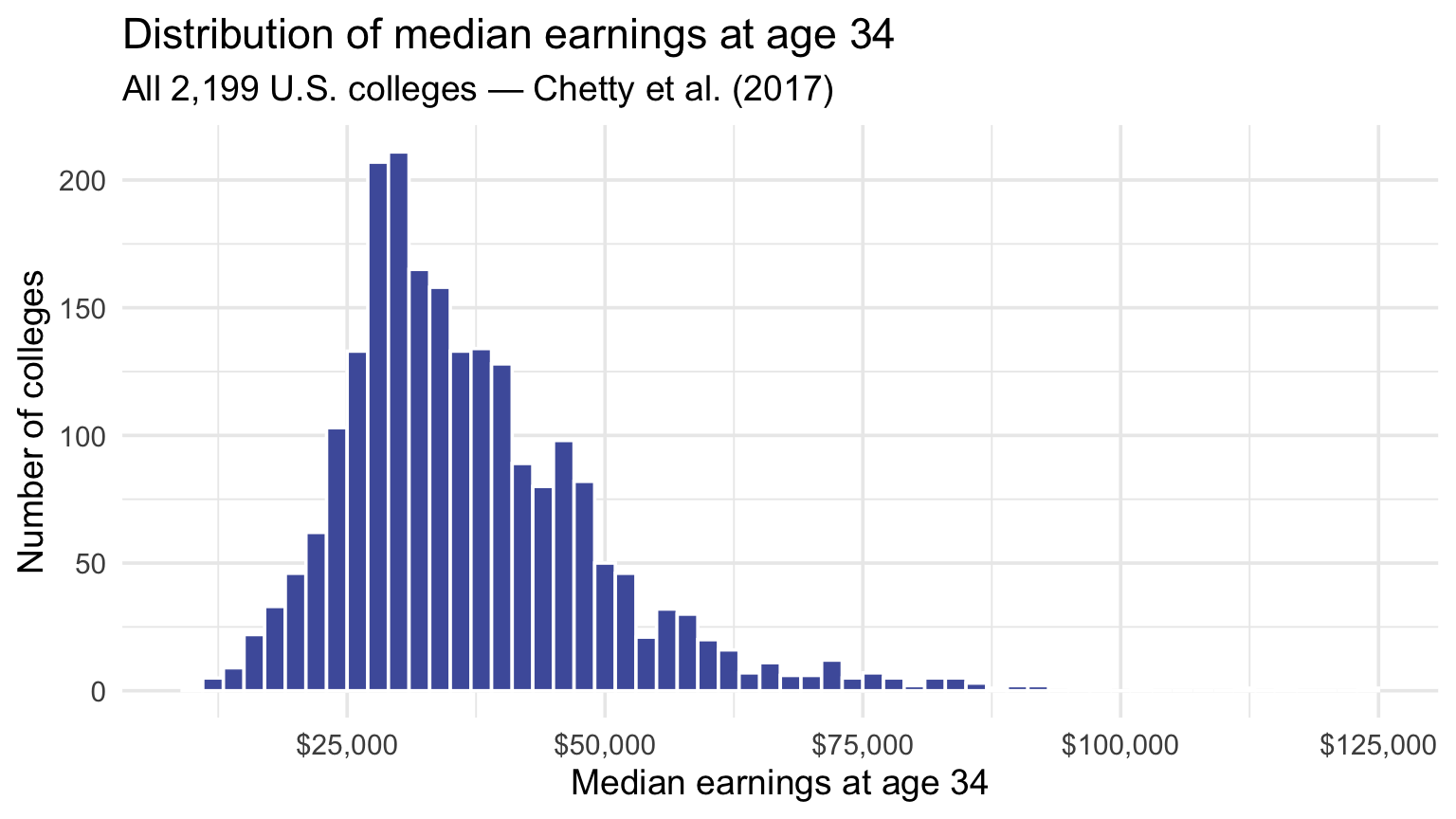
The distribution is clearly right-skewed: most colleges cluster between $25,000 and $55,000, with a long tail of high-earning institutions stretching past $100,000. File one thing away as you look at it — this population is decidedly not bell-shaped. That matters, because much of what follows rests on a surprising result: even when a population looks as lopsided as this, the average of a sample drawn from it behaves far more predictably. This is the population we will (pretend to) sample from, over and over, for the rest of the Module.
The true population mean
Here is what makes this dataset unusual — but particularly useful for learning about uncertainty due to sampling: all 2,199 colleges are in it. Rather than treat it as one sample from a larger population, we’ll use the full set as our known reference truth — the mean and SD across all 2,199 colleges become the \(\mu\) and \(\sigma\) we pretend not to know, then try to recover from small samples. That is the luxury real research never has, and it is exactly what lets us check every method against an answer key. (One refinement arrives later: when a formula needs it, the 2,199 are best read as a stand-in for the larger college-earnings process rather than a sealed box — the finite-population note in Approach 2 explains why that matters.)
In the code chunk below, we compute the true population mean and standard deviation of k_median across all 2,199 colleges. These are the parameters \(\mu\) and \(\sigma\) that our sample means will be trying to estimate, and that our confidence intervals will be trying to capture. By storing these values in the objects population_mean and population_sd, we can refer to these values in later code chunks.
population_mean <- college_mobility |> pull(k_median) |> mean()
population_mean
[1] 36928.74population_sd <- college_mobility |> pull(k_median) |> sd()
population_sd[1] 12835.46The true mean of median earnings at age 34 across all U.S. colleges is $36,929. The population standard deviation is $12,835.
We almost never know the truth — but today we do
In nearly every real-world research scenario, the population parameters, \(\mu\) and \(\sigma\) in this context, are unknown. We collect one sample, compute an estimate (\(\bar{x}\), \(s\)), and try to say something responsible about the values we cannot directly observe.
For this Module we will pretend we could only afford to study a sample of colleges — but we will secretly retain the population mean so that every uncertainty method we build can be checked against the truth. Think of this as running our estimators in “testing mode” before trusting them on problems where the answer is hidden.
The problem: you have one sample
To see why uncertainty about a sample mean is inevitable, let’s watch it happen. Imagine a policy researcher wants to estimate earnings outcomes across U.S. colleges, but she cannot survey all 2,199 institutions. Her budget allows her to survey 50 colleges. She computes the mean k_median from those 50 colleges and uses it as her best estimate of the average institutional median nationwide.
But that sample of 50 is only one possible sample. Another researcher, drawing a different set of 50 colleges from the same population, would almost certainly get a slightly different mean. Not because the colleges changed, and not because either researcher made a mistake — but because different samples capture different slices of the population.
That is sampling variability. The practical question is: how much do sample means wobble from sample to sample? And would they wobble less if the researcher could survey 250 colleges instead of 50? Because we have the full 2,199-college reference population in hand, we can simulate repeated samples and see exactly how much the sample mean moves around.
Draw the policy researcher’s sample of 50 colleges
To carry out the simulation, we will first randomly select 50 colleges from the population, mimicking what the policy researcher would do. In this single sample, we’ll compute the mean of k_median, as well as the standard deviation. The slice_sample() function from the dplyr package draws a random sample of rows from a tibble, and pull() extracts a single column as a vector so we can compute its mean and standard deviation. One habit worth noticing: we call set.seed() first because slice_sample() draws at random — seeding the random-number generator makes that draw reproducible, so everyone who runs this code (you included) pulls the very same 50 colleges and sees the same numbers below.
set.seed(777)

one_sample <-
  college_mobility |>
  slice_sample(n = 50)

# Print out the sample
one_sample
# Compute the sample mean of k_median
one_sample |> pull(k_median) |> mean()[1] 37092# Compute the sample standard deviation of k_median
one_sample |> pull(k_median) |> sd()[1] 11031.86So our policy researcher walks away with two numbers from her sample of 50 colleges: a mean of $37,092 and a standard deviation of $11,032. As it happens, that sample mean lands remarkably close to the true population mean of $36,929 — but here is the catch, and it is the whole reason this Module exists: she has no way of knowing that. She sees a single number, $37,092, with no answer key to check it against. Had the random draw landed on 50 different colleges, she would have gotten a different mean — maybe closer, maybe much further off. So the question that drives everything ahead is: given just this one sample, how far might $37,092 be from the truth, and how can she express that uncertainty honestly?
Many samples, many means
We have an advantage she doesn’t — we hold the entire population, so we can do the one thing she never could: draw the sample again. And again. A thousand times over.
Why would that help? Because repeating the draw lets us watch how much the sample mean bounces around from one sample to the next. If 1,000 different samples of 50 colleges all produce means huddled tightly together, then any single sample — hers included — is a trustworthy guess at the truth. If instead the means scatter widely, a lone sample mean could land far off. Either way, the spread of those many means is a direct picture of the uncertainty she faces with her one sample — exactly the thing we are trying to pin down.
So let’s mimic precisely that: draw many samples of 50 colleges, compute a mean for each, and look at how those means are distributed. That collection has a name — the sampling distribution of the sample mean, the distribution we would get if we could repeat the sampling procedure over and over and record a mean each time. It is the engine behind confidence intervals and nearly everything else ahead.
Step 1 · Draw 1,000 random samples of 50 colleges
The rep_slice_sample() function from the infer package does this in one call — think of it as slice_sample() repeated many times.
set.seed(777)

many_samples_50 <-
  college_mobility |>
  rep_slice_sample(n = 50, reps = 1000)

many_samples_50 |> glimpse()
Rows: 50,000
Columns: 3
Groups: replicate [1,000]
$ replicate <int> 1, 1, 1, 1, 1, 1, 1, 1, 1, 1, 1, 1, 1, 1, 1, 1, 1, 1, 1, 1, …
$ name <chr> "University Of Texas At El Paso", "Salter College", "Souther…
$ k_median <dbl> 38400, 22000, 54800, 27200, 31000, 30100, 24700, 28100, 3080…rep_slice_sample(n = 50, reps = 1000) draws 1,000 independent samples of size 50 from college_mobility and stacks them into a single tibble. Its two arguments do the obvious work: n = 50 sets the sample size per replicate, and reps = 1000 sets the number of independent samples. The output keeps the original columns and adds one more — replicate — which identifies the sample each row belongs to. So this object has \(50 \times 1000 = 50{,}000\) rows, with each block of 50 rows corresponding to one sampled dataset. (As before, set.seed() makes the 1,000 random draws reproducible.)
Storing all 1,000 samples in one tidy object like this is exactly what lets us compute per-sample summaries with group_by(replicate) followed by summarize().
Step 2 · Look at the first nine samples
Every sample is a 50-college snapshot of the population. Before we collapse each one down to a single mean, it helps to see what these 50-college snapshots actually look like. Here’s the within-sample distribution of k_median for the first nine samples, plotted as a 3×3 grid.
Show the code that built this figure
many_samples_50 |>
  filter(replicate <= 9) |>
  ggplot(aes(x = k_median)) +
  geom_histogram(binwidth = 5000, fill = "#4E5EAA", color = "white") +
  facet_wrap(~replicate, nrow = 3, labeller = label_both) +
  scale_x_continuous(labels = label_dollar()) +
  labs(
    title = "The first 9 of our 1,000 samples (n = 50 each)",
    subtitle = "Same population, same sampling procedure — different samples, different shapes",
    x = "Median earnings at age 34",
    y = "Count"
  ) +
  theme(axis.text.x = element_text(angle = 35, hjust = 1))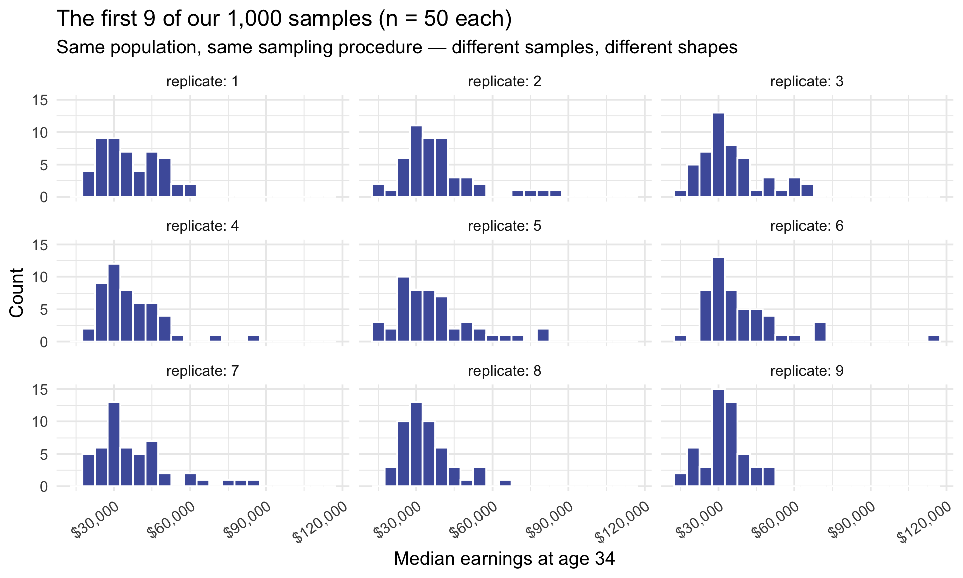
Step 3 · Compute the mean of each sample
Now we collapse each of the 1,000 samples down to one number — its mean. The standard dplyr pattern is group_by(replicate) followed by summarize(): grouping by replicate makes summarize() run once per sample, giving us 1,000 sample means. The table below presents the first nine sample means:
sampling_dist_50 <- many_samples_50 |>
  group_by(replicate) |>
  summarize(mean_income = mean(k_median))

sampling_dist_50 |> slice_head(n = 9)
Each mean_income is one number summarizing all 50 colleges in that replicate. None of the nine are identical — that wobble across samples is the sampling distribution starting to show.
Step 4 · Mean and standard deviation across the 1,000 sample means
Now we compute the mean of those 1,000 sample means, and their standard deviation:
sampling_dist_50 |>
  summarize(
    mean_of_means = mean(mean_income),
    se_n50 = sd(mean_income)
  )
Two numbers come out of that summary, and both are worth pausing on.
First, the mean of the 1,000 sample means — $36,874. Compare it to the true population mean, $36,929: they are essentially identical, off by only a handful of dollars. That centering is not luck — it is what \(E(\bar{x}) = \mu\) guarantees. (The precise average you see will shift a little each time the simulation is re-run, because 1,000 repetitions is still finite; as the number of repetitions grows, it settles ever closer to \(\mu\).) Individual samples overshoot and undershoot the truth all the time — the researcher’s own sample came in a little high — but those overshoots and undershoots cancel out, so averaged across many samples the means center squarely on the truth. This is exactly what we mean when we call random sampling unbiased: it has no systematic tendency to run high or low.
Second, the standard deviation of those 1,000 means — $1,811. This is the number that measures the researcher’s uncertainty. It is an estimate of the standard error of the mean (SE) — built from 1,000 simulated samples rather than from all possible ones, so it carries a little simulation noise of its own. The SE is: the typical distance between a single sample’s mean and the true $36,929. In plain terms, a sample of 50 colleges usually lands within about $1,811 of the truth — so a lone sample mean like her $37,092 typically wobbles roughly $1,811 in either direction.
One honest caveat before we move on, because it’s easy to lose track of: we only pinned down that SE by drawing a thousand fresh samples of 50 — and that takes the entire population, the answer key we are only pretending not to have. The researcher can’t rerun her study a thousand times; she has one sample and no truth to check it against. So we haven’t actually solved her problem yet — we’ve named it exactly. The SE is precisely the number she needs, and the rest of this Module is about how to recover it from a single sample, with no population in hand.
Step 5 · Repeat with larger samples (n = 250)
So $1,811 is the typical wobble at a sample size of 50 — but is that a lot, and is there anything the researcher could do to shrink it? One lever sits squarely in her control: how many colleges she samples. She chose 50; suppose she had gathered 250 instead. Let’s rerun the entire thought experiment at \(n = 250\) and watch what happens to the standard error:
set.seed(42)

sampling_dist_250 <- college_mobility |>
  rep_slice_sample(n = 250, reps = 1000) |>
  group_by(replicate) |>
  summarize(mean_income = mean(k_median))

sampling_dist_250 |>
  summarize(
    mean_of_means = mean(mean_income),
    se_n250 = sd(mean_income)
  )
The mean of means again sits right on the truth — $36,964 against the true $36,929, no better centered than before. But the standard error has dropped sharply: from $1,811 at \(n = 50\) down to $771 at \(n = 250\). A typical sample of 250 colleges lands less than half as far from the truth as a typical sample of 50.
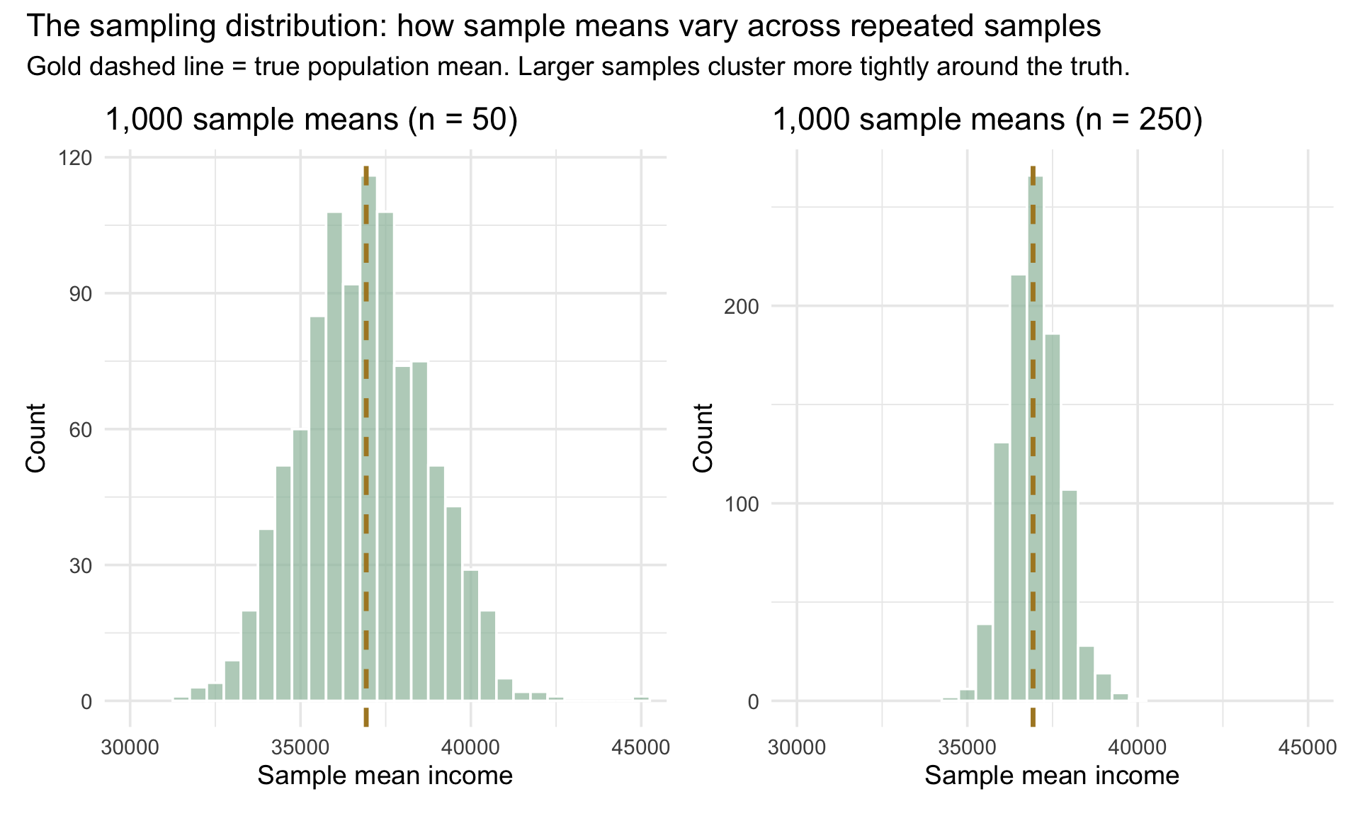
That is the researcher’s one real lever on uncertainty: gather more data and the sampling distribution tightens. But notice the exchange rate — she quintupled her sample (50 → 250), yet the wobble shrank by only a bit more than half, not to a fifth. Precision comes at a discount: it takes roughly four times the data to halve the standard error.2 Let’s watch the tightening with our own eyes — the 1,000 sample means for \(n = 50\) beside the 1,000 for \(n = 250\):
Two things stand out:
- Both distributions are centered on the true population mean (gold dashed line). That centering is the unbiasedness of the sample mean: across repeated random samples \(E(\bar{x}) = \mu\), so \(\bar{x}\) lands around \(\mu\). The related Law of Large Numbers — previewed in M06 — makes a different promise: a single sample mean tends to get closer to \(\mu\) as \(n\) grows.
- Larger samples produce tighter distributions. The n = 250 means cluster much closer to the truth than the n = 50 means. Bigger samples give more precise estimates.
Standard error: the spread of the sampling distribution
We have now met this number twice — $1,811 for samples of 50, $771 for samples of 250 — so let’s give it its proper name. The standard error of the mean is the standard deviation of the sampling distribution of sample means. In plain language, it tells us how much sample means typically wobble from sample to sample. In the histograms we just simulated, the bars emerge from the repeated sample: draw a sample, compute its mean, save that mean, repeat. The histogram for samples of 50 was more spread out; the histogram for samples of 250 was more tightly clustered. The standard error is the single number that summarizes that typical spread.
Standard error = standard deviation of the sampling distribution
The SE answers a question every researcher implicitly asks: if I’d drawn a different sample of the same size, how different would my sample mean have been?
What SE measures. The SE is the typical distance between any one sample mean \(\bar{x}\) and the true population mean \(\mu\). It captures the sampling-induced wobble — how much \(\bar{x}\) moves around simply because we measured a sample rather than the whole population. The SE is the foundation of every confidence interval we’ll build.
SE is not the SD of the data. This is the most common mistake students make — and our own numbers make the gap vivid. The individual colleges are quite spread out: the SD of k_median across all colleges is about $12,835. But the SE at \(n = 50\) is only $1,811, roughly seven times smaller — because a sample mean averages 50 colleges together, and averaging cancels out most of the college-to-college noise. So the SD of the data describes how spread out the individual values are; the SE describes how spread out the sample means would be across many hypothetical samples. Distinguishing the spread of values from the spread of means is the key conceptual move of inferential statistics — the move that lets the same dataset answer two different questions (“how varied are the individual colleges?” vs. “where might the true mean live?”).
Two things determine SE.
Sample size \(n\). Bigger samples give more precise estimates of \(\mu\), so SE shrinks as \(n\) grows. This is the dependency we just observed: the \(n = 250\) sampling distribution was visibly tighter than the \(n = 50\) distribution. The shrinkage is gradual, though — it scales with \(\sqrt{n}\), not with \(n\) itself.
Population variability. Populations with more variability in the raw values produce sample means that wobble more, so SE grows with that variability. Our two simulations didn’t isolate this dependency — both drew from the same college_mobility population, with the spread of k_median held constant — but it falls out cleanly from the formula we develop in Approach 2.
Looking ahead. For now we measure SE by simulation: build the sampling distribution by repeated sampling, then take its SD. In Approach 2 we’ll see that, for large-enough samples, the sampling distribution is approximately normal, and SE can be computed from a single sample using a formula that combines both dependencies above into one short expression. The simulation route and the formula route are answering the same question by different roads, and they land on nearly the same number. Nearly, not exactly: our simulation drew samples without replacement from a finite set of 2,199 colleges, which makes the simulated SE a touch smaller than the formula’s \(\sigma/\sqrt{n}\) — a finite-population wrinkle we pin down in a note in Approach 2.
The catch: in real research we only draw one sample
The simulation above was clarifying, but it relied on drawing 1,000 samples from a population we fully observed. Real research gives you one sample. You don’t get to rebuild the sampling distribution by repetition. So the practical question becomes:
How can we estimate sampling uncertainty from a single dataset?
That is the entire challenge of interval estimation. The next two sections address it two different ways.
Approach 1: bootstrap
To set up the bootstrap procedure, we need to understand that we are using our single sample as a proxy for the entire population. This allows us to simulate the process of drawing multiple samples from the population by resampling from our single sample.
First, a note on which sample is which — the bookkeeping matters from here on. Up to now, every sample has been one of many: a single illustrative draw of 50 colleges, then 1,000 draws of 50, then 1,000 draws of 250 — all pulled from a population we could see in full. Notice that the switch we are making is not from one sample size to another. It is from many samples to one. From here to the end of the Module we work from a single sample of 250 colleges, the only sample our researcher gets, and every interval we build — by either approach — comes from it. It is worth learning its name: sample_data. Its size is 250 on purpose: the \(n = 250\) simulation above already told us roughly how much a mean from 250 colleges should wobble, which gives us something to check our answers against.
Let’s draw it. Earlier we asked what would happen if she could survey 250 colleges instead of 50 — so let’s give her that larger study. She gets 250 colleges, one draw, no do-overs:
set.seed(42)

sample_data <-
  college_mobility |>
  slice_sample(n = 250)

sample_mean <- sample_data |> pull(k_median) |> mean()
sample_mean
[1] 37187.2Our sample mean is $37,187 — reasonably close to the population mean of $36,929, but not identical. From the sample alone, we have no way of knowing how far off we are.
The bootstrap idea
Recall the bind we’re in. To measure the standard error we would love to draw many fresh samples and watch how much the mean varies from one to the next — but out in the real world we only ever get one sample. We don’t have the population to draw more from; that was a luxury we borrowed earlier, and we’ve now handed it back. So how can a single sample possibly tell us how much other samples would have varied?
Here is the bootstrap’s clever answer. Our one sample of 250 colleges is, admittedly, an imperfect snapshot of the population — but it is the best snapshot we have. So let’s treat it as if it were the population and draw new samples from it. If resampling from our sample varies about as much as sampling from the real population would, then the spread of those resample means becomes an estimate of the standard error — built entirely from the one sample we actually hold.
The subtlety is in how we resample. If we simply pulled 250 colleges from our 250 without replacement, we’d get the exact same 250 back every single time — no variation, nothing to learn. The trick is to draw with replacement: each of the 250 picks is made independently from the full sample, so a college can be chosen twice, three times, or not at all. Every resample is therefore a slightly different reshuffling of the same 250 colleges — a few over-represented, a few missing — exactly the way genuinely different real samples would each happen to catch a different mix of the population. That reshuffling is what manufactures the variability we need.
One bootstrap resample
Start with a single resample, just to watch the mechanic work. Think of it as spinning up one alternate version of the study: the same 250 colleges, but with the luck of the draw reshuffled — a few counted twice, a few left out. We draw 250 colleges from our 250, with replacement, and take the mean:
set.seed(123)

one_resample <-
  sample_data |>
  slice_sample(n = 250, replace = TRUE)

one_resample |> pull(k_median) |> mean()
[1] 36583.2That resample’s mean, $36,583, comes out a little different from the original sample’s $37,187 — and that small gap is the entire point. This one resample is a single answer to the question “what if the draw had gone a little differently?” On its own it tells us almost nothing. But repeat it a thousand times and the spread of those thousand answers traces out how much the sample mean could plausibly wobble from one sample to the next — which is exactly the standard error we’ve been chasing, estimated now from a single dataset.
1,000 bootstrap resamples
One resample was a single “what if.” Now we run a thousand of them — each a fresh reshuffle of our 250 colleges — and collect the mean from every one. Line those 1,000 means up and you have the bootstrap sampling distribution: the bootstrap’s stand-in for the real sampling distribution we built earlier, back when we drew 1,000 genuine samples from the whole population. And here is the sleight of hand that makes the bootstrap remarkable — this time we never touched the population. Every one of these thousand resamples was built from the single sample of 250 we actually hold.
set.seed(123)

bootstrap_samples <- sample_data |>
  rep_slice_sample(n = 250, replace = TRUE, reps = 1000) |>
  group_by(replicate) |>
  summarize(mean_income = mean(k_median))

bootstrap_samples |> head()
We start from one observed dataset, sample_data, and want a simulated sampling distribution for the sample mean. The pipeline does three things: it resamples the observed data 1,000 times with replacement, groups rows by resample ID, and computes one mean per resample. Each step maps to one line of code:
| Step | What it does |
|---|---|
| rep_slice_sample(n = 250, replace = TRUE, reps = 1000) | Creates 1,000 bootstrap resamples of size 250 and draws them with replacement |
| group_by(replicate) | Defines each resample as one group |
| summarize(mean_income = mean(k_median)) | Returns one bootstrap mean per group |
Because replace is TRUE, each bootstrap resample can repeat some colleges and omit others. The resulting bootstrap_samples object has 1,000 rows — one mean per bootstrap replicate — which is the simulated bootstrap sampling distribution.
Each row in bootstrap_samples is one bootstrap mean; together they approximate the sampling variability of the sample mean.
Constructing the percentile CI
We can graph the bootstrap distribution of means to see how it wobbles around the original sample mean.
Show the code that built this figure
bootstrap_samples |>
  ggplot(aes(x = mean_income)) +
  geom_histogram(binwidth = 300, fill = "#9CBFAA", color = "white", alpha = 0.85) +
  scale_x_continuous(labels = label_dollar()) +
  labs(
    title = "Bootstrap distribution of sample means (1,000 resamples, n = 250)",
    subtitle = "Each mean is from a resample drawn with replacement from our 250-college sample",
    x = "Bootstrap sample mean",
    y = "Count"
  ) +
  # Extra right margin so the last axis label is not clipped at the figure edge.
  theme(plot.margin = margin(5.5, 30, 5.5, 5.5))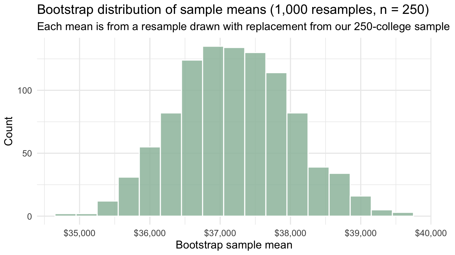
Before computing anything, take a moment to examine this picture. Each bar shows how many of the 1,000 bootstrap resamples produced a sample mean that fell in that range. The pile is centered very close to the original sample mean — that makes sense, because every resample is drawn from those same 250 colleges.
What matters for inference is the width of the pile: it tells us how much the sample mean would wobble across hypothetical repeated samples. In other words, the spread of this distribution is the standard error of the mean, measured by simulation — the same quantity the \(n = 250\) sampling distribution captured earlier in this Module, now estimated from one sample alone rather than from the full population. With a usable simulation of the sampling distribution in hand, we can read a CI directly off it.
Think of the histogram above as the bootstrap’s empirical counterpart to a probability density — the density-curve language from M06, but built from 1,000 simulated values instead of from a formula. The middle 95% of this empirical distribution is the 95% bootstrap percentile confidence interval. To find the 2.5th and 97.5th percentile cutoffs we use quantile(), which runs M06’s ecdf() backwards. There, you handed the ECDF a value and it returned \(P(X \leq x)\) — the proportion of observations at or below it. Here, you hand quantile() a proportion and it returns the value sitting at that percentile. Same staircase of observed numbers, read in the other direction.
ci_bootstrap <- bootstrap_samples |>
  summarize(
    lower = quantile(mean_income, probs = 0.025),
    upper = quantile(mean_income, probs = 0.975)
  )

ci_bootstrap
We start from a column of 1,000 bootstrap sample means in bootstrap_samples and want the 2.5th and 97.5th percentile cutoffs to define our CI. quantile() returns the value at a specified percentile of a numeric vector. We call it twice inside summarize(), once for each CI bound:
| Quantity | How it is computed |
|---|---|
| lower | quantile(mean_income, probs = 0.025) — the value below which 2.5% of bootstrap means fall |
| upper | quantile(mean_income, probs = 0.975) — the value below which 97.5% of bootstrap means fall |
| probs | A probability between 0 and 1 (or a vector of them); each value returns the corresponding percentile. With probs = c(0.025, 0.975), quantile() returns both bounds in one call — but splitting them across two summarize() columns keeps each bound as its own named field in ci_bootstrap. |
The result, ci_bootstrap, is a one-row data frame with two columns — lower and upper — holding the bounds of the 95% bootstrap percentile CI.
Our 95% bootstrap CI is $35,702 to $38,809. In concrete terms: 95% of the 1,000 bootstrap resamples produced a mean between $35,702 and $38,809. Read that carefully — it describes the spread of the bootstrap means we simulated, not a 95% probability that \(\mu\) falls in this particular interval. The confidence interpretation, as always, is about the long-run behavior of the procedure (more on that just below). Let’s visualize the bootstrap distribution, overlay this CI, and — because we know the truth — mark the true population mean so we can see whether our interval captured it:
Show the code that built this figure
bootstrap_samples |>
  ggplot(aes(x = mean_income)) +
  geom_histogram(
    binwidth = 300,
    fill = "#9CBFAA",
    color = "white",
    alpha = 0.70
  ) +
  geom_vline(
    xintercept = ci_bootstrap$lower,
    color = "#AD872B",
    linewidth = 1,
    linetype = "dashed"
  ) +
  geom_vline(
    xintercept = ci_bootstrap$upper,
    color = "#AD872B",
    linewidth = 1,
    linetype = "dashed"
  ) +
  geom_vline(xintercept = population_mean, color = "#AD872B", linewidth = 1.4) +
  scale_x_continuous(labels = label_dollar()) +
  labs(
    title = "Bootstrap distribution of sample means (1,000 resamples, n = 250)",
    subtitle = "Dashed lines = 95% CI bounds · Solid line = true population mean",
    x = "Bootstrap sample mean",
    y = "Count"
  ) +
  # Extra right margin so the last axis label is not clipped at the figure edge.
  theme(plot.margin = margin(5.5, 30, 5.5, 5.5))
Look at the chart. The two dashed gold lines are our CI bounds — the 2.5th and 97.5th percentiles of the bootstrap distribution. The solid gold line is \(\mu\), the true population mean. We were able to compute \(\mu\) at the start of this Module because we have the entire college_mobility dataset on hand; in real research, \(\mu\) is exactly the quantity we don’t know, and any single CI we build is reported into that uncertainty.
The question we’re checking, then, is whether our CI captured \(\mu\) — whether the dashed bounds straddle the solid line. Visually, they do. The true population mean falls inside our CI, so for this one sample, our method worked.
But “the method worked” deserves a closer look. The meaning of worked is the idea students most often get wrong, and it’s where the next section goes. The bootstrap procedure didn’t guarantee that any one interval would contain \(\mu\); it made a more subtle claim — about what happens across many hypothetical repetitions of this same sampling-and-CI-building procedure. We just got to peek at one realization of it.
What “95% confident” actually means
This is the single most-misunderstood concept in introductory statistics.
What 95% confidence does — and does not — mean
It is tempting to say: “We are 95% confident the true population mean is between $35,702 and $38,809.”
It does NOT mean there is a 95% probability the true mean is in this specific interval. The true mean is a fixed (though unknown) number. This specific interval either contains it or does not. There is no “probability” about it — the randomness was in the sampling, and the sampling already happened.
What 95% actually refers to is the reliability of the procedure over many repetitions: if we drew thousands of different samples from this population and built a 95% CI from each one, about 95% of those intervals would contain the true \(\mu\), and about 5% would miss. Our specific interval is one interval produced by that procedure — and in real research, because \(\mu\) is unknown, we cannot know whether this particular interval captured it.
The short version: 95% confidence is a statement about the long-run behavior of the method, not the probability that the parameter lies in this particular interval. Get this right now and most confusions about p-values and hypothesis testing become easier later.
Watch it happen
You do not have to take that on faith. We know \(\mu\) for this population — it is $36,929 — so we can do what no real researcher can: draw many samples, build a CI from each, and check which ones actually caught the truth.
Below are 100 samples of 250 colleges each — the same size as sample_data — with a 95% confidence interval built from every one. So every row is an interval our researcher could have ended up with, had her 250 colleges come out differently. Hers is one row in a picture like this one. The difference is that we can see the gold line and she cannot.
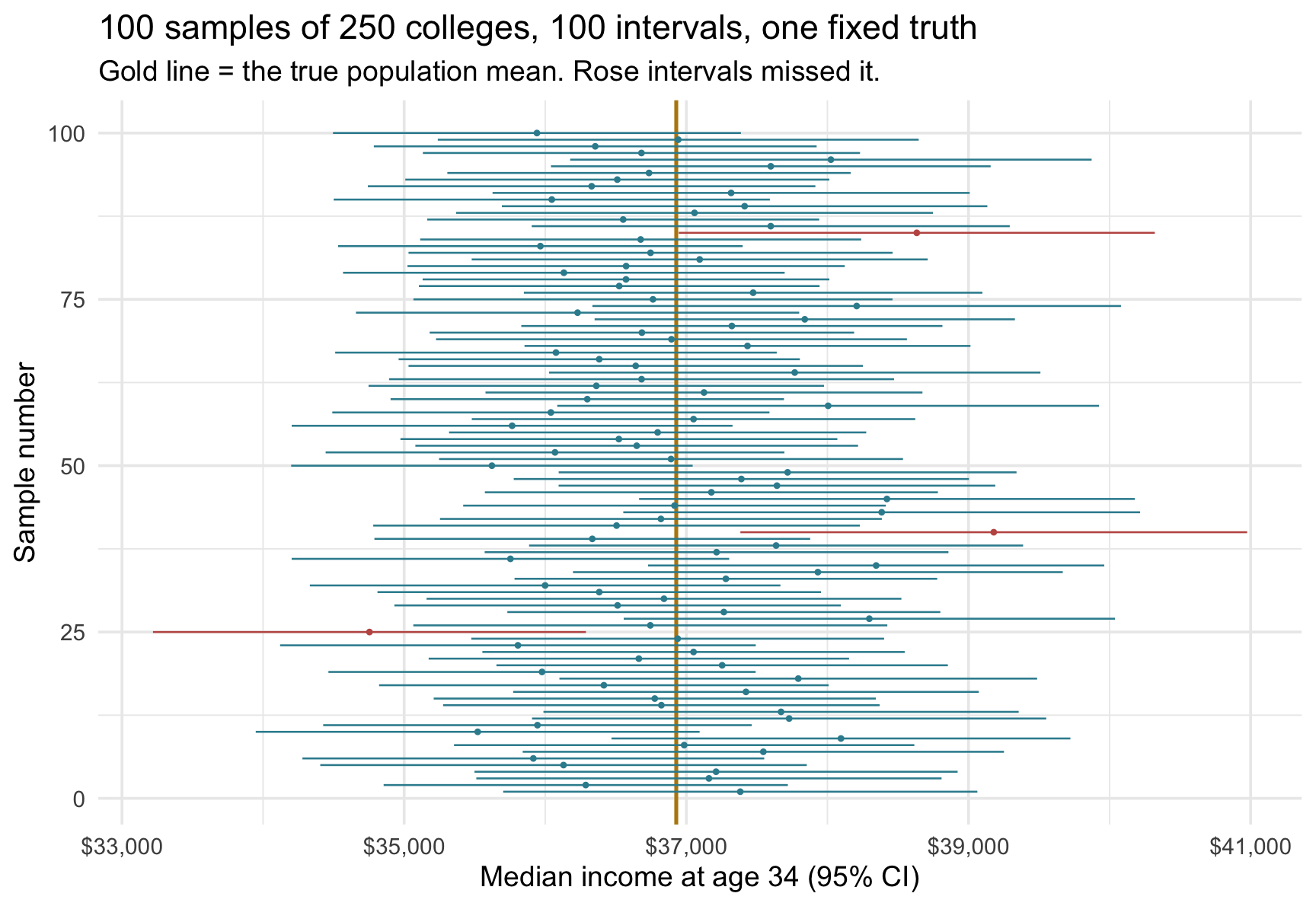
In this run, 3 of the 100 intervals missed the true mean.
Three questions about that figure
- What is moving from row to row — the parameter, or the interval? The gold line never moves. It is the intervals that jump around, because each one was built from a different sample. This is the whole idea: the randomness lives in the sampling, not in \(\mu\).
- Does a 95% method mean every interval works? No. Roughly one in twenty is expected to miss, and you can see them. A method that never missed would not be a 95% method — it would be a wider, more conservative one.
- Once an interval is drawn, does \(\mu\) move around inside it? No. Each of those 100 intervals either caught the truth or did not; nothing is left to chance once the sample is in hand. In real research you simply cannot tell which row you are on — which is exactly why the confidence statement is about the procedure.
A caution the figure makes concrete: 3 misses out of 100 is not the same claim as “this method has exactly 95% coverage.” Run the simulation again with a different seed and you will get a different count. The 95% is the procedure’s long-run target under the conditions that justify it — not a quota each batch of 100 must fill.
The 95% is a choice
The “95%” in our CI isn’t built into the procedure — it’s a knob you turn. And turning it trades off two things every researcher wants but can’t fully have at once: an interval that is right often (high confidence) and one that is narrow enough to be useful (high precision). Dial one up and the other slips down. Let’s watch it happen. To build a 90% CI from the very same bootstrap distribution, we keep the middle 90% — chopping 5% off each tail instead of 2.5%. That’s a one-character change to the quantile() call:
ci_bootstrap_90 <- bootstrap_samples |>
  summarize(
    lower = quantile(mean_income, probs = 0.05),
    upper = quantile(mean_income, probs = 0.95)
  )

ci_bootstrap_90
Same bootstrap distribution, different cutoffs — and the 90% interval ($35,885 to $38,607) sits inside the 95% interval ($35,702 to $38,809), narrower on both ends. That is the trade-off made visible. By asking for only 90% confidence, we accepted a procedure that misses the truth twice as often — 10% of the time instead of 5% — and in exchange we got a tighter, more precise interval: about $2,722 wide rather than $3,107.
Here is the intuition worth holding onto: to be more sure you have captured the truth, you have to cast a wider net. Turn the dial the other way, up to 99% confidence, and the interval swells to roughly $3,946 ($35,305 to $39,251) — now you’ll be wrong only about 1 time in 100, but you’ve bought that assurance with a vaguer answer. Push it to the absurd limit and a 100% CI would have to run from one end of the number line to the other — “the mean is somewhere between minus infinity and plus infinity,” guaranteed true and completely useless. 95% is simply the conventional spot most fields plant their flag, balancing “right often enough” against “precise enough to act on.”
The recipe generalizes. For any confidence level \(C\), chop \((1 - C)/2\) from each tail. For a 99% CI: probs = c(0.005, 0.995). For an 80% CI: probs = c(0.10, 0.90). The choice of level is the researcher’s, not the procedure’s — pick it before you compute the interval, never after seeing the bounds.
Approach 2: parametric t-distribution
Approach 1, the bootstrap approach, treated the observed sample as a stand-in for the population and resampled from it, reading the middle 95% off whatever histogram emerged. Notice that it didn’t assume a particular parametric shape of the PDF. That honesty is powerful — but it costs a thousand simulations, and it starts each problem from scratch, as if we knew nothing about the shape going in.
Approach 2 makes a bolder bet: what if we already know the shape of the sampling distribution? Suppose we are willing to say the sampling distribution of \(\bar{x}\) is a normal curve — a bell. As you learned in M06, a normal distribution is a wonderfully economical shape: it is completely pinned down by just two numbers, its center and its spread. So the instant we accept that the sampling distribution is a bell, we no longer have to build it by brute force. We compute its center and spread from a single sample, then carve off the middle 95% with a bit of algebra — no resampling, no thousand simulations, just one formula. And slicing the middle 95% out of a normal curve is a skill you already have: it is exactly the pnorm() / qnorm() work from M06.
It is the difference between tracing a shape and recognizing one. The bootstrap traces the sampling distribution point by point, without assuming a particular parametric shape. The parametric approach recognizes it as a bell and lets a formula finish the job — lightning fast when the bell assumption holds, and misleading when it badly fails.
Neither approach wins outright; they strike different bargains. The bootstrap assumes no particular parametric shape — bell, skewed, or lopsided, the data’s own shape emerges in the resamples — but that is not the same as assuming nothing. It still requires that your sample be an adequate stand-in for the population you care about, that the observations be independent (or that the resampling scheme match however they were actually collected), and that \(n\) be large enough for the approximation to hold. It also pays with computation, and can wobble on very small or badly skewed samples. The parametric approach trades a shape assumption for a tidy formula and an instant answer. Reassuringly, when samples are reasonably large and not too skewed, the two roads arrive at almost the same interval — as we’ll confirm on the college-mobility data shortly.
qnorm() vs. quantile() — same question, different data source
That bargain shows up concretely in which function you reach for. Back in Approach 1 we paired quantile() with M06’s ecdf(): same numbers, opposite direction. Here is the other comparison — same direction, different numbers. Those two things are the only ways this family of functions ever differs: which way you are going, and where the distribution comes from.
Both functions here answer the same question: what value sits at the \(p\)th percentile of a distribution? The difference is which distribution.
| Function | What it takes in | Where the distribution comes from |
|---|---|---|
| qnorm(p = 0.025, mean = \(\mu\), sd = \(\sigma\)) | A probability + two theoretical parameters | A theoretical normal distribution specified by \(\mu\) and \(\sigma\) |
| quantile(x, probs = 0.025) | A probability + a vector of observed values | The empirical distribution of whatever numbers you pass in |
In M06 you used qnorm() on the negative-sentiment example: what score cuts off the bottom 2.5% of a theoretical normal with that variable’s mean and SD? That was percentile-from-theory.
In Approach 1 you used quantile() on the bootstrap means: what value cuts off the bottom 2.5% of the 1,000 numbers we just simulated? That’s percentile-from-data.
The two are mirror images of each other. qnorm() hands you a percentile from a distribution defined by a formula; quantile() hands you a percentile from a distribution defined by an actual set of numbers. The bootstrap uses the second because we don’t assume a theoretical shape — we built the distribution by simulation. Approach 2, starting now, uses the first (via qt(), the t-distribution cousin of qnorm()) because the CLT lets us assume a theoretical shape, and the formula hands us the percentiles without any simulation at all.
That leaves one fair question hanging: why is it reasonable to assume the sampling distribution is a bell in the first place? We got a hint earlier — the \(n = 250\) sampling distribution we built by hand already looked reassuringly bell-shaped. The next section, on the Central Limit Theorem, is where that hint becomes a guarantee.
The Central Limit Theorem
Refresher: continuous distributions from M06
Before applying the Central Limit Theorem, take a moment to recall what it actually means to talk about a continuous probability distribution — the language M06 introduced for the normal distribution and its negative-sentiment example.
Density vs. probability. A continuous distribution is described by a density curve, not by individual probabilities. The y-axis is density — a kind of probability per unit width — so the height of the curve at any single point is not a probability on its own. Probability lives in the area under the curve over a range of values: \(P(a < X < b)\) is the area between \(a\) and \(b\). The total area under the entire density is exactly 1.
Two operations you already know. Both answer “where does this value sit relative to the rest of the distribution?” — they just travel in opposite directions:
| Function | What it does | Question it answers |
|---|---|---|
| pnorm(q, mean, sd) | Given a value, returns the area to its left (CDF) | What proportion of the distribution lies below this value? |
| qnorm(p, mean, sd) | Given a proportion, returns the value at that percentile (inverse CDF) | What value cuts off the bottom \(p\) of the distribution? |
These two are inverses of each other. Feed pnorm() a value, get a probability back; feed qnorm() a probability, get a value back.
Benchmarks worth keeping in mind (the Empirical Rule, for any normal distribution):
- About 68% of values fall within ±1 SD of the mean.
- About 95% fall within ±2 SD — more precisely, ±1.96 SD.
- About 99.7% fall within ±3 SD.
Why this matters now. Approach 2 commits to a shape — specifically, that the sampling distribution of \(\bar{x}\) is approximately normal. The moment we accept that commitment, every continuous-distribution tool from M06 is back on the table: areas under the curve become probabilities, the middle 95% of a distribution corresponds to specific quantiles, and we can answer questions like “what value cuts off the top 2.5%?” with a single function call. We’ll do exactly that with qt(), the t-distribution sibling of qnorm(), just a few sections from now.
The Central Limit Theorem (CLT) — previewed in M06 — is the theoretical guarantee that makes the normal-shape assumption defensible. It says: for large enough \(n\), the sampling distribution of \(\bar{x}\) is approximately normal — regardless of the shape of the original variable. The CLT is an asymptotic result: the approximation improves as \(n\) grows. There is no universal cutoff at which it switches on — not \(n = 30\), not any other number. How large is large enough depends on the population you are sampling from, and strong skewness or heavy tails can require far larger samples than a roughly symmetric distribution does. Rather than lean on a rule of thumb, we already have direct evidence for this population: the simulated sampling distributions at \(n = 50\) and \(n = 250\) earlier in this Module show exactly how fast the approximation settles down here.
That’s a remarkable guarantee. We just simulated the sampling distribution for \(n = 50\) and \(n = 250\) and saw that both were nicely bell-shaped — not by accident. With samples this large, that’s exactly what the CLT leads us to expect.
Put the CLT together with random sampling and we know three things about the sampling distribution of \(\bar{x}\) without any simulation:
- Its shape: approximately normal — this is the CLT’s contribution.
- Its center: \(\mu\) (the population mean).
- Its spread: a single predictable quantity called the standard error, with a closed-form formula (coming up below).
Those three facts together describe the entire sampling distribution: a normal needs only a center and a spread, and we now have both. (For a sampling distribution, that spread is the quantity we call the standard error.) We can ask any percentile question of it (what value cuts off the top 2.5%?) with M06’s qnorm(). No resampling. No simulation. Just a formula. There is one catch, and it is what the next two sections take up: the formula needs \(\sigma\), the population SD — and in real research we don’t have it.
The standard error formula
Approach 1 did not need a formula. The bootstrap did not assume a particular shape for the sampling distribution. Instead, we built the distribution by brute force: resample, compute the mean, save it, and repeat 1,000 times. Once we had that simulated distribution, we used quantile() to find the middle 95%.
Approach 2 strikes a different bargain. It assumes a shape. And an assumed shape changes what we have to carry.
A normal curve is completely determined by two numbers: where it is centered and how wide it is. So if the sampling distribution of the mean is approximately normal, we do not have to build the whole distribution by resampling. Two numbers describe the whole curve, and every percentile follows from them.
That is what parametric means: the distribution is pinned down by a small number of parameters, rather than by a heap of simulated values.
So how do we compute the standard error with the parametric approach? We use a formula:
\[ \text{SE}(\bar{x}) = \frac{\sigma}{\sqrt{n}} \]
In real studies, we almost never know \(\sigma\), so we plug in the sample standard deviation, \(s\):
\[ \widehat{\text{SE}}(\bar{x}) = \frac{s}{\sqrt{n}} \]
That small substitution is exactly why the next section uses a t critical value instead of a z critical value.
Why are we entitled to a formula at all? It is easy to read something like this as handed down from above. It is not. It follows from the sampling design: each college was drawn at random, and the draws are treated as independent.
That design decision is what makes the wobble predictable. One unusually high-earning college may pull a sample mean upward, but as more colleges enter the average, unusually high and unusually low observations tend to offset one another. Averaging does not eliminate randomness, but it makes that randomness shrink at a knowable rate.
The formula is that rate written down.
Drawing 1,000 samples was a way to see the sampling distribution. The formula is a way to compute its spread from the information real research usually has: a sample size and an estimate of population variability.
Notice, then, what the CLT is and is not doing. The CLT is not the source of the \(\sigma/\sqrt{n}\) formula. That formula comes from the mathematics of independent averages. What the CLT supplies is the shape: it tells us that, under broad conditions, the sampling distribution of the mean becomes approximately normal. The formula gives the spread; the CLT gives the curve.
The formula makes more sense when we read the numerator and denominator separately.
On top, \(\sigma\) — how much the population itself varies. If every college in the country reported almost the same median earnings, then any sample of 250 colleges would return almost the same average, and one sample mean would be a very reliable guide to \(\mu\). The more colleges genuinely differ from one another, the more one sample mean can disagree with the next. A noisier world makes for noisier estimates of it.
On the bottom, \(\sqrt{n}\) — how much averaging you did. Averaging cancels extremes. One unusually high-earning college can drag the mean of 5 colleges a long way, but it barely budges the mean of 500. In a larger sample, highs and lows have more chances to offset each other before you ever see the average.
The square root is why precision comes at a discount. The exchange rate is \(1/\sqrt{n}\), so cutting the wobble in half requires four times as much data.3
In one sentence: a sample mean wobbles in proportion to how variable the population is, and in inverse proportion to the square root of how many observations you averaged into it.
Importantly, this is the same SE we quantified by brute force in the simulation — the SD of the sampling distribution of \(\bar{x}\) — except that now we can compute it from theory rather than observing it across many samples.
One quick detour before we use it. We are briefly stepping away from sample_data — this next bit is not a calculation about our 250 colleges. It is a chance to audit the formula, and it is a chance we get exactly once. Earlier we measured the standard error the brute-force way at two sample sizes, by simulating 1,000 samples and taking the SD of their means. If the formula is right, it should reproduce both of those measured numbers with no simulation at all. Almost no one is ever in a position to run that check; we are, because we can see the whole population.
That is also why the code below uses population_sd. It is \(\sigma\), not \(s\) — the true population SD, which we have only because of this Module’s luxury. Using it is deliberate: the simulations we are checking against were themselves built from that same known population, so this tests the formula, not our ability to estimate \(\sigma\).
# SE = sigma / sqrt(n), at the two sample sizes we simulated earlier
population_sd / sqrt(50)
[1] 1815.208population_sd / sqrt(250)[1] 811.7859Compare each against what the simulation measured. At \(n = 50\): $1,815 from the formula, $1,811 from a thousand simulated samples. One line of arithmetic lands where a thousand draws landed.
At \(n = 250\) the formula runs slightly high — $812 against the simulated $771 — and the reason is worth knowing rather than ignoring, because it lands squarely on the assumption the formula rests on. We drew each sample without replacement from a fixed set of 2,199 colleges, so the draws within a sample were not quite independent: every college taken is one the rest of that sample can no longer include. At \(n = 50\) that hardly matters. At \(n = 250\) — better than a tenth of the whole population — it is enough to make the real wobble a little smaller than the formula predicts. The box that closes this section puts a number on the correction.
Detour over — back to sample_data. The audit says the formula works, so we can now point it at our own 250 colleges — using the estimated version introduced above, \(\widehat{\text{SE}}(\bar{x}) = s/\sqrt{n}\), because \(\sigma\) is precisely what a real study does not have. M06’s parameter-vs-statistic discipline is doing the work here: \(s\) stands in for \(\sigma\), and what that substitution costs us is the subject of the next section.
A note on finite populations
The formula \(\text{SE}(\bar{x}) = \sigma/\sqrt{n}\) assumes each observation is an independent draw from a very large (effectively infinite) population — which is why we framed the 2,199 colleges as a stand-in for a larger earnings-generating process rather than a fixed, closed population.
If your target really is a finite, fully observed population of size \(N\) and you sample without replacement, the true SE is a little smaller, by the finite population correction (FPC):
\[\text{SE}_{\text{FPC}}(\bar{x}) = \frac{s}{\sqrt{n}}\sqrt{\frac{N - n}{N - 1}}\]
For \(n = 250\) drawn from \(N = 2{,}199\), the FPC is about \(\sqrt{(2199 - 250)/(2199 - 1)} \approx 0.94\) — it trims the SE by roughly 6%. We set it aside because the standard \(s/\sqrt{n}\) machinery is what you’ll use in almost every applied setting, where the population dwarfs the sample and the correction is negligible. Just know the FPC exists for the genuine finite-population case — a survey drawn from a known, bounded roster is the classic example.
Why t, not z?
We now have the basic shape of a confidence interval. It starts with an estimate — here, the sample mean \(\bar{x}\) — and it reaches outward by some amount on both sides.
The standard error sets the unit of that reach: one standard error, two standard errors, and so on. What we still need is the count — how many standard errors should we go out?
That number is called a critical value.
A critical value is a cutoff from a reference distribution: it fences off a chosen amount of area under the curve. For a 95% confidence interval we want the middle 95%, leaving 2.5% in each tail. The two cutoffs that carve out that middle are the critical values.
You have already done this with qnorm(). Ask it for the cutoffs enclosing the middle 95% of a standard normal:
qnorm(p = c(0.025, 0.975))[1] -1.959964 1.959964±1.96 — the number you met in M06. Those are critical values. And the move is one you have already met under another name earlier in this Module: percentile-from-theory. Hand qnorm() a probability, get back the value sitting at that percentile. Nothing new has happened here except the name.
One feature of a critical value is worth fixing in place now, because it stays true every time the idea returns: it does not come from your data. You choose a reference distribution and how much of it to enclose, and the cutoff follows from those two choices alone. Your observed values never enter into it.
What the data do supply is the unit. In a confidence interval the critical value works as a multiplier: multiply the SE by 1.96 and you have the interval’s half-width. (The word critical names a role that stays in the background here, but turns literal in M08, where the same cutoff becomes the boundary of a decision.)
So why not simply use 1.96 and be done? Because of one subtlety in the SE — worth meeting before we build the interval, since it decides which curve we read that critical value off of.
To see the subtlety, return to the z-scores you met in M06 — positions on the standard normal:
\[z = \frac{x - \mu}{\sigma}\]
Our CI is the same idea, only applied to sample means instead of individual scores: how many standard errors is our \(\bar{x}\) from \(\mu\)? If we knew \(\sigma\) — the population SD — we could stay on the normal and use 1.96 directly.
The catch is that we don’t know \(\sigma\); we estimated it with \(s\) from our one sample (that was the \(s/\sqrt{n}\) substitution above). And \(s\) is itself uncertain — a different sample would hand us a slightly different \(s\). Using an estimate of the spread, rather than the true spread, injects an extra layer of uncertainty that the normal distribution simply doesn’t account for. The t-distribution does.
One distinction worth getting right. The sample mean does not suddenly follow a t-distribution because we estimated \(\sigma\). What has a t-distribution is the standardized quantity
\[t = \frac{\bar{x} - \mu}{s / \sqrt{n}}\]
which differs from a z-score only in that its denominator uses the estimated standard error. Under a normal population model that result is exact; with well-behaved larger samples the same t-based procedure is usually a good approximation even when the raw observations are not normal.
The t-distribution is symmetric and bell-shaped like the normal, but its tails are slightly heavier, especially for small samples. Those heavier tails are the distribution admitting “my spread is only an estimate, so the interval should be a touch wider to stay honest.” As \(n\) grows, \(s\) becomes a more reliable stand-in for \(\sigma\), and the t-distribution tightens back toward the normal until the difference is practically invisible.
The symbol for a critical value: \(z^*\) and \(t^*\)
We now know which curve to read. The critical value from the top of this section still has no symbol, though, and the one it gets is new to you — so let’s introduce it on purpose. The ±1.96 you computed above is written:
\[z^* = 1.96\]
The star marks a critical value. This is the first starred symbol in the course and it will keep showing up, so it is worth being precise about what it is not: a \(z^*\) is not a new kind of z-score computed from data. It is a position on the curve — the place you decided to put the fence.
You already have this pairing for \(z\), even if it never got named. A \(z\)-score says where one value landed on the curve. The \(z^*\) we just computed says where we chose to draw the line. Two different jobs, one star apart. The same split runs through \(t\), and there the two symbols are easy to confuse, so it is worth a table:
| Symbol | What it is | Where it comes from |
|---|---|---|
| \(t\) | The standardized statistic — how many estimated standard errors your \(\bar{x}\) sits from \(\mu\) | Your data. A different sample hands you a different \(t\). |
| \(t^*\) | The critical value — the cutoff enclosing the middle 95% of the t curve | Your choice of confidence level (plus the degrees of freedom, unpacked shortly). The observed values never touch it. |
One is where your sample landed; the other is where you drew the fence.
One reassurance before we use them: you never actually compute \(t\) in this Module. You couldn’t — look at its formula and you’ll see \(\mu\) sitting in the numerator, the very thing we don’t know. It earns its keep in the next few lines, as the bridge that turns a cutoff into an interval, and then it steps back. The only number you will ever calculate here is \(t^*\).
From the fence to the interval
Here is the step that turns a cutoff into a confidence interval. It is short, and seeing it once explains where the ± in the CI formula comes from.
Because the standardized quantity \(t\) follows a t-distribution, we know how often it lands in any stretch of that curve. By the definition of \(t^*\), it lands between \(-t^*\) and \(+t^*\) 95% of the time:
\[P\left(-t^* < \frac{\bar{x} - \mu}{s / \sqrt{n}} < t^*\right) = 0.95\]
As written, that is a statement about \(t\) — which is not yet useful, because the quantity we actually care about, \(\mu\), is buried in the middle of it. So we rearrange it to put \(\mu\) by itself, and out drops:
\[\bar{x} - t^* \cdot \frac{s}{\sqrt{n}} \;<\; \mu \;<\; \bar{x} + t^* \cdot \frac{s}{\sqrt{n}}\]
The two lines of algebra, if you want them
Multiply all three pieces of \(-t^* < \dfrac{\bar{x} - \mu}{s/\sqrt{n}} < t^*\) by the standard error:
\[-t^* \cdot \frac{s}{\sqrt{n}} \;<\; \bar{x} - \mu \;<\; t^* \cdot \frac{s}{\sqrt{n}}\]
Then isolate \(\mu\) — subtract \(\bar{x}\), and flip the inequalities when you multiply through by \(-1\) — which gives the interval above. Nothing enters or leaves; the same statement is simply re-arranged so the unknown sits in the middle.
That line is the confidence interval. It is not a new formula — it is the same statement about \(t\), rewritten so the unknown sits in the middle and everything we can actually compute sits on the outside. The familiar \(\bar{x} \pm t^* \cdot s/\sqrt{n}\) is just those two bounds written compactly.
Watch where the 95% went. It started as a claim about how often the random quantity \(t\) falls inside a fixed fence. After the rearranging, it reads as a claim about how often a random interval lands around a fixed \(\mu\). Nothing about \(\mu\) became random along the way — and that is the long-run coverage reading you already watched play out in the 100-interval figure. The algebra and that picture are the same statement in two languages.
You have made this move once already. The bootstrap also kept the middle 95% of a distribution — you read the 2.5th and 97.5th percentiles straight off 1,000 simulated means with quantile(), and the answer came back already in dollars. The parametric route reads the middle 95% off a theoretical curve with qt() instead, so the answer comes back in standardized units — a \(t^*\) of about 2 says “two standard errors,” not “two dollars.” Multiplying by the SE is what converts it back into dollars. Same target, two routes: simulate the distribution, or assume its shape.
z vs. t — when to use which
| Multiplier | Reference distribution | Interval | When to use |
|---|---|---|---|
| \(z^*\) | Standard normal \(N(0, 1)\) | \(\bar{x} \pm z^* \cdot \dfrac{\sigma}{\sqrt{n}}\) | When \(\sigma\) is known — almost never in practice |
| \(t^*\) | \(t\) with \(df = n - 1\) | \(\bar{x} \pm t^* \cdot \dfrac{s}{\sqrt{n}}\) | When \(\sigma\) is estimated from the sample — the standard case |
Both rows are the same interval with the same three parts — estimate, multiplier, standard error. What changes is which curve the multiplier is read off, and that is decided by one thing: whether the spread in the formula is the true \(\sigma\) or the estimated \(s\).
For our sample of 250 colleges, \(df = 249\), and the t-distribution is so close to normal that \(t^* \approx z^* \approx 1.96\). But for a sample of 10, using \(t\) instead of \(z\) noticeably widens the CI — which is exactly the right thing to do when you have less information.
The last thing \(t^*\) needs is a way to actually get one. qt() is the t-distribution’s counterpart to M06’s qnorm(), with one extra input — the degrees of freedom (\(df = n - 1\), unpacked in a moment). Compare the critical values yourself, and watch \(t^*\) collapse onto \(z^* = 1.96\) as the sample grows:
qt(p = 0.975, df = 9) # n = 10 — t is clearly wider than z[1] 2.262157qt(p = 0.975, df = 249) # n = 250 — t is getting closer to z[1] 1.969537qt(p = 0.975, df = 499) # n = 500 — t has collapsed onto z[1] 1.964729qnorm(p = 0.975) # the z critical value for reference[1] 1.959964That is the last piece. We now have all three ingredients of the interval — the estimate, the standard error, and the critical value \(t^*\) from qt() — so let’s assemble them.
Building the CI: \(\bar{x} \pm t^* \cdot \text{SE}\)
A recurring template for formula-based intervals
The CI formula has three pieces: estimate ± critical value × standard error. The estimate says where the sample landed. The standard error says how much that estimate wobbles across hypothetical samples. The confidence level says how much of the reference distribution you want to cover; the critical value is the cutoff that makes that happen. Many of the intervals in this course — and a great many in published research — are this template with different ingredients plugged in. Not all of them: the percentile bootstrap interval you built earlier in this Module has no critical value and no standard error in it at all, and neither do Bayesian credible intervals. The template is a workhorse, not a law.
The parametric CI formula for a mean is:
\[\bar{x} \pm t^* \cdot \frac{s}{\sqrt{n}}\]
where \(t^*\) is the critical value that cuts off the middle 95% of the t-distribution with \(n - 1\) degrees of freedom. For a 95% CI you want \(t^*\) such that the area to its left is 0.975 (so that 2.5% sits in each tail):
parametric_ci <- sample_data |>
  summarize(
    mean_income = mean(k_median),
    sd_income = sd(k_median),
    n = n(),
    se = sd_income / sqrt(n),
    df = n - 1,
    t_star = qt(p = 0.975, df = df),
    lower = mean_income - t_star * se,
    upper = mean_income + t_star * se
  )

parametric_ci |> select(mean_income, se, t_star, lower, upper)
Starting from one sample, this chunk computes a one-sample 95% t-interval for the population mean, building each piece of the formula one column at a time:
| Quantity | How it is computed |
|---|---|
| mean_income | Sample mean, \(\bar{x}\) |
| sd_income | Sample SD, \(s\) |
| n | Sample size |
| se | Standard error, \(s/\sqrt{n}\) |
| df | Degrees of freedom, \(n - 1\) |
| t_star | 97.5th percentile of \(t_{df}\) via qt() |
| lower, upper | CI bounds: \(\bar{x} \pm t^* \cdot SE\) |
The final select() call shows only the core inferential outputs so students can map each line of code to each formula component directly.
Our parametric 95% CI is $35,565 to $38,809 — very close to the bootstrap CI. Two methods, same sample, similar answers: a reassuring sign that the CLT is a reasonable approximation here.
What are degrees of freedom?
You probably noticed that qt() takes one additional argument besides p: the degrees of freedom (\(df\)) — the single parameter that indexes the t-distribution’s shape. For a CI for a mean, we set \(df = n - 1\). Here’s the intuition.
When we compute the sample SD, we first need deviations from the sample mean:
\[s = \sqrt{\frac{\sum(x_i - \bar{x})^2}{n - 1}}\]
But \(\bar{x}\) was computed from the same data. That puts a constraint on the deviations: they must sum to zero, because \(\bar{x}\) is defined as the value that makes them balance. Concretely: imagine 5 colleges with a sample mean of $40,000. If you know the first 4 deviations from the mean (say, \(+5000\), \(-2000\), \(+3000\), \(-8000\)), the 5th is completely determined — it must equal \(+2000\) so the deviations sum to zero. You had 5 values, but only 4 were free to vary. That is \(df = n - 1 = 4\).
More generally: once you’ve estimated \(\bar{x}\) from the data, you’ve “spent” one degree of freedom. Only \(n - 1\) observations carry independent information about variability. The t-distribution with \(df = n - 1\) reflects exactly this — it’s wider than the normal (more uncertain) for small \(n\) and tightens toward the normal as \(n\) grows and the constraint matters less.
Degrees of freedom beyond the one-sample case
For many familiar parametric models, degrees of freedom can be read as the information left in the data after estimating the model’s parameters — count the observations, then subtract the number of parameters you had to estimate. For a one-sample mean you estimate \(\bar{x}\) alone, so \(df = n - 1\). For a two-sample comparison (M08) you estimate two means; for a regression with \(p\) predictors (M10–M11) you estimate the intercept plus \(p\) slopes, leaving \(df = n - p - 1\). The exact formula changes from method to method — and some modern approaches (Welch’s unequal-variance t-test, mixed models, robust and bootstrap methods) complicate the accounting further — but the core intuition holds: estimating quantities from the data costs information.
The shortcut
The infer package provides a one-call version of everything we just did by hand via the t_test() function. It’s the calculation you’ll most often use in practice:
sample_data |>
  t_test(response = k_median, conf_level = 0.95) |>
  select(t_df, estimate, lower_ci, upper_ci)
Here we start from one observed dataset, sample_data, and want a 95% t-interval for the population mean. t_test() from the infer package performs the same parametric t-interval calculation we just walked through by hand: it computes the sample mean, the standard error, the right \(t^*\) for \(df = n - 1\), and the lower and upper CI bounds. By default it returns a one-row tibble with several columns — including a test statistic and p-value alongside the CI pieces. The piped select() keeps just the four columns relevant to interval inference.
It takes two key arguments. response = k_median is the numeric variable you want a CI for — passed unquoted, like a dplyr column reference. conf_level = 0.95 is the confidence level; set it to 0.99 for 99%, 0.90 for 90%, and so on, and it defaults to 0.95 if omitted.
The result is a one-row tibble with the four columns we kept via select(): estimate is the sample mean \(\bar{x}\), t_df is the degrees of freedom, \(n - 1\), and lower_ci and upper_ci are the CI bounds, \(\bar{x} \pm t^* \cdot s/\sqrt{n}\). The columns we dropped — statistic and p_value — will come back into play in M08, when we use the same function for hypothesis testing.
Same CI, one line. Learn the by-hand version first so you understand what t_test() is doing — but after that, reach for the shortcut.
The same knob, in the parametric approach
The same level-as-a-knob idea applies in the parametric setup — and the syntax is even cleaner. With t_test(), you change a single argument:
sample_data |>
  t_test(response = k_median, conf_level = 0.90) |>
  select(t_df, estimate, lower_ci, upper_ci)
The 90% bounds are tighter than the 95% bounds we just got — same trade-off as the bootstrap version: less confidence, narrower interval. Same data, same procedure — only the level changed.
If you’re computing the t-interval by hand, the only thing that needs to change is the probability you pass to qt(). For a 95% CI: qt(p = 0.975, df = n - 1) (cuts off 2.5% in each tail). For a 90% CI: qt(p = 0.95, df = n - 1) (cuts off 5% in each tail). Same formula \(\bar{x} \pm t^* \cdot s/\sqrt{n}\) — just a different \(t^*\).
When is the parametric approach appropriate?
The parametric CI relies on two key assumptions:
- Independence: Each observation is a random, independent draw from the population.
- Approximate normality of the sampling distribution: Either the original data is roughly normal, or the sample is large enough for the CLT to kick in.
When these hold, the parametric approach is fast and accurate. The bootstrap earns its keep when a statistic has no simple analytic standard error, or when committing to a parametric shape is unattractive. What it is not is a universal repair: the simple percentile method you have just learned does not automatically fix a small sample, strong skewness, or a sample that poorly represents its population. Severe skew is in fact one of the places where percentile intervals can miss their nominal coverage, which is why the methodological literature offers bias- and skewness-corrected variants beyond the scope of this course. When the sample is very small, be honest with yourself that no interval method here is fully reliable — the percentile bootstrap struggles, and the t-interval leans hard on its normality assumption.
Two methods compared
Let’s put the bootstrap and parametric CIs side by side and see how they line up with the truth:
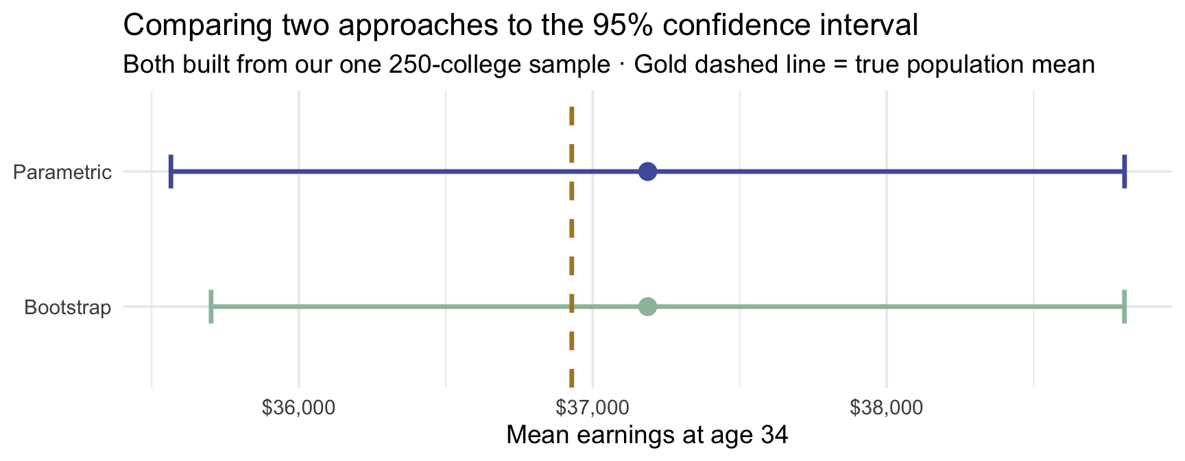
Two methods at a glance
| Approach | Core idea | Assumptions | When it shines |
|---|---|---|---|
| Bootstrap | Resample from the observed sample with replacement; use the middle 95% of the bootstrap distribution | Independent (or appropriately resampled) observations; the sample is an adequate stand-in for the target population; \(n\) large enough for the bootstrap approximation | Skewed data at moderate-to-large sample sizes, or statistics without a simple analytic SE |
| Parametric (t) | Estimate SE from the sample; use the t-distribution with \(df = n - 1\) | Independent observations; exact under a normal population model, and often approximately valid for sufficiently well-behaved larger samples | Moderate-to-large samples of reasonably well-behaved data; fast and traditional |
Both are frequentist and share the same interpretation of 95%: it describes the procedure’s long-run behavior across repeated samples, not a probability attached to this specific interval.
One more piece of precision. A 95% procedure is designed to achieve about 95% long-run coverage under the conditions that justify it. Some procedures hit that exactly under their model assumptions; others — including the simple percentile bootstrap — only approximately, and how close they land depends on the sample size and the shape of the data. “95%” is the label on the method, not a guarantee delivered by every dataset.
In the college mobility example the two approaches agreed. They often will. They can differ when the data are severely skewed or the sample is small, which is exactly when the bootstrap’s flexibility earns its keep.
Bayesian credible intervals — a third interpretation (optional)
This box is an optional deep-dive — recognize the idea, but it is not required for the rest of PSY 652.
That shared frequentist reading — our interval was built by a method that catches the truth 95% of the time — is not the only one on offer. It is a statement about the procedure.
The Bayesian approach asks a different — and for most people, more intuitive — question:
Given the data I actually have, and what I believed before seeing it, what values for the population mean are most plausible?
Bayesian inference combines a prior distribution (what you believed before the data) with a likelihood (how well each possible \(\mu\) fits the data) to produce a posterior distribution (your updated beliefs). A common 95% credible interval is the central 95% of the posterior (2.5% trimmed from each tail) — though Bayesian analyses also report highest-posterior-density (HPD) intervals, the narrowest interval containing 95% of the posterior mass.
The interpretive difference is direct:
| Type | Statement about 95% |
|---|---|
| Frequentist CI (bootstrap or parametric) | If we repeated this study many times, 95% of the intervals built this way would contain the true mean. |
| Bayesian credible interval | Given the data, the statistical model, and the prior, the posterior probability that the true mean lies between these bounds is 95%. |
The Bayesian answer is the one that most students naturally think a frequentist CI is saying — but it isn’t. The catch for Bayesian methods is that the answer depends on the prior. With small samples and strong priors the prior matters a lot; with large samples and weakly informative priors, the data dominates and the Bayesian credible interval usually lands very close to the frequentist CI.
Bayesian inference is a full semester of material in its own right and is not a prerequisite for the rest of this course. We’re flagging it here because students who go on to fit Bayesian models in other contexts should know the interpretive move it buys them. For those interested, some great tools to check out are the brms R package — a friendly front-end to Stan, the leading platform for Bayesian modeling — and tidybayes for posterior extraction and visualization.
Confidence intervals vs. prediction intervals
Every confidence interval we’ve built answers one question: how uncertain am I about the population mean? But hidden inside every average is a trap worth seeing clearly. Suppose we tell a prospective student, with complete honesty: “the average college’s attendees go on to earn about $37,000, and we’re confident the true average sits within a narrow band of that.” Precise, trustworthy — and almost useless to that student. Because they will not attend the average college. They will attend one college, and that one could easily land many thousands of dollars above or below the average. Knowing the average to the dollar tells you remarkably little about where any single case will fall.
That gap — between pinning down an average and predicting one new case — is the whole subject of this section. The mean is a population-level parameter, one number describing all the colleges, and a confidence interval (CI) — which we’ve now built two ways — says how precisely we know it: where is the mean? A prediction interval (PI) answers the other question entirely: where might the next one land? Same sample, same data — two genuinely different questions, which (as we’ll see) call for two different formulas and come out two different widths.
One clarification before we go on, because it’s easy to blur: in our college example, that “next one” is one more college’s k_median — the median-earnings figure for a single institution — not a single student’s future paycheck. Each college contributes one number; the PI asks how much that number swings from school to school.
Quick decision rule: CI or PI?
Ask: What is the target of your claim?
- If the target is a population average (e.g., mean treatment effect), report a confidence interval (CI). It answers where is the mean?
- If the target is a single future case (e.g., one patient, one clinic, one school), report a prediction interval (PI). It answers where might the next observation land?
Inferential vs. outcome uncertainty
Zhang, Heck, Meyer, Chabris, Goldstein & Hofman (2023) draw a useful vocabulary distinction:
- Inferential uncertainty describes how well we’ve pinned down a summary statistic like the mean. It is built from the standard error, \(s/\sqrt{n}\), and shrinks toward zero as \(n\) grows. The 95% CI is a display of inferential uncertainty.
- Outcome uncertainty describes how much individual values vary around that mean. It is built from the standard deviation \(s\) itself, and does not shrink with \(n\). A population has whatever spread it has; bigger samples do not make people more similar to each other. The 95% PI is a display of outcome uncertainty — layered on top of the inferential kind, never instead of it.
These are genuinely different quantities, and conflating them causes predictable mistakes.
Four quantities students mix up — start from one question
Every one of these four answers the same opening question: what is varying? Get that right and the rest follows.
                        WHAT IS VARYING?
                                |
        ┌───────────────────────┴───────────────────────┐
        │                                               │
  INDIVIDUAL OBSERVATIONS                        SAMPLE ESTIMATES
  (one college, one person)                      (a mean, computed
        │                                         from n of them)
        │                                               │
       SD                                              SE
  spread of individual                          spread of sample
  values around the mean                        means around μ
        │                                               │
        │                                               │
  PREDICTION INTERVAL                          CONFIDENCE INTERVAL
  where the NEXT single                        where the POPULATION
  observation may land                         MEAN plausibly lies
        │                                               │
  does NOT shrink with n                       DOES shrink with n
Read down either column and the whole logic is there: pick what varies, measure its spread, build the matching interval. Read across and you have the mistake — using a confidence interval, which describes a parameter, to answer a question about an individual.
This is also the M06 distinction, arriving with names attached. There, \(\mu \pm 1.96\sigma\) described where individual values fall under a normal model — it is how you shaded the middle 95% of articles — the left column. Here you use \(\bar{x} \pm t^* \cdot \text{SE}\) to describe uncertainty about a parameter — the right column. Same arithmetic shape, entirely different question.
SD and SE, in the middle of the diagram, are descriptive summaries of spread; the two intervals below them are built from those spreads. SD and SE differ by a factor of \(\sqrt{n}\); CI and PI differ by whether they carry individual-level variability.
Two intervals, two questions, two formulas
Side by side, the two formulas differ by one term:
| Interval | Formula | What it captures |
|---|---|---|
| 95% CI for the mean | \(\bar{x} \pm t^* \cdot \dfrac{s}{\sqrt{n}}\) | Inferential uncertainty — how well we know \(\mu\) |
| 95% PI for a new observation (normal-theory) | \(\bar{x} \pm t^* \cdot s\sqrt{1 + \dfrac{1}{n}}\) | Inferential uncertainty plus outcome uncertainty |
The only structural difference is the +1 under the square root in the PI — and that +1 is the opening trap written in algebra. The CI’s term, \(t^* \cdot s/\sqrt{n}\), is the uncertainty about the mean, and it shrinks as \(n\) grows. The PI keeps that term but adds the +1: the scatter of individual colleges around the mean — exactly the individual variability that makes a single college hard to predict even when the average is nailed down. The CI can drop that scatter because it only ever asks about the average; the PI can’t, because it asks about one real case.
The PI here is a normal-theory approximation
The formula \(\bar{x} \pm t^* \cdot s\sqrt{1 + 1/n}\) is the normal-theory prediction interval: it assumes the individual values are roughly symmetric / approximately normal around the mean, and it returns a symmetric interval. Because k_median is right-skewed, treat this PI as an instructional approximation — it faithfully captures the idea that individual-level spread doesn’t shrink with \(n\), but not the exact place the next college’s median will land. For badly skewed outcomes, a bootstrap prediction interval tracks the real shape better — we build one for these colleges just below, once we’ve seen the formula-based intervals to compare it against.
Why prediction intervals are wider (for the same model and confidence level)
Here’s the intuition first, then the algebra.
Intuition. Imagine, for the sake of argument, that we somehow knew the population mean exactly — say, exactly $40,000, zero uncertainty about it. We’d need an infinitely large sample to actually achieve that, but stay with the thought experiment. Even in that perfect-knowledge world, individual colleges would still scatter around $40,000. Some would produce attendees earning well above it, some well below. That scatter is what the sample standard deviation \(s\) measures, and it is a property of the population itself, not a property of how much data we collected. Doubling your sample size does not make colleges more similar to each other; it just gives you a better estimate of how different they are.
That scatter is precisely the outcome uncertainty we named earlier, and it is the whole reason the PI is wider: two ingredients instead of one. The algebra below shows exactly how the two behave as \(n\) grows.
The algebra: why the CI shrinks and the PI doesn’t
Let’s watch both interval widths as \(n\) grows.
The CI’s full width is \(2 \cdot t^* \cdot \dfrac{s}{\sqrt{n}}\). As \(n\) grows, \(\sqrt{n}\) grows, so the whole fraction shrinks toward zero. Quadruple the sample size and the CI halves. With billions of colleges in our sample, the CI would be a point.
The PI’s full width is \(2 \cdot t^* \cdot s \sqrt{1 + \dfrac{1}{n}}\). The only \(n\) in the formula is the \(1/n\) under the square root. As \(n\) grows, \(1/n\) approaches 0, so the square root approaches \(\sqrt{1 + 0} = 1\), and the whole expression approaches \(2 \cdot t^* \cdot s\). Notice what happened: \(n\) dropped out entirely. The PI stops depending on sample size and levels off at the width that reflects pure individual-level variability.
A quick numerical check: with \(s = 13{,}000\) (about what our 250-college sample shows) and \(t^* \approx 1.96\), the PI half-width approaches \(1.96 \times 13{,}000 \approx 25{,}500\) — regardless of whether you surveyed 250 colleges or 25,000 colleges. The CI half-width for \(n = 250\) is about \(1.96 \times 13{,}000 / \sqrt{250} \approx 1{,}610\); for \(n = 25{,}000\) it drops to about \(161\). The CI can shrink as far as you can afford to sample; the PI cannot.
The reason this matters for reading research: increasing \(n\) alone — same model, same measurements — will never let a study tell you where a single new case will land. More data can pin down the mean; it cannot make individual colleges stop varying around it. (Better prediction is possible, but it comes from better models and relevant covariates — the regression story of M10–M11 — not from more of the same observations.) The CI says “we know the population average to within $X”; the PI says “but a new individual college could still land anywhere in a $Y-wide range, and $Y does not go away with more funding.” Those are different questions with different costs.
Computing both for the college data
interval_comparison <- sample_data |>
  summarize(
    mean_income = mean(k_median),
    sd_income = sd(k_median),
    n = n(),
    t_star = qt(p = 0.975, df = n - 1),
    # CI for the mean
    ci_lower = mean_income - t_star * sd_income / sqrt(n),
    ci_upper = mean_income + t_star * sd_income / sqrt(n),
    # PI for a new observation
    pi_lower = mean_income - t_star * sd_income * sqrt(1 + 1/n),
    pi_upper = mean_income + t_star * sd_income * sqrt(1 + 1/n)
  )

interval_comparison |>
  select(mean_income, ci_lower, ci_upper, pi_lower, pi_upper)
The 95% CI for the population mean is $35,565 to $38,809 — a narrow range because 250 colleges give a precise estimate of the average.
The 95% PI for a single new college is $11,490 to $62,884 — substantially wider, because individual colleges vary a great deal around that mean.
Visualizing the difference
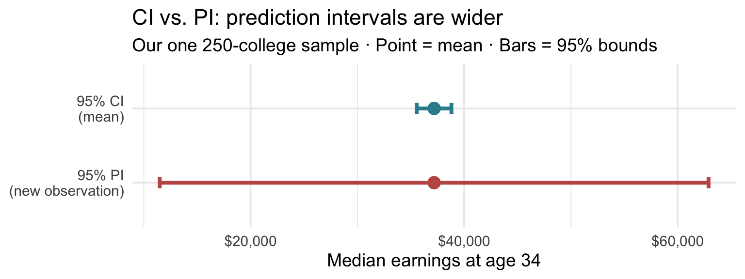
The CI sits in a narrow band around the sample mean. The PI spans a far wider range — reflecting the reality that predicting where one specific college will land requires accounting for all the individual-level variability, not just uncertainty about the average.
A skew-aware PI: the bootstrap version
The formula-based PI we just built is symmetric — it reaches the same distance above and below the mean. But college medians are right-skewed (that long tail in the opening histogram), so a symmetric interval is only a rough fit. There is a more faithful way to ask where might one new college land? — ask it literally. Draw one college at random from our sample, record its median, and repeat thousands of times; the middle 95% of those draws is a prediction interval that is free to be lopsided:
set.seed(123)
# "Draw one new college," 5,000 times, from our observed sample
boot_new_colleges <- sample_data |>
  rep_slice_sample(n = 1, reps = 5000, replace = TRUE) |>
  pull(k_median)

# The middle 95% of those 5,000 draws
quantile(boot_new_colleges, probs = c(0.025, 0.975))
2.5% 97.5%
18800 72500 Line the two prediction intervals up for the same colleges:
- Normal-theory (formula), symmetric: $11,490 to $62,884
- Bootstrap, skew-aware: $18,800 to $72,500
The bootstrap interval leans right: its lower bound sits well above the formula’s — the symmetric formula pushes the bottom all the way down to $11,490, where real colleges essentially never fall — while its upper bound stretches further into the long tail. Both intervals tell the same story: a single college’s median could plausibly land across a very wide range, and that range does not shrink with more data. The bootstrap simply gets the shape right, by never assuming one. And notice it needed no new formula — it is the very same “resample and read off the percentiles” logic that built the bootstrap CI, now aimed at a single new draw instead of at the mean.
Why this matters: the illusion of predictability
Zhang et al. (2023): even experts confuse the two
The CI-vs-PI distinction isn’t an academic nicety. Zhang et al. (2023) ran three large experiments that tested whether expert readers — people trained to interpret quantitative results — correctly distinguish uncertainty about a mean from variability across individuals. The results are striking.
Experiment 1: 163 medical providers with prescribing privileges. Participants read a paragraph describing a clinical trial for a new blood-pressure drug, then saw a figure showing the treatment and control groups’ results. Half saw standard-error error bars (±1 SE around each mean — a CI-family display of inferential uncertainty); half saw standard-deviation error bars (±1 SD around each mean — a PI-family display of outcome variability across patients). Participants then estimated the probability that a randomly chosen patient on the treatment would have a lower blood pressure than a randomly chosen patient on the control — the probability of superiority.
The true probability of superiority from the study’s own numbers was 72%. Providers who saw the SE bars estimated 89%. Providers who saw the SD bars estimated 66% — much closer to the truth. In a parallel COVID-19 scenario (true probability 76%), the SE group estimated 86% and the SD group 67%. A majority of SE-viewing providers gave estimates exceeding 90% — extreme overestimates well above the 72% truth. And only 36% of SE-viewing participants correctly recalled what the error bars in their figure represented — worse than chance.
Experiments 2 and 3 reproduce the pattern in other expert populations. 175 data scientists (Experiment 2) and 368 tenure-track faculty (Experiment 3) read a violent-video-game study whose true probability of superiority was 59%. Faculty shown only the SE error bars estimated 68%; faculty shown the same data with individual data points overlaid estimated 60%. Data scientists showed the same pattern, with 35% of the SE-only group giving extreme estimates above 90% compared to just 6% when individual points were visible.
In short: even experts read uncertainty about a mean as if it told them about individuals. That confusion isn’t a quirk of novices — it’s the default response even among physicians making prescribing decisions and researchers designing studies.
You will work inside this research line yourself: M09 is built entirely on Hofman, Goldstein & Hullman’s (2020) visualization study — an earlier experiment by two of the authors above — where you’ll test whether the kind of error bar a figure shows changes what readers conclude.
The take home message
Most published science shows 95% CIs (or their cousins, SE error bars). Whether that is enough depends on the question. If the scientific target genuinely is a population mean, a CI can be entirely appropriate on its own. But when your reader will make individual-level decisions from your result — should I take this treatment? does this particular intervention beat the alternative? — an outcome-uncertainty display (PI, SD error bars, or individual data points) almost always communicates a more honest story than an inferential-uncertainty display alone.
The remedy is cheap: when you report a mean and a CI, also report the SD (or a PI, or the raw points) so readers can see both kinds of uncertainty. When you consume a paper that shows only CIs, mentally ask: “How wide would the PI be? Is the question the authors want me to answer really about the mean, or about individual outcomes?”
APA-style reporting templates for intervals
Now that you’ve seen all three interval types, here are sentence stems you can use in Results sections.
Frequentist CI (parameter-level inference). “The sample mean was M = xx.xx (SD = xx.xx), and the 95% confidence interval for the population mean was [LL, UL].”
Bootstrap percentile CI. “A bootstrap percentile 95% confidence interval based on 1,000 resamples was [LL, UL].”
Prediction interval (individual-level prediction). “The 95% prediction interval for a single new observation from the same population was [LL, UL].”
Interpretation sentence (frequentist wording). “If this sampling procedure were repeated many times, 95% of the resulting confidence intervals would contain the true population mean.”
Avoid this wording. “There is a 95% probability that the true mean is in this specific interval.”
Looking ahead
Every interval in this Module answered one kind of question: where is the parameter? The next Module — M08, The Logic of NHST — keeps exactly the same ingredients (the sampling distribution, the standard error, the CLT) but turns them to a different question: not where is the parameter? but how surprising would our data be if a specific null value for the parameter were true? That shift — from estimating a parameter to testing a claim about it — is the whole of null hypothesis significance testing, and you’ll find a confidence interval and a hypothesis test are two views of the same underlying machinery.
Summary
Core concepts
The one-sample problem. You observe one random sample from a population, but you want to say something about the population. Every sample mean you could have observed is slightly different — the spread of those hypothetical sample means is the sampling distribution, and its SD is the standard error (SE). Bigger \(n\) shrinks SE as \(1/\sqrt{n}\); bigger population variability inflates it.
The key bridges from M06. The Law of Large Numbers guarantees \(\bar{x} \to \mu\) as \(n\) grows. The Central Limit Theorem adds that the sampling distribution of \(\bar{x}\) becomes approximately normal for large \(n\) regardless of the raw distribution’s shape. Both results let us reason about \(\bar{x}\) without observing thousands of samples.
Two construction methods for a 95% CI, both frequentist:
| Approach | Formula | Assumption |
|---|---|---|
| Bootstrap (percentile) | middle 95% of the bootstrap sampling distribution | Random, independent sample; no assumed parametric shape |
| Parametric (t) | \(\bar{x} \pm t^* \cdot s/\sqrt{n}\), with \(t^* = {}\) qt(p = .975, df = n - 1) | Independence; CLT-sized sample |
The interpretation of 95%. The 95% refers to the long-run frequency with which the procedure captures the true \(\mu\) — not a probability assigned to this specific interval. This is the most-misread sentence in introductory statistics.
Why t and not z. We use the t-distribution because \(\sigma\) is estimated from the sample (as \(s\)), and that estimate is itself uncertain. The t-distribution’s heavier tails account for that extra wobble. As \(n\) grows, t collapses onto z and \(t^* \to 1.96\).
Degrees of freedom. \(df = n - 1\) because once \(\bar{x}\) is computed from the sample, only \(n - 1\) deviations are free to vary: the \(n\) deviations \(x_i - \bar{x}\) must sum to zero, so fixing any \(n - 1\) of them determines the last one.
This is the promise M01 made and deferred. When you first met the sample variance, \(s^2 = \frac{1}{n-1}\sum(x_i - \bar{x})^2\), the \(n - 1\) in the denominator was asserted rather than explained — it is the same count of free deviations, and the same reason. Dividing the summed squared deviations by the number of free quantities rather than by \(n\) is what keeps \(s^2\) from running systematically small, which is what “unbiased” means here. The correction you took on faith in M01 and the degrees of freedom you are using now are one idea.
Confidence interval vs. prediction interval:
| Interval | Captures | Shrinks with more data? |
|---|---|---|
| CI for the mean | Uncertainty about \(\mu\) | Yes |
| PI for a new observation | Uncertainty about \(\mu\) and individual variability around it | No |
Showing only CIs (or SE error bars), without the accompanying outcome-uncertainty view, systematically misleads even expert readers — practicing physicians, data scientists, tenure-track faculty — into overstating treatment effects and understating individual variability (Zhang et al., 2023). If your reader will make individual-level decisions from your result, show both.
Footnotes
More precisely, around age 34: the children in these data were born in 1980–82, and their earnings were measured in 2014, when they were 32–34 years old. We say “age 34” throughout as a convenient shorthand.↩︎
More generally, multiplying the sample size by a factor \(k\) shrinks the standard error by \(1/\sqrt{k}\): doubling it (\(k = 2\)) narrows the SE by about 30%, quadrupling (\(k = 4\)) halves it, and quintupling (\(k = 5\), as we did here) cuts it to roughly 45%. This is the \(\text{SE} \propto 1/\sqrt{n}\) relationship, which we formalize later in the Module.↩︎
Where that factor of four comes from, for the curious. Since \(\text{SE} = \sigma/\sqrt{n}\), comparing two sample sizes makes \(\sigma\) cancel and leaves \(\dfrac{\text{SE}_\text{new}}{\text{SE}_\text{old}} = \sqrt{\dfrac{n_\text{old}}{n_\text{new}}}\). To halve the standard error, set that ratio to \(\tfrac{1}{2}\): \(\sqrt{n_\text{old}/n_\text{new}} = \tfrac{1}{2}\) gives \(n_\text{new} = 4\,n_\text{old}\). The square root is doing all the work, and its bite grows: a tenfold gain in precision costs a hundredfold in data. The same algebra with a general factor produces the exchange rates quoted earlier in this Module, when our researcher went from 50 colleges to 250.↩︎