library(tidyverse)
library(here)
library(infer)
library(scales)
library(effectsize)The Logic of Null Hypothesis Significance Testing
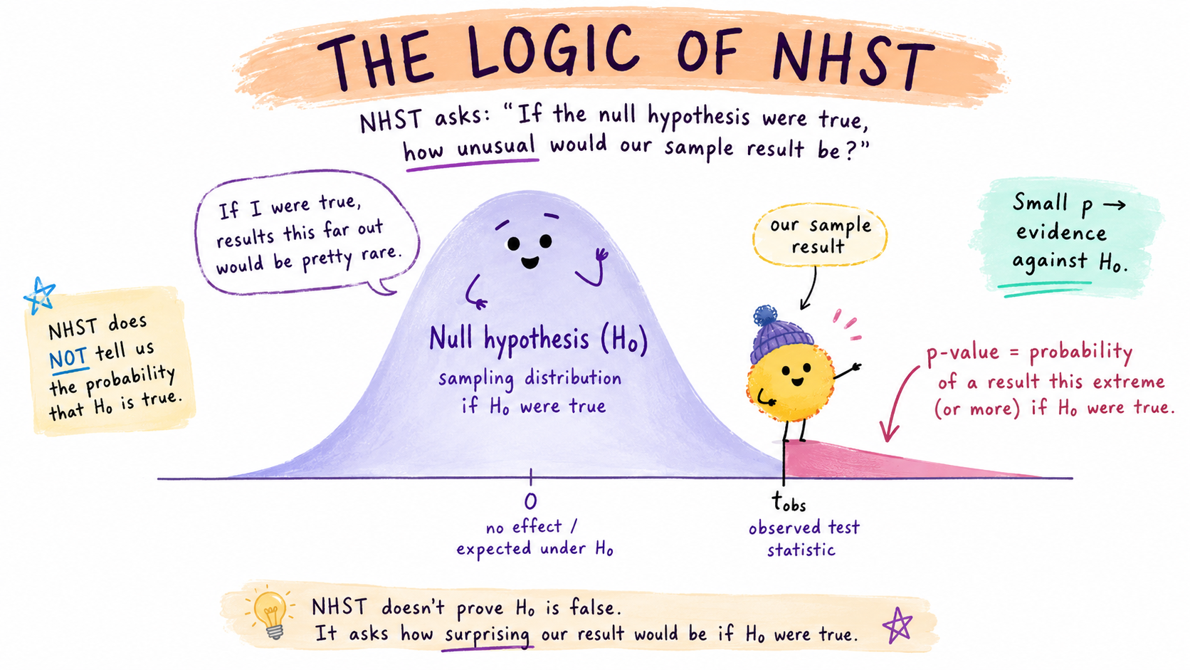
Learning Objectives
By the end of this Module, you should be able to:
- Explain what a null hypothesis is and why we test it rather than directly testing the hypothesis we actually care about
- Describe the null sampling distribution and explain how it differs from the sampling distribution we used for estimation
- Define a p-value as a conditional probability and state precisely what it does — and does not — mean
- State the assumptions of a one-sample t-test and explain why “my data aren’t Normal” is usually the wrong worry
- Run a one-sample t-test with t_test(), identify \(t_\text{obs}\), \(t^*\), \(df\), and the p-value in the output, and confirm the parametric route agrees with the bootstrap route on the same data
- Explain the connection between a 95% confidence interval and a p-value decision at \(\alpha = .05\)
- Compute and interpret Cohen’s d as a one-sample effect size, and report results in APA style
- Distinguish between Type I and Type II errors, and define statistical power
- Identify the most common misconceptions about the p-value and explain why each one is wrong
Overview
Where this fits — the Part 2 inference arc
Modules 6–9 are one continuous story: how we reason from a sample back to the world. Each module is a single step in that arc.
- M06 · Probability — what outcomes should we expect under a given data-generating process?
- M07 · Confidence intervals — how much does a sample statistic wobble from one sample to the next?
- M08 · The logic of NHST — how surprising is our statistic if a specific null value were true? · ← you are here
- M09 · Conducting tests — which standard test matches this design, variable type, and research question?
Last week, in M07, we were in estimation mode. We had a sample, and we wanted to characterize uncertainty about an unknown population parameter. Where is the true mean, and how confident are we? Confidence intervals — whether built with the bootstrap or the parametric t-distribution — all answer the same fundamental question: what range of values is plausible for the population parameter?
This Module shifts gears. We’re moving from estimation to hypothesis testing. The goal is no longer to ask where the parameter lives. Instead, we start with a specific claim about what the parameter is — and it is not our claim. It is the skeptic’s: the parameter equals some benchmark value, and whatever your sample seems to show beyond that is nothing but sampling chance. We provisionally assume that claim is true, and then ask whether our data provide enough evidence to cast doubt on it.
If that sounds like a strange way to do things, you’re in good company. It is strange. Why would we begin by assuming something we don’t actually believe, just to argue against it? Most people who encounter null hypothesis testing for the first time find it the most counterintuitive part of statistics — and the discomfort is appropriate, because the logic really is backwards from how scientific reasoning usually feels. But there’s a deep reason for it. To evaluate evidence against a claim, you need to know what the world would look like if that claim were true. If you can show that your data would be extremely unlikely in that world, you have grounds for skepticism. If your data would be fairly common in that world, you don’t have strong grounds for skepticism — even when you’d very much prefer the alternative.
This is the logic of null hypothesis significance testing (NHST). For better and worse, it is the dominant framework of inference in psychology, medicine, public health, and the social sciences. You’ve almost certainly encountered it already — p-values, “statistical significance,” and the threshold \(p < .05\) are the lingua franca of empirical research. By the end of this Module, you’ll understand exactly where those numbers come from, and what they actually mean. (And, just as importantly, what they don’t mean. That part takes a while to land, even for working researchers.)
One important reassurance before we dive in: NHST doesn’t require any new statistical machinery. Everything we need — sampling distributions, standard errors, the bootstrap — you’ve already built up in Modules 06 and 07. What changes is only the question we’re using those tools to answer.
The whole game, before we slow down
Here is the entire procedure this Module builds — five moves, shown for the simplest case, one mean against a benchmark:
- Choose a benchmark value for the parameter, written \(\mu_0\). This is a substantive judgment, and it is where we start.
- State the claim to test: the population mean equals that benchmark, \(\mu = \mu_0\). That claim is the null hypothesis, \(H_0\) — the skeptic’s position, which we assume in order to argue against. (Its counterpart, the alternative hypothesis \(H_a\), is the claim we would rather make.)
- Build the world where \(H_0\) is true — the null sampling distribution, which shows what sample means that world routinely produces.
- Compute how surprising our observed sample mean would be in that world. That measure of surprise is the p-value.
- Decide. If our result is too surprising to write off as sampling chance — past a threshold \(\alpha\) we fixed in advance — we reject \(H_0\). Otherwise we fail to reject it, which is not the same as accepting it.
Hold onto this map. The rest of the Module is these five steps, slowed down enough to see why each one works — when a section feels heavy, come back here and find which step you are on. And next week, M09 points this same machinery at three more designs: what changes is the claim, never the logic.
Packages used in this module
Meet the data: returning to college mobility
Last week, working with the Chetty et al. (2017) college mobility data, we asked an estimation question: what is the mean of college-level median earnings (k_median) at age 34, across U.S. colleges? From a sample of 250 colleges, the sample mean of those medians was $37,187, and the two methods we used gave very similar 95% confidence intervals — [$35,565, $38,809] parametric and [$35,702, $38,809] bootstrap percentile — differing by no more than about $137 at either endpoint.
Two construction notes about this dataset that will matter for how we phrase the research question:
- Chetty et al. assign each individual to the institution they attended most between ages 19 and 22, regardless of whether they completed a degree. So k_median captures the typical earnings outcome of students who enrolled at the college, not only those who graduated.
- Each row is a college, and k_median is itself the within-college median of individual earnings. Our sample mean is therefore a mean of medians — one number per college, averaged across colleges. Our test will be about that quantity, not about individual-level earnings directly.
For teaching purposes, we treat the 2,199 colleges as an empirical stand-in for the larger process that generates college-level earnings outcomes. That lets us know a reference “truth” while still using the standard bootstrap and t-test machinery you will see in applied research.
college_mobility · 2,199 observations · 2 variables · Chetty et al. (2017)
All 2,199 U.S. colleges with sufficient data for intergenerational mobility analysis — the same reference population you worked with in M07, and the frame from which this Module’s 250-college sample is drawn.
- name character — Institution name
- k_median numeric — Median individual earnings, in 2014 US dollars, among the college’s former students
Full codebook for college_mobility — values, levels, missingness, and how the file was prepared.
The CI from M07 is a perfectly good answer to a perfectly good question. But it’s not the only question we could be asking. Here’s another, framed at the college level to match what our data measure:
Across U.S. colleges, is the mean of within-college median earnings higher than a reasonable external benchmark for the typical no-college earner?
This is the kind of question NHST is designed to answer — and to answer it, we need a specific benchmark to test against. That number has a name in NHST: \(\mu_0\), the population mean implied by the null hypothesis. Where \(\mu_0\) comes from is a question most textbooks skim over, but it’s worth a moment of careful thought, because the choice is a substantive judgment, not a mechanical one.
Where does \(\mu_0\) come from?
The honest answer is that the analyst chooses \(\mu_0\). A useful \(\mu_0\) has three properties:
- It answers a substantive question someone cares about. “Is the mean different from zero?” rarely matches what we actually want to know. “Is the mean different from a known benchmark?” usually does.
- It’s defensible. Either grounded in a published reference value, a theoretical prediction, an established benchmark, or an explicit prior — not pulled out of thin air.
- It’s interpretable. The benchmark should have a clear, narrow meaning so that the result of the test (“we reject \(H_0\)”) translates into a clean substantive conclusion.
Let’s apply these criteria to our question. We want to test whether students who attended college earn more, on average, than people from the same birth cohort who never attended any postsecondary institution. To make that comparison concrete, we need a number. We considered three candidates:
- Chetty’s own “Never Attended College” aggregate (\(\sim\)$11,500). The Chetty release ships with this aggregate row alongside the per-college records. It’s appealingly self-contained — same dataset, same cohort, same measurement window. But the value is a median computed across the entire never-attended-college subset of the cohort, including individuals with $0 earnings (non-employed, incarcerated, full-time caregivers, informal-economy workers). That depresses the figure dramatically — $11,500 sits roughly at the federal poverty line. The substantive interpretation gets murky: a rejected null would tell us college attendees earn more than a benchmark that bundles employment status and wage levels together, which isn’t quite the question we set out to ask.
- The federal poverty line for a single adult (\(\sim\)$12,000 in 2015). Crisp and well-defined, but the question — “are college attendees above the poverty line on average?” — has an obvious and uninteresting answer.
- NCES median earnings for full-time year-round workers ages 25–34 with a high school diploma and no college. A published Census-derived figure, matched to our cohort’s age band, conditional on full-time employment. It captures what most readers mean by “typical earnings of a high school graduate.” For the mid-2010s — the measurement window of the Chetty cohort — this was approximately $32,000 in 2015 dollars.1
The NCES benchmark wins on all three criteria. It answers a question we actually care about, it’s grounded in a published reference, and it has a clean interpretation.
One honest trade-off worth flagging before we move on: choosing NCES means our test will answer a slightly narrower question than the one we set out to ask. The substantive question is “do college attendees earn more than the typical person who never went to college?” The NCES benchmark is “the typical full-time, year-round worker with a high school diploma and no college.” That’s not the same population — it excludes the unemployed, part-timers, and people without a high school diploma. We narrow the comparison in exchange for a clean, defensible reference point. (Going the other direction — sticking with Chetty’s $11,500, which does cover the broader never-attended-college population — would have given us a benchmark whose interpretation bundled employment status with wage levels in a way that obscures the substantive claim we want to make.)
So when the rest of the Module refers to $32,000 as “the no-college benchmark,” that narrower reading — the typical HS-only working adult — is what’s meant. We’ll use \(\mu_0 = \$32{,}000\).
One framing note that matters for how you read the result. We treat $32,000 as a fixed reference threshold, not as a second population parameter estimated with its own uncertainty. (The NCES figure is itself a survey estimate and carries a standard error; a one-sample test ignores that.) So the question this test answers is precisely: does the institution-weighted mean of college-level median earnings sit above a pre-specified $32,000 threshold? It is not a formal comparison of two estimated populations, and it is certainly not a causal estimate of the return to college. Notice also that our parameter weights every college equally, regardless of enrollment, while the benchmark weights people — an enrollment-weighted mean would answer a different question. The estimand depends on the unit of analysis and the weighting scheme, and both are choices.
Back to the question
The sample mean from M07 was $37,187. Our chosen benchmark is $32,000. The gap is $5,187 — modest in absolute dollars, but several standard errors wide given M07’s SE of about $824. With 250 observations, the test is going to reject. So why bother running the formal procedure if we already know what it’ll say?
The answer is pedagogical. When the substantive answer isn’t in doubt, you can give your full attention to the machinery of the test — what each step does, why it works, and how the pieces fit together. By the end of this Module you’ll have seen the full NHST procedure work end-to-end on a question whose answer you already know in your gut. That’s the right way to meet it the first time. Once the procedure is solid, you can apply it (in next week’s lab) to questions where the answer isn’t obvious.
Before we can test anything, we need the sample. Rather than draw a fresh one, we’ll reuse the very same 250 colleges you worked with in M07 — calling set.seed() = 42 before slice_sample() guarantees the identical draw, so every number in this Module lines up with the ones you already have in hand. The chunk below reloads the population, takes that sample, and stores the four quantities the test will need: the sample mean, the sample SD, the sample size, and the benchmark \(\mu_0 = \$32{,}000\).
college_mobility <- read_rds(here("shared_data", "college_mobility.Rds")) |>
  select(name, k_median) |>
  drop_na(k_median)

set.seed(42)
sample_data <- college_mobility |> slice_sample(n = 250)

sample_mean <- sample_data |> pull(k_median) |> mean()
sample_sd   <- sample_data |> pull(k_median) |> sd()
sample_n    <- nrow(sample_data)
mu0         <- 32000
The sample mean is $37,187, and the sample SD is $13,021. Let’s look at where the 250 colleges sit relative to the no-college benchmark:
Show the code that built this figure
sample_data |>
  ggplot(aes(x = k_median)) +
  geom_histogram(binwidth = 2500, fill = "#4E5EAA", color = "white", alpha = 0.75) +
  geom_vline(xintercept = sample_mean, color = "#C05852",
             linewidth = 1.3, linetype = "dashed") +
  geom_vline(xintercept = mu0, color = "#AD872B",
             linewidth = 1.3) +
  scale_x_continuous(labels = label_dollar()) +
  labs(
    title = "Earnings at age 34 — sample of 250 colleges",
    subtitle = paste0("Rose dashed = sample mean (", mean_plain, ")   |   Gold = no-college benchmark ($32,000)"),
    x = "Median earnings at age 34",
    y = "Number of colleges"
  )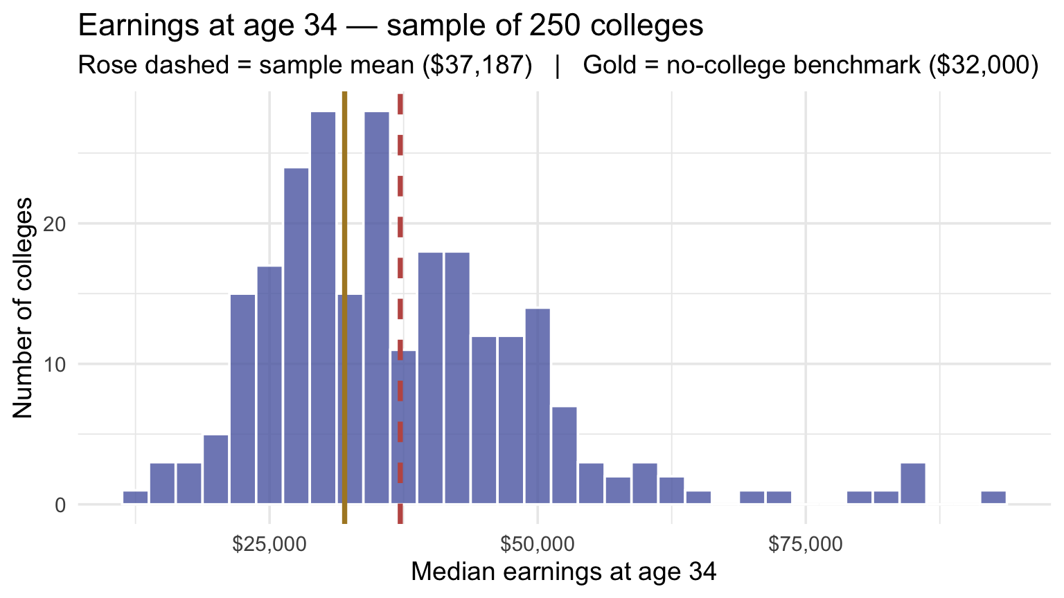
A useful caution before we run the test: the question we’re asking is about a mean, not about every individual college. Many colleges in this sample sit to the right of the gold line at $32,000 — at most colleges the typical attendee out-earns the benchmark — but a substantial fraction sit to the left. That’s expected: not every college has attendees whose median earnings clear the benchmark, and our test isn’t asking whether they all do. We’re asking whether the mean across all U.S. colleges exceeds $32,000. The sample mean (rose dashed line) sits clearly to the right of the benchmark, suggesting the answer is yes. The statistical question is whether we should trust that visual answer — whether the gap could have arisen by sampling chance even if the population mean across all colleges were only $32,000. NHST is the procedure that gives us a defensible “yes” or “no.”
The road from here
We’ve already done step 1 — choosing \(\mu_0 = \$32{,}000\). The rest of the Module walks the remaining four:
- Choose \(\mu_0\) ✓
- State \(H_0\) and \(H_a\) formally
- Build the null sampling distribution (via bootstrap-shift)
- Compute the p-value off that distribution
- Decide at \(\alpha\) — reject or fail to reject — and report the result honestly
The null hypothesis: assuming the skeptic is right
When we run a hypothesis test, we start from a position of deliberate skepticism — and this is the strangest part of the whole framework. We have a research hypothesis (something we’d like to find evidence for), and the first thing we do is set it aside and assume the opposite. To many students this feels backwards. They came here to make a positive claim, and now they’re being told to assume their claim is wrong and argue from there. That discomfort is appropriate; the logic really is unusual. But there’s a deep reason for it.
A useful analogy: the criminal trial. In an adversarial legal system, a defendant is presumed innocent until proven guilty. The prosecution doesn’t get to walk into the courtroom and assert guilt — it has to present evidence strong enough to overturn the default assumption of innocence. The burden of proof is on the side making the claim. Statistical hypothesis testing works the same way. The null hypothesis (\(H_0\)) is the presumption of innocence. For our example:
\[H_0: \mu = \$32{,}000\]
In words, the null says: “The mean of within-college median earnings, across all U.S. colleges, equals the no-college benchmark of $32,000. Any gap we see between our sample mean and $32,000 is just sampling chance — the kind of variation you’d get any time you draw a finite sample from a population.” Here \(\mu\) is the population-level mean of college-level medians, not an individual-level earnings parameter.
Note carefully which symbol appears in that statement. Hypotheses are always claims about a parameter — the unknown population quantity, \(\mu\) — never about a statistic like \(\bar{x}\), our sample mean. We already know \(\bar{x}\): it is $37,187, sitting right there in our data. There is nothing to hypothesize about it. The whole point of the test is to ask what that known sample mean implies about the unknown \(\mu\).
The alternative hypothesis (\(H_a\)) is the claim we’d like to make if the null is overturned:
\[H_a: \mu \neq \$32{,}000\]
In words: “The population mean of college-level medians differs from the no-college benchmark.”
A few features of this setup are worth dwelling on.
The p-value is computed under \(H_0\), and \(H_a\) decides which departures count as evidence against it. Why that division of labor? Because to compute a probability we need a fully specified sampling picture, and \(H_0\) — together with the model assumptions — supplies one. Naming \(\mu = \$32{,}000\) pins down the center; the sampling design, the independence assumption, and either a normal-population model or a large-\(n\) CLT argument supply the rest. “\(\mu \neq \$32{,}000\)” pins down nothing: it is consistent with an infinite range of values ($33,000? $40,000? $60,000?), so it cannot by itself tell us what data to expect. The alternative still does real work — it determines which results count as extreme (both tails here) and, later, how much power the test has. So rather than asking “is \(H_a\) true?”, we ask “how compatible are our data with the model \(H_0\) describes?” If the answer is barely, that is indirect evidence for \(H_a\).
Our alternative is two-tailed (\(\neq\)), even though our substantive question is directional (“do colleges whose attendees earn more sit above the benchmark?”). This is a deliberate convention. We use the two-sided test as a conservative default: we’d want to know about a surprising deviation from $32,000 in either direction, even if our prior expectation is for college earnings to be higher. A one-tailed test — which only looks for effects in one direction — is defensible only when the direction was specified in advance and an effect in the opposite direction, however large, would not count as evidence for your claim. You don’t have to believe the opposite direction is impossible; you do have to be genuinely uninterested in it as support for \(H_a\) — and those situations are rarer than you might think. When in doubt, use a two-tailed test.
Even so, when we do reject \(H_0\), the substantive reading is directional: because the observed mean sits above $32,000, the conclusion is that the mean of college-level medians is higher than the no-college benchmark, not merely different from it.
That directional reading is licensed, not a liberty we are taking — and it is worth seeing why, because on its face it looks like we are concluding something (\(\mu > \mu_0\)) that was never our alternative. Here is the argument. Our rejection region has two halves, each holding 2.5% of the null distribution. Landing in the upper half — which is what happened — means our result would also have cleared a one-sided test of “\(\mu\) is no greater than $32,000” at the \(\alpha/2 = .025\) level. So reading the direction off a two-sided rejection asks no more of the data than the test we already passed — landing in the upper half of a two-sided \(\alpha = .05\) rejection region and clearing an upper one-sided test at \(.025\) are the same boundary. Nothing is being smuggled in after the fact.
The genuine caution sits elsewhere. That guarantee is comfortable when the evidence is strong, as it is here. When a result barely clears the threshold and the study is underpowered, a rejection can point in the wrong direction often enough to matter — so a p-value hovering near \(\alpha\) earns humility about the sign, not just about the magnitude. We return to why underpowered studies misbehave when we reach statistical power.
Step back to the decision itself. Everything just above describes how we read a rejection once we have one; none of it says how much surprise it takes to earn one in the first place. That calls for a threshold, and the threshold has a name. Alpha (\(\alpha\)) is the share of outcomes the null world could produce that we agree, ahead of time, to treat as too surprising to write off as luck — conventionally the most extreme 5%. That is the threshold we adopt for this test: \(\alpha = .05\), fixed here and now, before we compute anything. We’ll develop it properly, and weigh what it costs, when we reach the decision rule.
\(\alpha\) must be set before looking at the data. We decide in advance how much evidence we’ll require before rejecting \(H_0\). The key point for now: setting the threshold after you’ve seen the data is like deciding the rules of a game after watching the outcome.
Why do we test the null instead of the hypothesis we actually care about?
Because the null, combined with the model’s assumptions, pins down a complete enough picture to compute probabilities from — and the alternative does not. NHST works by asking: if the null were true, how unlikely are our data? If the answer is “very unlikely,” we have grounds to reject it. That is indirect evidence for \(H_a\) — not proof of it.
The indirectness cuts both ways, and this is why we say “fail to reject \(H_0\)” rather than “accept \(H_0\).” Not finding evidence against the null doesn’t make the null true — it may just mean our sample was too small, or too noisy, to rule it out. The absence of evidence is not evidence of absence.
The null sampling distribution: the “what if” world
Now we arrive at the central concept of this Module: the null sampling distribution.
You already know what a sampling distribution is, from M07. If we could repeat our study thousands of times — drawing a new 250-college sample each time — we’d get a slightly different sample mean each time. The distribution of all those possible sample means is the sampling distribution. It’s centered at the true population mean, and its spread (the standard error) reflects how much sample means vary with this sample size.
In M07, we used the sampling distribution to build a confidence interval. We let the distribution be centered wherever the data suggested, and asked: what range of values is plausible for \(\mu\)?
For NHST, we ask a different but structurally identical question:
If \(H_0\) were true — if the population mean really were \(\mu_0 = \$32{,}000\) — what would the sampling distribution of sample means look like?
We’re not asking where the sampling distribution is centered based on what our data suggest. We’re asking where it would be centered in a world where the null hypothesis is true. This is the null sampling distribution: the distribution of sample means we’d expect to see if \(H_0\) were correct.
The null sampling distribution is a “what if” world. It’s a simulation of what repeated sampling would look like if nothing were going on — if the mean of college-level medians were no different from the no-college benchmark on average, and any apparent gap we see in our sample were just sampling chance. Once we have this distribution in hand, we can ask: where does our observed sample mean fall within it? If our observed mean is common in the null world, we have no grounds for skepticism. If it sits far out in the tails, we have evidence that the null world doesn’t describe our data well.
Building the null distribution via bootstrap
You already know how to bootstrap a sampling distribution. The new ingredient here is small but important: instead of centering the bootstrap distribution at our observed sample mean, we shift it to \(\mu_0\).
Here’s why the shift works. When we bootstrap, we treat our sample as the best available stand-in for the population. The resulting distribution of bootstrap means is naturally centered at \(\bar{x} = \$37{,}187\), because that’s what the data suggest about the population. But that’s not the null world. In the null world, the population mean is $32,000, so the sampling distribution of sample means should be centered there.
The fix is mechanical: for each of the 5,000 bootstrap resample means, we add the quantity \((\mu_0 - \bar{x})\) — a negative number in our case, because \(\mu_0\) is below \(\bar{x}\) — to shift the entire distribution down to be centered at $32,000. The spread of the distribution stays the same. Variability in sample means is determined by sample size and population SD, not by where the distribution happens to be centered. We’re just asking the same sampling process to operate in a world where the mean is $32,000 instead of $37,187.
This is a location-shift model of the null: we move the center to \(\mu_0\) while borrowing the spread and shape from the observed sample. That’s an approximation — a good one when the sample is a reasonable stand-in for the population — not an exact reconstruction of the true null distribution.
set.seed(777)

resamples <- sample_data |>
  rep_slice_sample(n = sample_n, replace = TRUE, reps = 5000) |>
  group_by(replicate) |>
  summarize(mean_resample = mean(k_median))

null_dist <- resamples |>
  mutate(mean_null = mean_resample - sample_mean + mu0)
The expression mean_resample - sample_mean + mu0 subtracts the observed sample mean and adds \(\mu_0\). For each bootstrap resample mean, we’re asking: “how far was this resample from our observed mean? Now imagine that same distance from \(\mu_0\) instead.” The result is a distribution with the same shape and spread as the bootstrap distribution, but centered at $32,000 rather than $37,187.
Let’s visualize both distributions side by side — the estimation sampling distribution from M07 (centered at \(\bar{x}\)) and the null sampling distribution (centered at \(\mu_0 = \$32{,}000\)):
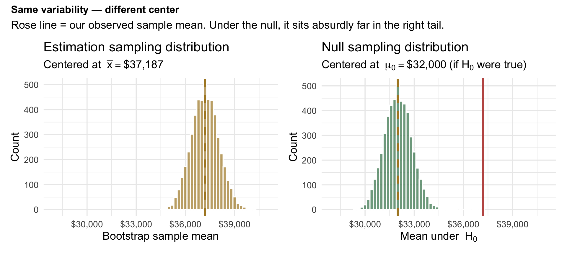
Look carefully at these two panels. They are identical in shape and spread — only the center has moved. That confirms what we said: the standard error doesn’t change when we shift to the null world, because it’s determined by sample size and data variability, not by the hypothesis being tested.
Now look at the right panel specifically. The null distribution is centered at $32,000, representing a world where the mean of college-level medians exactly equaled the no-college benchmark of $32,000. The rose vertical line shows our actual observed sample mean, $37,187. The null distribution stretches from about $29,453 on the low end to about $35,004 on the high end — and the rose line sits beyond every single one of the 5,000 null-world resamples. In 5,000 simulated null-world resamples, we did not observe a sample mean as high as $37,187. The true tail probability is not zero — it is simply smaller than 5,000 resamples can resolve.
That visual intuition is exactly the p-value. We just need to quantify it.
The p-value: conditional probability in action
In M06, you learned about conditional probability — the probability of one event given that another is known to be true, written \(P(A \mid B)\). The p-value is precisely this concept, applied to our inference problem:
\[p = P(\text{observing a sample mean this far from } \mu_0, \text{ or farther} \mid H_0 \text{ is true})\]
In plain English: if the null hypothesis were correct, how often would random sampling produce a result at least as extreme as the one we actually observed?
Notice carefully what the p-value is conditional on. It assumes \(H_0\) is true and then asks about the data. It is a statement about the data, computed in the null world. It is not a statement about \(H_0\). We will return to why this distinction is so important — and so routinely ignored — in a later section. For now, just keep it in mind: the p-value asks given the null, how surprising is what we saw?, not given what we saw, how likely is the null?
The phrase “at least as extreme as” is doing real work here. We’re not just asking “what’s the probability of getting exactly our sample mean?” That probability is essentially zero for any continuous variable — any specific value is vanishingly unlikely. Instead, we’re asking about the probability of being as far from \(\mu_0\) as we are, or farther. Because our test is two-tailed (\(H_a: \mu \neq \mu_0\)), we count extremity in both directions: a mean far below \(\mu_0\) is just as surprising as a mean far above \(\mu_0\).
We already have the null distribution from the bootstrap. Computing the p-value is just a matter of counting: how many of the \(B = 5{,}000\) null-world sample means are at least as far from \(\mu_0\) as our observed sample mean is? A small but principled refinement: even when zero resamples land beyond our observed mean, the true tail probability is not literally zero — we just haven’t run enough simulations to see one. The standard small-sample correction adds 1 to the numerator and the denominator:
\[p_{\text{boot}} = \frac{(\text{number of resamples at least as extreme}) + 1}{B + 1}\]
This both prevents reporting an impossible \(p = 0\) and acknowledges honestly that our simulation has only \(B\) resamples worth of resolution. The correction is a conservative finite-simulation adjustment — by treating the observed statistic as if it were one valid draw under \(H_0\), the formula \((X+1)/(B+1)\) keeps the reported p-value strictly positive and slightly more conservative than the naive \(X/B\). (The same formula has a formal “unbiased estimator” justification in random permutation settings — see Phipson & Smyth (2010); for a shifted bootstrap like ours, treat it as a principled finite-simulation correction rather than an exact theoretical guarantee.) We apply the correction even when the count is positive, not just when it’s zero — using one consistent formula avoids ad-hoc switching.
B <- nrow(null_dist)
obs_diff <- abs(sample_mean - mu0)

p_bootstrap <- null_dist |>
  summarize(
    n_extreme = sum(abs(mean_null - mu0) >= obs_diff),
    p = (n_extreme + 1) / (B + 1)
  )

p_bootstrap
So 0 of the 5,000 resamples were at least as far from \(\mu_0\) as our observed mean, giving a bootstrap p-value small enough that we report it the way APA style asks: \(p\) < .001.
Read that carefully. Out of 5,000 simulated null-world samples, none produced a sample mean as far from $32,000 as our observed mean of $37,187. The \((B+1)\) correction keeps us honest about reporting a non-zero p-value, but the visual claim is unambiguous: in a world where the no-college benchmark equaled the population mean, we would very rarely see a sample mean this far from \(\mu_0\). The data are highly inconsistent with \(H_0\).
Now let’s turn that count into a picture, because the count and the picture are the same operation.
Notice what the counting chunk actually did. sum(abs(mean_null - mu0) >= obs_diff) asked one yes-or-no question of every resample — is this one at least as far from \(\mu_0\) as our observed mean? — and then added up the yeses. We can ask that identical question again, but instead of summing the answers, keep each answer attached to its own resample as a TRUE/FALSE label:
null_dist_labeled <- null_dist |>
  mutate(extreme = abs(mean_null - mu0) >= obs_diff)
Same comparison, different verb: sum() collapsed 5,000 answers into one number, while mutate() keeps all 5,000 so we can draw them. Now we plot a histogram of every null-world resample mean and color each bar by that label — spruce for the resamples the null world produces routinely, rose for any that reach out as far as our observed mean.
And here is the thing to watch for. We already know the count came back 0, so we know in advance that the rose group is empty. The picture will be entirely spruce. That absence is not a failed figure — it is the p-value, drawn:
Show the code that built this figure
null_dist_labeled |> ggplot(aes(x = mean_null, fill = extreme)) +
  geom_histogram(binwidth = 200, color = "white", alpha = 0.7) +
  geom_vline(xintercept = mu0, color = "#AD872B",
             linewidth = 1.2) +
  scale_fill_manual(values = c("FALSE" = "#3A8055", "TRUE" = "#C05852"),
                    guide = "none") +
  scale_x_continuous(labels = label_dollar()) +
  labs(
    title = "Null sampling distribution",
    subtitle = "Rose would mark resamples as extreme as our observed mean — there are none.",
    x = bquote("Mean under " ~ H[0]),
    y = "Count"
  )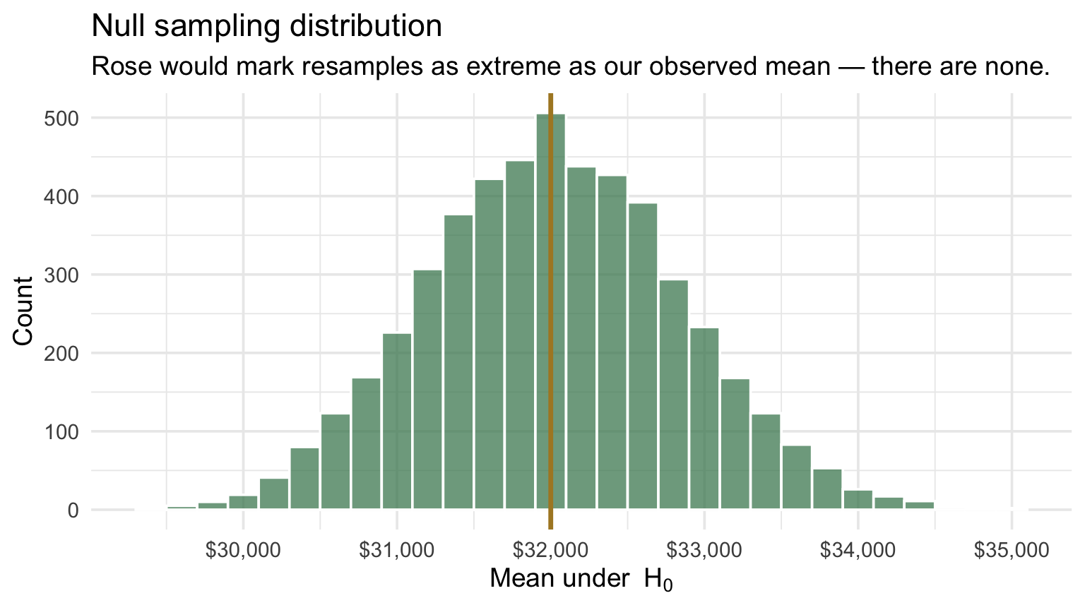
Not one bar is rose. Every one of the 5,000 null-world resamples lands close to $32,000 — within roughly $3,004 on either side. Our observed mean of $37,187 is well beyond anything the null world would produce.
Back to the courtroom analogy: the p-value tells you how surprising the evidence would be if the defendant were innocent. A vanishingly small p-value is like forensic evidence that would essentially never appear at an innocent person’s trial. It doesn’t prove guilt — but it makes the innocence hypothesis very hard to maintain.
Like every analogy, this one has limits: a trial is about a real defendant’s guilt, while NHST is about how data behave under a simplified statistical model — the parallel is for the burden of proof, not for interpreting probability.
The p-value is NOT the probability that \(H_0\) is true
This is the most common and most consequential misinterpretation in all of statistics. Before we go any further, let’s be completely explicit about what the p-value is and is not:
The p-value IS: \[p = P(\text{data this extreme or more extreme} \mid H_0 \text{ true})\]
This is the probability of the data, given the hypothesis.
The p-value IS NOT: \[P(H_0 \text{ true} \mid \text{data})\]
This would be the probability of the hypothesis, given the data — which is, almost without exception, what people actually want to know.
These two quantities are related by Bayes’ theorem, but they are not the same thing and they can differ dramatically. Computing \(P(H_0 \mid \text{data})\) requires background belief about how likely the hypothesis was before you saw the data — information the p-value contains nothing about. (For an exact point null like ours, it takes a little more than a single prior number: an ordinary continuous prior on \(\mu\) assigns the event \(\mu = \mu_0\) probability zero, so a Bayesian answer needs prior odds on two competing models — one where the null holds and one where it doesn’t — which is what a Bayes factor supplies.)
The p-value assumes \(H_0\) is true and then asks how surprising the data are. It says nothing about whether \(H_0\) actually is true. This is not a flaw you can patch with a better formula; it is a fundamental feature of frequentist probability. The Bayesian credible interval from M07’s optional box directly answers the question “what’s the probability the parameter is in this range?” precisely because it incorporates prior information. The p-value, by design, does not.
30-second self-check on the p-value
- The p-value is the probability of the data given the null — not the probability that the null is true.
- A \(p\) of \(.04\) does not mean “there is a 4% chance \(H_0\) is true.” It means “if \(H_0\) were true, data this extreme or more would arise 4% of the time.”
- To compute \(P(H_0 \mid \text{data})\), you would also need a prior probability for \(H_0\) — information the p-value contains nothing about.
- A small p-value is evidence against \(H_0\). It is not, by itself, a measure of effect size, importance, or replicability.
Another way to read the gap: distance in standard-error units
We just used the count-extremes framing to compute the bootstrap p-value. There’s a complementary way to express the same observation that’s worth meeting now, because it sets up the test-statistic language used across every parametric test (including the parametric one-sample t-test we’ll study in the next section, and all of the tests coming up in Module 9).
The bootstrap distribution we built has a spread — its standard deviation is the bootstrap standard error, \(SE_b\). For our worked example, \(SE_b \approx\) $827 (the SD of the 5,000 bootstrap-mean values). That’s a natural ruler for asking how far the observed gap is from \(\mu_0\):
\[\frac{\bar{x} - \mu_0}{SE_b} \;=\; \frac{\$37{,}187 - \$32{,}000}{\$827} \;\approx\; 6.3\]
Our sample mean sits about 6.3 standard errors above \(\mu_0\). That single number captures the same evidence as our bootstrap p-value, just expressed differently: a gap that big is so far out in the tail of the null distribution that almost no resamples can reach it — which is exactly why \(p < .001\) in the count we just did. The two routes — count the extremes and measure the gap in standard-error units — answer the same question and give the same answer.
That number you just computed has a name, and it is worth learning now, because a version of it appears in every test you will meet for the rest of the course. A test statistic is a single number that combines three things — what we observed, what the null predicts, and how much our estimate typically wobbles — and reports the result in a standard unit. For many tests, including every t and z you will meet, the recipe is literally:
\[\text{test statistic} \;=\; \frac{(\text{what we observed}) - (\text{what } H_0 \text{ predicts})}{\text{how much this estimate typically wobbles}}\]
Our 6.3 is a test statistic, and every t you have ever seen in a results section takes exactly this form. Others encode the same broad idea — discrepancy relative to expected variability — with different arithmetic: an F compares the variability a model explains to the variability left over, and a \(\chi^2\) adds up squared standardized discrepancies across categories (both arrive in M09). The letter changes from test to test, and so does the formula — but the job never does: squeeze the estimate, the null value, and the uncertainty into one number whose size tells you how surprising the data would be if \(H_0\) were true. A test statistic near 0 says the data landed about where the null expected. A large one says they did not — and the p-value is simply how we put a probability on “large.”
We can compute the standardized score directly from the bootstrap distribution we already built — no new machinery needed. The bootstrap SE is just the SD of the 5,000 resample means; standardizing each null-world resample mean is one division:
SE_b <- resamples |> pull(mean_resample) |> sd()

null_dist <- null_dist |>
  mutate(t_null = (mean_null - mu0) / SE_b)

t_obs <- (sample_mean - mu0) / SE_b

c(SE_b = round(SE_b, 2), t_obs = round(t_obs, 2))
SE_b t_obs
826.53 6.28 The same count-extremes p-value can now be computed in standardized units: how often does \(|t_\text{null}|\) reach our observed \(|t_\text{obs}|\)?
It is the same counting exercise, with the same \((B+1)\) correction — only the units on the ruler have changed. Note that we reuse the same \(B = 5{,}000\) resamples defined earlier:
p_bootstrap_t <- null_dist |>
  summarize(
    n_extreme_t = sum(abs(t_null) >= abs(t_obs)),
    p_t = (n_extreme_t + 1) / (B + 1)
  )

p_bootstrap_t
Read the two columns exactly the way you read the dollar-units table. 0 of the 5,000 standardized null-world scores reached our observed \(|t_\text{obs}|\), and the \((B+1)\)-corrected p-value is therefore \(p\) < .001 — the identical answer we got in dollars, because it is the identical count. We’ve just rescaled the ruler.
Notice that you have done this arithmetic before. Back in M01, a z-score answered a single question: how many standard deviations from the mean is this observation? What we just computed is that same move with one substitution. We divided not by the SD of individual colleges but by the standard error of the sample mean, so \(t_\text{obs}\) answers how many standard errors from \(\mu_0\) is our sample mean? Value minus center, divided by spread — the only thing that changed is which spread sits in the denominator.
That substitution also hands you the empirical rule as a ready-made yardstick. For a roughly normal distribution, about 68% of standardized scores fall between \(-1\) and \(+1\), about 95% between \(-2\) and \(+2\), and about 99.7% between \(-3\) and \(+3\). A standardized score of 2 is already unusual; 3 is rare. Ours is 6.3 — roughly twice the distance at which values essentially stop occurring, which is exactly why not one of the 5,000 null-world resamples came anywhere near it.
And now the payoff, the reason this rescaling was worth doing at all. In dollars, this null distribution belongs to this study alone: centered at $32,000 with a spread of $827, numbers that came from our benchmark and our sample. Standardized, its center is 0 and its spread is 1 — and those two features hold for any study that follows this logic, whatever its units or sample size. That is what makes a result portable: a standardized score of 6.3 has the same interpretation — a distance measured in standard-error units — whether the outcome is dollars, milliseconds, or test points.
Be precise, though, about what standardizing does and does not buy. Rescaling fixes the center and the spread. It does not change the shape. A skewed null distribution, standardized, is still skewed. So the histogram above has not quietly turned into a known mathematical curve — it is still our resampled distribution, just measured with a different ruler.
A naming caution. We call this quantity \(t_\text{obs}\) because it has the classic t shape — an estimate, minus a null value, divided by a standard error — and that generic usage is standard (the t value column in any regression output is the same construction). But it is not literally Student’s t-test. Student’s t-test divides by \(s/\sqrt{n}\); we divided by a bootstrap SE. And a true studentized bootstrap (the “bootstrap-t”) would go further still, recomputing a fresh standard error inside every resample rather than reusing one fixed \(SE_b\) for all of them. Ours is the simpler construction: one SE, applied to every resample, which is why the standardized picture is just the dollar picture on a rescaled axis. Keep the name; keep the distinction.
The visual is what makes the framing land. Here’s the standardized null distribution — the same 5,000 null-world resample means we built above, expressed in \(SE_b\) units rather than dollars. The rose vertical line marks our observed \(t_\text{obs} \approx\) 6.3:
Show the code that built this figure
null_dist |>
  ggplot(aes(x = t_null)) +
  geom_histogram(binwidth = 0.2,
                 fill = "#9CBFAA", color = "white", alpha = 0.85) +
  geom_vline(xintercept = t_obs,
             color = "#C05852", linewidth = 1.2) +
  annotate("label", x = t_obs, y = Inf,
           label = sprintf("t_obs ≈ %.2f", t_obs),
           color = "#C05852", fontface = "bold",
           fill = "white", vjust = 1.4, hjust = 1.1, size = 4.4) +
  annotate("label", x = 0, y = Inf,
           label = "Null world\n(centered at 0, SD ≈ 1)",
           color = "#3A4458", fontface = "bold",
           fill = "white", vjust = 1.4, hjust = 0.5, size = 3.8,
           lineheight = 0.95) +
  scale_x_continuous(breaks = scales::breaks_width(1)) +
  coord_cartesian(xlim = c(-4, max(7, t_obs + 0.5))) +
  labs(
    title = "How unusual is t_obs in the standardized null distribution?",
    subtitle = "Spruce histogram = 5,000 null-world resamples in SE_b units. \nRose line = our observed standardized score.",
    x = "Standardized null-world mean (in SE_b units)",
    y = "Number of resamples"
  )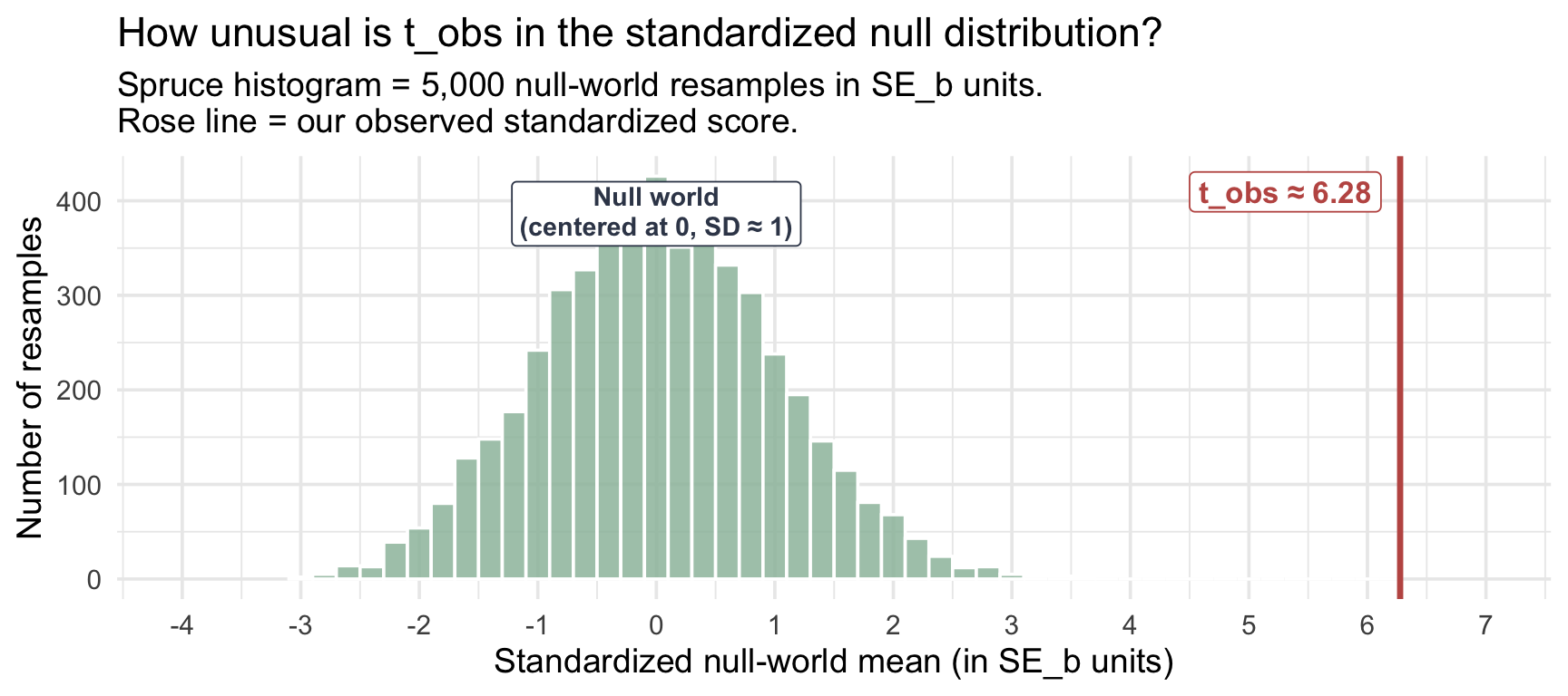
The standardized null has SD exactly equal to 1 by construction (dividing by \(SE_b\) does that algebraically) and is approximately centered at 0 (the bootstrap distribution’s mean is approximately, but not exactly, \(\bar{x}\) in any finite simulation, so the standardized version’s mean is close to but not exactly 0). Our observed \(t_\text{obs} \approx\) 6.3 is off the chart in the practical sense: not a single one of the 5,000 null-world resamples lands anywhere near it, which is why our \((B+1)\)-corrected bootstrap p-value comes back as \(1/5001 \approx 0.0002\) (we report this as \(p < .001\)).
The bootstrap test is now complete, and a finished test deserves a finished sentence. Here is how this result reads written up in APA style:
APA-style reporting · Bootstrap One-Sample Test
Across a sample of 250 U.S. colleges from the Chetty et al. (2017) mobility data, the mean of within-college median earnings at age 34 (M = $37,187, SD = $13,021, bootstrap percentile 95% CI [$35,615, $38,848]) was significantly above the external no-college reference benchmark (\(\mu_0 = \$32{,}000\); median earnings of full-time, year-round HS-only workers ages 25–34, NCES Digest Table 502.30), bootstrap p < .001 (B = 5,000, (B+1)-corrected).
Note the structure: descriptives → the interval → the benchmark being tested → the p-value, with the resampling details (B and the correction) standing where a parametric write-up will put a test statistic and its degrees of freedom. One element is still missing — an effect size, telling the reader how large the gap is. We haven’t built that tool yet; it arrives in the parametric section below, and from then on it is a fixed part of every write-up.
The next section swaps this simulated histogram for a smooth, model-based curve — the t-distribution — and reads tail probabilities off it directly instead of counting resamples. Notice carefully what carries over and what doesn’t. The standardized-score idea carries over exactly, and so does the question how far out is the observation? The curve itself does not: it isn’t derived from our data at all, but from a statistical model — exact when the population is normal, and a strong approximation here because \(n = 250\) is large. That is the real trade between the two routes. The bootstrap builds a reference distribution out of your data; the parametric route borrows one from a model, and pays for the convenience with assumptions.
The parametric one-sample t-test
We have everything we need to recognize the same hypothesis test in a second form. The bootstrap built a null world by resampling and counting; the parametric route builds the null world from a formula and a smooth reference distribution. The logic is identical — same \(H_0\), same data, same observed gap, same decision. What changes is only how we get the standard error and how we look up tail probabilities.
This is the version you will most often see in published papers, generated by infer’s t_test() function in two lines of code.
Why a t-distribution and not a normal?
When the population standard deviation \(\sigma\) is known, the standardized sample mean follows a normal distribution — exactly under a normal-population model, and approximately for large samples by the CLT. But \(\sigma\) is almost never known in practice; we estimate it with the sample SD, \(s\). That estimation introduces an extra layer of noise. When we estimate \(\sigma\) with \(s\), the classic normal model — independent observations from a normal population — makes the standardized statistic follow a t-distribution exactly. With large samples from nonnormal populations (like our right-skewed k_median), the t-test is a very good approximation, justified by the CLT: the sampling distribution of the mean is approximately normal.
The t-distribution looks a lot like the normal but has slightly heavier tails. The heaviness depends on the degrees of freedom, \(df = n - 1\) for a one-sample t-test. With small \(n\), the tails are noticeably heavier (more uncertainty in \(s\), more probability in the extremes). As \(n\) grows the t-distribution converges to the normal — the noise in \(s\) becomes negligible, and the standardized mean is essentially \(z\). The three panels below make that convergence visible, each t-curve drawn against the standard normal for reference (the dashed line): at \(df = 3\) the heavier tails are obvious, by \(df = 30\) the two are nearly indistinguishable, and at our \(df = 249\) the difference is invisible.
Show the code that built this figure
x_grid <- seq(-4, 4, length.out = 400)

df_panels <- tibble(df = c(3, 10, 30)) |>
  mutate(curve = purrr::map(df, ~ tibble(x = x_grid, y = dt(x_grid, df = .x)))) |>
  unnest(curve) |>
  mutate(label = factor(sprintf("t, df = %d", df),
                        levels = c("t, df = 3", "t, df = 10", "t, df = 30")))

z_curve <- tibble(x = x_grid, y = dnorm(x_grid))

ggplot(df_panels, aes(x = x, y = y)) +
  geom_line(color = "#4E5EAA", linewidth = 1.1) +
  geom_line(data = z_curve, color = "#0C1620",
            linewidth = 0.7, linetype = "dashed") +
  facet_wrap(~ label, nrow = 1) +
  scale_x_continuous(breaks = c(-3, 0, 3)) +
  labs(title = "How df changes the t-distribution's tail heaviness",
       subtitle = "Indigo solid = t-distribution at the labeled df    ·    Black dashed = standard normal (z)",
       x = "Standardized score",
       y = "Density")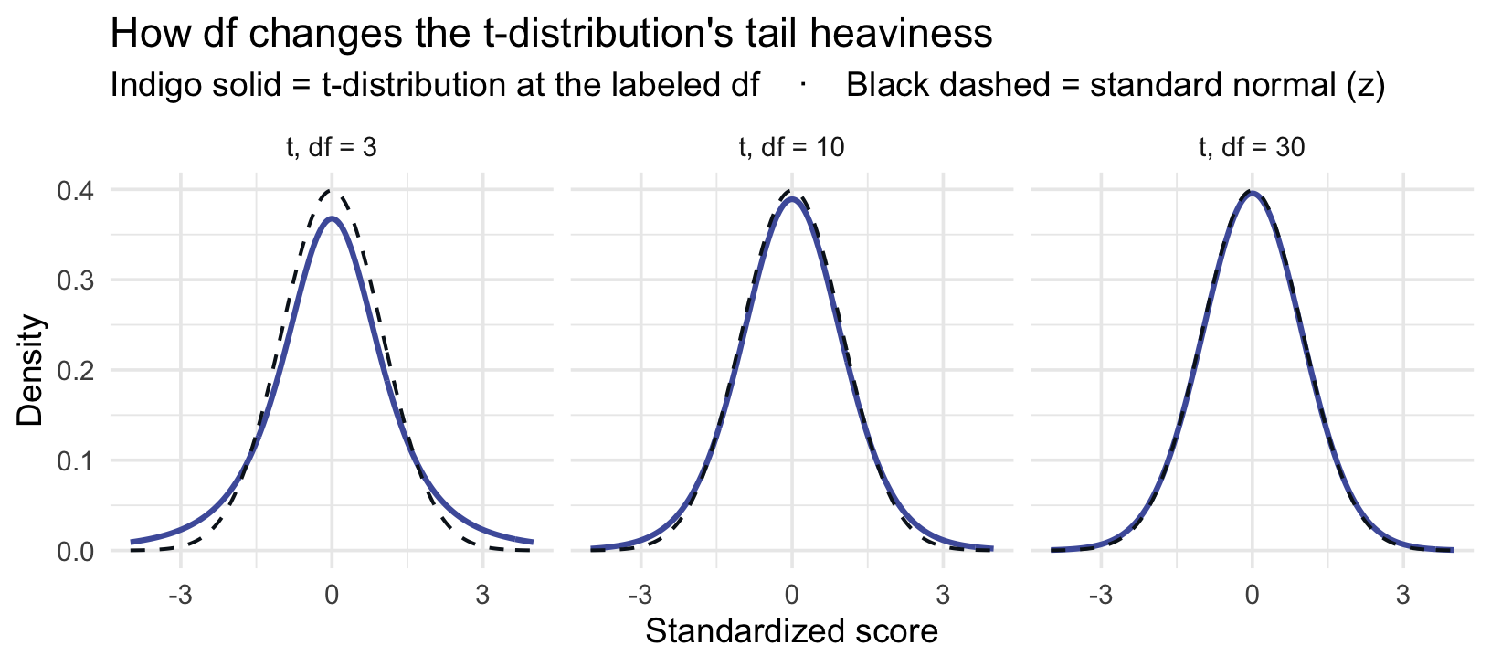
For our \(n = 250\) sample, \(df = 249\) — well into the regime where t and z are visually indistinguishable. We still use the t-distribution because it is exact under the classic normal-population model, and a very good large-sample approximation here, where \(n = 250\) and the sampling distribution of the mean is well behaved.
The four ingredients of every parametric NHST
Every parametric hypothesis test combines four pieces:
- A point estimate — what your data say about the parameter (\(\bar{x}\) here)
- A null value — what the null hypothesis says the parameter equals (\(\mu_0\) here)
- A standard error — the typical wobble of the point estimate, from a closed-form formula
- A reference distribution — the standardized sampling distribution under \(H_0\); for our one-sample test, the t-distribution with \(df = n - 1\)
One caution about that fourth ingredient. The four pieces are the same in every parametric test, but the degrees of freedom are not. Each test has its own \(df\), and it follows from that test’s design rather than from any universal rule. Here \(df = n - 1\) because we estimated a single mean from a single sample. A two-sample t must account for two group means (and Welch’s version returns a non-integer \(df\)); a one-way ANOVA carries two \(df\) values, one for the numerator and one for the denominator; a chi-square test takes its \(df\) from the number of rows and columns in the table. M09 works through each of these in turn. The habit worth building now: whenever you run a parametric test, know where its \(df\) came from — it is part of the test’s logic, not a detail R quietly fills in for you.
These four combine into a test statistic (\(t_\text{obs}\)) and a p-value. The arithmetic of the test statistic is exactly what we did with the bootstrap SE — we just compute the SE differently, and we look up the p-value in the smooth t-distribution instead of counting null-world resamples.
Step 1 — The standard error from a formula
In the bootstrap, the SE was the SD of the resample-mean distribution. In the parametric approach we compute it directly from the sample, no resampling required:
\[SE \;=\; \frac{s}{\sqrt{n}}\]
SE_param <- sample_sd / sqrt(sample_n)
SE_param
[1] 823.5328For our sample: \(s\) = $13,021, \(n = 250\), so \(SE\) = $824. Compare to the bootstrap SE we computed earlier (\(SE_b \approx\) $827): the two are within a few dollars of each other — exactly the agreement the bootstrap-vs-parametric comparison promised in M07.
Step 2 — Compute \(t_\text{obs}\)
With the standard error in hand, we now have both ingredients the test statistic needs: the gap between \(\bar{x}\) and \(\mu_0\), and a measure of how much a sample mean typically wobbles. Putting them together takes a single division — but it is worth pausing for a moment on what that division is doing for us, because it is the step that turns a description into a test.
Start with the gap on its own. The distance between our sample mean and \(\mu_0\) is $5,187 — a number that, by itself, settles nothing. A gap that size would be overwhelming if samples typically wobbled by a few hundred dollars, and thoroughly unremarkable if they wobbled by several thousand. Dividing by the standard error asks the only question that can settle it: how large is this gap compared with the noise we would expect anyway?
That division also changes what kind of number we are holding. Dollars go in, and what comes out is unitless — a count of standard errors. That is what makes the next step possible: a reference distribution knows nothing about colleges or earnings, but it knows a great deal about how far a standardized score should stray from zero.
Same arithmetic as the standardization section, with the parametric SE in the denominator:
\[t_\text{obs} \;=\; \frac{\bar{x} - \mu_0}{SE} \;=\; \frac{\$37{,}187 - \$32{,}000}{\$824} \;\approx\; 6.30\]
t_obs_param <- (sample_mean - mu0) / SE_param
t_obs_param
[1] 6.298717The sample mean sits about 6.3 standard errors above \(\mu_0\) — the same observation we made before, computed with a slightly different ruler.
Step 3 — The critical value \(t^*\) and the rejection region
Instead of counting extreme resamples to judge how unusual our test statistic would be if \(H_0\) were true, the parametric approach reads the answer straight off a curve. The t-distribution now is our null world — a smooth stand-in for the 5,000-bar histogram we built by hand. And because it is an ordinary continuous distribution, everything you learned about PDFs and CDFs in M06 carries over without modification.
It’s worth walking that connection one step at a time.
1. The shape of the curve says what the null usually produces. The t-distribution’s PDF is tall in the middle and thin in the tails. Under \(H_0\), test statistics near 0 are the ordinary outcome — that is simply what a typical sample looks like when the null is true. Values far from 0 do occur, but rarely.
2. Area under the curve is probability. This is the M06 rule that makes the picture usable: the area beyond a point on the curve is exactly the probability that the null world hands you a test statistic at least that extreme.
3. A rejection region is an area set aside in advance. We chose \(\alpha = .05\) before seeing the data. Read that as an instruction about area: set aside the most extreme 5% of the area under the null curve, and agree ahead of time that a result landing in it is too much to write off as luck. Because our test is two-sided, we split that area evenly — 2.5% in each tail.
4. The critical value is the edge of that area — and a two-sided test has two edges. Step 3 set aside 2.5% in each tail, so each tail needs its own boundary:
- the upper boundary is the score with 2.5% of the area above it — equivalently, 97.5% below it;
- the lower boundary is its mirror image — the score with 2.5% of the area below it, and 97.5% above.
So why does everyone quote only one number? Because the t-distribution is symmetric about zero. The two boundaries sit the same distance from the center in opposite directions, so naming one of them names both: whatever the upper boundary is, the lower one is its negative. We therefore compute the positive one, call it the critical value \(t^*\), and write the pair as \(\pm t^*\). The rejection region is everything at or beyond either edge — which is exactly what the shorthand \(|t| \geq t^*\) is saying: the distance from zero, in whichever direction, reaches the boundary.
That fourth step is the one real difference from the bootstrap. There, we asked how many resamples were at least as extreme as ours and turned the count into a proportion. Here we fix the boundary first and simply check which side of it we land on — the same judgment, reached from the opposite end.
Notice, too, which direction step 4 travels. We did not start with a score and ask for a probability; we started with a probability — 97.5% — and asked for the score. That is the quantile function, the CDF run backwards, and in R it is qt(). For \(\alpha = .05\), two-sided, with \(df = n - 1 = 249\):
\[t^* \;=\; \texttt{qt(0.975, df = 249)} \;\approx\; 1.97\]
t_star_param <- qt(0.975, df = sample_n - 1)
t_star_param
[1] 1.969537Why 0.975 and not 0.025? This trips up nearly everyone the first time, and the answer is that either would do — the two calls name the same pair of boundaries from opposite ends. Ask for both at once and the symmetry is impossible to miss:
qt(c(0.025, 0.975), df = sample_n - 1)[1] -1.969537 1.969537Two numbers, identical apart from the sign: qt(0.025, …) returns the lower edge, qt(0.975, …) the upper. Convention quotes the positive one because \(\pm t^*\) then covers both edges in one symbol, and because it lets the decision rule be written as the single comparison \(|t_\text{obs}| \geq t^*\) rather than as two separate checks.
One caution to carry into M09: that mirror-image shortcut works because the t-distribution is symmetric. Not every reference distribution is. The F and chi-square distributions you meet next are not symmetric and are not centered at zero — they live on the positive side only, which is why those tests use a single upper-tail cutoff and no \(\pm\) at all. The reasoning is identical; only the shape of the curve changes what the boundary looks like.
And if qt() still looks like new machinery, look again — you have already used its twin. In M06, pnorm() and qnorm() were exactly these two directions of travel: pnorm() takes a score and hands back a probability, while qnorm() takes a probability and hands back a score. You used this very call to find the middle 95% of a normal distribution — qnorm(c(0.025, 0.975), mean, sd) — the same \(0.025 / 0.975\) split we just made, and the same one behind M07’s confidence-interval endpoints.
qt() is that same quantile function, aimed at the t-distribution instead. R keeps the naming rigidly consistent: a p prefix always means the CDF (score → probability), a q prefix always means the quantile function (probability → score), and the suffix names the distribution — norm, t, chisq, f. So qt(0.975, df = 249) reads as: on a t-distribution with 249 degrees of freedom, what score has 97.5% of the area below it?
Both directions get used in a single test, which is worth noticing. We just travelled probability → score with qt() to place the rejection boundary. In a moment the p-value will travel score → probability with pt(), asking how much area lies beyond \(t_\text{obs}\). Same two tools you built in M06, same two directions — only the distribution underneath has changed.
The rejection region is every value with \(|t| \geq t^*\) — anything beyond \(\pm 1.97\) in standard-error units. Our \(t_\text{obs} \approx 6.30\) is far outside that boundary. We reject \(H_0\). The figure below draws that verdict: the shaded tails are the rejection region, and the vertical line marking \(t_\text{obs}\) sits far beyond the boundary, out where the null curve has essentially no height left — which is why \(p\) is vanishingly small.
Show the code that built this figure
x_max <- max(7, t_obs_param + 0.5)
t_grid <- tibble(x = seq(-4, x_max, length.out = 600),
                 y = dt(x, df = df_param))

t_grid |>
  ggplot(aes(x = x, y = y)) +
  # Color scheme deliberately matches the M08 pre-study V4 slide (and V3):
  # HEATHER = the rejection region and the +/- t* boundaries, ROSE = the observed
  # t_obs. That keeps rose meaning "our observed value" in every figure of this
  # Module and of the pre-study, and it keeps the Module from contradicting a
  # recorded video that students watch days after reading this. Do not swap these
  # (M09 uses the same scheme as of 2026-09-13: heather = rejection, rose = observed.)
  geom_area(fill = "#4E5EAA", alpha = 0.20) +
  geom_area(data = filter(t_grid, x <= -t_star_param),
            fill = "#945297", alpha = 0.40) +
  geom_area(data = filter(t_grid, x >=  t_star_param),
            fill = "#945297", alpha = 0.40) +
  geom_line(color = "#4E5EAA", linewidth = 0.9) +
  geom_vline(xintercept = c(-t_star_param, t_star_param),
             color = "#945297", linewidth = 0.9, linetype = "dashed") +
  geom_vline(xintercept = t_obs_param,
             color = "#C05852", linewidth = 1.2) +
  annotate("label", x = t_star_param, y = max(t_grid$y) * 0.9,
           label = sprintf("t* = ±%.2f", t_star_param),
           color = "#945297", fontface = "bold",
           fill = "white", hjust = -0.1, size = 4) +
  annotate("label", x = t_obs_param, y = max(t_grid$y) * 0.4,
           label = sprintf("t_obs ≈ %.2f", t_obs_param),
           color = "#C05852", fontface = "bold",
           fill = "white", hjust = 1.1, size = 4.2) +
  scale_x_continuous(breaks = c(-3, -t_star_param, 0, t_star_param, 3, 6),
                     labels = function(b) round(b, 2)) +
  labs(title = sprintf("t-distribution under H_0 (df = %d) — where does t_obs land?", df_param),
       subtitle = "Heather tails = rejection region beyond ±t*    ·    Rose line = observed t_obs",
       x = "Standardized score",
       y = "Density")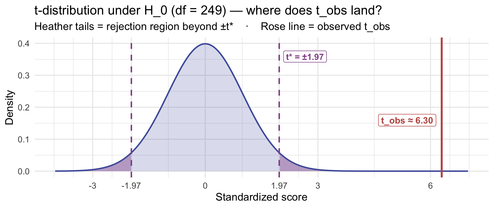
Step 4 — Run the test with t_test()
R’s t_test() from infer runs the parametric one-sample t-test in one call. Pass response to name the outcome column, mu to set \(\mu_0\), and alternative to specify the side (two-sided here):
t_result <- sample_data |>
  t_test(response = k_median, mu = 32000, alternative = "two-sided")

t_result
The columns:
- statistic: \(t_\text{obs} = 6.30\) — matches our hand calculation.
- t_df: \(249\) — that’s \(n - 1\).
- p_value:
1.35e-09— R’s compact notation for \(1.35 \times 10^{-9}\); vanishingly small, and reported in APA style as p < .001. - estimate: $37,187 — the sample mean.
- lower_ci / upper_ci: [$35,565, $38,809] — the parametric 95% CI on \(\mu\).
And here is the return trip promised back at the critical-value step. There, qt() travelled probability → score to place the rejection boundary. The p-value is the journey run the other way — score → probability — and pt() makes it in one visible line:
2 * pt(q = abs(t_obs_param), df = sample_n - 1, lower.tail = FALSE)[1] 1.349564e-09Read it inside-out. abs() takes the size of our statistic, its distance from 0 with the sign dropped. pt(q = abs(t_obs_param), df, lower.tail = FALSE) is the area in one tail beyond that distance, using the same lower.tail = FALSE switch you used with pnorm() in M06 to get the area to the right. The leading 2 doubles that area because our test is two-sided: extremity counts in both directions, which is the same move the bootstrap route made when it counted abs(mean_null - mu0) rather than one-sided departures. (You may also see this written 2 * pt(-abs(t_obs), df): the same area, read from the lower tail instead.) One check worth keeping: a p-value can never be above 1, so if you ever get one, you took the wrong tail. The result reproduces t_test()’s p_value column exactly — that column is nothing more than this line, run for you.
What the test assumes
Every statistical test is a model of how your data came to be, and a model is only as good as the conditions it rests on. Those conditions are the test’s assumptions. They are not fine print: a p-value is the probability of data this extreme if the null model is true — and “the null model” means \(\mu = \mu_0\) together with everything else the test takes for granted. Get an assumption badly wrong and the p-value still prints, unbothered and uncalibrated. Nothing in R will warn you.
So from here on, running a test is a two-part job: compute it, and say why you were entitled to. The one-sample t-test rests on three conditions.
1. Independence. Each observation carries its own information — knowing one tells you nothing about another. This is the one that comes from your design, not your data: students nested in classrooms, repeated measures on the same person, or siblings in the same household all violate it. It is also the assumption with the sharpest teeth, because more data cannot save you. A larger sample of dependent observations gives you a confidently wrong standard error, since the SE formula counts \(n\) independent pieces of information and you don’t have them. There is no plot that checks this; you check it by describing how the data were collected.
2. The sampling distribution of the mean is approximately Normal. Notice what this does not say. It does not require your individual observations to be Normal. That is the single most common misreading of this assumption, and it matters because real behavioral outcomes — reaction times, symptom counts, bounded rating scales — are routinely skewed. What has to be roughly Normal is the distribution of \(\bar{x}\) across hypothetical repeated samples, and M07’s Central Limit Theorem says that gets more Normal as \(n\) grows, whatever shape the individual values have. So the assumption is satisfied in either of two ways: the population is Normal (then it holds at any \(n\)), or \(n\) is large enough for the CLT to do the work. It bites when \(n\) is small and the data are severely skewed or heavy-tailed — that combination, not skew alone.
3. The sample represents the population you mean to describe. The test compares \(\bar{x}\) to \(\mu_0\) and reports about \(\mu\) — but which \(\mu\)? Whatever population your sampling procedure actually drew from. A convenience sample of undergraduates supports a claim about undergraduates, not about adults. No amount of statistical machinery repairs a mismatch here, because it is a question about recruitment, not about arithmetic.
Our college-earnings test meets all three comfortably: 250 colleges drawn at random from the national file (independence, representativeness), and \(n\) far past the point where the CLT handles the earnings distribution’s right skew.
Checking assumptions without fooling yourself
- Plot the data first, always. A histogram costs one line and reveals the things a mean and SD conceal: a second cluster, a ceiling or floor, an outlier steering the mean.
- But do not run a “Normality test” on your outcome and let it decide for you. Tests like Shapiro–Wilk answer the wrong question (is the population exactly Normal?), and they answer it perversely: at small \(n\) they miss real problems, and at large \(n\) they flag trivial departures — exactly backwards from when the CLT needs you to worry.
- Judge the assumption, not the histogram. Ask “is \(\bar{x}\) well behaved at this \(n\), given this much skew?” — not “does this look like a bell curve?”
- State assumptions in writing. A Method section that names the design feature supporting independence is doing real scientific work, not box-ticking.
When you genuinely can’t defend condition 2 — small \(n\), wild skew — you have options: the bootstrap route from earlier in this Module, which builds its reference distribution from your data instead of borrowing a curve, or a rank-based alternative. Notice, though, that the bootstrap drops only this assumption. It still needs independence and representativeness, which is a general pattern: the alternatives to a parametric test relax the distributional condition, never the design ones.
M09 extends this same habit to every test it introduces: each one arrives with its own assumption list, independence appears on every single one, and the scope question — whom does this sample represent? — governs every conclusion.
Bootstrap and parametric agree
Two routes, one decision. Side-by-side:
| Bootstrap (earlier in this Module) | Parametric (this section) | |
|---|---|---|
| Standard error | \(SE_b \approx\) $827 (SD of resamples) | \(SE = s/\sqrt{n} \approx\) $824 |
| \(t_\text{obs}\) | \(\approx 6.28\) | \(\approx 6.30\) |
| Reference distribution | 5,000 resampled null-world means | t-distribution, \(df = 249\) |
| p-value | \(\approx 1/5001\) (the floor set by simulation resolution) | \(1.35 \times 10^{-9}\) |
| 95% CI on \(\mu\) | [$35,615, $38,848] (percentile) | [$35,565, $38,809] |
| Decision at \(\alpha = .05\) | Reject \(H_0\) | Reject \(H_0\) |
The bootstrap CI and parametric CI agree to within about $50 at either endpoint in this case. The parametric p-value is more precise because it isn’t bounded by simulation count, but the substantive conclusion is identical. When the CLT applies and the bootstrap distribution is roughly symmetric, the bootstrap and parametric routes often agree closely. In this example, they lead to the same substantive conclusion.
Effect size: Cohen’s d (one-sample form)
From here on, every result needs two answers
A hypothesis test answers exactly one question: are these data sufficiently incompatible with the null model, at our chosen threshold? — that’s the p-value (equivalently, whether the CI excludes the null). In practice that verdict is bound up with sample size — the same true effect passes easily at large \(n\) and hides at small \(n\) — but the test says nothing about the second question every reader also needs: how large is the effect? That’s what an effect size and its confidence interval report. From this point in the course on, a complete result always carries both — the test for whether an effect was detected, the effect size for how large it is. M09 makes reporting both a fixed step in every test.
The t-statistic and p-value tell you the gap is hard to square with the null model; they don’t tell you how large the gap is in interpretable units. Cohen’s d gives that:
\[d \;=\; \frac{\bar{x} - \mu_0}{s} \;=\; \frac{\$37{,}187 - \$32{,}000}{\$13{,}021} \;\approx\; 0.40\]
Put that beside the test statistic and notice how little separates them:
\[t_\text{obs} \;=\; \frac{\bar{x} - \mu_0}{\underbrace{s/\sqrt{n}}_{SE\;=\;\text{SD of the } mean}} \qquad\qquad d \;=\; \frac{\bar{x} - \mu_0}{\underbrace{s}_{\text{SD of the } data}}\]
The numerators are identical — the same $5,187 gap between our sample mean and the benchmark. The only difference is what sits underneath, and that single choice is what makes the two answer different questions.
- Dividing by \(SE\) measures detectability. The standard error is \(s/\sqrt{n}\), so it shrinks as the sample grows. Gather more colleges and \(t_\text{obs}\) gets larger for the very same gap — exactly what you want from a detection statistic: more evidence should make a real effect easier to spot.
- Dividing by \(s\) measures magnitude. Unlike the standard error, \(s\) doesn’t systematically shrink as \(1/\sqrt{n}\) — it estimates the population SD, so in a larger sample it changes only by sampling noise. Double the sample and \(d\) has no reason to grow, the way \(t_\text{obs}\) mechanically does. It expresses the gap in units of how spread out colleges actually are. That makes \(d\) far less sensitive to study design than \(t_\text{obs}\) — though not independent of context, since the SD it divides by belongs to the particular population you sampled.
The two are tied together by a tidy identity:
\[t_\text{obs} \;=\; d \times \sqrt{n}\]
Check it against our numbers: \(d \approx 0.40\) and \(\sqrt{250} \approx 15.8\), whose product is about 6.3 — our \(t_\text{obs}\). That one line is the whole story: the test statistic is the effect size amplified by sample size. A large \(t_\text{obs}\) can mean a large effect, a large sample, or both — and only \(d\) tells you which. It is also why the p-value can never answer “is this big?”, and why the two numbers have to travel together.
By Cohen’s conventions: \(d \approx 0.2\) is small, \(0.5\) medium, \(0.8\) large. Our \(d \approx 0.40\) is small-to-medium. Treat those benchmarks as rough conventions, not universal rules — whether an effect is meaningful depends on the outcome, the context, and the decision being made.
effectsize::cohens_d() returns the point estimate together with a 95% CI:
sample_data |> pull(k_median) |> effectsize::cohens_d(mu = 32000)The CI on d is [0.27, 0.53] — comfortably above zero, comfortably below the large-effect threshold. Always report the CI on d alongside the point estimate. The point estimate alone hides how precisely d itself was measured.
Worth being explicit in a Module that keeps two routes distinct: this CI comes from the parametric route — effectsize computes it from t-distribution theory, not from resampling. The point estimate itself belongs to neither route; it’s plain arithmetic on the sample. And if you ever wanted a resampling version, d can be bootstrapped exactly the way M07 bootstrapped the mean — recompute it in every resample, then take percentiles — we just won’t need that here.
APA-style reporting · Parametric One-Sample t-Test
The mean of within-college median earnings (M = $37,187, SD = $13,021, n = 250) was significantly higher than the no-college benchmark of $32,000, t(249) = 6.30, p < .001, 95% CI [$35,565, $38,809], Cohen’s d = 0.40, 95% CI [0.27, 0.53].
Note the structure: descriptives → test statistic with df → p-value → CI on the parameter → effect size with its own CI. This is the same result the bootstrap box reported at the end of the bootstrap section — same data, same conclusion — now with t and df in place of B and the correction, and with the effect size on board.
One notation note, because it trips people up. APA style drops the subscript: the t in t(249) = 6.30 is our \(t_\text{obs}\), reported with its degrees of freedom. R drops it too — t_test() labels the same number statistic. So in a write-up or in R’s output, t means \(t_\text{obs}\); the cutoff \(t^*\) is never reported, because the p-value already carries the decision.
The decision rule: alpha and statistical significance
The p-value is a continuous quantity — a probability ranging from 0 to 1. But at the end of an analysis, someone usually has to act on it: approve the treatment or don’t, fund the program or don’t, publish the claim or don’t. Acting means converting a continuous measure of surprise into a binary decision — and that requires a threshold.
This threshold is called alpha (\(\alpha\)) — the cutoff a p-value must fall below for us to reject the null. It’s also called the significance level. The rule is simple:
- If \(p < \alpha\): reject \(H_0\). Our data are too surprising to be consistent with the null at this threshold.
- If \(p \geq \alpha\): fail to reject \(H_0\). Our data are not surprising enough to rule out the null at this threshold.
The conventional threshold in psychology, medicine, and most social sciences is \(\alpha = .05\). This means that when the null is actually true, we’re willing to make a false rejection — concluding there’s an effect when there actually isn’t one — 5% of the time in the long run. (That conditional matters: \(\alpha\) says nothing about what fraction of all significant results are false. We’ll examine this more carefully when we discuss Type I and Type II errors.)
For our example: the bootstrap p-value is well below .05. So we reject \(H_0\). The strict statistical conclusion is that the population mean of within-college median earnings differs from the $32,000 no-college reference threshold, with the sample mean above it — sampling variation under the null model would rarely produce a gap this large. Worth keeping in view: “rarely under the null model” is not the same as “therefore a real effect.” A small p-value flags incompatibility with the whole model — which includes the sampling design, independence, and measurement — so bias, dependence, or a measurement problem can produce one just as a genuine difference can. Translated back to the substantive question: across U.S. colleges, the average within-college median earnings exceeds the typical full-time-employed HS-only worker’s earnings. Notice the level of analysis: this is a claim about the mean of college-level medians, not about any individual college or any individual earner. Many colleges in the population fall below the benchmark; what we’ve shown is that the colleges’ medians average above it.
Why 0.05?
The short answer is: convention and history. Ronald Fisher, one of the founding figures of modern statistics, used 0.05 as a rough working threshold in the early 20th century — partly because it corresponded conveniently to critical values he could tabulate by hand. It was never meant to be a magical dividing line between “real” and “not real.” But the convention was adopted so widely that it became the de facto standard across disciplines.
This has generated enormous controversy in modern statistics. Critics argue that a strict \(\alpha = .05\) threshold leads to dichotomous thinking (“significant” vs. “not significant”), encourages p-hacking, and obscures the fact that a p-value of .049 and a p-value of .051 are essentially identical pieces of evidence. Many researchers now advocate for reporting exact p-values alongside effect sizes and confidence intervals, rather than treating .05 as a hard line.
For now, we’ll use the conventional threshold while acknowledging that it is a convention, not a truth.
The importance of setting alpha in advance
Here’s a crucial point that distinguishes legitimate hypothesis testing from what is sometimes called p-hacking or data dredging: the significance threshold must be set before you look at the data.
Why does this matter? Suppose you run a study and get \(p = .08\). That’s not below .05, so you’d fail to reject \(H_0\). Now suppose you go back to your data, try a slightly different analysis, include a few more participants, drop a few outliers, or run the test a slightly different way. After enough such attempts, you’re likely to find something that gives \(p = .04\). But what does that .04 actually mean? Taken in isolation, it is still the correct tail probability for that one test — the arithmetic is fine. What it is not is calibrated for the procedure that actually produced it: run many analyses, keep the one with the smallest p. Under that search procedure, small p-values turn up even when \(H_0\) is true, so the .04 no longer carries the meaning a pre-specified .04 would, and it cannot be read at face value.
Pre-specifying \(\alpha\), the analysis plan, and the sample size in advance (a practice called pre-registration) protects against this kind of inflation. The threshold only controls Type I error at the stated rate when it’s a genuine advance commitment, not a post-hoc announcement.
The language of decisions
One more point about language. There are two phrases that deserve careful attention.
First: we say “fail to reject \(H_0\)”, not “accept \(H_0\)”. This is not pedantry. Failing to find evidence against the null does not mean the null is true — it means we didn’t collect enough evidence to rule it out. Our study might have been underpowered (too small a sample to detect the effect reliably). The null might be exactly correct, or there might be a small true effect that our study couldn’t distinguish from zero. “Fail to reject” preserves this ambiguity; “accept” falsely implies we’ve confirmed the null.
Second: “statistically significant” means only that \(p < \alpha\) — nothing more. It does not mean the effect is large, important, or practically meaningful. With a large enough sample, even a completely trivial effect can yield \(p < .001\). The word “significant” in everyday language implies importance, but in statistics it means only that the test crossed a threshold. Always ask about effect size alongside p-values.
The CI–NHST connection (in this example)
There’s a tidy parallel between M07’s confidence interval and M08’s hypothesis test.
Recall the bootstrap 95% CI from M07: [$35,702, $38,809]. Our null value is \(\mu_0 = \$32{,}000\) — $3,702 below the lower bound, outside the CI. The bootstrap NHST also rejects (\(p < .001\)). Both routes agree:
| CI approach (M07) | NHST approach (M08) | |
|---|---|---|
| Question | What range of values is plausible for \(\mu\)? | Is this specific value (\(\mu_0\)) plausible? |
| Method | Build interval around \(\bar{x}\) | Build null distribution at \(\mu_0\) |
| Decision | Is \(\mu_0\) inside the 95% CI? | Is \(p < .05\)? |
| Result here | No — $32,000 is below [$35,702, $38,809] | Yes — \(p < .001\) |
| Conclusion | Reject \(H_0\) | Reject \(H_0\) |
The CI’s verdict matches the NHST’s verdict in this example, and the two will agree in the great majority of cases. Conceptually that should feel right: a 95% CI captures the values of \(\mu\) that are plausible given our data, and a value outside that range is one we’d reject in a matched test.
One caution about how firm that agreement is, because it differs by method. For the parametric t-test and its CI, the two verdicts are guaranteed to match — the same algebra produces both, so it is an identity rather than a tendency. For the bootstrap pair we’ve used here, the agreement is close but not guaranteed: the interval and the p-value are read off two different resampling distributions (one left where the data put it, one shifted to \(\mu_0\)), so a borderline case can in principle fall on opposite sides of the line. Ours is not borderline — $32,000 sits far outside the interval — so both routes reject decisively. The note below unpacks why the distinction exists.
Three readings of one calculation
It’s worth seeing why the two routes agree, because the reason is more interesting than the fact. They agree because they are not really two methods. They are three readings of a single calculation.
Everything in this Module has been built from the same four ingredients:
- the estimate — our sample mean, \(\bar{x}\)
- the standard error — how much that estimate typically wobbles
- a reference distribution — the t-distribution with \(df = n - 1\)
- a threshold — \(\alpha\), or equivalently the 95% confidence level
Now watch those same four ingredients produce all three outputs:
\[t_\text{obs} = \frac{\bar{x} - \mu_0}{SE} \qquad\quad \text{CI} = \bar{x} \pm t^* \times SE \qquad\quad p = \text{tail area beyond } t_\text{obs}\]
The test statistic measures the distance from \(\mu_0\) in standard-error units. The interval steps out \(t^*\) standard errors on either side of \(\bar{x}\). The p-value reports how much of the reference curve lies past \(t_\text{obs}\). Same estimate, same SE, same curve — read three ways.
Once you see that, the agreement stops being a happy coincidence and becomes an algebraic inevitability. “Is \(\mu_0\) outside the interval?”, “is \(|t_\text{obs}| \geq t^*\)?”, and “is \(p < \alpha\)?” are the same question rearranged: establish one and you have established the others. (That identity is exact for the parametric pair; as noted above, the bootstrap versions are close cousins rather than identical twins.)
So why report a confidence interval at all?
Here a common piece of advice deserves correcting. You will sometimes hear that you should report confidence intervals because they let you sidestep the problems with p-values. Given what we just established, that cannot be right. If you use an interval only to ask “does it contain the null?”, you have run a hypothesis test at \(\alpha = 1 - \text{confidence}\) — with all the dichotomous thinking, all the arbitrariness of the threshold, and all the exposure to p-hacking that comes with it. Read that way, a CI doesn’t escape NHST. It is NHST, in different notation.
The real case for the interval is better than that: it reports magnitude and precision on the scale of the outcome. Ours says the mean of college-level medians plausibly runs from about $35,702 to about $38,809 — how large the effect is, in dollars, and how tightly we’ve pinned it down. A p-value of \(< .001\) says only that $32,000 is implausible. It cannot distinguish an interval of [$35,702, $38,809] from one of [$32,100, $62,000], even though those two results would support very different conclusions about college earnings.
So report both — not because they are independent checks on each other (they are not), but because they answer different questions. The test asks “is this particular value credible?” The interval answers “then which values are?”
A note on rigor. The “matched CI excludes \(\mu_0\) ⇔ matched NHST rejects” equivalence is mathematically exact for the parametric one-sample t-test and its CI: both are built from the same critical value \(t^*_{n-1}\), and the algebra is an identity, not an approximation. This Module’s parametric one-sample t-test section presents that machinery, and the equivalence holds there as an exact identity.
For the bootstrap version we’re using here, the equivalence is approximate rather than exact: percentile bootstrap CIs come from an unshifted resampling distribution, while bootstrap NHST p-values count tails of a distribution shifted to \(\mu_0\). When the resampling distribution is asymmetric or when Monte Carlo error matters at the boundary — the random wobble you get from estimating by simulation rather than by formula, which shrinks as you run more resamples — the two routes can disagree. In our worked example they agree decisively — but the general “they always agree” statement belongs to the parametric story, which the parametric section above makes precise.
Type I and Type II errors
Here’s an uncomfortable truth about hypothesis testing: every test can be wrong. Not because we made a calculation mistake, but because statistical inference is fundamentally about drawing conclusions from imperfect, incomplete information. We observe a sample; we make a claim about a population. Samples are noisy. Sometimes the noise leads us astray.
There are exactly two ways to be wrong, and they have specific names:
| H₀ is TRUE | H₀ is FALSE | |
|---|---|---|
| Reject H₀ | ❌ Type I Error (α) | ✅ Correct (Power = 1−β) |
| Fail to reject H₀ | ✅ Correct | ❌ Type II Error (β) |
Type I error: a false positive
A Type I error occurs when we reject \(H_0\) even though it’s actually true. In our college-mobility example, this would mean concluding that the mean of within-college median earnings exceeds the $32,000 benchmark when it actually equals it — that we observed a gap between the sample mean and $32,000 just by chance, and we wrongly attributed it to a real difference.
The probability of a Type I error is exactly \(\alpha\) — under the test’s stated assumptions. This follows directly from the definition: if we set \(\alpha = .05\) and \(H_0\) is actually true, then by chance alone, 5% of samples from the null world will produce a p-value below .05. We’d reject the null 5% of the time even when we shouldn’t. This is sometimes called the false positive rate. (In practice, the actual false-positive rate can deviate from the nominal \(\alpha\) when assumptions are violated — heavy-tailed data, severe skew, or a discrete sample space can all push the actual rate above or below the nominal level. The robust statement is that \(\alpha\) is the target rate the test is designed to control.)
A medical-testing analogy: a Type I error is a false positive. The test says “disease present” when the patient is actually healthy. If a diagnostic test has a 5% false positive rate, then 1 in 20 healthy patients who take the test will be incorrectly told they have the disease.
Type II error: a false negative
A Type II error occurs when we fail to reject \(H_0\) even though it’s actually false. In our example, this would mean failing to detect a real difference — the mean of college-level medians actually is higher than the benchmark, but our sample didn’t produce a small enough p-value, so we retain \(H_0\). Notice the phrasing: the error is a failure to detect, not a conclusion that the null is true. Consistent with the language rules above, even a mistaken fail-to-reject verdict says only “we didn’t gather enough evidence” — it never asserts that the mean and the benchmark are the same.
The probability of a Type II error is \(\beta\). The contrast with \(\alpha\) is about control: you set \(\alpha\) directly when you choose your significance threshold, but \(\beta\) is not a number you get to set. It falls out of how large the true effect is (bigger effects are easier to detect), how large the sample is (larger samples reduce noise and make effects easier to see), and what \(\alpha\) is (a stricter threshold makes detection harder).
Returning to the medical-testing analogy: a Type II error is a false negative — the test says “healthy” when the patient actually has the disease. This can be just as consequential as a false positive, and in some contexts more so.
Statistical power
Statistical power is the complement of Type II error: \(\text{Power} = 1 - \beta\). It’s the probability that we will correctly reject a false null hypothesis. A study with 80% power, for example, will detect a true effect of a given size 80% of the time. One habit to build now: power is never a single permanent property of a study. It is always power to detect a particular effect size, at a particular sample size, \(\alpha\) level, variability, and test — which is why later you will see power reported as a curve across effect sizes rather than one number.
Three determinants of power matter most, and they work together:
- Sample size — the primary tool for increasing power. Larger samples produce smaller standard errors, which narrows both the null distribution and the sampling distribution around the true value. The raw gap between \(\mu\) and \(\mu_0\) doesn’t change, but it now spans more standard errors — the two distributions overlap less, and the effect is easier to detect.
- Effect size — a larger true effect (a bigger gap between the true \(\mu\) and \(\mu_0\)) is easier to detect than a smaller one. Picture two biased coins, each flipped exactly 30 times. A coin that lands heads 90% of the time betrays itself almost immediately — something like 27 heads in 30 flips doesn’t look remotely like chance. A coin that lands heads 52% of the time produces flip counts that look just like a fair coin’s — its bias is real, but invisible in 30 flips. Same sample size, same test; the only difference is how far the truth sits from the null. Unlike \(n\) and \(\alpha\), the effect size isn’t a dial you can turn — it’s a fact about the world. What it determines is how much data you’ll need: the smaller the true effect, the larger the sample required to see it.
- Alpha — a more lenient threshold (higher \(\alpha\)) makes it easier to reject \(H_0\), increasing power. But this comes at the cost of more Type I errors. Moving \(\alpha\) only trades one error rate for the other; it never lowers both. Lowering both requires more information, and a larger sample is only one way to get it — more reliable measurement, a paired or repeated-measures design, a well-chosen covariate, or anything else that shrinks residual variability will do the same work. For behavioral scientists, measurement reliability is often the cheapest lever available: a noisy outcome wastes statistical power that no realistic sample size can buy back.
The fundamental tradeoff
This is one of those things that seems obvious once stated, but has real consequences for research design. Lowering \(\alpha\) from .05 to .01 makes it harder to falsely reject a true null — but it also makes it harder to detect real effects (lower power). If you set \(\alpha = .01\), you need a substantially larger sample to maintain the power you had at \(\alpha = .05\).
This tradeoff is a fundamental constraint of frequentist inference. It underlies ongoing debates about research practices: the replication crisis in psychology, the push toward pre-registration, evidence that typical samples are chronically too small to detect the effects being studied (underpowered research), and proposals to lower the conventional threshold from .05 to .005 — which, to hold power constant, would demand substantially larger samples still. None of these debates have been fully resolved, which is one reason the field has been paying more attention to Bayesian approaches. Those don’t escape binary decisions — a posterior probability or Bayes factor can be dichotomized just as readily — but they make the probability statements, and the assumptions behind them, explicit. We’ll see more of these issues in M09.
What the p-value is not: a field guide to misconceptions
Because the p-value is so widely reported and so frequently misunderstood, it’s worth being explicit about the most common errors. These aren’t semantic quibbles — each one leads to substantively different and often wrong scientific conclusions. The American Statistical Association considered these misinterpretations consequential enough to issue a formal statement on p-values in 2016: Wasserstein and Lazar (2016) lay out six principles, several of which are direct corrections of the errors below. Even more thorough is Greenland et al. (2016), who give a 25-item field guide to misinterpretations of p-values, confidence intervals, and statistical power. If you read only one paper alongside this Module, read Greenland et al.
Four things a p-value does not tell you
1. “\(p = .03\) means there’s a 3% chance \(H_0\) is true.”
This is perhaps the most common misinterpretation. The p-value is a conditional probability about the data, not a probability about the hypothesis. It’s computed assuming \(H_0\) is true — so it can’t simultaneously be the probability that \(H_0\) is true. Saying “\(p = .03\) means there’s a 3% chance the null is true” confuses \(P(\text{data} \mid H_0)\) with \(P(H_0 \mid \text{data})\). To compute the latter, you need Bayes’ theorem and a prior probability for \(H_0\) — which depends on background knowledge the p-value doesn’t have access to.
2. “\(p = .03\) means there’s a 97% chance the result will replicate.”
This seems intuitive — if the probability of a false result is only 3%, surely there’s a 97% chance a new study would confirm it? No. Replication probability depends on the true effect size, the sample sizes of both studies, the variability in both studies, and whether the same analysis was used. A single p-value tells you almost nothing reliable about future studies. In practice, many well-powered replications of “\(p = .03\)” original findings fail to replicate — not because the original finding was fraudulent, but because p-values are highly variable across studies even when the null is genuinely false.
3. “\(p = .03\) means the effect is large or important.”
Statistical significance and practical significance are completely separate things. With a large enough sample, any effect — no matter how small — can produce a statistically significant result. Imagine testing whether a public-health campaign changes daily vegetable consumption. With 10,000 participants, you might detect a statistically significant increase of 0.02 servings per day (\(p = .001\)). Is that meaningful? Almost certainly not. A p-value quantifies how incompatible the data are with the null hypothesis; it tells you nothing about whether the effect matters. Always report and interpret effect sizes alongside p-values.
4. “\(p = .07\) means the result is ‘almost significant’ or ‘trending toward significance.’”
Here it helps to separate two things that are easy to conflate. The decision rule is binary; the evidence is not. With \(\alpha\) fixed at .05 in advance, \(p = .07\) yields a fail-to-reject decision — that part really is all-or-nothing. But \(p = .07\) is not separated from \(p = .05\) by any scientific cliff; as evidence, the two are nearly indistinguishable. So “trending toward significance” is poor practice, though not because \(p = .07\) conveys nothing. It is poor practice because it dresses a fail-to-reject decision in the language of a rejection, and because a single \(p = .07\) tells you little about what a future study would yield. Report the estimate, the confidence interval, and the exact p-value, and let readers weigh the evidence themselves.
What the p-value actually is:
\[p = P(\text{data this extreme or more} \mid H_0 \text{ is true})\]
It is a statement about how surprising our data would be in a world where \(H_0\) is true. It answers a specific, legitimate question: given the null hypothesis, how unusual is what we observed? But it is answering that question — not “is the null true?”, not “will the effect replicate?”, not “is the effect large?”.
The reason these confusions are so persistent is that people want \(P(H_0 \mid \text{data})\) — and a Bayesian analysis can provide exactly that. As an optional box in M07 noted, Bayesian credible intervals give you a direct probability statement about the parameter. The frequentist p-value answers a different question — a useful one, but a different one.
The base rate problem: when significance misleads
So far we’ve treated a significant p-value as meaningful evidence. And it is — under the right conditions. But there’s a deeper question that NHST cannot answer on its own:
If all we know is that a study crossed the significance threshold, what is the probability that \(H_a\) is actually true?
This feels like it should follow directly from \(p < .05\). It doesn’t. Treat this section as a capstone reflection on why NHST must be read cautiously — the core path is knowing what a p-value is and is not (above); the collapsed box below is the optional deep-dive into why “significant” is not the same as “probably true,” and the summary beneath it states the conclusion every reader should carry away. Understanding that conclusion is one of the most important things you can take away from this Module — it’s also the conceptual backbone of John Ioannidis’s (2005) influential paper “Why Most Published Research Findings Are False,” a landmark in the debates that became the replication crisis.
TipGoing further — Bayes’ theorem applied to the question of significance
The math below isn’t required to use NHST — and the rest of this Module doesn’t depend on it. But the base-rate problem is one of the most consequential issues in applied statistics, and the Bayes’ theorem treatment here is the cleanest way to see why “significant” findings can still mostly be wrong. Click to expand.
M06 introduced Bayes’ theorem in an optional Going further box (fitting, since this deep-dive is optional too):
\[P(A \mid B) = \frac{P(B \mid A) \cdot P(A)}{P(B)}\]
Let’s apply this to ask: given that a test came back significant, what is the probability that the alternative hypothesis is actually true?
We need three things:
- \(P(\text{significant} \mid H_a \text{ true})\) = statistical power (the probability of detecting an effect that’s real). Let’s use a well-powered study: power = 0.80.
- \(P(\text{significant} \mid H_0 \text{ true})\) = \(\alpha\) = .05 (the Type I error rate — the probability of a false positive).
- \(P(H_a \text{ true})\) = the prior probability that the hypothesis being tested is actually true. This is where things get uncomfortable.
Let’s work through three scenarios.
Scenario 1: The hypothesis is fairly plausible. Say, testing a well-established intervention with existing supporting evidence. \(P(H_a) = 0.50\).
\[P(\text{sig}) = P(\text{sig} \mid H_a)(0.50) + P(\text{sig} \mid H_0)(0.50) = (0.80)(0.50) + (0.05)(0.50) = 0.425\]
\[P(H_a \mid \text{sig}) = \frac{(0.80)(0.50)}{0.425} \approx 0.94\]
Good news: when you test plausible hypotheses with reasonable power, a significant result is highly likely to reflect a real effect.
Scenario 2: The hypothesis is speculative. Say, testing a novel mechanism in an area where most such hypotheses turn out to be false. \(P(H_a) = 0.10\).
\[P(\text{sig}) = (0.80)(0.10) + (0.05)(0.90) = 0.08 + 0.045 = 0.125\]
\[P(H_a \mid \text{sig}) = \frac{(0.80)(0.10)}{0.125} \approx 0.64\]
More sobering: even with 80% power, if only 1 in 10 hypotheses tested in a research area is actually true, a significant finding has only about a 64% chance of being real.
Scenario 3: The hypothesis is a long shot. Say, a surprising claim with essentially no prior support. \(P(H_a) = 0.01\).
\[P(\text{sig}) = (0.80)(0.01) + (0.05)(0.99) = 0.008 + 0.0495 = 0.0575\]
\[P(H_a \mid \text{sig}) = \frac{(0.80)(0.01)}{0.0575} \approx 0.14\]
Now a significant result has only a 14% chance of reflecting a true effect. Read these figures correctly: under this stylized model they are posterior probabilities — Ioannidis calls the quantity the positive predictive value — describing the long-run track record of a field that tests hypotheses at this prior rate, power, and \(\alpha\). What they are not is transportable: you cannot hand the 14% to your particular study unless its prior odds, its power, and the selection process that brought it to your attention actually match the model’s. The other 86% of significant results in this domain are false positives — not because anything went wrong statistically, but because most of the hypotheses being tested are false, and the Type I error rate accumulates across the many tests being run.
| Prior P(Hₐ) | Power | α | P(Hₐ | significant) |
|---|---|---|---|
| 0.50 (plausible) | 0.80 | 0.05 | ≈ 0.94 |
| 0.10 (speculative) | 0.80 | 0.05 | ≈ 0.64 |
| 0.01 (long shot) | 0.80 | 0.05 | ≈ 0.14 |
What this means for science
The specific numbers in the table are stylized, but the mechanism is not hypothetical. Scientific literatures can generate large numbers of false positives even when every individual study is conducted correctly. When a research area tests many speculative hypotheses with modest power and publishes only the significant results (publication bias), the published literature can become dominated by false positives. This mechanism is one important contributor to the replication crisis in psychology and medicine.
The fix isn’t just to lower \(\alpha\) to .005 — that improves the base-rate arithmetic, but as the tradeoff earlier in this Module showed, it has to be paid for with power or substantially larger samples. The fix requires:
- Caring about prior plausibility — grounding research questions in theory and existing evidence.
- Reporting effect sizes and CIs alongside p-values, so the magnitude of effects can be evaluated.
- Pre-registration — committing to hypotheses before seeing data, so readers know which findings were confirmatory and which were exploratory.
- Replication — treating a single significant result as suggestive, not conclusive.
The question NHST cannot answer
The p-value tells you \(P(\text{data} \mid H_0)\) — how surprising your data would be if \(H_0\) were true.
The question most people actually want answered is \(P(H_a \mid \text{data})\) — the probability that the alternative hypothesis is true, given what you observed.
These are not the same. They’re related by Bayes’ theorem, and the relationship depends on \(P(H_a)\) — the prior plausibility of the hypothesis — which the p-value doesn’t contain.
This is precisely why Bayesian inference is conceptually attractive: it can answer questions of the form \(P(\text{hypothesis} \mid \text{data})\) — but only after the hypotheses, model, and prior have been specified. The Bayesian credible interval sketched in M07’s optional box is a probability statement about the parameter, not about hypothetical repeated samples. You paid an explicit cost for that — specifying a prior — and that cost is also a feature: it forces you to make your background beliefs transparent and quantifiable.
Frequentist NHST doesn’t require a prior, which makes it easier to apply. But it answers a different question, and conflating the two is one of the most consequential errors in applied statistics.
Reporting a one-sample test: the five elements
A well-reported one-sample result carries five elements: the descriptive statistics (M, SD), the test statistic with its degrees of freedom (for a bootstrap test: B and the correction, in its place), the p-value, a confidence interval on the parameter, and an effect size with its own CI. This Module reached the result two ways, and each route’s full write-up appears where its machinery was completed — the bootstrap version at the end of the bootstrap section, the parametric version at the end of the effect-size section. Same data, same conclusion, different machinery.
Note the order in both write-ups: descriptives → test statistic with \(df\) → p-value → CI on the parameter → effect size with its own CI. That sequence is the one to carry forward.
A refinement worth knowing. Both write-ups put a CI on \(\mu\) — the mean itself. But the quantity the test actually evaluates is the difference from the benchmark, \(\bar{x} - \mu_0 = \$5,187\). The CI for that difference takes one line to compute — subtract \(\mu_0\) from both ends of the CI you already have:
c(t_result$lower_ci, t_result$upper_ci) - 32000[1] 3565.222 6809.178So the mean plausibly sits between $3,565 and $6,809 above the benchmark — which is usually the number a reader actually wants. Reporting the CI on \(\mu\) is standard and perfectly correct; adding (or substituting) the CI on the contrast you tested is often more interpretable.
Language reminders:
- ✗ “We accepted the null hypothesis” — never use this phrasing
- ✗ “The result was highly significant” — invites the reader to hear a claim about magnitude; size and importance belong to the effect size, not to how far \(p\) fell below \(\alpha\)
- ✗ “\(p = 0.000\)” — write \(p < .001\) instead; a p-value is never exactly zero
Which route should you report? Either is defensible, and here they reach the same conclusion. In practice, psychology journals overwhelmingly expect the parametric line, so that is the default to write unless you have a specific reason to prefer resampling — badly nonnormal data, a small sample, or a statistic with no closed-form standard error. Whichever you choose, report it completely: all five elements, not just the p-value. M09 keeps the same five and simply swaps in each test’s own statistic (\(F\) for ANOVA, \(\chi^2\) for categorical) with its degrees of freedom, and its own effect size (η², Cramér’s V, Cohen’s d_z) with a CI.
Summary
Here is the NHST procedure as a set of steps you can apply to any one-sample question — the same five moves this Module opened with, now wrapped in the two practice habits that surround them (\(\alpha\) fixed in advance; perspective at the end). In M09, we’ll extend this to two-sample comparisons, multi-group ANOVA, categorical-outcome chi-square tests, and within-subject (repeated measures) designs — but the logic stays the same; only the mechanics change.
State \(H_0\) and \(H_a\) before looking at the data. Specify the null value (\(\mu_0\)) and the direction of \(H_a\) (two-tailed unless theory strongly dictates otherwise). Be explicit about what “no effect” means in your study’s substantive terms.
Set \(\alpha\) in advance. Commit to a threshold — typically .05 — before running the analysis. Choosing \(\alpha\) after seeing the results defeats the error-rate logic entirely.
Build the null reference distribution. Either resample — bootstrap the sampling distribution (as in M07), then shift it to be centered at \(\mu_0\) — or go parametric, with the t-distribution on \(n - 1\) degrees of freedom. Both answer the same question: what would sampling look like if \(H_0\) were true?
Compute the p-value. Find the share of the null reference distribution at least as extreme as what you observed — by counting resamples on the bootstrap route, or from the t-distribution’s tail area (via pt()) on the parametric route. For a two-tailed test, take both tails.
Make a decision and interpret. If \(p < \alpha\), reject \(H_0\) and state the conclusion in plain language about the research question. If \(p \geq \alpha\), fail to reject — not “accept” — \(H_0\). Absence of evidence is not evidence of absence. If you actually want evidence that an effect is negligibly small, a hypothesis test cannot give it to you: that requires an equivalence test, which asks whether the effect falls inside a pre-specified interval of practical irrelevance. (Its one-sided cousin, the non-inferiority test, asks only that the effect be no worse than a pre-specified margin.) For the intuition, Dr. Kristoffer Magnusson’s interactive visualization at rpsychologist.com/d3/equivalence lets you drag the observed effect, the sample size, and the margin and watch the decision change; for the how-to with R code, see Lakens (2017) in the readings below.
Keep perspective. A significant result is evidence, not proof. Its strength depends on effect size, study quality, and the prior plausibility of the hypothesis. Report the CI alongside the p-value; consider what the result would mean if replicated.
Next Module extends this same machinery to the other test types: two-sample comparisons, multi-group ANOVA, and categorical-outcome chi-square tests — each with its own test statistic (\(F\), \(\chi^2\)) and effect size (η², Cramér’s V). The one-sample t-test and Cohen’s d you met here are the template; M09 changes the mechanics, not the logic. You have already done the hard part — every test you meet next is this same argument, wearing a different formula.
30-second self-check before moving to M09
- NHST always tests \(H_0\), not \(H_a\) — because only a specific null pins down a single value we can compute probabilities under.
- “Reject** \(H_0\)” = the data are surprising under the null at our chosen \(\alpha\). ”Fail to reject** \(H_0\)” = the data are not surprising enough to overturn the null. Neither verdict proves anything.
- A matched parametric two-sided 95% CI and a two-sided NHST at \(\alpha = .05\) (same model, same assumptions) always reach the same decision: \(\mu_0\) outside the CI ↔︎ \(p < .05\). (The bootstrap pair tracks this closely, but without a mathematical guarantee.)
- Type I error (\(\alpha\)) = wrongly rejecting a true null. Type II error (\(\beta\)) = wrongly failing to reject a false null. Lowering \(\alpha\) trades fewer false positives for more false negatives — and vice versa.
- Significance is not the same as importance. A p-value quantifies how incompatible the data are with the null hypothesis — not whether the underlying effect is large enough to matter. With a large enough sample, any nonzero effect can clear the \(p < .05\) threshold, including trivial ones. The size and meaningfulness of the effect are evaluated separately from significance, with effect-size measures like Cohen’s d, which this Module introduces.
- A statistically significant result is not the same as an important, large, or replicable result. The base-rate problem means even a “significant” finding from a low-prior hypothesis can have a high probability of being a false alarm.
Further reading and references
The references below underpin the major claims in this Module. Each is the primary source most cited in the relevant literature and a good entry point for further reading. Items marked with a 🔑 are particularly important — read at least these before designing your own hypothesis tests.
Foundational papers and books:
🔑 Wasserstein, R. L., & Lazar, N. A. (2016). The ASA statement on p-values: Context, process, and purpose. The American Statistician, 70(2), 129–133. doi:10.1080/00031305.2016.1154108 — The American Statistical Association’s formal six-principle statement on what p-values are and aren’t. Short, authoritative, widely cited.
🔑 Greenland, S., Senn, S. J., Rothman, K. J., Carlin, J. B., Poole, C., Goodman, S. N., & Altman, D. G. (2016). Statistical tests, P values, confidence intervals, and power: A guide to misinterpretations. European Journal of Epidemiology, 31(4), 337–350. doi:10.1007/s10654-016-0149-3 — A 25-item field guide to misinterpretations. The single most useful reference for catching your own NHST errors.
Lakens, D. (2017). Equivalence tests: A practical primer for t-tests, correlations, and meta-analyses. Social Psychological and Personality Science, 8(4), 355–362. doi:10.1177/1948550617697177 — How to get evidence that an effect is negligibly small — the question the Summary notes a standard hypothesis test cannot answer. Introduces the two one-sided tests (TOST) procedure, with R code via the TOSTER package, written for behavioral scientists. Pair it with Magnusson’s interactive equivalence visualization for the intuition.
Bootstrap and simulation-based inference:
Davison, A. C., & Hinkley, D. V. (1997). Bootstrap Methods and Their Application. Cambridge University Press. — The standard textbook on bootstrap methodology, including null-distribution shifts.
Efron, B., & Tibshirani, R. J. (1993). An Introduction to the Bootstrap. Chapman & Hall. — The accessible introduction. Read this before Davison & Hinkley.
Phipson, B., & Smyth, G. K. (2010). Permutation P-values should never be zero: Calculating exact P-values when permutations are randomly drawn. Statistical Applications in Genetics and Molecular Biology, 9(1), Article 39. doi:10.2202/1544-6115.1585 — Original derivation of the \((B+1)\) correction in the random permutation setting. The same formula carries over to shifted-bootstrap NHST as a principled, conservative finite-simulation adjustment.
Replication crisis and the base-rate problem:
🔑 Ioannidis, J. P. A. (2005). Why most published research findings are false. PLoS Medicine, 2(8), e124. doi:10.1371/journal.pmed.0020124 — The paper that crystallized the base-rate problem for the broader research community.
Open Science Collaboration (2015). Estimating the reproducibility of psychological science. Science, 349(6251), aac4716. doi:10.1126/science.aac4716 — A pre-registered replication of 100 published psychology studies, of which ~36% produced statistically significant results (the project reported several reproducibility criteria; this is the most-quoted one). Empirical evidence for the base-rate concerns above.
Nosek, B. A., Ebersole, C. R., DeHaven, A. C., & Mellor, D. T. (2018). The preregistration revolution. Proceedings of the National Academy of Sciences, 115(11), 2600–2606. doi:10.1073/pnas.1708274114 — Why pre-registration controls the inflation of false positives we discussed in the alpha-in-advance section.
Footnotes
U.S. Department of Education, National Center for Education Statistics, Digest of Education Statistics, Table 502.30: “Median annual earnings of full-time year-round workers 25 to 34 years old, by educational attainment.” NCES reports this series in constant 2022 dollars; we deflate to 2015 dollars (the Chetty cohort’s measurement window) using CPI-U and round to a clean reference point.↩︎