M06 Pre-Study: Probability & Distributions
Pre-Study · Module 6 · Fri Sep 18
Welcome to the M06 pre-study. You’ve already read the M06 Module, so the conceptual scaffolding — probability notation, the three probability rules, conditional probability, and the family of probability distributions — is in place. This pre-study is where you put those ideas into practice.
How this page is organized
Five videos take you from the foundations of probability all the way to the normal distribution:
- Why probability? — the two-directions idea, DGP, empirical vs. theoretical
- Probability rules — complement, addition, multiplication, conditional probability
- PMF, PDF, and CDF — the general framework for any distribution
- The binomial — counts of yes/no events
- The normal & z-scores — continuous measures and the ±1.96 standard-normal cutoff
Each video has a Quick Check (four or five short questions) and/or a set of scaffolded Activities (code chunks with blanks to fill in), and a birth-weight Final Practice ties the distribution tools together at the very end. An optional self-paced bonus — applying the probability rules to diagnostic screening and PPV — is linked after the probability rules for anyone who wants to go further.
Every activity code chunk has three tabs:
- ✍️ Your Code — the starter with blanks for you to fill in
- 💡 Hint — a nudge in the right direction
- 👀 Spoiler — the full working code if you get stuck
Work through the ✍️ tab first. Only open 💡 or 👀 after you’ve tried it yourself — struggling a little is how this stuff sticks.
A heads-up on length. This page is longer than the pre-studies you have done so far, so plan on about 90 minutes and feel free to split it across two sittings rather than pushing through in one. The length is deliberate: this is the foundation of statistical inference, and the tools you practice here come back in every module from M07 onward. Work through all of it rather than skimming — a little extra time now will pay you back for the rest of the semester.
The fake news dataset
Every video on this page works with a small sample of 150 news articles shared on Facebook in September 2016. The dataset is already loaded into your sandbox under the name fake_news, and tidyverse and gtsummary are already attached — so every chunk on this page can reference fake_news and call any tidyverse or gtsummary function without any setup on your part.
Treat these 150 as our working sample space
Every probability you compute on this page is computed inside this set of 150 articles, with each article equally likely to be drawn. That makes the arithmetic exact: when we say \(P(\text{Fake}) = 0.40\), we mean exactly 60 of 150, not an estimate with wobble in it.
What these numbers do not do is describe news articles in general. These 150 were curated, not sampled at random from the world’s news. Treating them as a finite working population is a teaching device that lets you practice the probability rules on numbers you can verify by counting — and from M07 onward the whole game changes to reasoning from a sample toward a population you cannot see.
fake_news · 150 observations · 6 variables
- article_id integer — Identifier for one news article
- title character — The article’s headline as published
- type factor — Whether the article was classified as real or fabricated news
- exclamation factor — Whether the headline contains an exclamation mark
- caps_pct numeric — Percentage of words in the headline written in all capitals
- negative numeric — Emotional negativity score for the headline, from a sentiment lexicon
The first half of this page (the probability rules) leans on the two categorical variables — type and exclamation. Later on this page, in the distributions videos, we’ll turn to the continuous variable negative. All six variables are available in the data throughout.
Full codebook for fake_news — values, levels, missingness, and how the file was prepared.
Want to see the data structure in one line? Run the chunk below.
Video 1 — Why probability?
What to listen for:
- Why statistics depends on probability — the two-directions idea
- What a Data Generating Process (DGP) is and why it matters
- Theoretical vs. empirical probability
- The \(\hat{p}\) (p-hat) notation for estimates from data
Quick Check
Answer each question — you’ll see green (correct) or pink (incorrect) feedback as you type.
1. In the fake_news dataset, 60 of 150 articles are fake. What is \(\hat{p}(\text{Fake})\)?
2. Which notation signals that a probability is an empirical estimate from data (as opposed to a true population value)?
3. True or false: A data generating process (DGP) is the same thing as the observed dataset.
4. Probability goes from process → data. Statistics goes in which direction?
Video 2 — Probability rules
What to listen for:
- The sample space and the complement rule: \(P(\text{not }A) = 1 - P(A)\)
- Joint vs. marginal probabilities from a cross-tab
- The general addition rule: \(P(A \text{ or } B) = P(A) + P(B) - P(A \text{ and } B)\)
- Independence, and how to check it
- The multiplication rule: \(P(A \text{ and } B) = P(A) \times P(B \mid A)\)
A note on notation: ∪ and ∩ vs. “and” / “or”
In probability textbooks — and in Wednesday’s lab — you will see two small symbols that look almost identical:
- \(\cup\) — read “union.” This is OR. Think of it as combining two regions.
- \(\cap\) — read “intersection.” This is AND. Think of it as the overlap between two regions.
These symbols come from set theory, the branch of math that describes collections of things. A probability distribution is built on top of a sample space — a set of all possible outcomes — and each event is a subset of that space. The symbols make sense once you think of events as regions on a Venn diagram:
- \(A \cup B\) = everything in A, plus everything in B, plus the overlap (the union of both regions).
- \(A \cap B\) = only the overlap — the part that is in both A and B (the intersection).
So these two expressions mean exactly the same thing:
- \(P(A \cup B) \;\equiv\; P(A \text{ or } B)\)
- \(P(A \cap B) \;\equiv\; P(A \text{ and } B)\)
Here’s what that looks like in a picture. Every event in probability can be drawn as a region inside the sample space. For two events A and B, the Venn diagram looks like this:
Reading the diagram:
- \(A \cap B\) is just the overlap — the region that is inside both circles. A point lives in \(A \cap B\) only if it’s in A and B.
- \(A \cup B\) is every point inside either circle, including the overlap. It’s A-only plus the overlap plus B-only.
The picture is where the addition rule comes from. If you add the area of A to the area of B, you’ve counted the overlap twice. To get the correct union, subtract it once:
\[P(A \cup B) = P(A) + P(B) - P(A \cap B)\]
You’ll apply exactly this idea to the fake-news cross-tab later in this pre-study.
Where we’re headed in this pre-study. For the rest of this page we’ll use plain and / or to keep the math easy to read as you practice. You’ll meet \(\cup\) and \(\cap\) again in Wednesday’s lab and in future readings. Both notations describe the same operations — it’s just two different ways of writing the same idea.
The next four activities work from the same setup: we’ll build a cross-tabulation of fake_news using the tbl_cross() function, and then use it to practice the three probability rules — just as you saw in the Module and the videos.
Activity 2.1 — Build the cross-tabulation
For this activity, we want a 2×2 table with:
- Rows = exclamation (does the title have an exclamation mark? Yes / No)
- Columns = type (is the article Fake or Real?)
- Cell values as joint probabilities — each cell divided by the total 150 articles
Your task: fill the row and col blanks so tbl_cross() knows which variable to put where.
tbl_cross() needs row and col arguments. Use the variable names exactly as they appear in the data: exclamation for rows, type for columns. The percent = "cell" option divides each cell by the grand total — so what you see is a joint probability.
First — a note on percentages vs. probabilities. tbl_cross() shows each cell as a count followed by a percentage (for example, 16 (11%)). Percentages and probabilities are the same information, just written differently:
\[\text{percentage} \;=\; \text{probability} \times 100 \qquad\quad \text{probability} \;=\; \text{percentage} \div 100\]
So a cell that shows 11% is the same as a probability of 0.11, and a row total of 12% is the same as 0.12. We’ll write probabilities as decimals throughout the rest of this activity (0.40 instead of 40%) because that’s the form the probability rules expect — but keep in mind that the table is giving you the same numbers in percentage form.
Now, reading the table:
- Marginal probabilities live in the row totals on the right and the column totals at the bottom. In our table: the rightmost column gives the marginals for exclamation (12% have “!” (recorded as “Yes” in the table), 88% don’t (recorded as “No” in the table)), and the bottom row gives the marginals for type (40% are Fake, 60% are Real).
- Joint probabilities live in the four interior cells. Each one tells you the probability of both things being true at once.
- Converting the key values from percentages to probabilities: \(\hat{p}(\text{Fake}) = 0.40\) (40% / 100), \(\hat{p}(\text{With !}) = 0.12\) (12% / 100), and the joint \(\hat{p}(\text{Fake and With !}) \approx 0.107\) (11% / 100, which matches 16 / 150 exactly).
Activity 2.2 — Conditional probability and independence
This is the most important concept in this pre-study. A conditional probability asks: given that some other event is already true, how likely is this one? The vertical bar | is read “given”:
\[P(\text{Fake} \mid \text{With !})\]
— “the probability an article is Fake, given that it has an exclamation mark.” Mechanically, it’s a ratio of a joint probability to a marginal:
\[P(A \mid B) \;=\; \frac{P(A \text{ and } B)}{P(B)}\]
But the visual intuition is simpler: conditioning on B means zooming into just the B region of the sample space and asking what fraction of that shrunken world is also in A. The Venn diagram from the callout above helps — when you condition on B, everything outside the B circle disappears from view, and your new denominator is the size of the B circle alone. The sample space got smaller; the question got narrower.
How this shows up in R and in cross-tabs. Every time you filter() a data frame to a subset and then compute a proportion within that subset, you have just computed a conditional probability. In a cross-tab, row percentages are conditional probabilities with the row event given; column percentages are conditional probabilities with the column event given. This course will lean on that correspondence all semester — every row-% / column-% you read in a table is a “given that…” statement.
Independence. Two events are independent if conditioning doesn’t change anything:
\[P(A \mid B) \;=\; P(A)\]
In words: “knowing B is true leaves the probability of A untouched.” If exclamation marks and article type were independent, restricting to just the “!” articles would give you the same 0.40 probability of Fake that we see in the full sample. If the conditional differs meaningfully from the marginal, the two events carry information about each other — not independent within this set of 150 articles.
Be careful with that last qualifier. Two proportions differing in a sample does not by itself establish that the events are dependent in some wider population — sampling variation alone produces gaps. Asking whether an association extends beyond the data in front of you is an inferential question, and it needs inferential tools: the chi-square test of independence in M09 is exactly the one built for this case.
Your task: compute the probability that an article is fake given it has an exclamation mark (i.e., \(\hat{p}(\text{Fake} \mid \text{With !})\)) by restricting the data to the 18 articles that have an exclamation mark, then counting what share are Fake. The steps:
- filter() the data to keep only rows where exclamation equals “Yes” — that filter() call is the “given” part in R.
- count() how many of those are Fake vs. Real.
- Turn those counts into proportions using mutate().
Fill in the blanks:
Which variable tells you whether an article has an exclamation mark? That’s the one that goes in filter(). Which variable tells you whether an article is Fake or Real? That’s the one that goes in count().
16 of the 18 articles that have an exclamation mark in the title are fake, which means \(\hat{p}(\text{Fake} \mid \text{With !}) \approx 0.889\) — far from the 0.40 baseline.
A single punctuation mark updates the probability from 40% to 89%. That’s the power of conditioning — and it shows that exclamation marks and article type are not independent.
The one-line cross-tab version. You just did that the long way — filter(), then count(), then mutate(). The very same conditional probability is one argument away in tbl_cross(), the tool from Activity 2.1.
Your task: fill the single percent blank with the denominator that matches “given it has a !”. Back there you used percent = "cell" to read joint probabilities off the interior cells — each cell divided by the grand total. Conditioning changes the denominator: you’re no longer dividing by the whole table, you’re dividing within just the “!” articles — that is, within a single row. Pick the percent value that makes the “Yes” row of the table reproduce your manual answer.
“Given it has an exclamation mark” restricts you to a single row of the table — the “Yes” row. You want each cell divided by its row total, not by the grand total. The three choices are "cell", "row", and "column".
Read across the “Yes” row: 89% Fake, 11% Real — exactly the \(\hat{p}(\text{Fake} \mid \text{With !}) \approx 0.889\) you computed by hand. percent = "row" divides each cell by its row total, which is precisely what conditioning on the row event does. (Had you wanted \(\hat{p}(\text{With !} \mid \text{Fake})\) instead — conditioning on type — you’d read down a column, so percent = "column".)
This makes concrete the correspondence noted just above: row percentages are conditional probabilities with the row event given.
Activity 2.3 — The addition rule
The addition rule answers an “or” question — what share of articles are Fake or have a “!” (or both)? Before computing, here are the same 150 articles as raw counts. This is the fourth percent setting, "none": no percentages at all, just the tallies you’ll add up.
The margins hold every number the rule needs: 60 articles are Fake (the bottom-row total under the Fake column), 18 have a “!” (the right-hand total of the Yes row), and 16 are both (the cell where the Yes row meets the Fake column). Now, using the probabilities from Activity 2.1, compute \(\hat{p}(\text{Fake or With !})\) using the general addition rule:
\[P(A \text{ or } B) \;=\; P(A) + P(B) - P(A \text{ and } B)\]
Your task: fill the three blanks — the marginal probability of Fake, the marginal probability of With !, and the joint probability of both. Read each count off the cross-tab above and divide by the total.
From the cross-tab: 60 of 150 are fake, 18 of 150 have “!”, and 16 of 150 are both fake AND have “!”. Divide each count by 150.
\(\hat{p}(\text{Fake or With !}) \approx 0.413\) — about 41% of articles are fake, or have “!”, or both.
Without subtracting the overlap, you’d get 0.520 — which counts the 16 articles that are both fake and have “!” twice (once in the Fake total and once in the “!” total). The general addition rule subtracts the overlap to fix this.
Activity 2.4 — Verify the multiplication rule
The multiplication rule says the joint probability equals a marginal times a conditional:
\[P(A \text{ and } B) \;=\; P(A) \times P(B \mid A)\]
Let’s use it as a check. You already know from Activity 2.1 that the joint probability of “Fake AND With !” is about 0.107 (= 16/150). Can you reproduce that number using the multiplication rule?
Your task: fill the two blanks — \(P(\text{With !})\) from Activity 2.1, and \(P(\text{Fake} \mid \text{With !})\) from Activity 2.2. The multiplication on the next line is written for you.
From Activity 2.1, \(\hat{p}(\text{With !}) = 18/150 = 0.12\). From Activity 2.2, \(\hat{p}(\text{Fake} \mid \text{With !}) = 16/18 \approx 0.889\). Multiply them.
\(0.12 \times 0.889 \approx 0.107\) — the same joint probability you read directly from the cross-tab in Activity 2.1. The rule checks out.
This is worth pausing on: a marginal probability × a conditional probability = the joint probability. That is the multiplication rule — and you’ll reach for it again and again, any time a joint probability has to be built from a conditional and a marginal.
Those four operations — complement, addition, multiplication, and conditional probability — are the whole grammar of probability, and they reach far beyond a dataset you can count.
One of the most consequential applications of these rules in psychology is diagnostic screening: when someone tests positive on a depression, autism, or suicide-risk screener, how much should you trust that result? The answer comes straight from the multiplication and addition rules — plus one counterintuitive twist about how the rarity of a condition drives the rate of false alarms. (There is an optional activity at the end of this page that builds the whole calculation one step at a time.)
Video 3 — PMF, PDF, and CDF
You’ve got the probability rules down now. From here, the page shifts from rules to distributions: the reusable shapes that let you answer these questions without building a table by hand every time. We start with the two ways probability itself gets represented — a Probability Mass Function (PMF) for discrete variables, a Probability Density Function (PDF) for continuous ones — plus the Cumulative Distribution Function (CDF), which works with either.
What to listen for:
- The difference between discrete and continuous random variables
- The PMF (Probability Mass Function) — for discrete variables, every bar is a real probability
- The PDF (Probability Density Function) — for continuous variables, probability = area under the curve, not height
- Why a single PDF value can exceed 1 (it’s a density, not a probability)
- The CDF (Cumulative Distribution Function) — running total of probability from left to right, always climbs from 0 to 1
- The subtraction trick for any range probability: \(P(a < X \leq b) = \text{CDF}(b) - \text{CDF}(a)\)
Quick Check
Answer each question — you’ll see green (correct) or pink (incorrect) feedback as you type.
1. A PDF gives you the probability of:
2. True or false: A single PMF value can exceed 1.
3. True or false: A single PDF value (the height of the density curve at one point) can exceed 1.
4. The empirical CDF of a variable returns 0.63 at x = 10 and 0.95 at x = 30. Using the CDF subtraction trick, what is the probability of observing a value between 10 and 30?
Video 4 — The binomial distribution
What to listen for:
- A Bernoulli trial — one test, two outcomes (success / failure), with fixed probability \(p\)
- The binomial setting — \(n\) independent Bernoulli trials with the same \(p\)
- The two parameters: \(n\) (trials) and \(p\) (success probability) fully determine the distribution
- The binomial formula: \(P(X = k) = \binom{n}{k} \, p^k \, (1-p)^{n-k}\)
- dbinom() — exact probability \(P(X = k)\) — and pbinom() — cumulative \(P(X \leq q)\)
- The Central Limit Theorem preview: as \(n\) grows, the binomial PMF becomes a bell curve
Quick notation review
\(\binom{n}{k}\) (read “n choose k”) is called the binomial coefficient and equals \(\frac{n!}{k!\,(n-k)!}\). It counts how many different orderings of \(k\) successes and \(n - k\) failures are possible.
For example, with \(n = 5\) trials and \(k = 3\) successes, there are \(\binom{5}{3} = 10\) different orderings where exactly 3 trials succeed. R computes this for you via choose() — but for this course, you’ll never need to call it by hand because dbinom() takes care of the whole formula.
The next two activities work from the same example the video walked through: you randomly select 5 articles from a source where the probability that any given article has an exclamation mark in the title is \(p = .12\). Let \(X\) = the number of articles (out of 5) with an exclamation mark. Then \(X \sim \text{Binomial}(n = 5, p = .12)\). We’ll reproduce the numbers from the video.
Activity 4.1 — Exact probability with dbinom()
From the video’s by-hand calculation: what’s the probability of getting exactly 3 articles with exclamation marks out of 5? We computed this step by step as \(\binom{5}{3} \cdot 0.12^3 \cdot 0.88^2 \approx 0.0134\). Let’s confirm that with R.
The function is dbinom(x, size, prob):
- x — the number of successes you’re asking about (\(k\) = 3 here)
- size — the total number of trials (\(n\) = 5 here)
- prob — the probability of success on each trial (\(p\) = 0.12 here)
Your task: fill the three dbinom() arguments — the number of successes, the number of trials, and the per-trial probability.
Plug in 3 for x (how many successes you’re asking about), 5 for size (the number of trials), and 0.12 for prob.
About 1.3% — so getting exactly 3 “!” articles out of 5 when only 12% of articles have “!” is quite unlikely. That matches the video’s hand calculation exactly.
Activity 4.2 — Cumulative probability with pbinom()
Now a different question: what’s the probability of getting at most 1 article with an exclamation mark (0 or 1)? That’s a cumulative probability, \(P(X \leq 1)\). The function is pbinom(q, size, prob):
- q — the cutoff (how many or fewer)
- size, prob — same as dbinom()
Your task: fill the three pbinom() arguments — the cutoff, the number of trials, and the per-trial probability.
Put q = 1, size = 5, and prob = 0.12. The function will sum dbinom() from 0 through 1 for you.
About 89% of 5-article batches contain 0 or 1 article with “!”. Notice this is the same number you saw on the PMF+CDF slide in the video.
Want to see the binomial drawn — the full bar chart, and how it morphs into a bell curve as the sample grows? There is an optional activity for that at the end of this page.
Quick Check
Answer each question — you’ll see green (correct) or pink (incorrect) feedback as you type.
1. Which R function returns \(P(X = k)\) — the exact probability of \(k\) successes — for a binomial distribution?
2. With \(n = 10\) and \(p = .40\), the expected value \(E(X) = n \times p\) = ___
3. True or false: \(P(X \leq 4)\) is always greater than or equal to \(P(X = 4)\) for any binomial distribution.
4. As \(n\) increases (with \(p\) fixed), the binomial PMF shape approaches a:
Video 5 — The normal distribution and z-scores
What to listen for:
- The normal distribution is fully described by two numbers: the mean \(\mu\) and standard deviation \(\sigma\)
- The Empirical Rule: ~68%, ~95%, and ~99.7% of values fall within 1, 2, and 3 SDs of the mean
- The standard normal: \(Z \sim \text{Normal}(\mu = 0, \sigma = 1)\) — the reference shape for all normal distributions
- pnorm() — give it a score, get back a probability (the CDF of the normal)
- qnorm() — give it a probability, get back a score (the inverse of pnorm())
lower.tail = FALSEflips pnorm() to return the upper tail- Z-scores express any value as “how many SDs above or below the mean” — a universal language
- The value ±1.96 cuts off the middle 95% of the standard normal
The next four activities work from the same variable the video walked through: the negative sentiment score — a continuous variable measured on every article in the fake_news dataset. Higher values mean more emotionally negative language. We’ll reproduce the video’s calculations and then extend them.
Activity 5.1 — Compute the sample mean and sample SD
The video says the mean is about 3.13 and the SD is about 1.36. Let’s verify that from the data.
- pull() grabs a single column out of a data frame.
- mean() and sd() compute the two summary statistics we need.
These are statistics, not parameters
What R hands back are \(\bar{x}\) and \(s\) — the sample mean and sample standard deviation of these 150 articles. They are not \(\mu\) and \(\sigma\), which describe a population and are ordinarily unknown.
For the next few activities we plug those statistics in as the two numbers defining a normal model, and then reason with that model. That is a completely standard move — but it is a choice we are making, not a discovery of the population values. Keeping the labels straight now is what makes M07 make sense, because M07 is precisely the question “how far might \(\bar{x}\) be from \(\mu\)?”
There are no blanks here — just run the chunk and confirm the two numbers match the video:
Why store values in objects?
Notice what the <- in Activity 5.1 actually did: it took the result of the pipeline fake_news |> pull(negative) |> mean() and stored the answer in a new object named neg_mean. From that point on, anywhere you write neg_mean later in the page, R substitutes the stored value back in — in our case, the full-precision number behind 3.13. R objects behave exactly like the values they hold.
That’s why you can now pass neg_mean and neg_sd into pnorm() and qnorm() as if they were numbers — they are numbers, just with names. You’ll see us do this in every code chunk below. Four reasons this is the preferred style:
- Clarity. Reading pnorm(q = 2.0, mean = neg_mean, sd = neg_sd) tells you what each argument represents. Reading pnorm(q = 2.0, mean = 3.13, sd = 1.36) makes the reader guess where those numbers came from.
- Fewer typing errors. Type the same number into ten different chunks and you’ll mistype it at least once. Store it once, pass the object — every use is guaranteed identical.
- Full precision. The object neg_mean holds the exact value R computed (something like 3.12646666…), not the rounded
3.13you printed with round(). If you hard-coded3.13, every downstream pnorm() or qnorm() call would start from a slightly wrong number — and those tiny rounding errors can compound. Passing the object keeps every calculation at full precision. - Reproducibility. If you ever recompute neg_mean from updated data, every downstream call that uses it automatically picks up the new value. No hunting around to re-edit numbers by hand.
Aside: the $ shortcut you’ll see in other people’s code
In this course we typically use pull() to grab a column from a data frame, because it fits naturally into a tidyverse pipeline. But you’ll run into another notation all the time in R textbooks, blog posts, Stack Overflow answers — the dollar-sign operator $.
The expression fake_news$negative does exactly the same thing as fake_news |> pull(negative) — it pulls the negative column out of the data frame as a plain numeric vector. So these two lines return the same number:
# Tidyverse style — what we use throughout this course
neg_mean <- fake_news |> pull(negative) |> mean()

# Base R style — what you'll frequently see elsewhere
neg_mean <- mean(fake_news$negative)
Both work. We stick with the pipe-first version throughout this course because it reads left-to-right as one continuous thought — “take the data frame → pull the column → compute the mean” — and it composes cleanly with every other tidyverse verb. But now when you read someone else’s code and see $, you know it’s the base-R way of doing the same thing.
Activity 5.2 — pnorm(): the left tail (\(P(X \leq q)\))
The video asked: what proportion of articles have a negative sentiment score of 2.0 or lower? That’s \(P(X \leq 2.0)\) — a CDF value — and you compute it with pnorm().
The function is pnorm(q, mean, sd):
- q — the cutoff value on the x-axis
- mean, sd — the two values defining the normal model we are using (\(\bar{x}\) and \(s\), plugged in)
By default, pnorm() returns the area to the left of the cutoff.
Your task: fill the single q blank with the cutoff value. neg_mean and neg_sd are already in your session.
The cutoff is 2.0 — plug that in as q. The objects neg_mean and neg_sd are already in the session from Activity 5.1.
About 20% of articles have a negative sentiment score at or below 2.0 — that is, about 20% are less negative than this cutoff. This matches the video’s answer.
Activity 5.3 — qnorm(): from probability to score
Sometimes you have a percentile and want the cutoff value — that’s qnorm(). The video asked: what negative sentiment score marks the top 10% most negative articles?
“Top 10%” means the 90th percentile — 90% of articles are below this cutoff, 10% are above.
Your task: fill the single p blank with the percentile you want.
Use p = 0.90 — that’s the 90th percentile.
Any article scoring above 4.87 is in the top 10% most negative. This is the inverse of pnorm() — if you pipe pnorm(q = 4.87, …) back through, you’d get 0.90.
Activity 5.4 — The middle 95%: a pattern you’ll see everywhere
You can pass a vector of two probabilities to qnorm() and get back the two cutoffs that enclose the middle 95% of the distribution. The same trim-2.5%-from-each-tail logic returns in M07 to build a 95% confidence interval — but applied to a different distribution, so keep them apart: this range describes where individual articles fall, not where a sample statistic falls.
Your task: fill the two blanks inside c() — the lower and upper percentiles that enclose the middle 95%.
The middle 95% leaves 2.5% in each tail. So the two probabilities are 0.025 (the lower cutoff) and 0.975 (the upper).
The middle 95% of articles have scores between about 0.46 and 5.79.
Standard normal shortcut: if you call qnorm(p = c(0.025, 0.975)) with no mean or SD, R defaults to the standard normal and returns −1.96 and +1.96. That’s where ±1.96 comes from — it’s the universal middle-95% cutoff on the z-scale, no matter what the original units were. Looking ahead: in M07 you’ll meet 1.96 again — there it will multiply variability among sample means rather than \(\sigma\) (variability among individuals), and you’ll see why the exact multiplier usually comes from a close relative of the normal curve rather than being exactly 1.96.
Quick Check
Answer each question — you’ll see green (correct) or pink (incorrect) feedback as you type.
1. What is pnorm(q = 0, mean = 0, sd = 1)?
2. What is qnorm(p = .975, mean = 0, sd = 1) (to two decimal places)?
3. A z-score of −2 means the raw value is:
4. The Empirical Rule says that approximately ___% of a normal distribution falls within ±2 SDs of the mean.
5. Which pnorm() argument tells R to return the upper-tail (right-tail) probability?
Final Practice — Newborn birth weights
Let’s practice with a classic example — newborn birth weights. The context is familiar enough that the numbers mean something to you, which lets you keep your attention on the tools rather than on the subject matter.
The scenario
For this exercise, suppose newborn birth weight in a reference population is modelled as Normal with a mean of 3254 grams and a standard deviation of 588 grams. We’ll use pnorm() and qnorm() to answer four questions about this distribution — the same pattern you just practiced with negative sentiment, now in a concrete clinical setting.
Press Run Code on the code chunk below to store these two constants in your R session. You can then use them in every subsequent calculation.
Part A — The middle 95%: the typical range
Question: What birth-weight range contains the middle 95% of newborns?
This is the same qnorm(p = c(0.025, 0.975), …) pattern from Activity 5.4.
Your task: fill the two blanks with the lower and upper percentiles, then read the two cutoffs back out of the returned vector.
2.5% in each tail → 0.025 and 0.975. qnorm() returns a vector of two cutoffs; middle_95[1] is the first (lower), middle_95[2] is the second (upper).
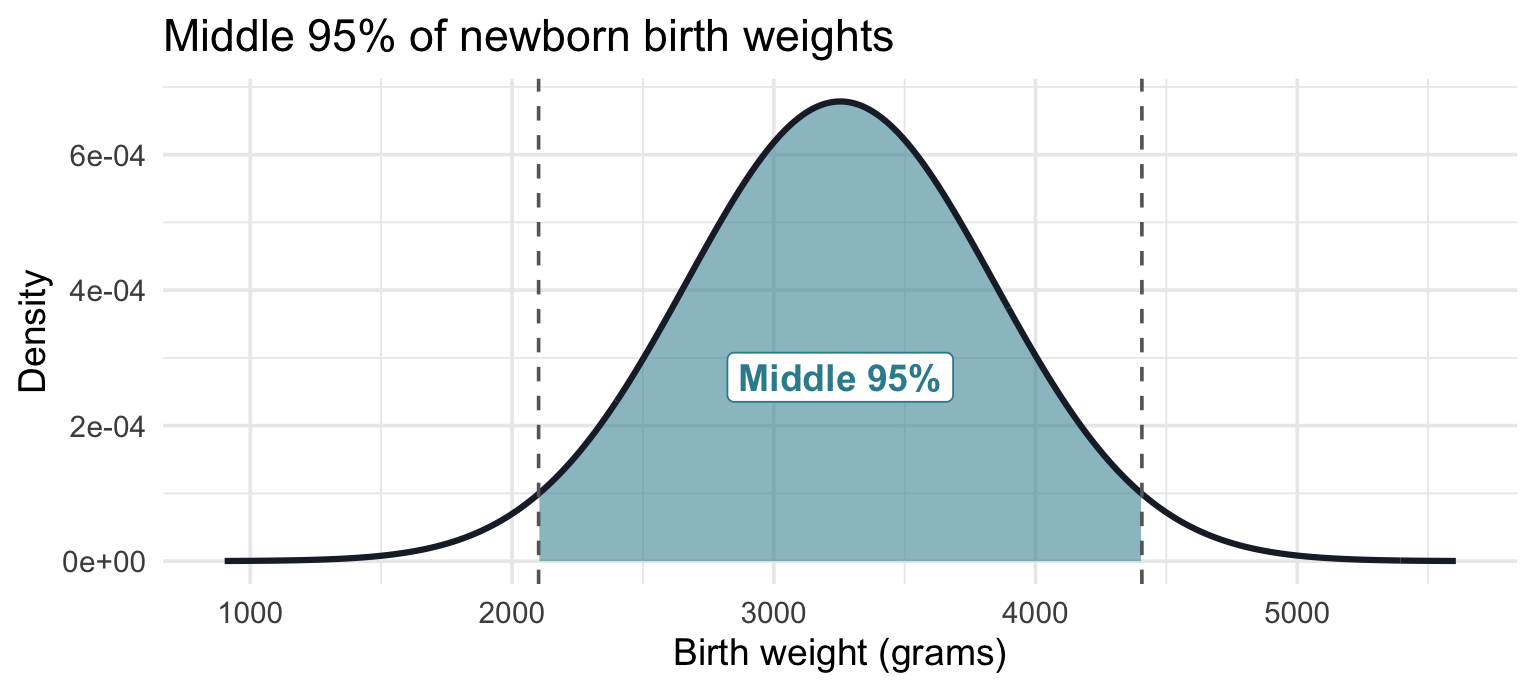
About 95% of newborns weigh between 2,102 g (roughly 4 lb 10 oz) and 4,406 g (roughly 9 lb 11 oz).
Part B — Top 10%: the model’s 90th percentile
Question: At what birth weight does a newborn enter the top 10%?
Your task: fill the single p blank with the percentile that marks the top 10%.
“Top 10%” = 90th percentile = p = 0.90.
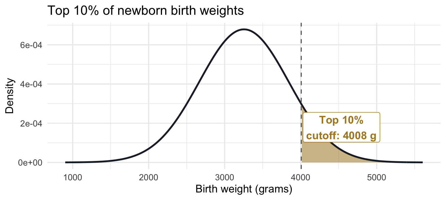
Under this model, babies above about 4,000 g are in the heaviest 10%.
Part C — Low birth weight: pnorm() in action
Question: What proportion of newborns meet the clinical definition of low birth weight (under 2500 g)?
Your task: fill the single q blank with the clinical cutoff. pnorm() returns the left tail by default, which is what you want here.
The cutoff is q = 2500. pnorm() with no extra arguments returns the left tail — exactly what we want.
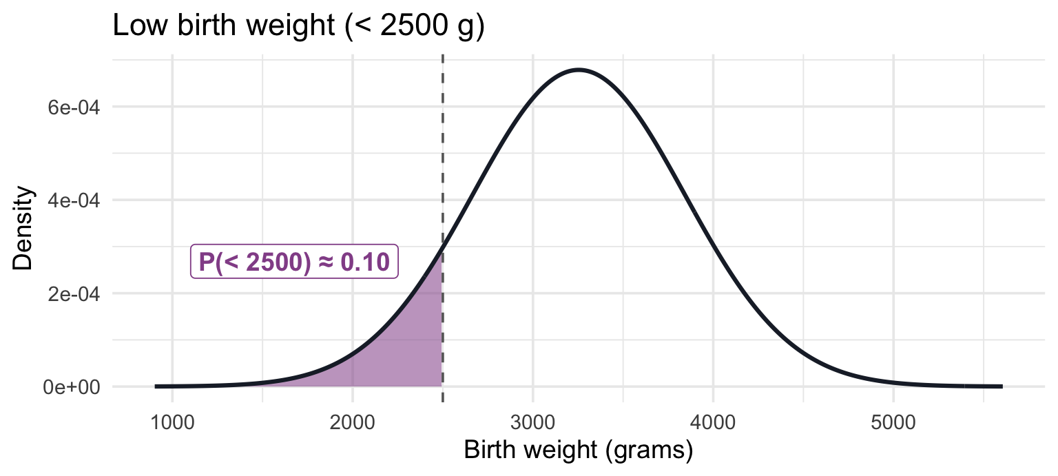
About 10% of newborns would fall below the 2,500 g low-birth-weight threshold.
Part D — Complement: using lower.tail = FALSE
Question: What proportion of newborns are at or above 2500 g (i.e., not low birth weight)?
This is the complement of Part C, which you could compute two equivalent ways. Let’s try both to confirm they match.
Your task: fill the single lower.tail blank in Approach B so it returns the upper tail. Approach A is written for you — the two answers should agree.
lower.tail should be FALSE for the upper tail.
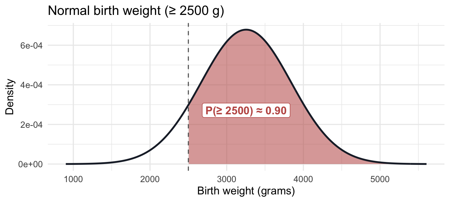
Both give the same answer — under this model about 90% of newborns would be not low birth weight. lower.tail = FALSE is just a shortcut for 1 - pnorm(q = ..., mean = ..., sd = ...).
Four things to carry into lecture
- Conditioning changes the denominator. \(P(\text{Fake} \mid \text{With !})\) is not a new kind of probability — it is the same counting, restricted to a smaller group. Every conditional statement comes down to which rows are we dividing by?
- The rules are bookkeeping on a table. Complement, addition, and multiplication all fell out of one 2×2 cross-tab — nothing to memorize that a careful count cannot rebuild.
- A distribution is a model you can query. dbinom() and pbinom() answer questions about counts; pnorm() turns a value into a probability, and qnorm() turns a probability back into a value — an inverse pair.
- ±1.96 marks the middle 95% of the standard normal. For now it is a fact about the curve; M07 puts it to work for inference.
Going further (optional)
Nothing here is required, graded, or on an exam. Two short self-paced pages that take today’s rules somewhere new.
- Diagnostic testing and positive predictive value → — why a highly accurate screener still returns mostly false positives for a rare condition. It builds the whole calculation one step at a time, and it is the single most consequential use of conditional probability in clinical work.
- Visualizing the binomial: from bars to a bell curve → — plot the binomial and watch it converge on the normal as n grows. The Central Limit Theorem, seen rather than asserted.
Every optional activity in the course is also listed on one page: Optional Activities.