Wrangling Data — the Opioid Shipments Story
Lab · Module 4 · Wed Sep 9
Welcome to the Module 4 lab
This week’s reading and pre-study introduced the four core wrangling operations you’ll use all semester: filter(), mutate(), group_by(), and summarize(). Today you’ll apply them to real opioid shipment data — county-year counts of pills shipped to covered buyers, from the U.S. Drug Enforcement Administration’s ARCOS database, released after a legal effort by the Washington Post and HD Media in 2019 as part of their reporting on the prescription opioid crisis. You’ll start with simple warm-up moves on a single state, then build one substantive pipeline that answers a real research question across the whole country.
This is also your first lab with figure cross-references — a small Quarto feature that lets your prose say “see Figure 1” and have it automatically link to the right chart. We’ll introduce it in Step 3.
How the time works. You’ll do the analysis — Step 0 setup through Step 3 — in class, then we’ll pause for a short group debrief. The write-up (the interpretation prose, the final render, and submitting to Canvas) is yours to finish at home. Plan for that split, and don’t rush the prose in the room — it’s the part that takes the most thought.
What you’ll leave with
In class: an analysis notebook that runs end to end —
- A loaded ARCOS dataset and practice with five small pipelines on a single state — including both ways a group_by() can end
- A multi-stage pipeline that aggregates county-level data to state-year summaries and produces a report-ready line chart of the five highest-rate states (Figure 1)
- A join to the Appalachian Regional Commission’s county list, verified in both directions with anti_join()
- A second chart comparing Appalachian with non-Appalachian counties across the period (Figure 2)
At home: a short prose interpretation that carries both figure cross-references and quotes a specific number, then the final render and Canvas submission.
Step 0 · Get set up
Start in GitHub Desktop, before RStudio. Select PSY652_project, click Fetch origin, and click Pull origin if it appears. That is the pull half of the pull → edit → commit → push loop — the same loop you’ll close at the end of today’s lab.
Right now it will usually report nothing to pull, and that is fine. Do it anyway. The habit costs five seconds while it is free, and it stops being free the moment your project group starts sharing a repository in Week 5.
Navigate to the PSY652_project folder. Double-click PSY652_project.Rproj to open the project in RStudio. The familiar four-pane layout should appear; in the Files pane (bottom-right), you should see data/, documentation/, output/, and programs/.
Open the M04 lab skeleton
In the Files pane, click into programs/ and open m04_lab.qmd. The skeleton is structured to mirror today’s lab steps — a Setup chunk at the top, then sections for Introduction, Data, Warm-up (five sub-tasks), and Main analysis (five stages, ending with Stage 5 · Interpret).
Scroll through it without writing anything yet. Each TODO comment names what you’ll add — fill them in as you work through the steps below.
Now run the Setup chunk. Click the green ▶ at its top-right corner. Nothing visible happens, and that is the correct outcome — the chunk loads tidyverse and here into your session so every function you use today is available.
Do this first, every session. Your R session starts empty each time you open RStudio, so a chunk further down that fails with could not find function "filter" is almost always a Setup chunk that was never run — not a mistake in the line you just wrote. When something breaks unexpectedly, re-running Setup is the cheapest thing to try.
Step 1 · Meet the data
The dataset is called opioid_counties — about 27,000 rows, one per (county, year) for U.S. counties from 2006 to 2014. Each row records how many opioid pills (oxycodone + hydrocodone) were shipped to that county that year, and what the county’s population was.
opioid_counties · 26,980 rows · 6 columns · 2006–2014
- fips character — Five-digit Federal Information Processing Standard code identifying the county
- county character — County name as recorded in the ARCOS release
- state character — Two-letter postal abbreviation for the state or jurisdiction
- year integer — Calendar year the shipments were recorded
- number_pills integer — Total oxycodone and hydrocodone pills shipped to retail buyers in that county that year
- population integer — County population in that year, used as the denominator for shipment rates
Source: ARCOS DEA database via the Washington Post; assembled by the arcos R package, whose documentation site shows how to pull your own slice of the raw data — by state, county, pharmacy, or manufacturer.
Full codebook for opioid_counties — values, levels, missingness, and how the file was prepared.
What this measure does — and does not — represent
number_pills counts dosage units shipped to pharmacies and practitioners located in the county. It is not a count of prescriptions written, pills dispensed, pills consumed, or pills taken by people who live there. Divide it by population and you get a shipment volume per resident — a useful way to compare the scale of shipments against population size, and not the number of pills the average resident took.
The distinction matters. A regional distribution facility, or a pharmacy serving patients from several surrounding counties, inflates its own county’s rate while deflating its neighbors’. The Washington Post’s own documentation warns about exactly this.
What’s here, and what isn’t
Three different things get called “missing data,” and this file has two of them. Knowing which is which shapes how you read every number you are about to compute.
No blank cells. Every row that exists is complete — number_pills and population are observed for all 26,980 of them, and so is every other column. Nothing is NA.
But some county-years are absent. The file covers 3,037 counties across 9 years. If every one of those counties appeared in every year that would be 27,333 rows — and there are 26,980. So 353 county-years have no row at all, rather than a row with blanks in it.
And some counties are absent entirely. The 50 states and DC contain 3,143 counties and county-equivalents (US Census, 2021). This file holds 3,037, and 107 counties never show up in a single year — concentrated in sparsely populated counties of Texas, the Great Plains, and Alaska, though no single state accounts for even a fifth of them.
The three hide in very different places. A blank cell announces itself as NA. An absent row is quieter — summarize() totals whatever rows it was handed and reports a number that looks as confident as any other. An absent county is quietest of all: nothing inside this file can reveal it. You only learn of it by comparing against a list of counties that ought to be there. (County codes are not permanent either — ARCOS carries one the 2021 list has since retired — and a stale code fails a join silently, filling NA or dropping the row without an error.)
Last week you ran a check like this; this week you write one. M03’s ## Check your typing chunk was n_distinct(), summarize(), and a few logical tests — the verbs of this Module.
Two habits follow, and you will use both today. Every summary table you build will carry a count beside its rate, so no total can hide a denominator that quietly changed. And in Stage 4 you will join an outside list of counties and check it with anti_join() — the move that makes the third kind of absence visible. It finds three Appalachian counties with no shipment rows here, which is a different question from the 107 U.S. counties absent overall.
In your skeleton’s # Data section, the import chunk is already filled in:
opioid_counties <- read_rds(here("data", "opioid_counties.Rds"))Run that import chunk in your skeleton (the green play arrow, or Cmd/Ctrl + Shift + Enter). For a quick orientation, glimpse() the data here in the sandbox — opioid_counties is already loaded:
Checkpoint 1 · Data is loaded
Your rendered glimpse() output shows about 27,000 rows × 6 columns, with the variable types matching the dataset card above.
Step 2 · Warm-up · the core verbs on one state
You’ll write five small pipelines — one per verb family, plus the two ways group_by() can be finished. Each is a single chunk in your skeleton.
The whole warm-up stays inside Colorado. One state is small enough to eyeball, and each task builds on the last: you filter down to Colorado, add a rate to every county-year, collapse those county-years to one row per year, put each county back next to its state-year, then sort to find the extremes. Step 3 opens the analysis up to all 51 jurisdictions.
How the sandboxes work
Each task below has a live code sandbox — click Run Code to run R right here in the browser (opioid_counties is already loaded for you). You can work your pipeline out here until it’s right, then copy the working code into the matching chunk in your RStudio skeleton and render it there. The sandbox is a scratchpad; your m04_lab.qmd skeleton is the deliverable.
Each sandbox has three tabs, the same set you used in the M03 lab:
- ✍️ Your Code — a pipeline with one or two blanks for you to fill in. This is the tab that does the learning.
- 💡 Hint — the function or argument you need, without the whole answer.
- 👀 Spoiler — the complete working code.
Work ✍️ first. If you have been stuck more than a few minutes, open 💡, then 👀 if you need it — and then close it and type the code yourself rather than pasting it. Finishing the lab matters more than getting any one blank unaided.
Task 2a · Filter to Colorado
Keep just the Colorado rows. The result (co_only) should have exactly 526 rows — 61 Colorado counties appear in this dataset, most once per year across the 9 years (a few county-years are missing, so it isn’t exactly 61 × 9).
Colorado has 64 counties, so three are missing — Costilla, Dolores, and Jackson. Small population alone cannot explain why: Hinsdale County, with about 871 residents, is the smallest county in the file and it appears in every year. (That rules out size as a complete explanation — it does not establish that size is unrelated.) One plausible explanation lies in what ARCOS actually records — distribution of controlled substances to DEA-registered retail-level dispensers, such as pharmacies, practitioners, and hospitals or clinics. A county with no relevant registered dispenser could therefore have no shipments recorded there. But this file cannot distinguish that possibility from an omission upstream in the extract, and ARCOS does not record where individual residents ultimately filled prescriptions — so we cannot follow those people anywhere. This is a good example of reasoning cautiously about why data are absent using only the data we actually observe.
Notice what the first line does. co_only <- ... doesn’t just print a filtered table — the assignment arrow creates a new data frame named co_only and stores it in your session. Run that chunk in RStudio and co_only shows up in the Environment pane (top right), listed next to opioid_counties with its row and column counts. That is your confirmation the object exists, and every task from here on refers to it by name. opioid_counties itself is unchanged — filtering never alters the data frame you filtered. (The Module’s “Where does the result go?” box walks through all three forms.)
Inside filter(), write a condition using == (double-equal, the test operator — NOT =, the assignment operator). Test whether state equals "CO".
Task 2b · Mutate to add the shipment rate
Starting from co_only, add a column called pills_shipped_per_resident computed as number of pills divided by population.
The right-hand side of the mutate is a one-line arithmetic expression: divide number_pills by population.
Task 2c · Group + summarize — Colorado, one row per year
So far every row has been a county-year. Now collapse Colorado to one row per year: count the counties that reported, total the pills across them, total the population, then derive Colorado’s aggregate rate among the counties represented in the data. That mouthful is deliberate: three Colorado counties never appear at all, and the number represented shifts year to year, so this is not literally the rate for the whole state. After this task we will shorten it to “the Colorado rate” — but keep the longer version in mind, because the shortening is a convenience, not a correction.
That count is not decoration. The Module’s rule — report n alongside any rate or rank — starts here: a rate with no count beside it hides how many things went into it, and you will use that column in a moment to notice something about the data.
Notice what you are not doing: averaging the pills_shipped_per_resident column you built in 2b. A simple mean of county rates would weight tiny Hinsdale County the same as Denver. Rebuilding the rate from summed totals weights each represented county by its population, which is what an aggregate rate means.
One argument in the code you have not met yet: na.rm = TRUE. It tells sum() to ignore missing values — and in this dataset it removes exactly nothing, because the setup chunk verifies that number_pills and population have no gaps. It is written here anyway so the shape is familiar by the time you meet data that does have holes in it. Just run it for now; Stage 1 of Step 3 comes back to it and explains when it changes your answer, and why it is a decision rather than a default.
The grouping variable is year (we want one row per year), and the source is co_only — you are still inside Colorado. The per-resident rate is built from the two summary columns you just created, not from 2b’s column.
n_counties takes the function that counts rows in a group — no arguments, just empty parentheses.
You should see 9 rows, one per year. Look at n_counties before you look at the rate — it runs from 60 down to 58. Colorado’s county count is not the same every year, so each year’s rate is built from a slightly different set of places. That is exactly what reporting n is for: you would never have seen it from the rate column alone. Colorado’s statewide rate climbs from about 22.9 pills per resident in 2006 to a peak near 35.3 in 2012, then eases back to about 31.0 — the same rise-and-fall you will see nationally in Step 3, at a scale you can check by hand.
Task 2d · Group + mutate — the same grouping, the other ending
Task 2c grouped by year and finished with summarize(), and Colorado’s 526 county-years collapsed to 9 rows. Now run the same grouping and finish with mutate() instead. Watch what happens to the row count.
The question this answers is different: how did each county compare to its own state-year? That needs every county’s row to survive, each one carrying its year’s statewide rate alongside its own.
The blank is the verb that keeps every row and adds a column. The expression inside it is identical to what you wrote in 2c — the difference is entirely in which verb receives it.
ungroup() afterwards is housekeeping: mutate() leaves the year grouping attached to the result. Dropping it now keeps a later summary or transformation from silently operating within year. It does not change the vs_state calculation on the next line — that one divides two columns row by row, so it gives the same answer grouped or not. The habit is what matters: leave a grouped frame lying around and the surprise arrives several lines later, far from its cause.
Compare the two results directly. Same data, same group_by(year), same sum() calls:
Task 2c — summarize() |
Task 2d — mutate() |
|
|---|---|---|
| Rows out | 9 — one per year | 526 — every county-year kept |
| What each row is | a year | a county in a year |
| The statewide rate is | the row’s own value | a column attached to each county |
| Answers | “How did Colorado do that year?” | “How did this county compare to its state that year?” |
That is the whole distinction: summarize() changes the level of the data; grouped mutate() keeps it. A vs_state of 2 means that county received twice its state’s rate that year — a comparison you could not make from 2c’s nine rows, because the individual counties are gone.
Task 2e · Arrange — top 10 county-years in Colorado
Sort Colorado’s rows by pills_shipped_per_resident descending and keep the top 10 county-years — note that phrase: one county can appear several times, so these are not ten distinct counties.
The display keeps three columns — county, year, and the rate, as your skeleton’s TODO says. Before you move on, though, try widening the select() here in the sandbox to include number_pills and population too. A rate is far easier to judge when the numerator and denominator that produced it are visible — a rate of 40 built from 4,000 pills and 100 residents is a very different object from one built from 4,000,000 and 100,000.
arrange() sorts ascending by default — wrap the column name in desc() for descending. head(n = 10) keeps the first 10 rows after sorting.
Checkpoint 2 · Warm-up runs clean
All five warm-up chunks execute without errors. You see:
- co_only with 526 rows (61 Colorado counties across 9 years)
- A pills_shipped_per_resident column in co_only
- co_by_year with 9 rows and a pills_shipped_per_resident column that climbs from about 22.9 (2006) to a peak near 35.3 (2012), then eases back
- A top-10 table for Colorado whose ten rows come from just 3 counties — the same places repeating across years
Step 3 · Main analysis · How do states compare?
The research question for this step
How did annual opioid pill shipment rates per resident vary across U.S. states and DC between 2006 and 2014, and which jurisdictions had the highest mean annual rate?
Every clause there is doing work. Shipment rates per resident, not “pills received” — see the caution in Step 1. Mean annual, because we will average nine yearly rates, giving each year equal weight. And states and DC, because the file has 51 jurisdictions, not 50. (Your skeleton states this same question in looser shorthand — “which states received the most?” — and the tightening here is deliberate: ARCOS records what was shipped to a county’s buyers, not what its residents received.)
You already have the building blocks: filter(), mutate(), group_by() + summarize(), arrange(), and slice_max(). We’re going to chain them into a single pipeline that aggregates the entire 27,000-row dataset down to one row per state — and then plot the top five.
Write your Introduction now. That research question is exactly what your report’s # Introduction section should frame. If a blank section is daunting, start from this three-sentence frame and make it your own:
The DEA’s ARCOS system records controlled-substance shipments from distributors to covered buyers such as pharmacies. In this analysis, county-year oxycodone and hydrocodone shipment counts are aggregated to annual state-level rates relative to resident population. The analysis asks how those rates changed from 2006 through 2014 and which states or DC had the highest mean annual rate.
Before you build the pipeline, take two minutes to fill in the # Introduction in your skeleton — one short paragraph on what you’re analyzing and the question you’ll answer. (You’ll write the closing reflection at the very end.)
Stage 1 · State-year aggregation
We want one row per (state, year) — a simpler unit than county-year for comparing states. The aggregation pattern is the same as Task 2c, but grouped by two variables instead of one.
Two sets of blanks this time:
group_by(___, ___)— the intro tells you the unit you want: one row per (state, year). Those are your two grouping columns, in that order.n_counties = ___— the same row-counting function you used in Task 2c.mutate(pills_shipped_per_resident = ___ / ___)— same pattern as Task 2c: divide the two summary columns you just built (total_pills by total_pop).
The .groups = "drop" line clears the grouping left over from the two-variable group_by() — the M04 Module explains why a summary over two or more groups needs it.
The data frame should have 459 rows — 51 jurisdictions × 9 years.
What that denominator actually is
sum(population) adds up the population of the counties present in that state-year — which is not always every county in the state. In this file, 155 of the 459 state-years are missing at least one county. Your n_counties column makes this visible rather than theoretical — 22 of the 51 jurisdictions report a different number of counties in different years. Sort state_year by that column if you want to see the extremes.
So total_pop is the population represented in the data, and the rate you just built is pills shipped per represented resident. For the five states this lab ends up reporting, coverage is stable: 3 of them include every county that appears anywhere in that state’s data in every single year, and the weakest is 86.7%.
But be precise about what that check can prove. It compares each state-year against the counties that appear somewhere in this file — so it catches a county that drops out in some years, and it is completely blind to a county missing from every year. Those are the 107 counties from Step 1, and no calculation performed on this file alone can surface them. Read these as rates for the represented counties, not as complete state rates.
And a note on na.rm = TRUE. You will see it in the summarize() above, and here it removes exactly nothing: the setup chunk verifies that number_pills and population have no missing values. Do not read that as “always write it.” On data that does have gaps, na.rm = TRUE quietly changes what your total is a total of — sometimes that is exactly right, sometimes it puts a short numerator over a full denominator and produces a rate of nothing in particular. Use it once you have decided that a total over the observed values answers your question, and report the coverage it rests on. It is a decision, not a default.
Stage 2 · Identify the top 5 states
Across the 9-year period, which 5 jurisdictions had the highest mean annual shipment rate? Read the pipeline aloud: “Start with state_year, group by state, summarize the per-state mean, then keep the 5 states with the highest mean.” Each step is a single verb — the last one, slice_max(), you met in the Module but haven’t used yet today.
Name the statistic before you compute it. mean(pills_shipped_per_resident) is the unweighted mean of nine annual rates — each year counts once, regardless of that year’s population. It is not the period total divided by the period population, which would weight each year by its own population. Both are defensible; they are different numbers, and the one you compute is the one you have to describe. That is why the column is called mean_annual_rate.
Notice that this is a second collapse: state_year already has one row per (state, year), and now summarize() reduces that further to one row per state.
slice_max() keeps the top rows by a column: slice_max(some_col, n = 5) returns the 5 rows with the largest values of some_col (its mirror slice_min() keeps the smallest). Fill in the four blanks, run it here, then copy the working code into the top5-states chunk in your skeleton.
Five blanks:
group_by(___)— the second collapse goes from (state, year) down to one row per state, so group by that single column.mean(___)— average the per-resident shipment rate you built in Stage 1: pills_shipped_per_resident.n_years = ___— the row counter again. Here each row of state_year is one year, so this tells you how many years each state’s mean rests on.slice_max(___, n = ___, with_ties = FALSE)— rank by the mean you just computed (mean_annual_rate) and keep the top 5.
You should see five two-letter state abbreviations in top5 — the data collapsed one more level, from one row per (state, year) to one row per state, by averaging the nine yearly values for each state. The top of the list will be WV (West Virginia) with a mean of about 66.2 pills shipped per resident per year.
Stage 3 · Plot the top 5 states’ trajectories — with a labeled figure
This is where the new Quarto feature comes in. The chart chunk in your skeleton already carries two special chunk options — #| label: fig-top5-trends (note the fig- prefix) and #| fig-cap: "..." — and together they give you a figure you can refer to from prose elsewhere with @fig-.... Open that chunk in your skeleton and look at its header before you go on — you’ll write the reference yourself in Stage 4.
If this feels like several moving parts at once, that reaction is normal. The key idea is simple: label the figure chunk, give it a caption, then refer to that label in your prose.
Figure cross-references in Quarto · the pieces
- Chunk label starts with
fig-— Quarto recognizes any chunk whose label begins withfig-as a figure and numbers it automatically. So#| label: fig-top5-trendsmakes a figure namedfig-top5-trends. - A figure caption —
#| fig-cap: "..."is the caption that appears under the chart in the rendered HTML. - Alt text —
#| fig-alt: "..."describes the figure for anyone using a screen reader, or anyone whose images simply fail to load. The knack is to write what the chart shows rather than what it is called: name the axes, say what is plotted, then describe the pattern a sighted reader would notice. There’s one written out in the chunk below — read it next to the caption and notice they do different jobs. The caption says why the figure matters; the alt text says what is on it. - Reference it in prose — anywhere in your
.qmdyou can write@fig-top5-trendsand Quarto turns it into “Figure 1” with a clickable link to the chart.
Together these turn a chart into something a reader can navigate to and something every reader can actually access — exactly how published papers work. Notice too what the caption carries: it names the measure precisely and repeats the shipments-not-consumption caveat, because a figure often travels away from the text around it.
Fill in the title — make it a title-as-finding (the M03 rule). What does the chart actually show? Some hints: three of the five — West Virginia, Kentucky, and Tennessee — contain ARC-designated Appalachian counties; most peak around the same year; the gap between the highest jurisdiction and the rest is striking.
A title-as-finding is a declarative sentence that states what the chart shows. Examples:
- “Shipment rates peaked in 2011 in four of the five highest-rate states”
- “West Virginia had the highest mean annual shipment rate of any state, 2006–2014”
- “The five highest-rate states rose and fell together, but at markedly different levels”
Pick the version that matches what your chart actually shows. Your title may differ from the example — that is fine. The requirement is that it describes a pattern visible in your rendered chart and does not claim a cause. Notice what none of these say: that these five states “drove” the national peak. A small state can have a very high rate per resident while contributing little to national volume — the chart cannot support that claim.
Now switch to RStudio and render your skeleton. (Make sure you’ve copied Stages 1–3 into their state-year-aggregation, top5-states, and fig-top5-trends chunks first — otherwise the render will stop with “object ‘state_year’ not found”.) Look at the rendered HTML. Your chart should appear with the caption below it, and the caption should read “Figure 1: Annual oxycodone and hydrocodone pills shipped per resident…” — the “Figure 1” part is added automatically by Quarto’s cross-reference machinery.
Checkpoint 3 · The state comparison is built
Three objects, each checkable before you build anything on top of them:
- state_year with about 459 rows — 51 jurisdictions × 9 years
- top5 listing WV, KY, TN, OK, NV, in that order
- A line chart labelled “Figure 1:” with five colored lines peaking around 2011, with axis labels and a title
If top5 comes out in a different order, check that Stage 2 averaged the yearly rates rather than re-deriving a rate from summed totals.
Stage 4 · What do the top states have in common? — a join
Look again at your top five: WV, KY, TN, OK, NV. Three of them — West Virginia, Kentucky, Tennessee — sit wholly or partly inside Appalachia. Two — Oklahoma and Nevada — do not. That is a disproportionate share, and it is worth chasing.
The Appalachian Region is a federally designated area of 423 counties across 13 states, running from southern New York to northern Mississippi and home to roughly 26 million people.
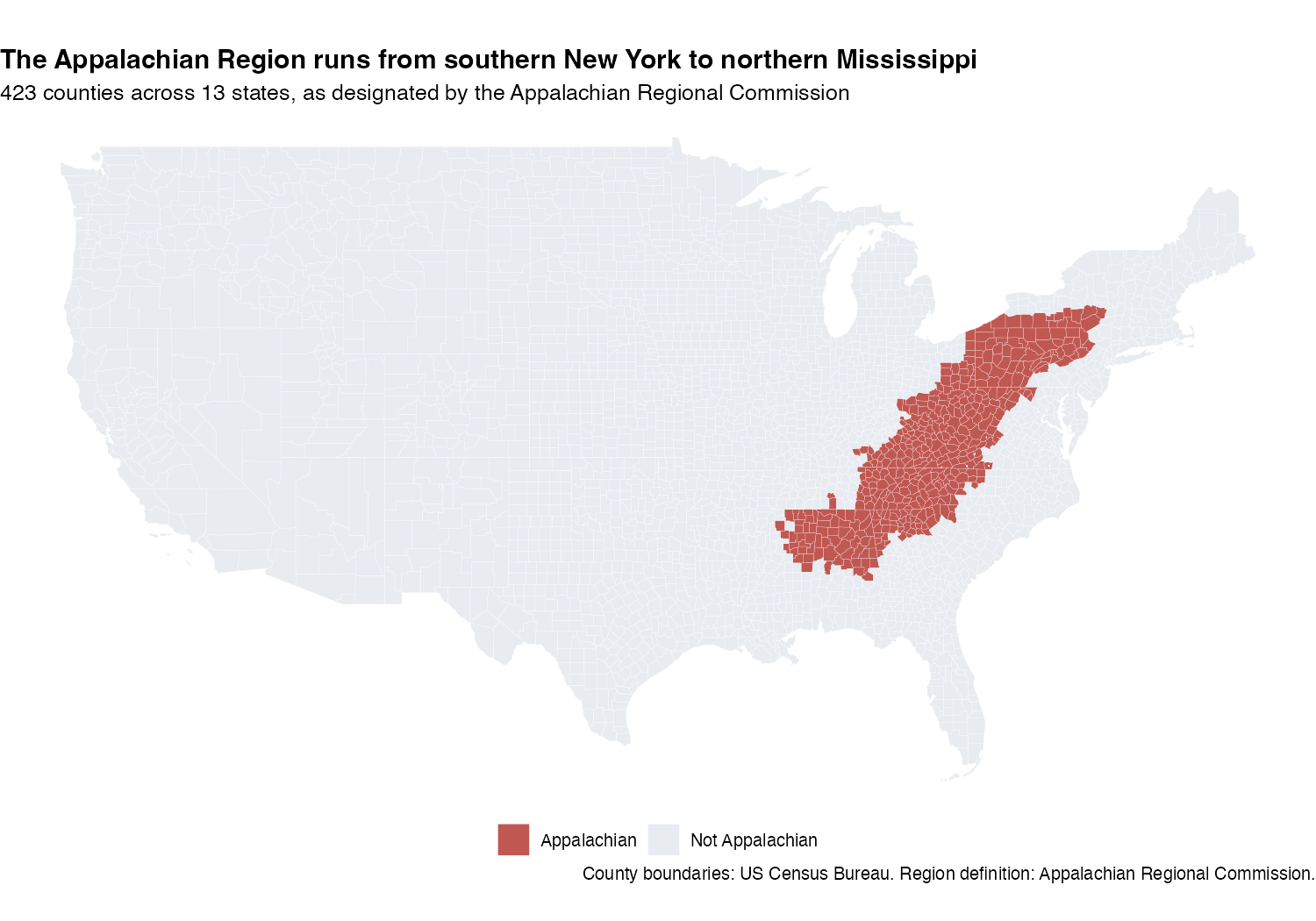
NoteShow the code that made this map
You will not build maps in this course, but the code is here if you want it later. It needs two extra packages — tigris for Census county boundaries and sf for spatial data — and downloads boundary files the first time it runs.
library(sf)
library(tigris)
options(tigris_use_cache = TRUE)

counties_sf <- counties(cb = TRUE, resolution = "20m", year = 2021) |>
  filter(!STATEFP %in% c("02", "15", "60", "66", "69", "72", "78"))  # lower 48

counties_sf |>
  mutate(is_appalachia = if_else(GEOID %in% appalachia$fips,
                                 "Appalachian", "Not Appalachian")) |>
  ggplot() +
  geom_sf(aes(fill = is_appalachia), color = "white", linewidth = 0.05) +
  scale_fill_manual(values = c("Appalachian" = "#C05852",
                               "Not Appalachian" = "#E8ECF1")) +
  labs(title = "The Appalachian Region runs from southern New York to northern Mississippi",
       fill = NULL) +
  theme_void()
The join key is the same fips code you are about to use — GEOID is simply the Census’s name for it.
Why this region. Appalachia was not a random casualty of the prescription-opioid epidemic — it was a target. Van Zee’s history in the American Journal of Public Health, The Promotion and Marketing of OxyContin (2009), documents a marketing operation that used prescriber databases to find high-volume physicians and steered sales representatives toward them, with economically distressed communities understood internally to be receptive markets.
That history is the reason a regional comparison is worth making at all. If shipments had simply tracked population, there would be nothing regional to see. The Appalachian Regional Commission (ARC) — the federal-state partnership for the region — publishes the official county list, and that list is the file you are about to join.
But notice the problem with your current table. West Virginia is entirely Appalachian — all 55 of its counties. Kentucky and Tennessee are each roughly half. A state-level average mixes those halves together, so “Kentucky is high” could mean the Appalachian half is very high, or that the whole state is moderately high. You cannot tell from a state-level number. The fix is to stop aggregating by state and start grouping by whether each county is Appalachian.
appalachia · 423 rows · 2 columns · Appalachian Regional Commission, FY 2023 · data/appalachia.Rds
One row per county that ARC designates as Appalachian. This is a lookup table, not a dataset you analyze on its own — it exists to be joined onto county-level data.
- fips character — Five-digit FIPS code identifying an Appalachian Regional Commission county
- county_economic_status factor — ARC’s economic-status tier for the county, from most prosperous to most distressed
The table holds only Appalachian counties, so a county’s absence from it is the information you want: no matching row means “not Appalachian.” There is no “no” value to look for.
That shapes the labelling step. Testing whether county_economic_status came back missing would work here — but only because every ARC county happens to carry a tier, which is a property of this file rather than something you decided. One blank tier and that code would quietly file a county as not Appalachian.
So we do the sturdier thing: mark the lookup table before joining. Adding in_arc_list = TRUE to every row of appalachia means that after the join, an NA in that column has exactly one possible cause — no matching row. You are no longer inferring membership from a column that was measuring something else.
One timing caveat worth naming. This is ARC’s FY 2023 county list, and the shipments run 2006–2014. The region’s boundary is set by federal legislation and has been amended over the years, so a few counties on this list were not designated during the shipment period. We apply the current definition consistently, which is a defensible choice for a descriptive comparison — but a historical analysis would want contemporaneous membership, or a check that the later additions do not drive the result. Full details in the appalachia codebook.
Full codebook for appalachia — values, levels, missingness, and how the file was prepared.
The join, and how to check it
left_join() keeps every row of the table on the left and adds columns from the table on the right wherever the key matches. Here the key is fips, the 5-digit county code both tables carry.
The Module’s Part 4 warned that a join can go wrong silently — a key that doesn’t match produces NA rather than an error. anti_join() is the check: it returns the rows of the left table that found no match on the right. Run it in both directions, because they answer different questions and here they give very different answers:
appalachia |> anti_join(opioid_counties, by = "fips")— ARC counties missing from the shipment data. You want this near zero.opioid_counties |> distinct(fips) |> anti_join(appalachia, by = "fips")— shipment counties absent from the ARC list. This one should be large, because most U.S. counties simply are not Appalachian.
A check is only meaningful if you know which answer you expect. “Zero is good” is not a rule — it is a rule for one direction of one join.
Your task comes in two steps, and it is worth seeing why they are separate before you write either one.
Step one · join and label
Join the ARC list onto opioid_counties and label every row Appalachian or not. This keeps the county-year grain: you finish with the same 26,980 rows you started with, each now carrying a group label. Nothing is collapsed — you have only added a column, exactly as the grouped mutate() in Task 2d did.
Two blanks: the join that keeps every shipment row and adds the ARC column, and the case_when() arm that labels a county with no ARC status.
One difference from Stages 1–3. Those each fed a single skeleton chunk. This sandbox is one workspace but feeds three — import-appalachia, check-the-join, and appalachia-join. The dividers in the code say which lines go where; keep them together here while you work, then split them across the three chunks when you copy in.
The import line is given, because the sandbox cannot show it to you. Your notebook reads the file from your project; the sandbox already has it in memory. So type this into your import-appalachia chunk directly — it is the same here() pattern you used for the ARCOS data in Step 1:
appalachia <- read_rds(here("data", "appalachia.Rds")) |>
  mutate(in_arc_list = TRUE)
In the sandbox below, appalachia is already loaded under that same name, so the first line there adds the label to an object that already exists rather than reading a file. Every other line in the sandbox copies across unchanged.
- The join keeps every shipment row and adds ARC’s column where the county matches — that is left_join(). Order matters: opioid_counties goes on the left because it is the table you want to keep whole.
- relationship = "many-to-one" is the Module’s “say the relationship out loud” move, applied here: many shipment rows, at most one ARC row each. Get it wrong and dplyr errors instead of silently inflating your data.
- The case_when() blank is the label for counties with no row in the ARC list — a quoted string, and the counterpart to
"Appalachian". Read the two arms literally: in_arc_list isTRUEfor every county that matched, andNAfor every county that did not, because the join had nothing to put there.
The first anti_join() returns 3 — three ARC counties have no shipment rows in this file. The second returns 2,617, because most U.S. counties are not Appalachian. Both are the answers you expected, which is the point: a check you ran and understood beats a check that happened to come out clean.
Note what the first number does not license you to say. Three out of 423 is a small, documented gap — but the missing rows cannot tell you what those counties’ shipment rates would have been, so “it is too small to matter” is a guess, not a finding. The honest move is the one you just made: measure the gap and say so.
The count() at the end confirms the labelling worked: every one of the 26,980 rows landed in one of two groups, with roughly 3,776 on the Appalachian side.
Step two · collapse to one row per group per year
Now collapse those labelled rows. This is the group_by() → summarize() move from Task 2c, and it is what the chart needs: a line wants one point per year per group, not one point per county.
Keep app_counties as its own object, so the county grain stays available without rebuilding the join.
Two blanks: the grouping for the year-by-year comparison, and the row counter for n_counties, so each group’s size travels with its rate.
You want one row per group per year, so group by both — the label column you just created, and year.
n_counties takes the same row-counting function you used in Task 2c and Stage 1.
What you should see: 18 rows — two groups × 9 years — each carrying its county count alongside its rate. Scan n_counties down the column: the two groups are nowhere near the same size, which is exactly why comparing their rates rather than their totals is the only fair move.
Now chart it. Your skeleton’s second figure chunk carries its own #| label: fig-appalachia and #| fig-cap: — the same machinery as Stage 3, so this reference will render as Figure 2.
What you are building, and what you have to supply. The chart is Stage 3’s line chart with two lines instead of five: year across the bottom, pills_shipped_per_resident up the side, and is_appalachia mapped to color. The geoms, the year breaks, and the two group colors are all written for you.
Your one blank is the title — and it is the part that takes thought rather than typing. Write it as the finding, the M03 rule: not “Appalachian vs non-Appalachian counties,” which only names the axes, but a sentence stating what the reader should take away. Before you write it, look at the two numbers you just produced: which group sits higher, and is the distance between them growing or shrinking across the decade? Your title should answer both.
Write the title as the finding, the M03 rule — not “Appalachian vs non-Appalachian counties.” Look at your own numbers: which line is higher, and is the distance between them growing or shrinking across the decade?
Both lines share the national arc — a rise through the late 2000s, a peak in the early 2010s, a decline after. What separates them is level and distance. Each point is a ratio of totals — all pills in the group divided by all population in the group — exactly as in Task 2c, and not the average of the individual county rates. The Appalachian group starts at about 40.4 pills per resident against 26.3 elsewhere, and by 2014 the gap has grown from 14.1 to 21.0 pills per resident. The gap between the two groups widened across the period.
One more view, for shape rather than trend. Your line chart collapses every county into two averages; a map keeps all 3,037 of them and lets you see where the heaviest shipping actually happened.
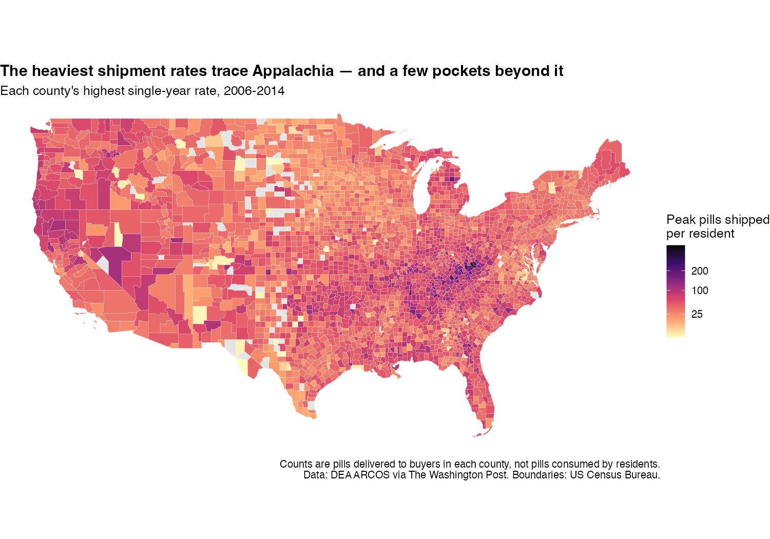
NoteShow the code that made this map
peak_rate <- opioid_counties |>
  mutate(rate = number_pills / population) |>
  group_by(fips) |>
  summarize(peak_rate = max(rate, na.rm = TRUE), .groups = "drop")

counties_sf |>
  left_join(peak_rate, by = c("GEOID" = "fips")) |>
  ggplot() +
  geom_sf(aes(fill = peak_rate), color = "white", linewidth = 0.05) +
  scale_fill_viridis_c(option = "magma", direction = -1, na.value = "grey90",
                       trans = "sqrt", breaks = c(25, 100, 200, 400),
                       name = "Peak pills shipped\nper resident") +
  labs(title = "The heaviest shipment rates trace Appalachia") +
  theme_void()
Note the trans = "sqrt" on the fill scale. A handful of counties have peak rates many times the national median, and on a linear scale they would wash every other county into the same pale shade — the same skew problem M03 solved with a log axis, met again in a color scale.
Compare the two maps. The dark corridor in the second one sits almost on top of the shaded region in the first — but not exactly, and the differences are as informative as the overlap. There are dark counties well outside Appalachia, and pale ones inside it. A regional average is a summary, not a description of every county in it.
Stop here for the analysis. What these two figures can and cannot support is a question for your write-up rather than for the last ten minutes of lab, so that discussion now lives in Step 4 — read it at home, before you write your paragraph.
Checkpoint 4 · The join is verified
Your rendered HTML shows:
- A state_year data frame with ~459 rows
- A top5 table with WV, KY, TN, OK, NV (in that order) and mean values around 55–66
- Both anti_join() direction checks, with the two very different counts you predicted before running them
- app_counties at the original county-year grain, and a count(is_appalachia) showing both groups present
- An app_trend table with 18 rows (2 groups × 9 years)
- A second chart labeled “Figure 2:” with two lines — Appalachian and non-Appalachian counties
The two figures are the visible payoff, but the verified join and the grouped aggregation are the actual lesson of Stage 4 — a chart drawn from an unchecked join looks exactly as convincing as one drawn from a good join.
That is the analysis complete. The interpretation prose comes next, at home.
Lab debrief · 5 minutes
That is the last activity. Save your work and look up — we will spend the last five minutes pulling the lab together while it is fresh, and the write-up is yours to finish at home.
Take one quiet minute to skim the questions below, then we’ll discuss as a group.
Lab debrief · what did we learn by doing?
The sticking point. What was the single hardest moment in today’s pipeline — the place where you got stuck the longest? What helped you move forward, or what would have helped?
Verb-to-question mapping. The pre-study taught you three families: row, column, group. Looking at the state-comparison pipeline in Step 3, which family did the most work? Which verb did you use most? Why is that the case for this particular question?
From summary statistics to story. Your top-5 list named WV, KY, TN, OK, NV. What’s the geographic clustering? What does the story your chart tells fail to explain — i.e., what’s missing that you’d want to know to fully understand the epidemic?
Cross-references and audience. You added
@fig-top5-trendsto your prose so the chart became “Figure 1.” Why does this matter for someone reading your report — and where else would this same pattern show up in a published paper?
Step 4 · Write it up · at home
The analysis is done and the notebook runs. What remains is the prose — the part worth giving unhurried time to, which is why it is homework rather than the last rushed ten minutes of class.
Below the second chart chunk in your .qmd, write a short interpretation paragraph (3–4 sentences) that carries both cross-references — @fig-top5-trends for the state trends and @fig-appalachia for the regional comparison. Quarto turns them into clickable “Figure 1” and “Figure 2” links, numbered in the order they appear.
What this chart does and does not show
The marketing history above is documented — it comes from court filings and internal company records, not from this dataset. Your chart is not evidence for it. What the chart shows is that shipments per resident were higher in Appalachian counties and that the gap widened. It cannot tell you why, and several explanations fit the same two lines: deliberate targeting, higher rates of injury in mining and manufacturing work, older populations, fewer prescribers so more volume per pharmacy, or differences in what a “county” means when populations are small and a regional pharmacy serves several of them.
Keep the two claims apart in your writing. The history is context that motivated the question. The chart is a description that the history helps you interpret. Neither one establishes the other.
Your paragraph needs to do four things:
- Identify one pattern visible in the figure.
- Compare at least two of the state trajectories.
- Cite one specific number from your Appalachian comparison — a rate, or the size of the gap in a given year.
- State one limitation of what shipment data can establish.
That third requirement is not padding. It is the difference between describing evidence and overselling it, and it is the habit this course wants you to leave with.
Example prose:
“As @fig-top5-trends shows, the five jurisdictions with the highest mean annual shipment rates all rose through the late 2000s and declined after the early 2010s, though at markedly different levels. West Virginia had the highest mean annual rate across the nine years, while Kentucky ran slightly above it during the 2010–2012 peak, reaching 76.1 pills shipped per resident in 2011. Splitting the counties by region (@fig-appalachia) shows why a state-level ranking is blunt: the aggregate rate across Appalachian counties was 40.4 pills per resident in 2006 against 26.3 elsewhere, and that gap widened to 21 by 2014. These figures describe pills shipped to covered buyers relative to resident population; they cannot show how many pills residents actually consumed, nor explain why the state patterns differ.”
Write your own version below the second chart chunk in your skeleton. Type the two references exactly as they appear in the example — @fig-top5-trends and @fig-appalachia, as plain text with no backticks around them. Your prose needs one of each. Then re-render and click both links in your HTML; they should jump to the two charts.
Requirement 3, done properly · the number comes from the code
Look again at the example paragraph. The numbers in it are not typed digits — they are inline R. r gap_2014 is not the text “21”; it is an instruction to look up an object called gap_2014 and print whatever it currently holds. (The “21” you just read was itself printed by that instruction.)
This is a small piece of syntax with a large payoff, and requirement 3 is where you use it for the first time. It is two steps:
Step one — compute the number and give it a name, in a chunk. The finished object must hold a single number — one value, not a table. That’s the part that takes a moment of thought: starting from app_trend, filter(year == 2014) gets you close but not all the way, because it leaves two rows — one per region. You still have to collapse those two rows into one number:
gap_2014 <- app_trend |>
  filter(year == 2014) |>
  ...   # <- your job: finish with ONE number, not a two-row table
Two routes work, both built from M04 verbs: filter() each region separately and pull() out the two rates before subtracting, or pivot_wider() the two rows into two columns and mutate() the difference. (And if you’d rather cite a single rate than the gap — requirement 3 allows either — the pipeline is shorter: filter to one region and one year, then pull the rate column.)
Step two — call it in your sentence, in the prose:
...and that gap widened to `r round(gap_2014, 1)` by 2014.Why bother, when you could just read the number off the table and type it? Because a typed number is correct only until the next time you change the wrangling — and nothing warns you when it stops being correct. Change a filter, fix a join, drop a year, and every typed digit in your prose silently becomes inaccurate. Inline R makes that impossible: the sentence and the table are computed from the same object, so they cannot disagree.
Checkpoint 5 · Interpretation is written
Your rendered HTML has a short interpretation paragraph (3–4 sentences) below the second chart, carrying both cross-references and naming the number you pulled from app_trend rather than typing its digits. The paragraph keeps the marketing history and your chart’s description as separate claims.
Final render and submit
You’re done with the analysis. One last loop to lock it in:
- Add your name to the YAML’s
author:field — replace"Your Name"with your actual name - Do a final render. Click Render or Cmd/Ctrl + Shift + K
- Open the rendered file — it renders right next to your
.qmd, atPSY652_project/programs/m04_lab.html - Read it end to end — open it in your browser (right-click → Open With → your browser of choice) and read the whole report as if you were encountering it for the first time
- Submit it to Canvas under “Lab 4 — Data Wrangling”
- Commit and push your work. In GitHub Desktop, your
m04_lab.qmdis in the Changes tab. Summarize it in one line (Add M04 state and Appalachia shipment analysis), Commit to main, then Push origin. Same loop as last week —opioid_counties.Rdsand the rendered HTML stay local.
Double check
Before you submit:
What you just did, in research terms
You took a prepared 27,000-row county-year extract — the DEA’s ARCOS records, released after litigation and cleaned by the Washington Post — reduced it to a five-state story with a report-ready chart, then brought in a second source to ask whether a state-level ranking was hiding a county-level pattern. That is one central arc of descriptive data analysis, on real data, in a single lab. The next time you read a paper that says “several states containing Appalachian areas had among the highest opioid shipment rates,” you now know what that single sentence sits on top of: a pipeline of a handful of verbs, the same ones you wrote today.
And this is publishable work, not a toy exercise. Griffith, Feyman, Auty, Crable, and Levengood published Implications of county-level variation in U.S. opioid distribution in Drug and Alcohol Dependence (2021, vol. 219, art. 108501) using this same ARCOS release at this same county level. Read their Methods section alongside your own notebook: the unit of analysis, the aggregation, the decision about what a rate’s denominator should be — you have now made every one of those choices yourself. The distance between a lab notebook and a Methods section is mostly a matter of how carefully you documented what you did.