library(tidyverse) # dplyr, tidyr, ggplot2, readr — the workhorse collection
library(here) # robust file paths for projects
library(skimr) # one-line dataset overviews (skim())Data Wrangling with dplyr and tidyr

Learning Objectives
By the end of this Module, you should be able to:
- Describe the principles of tidy data and recognize when a dataset is or isn’t tidy
- Apply the core dplyr verbs — filter(), arrange(), select(), mutate(), group_by(), summarize() — to prepare data for analysis
- Chain verbs together with the pipe (|>) and read a multi-step pipeline aloud as English
- Recode variables with if_else() and case_when(), and create new variables with mutate()
- Reshape datasets between long and wide formats using pivot_longer() and pivot_wider()
- Combine two tables on a shared key using left_join(), and check the result with anti_join()
Overview
From pictures to pipelines
Module 3 taught you to take an already-prepared data frame1 and build a chart with ggplot2 — for example, the Rosling bubble chart, with countries as points, GDP on the x-axis, and life expectancy on the y-axis. You wrote wdi_2022 |> ggplot(aes(...)) and got the chart you wanted because someone had already arranged the data into exactly the right shape. That “someone” was the assumption baked into M03: every chart you built started from a data frame that was already ready to chart.
That assumption is almost never true in real research. Real data shows up with extra columns you don’t need, rows for cases you don’t care about, missing values, and character codes that should be numbers. Worst of all, it often arrives in a shape that doesn’t match the question you want to ask. The work of getting from a raw dataset to “ready to chart, ready to model” has a name: data wrangling.
This Module is where you learn to wrangle. Everything in M03 took a data frame as input; M04 is where those data frames come from — built one verb at a time from messy real-world data.
The big idea
Most of the single-table transformations in this Module use a verb that belongs to one of three families:
- Row operations keep, sort, or extract specific rows — filter(), arrange(), distinct().
- Column operations keep, rename, or create columns — select(), rename(), mutate().
- Group operations split the data into groups, then summarize or compute within each group — group_by(), summarize(), count().
A second, smaller class of operations changes a table’s structure or combines two tables: the pivots (pivot_longer(), pivot_wider()) and the joins (left_join()). Those get Part 4 to themselves.
Once you know which family your question lives in, choosing the verb is straightforward. You chain verbs together with the pipe (|>, pronounced “then”), so a multi-step analysis reads left-to-right as a sentence:
wdi_trends |>
  filter(year == 2022) |>
  group_by(region) |>
  summarize(mean_life_expectancy = mean(life_expectancy, na.rm = TRUE)) |>
  arrange(desc(mean_life_expectancy))
Read that aloud: “Start with wdi_trends, then keep only 2022 rows, then group by region, then compute the mean of life expectancy within each region, then arrange in descending order.” Five lines of code, one English sentence, one answer.
By the end of this Module you’ll be able to write pipelines like this one — and read other people’s. That is the irreducible skill that every other Module in PSY 652 (and the project, and your dissertation) will assume you have.
How to use this long page
This Module is two things at once: a guided introduction, and a reference you will come back to all semester. On a first pass, six ideas are worth holding on to:
- Say what one row represents before deciding whether the data are in a useful shape.
- filter() for rows, select() for columns, mutate() to create columns.
- Read |> as “then” — and predict the shape after every step.
- group_by() + summarize() when you want one row per group.
- Grouped mutate() when every original row needs information about its group.
- Check every recode, pivot, and join before you trust its result.
The sections on distinct(), slice_*(), relocate(), the two pipe boxes, writing files, and Going further are reference material. Skim them now; come back when a real analysis needs them.
How this page is organized
This Module is anchored end-to-end in the World Development Indicators data you already know from M03 — same datasets, same columns, same Rosling story. We start with the conceptual scaffold (Part 1: the three families of verbs, the pipe, tidy data) and then walk through each family with real worked examples (Parts 2–4). Part 5 puts it all together in a single end-to-end pipeline that hands its result straight back to a ggplot2 chart from M03.
- Part 1 — The three families of verbs. Tidy data, the data-in-data-out contract, the pipe, and a taxonomy that organizes every verb you’ll meet.
- Part 2 — Rows and columns. filter(), arrange(), distinct(), slice_*(), select(), rename(), mutate(), if_else(), case_when().
- Part 3 — Groups. group_by() and summarize(), the engine behind every descriptive statistic in the rest of the course.
- Part 4 — Reshape and combine. pivot_longer(), pivot_wider(), left_join().
- Part 5 — Putting it together. One worked case study from a research question all the way to a chart, plus a quick tour of reading and writing data files, and debugging.
The textbook reading that maps to this Module is R for Data Science (R4DS) — primarily Chapter 3 (Data transformation) and Chapter 5 (Data tidying), plus Chapter 19 (Joins) for left_join() and Chapter 7 (Data import) for reading and writing files. This Module is a gentle introduction — enough to wrangle real data with confidence; R4DS is the canonical reference you’ll grow into as you become a fluent wrangler, covering every verb, every edge case, and every advanced technique.
Packages used in this module
The dplyr and tidyr packages are the workhorses of this Module. Both load when you call library(tidyverse), so you don’t need to attach them separately. The same is true of readr, forcats, and ggplot2, which we also use along the way.
Meet the data
We continue with the World Development Indicators (WDI) data introduced in M03. The advantage is that you already know what’s in these tables — you spent M03 looking at them. M04 is where you learn to transform them.
wdi_2022 · 207 observations · 5 variables · World Bank via WDI package · data/wdi_2022.Rds
A snapshot of 207 countries in 2022, with five variables per country:
- country character — Country or territory name as supplied by the World Bank
- region character — World Bank region the country is assigned to
- life_expectancy numeric — Life expectancy at birth, in years, for the total population
- gdp_per_capita numeric — Gross domestic product per capita, in current US dollars
- population numeric — Total population
wdi_2022 |> glimpse()Rows: 207
Columns: 5
$ country <chr> "Afghanistan", "Albania", "Algeria", "American Samoa", "Andorra", "Angola", "Antigua…
$ region <chr> "South Asia", "Europe & Central Asia", "Middle East & North Africa", "East Asia & Pa…
$ life_expectancy <dbl> 65.61700, 78.76900, 76.12900, 72.75200, 84.01600, 64.24600, 77.48300, 75.80600, 74.7…
$ gdp_per_capita <dbl> 357.2612, 7756.9619, 4960.3033, 18017.4589, 42414.0480, 3682.1132, 20105.1989, 13962…
$ population <dbl> 40578842, 2451636, 45477389, 48342, 79705, 35635029, 92840, 45407904, 2969200, 10731…Full codebook for wdi_2022 — values, levels, missingness, and how the file was prepared.
wdi_trends · 2,477 observations · 6 variables · World Bank via WDI package · data/wdi_trends.Rds
The same five variables as wdi_2022, plus a year column — 14 years (1960 to 2022, at roughly five-year intervals) for 211 countries.
- country character — Country or territory name as supplied by the World Bank
- region character — World Bank region the country is assigned to
- year integer — Calendar year of the observation
- life_expectancy numeric — Life expectancy at birth, in years, for the total population
- gdp_per_capita numeric — Gross domestic product per capita, in current US dollars
- population numeric — Total population
One caution before you start slicing this file. gdp_per_capita is in current US$ — each year’s value is in that year’s dollars, unadjusted for inflation. Comparing countries within a year is fine; a group_by(year) summary of GDP across 1960–2022 is not, because it measures price inflation and real growth at the same time. Every GDP example in this Module holds the year fixed for that reason. (See the wdi_trends codebook for the full note and the constant-dollar alternatives.)
wdi_trends |> glimpse()Rows: 2,477
Columns: 6
$ country <chr> "Afghanistan", "Afghanistan", "Afghanistan", "Afghanistan", "Afghanistan", "Afghanis…
$ region <chr> "South Asia", "South Asia", "South Asia", "South Asia", "South Asia", "South Asia", …
$ year <int> 2015, 2010, 2005, 2000, 2022, 2020, 1980, 2010, 2015, 2005, 2022, 1995, 2000, 1990, …
$ life_expectancy <dbl> 62.270, 60.702, 58.247, 55.005, 65.617, 61.454, 69.903, 78.414, 78.358, 76.427, 78.7…
$ gdp_per_capita <dbl> 565.5697, 560.6215, 254.1842, 174.9310, 357.2612, 510.7871, 590.6077, 4149.1447, 419…
$ population <dbl> 33831764, 28284089, 24404567, 20130327, 40578842, 39068979, 2671997, 2913021, 273129…This is the dataset that makes the change-over-time questions answerable — and most of the interesting wrangling lives in change-over-time questions.
Full codebook for wdi_trends — values, levels, missingness, and how the file was prepared.
wdi_regions · 6 observations · 3 variables
A tiny teaching lookup table that assigns each World Bank region a simplified income-profile label. This is not an official World Bank classification — the World Bank assigns income groups to individual countries, not to whole regions. This small region-level table was built purely so we can practice left_join() — the operation that adds region-level information to country-level rows.
- region character — World Bank regional grouping (matches region in wdi_2022)
- region_profile character — a simplified, illustrative income-profile label for the region (“High income,” “Upper-middle income,” “Mixed”) — built for this exercise, not an official classification
- num_countries_2022 integer — number of countries in this region that appear in wdi_2022
wdi_regionsThis table covers 6 of the 7 regions that appear in wdi_2022 — South Asia was left out on purpose so the anti_join() example in Part 4 has something meaningful to find. Codebooks and lookup tables in real research are often incomplete in exactly this way.
Part 1 — The three families of verbs
This Part lays the conceptual scaffold. Before you meet any single verb, we want you to have a structured place to put it. M03 used the grammar of graphics to organize every chart into seven layers; M04 uses verb families to organize every wrangling operation into three groups. Once the families are in place, the verbs feel less like a long list and more like a small toolbox.
What is data wrangling?
Data wrangling is everything you do between getting the data and getting the answer. Data arrives — from a survey, a database export, or a clinical record system — almost never in the shape you need. Wrangling is the work of reshaping it:
- removing rows you don’t want (incomplete cases, the wrong sub-sample, a pilot wave)
- removing columns you don’t want, or renaming the ones you keep (your raw data file has 200 columns and you need 12 of them)
- creating new columns from old ones (age from date of birth, BMI from height and weight, recoded categories)
- reshaping between long and wide layouts (panel data into one row per observation, or vice versa)
- combining two tables that hold related information (participant-level data + site-level data)
- summarizing within groups (mean depression score by treatment arm; mean GDP by region)
In practice, every published paper sits on top of a wrangling pipeline that’s often longer than the modeling code. Wrangling isn’t glamorous, but it’s unavoidable — and this Module teaches the verbs that do it.
Wrangle in code, not by hand
A discipline sits underneath everything in this Module: treat the raw data file as read-only, and make every change in a script. You read the raw file in, transform it with the verbs below, and write a cleaned copy out — the original is never touched. The script becomes the documentation: a complete, re-runnable record of every decision, that you (and a reviewer, and future-you) can read and reproduce.
Editing the raw file by hand (e.g., in Excel or another program) breaks all of that:
- No audit trail. A hand-edit leaves no record of what changed, when, or why. Months later, no one can tell whether a value was always
47or you “fixed” it. - Not reproducible. When the raw data is updated — or a reviewer asks you to redo the analysis — you would have to repeat every manual edit from memory. A script just re-runs.
- Silent corruption. Excel “helpfully” reformats things: it strips the leading zeros from ID and FIPS/ZIP codes and turns anything that looks like a date into one. The most infamous case — Excel converting gene names such as SEPT2 into dates — turned up in roughly one in five of the genetics papers that shipped supplementary gene lists as Excel files, and the problem proved persistent enough that the field eventually renamed the genes (Ziemann et al., 2016).
The rule of thumb: raw data in → script → clean data out, with the raw file untouched. For the full playbook on organizing and documenting data safely, Karl Broman and Kara Woo’s Data Organization in Spreadsheets is the canonical guide.
Tidy data — the shape dplyr expects
The dplyr verbs are designed around a specific data shape called tidy data. R4DS Chapter 5 lays out the three rules; we summarize them and then look at what they mean for wdi_trends.
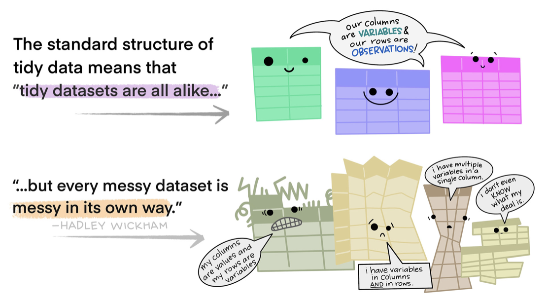
The three rules of tidy data
- Each variable is a column. Every variable you want to analyze appears as exactly one column.
- Each observation is a row. Every observation (a country-year, a participant-visit, a county-day) appears as exactly one row.
- Each value is a cell. In the beginner datasets for this course, that means one simple value per cell — one number, one label, one date — not a bundled string like
"12.4 (3.2)"or"A, B, C".
A concrete consequence: if your data has years as column headers (one column for 2020, one for 2021, one for 2022), then mean(year_column) doesn’t make sense — year isn’t a column, it’s scattered across header names. You’d have to add the three columns together and divide by three, and that trick only works because there happen to be exactly three years. Pivot to tidy form — one row per (country, year) pair, one year column — and a single summarize() call computes the mean across any number of years.
If your data follows the three rules, every dplyr verb does what you’d expect. When information you need as a variable is stored in column names instead — or values that should be separate variables are stacked in rows — pivot_longer() or pivot_wider() (Part 4) move the table into a more useful shape.
One caution about vocabulary. Long and wide describe a table’s shape; tidy and untidy describe whether that shape holds the variables and observations your analysis needs. They are not synonyms. A wide table can be perfectly tidy — if pre_score and post_score really are two different variables, then one row per participant with both columns satisfies all three rules. And a long table can be untidy, if one column mixes several distinct variables together. Before judging a table’s shape, say out loud what one row represents and name the variables; the answer usually settles it.
Look at wdi_trends. The variables are country, region, year, life_expectancy, gdp_per_capita, population — six variables, six columns. Each row is one country-year — one observation. Each cell holds one value. Tidy.
What would an untidy version look like? Here’s a common one — life expectancy by year, with each year as its own column:
This violates rule 1 — year is a variable, but here it’s spread across three column names (y_1960, y_1990, y_2022) instead of living in a column of its own. Watch what that does to a plain question: what is each country’s mean life expectancy across these years? In this layout the only way to average a country’s values is to reach into the three year-columns by name, add them, and divide by three — a recipe with the number of years, and their exact column names, baked into it. That fragility bites in three ways that come up constantly in real data:
- A country measured in more years. The moment a
y_2000column appears, “add the three and divide by three” is silently wrong — it never looks at the new column, and still divides by three. - A country missing a year. If Nigeria has no 1960 figure, its y_1960 cell is blank, and adding a blank into the sum breaks it — unless you stop and special-case that one country.
- Countries measured in different years. The wide layout needs a column for every year any country has, so most cells sit empty, and the tidy little “add the columns” recipe turns into a tangle of exceptions.
The same data in tidy form sidesteps every one of those:
Twelve rows, three columns. Now the mean is a completely different kind of instruction: “average the life_expectancy column, separately for each country.” Notice what that sentence never mentions — a year. It doesn’t need to. Because every value’s year is written beside it in the year column, the recipe can stay ignorant of how many years a country has or which ones they are. A country with eight measurements simply has eight rows; one with three has three; a missing year is just a row that isn’t there — nothing to skip, nothing to special-case in the code. (That makes the missingness easier to handle programmatically; it does not make the missing observation unimportant. Whether a country with three measurements can be compared to one with eight is a question about your research design, not about your data’s shape.) Add a whole new year of data and it shows up as new rows, and every recipe you already wrote keeps working untouched.
That is the whole reason tidy data matters. In the wide layout, the structure — how many years, which columns, which cells are blank — lives in your head, and has to be re-baked into every formula by hand. In the tidy layout, the structure lives in the data itself, so your instruction stays short and stays correct no matter how the data grows or where it has holes. Tidy shines exactly where real data is messiest: records of unequal length, missing observations, new data arriving over time. And every dplyr verb you’ll meet in this Module is built for this shape — hand it tidy data and it does what you expect, every time.
You’ll see plenty of untidy data in the wild — usually because it was tidied for human reading rather than for analysis. The fix is pivot_longer(), and we’ll get to it in Part 4. For now, just notice: tidy data is the shape dplyr expects. Almost everything that follows assumes you start there.
The data-in / data-out contract
Every dplyr verb honors the same contract:
- The first argument is always a data frame.
- The remaining arguments describe what to do with it — almost always referring to column names without quotes.
- The return value is always a new data frame.
That contract is what makes the pipe possible. Data in, data out, every time. Because every core table verb — filter(), select(), mutate(), summarize(), arrange(), the pivots, the joins — returns a data frame and expects one as input, the output of any verb can feed directly into the next, and you can chain them indefinitely. (A few helpers break the pattern on purpose: pull(), for instance, extracts a single column as a vector2. But the table verbs all keep the contract.)
data_frame |> verb_1() |> verb_2() |> verb_3()The pipe hands the thing on its left to the function on its right, as that function’s first argument. These two lines do exactly the same thing:
wdi_2022 |> filter(region == "South Asia")   # what you write
filter(wdi_2022, region == "South Asia")     # what R runs
That’s the answer to the question the first line raises — where did wdi_2022 go? It went into the empty first slot, which is why you never repeat the data frame’s name once a pipeline is running.
Pronounce |> as “then.” “Start with wdi_2022, then filter to South Asia.” That mnemonic is from R4DS, and it carries you through every pipeline you’ll ever read.
Where does the result go? <- vs. just looking
The third clause of the contract has a consequence worth stating outright: because every verb returns a new data frame, no verb ever changes the data frame you piped in. Run a pipeline with no assignment arrow and R computes the result, prints it, and throws it away.
# 1. Just look. Nothing is saved; wdi_2022 is untouched.
wdi_2022 |> filter(region == "South Asia")

# 2. Keep it under a NEW name. Both data frames now exist.
south_asia <- wdi_2022 |> filter(region == "South Asia")

# 3. Keep it under the SAME name. The unfiltered wdi_2022 is gone.
wdi_2022 <- wdi_2022 |> filter(region == "South Asia")
Which one you want depends on what you’re doing:
- No arrow — you’re looking. Checking that a filter() caught the rows you expected, eyeballing a summary, confirming a shape. This is most of what you do while writing a pipeline, and it’s why nearly every example on this page prints instead of saving.
- New name — you’ll want both versions. The original stays available, so you can compare against it or start over from it without re-reading the file.
- Same name — the change is cumulative and you won’t want it back. Adding a column you intend to keep is the usual case:
co_only <- co_only |> mutate(...)in the M04 Lab is exactly this. It keeps your Environment from filling withdata_1,data_2,data_3.
The one trap. Overwriting is safe to write but not always safe to re-run. Suppose you rescale a column in place:
wdi_2022 <- wdi_2022 |> mutate(population = population / 1e6) # now in millionsRun that chunk a second time and R divides by a million again. A country of 5,000,000 people reads 5 after the first run and 0.000005 after the second — a column a million times too small, with no error and no warning, because from R’s point of view nothing is wrong. The same thing bites when you edit an earlier chunk and re-run only the later ones: they start from data that has already been transformed. The habit that protects you is Session → Restart R, then run from the top. This is the same drift M02 warned about with the saved workspace, arriving by a different road.
Note this is a separate question from the read-only rule above: the raw file on disk is never touched by any of the three forms. It’s the object in your Environment that changes.
Does R care about spaces and line breaks?
Short answer: almost never. Spaces and indentation are for human readers — R ignores them, so filter(region == "South Asia") and filter( region=="South Asia" ) run identically. Three things are worth knowing:
- Pure style (R doesn’t care). Spaces around operators (
x + 1), a space after each comma, indentation, and putting each pipe step on its own line are all optional — they change how the code reads, never what it does. We follow the tidyverse style guide for consistency. - One structural rule (R does care). In a multi-line pipeline, the |> (and ggplot’s
+) must sit at the end of a line — that trailing operator is R’s signal to keep reading onto the next line. Put it at the start of a line and R thinks the statement already ended, and you get an error. You can always write the whole pipeline on one line instead; breaking it across lines is purely for readability. - One space that changes meaning. Keep the assignment arrow
<-together:x <- 5assigns5tox, butx < - 5(with a space) is the comparison “is x less than −5?”
Bottom line: spacing won’t break your code (except that arrow), and good spacing makes it readable. R4DS Chapter 4 (Workflow: code style) is the short, friendly reference, and the styler package will auto-format a messy script to the style guide for you.
The base pipe vs the magrittr pipe
You may see older code use the %>% pipe instead of |>. The %>% pipe is from the magrittr package and was the standard for years; |> arrived in base R 4.1 (2021). For the simple first-argument pipelines we use in this course, they usually behave the same way. They are not identical in every advanced case, but you can read both as “then.” We use |> because it is part of base R — no package needed — and slightly simpler. If you see %>% in a paper’s supplementary code or on Stack Overflow, just read it the same way: “then.”
When the data doesn’t belong in the first slot: the _ placeholder
The pipe has one rule: it hands the left-hand side to the function’s first argument. Every verb in the table above is built for that — filter(), mutate() and friends all take the data frame first, which is why pipelines read so cleanly.
Not every function cooperates. Some take a formula first and the data somewhere later. You’ll meet these from M09 onward — cohens_d() is one, and its signature begins cohens_d(x, y, data, ...), where x is the formula. Pipe into it the ordinary way and the data frame lands in the formula’s slot:
# What you meant:  cohens_d(psup_estimate ~ condition, data = my_data)
# What R gets:     cohens_d(my_data, psup_estimate ~ condition)
my_data |> cohens_d(psup_estimate ~ condition)
#> Error: Cannot compute effect size for a non-numeric vector.
The fix is the placeholder, written _. It tells the pipe: put the left-hand side here instead of in the first slot.
my_data |> cohens_d(psup_estimate ~ condition, data = _)Three rules, and the first one catches people out:
- The placeholder must be attached to a named argument.
data = _works; a bare_in a positional slot is a syntax error. (This is a real difference from magrittr’s., which can sit anywhere.) - It can appear only once in a call.
- It needs R 4.2 or newer, which everything in this course is.
You do not need this for ordinary wrangling — you’ll go all of M04 and M05 without it. But when you meet data = _ in a later Module, it isn’t a typo: it is someone routing the pipe past an argument that wanted something else.
The taxonomy: row, column, and group operations
Here is the toolbox, organized by what the verb operates on:
| Verb | What it does |
|---|---|
| Row | |
| filter() | Keep the rows that match a condition |
| arrange() | Sort rows by one or more columns |
| distinct() | Drop duplicate rows (optionally by selected columns) |
| slice_max() / slice_min() / slice_sample() | Take the top, bottom, or random N rows |
| Column | |
| select() | Keep, drop, or reorder columns by name |
| rename() | Rename columns |
| relocate() | Move columns to a new position |
| mutate() | Create new columns (or overwrite existing ones) |
| if_else() / case_when() | Recode values inside mutate() |
| Group | |
| group_by() | Partition the data into groups for the next operation |
| summarize() | Collapse each group to one row of summary statistics |
| count() | Shortcut for group_by() |> summarize(n = n()) |
| ungroup() | Remove grouping (return to a flat data frame) |
The list looks long, but the structure is small — three families, four or five verbs in each. Spend a minute looking at this table before reading further. The rest of the Module is one verb at a time within this scaffold.
Look at your data first
Before you wrangle anything, look at it. R4DS considers this one of the most important steps in data analysis, and it is — it catches half the bugs you would otherwise spend hours chasing. M02 introduced glimpse(); here are five checks you should make every time you load a new dataset:
# Structure: column names, types, and the first few values
wdi_2022 |> glimpse()
Rows: 207
Columns: 5
$ country <chr> "Afghanistan", "Albania", "Algeria", "American Samoa", "Andorra", "Angola", "Antigua…
$ region <chr> "South Asia", "Europe & Central Asia", "Middle East & North Africa", "East Asia & Pa…
$ life_expectancy <dbl> 65.61700, 78.76900, 76.12900, 72.75200, 84.01600, 64.24600, 77.48300, 75.80600, 74.7…
$ gdp_per_capita <dbl> 357.2612, 7756.9619, 4960.3033, 18017.4589, 42414.0480, 3682.1132, 20105.1989, 13962…
$ population <dbl> 40578842, 2451636, 45477389, 48342, 79705, 35635029, 92840, 45407904, 2969200, 10731…# Numeric ranges, quartiles, and missing-value counts
wdi_2022 |> summary() country region life_expectancy gdp_per_capita population
Length:207 Length:207 Min. :18.82 Min. : 303 Min. :9.992e+03
Class :character Class :character 1st Qu.:67.75 1st Qu.: 2951 1st Qu.:8.279e+05
Mode :character Mode :character Median :74.16 Median : 7656 Median :6.664e+06
Mean :73.17 Mean : 21173 Mean :3.795e+07
3rd Qu.:78.37 3rd Qu.: 28350 3rd Qu.:2.683e+07
Max. :85.75 Max. :226052 Max. :1.425e+09 # A richer overview — counts, missingness, distributional summaries, mini-histograms.
# partition() splits skim()'s result into one table per variable TYPE (here:
# character and numeric), which is what gets displayed below.
wdi_2022 |> skim() |> partition()Variable type: character
| skim_variable | n_missing | complete_rate | min | max | empty | n_unique | whitespace |
|---|---|---|---|---|---|---|---|
| country | 0 | 1 | 4 | 30 | 0 | 207 | 0 |
| region | 0 | 1 | 10 | 26 | 0 | 7 | 0 |
Variable type: numeric
| skim_variable | n_missing | complete_rate | mean | sd | p0 | p25 | p50 | p75 | p100 | hist |
|---|---|---|---|---|---|---|---|---|---|---|
| life_expectancy | 0 | 1 | 73.17 | 7.86 | 18.82 | 67.75 | 74.16 | 78.37 | 8.575000e+01 | ▁▁▁▅▇ |
| gdp_per_capita | 0 | 1 | 21173.47 | 31141.92 | 302.99 | 2951.23 | 7655.59 | 28350.34 | 2.260520e+05 | ▇▁▁▁▁ |
| population | 0 | 1 | 37947777.50 | 144782141.76 | 9992.00 | 827912.50 | 6664449.00 | 26825746.00 | 1.425423e+09 | ▇▁▁▁▁ |
# Top of the data — see real values, not just types
wdi_2022 |> head(n = 5)
# How many observations per level of a categorical variable?
wdi_2022 |> count(region, sort = TRUE)The five checks cover different angles. glimpse() shows you the shape and types. summary() gives quartiles and NA counts. skim() layers on richer distributional summaries with mini-histograms. head() shows real values so you can spot character vs numeric encoding issues. count() on a categorical column tells you what levels exist and how often. Five lines, five minutes, far fewer bugs.
Part 2 — Rows and columns: one rectangle at a time
The single-table verbs all work on the same rectangle of data — they just modify either the rows or the columns. We start with the row verbs (filter, arrange, distinct, slice_*), then move to the column verbs (select, rename, mutate, if_else, case_when).
Keeping the rows that answer your question — filter()
filter() keeps the rows where a condition is true. The conditions look like algebra. Here we keep just the countries in South Asia:
wdi_2022 |>
  filter(region == "South Asia")
== is the equality test — the double-equal is non-negotiable. Here’s what happens if you use a single = instead:
wdi_2022 |> filter(region = "South Asia")
#> Error in `filter()`:
#> ! We detected a named input.
#> ℹ This usually means that you've used `=` instead of `==`.
That’s because = is for assigning a value (e.g., the sort = TRUE argument to count()), while == is for testing a value. Mixing them up is a common beginner bug in R, and it bites everyone at least once. The good news: dplyr’s error message tells you exactly what went wrong and points at the fix.
The full menu of comparison operators is small: == equal, != not equal, > greater than, < less than, >= greater-or-equal, <= less-or-equal.
You can combine conditions with & (and) or , (also and, inside filter()) for both, and | (vertical bar, “or”) for either. Here we keep the countries that are both in Sub-Saharan Africa and have life expectancy above 70:
wdi_2022 |>
  filter(region == "Sub-Saharan Africa", life_expectancy > 70)
And here we keep the countries in either North America or Europe & Central Asia:
wdi_2022 |>
  filter(region == "North America" | region == "Europe & Central Asia") |>
  head()
The region == "X" | region == "Y" | region == "Z" pattern gets verbose quickly. The shortcut is %in%, which keeps rows where the variable matches any value in a vector:
wdi_2022 |>
  filter(region %in% c("North America", "Europe & Central Asia", "East Asia & Pacific")) |>
  count(region)
c() is the function that builds a vector — concatenate. You’ll use it constantly. Read c("A", "B", "C") as “a vector containing A, B, and C.”
Handling missing values: is.na() and drop_na()
Real data often arrives with missing values, and you need reflexes for handling them. As it happens, wdi_2022 is unusually complete — every country has all five variables — so the tools below won’t drop anything here. That does not make the section irrelevant. It makes the point visible: checking is how you know the data is complete. On a messier dataset, the exact same code would surface and remove real gaps.
The function that finds missing values is is.na(). Inside filter() it isolates the rows with NA in a column:
# Are any countries missing life expectancy?
wdi_2022 |>
  filter(is.na(life_expectancy))
Zero rows come back — wdi_2022 has no missing life-expectancy values. On a messier dataset, this is exactly how you would surface the gaps. It matters because NA rows fail every comparison (including ==), so an ordinary filter() drops them silently — you only learn they were there if you look. The negation !is.na() keeps only the non-missing rows.
The tidyr shortcut drop_na() removes any row with NA in the specified column(s):
wdi_2022 |>
  drop_na(life_expectancy) |>
  nrow()
[1] 207Notice the pattern here: you name the column bare — drop_na(life_expectancy), not drop_na("life_expectancy"). Bare names are the house style across the tidyverse, and it’s worth building the habit here where the stakes are low: drop_na() happens to accept the quoted form too, but in verbs like filter() and mutate() the quotes are an outright bug — filter("life_expectancy" > 2) doesn’t error, it compares the word "life_expectancy" to 2 and quietly hands back every row.
That closing nrow() simply reports how many rows a data frame has — it takes the data frame and hands back a single number. Here it returns 207, the same count you started with, because nothing was missing to drop. Get into the habit of checking nrow() before and after any step that can drop rows: the row-count difference (here, zero) is your audit trail. Most datasets you meet outside this course will not be this clean — which is exactly why the habit matters.
Drop on the variables you actually need — not all of them. Called with no arguments, drop_na() removes a row if any column is missing — usually too aggressive, because you lose rows over columns your analysis was never going to touch. Name the specific columns instead, as we did above: drop_na(life_expectancy) discards a row only when life_expectancy is missing, keeping rows that are complete on the variable you care about even if some other column is blank. A tidy habit makes this automatic: once you’ve met select() (a few sections down), narrow the data to just your analysis variables first and then drop_na() — so the only missingness that can ever cost you a row is missingness in a variable you are actually using.
Missing data in PSY 652 — the short version
When you call drop_na() you’re doing listwise deletion (also called complete-case analysis) — discarding any row that has a missing value on the variables you’re using. PSY 652 uses listwise deletion as the default throughout the course. It is the simplest and most transparent choice, and it lets us focus on the inferential machinery without first developing a separate missing-data toolkit.
It is also a choice, not a truth. Listwise deletion can lose statistical power (every dropped row shrinks your effective sample) and can bias your estimates if the missingness isn’t random in a specific sense. M05 (Describing Data with R) carries the full version of this discussion — what the assumption is, what alternatives exist (multiple imputation via mice, full-information maximum likelihood for structural equation models), and where the proper toolkit lives (PSY 653, second semester).
For M04, the takeaway is: use drop_na() when you need it, name it explicitly in your prose as “listwise deletion,” and know that this is the placeholder, not the destination.
Sorting the rectangle — arrange()
arrange() reorders rows by one or more columns. By default it sorts ascending (small to large for numbers, A to Z for character):
wdi_2022 |>
  arrange(life_expectancy) |>
  head()
To sort descending, wrap the column in desc():
wdi_2022 |>
  arrange(desc(life_expectancy)) |>
  head()
You can sort by multiple columns — additional columns act as tiebreakers:
wdi_2022 |>
  arrange(region, desc(gdp_per_capita)) |>
  head(n = 10)
That call sorts first by region alphabetically, then within each region sorts countries from highest GDP to lowest.
arrange() changes the row order but doesn’t add or remove rows — the data frame has the same number of rows it started with.
Finding distinct rows and ranked rows — distinct() and slice_*()
distinct() returns one row per unique combination of the columns you name. Here we get one row per region:
wdi_2022 |>
  distinct(region)
By default distinct() drops every column except the ones you named. To keep the rest, add .keep_all = TRUE — though this keeps only the first row of each unique combination, so the other columns come from whichever row happened to land first (rarely what you want). Most often, distinct() is a quick way to ask “what unique values are in this column?” — the first thing you reach for when meeting a new categorical variable.
When you want the top N rows or bottom N rows by some variable, reach for the slice_* family. slice_max(col, n = K) returns the top K rows by column, slice_min(col, n = K) returns the bottom K, and slice_sample(n = K) returns a random K:
# Top 5 countries by life expectancy
wdi_2022 |>
  slice_max(life_expectancy, n = 5)
# Bottom 5 countries by life expectancy
wdi_2022 |>
slice_min(life_expectancy, n = 5)# Five random countries — set.seed for reproducibility
set.seed(2)
wdi_2022 |>
slice_sample(n = 5)slice_sample() draws different countries every time it runs, which would make this page change on every render. set.seed() pins the randomness down: give it any number — 2 here is arbitrary — and R’s random draws come out identical every time, for you and for anyone re-running your code. That’s why you’ll see it before any random operation this semester.
One gotcha: by default slice_max() and slice_min() keep ties — if several rows are tied at the cutoff value, you can get back more than n rows. Add with_ties = FALSE when you need exactly n.
Report n alongside a rate or rank
The slice_max() family comes with one thing worth keeping in mind. R4DS Chapter 3 walks through a nice case study with baseball batting averages: if you rank players by hit-rate alone, the “top” of the ranking is filled with players who only batted three or four times. The same pattern shows up elsewhere — the hospitals or counties with the “best” per-capita rates are often simply the smallest ones.
So whenever you compute a rate or a rank, it’s a good idea to also compute n — the number of rows behind each value. That count tells you how the number is composed, so you can see at a glance whether a “top” row is built on many observations or just a few. (When the variable you are summarizing can be missing, count the observed values too — see Part 3.) We’ll use the same habit in Part 3 when we summarize by group.
Keeping the columns you need — select()
Real datasets have far more columns than you need for any one analysis. select() keeps just the columns you name:
wdi_2022 |>
  select(country, region, life_expectancy)
To drop columns instead of keep them, prefix with ! (read as “not”):
wdi_2022 |>
  select(!population)
You can also select a range of columns with :, and combine these patterns:
wdi_2022 |>
  select(country, life_expectancy:population) |>
  head()
That keeps country, then every column from life_expectancy through population inclusive.
For datasets with many columns, select() has helper functions that match names by pattern:
starts_with("dep_")— every column whose name starts with"dep_"ends_with("_2022")— every column whose name ends with"_2022"contains("score")— every column whose name contains"score"matches("^[a-z]+_score$")— every column whose name matches a regular expression. Regular expressions are an advanced topic you don’t need now, but they’re worth knowing about for future work: R4DS Chapter 15 (Regular expressions) is the reference.where(is.numeric)— every column whose values match a predicate (numeric, character, etc.)
These shine on a 200-column data file. You won’t need them in wdi_2022 (5 columns!), but they’ll save you in your project work.
Renaming columns — rename()
Sometimes a column name needs to change — it has spaces, it’s in ALLCAPS, it’s x1 instead of something informative. rename() renames columns. The new name goes on the left of =, the old name on the right:
wdi_2022 |>
  rename(
    life_exp_years = life_expectancy,
    gdp_usd = gdp_per_capita
  ) |>
  head()
You can also rename inside a select() call, which is handy when you’re keeping just a few columns and relabeling them in the same step:
wdi_2022 |>
  select(
    country,
    life_exp_years = life_expectancy,
    gdp_usd = gdp_per_capita
  ) |>
  head()
Reordering columns — relocate()
select() already reorders columns — the order you name them in is the order you get. But when you just want to move a column without re-listing all the others, relocate() is cleaner. By default it moves the named column(s) to the front; the .before and .after arguments drop them at a specific spot instead:
wdi_2022 |>
  relocate(population, .before = life_expectancy) |>
  head()
Here population jumps to sit just before life_expectancy, and every other column keeps its place. Reordering is purely cosmetic — it changes how the table reads, never the data — but a sensible column order (identifiers first, then the variables you care about) makes a data frame far easier to scan.
Creating new columns from old ones — mutate()
mutate() is the column-creation verb. You give it a name on the left and an expression on the right; the result becomes a new column. Here we compute an approximate total GDP (population times GDP per capita) and log GDP per capita (for plotting). We say approximate because it reconstructs a total from two separately-rounded indicator series — close to a directly reported total-GDP figure, but not identical to one:
wdi_2022 |>
  mutate(
    approx_gdp_total = population * gdp_per_capita,
    log_gdp_pc = log10(gdp_per_capita)
  ) |>
  head()
That log_gdp_pc line is worth a second look. You already log-transformed GDP per capita back in M03 — but there you did it inside the chart, with scale_x_log10(), which compresses the axis when the plot is drawn and leaves the underlying data untouched. Here it’s a different move: log10() inside mutate() computes the logged values and stores them as a real new column, one you can then filter, summarize, or feed to a model. Same math, two homes — in M03 it transformed the picture; in mutate() it transforms the data.
You can create multiple columns in one mutate() call, and any column you create can be used by a later expression in the same call:
wdi_2022 |>
  mutate(
    approx_gdp_total = population * gdp_per_capita,
    approx_gdp_total_bil = approx_gdp_total / 1e9,
    population_mil = population / 1e6
  ) |>
  select(country, approx_gdp_total_bil, population_mil) |>
  head()
Notice approx_gdp_total_bil is built from approx_gdp_total — a column that didn’t exist until the line right above it. That’s what “a later expression in the same call” means in practice.
The 1e9 and 1e6 are R’s scientific notation: 1e9 is 1,000,000,000 (a billion) and 1e6 is 1,000,000 (a million). Read 1e9 as “1 followed by 9 zeros.” R accepts these anywhere you’d write the long number, and they’re easier to read than counting zeros — 1e9 is unmistakable where 1000000000 invites a miscount. Dividing by them rescales the values into billions and millions, which is exactly what the _bil and _mil suffixes in the new column names are recording. Without that rescaling, approx_gdp_total for a large country runs to thirteen digits, and R would print it back to you in scientific notation anyway.
mutate() adds columns to the right of the data frame by default. If you want them up front, use the .before or .after arguments:
wdi_2022 |>
  mutate(
    approx_gdp_total_bil = (population * gdp_per_capita) / 1e9,
    .before = 1
  ) |>
  head()
The 1 in .before = 1 is a column position, not a column name — it says “put this new column before column number 1,” which lands it at the far left. Both .before and .after accept either form: a bare column name, the way relocate() used it just above (.before = life_expectancy), or a number counting columns from the left. Naming the column is the safer habit — it still means what you intended if the column order changes later — while 1 is just the shortest way to say “first.”
mutate() is the workhorse of feature creation. Every regression covariate in M10–M12 — centered predictors, log transforms, interaction terms, dummy-coded categories — is built with a mutate() call.
One thing to notice about all four examples above: none of them has an assignment arrow, so approx_gdp_total and log_gdp_pc were computed, printed, and discarded each time — wdi_2022 still has its original 5 columns. That’s deliberate; we’re demonstrating the verb, not building a dataset. When you want a new column to stay, put it behind an arrow, as described in Where does the result go? above.
Recoding values — if_else() and case_when()
A common need: “I want a new variable that takes value A when condition X is true, and value B otherwise.” The two functions for this are if_else() (binary recoding) and case_when() (multi-way recoding). Both live inside mutate().
if_else() takes three arguments: a condition, the value to return if the condition is true, and the value to return otherwise.
wdi_2022 |>
  mutate(
    high_le = if_else(life_expectancy >= 75, "High", "Lower")
  ) |>
  select(country, life_expectancy, high_le) |>
  head()
case_when() handles three or more categories. Slow down on this one — its syntax looks unlike anything you’ve written so far, and you’ll reach for it constantly.
Each line inside case_when() is called an arm, and every arm has the same two-part shape:
condition_to_test ~ value_to_use_when_that_test_passesThat ~ is a tilde — on most keyboards, shift plus the key just left of the 1. Read it aloud as “gives you”: “life expectancy of 80 or more gives you ‘Very high’.” The test always goes on the left of the tilde; the value it produces always goes on the right.
One rule then governs the whole thing: R reads the arms top to bottom and stops at the first one that’s true. That rule does more work than it looks like — watch what it buys you. (The four life-expectancy tiers below are invented for this example; they are not a World Bank or public-health classification.)
wdi_2022 |>
  mutate(
    le_tier = case_when(
      life_expectancy >= 80 ~ "Very high",
      life_expectancy >= 70 ~ "High",
      life_expectancy >= 60 ~ "Middle",
      life_expectancy < 60 ~ "Lower",
      TRUE ~ NA_character_
    )
  ) |>
  count(le_tier)
Look at those four arms and notice what ought to look like a bug. A country with a life expectancy of 84 satisfies life_expectancy >= 80 — but it also satisfies >= 70, and >= 60. Three arms match it. It comes out "Very high" anyway, because the first match wins and the arms below are never consulted for that row.
That’s precisely what lets you write plain thresholds instead of spelling out both ends of every band — you never have to write life_expectancy >= 70 & life_expectancy < 80, because by the time R reaches the >= 70 arm, every country over 80 has already been claimed and is out of the running. Each arm only ever sees the rows no arm above it took.
The flip side is the part to remember: the order of the arms is part of the logic, not a matter of taste. Move the >= 60 arm to the top and every country above 60 becomes "Middle" — no error, no warning, just a silently wrong variable and a table you might not think to double-check. The habit that keeps you safe: write the arms from most specific to most general, and read them back in order, out loud, as a chain of “otherwise” statements.
The final TRUE ~ NA_character_ arm is the fallback — it catches any row that didn’t match an earlier arm. Here every country falls into one of the four ranges, so the fallback never fires; but including it is still good practice, because it says out loud that an unmatched row should become NA. As for the _character_ suffix: case_when() wants all of its arms to return the same type of value, and the other arms here return text ("Very high", "High", …). So we write NA_character_ — a character NA — rather than a bare NA, to keep the types consistent.
Always check that a recode did what you meant
case_when() will error if your arms return incompatible types — but it cannot know what categories you meant. A wrong boundary or a mis-ordered arm runs perfectly and hands back a quietly wrong column, so never trust a recode until you’ve looked at it. Build one reflex: group by the new variable and inspect the source variable inside each group. For a number-into-bins recode like this one, that means checking the min and max of life_expectancy in each tier.
wdi_2022 |>
  mutate(
    le_tier = case_when(
      life_expectancy >= 80 ~ "Very high",
      life_expectancy >= 70 ~ "High",
      life_expectancy >= 60 ~ "Middle",
      life_expectancy < 60 ~ "Lower"
    )
  ) |>
  group_by(le_tier) |>
  summarize(
    n = n(),
    min_le = min(life_expectancy),
    max_le = max(life_expectancy)
  )
Now read each row against the name it carries. Very high runs from 80.3 up to 85.7 — every value is 80 or above, as promised. High tops out at 79.98 and never reaches 80, so nothing leaked up from the band below. Middle and Lower check out the same way. If any tier’s min or max had spilled past its intended boundary — or a tier you expected had gone missing, or an unplanned NA row had appeared — the arms would be wrong, and this two-line check would catch it before the bad variable reached a table or a model.
The same habit, one verb swapped, works for a category-to-category recode: there you’d run count(old_variable, new_variable) and confirm every old value maps to the new value you intended.
case_when() is one of the most-used verbs in real behavioral science work — it’s how you collapse 5-point Likert items into binary “agree vs disagree,” how you bin continuous scores into clinical cut-offs, how you group race and ethnicity categories for an analysis. It pays off the rest of your career.
But recoding is a measurement decision, not a formatting one. Every collapse throws information away, and some collapses do more than that — grouping race and ethnicity categories, in particular, can erase distinctions that are substantively central to the question you are asking, and the people the data describe. Three habits: keep the original variable rather than overwriting it, document every mapping where a reader can find it, and never collapse a category only because a smaller table or a better-behaved model is more convenient. The justification belongs in your write-up alongside the code.
Decision: filter, select, or mutate?
Which verb does your question want?
When you’re not sure which verb to reach for, ask what you want to change about the rectangle.
- Need fewer rows? → filter() (or drop_na() for missing-value pruning, distinct() for de-duplication, slice_*() for ranking).
- Need fewer columns? → select().
- Need a column to have a different name? → rename() (or rename inside select()).
- Need a column you don’t currently have? → mutate() — sometimes with if_else() or case_when() inside.
- Need to re-order rows? → arrange().
If your question mentions groups — “by region,” “per participant,” “for each year” — you’ve crossed into Part 3.
Quick check · which verb?
For each task, name the verb (or verb pair) you’d reach for — decide before you read the answers.
- Keep only the 2022 rows.
- Add a column
gdp_billionsholding GDP in billions. - Sort countries from highest to lowest life expectancy.
- Keep only
country,region, andlife_expectancy. - Report mean life expectancy for each region.
Answers: (1) filter() · (2) mutate() · (3) arrange(desc()) · (4) select() · (5) group_by() + summarize() — the group operation that takes you into Part 3.
Part 3 — Groups: the engine behind every descriptive statistic
So far you’ve filtered, sorted, and recoded one table at a time. Now comes the family that powers most behavioral science research: grouped operations — “compute this, separately for each group.” Mean depression score by treatment arm. Pre-post change by site. Hit-rate by recruitment wave. Reading proficiency by classroom. Group-by-and-summarize is the engine under all of it. Statisticians call this pattern split-apply-combine: split the data into groups, apply a computation within each, then combine the results back into one table.
The motivating question
Here’s a question the WDI data lets us ask: what is the average of the life-expectancy estimates in each World Bank region?
Listen to the shape of that question: a summary statistic (average life expectancy), computed within each group (region). Almost every grouped question you ask this semester has those same three pieces. In dplyr, they become a two-verb pipeline:
wdi_2022 |>
  group_by(region) |>
  summarize(mean_life_expectancy = mean(life_expectancy, na.rm = TRUE))
207 rows of country-level data collapsed to 7 rows of region-level summary, one row per group. That’s the basic pattern. Now let’s unpack what each verb did.
Partitioning the rectangle — group_by()
group_by() doesn’t change the data — it just marks the rows as belonging to groups so that subsequent verbs operate within each group:
wdi_2022 |>
  group_by(region)
So the table that comes back looks exactly like the ungrouped data — same 207 rows, same columns, nothing visibly different. The grouping is invisible metadata: run this in the R console and you’d see a small # Groups: region line noting the 7 region groups, but a rendered table like this one doesn’t display it. Either way, the rows are now marked “the next thing you do will be done per region.”
group_by() alone is rarely the answer — it’s a setup step. The real work happens when summarize() (or sometimes mutate()) comes next. (And group_by() accepts as many columns as you like — region and year, say — but grouping by two columns only earns its keep once you summarize, so we’ll come back to it in a moment.)
Collapsing each group — summarize()
summarize() computes a value per group and returns one row per group. The expressions inside summarize() look just like mutate() expressions — a name on the left, an aggregation function on the right — except the aggregation collapses many values into one.
Predict the shape first. Before you run a summarize(), ask: what is my grouping variable, and how many groups does it create? The answer is one row per group — so wdi_2022 grouped by region collapses to 7 rows, no matter how many countries went in. Then verify the prediction by looking at the output or checking nrow(). This is one of the fastest ways to catch a mis-grouped pipeline: if the row count surprises you, something upstream is wrong. (The same habit pays off for pivot_longer() and pivot_wider(), where the shape change is larger still.)
The aggregation functions you’ll use most:
| Function | What it returns |
|---|---|
| mean(x, na.rm = TRUE) | Arithmetic mean |
| median(x, na.rm = TRUE) | Median |
| sd(x, na.rm = TRUE) | Standard deviation |
| min(x, na.rm = TRUE) / max(x, na.rm = TRUE) | Smallest / largest value |
| n() | Count of rows in the group |
| sum(x, na.rm = TRUE) | Total |
You can compute several summaries in one summarize() call — one column per summary:
wdi_2022 |>
  group_by(region) |>
  summarize(
    n_countries = n(),
    mean_life = mean(life_expectancy, na.rm = TRUE),
    median_gdp = median(gdp_per_capita, na.rm = TRUE),
    total_pop_bil = sum(population, na.rm = TRUE) / 1e9  # population in billions
  ) |>
  arrange(desc(mean_life))
A few things to notice. First, n() counts rows in the group — it takes no arguments because it operates on the implicit group context. Second, na.rm = TRUE appears everywhere — without it, any group holding even one NA gets NA back from mean(), median(), and friends.
That default is worth understanding rather than just working around, because it’s a safety feature, not a nuisance. Asked for the mean of a variable with a hole in it, R would rather hand you a conspicuous NA — “I can’t answer that until you tell me what to do about the missing values” — than quietly average the rest and let you report a number without realizing some data never made it in. Writing na.rm = TRUE is you answering the question on purpose: “yes, I know some values are missing; average the ones we have.” Getting an unexpected NA back is not R breaking; it’s R telling you something about your data.
Two different denominators — and na.rm is not listwise deletion
What na.rm = TRUE actually does. mean() returns NA if any value handed to it is missing. Inside a grouped summarize() that plays out one group at a time — so a region with a single missing life_expectancy reports NA, every other region computes normally, and R issues no warning at all:
# Region A contains one missing value; B and C are complete.
d |> group_by(region) |> summarize(mean_x = mean(x))
#>   region mean_x
#> 1 A          NA     <- one missing value, and the whole group's mean is gone
#> 2 B           6
#> 3 C           2
That is the failure mode worth recognizing: not an error, not a warning, just one NA in an otherwise ordinary-looking table — easy to read straight past, and easy to carry into a write-up. Adding na.rm = TRUE tells mean() to set the missing values aside and average what is left, so region A returns the mean of its observed countries instead.
Which buys you a number, and buys you two things to be careful about.
n() counts rows, not observed values. In a group of 20 rows where 3 are missing life_expectancy, n() returns 20 while mean(life_expectancy, na.rm = TRUE) averages 17 values. The count you print and the count your mean actually used are then different numbers. When missingness is possible, report both:
summarize(
  n_rows = n(),                                   # rows in the group
  n_observed = sum(!is.na(life_expectancy)),      # values the mean actually used
  mean_life = mean(life_expectancy, na.rm = TRUE)
)
(The WDI files in this Module happen to have no missing life-expectancy values, so here the two counts agree exactly — which is precisely why it’s worth naming the distinction now, before you meet data where they don’t.)
na.rm = TRUE is not the same as listwise deletion. It is an available-case calculation: it drops missing values for that one statistic. Summarize three variables in one call and each can quietly rest on a different subset of rows.
Listwise deletion (complete-case analysis) is something you do deliberately, to rows, before summarizing — removing any row missing any variable your analysis needs:
analysis_data <- raw_data |>
  drop_na(outcome, treatment, age)
PSY 652’s default missing-data policy is listwise deletion — and that is the drop_na() line above, not the na.rm argument.
Third, the result is one row per group with the columns you named — exactly the shape you’d want to chart or table.
Grouping by more than one column. A natural extension is to ask for a summary at a more detailed level. If group_by(region) gives one row per region, then group_by(region, year) gives one row per region-year combination — a regional time series computed in a single pipeline:
wdi_trends |>
  group_by(region, year) |>
  summarize(
    n_countries = n(),
    mean_life = mean(life_expectancy, na.rm = TRUE),
    .groups = "drop"
  )
Now the “98 groups” is something you can see: 7 regions × 14 years = 98 rows, each the mean for one region in one year. And the n_countries column makes the coverage story concrete — the early-year rows rest on far fewer countries than the recent ones, which is exactly why you compute n() alongside any group mean.
The .groups = "drop" line — what it does, and when you need it
You’ll have spotted .groups = "drop" in the summarize above — and noticed the single-variable summaries earlier in this Part didn’t use it. Here’s the rule behind that.
When you summarize() a grouped table, dplyr peels off only the last grouping variable:
One grouping variable —
group_by(region)— and summarize() clears the grouping completely. The result is already flat; there’s nothing to add.Two or more —
group_by(region, year)— and one grouping level survives the summarize (here, region). dplyr tells you so, with a message in your Console:`summarise()` has grouped output by 'region'. You can override using the `.groups` argument.That’s a message, not an error — nothing is broken. It’s a heads-up that a grouping stuck around, which matters because a leftover grouping silently changes what the next verb does: a following mutate() or summarize() would run separately within each region, which is easy to not notice. Adding .groups
= "drop"inside the summarize() clears every grouping right there, so downstream verbs receive a plain, flat table — and the message goes away.
The habit for this course: add .groups = "drop" when you group by two or more variables; leave it off for a single grouping variable, where summarize() already clears the grouping for you.
A related tool is ungroup(), which does the same clearing as a separate step — ... |> summarize(...) |> ungroup(). Unlike .groups, it works after any grouped verb, including a grouped mutate() (which keeps all its rows and stays grouped until you clear it). .groups is an argument of summarize() only.
The shortcut for counts — count()
The pattern group_by(X) |> summarize(n = n()) is so common that dplyr ships a one-line shortcut: count(). In practice, this is often the first grouped verb beginners become comfortable with, because it makes the one-row-per-group idea very concrete.
wdi_2022 |>
  count(region)
wdi_2022 |>
count(region, sort = TRUE)count() also handles multi-column counts — count(region, country) gives one row per region-country combination, with n showing how many rows fell into each. The sort = TRUE argument sorts the result by n descending, surfacing the most common combinations first.
Grouped mutate vs grouped summarize
This distinction trips up most beginners, so we’ll be explicit. Both mutate() and summarize() can be used after group_by(), and they do different things:
- Grouped summarize() collapses each group to one row, returning a smaller data frame with one row per group.
- Grouped mutate() keeps every row but adds a column computed per group — so each row carries information about its group.
A quick rule of thumb: summarize changes the level of the data; grouped mutate keeps the level of the data the same. If that phrasing feels abstract, translate it into a row-count question: do I still want one row per country, or do I now want one row per region?
Example. Suppose you want each country’s life_expectancy expressed as a deviation from its region’s mean. You need every country’s original row preserved (because the deviation is a country-level number), but the regional mean computed once per region. Grouped mutate():
wdi_2022 |>
  group_by(region) |>
  mutate(region_mean_le = mean(life_expectancy, na.rm = TRUE),
         le_vs_region = life_expectancy - region_mean_le) |>
  select(country, region, life_expectancy, region_mean_le, le_vs_region) |>
  head()
You still have 207 country rows. Each one now carries its region’s mean and its own deviation from that mean. Countries in the same region share the same region_mean_le value, but each country keeps its own life_expectancy row and its own le_vs_region deviation. Grouped mutate() adds context without dropping detail.
Same setup, with summarize() instead:
wdi_2022 |>
  group_by(region) |>
  summarize(region_mean_le = mean(life_expectancy, na.rm = TRUE))
7 rows — one per region. The individual countries are gone.
Grouped mutate vs grouped summarize — at a glance
| Grouped mutate() | Grouped summarize() | |
|---|---|---|
| Number of rows | Same as input (no rows lost) | One row per group |
| Use when | Each row needs information about its group (deviation from mean, rank within group, group-membership label) | You want a per-group summary table |
| Returns | Original rectangle plus a new column | A new, smaller rectangle |
| Common example | “Center each subject’s score on their group’s mean” | “Mean depression score per arm” |
When you’re not sure: ask whether your next step needs per-country information (then grouped mutate) or per-region information (then summarize).
Ungrouping
Once you’ve done what you needed, remove the grouping — otherwise it sticks around and quietly surprises the very next verb. Let’s make that surprise concrete.
We build result by grouping wdi_2022 by region and adding a within-region rank. (min_rank() just numbers the rows 1, 2, 3, …; wrapping the column in desc() — the same desc() you met in arrange() — makes rank 1 the highest life expectancy rather than the lowest.)
result <- wdi_2022 |>
  group_by(region) |>
  mutate(rank_in_region = min_rank(desc(life_expectancy)))
Because mutate() doesn’t ungroup, result is still grouped by region. Now ask a seemingly simple question — “which one country has the highest life expectancy?” — with slice_max():
result |>
  slice_max(life_expectancy, n = 1) |>
  select(country, region, life_expectancy, rank_in_region)
You asked for one country and got 7 — the top country in every region, because slice_max() ran within each group (notice every row has a rank_in_region of 1). That is the surprise leftover grouping springs on you. Clear it with ungroup() and the same call does what you meant:
result |>
  ungroup() |>
  slice_max(life_expectancy, n = 1) |>
  select(country, region, life_expectancy, rank_in_region)
One row — the single highest-life-expectancy country in the whole dataset.
In modern dplyr, summarize() automatically peels off the last grouping variable after summarizing — but other verbs (like slice_max() and mutate()) don’t. The safe habit: when in doubt, ungroup().
Case study — why report n alongside a summary
Here’s a quick example, transposed from R4DS to our data. Suppose you want to rank World Bank regions by the average of their countries’ 2022 life-expectancy estimates. A first pass is two verbs:
wdi_2022 |>
  group_by(region) |>
  summarize(mean_life = mean(life_expectancy, na.rm = TRUE)) |>
  arrange(desc(mean_life))
North America sits at the top, at about 80 years. The tempting reading — “people in North America live longest” — is one this table cannot support, for two separate reasons.
First, every country counts once. mean(life_expectancy) is an unweighted average of country-level estimates, not a life expectancy for the people living in the region. The World Bank’s “North America” contains just 3 countries and territories — the United States, Canada, and Bermuda, a British overseas territory the World Bank includes in its country tables — and Bermuda, with a population of roughly 64,000, moves this mean exactly as much as the United States, with a population of roughly 330 million. A statistic about people would have to weight each row by its population; this one does not.
Second, the groups are wildly different sizes. That 3-country mean sits in the same column as Sub-Saharan Africa’s, which is built from 45. Ranking them against each other without showing that is what makes the table misleading.
The fix for the second problem is the habit R4DS recommends: report n alongside any aggregation.
wdi_2022 |>
  group_by(region) |>
  summarize(
    mean_life = mean(life_expectancy, na.rm = TRUE),
    n_countries = n()
  ) |>
  arrange(desc(mean_life))
Now the composition is visible. North America’s mean rests on 3 countries, so any one of them moves it by roughly a third of its own deviation; Europe & Central Asia’s rests on 57, so no single country can shift it much.
Be careful about what that does and doesn’t buy you. A larger n makes a mean less sensitive to any one country — it does not make it more representative. These countries are not a random sample from some larger population of countries, so neither number is an estimate of anything in the inferential sense you’ll meet in M07. Printing the count tells you how the summary is composed and how fragile it is; that is genuinely useful, and it is all it tells you.
The general rule, from R4DS: “Whenever you do any aggregation, it’s always a good idea to include a count (n()). That way you can ensure that you’re not drawing conclusions based on very small amounts of data.” You saw the same point in Part 2 with slice_max(), and it comes up whenever you rank or aggregate — a habit worth carrying out of M04.
Forward link: this is the engine of every descriptive statistic
M05 — Describing Data with R — leans on grouped summarize for every table it produces. So do M06’s expected counts under independence, M07’s group-level confidence intervals, M08–M09’s hypothesis tests, and M10–M12’s group-means-and-SEs that anchor every regression chart. The two-verb group_by() |> summarize() pattern is the most important thing in this Module. Once it’s automatic, the rest of the course gets a lot easier.
Part 4 — Reshaping and combining tables
The verbs you’ve seen so far all work on a single tidy data frame. Part 4 covers the two operations that get data into that tidy shape (pivoting), and the operation that combines two related tables (joining). This is the point where wrangling often starts to feel more like real research: the data are no longer just being filtered or summarized, but reorganized into the shape your question requires.
When tidy data isn’t
Most real datasets arrive untidy in a few common ways. A common beginner experience is opening a spreadsheet and thinking, “I can read this, but I can’t analyze it yet.” The two most frequent reasons are:
Variable spread across columns. Each column header is a value of what should be a single variable. Year-as-columns is the textbook example: instead of one year column and one value column, you have a y_2018 column, a y_2019 column, a y_2020 column, and so on. The fix is pivot_longer() — turn those columns into rows.
A variable’s values are stored across rows. Sometimes one column holds variable names — one row says
measure = "pre", another saysmeasure = "post"— while a second column holds the corresponding values. (Multiple rows per participant is often perfectly tidy — e.g., one row per participant-by-occasion. The trouble is only when a column contains what should be separate variables.) When you need those values side by side in their own columns, the fix is pivot_wider().
Both operations leave the values unchanged; only the shape changes.
Long from wide — pivot_longer()
Here’s a wide-format version of a WDI excerpt that we’ll use as a worked example. We’ll first build it from wdi_trends so the path back to long is explicit:
wide_le <- wdi_trends |>
  filter(
    country %in% c("United States", "Japan", "India", "Nigeria"),
    year %in% c(1990, 2000, 2010, 2020)
  ) |>
  select(country, year, life_expectancy) |>
  pivot_wider(
    names_from = year,
    values_from = life_expectancy,
    names_prefix = "y_",
    names_sort = TRUE
  )

wide_le
Don’t worry about the code that built wide_le — that’s pivot_wider(), and it’s the next section’s job. But one argument in there is worth naming now, because it explains where those column names came from: names_prefix = "y_" added a y_ to the front of each new column. That’s not decoration. Without it the columns would be named 1990, 2000, and so on — and a column whose name is a bare number is awkward to refer to in R, since you’d have to write it in backticks every time (`1990`). Putting a letter in front keeps them ordinary, typeable names. (names_sort = TRUE just puts them in ascending order.)
Year is now spread across four columns. Imagine receiving this from a colleague — to compute mean life expectancy across all years you’d have to write (y_1990 + y_2000 + y_2010 + y_2020) / 4, which only works because there are exactly four columns and they’re named exactly so. If next year’s data adds a y_2030 column, the formula breaks.
pivot_longer() fixes the shape:
wide_le |>
  pivot_longer(
    cols = starts_with("y_"),
    names_to = "year",
    values_to = "life_expectancy",
    names_prefix = "y_",
    names_transform = list(year = as.integer)
  )
The three key arguments:
- cols — which columns to pivot. We used starts_with("y_"), but any select()-style specification works.
- names_to — what to call the new column that will store the old column names.
- values_to — what to call the new column that will store the old column values.
The optional names_prefix strips a common prefix as the old column names are turned into row values — so y_1990 becomes 1990, not y_1990. Same argument, opposite direction: on pivot_wider() it adds the prefix (that’s how wide_le got its y_ names above); on pivot_longer() it takes the prefix off. That mirroring is deliberate — the two verbs undo each other, so their arguments do too.
If you find pivots disorienting at first, focus on just two questions: which columns are being gathered up, and what will the two new columns be called? The rest is detail.
The result is 16 rows (4 countries × 4 years), tidy and ready for any dplyr verb.
Wide from long — pivot_wider()
pivot_wider() is the inverse — it turns rows into columns. The two key arguments:
- names_from — which existing column provides the new column names.
- values_from — which existing column provides the new column values.
wdi_trends |>
  filter(country %in% c("United States", "Japan", "India", "Nigeria"),
         year %in% c(1990, 2000, 2010, 2020)) |>
  select(country, year, life_expectancy) |>
  pivot_wider(names_from = year, values_from = life_expectancy, names_sort = TRUE)
Look at the column names that came back: 1990, 2000, 2010, 2020 — bare numbers, because this time we left names_prefix off. That’s the awkwardness wide_le avoided earlier, and it’s worth seeing once. To refer to one of these columns you now need backticks — select(`1990`) — and leaving them off is worse than a typo: select(1990) doesn’t complain that there’s no column called 1990, it reads the bare number as a column position and goes looking for the 1990th column. Add names_prefix = "y_" and you’d get y_1990 through y_2020, typeable unquoted anywhere. We left it off here so the example stays on the two key arguments — but in your own code, reach for the prefix whenever names_from holds numbers.
Before you widen: does each cell have exactly one value?
pivot_wider() has to put one value in each output cell. If two rows share the same identifier and the same names_from value, it has no way to choose — so instead of erroring it hands you back a column of lists, which will break the next verb you run in a confusing way.
One line tells you in advance:
wdi_trends |>
  count(country, year) |>
  filter(n > 1)
Zero rows means every country-year appears exactly once, so the widen is safe. If rows do come back, stop and find out why before widening — duplicated records, a key you didn’t expect to be duplicated, or a genuine one-to-many relationship that needs summarizing first (or an explicit values_fn telling pivot_wider() how to combine them).
One small but important argument is names_sort = TRUE. By default, pivot_wider() orders the new columns in the order each value of names_from first appears in your data. When you care about the readability of the result, names_sort = TRUE is an easy way to keep the new columns in numerical (or alphabetical) order. Get into the habit of including it whenever column order matters.
When do you want wide format? Two main cases:
- Publication tables. Readers find wide tables easier to scan (“here is each country’s value across years”).
- Computing differences across columns. “What was the change in life expectancy from 1990 to 2020?” is one mutate() call away in wide form (y_2020 - y_1990) but needs a join or a per-row diff() in long form.
For most analysis, you’ll work in long form; for most reports, you’ll pivot_wider() at the very end. R4DS describes the rhythm as long for analysis, wide for display.
Which pivot does your situation want?
- My data has column headers that are values of a single variable, and I need them as rows. (Years spread across columns, items spread across columns.) → pivot_longer().
- My data stores a variable across rows that I need as columns. (One participant’s pre and post values sit on two rows; I want them side by side.) → pivot_wider().
The names describe the result: pivot_longer() makes the result longer (more rows, fewer columns), pivot_wider() makes the result wider (more columns, fewer rows).
Combining two tables — left_join()
The reshaping verbs change a single table’s shape. Joins combine two tables on a shared key — a column (or set of columns) that appears in both.
In our setup chunk we built wdi_regions, a small lookup table with one row per region. Suppose you want to add each region’s region_profile to every country row in wdi_2022. The two tables share the region column — that’s the key:
wdi_2022 |>
  left_join(wdi_regions, by = "region") |>
  select(country, region, region_profile, life_expectancy, gdp_per_capita) |>
  head()
left_join() keeps every row of the left table (wdi_2022, the one piped in) and adds the matching columns from the right table (wdi_regions). Rows on the left that find no match on the right get NA for the new columns; rows on the right that have no match on the left are dropped.
The by argument names the key. Notice it’s in quotes — by = "region", not by = region — because by takes a string3 naming the column to match on. This contrasts with verbs like group_by(region) or filter(region == "South Asia"), which use bare column names. A helpful way to remember the difference is this: most dplyr verbs ask you to work with columns, so you name them bare; by = asks you to describe the join rule, so you provide the column name as text. When the key columns have different names in the two tables, use by = c("left_name" = "right_name"). We’ll use the by = form throughout this course because it keeps the syntax visible — but you’ll also see join_by(region) in newer code (dplyr 1.1+); both do the same thing, and Going further at the end of this Module shows the join_by() alternative.
Joins come in a family — left_join(), right_join(), inner_join(), full_join() — and they differ in which rows survive when keys don’t match. left_join() is the workhorse, because most of the time you want to keep your main analytic dataset intact and just add some side information. The other join variants come up rarely enough that you can look them up when you need them.
Joining safely — the count check
The single most useful habit when joining: check the row count before and after.
nrow(wdi_2022)[1] 207nrow(wdi_2022 |> left_join(wdi_regions, by = "region"))[1] 207If the row count grew, some left-hand row matched more than one right-hand row. That can happen for several reasons — duplicate keys in the lookup table, the wrong key column, or a genuine one-to-many relationship you forgot about — so the growth is the signal to go looking, not a diagnosis on its own. If the row count shrank, you used inner_join() when you wanted left_join(). If the row count stayed the same — and your new columns mostly have non-NA values — the join did what you expected.
You can also check the key before joining, and state what you expect:
# A lookup table should have one row per key. Zero rows back = safe.
wdi_regions |>
  count(region) |>
  filter(n > 1)
# Say the relationship out loud, and dplyr will hold you to it:
wdi_2022 |>
left_join(wdi_regions, by = "region", relationship = "many-to-one")Many country rows to one region row is exactly what we intend here. Naming it means that if the lookup table ever gains a duplicate region, the join errors instead of silently inflating your dataset.
A second diagnostic: anti_join() returns the rows of the left table that didn’t find a match. Run it after every join and inspect what fell out:
wdi_2022 |>
  anti_join(wdi_regions, by = "region") |>
  count(region)
In our case, anti_join() returns the 8 countries with region = "South Asia" — because wdi_regions covered only six of the seven regions, and South Asia was left out. That’s exactly the kind of discovery anti_join() is for. Had it returned zero rows, every country would have found its region_profile; instead, we’ve surfaced a gap to either backfill, rename, or document. Most key-mismatch bugs in real research show up here — typos, encoding differences, case mismatches, missing categories. Run anti_join() after every join.
One direction is not both. anti_join(x, y) reports rows of x with no match in y — it says nothing about entries in y that nothing in x ever used. When both sides matter, run it both ways:
wdi_2022   |> anti_join(wdi_regions, by = "region")   # analytic rows with no lookup entry
wdi_regions |> anti_join(wdi_2022,   by = "region")   # lookup entries nothing matched
An unused lookup entry is usually harmless, but it is often the first sign that a category was renamed on one side and not the other. And note what anti_join() does not catch: unmatched keys, yes; duplicate keys, no. That’s what the count() check above is for.
Where left_join() is the workhorse for adding columns, anti_join() is its diagnostic counterpart — the verb that tells you what failed to match. It doubles as a genuine analytic tool, too, any time the question itself is “which cases are missing from this lookup table, roster, or codebook?”
Forward link
M05 uses pivot_longer() to reshape participant-level item responses ahead of summary-table creation, and it uses left_join() to attach codebook labels to numeric codes. By the time you get there, both operations should feel familiar — you’ve already done them here.
Part 5 — Putting it all together
Time to chain everything from Parts 1–4 into one pipeline that answers a real research question and ends with a chart. Then a brief tour of file I/O — short for input/output, meaning how to get data into R and back out again — and a short note on debugging long pipelines.
A worked WDI case study
The research question: Which world regions saw the biggest gains in life expectancy from 1960 to 2022?
The answer is hidden in wdi_trends, but before writing a line of code, say exactly what you intend to compute. A region’s “gain” here means the unweighted mean of the within-country changes, among the countries observed at both endpoints. Every clause in that sentence rules something out: within-country means we are not comparing two different sets of countries at the two dates; unweighted means a small country counts as much as a large one; observed at both endpoints means the answer describes only countries with data in both years.
That drives the pipeline: line up each country’s 1960 and 2022 values side by side (pivot_wider), keep only those measured in both years (drop_na), compute each one’s change (mutate), and only then average within region with a count (group_by + summarize + n()), before sorting (arrange) and charting (a familiar geom_col() from M03).
Computing each country’s change first is what protects the comparison. Averaging life expectancy in 1960 and again in 2022 and subtracting would let the answer be driven by which countries reported in each year rather than by anything that actually happened to a population.
We build the pipeline up one verb at a time so you can see each intermediate state. That pacing matters here, because one important limitation only becomes obvious once the data are widened.
Step 1 — Filter to the two endpoint years and keep the columns we need.
wdi_trends |>
  filter(year %in% c(1960, 2022)) |>
  select(country, region, year, life_expectancy) |>
  head()
Step 2 — Pivot wider so each country has a 1960 and a 2022 column.
wdi_trends |>
  filter(year %in% c(1960, 2022)) |>
  select(country, region, year, life_expectancy) |>
  pivot_wider(
    names_from = year,
    values_from = life_expectancy,
    names_prefix = "y_",
    names_sort = TRUE
  )
Scroll the output and you’ll see NA in the y_1960 column for many countries — they simply weren’t measured in 1960. Only 108 countries have a 1960 record, against 207 in 2022. That coverage gap is the subtlety the research question hides.
Before you can talk about change from 1960 to 2022, you need the same country measured at both endpoints. The widening step is what makes that requirement visible.
Step 3 — Keep countries measured in both years, then compute each country’s gain.
wdi_trends |>
  filter(year %in% c(1960, 2022)) |>
  select(country, region, year, life_expectancy) |>
  pivot_wider(names_from = year, values_from = life_expectancy,
              names_prefix = "y_", names_sort = TRUE) |>
  drop_na(y_1960, y_2022) |>
  mutate(gain = y_2022 - y_1960)
drop_na(y_1960, y_2022) keeps only the 108 countries with a value in both years — the only countries for which a 1960-to-2022 gain is even defined. Naming that out loud matters: our answer will describe those 108 countries, not every country in the world today.
Step 4 — Average the gains within each region — with a count.
wdi_trends |>
  filter(year %in% c(1960, 2022)) |>
  select(country, region, year, life_expectancy) |>
  pivot_wider(names_from = year, values_from = life_expectancy,
              names_prefix = "y_", names_sort = TRUE) |>
  drop_na(y_1960, y_2022) |>
  mutate(gain = y_2022 - y_1960) |>
  group_by(region) |>
  summarize(n_countries = n(), mean_gain = mean(gain)) |>
  arrange(desc(mean_gain))
Here the Part 3 rule pays off: we compute n_countries right alongside mean_gain, and read the two columns together. Middle East & North Africa shows the largest mean gain — about 30.8 years — but it rests on only 9 countries with data in both years, so it is the entry in this table most sensitive to any one of them.
One more check: does a single unusual value drive this?
M03 introduced an observation worth remembering — the World Bank’s 1960–2022 life-expectancy series for the Central African Republic, whose 2022 value of 18.8 years reflects a measured mortality crisis in a conflict setting where mortality is exceptionally difficult to estimate. In this pipeline that country is not just low, it is the only one in the matched set whose life expectancy fell: 39.6 years in 1960 down to 18.8 in 2022, a change of -20.8 years.
An influential, methodologically contested value like that deserves an explicit check — not to delete it, but to find out whether the story depends on it. Re-run the same pipeline with it excluded and compare:
Sub-Saharan Africa’s mean gain moves from 18.1 years to 19.4 — a shift of about 1.3 years, which is not nothing. But the ranking of the regions does not change, and Sub-Saharan Africa stays in the same position either way. That is what a sensitivity check is for: you report the result and the fact that you checked. Had the ordering flipped, the honest write-up would have had to say so.
Read the pipeline aloud: “Start with wdi_trends, then keep the 1960 and 2022 rows, then keep four columns, then pivot wider so each country’s two values sit side by side, then drop countries missing either year, then compute each country’s gain, then group by region, then average the gains and count the countries, then sort by mean gain.”
Step 5 — Hand the result to ggplot.
Show the code that built this figure
wdi_trends |>
  filter(year %in% c(1960, 2022)) |>
  select(country, region, year, life_expectancy) |>
  pivot_wider(
    names_from = year,
    values_from = life_expectancy,
    names_prefix = "y_",
    names_sort = TRUE
  ) |>
  drop_na(y_1960, y_2022) |>
  mutate(gain = y_2022 - y_1960) |>
  group_by(region) |>
  summarize(n_countries = n(), mean_gain = mean(gain), .groups = "drop") |>
  mutate(bar_label = sprintf("%.1f  (n = %d)", mean_gain, n_countries)) |>
  ggplot(aes(x = fct_reorder(region, mean_gain), y = mean_gain)) +
  geom_col(fill = "#3A8055", alpha = 0.85) +
  geom_text(aes(label = bar_label), hjust = -0.08, size = 3.4, color = "#26303F") +
  coord_flip() +
  scale_y_continuous(expand = expansion(mult = c(0, 0.16))) +
  labs(
    title = str_wrap(
      sprintf("%s shows the largest mean gain in life expectancy", top_region_gain),
      width = 60
    ),
    subtitle = str_wrap(
      sprintf(
        "Unweighted mean of within-country change, among the %d countries measured in both %d and %d",
        n_matched, start_year, end_year
      ),
      width = 72
    ),
    x = NULL,
    y = "Mean gain in life expectancy (years)",
    caption = "Source: World Bank World Development Indicators via the WDI package"
  ) +
  theme_minimal(base_size = 12) +
  theme(
    plot.title = element_text(face = "bold", lineheight = 1.05),
    plot.subtitle = element_text(lineheight = 1.1)
  )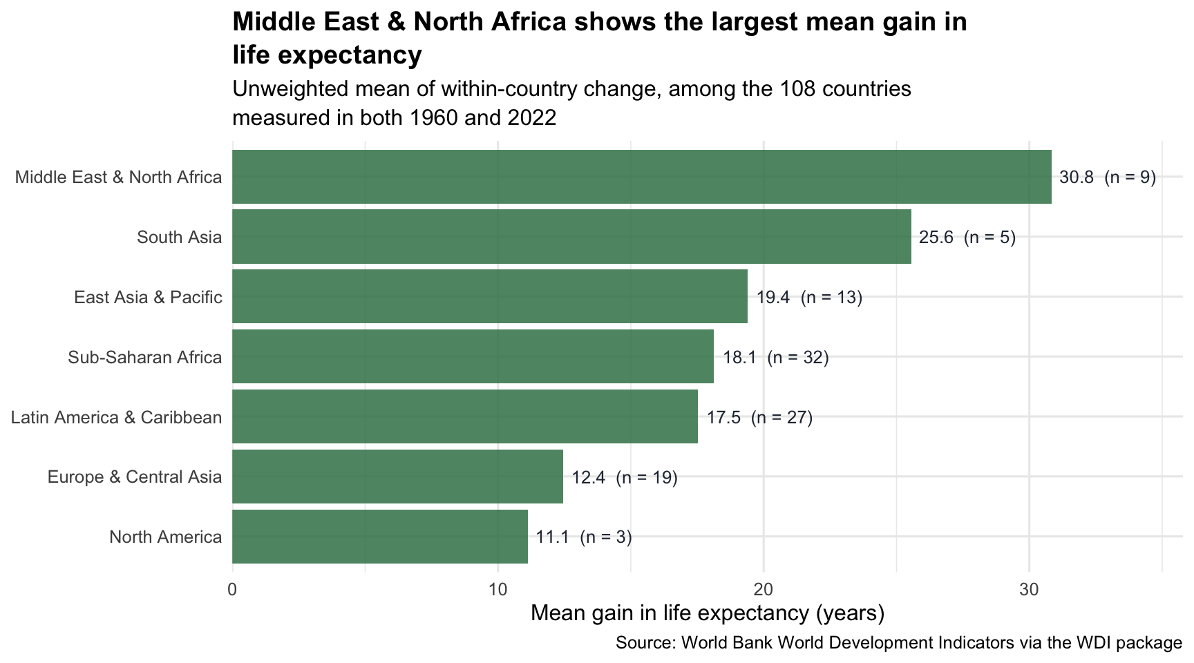
That is the full M03-to-M04 loop. A prepared longitudinal dataset went into a transparent pipeline and a chart-ready summary came out — and every step along the way was a single dplyr or tidyr verb.
Read the chart back to the research question: “Which world regions saw the biggest gains in life expectancy from 1960 to 2022?” Among countries measured in both years, Middle East & North Africa posted the largest mean gain — about 30.8 years across 9 countries — while North America gained the least, about 11.1 years. Carrying n() all the way onto the bars forces the honest footnote into the figure itself: this describes the 108 countries with data in both 1960 and 2022, not every country today. Reporting the count and the coverage alongside the headline is exactly what separates a careful analysis from a misleading one — and you can now produce all of it in one pipeline.
Reading and writing data files
Every analysis starts by reading data into R; many also end by writing a cleaned dataset or a summary table out. The functions you’ll use most live in readr (for delimited text files) and readxl/writexl (for Excel).
# Read a CSV file
df <- read_csv(here("data", "raw_data.csv"))

# Read an Excel file (specify sheet by name or index)
df <- readxl::read_excel(here("data", "raw_data.xlsx"), sheet = "Wave1")

# Read an R-native binary file (the .Rds files we use in this course)
df <- read_rds(here("data", "wdi_2022.Rds"))

# Write a cleaned data frame back out
write_csv(df_clean, here("data", "clean_data.csv"))

# Write to R-native format (preserves column types exactly)
write_rds(df_clean, here("data", "clean_data.Rds"))
A few habits worth carrying forward:
- Use here::here() to build file paths. It anchors paths to your project root so your code works no matter where the working directory currently is. M02 covered the why.
- Read each file into a clearly named object so you can still tell, weeks later, which raw file produced which cleaned object.
- Never overwrite your raw data file. Read raw → wrangle → save as a new file. If you overwrite, the wrangle is irreversible. The first time you discover a bug in step three of a 30-step pipeline, you’ll want the untouched original back immediately — and this habit is what gives it to you.
For most behavioral science work, CSV is the right portable interchange format (any tool can read it) and .Rds is the right format for intermediate analytic files (it preserves column types, factor levels, and labels exactly).
Debugging a long pipeline
When a pipeline doesn’t return what you expected, do not debug by reading the code harder. Run the pipeline up to the failing step and inspect the intermediate state. This is the single most useful debugging habit in all of dplyr.
A good workflow is simple: predict the shape → run one step → inspect → continue.
# Suppose this pipeline gives an unexpected result:
wdi_trends |>
  filter(year %in% c(1960, 2022)) |>
  group_by(region, year) |>
  summarize(mean_le = mean(life_expectancy, na.rm = TRUE)) |>
  pivot_wider(names_from = year, values_from = mean_le)

# Debug by stopping one step earlier and inspecting:
wdi_trends |>
  filter(year %in% c(1960, 2022)) |>
  group_by(region, year) |>
  summarize(mean_le = mean(life_expectancy, na.rm = TRUE))
# → look at the output, confirm the shape, then re-add pivot_wider()
Add a glimpse() or just print at any point and the data frame at that moment in the pipeline is right there in your console. This is how every working dplyr user actually writes code — incrementally, with output checked at each step.
Spot the bug. Before reading on, predict the shape of what this returns:
wdi_2022 |>
  summarize(mean_life = mean(life_expectancy, na.rm = TRUE))
If you were expecting one row per region, you’ll be surprised — it returns a single row, the mean across all 207 countries, because there’s no group_by(region) above the summarize(). Nothing errors; the only tell is the shape. This is exactly why the predict-the-shape habit pays off: you expected 7 rows and got one, so you know something upstream is missing. Add group_by(region) and the per-region table comes back.
A handful of bugs you’ll meet repeatedly:
- Lost rows you wanted to keep. Usually a filter() condition is wrong, or you accidentally used inner_join() where you meant left_join(), or your data has unexpected
NAvalues. Compare nrow() before and after each verb. - Got
NAwhere you expected a number. Usually you forgot na.rm = TRUE inside an aggregation function like mean(). - summarize() returned the wrong number of rows. You either forgot a group_by() call (so it summarized to one row total) or you grouped by too many columns (so each group has just one row and “summarize” doesn’t summarize anything).
- “Object not found” error. You used a column you haven’t created yet (e.g., a column that gets created in the next mutate() call), or there’s a typo in the column name. glimpse() the data frame at the step before to confirm what’s available.
The debugging-as-stepping-through-the-pipeline habit pays off forever. Build it now.
Looking ahead
The dplyr and tidyr verbs you learned in this Module are the foundation for every quantitative analysis you’ll do for the rest of the course — and for the rest of your career as an applied behavioral scientist.
M05 (Describing Data with R) — its Wednesday lab opens with a group_by(sex) |> summarize(mean_score = mean(…)) pipeline, and the published Table 1 it produces is the same pipeline piped into gtsummary::tbl_summary(). You’ll also use pivot_longer() to reshape participant-level item responses, and case_when() to recode raw codes into readable labels. Every M05 worked example is an M04 pipeline plus one or two new presentation packages on top.
M06–M09 (probability, confidence intervals, NHST) — the labs lean on group_by() |> summarize() for descriptive statistics, mutate() for derived variables, and pivot_* for putting results into chart-ready or table-ready shape. You will not encounter a new core wrangling verb in PSY 652 — you’ll just keep using these.
M10–M12 (regression) — every centered predictor (
x_centered = x - mean(x)), every recoded category, every interaction term, and every dummy coding lives in a mutate() call. The marginaleffects output that anchors M11 and M12 lands as a tidy data frame that you’ll filter(), select(), and ggplot() like any other.Your group projects. Every project pipeline in PSY 652 and PSY 653 sits on top of a wrangling phase. Project 1 (the Pew Data Brief), which launches Week 5, expects you to combine filter(), mutate(), group_by(), summarize(), and pivot_* into a single pipeline that delivers an analysis-ready analytic dataset for the three ggplot charts on your poster. Project 2 (NHST Reproduction), later in the semester, asks you to reproduce the finding of a published study — and that begins with the same wrangling: reading in the study’s data, filtering to the analytic sample, recoding variables to match the paper, and reshaping it into the form the significance test expects, all before a single p-value is computed. Both projects speak the M04 verbs; they are the language of that phase.
Cheat sheet — the verbs at a glance
Every verb you met in this Module
Row operations
- filter(condition) — keep rows where
conditionis TRUE - arrange(col) / arrange(desc(col)) — sort rows by a column
- distinct(cols…) — keep unique rows
- slice_max(col, n = k) / slice_min() / slice_sample() — top/bottom/random k
- drop_na(col) — drop rows where
colisNA
Column operations
- select(cols…) — keep, drop, or reorder columns (with helpers like starts_with())
- rename(new = old) — rename columns
- relocate(col, .before = pos) — move columns to a new position
- mutate(new = expr) — create new columns
- if_else(cond, yes, no) — binary recoding inside mutate()
- case_when(cond ~ value, …) — multi-way recoding inside mutate()
Group operations
- group_by(cols…) — partition the data for the next operation
- summarize(new = agg_expr) — collapse each group to one row
- count(cols…, sort = TRUE) — shortcut for
group_by() |> summarize(n = n()) - ungroup() — remove grouping
Reshape and combine
- pivot_longer(cols, names_to, values_to) — wide → long
- pivot_wider(names_from, values_from) — long → wide
- left_join(other, by = "key") — add columns from another table on a shared key
- anti_join(other, by = "key") — diagnostic: which rows didn’t find a match?
Pipe
data |> verb(args)runsverb(data, args)— the piped value fills the function’s first slot, so you never retype the data frame’s name. Pronounce as “then.”
Summary
Core ideas: Data Wrangling
Data wrangling is the work between getting the data and getting the answer — almost every published paper has more wrangling code than modeling code.
Tidy data has one variable per column, one observation per row, one value per cell. The dplyr verbs are designed for tidy data; reshape with pivot_longer() or pivot_wider() when your starting shape doesn’t match.
The core dplyr table verbs take a data frame as input and return a data frame as output (a few helpers, like pull(), return a vector instead). That contract is what makes the pipe (|>) work — pronounced “then,” it chains verbs into pipelines you can read aloud as English.
The verbs come in three families. Row operations (filter, arrange, distinct, slice_*), column operations (select, rename, mutate, if_else, case_when), and group operations (group_by, summarize, count). When you know which family your question is in, choosing the verb is straightforward.
Look at your data before you wrangle it. glimpse(), summary(), skim(), head(), and count() of any categorical variable take five minutes and prevent half the bugs you’d otherwise chase.
==is equality test,=is assignment. Mixing them up is the single most common beginner bug. R will usually warn you.Use
%in%to test whether a value is in a vector —region %in% c("A", "B", "C")is the shortcut for a chain of==tests joined with|.Listwise deletion is PSY 652’s default missing-data choice. Use drop_na() when you need it, name it as listwise deletion in your prose, and know that M05 carries the full discussion of why and what the alternatives are.
group_by() |> summarize() is the most important pattern in this Module. Every descriptive statistic, every modeling result table, every grouped comparison chart sits on top of it. The mutate-vs-summarize distinction matters: summarize collapses to one row per group; grouped mutate keeps every row and adds group-level context.
Report the relevant denominator alongside any aggregation. n() counts rows; when a statistic drops missing values, also report the number of observed values it actually used (
sum(!is.na(x))). A top-ranked group built on a handful of rows reads differently from one built on broader coverage — and is far more easily moved by any single row.pivot_longer() fixes values stored as column names; pivot_wider() fixes variable names stored across rows. Long for analysis; wide for display.
left_join() combines two tables on a shared key. Check nrow() before and after, and run anti_join() to see which rows didn’t match.
Debug pipelines by running them up to the failing step. Look at the intermediate state. This is how every working dplyr user actually writes code.
The chapters that map to this Module in our textbook (R4DS) are Chapter 3 (Data transformation) and Chapter 5 (Data tidying), plus Chapter 19 (Joins) and Chapter 7 (Data import). They cover the same material from slightly different angles, and seeing the same idea twice is how it sticks.
Going further
Beyond the core verbs
The verbs in this Module cover ~95% of real-world wrangling. The remaining 5% lives in a small set of advanced tools that you’ll meet when you need them.
across() — apply a function (or several functions) to many columns at once.
mutate(across(starts_with("score_"), ~ scale(.x)))z-scores every column whose name starts withscore_. Indispensable for repetitive operations across many measures.The .by argument — newer dplyr code often uses per-operation grouping, such as
summarize(mean_x = mean(x), .by = group). This is equivalent in spirit togroup_by(group) |> summarize(mean_x = mean(x)), but the grouping does not persist after the call. We teach group_by() first because it makes the partition step visible for beginners.join_by() — dplyr 1.1.0 also added a cleaner syntax for naming join keys:
left_join(wdi_regions, by = join_by(region))does the same thing asby = "region", andjoin_by(country == name)handles the cross-name-mismatch case more readably thanby = c("country" = "name"). We use the by = string form in this course because it’s compact and visible; switch to join_by() when your joins get complex (multi-key joins, key-name mismatches, inequality joins).The full join family — right_join(), inner_join(), full_join() have legitimate uses; the ggplot2-style pattern is to learn left_join() first and pick up the rest when a specific situation demands them. semi_join() and anti_join() are filtering joins — they return rows from the left table that have (or don’t have) a match in the right, without merging any columns.
String wrangling — stringr. When your variables include free text — names, addresses, open-ended responses — you’ll need str_to_lower(), str_detect(), str_replace(), and the rest of stringr. R4DS Chapter 14 (Strings) and Chapter 15 (Regular expressions) develop the toolkit.
Date and time wrangling — lubridate. The other place text variables turn up is dates. lubridate handles parsing, arithmetic, and formatting. R4DS Chapter 17 (Dates and times) covers it.
Nested data and purrr. When you have a column whose values are themselves data frames or lists — for example, fitting one model per group and storing each fit in a column — you’ve entered the territory of list columns. purrr::map() and friends handle this. Advanced, but powerful — R4DS Chapter 26 (Iteration) is the gentle on-ramp, and the purrr package site is the full reference.
These all live outside the M04 critical path. Add them to your repertoire when an analysis needs them.
Resources
R for Data Science (2e), Chapter 3 — Data transformation. The canonical reference for the dplyr verbs.
R for Data Science (2e), Chapter 5 — Data tidying. Tidy data principles and the pivot family.
R for Data Science (2e), Chapter 19 — Joins. left_join(), the rest of the join family, and key-matching diagnostics like anti_join().
R for Data Science (2e), Chapter 7 — Data import. Reading flat files with read_csv() / read_excel() and friends.
The tidyverse cheat sheets. https://posit.co/resources/cheatsheets/. One-page PDFs for dplyr, tidyr, readr, stringr, lubridate. Print the dplyr sheet, keep it on your desk for a month.
The dplyr package website. https://dplyr.tidyverse.org/. Function reference with worked examples; the “Articles” section has deep dives on grouped operations and joins.
The tidyr package website. https://tidyr.tidyverse.org/. Pivots, nesting, and the rest of the reshape family.
Footnotes
A data frame is a rectangular table of data — rows are observations, columns are variables, and each column holds a single type (all numbers, all text, and so on). It is the central object you work with in R, and every dataset in this course is a data frame.↩︎
A vector is R’s name for an ordered sequence of values that are all the same type —
c(1, 4, 9)is a numeric vector of length three. A single value is just a vector of length one: R has no separate “scalar” type. That’s why pull() always hands back a vector — one that happens to have length one when the column holds a single value, as after a one-row summarize().↩︎A string is a piece of text written in quotes —
"region"is a string, whereasregionwithout quotes is the name of a column. The quotes are the whole difference: they tell R “treat this literally as text,” not “go find a thing by this name.”↩︎