A No-Code Introduction to Describing Data
Learning Objectives
By the end of this Module, you’ll have a working vocabulary for describing data — the concepts that underlie every inferential method in the course, and that you’ll use every time you sit down with a dataset. Here’s what you’ll be able to do:
- Trace a measurement claim from construct to variable — explaining how the four-step chain (construct → operationalization → measure → variable) bridges theory and data, and recognizing which step is doing the analytic work in a given study.
- Explain what makes a measure trustworthy — describing the four angles on validity (content / construct / criterion / cultural-and-contextual) and the four angles on reliability (test–retest / internal-consistency / inter-rater / parallel-forms), and understanding why a measure can be reliable without being valid (or vice versa).
- Identify a variable’s place on the four-level scale of measurement — nominal, ordinal, interval, ratio — and recognize how the scale shapes which summaries are honest.
- Recognize and reason about patterns of missing data — distinguishing missing by design from not missing by design, and articulating what the missing-data mechanism is doing to your estimates.
- Summarize categorical variables using counts, proportions, and bar (or pie) charts — and use a frequency table, including its cumulative column, to answer threshold questions (“what fraction of the sample sits at or above this cutoff?”).
- Summarize numeric variables using the center (mode, median, mean), spread (range, interquartile range, mean and median absolute deviation, variance, standard deviation), and shape (symmetry, skew, kurtosis, modality) of their distributions.
- Read histograms, density plots, and cumulative-frequency plots — and recognize when each is the right view.
- Apply the empirical rule (68–95–99.7) and Chebyshev’s theorem to translate a mean and standard deviation into intuitive coverage statements.
- Compute and make sense of standardized scores (z-scores) and use them to compare values across different scales or different distributions.
- Compare distributions across groups — looking at differences in central tendency and spread, and using the coefficient of variation for fair comparisons across variables on different scales.
- Visualize and describe relationships between two variables using scatterplots and the correlation coefficient — and distinguish correlation from causation, articulating what additional evidence would be needed to support a causal claim.
- See how each descriptive concept here connects to the inferential machinery the rest of PSY 652 develops — this Module is the foundation the course builds on.
Overview
Think back to the last time a nurse wrapped a blood-pressure cuff around your arm and you watched the number pop up — maybe 120 over 80. It feels like a simple readout. But behind that single number sits a long chain of decisions made by people you’ll never meet: which cuff size to use, where to place it, how long to wait after you sat down, whether to take one measurement or three and average them, and what cutoff counts as “high.” The number you leave with is a real measurement, relevant to your health. It’s also the end product of a measurement system that someone, somewhere, carefully designed.
This is the idea descriptive statistics rests on, and it’s the stance we’d like you to take seriously throughout this Module. Every dataset you analyze in this course — and every dataset you’ll analyze in your research career — is the output of a measurement system someone built. So before we can defensibly say what data show, we need to know what the data actually are. What did the researchers decide to measure, and what did they leave out? How are observations encoded — as numbers, as labels, as ordered ranks? And what kind of summary does that encoding even let us compute?
Once those questions are on the table, descriptive statistics turns into a pretty clear-headed enterprise. You describe what’s in front of you using tools that respect the kind of variable you have. Categorical data want counts and proportions; numeric data want a center (mean, median, mode), a spread (range, interquartile range, variance, standard deviation), and a shape (the symmetric bell, the long right tail, the bimodal split). The tools themselves are simple — the skill is in picking the right one for the variable in front of you, and being honest about what it does and doesn’t tell you.
To make all this concrete, we’ll spend the Module getting to know one variable closely: systolic blood pressure (SBP), from the National Health and Nutrition Examination Survey (NHANES), a public-health surveillance dataset collected by the Centers for Disease Control and Prevention (CDC). SBP is a nice teaching anchor for a few reasons. It’s continuous, so the whole numeric toolkit applies. It’s clinically meaningful, so the summaries we compute carry real interpretive weight — a mean SBP around 119 mm Hg isn’t just a number floating in space, it’s a description of blood pressure in a real public-health sample. And it’s measured imperfectly, in ways researchers actively debate, so the measurement question stays alive across the whole Module instead of disappearing the moment we start computing averages.
This Module is deliberately no-code. You’ll see R output and rendered figures, but you won’t be writing or running code yet — that starts in M02. Our bet is that the conceptual core of descriptive statistics — what center means, why spread matters, when a histogram beats a table, what a z-score actually does, how a correlation can be strong and still not tell you what causes what — lands better when you’re free to think it through without also wrestling with syntax. By the end of this Module you should have all the ideas in hand; the code that produces them is next Module’s job.
One more thing before we dive in: every concept this Module introduces has an inferential cousin later in the course. The mean of SBP in NHANES becomes the sample mean as an estimator of a population mean in M05–M07. The standard deviation becomes the building block of the standard error. The z-score generalizes into the test statistic of M08–M09. The correlation generalizes into the slope of a regression line in M10–M12. So even though we’re not doing inference yet, you’ll meet each of these ideas again — everything here is also a setup for what’s coming. Consider this Module the foundation; the Modules after it build the house on top of it.
How to use this (long) page
This Module is long because it lays the conceptual foundation for the whole course — but you are not meant to memorize every formula on a first pass. The formulas are here as reference; the goal is to understand what each statistic is trying to tell you. Three habits will carry you through:
- Always ask what was measured, and how — every number begins as a measurement decision.
- Match the summary to the variable type — categorical variables get counts and proportions; numeric variables get a center, a spread, and a shape.
- For a numeric variable, report center, spread, and shape together — a lone mean is always a partial picture.
If you come away with those three habits, the Module has done its job. Everything else is reference you can return to.
Measurement
Try recalling the SBP reading from your last check-up. Behind that single number is a question — how do you measure blood pressure? — that took decades of clinical research to answer. Cuff size matters: a too-small cuff on a thick arm reads high, sometimes by 10 mm Hg or more. Position matters: legs uncrossed, back supported, feet flat on the floor, arm at heart level. Timing matters: a single elevated reading at a tense doctor’s visit (the so-called white-coat effect) doesn’t mean hypertension. Number of readings matters: current guidelines recommend averaging two or three. Each of these decisions is a trade-off between what we want to know — your underlying blood pressure when you’re not at the doctor’s — and what we can actually observe — a number on a cuff at a moment in time.
Even blood pressure — about as physically concrete a measurement as you’ll find — rests on a chain of choices someone made before the cuff ever touched an arm. In the social and behavioral sciences, that chain is usually longer, and the choices more contested. We rarely get to study something with the brute physicality of pressure on an artery wall. Instead we care about anxiety, recovery from trauma, information-processing bias, work-life balance — constructs that live in our theories, not in any blood-pressure monitor. Turning those constructs into numbers is what we call measurement, and how we do it shapes what our numbers can honestly tell us.
Some measurements are simple: a height of 72 inches, a marital status of single, a count of 0 children, a self-report of 8 hours of sleep. These have a clear unit or a small set of allowable labels, so the operationalization is essentially finished by the time you read the question. But the constructs that motivate most behavioral research don’t arrive pre-operationalized. They live in theory long before they live in any dataset, and they vary by subdiscipline in ways that hint at how different fields end up measuring them.
A few concrete examples make the pattern clear:
- An industrial-organizational psychologist studies work-life balance — a construct nobody can put a tape measure on, but one that drives turnover, burnout, and well-being at scale.
- A clinical psychologist studies recovery from trauma — the slow reintegration of identity and function that happens (or doesn’t) in the months and years after a singular hard event.
- A cognitive psychologist studies information-processing bias — the systematic ways perception, memory, and judgment lean in one direction even when the data don’t.
Bridging theory and data — turning work-life balance or recovery from trauma or information-processing bias into a number on a spreadsheet — is what researchers mean when they say a study operationalizes its variables. That work has a name, a structure, and a small number of decisions you can spot in advance.
Operationalization · turning constructs into variables
Every measurement study walks the same four-step chain: construct → operationalization → measure → variable. Each step narrows the abstract idea into something more concrete, and each step makes choices the next one has to live with.
Construct
What theoretical idea are you trying to study?
The abstract concept that lives in your literature — anxiety, work-life balance, post-traumatic growth. It exists in theory long before it shows up in any spreadsheet, and different fields argue about what it includes and excludes.
Operationalization
How will you pin the construct to a concrete method?
The decision to treat the construct as if it were observable through a specific approach — self-report, behavioral observation, physiology. This is the step where most of the research disagreement lives.
Measure
What tool actually does the observing?
The specific instrument that implements the method: the PHQ-9 questionnaire, a behavioral coding scheme, a salivary-cortisol assay. Two valid measures of the same construct can still produce different numbers.
Variable
What lands in your spreadsheet?
The column each participant contributes a value to — a PHQ-9 sum from 0 to 27, a behavior-rating average, a cortisol concentration in nmol/L. This is the only piece your analysis actually sees.
Most of the interesting research disagreement lives in that middle step, because operationalization isn’t a single decision — it’s a small bundle of three. A clinical psychologist studying anxiety in college students, for example, has to settle each one before collecting a single data point: what counts as anxiety in this study, how it will actually be observed, and what shape the answers can take.
Define the construct, precisely. What exactly counts as “anxiety” in this study? The researcher commits to a working definition — say, “persistent worry and nervousness about academic performance over the past month” — and accepts that it will exclude some aspects of what laypeople call anxiety (panic attacks, social anxiety, generalized worry about non-academic matters) while including others.
Choose a method. How will the construct actually be observed? Self-report surveys ask participants to rate their own feelings; observational methods send a trained observer to score visible behaviors during a stressful task; physiological methods record heart rate or cortisol. The three approaches do not pick up the same thing — each captures a different facet of the construct.
Specify the allowable values. What shape does each response take? A self-report scale running “Never / Sometimes / Often / Always” produces ordinal data; a 0-to-100 visual analog scale produces continuous data; a clinical cutoff produces a binary “anxious / not anxious” classification. The same underlying answer can land in your dataset in different shapes.
Every one of these decisions narrows the construct down to something measurable, and every narrowing is also a loss — what you keep is what you can count, and what you drop is what your data will stay silent about. Two well-respected anxiety researchers can operationalize the same construct in three different ways and land on three slightly different conclusions about the same population — not because anyone is wrong, but because they’re looking at different shadows of the same abstract idea. This is why the methods section of a published paper matters so much: when you read someone else’s finding about anxiety, the first question to ask is always which anxiety, measured how?
Validity and reliability · two flavors of trust
Once you’ve settled on an operationalization, two questions follow.
- Is your measure picking up the construct you actually care about? That is validity.
- Does it pick it up the same way when nothing about the construct has changed? That is reliability.
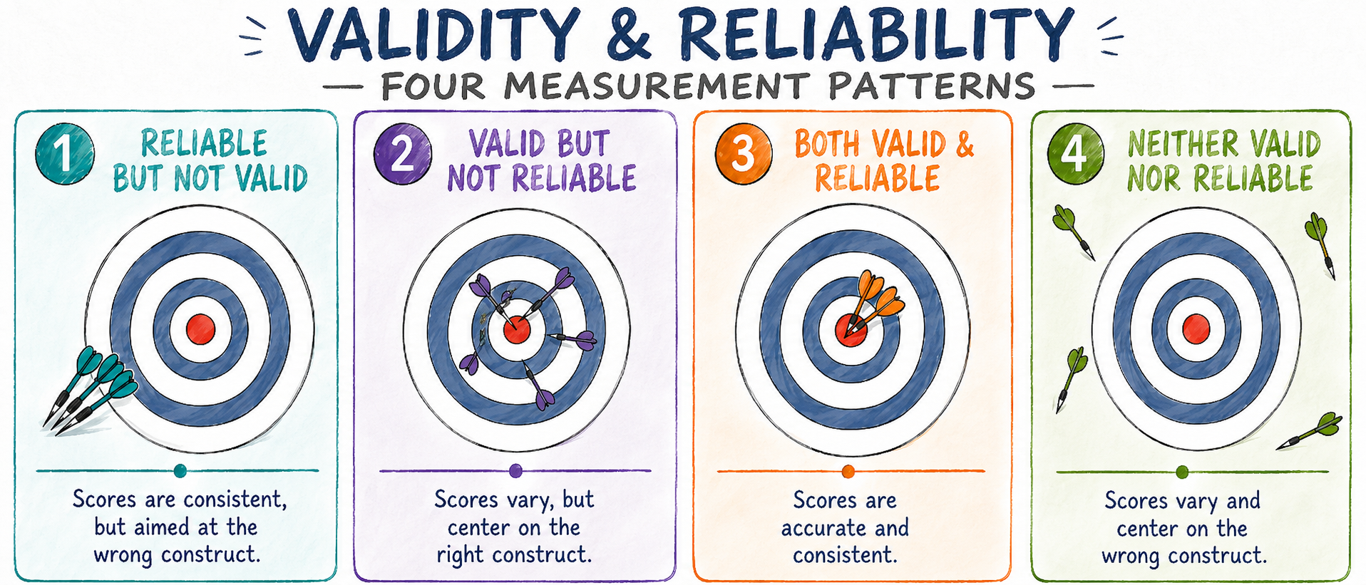
The two can fail independently. An invalid measure can be perfectly consistent — a self-esteem scale that mostly tracks social desirability is reliable as a measure of how much someone wants to look good, but invalid for self-esteem. A measure can also be aimed at the right construct yet too noisy to pin it down — a single-item mood probe points in the right direction, but its scores bounce around so much they establish little. (Strictly, heavy unreliability caps how much validity the scores can demonstrate — you can’t show scores capture the right thing if they barely agree with themselves — so “valid but unreliable” is better read as on target on average, but too imprecise to trust.) Good measurement needs both at once.
Validity · are we measuring what we think we’re measuring?
Validity asks whether a measure is picking up the construct it claims to capture. Behavioral scientists carve this question up in a few competing ways, and there’s no single agreed taxonomy — classic treatments often name content, construct, and criterion validity, while contemporary frameworks treat construct validity as the umbrella the others feed into. In this course we’ll work with four angles, each a distinct way validity can fail. The fourth — cultural and contextual validity — isn’t a universally listed member of any one taxonomy, but it’s essential in a field whose measures routinely travel across populations they were never developed in, so we give it equal billing here.
- Content validity — Are the items covering the major features of the construct? An anxiety questionnaire with good content validity asks about worry, tension, sleep, and concentration — not just one of these.
- Construct validity — Does the measure behave the way theory says it should? Anxiety scales should correlate strongly with other anxiety scales (convergent) and weakly with unrelated traits like optimism (discriminant).
- Criterion validity — Does the measure track a standard or predict relevant outcomes? Anxiety scores should be higher among diagnosed students (concurrent) and should predict later academic or mental-health outcomes (predictive).
- Cultural & contextual validity — Is the measure meaningful across the groups and settings it will be used in? Anxiety symptoms manifest differently across cultures; a scale that works well in one population may misfire in another.
A new scale rarely passes all four on the first pass — establishing validity is a years-long, multi-paper enterprise. When you read someone else’s measure, the question isn’t “is it valid?” but which kinds of validity have been established, and are those the ones I need? A paper can claim a scale is “valid” while only showing one slice of the argument; your job is to ask which slice — content, construct, criterion, or cultural/contextual — the evidence actually covers, and whether that’s the slice your own research question needs. Two related habits help. First, don’t treat validity as all-or-nothing: a measure can have strong evidence for one flavor and weak evidence for another, and that doesn’t automatically make it useless — it means you have to be precise about what’s actually been established. Second, the burden of evidence travels with the use of the measure, not just its existence: a scale validated for diagnosing clinical anxiety in adults isn’t automatically a valid measure of test-related anxiety in undergraduates.
Reliability · can we trust our measures to be consistent?
Reliability is the companion question. If validity asks “are you measuring the right thing?”, reliability asks “are you measuring it consistently?” The opposite of reliable is noisy — variation in your data reflects randomness in the measurement process rather than real variation in the construct. Reliability also comes in four flavors.
- Test–retest reliability — Does the measure give consistent results across time? Students who complete an anxiety survey twice a week apart should score similarly — assuming their anxiety has not actually changed in between.
- Internal-consistency reliability — Do the items within the survey hang together? A good anxiety questionnaire has items that all reflect anxiety. Cronbach’s alpha is the most commonly reported numerical check (later courses may introduce alternatives such as omega). Read a high alpha narrowly, though: it says the items covary, not that they measure a single dimension, and certainly not that they measure the right construct. Alpha also climbs simply by adding items, so a long questionnaire of near-duplicate questions can post an impressive alpha while telling you very little.
- Inter-rater reliability — Do different observers agree? Two trained observers scoring the same student’s exam behavior should give similar anxiety ratings.
- Parallel-forms reliability — Do equivalent versions of the measure agree? Two slightly different anxiety surveys covering the same symptoms should produce similar scores when given to the same students.
A measure can be reliable without being valid (consistent but pointed at the wrong thing) or — the harder case to spot — aimed at the right construct yet too noisy to be useful, since scores that barely agree with themselves can carry only limited validity evidence.
Putting it all together
Try it · diagnosing a new anxiety scale
A clinical psychologist administers a brand-new “anxiety inventory” to 200 college students twice, one week apart. Three observations come back:
- The two sets of scores correlate at \(r = .94\) — students’ relative ordering is highly stable across the two occasions (whoever scored high on Monday tended to score high again the next week). Note that a high correlation shows this rank-order consistency, not that each student’s two scores were numerically identical — everyone could shift up by five points and \(r\) would be unchanged.
- The inventory correlates weakly with established anxiety scales at around \(r = .15\).
- The inventory correlates strongly with a measure of social desirability at \(r = .72\).
Is this inventory:
- (a) Valid but not reliable
- (b) Reliable but not valid
- (c) Both valid and reliable
- (d) Neither valid nor reliable
The answer is (b): reliable but not valid.
The test–retest correlation of .94 means the inventory gives consistent scores across time — students who score high on Monday score high again the next week. That is exactly the test–retest reliability criterion. The measure is reliable.
But the validity evidence is poor. A valid anxiety measure should correlate strongly with other established anxiety scales (convergent validity) and weakly with unrelated constructs (discriminant validity). This inventory does the opposite — it correlates weakly with established anxiety measures and strongly with social desirability. The instrument is consistently picking up something, but that something looks much more like a socially desirable response style — impression management — than like anxiety itself.
Visually, this is the reliable-but-not-valid dartboard from the figure above: the darts are tightly clustered (consistent) but landing well off the bullseye (wrong target). Spotting this pattern in someone else’s measure — before you build an analysis on top of it — is one of the most useful skills you can take out of this section.
Types of variables
Essential question
What kind of variable do we have, and what are we allowed to do with it?
Before you compute anything, it helps to know what the values in the column mean. The scale of measurement determines which summaries are informative, which graphs are appropriate, and which interpretations are defensible.
What this section gives you
- A four-part vocabulary: nominal, ordinal, interval, ratio
- A simple test for what you are allowed to do: rank, subtract, or divide
- A way to spot when numeric coding is visually convenient but statistically misleading
Why it matters
A variable can look numeric in a spreadsheet and still fail to support numeric summaries. This is why a careful analyst asks “what kind of variable is this?” before asking for its mean, standard deviation, or correlation.
Once we’ve measured something, the next question is what the recorded values can actually do. Different kinds of variables allow different kinds of comparisons. You can’t take the mean of political affiliation. You can’t say a satisfaction rating of 4 is twice as much satisfaction as a 2. But you can take the mean of systolic blood pressure, and a ratio like 140 mm Hg ÷ 70 mm Hg has a physically meaningful interpretation.
These distinctions aren’t pedantry — they determine which summaries and graphs are honest, and which quietly misrepresent the data.
The standard four-level taxonomy is nominal, ordinal, interval, and ratio. Each step up the ladder adds one more kind of comparison you’re allowed to make — rank, subtract, divide. As you read each card below, ask yourself which of those three operations the variable actually supports.
Nominal
Just labels — no inherent order?
Categories like political affiliation (Democrat, Republican, Independent), blood type, ethnicity. You can count how many fall in each group, but ranking, subtracting, or dividing two values is meaningless — “Democrat minus Republican” has no defensible interpretation.
Ordinal
Ranked — but is the spacing equal?
Categories like satisfaction (Very Dissatisfied → Very Satisfied) or education level (High School → Bachelor’s → Master’s). Rank is meaningful, but the gap between adjacent levels is not necessarily equal — Very Satisfied to Satisfied isn’t necessarily the same psychological distance as Satisfied to Neutral.
Interval
Equal spacing — but no true zero?
Numbers like temperature in Celsius or Fahrenheit. The gap between 20° and 30° equals the gap between 30° and 40°, so subtraction is honest. But 0° does not mean “no temperature,” so 20° is not twice as hot as 10°.
Ratio
Equal spacing AND a true zero?
Numbers like height, weight, time, and many physical measurements. Zero genuinely means absence, so all three operations are honest. Ratios like “twice as heavy” or “twice as long” mean what you’d expect.
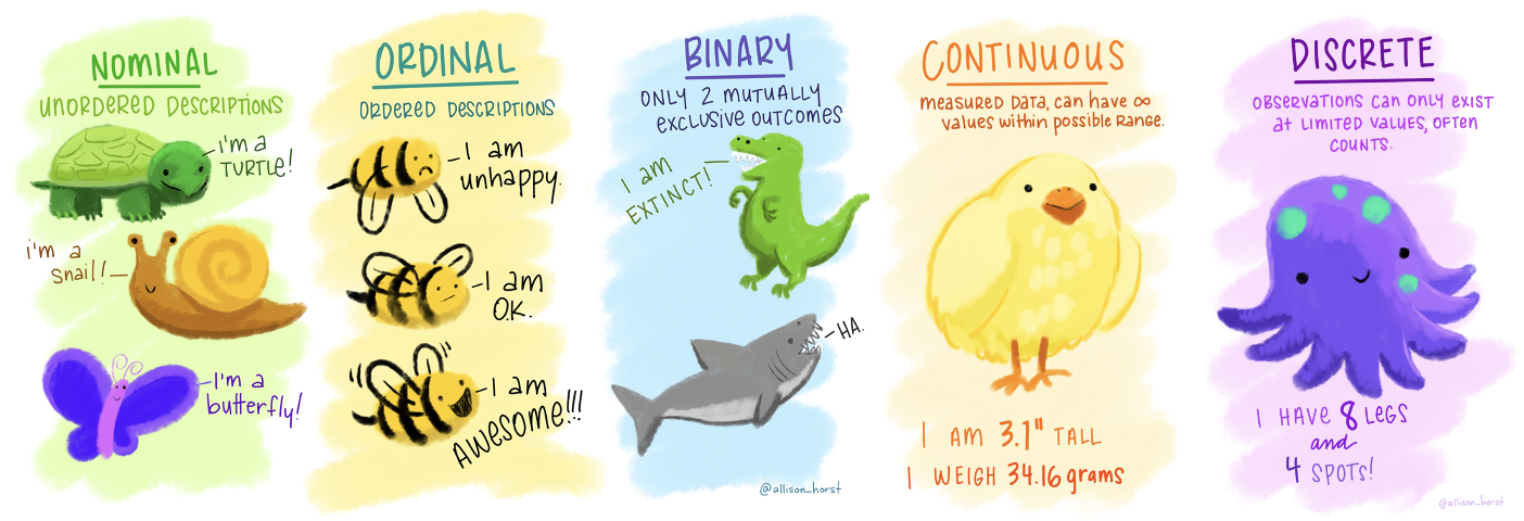
Two special distinctions come up often enough to deserve their own labels. Binary variables are nominal variables with exactly two categories — yes/no, pass/fail, treatment/control — often coded 0/1 for analysis. Discrete variables are numeric counts that take only specific values (number of children, website visits, anxiety episodes per week); they contrast with continuous variables, which can take any value within a range (height, weight, time, blood pressure).
The takeaway is simple: the kind of variable you have determines the kinds of summaries, graphs, and interpretations you can defend.
Try it · classifying NHANES variables
You are about to meet the nhanes dataset in the next section. Classify each of the following variables on the four-level scale of measurement (nominal · ordinal · interval · ratio), and note any caveats. Also flag any that are binary or discrete.
- age — recorded in whole years
- marital_status — one of Divorced, Married, Single, Separated, Widowed, Live with Partner
- education — one of 8th Grade or Less, 9–11th Grade, High School Graduate or GED, Some College, College Graduate
- SBP — systolic blood pressure in mm Hg
- smoker_status (a hypothetical addition) — coded as 0 (non-smoker) or 1 (current smoker)
- age — ratio (and discrete, since it’s recorded in whole years). Zero marks the starting point of the scale, and ratios are meaningful — a 40-year-old has lived twice as long as a 20-year-old. The full numeric toolkit (mean, median, standard deviation) applies.
- marital_status — nominal. The six categories have no inherent rank — “Divorced” is not “more” or “less” than “Married.” You can report counts and proportions, but ranking, subtracting, or dividing values is meaningless.
- education — ordinal. The five levels have a clear rank (8th Grade or Less < 9–11th Grade < High School Graduate or GED < Some College < College Graduate), but the gap between adjacent levels is not necessarily equal. The difference in years of schooling between Some College and College Graduate is not the same as between 8th Grade or Less and 9–11th Grade.
- SBP — numeric, and usually treated as ratio-scale (and continuous). It supports the usual numeric summaries, and zero marks the absence of pressure. In practice, the main point is that SBP behaves like a continuous numeric variable, so the full descriptive toolkit applies.
- smoker_status — binary (a special case of nominal). The 0/1 coding is a notation convenience for analysis — it does not mean smokers are “1 unit more” of anything than non-smokers.
The recognition to carry forward: the numeric coding in a dataset is not the same as the scale of measurement. R can store any variable as a number, but only some of those numbers have earned the right to be averaged.
Meet the data
With the vocabulary in hand, let’s ground it in a real dataset. For the rest of this Module — and as a recurring touchstone for several Modules that follow — we’ll work with the National Health and Nutrition Examination Survey (NHANES), the CDC’s flagship surveillance program for the health and nutritional status of people living in the United States. NHANES has been running in some form since the early 1960s. Each two-year cycle interviews and examines roughly 10,000 people drawn to be representative of the U.S. civilian non-institutionalized population, then puts the de-identified data in the public domain. The dataset is one of American public health’s most important windows into population health — what people eat, how much they sleep, what they weigh, what their cholesterol looks like, and (for our purposes) what their blood pressure reads when a trained examiner measures it under standardized conditions. It’s a carefully designed sample survey, not a census — but a large, nationally representative one.

Why public-health surveillance matters
Public-health surveillance is the machinery behind many of the news headlines you read about national health trends — the rise in adult obesity, the changing prevalence of childhood lead exposure, the regional patterns of hypertension. The data come from programs like NHANES. They are how policymakers know what to prioritize, how funders know which interventions are working, and how researchers know whether the populations they study look anything like the country at large. A typical NHANES cycle does five distinct things at once:
- Describes the current state of the population — what fraction of U.S. adults are hypertensive, undernourished, sleep-deprived, food-insecure.
- Tracks change over time — obesity rates climbing, smoking rates falling, diabetes prevalence rising — by sampling fresh cohorts every two years using comparable protocols.
- Surfaces disparities by demographic stratum — age, sex, race/ethnicity, income, education — that single-clinic studies cannot see.
- Detects emerging concerns early — environmental exposures, novel infectious agents, nutritional deficits — by running standardized lab assays on biospecimens that were not yet known to matter when the cycle launched.
- Anchors comparison studies internationally — researchers in other countries use NHANES as a reference distribution for the U.S. against which their own populations can be benchmarked.
For the purposes of this Module, what matters is that NHANES is a real dataset — the same dataset clinicians, epidemiologists, and policy analysts read every day — and the systolic blood pressure values you’ll see in the next sections are measurements of actual American adults and children.
In this Module, we will use NHANES data collected during 2011–20121. NHANES data are publicly available for download.
nhanes · 5,000 observations · 4 variables · CDC NHANES 2011–2012 · data/nhanes.Rds
The nhanes data frame contains a resampled subset of the NHANES health survey, designed to approximate a simple random sample of the U.S. population.
- age numeric — Age at screening, in completed years
- marital_status factor — Current marital status, self-reported
- education factor — Highest level of education completed
- SBP numeric — Systolic blood pressure in millimetres of mercury, from the examination component
Full codebook for nhanes — values, levels, missingness, and how the file was prepared.
Here are the first few rows of the data. Notice that age and SBP are listed as <dbl> — short for double, R’s standard storage type for any numeric value (whole numbers or decimals). Marital status and education are listed as <fct> — short for factor, R’s storage type for a categorical variable with a fixed set of allowed levels. The data type is R’s way of remembering, behind the scenes, how to handle each column. It’s related to, but not the same as, the variable’s measurement scale: as you saw in Types of variables, it’s the underlying scale — nominal, ordinal, interval, ratio — that ultimately determines which summaries are meaningful, while the storage type governs what R will let you compute without complaint.
The table below presents 20 randomly selected participants. Look across the table and you’ll find some cells listed as NA. R uses NA to mark a value that’s missing or unknown — and missing data are a research problem in their own right, not a typo. Why a value is missing controls whether you can simply ignore it or have to do real methodological work to handle it.
Two missingness patterns will come up in this course. The first is missing by design: the researcher decided not to ask a question of certain participants, on purpose. For example, NHANES doesn’t ask marital status or education of respondents under 20, and it doesn’t measure blood pressure in children under 8. These structural absences are predictable, and easier to reason about than the alternative — but they’re not simply benign. They quietly change which population a variable describes: marital status here describes NHANES adults, not the whole sample, so every summary of it is a statement about adults only. Even so, a row missing SBP because the participant is six years old is a different kind of problem than a row missing SBP because the participant refused to have their blood pressure measured.
The second is not missing by design: a participant refused to answer, skipped part of the survey, or declined a physical measurement. Whether this kind of missingness biases your analysis depends on why people skipped, and it helps to separate three cases. If skipping is unrelated to both what you can see and what you can’t — missing completely at random — an analysis of the observed cases stays unbiased, though it loses precision. Often, though, skipping is related to something you did record (older participants skip an item more often, and you have their age) — missing at random — where the observed information can be used to account for it. And if skipping is related to the unobserved value itself (people with very high blood pressure refuse the cuff more often; recently divorced respondents skip the marital-status item) — then the missingness is itself information, and ignoring it biases your estimates. Which case you’re in — together with the estimand and the variables involved, not simply whether the missingness looks random — is what decides whether dropping incomplete rows is safe. The technical name for the underlying pattern is the missing-data mechanism; we’ll return to it more formally in M05, but the instinct to ask why is this missing? before deciding how to handle it is one you can carry into every dataset you ever read.
Describing categorical data
Categorical data — variables on nominal or ordinal scales, sometimes called qualitative variables in statistics — get a much smaller toolkit than numeric variables, but the few tools we do have are essential. (A quick heads-up for behavioral scientists: “qualitative” here means categorical measurements, not interviews or thematic analysis.) Categorical variables can be summarized by how often each category occurs (a count or frequency), what fraction of the sample sits in each category (a proportion or percentage), and how those frequencies look as a picture (a bar chart for nominal variables, sometimes a pie chart for proportions of a whole). That’s, in a real sense, the entire repertoire — as a rule, no means, no standard deviations, no histograms. (One useful exception: a binary variable coded 0/1 — like smoker_status — does have a meaningful mean, because the average of a column of 0s and 1s is exactly the proportion coded 1. For arbitrary category codes, though, a mean really is meaningless.) The discipline is in picking the right tool for the question and reading what it does and doesn’t say.
The NHANES adult subsample (age ≥ 20, n = 3,587) used here gives us two categorical variables: marital status (nominal — six unordered categories) and education (ordinal — five ranked categories). For each, the natural first step is a frequency table.
| Characteristic | N = 3,5871 |
|---|---|
| Marital status | |
| Divorced | 352 (9.8%) |
| Live with Partner | 294 (8.2%) |
| Married | 1,896 (53%) |
| Single | 737 (21%) |
| Separated | 84 (2.3%) |
| Widowed | 222 (6.2%) |
| Unknown | 2 |
| Highest level of education achieved | |
| 8th Grade or Less | 212 (5.9%) |
| 9–11th Grade | 405 (11%) |
| High School Graduate or GED | 679 (19%) |
| Some College | 1,160 (32%) |
| College Graduate | 1,128 (31%) |
| Unknown | 3 |
| 1 n (%) | |
The numbers in the table are worth a close look. 352 of the 3,587 adults were divorced. Notice the percentages are computed out of 3,585, not 3,587 — two participants didn’t report marital status, and the convention used here is to compute proportions among the observed responses rather than the full sample. That’s a defensible default, but it’s also a choice: had we instead divided by 3,587 (the so-called raw base), our percentages would tilt slightly lower and the marital-status column wouldn’t sum to exactly 100%. There’s no universally right answer; what matters is that you know which denominator you’re using and say so explicitly. Either way, the divorce rate in this adult sample lands near \(352 / 3{,}585 \approx 9.8\%\).
Try it · the education column
The education table reports five ordered levels — 8th Grade or Less (5.9%), 9–11th Grade (11%), High School Graduate or GED (19%), Some College (32%), and College Graduate (31%).
What percentage of NHANES adults in this sample have completed at least a high school education?
Add the three highest categories: High School Graduate or GED + Some College + College Graduate. Using the rounded table percentages, 19% + 32% + 31% = about 82%. But the underlying counts tell a slightly sharper story: 2,967 of the 3,584 participants who answered the education item — that is, 2,967 / 3,584 = 82.8%, so about 83% completed at least high school. The gap is a small but useful reminder that rounded percentages don’t always add up to the count-based total.
Two things to notice on the way to that number. First, the same denominator caveat from marital status applies here — three of the 3,587 adults did not report education, so the column percentages sit on a base of 3,584. Second, summing “at least high school” only makes sense because the education categories are ordered. There is no equivalent “at least Married” question for marital status, because marital status is nominal — its categories have no rank.
Bar charts and pie charts are the standard visual companions to a frequency table — they show the same numbers in different ways. The two charts below display the marital-status distribution side-by-side: the pie chart emphasizes how the whole sample breaks down into parts, while the bar chart makes it easier to rank categories by size and compare adjacent ones. For nominal variables with more than three or four categories — like the six here — the bar chart is usually the easier read, but pies remain popular for the part-of-whole intuition. Both charts are interactive: hover over a wedge or bar to see its category and percentage.
The two charts encode exactly the same numbers — Married is just over half the sample in both (about 53%), Single about 21%, and so on — but the visual emphasis differs. The pie makes the “Married slice dominates” story land immediately, while the bar chart makes it easier to read the secondary distinctions between Single, Divorced, and Live with Partner. Neither is “wrong”; they answer slightly different questions. For most categorical reports, the bar chart is the safer default — proportions are encoded in length, which the eye reads accurately, rather than in angle or area, which the eye reads less reliably.
Describing numeric data
Where categorical variables lend themselves to just a few standard summaries, numeric variables — measured on interval or ratio scales — open up a much larger toolkit. We can talk about a typical value (a center), how spread out the values are (a spread), what shape the distribution takes, where any unusual points sit, and how one numeric variable tracks with another. Each of these gets its own treatment in this section, and each comes back in later Modules as the building block of an inferential procedure. The mean of SBP today becomes the sample mean as an estimator of a population mean in M05–M07; the standard deviation today is the building block of the standard error in M07; and so on.
A clinical orientation to SBP
Before we start computing, a quick clinical orientation to systolic blood pressure (SBP) — the variable we’ll consider for the rest of the Module. SBP is the top number in a blood-pressure reading: the peak pressure in your arteries at the moment your heart contracts, measured in millimeters of mercury (mm Hg). Clinically, sustained high SBP — systolic hypertension — is a major modifiable risk factor for heart disease, stroke, and kidney disease, which is why every adult physical includes it. Statistically, SBP is a familiar continuous measurement with a clear age gradient — which makes it perfect for showing how center, spread, shape, and covariation land on real data.
A few facts to keep in your back pocket as we work through the next sections:
- A healthy resting SBP for an adult sits roughly between 90 and 120 mm Hg.
- An SBP of 120–129 is now classified as elevated, 130–139 as Stage 1 hypertension, and 140 and above as Stage 2 hypertension — though these cutoffs have shifted more than once over the past two decades, and the Stage 1 cutoff of 130 was introduced only in 2017, when the guideline lowered the hypertension threshold from 140 to 130. These are the categories for adults; blood-pressure classification in children under 13 depends on age, sex, and height percentiles, and our SBP sample includes participants as young as 8.
- SBP climbs with age. The average 16–25-year-old and the average 65+-year-old in our NHANES sample differ by roughly 22 mm Hg — a gap big enough that you will see it cleanly in the figures below.
Two cautions travel with these category labels. They are adult cutoffs, and our sample spans ages 8 and up — so a young participant’s reading should not be judged against them. And a single cuff reading, at any age, describes the recorded value, not a clinical diagnosis: real hypertension is diagnosed from several readings on several occasions. So when we count participants at or above 140 mm Hg in the next section, read it as “the percentage with an observed SBP at or above the adult Stage 2 threshold” — not as a hypertension rate. With that in mind, every time we compute a mean, plot a histogram, or compare two age groups across the next sections, these clinical anchors give you a quick gut-check: does the number look the way blood pressure ought to look?
We have 4,281 NHANES participants with an observed SBP value, recorded in millimeters of mercury (mm Hg). Before we compute anything, the natural first instinct is to see the distribution — to look at how blood pressure is spread across these thousands of individuals, where it piles up, where it thins out, where the extreme values live.
The cleanest first view is a frequency table built by chopping the SBP scale into bins of equal width. Below, we bin SBP into 5-mm Hg intervals starting at the minimum observed value (79 mm Hg) and count how many participants land in each bin. Each row of the table carries five numbers, and it is worth meeting them in the abstract before reading the table itself:
SBP_bin — the bin range. Square brackets
[ ]mean inclusive; parentheses( )mean exclusive. So[79,84)covers 79 through 83.99…, and the last bin[219,224]includes both endpoints.frequency — the count of participants whose SBP lands in that bin.
relative_frequency — the count expressed as a proportion of the full 4,281 participants. The first bin’s 14 people become \(14 / 4{,}281 \approx 0.0033\).
percent_of_n — the same proportion expressed as a percent (0.0033 → 0.33%). Easier to read than the raw proportion when comparing bins at a glance.
cumulative — a running total of the frequency column. Read the boundary carefully: because these bins are right-open, the running total through
[124,129)counts everyone with SBP strictly below 129 — not “at or below 129.” The value is 3,269, so 3,269 of 4,281 participants (~76%) have SBP below 129 mm Hg. This column is what makes threshold questions easy: how many are below 120? or at 140 and above?That distinction is worth holding onto, because two different quantities get casually called “cumulative.” From a binned table, you can only ever read below the bin’s upper edge, because the table has thrown away where inside the bin each observation sits. From the raw data, you can ask a sharper question — at or below a specific value, such as 139 — since nothing has been binned away. The two agree only when the value you care about happens to be a bin edge. The next learning check turns on exactly this gap.
Binning a continuous variable into a frequency table is a starting place, not a final answer — choose the bin width too wide and you smooth away real features of the distribution; too narrow and the noise overwhelms the signal. The 5 mm Hg width used here works well for SBP at this sample size; later we’ll replace the table with a histogram, which does the same job visually.
Try it · reading the SBP frequency table
Recall from the clinical orientation earlier in this section that the American Heart Association classifies an SBP of 140 mm Hg or higher as Stage 2 hypertension.
What percentage of the 4,281 NHANES participants with observed SBP have a reading at or above the adult Stage 2 threshold of 140 mm Hg? (Remember: this describes the recorded reading, not a diagnosis.)
The cleanest path is to count directly from the raw SBP values, but the cumulative column can give you a quick approximation. Think about both.
Answer it the way you would with the table in front of you — by reading the cumulative column, not by computing anything.
The cumulative column tells you how many participants fall below each bin’s upper edge (right-open bins, so the edge itself is not included). The bin edge closest to the Stage 2 threshold is the top of [134, 139), with a cumulative count of 3,787 — the participants below 139 mm Hg. Subtract that from the 4,281 observed sample and you are left with 494 participants at 139 mm Hg or above.
That is close to the Stage 2 count, but not exact: 140 does not sit on a bin edge, so a handful of people at exactly 139 get swept in. The box below works through the small correction. Once you make it, the answer is 469 participants at SBP ≥ 140, or 11% of the observed sample.
Why the cumulative column does not give you the exact answer here
The cumulative column gives the running total of participants below each bin’s upper edge — not at or below it, because the bins are right-open. The bins are 5 mm Hg wide and start at 79 mm Hg (the minimum observed value), so the bin edges are 79, 84, 89, …, 134, 139, 144 — and 140 mm Hg does not land on a bin edge.
The closest cumulative count is at the top of [134, 139), which is 3,787 — the number of participants with SBP below 139, not below 140. Anyone with SBP = 139 lands in the next bin, [139, 144), which also contains SBP = 140, 141, 142, 143 — and the binned table can’t tell you how many of that bin’s 175 people have SBP = 139 versus SBP ≥ 140.
In our data, 25 participants have SBP = 139, so the correct “below 140” count is \(3{,}787 + 25 = 3{,}812\), and the “at or above 140” count is \(4{,}281 - 3{,}812 = 469\) — matching the direct calculation above.
The lesson: a cumulative-column lookup answers threshold questions exactly only when the bin edges line up with the threshold. When they don’t, the cumulative gets you close, but the raw-data calculation is what you should trust.
So roughly one in 9 NHANES participants sits at the Stage 2 hypertension threshold or above — a noteworthy public-health number even before we condition on anything else. As you’ll see soon, almost all of that 11% is concentrated in the older age groups.
A frequency table is useful, but a histogram of the same information makes the distributional shape easier to see at a glance. Two views below — one with raw frequencies on the y-axis, one with relative frequencies (percentages) on the same y-axis position.
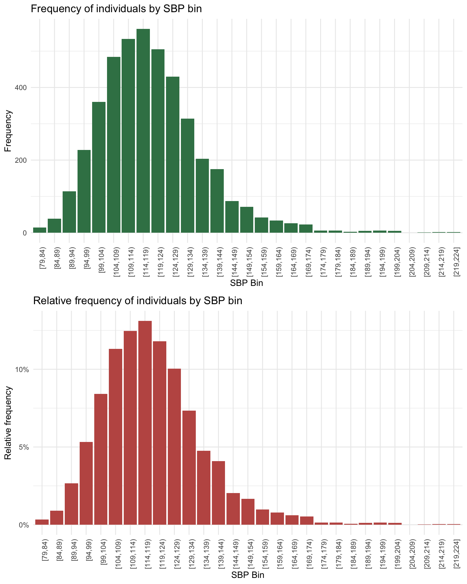
The two panels above tell the same story with different scales. Each bar’s height is the count (top) or proportion (bottom) of participants whose SBP falls in that bin. The shapes are identical — only the y-axis tick labels change. The first bin [79,84) holds 14 people, which is 0.33% of the 4,281 participants; the tallest bars cluster in the 110–130 range, where most U.S. adults live, with a long thin tail running out toward 200 mm Hg and beyond. That long right tail is your first visual clue that SBP isn’t symmetric: the bulk of the data sits in a tight middle range, but the most extreme cases sit far from it.
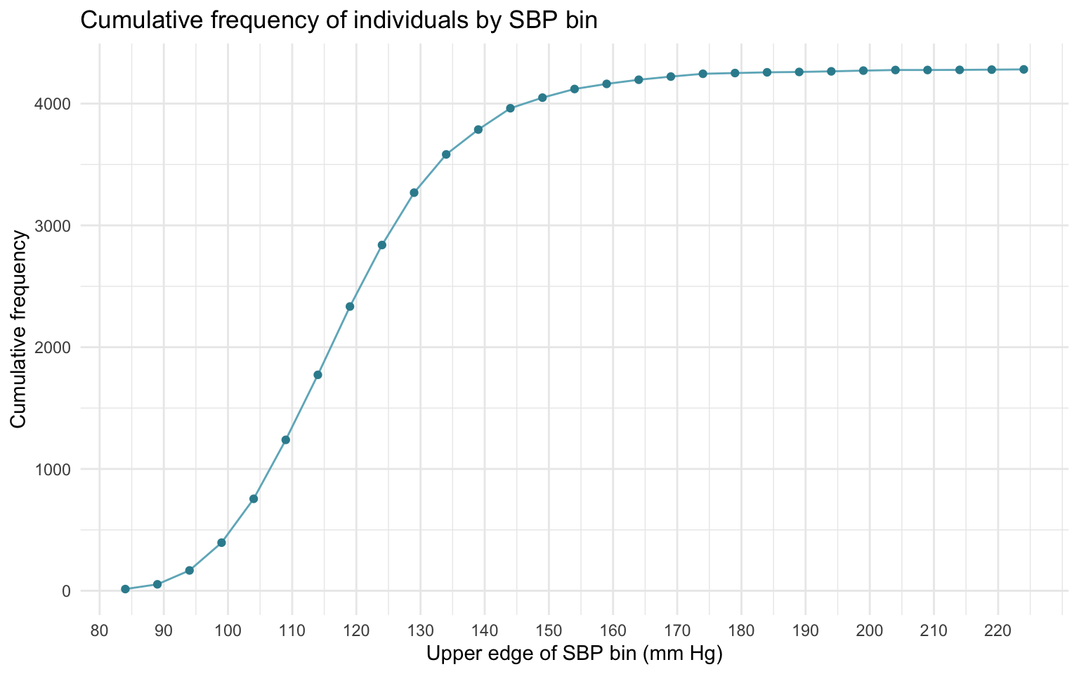
Frequency and relative-frequency views answer “how many people are at each level?” A cumulative frequency view answers a different question: how many people are below this level? — below, not at-or-below, because these bins are right-open, exactly as the cumulative column above. Cumulative frequency is built by reading the frequencies left-to-right and keeping a running total. Plotted as a function of SBP, it produces a monotonically increasing curve — flat where there are few observations, steep where the data pile up. The curve makes threshold questions trivial: drop a vertical line at the clinical elevated cutoff of 120 mm Hg and read off the cumulative value to find the fraction of the sample sitting below it. (That 120 is a clinical constant, not a fact about our sample — do not confuse it with the sample mean, which lands nearby by coincidence.)
Try it · reading the cumulative-frequency curve
Earlier in this section you computed directly from the raw data that about 11% of NHANES participants have an observed SBP at or above the adult Stage 2 threshold (≥ 140 mm Hg). The cumulative-frequency curve above shows the same distribution in picture form.
Using only the chart, how would you arrive at approximately the same answer? Describe the visual approach — what point you would locate on the curve, what height you would read off, and how that translates to the percentage above the cutoff.
The cumulative curve is a running count, so the answer is the vertical gap between the curve and its plateau at the threshold, as a fraction of the total height. Walking through it — using only what the plotted points can actually give you:
- Locate SBP ≈ 140 on the x-axis — the upper-right shoulder of the curve, between the plotted points at 139 and 144.
- Read the nearest plotted height below the cutoff. The curve is drawn at bin edges, and the closest one under 140 is the top of
[134,139), sitting at about 3,787. Remember what that height means: the bins are right-open, so it is the count of participants below 139 — the nearest readable stand-in for “below 140,” not the thing itself. - The curve’s final height is 4,281 — where the running total plateaus once every participant has been counted; this is the total observed sample.
- The participants at or above the cutoff are the gap between that height and the plateau: \(4{,}281 - 3{,}787 = 494\), or about \(11.5\%\) of the sample.
Compare that with the 11% you computed from the raw data and you can see the size of the approximation: reading the chart overstates the Stage 2 group by the 25 participants sitting at exactly 139, who are swept in because 140 is not a bin edge. Close enough to sanity-check a claim; not close enough to report.
That gap between the two answers is the whole point of the exercise, and it’s the binned-versus-raw distinction from the frequency table showing up again: a chart drawn from bins can only ever tell you below an edge, while the raw data can tell you at or above any value you name. The chart’s job here is to make the visual logic of threshold reading clear — locate, read, subtract — not to supply the number you’d publish.
Visually, threshold questions become gap questions. At any SBP cutoff you care about, “what fraction is above this?” is the vertical distance from the curve to its plateau, scaled by the total. What makes that gap small here is simply how high the curve has already climbed by 140 — it has nearly reached its plateau, so little is left above it. (The curve’s local steepness is a related but separate fact: it tells you how densely observations pile up right around the cutoff, not how big the remaining gap is.) You will see the same gap-reading trick again in M06 when we put a probability distribution on top of the curve and call this gap a tail probability.
A note on notation
Before we compute anything, we need a little notation. In this course, we’ll use an uppercase letter such as \(X\) to denote a variable like SBP — the quantity as a concept — and lowercase letters with subscripts for its individual observed values. (More formally, an uppercase \(X\) denotes a random variable; we lean on that reading later, once we reach probability in M06.)
So if there are n participants with observed SBP, the variable as a whole is \(X\), and the individual SBP readings are:
\[x_1, x_2, x_3, \ldots, x_n\]
where \(x_1\) is the first participant’s SBP, \(x_2\) is the second’s, and \(x_i\) is the \(i^{\text{th}}\) participant’s SBP for whichever \(i\) you have in mind. You’ll see this notation again every time we write a formula in this course. It’s a kind of bookkeeping: when we want to add up everyone’s SBP, we’ll write \(\sum_{i=1}^{n} x_i\) — the sum, over every participant from the first to the last, of their individual reading. There’s nothing fancy here; it’s just a compact way of saying “do this for every row of the column.”
A quick concrete example. Suppose we have three participants with SBP readings of 120, 125, and 130. Then \(x_1 = 120\), \(x_2 = 125\), \(x_3 = 130\), \(n = 3\), and \(\sum_{i=1}^{3} x_i = 120 + 125 + 130 = 375\). Every formula in this Module is a variation on this same structure — pick a per-observation quantity, sum it across observations, possibly divide by \(n\).
Measures of central tendency · what is a “typical” value?
The first question you can ask of a numeric variable is: what value is typical? The answer turns out to depend on what you mean by typical, which is why there isn’t one measure of central tendency but three.
- The mode is the value that occurs most often. It answers: What shows up the most?
- The median is the value in the middle when the data are sorted. It answers: What is the middle of the distribution?
- The mean is the arithmetic average. It answers: What value would each person have if the total were redistributed evenly?
Each lands differently when the distribution is skewed or has outliers, which is why no one of them is the right answer in every situation. The rest of this section walks each one carefully and then shows where they agree and where they diverge.
Mode · the popular choice
The mode is the most-frequent value in the data — the answer to “if I had to bet on a single SBP and could only pick one, which one occurs most often?” There is no arithmetic involved; you just count occurrences and pick the winner.
For example, consider the following 10 scores of SBP:
| SBP |
|---|
| 120 |
| 135 |
| 125 |
| 150 |
| 125 |
| 130 |
| 160 |
| 160 |
| 125 |
| 115 |
We can calculate the number of times (labeled n in the table below) that each SBP score occurred in this collection of 10 individuals.
| SBP | n |
|---|---|
| 115 | 1 |
| 120 | 1 |
| 125 | 3 |
| 130 | 1 |
| 135 | 1 |
| 150 | 1 |
| 160 | 2 |
125 is the mode in this set — it shows up three times, more than any other value. Modes can tie. Consider the next set:
| SBP | n |
|---|---|
| 100 | 1 |
| 115 | 3 |
| 120 | 3 |
| 125 | 1 |
| 130 | 1 |
| 184 | 1 |
115 and 120 each appear three times, so this distribution is bimodal — two values share the top frequency. A distribution can have one mode (unimodal), two (bimodal), more, or — when every value appears equally often — no mode at all, and the count of modes is itself an informative description of the data’s shape.
The mode tells you what’s most common, but “most common” isn’t always “near the center.” Suppose almost every observation is moderate, but a small handful repeat at an extreme value. The mode will sit at that extreme, far from the bulk of the data:
| SBP | n |
|---|---|
| 100 | 1 |
| 105 | 1 |
| 115 | 1 |
| 120 | 1 |
| 125 | 1 |
| 130 | 1 |
| 135 | 1 |
| 138 | 1 |
| 190 | 2 |
The mode is 190 — it appears twice, more than any other value — but the eight other readings cluster between 100 and 138. Most of the data are not near 190. That’s the mode’s limitation: it knows about frequency, not position. When a distribution is approximately bell-shaped and unimodal, the mode coincides nicely with the bulk; when it’s skewed or sparse, the mode can mislead.
Median · the middle ground
The median is the value that sits in the middle of the sorted data — the point with as many observations above as below. To find it, you sort the values from low to high and look at the middle one. With 9 scores, the median is the 5th-from-low (and also 5th-from-high):
| SBP |
|---|
| 120 |
| 135 |
| 128 |
| 152 |
| 180 |
| 140 |
| 138 |
| 122 |
| 158 |
Now the same scores arranged from smallest to largest:
| SBP |
|---|
| 120 |
| 122 |
| 128 |
| 135 |
| 138 |
| 140 |
| 152 |
| 158 |
| 180 |
The median is 138 for these 9 scores, as there are four scores below it and four scores above it.
What if there’s an even number of data points? Consider these 8 scores arranged from smallest to largest.
| SBP |
|---|
| 120 |
| 122 |
| 128 |
| 135 |
| 138 |
| 152 |
| 158 |
| 180 |
With an even number of observations there is no single middle value, so the median is defined as the average of the two values straddling the middle: \((135 + 138) / 2 = 136.5\).
Unlike the mode, the median always lands at the middle of the sorted distribution, regardless of how the data are shaped. That position-based definition is what makes the median robust to outliers — pulling one extreme observation doesn’t move the middle position, only the values around it.
Mean · the balancing point
The mean is what most people call the average — the sum of all scores divided by the number of scores:
\[\text{Mean} = \frac{\text{Sum of all scores}}{\text{Total number of scores}}\]
In the notation we set up earlier, the mean of variable \(X\) — written \(\bar{x}\) (“x-bar”) — is
\[\bar{x} = \frac{1}{n}\sum_{i=1}^{n} x_i,\]
where \(n\) is the number of observations, \(x_i\) is the \(i^{\text{th}}\) observation, and \(\sum_{i=1}^{n}\) says “add this up across every observation from the first to the last.”
A useful physical intuition: the mean is the balancing point of the distribution. If you imagine each observation as a small weight placed along a number line and try to balance the line on a single fulcrum, the fulcrum sits exactly at \(\bar{x}\). That picture also explains the mean’s most-discussed weakness — adding one extreme observation tilts the whole balance.
For example, take these 10 SBP scores:
| SBP |
|---|
| 140 |
| 115 |
| 125 |
| 132 |
| 118 |
| 142 |
| 129 |
| 148 |
| 130 |
| 115 |
\[\overline{\text{SBP}} = \frac{1}{10}\sum_{i=1}^{10} SBP_i = \frac{1294}{10} = 129.4\]
A mean of 129.4 mm Hg sits comfortably in the middle of these ten values — no single observation is too far from the others, so the balance lands cleanly. Now watch what happens when we add one extreme reading:
| SBP |
|---|
| 140 |
| 115 |
| 125 |
| 132 |
| 118 |
| 142 |
| 129 |
| 148 |
| 130 |
| 115 |
| 220 |
The mean jumped from 129.4 to \(1{,}514 / 11 = 137.6\) — an eight-point increase produced by a single observation. The median, by contrast, would barely have budged. That sensitivity is the central trade-off. The mean uses every observation by adding it in, which makes it efficient under the roughly normal conditions where classical statistics usually operates (it wrings information from every data point) but also vulnerable to extreme values. The median throws away most of the magnitude information and uses only position, which makes it less efficient but far more robust to outliers. Choose accordingly.
Pulling it all together · all three on real data
Let’s see all three measures land on the full NHANES SBP distribution. We will count how many people have each unique SBP value, plot the distribution as a histogram (one bar per observed SBP value), and overlay the mean and median as vertical lines.
The graph below shows the same information visually. The x-axis lists every observed SBP value; the y-axis shows how many participants had each value.
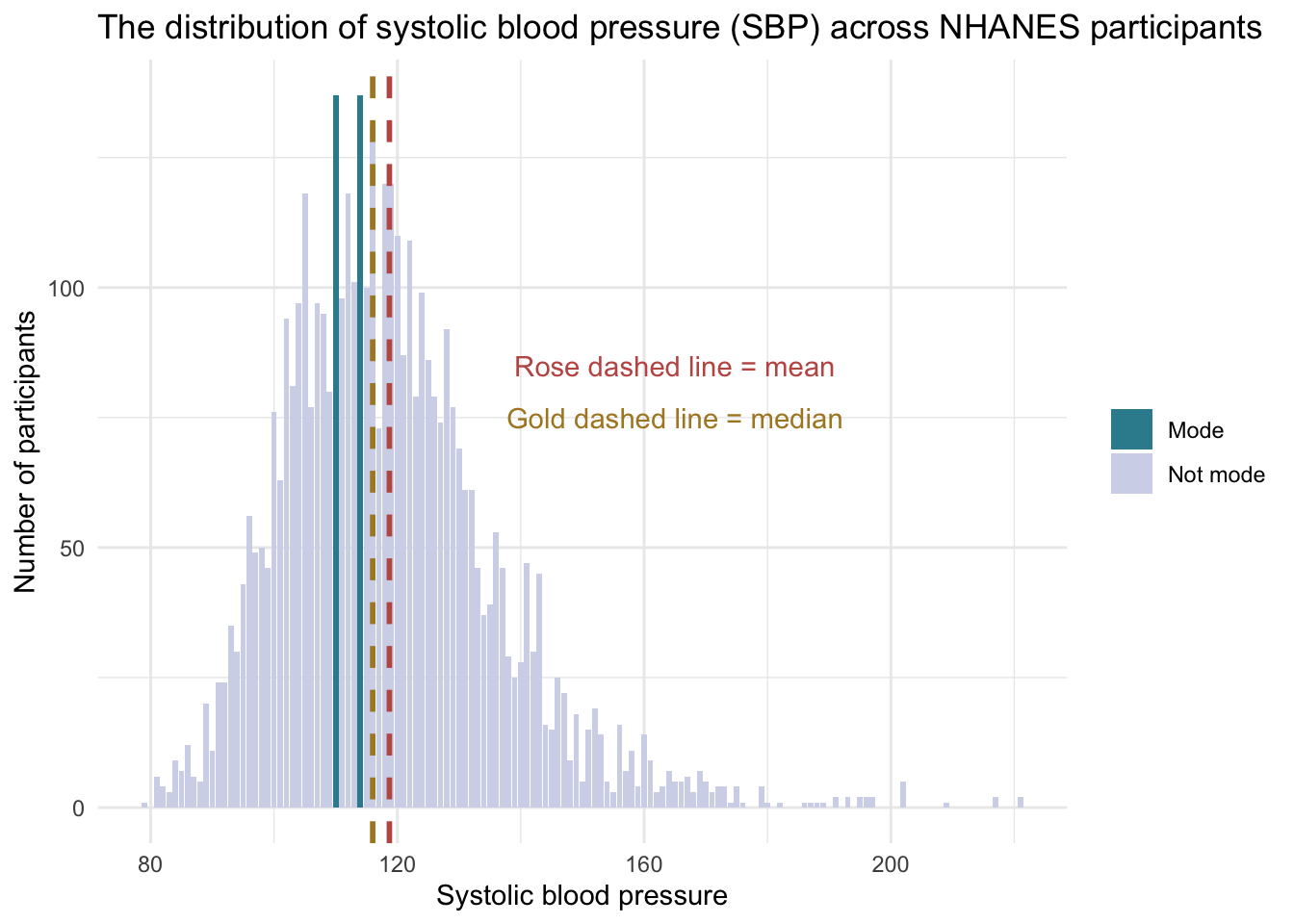
A few features of the picture are worth a close look. The tallest bars — the two modes — sit at 110 and 114 mm Hg (each value occurs 137 times, the highest frequency in the dataset). The median of 116 sits just slightly to their right, marking the exact middle of the sample. The mean is 119, a few points to the right of the median.
Why is the mean greater than the median here? Look at the right side of the plot. A small number of participants sit far out in the tail, with SBP readings over 180 and a handful above 200. The mean, being a balance point, gets pulled in the direction of those extreme values. The median, being a position, doesn’t move. The fact that mean > median is a useful clue here: it’s consistent with a distribution that has a longer right tail than left, a pattern called right (positive) skew. For a perfectly symmetric distribution, mean and median sit exactly on top of each other, and a gap between them often signals skew — but the ordering of mean and median is only a hint, not proof, and it can mislead for oddly shaped or multimodal data. The graph is the primary evidence; treat the mean-versus-median gap as a first sanity check, then confirm the direction and degree of skew by looking at the picture.
The three measures together — mode, median, mean — give complementary answers to what is typical?
- Mode is what occurs most often. Strongest when the distribution has a clear peak.
- Median is what sits in the middle. Robust to outliers; the workhorse summary for skewed data.
- Mean is the balance point. Efficient and the right summary for symmetric distributions, but vulnerable to extreme observations.
Try it · the mayor’s average and the median
A regional newspaper reports two statistics about household income in a U.S. city:
- Mean household income: $85,000
- Median household income: $52,000
The mayor cites the $85,000 figure in a re-election speech (“the average household in our city earns $85,000”). An opposition candidate cites the $52,000 figure (“half of our households earn $52,000 or less”).
- What does the gap between the mean and the median tell you about the shape of the income distribution?
- Which of the two numbers is the more honest summary of what a typical household in the city earns? Why?
The mean is substantially higher than the median ($85,000 > $52,000) — a gap of $33,000. This gap is the classic fingerprint of a right-skewed distribution — a clue to confirm against the shape, not a proof on its own: a small number of very-high-income households (the long right tail) pulls the balance point (the mean) up, while the middle position (the median) stays anchored at the bulk of the distribution. Income distributions almost always look this way — a heavy concentration of households at modest values with a long thin tail of wealthy households extending to the right.
The median ($52,000) better represents the typical household. By definition, at least half of households earn at or below $52,000 and at least half earn at or above it. The mean is dragged upward by a small number of very wealthy households and overstates what the typical resident earns. The mayor’s choice of the mean is technically correct arithmetic but a rhetorical one — citing the mean makes the income picture look healthier than the median would suggest. The opposition candidate’s choice of the median better represents the typical experience.
The general rule of thumb: when mean and median disagree by a noticeable amount, decide which one your question actually calls for before you report it. Neither is dishonest — they answer different questions. In a skewed income distribution the median describes the household in the middle, while the mean tracks income per household and ties directly to the city’s total income. For conveying a typical resident’s experience the median usually serves better; when totals or per-capita figures are the point, the mean is exactly the right summary. This is the same mean-greater-than-median pattern we saw in the NHANES SBP distribution (mean 119 vs median 116) — just on a much more dramatic scale because income tails are far longer than blood-pressure tails.
Computing mean, median, and mode from a summary table
In the examples thus far, we have computed these estimates from the full row-level data frame. But often what is shared in a published paper is not row-level data — it is a summary table of values and counts. Knowing how to recover the mean, median, and mode from such a table is a small but useful skill, because it lets you compute summaries from any frequency table you find in someone else’s report.
The table below summarizes SBP from 15 people: five distinct SBP values and the count of people at each. Two of the 15 have an SBP of 110, five have 120, and so on.
| Systolic Blood Pressure (mm Hg) | Number of People |
|---|---|
| 110 | 2 |
| 120 | 5 |
| 130 | 3 |
| 140 | 4 |
| 150 | 1 |
All three summaries follow naturally from “weighting each value by how many people reported it.” The full dataset, expanded, is 15 observations: \(\{110, 110, 120, 120, 120, 120, 120, 130, 130, 130, 140, 140, 140, 140, 150\}\).
- Mode is the most frequent value — 120 mm Hg, with 5 people.
- Median is the 8th value in the sorted list (with 15 observations, position \((n+1)/2 = 8\)). The first 2 values are 110; values 3 through 7 are 120; the 8th value is the first 130. So the median is 130 mm Hg.
- Mean is the weighted average of the unique values:
\[\bar{x} = \frac{(110 \times 2) + (120 \times 5) + (130 \times 3) + (140 \times 4) + (150 \times 1)}{2 + 5 + 3 + 4 + 1} = \frac{1{,}920}{15} = 128 \text{ mm Hg}.\]
This is exactly what you would get by adding all 15 individual scores and dividing by 15 — the frequency-weighting just lets you compute the same thing more efficiently when the same value appears many times.
A Crash Course Statistics video covers the same territory from a slightly different angle — a useful second take before moving on.
Measures of variability, dispersion, and spread
A center alone isn’t enough. Two distributions can have exactly the same mean and look almost nothing alike — one tightly clustered, the other strewn across a wide range. Imagine two samples of SBP, both with a mean of 120 mm Hg. In one sample, every observation falls between 115 and 125; in the other, observations stretch from 80 to 200. The single value “120” hides this difference completely. To describe the data honestly we need a second kind of summary — one that captures how much variation surrounds the center. That’s the job of measures of spread (also called dispersion or variability — three names for the same idea).
This section walks five measures of spread, from the crudest to the most informative: the range, the percentile / IQR, the mean absolute deviation, the variance, and the standard deviation. Each adds something the previous one missed, and the standard deviation, in particular, becomes a building block we will rely on heavily in M07 and M08.
Range
The crudest measure of spread is the range — the simple difference between the largest and smallest observation.
In the NHANES SBP sample, the smallest reading is 79 mm Hg and the largest is 221 mm Hg, so
\[\text{Range} = \max(X) - \min(X) = 221 - 79 = 142 \text{ mm Hg}.\]
That single number says the SBP values span 142 mm Hg from low to high — but it says nothing about what’s happening between those extremes. Almost the entire information about the distribution is thrown away. The range is also extremely sensitive to outliers: a single unusually high reading can blow it up by 50 points or more. It’s rarely the only measure of spread you’d want to report.
Percentile distribution and the interquartile range
A more useful approach is to use the percentiles of the distribution. Recall that the median is the value at the 50th percentile — at least half the observations sit at or below it and at least half at or above (a hedge that matters when values are tied, as integer SBP readings often are). The other percentiles are defined the same way: the 25th percentile is the value at or below which 25% of the observations sit; the 90th percentile is the value at or below which 90% sit; and so on.
In the NHANES SBP sample, two percentiles are especially useful:
- The 25th percentile — also called the first quartile or \(Q_1\) — is 107 mm Hg. One in four NHANES participants has an SBP at or below 107.
- The 75th percentile — also called the third quartile or \(Q_3\) — is 128 mm Hg. Three in four participants sit at or below 128.
The gap between these two — \(Q_3 - Q_1\) — is called the interquartile range or IQR. In this sample,
\[\text{IQR} = Q_3 - Q_1 = 128 - 107 = 21 \text{ mm Hg}.\]
The IQR is the range of the middle 50% of the data. Unlike the full range, the IQR throws away the most extreme values on both ends and tells you how spread out the typical observations are — making it robust to outliers in the same way the median is. When a distribution is skewed or has long tails, the IQR is usually the spread worth reporting.
Visualizing percentiles · two perspectives
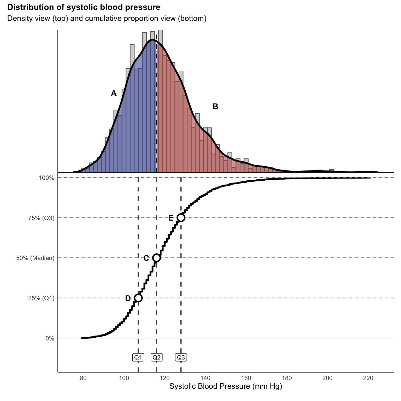
A percentile is a point on a distribution that depends on a cumulative view of the data. The figure below shows the NHANES SBP distribution two ways — as a density (top) and as a cumulative curve (bottom). The density panel marks the median (\(Q_2\)), while the cumulative panel marks all three quartiles — \(Q_1\), the median (\(Q_2\)), and \(Q_3\) — where the curve crosses the 25%, 50%, and 75% levels. A quartile’s vertical line on the cumulative panel sits at the same SBP value on the density panel above it. This is the easiest way to see how percentiles and the cumulative distribution are two perspectives on the same idea.
Understanding the figure:
The top panel shows the familiar SBP distribution with a smooth density curve overlaid. The dashed vertical line marks the median (\(Q_2\) = 116 mm Hg), which divides the distribution into two halves. Region A (shaded blue) contains the 50% of participants with SBP below the median, and Region B (shaded coral) contains the 50% above it.
This view emphasizes where the data are concentrated. Most participants have SBP values clustered around 110–120 mm Hg, with fewer observations at the extremes.
The bottom panel shows a complementary perspective: the cumulative-proportion curve. Rather than asking “how many people have this specific SBP value,” the cumulative view answers the question, “what fraction of people have SBP at or below this value?” You will meet this curve again in M06 under its formal name — the empirical cumulative distribution function, usually shortened to empirical CDF. “Empirical” just means it is built from the observed data rather than from a theoretical model. Nothing in this Module depends on the name; it is worth flagging now so the term reads as familiar when it returns.
Reading the curve is a straightforward two-step process:
- Start at any SBP value on the x-axis and follow it up to meet the curve.
- Then read left to the y-axis — that height is the percentage of people at or below that value.
For example, Point D shows that at \(Q_1\) = 107 mm Hg, 25% of participants have SBP of 107 or lower. Point C marks the median at \(Q_2\) = 116 mm Hg, where 50% of participants fall below this value and 50% fall above it. Point E indicates that at \(Q_3\) = 128 mm Hg, 75% of participants have SBP at or below this level.
The value of this dual representation is that it shows the same information in two ways. The density view emphasizes where values cluster; the cumulative view emphasizes how observations accumulate as we move from low to high values. Notice that the steepest part of the cumulative curve corresponds to the peak of the density view: where many observations are packed together, the cumulative curve rises fastest.
Together, these two views give a fuller picture of a variable’s behavior than either one alone.
Mean absolute deviation · the first deviation-based summary
The range and the IQR are both percentile-based: they read spread off the distribution’s edges or quartiles without paying attention to how far most observations are from the center. The deviation-based measures take the opposite approach. They ask, on average, how far is each observation from a reference point — typically the mean?
The cleanest version of this idea is the mean absolute deviation. (One naming caution: the bare abbreviation “MAD” is most commonly used for the median absolute deviation — an outlier-robust cousin we meet just below, and the quantity R’s built-in mad() function returns. To keep the two straight, this Module spells out “mean absolute deviation” in full and reserves “MAD” for the median-based version.) The recipe is exactly what the name says:
Find the Mean: First things first, calculate the average score. For example, the average SBP for the NHANES sample is 119.
Absolute Differences from the Mean: Now, for each data point (i.e., person in the sample), calculate how far it is from the mean. Don’t worry about whether it’s above or below; just look at the raw distance (which means you’ll take the absolute value of the differences). So for example, for a person who has an SBP of 140, their absolute difference from the mean in the sample is \(|140 - 118.7| = 21.3\).2 Note that we use the mean carried to a decimal place, not the rounded 119 — deviations are measured from the actual sample mean, and rounding the reference point first would quietly shift every deviation in the same direction.
Find the Mean of the Absolute Differences: Finally, find the mean of these absolute differences. This resultant value is the mean absolute deviation.
Formally, the mean absolute deviation around the mean, \(\bar{x}\), for a series of observations \(x_1, x_2, x_3, \ldots, x_n\) is given by:
\[\text{MeanAD} = \frac{1}{n}\sum_{i=1}^{n} |x_i - \bar{x}|\]
where:
\(n\) is the total number of observations.
\(x_i\) represents the \(i^{\text{th}}\) observation in the dataset.
\(\bar{x}\) is the mean of the observations.
\(|x_i - \bar{x}|\) denotes the absolute value of the deviation of each observation from the mean.
The mean absolute deviation gives you a sense of how far, on average, each data point is from the mean. A larger mean absolute deviation indicates the data points are more spread out around the mean, while a smaller value shows they’re clustered more closely together.
Here’s a small example of calculating the absolute deviation from the overall mean (119) for 10 of the people in our data frame. Can you solve for each of these difference scores, \(\text{diff\_SBP} = |\text{SBP} - 119|\)?
| SBP | diff_SBP |
|---|---|
| 122 | 3.3 |
| 110 | 8.7 |
| 119 | 0.3 |
| 128 | 9.3 |
| 157 | 38.3 |
| 111 | 7.7 |
| 110 | 8.7 |
| 96 | 22.7 |
| 108 | 10.7 |
| 154 | 35.3 |
The first person has an SBP of 122, so the difference between 122 and 119 (the mean in the full NHANES sample) is 3.3. The last person listed has an SBP of 154, so the difference between 154 and 119 is 35.3. Notice that we record the absolute difference: it does not matter whether the person’s score is above or below the mean.
The mean of these 10 differences is about 14.5:
\((3.3 + 8.7 + 0.3 + 9.3 + 38.3 + 7.7 + 8.7 + 22.7 + 10.7 + 35.3) / 10 = 14.5\)
So the average absolute deviation for the 10 people listed above is about 14.5, taking deviations from the full-sample mean of 118.7 mm Hg.
If we calculate the mean absolute deviation for the whole NHANES sample using the same technique, we get about 13.
You may also come across the median absolute deviation (MAD) — this is the version that “MAD” most often refers to, and the one R’s mad() returns. The idea is very similar, except that you swap in the median for the mean at both steps: the median absolute deviation is the median of the absolute differences between each data point and the overall median,
\[\text{MAD} = \text{median}_i\left(|x_i - \tilde{x}|\right),\]
where \(\tilde{x}\) denotes the sample median. Using the median at both steps makes it far less sensitive to outliers than the mean-based version above. One R detail worth knowing: mad() does not return this raw quantity by default — it multiplies it by a constant (≈ 1.4826)3 so that, for normally distributed data, the result estimates the same thing as the standard deviation. Reach for mad(x, constant = 1) when you want the unscaled median absolute deviation.
Variance · the squared-deviation cousin
Why square the deviations instead of taking their absolute values? Squared deviations turn out to have unusually convenient algebraic and statistical properties: they decompose cleanly (the foundation of least-squares regression in M10–M12), they connect directly to the normal distribution, and — unlike the absolute value — they’re smooth (differentiable) everywhere, which the mathematical machinery of inference from M07 onward leans on heavily. (Absolute-deviation methods are perfectly tractable too, and see real use; squared deviations are simply the more convenient default.) The workhorse built on them is the variance. Rather than averaging absolute deviations from the mean, the variance averages squared deviations.
The variance, often denoted as \(s^2\), for a series of observations \(x_1, x_2, x_3, \ldots, x_n\) with mean \(\bar{x}\), is given by:
\[s^2 = \frac{1}{n-1}\sum_{i=1}^{n} (x_i - \bar{x})^2\]
where:
\(n\) is the total number of observations.
\(x_i\) represents the \(i^{\text{th}}\) observation in the dataset.
\(\bar{x}\) is the mean of the observations.
\((x_i - \bar{x})^2\) denotes the squared deviation of each observation from the mean.
The division by \(n-1\) (instead of \(n\)) is the usual sample-variance correction. It makes \(s^2\) an unbiased estimator of the population variance under the standard random-sampling setup. The intuition — that once \(\bar{x}\) has been computed from the sample, only \(n-1\) of the deviations are still free to vary — arrives in M07, where this same \(n-1\) reappears as the degrees of freedom of the \(t\)-distribution.
The table below shows the squared deviations for 10 people in the NHANES data frame (the same 10 selected earlier when calculating the mean absolute deviation). For example, we previously calculated the first person to have an absolute deviation of 3.3 — squaring that value (that is, \(3.3 \times 3.3\)) yields 10.89.
| SBP | diff_SBP | squared_diff_SBP |
|---|---|---|
| 122 | 3.3 | 10.89 |
| 110 | 8.7 | 75.69 |
| 119 | 0.3 | 0.09 |
| 128 | 9.3 | 86.49 |
| 157 | 38.3 | 1466.89 |
| 111 | 7.7 | 59.29 |
| 110 | 8.7 | 75.69 |
| 96 | 22.7 | 515.29 |
| 108 | 10.7 | 114.49 |
| 154 | 35.3 | 1246.09 |
Notice how the squared deviations grow much faster than the absolute deviations did: the person who was 38.3 mm Hg from the mean now contributes 1466.89 to the variance sum, not 38.3. This is the magnifying effect that variance buys you — extreme values receive disproportionate weight in the sum.
One important framing note up front. The table above is a window into the variance calculation for the full 4,281-participant NHANES sample — not a standalone variance calculation for these 10 rows. The reference value (119) is the full-sample mean of all 4,281 participants, not the mean of these 10 rows. Computing \(s^2\) for the 10-person sub-sample directly would instead use those 10 people’s own mean as \(\bar{x}\), which would give a different (and not especially interesting) number. The mini-table is here to make the squaring step concrete; the actual variance is computed across the full dataset.
So what we want is the sample variance of all 4,281 NHANES participants: square every participant’s deviation from the exact sample mean \(\bar{x} = 118.7\), sum those squared deviations across all 4,281 rows, and divide by \(n - 1\). The result is approximately \(302\,(\text{mm Hg})^2\).
So the variance for SBP is 302 — but 302 what? Notice that squaring the deviations changed the units. Each deviation was in mm Hg; squaring it produces a quantity in \((\text{mm Hg})^2\). The variance is in squared mm Hg, which has no clinical interpretation — no doctor reports squared millimeters of mercury. The variance is the right quantity for the mathematical machinery but the wrong quantity for human-scale interpretation.
The remedy is mechanical and elegant: take the square root. That brings us back to the original units and gives us the most-used measure of spread in all of statistics.
Standard deviation · the variance, restored to original units
The standard deviation — commonly abbreviated SD in prose and denoted \(s\) in formulas — is the square root of the variance:
\[s = \sqrt{s^2} = \sqrt{\frac{1}{n - 1}\sum_{i=1}^{n}(x_i - \bar{x})^2}.\]
For the NHANES SBP sample, \(s = \sqrt{302} \approx 17\) mm Hg. The standard deviation is on the same scale as the data, which makes it both interpretable and comparable: SBP values vary around the mean of 119 by roughly 17 mm Hg — a sentence anyone can read. (Conceptually the SD is a root-of-averaged-squared-deviations measure, which is why it comes out a little larger than the mean absolute deviation you just computed; the two are close cousins, not the same number. Strictly, the sample SD here divides by \(n - 1\) rather than \(n\), so it is not exactly the root of the mean squared deviation — the \(n - 1\) correction, which we motivate in M07, nudges it slightly upward.)
The standard deviation is the workhorse measure of spread. We will reach for it repeatedly across the rest of the course — it is the building block of the standard error in M07, the test statistic in M08, and (with a little reshaping) the residual standard error in regression in M10. Of all the descriptive statistics in this Module, \(s\) is the one whose name you should be on first-syllable terms with.
Expressing distances in terms of standard deviations is a useful way to describe where individual data points fall relative to the mean. For example, suppose the mean SBP in a sample is 100 mm Hg and the standard deviation is 10 mm Hg. Now consider two individuals:
- Person 1 has SBP of \(x_1 = 95\) mm Hg
- Person 2 has SBP of \(x_2 = 120\) mm Hg
We can describe where each person falls relative to the mean:
- Person 1 is 5 mm Hg below the mean, so their deviation from the mean is \(x_1 - \bar{x} = 95 - 100 = -5\) mm Hg. Since one standard deviation is 10 mm Hg, that deviation is half a standard deviation: \(x_1 - \bar{x} = -0.5s\). Read that carefully — the signed quantity \(-0.5s\) is the distance below the mean, not the reading itself. To write the person’s location, you add the deviation back onto the mean: \(x_1 = \bar{x} - 0.5s\). (Divide the deviation by \(s\) and you get the standardized form, \(z_1 = -0.5\), which we develop fully a few sections from now.)
- Person 2 is 20 mm Hg above the mean, so \(x_2 - \bar{x} = 120 - 100 = 20 = 2s\) — a deviation of two standard deviations. The person’s location is \(x_2 = \bar{x} + 2s\), and the standardized form is \(z_2 = 2\).
This notation becomes especially useful when describing ranges around the mean. For instance:
- The range from \(\bar{x} - s\) to \(\bar{x} + s\) (or “\(\bar{x} \pm s\)”) captures all values within 1 standard deviation of the mean
- The range from \(\bar{x} - 2s\) to \(\bar{x} + 2s\) (or “\(\bar{x} \pm 2s\)”) captures all values within 2 standard deviations of the mean
In our example, the range \(\bar{x} \pm 2s\) would be from \(100 - 2(10) = 80\) to \(100 + 2(10) = 120\) mm Hg.
A short caution: “small” and “large” standard deviations are relative, and the bare number never settles it — a standard deviation always carries the units of the variable it came from, so you have to know both the units and the variable’s typical scale before you can judge it.
Take the number 17 on its own, and watch how much the units do. As a spread in beats per minute, it would be large for resting heart rate, where adult values typically vary by something closer to 10 bpm. As a spread in dollars, it would be no meaningful variation at all in household income, where spreads run into the tens of thousands. Ours is 17 mm Hg, and against blood pressure’s scale — a mean near 119 — that is a moderate spread.
Notice what this rules out: because the units differ, you can’t compare those three spreads directly at all. Doing that honestly needs a unit-free measure, which is exactly what the coefficient of variation later in this Module provides.
Reading SD coverage · Chebyshev’s theorem and the empirical rule
The standard deviation gains real interpretive power when we pair it with a rule of thumb for what fraction of the data sits within \(k\) standard deviations of the mean. Two such rules will recur throughout the course — one general-purpose, one specialized.
Chebyshev’s theorem · a rule for any distribution
Chebyshev’s theorem is the conservative one. It works for any distribution — symmetric, skewed, multimodal, anything — and produces guarantees of the form
- At least 75% of the data fall within \(\bar{x} \pm 2s\)
- At least 89% of the data fall within \(\bar{x} \pm 3s\)
(and more generally, at least \(1 - \frac{1}{k^2}\) of the data fall within \(k\) standard deviations of the mean, for any \(k > 1\)). What we have written is the sample-data form of Chebyshev’s theorem, stated in terms of \(\bar{x}\) and \(s\); the theorem is more commonly written as a probability statement, \(P(|X - \mu| < k\sigma) \geq 1 - \frac{1}{k^2}\), about a population mean \(\mu\) and standard deviation \(\sigma\) — a reading we return to once we reach probability in M06. The “at least” is doing real work: Chebyshev gives you a minimum that holds no matter what the distribution looks like. For a hypothetical sample with \(\bar{x} = 100\) mm Hg and \(s = 10\), Chebyshev guarantees that at least 75% of readings sit between 80 and 120, and at least 89% sit between 70 and 130 — period, regardless of distributional shape.
The catch is that Chebyshev’s guarantees are deliberately conservative. For most real-world distributions, the actual fraction of data inside \(\bar{x} \pm 2s\) is much higher than 75%. When the distribution is approximately bell-shaped, we can use a sharper rule of thumb.
The empirical rule (68–95–99.7)
When the distribution is bell-shaped and symmetric — what M06 will call a normal distribution — a much more specific rule applies. The empirical rule, also called the 68–95–99.7 rule, says:
- Approximately 68% of the data fall within \(\bar{x} \pm s\)
- Approximately 95% of the data fall within \(\bar{x} \pm 2s\)
- Approximately 99.7% of the data fall within \(\bar{x} \pm 3s\)
That is, for a roughly normal distribution, a single observation more than two standard deviations from the mean is unusual (only ~5% of cases), and one more than three standard deviations from the mean is genuinely extreme (only ~0.3%). The empirical rule also previews the logic of much that follows in M06–M09 — the habit of converting a distance into a coverage statement. Be careful with the analogy, though. A 95% confidence interval is not the mean plus or minus two raw standard deviations. It is built on the standard error — the spread of the sample mean across hypothetical repeated samples, which shrinks as n grows — and it uses a multiplier from the appropriate reference distribution rather than a flat 2. The reasoning rhymes; the ingredients are different, and M07 builds them properly.
The figure below shows the rule visually — at \(\pm 1s\), \(\pm 2s\), and \(\pm 3s\), the shaded regions cover 68%, 95%, and 99.7% of the area under the bell curve.
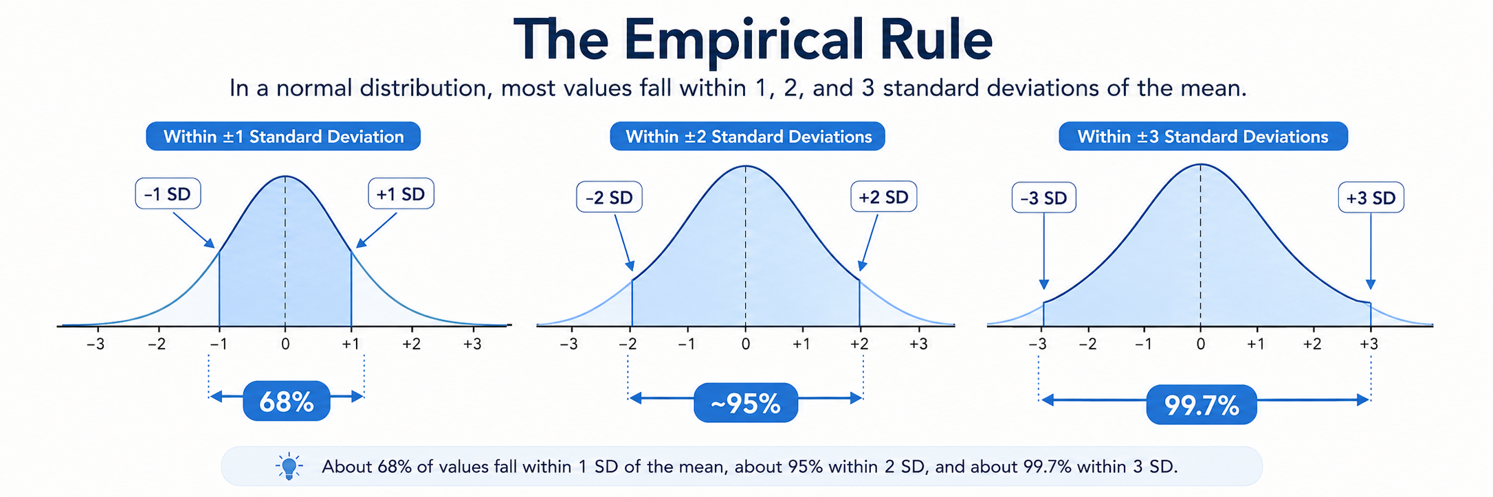
A few facts about a bell curve worth registering before we apply the rule. A perfectly symmetric, bell-shaped distribution has the mean, median, and mode all sitting at the same point — the curve’s peak. The left and right sides are mirror images, the tails taper off equally on both sides, and the empirical rule holds exactly. In real data, of course, no distribution is perfectly bell-shaped — the question is always whether the data are close enough that the rule’s approximations are useful.
Is SBP in NHANES close enough? Look at the distribution below.
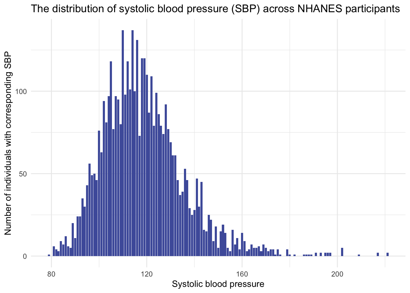
SBP is roughly bell-shaped — there’s a clear central peak and the distribution tapers on both sides — but it has a noticeable right tail: a handful of participants register SBP values far above the bulk. The standard clinical explanation is age. Blood pressure typically climbs as people get older, and the variation in SBP within an age group also widens, so a sample drawn from a population spanning ages 8 to 80 will show both higher means and wider spread among the older participants. The long right tail comes, in effect, from the older participants clustering at the high end.
To see this directly, look at the distribution of SBP within age groups:
- Ages 16 to 25
- Ages 26 to 35
- Ages 36 to 45
- Ages 46 to 55
- Ages 56 to 64
- Ages 65 and older
In the next figure, the SBP distributions are colored using the American Heart Association’s systolic categories shown below. Bars are green for SBP values below 120, gold for 120–129, orange for 130–139, and red for 140 and above. Because we are looking only at systolic blood pressure here, these colors are a simplified teaching device rather than a full clinical classification, which would also use diastolic pressure.
Healthy and Unhealthy Blood Pressure Ranges from the American Heart Association
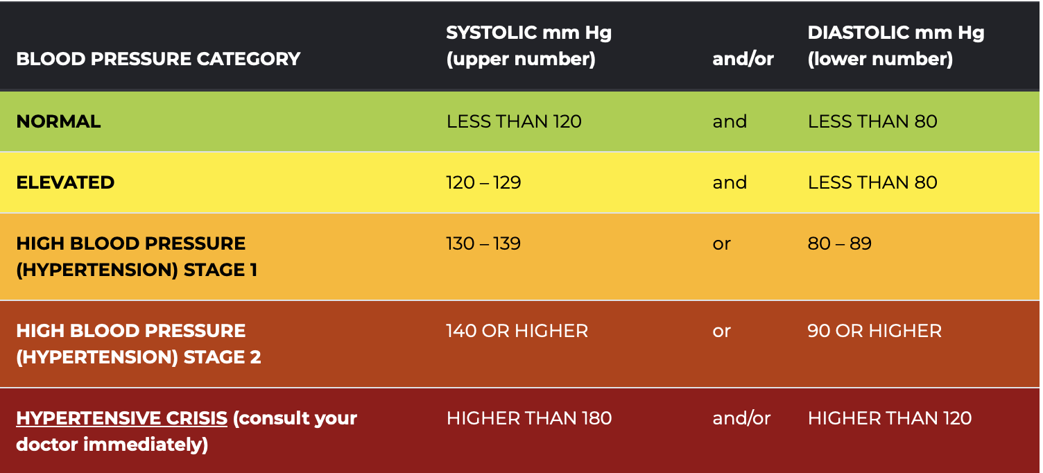
The graph below shows the distribution of systolic blood pressure (SBP) across the six age groups. Each subplot displays a histogram of SBP values, with green indicating normal values, gold for elevated, orange for Stage 1 hypertension, and red for Stage 2 hypertension and above.
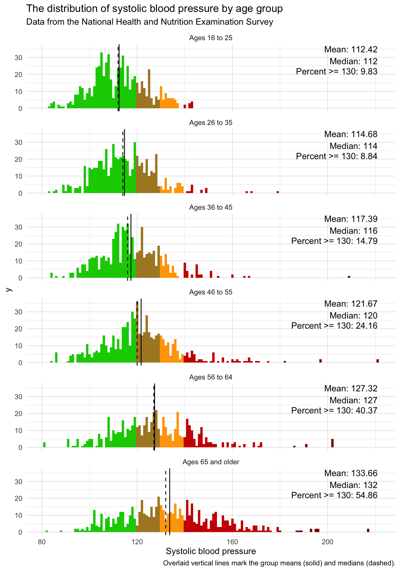
Three things move together as you scan down the panels. First, both the mean and the median shift to the right — the typical SBP climbs from about 112 mm Hg in the youngest group to about 134 in the oldest. Second, the spread widens — the distribution that was tightly clustered in young adults stretches out across a much broader range in older participants. Third, the right tail lengthens — the small fraction of readings far above the rest, the Stage-2 hypertension cases shaded red, become both more common and more extreme. All three patterns together produce the long right tail that you saw in the full-sample distribution: it is, mostly, the older participants showing up.
A substantive take · what’s behind the wider spread at older ages
The widening distribution at older ages is not a statistical curiosity — it reflects real heterogeneity in older populations. Over decades of life, people accumulate different exposures, diseases, treatments, and lifestyle patterns, and those differences compound into very different cardiovascular profiles. Some older adults remain within healthy limits (the green portion of each older-age panel); others develop substantial hypertension. The distribution stretches to accommodate both. Greater spread, in this case, is the signal — not noise.
Within any single age group the distribution looks more bell-shaped, so part of the full sample’s long right tail comes from pooling groups with different means and different spreads. Only part, though — SBP stays right-skewed within most age bands too, and in the 46–55 group it is more skewed than the pooled distribution is. Pooling lengthens the tail; it does not manufacture it. The cleanest near-symmetric illustration is the youngest group, ages 16–25, with mean ≈ 112 mm Hg, median ≈ 112, and standard deviation ≈ 12. (Mean and median sitting together is consistent with symmetry — it is a useful check, not a proof, since a lopsided distribution can also produce a matching mean and median.) The figure below overlays a perfect bell curve on the histogram of this subsample — and you can see how closely the data follow the theoretical shape.
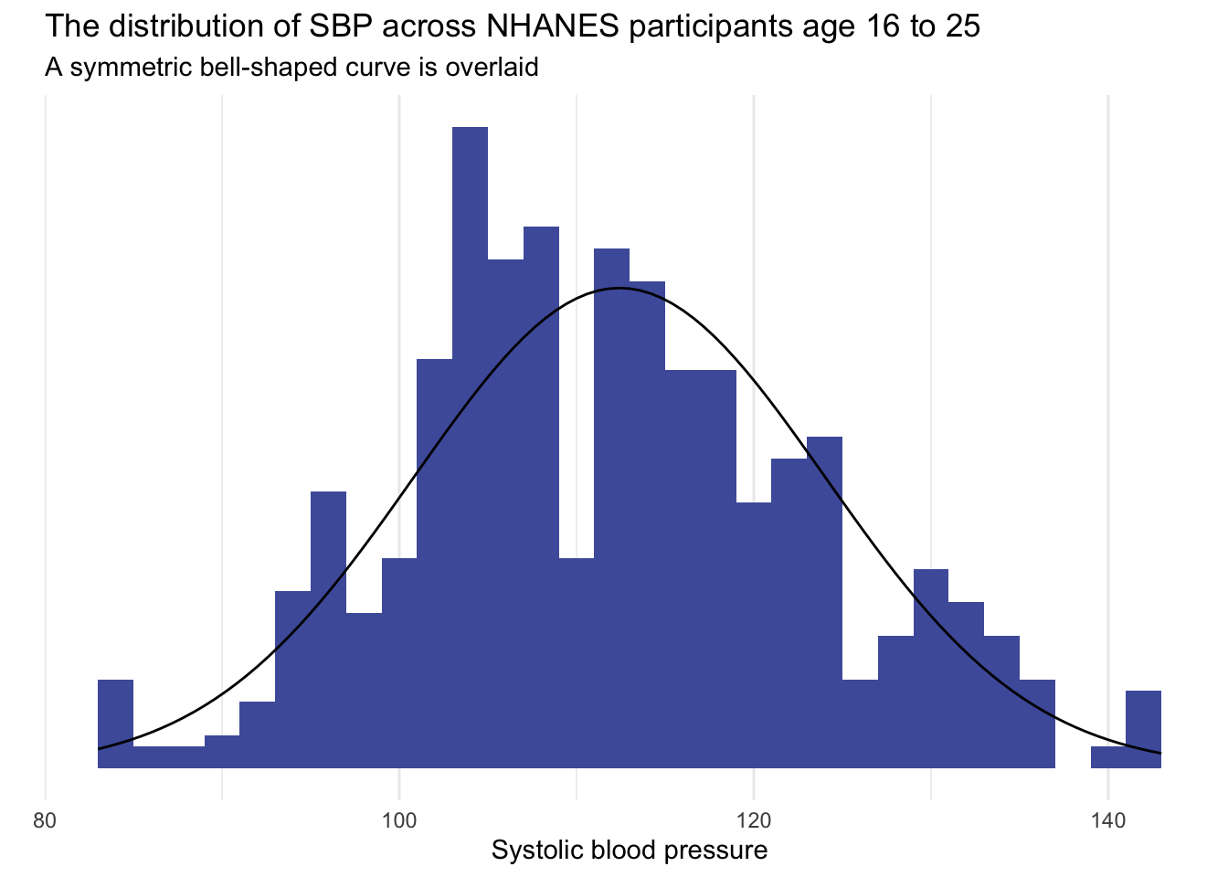
Because this distribution is approximately normal, we can apply the empirical rule to predict the coverage of young-adult SBP. The rule tells us what to expect if the normal approximation is adequate — it is not a count of the actual observations, which could differ. With \(\bar{x} = 112\) and \(s = 12\), we would expect:
- About 68% of 16–25-year-olds to have SBP between \(\bar{x} - s = 100\) and \(\bar{x} + s = 124\) mm Hg.
- About 95% between \(\bar{x} - 2s = 88\) and \(\bar{x} + 2s = 136\) mm Hg.
- About 99.7% between \(\bar{x} - 3s = 76\) and \(\bar{x} + 3s = 148\) mm Hg.
A good habit is to then check those predictions against the data by actually counting the fraction of observations inside each interval — the closer the counts land to 68/95/99.7, the better the normal approximation is serving you.
The interval for “95% of young adults” (88 to 136 mm Hg) is fairly wide because young adults are still heterogeneous. Under the normal approximation, a reading outside that interval would be relatively uncommon in this age group. The image below summarizes these intervals visually.
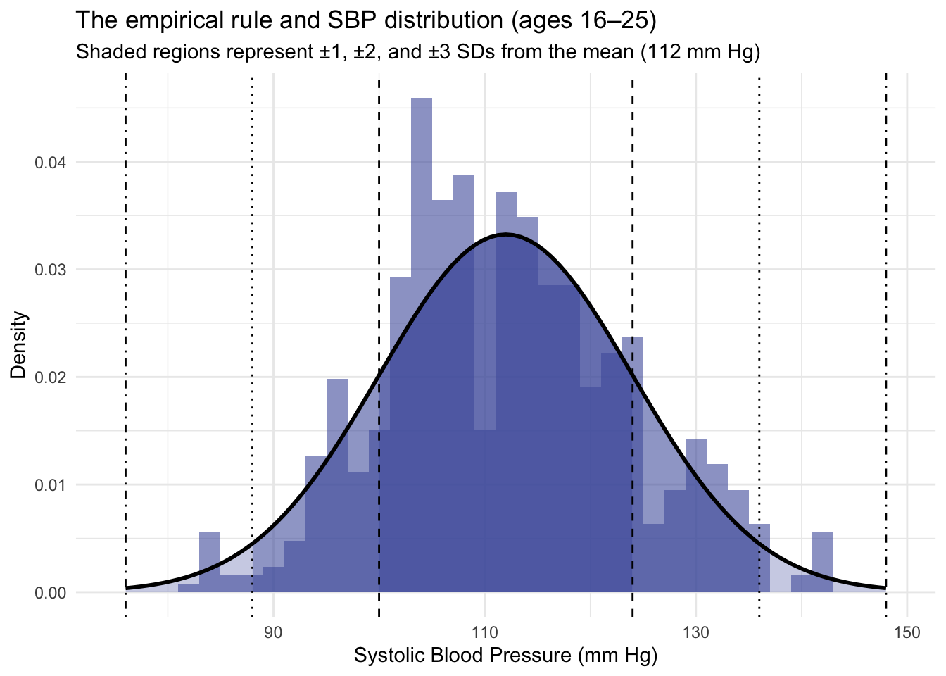
Try it · applying the empirical rule to SAT scores
A high school administers the SAT Evidence-Based Reading and Writing section to a graduating class of 1,000 students. The scores are approximately normally distributed with mean = 580 and standard deviation = 95.
Use the empirical rule to answer:
- Approximately what percentage of students scored between 485 and 675?
- Approximately how many students scored above 770?
- Consider a student who scored 390. Where do they sit relative to their classmates? Is the score unusual?
The approach on every empirical-rule question is the same: express the value in standard-deviation distances from the mean, then read off the 68 / 95 / 99.7 coverage.
Between 485 and 675. Notice that \(485 = 580 - 95 = \bar{x} - 1s\) and \(675 = 580 + 95 = \bar{x} + 1s\). So the range is \(\bar{x} \pm 1s\) exactly — and by the empirical rule about 68% of students fall inside it. In a class of 1,000 that’s roughly 680 students.
Above 770. Notice that \(770 = 580 + 2 \cdot 95 = \bar{x} + 2s\). The empirical rule says about 95% of students fall within \(\bar{x} \pm 2s\), leaving about 5% in the two tails combined. Split symmetrically, that’s about 2.5% in each tail. So approximately 2.5% of the class, or about 25 students, scored above 770.
A score of 390. Notice that \(390 = 580 - 2 \cdot 95 = \bar{x} - 2s\) — it sits exactly two standard deviations below the mean. From the answer to question 2, about 2.5% of the class scored below this point. So this student is at roughly the 2.5th percentile — about the bottom 25 students in a class of 1,000. Yes, the score is unusual in the technical sense: only 2 to 3 students per 100 would be expected to score this low.
A small caution: the empirical-rule shortcut works only when the distribution is approximately normal. When it is skewed or bimodal, the 68/95/99.7 percentages do not hold — Chebyshev’s theorem gives weaker but distribution-free guarantees you can fall back on. When in doubt, look at the shape of the distribution before trusting any percentile claim that relies on the bell curve.
Distribution shape · normal, skewed, and beyond
The empirical rule’s accuracy depends entirely on the shape of the underlying distribution. When the data look approximately bell-shaped — as our young-adult SBP did — the rule works well. When the data are skewed, bimodal, or otherwise non-normal, the rule overstates or understates the actual coverage. Shape, in other words, is its own descriptive feature, and worth a careful look. The figure below shows a large sample drawn from a normal population: a single peak, roughly symmetric, with mean and median close together near the center. Notice the wording — the population is exactly normal, but any finite sample from it still shows random bumps and slight asymmetries. Real data never trace the theoretical curve exactly, and small departures like these are what sampling variation looks like rather than evidence that something is wrong.
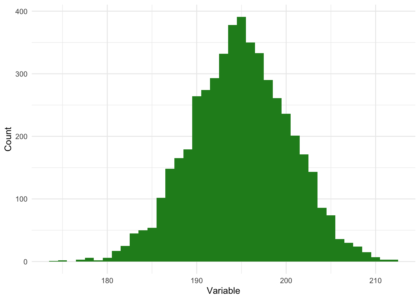
Many real-world variables are not symmetric. They tilt — a long tail on one side, most of the mass on the other. The two panels below show the two flavors of skew:
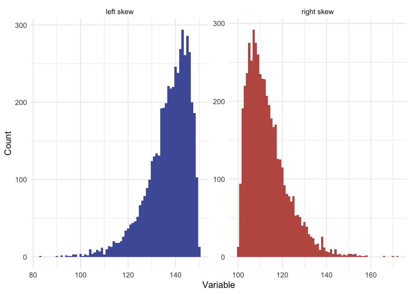
Left skew (negative skew) describes a distribution whose tail extends toward low values while the bulk of the data clusters on the high side. Extremely low scores in the left tail pull the mean below the median: mean < median.
Right skew (positive skew) is the mirror image — the tail extends toward high values while the bulk clusters on the low side. Extremely high scores pull the mean above the median: mean > median. (Our full-sample SBP showed exactly this pattern, with the long right tail produced by older participants and a mean of 119 sitting a few points above the median of 116.)
Skew matters for which summaries are most honest. In a heavily skewed distribution, the mean is dragged by the long tail and may not represent the typical observation well; the median is a more honest “typical value.” Likewise the standard deviation reflects the spread but is also dragged by the tail; the IQR is the more honest spread when skew is strong. None of these summaries are wrong for skewed data, but the choice of which to report should be deliberate: in a skewed setting, a paper that reports only the mean and SD is hiding part of the story.
Two Crash Course videos on spread and distributions offer a useful complement to what you’ve just read — a different take on the same ideas before moving on.
A unified framework · the four moments of a distribution
Three summaries you have just met — mean, variance / SD, and skewness — together with a fourth, kurtosis (how heavy a distribution’s tails are), are not four unrelated tools. Each is derived from one of the first four moments of a distribution — a single family of quantities that statisticians use to describe shape. The name comes from physics: a moment is a measure of how a quantity is distributed around a point, the same idea that lets a seesaw balance on a fulcrum.
Each successive moment captures a different aspect of distributional shape:
| Moment | Statistic | What it captures |
|---|---|---|
| 1st | Mean | Where is the distribution centered? |
| 2nd | Variance / SD | How spread out is it around the center? |
| 3rd | Skewness | Is it symmetric or lopsided? |
| 4th | Kurtosis | Are the tails heavy (many outliers) or light? |
More precisely, the mean is the first raw moment; the variance is the second central moment (and the SD its square root); and skewness and kurtosis are the standardized third and fourth central moments. The everyday statistics are built from the moments, in other words — not quite identical to them — but the one-to-one correspondence in the table is what matters for reading distributions.
For roughly bell-shaped distributions — like the 16–25 SBP data above — the first two moments often tell you most of what you need to know. When distributions are skewed or have heavy tails, the higher moments earn their keep. The taxonomy reappears whenever you read a paper that checks distributional assumptions, tests normality, or chooses between parametric and non-parametric methods4 — many of those moves lean on one of the four moments above, alongside other considerations like sample size, dependence, and the raw shape of the data.
Comparing distributions across groups
Up to this point we’ve read a single distribution at a time. Most interesting research questions are comparative, though — do men and women differ in blood pressure on average? Is blood pressure more variable among older adults than among younger ones? Each comparison needs the same three lenses we’ve been building: differences in center, differences in spread, and (eventually) differences in shape.
Comparing means · differences in central tendency
For our SBP age groups: the mean SBP is 112 mm Hg among 16–25-year-olds and 134 mm Hg among the 65-and-older group, a difference of 22 mm Hg. That sounds large, but how large depends on the spread within each group. A 22-point gap looks dramatic against a group SD of 5 and modest against an SD of 25. One way to put the difference on a spread-aware scale is to divide by a group’s SD: 22 ÷ 12 ≈ 1.8 younger-group standard deviations. This uses the younger group’s SD purely as a descriptive reference scale — it is not the pooled standardized mean difference (Cohen’s d), which divides by a pooled within-group SD and which we develop in M08. Even as a rough descriptive yardstick, though, 1.8 is substantial, and you can see it cleanly in the overlaid histograms below.
Comparing standard deviations · differences in spread
The SD of SBP is 12 mm Hg in the younger group and 20 mm Hg in the older group. The older group is genuinely more variable: some 65+ adults maintain healthy blood pressure into advanced age while others develop substantial hypertension, and the distribution stretches to accommodate both. Differences in spread carry as much research meaning as differences in means — a group whose distribution is wider is a group with more within-group heterogeneity, which is itself a finding.
Visualizing the comparison
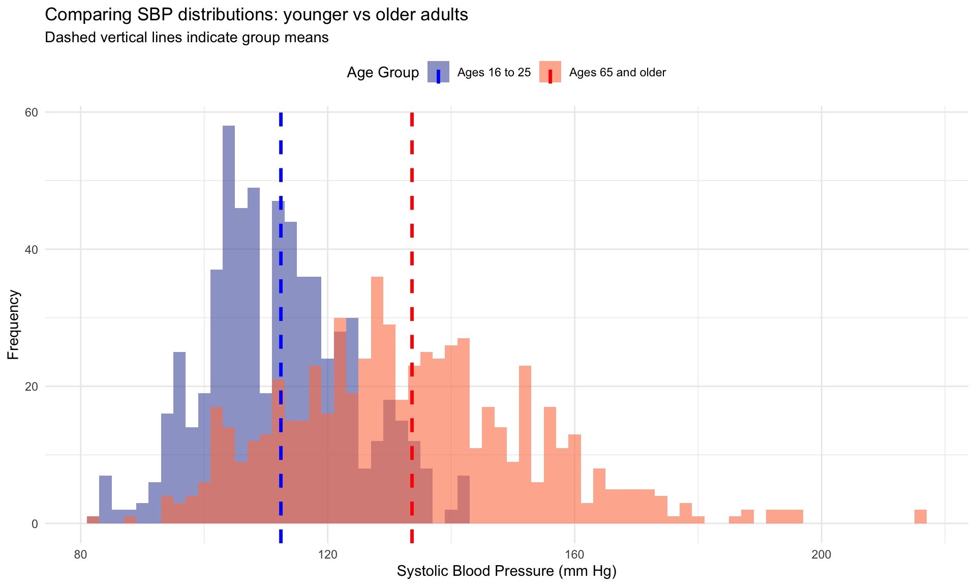
Relative variation · the coefficient of variation
Standard deviations are useful for comparing groups on the same scale, but they get awkward when groups have very different means or are measured in different units. A standard deviation of 20 mm Hg in older adults vs 12 in younger adults sounds dramatic — but the two groups also differ in their means, so we might reasonably ask whether older adults are more variable relative to their higher mean, or only in absolute terms. And a comparison between “SBP spread” (in mm Hg) and “heart-rate spread” (in beats per minute) cannot be done with SDs at all.
The coefficient of variation (CV) solves both problems by scaling the SD by the mean:
\[CV = \frac{s}{\bar{x}} \times 100\%.\]
For our two age groups:
- Ages 16–25: \(CV = 12 / 112 \times 100 \approx 11\%\).
- Ages 65+: \(CV = 20 / 134 \times 100 \approx 15\%\).
How to read those numbers. A CV is just the standard deviation re-expressed as a percentage of the mean, so the younger group’s 11% says: typical variation in this group is about 11% the size of its own average. Concretely, for a group averaging 112 mm Hg, a one-standard-deviation swing is about 12 mm Hg — roughly a tenth of the average value. The older group’s 15% says the same thing about a bigger average: a one-SD swing of about 20 mm Hg against a mean of 134.
Putting the two side by side is the whole point. Older adults’ blood pressure varies about 39% more than younger adults’ relative to each group’s own average — so the older group’s larger raw SD is not just an artifact of its larger mean. That is a claim the raw SDs (12 vs 20 mm Hg) cannot make on their own, because they are anchored to different centers.
WarningTwo cautions before you interpret a CV
First, the percent sign invites a misreading. A CV of 11% does not mean 11% of participants fall in some range, and it is not a coverage statement like the empirical rule’s 68–95–99.7. It is a ratio of two summary numbers — spread divided by center — that happens to be conventionally written as a percentage. Nothing about it tells you what share of the sample sits anywhere.
Second, there is no small / medium / large convention for a CV — and it is worth knowing why, because you will look for one. A CV measures spread against a particular mean, so its size depends on where the variable’s zero happens to sit. SBP averages near 119 mm Hg, a long way from zero, which makes its CV small almost by construction. A variable whose values sit closer to zero relative to their spread — reaction times, income, counts of rare events — routinely produces CVs several times larger with nothing unusual going on. A threshold that meant anything for one of those would mean nothing for the others.
Where thresholds do exist, they are acceptance criteria for a particular use, not effect-size benchmarks. Many laboratories require a CV below roughly 5–10% before an assay counts as reproducible; federal statistical agencies commonly flag an estimate whose relative standard error runs above about 30%.
Keep that second one separate in your mind, because it is the rule you are most likely to meet and misapply. A relative standard error is the standard error divided by the estimate — the variability of a number we computed. The CV here is the standard deviation divided by the mean — the variability of people. Same arithmetic shape, different quantities: a large RSE says we do not know the number well, while a large CV may be exactly the finding.
So read a CV comparatively — as we just did across the two age groups — rather than against an imagined table of cutoffs.
The CV is unitless, which lets you place relative variability on a common scale even across variables measured in different units — though whether such a cross-variable comparison is substantively meaningful is a separate judgment. CV is most useful for positive ratio-scale variables (where zero genuinely means absence) and gets unstable when the mean is near zero, so it is not a tool to reach for in every comparison — but when it fits, it fills a gap that absolute SDs cannot.
Where this returns. Several tests in M09 ask whether the groups being compared have similar spread, and M09 judges that by comparing the group SDs directly. The CV sharpens one point about that comparison: groups with different means but similar CVs must have systematically different SDs. One caution to carry with it, because the intuition runs the wrong way: a small CV does not mean a group difference is easier to detect. That depends on the gap between the means relative to the within-group SD, which is a different ratio entirely.
Standardized scores · putting a value in context
A reading of 140 mm Hg sounds high — and for a young adult, it is. For an 80-year-old, it’s closer to average. The same number means different things in different distributions, which is the central inconvenience of using raw scores to describe how unusual an observation is. What we want is a way of saying “this observation is X standard deviations above the mean of its distribution” — a unit that doesn’t depend on whether we’re looking at blood pressure, IQ scores, test grades, or income. That unit is the standardized score, almost always called a z-score.
A z-score answers a single question: how many standard deviations from the mean is this observation? The formula is the cleanest in all of descriptive statistics:
\[z_{i} = \frac{x_{i} - \bar{x}}{s_{x}}\]
In words: subtract the mean from the observation to get the deviation, then divide by the standard deviation to scale that deviation into standard-deviation units. The result is unitless — the original mm Hg cancel — and it is signed: a positive z is above the mean, a negative z below.
In the full NHANES sample, mean SBP is 119 and the SD is 17 — both rounded, so the z-scores below are approximate:
If someone has an SBP of 102, then their z-score is: \(z = \frac{102 - 119}{17} \approx -1\). That is, their SBP is about 1 standard deviation below the mean.
Let’s try another. If someone has an SBP of 153, then their z-score is: \(z = \frac{153 - 119}{17} \approx 2\). That is, their SBP is about 2 standard deviations above the mean.
One last example. If someone has an SBP of exactly 119, then their z-score is: \(z = \frac{119 - 119}{17} = 0\). That is, their SBP sits at (the rounded) mean.
Three things to register about z-scores:
- They are unitless. This is what allows you to compare apples to oranges. A z-score of 2 on SBP and a z-score of 2 on a depression-symptom scale both say the same thing — this individual is 2 SDs above the mean of their distribution — even though the original quantities have different units, different scales, and different substantive meanings.
- They are the language of the empirical rule. About 68% of the z-scores lie between −1 and +1, about 95% lie between −2 and +2, and about 99.7% lie between −3 and +3. So a quick glance at a z-score tells you how unusual the observation is in any normal distribution — z = 3 is rare, z = 5 is extraordinarily rare, z = 10 is astronomically improbable (not literally impossible under a normal model, just vanishingly so).
- The z-score is the conceptual root of the test statistic. Every time M08 and M09 ask you to compute a t-statistic or a z-statistic to test a hypothesis, you will be doing some variation of “how many standard errors away from the null is the observed value?” — the same scaling logic as the z-score, just with a different denominator. We are introducing it here as a description of an individual; later it will reappear as the engine of inference.
A small caveat. A z-score can be computed for any numeric distribution that has a mean and an SD — the standardizing itself never requires normality. What does require caution is the percentile interpretation. In a normal distribution, z = 2 sits around the 97.5th percentile; but if the distribution is heavily skewed or bimodal, that 68–95–99.7 shortcut breaks down — a z of 2 may not correspond to the 97.5th percentile, and unusual observations can land at much smaller z-scores than the rule would suggest. For skewed distributions, the percentile is often a more honest description of position than the z-score.
Relationships between variables · a first look at covariation and correlation
Almost every interesting research question involves at least two variables. Does blood pressure climb with age? Do people who sleep more weigh less? Does a vocabulary score predict later reading comprehension? Each is a question about how one variable changes when another changes. To answer questions like these we need a new descriptive vocabulary — one that describes the joint behavior of two variables, not just each one separately.
This section introduces the first three tools for that job: the scatterplot, the concept of covariation, and the correlation coefficient. All three reappear with much more depth in M03 (when we learn to build scatterplots in R) and again in M10 (when the same scatterplot becomes the canvas for the regression line). For now, the goal is to read what those tools show you and to know what they can and cannot defend.
Visualizing relationships · the scatterplot
The single most useful first step in any two-variable investigation is the scatterplot. Each point represents one observation; its horizontal position is its value on one variable, its vertical position is its value on the other. The cloud of points that results is the picture of the joint distribution — and the shape of that cloud encodes everything you can say about how the two variables relate.
For our running example, we will look at the relationship between age and SBP in the NHANES sample:
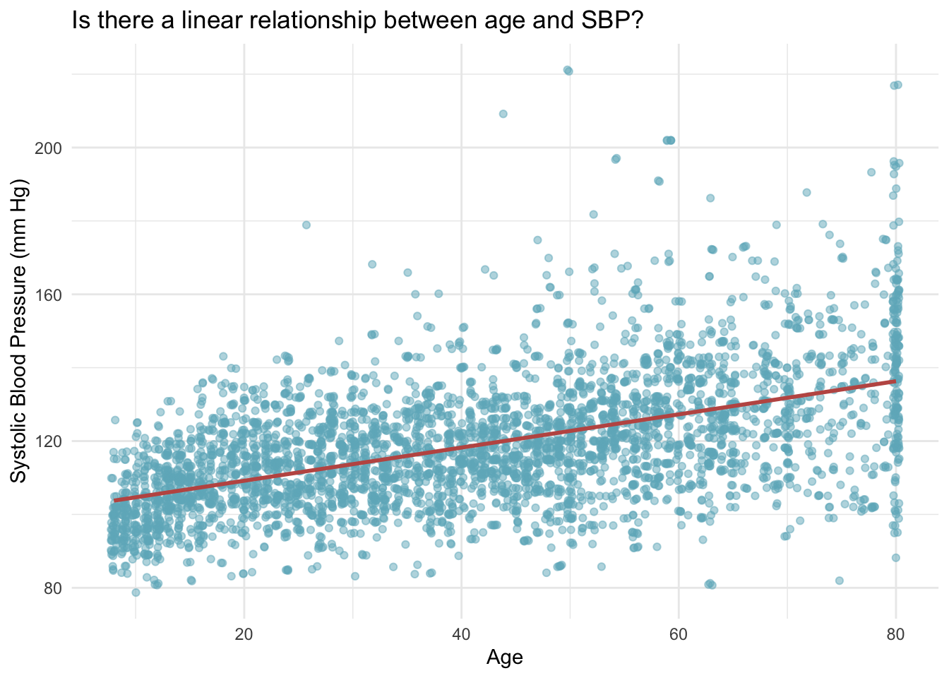
Each point in this scatterplot represents one person in our sample. The rose line shows the overall trend in the data — it’s called a regression line or trend line, and we’ll learn much more about it in future Modules.
What do we notice in this scatterplot?
There’s a general upward trend — as age increases, SBP tends to increase as well. This suggests a positive relationship between age and blood pressure.
The relationship isn’t perfect — there’s a lot of scatter around the trend line. Not everyone of a given age has the same blood pressure. Some 60-year-olds have SBP in the healthy range, while others have elevated readings.
The spread increases with age — notice how the points fan out more at older ages. This reflects what we observed earlier: there’s more variability in SBP among older adults.
Covariation · when variables change together
When two variables change together in a systematic way, we say they covary — they show covariation. Covariation has both a direction and a strength.
The direction comes in three flavors:
- Positive covariation — high values of one variable tend to come with high values of the other (age and SBP, in our scatterplot)
- Negative covariation — high values of one tend to come with low values of the other (exercise frequency and resting heart rate)
- No linear covariation — no systematic upward or downward straight-line tendency (the last digit of someone’s phone number and their blood pressure). Note the word linear: two variables can show no straight-line trend and still be strongly related in a curved pattern, so “no linear covariation” is not the same as “unrelated.”
The scatterplot above shows clear positive covariation: the cloud tilts up from lower-left to upper-right. But the qualifier “tends to” matters here. Not every older person has higher SBP than every younger person — the scatter around the trend is substantial. Covariation describes a tendency in the joint distribution; it does not describe a deterministic rule about individuals.
Covariation is also silent about why the two variables are related. The cloud of age vs SBP does not tell us that getting older causes blood pressure to rise — older participants and younger ones differ in many ways besides age (medications, decades of accumulated cardiovascular wear, diet over a lifetime, generational differences in salt intake). Causal claims require evidence beyond the joint distribution; we will sharpen this point in M02 and again in M10.
Correlation · putting a number on the relationship
The scatterplot lets you see covariation; the correlation coefficient lets you put a single number on it. The most common version — Pearson’s \(r\) — is bounded between \(-1\) and \(+1\) and captures two things at once:
- The direction of the relationship (the sign of \(r\))
- The strength of the linear pattern (the magnitude of \(r\))
Read \(r\) as you would a thermometer:
- \(r = +1\) — perfect positive linear relationship; every point sits exactly on an upward-sloping line.
- \(r \approx +0.8\) — strong positive; points cluster tightly along an upward line.
- \(r \approx +0.3\) — modest positive; an upward trend is visible but with substantial scatter.
- \(r \approx 0\) — no linear relationship; the cloud has no tilt.
- \(r \approx -0.3\) — modest negative.
- \(r \approx -0.8\) — strong negative.
- \(r = -1\) — perfect negative linear relationship.
These verbal labels — “modest,” “strong” — are rough conventions for reading this Module’s figures, not universal thresholds: what counts as a “strong” correlation depends on the field, the reliability of the measures, the range of values sampled, and what rides on the association. Crucially, \(r\) summarizes only the linear relationship. Two variables can be tightly related in a curved or U-shaped pattern and still have \(r \approx 0\) — Pearson’s \(r\) can fail to reveal, or badly under-summarize, a strong non-linear relationship. This is why the scatterplot comes first; the picture catches non-linear structure that the single number misses.
The correlation between age and SBP in the NHANES sample is \(r = 0.53\).
The positive sign confirms the upward tilt we saw in the scatterplot — older participants tend to have higher SBP. The magnitude (around 0.5) describes a moderate linear relationship: clearly not zero, but well short of perfect. There’s real signal, and there’s real noise. Translated into substance, what this number says is: age is associated with some of the variation in SBP, but a great deal of the variation between people of the same age remains. This makes biological sense — age is one of many factors that shape blood pressure (genetics, weight, medications, stress, diet, exercise, sleep, sodium intake), and the rest of those factors live in the scatter around the trend line.
What correlation does and does not tell you
A useful discipline whenever you see a correlation in the wild is to keep the list of what \(r\) can defend separate from the list of what \(r\) cannot.
\(r\) tells you:
- The direction of the linear relationship (positive or negative).
- The strength of the linear relationship (how tightly the points hug a straight line).
- A unit-free scale that is common across studies — a correlation of 0.5 sits at the same point on the −1-to-+1 scale whether you’re correlating SBP with age or test scores with study hours (though how important that 0.5 is remains context-dependent).
\(r\) does not tell you:
- Whether one variable causes the other. Correlation is not causation is more than a slogan; it is the iron law of observational data. A non-zero correlation can arise from causation in either direction, from a third variable that drives both, or from chance.
- Whether the relationship is the same in every subgroup. A correlation of 0.5 in the full sample can mask very different patterns in men vs women, or young vs old, or treated vs untreated.
- Anything about non-linear patterns (a U-shape, a plateau, a threshold effect).
We will return to each of these limitations carefully throughout the course. The first lecture will sharpen the distinction between description, prediction, and causal inference. M10 will extend \(r\) into the slope of a regression line and develop the proper machinery for asking how confident should we be in this relationship?
The Crash Course video below brings in a few more angles on correlation — particularly the intuition behind the coefficient and its limits.
From describing to inferring · what’s coming next
Every concept in this Module shows up again — sometimes in a new disguise — in the inferential work that follows. PSY 652 is built around taking the descriptive vocabulary you have right now and asking, in each new context, “how confident should I be in this summary, given that I only see a sample?” Here’s the map:
- Sampling, populations, and samples — what does it mean to draw a sample from a population, and how does that constrain what your descriptive statistics tell you? Picked up in M05 (Describing Data with R) and refined throughout Part 2.
- Probability and distributions — the bell curve and the empirical rule (you met them here) get formalized as probability distributions, with the normal distribution as one example of many. M06 (Probability and Distributions).
- Standard error and confidence intervals — the mean is a single number; the confidence interval around it is the range of plausible population means given your sample. The standard deviation you just computed is the foundation of the standard error. M07 (Confidence Intervals).
- Null hypothesis significance testing — your descriptive comparisons across groups (the mean SBP for the youngest age group vs the oldest) become statistical tests. The two-sample t-test, ANOVA, and chi-square test all build on the descriptive vocabulary here. M08 (The Logic of NHST) and M09 (Conducting NHST).
- Regression — correlation extends to linear regression, where one variable predicts another. The scatterplot you just learned to read becomes the picture of a regression model. M10 (Simple Linear Regression) through M12 (Model Assumptions and Diagnostics).
The descriptive tools are the foundation. Inferential tools build on them — they don’t replace them. By the time you reach M09, every test result you read will be reported as a descriptive comparison (means, SDs, effect sizes) plus an inferential layer (CIs, p-values). The two layers always travel together.
Summary
Core takeaways
Measurement is upstream of analysis. Every dataset reflects a chain of decisions — construct → operationalization → measure → variable — and a body of evidence for the measure’s validity (right construct) and reliability (consistent across time, raters, items, forms). Before you summarize a variable, ask what it actually represents and what evidence supports that claim.
Variable scale constrains the meaningful summary. Categorical variables get counts and proportions; numeric variables get center, spread, and shape. Using the wrong summary type — a mean for a multi-category nominal variable, a frequency table as the only summary for a continuous one — produces output that doesn’t mean what you think.
Describe a numeric variable with three features, not one number. Center alone (the mean) is a partial description; you also need spread (SD) and shape. “Features” rather than “numbers” is deliberate — center and spread each reduce to a single value, but shape usually does not: skew, kurtosis, and modality are separate readings, and the histogram often tells you more than any of them. Two distributions can share a mean and tell very different substantive stories.
Standardized scores let you compare apples to oranges. A z-score expresses any value in standard-deviation units from its distribution’s mean — so you can compare your blood-pressure reading to your friend’s IQ test in a common unit. Its shape, \(\dfrac{\text{observed} - \text{center}}{\text{spread}}\), then recurs through Part 2 with one thing swapped each time:
- M06 uses z as the lookup key into the standard normal — standardize a value, then read off a probability with pnorm() or run it backwards with qnorm().
- M07 swaps the denominator. Describing an individual calls for the standard deviation; describing a sample mean calls for the standard error, which shrinks as n grows. A confidence interval is built from that swap.
- M08 keeps the same ratio and changes what sits on top: instead of one person’s distance from the mean, it is the observed result’s distance from what the null hypothesis predicts. That is a test statistic.
- M09 carries the same idea across three designs. The t keeps this exact shape; F and χ² make the same comparison — the observed departure against the departure the null would ordinarily produce — with their own arithmetic.
Learn to read a z-score now and you have the skeleton of every inferential statistic in this course.
Correlation describes linear association — and only linear association. Two variables can be strongly related and still have r ≈ 0 if the relationship is curved. Correlation is not causation — you’ll need more than the descriptive coefficient to support a causal claim.
Comparing groups means comparing distributions — center and spread together. A difference in means between two groups means something different when the two groups have similar spreads than when one is far more variable than the other. The coefficient of variation lets you put spreads on a common scale when the means themselves differ; the simple mean-comparison alone is rarely the whole story.
Credits
- The Measurement section of this Module drew from the excellent commentary on this subject by Dr. Danielle Navarro in her book entitled Learning Statistics with R.
Footnotes
The 5,000 individuals from NHANES that are considered in this Module are resampled from the full NHANES study to mimic a simple random sample of the U.S. population.↩︎
Vertical bars around a number or an equation denote the absolute value. The absolute value of a real number is its distance from zero on the number line, regardless of the direction. Therefore, for example, \(|-5| = 5\) and \(|5| = 5\).↩︎
Where does 1.4826 come from? For normally distributed data, the raw median absolute deviation works out to about 0.6745 standard deviations — a little over two-thirds of one SD. To rescale it into an estimate of the standard deviation itself, you divide by 0.6745, which is the same as multiplying by \(1 / 0.6745 \approx 1.4826\). (That 0.6745 is the 75th percentile of the standard normal distribution; it appears because, for a normal distribution, half of the absolute deviations from the median fall below this point and half above.) The scaling is what makes the scaled MAD and the standard deviation line up on normal data — on skewed or heavy-tailed data the two can differ, which is exactly when the outlier-robust MAD earns its keep.↩︎
The labels are less tidy than they sound, so it is worth being careful. A parametric method commits to a distributional form for some part of the model — very often the errors or the sampling distribution of a statistic, not necessarily the raw outcome itself. (A t-test, for instance, leans on the sampling distribution of the mean difference, which is why it behaves well in large samples even when the outcome is visibly non-normal.) Non-parametric methods are a broad family rather than a single alternative — rank-based tests are the ones you meet first, but resampling and bootstrap procedures belong here too — and they make weaker distributional commitments, not no commitments: independence and, for many rank tests, assumptions about shape or symmetry still apply. Nor is there a fixed power penalty. Which approach has more power depends on the data-generating process and the hypothesis being tested; against heavy-tailed data a rank test can be more powerful than its parametric counterpart, not less. So the choice is not settled by running a normality test and reading off a verdict. It is settled by asking what quantity you are trying to estimate, what the design and measurement scale will support, and which assumptions you can actually defend — with the shape of the distribution one input among several. You will meet specific examples in M08–M09.↩︎