library(tidyverse)
library(here)
library(broom)
library(infer)
library(effectsize)
library(scales)
library(patchwork)
library(gtsummary)
library(labelled)Conducting Common Hypothesis Tests
Learning Objectives
By the end of this Module, you should be able to:
- Choose the right test for a design — one-sample t, two-sample t, one-way ANOVA, or chi-square — by identifying the outcome type, the number of groups, and whether the observations are independent.
- State, in words and then in symbols, the population parameter and the hypotheses each test evaluates.
- Run each test in R and read its key output: the estimate and confidence interval where applicable, the test statistic, the degrees of freedom, and the p-value.
- Assess the design and model assumptions that matter for each test, and choose a defensible alternative when the standard analysis is unsuitable.
- Report each result in APA style — the raw effect first, then its uncertainty, then a standardized effect size — with a claim whose scope matches the design.
Overview
Where this fits — the Part 2 inference arc
Modules 6–9 are one continuous story: how we reason from a sample back to the world. Each module is a single step in that arc.
- M06 · Probability — what outcomes should we expect under a given data-generating process?
- M07 · Confidence intervals — how much does a sample statistic wobble from one sample to the next?
- M08 · The logic of NHST — how surprising is our statistic if a specific null value were true?
- M09 · Conducting tests — which standard test matches this design, and how do I run, read, and report it? · ← you are here
In Module 8 you learned the logic of null-hypothesis significance testing, and you learned it on a single test: imagine a world where \(H_0\) is true, ask how compatible your data are with that world, and decide against a pre-specified \(\alpha\). That logic is now fixed. You will not learn a new version of it in this Module. What changes from here on is something else entirely:
The logic never changes. What changes is the design — and the design chooses the test.
That sentence is the whole Module. A one-sample t-test, a two-sample t-test, an ANOVA, a chi-square test — these are not separate theories to memorize. They are one piece of logic pointed at different research designs. Each design asks about a different population quantity, so each needs its own test statistic, reference distribution, and effect-size measure. But the reasoning underneath — how compatible is what I observed with what the null model predicts? — never moves.
This is also the Module built to be used. When Project 2 asks you to reproduce a published test in a few weeks, this is where you’ll look up how. When your own data arrive next semester — or mid-dissertation, three years from now — and you need to compare two groups, or four, or a table of counts, this is the page to come back to. Every test below answers the same four practical questions: when do I use it, how do I run it, how do I report it, and what does the result actually mean?
One study, one on-ramp, three tests. To keep the statistics in front and the bookkeeping behind, the whole Module works inside a single research world — Hofman, Goldstein, and Hullman’s boulder-sliding visualization study, introduced just below. The data stay familiar; only the structure of the question changes:
The on-ramp re-runs the one-sample t from the M08 lab to teach the template. Tests 1–3 then ask three questions of the same study — do two independent groups differ (two-sample t), do four independent groups share one mean (one-way ANOVA), and does a yes/no outcome depend on group (chi-square) — and the card in Meet the study maps each to its data.
Each question is a small transformation of the one before it: a second group appears, then two more, then the outcome turns categorical. Tests 1 and 3 use the study’s first experiment: one sample of 905 readers, randomized to a CI or a PI display, the same people the pre-study works with. The on-ramp and Test 2 use the second experiment, where the four displays live.
What this Module deliberately does not cover: regression (M10–M11), correlation as a standalone test (M10 shows it’s a special case of regression — easier to learn once, there), and factorial designs with interactions (a PSY 653 topic; more on that below). What you get here is the toolkit behind most published group comparisons in psychology — and the judgment to match the right tool to the right question.
Packages used in this module
Meet the study
All the tests in this Module share a single research context — a study by Hofman, Goldstein, and Hullman (2020) titled How visualizing inferential uncertainty can mislead readers about treatment effects in scientific results (CHI 2020). The full paper is in your reading list, but you don’t need it in front of you to follow the analyses below. Here’s what you need to know.
The Hofman et al. boulder-sliding study
Hofman and colleagues wanted to know whether the kind of error bar an author chooses — a 95% confidence interval (CI), a 95% prediction interval (PI), or something else entirely — changes how readers interpret a finding. They built a clever experimental scenario to test this. Participants on Amazon Mechanical Turk were told they were competing in a fictional boulder-sliding game against an equally skilled opponent named Blorg. The goal was to slide a boulder farther than Blorg’s; the contestant whose boulder slid farthest won an all-or-nothing prize of 250 Ice Dollars. Participants were given the chance to rent a “special boulder” (a treatment that was expected, but not guaranteed, to slide farther than the standard boulder). They were shown a visualization comparing the two boulders’ performance, then asked two questions:
- Willingness to pay (WTP) — how much, in Ice Dollars, would you pay to rent the special boulder?
- Probability of superiority — what’s the probability that the special boulder will out-slide the standard boulder on a given attempt?
The fictional cover story was deliberate: it reduces the role of domain-specific expertise. Random assignment is what allows any systematic difference in responses across visualization conditions to be attributed to the visualization itself.
Behind the scenes, the simulated boulder distributions were Normal random variables. The standard boulder always had mean 100 m and standard deviation 15.3 m. The special boulder had the same SD but a higher mean — by 4 m in the small effect-size condition (104 m; Cohen’s d ≈ 0.25, true probability of superiority ≈ 57%) or by 16 m in the large effect-size condition (116 m; Cohen’s d ≈ 1.0, true probability of superiority ≈ 76%).1 The “right” answers were therefore knowable: the risk-neutral willingness to pay (what the upgrade is worth on average, its expected payoff) was approximately 17.5 Ice Dollars for the small-effect condition and approximately 65 for the large-effect condition.
The study ran two experiments, and this Module uses both. Experiment 1 is a 2 × 2 design crossing interval format (CI vs PI) with caption text, run at the small effect size only — so its risk-neutral price is $17.50. Tests 1 and 3 run on its matching-caption participants: the same 905 people the pre-study’s Videos 2, 3, and 5 work with, so the numbers you build there are ones you will have met here first. Experiment 2 crossed four visualization formats with two effect sizes, for eight conditions in all, with each participant seeing only one; the on-ramp and Test 2 run on its large-effect condition, because that is where all four displays live.
The four displays, side by side. This is the figure to sit with for a minute, because it contains the paper’s entire argument. Every panel below plots exactly the same underlying data — a standard boulder averaging 100 m against a special boulder averaging 104 m, both with an SD of 15.3 m. Nothing about the boulders changes from panel to panel. Only the choice of what to draw changes.
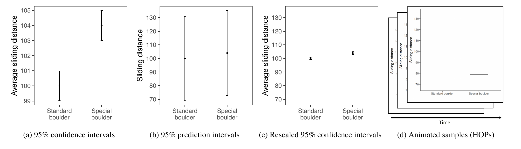
Look at what that does. In (a) the two boulders look worlds apart; in (b) they look almost indistinguishable. Panel (a) draws the mean ± 1.96 standard errors — uncertainty about where the average sits, which shrinks as the sample grows. Panel (b) draws the mean ± 1.96 standard deviations — the spread of individual slides, which does not shrink no matter how much data you collect. Panel (c) keeps (a)’s confidence interval but borrows (b)’s axis, separating “how wide the interval looks” from “what the interval means.” Panel (d) abandons error bars entirely and animates individual draws, one at a time.
Same data, four pictures, four very different impressions. That is the phenomenon every test in this Module is measuring.
The questions, mapped to the data. Here is the whole Module on one card — the same study, interrogated four ways:
| The question | The design | The test | |
|---|---|---|---|
| On-ramp | Does one group’s average judgement match the truth? | One group (Exp 2, CI display / Large), external benchmark of .76 | One-sample t |
| Test 1 | Do CI viewers and PI viewers pay different amounts? | Two independent groups, here randomized (Exp 1, matching caption) | Two-sample t |
| Test 2 | Do the four display formats all produce the same mean WTP? | Four independent groups, here randomized (Exp 2, Large) | One-way ANOVA |
| Test 3 | Does overpaying (WTP above the $17.50 risk-neutral price) depend on the display? | Test 1’s two groups × a yes/no outcome (Exp 1, matching caption) | Chi-square (2 × 2) |
Part 1 — One logic, three designs
The question comes before the test
Here is the most practical thing this Module will tell you: statistical software does not choose the test — you do. R will happily run a t-test on data that needed a chi-square, and it will not warn you. The choice is yours, and it is made before any statistics happen, by answering four questions about your research design:
- What kind of outcome do you have? A continuous measurement, or category membership?
- How many groups or measurements are being compared? One group against a benchmark? Two groups? Several?
- Are the observations independent or paired? Different people in each group, or the same people measured more than once?
- What population parameter does your question name? A mean? A difference of means? A set of proportions?
Answer those four, and the test falls out. Here is the decision map for the designs this Module covers — worth bookmarking, because it is the lookup you’ll use for Project 2 and beyond:
The decision map
| Outcome | Design | The question | The test |
|---|---|---|---|
| Continuous | One sample | Is one population mean equal to a benchmark? | One-sample t |
| Continuous | Two independent groups | Are two population means equal? | Two-sample t |
| Continuous | Three or more independent groups | Are all the population means equal? | One-way ANOVA |
| Categorical | One categorical variable | Do the category proportions match values specified in advance? | Chi-square goodness-of-fit |
| Categorical | Two categorical variables | Are the variables independent? | Chi-square test of independence |
| Continuous | Two measurements on the same units | Is the mean within-person difference zero? | Paired-samples t (worked through in the M09 bonus activity) |
| Categorical (binary) | Two measurements on the same units | Did the proportion change? | McNemar’s test (named, not developed) |
Two edges of the map, for completeness: a categorical outcome with a continuous predictor calls for logistic regression (beyond this course), and a continuous outcome with a continuous predictor is regression — that’s M10.
And one honest caveat about the map itself. It covers the uncomplicated designs this Module develops: one outcome, independent units or a single pairing, no covariates. Real studies routinely add complications that take you off it — clustered or nested data, repeated measurements at more than two time points, covariates you need to adjust for, unequal follow-up, complex survey sampling. When the slogan says the design chooses the test, read it as useful shorthand: more precisely, the question, the outcome type, the dependence structure, and the modeling assumptions together narrow the set of defensible analyses. The map is where that narrowing starts, not where it ends.
What stays fixed, what changes
If the last Module taught the logic and this one applies it to several designs, it helps to be explicit about exactly which parts travel and which parts swap out:
| Component | What stays the same | What changes |
|---|---|---|
| The null logic | Ask how compatible the data are with \(H_0\) | The parameter \(H_0\) constrains |
| The evidence | A test statistic and its p-value | t, F, or \(\chi^2\) |
| The uncertainty | Sampling variability under a model | The formula and reference distribution |
| The magnitude | Report an effect size with its CI | d, \(\eta^2\), or V |
| The interpretation | Name the direction and size in plain language | The substantive claim |
One clarification about the test statistic, because it’s easy to over-generalize. Every test statistic in this Module does the same job: it compares the departure you observed with the amount of departure the null model would ordinarily produce. For the t-tests, that comparison is literally a gap divided by its standard error. ANOVA’s F and the chi-square statistic do the same job differently — they aggregate many departures (between-group spread against within-group spread; observed counts against expected counts) into a single number. Same purpose, different arithmetic. They don’t need to share one formula; the idea is what carries across.
And a reminder from M08 worth keeping precise: the p-value describes how incompatible the observed result is with the null model — not the probability the null is true, and not a measure of importance. Because incompatibility depends on precision, the same size of effect can produce different p-values at different sample sizes. That is exactly why every test below reports an effect size alongside the test: magnitude is a separate question, and it gets a separate number.
One decision rule, fixed now for the whole Module. Every test below uses \(\alpha = .05\), carrying forward the convention M08 set. The t-tests use two-sided alternatives; ANOVA and chi-square use upper-tail reference distributions, because larger values of their non-negative statistics mean greater departure from \(H_0\) — which, as the next paragraph explains, is not the same thing as choosing a directional hypothesis. Stating it once here rather than re-arguing it in every test is deliberate — and so is stating it before seeing any results, which is the only honest moment to choose it. Two things worth remembering about that number:
- It is a convention, not a law of nature. There is nothing about .05 that makes a departure real at .049 and imaginary at .051. It is an agreed-upon tolerance for how often we are willing to reject a true null, and fields differ: some areas of physics and genomics work at thresholds many thousands of times stricter.
- Two-sided for the t-tests, even though theory predicts a direction. A result in the unexpected direction is a finding we would want to see rather than one our test should be blind to; the prediction does interpretive work, telling us what a rejection means, rather than buying a smaller critical value. (A one-sided test is defensible when the direction is fixed in advance; what is indefensible is choosing it after seeing which way the data fell.)
A related point that is easy to garble. ANOVA’s and chi-square’s upper-tail reference distributions are not a directional, one-sided alternative. Their statistics are non-negative by construction, so any departure from \(H_0\), in whatever direction, pushes the statistic up; the upper tail is simply where all the evidence lives. Nothing directional has been assumed. Separately, Test 2’s follow-up comparisons adjust \(\alpha\) to account for testing six pairs at once.
Two kinds of assumptions — and only one is visible in a plot
M08 introduced the three conditions a one-sample t-test rests on — independence, a well-approximated sampling distribution for the mean, and a sample that represents the population you mean to describe. Every test in this Module carries its own list, and the single most useful thing you can learn about such lists is that their entries come in two kinds. The order of operations matters too — this is not a ritual you perform after picking a test, it’s part of how you pick:
Understand the design → choose a model appropriate to it → examine whether the model is reasonable.
- Design assumptions — independence of observations, random assignment, whether observations are paired or independent, each person appearing exactly once. These come from how the data were collected. They are the most consequential assumptions and no plot can check them — you verify them by knowing the design. A violated design assumption isn’t patched with a histogram; it calls for a different model.
- Model considerations — is the mean a sensible summary of this outcome? Could a few extreme values dominate it? Is the sampling distribution of the statistic well approximated at this sample size (the CLT’s job)? Do the group variances differ enough that the standard-error model matters? For chi-square: are the expected cell counts adequate? These you assess with plots, summaries, and judgment.
Each test below walks the two in that order, asking only the questions that matter for that test — no generic checklists.
How we’ll run things in R
The tests use a deliberately mixed set of R tools, and the rule behind the mix is worth stating so it never feels arbitrary:
| Analysis | Primary tool |
|---|---|
| One-sample and two-sample t | t_test() from infer |
| One-way ANOVA | lm() + anova() + broom::tidy() |
| Chi-square | chisq_test() from infer |
| Standardized effect sizes | effectsize functions |
The rule: we use infer’s wrappers wherever a test reduces to one statistic and one p-value — t_test() is the function you used in M08, and chisq_test() is its sibling; both return a one-row tibble you can read at a glance and pull reported values from. We use the model-fitting functions where the model’s internals are themselves the lesson: ANOVA’s variance decomposition arrives via lm() + anova(), which prints the whole table of sums of squares that Test 2 builds by hand (and previews M10). The logic is unified even when the function changes — that’s the point.
How to read the three tests
Every test below uses the same six headings, in the same order:
- Recognize the design — the design’s features first; the test’s name second.
- State the parameter and hypotheses — name the estimand (M05’s word for the quantity you are trying to learn) in words before symbols.
- See the data and assess the model — descriptives, one good plot, and the assumptions that actually matter.
- Run and read the test — the R call, what each output value means, and a Show the answers pill that walks the output value by value and shows the one decision written three ways.
- Quantify and visualize the effect — the raw effect first, then the standardized one.
- Write the result and define its scope — the APA sentence, the plain-language sentence, and one sentence on what the analysis does not establish.
Read the on-ramp carefully — it teaches the template at full length. For Tests 1 through 3, each section opens by naming what’s new relative to the previous test, and leans on the template for everything else. That’s the cumulative structure of the Module: not separate chapters, one chapter with variations.
One deliberate exception: Test 3 opens with a short warm-up before the six headings begin, meeting the chi-square calculation on a single categorical variable — the goodness-of-fit test — where it is easiest to see, before extending it to two variables at once.
The reference distribution — and why each test needs its own
This part of the Module builds directly on two earlier ones, so it is worth slowing down for.
In M06 you learned what a probability distribution is: a complete account of which values a quantity takes and how often — a PDF you can integrate, a CDF you can query with pnorm(), a z-score that converts any value into “how many SDs from the center.” In M08 you put that to work: you built a null distribution — the set of results the world would produce if \(H_0\) were true — and asked where your observed statistic fell in it.
M09’s whole job is to run that same reasoning on every design. And here is the sentence that organizes it:
Every test reduces the evidence in the data to a single test statistic and compares it with a reference distribution: a description — exact under some models, approximate under others — of what that statistic should do if \(H_0\) were true. The design picks which one you get.
You have met one already. M08’s t-distribution, with its heavier-than-normal tails, chosen because we estimate \(\sigma\) from the sample rather than knowing it. Its shape depends on degrees of freedom — small df, fat tails; large df, indistinguishable from the normal.
Degrees of freedom: quantities minus constraints
Every reference distribution in this Module is selected by its degrees of freedom, so it is worth having one idea that explains df everywhere instead of a separate rule for each test. Here it is:
Degrees of freedom = the number of quantities that went into the calculation − the number of constraints they must satisfy.
Read that as a counting rule that holds for every test in this Module except one — Welch’s t-test, flagged below — rather than as a derivation that works for every model you will ever meet.
A constraint is anything the data are forced to satisfy because you already estimated something from them. Estimating a mean and then measuring deviations from it costs you one piece of information: once you know the mean and all but one of the deviations, the last one is determined — it has no freedom left to vary.
That single sentence generates every df you will meet below:
| Test | Quantities | Constraints | df |
|---|---|---|---|
| One-sample t | n observations | 1 (the sample mean) | \(n - 1\) |
| Two-sample t (equal-variance form) | N observations | 2 (two group means) | \(N - 2\) |
| One-way ANOVA, within | N observations | k (one mean per group) | \(N - k\) |
| One-way ANOVA, between | k group means | 1 (the grand mean) | \(k - 1\) |
| Chi-square, \(r \times c\) table | \(rc\) cell counts | row and column totals | \((r-1)(c-1)\) |
Why the letter changes down that column. It is not a typo: N and n mean different things, and APA is strict about it. Capital N is a total; lowercase n is one group or subsample. So the one-sample t counts n — a single group — while the two-sample t and ANOVA count N, everyone in the analysis pooled across groups, and then name the individual groups \(n_{CI}\), \(n_{PI}\), and so on. Watch for this in published tables too: N = 905 and n = 419 in the same paragraph are telling you the scope of each count.
The chi-square row is the one worth staring at, because you can see the constraint working. In a 2 × 2 table with the margins fixed, fill in any one cell and the other three are forced — so one cell is free, and \((2-1)(2-1) = 1\). Test 3’s table is exactly that 2 × 2.
One honest exception, flagged now so it doesn’t surprise you in Test 1: Welch’s t-test breaks this heuristic. Its df is a weighted compromise between two groups’ information, and it comes out fractional rather than a whole number — you’ll see the actual value when we get there. That is not a counting argument at all; it is an approximation chosen to make the reference distribution fit well. The principle covers the other cases, which is most of what you need.
This Module adds two more reference distributions:
| Test | Statistic | Reference distribution | How many df values pick the curve |
|---|---|---|---|
| One-sample and two-sample t | t | t-distribution | 1 |
| One-way ANOVA | F | F-distribution | 2 — a numerator df and a denominator df |
| Chi-square | \(\chi^2\) | \(\chi^2\)-distribution | 1 |
Read that last column carefully, because it is easy to misread. It counts how many degrees-of-freedom numbers you must supply to select one specific curve — not what those numbers are. The t and χ² families are each indexed by a single value, so naming that one number picks the curve — the on-ramp will use a t-distribution at \(df = n - 1\), which for its sample is in the hundreds. The F family is indexed by a pair, and you need both: Test 2’s ANOVA uses F(3, 906), and changing either number gives you a different curve entirely.
What changes when df changes. Because df picks the curve, it also moves the cutoff. For a two-sided t-test at \(\alpha = .05\) the critical value puts \(\alpha/2 = .025\) in each tail, and that value shrinks as df grows:
Two of these are non-negative by construction — F is a ratio of variances and \(\chi^2\) is a sum of squares, so neither can go below zero. That single fact changes the picture: the t-tests have rejection regions in both tails, while ANOVA and chi-square have one, in the upper tail only. Their curves are right-skewed rather than symmetric.
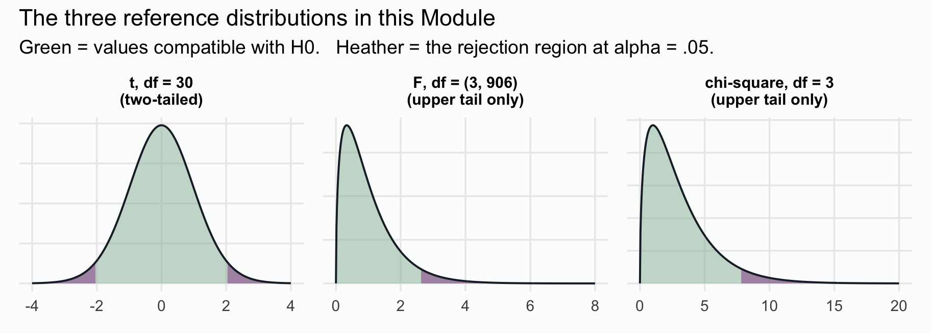
(Two of the panels are drawn at illustrative df. The t panel uses df = 30 so its heavier tails show; at the df you will meet below, in the hundreds, the curve is indistinguishable from the Normal. The chi-square panel is Test 3’s four-category warm-up curve, df = 3; Test 3’s own 2 × 2 test runs on df = 1, whose curve looks different and is drawn there.)
How to read any of these panels. Three things are on every one of them, and it helps to take them in order.
The curve — the world you are testing against. Suppose \(H_0\) really were true, and you ran your study again and again, thousands of times, on a fresh sample each time. Every run would hand you one test statistic. Pile all of those numbers up and you get this curve. Notice what it is not: it contains none of your data. It is a picture of what your statistic would do in a world where \(H_0\) holds.
The heather region — the values we agreed to call surprising. These sit far enough out in the tail that we decided, before looking at any data, to treat them as evidence against \(H_0\). We fix “far enough” by fixing the region’s area: exactly \(\alpha\) = .05. The point where the shading begins is the critical value.
Your result. Mark your observed statistic on the same axis. The p-value is the total area under the null curve for results at least as extreme as yours — in both tails for a two-sided t-test, and in the upper tail for F and \(\chi^2\).
So one picture answers the question two ways — is my statistic inside the heather? and how much area lies past it? They always agree, and they have to: the rejection region is defined to have total area \(\alpha = .05\) — split across the two tails for a two-sided t-test, entirely in the upper tail for F and \(\chi^2\) — so “am I past that point?” and “is my area smaller than .05?” are the same question asked from opposite ends.
The colors are the same ones M08 used, and they carry the same meanings throughout: heather marks the rejection region, the territory we are testing against; rose marks our own observed statistic. Every figure below is that pair.
Two symbols you need to keep apart
Those panels involve two numbers on the horizontal axis, and confusing them is one of the most common sources of trouble in a first inference course. Both are carried over from M08, and the notation is worth pinning down before we start using it in earnest:
| What it is | Where it comes from | How we write it | |
|---|---|---|---|
| Observed statistic | the single number your data produced | your sample — you cannot know it until you collect and compute | \(t_\text{obs}\), and by extension \(F_\text{obs}\), \(\chi^2_\text{obs}\) |
| Critical value | the cutoff for “extreme enough to reject” | the decision rule — \(\alpha\), two-sidedness, and the reference family — fixed before you look at your data; the numerical cutoff follows once the df are known | \(t^*\), \(F^*\), \(\chi^{2*}\) |
The shorthand is easy once you see the logic behind it: the asterisk marks a threshold, and the “obs” subscript marks your result. So \(t^*\) is a property of your decision rule; \(t_\text{obs}\) is a property of your data. The whole test is then a single comparison between them — reject when the observed value passes the starred one.
Two practical notes. First, we write the subscript every time we mean our own number — \(t_\text{obs}\), \(F_\text{obs}\), \(\chi^2_\text{obs}\) — and keep plain t, F, and χ² for the names of the tests and their curves. Two places drop the subscript, and you should read it back in: R labels our number statistic, and an APA write-up such as t(df) = value reports \(t_\text{obs}\) with its df. Neither ever reports the cutoff. Second, this is exactly the notation M08 used — and \(t^*\) is also the multiplier you met in M07, where \(\bar{x} \pm t^* \cdot SE\) built a confidence interval. That is not a coincidence, and it is the reason a CI and a test agree: they are built from the same \(t^*\).
Every test below draws this picture with its own distribution, its own df, and your observed statistic marked on it. That figure is the moment where M06’s distributions and M08’s null-world reasoning become the thing you actually use.
The on-ramp — the one-sample t, and the six-step template
The on-ramp teaches the template
You already know this test — and you have already run this analysis. M08 built the one-sample t from scratch, and the M08 lab walked you through this exact question on this exact sample: the participants shown a 95% CI at the large effect size, and whether the probability they perceived matched the probability the stimulus actually produced.
That repetition is deliberate. The six-step template from How to read the three tests is the new thing here — the test is not, and neither is the data. With nothing else competing for your attention, you can watch the template do its work. Tests 1 through 3 then apply the same six steps to designs you have not met.
What the lab did not do is show the calculation inside. It called t_test() and read the output. Below we build the statistic by hand, count the degrees of freedom, and locate the critical value — so that when Tests 1 through 3 change the design, you can see exactly which piece changes with it.
One note on what we are asking. This is a course-designed analysis, not one of the paper’s. Hofman et al. preregistered comparisons between visualization formats — that is Test 1. Here we take one condition and ask whether it was calibrated, which is a reasonable thing to do with the authors’ own descriptive observation; it just is not the paper’s central question.
Recognize the design
Start where every analysis should start — with the design’s features, not the test name:
- The outcome is each participant’s perceived probability that the special boulder out-slides the standard one: a single continuous measurement per person, bounded between 0 and 1.
- There is one group — the participants shown a 95% confidence interval at the large effect size. One cell of the eight, with no comparison group in play.
- The comparison is external, and the benchmark is an unusual kind: not a reference value someone chose, but a correct answer the stimulus guarantees.
- Observations are independent — each MTurk worker was recruited separately and appears exactly once.
- The estimand — the quantity this analysis is trying to learn — is that group’s population mean perceived probability, \(\mu\).
One continuous outcome, one group, one external benchmark, independent observations, a question about a mean. The decision map gives the answer: a one-sample t-test.
This is the pattern to practise on every dataset you ever meet: name the outcome type, count the groups, check independence, identify the estimand — then the test names itself.
State the parameter and hypotheses
Where .76 comes from. You already have it from Meet the study: in the large-effect condition the special boulder’s distribution sits 16 m above the standard boulder’s with the same spread, which makes it the winner on about 76% of individual attempts. Nothing is estimated from the data to get that number — it is a property of the simulation the participants were shown.2
That makes this benchmark different in kind from the one M08 used, and the difference changes what rejecting means. M08 tested college-attendee earnings against $32,000 — an externally sourced threshold, a figure we take as a fixed point of comparison. Rejecting there says the population mean sits somewhere other than that threshold. Here .76 is a correct answer. Rejecting does not say these participants differ from some other group; it says the population mean judgment is miscalibrated relative to the benchmark. “Significant” reads as miscalibrated on average, not merely different from an arbitrary reference value.
Now the hypotheses — and first, be precise about what \(\mu\) refers to. The estimand is the population mean perceived probability among people shown a 95% CI display at the large effect size — not all participants, not all displays. Naming the population is half of stating a hypothesis well.
\[H_0: \mu = .76 \qquad\qquad H_a: \mu \neq .76\]
The same two statements in words, because the symbols alone don’t say what is at stake:
- \(H_0\) — the population mean perceived probability in this condition equals the true probability. On average, readers of this display are calibrated. Notice this is not a straw man3 — it is the hypothesis that people read the chart correctly, which is the whole reason the chart is drawn.
- \(H_a\) — the population mean differs from the truth. On average, readers of this display are miscalibrated, in one direction or the other.
Be careful about what these statements are and aren’t. They are claims about one number — a population mean — not about how any individual judges. A mean of exactly .76 would not establish that participants were individually accurate: large overestimates and underestimates can average out to a correct-looking number. A one-sample test is a test about a mean, and keeping the hypothesis that modest is what keeps the conclusion honest.
Which way do we expect it to go? Up. A confidence interval shows uncertainty about the mean, which is narrow at large n; a reader who mistakes that narrow separation for separation of individual outcomes should overestimate how often the special boulder wins. So the substantive prediction is \(\mu > .76\). We nevertheless test two-sided at \(\alpha = .05\), the same convention M08 used. A one-sided test would put all of \(\alpha\) in the predicted tail and buy more power there; we decline it because an unexpected under-estimate would also be worth seeing. What the prediction buys us is interpretive: rejecting with the sample mean above .76 is evidence of average over-estimation specifically, not merely “a difference.”
See the data and assess the model
The on-ramp and Test 2 run on Experiment 2, so this is where we meet it properly. (Tests 1 and 3 use Experiment 1; you’ll meet that dataset in Test 1.) It crossed four visualization formats with two effect sizes for an 8-cell between-subjects factorial — the full set of displays from the figure above, each shown at a small and a large true effect.
blorg_exp2 · 4 visualization formats × 2 effect sizes · between-subjects · Hofman, Goldstein, & Hullman (2020), Experiment 2
A course-prepared version of Hofman, Goldstein, & Hullman (2020), Experiment 2 (data/blorg_exp2.Rds) — all 1,830 post-exclusion participants, all four visualization arms.
- graph_type factor — Visualization shown to the participant.
"CI"— Hofman et al.’s “95% confidence interval” display: error bars at mean ± 1.96 SE."CI rescaled"— the same CI display with its y-axis stretched to span the 95% PI range. The paper included it to test whether the visual width of the interval, rather than its statistical meaning, was driving readers’ judgments."PI"— the study’s PI-style outcome interval: error bars at mean ± 1.96 SD, visualizing roughly 95% of individual outcomes. (A textbook prediction interval built from sample estimates would carry a small additional correction; Hofman et al. displayed the ± 1.96 SD form.)"HOPS"— hypothetical outcome plots (HOPs): an animation showing draws from each boulder’s distribution one at a time, rather than summarizing them with a static bar.
- effect_size factor — Underlying gap between the standard and special boulders.
"Small"— Cohen’s d ≈ 0.25 (true win probability ≈ 57%)"Large"— Cohen’s d ≈ 1.0 (true win probability ≈ 76%)
- wtp numeric — Willingness to pay to rent the special boulder, in Ice Dollars (continuous slider, 0 to 250)
- superiority numeric — Participant’s estimated probability that the special boulder will out-slide the standard boulder, on a 0–1 scale (typed as 0–100, then rescaled)
blorg_exp2 <- read_rds(here("shared_data", "blorg_exp2.Rds"))

blorg_exp2 |> glimpse()
Rows: 1,830
Columns: 4
$ graph_type <fct> HOPS, CI, HOPS, PI, CI, CI, HOPS, HOPS, HOPS, CI, HOPS, CI…
$ effect_size <fct> Large, Small, Large, Large, Large, Large, Large, Small, La…
$ wtp <dbl> 50, 0, 25, 50, 50, 50, 50, 25, 150, 11, 50, 0, 50, 20, 30,…
$ superiority <dbl> 0.75, 0.90, 0.73, 0.75, 1.00, 0.75, 0.75, 0.62, 0.90, 0.50…We filter to the single cell our question concerns — the CI display at the large effect size. This is the sample you built in the lab:
ci_large <- blorg_exp2 |>
  filter(effect_size == "Large", graph_type == "CI") |>
  select(superiority) |>
  drop_na()

ci_large |>
  summarize(
    n = n(),
    M = mean(superiority) |> round(3),
    SD = sd(superiority) |> round(3)
  )
So 231 participants gave a mean perceived probability of M = .887 (SD = .151, SE = .0099) — already sitting well above the true .76. The test will tell us whether that gap is large relative to the sampling uncertainty in a mean at this sample size.
Show the code that built this figure
ci_large |>
  ggplot(aes(x = superiority)) +
  # boundary = 1 puts a bin edge exactly on 1.0, so no bar spills past the
  # ceiling into territory no response could occupy.
  geom_histogram(binwidth = 0.05, boundary = 1, fill = "#4E5EAA", color = "white") +
  geom_vline(xintercept = 0.76, color = "#AD872B", linewidth = 1.1, linetype = "dashed") +
  labs(title = "Perceived probability of superiority — CI display, large effect",
       subtitle = "Gold dashed line = the true probability, .76",
       x = "Perceived probability the special boulder wins",
       y = "Number of participants")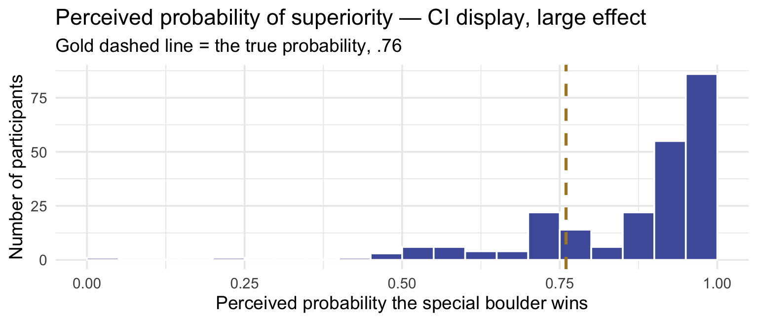
The lab walked all three assumptions through at length on this same picture. Here is the short form, which is all a write-up needs:
- Design assumptions. Independence ✓ — separate participants, each appearing once. Random assignment is in place too, but that matters for comparing conditions, which Test 1 does and this test does not.
- Model considerations. The outcome is a probability, so it is trapped between 0 and 1, and about 25% of this group answered exactly 1.0 — a hard ceiling, not an outlier problem. The mean is still a sensible summary; what would trouble us is a handful of extreme values dominating it, and a bounded scale cannot produce those. And the assumption is about the mean, not the raw scores: at n = 231 the Central Limit Theorem does that work despite the skew. ✓
The lesson the lab drew is worth repeating, because it is the one students most often get backwards: “is my outcome Normal?” is usually the wrong question. “Is the mean of my outcome well estimated at this sample size, are my observations independent, and whom does this sample represent?” is the right one.
Run and read the test
M08 derived the calculation in full — the standard error, \(t_\text{obs}\), the reference distribution. Nothing changes, so we quote the recipe:
\[t_\text{obs} = \frac{\bar{x} - \mu_0}{SE}, \qquad SE = \frac{s}{\sqrt{n}}, \qquad df = n - 1\]
Read it as a ratio of two distances. The numerator is the gap you actually observed — how far this sample’s mean sits from the benchmark, in probability points. The denominator is how far a sample mean would typically wander from the truth just by chance at this sample size. So \(t_\text{obs}\) answers: how many “typical wanderings” is my observed gap?
Now put our numbers in. The sample mean was .887, the benchmark is .76, and the standard error is .0099:
\[t_\text{obs} \;=\; \frac{\bar{x} - \mu_0}{SE} \;=\; \frac{.887 - .76}{.0099} \;\approx\; 12.77\]
In R, the whole test is one summarize(). Every quantity you need — the statistic, the degrees of freedom, the critical value, the p-value, and the confidence interval — comes straight from the three numbers at the top of the call, and each line names the one before it. Nothing here is magic, and the figure below is built from exactly these values:
test1_pieces <- ci_large |>
  summarize(
    n_obs  = n(),
    M      = mean(superiority),
    SE     = sd(superiority) / sqrt(n()),
    # the observed statistic: the gap, measured in standard errors
    t_obs  = (M - 0.76) / SE,
    # quantities minus constraints
    df     = n_obs - 1,
    # the two-tailed critical value: the t that leaves .025 in the upper tail
    t_star = qt(0.975, df = df),
    # the p-value: area beyond the SIZE of our statistic, counted in BOTH tails
    p      = 2 * pt(q = abs(t_obs), df = df, lower.tail = FALSE),
    # the interval: the SAME t* and SE, stepped out from the estimate
    ci_lo  = M - t_star * SE,
    ci_hi  = M + t_star * SE
  )

test1_pieces |> glimpse()
Rows: 1
Columns: 9
$ n_obs <int> 231
$ M <dbl> 0.8867965
$ SE <dbl> 0.009932796
$ t_obs <dbl> 12.76544
$ df <dbl> 230
$ t_star <dbl> 1.970332
$ p <dbl> 1.439534e-28
$ ci_lo <dbl> 0.8672256
$ ci_hi <dbl> 0.9063674Look at the last two lines. The interval is \(\bar{x} \pm t^* \cdot SE\), built from the same \(t^*\) and the same SE the decision used — which is why, a few paragraphs from now, we can call the p-value, the critical value, and the interval one comparison written three ways.
Two functions there are worth naming, because you will reach for them constantly. qt() is the t-distribution’s quantile function — hand it a probability, it returns the cutoff. pt() is the cumulative function running the other way — hand it a cutoff, it returns the area below, or with lower.tail = FALSE the area above. They are the t-family versions of the qnorm() and pnorm() you met in M06, and between them they generate every number in this section: qt() gives the critical value, pt() gives the p-value. As in M08, the p-value line hands pt() the statistic’s size, abs(t_obs), because a two-sided test counts results at least as far from 0 in either direction, then doubles that one tail.
So this sample’s mean sits about 13 standard errors above the true probability. Hold onto that number — everything that follows is about deciding whether it is large.
Where the null world comes from, before we name its curve. In M08 you built a null distribution by hand for exactly this kind of question: take the sample, shift it so its mean sits on \(\mu_0\), then resample it thousands of times and watch where the resampled means land. Do that here — 5,000 resamples of a copy of our data recentred on .76 — and those means pile up around .760 with a standard deviation of .0099. Compare that with the \(SE\) the formula gave us a moment ago: .0099. The same number, to the digits shown. The simulation and the formula are two ways of building a null reference distribution, and in a sample this large they agree on its width — reassuring, though they are not literally the same procedure. Everything below divides by that width and then reads a tail area off a curve, and the curve is next.
Now the reference distribution — this test’s own. Our df is \(n - 1 = 230\) — and now the counting principle becomes useful. We put 231 observations into the calculation and imposed one constraint on them: the sample mean, which we estimated from those same observations in order to measure deviations from it. Quantities minus constraints, 231 − 1 = 230. So the curve describing what t does when \(H_0\) is true is a t-distribution with 230 degrees of freedom. At that many df it is visually indistinguishable from the standard normal, and the two-tailed critical value is \(t^* = 1.97\) — essentially the 1.96 you know from M06’s Empirical Rule.
How \(t^*\) moves with df is worth one table, now that df has a concrete meaning:
Show the code that built this table
# Critical t-values for a two-sided test at alpha = .05, across several df.
tibble(df = c(5, 10, 25, 50, 100, 500, Inf)) |>
  mutate(
    `t* (α = .05, two-sided)` = qt(p = 0.975, df = df) |> round(3)
  )
As df grows, \(t^*\) falls toward 1.96 — the cutoff you would use if \(\sigma\) were known and the reference distribution were z. Smaller samples face a double disadvantage: their standard errors are larger, and their t reference distributions have heavier tails, so the critical value is also a little farther out. Both reduce power — M08’s point about small n, now with both parts visible. You will never have to read this table in practice — every test below computes its own cutoff with qt().
Here is where our statistic falls on it:
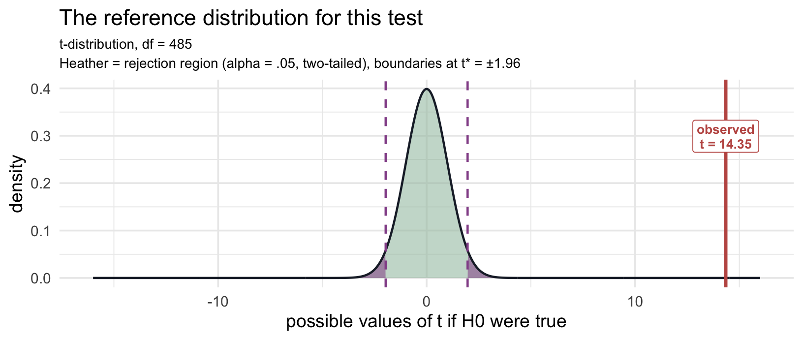
Notice the axis. To fit \(t_\text{obs}\) on the same picture, the plot has to run out to ±14 — which squashes the entire distribution into a narrow spike near zero. That squashing is the result. Under \(H_0\), essentially all the probability sits between −4 and +4; our statistic landed at 12.77. The p-value is the area beyond that mark, and there is almost none of it.
infer’s t_test() runs the one-sample form when you give it a response but no formula. Pass mu = 0.76 to anchor the null — the same call you made in the lab:
t_result_1 <- ci_large |>
  t_test(
    response = superiority,
    mu = 0.76,
    alternative = "two-sided"
  )

t_result_1
Study the output before you read on. Across the analyses in this Module you will be looking for the same handful of quantities. Find each one in the tibble above and say to yourself what it means here:
- the estimate — what parameter is being estimated, and what’s its value?
- the test statistic — in which direction, and how far from what \(H_0\) predicts?
- the degrees of freedom — what determines them for this test?
- the p-value — compatible or incompatible with \(H_0\)?
- the confidence interval — for which quantity, and does it contain \(\mu_0\)?
- estimate = .887 — the sample mean perceived probability. The parameter being estimated is \(\mu\), this condition’s population mean.
- statistic = 12.77 — this is \(t_\text{obs}\): the observed gap is about 13 standard errors above the benchmark, matching the hand calculation just above.
- t_df = 230 (\(n - 1\)): a whole number, because there is a single group and a single mean to estimate.
- p_value < .001 — a sample mean this far from .76, or further, would essentially never arise if the population mean really were .76. The data are highly incompatible with \(H_0\). We reject the null hypothesis.
- 95% CI = [.867, .906] — the plausible range for \(\mu\) itself, and identical to the
ci_lo/ci_hiyou computed by hand. It sits entirely above .76, which is the interval form of the same decision — and it tells you by how much, which the p-value never does.
Three readings, one decision — and they agree by construction
Notice that the output just gave you three separate-looking reasons to reject \(H_0\):
| Reading | Here | Verdict |
|---|---|---|
| The statistic clears the critical value | \(\lvert t_\text{obs} \rvert = 12.77\) against \(t^* = 1.97\) | beyond it |
| The p-value falls below \(\alpha\) | p < .001 against \(\alpha = .05\) | below it |
| The confidence interval excludes the null value | [.867, .906] against \(\mu_0\) = .76 | excludes it |
These are not three independent confirmations. It is tempting to read agreement across three rows as three pieces of evidence stacking up, and it isn’t. They are one comparison written three ways, and all three are built from the same two numbers: the observed statistic and the critical value \(t^*\).
Follow the chain. The p-value is the tail area beyond \(t_\text{obs}\); \(\alpha\) is the tail area beyond \(t^*\). So p < \(\alpha\) is \(|t_\text{obs}| > t^*\) — the same sentence, one written in areas and the other in distances. And the interval is \(\bar{x} \pm t^* \cdot SE\), so it clears \(\mu_0\) at exactly the moment the gap \(|\bar{x} - \mu_0|\) grows past \(t^* \cdot SE\) — which is that same comparison a third time, rearranged. Part 1’s box on the CI and the test works the algebra through.
The practical upshot: if these three ever disagree in your own output, you have not found something interesting — you have made an error. The usual culprits are comparing against the wrong \(\alpha\), reading a one-sided interval beside a two-sided test, or pairing a CI with a p-value that came from a different method (M08’s bootstrap CI and bootstrap p-value can part company for exactly this reason).
One scope note for later: the p-value-and-critical-value pair agree for every test in this Module. The CI leg is the special privilege of the t-tests, because each has a single parameter to build an interval around. ANOVA and chi-square ask about several groups at once, so there is no one interval to line them up against — Tests 2 and 3 will say more.
Quantify and visualize the effect
Report the effect in raw units first — they need no translation. The mean is .887 against a true value of .76: participants overestimated the special boulder’s chances by about 12.7 percentage points, with a 95% CI on the mean of [.867, .906].
Then the standardized companion. Cohen’s d for a one-sample design is the same gap scaled by the standard deviation rather than the standard error — \(d = (\bar{x} - \mu_0)/s\) — so unlike \(t_\text{obs}\), it doesn’t mechanically grow as \(n\) grows. (effectsize::cohens_d() returns the point estimate with a 95% CI; report both — the point estimate alone hides how precisely d was measured.)
cohens_d_1 <- ci_large |>
  pull(superiority) |>
  cohens_d(mu = 0.76)
cohens_d_1
Cohen’s d = 0.84, 95% CI [0.69, 0.99] — large by the conventional labels, with an interval nowhere near zero. Treat those labels as what they are, though: context-free rules of thumb. (What d means visually — overlap between distributions, and what “large” buys you — is developed properly in Test 1, where there are two real groups to draw.)
Write the result and define its scope
APA-style reporting · One-Sample t-Test
Participants shown a 95% confidence interval at the large effect size judged the special boulder’s probability of winning to be substantially higher than its true value of .76 (M = .887, SD = .151, n = 231), t(230) = 12.77, p < .001, mean 95% CI [.867, .906], Cohen’s d = 0.84, 95% CI [0.69, 0.99].
Note the structure, because every test below reuses it:
descriptives → test statistic → degrees of freedom → p-value → CI on the parameter being tested → effect size with its own CI
The opening clause names the parameter in plain language, so a reader who skips the equation still knows what the benchmark is. The second CI (on d) reports the precision of the effect-size estimate — a different question from the precision of the mean.
Two number formats in one sentence — and both are correct. M, SD, the mean’s interval, and p are written with no leading zero; Cohen’s d and t keep theirs. This is an APA convention, and it turns on a single question: can this quantity exceed 1? A probability and a p-value cannot, so nothing other than a zero could ever sit to the left of that decimal point and APA drops it as uninformative. A d and a t can exceed 1, so theirs stays. The on-ramp is the one place in this Module you see both forms in a single sentence, because its outcome is itself a probability. From Test 1 on the outcome is measured in Ice Dollars, so the means and SDs keep their zeros; the rule still applies to p, and to the two effect sizes you’ll meet that cannot exceed 1 — η² in Test 2 and Cramér’s V in Test 3.
Two practical notes. R always prints the leading zero, so this is a formatting decision you make when writing up, not something the output hands you. And it is a disciplinary convention rather than a statistical rule: APA requires dropping the zero, while many medical journals (NEJM and The Lancet, for example) keep it even on p. M05 has the full treatment.
In plain language: readers of this display thought the special boulder would win about nine attempts in ten, when in truth it wins about three in four.
What this analysis does not establish. It establishes that this group was miscalibrated on average — not that any particular participant was wrong, and not that the display is what made them wrong. Exactly the same overestimate is consistent with three different stories: the CI misled them; the stimulus is simply hard to judge and any display would have produced it; or people overestimate their odds in any prize game whatever they are shown. All three predict what we just observed, so observing it cannot tell them apart. Separating them needs a group that saw a different display — which, because assignment was random, is what would license a claim about the display itself. That is the question Test 1 takes up: does the display change what readers do?
TipGoing further — if the standard analysis is unsuitable · Wilcoxon signed-rank
First, what a “rank-based” test is, since several of the alternatives in this Module are described that way. To rank data is to throw away the numbers and keep only the order: line the values up smallest to largest and replace each one with its position. Perceived probabilities of .40, .75, .90, and 1.00 become ranks 1, 2, 3, and 4 — the largest is still largest, but it is now only one step above its neighbor rather than a specific distance above it.
Ranking the data has two benefits. A wild value can no longer drag the analysis around, because the biggest contributes rank n whatever its magnitude. And the ranks of a sample are just the numbers 1 through n (tied values share an average rank), whatever shape the raw data had — so the test’s reference distribution can be worked out without assuming a Normal population. That is what nonparametric means here: not assumption-free, but free of a model for the population’s shape. These tests still carry assumptions of their own.
The cost is the flip side of the benefit. Throwing away the spacing between values means you can no longer say anything about a mean, because means depend on exactly the magnitudes you discarded. So rank-based tests answer a genuinely different question, which is why we don’t treat them as drop-in substitutes.
The Wilcoxon signed-rank test answers a rank-based question rather than one about the mean. It is worth considering when that question suits your research — most often when the outcome is heavily skewed and the sample is too small for the CLT to cover the mean (typically n < 20–30):
ci_large |> pull(superiority) |> wilcox.test(mu = 0.76)One caution before reaching for it: it does not test the same parameter. Strictly, it tests whether the distribution of \(X - \mu_0\) is symmetric around zero — which coincides with a test on the median only under symmetry, and our ceiling at 1.0 guarantees the distribution here is not symmetric. Rather than switching tests because a histogram looks non-Normal, first decide whether your question is about the mean. With n = 231, the one-sample t is the right choice here; the Wilcoxon is the alternative to consider for a small sample.
Test 1: Two independent groups — the two-sample t-test
What’s new in Test 1
The question changes, and the design changes with it. The on-ramp asked whether one group was right — a calibration question, which needs an outcome with a known correct answer, and that is why it used the perceived probability. From here on the question is whether the display changes what readers do, so the outcome becomes willingness to pay: the decision the participant actually made. It stays the outcome for Tests 1 through 3.
Then one change of design, three consequences. The design now has two independent groups. Independent is what the test requires; randomized is not. The two-sample t runs the same way on groups that formed themselves, such as smokers and non-smokers, or first-year and fourth-year students. What randomization adds is the right to read the difference causally, which the box Where does the causal claim come from? near the end of this test takes up. With two independent groups: (1) the estimand is no longer one mean but a difference between two population means; (2) the standard error has to combine two groups’ worth of spread — in the standard, equal-variance version we build first, through a pooled standard deviation; and (3) in that version the degrees of freedom become \(N - 2\), because two means were estimated instead of one. (Welch’s version, R’s default, drops the equal-variance assumption; it comes later in this test.) The logic, the template, and everything else carry over from the on-ramp unchanged.
And the data change. Tests 1 and 3 run on Experiment 1 — the same 905 participants the pre-study’s Videos 2, 3, and 5 work with, so the core numbers you meet here (the pooled SD, the standard error, \(t_\text{obs}\), the interval, and d) are ones you will build yourself there.
Recognize the design
The on-ramp took one cell of Experiment 2 and asked whether its mean was calibrated to a known truth. It could not, even in principle, say anything about whether the visualization matters — for that, you need groups to compare. Experiment 1 was built for exactly this comparison, and it asks the paper’s own preregistered question: do readers respond differently to a CI display than to a PI display?
blorg_exp1 · 2 displays × 2 captions · between-subjects · Hofman, Goldstein, & Hullman (2020), Experiment 1
A course-prepared version of Experiment 1 (data/blorg_exp1.Rds) — all 1,743 participants who passed the attention check. Each saw one chart comparing the special and standard boulders (a CI display or a PI display) with one caption — either matching, describing only what the chart showed, or extra info, spelling out both intervals’ numbers in words — and then named a price. The boulder advantage was the small one throughout: 104 m against 100 m.
- worker_id character — Anonymized Amazon Mechanical Turk worker identifier
- condition.f factor — Four-level experimental condition crossing visualization format and caption text
- interval_CI numeric — Visualization format shown to the participant
- text_extra numeric — Whether the caption supplied information beyond the visualization
- wtp_final numeric — Willingness to pay to rent the special boulder, in Ice Dollars
- superiority numeric — Participant’s estimate of the probability that the special boulder out-slides the standard one
Full codebook for blorg_exp1 — values, levels, missingness, and how the file was prepared.
We keep the comparison clean by using the matching-caption participants only — the ones whose caption described just the chart in front of them, so that the display is the only thing that differed between the two groups.4 That leaves two randomized groups, and we label them with the display each person saw:
blorg_exp1 <- read_rds(here("shared_data", "blorg_exp1.Rds"))

ci_pi <- blorg_exp1 |>
  filter(text_extra == 0) |>                  # the matching-caption participants
  select(interval_CI, wtp_final) |>
  drop_na() |>
  mutate(graph_type = case_when(
    interval_CI == 1 ~ "CI",
    interval_CI == 0 ~ "PI"
  ) |> factor(levels = c("CI", "PI")))
The design’s features:
- The outcome is willingness to pay, in Ice Dollars — one continuous measurement per participant.
- There are two groups, and participants were randomly assigned to them: some saw the CI display, others the PI display.
- Observations are independent — different participants in each group, each appearing once.
- The estimand is the difference between the two population means.
Continuous outcome, two independent groups, a question about a difference of means: a two-sample t-test.
State the parameter and hypotheses
In words first: the estimand is \(\mu_{CI} - \mu_{PI}\), the population difference in mean willingness to pay between readers assigned to the CI display and readers assigned to the PI display. Writing the null as a difference equal to zero keeps continuity with the on-ramp — it is still one parameter tested against one benchmark; the benchmark is now 0, and the parameter is a difference:
\[H_0: \mu_{CI} - \mu_{PI} = 0 \qquad\qquad H_a: \mu_{CI} - \mu_{PI} \neq 0\]
- \(H_0\) — the display makes no difference to average willingness to pay. On average, readers of either chart would name the same price.
- \(H_a\) — the display shifts average willingness to pay, in one direction or the other.
Which way do we expect it to go? The paper’s argument predicts \(\mu_{CI} > \mu_{PI}\): a CI shows uncertainty about the mean, which is narrow at large n, so a CI display makes the special boulder’s advantage look tight and dependable — while a PI shows the spread of individual outcomes, which stays wide. A reader anchored on the tight interval should value the upgrade more. As always, we test two-sided at \(\alpha = .05\) and let the prediction do interpretive work: rejecting with \(\bar{x}_{CI}\) on top is evidence for the paper’s account specifically.
See the data and assess the model
Start with each group’s size, mean, and standard deviation — the three numbers the whole test is built from:
ci_pi |>
  group_by(graph_type) |>
  summarize(
    n = n(),
    M = mean(wtp_final) |> round(2),
    SD = sd(wtp_final) |> round(2)
  )
CI viewers report a mean WTP of $79.01 (SD = $53.09); PI viewers report $49.64 (SD = $49.38). The observed gap is $29.37. The question for the rest of this section is whether a gap that size would commonly arise from sampling variation if the two population means were equal — and then, how big it is in standardized terms.
Show the code that built this figure
ci_pi |> ggplot(aes(x = graph_type, y = wtp_final, fill = graph_type)) +
  geom_violin(alpha = 0.35, color = NA) +
  geom_boxplot(width = 0.15, fill = "white", outlier.alpha = 0.3) +
  stat_summary(fun = mean, geom = "point", shape = 21, size = 3,
               fill = "#AD872B", color = "#AD872B") +
  scale_fill_manual(values = c("CI" = "#4E5EAA", "PI" = "#3A8055"),
                    guide = "none") +
  labs(title = "Willingness to pay by display",
       subtitle = "Gold dot = group mean",
       x = "Display",
       y = "Willingness to pay (Ice Dollars)")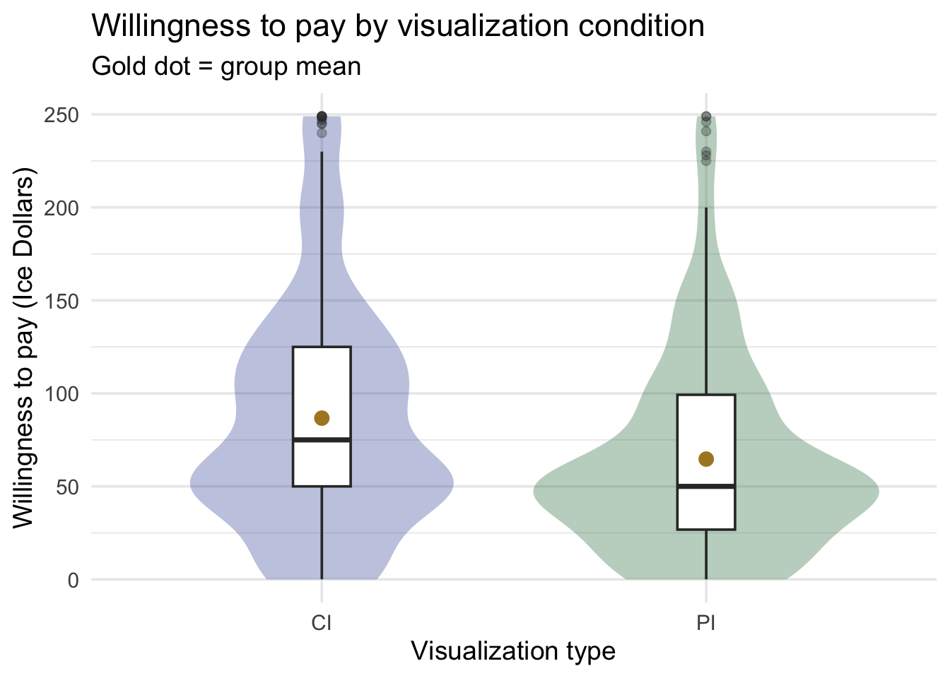
The CI condition sits visibly higher — and yet look how much the two distributions overlap: most CI viewers are indistinguishable from most PI viewers, even though the means clearly differ. Hold onto that observation; it is exactly what Cohen’s d will quantify below.
Design assumptions. Independence holds by design — each participant was randomly assigned to exactly one condition and appears once. And random assignment is doing quiet, crucial work here that no statistic can do: it is what makes the two groups comparable, in expectation, in every respect except the display.
Model considerations. Both distributions are right-skewed and clumped at round numbers — but with 419 and 486 participants, the CLT covers the sampling distribution of each mean, and therefore of their difference. On variances: the two SDs ($53.09 and $49.38) are similar, so the standard two-sample t-test (also called Student’s t-test) — which treats the two populations as sharing one spread — is a reasonable model here. R’s default is a version that drops that assumption (Welch’s). We build the standard version by hand first, because its pieces are the ones every later test reuses, and then let R show us both.
Run and read the test
Two new pieces of the calculation:
First, the idea that will carry you through Test 2 as well: signal against noise. For the t-tests — and, in Test 2, for ANOVA’s F — a useful intuition is signal relative to noise. Both statistics are fractions, and it is worth naming what lives upstairs and downstairs:
\[\text{test statistic} \;=\; \frac{\textbf{signal — how far apart the groups are}}{\textbf{noise — how much individuals vary anyway}}\]
In the on-ramp the “signal” was one mean’s distance from a benchmark, and the “noise” was how much a single mean wanders by chance. Here the signal is the gap between two group means, and the noise is built from how much participants scatter within their own group. Hold onto it in this form: a difference between group means is only impressive relative to how much people differ from each other inside a group. A $29 gap between two conditions means something quite different when people within a condition typically differ by $5 than when they differ by $50 — and the standard error inherits that scatter, shrunk by the sample sizes. The denominator is what supplies that context — which is why a test statistic, not a raw difference, is what gets compared to a distribution.
Quantifying the noise: the pooled standard deviation. We now have two estimates of within-group spread, \(s_{CI}\) and \(s_{PI}\). How do we get one number out of two? The answer is to pool them, and the cleanest way to see what pooling does is to think of it as computing one variance around two centers. An ordinary variance takes each observation’s deviation from the mean, squares it, adds them up, and divides. The pooled variance does exactly that — except each participant’s deviation is measured from their own group’s mean:
\[s_\text{pooled}^2 \;=\; \frac{\sum_{\text{all participants}} (x_i - \bar{x}_{\text{their group}})^2}{N - 2}\]
Look at the denominator, because it is the counting principle again. We have \(N = 905\) observations and we estimated two means from them in order to measure those deviations — two constraints, so \(N - 2 = 903\) degrees of freedom. The on-ramp divided by \(n - 1\) because it estimated one mean; here we estimate two, so we divide by \(N - 2\). (The capital letter is doing work: N counts both groups together, which is why \(n_{CI}\) and \(n_{PI}\) keep the lowercase form.)
Written in terms of the two group SDs you already have, that same quantity is a weighted average of the two variances, each weighted by its group’s df:
\[s_\text{pooled} \;=\; \sqrt{\frac{(n_{CI} - 1)\,s_{CI}^2 + (n_{PI} - 1)\,s_{PI}^2}{n_{CI} + n_{PI} - 2}}\]
# Each group's n and SD, pulled from the data: the same numbers as the table above.
grp2 <- ci_pi |>
  group_by(graph_type) |>
  summarize(n = n(), SD = sd(wtp_final), .groups = "drop")

grp2
# The weighted average of the two variances, each weighted by its own df — then the root.
s_pooled <- grp2 |>
summarize(pooled_var = sum((n - 1) * SD^2) / (sum(n) - 2)) |>
pull(pooled_var) |>
sqrt()
s_pooled[1] 51.12969So the typical distance between a participant and their own group’s mean is about $51.13. That is the noise floor, in Ice Dollars — and it is worth fixing in memory, because in Test 2 this exact quantity comes back under a different name, computed the same way across four groups instead of two.
The standard error of a difference. The on-ramp used one SE, \(s/\sqrt{n}\). A difference of two independent means has more uncertainty than either mean alone — each group contributes its own \(1/n\) share of the pooled variance, and the two add under the square root:
\[SE_\text{diff} \;=\; s_\text{pooled}\sqrt{\frac{1}{n_{CI}} + \frac{1}{n_{PI}}} \;=\; 51.13 \times \sqrt{\frac{1}{419} + \frac{1}{486}} \;\approx\; 3.41\]
Notice how small that is next to the pooled SD. Individuals scatter by about $51, but a mean of hundreds of people is pinned down far more tightly — and a difference between two such means wobbles by only about $3.41 from sample to sample. That wobble is the ruler we measure our $29.37 gap with.
# ci_M / ci_n and pi_M / pi_n are the group means and sizes from the table above.

SE_diff <- s_pooled * sqrt(1 / ci_n + 1 / pi_n)   # one 1/n term per group
df_std  <- ci_n + pi_n - 2                        # N - 2: two means were estimated

t_obs_2  <- (ci_M - pi_M) / SE_diff
t_star_2 <- qt(p = 0.975, df = df_std)                                # two-tailed cutoff
p_obs_2  <- 2 * pt(q = abs(t_obs_2), df = df_std, lower.tail = FALSE)  # both tails, so doubled

# The interval brackets the DIFFERENCE, not either mean: same t*, same SE.
ci_lo_2 <- (ci_M - pi_M) - t_star_2 * SE_diff
ci_hi_2 <- (ci_M - pi_M) + t_star_2 * SE_diff

c(SE_diff = SE_diff, df = df_std, t_obs = t_obs_2, t_star = t_star_2,
  p = p_obs_2, ci_lo = ci_lo_2, ci_hi = ci_hi_2) |> round(4)
SE_diff df t_obs t_star p ci_lo ci_hi
3.4086 903.0000 8.6152 1.9626 0.0000 22.6759 36.0552 Same two functions as the on-ramp — qt() for the cutoff, pt() for the tail area — handed the new df. The statistic is the on-ramp’s recipe with the new SE:
\[t_\text{obs} \;=\; \frac{\bar{x}_{CI} - \bar{x}_{PI}}{SE_\text{diff}} \;=\; \frac{79.01 - 49.64}{3.41} \;\approx\; 8.62\]
Our gap is about 8.6 standard errors from what the null model predicted. Before the curve: where does “no difference” actually come from? The t-distribution is about to tell us what \(t_\text{obs}\) does when \(H_0\) is true. It is worth pausing on why that is the right description of the null world, because this design makes it unusually easy to picture. If the display made no difference to anyone, a slightly stronger reading of \(H_0\) than “equal means” and the easiest one to picture, then every participant would have named the same price whichever chart they happened to see. And if that is so, the labels CI and PI are arbitrary decorations. We could deal them out again at random — the same coin flip that assigned the conditions in the first place — and get a dataset exactly as likely as the one we actually got. So do it: shuffle the 905 labels, recompute the difference in means, and repeat 2,000 times. That is a null distribution built by hand, as M08 did with the bootstrap:
Show the code that built this figure
set.seed(652)

# Under H0 the labels carry no information, so dealing them out at random yields
# an equally likely dataset. 2,000 re-deals = 2,000 differences the null world
# could have produced -- the same shuffle the M09 lecture builds by hand.
labels <- ci_pi |> pull(graph_type)
prices <- ci_pi |> pull(wtp_final)

shuffle_once <- function() {
  dealt <- sample(labels)                                   # deal the CI / PI labels out at random
  mean(prices[dealt == "CI"]) - mean(prices[dealt == "PI"]) # the gap those labels produce
}

perm_null <- tibble(stat = replicate(2000, shuffle_once()))

perm_sd  <- perm_null |> pull(stat) |> sd()
perm_max <- perm_null |> pull(stat) |> abs() |> max()

ggplot(perm_null, aes(x = stat)) +
  geom_histogram(bins = 45, fill = "#9CBFAA", color = "white") +
  geom_vline(xintercept = diff_M, color = "#C05852", linewidth = 1.2) +
  annotate("label", x = diff_M, y = Inf, vjust = 1.4,
           label = sprintf("observed\n$%.2f", diff_M),
           color = "#C05852", fill = "white", size = 3.6, lineheight = 0.95) +
  labs(
    title = "The null distribution, built by shuffling the labels 2,000 times",
    subtitle = sprintf(
      "Centered on zero, SD = $%.2f: about the size of the SE_diff the formula gave ($%.2f).\nRose = the difference we actually observed.",
      perm_sd, SE_diff),
    x = "Difference in mean WTP (CI - PI), Ice Dollars",
    y = "Shuffles")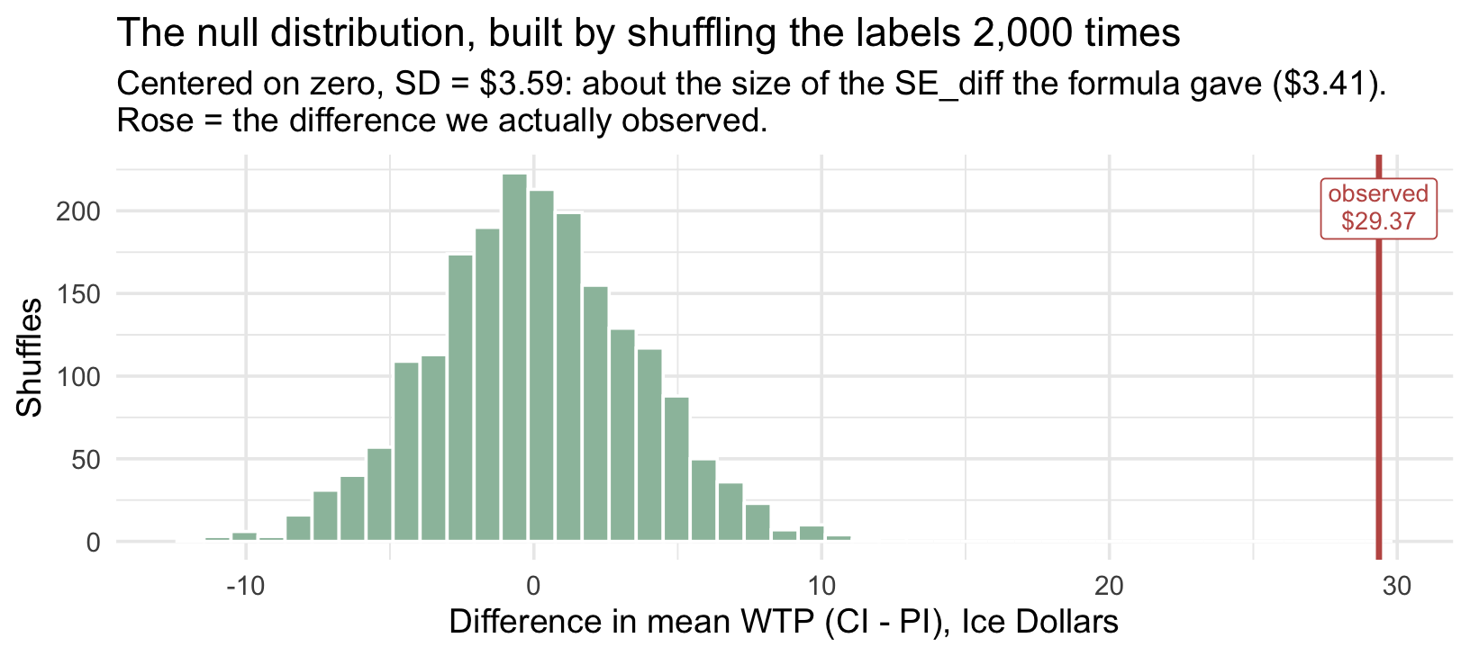
Read the two numbers in that subtitle. Shuffling produces differences centered on zero — no surprise, since under \(H_0\) the labels mean nothing. And those shuffled differences have a standard deviation of about $3.59: about the size of the \(SE_\text{diff}\) of $3.41 the formula produced a moment ago. (Close, not identical: the shuffle deals the real CI-over-PI gap into both groups, so the shuffled prices are a little more spread than the pooled SD says, and 2,000 shuffles carry a little noise of their own. Both describe the same thing: how far a two-group gap ordinarily wobbles when the display does nothing.) The largest gap any of the 2,000 shuffles produced was $12.93; ours is $29.37. Dividing the observed gap by \(SE_\text{diff}\) is what turns that picture into a single number — \(t_\text{obs}\) = 8.62, the observed difference measured in units of the null world’s wobble — and the t-distribution converts that number into a tail area read from a smooth curve instead of a proportion out of 2,000.
Keep this picture in mind for the two tests that follow. Each has its own version of it, and for some the shuffling story is harder to draw — but every reference distribution in this Module is answering the same question the histogram above answers by direct simulation: what would this statistic do if \(H_0\) were true?
And this test’s reference distribution. The df of 903 picks the curve; the two-tailed critical value is \(t^* = 1.963\) — essentially the 1.96 you know from M06, because at df in the hundreds the t curve is all but Normal:
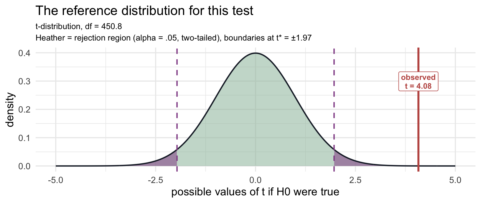
Compare this picture with the on-ramp’s. Same distribution family, same \(\alpha\), same two-tailed logic. The on-ramp’s statistic of 12.8 needed an axis stretched to ±14; ours, at 8.62, fits on a narrower one — but it still sits far out in territory where the curve has flattened to nothing. The null world essentially never produces a gap this many standard errors from zero.
The interval, before R prints it. The last two lines of the by-hand chunk are the on-ramp’s with one word changed: the estimate is now the difference \(\bar{x}_{CI} - \bar{x}_{PI}\), so the interval brackets a gap in Ice Dollars, not either group’s mean.
With our numbers:
\[(\bar{x}_{CI} - \bar{x}_{PI}) \pm t^* \cdot SE_\text{diff} \;=\; 29.37 \pm 1.963 \times 3.41 \;=\; [22.68,\ 36.06]\]
So the 95% interval for the population gap runs from $22.68 to $36.06, built from exactly the pieces the test used: the same gap, the same \(t^*\), the same \(SE_\text{diff}\).
Now let R do it. t_test() takes a formula — the syntax you’ll meet again in lm() — with order setting the direction of subtraction (CI − PI). Adding var.equal = TRUE asks for the standard version we just built by hand:
t_result <- ci_pi |>
  t_test(
    formula = wtp_final ~ graph_type,
    order = c("CI", "PI"),
    alternative = "two-sided",
    var.equal = TRUE
  )

t_result
Study the output before you read on. Same five numbers as the on-ramp — but two of them now mean something subtly different. Find the estimate and the CI, and ask: estimate of what? interval for what?
- estimate = 29.37 — no longer a group mean but the difference in means (CI − PI), in Ice Dollars. The parameter is \(\mu_{CI} - \mu_{PI}\).
- statistic = 8.62 — this is \(t_\text{obs}\): the observed difference is about 8.6 standard errors away from the null value of 0. It matches the hand calculation exactly.
- t_df = 903 — the counting rule’s \(N - 2\).
- p_value < .001 — a difference this large, or larger, would be extraordinarily rare if the two population means were equal. We reject \(H_0\).
- 95% CI = [$22.68, $36.06] — the plausible range for the difference, not for either mean. It excludes 0 (the test’s decision, in interval form) and, just as usefully, it tells you the difference could plausibly be as small as $23 or as large as $36.
A note on the sign of \(t_\text{obs}\), because it trips up almost everyone. Had we written order = c("PI", "CI"), R would have subtracted the other way and reported \(t_\text{obs}\) = -8.62 with a CI of [−$36.06, −$22.68] — every sign flipped. The p-value would be identical, and so would the conclusion. When you reproduce a published analysis and your \(t_\text{obs}\) comes out negative where theirs was positive, you have almost certainly not made an error — you subtracted in the other direction. Compare the group means, not the sign. And when you write results up, choose the direction that matches your sentence: if you write “CI viewers were willing to pay more than PI viewers,” report the positive \(t_\text{obs}\) that goes with CI − PI.
What R does by default: Welch’s version. Leave var.equal out and t_test() runs Welch’s t-test instead, which lets each group keep its own variance rather than pooling them. Here are the two side by side:
bind_rows(
  ci_pi |>
    t_test(formula = wtp_final ~ graph_type, order = c("CI", "PI"), var.equal = TRUE) |>
    mutate(version = "Standard (pooled SD)"),
  ci_pi |>
    t_test(formula = wtp_final ~ graph_type, order = c("CI", "PI")) |>
    mutate(version = "Welch (R's default)")
) |>
  select(version, statistic, t_df, p_value)
The df is the tell: the standard version’s whole-numbered \(N - 2 = 903\) against Welch’s fractional 861.2. Welch’s df is not a count of anything — it is a weighted compromise between the two groups’ information, chosen so that the t-curve fits the statistic’s actual behavior — which is why it comes out fractional, and why it is the one exception to the counting rule flagged back in Part 1. The two versions barely differ here (8.62 against 8.57), because the groups are large and their SDs similar. When group sizes and spreads both differ, the two can part company, and Welch’s is the safer choice — it gives up very little when the variances are equal and protects you when they aren’t. That is why R makes it the default, and why the pre-study’s Activity 2.3 runs t_test() both ways and asks you to match each output to a row of your own table.
So which one do you use? Either is defensible here. We built the standard version because its pieces — the pooled SD and the counted df — are the ones Test 2’s ANOVA is made of (with two groups, ANOVA is this test, as a box in Test 2 shows). Report the one you ran, and name it.
Quantify and visualize the effect
Raw units first. Readers randomized to the CI display were willing to pay about $29 more on average than readers randomized to the PI display — 95% CI [$22.68, $36.06]. That sentence, in Ice Dollars, is the primary result. Everything standardized comes second. (Both groups, notice, were willing to pay well above the $17.50 the upgrade is actually worth; Test 3 comes back to that.)
Now the standardized companion. Cohen’s d is the same gap with one change in the denominator: divide by the pooled standard deviation — how much individual people differ — instead of the standard error — how much a sample mean wobbles:
\[d \;=\; \frac{\bar{x}_{CI} - \bar{x}_{PI}}{s_\text{pooled}} \;=\; \frac{29.37}{51.13} \;\approx\; 0.57\]
cohens_d(wtp_final ~ graph_type, data = ci_pi)Cohen’s d = 0.57, 95% CI [0.44, 0.71]. (cohens_d() subtracts in factor-level order; graph_type lists CI first, so d is CI − PI and comes out positive.)
The two numbers answer different questions, and it is worth being able to say how. \(t_\text{obs}\) measures the difference against its sampling uncertainty — how well pinned down is it? Cohen’s d measures the same difference against the spread of individual observations — how large is it relative to how much people differ? Look at the two denominators: the pooled SD is about 15 times the standard error. That ratio is why \(t_\text{obs}\) is 8.6 while d is only 0.57, and why d does not mechanically grow with n the way \(t_\text{obs}\) does. It isn’t a context-free constant either — it depends on the population’s variability, the measure’s reliability, and the standardizer you chose. Which is the reason to name your standardizer whenever you report a d.
TipGoing further — which SD, exactly?
The pooled SD above assumes the two populations share a variance — the same assumption the standard t-test makes, which is why the two belong together. If you report Welch’s test instead, the matching effect size drops that assumption too: cohens_d() with pooled_sd = FALSE standardizes by \(\sqrt{(s_{CI}^2 + s_{PI}^2)/2}\), which is what ?cohens_d recommends “for effect sizes that are to accompany a Welch’s t-test” (Delacre et al., 2021).
cohens_d(wtp_final ~ graph_type, data = ci_pi, pooled_sd = FALSE)Here the two agree to two decimals, because the groups are close in size and spread; the more those differ, the further the two drift apart. The rule to carry: pooled d beside the standard test, unpooled d beside Welch’s — and say which.
| |d| | Conventional label |
|---|---|
| < 0.2 | Negligible |
| 0.2 – 0.5 | Small |
| 0.5 – 0.8 | Medium |
| ≥ 0.8 | Large |
Treat these as rough, context-free conventions — orientation, not verdicts.
What a d of this size actually looks like
A number like “d = 0.57” is hard to feel. A picture is not.
Start with the general case. Imagine a randomized trial: a treatment group and a control group, everyone measured on the same outcome. Each group produces a distribution of scores, and Cohen’s d is the distance between the two distribution centers, expressed in standard-deviation units. That “in standard deviations” step is the same standardizing trick you’ve used all term — M07 standardized a sample mean into a z, M08 standardized a gap into \(t_\text{obs}\) — and it’s what makes d portable across outcomes measured in points, dollars, or millimeters of mercury.
The panels below draw two Normal populations at three benchmark values of d. Two things to watch:
- The shaded region is the overlap — the ground the two distributions share. Big overlap means the groups are mostly indistinguishable at the individual level even when their averages differ.
- CLES, the common-language effect size, is the probability that a randomly drawn member of the higher group scores above a randomly drawn member of the lower group. If the grouping made no difference, it would be 50%.
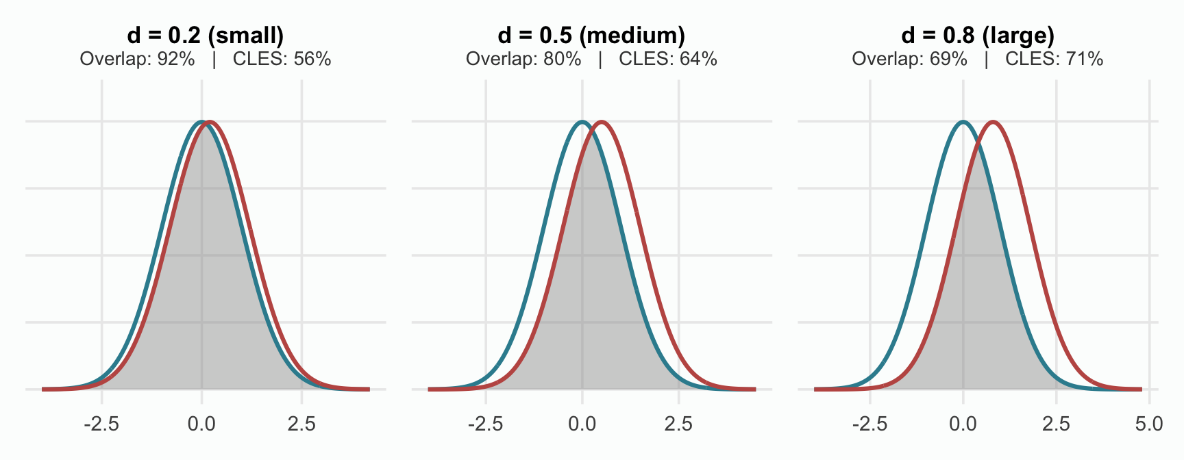
Even at d = 0.8 — Cohen’s “large” — the distributions still overlap substantially, and plenty of lower-group members outscore plenty of higher-group members. A real average effect is entirely compatible with enormous individual variation. Our d of 0.57 sits just past the middle panel: the CI display reliably shifts the average, while most individual CI viewers remain indistinguishable from most individual PI viewers. Both halves of that sentence belong in your understanding of the result.
Where the CLES on that plot comes from.
The figure above reports a CLES in its subtitle. Here is the number behind it. Under an equal-variance Normal model, d converts to the probability that a random draw from the higher-mean population exceeds a random draw from the lower-mean one: \(\Phi(d/\sqrt{2})\). For d = 0.2 → 56%; d = 0.5 → 64%; d = 0.8 → 71%. For our d of 0.57 it is about 66%: pick one CI viewer and one PI viewer at random, and the CI viewer names the higher price about two times in three.
Used carefully, this can be an intuitive supplement for non-statistical audiences. The caution is in the premise: the conversion assumes Normal distributions with equal variances. With skewed outcomes like WTP, quote it as an approximation under that model, not as a measured fact about your sample. In R, the effectsize package’s p_superiority() computes it with a 95% CI: p_superiority(wtp_final ~ graph_type, data = ci_pi) uses this conversion, and adding parametric = FALSE counts pairs from the data instead, with no Normal assumption. The pre-study computes the counted version, which needs no Normal assumption. (Dr. Kristoffer Magnusson’s interactive rpsychologist.com/cohend lets you drag d and watch the overlap and CLES change.)
Write the result and define its scope
APA-style reporting · Two-Sample t-Test
Participants in the CI condition (M = $79.01, SD = $53.09) reported significantly higher willingness to pay than participants in the PI condition (M = $49.64, SD = $49.38), t(903) = 8.62, p < .001, 95% CI for the mean difference [$22.68, $36.06], Cohen’s d = 0.57, 95% CI [0.44, 0.71].
Had we reported R’s default instead, the sentence would read t(861.2) = 8.57 — same conclusion. The fractional df is how a reader can tell which version you ran, so make sure it matches the one you actually used.
In plain language: readers randomized to a CI display were willing to pay about $29 more for the special boulder than readers randomized to a PI display — a medium effect by the conventional labels, in the direction the paper’s account predicts.
Where does the causal claim come from?
Not from the t-test. All the test knows is two columns of numbers. It answers one question — is a gap this big surprising if the two populations really have the same mean? — and it would give exactly the same answer whether the groups were formed by a coin flip or by people choosing their own chart. The test cannot see how the groups came to be.
The word caused comes from somewhere else: random assignment. A coin flip decided who saw the CI and who saw the PI. That means the two groups were alike, on average, in everything — age, statistics background, how much they like gambling, things nobody measured — except the chart. Any one random split can still be a little lopsided by luck — and the shuffling picture above showed exactly how big that luck can get. So the two pieces fit together: randomization licenses the causal comparison, and the test says how surprising a gap this size would be if the display did nothing.
This is why the same test carries two different claims in two different studies. Run it on groups that assigned themselves — people who happened to look at CIs versus people who happened to look at PIs — and you get the identical \(t_\text{obs}\), p, and interval, but only the ✅ descriptive sentence from the M08 lab: the groups differed. The ❌ causal sentence, the display made them differ, needs the coin flip.
What this analysis does not establish. It compares the two displays for readers whose caption matched their chart; whether spelling out both intervals in the caption narrows the gap is a separate comparison (the pre-study looks at it descriptively). It cannot say where HOPs or the rescaled CI land — those displays exist only in Experiment 2, and that is Test 2’s job.
TipGoing further — if the standard analysis is unsuitable · Mann-Whitney U
The Mann-Whitney U answers a different question from the t-test: whether values in one group tend to run larger than in the other. R frames it as a rank-sum test of a location shift between the two distributions, which coincides with a comparison of medians only when the two distributions share a shape; it is not, in general, a test of means. If that is the question your research needs, it is a good choice — heavy skew with small per-group samples (typically n < 20–30 per group) is what most often makes it attractive.
wilcox.test(wtp_final ~ graph_type, data = ci_pi)With hundreds of observations per group, the t-test is the right choice here.
Test 2: Four independent groups — one-way ANOVA
What’s new in Test 2
The design gains groups: four independent groups instead of two. As in Test 1, independence is the requirement; here the groups also happen to be randomized conditions, which is what will let us read their differences causally. That changes the kind of question the main test can answer — it becomes an omnibus5 question (“could all four population means be equal?”) that deliberately does not say which groups differ. Two new tools arrive with it: the F-statistic, which aggregates many departures at once, and the multiple-comparisons problem, which governs how you follow up.
Recognize the design
Test 1 compared CI against PI and left two threads hanging. Where does HOPs — the animated display that shows individual draws one at a time — land? And what about CI rescaled, the display the authors built specifically to separate how wide an interval looks from what it statistically means? Those two displays exist only in Experiment 2, so Test 2 moves there — back to the on-ramp’s data, and to its Large effect-size condition, where the special boulder is worth $65 rather than $17.50.
The design’s features: the outcome is still continuous WTP; there are now four independent groups (randomized, in this study); the parameters in question are four population means.
Why not just run all the pairwise t-tests? Count them: four groups make \(4 \times 3 / 2 = 6\) pairs. At \(\alpha = .05\) per test, the chance of at least one false positive across the whole family of six tests (the familywise error rate) is about 26% if the six tests were independent6. They aren’t — comparisons that share a group are correlated — so 26% is an illustration rather than the exact rate. The point holds either way: looking six times at .05 pushes the chance of at least one false positive far above the 5% you signed up for. A one-way ANOVA answers the question differently: a single omnibus test of equality across all four means, whose one decision carries a single 5% false-positive rate. It does not by itself dispose of the multiplicity problem — any follow-up comparisons still need an appropriate adjustment or a set of contrasts specified in advance.
all_groups <- blorg_exp2 |>
  filter(effect_size == "Large") |>
  select(graph_type, wtp) |>
  drop_na()
State the parameter and hypotheses
In words: the estimand is not one number but four — the four population mean WTPs, one per display condition — and the null claims the display makes no difference to any of them.
\[H_0: \mu_{CI} = \mu_{CI\,rescaled} = \mu_{PI} = \mu_{HOPS}\] \[H_a: \text{at least one population mean differs}\]
Note what \(H_a\) does not say: which mean differs, or by how much, or in what direction. The omnibus alternative is deliberately unspecific — that’s the price of testing four groups with one decision, and it’s why a significant ANOVA is the start of the answer, not the end.
Two kinds of variation — the whole idea, before any symbols
Everything the F-test does rests on two facts about the four groups — both true at once, and both obvious the moment you say them out loud.
People who saw the same chart still differ from each other. Inside any one display condition, willingness to pay runs across most of the $0–$250 slider — the typical distance from a person to their own group’s average is about $56. The display explains none of that: everyone in the group saw the same picture. It is people being different — different appetite for risk, different feel for a fictional boulder, different habits about round numbers. That is within-group variation: the scatter inside each column.
The four group averages are not identical either. They span about $22 from the lowest display to the highest. That is between-group variation: how far apart the columns sit.
Now the point that makes a test necessary rather than obvious. The question is not “is there any between-group variation?” There always is. Four averages computed from four different sets of people will never land on exactly the same number, even if the display changes nothing whatsoever — random assignment guarantees a little accidental separation. The real question is whether the groups sit farther apart than their own internal scatter can comfortably explain.
That is a comparison, and this is what it looks like:
Show the code that built this figure
set.seed(652)

# Two invented studies with the SAME four group averages. Each group's draws are
# recentred so its sample mean lands exactly on the target -- otherwise the two
# panels would have slightly different diamonds and the figure's claim would be
# false. Only the within-group spread changes: tight (SD 14) against wide (SD 56).
demo_means <- c(A = 65, B = 70, C = 75, D = 87)

draw_group <- function(target, sd_within, k = 30) {
  x <- rnorm(k, mean = 0, sd = sd_within)
  x - mean(x) + target
}

make_study <- function(sd_within) {
  tibble(grp = names(demo_means), mu = as.numeric(demo_means)) |>
    mutate(value = map(mu, \(m) draw_group(m, sd_within))) |>
    unnest(value)
}

f_of <- function(d) anova(lm(value ~ grp, data = d))[["F value"]][1]

tight <- make_study(14)
wide  <- make_study(56)

# Keep the two F values for the prose below, where F is actually defined --
# the panels stay free of a statistic the reader has not met yet.
f_tight <- f_of(tight)
f_wide  <- f_of(wide)

two_studies <- bind_rows(
  tight |> mutate(study = "Study A · tight groups - the gaps stand out"),
  wide  |> mutate(study = "Study B · scattered groups - the gaps vanish into the noise")
)

study_means <- two_studies |>
  group_by(study, grp) |>
  summarize(value = mean(value), .groups = "drop")

ggplot(two_studies, aes(x = grp, y = value)) +
  geom_jitter(width = 0.22, alpha = 0.14, size = 0.9, color = "#4E5EAA") +
  geom_point(data = study_means, shape = 23, size = 4.4, stroke = 1.1,
             fill = "#AD872B", color = "#1C2433") +
  facet_wrap(~study) +
  coord_cartesian(ylim = c(-40, 190)) +
  labs(title = "Same four group averages. Opposite conclusions.",
       subtitle = paste0("Gold diamonds are the group averages - identical in both panels.\n",
                         "Only the scatter within each group changes - and that alone decides\n",
                         "whether the gaps between them look convincing."),
       x = "Group", y = "Outcome") +
  theme(plot.subtitle = element_text(size = 10, lineheight = 1.2),
        strip.text = element_text(size = 11))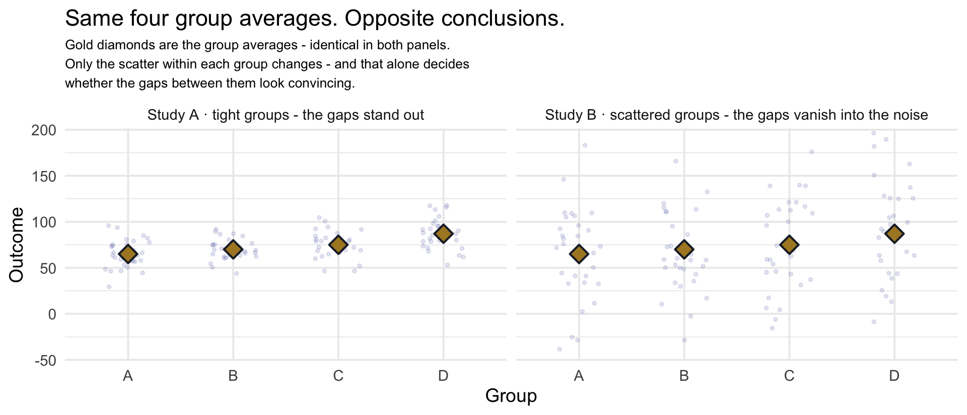
Look at the gold diamonds: they sit at the same four heights in both panels. The group averages are identical — 65, 70, 75, and 87. Only the scatter around them differs, and it completely reverses the verdict. On the left the groups are tight, so a gap of that size between averages is enormous by comparison; the columns barely touch and something is plainly going on. On the right the very same gap disappears into the noise, the columns overlap almost entirely, and you would not want to bet on any of it.
Same signal, different noise, opposite conclusion. That is why the statistic has to be a ratio — between-group variation measured in units of within-group variation:
\[F \;=\; \frac{\text{how far apart the group averages sit}}{\text{how much people scatter within their own group}}\]
Run that ratio on the two panels above and the contrast finally gets a number: about 13 on the left, about 0.9 on the right — from the very same four group averages.
If the displays do nothing, numerator and denominator are both measuring the same accidental wobble, so F averages about 1. The more the displays genuinely separate the groups, the more the numerator grows relative to the denominator, and the higher above 1 F climbs. That is the whole logic. Everything that follows is bookkeeping about how to compute each piece honestly.
One more thing the figure is quietly telling you: with a within-group spread of $56 and only $22 separating the extreme group averages, our study is going to look far more like the right panel than the left — but with about 230 people per group instead of 30, and that is what rescues it: the ratio can see a gap the eye cannot. Hold onto that — it is why Test 2’s effect size will matter as much as its p-value.
The same two hypotheses, written as models
Here is a second way to write those same two hypotheses. It costs a couple of minutes and it changes what a hypothesis test is in your mind — from a procedure you run into a comparison between two accounts of how the data came to be. This is the framing that carries you into regression in M10, and further still if you ever move to Bayesian modeling, where writing the model down is not optional. Because it is the idea the whole Module rests on, we will meet it first on a test you already know, and only then write Test 2 in the same language.
The model comparison, on the one-sample t. The on-ramp compared \(Y_i = \mu_0 + \epsilon_i\) with \(Y_i = \mu + \epsilon_i\), where \(Y_i\) is participant i’s perceived probability and \(\epsilon_i\) is that person’s own departure from the mean. The two models look almost identical, so focus on the one thing that changes. In the first model, \(\mu_0\) is a number fixed in advance — .76, the value built into the stimulus. The model assumes that this is the population mean, and that any difference between \(\bar{x}\) and .76 is just sampling variation. In the second model, \(\mu\) is allowed to differ from .76. We let the data estimate that population mean, and the estimate is the sample mean perceived probability, \(\bar{x}\) = .887. So the second model has one additional quantity that must be estimated from the data. That is what makes it more elaborate — and it is also why estimating the mean costs us one degree of freedom.
Now the intuition that makes the test make sense. A model that estimates its mean from the data will always fit at least a little better than one with the mean fixed in advance — the data cannot choose a worse mean than the one you fixed before looking. So the test is never asking whether the elaborate model fits better. It is asking whether it fits better by more than luck alone would buy.
You have already answered a question of exactly this shape. In the M06 lecture’s fake-news detective game, 7 correct out of 10 felt impressive until you saw what a penny flipped ten times could do: those penny scores were a reference distribution, showing what no skill at all produces, and only against that backdrop could you tell a real difference from a lucky one.
The on-ramp made the same comparison with a mean in place of a tally. The sample mean of .887 sat above .76 — just as 7 sat above 5 — and by itself that proved nothing, because a sample mean wanders. The reference distribution is what told you how far it wanders when .76 really is the population mean. If .887 had been about where such a mean could land by chance, the extra estimated quantity would not have been worth adding and you would have stayed with the simple model — that is failing to reject. It sat far outside what chance produces, so the separately estimated mean was needed — that is rejecting. \(t_\text{obs}\) was exactly that measurement: the gap between the two models’ means, counted in units of how far chance alone would move it.
Now Test 2, written the same way. Write \(Y_{ik}\) for the willingness to pay of participant i in display condition k — i indexes a person, k indexes which of the four charts they saw. The two hypotheses become two models:
\[H_0: \; Y_{ik} = \mu + \epsilon_{ik} \qquad\qquad H_a: \; Y_{ik} = \mu_k + \epsilon_{ik}\]
Read them out loud, because they say something concrete:
- Under \(H_0\), everyone’s score is built from one population mean \(\mu\) — the same number for every condition — plus \(\epsilon_{ik}\), that person’s own departure from it. One mean for all 910 people. This is the simple account.
- Under \(H_a\), each condition has its own mean \(\mu_k\) — four numbers now — and a person’s score is built from their condition’s mean plus their own departure. This is the elaborate account: three additional quantities estimated from the data, which is exactly why \(df_\text{between}\) will be 3.
That \(\epsilon\) (“epsilon”) is the within-group variation you just met, given a symbol. Both models make the same assumption about it: \(\epsilon_{ik} \sim \text{Normal}(0, \sigma^2)\), which reads “the departures follow a Normal distribution centered on zero with variance \(\sigma^2\).” Centered on zero because a departure is measured from a mean, so it falls above as often as below. And one \(\sigma\) shared by all four groups — people scatter about equally inside every condition. That shared \(\sigma\) is where the equal-variance assumption actually lives: not an extra rule bolted on afterwards, but something written into the model from the start. Keep in mind what kind of quantity \(\sigma^2\) is: the population within-group variance — a fixed but unknown number our data can only estimate. It is a parameter of the model rather than the scientific target; the estimands here are the group means and the differences among them.
Two quantities turn this into a test, and they are the two halves of the ratio you already understand. You will build both by hand shortly; for now, take them as names for what the figure showed you:
- \(MS_\text{within}\) — how much people scatter around their own group’s average. The noise floor, and the denominator. It is the same pooled spread Test 1 called \(s_\text{pooled}^2\), now computed across four groups instead of two — and it is our sample estimate of \(\sigma^2\).
- \(MS_\text{between}\) — how much the four group averages scatter around the overall average, rescaled so it can be compared against the first. The numerator.
MS is short for mean square — a variance-like average of squared deviations. \(MS_\text{within}\) estimates the common within-group variance; \(MS_\text{between}\) is built the same way from the group averages. Both are averages of squared distances; they simply measure distance from different things.
You already know from the figure that F averages about 1 when the displays do nothing and climbs above 1 when they do. Here is why the numerator and denominator agree under \(H_0\), which is the part the figure could only show and not explain:
\(MS_\text{within}\) estimates \(\sigma^2\). \(MS_\text{between}\) estimates \(\sigma^2\) plus something that grows with the true differences among the group means.
So the F-ratio is, roughly,
\[F \;\approx\; \frac{\sigma^2 + (\text{true differences among the } \mu_k)}{\sigma^2}\]
If \(H_0\) is true, the added term is zero, both mean squares are estimating the same \(\sigma^2\), and the ratio averages about 1 (most single values a little below it, a few well above). If \(H_a\) is true, the numerator carries something extra and the ratio is pushed above 1. That is the entire logic of ANOVA in one fraction. Two things to keep straight when reading it. The statement is about what each mean square estimates on average: in any one sample \(MS_\text{between}\) can land below \(MS_\text{within}\), so an \(F_\text{obs}\) below 1 is perfectly possible and simply looks like the null. And it explains not just why we compare against 1 but why the comparison is one-tailed: on average, the extra term can only add.
So Test 2 is the on-ramp’s model comparison with a different extra quantity — one mean for everyone against a separate mean for each group — and Test 1 was the two-group version of the same thing. Every test in this Module, and the regression models of M10, which pit a flat line against a sloped one, is this same comparison between a simpler account of the data and a more elaborate one, asking whether the extra detail is worth adding.
See the data and assess the model
all_groups |>
  group_by(graph_type) |>
  summarize(
    n = n(),
    mean = round(mean(wtp), 1),
    sd = round(sd(wtp), 1)
  )
Show the code that built this figure
all_groups |> ggplot(aes(x = graph_type, y = wtp, fill = graph_type)) +
  geom_violin(alpha = 0.35, color = NA) +
  geom_boxplot(width = 0.12, fill = "white", outlier.alpha = 0.3) +
  stat_summary(fun = mean, geom = "point", shape = 21, size = 3,
               fill = "#AD872B", color = "#AD872B") +
  scale_fill_manual(values = c("CI" = "#4E5EAA", "CI rescaled" = "#348C9E",
                               "PI" = "#3A8055", "HOPS" = "#945297"),
                    guide = "none") +
  labs(title = "Willingness to pay across the four displays",
       subtitle = "Gold dot = group mean",
       x = "Display",
       y = "Willingness to pay (Ice Dollars)")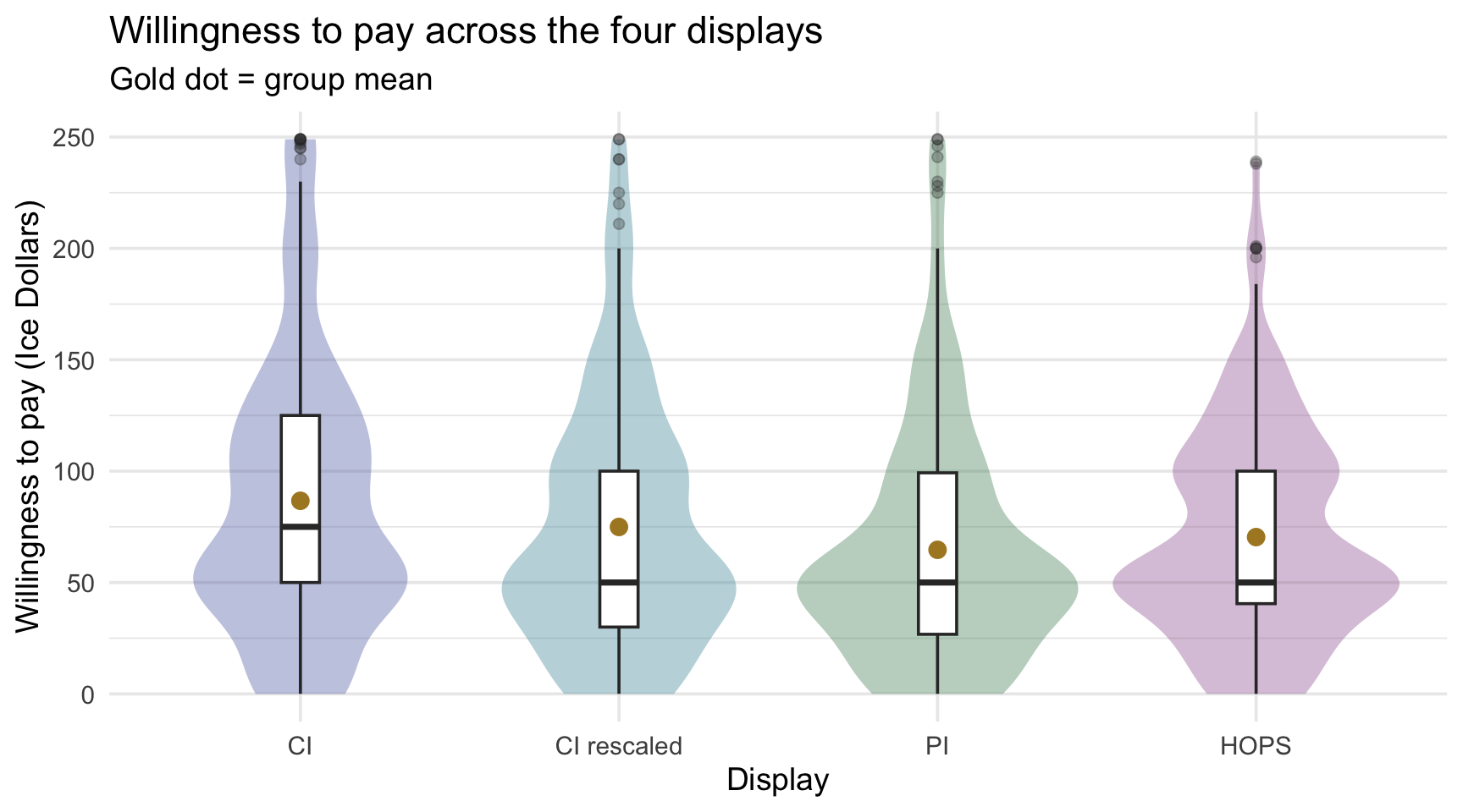
The four means step downward from CI to PI, with the rescaled CI and HOPs in between — but each pair of distributions overlaps heavily, so eyes alone can’t settle whether four population means differ.
Design assumptions. Random assignment to one of four conditions; each participant once; independence across groups. ✓
Model considerations. As in Test 1, the scores within each group are right-skewed, but with 209 to 236 people per group the CLT covers each group mean, and it is the means that F compares. The standard one-way ANOVA is also an equal-variance model: it pools all four groups’ spread into one within-group variance. Our four SDs are similar (from $48 to $63), the group sizes are large and nearly balanced, and under those conditions the standard ANOVA behaves well — so we use it here, follow it with Tukey, and note the alternative: if group variances differ substantially, the direct unequal-variance extension is Welch’s ANOVA (the multi-group analog of the Welch t you saw in Test 1), paired with Games–Howell follow-ups. Details in the box below. The principle is the one Test 1 set out for Welch’s t: the unequal-variance version gives up little when the variances are equal and protects you when they aren’t, so there is no need to run a preliminary variance test to decide.
TipGoing further — Welch’s ANOVA, Games–Howell, and Levene’s test
The standard ANOVA’s F can drift from its advertised \(\alpha\) when group variances differ, and the distortion is worst when smaller groups carry larger variances. Rather than running a variance test as a gatekeeper (preliminary assumption tests have their own power and multiplicity problems), know the direct alternative:
- Welch’s ANOVA — same omnibus logic, degrees of freedom adjusted for unequal variances: oneway.test()
(wtp ~ graph_type, data = all_groups)(its default is the Welch form). - Games–Howell — the pairwise follow-up that assumes nothing about equal variances: rstatix::games_howell_test().
The pairing rule: Tukey after standard ANOVA; Games–Howell after Welch’s ANOVA. If you’re unsure which world you’re in, prefer the unequal-variance analysis whenever unequal variances are substantively plausible; running both is cheap, and comparing them shows how much the assumption mattered.
You will nonetheless meet such a test constantly in published papers, so you should know its name: Levene’s test (car::leveneTest()) evaluates the null hypothesis that all groups share one variance. Its mechanism is charming — it replaces each score with its absolute distance from its own group’s center, then runs an ANOVA on those distances, since “are the groups equally spread?” becomes “do these distance-scores have equal means?” One detail worth knowing, because the output announces it and students routinely miss it: car::leveneTest() centers on the median by default, which is the Brown–Forsythe variant, less thrown off by skewed scores or outliers; the original mean-centered form has to be requested explicitly with center = mean. We name the test rather than use it, for the reason just given — making one test’s legitimacy conditional on another test’s outcome can distort the advertised error rate of the pair. Read the group SDs, know your design, and prefer Welch when in doubt.
Run and read the test
How F does its job. Test 1’s fraction — signal over noise — is about to become literal. The F-statistic is built by taking the total variability in willingness to pay and splitting it into two piles.
Start with a single question: why do these 910 people not all report the same WTP? Sort the spread into two piles:
- The group averages sit apart. If the display matters, that pushes the four averages apart — but any four randomly formed groups differ a little by accident too, so this pile holds any genuine display effect plus ordinary sampling variation. This is between-group variability.
- Because people differ. Two participants who saw the identical chart still answer differently — different risk appetites, different reading of a fictional currency, different moods. This is within-group variability, and it is the irreducible noise floor.
The remarkable fact — and it is exact algebra, not an approximation — is that those two pieces add up to the whole:
\[\underbrace{SS_\text{total}}_{\text{everyone vs the grand mean}} \;=\; \underbrace{SS_\text{between}}_{\text{group means vs the grand mean}} \;+\; \underbrace{SS_\text{within}}_{\text{each person vs their own group mean}}\]
where each SS (“sum of squares”) is exactly what M01 taught you variance is built from: take a deviation from a mean, square it, add them all up. In symbols, write \(x\) for one participant’s willingness to pay, \(\bar{x}_\text{grand}\) for the grand mean, and \(\bar{x}_\text{group}\) for that participant’s own group mean (the same \(\bar{x}_{\text{their group}}\) as in Test 1’s pooled variance):
\[\begin{aligned} SS_\text{total} &= \sum_{\text{all participants}} (x - \bar{x}_\text{grand})^2 \\[4pt] SS_\text{between} &= \sum_{\text{all participants}} (\bar{x}_\text{group} - \bar{x}_\text{grand})^2 \;=\; \sum_{\text{groups}} n_\text{group}\,(\bar{x}_\text{group} - \bar{x}_\text{grand})^2 \\[4pt] SS_\text{within} &= \sum_{\text{all participants}} (x - \bar{x}_\text{group})^2 \end{aligned}\]
The two forms of \(SS_\text{between}\) are the same sum: everyone in a group carries the same squared gap, so adding it once per person is the same as multiplying it by the group’s size, \(n_\text{group}\). And \(SS_\text{within}\) is exactly the numerator of Test 1’s pooled variance, now summed over four groups instead of two.
Let’s compute all three from our data and check that the identity really holds:
# Two reference points: one grand mean for everyone, and one mean per group.
grand_mean <- all_groups |> pull(wtp) |> mean()

group_means <- all_groups |>
  group_by(graph_type) |>
  summarize(n = n(), group_mean = mean(wtp), .groups = "drop")

# Put each participant's own group mean beside their score, so all three sums
# of squares can be read off the same table, one line each -- exactly the three
# labels under the braces above.
ss_pieces <- all_groups |>
  left_join(group_means, by = "graph_type") |>
  summarize(
    ss_total   = sum((wtp - grand_mean)^2),         # everyone vs the grand mean
    ss_between = sum((group_mean - grand_mean)^2),  # group means vs the grand mean, counted once per person
    ss_within  = sum((wtp - group_mean)^2)          # each person vs their own group mean
  )

ss_pieces
# Keep the three totals as plain numbers for the arithmetic that follows.
ss_total <- ss_pieces |> pull(ss_total)
ss_between <- ss_pieces |> pull(ss_between)
ss_within <- ss_pieces |> pull(ss_within)
tibble(
piece = c("SS_between", "SS_within", "sum of the two", "SS_total"),
value = round(c(ss_between, ss_within, ss_between + ss_within, ss_total))
)The two pieces reconstruct the total exactly. Every bit of variation in this dataset is now labeled: some of it attributable to which chart you saw, the rest to being a different person.
Put a number on how small the between piece is. Re-measuring everyone against their own group’s mean removed 60,946 of the 2,861,857 total — a reduction of 2.1%. That is the Two kinds of variation picture in arithmetic: the group averages sit tens of dollars apart while individuals scatter across hundreds. Small effect, large noise — and it is the same contrast the F-test is about to formalize.
From sums of squares to a fair comparison. We cannot compare \(SS_\text{between}\) and \(SS_\text{within}\) directly, because they are built from different numbers of free quantities — and Part 1’s counting principle tells us exactly how many each has. For the between piece, the quantities are the four group means and the constraint is the grand mean they must average to: \(k - 1 = 3\). For the within piece, the quantities are all 910 observations and the constraints are the four group means we estimated in order to measure deviations from them: \(N - k = 910 - 4 = 906\). Dividing each sum of squares by its own df converts it into an average squared deviation per free piece — a mean square, which is just a variance:
# Degrees of freedom, counted rather than typed.
n_obs_3 <- nrow(all_groups)
k_grp_3 <- nrow(group_means)
df_b_3  <- k_grp_3 - 1          # k - 1
df_w_3  <- n_obs_3 - k_grp_3    # N - k

# Each sum of squares divided by its own df is a mean square -- a variance.
ms_between <- ss_between / df_b_3
ms_within  <- ss_within / df_w_3

# F is simply their ratio.
f_from_ss <- ms_between / ms_within

c(df_between = df_b_3, df_within = df_w_3,
  MS_between = ms_between, MS_within = ms_within, F = f_from_ss) |> round(2)
df_between df_within MS_between MS_within F
3.00 906.00 20315.42 3091.51 6.57 \[MS_\text{between} = \frac{SS_\text{between}}{df_\text{between}} = \frac{60,946}{3} = 20,315 \qquad MS_\text{within} = \frac{SS_\text{within}}{df_\text{within}} = \frac{2,800,910}{906} = 3,092\]
\(MS_\text{within}\) deserves a moment, because you have already met it. In Test 1 we built the pooled variance for two groups: deviations from each participant’s own group mean, squared, summed, divided by \(N - 2\). \(MS_\text{within}\) is that same quantity with the 2 replaced by 4 — deviations from each participant’s own group mean, squared, summed, divided by \(N - k\). Two groups or four, it is one idea: pool everyone’s distance from their own group’s center into a single estimate of \(\sigma\), the noise the model says all groups share.
The numbers make the continuity visible. In Test 1, Experiment 1’s two groups gave a pooled SD of $51.13; here, across Experiment 2’s four groups, \(\sqrt{MS_\text{within}} =\) $55.6. A different sample, but the same recipe — and each figure is the typical distance between a participant and their own group’s mean: the noise floor, in Ice Dollars.
And now F is just the ratio:
\[F = \frac{MS_\text{between}}{MS_\text{within}} = \frac{20,315}{3,092} = 6.57\]
Why 1 is the number to compare against. If \(H_0\) were true — if the four population means were identical — then the group means would still not be exactly equal in any sample; they would scatter a bit, purely by sampling luck. And here is the key: under \(H_0\), that accidental scatter is generated by the same within-group noise. Both mean squares would be estimating the same underlying variance, so their ratio would average about 1. Values much above 1 mean the group means are further apart than within-group noise alone can manufacture. Our 6.57 says the between-group mean square is about 6.6 times the within-group mean square — more separation among the group means than the null model would ordinarily produce.
That also explains the shape you saw in Part 1. F is a ratio of two non-negative quantities, so it cannot go below zero, and under \(H_0\) it averages about 1 — with most values landing below 1 and a long tail to the right — a completely different picture from the symmetric t, for a completely understandable reason.
The two numbers that turn \(F_\text{obs}\) into a decision come from the F distribution the same way the on-ramp’s came from the t distribution — a quantile function for the cutoff, a cumulative function for the tail area:
# Both use the SAME pair of df. Upper tail only, because F cannot be negative --
# so unlike the t-tests, there is no doubling for a second tail.
f_star_3 <- qf(0.95, df1 = df_b_3, df2 = df_w_3)
p_from_f <- pf(f_from_ss, df1 = df_b_3, df2 = df_w_3, lower.tail = FALSE)

c(F_obs = f_from_ss, F_star = f_star_3, p = p_from_f) |> round(4)
F_obs F_star p
6.5714 2.6147 0.0002 So we reject when \(F_\text{obs}\) = 6.57 clears the critical value \(F^*\) = 2.61 — which it does.
And the same question Test 1 answered by shuffling applies here. If the display makes no difference, the four labels are arbitrary: you could re-deal CI, CI rescaled, PI and HOPS among the 910 participants, recompute F each time, and build this reference distribution by direct simulation — the same permutation approach, now with four labels instead of two. The F-curve below is the theory-based route to that same null world, just as the t-curve was in Test 1 — and again the two agree closely in a sample this size. What differs is only the shape: because F is a ratio of two non-negative quantities, the shuffled values mostly land below 1 and trail off to the right — averaging about 1 — which is why the rejection region sits entirely in the upper tail. Note lower.tail = FALSE in pf(): it asks for the area above our statistic, which for a one-tailed test is the whole p-value.
Show the code that built this figure
ref_dist_plot(
  dens = function(x) df(x, df1 = df_b_3, df2 = df_w_3),
  crit = qf(0.95, df_b_3, df_w_3),
  obs  = f_from_ss,
  xlim = c(0, 8),
  stat_label = "F",
  subtitle = sprintf(
    "F-distribution, df = (%d, %d) — upper tail only, because F cannot be negative\nCritical value F* = %.2f",
    df_b_3, df_w_3, qf(0.95, df_b_3, df_w_3))
)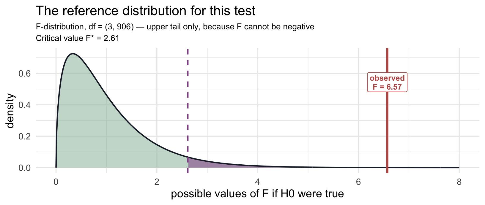
Read it exactly as before: the curve is what F does when all four population means are equal, the heather region holds 5% of the area, and \(F_\text{obs}\) sits well inside it. One number, aggregating all four groups’ departures at once — which is precisely why it cannot tell you which group is responsible.
We fit the model with lm() and ask anova() for the F-table — deliberately, because ANOVA is a linear model with a categorical predictor, and this is the same workflow M10 builds on:
anova_model <- lm(wtp ~ graph_type, data = all_groups)

anova(anova_model) |> tidy()
All three functions in that chunk are new, so read it inside-out:
- lm() fits a linear model that predicts each person’s willingness to pay from the display they saw. With one categorical predictor, its predictions are simply the four group means. The
~reads “by,” just as in t_test(). - anova() takes that fitted model and builds the ANOVA table from it: the sums of squares, degrees of freedom, mean squares, \(F_\text{obs}\), and p-value you just built by hand.
- tidy(), from the broom package, turns that table into a tibble, the same kind of object
t_test()returns, so you read it and pull values from it the same way.
This pairing becomes your standard toolkit. From Module 10 on, nearly every analysis in the course fits a model with lm() and reads it with broom: tidy() for the table of model terms, glance() for one-row summaries of the whole model, and augment() for each observation’s fitted value and residual. You are meeting the first of those three here.
Study the output before you read on. The ANOVA table looks different from a t-test tibble, and it does not carry every quantity a t-test does — an omnibus test has no single estimate or interval. Find: the two df values (where does each come from?), \(F_\text{obs}\) (what would 1 mean?), and the p-value.
- Two rows:
graph_typeis the between-group signal;Residualsis the within-group noise floor. - df = (3, 906): the numerator df is groups − 1 = 3; the denominator is \(N -\) groups \(= 906\).
- statistic = 6.57 — this is \(F_\text{obs}\): the between-group mean square is about 6.6 times the within-group mean square. (Under \(H_0\) both estimate the same population variance, so F averages about 1 in the null world.)
- p-value < .001 — four equal population means would essentially never produce an F as large as \(F_\text{obs}\), or larger. We reject \(H_0\): at least one display’s mean WTP differs.
- No confidence interval in this table — an omnibus test has no single parameter to build one around. Intervals reappear at the pairwise step, next.
TipGoing further — with two groups, ANOVA is the t-test
The Module has been claiming that these are not different theories, only one logic pointed at different designs. Here is the place that claim becomes checkable rather than rhetorical.
Run an ANOVA on just two groups and you do not get something similar to a two-sample t-test. You get the same test — with the statistics related by \(F = t^2\). Take Test 1’s CI-versus-PI data and analyze it both ways:
# The standard t-test (the equal-variance form, so both analyses assume one shared sigma)
student_t <- ci_pi |>
  t_test(formula = wtp_final ~ graph_type, order = c("CI", "PI"), var.equal = TRUE)

# The same comparison as a one-way ANOVA
two_group_f <- anova(lm(wtp_final ~ graph_type, data = ci_pi)) |> tidy()

tibble(
  quantity = c("t (standard)", "t squared", "F (ANOVA)"),
  value = c(
    student_t$statistic,
    student_t$statistic^2,
    two_group_f$statistic[1]
  )
)
Not approximately equal — equal, to every decimal R will print: 74.2216 against 74.2216. (It is the standard, equal-variance t that squares to F; Welch’s t² lands close but not on it, because its SE and df differ.) The p-values match too, and so do the degrees of freedom, once you know where to look: the standard t-test had \(df = N - 2 = 903\), and the ANOVA reports \(df = (1, 903)\). The numerator 1 is \(k - 1\) with two groups.
Why does this happen? Look back at the two models. With \(k = 2\), “each group has its own mean” is “the two means differ,” so the two tests are asking one question in two notations. Squaring is what erases the direction: \(t_\text{obs} = +8.62\) and \(t_\text{obs} = -8.62\) describe equally strong evidence, and F — which cannot be negative and has no direction to report — collapses them onto the same value. That is also why F’s rejection region sits in the upper tail only. The two-tailed t-test and the one-tailed F-test are, here, literally the same decision.
Keep this in your pocket for Project 2: if a paper reports F(1, df) for a two-group comparison and you ran a t-test, take the square root before deciding you disagree with them.
One model behind all these tests. If the tests in this Module are starting to feel like a long list to memorize, here is the good news: the box above is a preview of how the story ends. The two-sample t-test and the one-way ANOVA are not separate inventions. Both are special cases of a single model, the linear model, which is exactly what lm() fits: one predictor that marks which group each person is in. Part 3 of the course builds that model properly, and once you know it, you won’t need a new test for every design; you’ll adjust one formula instead. (The chi-square test belongs to a close cousin of the same family. Looking ahead, at the end of this Module, sketches how each test fits.)
Quantify and visualize the effect
Raw units first. The group means run from $65 (PI) up to $87 (CI) — a spread of about $22 across displays, against a risk-neutral price of $65.
Follow-up comparisons — matched to the question. The omnibus result tells us the four means are not all equal, but not where the differences lie. The follow-up should fit what you actually want to know — and note that it is not gated on the omnibus test: planned contrasts can be tested regardless of how F came out, and Tukey-adjusted comparisons already control their own familywise rate without needing a significant F as a gatekeeper. If your hypotheses named specific comparisons in advance, planned contrasts (a contrast is a specific comparison among means written down before the data are seen, for example CI against the average of PI and HOPs) let you test those directly and can be more efficient than testing every possible pair; whether a multiplicity adjustment is needed depends on the family of contrasts you planned. If — as here — the question is exploratory (“which displays differ from which?”), the standard tool is Tukey’s HSD, which tests all pairs while holding the familywise error rate at \(\alpha\) (it draws its critical values from the studentized range distribution, built for the largest-gap-among-\(k\)-means question):
# TukeyHSD() wants the model fitted with aov(): the same model as lm(), in ANOVA clothing
TukeyHSD(aov(wtp ~ graph_type, data = all_groups)) |>
  tidy() |>
  select(contrast, estimate, conf.low, conf.high, adj.p.value) |>
  mutate(across(where(is.numeric), ~ round(.x, 3)))
Each row is one pair: the estimated difference, a Tukey-adjusted 95% CI, and a Tukey-adjusted p-value. Read each label as a subtraction: PI-CI means PI minus CI, so a negative estimate says PI sits lower. A pair whose CI excludes 0 differs significantly after accounting for the fact that six comparisons were made. The rule to carry: Tukey for all pairwise comparisons of means; planned contrasts for questions specified in advance. Tukey isn’t the only adjustment; the Multiple comparisons deep-dive compares the alternatives, and the box below lists them.
TipGoing further — the other adjustments, in order
- Bonferroni — multiply every p-value by the number of comparisons. Controls the familywise rate, and it is the easiest to explain, which is why it is still everywhere.
- Holm — the same idea applied sequentially: rank the p-values, and scale each by how many comparisons remain rather than by the full count. It controls the familywise rate at exactly the same level as Bonferroni while rejecting at least as often — never less. Holm uniformly dominates Bonferroni, so there is no situation in which Bonferroni is the better choice; prefer Holm whenever you would have reached for Bonferroni.
- Tukey’s HSD — purpose-built for all pairwise comparisons of means, which is exactly our situation, and more powerful than the general-purpose corrections for that specific job. Hence its use here.
- Benjamini–Hochberg — changes the goal rather than the arithmetic: it controls the false-discovery rate (the expected share of your rejections that are wrong) instead of the probability of any error. Suited to screening many comparisons where a few false leads are tolerable.
See the deep-dive for the arithmetic and for when each fits.
The standardized effect for ANOVA is \(\eta^2\) (eta-squared) — and you have already computed everything it needs. Look again at the partition: \(SS_\text{total}\) was all the variation in willingness to pay, and \(SS_\text{between}\) was the slice attributable to which display someone saw. Their ratio is the proportion of variance explained:
\[\eta^2 = \frac{SS_\text{between}}{SS_\text{total}} = \frac{60,946}{2,861,857} = .021\]
ss_between / ss_total[1] 0.02129605So, in this sample, display format accounts for about 2.1% of the variation in WTP, and the other 97.9% is people differing from one another within their condition. That is the arithmetic behind the reduction you saw a moment ago: switching from measuring everybody against the grand mean to measuring them against their own group’s mean removed only a small share of the total spread.
Cohen’s conventional labels for η², for orientation only:
| η² | Conventional label |
|---|---|
| < .01 | Negligible |
| .01 – .06 | Small |
| .06 – .14 | Medium |
| ≥ .14 | Large |
Notice how tightly \(\eta^2\) and F are related — both are built from the same two piles, just combined differently. F asks “is the between-group signal bigger than noise?”; \(\eta^2\) asks “what share of everything does the signal account for?” A large sample can make a small share highly detectable, which is exactly the case here.
effectsize confirms the hand calculation and adds a confidence interval:
eta_squared(anova_model, alternative = "two.sided")(The alternative = "two.sided" argument requests a conventional two-sided 95% CI; effectsize’s default for variance-explained measures is a one-sided interval whose upper bound is always 1.)
Note what \(\eta^2\) can and cannot do: it summarizes how much of the outcome the factor explains, but — like the omnibus F it accompanies — it says nothing about which means differ or in what direction. The Tukey table carries that information; the two are complements, not substitutes.
Write the result and define its scope
APA-style reporting · One-Way ANOVA
A one-way ANOVA indicated a significant effect of display on willingness to pay, F(3, 906) = 6.57, p < .001, η² = .021, 95% CI [.005, .041]. Tukey-adjusted comparisons identified significant differences for the following pairs: PI-CI (mean difference = -22.015 Ice Dollars, 95% CI [-35.26, -8.769], adjusted p < .001); HOPS-CI (mean difference = -16.299 Ice Dollars, 95% CI [-29.573, -3.026], adjusted p = .009).
Two notes on this sentence. Report η² alongside F: a significant F with a small η² means the effect, though detected, accounts for little of the outcome’s variance. And notice the adjusted p-values are formatted the APA way — the smallest one is reported as < .001, never as 0. That is not cosmetic. Rounding a p of .000123 to three decimals would print 0, which claims an impossibility: no observed result has zero probability under the null. When a full table of comparisons would crowd the paragraph, give the reader the pattern in prose and put the complete table alongside, as we did above.
In plain language — where the four displays land. The Tukey table draws a clean substantive map. The CI display stands apart: it sits significantly above both PI ($87 vs $65) and HOPs ($87 vs $70). The two displays that show outcome variability — PI as a wide interval, HOPs as individual draws — sit together at the bottom (adjusted p = .681 for their difference). And CI rescaled lands in between ($75): not reliably different from the CI display it copies (p = .120) nor from PI (p = .210). That intermediate position echoes the paper’s own reading — stretching the CI’s axis to look as wide as a PI “helps somewhat,” but doesn’t fully reproduce the effect of actually showing outcome variability.
One honest caveat, courtesy of the effect size: η² ≈ .021 means that, in this sample, display format explains only about 2.1% of the variance in WTP — most of what drives any individual’s willingness to pay is everything else they bring to the decision. “Significant” answers whether the group differences are larger than sampling variation under \(H_0\) would typically produce, not how much of the outcome the factor controls; keeping those apart is exactly what the effect-size step is for.
What this analysis does not establish. All conclusions live within the Large effect-size condition — whether the display ranking changes at the small effect size is an interaction question this one-way analysis cannot touch. The HOPs–PI non-difference is a failure to detect, not a demonstration of equivalence. And the omnibus F itself established only “not all equal” — every specific claim above rests on the adjusted pairwise comparisons, not on F.
TipGoing further — if the standard analysis is unsuitable · Kruskal-Wallis
The Kruskal-Wallis test extends the same rank-based question to several groups: its null is that the groups share one distribution, and the alternative is that values in at least one group tend to run larger than in the others — a statement about distributions, not means. If that is the question you need answered, it is a good choice, most often attractive with heavily skewed outcomes and small per-group samples. Its pairwise follow-up is Dunn’s test (dunn.test).
kruskal.test(wtp ~ graph_type, data = all_groups)Test 3: A categorical outcome — the chi-square test of independence
What’s new in Test 3
The outcome type changes: instead of comparing means of a continuous variable, we ask whether category membership depends on group. The calculation changes accordingly — expected counts replace expected means, and the \(\chi^2\) statistic adds up the cell-by-cell departures between the counts you observed and the counts a null model would predict.
The groups do not change. Test 3 returns to Test 1’s two groups — the 905 matching-caption readers of Experiment 1 — and asks a yes/no question about the price each one named: did they pay more than the upgrade is worth? Two displays by two answers makes a 2 × 2 table, the smallest table a chi-square test can run on, and the one where every part of the test is easiest to see.
Because the whole test rests on comparing observed and expected counts, it opens with a warm-up before the usual seven headings: we meet that comparison first on a single categorical variable, where it is simplest, and then extend it to two.
Warm-up: one categorical variable — the goodness-of-fit test
Before leaving Test 2’s four groups, one short question about them. Test 2 compared their means; this warm-up asks about their sizes. It is the categorical twin of the on-ramp — one variable, one externally supplied benchmark — and it introduces the two symbols every chi-square test runs on.
| Continuous outcome | Categorical outcome | |
|---|---|---|
| One variable vs a benchmark | one-sample t (the on-ramp) | \(\chi^2\) goodness-of-fit |
| Outcome vs a grouping variable | two-sample t / ANOVA (Tests 1–2) | \(\chi^2\) independence (below) |
The study intended to allocate participants equally across the four displays. Were the realized cell sizes compatible with that? Under \(H_0\) every display has probability .25, so the expected count in each cell is \(E_i = N \times P_i = 910 \times .25 = 227.5\); the observed count \(O_i\) is what the data hold. The statistic is the one you will use for the rest of this section — each cell’s squared departure, scaled by what was expected there, summed:
\[\chi^2 \;=\; \sum_i \frac{(O_i - E_i)^2}{E_i}\]
chisq_test() is infer’s chi-square function — the sibling of the t_test() you have been using, returning the same kind of one-row tibble. For a goodness-of-fit test you hand it the variable and the proportions \(H_0\) claims:
all_groups |>
  chisq_test(response = graph_type, p = c(0.25, 0.25, 0.25, 0.25))
Four category counts, one constraint (they must add to 910), so \(df = 3\) — the counting principle again. χ²(3, N = 910) = 2.06, p = .560: the observed counts sit close to the 227.5 apiece that equal allocation predicts, and a departure this small is ordinary under \(H_0\). Failing to reject is the reassuring outcome here — but read it as no detectable departure from equal allocation, not as proof the randomization was flawless (the M08 rule: failing to reject is never accepting). Two things to carry: in a goodness-of-fit test you bring the expected proportions with you, and the same \(O\)-versus-\(E\) comparison is about to be applied to two variables at once.
Recognize the design
Back to Test 1’s two groups. Tests 1 and 2 asked whether the display shifts the mean of a continuous outcome. Some research questions are natively categorical — diagnosed or not, retained or dropped out, above a threshold or below it — and here we can build a sharp one from the study’s own economics: did this participant overpay?
The number that makes “overpay” precise comes from the boulders. In Experiment 1 the special boulder out-slides the standard one 57% of the time, and the prize for winning is 250 Ice Dollars. Renting the upgrade therefore raises your expected winnings by \(250 \times .57 - 250 \times .50 = \$17.50\) — the risk-neutral price, the most the upgrade is worth. Paying more than $17.50 has a precise meaning: paying more than the upgrade is worth.
One flag before we build it: dichotomizing a continuous variable discards information, and we do it here to teach the categorical test, not because it improves on Test 1’s analysis of the full WTP scale. A good reason to cut a continuous variable is a substantively meaningful cutpoint — and a benchmark derived from the study’s own payoff structure is exactly that. (Cutting at a convenient round number, or hunting for the threshold that makes p smallest, is how dichotomization earns its bad reputation.)
The design’s features: two categorical variables, each with two levels — display (CI or PI) and overpay status (yes or no) — measured on independent, randomized participants. The decision map says: chi-square test of independence.
chi_data <- ci_pi |>
  mutate(overpaid = case_when(
    wtp_final >  17.50 ~ "Overpaid",
    wtp_final <= 17.50 ~ "Did not overpay"
  ) |> factor(levels = c("Did not overpay", "Overpaid"))) |>
  select(graph_type, overpaid)

chi_data |>
  count(graph_type, overpaid) |>
  pivot_wider(names_from = overpaid, values_from = n)
That tidy form is what our plotting and modeling code wants. But the shape that makes the test’s logic visible is a proper cross-tabulation with its margins — and you already have the tool for it. tbl_cross() from gtsummary is the same function you used in M05 to describe two categorical variables and again in M06 to read a contingency table as probabilities. Same function, a third use:
chi_data |>
  set_variable_labels(
    graph_type = "Display",
    overpaid   = "Willing to pay more than the $17.50 risk-neutral price?"
  ) |>
  tbl_cross(
    row     = graph_type,
    col     = overpaid,
    percent = "row"
  )
Willing to pay more than the $17.50 risk-neutral price?
|
Total | ||
|---|---|---|---|
| Did not overpay | Overpaid | ||
| Display | |||
| CI | 48 (11%) | 371 (89%) | 419 (100%) |
| PI | 128 (26%) | 358 (74%) | 486 (100%) |
| Total | 176 (19%) | 729 (81%) | 905 (100%) |
Read it the way you read M06’s tables. Each cell gives a count and, because we set percent = "row", the percentage within that display condition — so 371 (89%) means 371 of the 419 CI viewers overpaid, or 89% of them. That row percentage is a conditional probability: \(P(\text{overpaid} \mid \text{saw a CI})\), exactly the quantity M06 taught you to read off a cross-tab.
Now look down the “Overpaid” column and the null hypothesis writes itself. The Total row says 729 (81%) — across everyone, 81% overpaid. If the display were irrelevant, both rows should sit near that same 81%. Instead CI runs at 89% and PI at 74%. Independence is the claim that the two row percentages are equal; the chi-square test asks whether the gap we see is more than sampling noise would produce.
The margins — the Total row and Total column — are used twice more before this section ends: they generate the expected counts, and they fix the degrees of freedom.
State the parameter and hypotheses
In words: the estimand is a pair of population proportions — the proportion of CI viewers who overpay and the proportion of PI viewers who overpay — and the null says they are equal.
- \(H_0\): graph_type and overpaid are independent — the population proportion overpaying is the same under both displays.
- \(H_a\): they are not independent — the probability of overpaying depends on which display a participant saw.
Independence has a concrete meaning worth internalizing: if \(H_0\) were true, knowing which chart someone saw would tell you nothing about whether they overpaid.
See the data and assess the model
The chi-square question — do the two displays split the same way across the two overpay statuses? — is a picture before it’s a statistic. A stacked-proportion bar chart shows it directly: each bar is normalized to 100%, so identical splits would mean independence.
Show the code that built this figure
chi_plot_data <- chi_data |>
  count(graph_type, overpaid) |>
  group_by(graph_type) |>
  mutate(
    prop = n / sum(n),
    cell_text = sprintf("n = %d (%.0f%%)", n, 100 * prop)   # one line, so it fits the thin segment
  ) |>
  ungroup()

chi_plot_data |>
  ggplot(aes(x = graph_type, y = prop, fill = overpaid)) +
  geom_col(width = 0.55, color = "white", linewidth = 1) +
  geom_text(
    aes(label = cell_text),
    position = position_stack(vjust = 0.5),
    color = "white", fontface = "bold", size = 3.6
  ) +
  scale_y_continuous(labels = scales::percent_format(accuracy = 1),
                     expand = expansion(mult = c(0, 0.02))) +
  scale_fill_manual(
    values = c("Did not overpay" = "#4E5EAA",
               "Overpaid" = "#AD872B"),
    breaks = c("Overpaid", "Did not overpay")
  ) +
  labs(
    title = "Overpaying the $17.50 risk-neutral price, by display",
    subtitle = paste0("Each bar = 100% of participants in that condition.\n",
                      "Independence would mean identical splits."),
    x = "Display",
    y = "Proportion of participants",
    fill = "Overpay status"
  )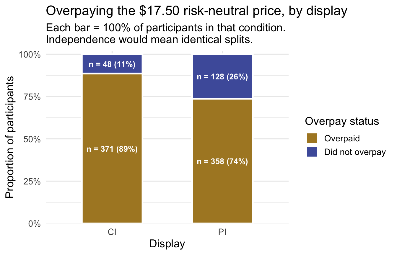
The splits are not identical: 89% of CI participants were willing to pay more than the boulder is worth, against 74% of PI participants. The question is whether a gap that size would commonly arise from sampling variation if the display made no difference.
Design assumptions. Same as Test 1: randomized, independent, one row per participant. ✓
Model considerations. Chi-square’s reference distribution is a large-sample approximation, and the adequacy check is on the expected cell counts — the counts each cell would hold if the null were true. The common guideline is that none should fall below 1 and no more than about 20% should fall below 5. So we need those expected counts — and computing them is the margins’ first job. Under independence, a cell’s expected count is its row total × column total ÷ overall total: the share of everyone who overpaid, applied to the number of people in that row. The code builds it with the M04 verbs in four short steps, each adding one column you can see (Step 1’s name = "observed" just labels the count column; Steps 2 and 3 are M04’s grouped mutate). The pre-study walks through each step.
# Step 1: one row per cell, with the number of people observed in it.
#         name = "observed" labels that count column (count()'s default name is n).
cells <- chi_data |>
  count(graph_type, overpaid, name = "observed")

# Step 2: each cell's ROW total -- how many people saw that display
cells <- cells |>
  group_by(graph_type) |>
  mutate(row_total = sum(observed)) |>
  ungroup()

# Step 3: each cell's COLUMN total -- how many people had that outcome
cells <- cells |>
  group_by(overpaid) |>
  mutate(col_total = sum(observed)) |>
  ungroup()

# Step 4: expected = row total x column total / overall total
expected_tbl <- cells |>
  mutate(expected = row_total * col_total / sum(observed))   # sum(observed) = all 905 people

expected_tbl |> mutate(expected = round(expected, 1))   # rounded for display; the next step uses the full values
Read the first row as a sentence: 81% of everyone overpaid, so if the display were irrelevant we would expect about 19.4% of the 419 CI viewers — 81.5 of them — not to overpay. We observed 48. The smallest expected count is 81.5 — far above 5. ✓ (When expected counts are small, the standard choice is Fisher’s exact test — see the box at the end.)
Run and read the test
How \(\chi^2\) does its job. For each of the four cells, independence predicts an expected count from the margins — that’s the table you just built. The statistic then aggregates each cell’s departure from its prediction:
\[\chi^2 = \sum_{i,j} \frac{(O_{ij} - E_{ij})^2}{E_{ij}}\]
Two features of that formula are worth pausing on, because they explain the distribution’s shape. The numerator is squared, so a cell that comes in below expectation contributes exactly as much as one equally far above. Departures in either direction count as evidence, which is why — unlike a t-test — there is no “direction” to a chi-square and no two-tailed/one-tailed choice to make. And the denominator scales each departure by what was expected there: being 20 counts off matters enormously in a cell expecting 30 and hardly at all in a cell expecting 3,000. Every cell is put on the same footing before being added up. Because it is a sum of squared, scaled departures, \(\chi^2\) is non-negative by construction and grows as the table drifts from independence. Zero would mean every cell landed exactly on its expectation.
Now compute it, exactly as in the warm-up — each cell’s departure, squared, scaled by what independence expected there, then summed:
chi_cells <- expected_tbl |>
  mutate(
    departure    = observed - expected,
    contribution = departure^2 / expected
  )

chi_cells |>
  select(graph_type, overpaid, observed, expected, departure, contribution) |>
  mutate(across(c(expected, departure), \(x) round(x, 1)),   # rounded for display only
         contribution = round(contribution, 2))
chi_cells |> summarize(chi_sq = sum(contribution))Look at the departure column first, because it shows something that holds for every 2 × 2 table: all four departures have the same size, 33.5 people, two positive and two negative. That is the margins at work — the expected counts share the row and column totals with the observed counts, so whatever one cell gains relative to expectation, its row-mate and its column-mate must lose. (It is also why simply adding the raw departures could never measure anything: they cancel to exactly zero. Squaring is what fixes that.) Now look at the contribution column. The same squared departure divided by a small expected count (81.5) contributes 13.76; divided by a large one it contributes far less. Add the four and \(\chi^2_\text{obs} = 31.81\).
Why the reference distribution is a chi-square distribution
Every other test in this Module borrowed its reference distribution from somewhere you had already been. Here we can at least see where the chi-square shape comes from, using ideas M06 already gave you — and the sketch explains the name, the shape, and the one condition this test actually leans on.
Follow a single cell. How many of the 419 participants who saw the CI display will overpay? Each of them independently either does or doesn’t, and under \(H_0\) each does so with the same probability. That is precisely a binomial count — M06’s first named distribution. Now the three steps:
- A cell count is binomial. \(O_{ij} \sim \text{Binomial}(n, p)\), with mean \(E_{ij}\).
- At large expected counts, a binomial is approximately Normal. This is the Central Limit Theorem at work, as M06 showed: a binomial count is a sum of many independent 0/1 outcomes, and sums of many independent things become approximately Normal. This is the step that requires the expected counts to be reasonably large — it is exactly where the guideline on expected counts comes from.
- Scale each departure and square it. Divide each cell’s departure by \(\sqrt{E_{ij}}\), square the result, and add across cells:
\[\chi^2 = \sum_{i,j} \frac{(O_{ij} - E_{ij})^2}{E_{ij}} = \sum_{i,j} \left( \frac{O_{ij} - E_{ij}}{\sqrt{E_{ij}}} \right)^{2}\]
Summing squared Normal-ish quantities is what produces a chi-square shape — a chi-square distribution is, by definition, what you get when you square standard Normal variables and add them up. That is why the statistic cannot be negative, why its distribution is right-skewed, and why it carries the name.
TipGoing further — why that is a sketch and not a proof
Three things are glossed over above. First, the scaled departure \((O_{ij} - E_{ij})/\sqrt{E_{ij}}\) is not exactly a standard Normal — a binomial count has standard deviation \(\sqrt{np(1-p)}\), not \(\sqrt{np} = \sqrt{E}\). Second, the four cell counts are not independent of one another — the row and column totals constrain them (you just saw all four departures come out the same size). Third, the expected counts are estimated from the margins of the very table being tested. Each of those pulls in a direction the simple sketch ignores, and remarkably they work out: the Pearson statistic really does converge to a chi-square distribution — but with \((r-1)(c-1)\) degrees of freedom rather than one per cell, which is precisely the accounting the next paragraph does. What survives, and what you should carry: larger values mean a bigger aggregate departure from the null model, and the chi-square curve is the right yardstick once expected counts are large enough.
Which brings us to df, and it is the counting principle one last time. A chi-square’s degrees of freedom count how many of those squared quantities are free. Our table has \(2 \times 2 = 4\) cells, but they are not four free quantities: the expected counts were computed from the row and column totals, so those totals are fixed — and once they are, filling in a single cell forces the other three. Try it: put 48 in the top-left cell, and the CI row total gives its neighbor, the “Did not overpay” column total gives the cell below, and the last cell has no choice at all. One free cell, so
\[df = (r - 1)(c - 1) = (2 - 1)(2 - 1) = 1\]
— which is also why all four departures had the same size. Writing \(r\) for rows and \(c\) for columns, the same formula covers any table: a 4 × 2 table would have three free cells.
This test’s reference distribution is a \(\chi^2\) curve with 1 degree of freedom, and here is where 31.81 falls on it:
Show the code that built this figure
chi_df_ref <- (2 - 1) * (2 - 1)   # (r - 1)(c - 1) for our 2 x 2

# The curve starts just above zero: with df = 1 its height at exactly 0 is infinite.
ref_dist_plot(
  dens = function(x) dchisq(x, df = chi_df_ref),
  crit = qchisq(0.95, chi_df_ref),
  obs  = chi_hand,   # the value we just summed by hand, above
  xlim = c(0.05, 35),
  stat_label = "chi-square",
  subtitle = sprintf(
    "chi-square distribution, df = %d — upper tail only, because the statistic cannot be negative\nchi-square* = %.2f",
    chi_df_ref, qchisq(0.95, chi_df_ref))
)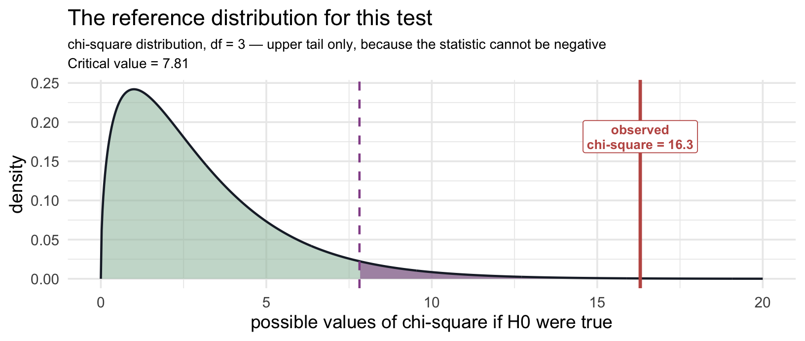
The shape is new, so read it slowly. With one degree of freedom the curve piles up against zero: if the display made no difference, most tables would land very close to independence and produce a \(\chi^2\) near 0, and values past the critical value of 3.84 would occur only 5% of the time. Our 31.81 sits far out where the curve has flattened to nothing.
Now let R do it. Same chisq_test() as the warm-up, but with a formula — outcome ~ group, the same shape t_test() took — instead of a vector of proportions. And one argument to know about, explained in the box just below:
chi_result <- chi_data |>
  chisq_test(formula = overpaid ~ graph_type, correct = FALSE)

chi_result
Study the output before you read on. Find the statistic, the df, and the p-value — and check the statistic against the sum you computed by hand.
- statistic = 31.81 — this is \(\chi^2_\text{obs}\): the accumulated, scaled departure of all four observed counts from their independence expectations. It matches the hand calculation exactly.
- chisq_df = 1 — for a 2 × 2 table, \((r-1)(c-1) = 1\): once the margins are fixed, only one cell is free to vary.
- p_value < .001 — if display and overpaying were truly independent, a \(\chi^2\) this large, or larger, would be extraordinarily rare. We reject independence: the proportion who overpaid differs between the two displays.
One thing R does silently that you need to know about: Yates’s continuity correction.
The derivation above approximated a discrete thing (counts, which arrive in whole numbers) with a continuous one (the Normal, and hence the \(\chi^2\) curve). That approximation is roughest when the table is smallest, and by convention R patches it — but only for 2 × 2 tables, which is exactly what we have. When \(df = 1\), chisq_test() (like the base-R chisq.test() underneath it) automatically applies Yates’s continuity correction, shrinking each departure by 0.5 before squaring. Leave the argument out and you get \(\chi^2_\text{obs} = 30.87\) instead of our 31.81 — a little smaller, with a slightly larger p-value, and no announcement in the output. correct = FALSE switches it off, which is why the statistic above matches the one you built by hand.
Why this matters for Project 2: if you reproduce a 2 × 2 analysis and your \(\chi^2\) comes out slightly smaller than the published one, you have very likely not made a mistake — you applied the correction and the original authors didn’t, or the reverse. Say in your write-up which you used. (Yates introduced the correction to improve the continuous approximation to discrete 2 × 2 counts; it makes the test more conservative (less likely to reject \(H_0\)) and can over-correct, which is why statisticians still disagree about using it. With expected counts as large as ours, the two statistics differ by less than one unit of χ².)
Quantify and visualize the effect
Raw units first. The effect is a pair of proportions, and they are the most interpretable numbers in this whole test: 89% of CI viewers overpaid, versus 74% of PI viewers — a 15-percentage-point gap in the probability of paying more than the upgrade is worth.
The standardized companion is Cramér’s V — chi-square’s analog of Cohen’s d, a measure of association bounded between 0 (no association) and 1 (the display would completely determine who overpays). cramers_v(), from effectsize, wants the 2 × 2 table of counts itself rather than a formula, so the first step builds that table:
# The 2 x 2 table of counts: select the two variables, then cross-tabulate them
chi_tab <- chi_data |>
  select(graph_type, overpaid) |>
  table()

cramers_v(chi_tab, adjust = FALSE, alternative = "two.sided")
Two arguments are worth knowing. adjust = FALSE asks for the plain V, \(\sqrt{\chi^2 / N}\); the default applies a small-sample correction that shrinks it slightly. alternative = "two.sided" asks for an ordinary two-sided 95% CI; the default reports a one-sided interval whose upper end is fixed at 1.
V = .19, 95% CI [.12, .25]. For a 2 × 2 table the formula is simply \(V = \sqrt{\chi^2 / N} = \sqrt{31.81 / 905}\), and you will also see this number called the phi coefficient, φ — same quantity, two names. (Say which version you report.)
| V (2 × 2 table) | Conventional label |
|---|---|
| < .1 | Negligible |
| .1 – .3 | Small |
| .3 – .5 | Medium |
| ≥ .5 | Large |
These are Cohen’s benchmarks for a 2 × 2 table, where V equals φ; they shrink as tables grow, so don’t carry them to a 3 × 4. Even here they are rough conventions, and the substantive stakes matter more. Notice the now-familiar contrast: a p-value far below .001 beside a small association. With 905 people, even a modest difference in proportions produces an emphatic \(\chi^2\) — the evidence-versus-magnitude habit from Test 1, in categorical form.
Where the association comes from needs no extra tool here. With one degree of freedom there is only one way a 2 × 2 table can depart from independence, and the two row percentages already show it: CI viewers overpaid more often than independence predicts, PI viewers less often. (Larger tables have more ways to depart, and use standardized residuals to find the cells that carry the association — a tool for later courses.)
Write the result and define its scope
APA-style reporting · Chi-Square Test of Independence
A chi-square test of independence indicated a significant association between display and overpaying the $17.50 risk-neutral price, χ²(1, N = 905) = 31.81, p < .001, V = .19, 95% CI [.12, .25]. Participants who saw a 95% confidence interval were more likely to overpay (89%) than participants who saw a 95% prediction interval (74%).
Note the APA format for chi-square: χ²(df, N = sample size) = value. Reporting N matters here more than usual: for a fixed pattern of proportions, the Pearson χ² statistic scales directly with N — double the sample, double the statistic — so N is what lets a reader interpret the statistic alongside the effect size.
In plain language: the display didn’t just nudge the average price — it changed how many people crossed the line from at or below the benchmark to above it, from 74% under PI to 89% under CI.
What this analysis does not establish. The conclusion depends on the $17.50 cutpoint — defensible here because the study’s own economics fix it, but a different (equally defensible) threshold would be a different analysis, and agreement across thresholds is worth checking before leaning on any single one. And remember what this test gave up: Test 1 used every dollar of the WTP scale on these same 905 people; this test compressed it to one bit per person. When both analyses are available and agree — as they do here — the continuous one is the primary evidence and the categorical one is the more communicable restatement.
TipGoing further — if the standard analysis is unsuitable · Fisher’s exact test
Pearson’s chi-square relies on a large-sample approximation that degrades when expected cell counts fall below about 5. Fisher’s exact test is not a “nonparametric fallback” in the usual sense — it is an exact test for contingency tables, computing the exact probability of tables at least as extreme as yours under independence. It’s the standard choice for small expected counts, and it agrees with chi-square asymptotically7 at large N.
fisher.test(chi_tab)With expected counts in the eighties and above, the chi-square test is the right choice here.
The tests, side by side
The Module opened with a claim: one logic, three designs — plus the on-ramp that taught the template. Here is that claim, made checkable — every row answers the same six questions:
The synthesis table
| Test | The unit & design | The parameter | \(H_0\) predicts | Statistic (APA form) | Raw effect to report | Standardized ES |
|---|---|---|---|---|---|---|
| One-sample t | Person; one group vs benchmark | \(\mu\) | \(\bar{x}\) near \(\mu_0\) | t(df) | mean, vs the benchmark | Cohen’s d |
| Two-sample t | Person; two independent groups | \(\mu_1 - \mu_2\) | \(\bar{x}_1 - \bar{x}_2\) near 0 | t(df) | difference in means, with CI | Cohen’s d |
| One-way ANOVA | Person; 3+ independent groups | the \(k\) population means \((\mu_1, \dots, \mu_k)\) | group means spread ≈ within-group noise | F(df₁, df₂) | the group means | \(\eta^2\) (+ pairwise CIs) |
| Chi-square | Person; two categorical variables | conditional proportions across groups | observed counts ≈ expected counts | \(\chi^2\)(df, N = total) | the group proportions | Cramér’s V |
Shared across all of them: independent sampling units (here, individual participants, each appearing once), \(\alpha\) set in advance, an effect size with CI reported alongside the p-value, the raw effect reported before the standardized one, and the direction named in plain English.
Follow-ups: the t-tests deliver their specific comparison directly. A significant ANOVA calls for follow-up matched to the question — Tukey-adjusted pairwise comparisons when all pairs are of interest, planned contrasts when hypotheses were specified in advance (Multiple comparisons deep-dive). A significant chi-square on a 2 × 2 table needs no follow-up — its two proportions already say where the association lies; larger tables use standardized residuals to find the driving cells.
Three more tests were named along the way, all for designs the rows above don’t reach. The chi-square goodness-of-fit test (Test 3’s warm-up) takes one categorical variable and compares its proportions against values you specify in advance — the categorical twin of the one-sample t. The paired-samples t handles the same people measured twice: take each person’s difference and run the one-sample t on those differences; the M09 bonus activity works through one on real data. McNemar’s test handles a categorical outcome measured twice on the same people, where the independence that chi-square requires fails by construction.
Alternatives when the model is unsuitable (Wilcoxon forms, Mann-Whitney, Kruskal-Wallis, Fisher’s exact): remember that most of them test a different population quantity than their standard counterpart. Choose by asking which parameter your research question needs — not by glancing at a histogram.
Keep this table close. It is the one-page version of the Module — built for the moment, a semester or three from now, when your own data are in front of you and you need to pick the right test, run it, and report it without re-reading the whole chapter.
Looking ahead
Each of these tests connects naturally to the regression-modeling framework. The mean structures behind the t-tests and the ANOVA can all be written as linear models — the standard t-test and the standard ANOVA are exact lm() special cases, while Welch keeps the same mean comparison but changes the standard-error model; the chi-square test connects to a close cousin, logistic regression, which keeps the same right-hand side but models a yes/no outcome (beyond this course). The linear model is one model with the unifying form
\[Y = \beta_0 + \beta_1 X_1 + \beta_2 X_2 + \dots + \epsilon\]
where the \(X\)’s can be continuous, binary, or categorical. Once you see regression as the parent framework, the tests above stop looking like different things and start looking like members of the same broader modeling family:
| M09 test | Its regression equivalent in R | Notes |
|---|---|---|
| One-sample t | lm(y - mu0 ~ 1) |
Intercept-only regression on the centered outcome; the intercept tests whether \(\mu - \mu_0 = 0\). |
| Two-sample t | lm(y ~ group) |
Regression with one binary predictor; the slope on group is the same difference in means. Ordinary lm() uses the pooled-variance (standard) form; Welch keeps the coefficient but uses an unequal-variance SE and df. |
| One-way ANOVA | lm(y ~ factor) |
Regression with one categorical predictor; the F-test on the factor is what anova() reports. |
| Chi-square (2×2, binary outcome) | logistic regression (a close cousin; beyond this course) | For a 2 × 2 table like Test 3’s, a logistic regression with one binary predictor asks a closely related independence question. The right-hand side looks the same; what changes is how a yes/no outcome is modeled. |
Why does this matter? Because once you can write any of these tests as a regression model, extending it is just a matter of adding to the formula — more predictors, their interactions — without re-learning a new “test” for every design. (The same regression logic reaches further still, to mixed-effects models and to different outcome families for non-normal data, but those lie beyond this course.) The tests in this Module are not the destination; they’re the foundation for the regression-based second half of the course.
Module 10 introduces simple linear regression. Module 11 layers in multiple predictors. The same lm() / tidy() / anova() workflow you already saw in Test 2 carries you all the way from there to your dissertation analyses.
Summary
One logic, three designs — and one on-ramp. Every test in this Module asked how compatible the observed data are with a null model, decided against a pre-set \(\alpha\), and then did the more important work: reporting the effect in raw units, bounding it with a confidence interval, standardizing it for comparability, and stating a claim whose scope matches the design. What changed from test to test was never the reasoning — it was the design: one group against a benchmark, then two independent groups, then four, then a categorical outcome.
When your own data arrive, start where this Module starts: outcome type, number of groups, independent or paired, and the parameter your question names. The decision map turns those answers into a test; the synthesis table turns the test into a complete, honest report.
Footnotes
The large-effect condition is the one place the published numbers don’t quite reconcile, and it’s worth knowing why. The concrete stimulus parameters are the boulder distances: 116 m against 100 m with \(\sigma = 15.3\) m implies Cohen’s d = 1.046 and a probability of superiority of .770. The article rounds that effect to “approximately 1.0” and reports the probability as 76% — which is the value a d of exactly 1.0 gives, \(\Phi(1/\sqrt{2}) = .760\). The gap is about one percentage point. The small-effect condition has no such gap: 104 m gives d = 0.261 and P = .573, and both the article’s “0.25” and the pre-registration’s “approximately 0.26” round to the same stated 57%. We use 76% throughout because it is the benchmark the authors themselves analyze against — their normative willingness-to-pay of $65 is computed as \(250 \times .76 - 250 \times .50\).↩︎
Footnote 1 above explains why the paper’s stated 76% and its stimulus parameters differ by about a percentage point, and why we use .76 throughout.↩︎
A straw man is a position set up mainly so that it can be knocked over — in hypothesis testing, a null that nobody seriously entertains, so that rejecting it establishes very little. The criticism has real force against some uses of the nil null (\(\mu = 0\)): if no one ever believed the effect was exactly zero, “we rejected zero” is a thin finding. But it is not a general indictment of nulls at zero. A null of zero often encodes a genuine scientific claim — this treatment does nothing, these two groups do not differ — and rejecting it is then informative. What separates a useful null from a straw man is not the number but whether someone could defensibly hold it. M08’s worked example tested against $32,000 rather than zero for exactly this reason, and \(\mu_0 = .76\) here qualifies on the same grounds: it is the probability the stimulus actually produced.↩︎
What this analysis keeps, and what it sets aside. Experiment 1’s other half — the 838 participants whose caption spelled out both intervals — is set aside here; a Going further box after the pre-study’s Activity 3.1 re-estimates d in that half, descriptively; a formal test of whether the caption changes the display’s effect is an interaction, which waits for PSY 653. Setting it aside is not a limitation of the t-test: a two-sample t answers a two-group question, so we hand it two groups.↩︎
Omnibus is Latin for “for all” — the same root as the vehicle that carries everybody. An omnibus test asks one question about all the groups at once: could every one of these population means be equal? Its answer is a single yes-or-no covering the whole set, which is both its strength and its limitation. The strength is bookkeeping: one test, one decision, one 5% false-positive rate, no matter how many groups you have. The limitation is precision: rejecting tells you “not all equal” and nothing more — not which group stands out, not by how much, not in which direction. That is why a significant omnibus result is the beginning of the analysis, and why the follow-up comparisons later in this section exist. You will meet the same word attached to other tests (an omnibus F in regression, for instance, asking whether any predictor matters); it always means the same thing — one test spanning a whole set of possibilities.↩︎
Where that 26% comes from — the probability rules of M06. Three of them, chained. (1) If a single test has a 5% chance of a false positive, then by the complement rule it has a \(1 - .05 = .95\) chance of not producing one. (2) If the six comparisons were independent, the multiplication rule for independent events would say the chance that all six stay clean is \(.95 \times .95 \times \dots = (.95)^6 = 0.735\). (3) “At least one false positive” is the complement of “none at all,” so we flip back: \(1 - (.95)^6 = 0.265\), about 26%. The same at-least-one-out-of-many reasoning you used in M06 for coin flips and for the fake-news detective; only the labels have changed. (That arithmetic assumes the six tests are independent, and they aren’t: comparisons that share a group are correlated, so 26% is not their exact familywise rate — the exact value depends on how the comparisons are correlated. The point is unchanged: unadjusted repeated testing pushes the chance of at least one false positive far above .05.)↩︎
Asymptotically means in the limit, as the sample size grows without bound — so “these two tests agree asymptotically” is shorthand for “the bigger your sample, the closer their answers get, and in the limit they coincide.” It is one of the most common words in statistics writing and one of the least often explained. You have already relied on the idea twice in this Module without the label: the Central Limit Theorem is an asymptotic result (the sampling distribution of a mean approaches Normal as n grows), and the derivation above made the χ² curve an asymptotic approximation to a discrete reality (which is exactly why it needs expected counts of at least 5, and why the continuity correction exists). The practical translation is always the same, and it is a caution rather than a reassurance: an asymptotic guarantee tells you what happens with plenty of data, and says nothing about whether your sample is big enough. That question you answer by checking the specific condition — here, the expected cell counts.↩︎