Data Visualization
Pre-Study · Module 3 · Fri Aug 28
Welcome to the Module 3 pre-study. You’ve already read the M03 Module — Hans Rosling’s bubble chart, Wilke’s art-and-science framing, the seven-layer grammar of graphics, and a tour of the most common chart types in behavioral science research. That was the textbook treatment. This pre-study is where you start writing the code yourself.
How this page is organized
Two short videos establish the why and the how of building a chart. Most of your time on this page will be spent in five build-it-yourself activities — each one extends the previous chart with one small addition, so the syntax accumulates naturally as you go.
Every code activity uses a three-tab panel:
- ✍️ Your Code — the starter with blanks for you to fill in
- 💡 Hint — a nudge in the right direction
- 👀 Spoiler — the full working code if you get stuck
Work through the ✍️ tab first. Run it, see what happens, and debug if it errors. Only open 💡 or 👀 after you’ve tried it yourself — struggling a little is how this stuff sticks.
Plan to spend about 60–75 minutes on the required sections (the two bonuses at the end are extra). Don’t rush. The point is to make charts and feel good about them.
The wdi_2022 dataset
The pre-study uses the same dataset as the M03 Module: 207 countries with health, economic, and demographic indicators for 2022, retrieved from the World Bank’s World Development Indicators database via the WDI R package. It shares the same basic ingredients as Rosling’s chart — country, GDP per capita, life expectancy, population, and region — though the Gapminder tool uses its own harmonized historical estimates, so its values will not always match this 2022 WDI extract exactly. What carries across is the visual structure. The dataset is already loaded into your sandbox under the name wdi_2022, and tidyverse is attached, so every chunk on this page can reference wdi_2022 without any setup.
wdi_2022 · 207 observations · 5 variables
- country character — Country or territory name as supplied by the World Bank
- region character — World Bank region the country is assigned to
- life_expectancy numeric — Life expectancy at birth, in years, for the total population
- gdp_per_capita numeric — Gross domestic product per capita, in current US dollars
- population numeric — Total population
Full codebook for wdi_2022 — values, levels, missingness, and how the file was prepared.
Want to see what the dataset looks like before we build anything? Run the chunk below. glimpse() prints one row per variable with the variable type and first few values:
Warm-up — meet the chart you’ll learn to build
To begin, explore the chart Hans Rosling made famous — using the live interactive tool he and his team at Gapminder built. By the end of this pre-study, you’ll have built a static 2022 snapshot of this same chart in R — the same visual structure (an economic measure on x, life expectancy on y, population as size, region as color), just one year instead of two centuries. The next two videos will introduce the grammar of graphics and show you how, one layer at a time.
Open the Gapminder bubble chart in a new tab
gapminder.org/tools
Spend about five minutes working through the following with the live chart open in another tab:
- Take a moment to familiarize yourself with the various elements and tools available on the graph.
- Drag the year slider (at the bottom of the chart) back to 1800 and then press play. Let it run until it reaches the current year.
- Click the down-arrow beside “GDP per capita” on the x-axis label. Read the variable description, then toggle between the “log” and “linear” options. What changes?
- Find the United States. Note approximately where its bubble sits in the most recent year, then drag the slider back to 1800 and watch how the bubble moves over time. What changed most across more than two centuries — GDP per capita, life expectancy, or both?
- Don’t worry about recording exact values. The goal is to notice how the chart encodes change over time — the shape of the trajectory, not the specific numbers.
Gapminder’s numbers won’t match ours — and that’s worth knowing
The chart you just explored and the one you’ll build below come from different sources. Gapminder builds its own harmonized long-run series, combining historical sources, modeled estimates, and projections so that a two-century animation runs cleanly. The wdi_2022 file you’ll use below is a snapshot of the World Bank’s World Development Indicators exactly as published for 2022.
The x-axes aren’t even the same quantity. Ours is GDP per capita in current US dollars (World Bank indicator NY.GDP.PCAP.CD) — nominal, converted at market exchange rates. Gapminder’s income axis is in constant, purchasing-power-adjusted international dollars, built to be comparable across both countries and centuries. They play the same visual role; they are not the same number.
For most countries the two agree closely. For a few they don’t, and the gap can be large. The Central African Republic is the extreme case: the World Bank reports a 2022 life expectancy of 18.8 years, while Gapminder’s harmonized series showed a value in the mid-50s in the version accessed for this Module. If you go looking for that country in either chart, you will see the discrepancy — it isn’t a mistake on your part.
Neither figure is a typo, and this pre-study will not determine why the estimates differ or which is most appropriate for a given analytic purpose. The point is the one every applied researcher meets eventually: “life expectancy” is not a single number sitting in the world waiting to be looked up. It is an estimate produced by a method, and different organizations use different methods, different inputs, and different vintages. Whenever you report a number, say where it came from.
Check your observations
The chart you just explored encodes five distinct pieces of information. Name each one — four of them are aesthetic mappings, the idea Video 2 will introduce as the most important in ggplot2.
Answer each question — you’ll see green (correct) or pink (incorrect) feedback as you click.
1. What variable is on the x-axis?
2. What variable is on the y-axis?
3. What does each bubble represent?
4. What do the colors of the bubbles encode?
5. What do the sizes of the bubbles encode?
What you just identified
Four variables are mapped to visual aesthetics: GDP per capita → x-position, life expectancy → y-position, region → color, and population → bubble size. The fifth piece is different in kind: each bubble is one country — the observational unit. Country isn’t mapped to anything; every row simply becomes one point because that’s what geom_point() draws. (In the animated version there is a sixth: year decides which frame you’re looking at, and country identity is what lets you follow the same bubble through time.)
In Video 2 you’ll meet the term for the first four — aesthetic mapping, written as aes() in R code — and in Activity 2.2 you’ll add them to your own chart. Hold them in mind as you work through the videos; everything that follows is naming what you just did intuitively.
Video 1 — Why visualize?
What to listen for:
- Hans Rosling’s bubble chart and what a great visualization actually does — compresses a high-dimensional story into something the eye can read in seconds
- Claus Wilke’s framing — a figure must be both accurate and clear (either one alone is not enough)
- The ugly / bad / wrong taxonomy for diagnosing bad figures
- The two foundational questions that organize much of exploratory data analysis: variation WITHIN one variable, and covariation BETWEEN variables
- How to match the chart type to the question you’re asking — not to your data type alone
Quick check
Answer each question — you’ll see green (correct) or pink (incorrect) feedback as you click.
1. Video 1 closes with a rule for picking a chart: write down the research question as a sentence first; the chart type usually falls out of the wording. Which pairing below correctly matches a research question to the right chart type?
2. Video 1 frames every chart as answering one of two foundational EDA questions. Which pair does the video name?
Video 2 — How every ggplot is built
What to listen for:
- The grammar of graphics as a mental model — every chart is built from a small number of stackable layers
- The Rosling chart built up one layer at a time — empty canvas → axes → points → color → size
- The three-line skeleton we’ll use throughout this course:
data |> ggplot(aes(...)) + geom_*()— the pattern you’ll write in every activity below. - The difference between the two operators you’ll use everywhere:
|>passes data into a function;+stacks layers onto a plot (and always goes at the end of a line, never the start of the next) - A key rule in ggplot2: anything inside aes() is a mapping (variable → visual property); anything outside is a fixed value (one setting for every mark).
Now you’ll build the chart yourself. Activities 2.1, 2.2, 2.4, and 2.5 each extend the previous chart by one addition; Activity 2.3 steps sideways to a different chart type, because a different research question needs a different geom. By the end of Activity 2.4 you’ll have the static Rosling chart — bubbles, color, size, log axis, and labels — and Activity 2.5 splits it into small multiples.
Activity 2.1 — Your first scatterplot
Start with the simplest possible chart: a scatterplot of life expectancy on the y-axis vs GDP per capita on the x-axis, one point per country.
This initial graph establishes the three-line skeleton you’ll see in every ggplot2 call: pipe the data in, map the variables to the axes inside aes(), and add a geometry layer (a geom_*() function) to draw the marks.
Your task: fill in the three blanks — the x-axis variable, the y-axis variable, and the geom that draws a scatterplot.
The x-axis blank should be the economic variable — the one that varies from a few hundred dollars among the countries with the lowest observed GDP per capita to more than one hundred thousand among those with the highest. The y-axis blank should be the variable measured in years. The geom blank is the geometry that draws one dot per observation — the one that makes a scatterplot: geom_point().
That’s it. You just built your first R chart. Each point is one country — its x-position is GDP per capita and its y-position is life expectancy. The crowded mass on the left is the cluster of lower-income countries; the spread-out points on the right are the wealthier ones. Already you can see the positive relationship the Module talks about: country-level life expectancy generally rises with GDP per capita. The pattern appears to flatten at higher GDP, and part of that appearance comes from the raw-dollar x-axis, which squeezes most countries onto the left side of the plot. You’ll see the same relationship more clearly once you switch to a log-scaled x-axis in Activity 2.5. That’s the power of a scatterplot — it lets you inspect the form, direction, and strength of an observed relationship between two numerical variables.
Activity 2.2 — Add color and size
Your scatterplot is monochrome and every point is the same size. Let’s add two more aesthetic mappings to bring it closer to the Rosling bubble chart: color by region (so we can see whether countries from different regions occupy different parts of the plot) and size by population (so big countries like China and India stand out from small countries like Iceland and Bhutan).
Both new mappings go inside aes() because they’re mapped to variables in the data. This is the heart of the grammar of graphics: aesthetics inside aes() are mappings, not fixed properties.
Your task: fill in the two blanks inside aes() — the variable that colors each country by the part of the world it sits in, and the variable that sizes each bubble by how many people live there.
The color = blank should be the categorical variable that groups countries — the variable named after parts of the world. The size = blank should be the variable measured in number of people.
Now you have the core aesthetic mappings of a Rosling-style bubble chart. Every point is colored by world region — notice the legend on the right that ggplot2 generated automatically — and bubble size reflects population. alpha = 0.6 makes each point partly transparent so overlapping bubbles do not completely hide one another. This one-line upgrade turned a flat scatterplot into a multidimensional chart. That’s the power of the aesthetics layer.
Activity 2.3 — A different question, a different geom
So far your chart has answered “how do GDP and life expectancy relate?” — a question about the relationship between two numerical variables. The right geom for that was geom_point().
But suppose your research question is different. You want to know how many countries are in each World Bank region? That’s no longer a relationship question — it’s a frequency-distribution question about one categorical variable. The right geom is geom_bar(), which counts up rows automatically.
Your task: fill in two blanks — the aesthetic mapping for the y-axis (mapping the categorical variable to y instead of x produces horizontal bars — better for long region names than the more common vertical form, where labels would overlap or have to rotate 45°) and the geom that draws bars.
The y-axis blank should be the categorical variable that splits countries into groups. The geom blank is geom_bar(), the bar-counting function. Notice that fill is outside aes() because we’re setting one fixed color (teal) for every bar, not mapping a variable to color.
A completely different-looking chart, built with the same three-line skeleton — pipe the data, map an aesthetic, add a geom. Notice that you never told geom_bar() how many countries are in each region; it counted them automatically. That’s the power of the geometry layer.
Notice also that fill = "#348C9E" sits outside aes(). That’s because we wanted one fixed color (teal) for every bar — not a mapping from a variable to color. A handy rule: if the value comes from your data, it goes inside aes(); if it’s a single fixed value, it goes outside.
Activity 2.4 — Rescale with scale_x_log10() and polish with labs()
Now, let’s return to the Rosling scatterplot. Two things are still missing from Activity 2.2’s bubble chart.
First, the right ruler. GDP per capita spans from a few hundred dollars to over a hundred thousand, so on a linear axis many countries get crushed into the left edge. scale_x_log10() respaces the axis so equal distances mean equal proportional differences — the move you met in Step 6 of the Module, and the one that makes this look like the Rosling chart. We also format the tick labels as $1K / $10K / $100K with label_dollar().
Second, the labels a standalone communication figure needs in this course: a title that states the finding, axis labels in plain English with units, a caption crediting the source, and clear legend titles — all set with labs().
This is the title-as-finding rule from the Module. The title should not be “Scatterplot of life expectancy vs GDP per capita” (describing the plot). It should state what the figure shows.
Your task: fill the six blanks in the labs() call — a title that states the finding, axis labels in plain English with units, legend titles for color and size, and a caption crediting the source. Each blank is a text string, so wrap it in quotation marks.
Fill in each blank with a descriptive label. Because these are labels, not variable names, each one must be wrapped in quotation marks — that’s how R knows they’re text strings to display, not columns to look up in the data.
The underlying data and marks have not changed, but the figure is now far easier for a reader to interpret — and with the log axis, this is the static Rosling chart. The title states the finding, the axes read in English with units, the legend titles match the prose, and the caption credits the source.
Labels are open-ended, so treat the spoiler as one possible version, not the answer. Your title should name whatever you actually see.
Activity 2.5 — Small multiples with facet_wrap()
Let’s try one last trick. Sometimes you do not want one chart for all countries — you want one panel per region, arranged in a grid, so you can compare how the country-level GDP–life-expectancy association appears within each part of the world. The ggplot2 function for that is facet_wrap(), and it takes a formula starting with ~.
This activity brings several ideas together, so if it feels like a bigger step, that is normal. The main new idea is still simple: facet_wrap() splits one chart into several small panels.
Your task: fill the one blank in the facet_wrap() layer so the chart from Activity 2.4 splits into one panel per region.
Two simplifications in the code below are worth noticing:
- Drop
color = regionfromaes(). Each panel already represents one region — coloring the points by region too would be visual redundancy. Instead we set one fixed color for every point withcolor = "#4E5EAA"outsideaes(). (A clean reminder of the inside-vs-outside-aes()rule from Video 2:"#4E5EAA"is a constant → outsideaes(), applied to every point equally. The variableregionneeds noaes()mapping at all here —facet_wrap()already uses it to split the plot into panels.) - Drop
size = populationtoo. Bubble size would need its own legend to be readable, and seven narrow panels have no room for one.
The log-scaled x-axis carries over unchanged from Activity 2.4.
The blank takes the categorical variable you want to split into panels — the same variable you mapped to color in Activity 2.2.
This is the small multiples idea — one panel per group, drawn with common x- and y-scales so positions can be compared across panels. Within many regions the points still tend upward, though panels holding only a few countries should not be read as precise estimates of a regional relationship. That’s the power of facets: they turn a question about overall pattern into questions about within-group patterns, with one line of code.
Two polish moves to file away for later
The Activity 2.5 code uses two polish moves worth a closer look. You’ve already met one — the \n line break — in the M03 Module (the boxplot and stacked-bar titles used it); the genuinely new bit is the per-element theme() block (plus str_wrap() as an automatic alternative to \n). You do not need to master them right now. For this activity, the important idea is simply that these are small readability tweaks for a chart that has been split into many narrow panels.
\ninside a title string ("…accompanies higher life\nexpectancy, but regions…"in the chart above) is a manual line break. R reads\nas “start a new line here.” It is useful when a title is long enough to run wide and you want control over where the break lands. A handy alternative is str_wrap() from stringr, which inserts the breaks automatically — the chunk below builds the very same chart that way. Try moving the placement of the\nin the title above to explore.- A theme() block at the end of the chart adjusts specific text elements like the title, subtitle, axis labels, and caption. The simplest way to think about theme() is: it lets you fine-tune the appearance of a plot one element at a time. Here it mainly keeps seven narrow panels readable.
Try it — the same chart, wrapped automatically. Here the title is one long string with no \n anywhere; str_wrap() inserts the breaks for you at whatever width you ask for. Change width = 60 to a smaller or larger number and re-run to watch the title re-flow.
Quick check
Answer each question — you’ll see green (correct) or pink (incorrect) feedback as you click.
1. A colleague hands you a dataset with one row per participant and asks for a chart showing how many participants are in each of five experimental conditions. Which geom is the right starting point?
2. You’ve written this code: ggplot(data, aes(x = year, y = sales, color = "red")). The chart renders but every line is a salmon-pink color, NOT red — and there’s a weird legend titled “red”. What went wrong?
Three things to carry into lecture
- Our default ggplot2 skeleton has three lines: pipe the data in, map variables to aesthetics inside aes(), then add a geom. Activities 2.1–2.5 built that skeleton up one layer at a time. The foundation stays the same across charts; only the geom and the aesthetics change.
- Match the geom to the research question, not just to the data type. “How are two numerical variables related?” → scatterplot. “How does a variable change across ordered time points?” → line chart. “How many of each kind?” → bars. “What does one variable’s distribution look like?” → histogram.
- A finished chart needs labels. labs() with a title-as-finding, axis labels with units, and a caption is the difference between an exploratory plot and a communication plot. From now on, every standalone figure you submit should be understandable without reading your code — informative labels with units, and a title and source caption when the format calls for them.
Going further. The canonical reference for everything you just did — and every option, palette, and polish move beyond what we touched here — is R4DS, Chapters 1, 9, 10, and 11. Treat the M03 Module as the gentle introduction; reach for R4DS when you want finer-grain control. The ggplot2 cheat sheet is the companion one-pager — every geom, every scale, every theme element on a single printable page worth keeping at your desk.
Bonus #1 — Your turn · build something of your own
If you have some spare time, try something new. The five activities above were scripted to teach you the grammar of graphics in a controlled way; this is your chance to explore. One of the fastest ways to internalize a new toolkit is to deviate from the script — try something the activities did not ask for, see what works, see what breaks, and try again. The sandbox below is empty. The wdi_2022 dataset is loaded and waiting.
Three ideas to spark your exploration
If you’re not sure where to start, each of these is one small change away from something you already wrote:
Swap a variable. Make the Activity 2.1 scatterplot, but put population on the x-axis instead of gdp_per_capita. What does the relationship look like? Does adding a scale_x_log10() change the way the plot looks?
Try a different geom. Map only x — not y — and replace geom_point() with geom_histogram(). What does the distribution of life_expectancy across countries look like?
Highlight one region. Build a scatterplot where every country is gray except countries from one region — the color-to-highlight pattern from the M03 Module’s Colors section. Mapping the logical expression is only half of it; scale_color_manual() is what actually assigns the gray and the highlight color:
wdi_2022 |>
  ggplot(aes(
    x = gdp_per_capita,
    y = life_expectancy,
    color = region == "Sub-Saharan Africa"
  )) +
  geom_point() +
  scale_color_manual(
    values = c("FALSE" = "grey75", "TRUE" = "#D97941"),
    guide = "none"
  )
The point isn’t to make something polished. It’s to make something you didn’t plan to make, and learn something the scripted activities couldn’t teach you on their own. Play, explore, and see what you discover — that’s the best way to learn!
Bonus #2 — Animating the Rosling chart
Tip
Optional bonus — only for the curious. You don’t need to understand or run this section before lecture. It’s a peek at where the chart you just built can go next.
You’ve now built a static version of the Rosling bubble chart. But the chart that made Hans Rosling famous wasn’t static — it was animated, with each country’s bubble moving across the GDP × life-expectancy plane as the years advanced. If you watched his 2006 TED talk, you remember the magic of watching the bubbles dance.
The R package that adds animation to ggplot2 is called gganimate, and it lets you turn any ggplot into a GIF or video by adding one or two extra layers to your existing code. Here’s what an animated Rosling chart looks like, built from a multi-year companion dataset called wdi_trends (the same indicators as wdi_2022, but with one row per country-year from 1960 to 2022):
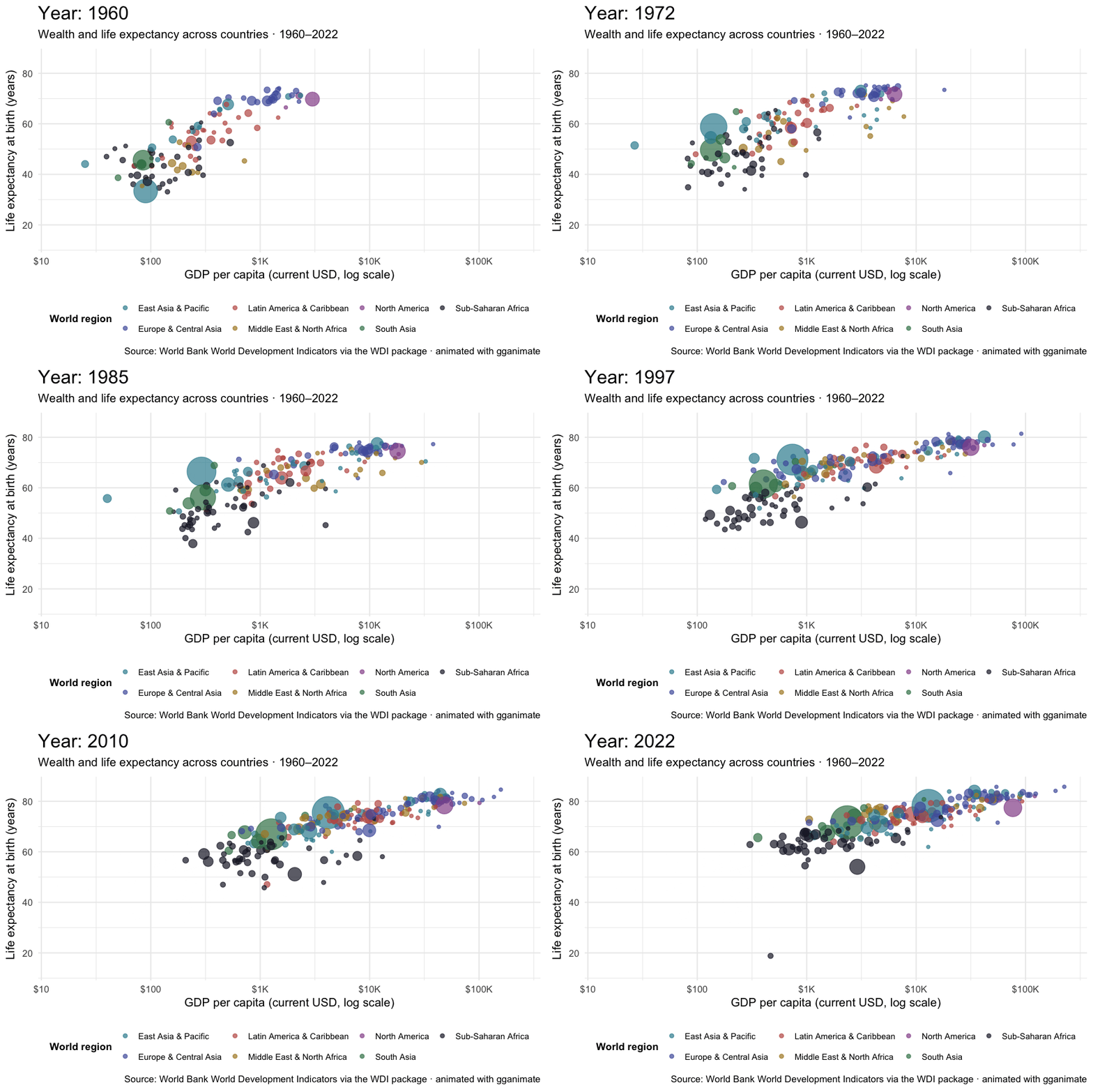
Every bubble is a country; size is population; color is region. The title at the top updates with each frame to show the current year. As the years advance, country-level life expectancy and the plotted economic measure generally move upward together.
One honest caveat about that x-axis: gdp_per_capita is in current US dollars, so part of the rightward drift across six decades is inflation and exchange-rate movement rather than real growth. Gapminder’s own animation uses constant purchasing-power-adjusted dollars for exactly this reason. Read this GIF for the shape of the motion, not as a measure of real income change.
The code that produces the animation
The animation isn’t runnable in your browser sandbox here — gganimate’s GIF renderer needs system libraries that WebR doesn’t ship. But if you have gganimate installed in your local R session, this is the full pipeline. Install both packages first — gifski is the renderer that actually writes the GIF, and it does not get installed automatically along with gganimate:
install.packages(c("gganimate", "gifski"))library(tidyverse)
library(scales)
library(gganimate)
library(here)
# wdi_trends is a companion dataset to wdi_2022, with one row per
# country-year (1960–2022 at five-year intervals). Load it the same way
# wdi_2022 was loaded earlier:
wdi_trends <- read_rds(here("data", "wdi_trends.Rds"))
# Same dataset and same chart anatomy you built in the activities —
# plus three new lines at the bottom that turn the static chart into a GIF.
wdi_trends |>
drop_na(life_expectancy, gdp_per_capita, population) |>
ggplot(aes(
x = gdp_per_capita,
y = life_expectancy,
size = population,
color = region,
group = country
)) +
geom_point(alpha = 0.7) +
scale_x_log10(labels = label_dollar(scale_cut = cut_short_scale())) +
scale_size(range = c(1.5, 18), guide = "none") +
labs(
title = "Year: {round(frame_time)}",
subtitle = "Wealth and life expectancy across countries · 1960–2022",
x = "GDP per capita (log scale, current USD)",
y = "Life expectancy at birth (years)",
color = "World region"
) +
# ↓ The animation layer ↓
transition_time(year) +
ease_aes("linear")Three new ideas to notice:
- transition_time(year) uses the year variable to animate the country observations across the 14 recorded time points. gganimate interpolates between adjacent years to create in-between frames, so the bubbles glide rather than jump. Those intermediate frames are visual interpolation — not additional yearly measurements.
group = countryis the aesthetic that tells gganimate which bubble at one time point is the same object at the next. Without it, gganimate guesses from whatever discrete aesthetics happen to be mapped — here that would be region, so bubbles would be matched within region rather than followed country by country. For a Rosling animation this line is not optional.{round(frame_time)}inside the title string is a token replaced on each frame — that’s the year ticker at the top. It needs round() because interpolated frames land between whole years and would otherwise print decimals.- ease_aes("linear") controls how the bubbles move between frames.
"linear"is the default;"cubic-in-out"and similar give the bubbles a more natural acceleration. To see the full list, type?ease_aesin your RStudio Console and press Enter — the help page opens in the Help pane.
That’s the recipe. Many ggplots can be animated by adding a transition_*() line and (optionally) an ease_aes() line — but you also need a meaningful variable to transition over and a way to match observations across frames, which usually means an explicit group aesthetic. Printing the object renders it; to save one deliberately, use animate() and then anim_save() (the animation counterpart to ggsave()). The full gganimate documentation at gganimate.com shows the other transition types: transition_states() for cycling through discrete categories, transition_reveal() for drawing a line over time, and a half-dozen more.