Reshape Wide → Long with Pew Social-Media Data
Self-paced bonus activity · practice pivot_longer() on familiar data
Welcome to a self-paced bonus activity. In the M04 pre-study you used pivot_wider() — turning long-format data into a wide table with one row per entity and a column per year. This activity does the opposite reshape: starting from a wide table you build yourself, you’ll use pivot_longer() to get to the long format ggplot2 works with most naturally, and end by building a Pew-inspired line chart of regular news use among each platform’s users. Everything happens on this page — nothing here goes into your lab notebook, and none of it is graded.
We’ll use the exact data you typed into Excel in the M03 lab — the Pew Research Center’s Social Media and News Fact Sheet: the percentage of each platform’s users who say they regularly get news there, for four platforms (Facebook, Instagram, TikTok, Reddit) across six years (2020–2025). Same numbers, new skill: last time you imported them and made one chart; this time you’ll build them from vectors and reshape them.
What you’ll do
- Build a small wide-format data frame from four vectors of Pew Research Center percentages
- Reshape it from wide to long with pivot_longer()
- Convert platform into a factor so the panels order and label cleanly
- Build a faceted line chart of regular news use among the users of four platforms
- (Bonus) Apply Pew-inspired styling to make the chart look like it could ship in the report
Estimated time: about 30–40 minutes for the core activity, or 45 with the styling extension.
Run the steps in order
The chunks on this page build on one another: Step 2 needs the vectors from Step 1, Step 3 needs pew_data, Step 4 needs pew_data_long, and Step 5 needs pew_data_long_formatted.
The browser sandbox forgets everything when you reload. If you refresh the page, or come back to this tomorrow, re-run the earlier chunks before the later ones — otherwise you’ll meet object 'pew_data' not found, which looks alarming and means nothing more than “run the chunk above.”
Step 1 · The platform vectors
At its simplest, a data frame is a collection of equal-length vectors, each one becoming a column. A vector is a sequence of values of the same type, built with the c() function (think concatenate) and named with the assignment arrow <-. Most data you meet will arrive already assembled — here we build one by hand so you can see that structure directly. So facebook <- c(54, 47, 44, 43, 48, 53) creates a numeric vector named facebook holding the percentage of Facebook users who regularly got news there in each year from 2020 through 2025.
Here are all four platform vectors, straight from the M03 lab — one value per year from 2020 through 2025. You don’t need to type them; just run the chunk to create them:
These four series are trend data from Pew Research Center’s Social Media and News Fact Sheet — the share of each platform’s users who say they regularly get news there.
Vectors are the building blocks of data frames
Each vector you just created holds one column’s worth of values. To build a data frame, you’ll combine them — naming each column as you go. That’s the next step.
Step 2 · Combine the vectors into a wide data frame
The tibble() function builds a modern data frame (a “tibble”) from vectors. The pattern is:
my_data <- tibble(
  column_one = vector_one,
  column_two = vector_two,
  ...
)
Each column_name = vector_name pair adds one column. Run the chunk below to create pew_data — a wide-format data frame with five columns: year, then one column per platform.
Why this is “wide” format
The pew_data frame has 6 rows × 5 columns. Each row is one year; the four platforms are spread across separate columns. It is compact and easy to scan as a small reference table — the shape of the reference image you read from in the M03 lab, and there is nothing wrong with it. (What you actually typed into Excel was the long version: one row per year-platform pair.)
But it does not suit the chart we want. Look at what we’re about to ask for: one panel per platform. For ggplot2 to draw a panel per platform, platform has to be something it can map — which means it has to live in a column, not be spread across four column names.
In long format we’d have one row per (year, platform) with three columns: year, platform, percentage. Same observed values, rearranged so the variable we need to map is a variable.
Step 3 · Pivot from wide to long
The verb that reshapes wide → long is pivot_longer(). You name three things:
- cols — which columns to “stack” into a single column
- names_to — the name of the new column that will hold the old column names (here, the platform names)
- values_to — the name of the new column that will hold the cell values (here, the percentages)
Here’s the operation drawn as a diagram. This is a generic illustration from another textbook, not our Pew table — but the structure is the same one you have: an identifier column on the left (for us, year), then one measurement column per category (for us, one per platform). Read it for the shape of the move, then come back and apply it to pew_data.
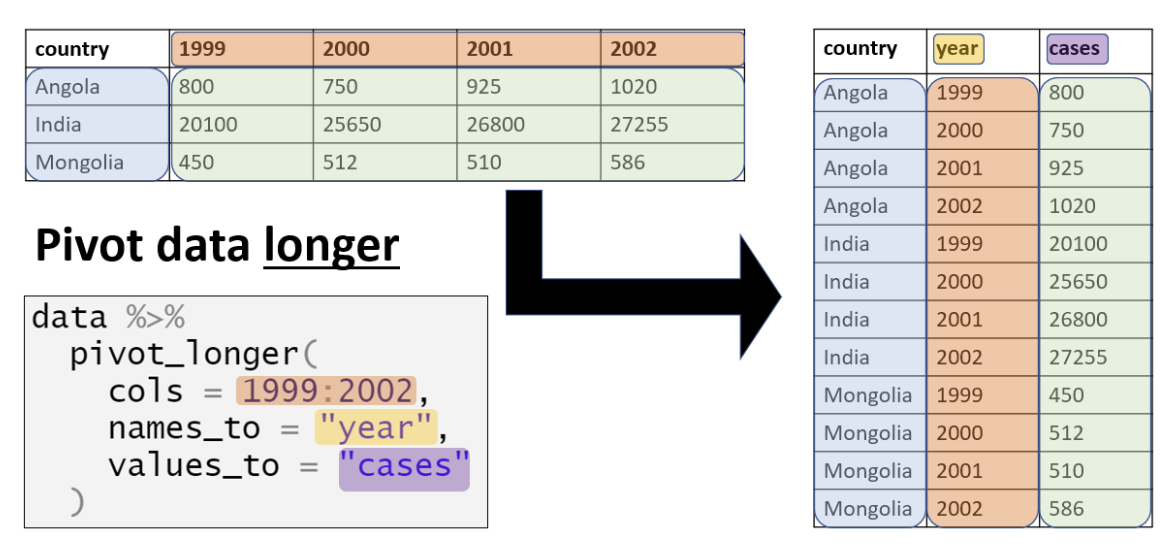
Figure from The Epidemiologist R Handbook by Applied Epi Incorporated, used under CC BY-NC-SA 4.0.
Your task: fill the three blanks in pivot_longer() so pew_data becomes a long-format frame called pew_data_long with three columns — year, platform, percentage.
Before you run it, predict the shape: how many rows and columns should the long data have?
- For cols, you want the four platform columns — so write
c(facebook, instagram, tiktok, reddit)(unquoted, the way you name columns in other tidyverse verbs). (You could equivalently write-yearto mean “everything exceptyear,” but listing the columns explicitly is clearer when you’re learning.) - For names_to, pick a sensible name for the new column that will hold the platform identifiers —
"platform"is the natural choice. - For values_to, pick a name for the new column that will hold the percentages —
"percentage"is right.
You should now see 24 rows × 3 columns — one row for each (year, platform) combination (6 years × 4 platforms). The same observed values that lived in pew_data’s 6×5 wide format, just rearranged.
The observational unit is now one year-platform combination. That is the sentence worth keeping: what does one row represent? Answer it and the row count follows — 6 years × 4 platforms = 24 rows.
Don’t assume a reshape worked — check it
A pivot that produces output has not necessarily produced the right output. Two counts confirm it:
Each platform should appear six times, once per year. Each year should appear four times, once per platform. If either count is uneven, something went wrong in the cols argument — and you would much rather find out here than three steps later when the chart looks strange.
Pause and study both
Take a look at pew_data (wide) and pew_data_long (long) again. Find where the value 22 — TikTok’s 2020 percentage — sits in each one. Same number, two layouts. Convince yourself that the observed values, and which year-platform each belongs to, are preserved exactly; only the shape changed.
Step 4 · Control panel order and labels
A small polishing step before we plot. Right now platform is a plain character vector (“facebook”, “instagram”, …). For the chart we want two things from it:
- Panels in a deliberate order — not just alphabetical.
- Properly formatted labels — so we display “TikTok,” not “tiktok.”
The verb we need is factor(), which converts a vector into a categorical variable with controlled levels (the order) and labels (the display text). The pattern is:
factor(x, levels = c(...), labels = c(...))Your task: fill the levels and labels blanks so that, inside a mutate(), platform becomes a factor whose levels are the four lowercase names and whose labels are the properly capitalized versions.
How to approach the two blanks. Both take a vector built with c(), and the pairing between them is positional — the first label renames the first level, the second renames the second, and so on. So the two vectors need the same number of entries, in matching order.
- levels takes the values exactly as they appear in the data right now, spelling and capitalization included. If you’re not sure what they are, run
pew_data_long |> distinct(platform)first and read them off. - labels takes the text you want displayed on the panels, in the same positions.
- The order you put them in is the order the panels will appear in. That’s a design decision, not a lookup — pick the sequence you want a reader to travel through, which needn’t be alphabetical.
If R complains about lengths, it’s almost always because the two vectors don’t match: four levels need exactly four labels.
(We leave year as a number — a line chart wants a real numeric axis so the six years sit at their true spacing.)
- levels is a vector of the platform values as they currently appear — the lowercase names, in the order you want the panels:
c("facebook", "instagram", "tiktok", "reddit"). - labels is a vector of the display text, in the same order:
c("Facebook", "Instagram", "TikTok", "Reddit").
Notice that platform is now listed as type <fct> (factor) instead of <chr> — and its values display as “Facebook,” “Instagram,” and so on. This step does not change which platform each row represents. It changes how R stores the platform — as a factor with an explicit category order and matching display labels — which is what gives you control over panel order and capitalization.
Step 5 · Build the line chart
You now have everything ggplot2 needs to build the Pew chart: a long-format data frame with a properly labeled platform factor. Time to plot.
The target chart has these features:
- One panel per platform (small multiples) — that’s facet_wrap(~platform)
- A line visually connecting the six annual survey estimates within each panel — geom_line()
- A point at each year — geom_point()
- Year on the x-axis, percentage on the y-axis —
aes(x = year, y = percentage)
Notice what is not in that list: any color or group mapping. Each panel already contains exactly one platform, so the six points in a panel form one line on their own. Mapping platform to color as well would encode the same information twice — the same redundancy you saw when the Rosling chart dropped color = region after faceting by region.
Your task: write the whole ggplot2 call from scratch — pipe pew_data_long_formatted in, map year and percentage to the axes, add the line and point layers, and facet by platform. Try it yourself first; if you get stuck, the 💡 Hint has a scaffold.
Three reminders from M03:
- Map the basics in aes().
x = year,y = percentage. Each panel is already one platform, so you need neither acolornor agroupmapping — a single line color keeps the focus on the reshape. - Layers add with
+. geom_line(), then geom_point(). - Small multiples with facet_wrap().
facet_wrap(~platform, ncol = 2)gives a 2 × 2 grid, which leaves room for readable year labels.
Here’s a scaffold — fill in the underscores:
Here’s the same chart with a Pew-inspired visual treatment: a rust line color, hollow circle markers, and percent-formatted axis labels. You don’t need to type this — just read and run.
One design choice worth naming, because M03 just spent a class on it: the y-axis starts at zero. It would be tempting to zoom to 20–60% and make the year-to-year swings look bigger, and a line chart does not always need a zero baseline — but truncating an axis magnifies change, and if you do it you have to say so. Here the full range (22% to 55%) fits comfortably above zero, so there is nothing to gain from cropping and one honesty problem to avoid.
What you just did
Three things to carry forward
pivot_longer()is the wide → long verb. Name the columns to stack (cols), the destination for the old column names (names_to), and the destination for the cell values (values_to). It’s the mirror of pivot_wider(), which you met in the M04 pre-study.- Long format is often the convenient shape for grouped analysis and plotting. When the category you want to map — here, platform — lives in its own column, mapping it to a color, a group, or a facet is one line of code. Wide format stays useful for other jobs: presentation tables, and direct comparisons between two named columns.
- Factors give you control over order and labels. Converting platform to a factor let you control how the panels are arranged and made the labels read like a clean communication figure (TikTok, not tiktok).
Back to the M04 pre-study: open it again →
Want the conceptual version? The M04 Module works through both pivots in full, including when each shape is the right one: Part 4 · Reshaping and combining tables →