library(tidyverse)
library(here)
library(gt)
library(gtsummary)
library(labelled)Probability and Probability Distributions
Learning Objectives
By the end of this Module, you should be able to:
Probability foundations
- Define probability as a measure of uncertainty ranging from 0 (impossible) to 1 (certain)
- Explain the data generating process (DGP) and distinguish probability (forward reasoning) from statistics (backward reasoning)
- Apply the complement, addition, and multiplication rules for computing event probabilities, and evaluate when independence holds
- Interpret joint, marginal, and conditional probabilities from a contingency table
Random variables and distributions
- Define random variables and distinguish between their expected value \(E(X)\) and variance \(\text{Var}(X)\)
- Describe what a probability distribution is and distinguish discrete (PMF) from continuous (PDF / CDF) distributions
- Describe key features of the normal distribution and apply the Empirical Rule
- Check whether a variable is approximately normal before applying the normal toolkit
The R toolkit
- Use dbinom() in R to calculate binomial probabilities, and recognize that this is the same machinery used in hypothesis testing
- Use pnorm() and qnorm() in R to answer probability questions about normally distributed variables
- Interpret z-scores as standardized distances from the mean
The bridge to inference
- Distinguish population parameters from sample statistics using standard notation (\(\mu\) vs. \(\bar{x}\), \(\sigma\) vs. \(s\), \(p\) vs. \(\hat{p}\))
- Name the Law of Large Numbers and Central Limit Theorem as the bridges from M06 (probability) to M07 (confidence intervals) and M08 (hypothesis testing)
Overview
Where this fits — the Part 2 inference arc
Modules 6–9 are one continuous story: how we reason from a sample back to the world. Each module is a single step in that arc.
- M06 · Probability — what outcomes should we expect under a given data-generating process? · ← you are here
- M07 · Confidence intervals — how much does a sample statistic wobble from one sample to the next?
- M08 · The logic of NHST — how surprising is our statistic if a specific null value were true?
- M09 · Conducting tests — which standard test matches this design, variable type, and research question?
Every time a scientist draws a conclusion from data, they are making a probability statement — whether they say so explicitly or not. Probability is the language for reasoning about uncertainty. It allows us to describe what we expect to observe under a given data-generating process. Statistics builds on this to move from observed data to conclusions about the world. Without it, data analysis is just description; with it, we have a logic for turning observations into conclusions.
This Module is where that logic begins. We will build up the core concepts using a dataset of 150 news articles — some from legitimate outlets, some fabricated. The guiding question: before reading a single word of an article, can surface features like an exclamation mark in the title or ALL CAPS words help us estimate whether it is fake?
By the end, you will be able to compute probabilities of events, combine them according to logical rules, describe the shape of a distribution mathematically, and use R’s built-in functions to make precise numerical statements about normally distributed data. These skills are the foundation of everything in Part 2 of the course — every confidence interval and every hypothesis test ahead is built from the probability machinery you learn here.
A map of this Module
This Module makes three moves:
- Learn how probabilities combine — the complement, addition, and multiplication rules, and the conditional probabilities that power every cross-tab you will ever read.
- Learn how probabilities are organized into distributions — the PMF, PDF, and CDF vocabulary that applies to every distribution you will ever meet.
- Meet the two distributions that drive the rest of the course — the binomial, for counts of yes/no events, and the normal, for continuous measures.
Core for PSY 652: conditional probability, binomial probabilities, normal probabilities, and z-scores. Preview only: the binomial formula and the formal Central Limit Theorem — recognize these now, as later Modules put them to work. And for context: Bayes’ theorem and the Bayesian view of probability — a second perspective this course contrasts with, but does not itself develop.
Packages used in this module
Meet the data
fake_news · 150 observations · 5 variables · bayesrules package
These 150 news articles were posted to Facebook in September 2016, in the run-up to the U.S. presidential election, and each carries a veracity rating from professional fact-checkers. They come from FakeNewsNet, a public repository pairing news content with such ratings (Shu et al., 2018); the bayesrules package curates this 150-article sample and adds the text features used below. We’ll consider five of the variables in this Module:
- title character — The article’s headline as published
- type factor — Whether the article was classified as real or fabricated news
- exclamation factor — Whether the headline contains an exclamation mark
- caps_pct numeric — Percentage of words in the headline written in all capitals
- negative numeric — Emotional negativity score for the headline, from a sentiment lexicon
Full codebook for fake_news — values, levels, missingness, and how the file was prepared.
We load the pre-prepared .Rds file, which contains the curated 150-article sample with cleaned variable names. We then use select() to keep only the five variables this Module uses.
fake_news <- read_rds(here("shared_data", "fake_news.Rds"))

# Select variables relevant to this Module
fake_news <- fake_news |>
  select(type, exclamation, caps_pct, negative, title) |>
  mutate(
    type = fct_relevel(type, "Fake", "Real"),
    exclamation = fct_relevel(exclamation, "Yes", "No")
  )

fake_news |> head()
Probability: reasoning under uncertainty
Before you read a single word of a news article, what is the probability it is fake?
Imagine putting all 150 of these articles in a box and drawing one out at random, every article equally likely. Then the answer is exactly 40% — because 60 of the 150 are fake. That number — \(P(\text{Fake}) = 0.40\) — is a probability: a measure of uncertainty on a scale from 0 to 1.
The box of 150 — our working population
Every probability in this Module is computed inside that box. These 150 articles are the sample space: finite, fully observed, and equally likely to be drawn. That makes the arithmetic exact rather than approximate — \(P(\text{Fake}) = 60/150 = 0.40\), full stop.
What we are not claiming is that 40% is the true prevalence of fake news in some broader population of news articles. These 150 were curated, not drawn at random from the world’s news. Treating them as a working population is a teaching device that lets you learn the probability rules on numbers you can verify by counting — and it is worth noticing, because from M07 onward the whole game becomes reasoning from a sample to a population you cannot see.
\[0 \leq P(A) \leq 1\]
A probability of 0 means impossible. A probability of 1 means certain. Everything in between reflects partial certainty: \(P(\text{heads}) = 0.50\) says a fair coin lands heads half the time in the long run; \(P(\text{rain}) = 0.70\) says that on days like today, it rains about 70% of the time.
The “long run” framing is important. A probability of 0.40 does not mean that exactly 40 of every 100 randomly selected articles will be fake — any particular batch of 100 might yield 37 or 44. What it means is that over many such batches, the proportion converges toward 0.40. This is the frequentist interpretation of probability: probabilities describe what happens when a chance process is repeated many times under stable conditions. This interpretation makes most sense when we can imagine repeating the same process under similar conditions — drawing new random samples from the same population, flipping the same coin again, running the same experiment with new participants.
The data generating process
To analyze data well, it helps to think about where it came from.
The full system of causes, conditions, and random variation that produces the data you observe is called the data generating process (DGP). Think of baking cookies. The cookie you pull from the oven — your data — is the product of a whole process: the recipe, the oven temperature, the humidity, how long you mixed the batter, and chance. If you want to understand why your cookies turned out the way they did (or how to make better ones), you have to think about the process, not just the result.
The fake_news articles are no different. Each one is the end product of a DGP that includes editorial decisions about what counts as newsworthy, the incentives that make sensationalism more clickable than accuracy, platform algorithms that amplify whatever gets engagement, and the social environment that determines what spreads. The features we can observe — exclamation marks, ALL CAPS, emotional language — are traces of that underlying process. Our job is to work backward from those traces to learn something about the process.
Thinking carefully about the DGP pays dividends in two concrete ways. First, it guides your analysis choices. If fake and real articles in this dataset come from fundamentally different types of outlets — different ownership, different audiences, different editorial standards — then a difference in exclamation-mark rates might reflect outlet type, not a direct signal of deception. That possibility is invisible in the data alone. It only surfaces when you think about the process that generated the data. Second, it shapes what your conclusions actually mean. Discovering that exclamation marks are more common in fake articles tells you these things co-occur — but whether sensational punctuation causes anyone to believe misinformation, or whether it is merely a symptom of the outlets that produce fake news, cannot be resolved by counting. Researchers who skip the DGP step often end up with statistically rigorous answers to questions no one actually asked.
Probability and statistics: two directions
Understanding the DGP clarifies the relationship between probability and statistics — two disciplines that move in opposite directions:
Probability starts with the DGP and asks what data to expect.
“If 40% of articles are fake and we randomly select 10, how likely is it that exactly 4 are fake?”Statistics starts with data and asks what the DGP looks like.
“We observed 4 fake articles in our sample of 10. What does that tell us about the true rate of fake news?”
Probability moves forward — from the world to the data. Statistics moves backward — from the data to the world. Both are essential. This Module focuses primarily on probability; the rest of the course applies those tools to do statistics.
Theoretical vs. empirical probability
Probabilities can be computed two ways.
Theoretical probability comes from logical reasoning about the DGP. For a fair coin, \(P(\text{heads}) = 1/2\) by definition — no data required.
Empirical probability comes from observed data. In the fake_news dataset, 60 of 150 articles are fake, giving us \(\hat{p}(\text{Fake}) = 60/150 = 0.40\). The hat (\(\hat{p}\), read “p-hat”) signals that this is an estimate — a summary of one particular sample. We can verify this directly:
fake_news |>
  count(type)
\[\hat{p}(\text{Fake}) = \frac{60}{150} = 0.40 \qquad \hat{p}(\text{Real}) = \frac{90}{150} = 0.60\]
A different random sample of 150 articles from the same sources might yield 57 or 63 fake articles and a slightly different estimate. That is why the hat matters: \(\hat{p}\) is what this sample says; the unknown underlying \(p\) is what we are trying to learn about. As sample size grows, empirical estimates tend to converge on the true value — a result known as the Law of Large Numbers (LLN). A related but deeper result — the Central Limit Theorem (CLT) — describes the shape of the distribution of sample statistics as \(n\) grows. Both appear throughout the rest of the course; the CLT gets its formal treatment in M07.
For the rest of this Module, we will treat the 150-article sample as if it were the full population so we can focus on probability itself. Where it matters (starting in M07), the distinction between sample estimate and population truth becomes central.
Rules of probability
Probability has a small set of rules — logical constraints that any valid probability assignment must satisfy. They are the arithmetic of uncertainty, and they tell us how probabilities of simple events combine to give probabilities of more complex ones.
Why does this matter? Because nearly every inferential tool you will meet later in this course is built from these rules. A p-value, a confidence interval, and the sampling distributions behind them are all, at bottom, statements about the probability of events — assembled from exactly the rules below. The same rules govern the everyday reasoning of research: the chance that at least one of many tests raises a false alarm, the probability that two findings co-occur, and how much a positive screening test should really change your belief that someone has a condition. Learn this small set now, and the inference that follows will feel less like memorized recipes and more like arithmetic you can rebuild from scratch.
The complement rule
The question we’re answering
If we know how likely an event is, how likely is it that the event does not happen?
The simplest rule: the probability that event A does not happen equals one minus the probability that it does.
\[P(\text{not A}) = 1 - P(A)\]
This must be true because either A happens or it does not — the two possibilities are exhaustive and mutually exclusive, so their probabilities sum to 1.
In our dataset: \(P(\text{Fake}) = 0.40\), so \(P(\text{Real}) = 1 - 0.40 = 0.60\). Of course, with a binary variable we can read both values directly from the data. The complement rule becomes genuinely useful when one probability is harder to calculate than the other. If you want to know the probability that at least one of 10 randomly selected articles is fake, it is much easier to compute the probability that all 10 are real — \((0.60)^{10} \approx 0.006\) (assuming each selection is independent, as in sampling with replacement) — and subtract from 1: \(P(\text{at least one Fake}) = 1 - 0.006 \approx 0.994\).
The diagram below makes the complement concrete — and it shows the two kinds of number side by side. Each region carries both its raw count (how many articles land there) and its probability (that count divided by the 150-article sample space). The bounding rectangle is the sample space: all 150 articles, with total probability 1. Inside the circle is event \(A\) = “Is Fake” — a count of 60 articles, which becomes a probability once we divide by the whole: \(P(\text{Fake}) = 60/150 = 0.40\). Outside the circle is the complement, \(P(\text{not Fake})\) — the remaining 90 articles, or 0.60. That is the key distinction to carry forward: a count tallies how many; a probability re-expresses that count as a share of the whole, always between 0 and 1. Because the circle and everything outside it together fill the rectangle, their two probabilities sum to exactly 1.
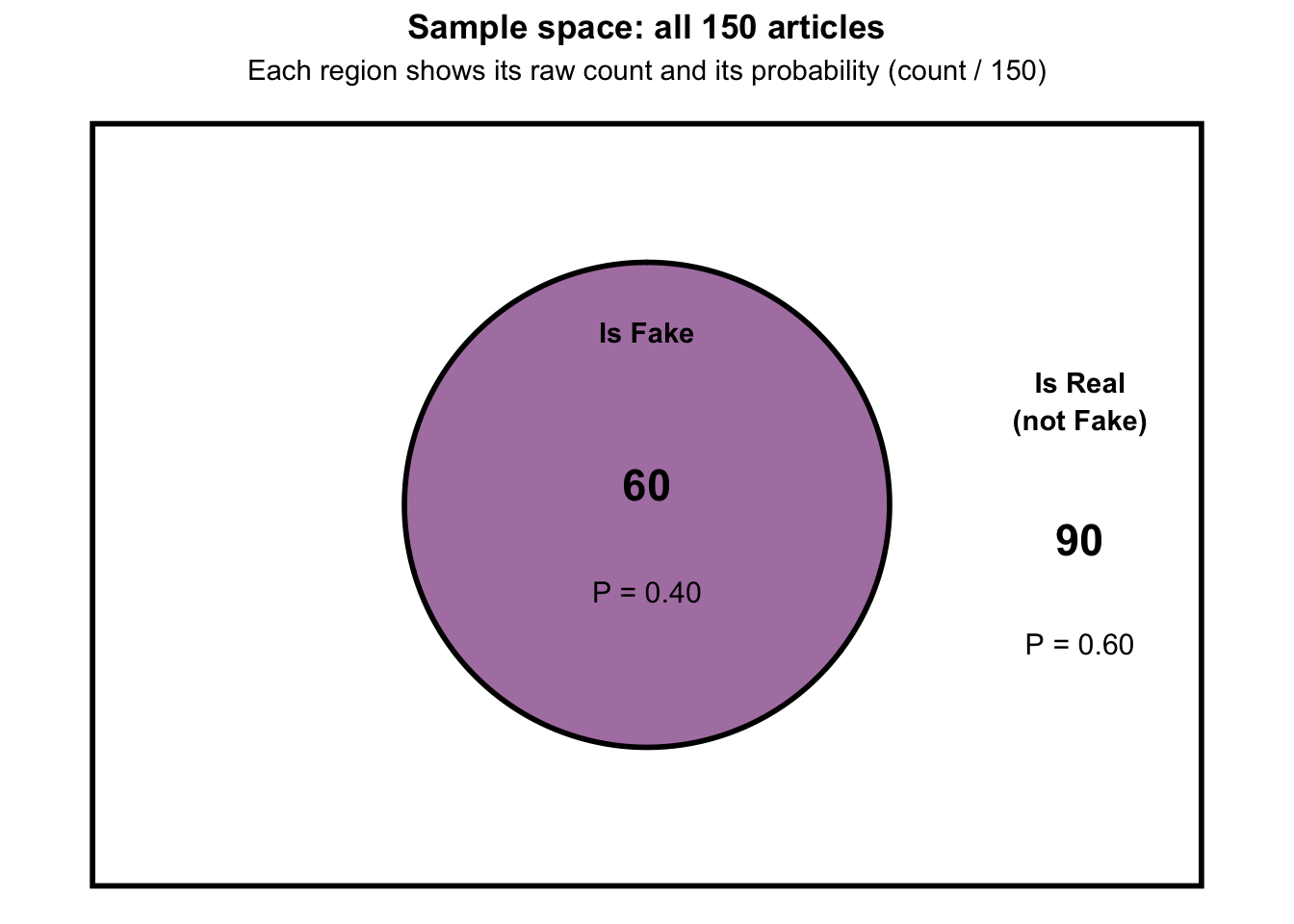
This is a one-variable picture. Once we introduce a second variable — whether the title has an exclamation mark — each article must be placed relative to two events simultaneously, and the picture becomes a Venn diagram with two overlapping circles. That is the subject of the next section.
The addition rule
The question we’re answering
What is the probability that event \(A\) or event \(B\) occurs?
When events are mutually exclusive — they cannot both happen to the same observation — probabilities simply add:
\[P(A \text{ or } B) = P(A) + P(B)\]
An article can only be fake or real, never both. So:
\[P(\text{Fake or Real}) = P(\text{Fake}) + P(\text{Real}) = 0.40 + 0.60 = 1.0\]
That is guaranteed to be 1 — every article is one or the other.
When events can overlap — both can apply to the same observation — you must subtract the overlap to avoid double-counting:
\[P(A \text{ or } B) = P(A) + P(B) - P(A \text{ and } B)\]
A Venn diagram makes the logic concrete. Imagine two overlapping circles — one for each event. Adding the two circle areas counts the overlap region twice, once as part of each circle. Subtracting \(P(A \text{ and } B)\) removes that double count.
Let’s see this on the fake_news data. Let \(A\) = “the article is Fake” and \(B\) = “the title has an exclamation mark.” Here is where every article falls:
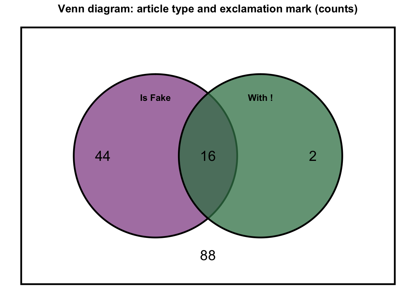
Reading the four regions:
- Fake only (no exclamation mark): 44 articles
- Both Fake and with an exclamation mark (the overlap): 16 articles
- With exclamation only (Real): 2 articles
- Neither (Real, no exclamation): 88 articles
Computing each piece:
\[P(\text{Fake}) = \frac{n_\text{Fake only} + n_\text{both}}{150} = \frac{44 + 16}{150} = \frac{60}{150} = 0.40\]
\[P(\text{with exclamation}) = \frac{n_\text{both} + n_\text{excl only}}{150} = \frac{16 + 2}{150} = \frac{18}{150} = 0.12\]
\[P(\text{Fake AND exclamation}) = \frac{n_\text{both}}{150} = \frac{16}{150} \approx 0.107\]
Applying the addition rule:
\[P(\text{Fake OR exclamation}) = 0.40 + 0.12 - 0.107 \approx 0.413\]
Sanity check: the circle regions together contain \(44 + 16 + 2 = 62\) articles, and \(62/150 \approx 0.413\) — the same answer. Without the subtraction, we would double-count the 16 articles sitting in the overlap.
The multiplication rule
The question we’re answering
What is the probability that event \(A\) and event \(B\) both occur?
When events are independent — knowing one tells you nothing about the other — their joint probability is the product of their individual probabilities:
\[P(A \text{ and } B) = P(A) \times P(B)\]
If 40% of articles are fake and you randomly select two articles independently (i.e., the type of the first tells you nothing about the second), the probability that both are fake:
\[P(\text{Fake}_1 \text{ and } \text{Fake}_2) = 0.40 \times 0.40 = 0.16\]
You have already put this rule to work. Back in the complement section, to find the chance that at least one of ten randomly selected articles is fake, we first computed the probability that all ten are real: \(0.60^{10} \approx 0.006\). Multiplying \(0.60\) by itself ten times is nothing more than the multiplication rule for independent events, extended from two draws to ten: \(P(A_1 \text{ and } \cdots \text{ and } A_{10}) = P(A_1) \times \cdots \times P(A_{10})\).
Notice how much that calculation rests on a single word — independently. It is worth pausing on, because independence is one of the most consequential, and most frequently violated, assumptions in behavioral research.
Independence in behavioral research
Independence is not just a technical condition — it determines which analyses are valid. Two individuals drawn independently in a simple random sample have approximately independent outcomes. But two siblings, two children in the same classroom, two patients sharing a therapist, or two partners in a dyad are not independent — they share environmental influences that make their outcomes correlated. With the positive within-cluster dependence common in behavioral data, treating dependent observations as if they were independent overstates how much information you actually have, so standard errors come out too small — giving confidence intervals that are too narrow and hypothesis tests that reject the null too often. (Both of those terms arrive properly in M07. For now the shape of the problem is enough — pretending you have more independent information than you do makes every result look more certain than it is.)
Note that “it’s a big national survey” is not a guarantee of independence. Most large surveys — NSDUH included — use clustered, multistage designs precisely because simple random sampling of a whole country is impractical. That is exactly why NSDUH ships vestr and verep alongside its weights, and why M05 and the M07 lab reach for the survey package rather than treating the rows as independent draws. Multilevel models and clustered standard errors are the tools built to handle non-independence properly; they are the subject of follow-up methods courses (PSY 653).
Back to our two events. When events are dependent — when knowing one changes the probability of the other — the simple product no longer holds, and we account for the dependence directly:
\[P(A \text{ and } B) = P(A) \times P(B \mid A)\]
Here, \(P(B \mid A)\) is the conditional probability of B given A — the probability of B evaluated only among cases where A already occurred. We develop conditional probability in the next section, then return at its end to close this loop with a worked example.
Conditional probability
The question we’re answering
Once we know that one event has occurred, how does that change the probability of another?
Does knowing an article has an exclamation mark in its title change how likely you think it is to be fake?
Before seeing any features, there is a 40% chance that any randomly selected article is fake — that is our baseline. Conditional probability is how we update that estimate when we learn something new.
The intuition is straightforward: among cases where A is true, what fraction also have B? If you restrict your attention only to articles with exclamation marks, what proportion of those are fake? We write this as \(P(\text{Fake} \mid \text{exclamation})\) — read “the probability of fake given exclamation.” The vertical bar means “given” and signals that we have restricted attention to a specific subset.
Formally:
\[P(B \mid A) = \frac{P(A \text{ and } B)}{P(A)}\]
The denominator \(P(A)\) defines the smaller world we are now working within. The numerator counts, among the cases where A is true, how many also have B. Dividing gives the proportion of B within that restricted world.
The key insight: conditioning on information reshapes your probability space. Before conditioning, we look at all 150 articles. After conditioning on “has an exclamation mark,” we look only at the subset with exclamatory titles and ask what fraction of those are fake. The 40% baseline no longer applies.
The question now: do fake articles use more exclamation marks in their titles than real articles? Sensationalist punctuation is a plausible signal — a headline designed to provoke rather than inform. We will explore this through the joint distribution of type and exclamation.
A 2×2 contingency table
In M05 you built contingency tables like this one. Recall the anatomy: a contingency table — also called a cross-tabulation — displays two categorical variables at once. The rows represent one variable, the columns the other, and each interior cell counts the observations in that specific combination; the row and column totals (the margins) summarize each variable on its own. Back then you read these tables two ways — first as raw counts, then as percentages, choosing a row, column, or cell denominator depending on the question you were asking.
This Module reads the very same kind of table through the lens of probability. The arithmetic does not change — a probability, like a percentage, is just a part divided by a whole — but the interpretation is exactly what we are here to build. The table below cross-tabulates type (is the article fake or real?) and exclamation (does the title have an exclamation mark?). Each interior cell shows its count and its joint probability — the count divided by the total of 150 articles, which is M05’s cell percent read as a probability. The row and column totals give the marginal probabilities. And the row and column percentages you already know will return, a few sections from now, as conditional probabilities.
| Exclamation mark |
Article type
|
||
|---|---|---|---|
| Fake | Real | Total | |
| With "!" | 16 (0.107) |
2 (0.013) |
18 (0.120) |
| No "!" | 44 (0.293) |
88 (0.587) |
132 (0.880) |
| Total | 60 (0.400) |
90 (0.600) |
150 (1.0) |
What the numbers mean
The contingency table gives us three distinct types of probability simultaneously.
Marginal probabilities come from the row and column totals, divided by the grand total. They describe each variable on its own, ignoring the other. \(P(\text{Fake}) = 60/150 = 0.40\) is a marginal probability — it does not depend on whether the article has an exclamation mark.
Joint probabilities come from a single interior cell divided by the grand total. The cell at the intersection of “Fake” and “With !” counts articles that are simultaneously fake and have an exclamation mark. Divide that cell count by 150 to get \(P(\text{Fake AND exclamation})\). (This is the same overlap region you saw in the Venn diagram in the addition-rule section.)
Conditional probabilities restrict the denominator to a row or column. Instead of dividing by 150 (the grand total), divide by the total in one row:
\[P(\text{Fake} \mid \text{exclamation}) = \frac{\text{count: Fake AND exclamation}}{\text{count: all articles with exclamation}}\]
The denominator here is the total in the “With !” row — only the articles with exclamation marks. The result answers: of the articles that have exclamation marks, what fraction are fake? Comparing this to \(P(\text{Fake} \mid \text{no exclamation})\) — the same calculation in the “No” row — tells us whether exclamation marks are informative.
Three types of probability from a contingency table
| Type | Where it comes from | What it ignores |
|---|---|---|
| Marginal | Row or column total ÷ grand total | The other variable entirely |
| Joint | A single interior cell ÷ grand total | Neither — both variables matter |
| Conditional | A single interior cell ÷ row or column total | Everything outside that row/column |
Quick intuition:
- Marginal → look at one variable, ignore the other
- Joint → both variables are true simultaneously
- Conditional → restrict your world to one subset, then ask about the other
Computing cross tabulations in R
The table above is a polished graphic of a cross-tabulation. In practice, you will build contingency tables yourself in R using tbl_cross() from the gtsummary package — the same function you met in M05, where you used it to describe two categorical variables with row, column, and cell percents. Here we build the very same kind of table, but read those percents through a new lens: as conditional, marginal, and joint probabilities. Same tool, deeper meaning. The output looks simpler than the graphic version — no custom colors or font sizing — but the result is the same.
Note: tbl_cross() reports probabilities as percentages, rounded for display. The 16 (11%) in the Fake × With ! (i.e., Exclamation mark equals “Yes”) cell is the joint probability \(P(\text{Fake AND exclamation}) = 16/150 \approx 0.107\), shown as a rounded 11%. Divide any displayed percentage by 100 to get the decimal probability.
fake_news |>
  set_variable_labels(
    type = "Article type",
    exclamation = "Exclamation mark in title?"
  ) |>
  tbl_cross(
    row = exclamation,
    col = type,
    percent = "cell"
  )
Article type
|
Total | ||
|---|---|---|---|
| Fake | Real | ||
| Exclamation mark in title? | |||
| Yes | 16 (11%) | 2 (1.3%) | 18 (12%) |
| No | 44 (29%) | 88 (59%) | 132 (88%) |
| Total | 60 (40%) | 90 (60%) | 150 (100%) |
Two functions build this table. set_variable_labels() (from the labelled package) attaches the descriptive labels that appear as the table’s row and column headers — so the exclamation column displays as “Exclamation mark in title?” without our having to rename the variable itself. And tbl_cross() (from gtsummary) builds the contingency table itself: row and col name the two variables (use them exactly as they appear in the data — exclamation and type); the margin totals are labeled Total by default, which you can change with the margin_text argument; and percent sets the denominator — the argument that matters most here, because it decides which probability you are reading:
percent = |
Denominator | Probability type |
|---|---|---|
"cell" |
Grand total (n = 150) | Joint probabilities |
"row" |
Row total | Conditional on row variable |
"column" |
Column total | Conditional on column variable |
Computing conditional probabilities in R
Where are we going with this? A conditional probability asks about one variable given the value of another — given that a title carries an exclamation mark, how likely is the article to be fake? We will reach that number two ways: first “by hand” with dplyr, so you can see exactly which total we divide by, and then in a single line with tbl_cross(). Both routes land on the identical answer — doing it by hand first is what makes the one-line shortcut make sense.
Start with the by-hand version. First we tally the four cell counts with count() — how many articles fall in each exclamation × type combination. Then we turn those counts into probabilities three times over, changing only what we divide by each time:
- divide by the grand total (150) → the joint probability, \(P(\text{exclamation and type})\);
- divide by each row total (grouping by exclamation) → the conditional probability \(P(\text{type} \mid \text{exclamation})\);
- divide by each column total (grouping by type) → the conditional probability \(P(\text{exclamation} \mid \text{type})\).
The denominator is the only thing that changes from column to column — and it is exactly what decides which probability you are reading.
fake_news |>
  count(exclamation, type) |>                 # the four cell counts
  mutate(cell_prob = round(n / sum(n), 2)) |> # ÷ grand total (150)  → joint P(exclamation and type)
  group_by(exclamation) |>
  mutate(row_prob = round(n / sum(n), 2)) |>  # ÷ row total          → P(type | exclamation)
  group_by(type) |>
  mutate(col_prob = round(n / sum(n), 2)) |>  # ÷ column total       → P(exclamation | type)
  ungroup()
The row_prob column already answers our motivating question. Among articles with an exclamation mark, 89% are fake — \(P(\text{Fake} \mid \text{exclamation mark}) = 0.89\); among those without one, only 33% are — \(P(\text{Fake} \mid \text{no exclamation mark}) = 0.33\). One punctuation character more than doubles the probability relative to the unconditional 40% baseline, while its absence trims it to 33%, 7 points below.
The same counts, three denominators
Every probability in this section is built from the same four cell counts — the by-hand table computes all three types at once, and each tbl_cross() simply isolates one of them by changing percent. Follow the 16 articles that are both Fake and carry an exclamation mark:
| By-hand column | Divide 16 by… | Probability | Same value in tbl_cross() |
|---|---|---|---|
| cell_prob | 150 (grand total) | \(P(\text{Fake and exclamation}) \approx 0.11\) | percent = "cell" — the joint table above |
| row_prob | 18 (the exclamation-mark row) | \(P(\text{Fake} \mid \text{exclamation}) = 0.89\) | percent = "row" — below |
| col_prob | 60 (the Fake column) | \(P(\text{exclamation} \mid \text{Fake}) = 0.27\) | percent = "column" — below |
Same 16 articles every time — only the denominator changes. Joint, row-conditional, and column-conditional probabilities are three different answers, from three different denominators, to three different questions about one set of counts.
Those row_prob and col_prob columns are exactly what tbl_cross() produces in a single line — no manual grouping required. Setting percent = "row" reproduces the row_prob column, dividing each cell count by its row total rather than the grand total:
fake_news |>
  set_variable_labels(
    type = "Article type",
    exclamation = "Exclamation mark in title?"
  ) |>
  tbl_cross(
    row = exclamation,
    col = type,
    percent = "row"
  )
Article type
|
Total | ||
|---|---|---|---|
| Fake | Real | ||
| Exclamation mark in title? | |||
| Yes | 16 (89%) | 2 (11%) | 18 (100%) |
| No | 44 (33%) | 88 (67%) | 132 (100%) |
| Total | 60 (40%) | 90 (60%) | 150 (100%) |
Here is how to read the table. Each row sums to 100% — that is your “given.” The “No” row contains the 132 articles with no exclamation mark; within that group, 33% are fake and 67% are real. The “Yes” row contains only the 18 articles with an exclamation mark; within that group, 89% are fake and just 11% are real. The percentages in parentheses are conditional probabilities: the 89% in the “Yes / fake” cell is \(P(\text{Fake} \mid \text{exclamation mark})\) and the 33% in the “No / fake” cell is \(P(\text{Fake} \mid \text{no exclamation mark})\). One table, two conditional probabilities, side by side.
Switching to percent = "column" reproduces the col_prob column — it flips the conditioning, giving \(P(\text{exclamation} \mid \text{Fake})\) and \(P(\text{exclamation} \mid \text{Real})\), the probability of having an exclamation mark given the article type:
fake_news |>
  set_variable_labels(
    type = "Article type",
    exclamation = "Exclamation mark in title?"
  ) |>
  tbl_cross(row = exclamation, col = type, percent = "column")
Article type
|
Total | ||
|---|---|---|---|
| Fake | Real | ||
| Exclamation mark in title? | |||
| Yes | 16 (27%) | 2 (2.2%) | 18 (12%) |
| No | 44 (73%) | 88 (98%) | 132 (88%) |
| Total | 60 (100%) | 90 (100%) | 150 (100%) |
Here the columns sum to 100% — article type is now the “given.” Reading down the fake column: 73% of fake articles have no exclamation mark and 27% do. Reading down the real column: 98% of real articles have no exclamation mark and only 2% do. So \(P(\text{exclamation} \mid \text{Fake}) = 0.27\) and \(P(\text{exclamation} \mid \text{Real}) = 0.02\).
Notice that \(P(\text{Fake} \mid \text{exclamation})\) and \(P(\text{exclamation} \mid \text{Fake})\) are different quantities. The first asks: given an exclamation mark, how likely is the article to be fake? The second asks: given the article is fake, how likely is the title to have an exclamation mark? These can be — and often are — very different numbers.
The multiplication rule, revisited
When we introduced the multiplication rule earlier, we hit a wall for dependent events:
\[P(A \text{ and } B) = P(A) \times P(B \mid A)\]
We could write the formula, but we could not yet compute \(P(B \mid A)\). Now we can. Let’s close the loop.
What is the probability that a randomly selected article is both Fake and has an exclamation mark? We have every piece we need:
- \(P(\text{Fake}) = 60/150 = 0.40\) (marginal — row total for Fake, divided by the grand total)
- \(P(\text{exclamation} \mid \text{Fake}) = 16/60 \approx 0.27\) (conditional — of the 60 Fake articles, 16 have exclamation marks)
Multiplying:
\[P(\text{Fake AND exclamation}) = P(\text{Fake}) \times P(\text{exclamation} \mid \text{Fake}) = \frac{60}{150} \times \frac{16}{60} = \frac{16}{150} \approx 0.107\]
Sanity check against the contingency table: the joint cell shows 16 articles that are both Fake and carry an exclamation mark, so \(P(\text{Fake AND exclamation}) = 16/150 \approx 0.107\) computed directly. The two paths agree — the multiplication rule always lines up with the direct joint-cell reading. The value of going through the rule is that it reveals the structure of the joint probability as a product of a marginal and a conditional.
The rule is also symmetric — the order of conditioning does not matter:
\[P(A \text{ and } B) = P(A) \times P(B \mid A) = P(B) \times P(A \mid B)\]
Either factoring yields the same joint probability. In practice, use whichever form matches the information you already have.
Intuition — the price of admission. To land in the overlap (Fake and exclamation), an article must first be Fake (probability 0.40), and then, given that it is Fake, also have an exclamation mark (conditional probability 0.27). The marginal is the price of admission to the first event; the conditional is the price of admission to the second, given you are already in the first. Multiplied together, they give the probability of being in both simultaneously.
Two views of probability: frequentist and Bayesian
Conditional probability has a natural interpretation as belief updating. We started with \(P(\text{Fake}) = 0.40\) — our best guess before seeing any features. Then we learned something new: the title has an exclamation mark. Because exclamation marks are more common in fake articles, that evidence raised our estimate — from 40% all the way up to 89%. We revised a belief in light of evidence.
That small move points to a deeper divide in how statisticians think about probability itself. Frequentists define a probability as a long-run frequency — the proportion of times an event would occur if you repeated the same process indefinitely (the interpretation we met at the start of this Module). Bayesians treat a probability as a degree of belief — how confident you are in a claim, updated as evidence accumulates.
But be careful what the fake-news calculation does and does not illustrate. Updating \(P(\text{Fake}) = 0.40\) to \(P(\text{Fake} \mid \text{exclamation}) = 0.89\) is not distinctively Bayesian — it is ordinary conditional probability, and Bayes’ theorem is a probability identity that frequentists and Bayesians both use freely. The 0.40 here is an empirical base rate computed from the 150 articles, not a prior distribution expressing belief about an unknown parameter.
What makes statistical inference Bayesian is something further: representing uncertainty about unknown parameters with probability distributions, and updating a prior distribution into a posterior distribution after seeing data. That is the step this Module does not take.
This course focuses on frequentist methods. Confidence intervals, p-values, and the sampling-distribution logic beneath them all rest on the long-run-frequency view, and we will not develop the full Bayesian framework here — it is a course in its own right. But the distinction is worth carrying with you, because the two views answer subtly different questions, and that difference surfaces at a few key moments: most clearly when we contrast a frequentist confidence interval with a Bayesian credible interval in M07, and when we see why a p-value is not the probability that a hypothesis is true in M08. For now, it is enough to know that two coherent views of probability exist — and that the conditional-probability rule you just used is the machinery Bayesian inference builds on, not Bayesian inference itself.
Bayes’ theorem
For those interested, rearranging the formula for conditional probability yields Bayes’ Theorem:
\[P(\text{Fake} \mid \text{exclamation}) = \frac{P(\text{exclamation} \mid \text{Fake}) \times P(\text{Fake})}{P(\text{exclamation})}\]
This is an exact rule for how evidence updates a prior probability. The numerator multiplies the likelihood of the evidence under the hypothesis by the prior probability of the hypothesis. The denominator normalizes the result to sum to 1. Bayesian statistics takes this formula seriously and applies it systematically to all inferences — replacing point estimates with full probability distributions over unknown quantities.
Probability distributions
Every probability we have computed so far has been a single number answering a single question — the probability that an article is fake, the probability that its title carries an exclamation mark, the probability that it has both at once. Each is genuinely useful, but each describes just one outcome, in isolation.
Often, though, we want the bigger picture: not “how likely is this one outcome?” but “how is probability spread across all the possible outcomes?” That complete map — every outcome paired with its probability — is a probability distribution. If a single probability is one fact about a chance process, the distribution is the whole story.
A deck of cards makes the shift concrete. Knowing that the probability of drawing a spade is 0.25 tells you one useful fact. The distribution hands you the entire layout at once: 25% spades, 25% hearts, 25% diamonds, 25% clubs — every suit and its share, side by side. Nothing is left out, and nothing is double-counted.
That completeness comes with a built-in guarantee. Because a distribution accounts for every outcome that could happen, the probabilities across all of them must add up to exactly 1. Whatever the result turns out to be, it is one of the listed outcomes — something always happens.
Before we can write a distribution down formally, we need one more piece of vocabulary.
Random variables
A random variable is a numerical summary of a chance outcome — a function that maps each possible result of a random process to a number. By convention, random variables are written with capital letters (X, Y), and particular observed values with lowercase letters (x, y).
- “The number of articles with an exclamation mark in a random sample of 10 titles” is a discrete random variable. Write it \(X\); its possible values are \(x = 0, 1, 2, \dots, 10\).
- “The negative sentiment score of a randomly selected article” is a continuous random variable. Write it \(Y\); its observed values fall along a continuous range rather than on a list of separate categories.
- “Whether a randomly selected article is fake” is a Bernoulli random variable — a discrete random variable that takes exactly two values, usually coded 0 and 1.
Many variables in a dataset can be treated as observed realizations of random variables. A probability distribution describes how probability is spread across the possible values that random variable can take. For the rest of this Module (and the rest of the course), almost every formula you meet is a statement about the distribution of some random variable.
Whether we describe a distribution with a mass function or a density function depends on whether the variable is discrete or continuous. Let’s dig into those two cases now.
Discrete variables: the probability mass function
When a variable takes only a finite or countable set of values — "Fake" or "Real" or a count of exclamation marks — we describe it with a Probability Mass Function (PMF). The PMF assigns a specific probability to each value, and all probabilities must sum to exactly 1. (Strictly, a random variable is numeric, so to treat article type as one we code it as a Bernoulli variable — Fake = 1, Real = 0. The PMF then puts probability 0.40 on \(X = 1\) and 0.60 on \(X = 0\); the bars are labeled “Fake”/“Real” only for readability.)
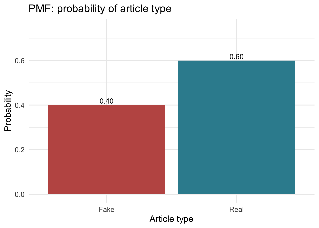
The bar heights sum to 1.0 — the distribution accounts for every possibility. For a binary variable, the PMF simply restates what we already knew. Its real power appears when the variable can take many values, like the number of exclamatory titles among 8 randomly selected articles — which could be 0, 1, 2, …, or 8. The binomial distribution, coming up soon, handles exactly that.
Summarizing a distribution: expected value and variance
For the distributions you will use in this course, two summaries matter constantly: a center and a spread. (Not every mathematical distribution has them — some have no finite mean at all — but every distribution in this course does.)
For a discrete random variable \(X\) with PMF \(p(x)\):
\[E(X) = \mu = \sum_x x \cdot p(x)\]
\[\text{Var}(X) = \sigma^2 = \sum_x (x - \mu)^2 \cdot p(x)\]
- Expected value (also called the expectation), \(E(X)\) or \(\mu\) — the long-run average of the random variable. Read \(E(X)\) as “the expected value of* \(X\)” or ”the expectation of* \(X\)“; the letter \(E\) stands for expectation. Concretely, \(E(X)\) is the probability-weighted sum of every value \(X\) can take. The name”expected” has a gambling origin: the expected winnings from a bet are what you would average over many plays — not a guarantee for any single play.
- Variance, \(\text{Var}(X)\) or \(\sigma^2\) — the probability-weighted average of squared distances from the mean. Its square root, \(\sigma\), is the standard deviation, which is on the original scale of the variable.
For continuous random variables, replace the sum with an integral. If integrals are unfamiliar, the intuition is simple: an integral is just a sum taken over a continuous range. A discrete variable offers a countable list of values to add up; a continuous one has infinitely many, packed together so tightly that the probability-weighted “sum” becomes a smooth area under the curve. The idea is exactly the same — center and spread are still probability-weighted averages, only now measured as areas. You will almost never compute either integral by hand in this course — R does it for you when you call functions like pnorm() and qnorm() — which we’ll explore in just a bit.
Why this matters
\(E(X)\) and \(\text{Var}(X)\) are properties of the distribution itself — fixed, unknown numbers that describe the underlying random process. When you compute a sample mean \(\bar{x}\) or a sample SD \(s\) from your data, you are estimating these population quantities from a finite sample. The distinction between what the distribution is (\(\mu\), \(\sigma\)) and what your sample says it is (\(\bar{x}\), \(s\)) is the heart of statistical inference — and the subject of M07 and M08.
Continuous variables: the PDF and CDF
When a variable can take any value within a range — a reaction time, an income, a systolic blood pressure reading, the percent of words in an article title that are in ALL CAPS — the rules change. Imagine a cognitive psychologist running a response-time study. She measures a participant and the stopwatch reads 342.7 ms. What was the probability of that exact reading? Not “approximately 342.7 ms,” but exactly 342.7000000… to infinite decimal places? The answer is zero. Not small. Zero.
That sounds paradoxical at first — how can every exact value have probability zero when one of them definitely just happened? The resolution is that continuous variables don’t actually produce meaningful probabilities for individual points. They produce probabilities for ranges. The psychologist never needed the probability of exactly 342.7 ms; what she wants is the probability that her participant’s RT fell between, say, 300 and 400 ms. That is the quantity that maps onto a claim she might publish (“most participants responded in the typical range”). So we shift the question: instead of “what is the probability of this exact value?”, we ask “what is the probability of falling within this range?”
A Probability Density Function (PDF) describes continuous distributions. Its key property: the area under the curve between two values equals the probability that a randomly selected observation falls in that range. The total area under the entire curve equals 1. Where the curve is tall, values are common; where it is low, values are rare.
Let us explore using a variable called caps_pct from the fake news study — the percentage of title words in ALL CAPS. Looking at fake and real articles side by side:
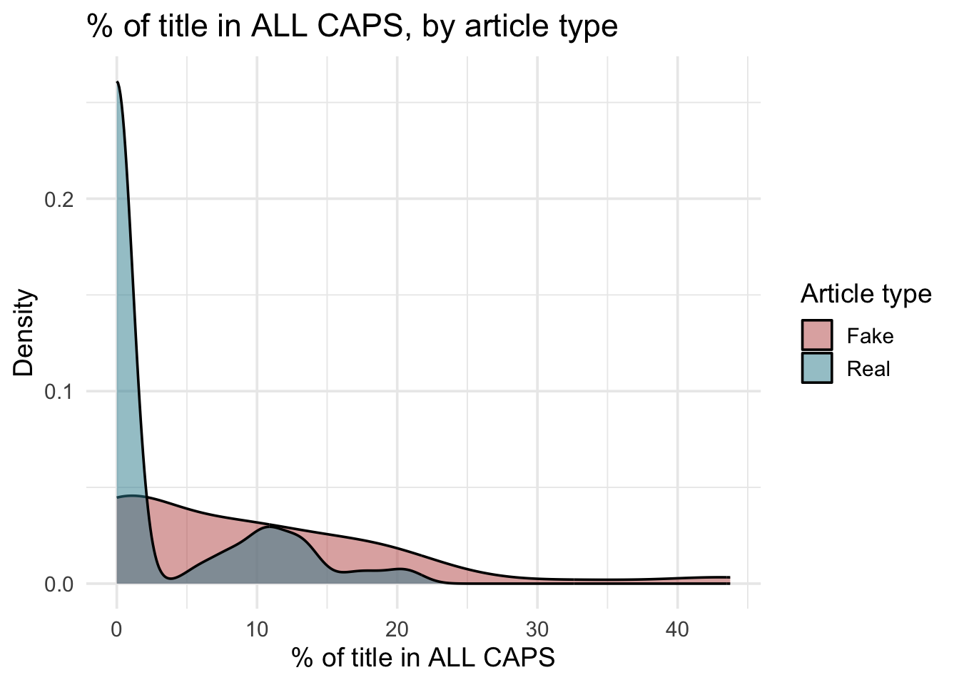
Three things stand out. First, the rose (fake) distribution is shifted right — higher ALL CAPS percentages are more common in fake articles. Second, both distributions are right-skewed: most titles have nearly 0% ALL CAPS, but a long tail of articles uses dramatically more. Third, the distribution has no clean mathematical form — its shape is irregular and cannot be summarized by a simple equation. That last point matters for what comes next.
Probability as area
The density curve is an estimate of the PDF — specifically a kernel density estimate (KDE), which smooths the observed data into a continuous curve. With enough data, the KDE converges to the true underlying PDF. We use it here only to visualize where probability mass lies — the empirical CDF later in this section (the cumulative-proportion curve you met in M01) gives empirical proportions directly, without the smoothing. For a genuine PDF the total area equals 1, and the area between any two values equals the probability of falling in that range; height alone is not probability.
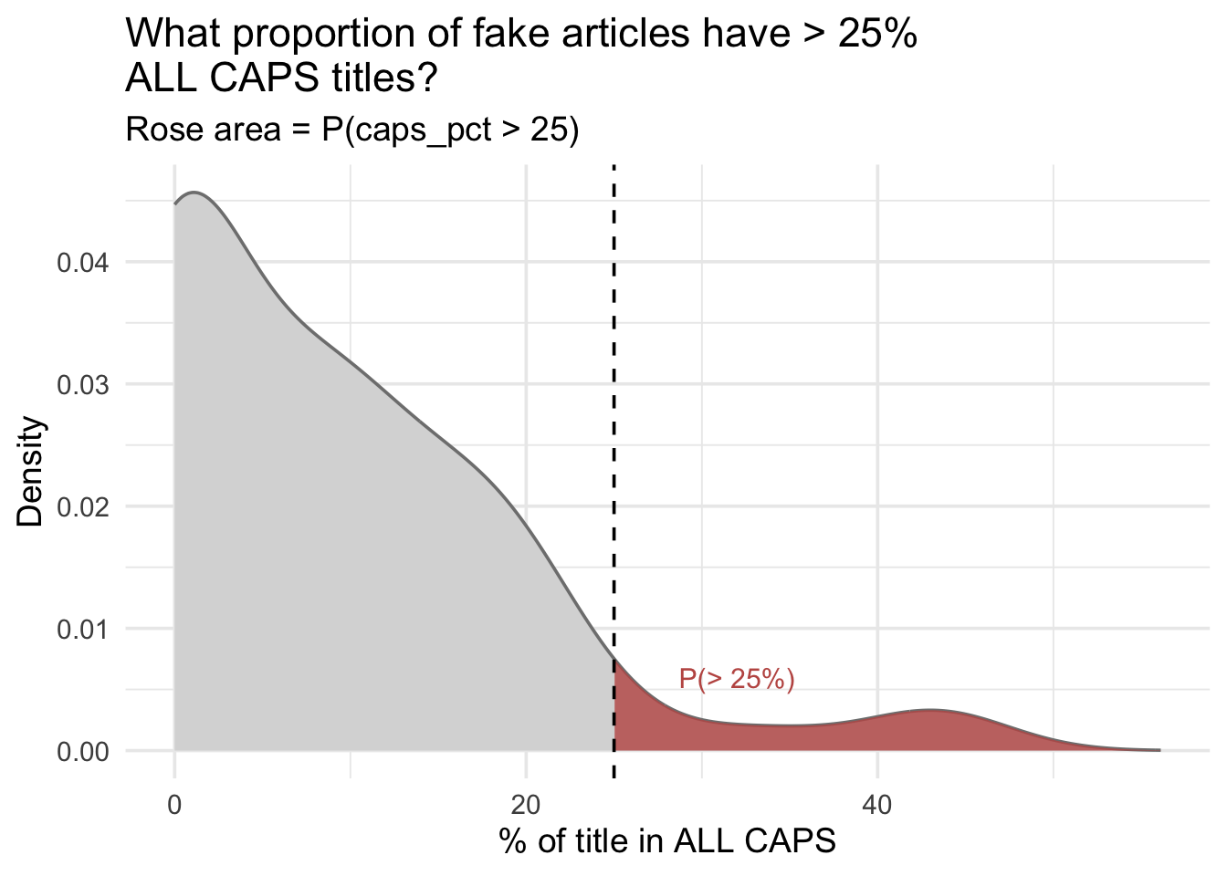
Let us focus on fake articles and ask two specific probability questions. A quick word on where we are headed: right now the goal is only to picture each answer as an area under the curve — not yet to compute it. Once you can see the quantity as a shape, the next section introduces the tool that turns that area into an exact number.
Question 1: What proportion of fake articles have more than 25% of their title in ALL CAPS?
The shaded region covers everything to the right of the dashed line at 25%. Its area equals that probability — the fraction of all fake articles whose titles cross that threshold.
Question 2: What proportion of fake articles have between 10% and 20% ALL CAPS?
Now the shaded region is the slice between the two dashed lines. The curve hasn’t changed — only the window we are asking about. The area of that narrow band is the probability of landing in that range.
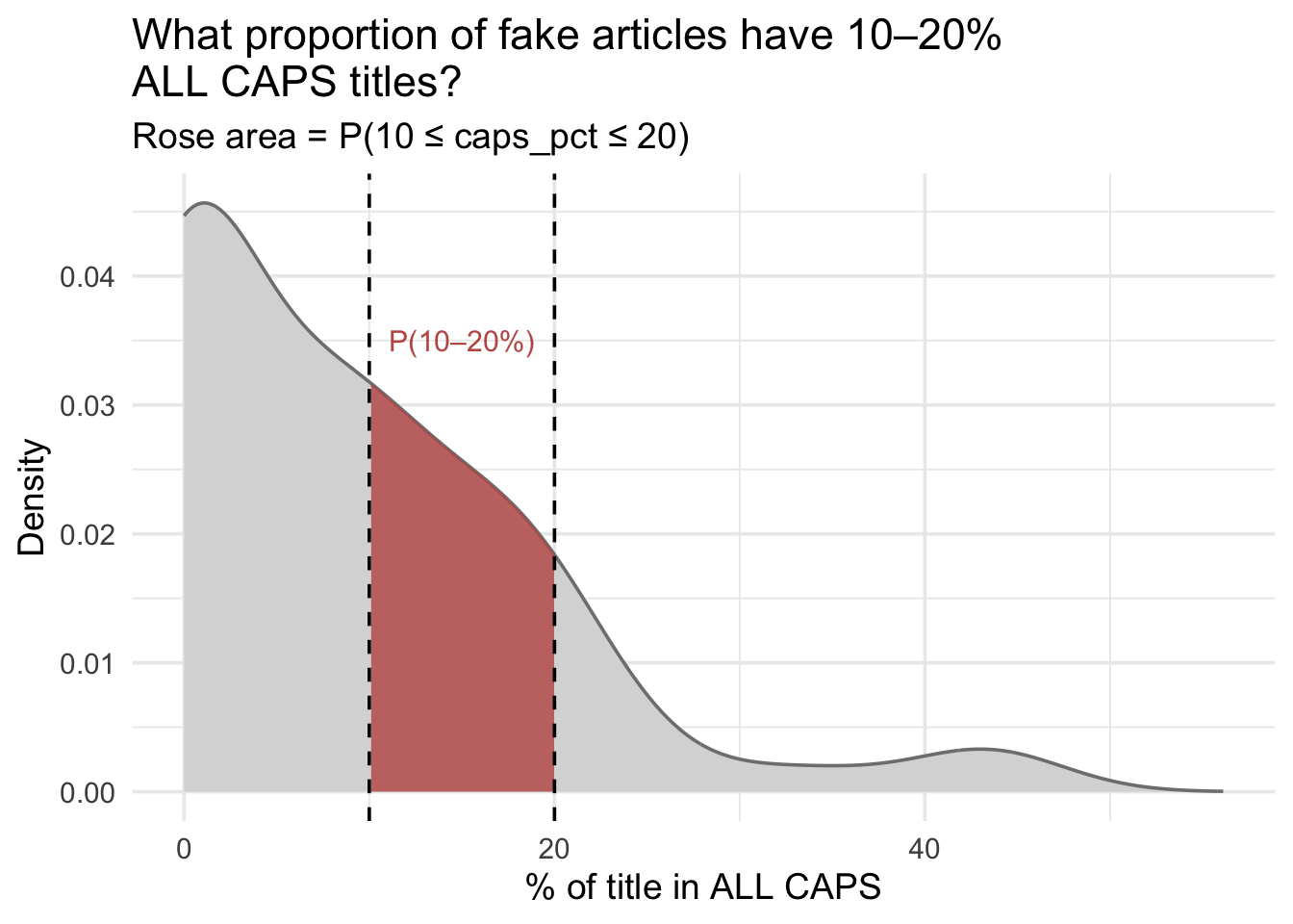
The graphs make the idea concrete: probability is just area under a curve. The question now is how to compute those areas without drawing pictures.
The cumulative distribution function
The tool that does this is the cumulative distribution function (CDF). At any value \(x\), the CDF answers a single question — what proportion of observations fall at or below \(x\)? — and that proportion is exactly the area under the density curve to the left of \(x\). So the CDF is a direct area-reading device: hand it a value, and it returns the accumulated probability up to that point. It starts at 0 on the far left, rises to 1 on the far right, and in between behaves like a running total — as you scan across the x-axis, it counts up the fraction of observations you have already passed. Every area we posed above then becomes simple arithmetic on CDF values: a left-hand area is a CDF value directly, a right-hand tail is \(1\) minus it, and a slice between two points is one CDF value minus another.
Plotting the CDF with stat_ecdf()
The fastest way to see a CDF is to build one straight from the data. The empirical CDF (ECDF) does exactly that: it walks through the observed caps_pct values from lowest to highest and, at each one, records the fraction of the sample at or below it — the running total from the last section, computed directly from real observations instead of a formula. ggplot2 draws it in a single layer with stat_ecdf(). We add dashed lines at the three thresholds from our two questions — 10%, 20%, and 25% — so we can read their cumulative probabilities straight off the curve.
fake_only |>
  ggplot(aes(x = caps_pct)) +
  stat_ecdf(geom = "step", color = "#C05852", linewidth = 1) +
  geom_vline(
    xintercept = c(10, 20, 25),
    linetype = "dashed",
    color = "gray40"
  ) +
  annotate(
    "text",
    x = c(10, 20, 25),
    y = 0.08,
    label = c("10%", "20%", "25%"),
    hjust = -0.1,
    size = 3.5
  ) +
  labs(
    title = "Empirical CDF: ALL CAPS percentage (fake articles)",
    x = "% of title in ALL CAPS",
    y = "Proportion of articles at or below x"
  )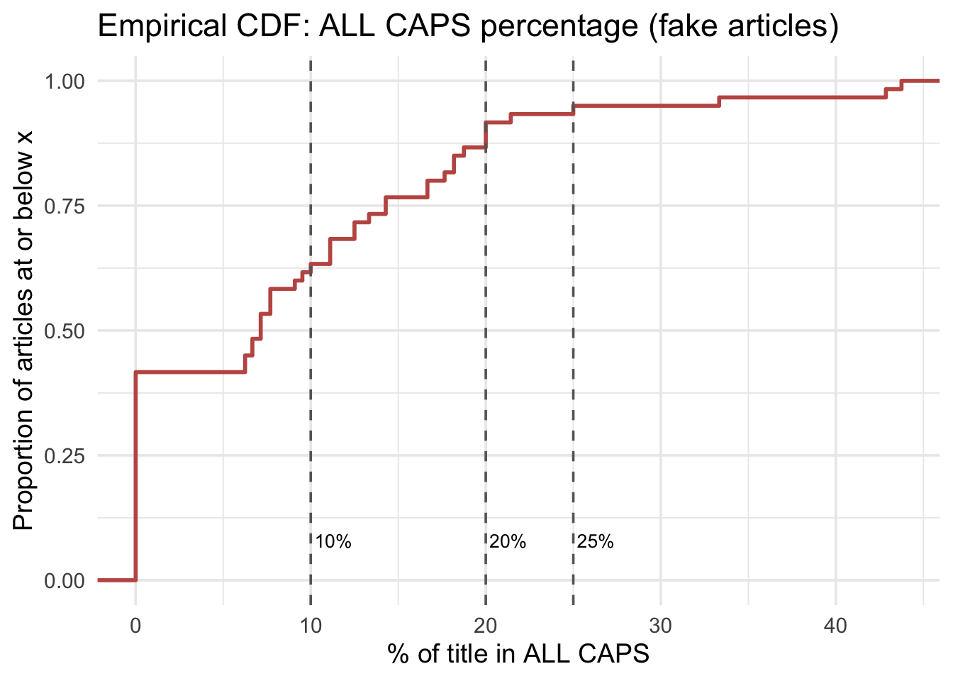
This gives us a visual CDF for one numeric variable using raw sample data. Used inside ggplot(), stat_ecdf() with geom = "step" draws the empirical CDF as a staircase curve. The x-axis shows values of the variable; the y-axis shows the cumulative proportion of observations at or below each value. Each step up in the staircase marks at least one observation at that value — a taller jump means several observations tied at the same value. Because the ECDF is built from a finite sample rather than a theoretical formula, it is inherently a step function — it only jumps at values actually observed in the data, and it cannot be smooth. Setting geom = "line" instead connects those same computed points with straight segments — convenient to read, though the true empirical CDF is the staircase, which holds flat between observed values rather than sloping. Two styling arguments finish the call: color sets the line color and linewidth its thickness.
Reading the curve is a two-step move. Pick a percentage on the x-axis, trace straight up until you meet the staircase, then straight left to the y-axis. The value you land on is the proportion of fake articles at or below that x — a cumulative probability, read right off the graph.
Now try it at our three thresholds. First take in the overall shape: the curve shoots up steeply just past 0 — most fake articles use almost no ALL CAPS — then flattens as it nears 1, since very few use a lot. Trace up from 10% and across: you meet the curve at about 0.63, so roughly 63% of fake articles have 10% or less of their title in ALL CAPS. Trace up from 25%: you land at about 0.95 — about 95% of fake articles sit at or below that threshold, leaving only the remaining 5% above it. And that last read is Question 1’s answer coming into view: the right-hand tail we shaded earlier is simply \(1 - 0.95 = 0.05\).
Querying the CDF with ecdf()
The plot gives us visual answers; now we want exact ones. We build a queryable version of the very same curve with ecdf(): hand it the raw data and it returns a step-function object you can call like any other function — give it a value \(x\) and it returns \(P(X \leq x)\), the cumulative probability at that point. First, build it:
ecdf_caps <- ecdf(fake_only |> pull(caps_pct))Now ecdf_caps() is the staircase we just traced by eye, made exact. Let’s rebuild Question 1 one step at a time, starting with the most direct question the function can answer: what proportion of fake articles have 25% or less of their title in ALL CAPS?
ecdf_caps(25) # P(X <= 25): the proportion at or below 25%[1] 0.95That is the exact version of our visual read — about 95% of fake articles sit at or below 25%. But Question 1 asked the opposite: strictly more than 25%. “At or below” and “above” are complements, so we subtract from 1:
1 - ecdf_caps(25) # P(X > 25): the complement of P(X <= 25)[1] 0.05So only about 5% of fake articles put more than a quarter of their title in ALL CAPS — the right-hand tail we shaded in Question 1, now an exact number.
Question 2 asked for a slice: articles between 10% and 20%. Because the CDF is a running total, the probability inside any band is the amount accumulated up to the top of the band minus the amount accumulated up to the bottom — subtract the smaller running total from the larger:
ecdf_caps(20) - ecdf_caps(10) # P(10 < X <= 20): a slice of the distribution[1] 0.2833333That subtraction strips away every article at 10% or below, leaving about 28% in the 10–20% band — the shaded strip from Question 2, computed exactly.
Here are all three queries side by side:
| Expression | Meaning |
|---|---|
ecdf_caps(25) |
\(P(X \leq 25)\) — proportion at or below 25% |
1 - ecdf_caps(25) |
\(P(X > 25)\) — complement rule: \(1 - P(X \leq 25)\) |
ecdf_caps(20) - ecdf_caps(10) |
\(P(10 < X \leq 20)\) — proportion above 10% and at or below 20% |
A subtlety on that last row: because an ECDF returns \(P(X \leq x)\), the subtraction gives the half-open interval \(P(10 < X \leq 20)\) — it excludes exactly 10. For a continuous variable that rarely matters, but empirical data can have repeated values, so if you need a specific inclusion rule, compute it directly: mean(caps_pct >= 10 & caps_pct <= 20).
One important limitation: ecdf() requires the raw data. Without the individual observations, you cannot call it.
PDF and CDF: two views of the same distribution
- The PDF (density curve) shows where values are concentrated. Taller = more common. Area between two values = probability.
- The CDF accumulates probability from left to right. Its value at any \(x\) = the probability of falling at or below \(x\).
- Key subtraction rule:
ecdf(b) - ecdf(a)= the probability of falling between \(a\) and \(b\).
How R names these functions: d, p, q, r
Before we start calling them, it is worth seeing the pattern, because it will save you looking anything up for the rest of the course. Every distribution in R comes with four functions. The suffix names the distribution — binom, norm, and later t and chisq. The prefix names what you want back from it.
| Prefix | Stands for | What it gives you | Binomial | Normal |
|---|---|---|---|---|
d |
density | the height of the PMF or PDF at one value | dbinom() | dnorm() |
p |
probability | the CDF — probability of landing at or below a value | pbinom() | pnorm() |
q |
quantile | the inverse CDF — the value sitting at a given percentile | qbinom() | qnorm() |
r |
random | random draws from the distribution | rbinom() | rnorm() |
So dbinom() reads as “density, binomial,” and rnorm() as “random, normal.” Learn the four prefixes once and every new distribution you meet arrives already half-familiar.
One wrinkle in the word “density”
Density is really the continuous word, and R applies it to both cases anyway.
For a discrete distribution, dbinom() returns a probability mass — an honest probability you can read straight off. dbinom(4, size = 10, prob = 0.4) is the probability of exactly 4 successes.
For a continuous distribution, dnorm() returns a density — a curve height, not a probability, and one that can exceed 1. To get a probability from a continuous distribution you need an area, which is what pnorm() gives you.
That is the PMF/PDF distinction from earlier in this Module, showing up in the function names.
The binomial distribution
Everything so far has leaned on the data itself. The empirical CDF can answer any question you throw at it — but only because it holds every observation in hand to count. Take the raw data away and ecdf() has nothing to work with.
A theoretical distribution flips this around. Instead of counting observations, it is a formula — a mathematical model of how a particular kind of chance process behaves. Tell it a couple of numbers that describe the setup, and it returns any probability you ask for, with no raw data required. That makes it both portable and predictive: you can reason about outcomes you have not observed yet — “if you drew 10 titles at random, how likely is it that exactly 4 carry an exclamation mark?” — the kind of forward-looking question a pile of past articles cannot answer directly. The binomial distribution is the first such model we will study, and it computes probabilities from just two numbers: the number of trials and the probability of success on each.
The binomial distribution models the number of “successes” in a fixed number of independent trials, where each trial has the same probability of success.
Bernoulli trials
A Bernoulli trial is the simplest possible random experiment: a single test with exactly two outcomes — success or failure — with a fixed probability \(p\) of success. The corresponding random variable is typically coded as 1 (success) or 0 (failure), with \(E(X) = p\) and \(\text{Var}(X) = p(1-p)\).
A Bernoulli random variable is the building block for the binomial: a Binomial(n, p) random variable is just the sum of \(n\) independent Bernoulli(\(p\)) trials, so Bernoulli(\(p\)) is the special case Binomial(\(n = 1\), \(p\)). This matters more than it looks — virtually every behavioral outcome you code as 0/1 (has a disorder / doesn’t, clicked the ad / didn’t, dropped out / didn’t) is Bernoulli. The binomial just counts how many successes occur across a sample.
For each article in the fake_news dataset: either it has an exclamation mark in the title (success) or it does not. If articles are independently sampled from the same population, each one is a Bernoulli trial. We can estimate \(p\) directly from the data:
p_excl <- fake_news |>
  summarize(p = mean(exclamation == "Yes")) |>
  pull(p)

p_excl
[1] 0.12So \(p = 0.12\): about 12% of articles in this dataset have an exclamation mark in the title. This is our estimate of the underlying probability for any single randomly drawn article.
Calculating binomial probabilities
Suppose you’re a media-studies researcher spot-checking a news outlet for sensational headlines. You pull the next 8 articles the outlet publishes and count how many have an exclamation mark in the title. Assume the 8 articles are selected independently from the same stream, and — based on our fake_news dataset — any one article has a probability of 0.12 of having an exclamation mark. Before you read anything, what count should you expect?
Any answer from 0 (a perfectly restrained outlet) through 8 (every headline shouting) is technically possible. The binomial distribution is the tool that assigns a probability to each of those nine possible counts — it turns your question “what should I expect?” into a concrete distribution over the number line from 0 to 8.
# Number of trials: 8 headlines drawn at random
n <- 8

# Probability of exactly k exclamation marks, for every count k from 0 to 8
probs <- tibble(
  k = 0:n,
  probability = dbinom(0:n, size = n, prob = p_excl)
)

# Round for display
probs |>
  mutate(probability = round(probability, 4))
Here you have a fixed number of Bernoulli trials and want probabilities for exact success counts. dbinom() with arguments (x, size, prob) returns the probability of observing exactly x successes in size independent trials, each with success probability prob — so x is the number of successes you are asking about, size is the total number of trials (n), and prob is the probability of success on each trial (p).
We pass x = 0:n — a vector of all possible counts from 0 to 8 — so dbinom() returns all 9 probabilities at once. We store them in a tibble with columns for the count (k) and the probability (rounded to four places only for display). All 9 probabilities sum to exactly 1.0.
Start with a single row. Row \(k = 1\) says: if you drew 8 headlines at random, the probability that exactly one of them carries an exclamation mark is about 39%. Every row answers that same question for a different exact count — exactly 0, exactly 2, and so on. Because those counts are mutually exclusive and cover every possibility, the nine probabilities add up to 1.
Now read down the column and let the shape tell a story. Recall that only about 12% of all headlines use an exclamation mark, so in any batch of 8 we should expect very few:
- \(k = 0\) — about 36%. More than a third of the time, none of the 8 shout. With exclamation marks this rare, drawing 8 quiet headlines in a row is entirely ordinary.
- \(k = 1\) — about 39%. Exactly one is the single most likely result. Put \(k = 0\) and \(k = 1\) together and roughly three of every four samples of 8 contain zero or one exclamation mark.
- \(k = 2\) — about 19%, and three or more is genuinely uncommon — the probabilities shrink toward zero quickly.
Why does the pile sit at 0 and 1 rather than in the middle? Because on average you expect only \(E(X) = n \cdot p = 8 \times 0.12 = 0.96\) exclamation marks in 8 headlines — just under one. A binomial distribution clusters around that expected value, which is exactly why \(k = 1\) is the tallest bar and the counts trail off to the right. How tightly it clusters is measured by the variance, \(\text{Var}(X) = n \cdot p \cdot (1-p) = 0.84\).
Now let us visualize the full distribution:
Show the code that built this figure
probs |>
  ggplot(aes(x = factor(k), y = probability)) +
  geom_col(fill = "#AD872B") +
  labs(
    title = sprintf("Binomial probabilities: n = 8, p = %.2f", p_excl),
    x = "Number of articles with exclamation mark in title",
    y = "Probability"
  )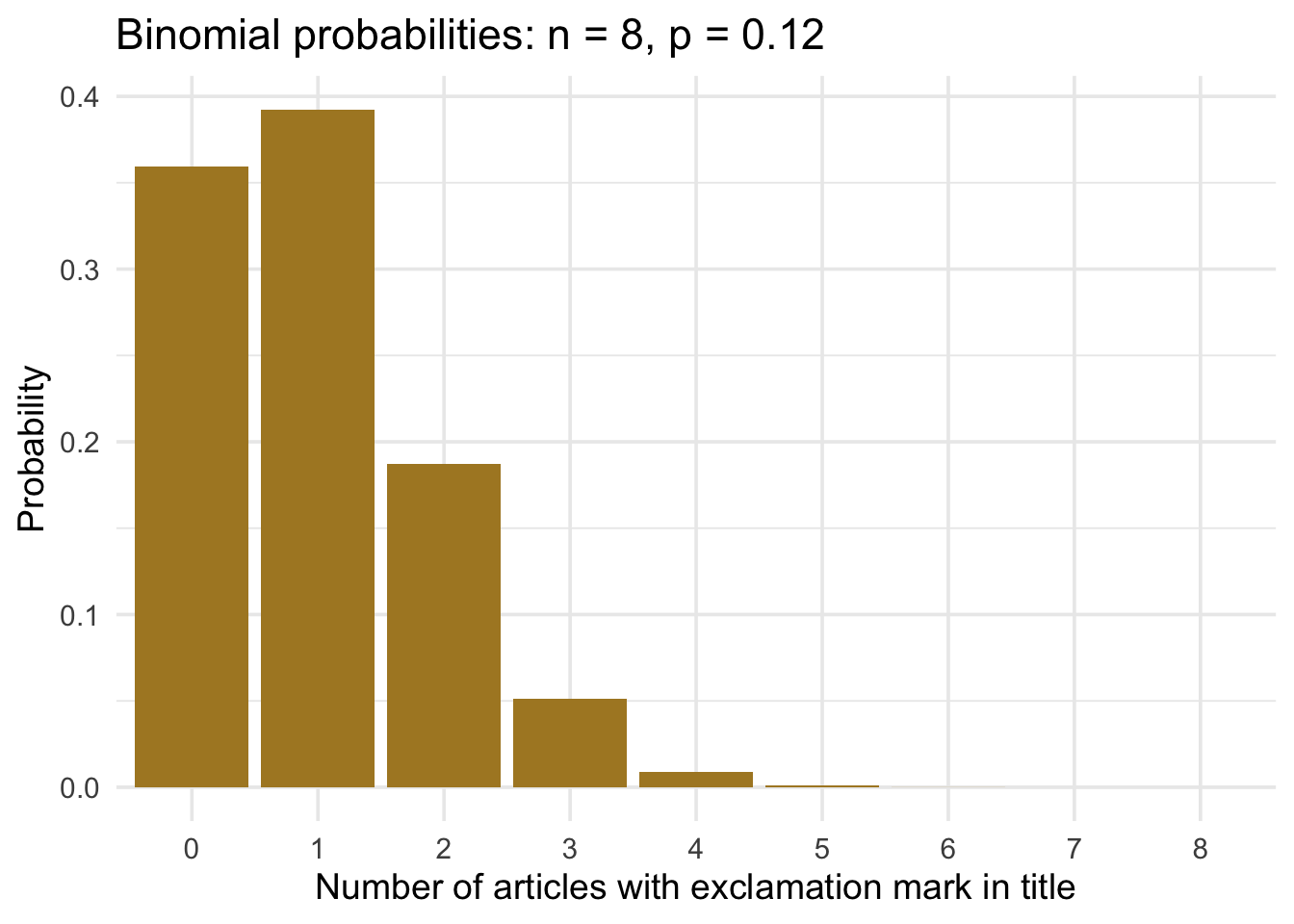
The bars confirm what the table showed: the distribution is right-skewed and concentrated near 0 and 1. This shape is typical when \(p\) is small — most samples will contain few or no successes, and the long right tail represents increasingly rare high counts.
The binomial formula
Every probability in the table above came from a single formula. The probability of exactly \(k\) successes in \(n\) trials, each with success probability \(p\), is:
\[P(X = k) = \binom{n}{k} \, p^k \, (1-p)^{n-k}\]
where \(\binom{n}{k} = \frac{n!}{k!(n-k)!}\) counts the number of ways to arrange \(k\) successes among \(n\) trials (on its own, that coefficient is choose(n, k) in R).
Put our own numbers in for the most likely outcome — exactly \(k = 1\) exclamation mark in \(n = 8\) headlines with \(p = 0.12\). The coefficient \(\binom{8}{1} = 8\) counts the eight slots the lone exclamation mark could fall in; multiply that by \(p^1\) (that one success) and \((1-p)^7\) (the other seven all quiet): \(8 \times 0.12 \times (1 - 0.12)^7 \approx 0.39\) — exactly the value in the \(k = 1\) row. dbinom() simply evaluates this formula for us, once per row.
We reached for dbinom() because we wanted the probability of an exact count — but that is only one of the questions you can ask about a distribution, and R gives each its own function. They share a naming convention worth memorizing, because it recurs for every distribution in R (the normal, just ahead, included): a one-letter prefix says what kind of answer you want, and the rest of the name (here, binom) says which distribution. Here are the three you will use for the binomial — a fourth, q, runs p backward (give it a probability, get back a value) and shows up as qnorm() with the normal:
| Function | What it returns |
|---|---|
dbinom()(x, size, prob) |
\(P(X = x)\) — exact probability of \(x\) successes |
pbinom()(q, size, prob) |
\(P(X \leq q)\) — cumulative probability at or below \(q\) |
rbinom()(n, size, prob) |
\(n\) random draws from the binomial distribution |
A preview of hypothesis testing
Above we used dbinom() with \(\hat{p} = 0.12\) — our sample estimate — to picture the binomial distribution. The exact same machinery becomes null hypothesis significance testing (NHST) when you swap the estimate for a hypothesized value of \(p\) and ask whether your observed data are compatible with that hypothesis. The logic has three moves:
- State a null hypothesis about the parameter. For example, “the true rate of exclamation-marked headlines is \(p_0 = 0.50\) — articles are no more likely to use one than not.”
- Compute the distribution of outcomes under that null using dbinom() or pbinom(). What counts would be common if \(p_0 = 0.50\) were actually true?
- Compare your observed count to that distribution. If your data would be rare under the null — say, observing only 1 exclamation-marked title in 8 when the null says ~4 are expected — that is evidence against the null.
M08 formalizes step 3 with the p-value: the probability, under the null, of observing data at least as extreme as what you actually got. Every hypothesis test you meet in this course — from two-sample comparisons to regression coefficients — follows this same three-step logic. The distribution changes; the structure does not.
What happens as n grows
So far we have fixed the batch size at \(n = 8\) headlines — but that choice was arbitrary. Nothing stops us from drawing a bigger batch each time. What if we sampled 80 headlines instead, or 800, keeping the per-headline exclamation rate fixed at \(p \approx 0.12\)?
That is all “increasing \(n\)” means here — more trials in each draw, with the same success probability on each. And a bigger batch has more possible counts to land on: 0 through 8 for eight headlines, but 0 through 800 for eight hundred. So the distribution gains far more bars, each one thinner, and its shape has room to fill in. Keep your eye on that shape as \(n\) climbs from 8 to 80 to 800:
n_vals <- c(8, 80, 800)

clt_data <- map_dfr(n_vals, function(trials) {
  tibble(
    n = trials,
    k = 0:trials,
    prob = dbinom(0:trials, size = trials, prob = p_excl)
  )
})

clt_data |>
  mutate(
    n_label = paste0("n = ", n) |> factor(levels = paste0("n = ", n_vals))
  ) |>
  ggplot(aes(x = k, y = prob)) +
  geom_col(fill = "#AD872B", width = 0.9) +
  facet_wrap(~n_label, scales = "free", nrow = 1) +
  labs(
    title = "The normal approximation improves as n grows",
    x = "Number of successes (k)",
    y = "Probability"
  ) +
  theme(axis.text.x = element_text(size = 8))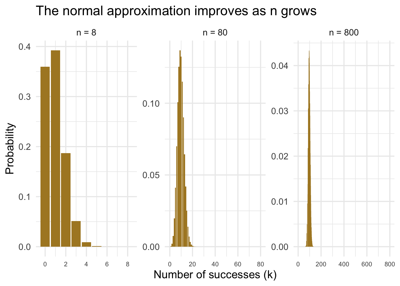
At \(n = 8\) the distribution is rough — only nine possible outcomes, so the shape is coarse. By \(n = 80\) it is noticeably more symmetric and mound-shaped. By \(n = 800\) it is nearly indistinguishable from a smooth bell curve.
Why does this happen? It comes down to what a binomial count really is. Each of the \(n\) headlines is a tiny, independent yes/no event — exclamation mark or not — so the count is nothing more than the sum of all those 0/1 outcomes. And here is one of the most useful facts in all of statistics: when you add up many small, independent random pieces, the total drifts toward a bell curve, almost regardless of what the individual pieces look like. That tendency is the Central Limit Theorem (CLT), and the smoothing you just watched is its most classic case — the normal approximation to the binomial.
How many trials you need depends on how lopsided each one is. Our exclamation marks are rare — only about 12% of headlines have one — so a batch of 8 stays bunched up against 0 and looks nothing like a bell; but by 800 the shape has room to even out and the bell emerges. (A common rule of thumb: trust the approximation once both \(np\) and \(n(1-p)\) — the expected number of successes and of failures — are at least around 10. At \(n = 8\) we expect fewer than one success, which is exactly why it still looks skewed.)
This is worth pausing on, because it reframes why the bell curve turns up everywhere in data analysis. It is not that nature is bell-shaped — most raw measurements aren’t. It is that so many quantities we care about are secretly sums or averages of many independent influences, and sums and averages drift toward normality. That single fact is the engine beneath confidence intervals, hypothesis tests, and regression inference — nearly everything we build in the rest of the course. We develop it in full in M07.
The normal distribution
We just watched something striking: as the batch grew, the jagged binomial smoothed into a graceful bell. That bell is not a quirk of exclamation marks — it is a theoretical distribution in its own right, the normal distribution, and it is the single most important distribution in statistics.
It belongs to the same family of ideas as the binomial, so the intuition you just built carries straight over. A theoretical distribution replaces a pile of raw observations with a formula: tell it a couple of numbers that describe the situation, and it returns any probability you ask for. The binomial took two — the number of trials \(n\) and the success probability \(p\). The normal also takes two: a center, the mean \(\mu\), and a spread, the standard deviation \(\sigma\). Hand it those, and it fixes the probability of every possible value — no raw data required, with pnorm() and qnorm() (just ahead) doing the arithmetic. The one new wrinkle is that the normal is continuous: where the binomial placed probability on a list of whole-number counts, the normal spreads it smoothly across an entire range of values.
Why is it the most important? Here’s the reason, in a scene most psychology students will recognize: a clinical psychologist studying depression with the PHQ-9. Within any single sample of patients, individual PHQ-9 scores form a ragged, often skewed, distinctly-not-bell-shaped distribution — most people score low, a few score high, and nothing about those raw scores looks normal. But now imagine she repeatedly draws fresh samples and records each sample’s mean PHQ-9 score. As the sample size grows, those means tend toward a nearly perfect bell curve — even though the raw scores never did. This is the Central Limit Theorem again — the same force that bent the binomial into a bell, now acting on sample means. The normal is central not because raw data are normal (most aren’t), but because the sample means and sums our analyses rest on tend to be, under standard CLT conditions. That fact is the engine of frequentist inference, and it gets its full treatment in M07.
Two parameters, complete description
The normal distribution is fully determined by exactly two numbers. You will see them written with Greek letters — \(\mu\) (mu) for the mean and \(\sigma\) (sigma) for the standard deviation. These are population parameters: symbols that describe the true underlying distribution, not a particular sample. Think of them as the settings on a dial that control the shape of the curve.
- Mean (\(\mu\)): the center of the distribution — the peak of the bell. Values cluster symmetrically around it.
- Standard deviation (\(\sigma\)): the spread. A smaller \(\sigma\) produces a narrow, tall curve — values packed close to the mean. A larger \(\sigma\) produces a wide, flat curve — values spread out.
The distribution is symmetric around \(\mu\): values are equally likely to fall above or below the mean. The total area under the curve equals 1. No other numbers are needed. Once you know \(\mu\) and \(\sigma\), you know everything about the distribution — including any probability you might want to calculate.
This compactness is what makes the normal so powerful. For any variable that is approximately normal, knowing just the mean and SD lets you answer probability questions without the raw data at all. You will see exactly what that means in the From score to probability and From probability to score sections below.
Back with the fake_news data we met two ways to picture a continuous distribution, and they return here. The PDF is the density curve: the area beneath it between two values is a probability. The CDF is the running total: its height at any \(x\) is the probability of landing at or below \(x\) — that is, the area under the PDF to the left of \(x\). There, we could only estimate both from raw observations (a kernel density curve and an empirical CDF). The normal hands us the exact versions for free, straight from \(\mu\) and \(\sigma\): dnorm() gives the PDF and pnorm() gives the CDF (there are the d and p prefixes again, now attached to norm).
The figure below shows both views of the standard normal — the reference case with \(\mu = 0\) and \(\sigma = 1\) — side by side. The PDF on the left is the familiar bell; the CDF on the right is its running total of probability, climbing smoothly from 0 to 1. The link between the two panels is exactly the one you learned before: at any \(x\), the height of the CDF equals the area under the PDF to the left of that point.
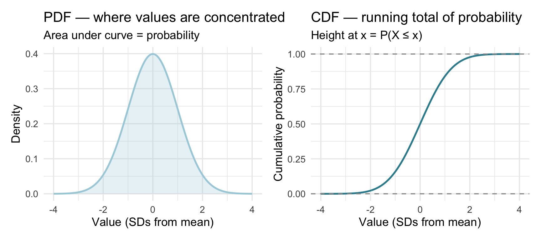
Read the two panels together and they tell one story in two visual languages. On the PDF (left), the curve is tallest right at the mean (\(x = 0\)) and tapers off symmetrically: most observations fall near the center, and values grow rarer the farther out you go — the thin tails. On the CDF (right), that same fact appears as steepness. Near the mean, where the PDF is tall, probability piles up quickly and the CDF climbs steeply; out in the tails, where the PDF is nearly flat, almost no probability is being added and the CDF barely rises. So the CDF is steepest directly beneath the PDF’s peak — and because the bell is symmetric, the CDF passes through exactly 0.5 at the mean: half the probability lies below the center, half above.
Checking normality: negative sentiment in news articles
What this check is — and what it is not
Everything in this section asks one narrow question: is a normal model good enough to make probability statements about individual scores? That is what licenses pnorm() and qnorm() on this variable.
Do not carry it forward as “my outcome has to be normal before I can run a test.” That is one of the most persistent misconceptions in applied statistics, and it does not follow from anything here. The conditions that matter for the inferential tools in M07–M09 are about the sampling distribution of a statistic, not the shape of the raw variable — which is exactly why the CLT matters so much. M09 takes this up directly when it works through what each test actually assumes.
Let’s apply this to our fake news study. We have seen that fake and real articles differ in their use of exclamation marks and ALL CAPS. Now let us look at a continuous measure: the negative sentiment score, derived from the NRC Word-Emotion Association Lexicon, which estimates the percent of emotionally negative words in each article’s body. Higher values indicate more negative, emotionally charged language.
Let’s compute the mean and standard deviation of the negative sentiment scores and store them as neg_mean and neg_sd:
# Compute the mean of negative sentiment scores
neg_mean <- fake_news |> pull(negative) |> mean()
# Compute the standard deviation of negative sentiment scores
neg_sd <- fake_news |> pull(negative) |> sd()

neg_mean
[1] 3.126467neg_sd[1] 1.361328Across all 150 articles, negative sentiment has a mean of about 3.13 and a standard deviation of about 1.36. Two framing notes before we use them. Within this Module’s treat-the-sample-as-the-population device, these two numbers play the role of \(\mu\) and \(\sigma\); in real research you would compute the same two numbers from a sample and use them as plug-in estimates of an unknown \(\mu\) and \(\sigma\) — the hat discipline of the parameters-vs-statistics section below. And either way, the curve they describe is a fitted normal approximation: an idealized model laid over the observed scores, not a property of the scores themselves. Before we can use the normal distribution’s mathematical machinery, then, we need to check that the model actually fits — that this variable is approximately normal. A histogram with an overlaid normal density curve is the standard visual check:
# Extend x-range to show the full theoretical normal (±3.5 σ) so the left
# tail of the overlaid curve is not clipped.
hist_xmin <- neg_mean - 3.5 * neg_sd
hist_xmax <- neg_mean + 3.5 * neg_sd

fake_news |>
  ggplot(aes(x = negative)) +
  geom_histogram(
    aes(y = after_stat(density)),
    binwidth = 0.5,
    fill = "#945297",
    alpha = 0.7
  ) +
  stat_function(
    fun = dnorm,
    args = list(mean = neg_mean, sd = neg_sd),
    linewidth = 1.5,
    xlim = c(hist_xmin, hist_xmax)
  ) +
  coord_cartesian(xlim = c(hist_xmin, hist_xmax)) +
  labs(
    title = "Negative sentiment scores across all 150 articles",
    subtitle = "Normal density curve overlaid",
    x = "Negative sentiment score",
    y = "Density"
  )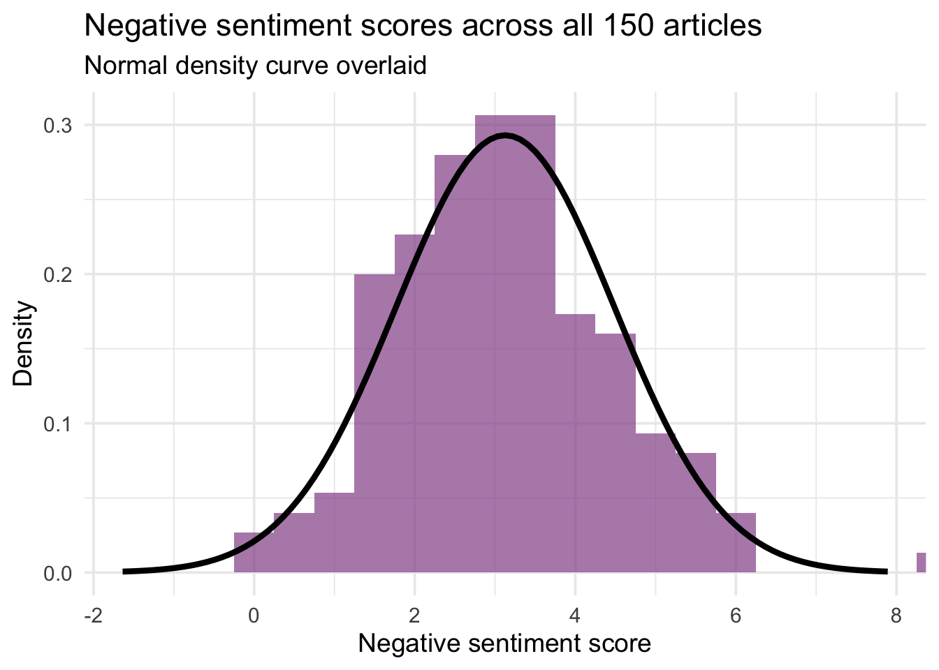
The distribution is roughly mound-shaped and centered near the mean. The fit is not perfect — with only 150 articles, you would never get a perfectly smooth histogram even if the true underlying distribution were exactly normal. What we are looking for is the absence of systematic problems: a strong skew, two distinct humps, or values piling up against a boundary. Negative sentiment is a percent, so it is bounded below by zero; the question is whether that floor visibly distorts the distribution where most of the data sit. Here it is close enough to mound-shaped for a first normal-approximation example, though the fit is not exact.
This is also a good moment to see why the normal is special. To answer probability questions about the percentage of ALL CAPS words (caps_pct) earlier, we needed all 60 raw observations from the fake articles — take them away and we are stuck, because the empirical CDF has no formula behind it. For the negative sentiment scores (negative), once we have confirmed the normal is a reasonable model and know \(\mu \approx 3.13\) and \(\sigma \approx 1.36\), we can answer probability questions without touching the data. If the normal model is reasonable, two numbers stand in for 150 rows.
Why the normal matters in behavioral research
The machinery we are about to use — pnorm(), qnorm(), and z-scores — gives trustworthy probability statements for any variable that is well described by a normal model. Whether a normal model fits well is always an empirical question about a particular measure in a particular population — normality is a modeling choice, not a property a variable carries around. With that caveat, a normal model is often an adequate approximation for measures like these:
- Cognitive performance: IQ (designed to be \(N(100, 15)\)), working memory / digit span
- Personality trait scores: Big Five facet scores in large samples
- Survey-based well-being measures: SWLS, WEMWBS, and similar summed scales in large samples
- Physical characteristics and growth norms: adult height within a reasonably homogeneous population, infant head circumference, birth weight
Notice how much those entries lean on conditions. IQ is designed to be \(N(100, 15)\), so it is normal by construction rather than by nature. The others depend on the population, the instrument, and the measurement conditions — a birth-weight distribution pooled across gestational ages looks nothing like one within a single week of gestation.
But some variables in behavioral research are not normal, and it matters. Reaction time is famously right-skewed and is usually modeled with ex-Gaussian or log-normal distributions. Clinical symptom scales (PHQ-9, BDI-II, CAPS-5) are typically right-skewed in general populations because of floor effects: most people score low. Applying pnorm() or qnorm() to a skewed variable gives wrong answers in the tails — which is often exactly where the clinically interesting decisions happen (flagging severe cases, detecting extreme outliers).
The discipline: before reaching for the normal toolkit, always check the distribution first — with a histogram, a Q-Q plot, or both. This week’s lab walks through exactly that check — a density overlay and a Q-Q plot — on a composite built from NSDUH’s four depression-interference items.
The Empirical Rule
For any normally distributed variable, these three approximate facts hold regardless of the original units:
- ~68% of values fall within 1 SD of the mean (\(\mu \pm \sigma\))
- ~95% of values fall within 2 SDs of the mean (\(\mu \pm 2\sigma\))
- ~99.7% of values fall within 3 SDs of the mean (\(\mu \pm 3\sigma\))
These are rounded benchmarks, not exact values — they hold precisely for a perfect normal distribution, and approximately for variables that are close to normal.
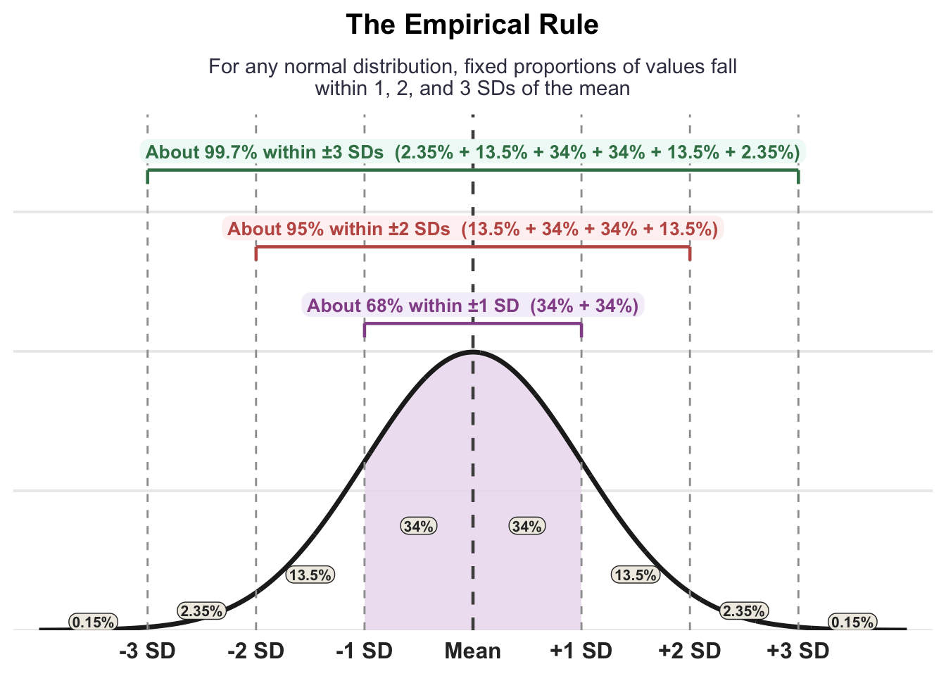
Applied to negative sentiment (\(\mu = 3.13\), \(\sigma = 1.36\)). Read every line below as a prediction the fitted normal model makes — we check it against the actual data in a moment:
- If the model were exact, about 68% of articles would score between 1.77 and 4.49 (\(\mu \pm 1\sigma\))
- and about 95% between 0.4 and 5.85 (\(\mu \pm 2\sigma\))
- The remaining 5% fall in the two tails: about 2.5% exceed 5.85 (unusually negative) and about 2.5% fall below 0.4 (unusually positive)
Because the distribution is symmetric, the upper and lower cutoffs are equidistant from the mean. An article scoring above 5.85 is more negative than about 97.5% of all articles; one scoring below 0.4 is more positive than 97.5%. Both are meaningful signals, just in opposite directions.
Let us verify how well the Empirical Rule holds in the actual data:
fake_news |>
  summarize(
    `Within 1 SD (±1σ)` = mean(abs(negative - neg_mean) <= neg_sd),
    `Within 2 SDs (±2σ)` = mean(abs(negative - neg_mean) <= 2 * neg_sd),
    `Within 3 SDs (±3σ)` = mean(abs(negative - neg_mean) <= 3 * neg_sd)
  ) |>
  pivot_longer(everything(), names_to = "band", values_to = "observed") |>
  mutate(theoretical = c(0.680, 0.950, 0.997)) |>
  gt() |>
  fmt_percent(columns = c(theoretical, observed), decimals = 1) |>
  cols_label(
    band = "SD band",
    theoretical = "Empirical Rule",
    observed = "Actual (n = 150)"
  ) |>
tab_header(title = "How well does the Empirical Rule fit?")| How well does the Empirical Rule fit? | ||
| SD band | Actual (n = 150) | Empirical Rule |
|---|---|---|
| Within 1 SD (±1σ) | 67.3% | 68.0% |
| Within 2 SDs (±2σ) | 96.7% | 95.0% |
| Within 3 SDs (±3σ) | 99.3% | 99.7% |
The 1 SD band is nearly exact. The 2 SD band captures slightly more than expected, meaning the tails between ±2σ and ±3σ are a bit thinner than a perfect normal predicts — values cluster a little more toward the center. With \(n = 150\), differences of 1–2 percentage points are small enough to be unremarkable — they could reflect ordinary sampling fluctuation, a mild mismatch between the model and the data, or both, and this comparison alone cannot separate those. What it does tell you is that nothing here is badly wrong. (Worth noting too: 68–95–99.7 are themselves rounded — the exact figures are 68.3%, 95.4%, and 99.7% — so a percentage point of slack is built into the rule before your data arrive.)
What counts as “good enough”? There is no universal threshold — it depends on what you plan to do with the normal model. A useful guide: gaps of 1–2 points in the 1 SD and 2 SD bands are typical sampling variation with \(n\) around 100–200 and will not meaningfully affect answers from pnorm() or qnorm() (two normal-distribution tools we’ll use in the next two sections). What we are really guarding against is using the normal when the data have a heavy tail, a hard boundary, or two distinct modes — because in those cases the model’s probability estimates can be substantially wrong. The table here shows nothing alarming.
From score to probability: pnorm()
The Empirical Rule gives benchmarks only at exactly 1, 2, and 3 SDs. For any cutoff — not necessarily a round number of standard deviations — we use pnorm(). Think of it as the theoretical twin of ecdf(): it answers the very same “what fraction of the distribution lands at or below this value?” question, but instead of counting raw observations it reads the area straight off the normal curve — so all it needs is the mean and SD, never the data itself.
Those two numbers, for our negative-sentiment variable, are already stored from the normality check above:
neg_mean[1] 3.126467neg_sd[1] 1.361328With those in hand, we can ask the same three kinds of question we put to the empirical CDF — below a cutoff, above a cutoff, and between two cutoffs — taking them one at a time.
Question 1 — the area to the left. What proportion of articles score below 2.0?
pnorm(q = 2.0, mean = neg_mean, sd = neg_sd)[1] 0.2039836By default, pnorm() returns \(P(X \leq q)\) — the cumulative area to the left of the cutoff, exactly like reading the CDF at that point. So about 20% of articles score below 2.0. (The q you pass in stands for quantile — simply a value on the x-axis.)
Question 2 — the area to the right. What proportion score above 5.0?
pnorm(q = 5.0, mean = neg_mean, sd = neg_sd, lower.tail = FALSE)[1] 0.08437146Adding lower.tail = FALSE flips the question to the right tail, \(P(X > q)\). That is just the complement rule — \(P(X > q) = 1 - P(X \leq q)\) — with R doing the subtraction for you, so you never have to write 1 - pnorm(...) by hand. Only about 8.4% of articles are this negative — a distinctly high score, out in the distribution’s upper tail.
Question 3 — the area in a slice. What proportion score between 2.0 and 4.5?
pnorm(q = 4.5, mean = neg_mean, sd = neg_sd) -
  pnorm(q = 2.0, mean = neg_mean, sd = neg_sd)
[1] 0.6395209The move is identical to ecdf(b) - ecdf(a) from the previous section: pnorm(4.5) is all the area up to 4.5, pnorm(2.0) is all the area up to 2.0, and subtracting leaves only the strip in between. About 64% of articles land in that middle band — the central bulk of the distribution.
For reference, here is everything pnorm() takes:
| Argument | What it means |
|---|---|
| q | The cutoff score you are asking about (a quantile — a value on the distribution’s x-axis) |
| mean | The mean of the distribution (\(\mu\)) |
| sd | The standard deviation (\(\sigma\)) |
| lower.tail | TRUE (the default) counts the area to the left, \(P(X \leq q)\); FALSE counts the area to the right, \(P(X > q)\) |
Look back at what just happened, because it is the whole point: the empirical CDF needed all 150 raw scores on hand, but pnorm() produced every one of these answers from just mean and sd. That is the practical reward of knowing a variable is approximately normal.
One more piece of discipline: these are model-based probabilities. They are exact statements about the fitted normal curve, and they describe the articles well only insofar as the normal describes the articles well. Empirical proportions computed directly from the 150 rows will differ slightly — just as the Empirical-Rule check above came out near, but not exactly at, 68–95–99.7. When the model fits, the differences are too small to matter; the discipline is knowing which of the two you are quoting.
From probability to score: qnorm()
pnorm() went from a score to a probability. qnorm() runs the arrow backward: hand it a probability — a percentile — and it returns the score that sits at that point. Reach for it whenever your question starts with a proportion you already know and asks which cutoff produces it. (In the d/p/q/r family from the binomial section, this is the q — for quantile — cousin we flagged would return with the normal.)
Question 1 — a one-sided threshold. What negative-sentiment score marks the top 10% of articles?
qnorm(p = 0.90, mean = neg_mean, sd = neg_sd)[1] 4.871079The top 10% begins exactly where 90% of the distribution lies below — so we ask for the 90th percentile, p = 0.90. Under the fitted normal, any score above 4.87 puts an article in the most-negative tenth.
Question 2 — a two-sided interval. What range of scores holds the middle 95% of articles?
qnorm(p = c(0.025, 0.975), mean = neg_mean, sd = neg_sd)[1] 0.458313 5.794620To bracket the middle 95%, trim 2.5% off each tail and ask for both cutoffs at once — the 2.5th and 97.5th percentiles. (Passing a vector of two probabilities returns two scores.) The middle 95% of articles fall between 0.46 and 5.79 on the negative-sentiment scale. Hold on to this “trim 2.5% from each tail” move: you will meet it again in M07, where the same quantile logic builds a 95% confidence interval — cutoffs chosen so that, across repeated samples, the procedure captures the true parameter about 95% of the time.
qnorm() takes p — the cumulative probability (percentile) you want to locate — plus the mean and sd, and returns the value \(x\) for which \(P(X \leq x) = p\). A few patterns cover most uses:
| Goal | Code |
|---|---|
| Find the \(k\)th percentile | qnorm(k/100, mean, sd) |
| Find the top \(q\)% threshold | qnorm(1 - q/100, mean, sd) |
| Find the middle 95% interval | qnorm(c(0.025, 0.975), mean, sd) |
The two functions are exact inverses: feed pnorm()’s output straight back into qnorm() and you return to the score you started with — qnorm(pnorm(x, mean, sd), mean, sd) gives back x. Use pnorm() when you know the score and want the probability; use qnorm() when you know the probability and want the score.
pnorm() vs. qnorm(): two directions
pnorm(): Give it a score → get back a probability
“What proportion of articles score above 5.0?”qnorm(): Give it a probability → get back a score
“What negative-sentiment score marks the top 10% of articles?”
They are mathematical inverses of each other.
z-scores: a universal language
Here is a question you cannot settle by staring at raw numbers: which is more unusual — an article with a negative-sentiment score of 6.0, or a person with an IQ of 130? The two live on completely different scales, so the raw values simply are not comparable. What we need is a way to ask, of any value, how far from typical is this, in the natural units of its own distribution? That common ruler is the z-score.
A z-score answers exactly that, by measuring a value’s distance from the mean in standard-deviation units:
\[z = \frac{x - \mu}{\sigma}\]
Read the formula as two small steps. The numerator, \(x - \mu\), is how far the value sits above or below the mean — its raw distance from the center. Dividing by \(\sigma\) then re-expresses that distance in SD units: a \(z\) of \(+1\) means “one standard deviation above the mean,” \(-2\) means “two below.” Because every variable, whatever its original units, ends up on this same standard-deviation ruler, a sentiment score and an IQ score suddenly become directly comparable.
When can you interpret a z-score probabilistically?
Computing a z-score requires no assumptions — you can standardize any value in any distribution. But interpreting a z-score as a probability (e.g., “z = 2 means I’m in the top 2.5%”) only works when the underlying distribution is approximately normal. For a skewed or otherwise non-normal variable, a z-score of 2 might correspond to a very different percentile. Always check normality before making probability statements from z-scores.
Let’s standardize one value. Take an article with a negative-sentiment score of 6.0, and drop it into the formula alongside our mean (\(3.13\)) and SD (\(1.36\)):
\[z = \frac{6.0 - 3.13}{1.36} = 2.11\]
So this article sits about 2.11 standard deviations above the mean — a long way out on the negative end of the scale. Reading a z-score is a two-part habit: the sign gives the direction (positive is above the mean, negative below), and the magnitude gives the extremity. As a rough guide under a normal model, \(|z| \approx 2\) is relatively uncommon and \(|z| \approx 3\) is very uncommon — but note that the guide comes from the model, not from the z-score itself, which can be computed for any variable. This also settles the question we opened with: an IQ of 130 sits \((130 - 100)/15 = 2.0\) standard deviations above its mean, so our article, at \(z \approx 2.11\), is actually a shade more extreme than that famously high IQ — even though the two scores share nothing in their raw units.
When the variable is approximately normal, a z-score becomes more than a distance — it converts straight into a percentile. A z of \(+1.96\) always marks the 97.5th percentile, whether the variable is sentiment, IQ, or blood pressure; that is the real payoff of putting everything on one ruler. (When the variable is not approximately normal, a z-score still measures standardized distance, but it no longer maps to a clean percentile — which is exactly why the normality check earlier mattered.)
This leaves you two equivalent routes to the same probability: standardize the value to a z and read it against the standard normal (mean 0, SD 1), or hand the raw score to pnorm() with the variable’s own \(\mu\) and \(\sigma\). They agree exactly:
# Both give the same result
pnorm(q = (6.0 - neg_mean) / neg_sd, mean = 0, sd = 1) # z-score approach
[1] 0.9826066pnorm(q = 6.0, mean = neg_mean, sd = neg_sd) # raw score approach[1] 0.9826066Either way, under the fitted normal model, a score of 6.0 places this article above about 98% of all articles on negative sentiment — just what you would expect for a z of about 2.11 sitting well into the upper tail.
The standard normal distribution
The standard normal distribution (often called the z-distribution) has mean = 0 and SD = 1. If a variable is normally distributed, its z-scores follow the standard normal distribution; if the original variable is skewed or bimodal, standardizing changes the scale but not the shape. In R, pnorm() and qnorm() default to the standard normal when no mean or sd is specified:
qnorm(p = c(0.025, 0.975)) # default: mean = 0, sd = 1[1] -1.959964 1.959964The values ±1.96 cut off the middle 95% of the standard normal. You might expect ±2.00 — that is what the Empirical Rule says. The Empirical Rule is a rounded approximation: “about 95% within 2 SDs” is easier to remember than 1.96, and close enough for mental arithmetic. When precision matters — as it does in confidence intervals and hypothesis tests — the exact value is 1.96. You will see this number repeatedly throughout the course.
The figure below makes ±1.96 concrete for the negative sentiment variable. The shaded region contains the middle 95% of articles. The dashed lines fall at 0.46 and 5.79 — the actual score values corresponding to ±1.96 SDs from the mean.
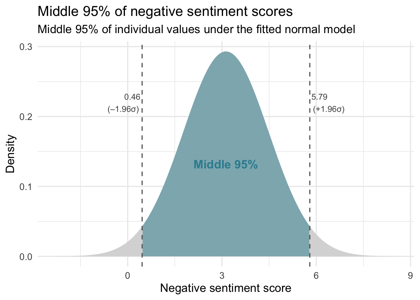
Parameters vs. statistics: notation you will live with
Before we close the Module, a notational habit worth forming now. Throughout the rest of this course, you will constantly need to distinguish population parameters — the true, usually unknown, numbers that describe the data generating process — from sample statistics — the quantities you actually compute from your data.
| Quantity | Population parameter | Sample statistic (estimator) |
|---|---|---|
| Mean | \(\mu\) (“mu”) | \(\bar{x}\) (“x-bar”), or \(\hat{\mu}\) |
| Standard deviation | \(\sigma\) (“sigma”) | \(s\), or \(\hat{\sigma}\) |
| Variance | \(\sigma^2\) | \(s^2\), or \(\hat{\sigma}^2\) |
| Proportion | \(p\) | \(\hat{p}\) (“p-hat”) |
| Regression slope | \(\beta\) (“beta”) | \(\hat{\beta}\) (“beta-hat”) |
Two rules of thumb:
- Greek letters describe the population. They are properties of the distribution — fixed, usually unknown.
- Latin letters and hats describe your sample. They are quantities you can actually compute. R functions like mean(), sd(), and var() return statistics; they never return parameters.
The “hat” notation (e.g., \(\hat{\mu}\)) emphasizes that a statistic is an estimator — a value computed from data that is designed to estimate a specific parameter. Often \(\hat{\mu} = \bar{x}\) — they are the same number. The two notations emphasize different roles: \(\bar{x}\) is “the mean of this particular sample”; \(\hat{\mu}\) is “my estimate of the population mean \(\mu\).” In applied work you will see both.
Why this matters
Inference is the art of using statistics to reason about parameters. Every confidence interval in M07 and every hypothesis test in M08/M09 is a formal claim about a parameter, made using only a statistic and the data’s sampling variability. Getting the notation habit right now — is that symbol a parameter or a statistic? — makes the rest of the semester much easier.
Looking ahead
So far, each random variable we studied was a single value drawn from a distribution — one article’s negative sentiment score, the number of exclamation marks in 8 articles. In M07 we ask a harder and more useful question: what happens when we summarize a whole sample?
Consider the sample mean \(\bar{x}\) — a number you routinely compute from data. Here is the central realization:
\[\bar{x} \text{ is itself a random variable.}\]
A different random sample from the same population would yield a different \(\bar{x}\). Draw 1,000 different samples of 50 articles from the same source and you get 1,000 different sample means — all clustered around the true \(\mu\), but not identical to it.
That variation is not a nuisance to be apologized for — it is itself a distribution, with a center, a spread, and a shape. All three follow from machinery you already have: a statistic computed from a random sample is a random variable, and random variables have distributions.
This week’s lecture is where you build one of these distributions yourself — simulating many studies, watching what the results do, and giving the object its name. There you will do it with a count rather than a mean, but the logic is identical: a proportion is just a mean of 0s and 1s. This Module supplied the machinery; the lecture puts it to work.
Three threads run through the rest of Part 2 of this course:
- M07 — Confidence Intervals. Once you can describe how \(\bar{x}\) varies from one sample to the next, you can build an interval using a procedure with known long-run coverage — across repeated samples, it captures the true \(\mu\) about 95% of the time. That procedure is a confidence interval.
- M08/M09 — Null Hypothesis Significance Testing. If we fix a hypothesized value of a parameter (the “null”) and ask how rare our observed data would be under that hypothesis, we can decide whether the data are compatible with it. That is the p-value: the tail probability of a test statistic under a specified null model.
- The common engine — probability. Both CIs and NHST are applications of the probability machinery you learned in this Module: distributions, parameters, expectations, and events defined on the distribution of a statistic. If you understood M06, M07, M08, and M09 are applications, not new material.
The shift from “what is the probability of an individual article scoring above 4.5?” to “what is the probability that the mean of a sample of 50 articles is within \(\pm 0.2\) of the true population mean?” is where probability becomes inference. That shift starts in this week’s lecture and carries through M07.
Summary
Core concepts
In the frequentist framing this course leans on, probability is a number between 0 and 1 describing how often an event would occur in the long run under stable conditions. The data generating process (DGP) is the full system that produces observed data; understanding it guides both what to analyze and what conclusions are warranted.
The four rules of probability:
| Rule | Formula |
|---|---|
| Complement | \(P(\text{not A}) = 1 - P(A)\) |
| Addition (exclusive) | \(P(A \text{ or } B) = P(A) + P(B)\) |
| Addition (overlapping) | \(P(A \text{ or } B) = P(A) + P(B) - P(A \cap B)\) |
| Multiplication | \(P(A \text{ and } B) = P(A) \times P(B \mid A)\) |
Conditional probability \(P(A \mid B)\) is the probability of A restricted to cases where B is known to be true. When A and B are independent, \(P(A \mid B) = P(A)\) — knowing B gives no information about A.
Random variables are numerical summaries of chance outcomes, written with capital letters (\(X\), \(Y\)). A probability distribution describes how probability is spread across the possible values \(X\) can take:
- PMF (discrete): assigns an exact probability to each possible value; all probabilities sum to 1
- PDF (continuous): probability = area under the curve between two values
- CDF: gives the cumulative probability up to any value; differences in CDF values give range probabilities
Two summary numbers describe any distribution: the expected value \(E(X) = \mu\) (its center) and the variance \(\text{Var}(X) = \sigma^2\) (its spread).
The Bernoulli and binomial distributions. Bernoulli(\(p\)) is a single trial with two outcomes; Binomial(\(n\), \(p\)) counts the number of Bernoulli successes across \(n\) independent trials, with \(E(X) = np\) and \(\text{Var}(X) = np(1-p)\). Use dbinom() for exact probabilities and pbinom() for cumulative probabilities.
The normal distribution is fully described by its mean (\(\mu\)) and standard deviation (\(\sigma\)). The Empirical Rule gives quick benchmarks (68–95–99.7% of values within 1, 2, 3 SDs). Use pnorm() (score → probability) and qnorm() (probability → score). It is the right tool only when the variable is approximately normal.
A z-score standardizes a value to the standard normal scale: \(z = (x - \mu)/\sigma\). In a normal distribution, a z-score of +1.96 sits at the 97.5th percentile, regardless of the original units.
Parameters vs. statistics. Greek letters (\(\mu\), \(\sigma\), \(p\), \(\beta\)) describe population parameters — fixed, usually unknown. Latin letters and hats (\(\bar{x}\), \(s\), \(\hat{p}\), \(\hat{\beta}\)) describe sample statistics — quantities you compute from data. Inference is the art of using the second to reason about the first.
Two results that bridge to M07. The Law of Large Numbers says the sample mean converges to the population mean as \(n\) grows — with the sample proportion as an important special case, since a proportion is a mean of 0s and 1s. The Central Limit Theorem says that, under standard CLT conditions (independent observations from a distribution with finite variance), sample means tend toward a normal shape for large \(n\) — whatever the shape of the raw variable. M07 makes both results precise and puts them to work.
In the next Module, we shift the question from “what is the probability this individual article has a score above 4.5?” to “what is the probability that the mean of a sample of 50 articles falls in a certain range?” That shift — from individual values to sample means, from parameters to estimators — is where inferential statistics begins.