| Variable | Description |
|---|---|
| cohort | Birth year |
| age30_absmob | The proportion of people who earned more than their parents at age 30 (after tax and adjusting for inflation). |
| age40_absmob | The proportion of people who earned more than their parents at age 40 (after tax and adjusting for inflation). |
Apply and Practice Activity
Pivoting the American Dream
Introduction
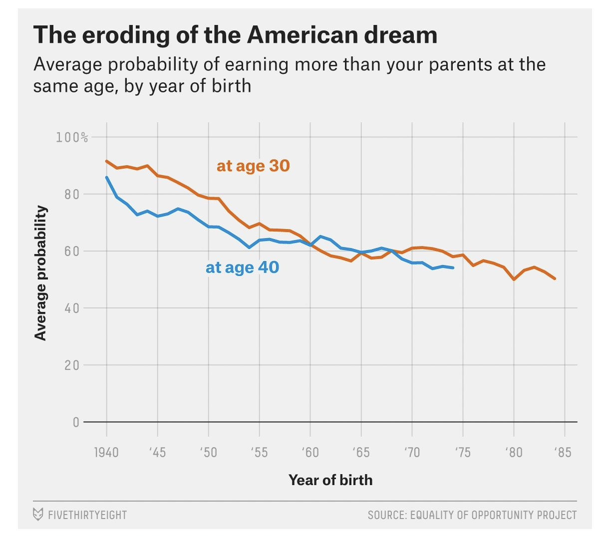
For this activity you are going to apply an alternative method to create the first graph presented in this article by FiveThirtyEight that you created earlier in the semester. It is also pasted here:

Please follow the steps below to complete this activity.
Step by step directions
Step 1
Open up the american_dream.qmd analysis notebook that you worked on earlier in the Posit Cloud foundations project.
To ensure you are working in a fresh session, close any other open tabs (save them if needed). Click the down arrow beside the Run button toward the top of your screen then click Restart R and Clear Output.
Step 2
Run the code chunk to load packages.
Step 3
Run the code chunk to import data.
Recall that the mobility538.Rds data frame has three variables:
Step 4
Create a pivoted version of the data frame.
Under your prior interpretation, create a new first level header called:
# An alternative graphing approach
Then create a second level header called:
## Pivot the data from wide to long
Underneath the second level header, add a code chunk. Put your cursor where you want to put the code chunk then click on the green C at the top of the RStudio session.
Inside this code chunk — create a new version of the mobility538 data frame. Call it mobility538_long. In this data frame, pivot the data longer (i.e., use the pivot_longer() function) so that there is one variable called absmob rather than two and a new variable called at_age that indexes whether the absmob score refers to age 30 or age 40.
Step 5
Before we create a new graph with the pivoted data — we need to create a version of at_age — specifically a factor with informative labels.
What is a factor? A factor is a data type used in R for categorical variables. Factors are very important in data analysis and statistical modeling, as they can significantly influence how data is analyzed and presented. We’ll use factors often in this course.
To accomplish this task of creating a factor, add a pipe operator at the end of the pivot_longer() line that you created in the last step, return and create a new variable (via mutate()) called at_age.f — it will be a factor. Though not required, it is convenient to name factors with a .f extension. It can help you to remember which variables are coded as factors. With this factor, we will make level “age30_absmob” have the label “At age 30” and level “age40_absmob” have the label “At age 40”.
Here’s what your code should look like:
mobility538_long <-
  mobility538 |>
  pivot_longer(cols = c(age30_absmob, age40_absmob), names_to = "at_age", values_to = "absmob") |>
  mutate(at_age.f = factor(at_age,
                           levels = c("age30_absmob", "age40_absmob"),
                           labels = c("At age 30", "At age 40")))
Here’s a breakdown of the code to create a factor:
The factor() function is used to create a factor within the mutate() function, this new factor is named at_age.f. This part is accomplished via the code
mutate(at_age.f =.The first argument to factor(),
at_age, is the variable being converted into a factor. That is, at_age is the existing variable that you want to convert to a factor.The
levelsargument specifies the levels of the factor. Here it is set as c(“age30_absmob”, “age40_absmob”), which are the original values in the at_age variable. The c() function stands for combine or concatenate, and it is used to provide R with a list of values.The
labelsargument is used to give each level a label. Here it is set as c(“At age 30”, “At age 40”). This means that in the new factor variable at_age.f, age30_absmob will appear as “At age 30” and age40_absmob will appear as “At age 40”. Note that the order of the levels on the levels list, but be the same as the order of the levels on the labels list.
In summary, this part of the code is creating a new variable called at_age.f that takes the at_age variable and converts it to a factor. The values “age30_absmob” and “age40_absmob” are then relabeled as “At age 30” and “At age 40” respectively. This can make the data more understandable when it’s presented, as “At age 30” and “At age 40” are more descriptive than the original labels. As we progress through the course, we’ll also learn about some additional benefits of converting a character variable to a factor.
Step 6
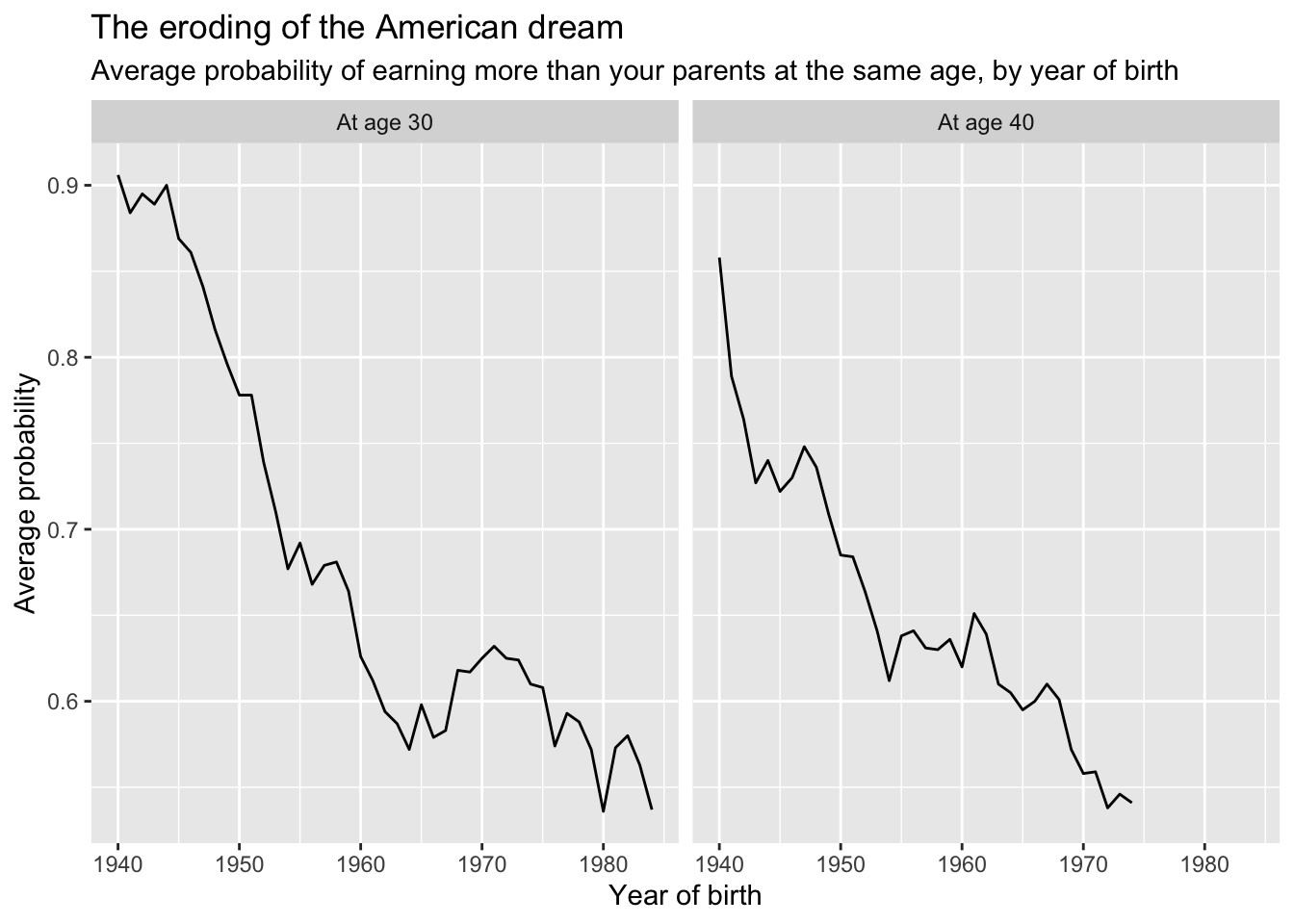
With the data in the long format, we have new options for graphing. First, create a version of the graph that treats at_age.f as a facet.
After the code chunk that pivots the data. Return, and then create a second level header called:
## at_age.f as a facet
Then, add a code chunk. Create a version of the graph that presents the two lines (one for age 30, one for age 40) as a facet. You should have two plots — one for each level of at_age.f.
Your graph should look something like this:

Step 7
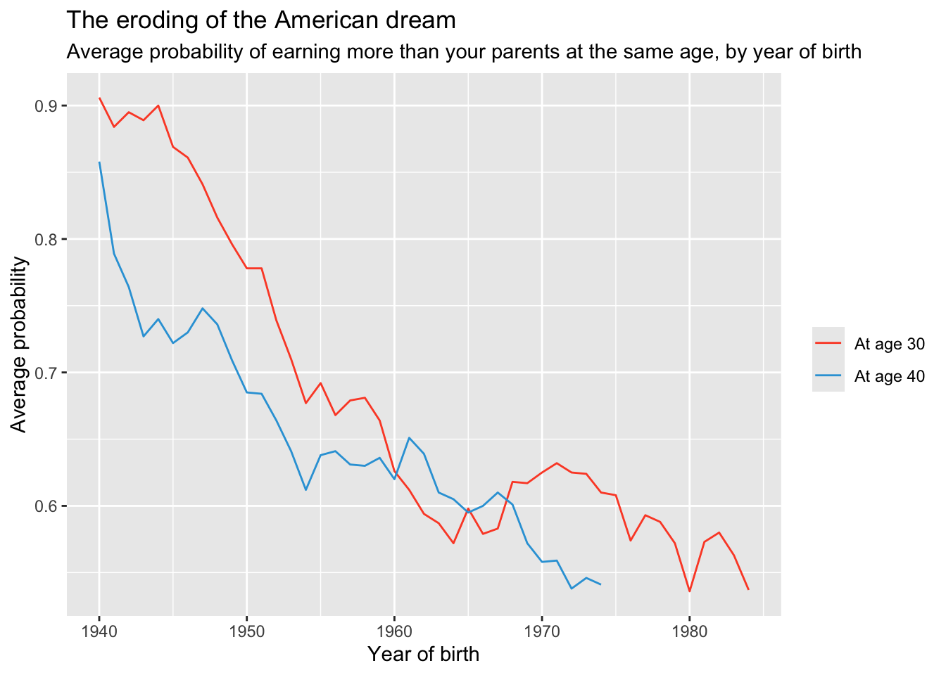
Let’s explore one other variation of the graph. Let’s create a graph that puts both lines on one plot — as it was before. However, rather than treating at_age.f as a facet, let’s map at_age.f as an aesthetic by adding: group = at_age.f, color = at_age.f to the aes() function call.
To add this to your notebook, below the faceted graph, add a second level header called:
## at_age.f as an aesthetic grouping
If you wanted to make the colors the same as in our initial graph, you could use the following approach (which uses the technique you learned about in Module 3):
group.colors <- c("At age 30" = "#fc4f30", "At age 40" = "#30a2da")

mobility538_long |>
  drop_na() |>
  ggplot(mapping = aes(x = cohort, y = absmob, group = at_age.f, color = at_age.f)) +
  geom_line() +
  scale_color_manual(values = group.colors) +
  labs(title = "The eroding of the American dream",
       subtitle = "Average probability of earning more than your parents at the same age, by year of birth",
       color = "",
       x = "Year of birth",
       y = "Average probability")
Step 8
As a final step, choose the style you prefer (faceted or as an aesthetic grouping) – and then add additional styling and themes to make a final graph that appeals to you (i.e., colors, themes, labels, etc.). Be creative — and consider exploring some of these possibilities:
Click here for themes to try.
Consider more stylized themes from the ggthemes package, described here — there’s even a FiveThirtyEight theme, which you can add with one extra line of code to your ggplot(): e.g.,
+ ggthemes::theme_fivethirtyeight().Click here for information about exploring R colors.
You might like to add back in the line labels directly to the graph (recall that we used the annotate() function to accomplish this task).
Try changing the look of the lines with arguments to the geom_line() function, this chapter from the R Graphics Cookbook has many great ideas.
To create your perfect graph — below the last graph, add a second level header called:
## My ideal graph
Then, add a code chunk and your corresponding code. Use ggsave() to save your graph using the following naming protocol:
firstname_lastname_perfect538.png
For example, to save my graph I would use the following code:
ggsave("kim_henry_perfect538.png")Export the graph to your desktop then please follow the directions for the “Pivoting the American Dream Apply and Practice Activity” on Canvas to submit your creation.