| Variable | Description |
|---|---|
| character | Name of character |
| ptsd_universe1 | PTSD when given the treatment (Universe 1), 1 = has PTSD, 0 = does not have PTSD |
| ptsd_universe2 | PTSD when treatment is withheld (Universe 2), 1 = has PTSD, 0 = does not have PTSD |
Causal Inference
Module 18
Learning Objectives
By the end of this Module, you should be able to:
- Define what a causal effect is
- Distinguish between an individual causal effect and an average causal effect
- Describe the potential outcomes framework and explain its importance for causal inference
- Differentiate between factual and counterfactual outcomes
- Explain the advantages and disadvantages of using randomized controlled trials (RCTs) to estimate causal effects
- Identify the strengths and limitations of observational studies for estimating causal effects
- Describe how statistical methods can be used to control for confounders in observational studies
- Distinguish between internal validity and external validity and discuss why both are important for causal inference
Overview
What is a causal effect?
A causal effect refers to a relationship between two variables in which a change in one variable (the cause) directly leads to a change in another variable (the effect). That is, if variable X causes variable Y, then changing X will result in a corresponding change in Y.
You’re already familiar with causal thinking from everyday life. For example:
- Eating a nutritious lunch causes your cells to function properly.
- Taking a pain reliever causes a headache to subside.
As behavioral scientists, we are often interested in identifying the causes of human behavior. For instance, we might ask:
- Does social media use among teenage girls cause an increase in depression?
- Does regular exercise cause a reduction in the risk of dementia in older adults?
- Does a 4-day workweek cause improvements in employee well-being?
In this Module, we will focus on causal relationships where one variable clearly exerts directional influence over another. We refer to the variable that initiates the change as the treatment variable, and the variable that responds as the outcome variable. These are often denoted as:
- X = treatment
- Y = outcome
Thus, a causal relationship can be represented as:
\[X \rightarrow Y\]
The Potential Outcomes Framework
To explore the key principles necessary to uncover a causal effect, let’s imagine two people who have recently experienced a traumatic event — Billy and Erica.


A psychologist developed a new treatment designed to prevent post-traumatic stress disorder (PTSD) in individuals who have experienced significant trauma. She administers the treatment to Billy, who does not develop PTSD. She also treats Erica, who likewise does not develop PTSD.
Based on these outcomes, can we conclude that the treatment prevented PTSD (i.e., caused the beneficial outcome)?
Now, imagine a parallel universe in which neither Billy nor Erica receives the treatment. In this version, Billy develops PTSD, but Erica does not.
Does this change our assessment of the treatment’s causal effect?
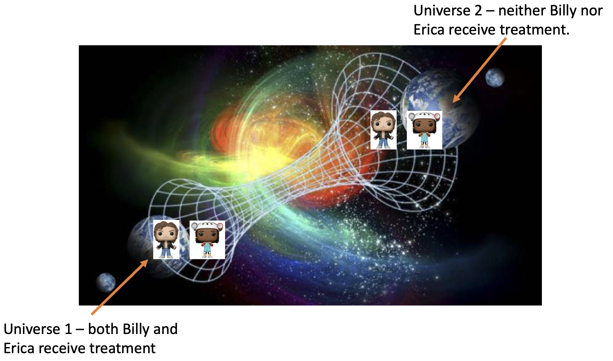
Let’s summarize the outcomes in these two parallel universes:
For Billy:
With treatment → No PTSD
Without treatment → PTSD
The outcomes differ depending on whether treatment is given.
👉 Conclusion: The treatment caused the outcome for Billy (i.e., it prevented PTSD).
For Erica:
With treatment → No PTSD
Without treatment → No PTSD
The outcomes are the same regardless of treatment.
👉 Conclusion: The treatment did not cause the outcome for Erica.
Definition of an individual causal effect
In the imaginary scenarios we considered for Billy and Erica, we were asking whether the treatment caused a different outcome for each person. This is known as the individual causal effect — the effect of the treatment on the outcome for a specific individual.
To assess this, we consider two potential outcomes for each person (where \(y_i\) is the outcome, and \(x_i\) is the treatment):
- \(y_i(x_i = 1)\): the outcome for individual i if they receive the treatment
- \(y_i(x_i = 0)\): the outcome for individual i if they do not receive the treatment
The individual causal effect is the difference between these two potential outcomes:
\[ \text{Individual Causal Effect} = y_i(1) - y_i(0) \]
If the individual causal effect is not equal to zero, the treatment changed the outcome for that case — it had a causal effect. If the causal effect is zero, the treatment did not change the outcome.
Individual Casual Effect for Billy
- \(y_i(1) = 0\) → no PTSD when treated
- \(y_i(0) = 1\) → PTSD when untreated
- Causal effect = \(0 - 1 = -1\)
👉 The treatment prevented PTSD for Billy.
Individual Causal Effect for Erica
- \(y_i(1) = 0\) → no PTSD when treated
- \(y_i(0) = 0\) → no PTSD when untreated
- Causal effect = \(0 - 0 = 0\)
👉 The treatment had no effect on Erica.
In this way, we can say the treatment helped Billy but not Erica. The treatment made a difference for Billy — it prevented PTSD — but it didn’t change anything for Erica, who would not have developed PTSD regardless.
Potential outcomes for all characters
Let’s build on this example a bit, and imagine that we could observe both potential outcomes of the new treatment for all characters in the Stranger Things series.

That is, imagine two parallel universes that are identical in every way except for one key difference:
In Universe 1, the psychologist delivers her new treatment to all of the characters and observes the potential outcome under treatment (\(y_i(x_i = 1)\)).
In Universe 2, the psychologist withholds the treatment from all of the characters and observes the potential outcome without treatment (\(y_i(x_i = 0)\)).
The table below describes the variables we will consider in this illustrative example.
The data frame is presented below.
Let’s take a look at the cross tabulation of the PTSD potential outcomes.
parallel |>
  tbl_cross(
    row = ptsd_universe1,
    col = ptsd_universe2,
    percent = "cell",
    label = list(
      ptsd_universe1 ~ "PTSD in Universe 1 (with treatment)",
      ptsd_universe2 ~ "PTSD in Universe 2 (without treatment)"
    )
  )
PTSD in Universe 2 (without treatment)
|
Total | ||
|---|---|---|---|
| 0 | 1 | ||
| PTSD in Universe 1 (with treatment) | |||
| 0 | 22 (35%) | 26 (41%) | 48 (76%) |
| 1 | 4 (6.3%) | 11 (17%) | 15 (24%) |
| Total | 26 (41%) | 37 (59%) | 63 (100%) |
Of the 63 characters, 11 (i.e., 17% of the total) had PTSD whether or not they received the treatment and 22 (i.e., 35%) didn’t have PTSD whether or not they received the treatment. For these people, there is no individual causal effect of the treatment because their outcome, \(y_i\), under treatment is the same as their outcome without treatment.
For 26 people (41% of the characters), they didn’t have PTSD when given the treatment (Universe 1), but they did have PTSD if the treatment was withheld. The outcome under treatment is not equal to the outcome under control — thus there is an individual causal effect for these characters. This represents exactly what an interventionist would want to see — a beneficial treatment effect. That is, for these 26 people, receiving the treatment prevented PTSD.
Last, there are 4 people (6.3% of the characters) who had PTSD if they received the treatment, but they didn’t have PTSD if the treatment was withheld. Because the outcome under treatment is different than the outcome under control, there is an individual causal effect of the treatment — but it’s an iatrogenic treatment effect. That is, for these 4 people, receiving the treatment caused PTSD.
Definition of an average causal effect
So far, we’ve focused on individual causal effects — comparing outcomes for each person across two hypothetical conditions: treatment and no treatment. Now, let’s shift our focus to the average causal effect by looking at what happens in aggregate.
Sticking with our two parallel universes:
- In Universe 1, everyone receives the treatment (\(x_i = 1\))
- In Universe 2, no one receives the treatment (\(x_i = 0\))
parallel |>
  select(-character) |>
  tbl_summary(label = list(
      ptsd_universe1 ~ "PTSD in Universe 1 (with treatment)",
      ptsd_universe2 ~ "PTSD in Universe 2 (without treatment)"
    )
)| Characteristic | N = 631 |
|---|---|
| PTSD in Universe 1 (with treatment) | 15 (24%) |
| PTSD in Universe 2 (without treatment) | 37 (59%) |
| 1 n (%) | |
In Universe 1, 15 out of 63 individuals had PTSD. Thus, the probability of PTSD given treatment is:
\[ P(\text{PTSD} \mid \text{treatment}) = \frac{15}{63} \approx 0.24 \]
In Universe 2, 37 out of 63 individuals had PTSD. Thus, the probability of PTSD given no treatment is:
\[ P(\text{PTSD} \mid \text{no treatment}) = \frac{37}{63} \approx 0.59 \]
This suggests that the treatment reduced the probability of PTSD from 59% to 24%.
Risk Ratio as a Summary of the Average Causal Effect
We can summarize the difference using a risk ratio (RR):
\[ RR = \frac{P(\text{PTSD} \mid \text{treatment})}{P(\text{PTSD} \mid \text{no treatment})} = \frac{0.24}{0.59} \approx 0.41 \]
This tells us that the risk of PTSD under treatment is about 41% of the risk when untreated — a substantial reduction1.
If the treatment had no effect, the risk ratio would be 1 (e.g., \(0.5 / 0.5 = 1\)). Therefore, a risk ratio significantly different from 1 indicates that, on average, the treatment influenced outcomes. Because our RR of 0.41 is far from 1, this supports the presence of an average causal effect.
Tip
Note that in the summary table above, for each row, the number of people with a score of 1 (i.e., they have PTSD) is presented and the corresponding percentage of 1s is presented. For example, in parallel Universe 1, where all 63 people received the treatment, 15 of the 63 people, or 15/63 = 24% of the people, had PTSD. If you like, you can make the two variables being summarized into factor variables instead of numeric variables, and then the tbl_summary() function will print out the number of people with PTSD and the number of people without PTSD. See the example below:
parallel <- parallel |>
  mutate(
    ptsd_universe1.f = factor(ptsd_universe1,
                              levels = c(0,1),
                              labels = c("does not have PTSD", "has PTSD")),
    ptsd_universe2.f = factor(ptsd_universe2,
                              levels = c(0,1),
                              labels = c("does not have PTSD", "has PTSD"))
  )

parallel |>
  select(ptsd_universe1.f, ptsd_universe2.f) |>
  tbl_summary(
    label = list(
      ptsd_universe1.f ~ "PTSD in Universe 1 (with treatment)",
      ptsd_universe2.f ~ "PTSD in Universe 2 (without treatment)"
    )
)| Characteristic | N = 631 |
|---|---|
| PTSD in Universe 1 (with treatment) | |
| does not have PTSD | 48 (76%) |
| has PTSD | 15 (24%) |
| PTSD in Universe 2 (without treatment) | |
| does not have PTSD | 26 (41%) |
| has PTSD | 37 (59%) |
| 1 n (%) | |
The fundamental problem of causal inference
You might be wondering: how could we possibly observe both potential outcomes for each person?

In real-world studies, we can’t. For any individual, we only observe one of the potential outcomes — the one corresponding to the treatment condition they actually experienced. This is the factual outcome.
The outcome under the treatment condition not received is the counterfactual outcome. And that’s the core of the fundamental problem of causal inference:
The “fundamental problem of causal inference” is that we DO NOT directly observe causal effects for individuals because we can never observe all potential outcomes for a given individual. Holland, 1986.
Even though both potential outcomes exist in theory (in the potential outcomes framework), we only ever see one. This is essentially a missing data problem — we can’t simply compare both outcomes for the same individual because one outcome will be observed (the factual outcome), but one will remain unobserved (the counterfactual outcome).
What Can We Do Without a Parallel Universe?
To approximate counterfactuals in the real world, we turn to randomized experiments (RCTs).
In an RCT, individuals are randomly assigned to receive either the treatment or control condition. This ensures that, on average, the treatment and control groups are comparable in all pre-treatment characteristics, both observed and unobserved.
This makes the comparison of outcomes between the two groups similar to comparing parallel universes — where the only difference between the groups is whether or not they received the treatment.
A RCT for the Stranger Things Characters
Suppose we conducted an RCT with the Stranger Things characters. As observed in the data frame below, each character was randomly assigned to either the treatment or control group (as observed by the variable condition_rct — where 1 = treatment and 0 = control) and subsequently, their PTSD was observed (ptsd_rct — where 1 = has PTSD and 0 = does not have PTSD).
Here’s the data frame under this scenario:
Let’s create factor versions of the \(x_i\) and \(y_i\) variables (i.e., treatment condition and PTSD indicators) to make our summary of results easier to read. Then, we’ll compute the number of people with PTSD by treatment condition.
rct <- rct |>
  mutate(condition_rct.f = factor(condition_rct, levels = c(0,1), labels = c("control group", "treatment group"))) |>
  mutate(ptsd_rct.f = factor(ptsd_rct, levels = c(0,1), labels = c("does not have PTSD", "has PTSD")))

rct |>
  select(condition_rct.f, ptsd_rct.f) |>
  tbl_summary(by = condition_rct.f,
label = list(ptsd_rct.f = "PTSD status in the RCT"))| Characteristic | control group N = 311 |
treatment group N = 321 |
|---|---|---|
| PTSD status in the RCT | ||
| does not have PTSD | 12 (39%) | 25 (78%) |
| has PTSD | 19 (61%) | 7 (22%) |
| 1 n (%) | ||
By randomly assigning people to treatment condition (i.e., treatment group, control group), we are able to recover the effect. Comparing the bottom row (has PTSD) across condition, we find that 22% of characters randomly assigned to the treatment condition have PTSD post-intervention, compared to 61% of characters randomly assigned to the control condition. Thus, a treatment effect is apparent — i.e., the treatment appears to work to mitigate PTSD.
It is of interest to note that in this setting, we observe the outcome from parallel Universe 1 for people who were randomly assigned to the treatment condition and we observe the outcome from parallel Universe 2 for people who were randomly assigned to the control condition. Notice this in the table below:
When people are randomly assigned to receive the treatment condition (condition_rct.f == “treatment group”), then the PTSD score that we observe (ptsd_rct) is equal to the PTSD score in Universe 1 (where everyone received the treatment) and the PTSD score in Universe 2 (where no one received the treatment) is unobserved. For these people, the factual outcome is the PTSD score when treatment is received (the Universe 1 outcome) and the counterfactual outcome is the PTSD score when treatment is withheld (the Universe 2 outcome). The counterfactual outcome is missing because in the real world we don’t observe what happens to this group of people when treatment is withheld.
The table below presents the data for people who were randomly assigned to the treatment condition in the RCT.
On the other hand, notice that when people are randomly assigned to receive the control condition (condition_rct.f == “control group”), then the PTSD score that we observe (ptsd_rct) is equal to the PTSD score in Universe 2 (where no one received the treatment) and the PTSD score in Universe 1 (where everyone received the treatment) is unobserved. For these people, the factual outcome is the PTSD score when treatment is withheld (the Universe 2 outcome) and the counterfactual outcome is the PTSD score when treatment is received (the Universe 1 outcome). The counterfactual outcome is missing because in the real world we don’t observe what happens to this group of people when treatment is given.
The table below presents the data for people who were randomly assigned to the control condition in the RCT.
In this way, a randomized experiment presents a solution to the fundamental problem of causal inference. By randomly assigning participants to either a treatment or control group, any differences between these groups besides the treatment are attributed to chance. This includes all pre-treatment characteristics such as age, sex, prior trauma, and more. Any differences in post-treatment variables (e.g., PTSD) are thus confidently attributed to the treatment. This method allows for the estimation of an average causal effect across groups, instead of individual causal effects. The analogy of two parallel universes is used to explain the concept of factual and counterfactual outcomes. In this approach, we observe the factual outcome (the outcome in the the real world where treatment is either received or withheld) and estimate the counterfactual outcome (the outcome that could have occurred in the parallel universe). This way, even without a parallel universe, we can approximate counterfactual outcomes and infer causal effects.
A Real Life Example of a RCT
In Module 16 we studied a real life example of a Randomized Controlled Trial conducted by Hofman, Goldstein & Hullman.

The researchers aimed to investigate how the type of uncertainty interval presented in visualizations affects individuals’ willingness to pay (WTP) for a special boulder. Specifically, participants were randomly assigned to one of two conditions: they either viewed a Confidence Interval (CI) or a Prediction Interval (PI).
Thus, the treatment effect indicator (i.e., X) in this example was the variable called interval_CI and the outcome (i.e., Y, willingness to pay) was called wtp_final.
In analyzing the data, we found a statistically significant average causal effect of interval type on willingness to pay — where participants who viewed the CI paid, on average, about 29 ice dollars more for the special boulder, than participants who viewed the PI.
One of the fundamental strengths of the Hofman et al. study lies in the random assignment of participants to the CI or PI conditions. Because the type of interval observed was randomly assigned, any differences in WTP between the two groups can be attributed to the type of interval presented, rather than to other confounding variables. This randomization ensures that, on average, the two groups are comparable in all respects except for the intervention they received (the type of interval viewed). Consequently, any observed difference in WTP can be causally attributed to the type of interval.
What if Participants Choose their Treatment Condition?
Now imagine a version of the Hofman et al. study in which participants were allowed to choose whether to view a CI or a PI. Without random assignment, this introduces the possibility of selection bias. For example, participants who are more numerate, skeptical, or detail-oriented might be more inclined to choose the PI because it presents a fuller picture of uncertainty. Others might prefer the CI because it appears more precise or easier to interpret. The key issue is that these underlying characteristics — such as cognitive ability, risk tolerance, or trust in statistics — might also influence willingness to pay. In that case, any observed difference in WTP between CI and PI groups could reflect pre-existing differences between participants, not the effect of the interval type itself. Because treatment choice is now related to participant characteristics, it becomes entangled with which potential outcome we observe — compromising our ability to make valid causal claims.
We can see a similar issue by revisiting the Stranger Things RCT. Suppose, instead of randomly assigning characters to receive or not receive therapy, we let each character choose for themselves. In this scenario, the two groups — those who opt in versus those who opt out — might differ in important ways. For example, individuals who choose therapy may be more motivated to recover, have stronger support systems, better baseline mental health, or greater access to resources. These confounding variables can influence PTSD outcomes independently of the treatment, making it difficult to determine whether the therapy itself is effective.
This challenge is known as selection bias — bias introduced when individuals self-select into treatment or control conditions. In the potential outcomes framework, selection bias occurs when pre-treatment characteristics influence both the likelihood of receiving treatment and the outcome itself. That is, we become more likely to observe one potential outcome over the other based on these prior characteristics. For instance, if motivated individuals are more likely to choose therapy, we’re more likely to observe the treated outcome under conditions of high motivation and the untreated outcome under low motivation. As a result, the treatment condition becomes systematically linked to the potential outcome we observe, which undermines causal inference.
When participants select their own treatment, simply comparing outcomes between the treatment and control groups may reflect these pre-existing differences — not the causal effect of the treatment. This makes it difficult, if not impossible, to draw valid conclusions about treatment effectiveness.
For this reason, randomized controlled trials (RCTs) are considered the gold standard for causal inference. Random assignment ensures that, on average, the groups are comparable in all respects except for the treatment received. This holds true for both observed and unobserved confounding variables. In this context, treatment assignment is, by design, unrelated to the potential outcomes — allowing us to estimate average causal effects with confidence.
Benefits and Challenges of RCTs
Benefits of randomization
Eliminates selection bias: By randomly assigning participants to treatment or control groups, researchers prevent selection bias, which occurs when group assignment is related to outcomes. Randomization ensures that groups are comparable at baseline, allowing for a fair test of the treatment’s effect.
Balances both observed and unobserved variables: Randomization helps distribute not only known characteristics (e.g., age, gender, income) evenly across groups, but also unknown or unmeasured confounders. This is crucial because even unmeasured factors can bias causal estimates in observational studies.
Facilitates statistical analysis: When randomization is successful, groups are balanced on background variables, allowing for simpler and more transparent analysis. Basic comparisons of group means or proportions can yield valid causal estimates.
Increases internal validity: Random assignment strengthens the internal validity of a study by making it more likely that observed differences in outcomes are attributable to the treatment rather than pre-existing differences between groups.
Challenges to randomization
Although randomized experiments are considered the gold standard for establishing causal effects, they are not always practical, ethical, or sufficient. Some key limitations include:
Ethical concerns: In many cases, it is not ethical to randomly assign individuals to harmful exposures or to withhold beneficial treatments. For example, researchers cannot ethically assign participants to smoke cigarettes or deny access to a potentially life-saving therapy.
Practical constraints: RCTs often require substantial financial, logistical, and administrative resources. Large-scale or long-term studies may be prohibitively expensive or infeasible to carry out.
Logistical issues: It can be difficult to recruit or randomize certain populations, particularly when working with vulnerable, marginalized, or geographically dispersed groups.
External validity: Findings from RCTs conducted in tightly controlled environments may not generalize to real-world settings. If the study population is not representative of the broader target population, conclusions about effectiveness outside the study context may be limited.
Rare events or long-term outcomes: Studying rare outcomes or effects that take years to emerge may not be practical in an RCT setting, as they would require large sample sizes and lengthy follow-up.
Dropout and non-compliance: Even in well-designed RCTs, participants may drop out of the study or fail to adhere to their assigned condition (e.g., not following the treatment protocol). When dropout or non-compliance differs between groups, it can reintroduce bias and undermine the benefits of randomization. For example, if sicker individuals are more likely to discontinue the treatment, the observed effect may underestimate the true benefit.
Causal Inference in Observational Studies
When randomized experiments are not feasible or appropriate, researchers may turn to observational data to estimate causal effects. In observational studies, the researcher does not control or randomize who receives the treatment or exposure. Instead, the study observes existing differences between individuals who are exposed to the factor being studied and those who are not. This lack of random assignment introduces a major challenge: the groups being compared may differ in ways that influence the outcome, making it difficult to isolate the effect of the treatment or exposure.
To address this, researchers must use alternative techniques to approximate the balance achieved through randomization. This typically involves statistical adjustment — such as regression modeling, matching, or weighting — to account for differences in background characteristics and improve the comparability of the groups.
Confounders
A confounder is a variable that influences both the independent variable (the presumed cause) and the dependent variable (the presumed effect), potentially leading to a misleading conclusion about the relationship between them. Confounders can create the illusion of a causal relationship when none exists, or they can obscure a true causal effect.
A classic example of confounding involves the observed association between ice cream sales and shark attacks. Suppose a study finds that as ice cream sales increase, the number of shark attacks also increases. At first glance, this might suggest a causal link — perhaps that eating ice cream somehow leads to more shark attacks. But of course, there’s no real connection between the two.
The explanation lies in a confounding variable: the weather — specifically, warm temperatures. As the weather heats up, people are more likely to buy ice cream, and they are also more likely to visit the beach, increasing the chances of shark encounters. Thus, weather conditions affects both ice cream sales and shark attacks, making it appear that these two variables are related when they are not.
This relationship can be diagrammed as follows:

In this case, weather is the confounder that creates a spurious association between the two variables. Recognizing and adjusting for confounders is critical when trying to estimate a true causal effect.
Confounding in real-world research
While the ice cream and shark attacks example illustrates a dramatic case of confounding, most research scenarios involve more subtle forms of confounding. In many cases, a true causal relationship may exist between the exposure and the outcome, but confounding variables make it difficult to accurately estimate the size or direction of that effect.
Let’s consider three examples from behavioral science:
Stress and academic performance: Suppose a study investigates the effect of stress on students’ academic performance and finds that higher stress is associated with lower grades. However, a potential confounder is sleep quality. Poor sleep can increase stress levels and independently impair academic performance. As a result, it becomes difficult to disentangle the direct effect of stress on acadmic performance.
Exercise and cognitive function: A study may find that older adults who exercise regularly show better cognitive function. But socioeconomic status (SES) could be a confounding variable. Individuals with higher SES may have more time, access, and resources to engage in physical activity and to support cognitive health (e.g., through better healthcare, nutrition, or education). This makes it hard to know whether the benefit is due to exercise itself or to the broader advantages associated with higher SES.
Social media use and adolescent depression: Researchers may observe that adolescents who use social media more frequently report higher levels of depression. But social isolation could be a confounder: adolescents who feel isolated may turn to social media more often as a substitute for face-to-face interaction, and isolation itself is a known risk factor for depression. In this case, social isolation influences both the exposure (social media use) and the outcome (depression), making it challenging to determine whether social media use directly contributes to depression or simply correlates with other underlying factors.
The role of confounders in causal inference
In all of these examples, confounders distort or obscure the true relationship between the independent and dependent variables, potentially leading to misleading conclusions. When random assignment is not possible, researchers must use alternative strategies to control for confounding and recover valid estimates of causal effects.
In the last section of this Module, we’ll explore how analysts can address confounding by including potential confounders as covariates in a multiple regression model. In this framework, the outcome is regressed on both the treatment (or exposure) and the confounding variable(s). This approach helps adjust for pre-existing differences between groups, making it possible to isolate the effect of the treatment (provided all potential confounders have been measured and properly included in the model).
Through careful study design, thoughtful measurement, and proper statistical adjustment, researchers can mitigate the influence of confounding and move closer to understanding the true causal relationships underlying their data — even in observational studies.
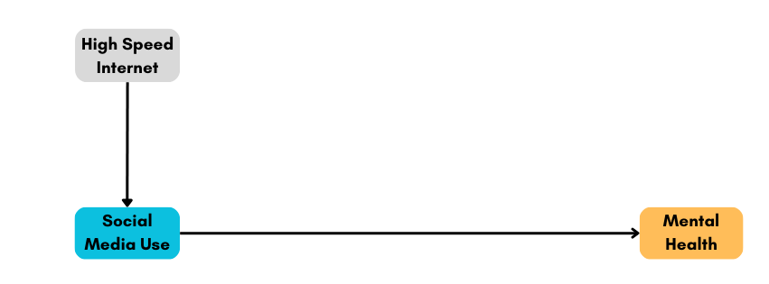
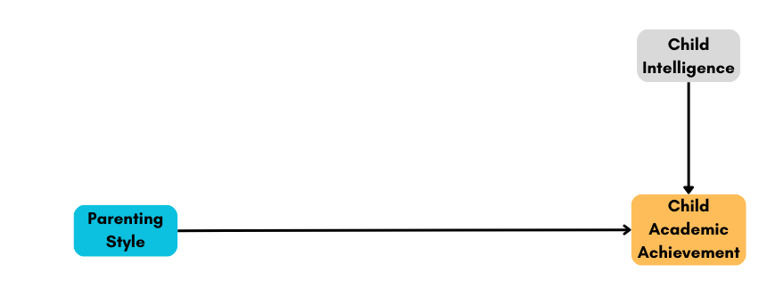
Not all third variables are confounders
So far, we’ve focused on confounders — variables that distort the estimated relationship between an exposure (X) and an outcome (Y) because they influence both. But not all third variables introduce confounding. In fact, a variable must influence both X and Y to qualify as a confounder. If it affects only one of them, or lies on the causal pathway between them, it may still be important to understand—but it does not pose the same challenge to causal inference.
Let’s consider three scenarios in which a third variable (we’ll call it variable A) does not confound the relationship between X and Y:
- Variable A causes X, but not Y: In this case, variable A is not a confounder because it does not affect the outcome variable Y. For example, in a study examining the effect of social media use (X) on mental health (Y), variable A might be the availability of high-speed internet, which influences social media use but has no direct effect on mental health.
- Variable A causes Y, but not X: Here, variable A is not a confounder since it does not influence the exposure variable X. For instance, in a study investigating the relationship between parenting style (X) and child academic performance (Y), variable A could be the child’s innate intelligence, which affects their academic performance but not the parenting style employed.
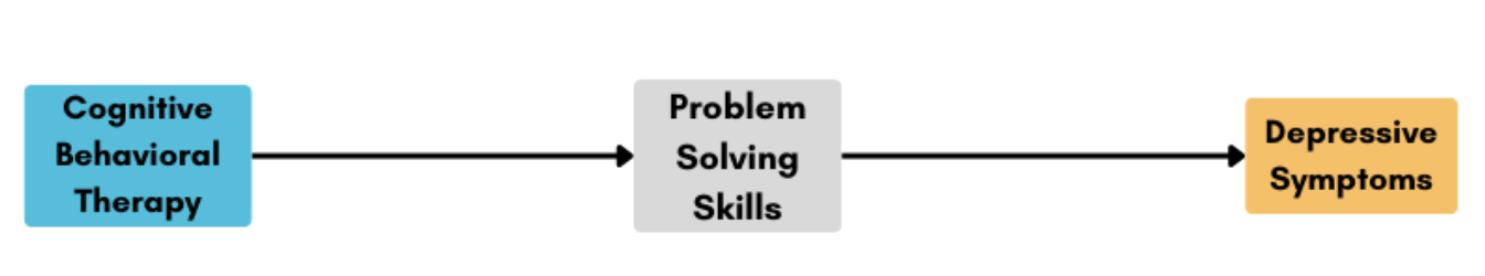
- Variable X causes variable A, and in turn, A causes Y (i.e., an intermediate variable): In this scenario, variable A is not a confounder but rather a mediator or an intermediate variable. It is part of the causal pathway between X and Y. For example, in a study assessing the impact of cognitive-behavioral therapy (CBT — the X variable) on depressive symptoms (Y), variable A might be improved problem-solving skills. The CBT intervention might enhance a participant’s problem-solving skills (A), which in turn reduces their depressive symptoms (Y). However, A does not confound the relationship between CBT and depressive symptoms because it is an outcome of the treatment and not an external factor influencing both X and Y.
Summary (and a path to learn more)
While this Module introduces the foundational concepts of causal inference and confounding, a full treatment of how to build appropriate models for causal inference is beyond our current scope. Still, it’s important to understand that estimating causal effects isn’t just about plugging variables into a regression model. As statistician Dr. Richard McElreath warns, we shouldn’t throw every variable into the model and hope for the best — a practice he calls making a “causal salad.” Instead, we need to carefully think about the data-generating process and use tools like Directed Acyclic Graphs (DAGs) to map out our assumptions about which variables influence which others. DAGs help clarify whether a variable is a confounder, a mediator, or something else entirely. If you’re curious to go deeper into these ideas, check out the additional resources linked at the end of this Module.
Estimating a causal effect in observational research
So far in this Module, we’ve discussed how randomized experiments help us estimate causal effects and how confounding complicates this task when randomization isn’t possible. But many important psychological and social questions — especially those involving large-scale social or political processes — cannot be studied experimentally for ethical or practical reasons. In such cases, researchers rely on observational data and thoughtful research design to estimate causal effects. This section introduces a compelling example of how researchers can use naturally occurring variation — in this case, differential access to state-owned television — to study the impact of propaganda on political attitudes and behavior.
A case study: Russian television propaganda and the 2014 Ukrainian elections
The history between Ukraine and Russia is complex, shaped by centuries of political, cultural, and social entanglement. The two nations share a common Slavic heritage, with Kievan Rus’ — a medieval state from the 9th to 13th centuries — often considered the cradle of both Ukrainian and Russian cultures. However, Ukraine has long struggled to assert independence from Russian influence, including during its incorporation into the Russian Empire and later the Soviet Union. After gaining independence in 1991, tensions escalated again in 2014, when Ukraine’s pro-Russian president, Viktor Yanukovych, was removed from office. In response, Russia annexed Crimea and began supporting separatist groups in eastern Ukraine, while launching a widespread disinformation campaign aimed at undermining Ukraine’s new pro-Western government.
Television became a key tool in this propaganda effort. In 2014, over 90% of Ukrainians relied on television for news, and Russian state-controlled media used this reach to promote pro-Russian narratives and undermine the legitimacy of Ukraine’s leadership. To counter this influence, Ukraine banned Russian state media broadcasts, yet about 21% of the population still accessed Russian television.
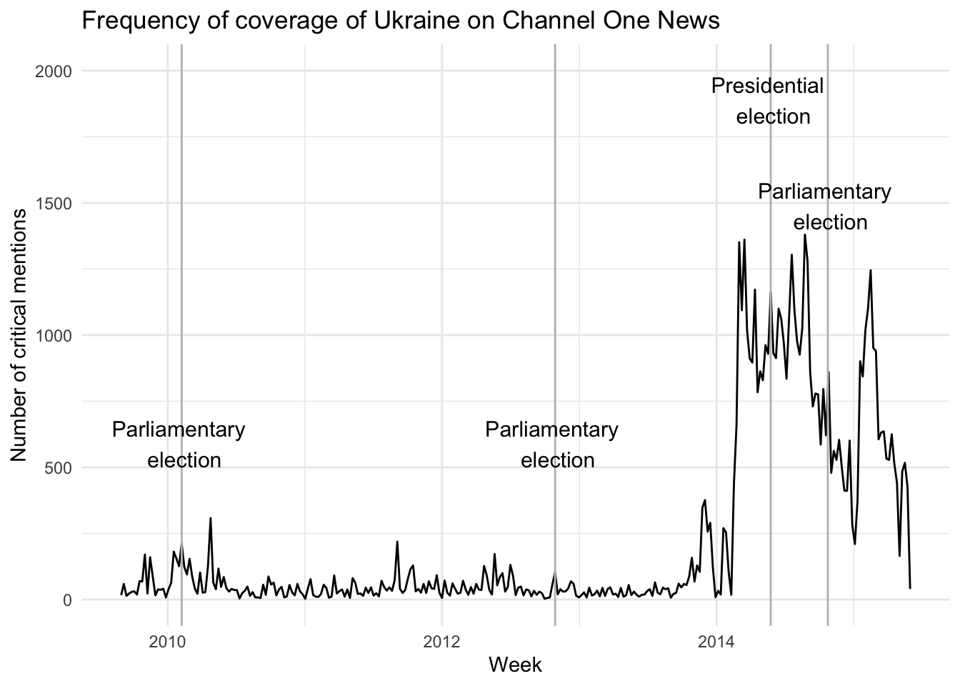
Propaganda intensified during Ukraine’s 2014 presidential and parliamentary elections. Russian news coverage frequently portrayed Ukrainian pro-Western parties as extremist or illegitimate, while characterizing pro-Russian opposition as unfairly persecuted. To analyze how Ukraine was portrayed, researchers reviewed transcripts of Russia’s most-watched news program, Channel One, from 2010 to 2015. The graph below shows a sharp increase in coverage of Ukraine during the 2014 election period, reflecting Russia’s strategic use of media to shape public opinion.
Taking advantage of this natural surge in propaganda, two political scientists — Drs. Leonid Peisakhin and Arturas Rozenas — conducted a study to estimate its causal impact on election outcomes. In their 2018 article, Electoral Effects of Biased Media: Russian Television in Ukraine, they examined whether exposure to Russian TV increased support for pro-Russian candidates in the 2014 elections.
Ukraine presented a unique opportunity for this research: although the Ukrainian government banned Russian television, some regions — particularly near the Russian border — could still access broadcasts due to signal spillover, while others could not. These differences in access were largely driven by geography rather than individual choice, which reduced the threat of self-selection bias. Importantly, the regions with and without access were otherwise very similar in terms of language, economic conditions, and voting history, making them well-matched for causal comparison. While exposure to Russian propaganda wasn’t randomly assigned, this naturally occurring variation in access allowed the researchers to estimate the impact of Russian television on voting behavior, adjusting for potential confounders.
In the remainder of this µodule, we’ll work with the data used in Peisakhin and Rozenas’s study. Our goal is to estimate the causal effect of exposure to Russian TV (the treatment) on the percent of votes received by pro-Russian candidates (the outcome) in the 2014 Ukrainian elections. The dataset includes information on 3,567 voting precincts. While the authors used more complex statistical methods in their published analysis, we’ll use a simplified model to illustrate how causal inference can be approached with observational data.
Introduction to the data
Peisakhin and Rozenas’s paper focuses on two national elections held in 2014 when Ukrainian domestic affairs were prominent on Russia’s news agenda. The data file includes election data and other relevant variables pertaining to 3,567 voting precincts in Ukraine. That is, each row of data represents a precinct.
First, we need to load the necessary packages:
library(here)
library(gtsummary)
library(gt)
library(broom)
library(tidyverse)
The data frame we’ll consider includes the following variables:
| Variable | Description |
|---|---|
| precinct | Precinct code |
| raion.f | Administrative county |
| r14pres | Percent pro-Russian votes in the 2014 presidential election |
| r14parl | Percent pro-Russian votes in the 2014 parliamentary election |
| distrussia | Distance to the Russian border (km) — log scale |
| ukrainian | Percent Ukrainian speakers from census |
| r12.f | Deciles of percent pro-Russian votes in the 2012 parliamentary election |
| turnout12 | Percent of voters who voted in the 2012 parliamentary election |
| registered12 | Registered voters in the 2012 parliamentary election — log scale |
| roads | Road density within 1-km of the polling station — log scale |
| village | Binary indicator to compare villages to towns and cities |
| qualityq | Probabality of Russian TV reception |
Let’s import the data frame.
ukraine <- read_rds(here("data", "ukraine.Rds"))
ukraine |> head()
Understanding the variables in the Russian propaganda case study
The variables in this study are more complex than in previous examples we’ve considered. To understand how the researchers estimated a causal effect, we need to take a closer look at the key components of their analysis: the exposure, the outcome, the potential confounders, and other relevant control variables.
The exposure variable
The researchers used a sophisticated method called the Irregular Terrain Model to estimate the quality of reception of Russian analog television signals in Ukrainian precincts. They included all Russian transmitters located within 100 kilometers of the study area that broadcast news programming. From this, they computed a probability score for each precinct indicating the likelihood it received Russian television. This score ranges from 0 (no reception) to 1 (certain reception) and serves as the treatment or exposure variable in the analysis.
The outcome variables
Ukraine has a multiparty system, so instead of examining support for a single party or candidate, the researchers classified all political candidates into two blocs:
Pro-Western candidates: Those who supported closer ties with the European Union or NATO, or served in the Yushchenko or Tymoshenko administrations.
Pro-Russian candidates: Those who promoted alignment with Russia or served in the Yanukovych administration.
Using this classification, they created two outcome variables based on voting results in the 2014 presidential (r14pres) and 2014 parliamentary (r14parl) elections. These outcome variables represent the proportion of votes cast for pro-Russian candidates in each precinct.
Potential confounders
One major challenge in this study is that proximity to the Russian border influences both the exposure (TV signal strength) and potentially the outcome (support for pro-Russian candidates). This makes geography a likely confounder. To adjust for this, the authors included:
raion.: A categorical variable indicating the county (or district) of the precinct.
distrussia: The distance from each precinct to the Russian border.
These geographic variables help control for the fact that both media access and political preferences may differ systematically across regions.
Other control variables
When estimating causal effects, it’s also common to adjust for other background variables that may be associated with either the treatment or the outcome, even if they’re not formal confounders. This can improve model accuracy in several ways:
Improved precision: Adjusting for relevant covariates can reduce unexplained variability in the outcome, leading to more precise (i.e., narrower) confidence intervals.
Exploring effect modification: Some variables may interact with the treatment, helping to reveal for whom or under what conditions the treatment is more or less effective. In this study, the authors explored whether the effect of Russian propaganda depended on prior political leanings — specifically, precinct-level support for pro-Russian candidates in the 2012 parliamentary elections.
Greater generalizability: Including control variables allows researchers to estimate the treatment effect while holding other factors constant (e.g., comparing two precincts with similar population sizes or infrastructure), which supports applying findings across diverse settings.
Thus, in addition to geography, the authors adjusted for the following variables to account for key differences across precincts:
Pre-existing political preferences: Support for pro-Russian parties in 2012 and voter turnout.
Economic development: Road density within a 1-km radius of the polling station.
Population size: Number of registered voters.
Urban vs. rural location: Whether the precinct was in a village, town, or city.
Language use: Percentage of Ukrainian speakers (based on the 2001 census).
These controls helped the researchers better isolate the causal effect of Russian television exposure on 2014 voting behavior by accounting for meaningful variation across precincts.
A note of caution: What NOT to control for
While including control variables can improve causal inference, not all variables should be adjusted for:
Avoid controlling for mediators: These are variables that lie on the causal pathway between the exposure and the outcome. For example, in this study, the number of hours a person watched Russian TV would be a mediator, not a confounder. Adjusting for it would “explain away” part of the effect we’re trying to estimate.
Avoid controlling for post-treatment variables: These are variables affected by both the treatment and the outcome. For instance, the number of casualties during the 2022 Russian invasion of Ukraine is influenced by both prior propaganda exposure and political outcomes and would introduce bias if included in the model.
Avoid over-adjustment: Including too many variables can reduce the efficiency of your estimates and introduce multicollinearity, which complicates interpretation.
For a helpful guide on choosing control variables in observational studies, see this paper by Dr. Tyler VanderWeele.
Descriptive statistics
Let’s first create a table of all variables that will be considered in this examination. There are already variable labels in the data frame — so we can benefit from that in our gtsummary tables. I’ll print those labels here using look_for() from the labelled package.
ukraine |>
  labelled::look_for() |>
  select(variable, label)
I’m going to exclude precinct code and the county from the descriptive table since the listings of these are very long.
ukraine |>
  select(-precinct, -raion.f) |>
  tbl_summary(
    statistic = list(
      all_continuous() ~ "{mean} ({sd}) [{min}, {max}]")) |>
  as_gt() |>
tab_header(title = md("**Table 1. Descriptive statistics for study variables**"))| Table 1. Descriptive statistics for study variables | |
|---|---|
| Characteristic | N = 3,5671 |
| Percent pro-Russian votes in the 2014 presidential election | 22 (18) [0, 76] |
| Percent pro-Russian votes in the 2014 parliamentary election | 27 (19) [0, 79] |
| Probabality of Russian TV reception | 0.11 (0.15) [0.00, 0.85] |
| Distance to the Russian border (km) -- log scale | 3.88 (0.83) [0.12, 5.20] |
| Percent Ukrainian speakers from census | 79 (27) [2, 100] |
| Deciles of percent pro-Russian votes in the 2012 parliamentary election | |
| 1 | 358 (10%) |
| 2 | 357 (10%) |
| 3 | 356 (10.0%) |
| 4 | 358 (10%) |
| 5 | 358 (10%) |
| 6 | 357 (10%) |
| 7 | 355 (10.0%) |
| 8 | 356 (10.0%) |
| 9 | 359 (10%) |
| 10 | 353 (9.9%) |
| Registered voters in the 2012 parliamentary election -- log scale | 6.66 (0.91) [3.85, 7.83] |
| Percent of voters who voted in the 2012 parliamentary election | 59 (10) [32, 98] |
| Road density within 1-km of the polling station -- log scale | 3.35 (0.77) [0.00, 5.11] |
| Binary indicator to compare villages to towns and cities | 1,977 (55%) |
| 1 Mean (SD) [Min, Max]; n (%) | |
Scatterplot between key predictor and key outcome
Let’s examine the relationship between the exposure variable — quality of Russian TV reception — and the outcome variable — percent of pro-Russian votes in the 2014 Ukrainian presidential election.
In the plot below, we display:
A linear best-fit line (blue), estimated using
geom_smooth(method = "lm"), which assumes a straight-line relationship.A loess smooth line (orange), added with
geom_smooth(method = "loess"), a flexible, non-parametric technique that reveals local patterns without assuming linearity.
ukraine |>
  ggplot(mapping = aes(y = r14pres, x = qualityq)) +
  geom_point() +
  geom_smooth(method = "lm", formula = y ~ x, se = FALSE, color = "#2F9599") +
  geom_smooth(method = "loess", formula = y ~ x, se = FALSE, color = "#F26B38") +
  theme_minimal() +
  labs(title = "Is there a linear relationship between Russian TV reception and \npro-Russian votes in the 2014 Ukrainian Presidential election?",
       subtitle = "Blue line represents linear best fit, orange line represents loess smooth",
       x = "Quality of Russian television reception in the precinct",
       y = "Percent of pro-Russian votes in the precinct")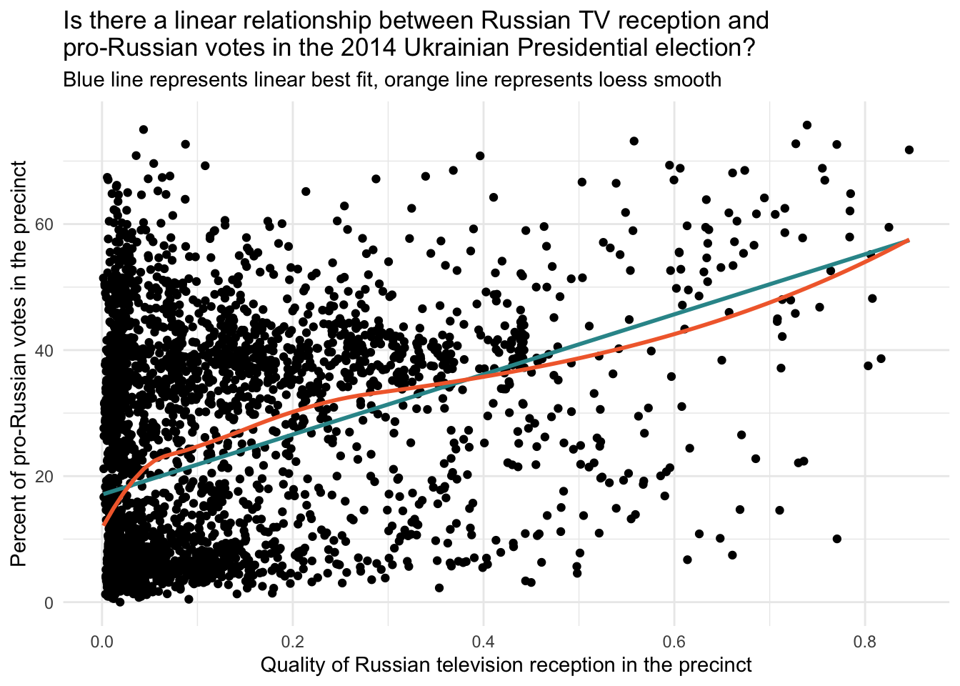
This graph helps us evaluate whether a linear model is appropriate for describing the relationship.
The linear best-fit line summarizes the overall trend between exposure and outcome. If it aligns well with the data, a linear model may be sufficient.
The loess smooth line highlights any non-linear patterns (e.g., curves or plateaus) that a linear model could miss. It’s especially helpful when working with large datasets where patterns may be harder to detect visually.
In this case, both lines follow a similar trajectory, suggesting that the linear assumption appears reasonable for modeling the relationship between Russian TV reception and pro-Russian voting in the 2014 presidential election.
Center predictors for analysis
Before we fit the regression models, I am going to center the numeric confounders and control variables at the mean. When predictor variables are centered at their mean, the intercept term in the linear regression model represents the predicted response when all the predictor variables are at their mean values. This makes the interpretation of the intercept more meaningful and easier to interpret in practical terms. I will leave the TV reception variable, qualityq uncentered — since left in it’s original form signifies a precinct without any reception — which is a meaningful quantity.
ukraine_centered <-
  ukraine |>
  mutate(across(c(distrussia, ukrainian, turnout12, registered12, roads, village), ~ . - mean(., na.rm = TRUE)))
There are two factor variables that will be used as predictors. The default in R is to treat these as dummy-coded indicators when included as predictors in a regression model. Instead, I’ve changed these to be considered effect code indicators — which is accomplished with the code below. When using the contr.sum (i.e., effect coding) method for contrast coding in R, the intercept term represents the grand mean or the overall average response or outcome across all levels of the factor variable, rather than the selected reference group (as is the case for dummy-coding). If interested, you can learn more about this here.
contrasts(ukraine_centered$raion.f) <- "contr.sum"
contrasts(ukraine_centered$r12.f) <- "contr.sum"
ukraine_centered |>
skimr::skim()| Name | ukraine_centered |
| Number of rows | 3567 |
| Number of columns | 12 |
| _______________________ | |
| Column type frequency: | |
| character | 1 |
| factor | 2 |
| numeric | 9 |
| ________________________ | |
| Group variables | None |
Variable type: character
| skim_variable | n_missing | complete_rate | min | max | empty | n_unique | whitespace |
|---|---|---|---|---|---|---|---|
| precinct | 0 | 1 | 6 | 6 | 0 | 3567 | 0 |
Variable type: factor
| skim_variable | n_missing | complete_rate | ordered | n_unique | top_counts |
|---|---|---|---|---|---|
| raion.f | 0 | 1 | FALSE | 66 | Kha: 641, Che: 189, Sum: 167, Rom: 89 |
| r12.f | 0 | 1 | FALSE | 10 | 9: 359, 1: 358, 4: 358, 5: 358 |
Variable type: numeric
| skim_variable | n_missing | complete_rate | mean | sd | p0 | p25 | p50 | p75 | p100 | hist |
|---|---|---|---|---|---|---|---|---|---|---|
| r14pres | 0 | 1 | 22.48 | 17.69 | 0.00 | 6.02 | 16.92 | 37.89 | 75.71 | ▇▂▅▂▁ |
| r14parl | 0 | 1 | 26.73 | 19.02 | 0.00 | 8.84 | 21.96 | 45.16 | 78.90 | ▇▃▃▃▁ |
| qualityq | 0 | 1 | 0.11 | 0.15 | 0.00 | 0.02 | 0.04 | 0.15 | 0.85 | ▇▂▁▁▁ |
| distrussia | 0 | 1 | 0.00 | 0.83 | -3.75 | -0.42 | 0.03 | 0.60 | 1.32 | ▁▁▂▇▇ |
| ukrainian | 0 | 1 | 0.00 | 27.05 | -76.60 | -5.75 | 14.65 | 19.26 | 21.48 | ▁▂▁▂▇ |
| registered12 | 0 | 1 | 0.00 | 0.91 | -2.81 | -0.70 | 0.09 | 0.89 | 1.17 | ▁▂▅▅▇ |
| turnout12 | 0 | 1 | 0.00 | 9.74 | -27.31 | -7.26 | -1.04 | 6.58 | 38.64 | ▁▇▆▂▁ |
| roads | 0 | 1 | 0.00 | 0.77 | -3.35 | -0.51 | 0.05 | 0.59 | 1.77 | ▁▁▅▇▃ |
| village | 0 | 1 | 0.00 | 0.50 | -0.55 | -0.55 | 0.45 | 0.45 | 0.45 | ▆▁▁▁▇ |
Fit regression models to predict 2014 presidential election results
Model 1: Without confounders
First, let’s fit a naive model that ignores potential confounders. Here, we regress r14pres (i.e., the percent of pro-Russian votes in the 2014 presidential election in the precinct) on qualityq (i.e., the strength of Russian television reception in the precinct).
fit1 <- lm(r14pres ~ qualityq, data = ukraine_centered)
fit1 |> tidy(conf.int = TRUE, conf.level = 0.95) |> select(term, estimate, std.error, conf.low, conf.high)
The intercept in this model is the predicted percent of pro-Russian votes in a precinct with 0 (no) Russian television reception. Therefore, if a precinct has no reception, we predict that 17.1% of the votes in the precinct for the 2014 Presidential election will be for a pro-Russian candidate. The regression coefficient for qualityq quantifies the predicted change in the percent of pro-Russian votes for a one unit increase in the quality of reception. Because qualityq ranges from 0 to 1, where 0 indicates a zero probability of reception and 1 indicates certain probability of reception, a one unit increase in qualityq essentially contrasts precincts with zero probability of reception to those with certain probably of reception. Therefore, we predict that the vote share for pro-Russian candidates will increase by nearly 48 percentage points if the precinct surely has Russian television reception. Using the equation, the model predicts that 65% of the votes in the precinct will be for a pro-Russian candidate if the precinct has a qualityq score of 1 (that is, \(17.1 + 47.7 = 64.8\)).
But, of course, this effect does not consider the confounders and other important control variables. Therefore, we fit a second model that adjusts for the confounders, and a third model that adjust for the confounders and the additional relevant control variables discussed by the authors.
Model 2: With confounders
In the second model, we add the identified confounders — namely the variables that control for geography.
fit2 <- lm(r14pres ~ qualityq + distrussia + raion.f, data = ukraine_centered)
fit2 |> tidy(conf.int = TRUE, conf.level = 0.95) |> select(term, estimate, std.error, conf.low, conf.high)
In the second model, the intercept represents the predicted pro-Russian vote for precincts with no Russian television reception, an average score on distance to Russia, and averaged across raions. Notice that in the second model, the effect of interest (the estimate for qualityq) has been substantially reduced, from an effect of nearly 47.7 percentage points to an effect of about 8.8 percentage points. This large reduction in the effect estimate of exposure to Russian television indicates that much of the initial observed effect was confounded by geography. By controlling for geographic factors, we now estimate that the difference in pro-Russian votes between precincts with and without Russian TV reception is 8.8 percentage points.
Model 3: With confounders and other control variables
In the third model, we add the relevant control variables.
fit3 <- lm(r14pres ~ qualityq + raion.f + distrussia + ukrainian + registered12 + r12.f + turnout12 + village + roads, data = ukraine_centered)
fit3 |> tidy(conf.int = TRUE, conf.level = 0.95) |> select(term, estimate, std.error, conf.low, conf.high)
In the third model, the intercept represents the predicted pro-Russian vote share for precincts with no Russian television reception and average scores on all numeric confounders and control variables, and averaged across the effect-coded variables. Notice that the effect of exposure to Russian television decreases slightly once these additional control variables are included.
For example, using the results from the third model, if we compare two precincts that are identical in all aspects except for their Russian television reception, we can observe the following: one precinct receives no Russian television reception (qualityq = 0), while the other has very strong Russian television reception (qualityq = 1). We expect the precinct with very strong reception (and presumably greater exposure to Russian propaganda) to have a pro-Russian vote share approximately 7.2 percentage points higher than the precinct with no reception. The standard error is relatively small, leading to a 95% confidence interval that ranges from 4.9 to 9.5 percentage points, which does not include 0.
The authors describe the effect as follows:
The goal of this article was to evaluate how conspicuously biased media impacts mass electoral behavior in a highly polarized political environment. We find consistent evidence that Russian television had a major impact on electoral outcomes in Ukraine by increasing electoral support for pro-Russian political candidates and parties.
Check the linearity assumption
We interpreted the effect of interest in this model — i.e., the effect of qualityq holding constant the confounders and other control variables — as the expected change in percent vote for pro-Russian candidates for a one-unit increase in the quality of Russian TV reception in the precinct. This assertion assumes that the relationship between the predictor and the outcome, holding constant the other variables, is indeed linear. Earlier, we examined a scatter plot of the raw data — and the linear assumption seemed reasonable. Now, let’s examine whether the assumption holds after controlling for the confounders and the other control variables.
Let’s begin with an Added Variable Plot.
y_resid <-
  lm(r14pres ~ raion.f + distrussia + ukrainian + registered12 +  r12.f + turnout12 + village + roads, data = ukraine_centered) |>
  augment(data = ukraine) |>
  select(precinct, r14pres, qualityq, .resid) |>
  rename(y_resid = .resid)

x_resid <-
  lm(qualityq ~ raion.f + distrussia + ukrainian + registered12 + r12.f + turnout12 + village + roads, data = ukraine_centered) |>
  augment(data = ukraine) |>
  select(precinct, .resid) |>
  rename(x_resid = .resid)

check <-
  y_resid |>
  left_join(x_resid, by = "precinct")

check |>
  ggplot(mapping = aes(y = y_resid, x = x_resid)) +
  geom_point() +
  geom_smooth(method = "lm", formula = y ~ x, se = FALSE, color = "#2F9599") +
  geom_smooth(method = "loess", formula = y ~ x, se = FALSE, color = "#F26B38") +
  theme_minimal() +
  labs(title = "Does the linear relationship between Russian TV reception and \npro-Russian votes in the 2014 Ukrainian Presidential election hold after \naccounting for covariates?",
       subtitle = "Blue line represents linear best fit, orange line represents loess smooth",
       x = "Residual for quality of Russian television reception in the precinct",
       y = "Residual for percent of pro-Russian votes in the precinct")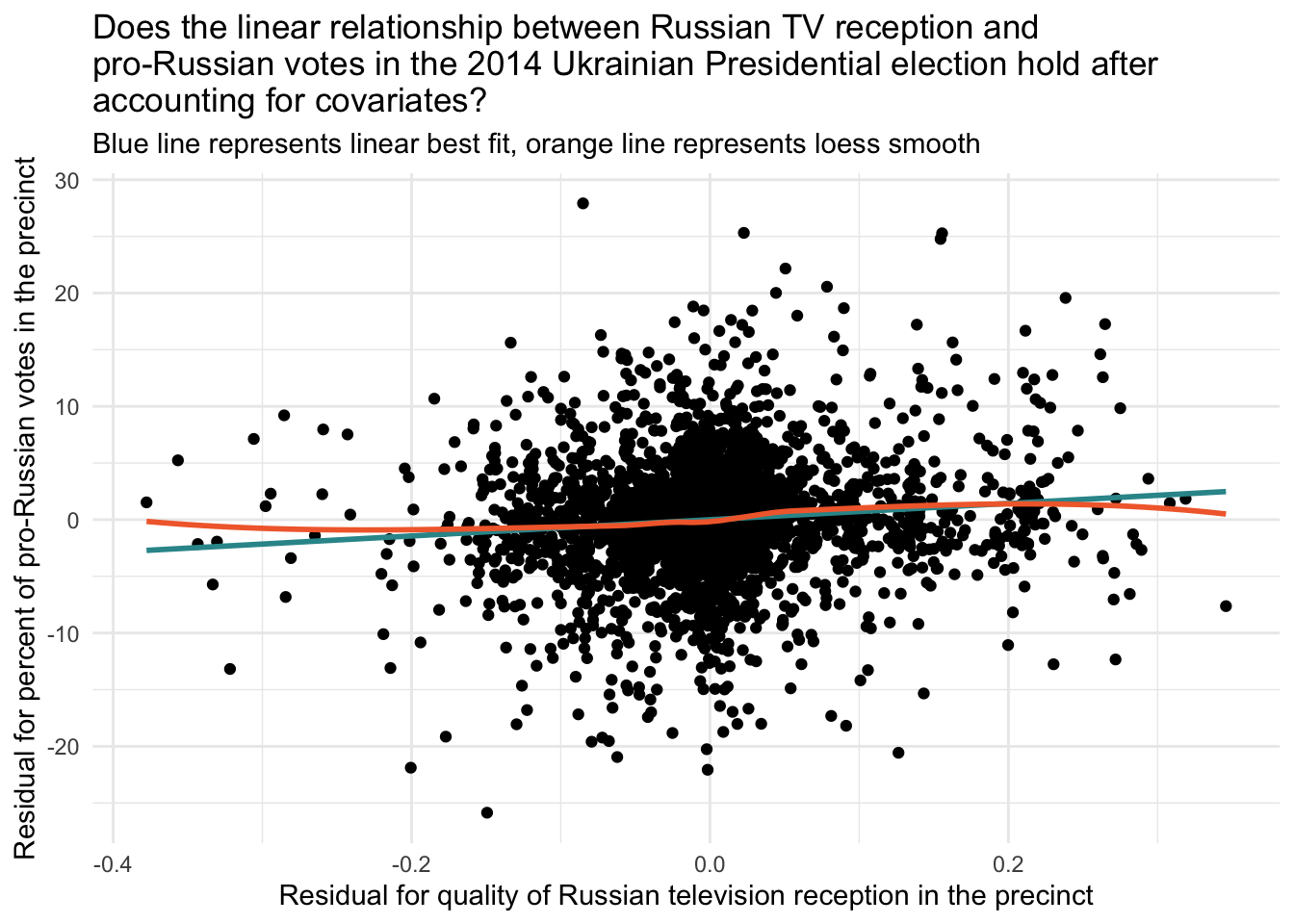
The linear assumption appears to hold here as well. Therefore, we are on solid ground for using a linear model to relate our exposure (qualityq) to our outcome (r14pres) after accounting for the confounders and control variables.
Recall that another useful plot for examining the assumption of linearity is to examine a scatterplot of the .fitted values and the .resids from the fitted model. Let’s create this plot for our third model — which we named fit3.
fit3 |>
  augment(data = ukraine_centered) |>
  ggplot(mapping = aes(x = .fitted, y = .resid)) +
  geom_point() +
  geom_hline(yintercept = 0, linetype = "dashed", linewidth = 1, color = "#2F9599") +
  geom_smooth(method = "loess", formula = y ~ x, se = FALSE, color = "#F26B38") +
  xlab("Fitted Values") +
  ylab("Residuals") +
  ggtitle("Fitted Values vs Residuals") +
  theme_bw()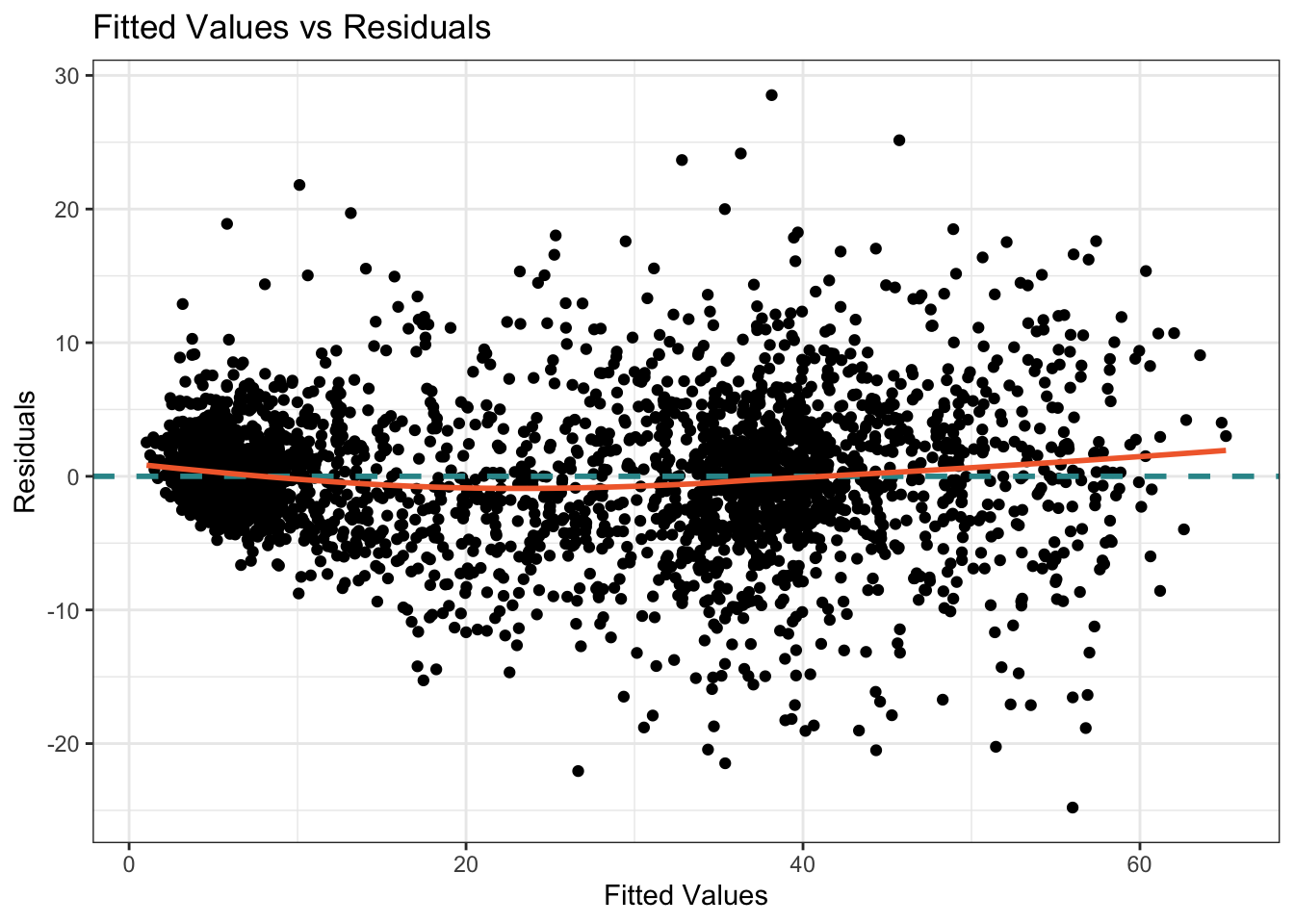
If the relationship between the fitted values and residuals appears random and shows no discernible pattern, it suggests that the linearity assumption for the overall model is reasonably met. If the residuals exhibit a clear pattern or systematic trend as the fitted values change, it indicates a violation of the linearity assumption. If the residuals form a curved pattern, it suggests a potential nonlinear relationship between the predictors and the outcome variable. The addition of the loess smooth on this graph helps us to discern patterns. The assumptions of linearity seem to be met in this graph as well — the orange loess smooth only departs from the blue horizontal line minimally.
Create a publication-ready table of the results
We can create a publication ready table of these findings using tbl_regression() from the gtsummary package. Note that I left out the indicators for county (raion.f) to create a smaller table.
The code fits three regression models (fit1, fit2, and fit3) with different sets of predictor variables. For each model, it creates a table of regression results using the tbl_regression() function from the gtsummary package. The include argument specifies the variables to include in the regression model, while intercept = TRUE includes the intercept term.
After obtaining the tables for each model (out1, out2, and out3), the code merges them into a single table using tbl_merge() from the gtsummary package. The tab_spanner argument specifies the labels for each model in the merged table.
Finally, the as_gt() function is used to convert the table to the gt format. The gt package provides additional styling and customization options for the table — including titles and source notes as demonstrated here.
out1 <- fit1 |>
  tbl_regression(include = c("qualityq"), intercept = TRUE) |>
  modify_header(label ~ "**Term**", estimate ~ "**Estimate**")

out2 <- fit2 |>
  tbl_regression(include = c("qualityq", "distrussia"), intercept = TRUE) |>
  modify_header(label ~ "**Term**", estimate ~ "**Estimate**")

out3 <- fit3 |>
  tbl_regression(include = c("qualityq", "distrussia", "ukrainian", "r12.f", "registered12", "turnout12", "village", "roads"), intercept = TRUE) |>
  modify_header(label ~ "**Term**", estimate ~ "**Estimate**")

  tbl_merge(
    tbls = list(out1, out2, out3),
    tab_spanner = c("Model 1", "Model 2", "Model 3")) |>
    as_gt() |>
    tab_header(title = md("**Table 2. Fitted regression model to estimate the causal effect of Russian propaganda on the presidential election for Ukraine in 2014**")) |>
tab_source_note("Ukrainian counties are included as confounders in Models 2 and 3, but excluded from table")| Table 2. Fitted regression model to estimate the causal effect of Russian propaganda on the presidential election for Ukraine in 2014 | |||||||||
|---|---|---|---|---|---|---|---|---|---|
| Term |
Model 1
|
Model 2
|
Model 3
|
||||||
| Estimate | 95% CI | p-value | Estimate | 95% CI | p-value | Estimate | 95% CI | p-value | |
| (Intercept) | 17 | 16, 18 | <0.001 | 20 | 20, 21 | <0.001 | 20 | 20, 20 | <0.001 |
| Probabality of Russian TV reception | 48 | 44, 51 | <0.001 | 8.8 | 5.9, 12 | <0.001 | 7.2 | 4.9, 9.5 | <0.001 |
| Distance to the Russian border (km) -- log scale | -4.3 | -5.1, -3.6 | <0.001 | -1.6 | -2.3, -1.0 | <0.001 | |||
| Percent Ukrainian speakers from census | -0.03 | -0.04, -0.02 | <0.001 | ||||||
| Deciles of percent pro-Russian votes in the 2012 parliamentary election | |||||||||
| 1 | -8.5 | -9.3, -7.7 | <0.001 | ||||||
| 2 | -7.5 | -8.2, -6.9 | <0.001 | ||||||
| 3 | -6.7 | -7.3, -6.0 | <0.001 | ||||||
| 4 | -5.6 | -6.2, -5.1 | <0.001 | ||||||
| 5 | -3.7 | -4.2, -3.1 | <0.001 | ||||||
| 6 | -1.4 | -2.0, -0.84 | <0.001 | ||||||
| 7 | 1.7 | 1.1, 2.2 | <0.001 | ||||||
| 8 | 5.3 | 4.7, 5.9 | <0.001 | ||||||
| 9 | 9.4 | 8.7, 10 | <0.001 | ||||||
| 10 | — | — | |||||||
| Registered voters in the 2012 parliamentary election -- log scale | 0.16 | -0.21, 0.53 | 0.4 | ||||||
| Percent of voters who voted in the 2012 parliamentary election | -0.02 | -0.04, 0.01 | 0.2 | ||||||
| Binary indicator to compare villages to towns and cities | -0.94 | -1.5, -0.37 | 0.001 | ||||||
| Road density within 1-km of the polling station -- log scale | -0.43 | -0.74, -0.12 | 0.006 | ||||||
| Abbreviation: CI = Confidence Interval | |||||||||
| Ukrainian counties are included as confounders in Models 2 and 3, but excluded from table | |||||||||
Enhanced interpretation of effect of exposure
Rather than interpreting the effect of the exposure as the expected difference in the vote percentage when comparing a precinct with no reception (qualityq equals 0) to a precinct with certain reception (qualityq equals 1), we could instead compute the expected change in the vote percentage for a 1 standard deviation increase in reception strength.
To calculate the expected change in the pro-Russian vote (the outcome) for a 1 standard deviation increase in qualityq, we can use the estimated slope for qualityq from our regression results. Here are the steps for Model 3:
Identify the standard deviation of qualityq: The standard deviation of qualityq is 0.1480122.
Identify the estimated slope for qualityq from our regression results: The estimated slope for qualityq is 7.17268669.
Calculate the expected change in the outcome for a 1 standard deviation increase in qualityq: Multiply the coefficient for qualityq by the standard deviation of qualityq. 7.17268669×0.1480122 ≈ 1.061. Therefore, the expected change in the pro-Russian vote (the outcome) for a 1 standard deviation increase in qualityq is approximately 1.1 percentage points.
Acknowledgement of study limitations
Importantly, the authors carefully consider potential issues with their analyses that could threaten the validity of their findings.
Two additional concerns regarding identification are worth noting. First, Russia might be building its television transmitters strategically in order to influence Ukrainian voters. According to the data by the International Telecommunication Union, Russia issued 108 new analog television transmitter licenses from 2013 to 2015. None of these new transmitters were placed in the vicinity of the Russian–Ukrainian border. In fact, in June 2015, Russia reduced the power of television transmitters along its border with Ukraine. This is the opposite of what one would expect had Russia been strategically placing its transmitters along the Ukrainian border.
Another potential source of concern is residential self-sorting: Individuals might relocate to places with better (worse) Russian analog television reception if they already have pro-Russian (pro-Western) sympathies and values. This concern is exacerbated by the fact that millions of internally displaced persons (IDPs) moved from the conflict zone in the east to other parts of Ukraine. While this type of self-sorting is possible in theory, there is little empirical support for this notion. The IDPs typically move to settlements where there are jobs and government services geared toward them (primarily cities and large towns), and it is highly unlikely that the IDPs would prioritize the availability of Russian analog television when deciding where to relocate. In addition, the movement of the IDPs began in earnest in the summer of 2014, whereas we identify electoral effects of Russian television as of May 2014. In summary, the overall evidence indicates that the main assumptions behind our research design are well justified. At the same time, as in any observational study, the problem of confounders can never be ruled out conclusively, so the results should be interpreted with caution.
Overall, this is an excellent example of how to cleverly construct a data frame to answer an important research question, and carefully carry out an analysis to estimate a causal effect.
Summary and closing remarks
Estimating causal effects from observational data is a challenging but essential task in psychological and behavioral science research. Unlike randomized experiments, observational studies rely on naturally occurring variation, which makes it harder to draw clear cause-and-effect conclusions. Yet, with thoughtful design and analysis, it is possible to make meaningful causal inferences even in the absence of random assignment.
As the statistician John Tukey famously warned:
The combination of some data and an aching desire for an answer does not ensure that a reasonable answer can be extracted from a given body of data.
This quote is a useful reminder: sound causal inference requires more than just data and good intentions — it demands careful thinking, appropriate methods, and an awareness of the limitations of our tools.
Throughout this Module, we’ve seen that estimating causal effects requires researchers to:
- Carefully consider how their data were generated,
- Identify and control for potential confounders, and
- Use statistical models that align with the structure of their research questions and data.
For the Russian propaganda study, we used multiple regression to adjust for confounding, but other advanced methods — such as propensity score matching, instrumental variables, regression discontinuity designs, and difference-in-differences models — are also commonly used in applied research. You’ll find resources at the end of the Module if you’d like to explore these methods further.
Beyond analytical techniques, the quality of the data matters greatly. Well-defined variables, accurate measurements, and sufficient sample sizes are all critical for drawing valid conclusions. Researchers must also be mindful of sources of bias, including selection bias, measurement error, and unmeasured confounders — all of which can distort results.
In summary, while estimating causal effects from observational data is inherently complex, it is both possible and necessary in many real-world contexts. With a thoughtful, rigorous approach, researchers can uncover meaningful insights that advance our understanding of human behavior — even when experiments aren’t an option.
After completing this Module, you should be able to answer the following questions:
- What is a causal effect, and how does it differ from a correlation or association between two variables?
- What is the difference between an individual causal effect and an average causal effect?
- What are potential outcomes, and how do they help us define causal effects clearly?
- What is the fundamental problem of causal inference, and why does it arise?
- What are the key benefits of using a randomized controlled trial (RCT) to estimate causal effects?
- Why is selection bias a concern when participants choose their own treatment conditions, and how does random assignment mitigate this issue?
- What are some reasons that researchers might not be able to use an RCT, and what challenges arise when using observational studies instead?
- What is a confounder, and how can confounders affect the interpretation of causal relationships?
- How can researchers use statistical methods like multiple regression to control for confounding variables in observational research?
- What is the difference between internal validity and external validity, and why must researchers consider both when interpreting causal effects?
Resources
If you’d like to learn more about estimating causal effects with observational data, I highly recommend the following books:
- The Effect: An Introduction to Research Design and Causality by Dr. Nick Huntington-Klein
- Mastering Metrics by Drs. Joshua D. Angrist and Jörn-Steffen Pischke
- What if by Drs. Miguel Hernan and Jamie Robins
- Regression and Other Stories by Drs. Andrew Gelman, Jennifer Hill, and Aki Vehtari
- Statistical Rethinking by Dr. Richared McElreath
Footnotes
If we reverse the numerator and denominator, we would calculate the RR as: RR = 0.59/0.24 = 2.46. In this case, the risk of PTSD if the treatment is withheld is about 2.46 times the risk if the treatment is received. In other words, the risk of PTSD in those who have not undergone the therapy is 2.46 times the risk in those who have. This also indicates a strong effect of the treatment in reducing the risk of PTSD. You can convert from one form of the RR to the other by taking the reciprocal of the RR as well.↩︎