Probability distributions
Module 6

Learning Objectives
By the end of this Module, you should be able to:
- Define and distinguish between discrete and continuous probability distributions
- Interpret and visualize the probability mass function (PMF) for discrete random variables
- Interpret and visualize the probability density function (PDF) for continuous random variables
- Interpret and calculate cumulative probabilities using the cumulative distribution function (CDF)
- Describe the properties and assumptions of the binomial distribution and identify real-world examples
- Explain the relationship between the binomial distribution and the normal distribution as sample size increases
- Describe the properties of a normal distribution and apply the Empirical Rule to interpret its spread
- Calculate probabilities and quantiles for normally distributed variables using pnorm() and qnorm()
- Standardize raw scores into z-scores and interpret their meaning in context
Overview
In Module 05, we explored the basics of probability—simulating data, analyzing contingency tables, and applying probability rules, including Bayes’ theorem. Now, in Module 06, we’ll build on that foundation by diving into probability distributions, which are essential for understanding variability in psychological data, designing experiments, and interpreting research findings.
As future psychologists, researchers, or data-savvy professionals, you’ll constantly encounter questions like:
How likely is it that a therapy intervention reduces anxiety symptoms by a certain amount?
What’s the probability that a surveyed group’s average happiness score differs from the general population?
How do we determine whether an observed effect in an experiment is meaningful or just due to chance?
Probability distributions help us answer these questions. They provide a mathematical framework for modeling uncertainty, predicting outcomes, and making data-driven decisions.
Key reasons probability distributions are essential
Describing psychological data
Human behavior is variable — people differ in traits, responses, and behaviors. Probability distributions (e.g., normal, binomial) help us summarize and make sense of this variability.
Example: If you measure depression scores in a sample, the distribution tells you whether most people cluster around an average or if there are extreme outliers.
Designing and analyzing experiments
Many statistical tests (e.g., t-tests, ANOVA) assume data follows certain distributions. Knowing these allows you to choose the right test and interpret results accurately.
Example: If you’re comparing two groups’ reaction times, the normal distribution helps assess whether differences are significant.
Making predictions in clinical and social research
Distributions let us estimate probabilities, like how likely a patient is to benefit from a treatment or how often a behavior might occur in a population.
Example: The binomial distribution can model the probability of success (e.g., recovery rate) in a clinical trial.
Quantifying uncertainty in real-world decisions
Policymakers, clinicians, and researchers rely on distributions to assess risk and make evidence-based choices.
Example: The normal distribution helps determine “cutoff scores” for diagnosing disorders based on deviation from the mean.
In summary, probability distributions are essential for understanding and managing the inherent uncertainty in data. They serve as foundational tools in statistics, enabling us to summarize data, make predictions, and ultimately, make informed decisions based on empirical evidence.
Introduction to Probability Distributions
In Module 05, we considered the ABO blood type system, where each type occurs with a known frequency in the population:
Type A: 42%
Type B: 10%
Type AB: 4%
Type O: 44%
These percentages define the theoretical probabilities of randomly selecting someone with a specific blood type. To visualize this, imagine a bag of 1,000 ping pong balls: 420 balls marked “A”, 100 marked “B”, 40 marked “AB”, and 440 marked “O”. Shaking the bag and drawing one ball at random mirrors how probability works: each draw is independent, and the chance of each outcome matches its real-world prevalence.
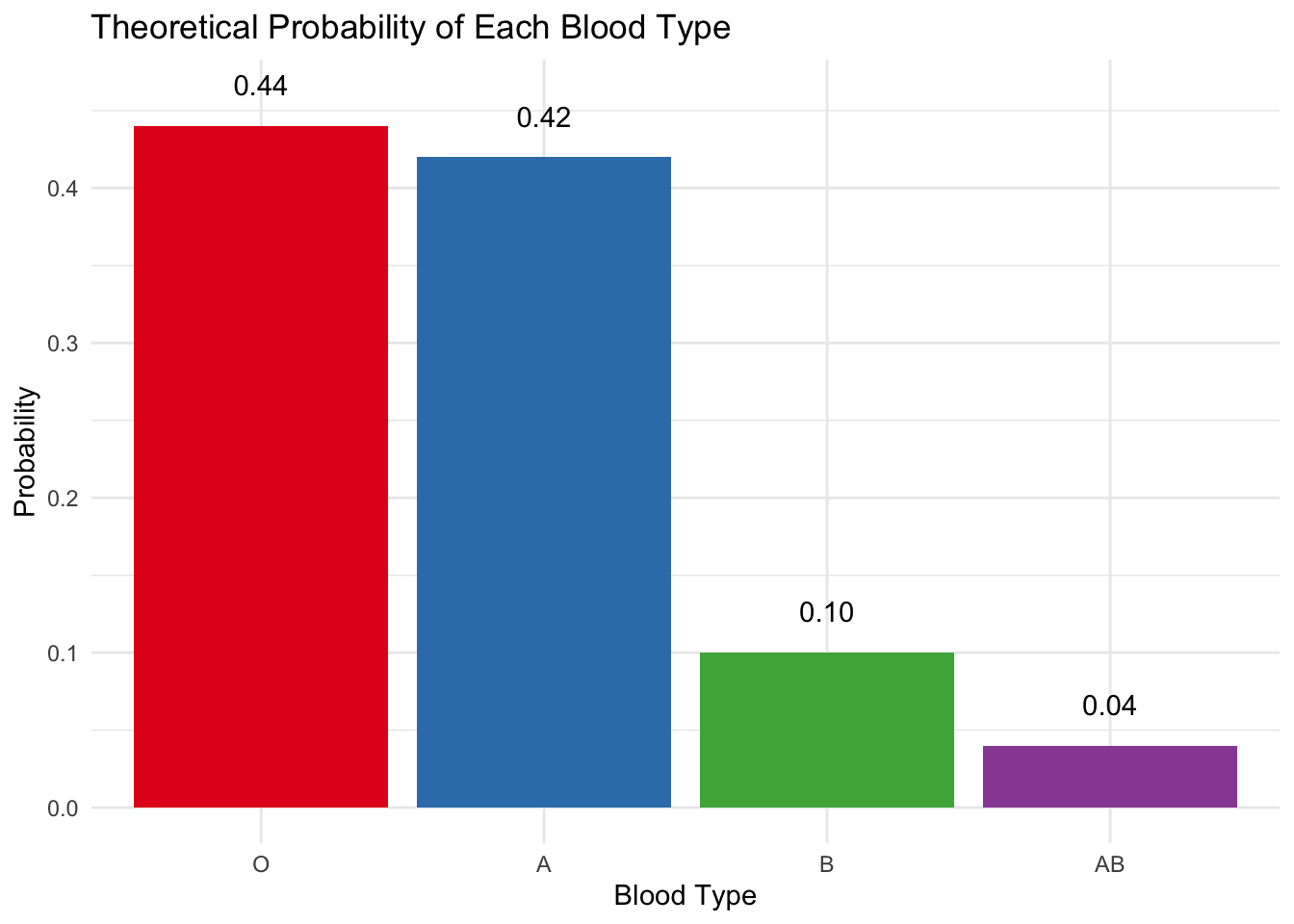
The Probability Mass Function
The barplot below shows the Probability Mass Function (PMF) for blood types — a discrete probability distribution where each bar’s height represents the exact probability of that outcome. Notice how the bar height corresponds to the the population frequency described above.
Key Takeaway: The PMF answers questions like “What’s the probability of randomly selecting a Type B individual?” (Answer: 0.10 — or, equivalently, a 10% chance).
The Cumulative Distribution Function
But what if we want to know: “What’s the probability of selecting someone with one of the two most common blood types (i.e., Type O or Type A)?” Here, we use the Cumulative Distribution Function (CDF), which sums probabilities up to a point. This provides a way to see the total probability of achieving a result up to a certain category, ordered typically by prevalence or some other logical sequence. For example, let’s order blood type by prevalanece and consider the CDF.
Type O: The most common blood type, standing at a probability of 0.44.
Adding the probability of Type A (0.42) to Type O’s gives us 0.44 + 0.42 = 0.86. This implies that the probability of an individual having either Type O or Type A blood is 0.86.
Including Type B (0.10) to the sum of Types O and A yields a cumulative probability of 0.44 + 0.42 + 0.10 = 0.96, suggesting that 96% of the population is expected to have either Type O, A, or B blood.
Incorporating Type AB (0.04) results in a total cumulative probability for Types O, A, B, and AB of 0.44 + 0.42 + 0.10 + 0.04 = 1.0, which logically covers the entire population since these are the only blood types available.
Below is the CDF plot for blood type as just described:
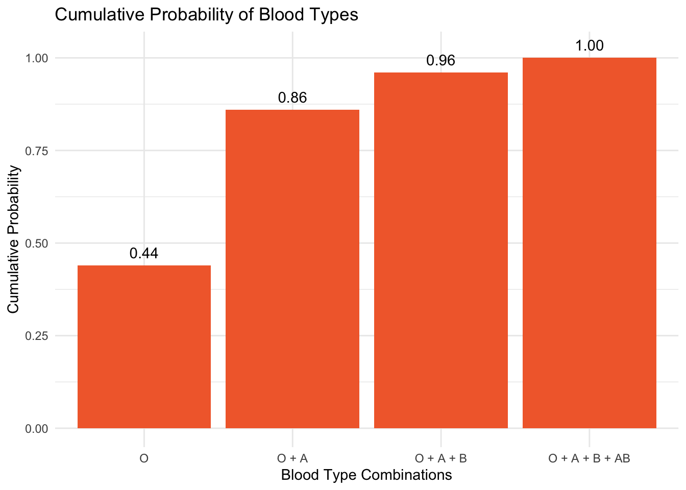
Key Takeaway: The CDF helps us answer “up to” questions (e.g., likelihood of a blood type being in the top two most common categories).
Before diving into the next components of the Module, please watch the following Crash Course Statistics video on Randomness.
Types of Probability Distributions
There are two main types of probability distributions: discrete and continuous.
Discrete probability distributions apply to scenarios where the outcomes can be counted and are finite or countably infinite. Our example of ABO blood type is an example of a discrete probability distribution. Each outcome has a specific probability (i.e., a probability mass function or PMF) associated with it, and the sum of all these probabilities equals one. When we say a set of outcomes is countably infinite, we mean that even though there may be infinitely many possibilities, you could still list them one by one in a sequence — like 1st, 2nd, 3rd, and so on. For example, imagine flipping a coin until you get heads. You might get heads on the first try, or the second, or the tenth, or the hundredth. There’s no upper limit to how many flips it might take, but each possible outcome (1st try, 2nd try, 3rd try, … 100th try) can be counted. That’s what makes it countably infinite. This is different from something like measuring reaction time, where between any two values — say, 1 second and 2 seconds — there are infinitely many numbers (e.g., 1.552 seconds, 1.763 seconds), and you can’t list them all in order. That’s called uncountably infinite, and it’s why we use continuous probability distributions for things like reaction time or income or height.
Continuous probability distributions, on the other hand, deal with outcomes that can take on any value within an interval or range. These distributions are described using probability density functions (PDFs) rather than probabilities for each individual outcome. The area under the PDF curve between any two points gives the probability of the random variable falling within that interval. This concept is crucial for analyzing measurements and data that vary continuously.
Discrete Probability Distributions
Let’s begin by examining discrete probability distributions, starting with those that apply to binary variables. Binary variables represent outcomes that fall into one of two mutually exclusive categories. These appear frequently in psychological research and practice — for instance, when classifying individuals based on:
- Diagnostic status (diagnosed vs. not diagnosed)
- Treatment adherence (completed vs. discontinued)
- Task performance (correct vs. incorrect response)
Bernoulli trials
At the heart of discrete probability distributions lies the concept of Bernoulli trials, named after the Swiss mathematician Jacob Bernoulli. A trial (in this context) is a single attempt or observation in an experiment—something you do once to see what happens. In a Bernoulli trial, there are only two possible outcomes, typically labeled as “success” and “failure,” and the outcome is determined by chance.
A classic example is flipping a fair coin. In this case, each flip is a trial, and if we define “heads” as a success and “tails” as a failure, each flip becomes a Bernoulli trial. Even though this setup is simple, it forms the foundation for understanding more complex probability models that are used in real-world research — like determining whether a medical test result is positive or negative, or whether someone completes a treatment program.
Key Properties of Bernoulli Trials
Binary Outcomes: The defining feature of a Bernoulli trial is that it has only two outcomes. These outcomes are typically labeled as “success” and “failure,” but they can represent any two mutually exclusive outcomes, such as “heads” or “tails,” “yes” or “no,” “positive” or “negative,” etc.
Fixed Probability: The probability of success, denoted by \(p\), is the same every time the trial is conducted. The probability of failure is then \(1 - p\). Additionally, the values of \(p\) must lie between 0 and 1. For example, if we flip a fair coin, the probability of heads is 0.5, and the probability of tails is 0.5.
Independence: Each Bernoulli trial is independent of the other trials. This means the outcome of one trial does not influence or change the outcomes of subsequent trials. The probability of success remains constant across trials. For example, each time you would flip a coin — there is an equal probability of it coming up heads vs. tails, and the act of it coming up heads on one flip does not impact the likelihood that it will come up heads on a subsequent flip.
Randomness: The outcome of each trial is determined by chance. The process is random, meaning that while the probability of each outcome is known, the actual outcome of any single trial cannot be predicted with certainty.
Example: COVID-19 rapid antigen testing
To illustrate the concept of Bernoulli trials in a real-world context, consider the following scenario which builds on the COVID-19 example from Module 05.
Imagine you’ve been notified of a COVID-19 outbreak at your workplace. Concerned about the risk of infection, and anxious to know if you have been infected in the days leading up to your much anticipated vacation, you decide to assess the situation using rapid antigen testing. You purchase a handful of identical saliva-based tests. You administer two of the tests simultaneously, following the test protocol precisely.
In this experiment:
Each test constitutes a Bernoulli trial with two possible outcomes: “Positive” (indicating the presence of the virus) or “Negative” (indicating the absence of the virus).
The “success” in this context is defined as obtaining a positive result, reflecting the test’s objective to detect the virus, if present.
The assumption here is that by using the same saliva sample and conducting both tests simultaneously, the probability of success (\(p\)) — a positive test result — remains constant across trials, satisfying the fixed probability condition.
The independence of each trial is maintained by the nature of the tests themselves, assuming the results of one test doesn’t directly influences the other test.
The Binomial Distribution
The binomial distribution models the probability of obtaining a specific number of successes in a series of identical, independent trials called a binomial experiment. Each trial in this experiment has exactly two mutually exclusive outcomes (traditionally called “success” and “failure”), such as receiving a positive or negative result on an individual rapid antigen test. The distribution describes how likely we are to observe each possible count of successes across all trials in the experiment. Before we explore the details of the binomial distribution, please watch the following Crash Course Statistics video on this very topic:
Binomial random variables
The binomial random variable (\(X\)) represents the number of successes in \(n\) repeated Bernoulli trials, where each trial has a fixed probability \(p\) of success.
Let’s make the following assumptions as we progress through the COVID-19 example:
Let’s imagine that the outbreak at your workplace was extreme, and the probability of a positive result on your test (\(p\)) is 0.5.
The number of tests conducted (\(n\)) is 2 (i.e., you will take two rapid tests).
The results of both tests were conclusive (i.e., neither test kit produced an unusable result).
With these two tests — there are three possible outcomes in the experiment:
Both tests come up negative (i.e., \(k=0\) positive results)
One test comes up positive, while the other is negative (i.e., \(k=1\) positive result)
Both tests are positive (i.e., \(k=2\) positive results).
We are interested in calculating \(P(X = k)\), the probability of observing k successes (positive tests) out of \(n\) trials, for three possible values of \(k\) — that is: \(k = 0,1,2\). In other words, we are interested in knowing the probability that neither test is positive (\(k = 0\)), the probability that one of the two tests is positive (\(k = 1\)), and the probability that both tests are positive (\(k = 2\)).
The probability of getting exactly \(k\) successes in \(n\) trials can be calculated using the binomial probability formula.1
\[P(X=k) = \binom{n}{k} p^k (1-p)^{n-k}\]
Where:
- \(\binom{n}{k}\) is the binomial coefficient, representing the number of ways to choose \(k\) successes out of \(n\) trials.
- \(p\) is the probability of success on a single trial.
- \(1-p\) is the probability of failure on a single trial.
The notation \(\binom{n}{k}\), read as “n choose k,” represents the binomial coefficient in mathematics. It calculates the number of ways to choose \(k\) successes out of \(n\) trials, regardless of the order in which those successes occur.
The binomial coefficient presented in the equation above is calculated using the formula:
\[\binom{n}{k} = \frac{n!}{k!(n-k)!}\]
where:
- \(n!\) (n factorial): This represents the total number of ways to arrange \(n\) items in a specific order. For example, if \(n\) is 2, then \(n! = 2 \times 1 = 2\). As another example, if \(n\) is 6, then \(n! = 6 \times 5 \times 4 \times 3 \times 2 \times 1 = 720\).
- \(k!\) (k factorial): This is the number of ways to arrange \(k\) successful outcomes. For example, if \(k = 1\), then \(1! = 1\). If \(k = 2\), then \(2! = 2 \times 1 = 2\).
- \((n-k)!\): This term calculates the number of ways to arrange the remaining \(n-k\) items after \(k\) items have been chosen. If \(n = 2\) and \(k = 1\), then \((n-k) = 1\) and \(1! = 1\). If \(k = 2\), \((n-k) = 0\) and \(0! = 1\) (since \(0!\) is defined as 1).
Please note — factorials grow fast and are mostly handled by software like R — so while it’s good to know how the binomial coefficient is calculated, it’s rarely done by hand. But, for some students, seeing the math in action might be useful — therefore, I’ll show you both the hand calculation, and R code to accomplish the task.
Let’s imagine that we wanted to calculate \(\binom{2}{2}\), representing the number of ways to achieve 2 positive test results out of 2 attempts, assuming each test is a Bernoulli trial in our defined Bernoulli experiment.
Using the formula for the binomial coefficient:
\[\binom{n}{k} = \frac{n!}{k!(n-k)!}\]
we set \(n=2\) and \(k=2\), which gives us:
\[\binom{2}{2} = \frac{2!}{2!(2-2)!} = \frac{2 \times 1}{(2 \times 1) \times 0!}\]
Remembering that \(0! = 1\) by definition, this simplifies to:
\[\binom{2}{2} = \frac{2}{2 \times 1} = 1\]
\(\binom{2}{2} = 1\) means there is exactly 1 way to achieve 2 successes (positive tests) out of 2 trials. This result is intuitive — when you have two tests and you’re looking for the number of ways to get positive results on both, there’s only one scenario where this happens: both tests must be positive.
The full experiment
Now, that we understand the gist of the binomial coefficient formula, let’s use the formula \(P(X=k) = \binom{n}{k} p^k (1-p)^{n-k}\) to calculate the probability that \(k = 0, k = 1, k = 2\) for our COVID-19 experiment:
For \(k=0\) (No Positive Tests)
Here, we’re calculating the probability that both tests are negative.
Using the formula: \(\binom{2}{0}(0.5)^0(1-0.5)^{2-0} = 1 \times 1 \times (0.5)^2 = 0.25\)
Interpretation: There’s a 25% chance that neither test will return a positive result.
For \(k=1\) (One Positive Test)
This calculates the probability of exactly one test being positive, either the first or the second.
Using the formula: \(\binom{2}{1}(0.5)^1(1-0.5)^{2-1} = 2 \times 0.5 \times 0.5 = 0.5\).
Interpretation: There’s a 50% chance of getting exactly one positive result out of the two tests. This is because there are two scenarios that result in one positive and one negative test, and each has a probability of 0.25; summed together, they yield 0.5.
For \(k=2\) (Two Positive Tests)
This calculates the probability of both tests being positive.
Using the formula: \(\binom{2}{2}(0.5)^2(1-0.5)^{2-2} = 1 \times (0.5)^2 \times 1 = 0.25\).
Interpretation: There’s a 25% chance that both tests will return a positive result.
That was easy enough to calculate by hand, but in scenarios where \(n\) and \(k\) are larger, automation is necessary. The R code below demonstrates how to use the binomial distribution via the dbinom() function to calculate and visualize the probabilities of observing a range of successful outcomes (in this case, positive test results) from a series of Bernoulli trials (COVID-19 tests). We’ll stick with the probability of success of 0.5 (i.e., for any one test, the probability of a positive result is 0.5). Therefore, this automated example will reproduce the hand calculations above.
# Define parameters for the binomial distribution
n <- 2  # Number of trials
p <- 0.5  # Probability of success

# Calculate probabilities
probabilities <- dbinom(0:n, size = n, prob = p)

# Create a data frame for plotting
results_df <- tibble(
  positive_results = 0:n,
  probability = probabilities
)

results_df
Tip
Detailed code explanation for the curious
Define Parameters for the Binomial Distribution:
n <- 2: This sets the number of trials in the binomial distribution to 2.p <- 0.5: This sets the probability of success on each trial to 0.5.
Calculate Probabilities:
probabilities <- dbinom(0:n, size = n, prob = p): This line uses the dbinom() function to calculate the probability of each possible number of successes (from 0 ton) inntrials of a binomial experiment. The parameters set above fornandpare read in here.0:ngenerates a sequence from 0 ton(here, 0 to 2), representing all possible counts of successes.size = nspecifies the total number of trials.prob = psets the probability of success in each trial.
The result is a vector of probabilities where each element corresponds to the probability of obtaining 0, 1, 2, …, up to
nsuccesses out ofntrials.
Create a Data Frame for Plotting:
results_df <- tibble(positive_results = 0:n, probability = probabilities): This line creates a data frame. The data frame is intended to organize and later facilitate displaying the data.positive_results = 0:ncreates a column named positive_results that lists the number of successes from 0 ton(inclusive).probability = probabilitiescreates a column named probability that stores the computed probabilities corresponding to each count of successes from theprobabilitiesvector.
This data frame, results_df, is structured to clearly display the number of successes alongside their associated probabilities, making it suitable for visualization or presentation in a table format.
We can plot the tabled results using a bar chart as follows:
results_df |>
  ggplot(mapping = aes(x = factor(positive_results), y = probability)) +
  geom_col(fill = "#2F9599") +
  labs(title = "Binomial probabilities for 2 trials, where p = 0.5",
       x = "Number of positive test results",
       y = "Probability") +
  theme_minimal()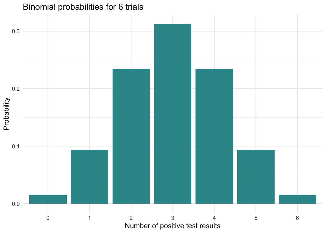
These results illustrate the binomial distribution’s characteristic symmetry, which emerges most clearly when the success probability (\(p\)) equals 0.5. In this special case, the distribution assumes a perfectly symmetrical, bell-shaped form centered around its mean (which equals \(n \times p\)). For our example with \(n = 2\) trials and \(p = 0.5\), we observe peak probability at the expected value of 1 success, with probabilities decreasing equally in both directions as outcomes diverge from this central value.
The Mean and Variance of a Binomial Distribution
Now that we’ve examined the binomial distribution, let’s characterize its behavior using familiar descriptive statistics: the mean, variance, and standard deviation. These measures describe what we’d expect to see on average across all possible repetitions of the same experiment — like repeating our COVID-19 testing scenario many times under identical conditions (e.g., you cloned yourself 100 times and the 100 clones each completed the experiement with the 2 rapid antigen tests).
The mean tells us where outcomes center, while the variance and standard deviation reveal how much they spread around that center. Just as we might calculate these statistics for a dataset of actual test results, we can compute them theoretically for the binomial distribution to understand its fundamental properties.
A formula approach
The mean of a binomial distribution is represented as:
\[ \mu = n \cdot p \]
where:
\(\mu\) (mu) is the mean number of successes you’d expect. We use the Greek letter to denote this is a parameter of the entire population (i.e., a theoretical probability). When we talk about a “population” here, we mean the concept applies broadly, like to every series of COVID-19 tests that you could take.
\(n\) represents the total number of trials (i.e., tests you plan to take).
\(p\) is the probability of success on each trial (i.e., getting a positive result for each test).
The mean gives us an idea of where the distribution is centered (remember our discussion of measures of Central Tendency from Module 02).
The variance of a binomial distribution tells us about the spread or variability of outcomes around this mean. In the context of a binomial distribution, variance is calculated as:
\[ \sigma^2 = n \cdot p \cdot (1 - p) \]
where:
\(\sigma^2\) is the variance of the binomial distribution.
\(n\) is the number of trials.
\(p\) is the probability of success on each trial.
(1 - \(p\)) is the probability of failure on each trial.
The variance gives us an idea of how spread out the distribution of successes is.
While variance is a key measure of dispersion, the standard deviation (\(\sigma\)) of the binomial distribution, which is the square root of the variance, is often more intuitive as it is in the same units as the mean. For the binomial distribution, the formula for the standard deviation is:
\[ \sigma = \sqrt{n \cdot p \cdot (1 - p)} \]
The mean and variance of a binomial distribution together characterize both the central tendency and dispersion of outcomes across all possible realizations of the binomial experiment. The mean represents the long-run average number of successes we would observe if the Bernoulli experiment were repeated indefinitely. Meanwhile, the variance quantifies how much individual experimental outcomes tend to deviate from this expected value, with the standard deviation providing this measure in the original units of count.
Now, let’s apply these formulas to our COVID-19 example, where \(n = 2\) and \(p\) = 0.5.
The mean is: \(\mu = n \cdot p = 2 \cdot 0.5 = 1\). On average, you would expect 1 positive test result out of the 2 tests.
The variance is: \(\sigma^2 = n \cdot p \cdot (1 - p) = 2 \cdot 0.5 \cdot (1 - 0.5) = 0.5\). The variance tells you how much the number of positive results fluctuates around the mean (1). A variance of 0.5 means there’s moderate variability — the outcomes won’t always be 1, but they also won’t be wildly spread out. Variance is less intuitive in raw form because it’s in squared units, but it’s essential for understanding uncertainty and for calculating the standard deviation.
The standard deviation is: \(\sigma = \sqrt{n \cdot p \cdot (1 - p)} = \sqrt{2 \cdot 0.5 \cdot (1 - 0.5)} = 0.71\). The standard deviation of about 0.71 means that the number of positive tests typically varies by about 0.71 tests from the mean of 1. Put differently, most outcomes will fall within about 1 ± 0.71 positives — that is, between 0.29 and 1.71 positive results. Since we’re limited to 0, 1, or 2 positives in this simple example, this gives you a sense that 1 is the most common outcome, but 0 and 2 are also possible.
An enumerative approach
There is an equivalent method for calculating the mean and variance of a binomial distribution that can be especially helpful when the number of trials is small. While it’s not as scalable as using the formulas \(n \cdot p\) and \(n \cdot p \cdot (1 - p)\), it builds intuition by connecting the calculations to the underlying probabilities. Let’s see how it works.
The mean (or expected value) of a binomially distributed random variable can also be calculated by taking the sum of each possible outcome \(x\) multiplied by the probability of \(x\), which is represented by the formula below:
\[ \text{Mean} = \sum (x \cdot P(x)) \]
Where:
\(x\) represents the possible outcomes (in this case, 0, 1, and 2 successes).
\(P(x)\) is the probability of achieving \(x\) successes.
Thus, we can calculate the mean as follows:
\[ \text{Mean} = (0 \times 0.25) + (1 \times 0.5) + (2 \times 0.25) \]
By taking the sum of each possible outcome \(x\) multiplied by the probability of \(x\), we also find that the mean of the random variable is 1.0. This confirms that both methods — using the formula \(n \times p\) and summing over all \(x \times P(x)\) — yield the same result for the mean of a binomial distribution with \(p = 0.5\) and \(n = 2\).
Likewise, the variance of a binomially distributed random variable can be calculated using the formula:
\[ \text{Variance} = \sum ((x - \mu)^2 \cdot P(x)) \]
where:
\(x\) represents each possible outcome.
\(\mu\) is the mean (or expected value) of the distribution.
\(P(x)\) is the probability of \(x\) occurring.
Given that the mean (\(\mu\)) we calculated earlier is 1.0 and the probabilities for 0, 1, and 2 successes are 0.25, 0.5, and 0.25 respectively, the variance can be calculated as follows:
\[\text{Variance} = (0 - 1)^2 \times 0.25 + (1 - 1)^2 \times 0.5 + (2 - 1)^2 \times 0.25\]
This calculation considers the squared difference between each outcome and the mean, weighted by the probability of each outcome, yielding a variance of 0.5. This indicates the spread of the distribution around the mean.
The Binomial Distribution & the Law of Large Numbers
Let’s consider one last example. Let’s imagine that your workplace is deeply concerned about the COVID-19 outbreak and your Human Resources department springs into action, compiling a list of employees and initiating a random testing protocol using rapid antigen tests for COVID-19. For the purpose of our exploration, we’ll assume a relatively low probability of a positive test result, setting our success probability at \(p\) = 0.1. Note that in this context, the trials (i.e., \(n\)) are not the repeated COVID-19 tests that you administered to yourself, but rather the testing of various randomly selected employees, making the trials (\(n\)) in this case the number of employees sampled.
Initially, let’s focus on a small group of 10 randomly selected employees. We can use R to produce the probability distribution when \(n\) = 10 and \(p\) = 0.1. Here, we see a distribution where the bulk of the data is concentrated on the lower end of the distribution.
# Parameters
n <- 10
p <- 0.1

# Generate data
k <- 0:n
probability <- dbinom(k, n, p)

# Create a data frame
data_df <- data.frame(k, probability)

# Plot the data
ggplot(data_df, aes(x = factor(k), y = probability)) +
  geom_bar(stat = "identity", fill = "#A7226E") +
  labs(title = "Binomial Distribution for n = 10, p = 0.1",
       x = "Number of Successes (k)",
       y = "Probability") +
  theme_minimal()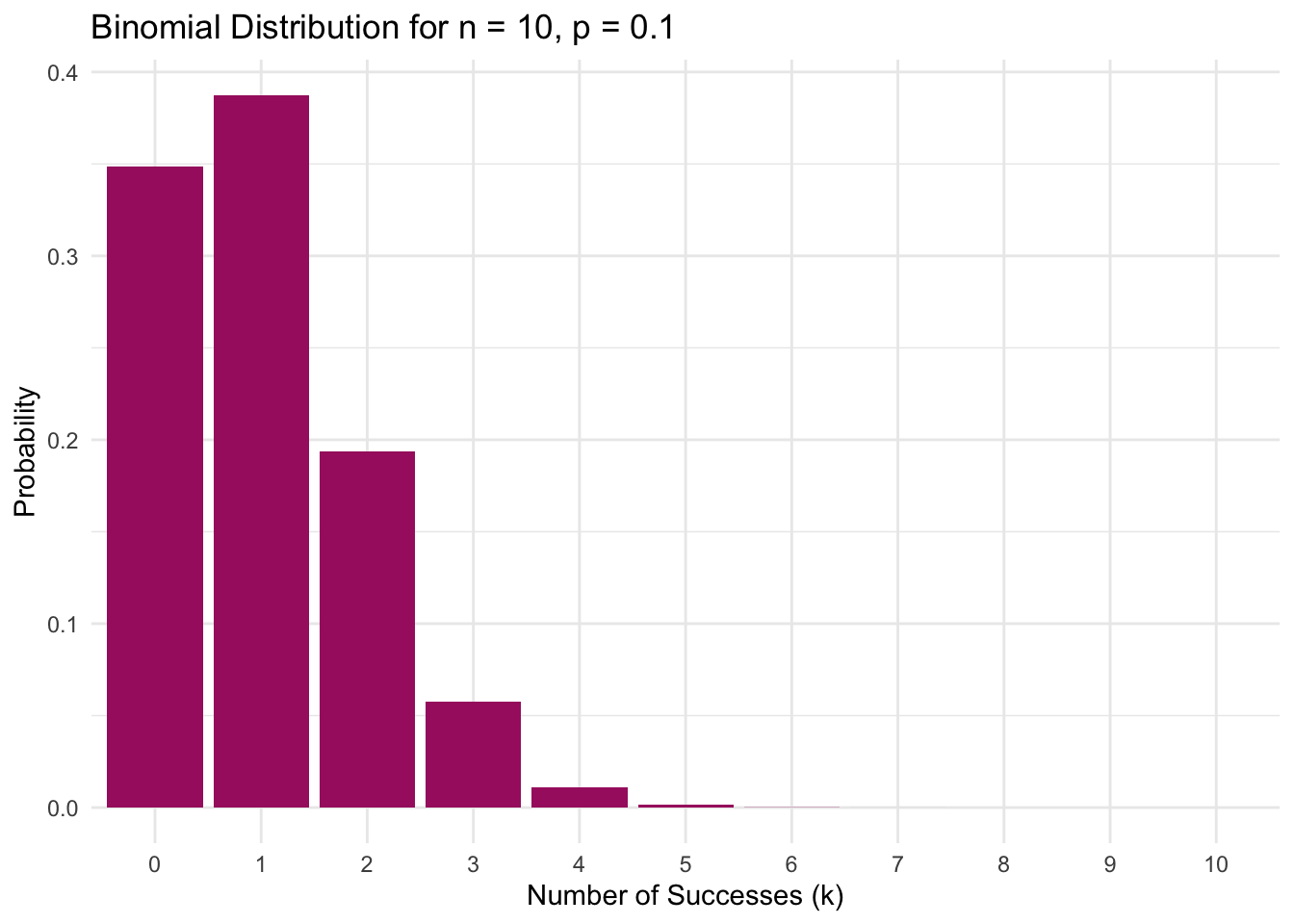
When we start with a small sample of 10 employees, the distribution of positive test results shows the expected skewness for rare events. With each test having only a 10% chance of being positive (i.e., \(p = 0.10\)), the most probable outcomes cluster at the lower end — the plot shows there’s a 35% chance of seeing no positives at all, and a 39% chance of exactly one positive result. While one positive test out of ten is the single most likely outcome (i.e., 10% of tested employees get a positive result), the graph reveals how small samples amplify variability: the chance of seeing 2 positives out of 10 is still substantial, and even extreme results like 4 positives out of 10 remain possible. This illustrates a key feature of binomial distributions with small \(n\) and low \(p\) — while the distribution centers around the expected \(n \times p = 1\) positive test, the limited number of trials creates wide variability in possible outcomes, with the tail extending noticeably to the right.
What unfolds as we increase \(n\)? Rather than sampling 10 employees, let’s see what happens if we sample 100 employees.
# Parameters
n <- 100
p <- 0.1

# Generate data
k <- 0:n
probability <- dbinom(k, n, p)

# Create a data frame
data_df <- data.frame(k, probability)

# Plot the data
ggplot(data_df, aes(x = factor(k), y = probability)) +
  geom_bar(stat = "identity", fill ="#A7226E") +
  scale_x_discrete(breaks = seq(0, n, by = 5)) + # Adjust by parameter as needed
  labs(title = "Binomial Distribution for n = 100, p = 0.1",
       x = "Number of Successes (k)",
       y = "Probability") +
  theme_minimal() +
  theme(axis.text.x = element_text(angle = 45, hjust = 1)) # Rotate x-axis labels for better visibility
When we expand our testing to 100 employees, the distribution undergoes a remarkable transformation. The previously skewed shape smooths into a more symmetrical bell curve centered precisely at the expected 10 positive cases (\(p = 0.10\)). This evolution demonstrates the Law of Large Numbers (LLN) in action: as our sample size grows, the sample proportion stabilizes around the true population probability of 10% (i.e., 10 out of 100 cases). While randomness persists — we might observe 8% or 12% positives rather than exactly 10% — its influence becomes constrained. Imagine the true infection rate as a clear signal emerging from statistical noise. Where testing just 10 employees could yield misleading results (like 30% or 0% positivity) due to chance fluctuations, testing 100 employees filters out much of this noise. The LLN ensures that larger samples act like noise-canceling headphones for data, progressively revealing the underlying truth with greater fidelity. With \(n = 100\), we achieve sufficient precision to distinguish the genuine infection pattern from random variation.
Taking another leap, let’s examine the distribution when the sample size reaches 1,000.
# Parameters
n <- 1000
p <- 0.1

# Generate data
k <- 0:n
probability <- dbinom(k, n, p)

# Create a data frame
data_df <- data.frame(k, probability)

# Plot the data
ggplot(data_df, aes(x = factor(k), y = probability)) +
  geom_bar(stat = "identity", fill = "#A7226E") +
  scale_x_discrete(breaks = seq(0, n, by = 50)) + # Adjust by parameter as needed
  labs(title = "Binomial Distribution for n = 1000, p = 0.1",
       x = "Number of Successes (k)",
       y = "Probability") +
  theme_minimal() +
  theme(axis.text.x = element_text(angle = 45, hjust = 1)) # Rotate x-axis labels for better visibility
Notice what happens when we jump from testing 100 to 1,000 employees. Where our \(n = 100\) graph showed a somewhat wide spread of possible outcomes (e.g., 1% up to about 20%), the \(n = 1,000\) distribution now forms an incredibly tight, symmetrical bell shape centered exactly at 100 positives (i.e., 10% of the sample). Nearly all plausible results fall within just 75-125 positive cases (7.5%-12.5% of the sample) — a much narrower window around the true 10% rate compared to our smaller samples.
Putting It All Together
We’ve covered a lot about the binomial distribution — a type of discrete probability distribution that models repeated binary outcomes. If your head is spinning a bit, that’s completely normal. Don’t worry about remembering every detail. What does matter is recognizing how these ideas connect to one of the most powerful tools in all of statistics: the Central Limit Theorem (CLT).
Let’s take a step back to pull the big ideas together.
So far, we’ve focused on the number of successes (\(k\)) out of \(n\) trials — for example, how many employees test positive out of 10, or 100, or 1,000 employees tested. This is a count, and those counts follow the binomial distribution — a probability distribution that tells us how likely it is to observe each possible number of successes.
But in research and data analysis, we’re often more interested in the proportion of successes: that is, \(k \div n\).
When 1 out of 10 employees tests positive, the proportion is 0.10.
When 12 out of 100 test positive, the proportion is 0.12.
When 104 out of 1,000 test positive, the proportion is 0.104.
These proportions fluctuate due to chance, but the bigger the sample, the more they tend to hover near the true population value of \(p = 0.10\). This is the Law of Large Numbers (LLN) in action: as sample size increases, the sample proportion stabilizes around the population proportion.
But here’s the next big leap…
The Sampling Distribution of the Sample Proportion
Imagine repeating the same experiment over and over — say, selecting 100 employees at random and calculating the proportion who test positive each time. Each sample gives a slightly different result, just due to random variation. Now plot those sample proportions on a graph. That new distribution — of the sample proportion across many samples — is itself a probability distribution. Specifically, it’s called a sampling distribution — and it’s a topic we’ll cover in more detail in future Modules.
Now here’s the amazing part: no matter what \(p\) is, as long as your sample size is large enough, the sampling distribution of the sample proportion will start to look normal — that classic bell-shaped curve — even though the original variable (e.g., test results: positive or negative) is binary and non-normal.
This is the Central Limit Theorem (CLT)
The CLT tells us that if you take lots of samples and calculate the average or proportion from each one:
Those values will follow a normal distribution (at least approximately),
The mean of this distribution will equal the true population mean (\(p\)),
And the standard deviation (called the standard error) will shrink as sample size grows.
This means we can use the normal distribution to estimate, test, and make inferences — even when the underlying data is not normal — as long as we’re working with averages or proportions from large enough samples.
Why this matters
This is what makes statistics work. The world is messy, random, and full of uncertainty. But the CLT gives us a bridge from randomness to predictability — from individual variability to reliable patterns in data. Thanks to the CLT:
We can build confidence intervals around a sample proportion or mean,
We can test hypotheses,
We can generalize from a sample to a population — the holy grail of scientific inference.
The bottom line
If you take one idea from this section, let it be this:
The binomial distribution is a discrete probability distribution used to model repeated binary outcomes. The Law of Large Numbers tells us that sample proportions stabilize as sample size grows. And the Central Limit Theorem tells us that the distribution of those proportions — across many repeated experiments — will follow a normal (continuous) distribution. That’s what makes statistical inference possible.
Continuous Probability Distributions
Now let’s turn our attention to continuous probability distributions — which apply to variables measured on a scale that can take on any value within a range, including decimals and fractions. These kinds of variables are common in psychological research because they allow us to capture nuanced differences in behavior, physiology, and experience.
Some examples include:
- Reaction time in milliseconds
- Systolic blood pressure
- Anxiety scores on a scale
- Time spent sleeping
What makes continuous variables unique is that there are infinitely many possible values between any two points. You could measure someone’s sleep as 7 hours, or 7.25 hours, or 7.246 hours — and all would be valid.
This creates a challenge: the probability of any one exact value (like sleeping exactly 7.0000 hours) is essentially zero. So instead of focusing on exact values, continuous distributions tell us the likelihood of values falling within a certain range — for example, between 6.5 and 8 hours of sleep.
To model this, we use Probability Density Functions (PDFs), which are designed specifically for continuous data.
Probability Density Function (PDF)
A Probability Density Function (PDF) is a curve that describes how values of a continuous variable are distributed across the number line. Instead of giving probabilities for specific values, it shows how dense the data is in different regions — where values are more or less likely to fall.
For example, think about height as a continuous variable. It’s not very meaningful to ask, “What’s the probability someone is exactly 70.4598 inches tall?” Instead, we ask questions like:
“What’s the probability someone is between 70 and 72 inches tall?”
The PDF allows us to answer that. The area under the curve between two values — like 70 and 72 — represents the probability that a value falls within that interval.
In short:
The PDF shows where values are concentrated
The total area under the curve is 1, representing 100% of the probability
The taller the curve, the more likely values are in that region
We interpret probabilities based on area under the curve, not height alone
This approach helps us better understand the shape, spread, and central tendency of continuous data — and lays the foundation for working with distributions like the normal curve, which we’ll explore next.
Definition of the PDF
In this section, I’ll introduce a few equations to give a formal definition of the concepts we’re discussing. However, don’t worry about memorizing or mastering the math right now—the key is to focus on the ideas behind the equations. Understanding the concepts is what matters most at this stage.
Formally, the PDF, also written as \(f(x)\), of a continuous random variable \(X\) (e.g., height) is a function that satisfies the following properties:
Non-negativity: \(f(x) \geq 0\) for all \(x\) in the domain of \(X\). This just means the density function can never take on a negative value, aligning with the concept that probabilities are always positive or zero. For example, for every height \(f(x) \geq 0\). This should be intuitive because it doesn’t make sense to have a negative probability of being a certain height. A negative value would imply a negative likelihood, which is nonsensical (e.g., there can’t be less than a 0 probability that someone will be between 50 and 55 inches tall).
Area Equals 1: The total area under the PDF curve and above the x-axis equals 1. Mathematically, this is expressed as \(\int_{-\infty}^{\infty} f(x) dx = 1\). Though complicated looking, it’s just important to know that the total probability of all possible outcomes for a random variable adds up to 1. So, if you consider all possible values a continuous variable could take, the likelihood that the variable will take on some value within that range is a complete certainty (or 100%).
Probabilities for Intervals: The probability that \(X\) falls within an interval \(a \leq X \leq b\) is given by the integral of \(f(x)\) over that interval: \(P(a \leq X \leq b) = \int_{a}^{b} f(x) dx\), for example, the probability that someone is between 74.0 (a) and 74.9 (b) inches tall. This differs from discrete random variables, where probabilities are assigned to specific outcomes rather than intervals.
In a PDF, the height of the curve, \(f(x)\), at a particular point \(x\) does not represent the probability of \(X = x\) (because that’s always zero for continuous variables). Instead, it represents the probability density — a measure of how concentrated the distribution is around \(x\). The units of the y-axis are “probability per unit of \(x\)” — for instance, probability per inch if we’re measuring height. That’s why area, not height, determines probability: the area under the curve from \(a\) to \(b\) tells you the chance that \(X\) falls in that interval.
An example of a PDF
Imagine you’re analyzing the duration of visits to an online newspaper (e.g., the New York Times), measured in minutes. This duration is a continuous random variable because a visit can last any length of time within a range. The PDF for this variable might show a peak at around 15 minutes, indicating a high density (and thus a higher probability) of visits lasting close to 15 minutes. As the curve falls off towards longer durations, the density decreases, indicating that longer visits become progressively less likely.

The value of the PDF at any specific point does not give the probability of the variable taking that exact value (in continuous distributions, the probability of any single, precise outcome is 0) but rather indicates the density of probability around that value. When considering a range of values, the PDF allows us to calculate the likelihood of the variable falling within that range by integrating the PDF over that interval. For example, the probability of a visitor spending between 4 and 6 minutes on the website is approximately 0.06 — or about 6% of visitors spend 4 to 6 minutes on the news website (you’ll see how to calculate the probability of falling with a certain interval in just a bit). This is displayed in the graph below.

Key takeaways
- The PDF is crucial for understanding and modeling the behavior of continuous random variables.
- It provides a graphical representation of where probabilities are “concentrated” across the range of possible values.
- While the PDF itself doesn’t give probabilities for exact values, it enables the calculation of probabilities over intervals.
Cumulative Distribution Function (CDF)
The CDF for a continuous random variable builds directly on the concept of the PDF by providing a cumulative perspective on the distribution of a continuous random variable. While the PDF shows the density of probabilities at different points, the CDF aggregates these probabilities to give us a comprehensive view of the likelihood of a variable falling below a certain threshold.
Definition of the CDF
The CDF, denoted as \(F(x)\), for a continuous random variable \(X\), is defined as the probability that \(X\) will take a value less than or equal to \(x\), that is, \(F(x) = P(X \leq x)\). This function starts at 0 and increases to 1 as \(x\) moves across the range of possible values, reflecting the accumulation of probabilities.2
Characteristics of the CDF
- Monotonically Increasing: The CDF is always non-decreasing, meaning it never decreases as \(x\) increases. This reflects the accumulating nature of probabilities as we consider larger and larger values of the random variable.
- Bounds: \(F(x)\) ranges from 0 to 1. At the lower end of the range, \(F(x) = 0\) indicates that no values are less than the minimum value. At the upper end, \(F(x) = 1\) signifies that all possible values of the random variable have been accounted for.
- Slope Indicates Density: The slope of the CDF at any point is related to the density at that point in the PDF. Where the PDF is high (indicating a high probability density), the CDF rises steeply, reflecting a rapid accumulation of probability.
- For the CDF, the y-axis denotes the probability that the random variable \(X\) takes a value less than or equal to \(x\). As you move from left to right along the x-axis, the y-value at any point \(x\) gives the total probability of \(X\) being in the range up to and including \(x\). The y-axis in a CDF plot ranges from 0 to 1, where 0 represents the probability that the random variable takes on values less than the minimum of its range (which, in practical terms, is zero probability), and 1 represents the certainty that the random variable takes on a value within its entire possible range.
An example of a CDF
In the context of analyzing time spent on a website, the CDF can answer questions such as: “What proportion of visitors spend less than 10 minutes on the site?”. To find this, you would look at the value of \(F(10)\), which gives the cumulative probability of a visit lasting 10 minutes or less.
Graphically, the CDF starts at 0 (indicating that 0% of visitors spend no time on the site) and progresses toward 1 (indicating that 100% of visitors are accounted for) as the duration increases. By plotting the CDF, we can easily visualize how the distribution of visit durations accumulates. For example, if \(F(10) = 0.25\), it means that 25% of the visitors spend 10 minutes or less on the website (see the black shaded area in the graph below).
Key takeaways
- The CDF shows the probability that a visitor spends a certain amount of time or less on the website.
- It provides a cumulative perspective, allowing us to determine the total proportion of visitors who spend up to a certain duration on the website.
- By observing the CDF curve, we can understand how visit durations accumulate: a flatter section indicates a slow accumulation of visitors with those visit durations, while a steeper section indicates a rapid accumulation of visitors with those visit durations.
Contrasting the PDF and CDF
Together, the PDF and CDF offer complementary views of the distribution of continuous random variables like time spent on a website. The PDF shows the likelihood of specific durations, highlighting where data points are most and least concentrated. The CDF, on the other hand, provides the cumulative probability, helping us understand the total proportion of observations that fall within or below specific ranges. By using both, we gain a comprehensive understanding of the variable’s distribution and behavior.
We can now bring the concepts of the PDF and CDF together using the graph we saw earlier:
Recall that the black shaded area under the curve represents the probability that a visitor spent between 4 and 6 minutes on the website. We can calculate this probability using the ecdf() function in R, which estimates the empirical-CDF based on the actual observed data. Assuming we have a variable called time_spent, we can compute this value as follows:
# Set up a ecdf function
ecdf_fn <- ecdf(time_spent)

# Get cumulative prob for 6 minutes
ecdf_fn(6)
[1] 0.1162# Get cumulative prob for 4 minutes
ecdf_fn(4)[1] 0.0566# Compute the difference
ecdf_fn(6) - ecdf_fn(4)[1] 0.0596This calculation gives us the proportion of visitors whose time on the website falls between 4 and 6 minutes. In other words, it estimates the difference in cumulative probability between those two points on the CDF, which corresponds exactly to the area under the PDF curve from 4 to 6.
Why does subtracting work?
ecdf_fn(6)gives the cumulative probability for 6 minutes or less on the site.ecdf_fn(4)gives the cumulative probability for 4 minutes or less on the site.
Subtracting the two gives us the probability that a visitor spent more than 4 and up to 6 minutes — exactly the interval we care about. Think of the CDF as a running total of probability. The difference between two totals tells you how much probability “accumulated” between those two values — that is, how many visitors fell into that specific time range.
In sum, even though the PDF and CDF look very different graphically, they’re two sides of the same coin:
- The PDF shows where values are more or less common.
- The CDF accumulates those values to show the probability of being below or between certain cutoffs.
Together, they help us make sense of how a continuous variable like time is distributed.
The Mean and Variance of a Continuous Random Variable
In many practical scenarios, you will have a dataset and compute the mean and variance of a continuous random variable (like heights) directly from the raw data. This is common in empirical data analysis, where you’re dealing with a finite number of observations (like the heights of 1,000 people). In such cases, we calculate the mean and variance using simple arithmetic formulas based on the data we have. We covered these formulas in Module 02.
However, just as we have methods for calculating the mean and variance using a binomial distribution, there are also methods for finding the mean and variance of a continuous distribution. In these cases, the integral approach is used — allowing us to understand the underlying distribution of a continuous random variable when we don’t have specific data points but instead have knowledge about the overall behavior of the variable. This method helps us derive the distribution’s properties directly from its PDF.
For example, if we know that a certain variable follows a normal distribution with a specific mean and standard deviation, the PDF helps us understand its behavior without needing to gather data. We can use the PDF to describe the distribution’s properties, such as its mean and variance, through mathematical expressions.
Calculation of the Mean
The mean, or expected value, of a continuous random variable \(X\) with PDF (also denoted as \(f(x)\)) over its range is given by the formula:
\[ \mu = E(X) = \int_{-\infty}^{\infty} x f(x) dx \]
This looks frightful (and it’s certainly not necessary to commit to memory) — but let’s break it down as understanding these elements may help build intuition:
\(x\): This represents the variable of the function, which is the value of the random variable \(X\). For example, some scores for \(x\) for the website example are 10.2 minutes, 11.5 minutes, 2.1 minutes.
\(f(x)\): This is the probability density function (PDF) of \(X\). It describes the relative likelihood for this random variable to take on a given value. The function \(f(x)\) essentially tells us how “dense” the probability is at each point \(x\).
\(\int_{-\infty}^{\infty}\): This integral sign, along with the limits of \(-\infty\) to \(\infty\), indicates that we’re considering all possible values of \(X\) from negative infinity to positive infinity, which is typical when the random variable can take any value along the real number line.
\(dx\): This is a small slice along the x-axis. When we integrate a function, we’re essentially summing up infinitely many infinitesimally small values of the function \(x f(x)\) across the range of \(X\). The \(dx\) denotes that this summing (or integration) is happening over the variable \(x\).
So, the whole expression \(\int_{-\infty}^{\infty} x f(x) \, dx\) is calculating the expected value (mean) of the random variable \(X\), weighted by its probability density. It’s finding the “balance point” of the distribution defined by \(f(x)\).
In simple terms, the formula states:
- Take every possible value that the random variable \(X\) could take on
- Multiply each value by how likely it is to occur — this is given by the density \(f(x)\)
- This gives a weighted value for each \(x\), with more likely values contributing more to the average
- Sum up (integrate) all these weighted values across the entire range of possible \(x\) values
- The result is a single number that represents the average (expected) value of the distribution.
Calculation of the Variance
The variance of a continuous random variable measures the spread of its possible values around the mean, and is calculated as:
\[ \sigma^2 = Var(X) = \int_{-\infty}^{\infty} (x - \mu)^2 f(x) dx \]
In simple terms, the formula states:
Take every possible value of \(X\),
Look at how far it is from the mean \((x - \mu)\),
Square this distance \((x - \mu)^2\) to emphasize larger deviations and treat positive and negative deviations equally,
Weight these squared distances by how likely each value is \(f(x)\),
Then average these weighted squared distances by integrating \(\int_{-\infty}^{\infty} ... dx\) across all possible values to get a single number that represents the overall dispersion of the distribution.
Contrasting discrete sums and integrals
The formulas for the mean and variance seem complex, and it’s not necessary to memorize, but the important element is to note that the formulas shift from the discrete sums (which we used in the discrete example earlier) to integrals, acknowledging the continuum of potential values. The PDF delineates the relative likelihood of \(X\) assuming specific values, with the integral calculations extending over all conceivable values \(X\) might take. While we can’t pinpoint exact outcomes as with discrete variables (e.g., it doesn’t make sense to find the probability of spending exactly 7 minutes and 5 seconds on the website), we can ascertain the probabilities of landing within specific intervals. You’ll get to practice this later in the Module under the context of a normally distributed variable.
The Normal Distribution
Imagine standing at the peak of a smooth, perfectly symmetrical hill, with the ground rolling gently down on either side. This hill is a helpful way to visualize the normal distribution, often called the “bell curve” because of its distinctive shape.
Why is the normal distribution so important? Many everyday phenomena — like people’s heights, IQ scores, reaction times, or exam scores — tend to cluster around an average value. As you move further from this center, such values become increasingly rare. The normal distribution captures this common pattern, making it one of the most widely used and studied probability distributions in statistics.
How is the normal distribution different from the ones we’ve seen before?
Earlier, we explored distributions like the binomial, which deal with discrete outcomes — such as the number of heads in a series of coin flips. In contrast, the normal distribution is a continuous distribution, meaning it models variables that can take on any value within a range — including decimal values.
Key features of the Normal Distribution
The normal distribution is defined by just two parameters:
The mean (\(\mu\)): This is the center of the distribution — the peak of the bell curve — and represents the average value of the data.
The standard deviation (\(\sigma\)): This controls the spread or width of the curve.
- A smaller standard deviation results in a narrower, steeper curve, meaning most values are tightly clustered around the mean.
- A larger standard deviation produces a wider, flatter curve, indicating more variability in the data.
- A smaller standard deviation results in a narrower, steeper curve, meaning most values are tightly clustered around the mean.
Together, the mean and standard deviation determine the exact shape and location of the curve. And because the normal distribution is symmetric, values are just as likely to fall above or below the mean.
To set the stage, please watch the following Crash Course Statistics videos on Z-scores/Percentiles and the Normal Distribution.
An example
Let’s explore the properties of a normal distribution. Recall that earlier in the course we used the National Health and Nutrition Examination Study (NHANES) data frame. This national study is conducted by the Centers for Disease Control and Prevention, and is one of their surveillance initiatives to monitor the health and morbidity of people living in the US. In Module 02 we used these data to examine systolic blood pressures. Now, we’ll use the same data frame to explore heights of U.S. adults.
We’ll use the following variables:
| Variable | Description |
|---|---|
| sex.f | Biological sex of respondent |
| age | Age of respondent |
| height_cm | Height of respondent, in centimeters |
The code below loads the libraries that we’ll use in this section, and imports the data frame that we’ll explore:
library(here)
library(skimr)
library(gt)
library(tidyverse)

nhanes <- read_rds(here("data", "nhanes_heights.Rds"))
We’re going to use a subset of the data. Let’s construct a data frame that includes just the cases and variables that we need for this Module. We have a variety of tasks that we need to accomplish:
First, we’re going to focus on people 20 years or older, we can accomplish this with filter() to choose just rows of data (i.e., people) where age is greater than or equal to 20.
Then we’ll transform height_cm, which is expressed in cm, to a new variable called ht_inches that is expressed in inches using mutate().
We will subset columns with select() to keep just the variables needed.
Finally, we’ll use drop_na() to exclude cases missing on ht_inches or sex.f (the two variables we will use in this Module).
height <-
  nhanes |>
  filter(age >= 20) |>
  mutate(ht_inches = height_cm/2.54) |>
  select(ht_inches, sex.f) |>
  drop_na()
Visualize the data
Let’s begin our descriptive analyses by examining the distribution of heights by sex.
height |>
  ggplot(mapping = aes(x = ht_inches, group = sex.f, fill = sex.f)) +
  geom_density(alpha = 0.5) +
  theme_bw() +
  labs(title = "What is the distribution of heights for males and females?",
       fill = "Sex",
       y = "Density",
       x = "Height in inches")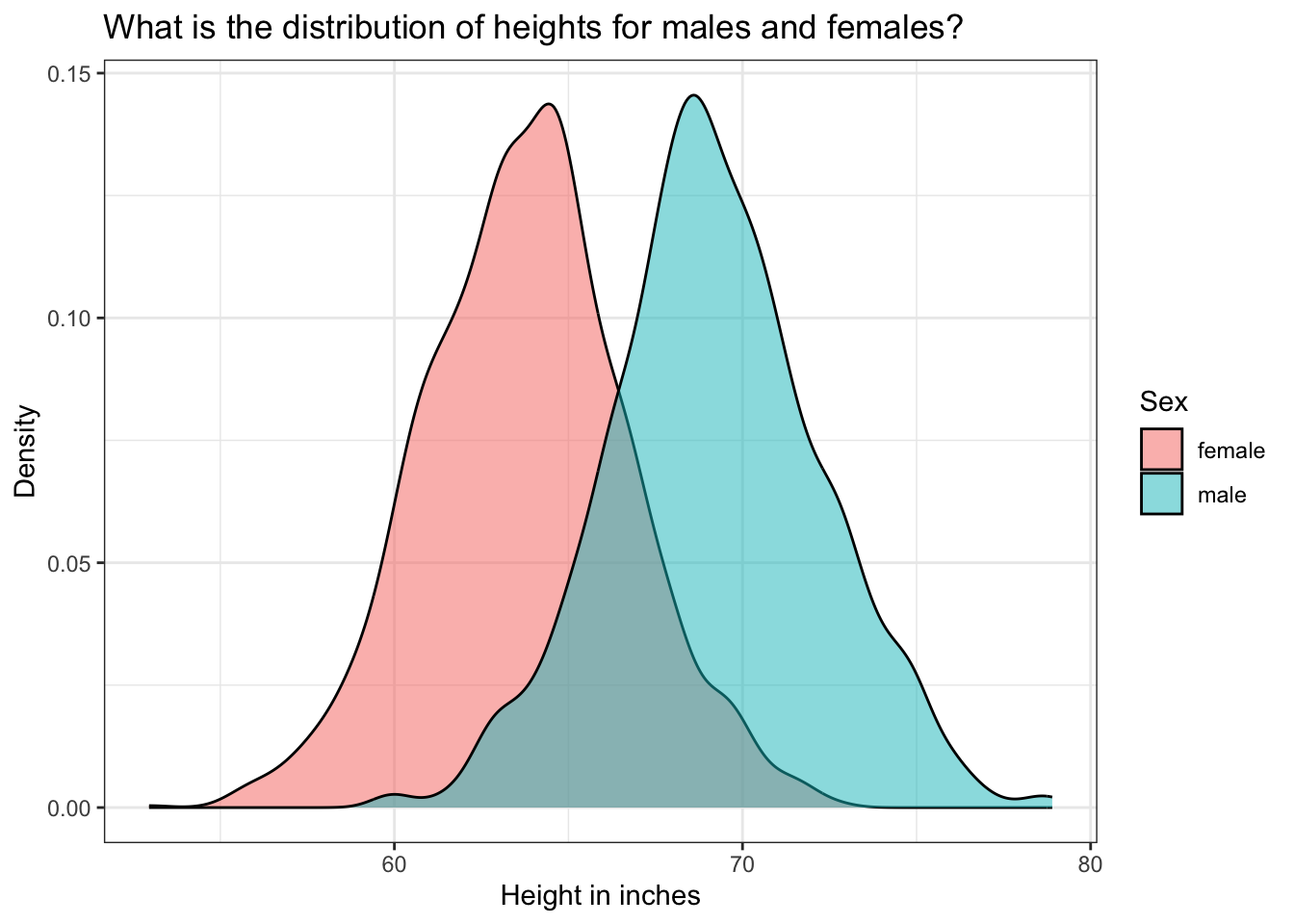
The highest density of data points for males is around 69 inches and for females around 64 inches. But, we have a reasonably large range in both groups, representing the large variation in heights of people in our population. As we would expect, males are, on average, taller than females.
Let’s use skim() to calculate the descriptive statistics for height by sex.
height |>
  group_by(sex.f) |>
skim()| Name | group_by(height, sex.f) |
| Number of rows | 3561 |
| Number of columns | 2 |
| _______________________ | |
| Column type frequency: | |
| numeric | 1 |
| ________________________ | |
| Group variables | sex.f |
Variable type: numeric
| skim_variable | sex.f | n_missing | complete_rate | mean | sd | p0 | p25 | p50 | p75 | p100 | hist |
|---|---|---|---|---|---|---|---|---|---|---|---|
| ht_inches | female | 0 | 1 | 63.76 | 2.91 | 52.95 | 61.80 | 63.82 | 65.63 | 72.64 | ▁▂▇▅▁ |
| ht_inches | male | 0 | 1 | 69.19 | 3.01 | 59.88 | 67.32 | 69.02 | 71.06 | 78.90 | ▁▃▇▃▁ |
Let’s consider males first. The mean height is 69.2 inches and the standard deviation is 3.0 inches. The median is listed under p50, referring to the 50th percentile score — 69.0 inches in our example. The range is ascertained through the p0 and p100 scores, referring to the 0th (lowest) and 100th (highest) percentile score — 59.9 inches to 78.9 inches in our example.
Building intuition for percentiles
To make these percentile scores a little more concrete and review some key elements of desctiptive statistics from Module 02, let’s randomly select 11 males from the data frame. Once 11 are selected — I am going to sort by height, and create a value denoting the rank order from shortest to tallest of these 11 males.
set.seed(1234567)

pick11 <- height |>
  filter(sex.f == "male") |>
  select(ht_inches) |>
  sample_n(11) |>
  arrange(ht_inches) |>
  mutate(ranking = as.integer(rank(ht_inches)))
Here’s a table of these 11 selected males.
| ht_inches | ranking |
|---|---|
| 66.25984 | 1 |
| 66.29921 | 2 |
| 67.48031 | 3 |
| 68.18898 | 4 |
| 68.34646 | 5 |
| 69.44882 | 6 |
| 69.76378 | 7 |
| 70.23622 | 8 |
| 70.94488 | 9 |
| 72.48031 | 10 |
| 72.67717 | 11 |
We see that the shortest male in this random sample is 66.3 inches, and the tallest male is 72.7 inches. Let’s request the skim output for this subset of males.
pick11 |> skim()| Name | pick11 |
| Number of rows | 11 |
| Number of columns | 2 |
| _______________________ | |
| Column type frequency: | |
| numeric | 2 |
| ________________________ | |
| Group variables | None |
Variable type: numeric
| skim_variable | n_missing | complete_rate | mean | sd | p0 | p25 | p50 | p75 | p100 | hist |
|---|---|---|---|---|---|---|---|---|---|---|
| ht_inches | 0 | 1 | 69.28 | 2.21 | 66.26 | 67.83 | 69.45 | 70.59 | 72.68 | ▇▅▅▅▅ |
| ranking | 0 | 1 | 6.00 | 3.32 | 1.00 | 3.50 | 6.00 | 8.50 | 11.00 | ▇▅▅▅▅ |
Take a look at the row for ht_inches. The p0 score is the 0th percentile of the data points — which represents the shortest male in the subsample. The p100 score is the 100th percentile of the data points — which represents the tallest male in the subsample. Notice that the 50th percentile is the middle score (a ranking of 6 — where 5 scores fall below and 5 scores fall above) — that is, 69.4 inches (see that this height corresponds to ranking = 6 in the table of the 11 male heights printed above).
Using the quantile() function to query the distribution
Going back now to the full sample of males, let’s explore the full distribution of heights for males. Inside the summarize() function, we can use the quantile() function to identify any quantile that we are interested in. For example, we might have an interest in finding the height associated with the 2.5th percentile and the 97.5th percentile.
height |>
  filter(sex.f == "male") |>
  select(ht_inches) |>
  summarize(q2.5 = quantile(ht_inches, probs = 0.025),
            q97.5 = quantile(ht_inches, probs = 0.975))
This indicates that for the observed heights of males in the NHANES study — a male who is about 63 inches is at the 2.5th percentile of the distribution, while a male who is about 75 inches is at the 97.5th percentile. This means that about 2.5% of males are shorter than 63 inches, and 2.5% of males are taller than 75 inches. Likewise, this tells us that about 95% of males are between 63 and 75 inches tall.
We can mark these percentiles on our density graph of male heights:
height |>
  filter(sex.f == "male") |>
  ggplot(mapping = aes(x = ht_inches)) +
  geom_density(fill = "#00BFC4") +
  geom_vline(xintercept = 63.07087, linetype = "dashed") +
  geom_vline(xintercept = 75.07874, linetype = "dashed") +
  theme_bw() +
  labs(title = "What is the distribution of heights for males?",
       subtitle = "Dashed lines denote the 2.5th and 97.5th percentiles of the observed distribution",
       x = "Height in inches")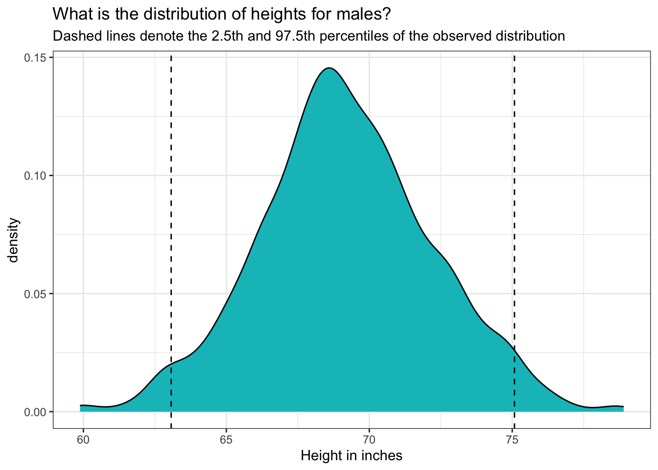
Relationship to the PDF and CDF
This density graph is akin to a PDF for the heights of males. Here’s why:
PDF Definition: Recall that a PDF describes the relative likelihood for a continuous random variable to take on a given value. It shows how probability is distributed over the values of the variable.
Shape and Interpretation: The density graph depicts the distribution of male heights, where the area under the curve represents the total probability, which is always equal to 1. The shape of the curve shows where the values are most concentrated. Peaks in the graph indicate the heights where the probability density is highest.
Probabilities: While the exact probability of a specific height (e.g., exactly 70.562 inches) is technically zero in a continuous distribution, the PDF helps us understand the probability of height falling within an interval. For example, the area under the curve between 63 inches and 75 inches represents the probability of a male’s height falling within this range.
Percentiles: The vertical dashed lines at the 2.5th and 97.5th percentiles illustrate specific points in the distribution. These lines help visualize that 95% of the male heights lie between about 63 and 75 inches.
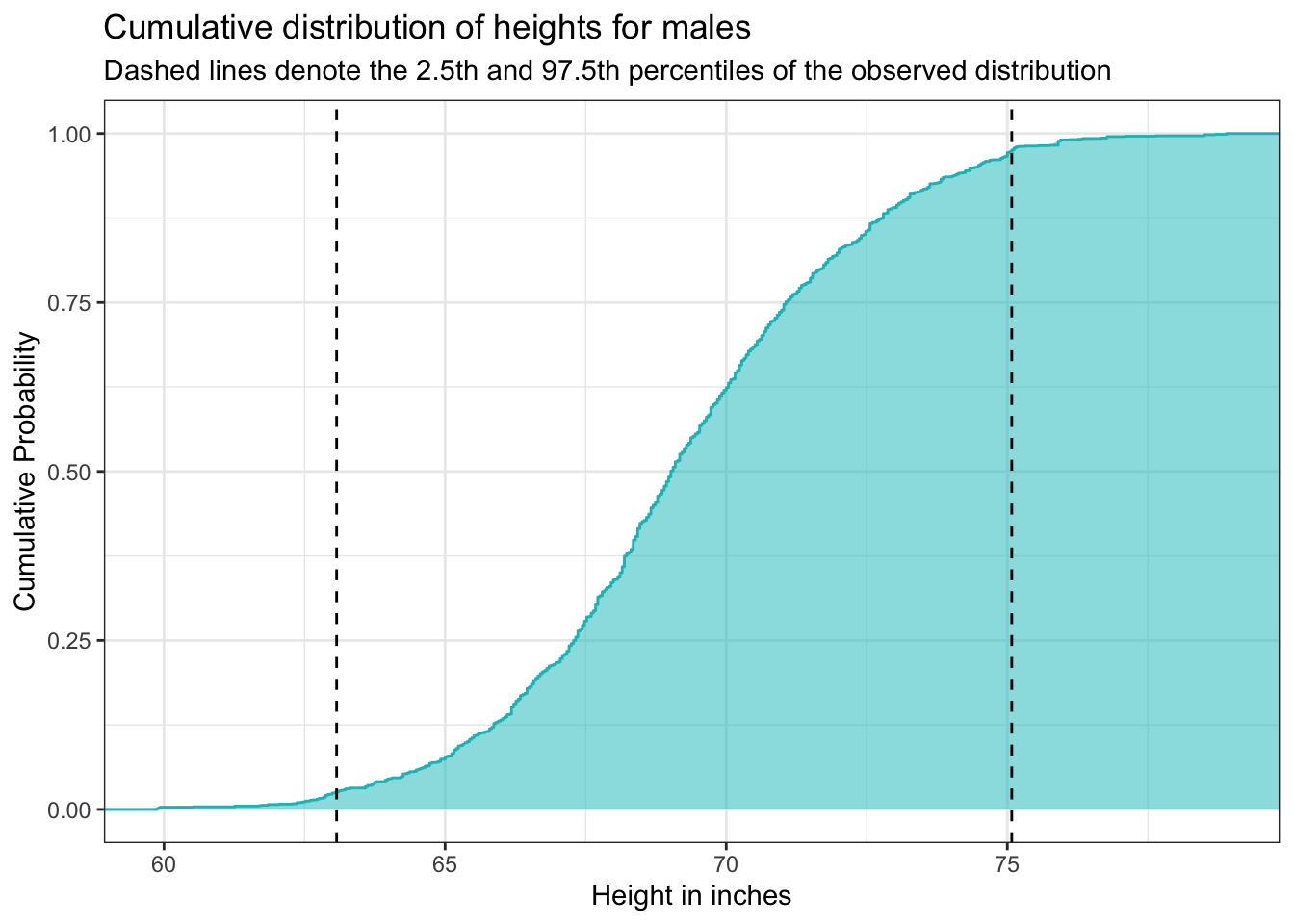
Now, let’s take our analysis a step further by exploring the CDF of male heights. The CDF provides a cumulative perspective, illustrating the probability that a male’s height will fall at or below a particular value. By plotting the CDF, using the stat_ecdf() we can easily determine the proportion of males whose heights are less than or equal to any given value, offering a comprehensive view of how heights accumulate across the population. This visualization helps us understand not just the distribution of heights but also the overall trend and distribution shape, making it easier to interpret percentiles and cumulative probabilities.
height |>
  filter(sex.f == "male") |>
  ggplot(mapping = aes(x = ht_inches)) +
  stat_ecdf(geom = "step", color = "#00BFC4") +
  stat_ecdf(geom = "area", fill = "#00BFC4", alpha = 0.5) +
  geom_vline(xintercept = 63.07087, linetype = "dashed") +
  geom_vline(xintercept = 75.07874, linetype = "dashed") +
  theme_bw() +
  labs(title = "Cumulative distribution of heights for males",
       subtitle = "Dashed lines denote the 2.5th and 97.5th percentiles of the observed distribution",
       x = "Height in inches",
       y = "Cumulative Probability")
The graph above shows the cumulative distribution function (CDF) for male heights. The x-axis displays height in inches, and the y-axis shows cumulative probability, which ranges from 0 to 1.
The blue curve represents the cumulative probability of being less than or equal to a given height. As we move from left to right along the x-axis, the curve increases — indicating that more of the population is included. The steeper the curve, the more individuals fall within that height range. Flatter sections suggest fewer individuals have heights in that interval.
The shaded region under the curve reinforces this accumulation visually: the area grows as we include more of the population.
The dashed vertical lines highlight the 2.5th percentile (around 63 inches) and the 97.5th percentile (around 75 inches). This means that approximately 95% of adult males in the sample have heights between 63 and 75 inches. About 2.5% are shorter than 63 inches, and 2.5% are taller than 75 inches.
This kind of cumulative plot is especially helpful for identifying percentiles and understanding how values are distributed across a population.
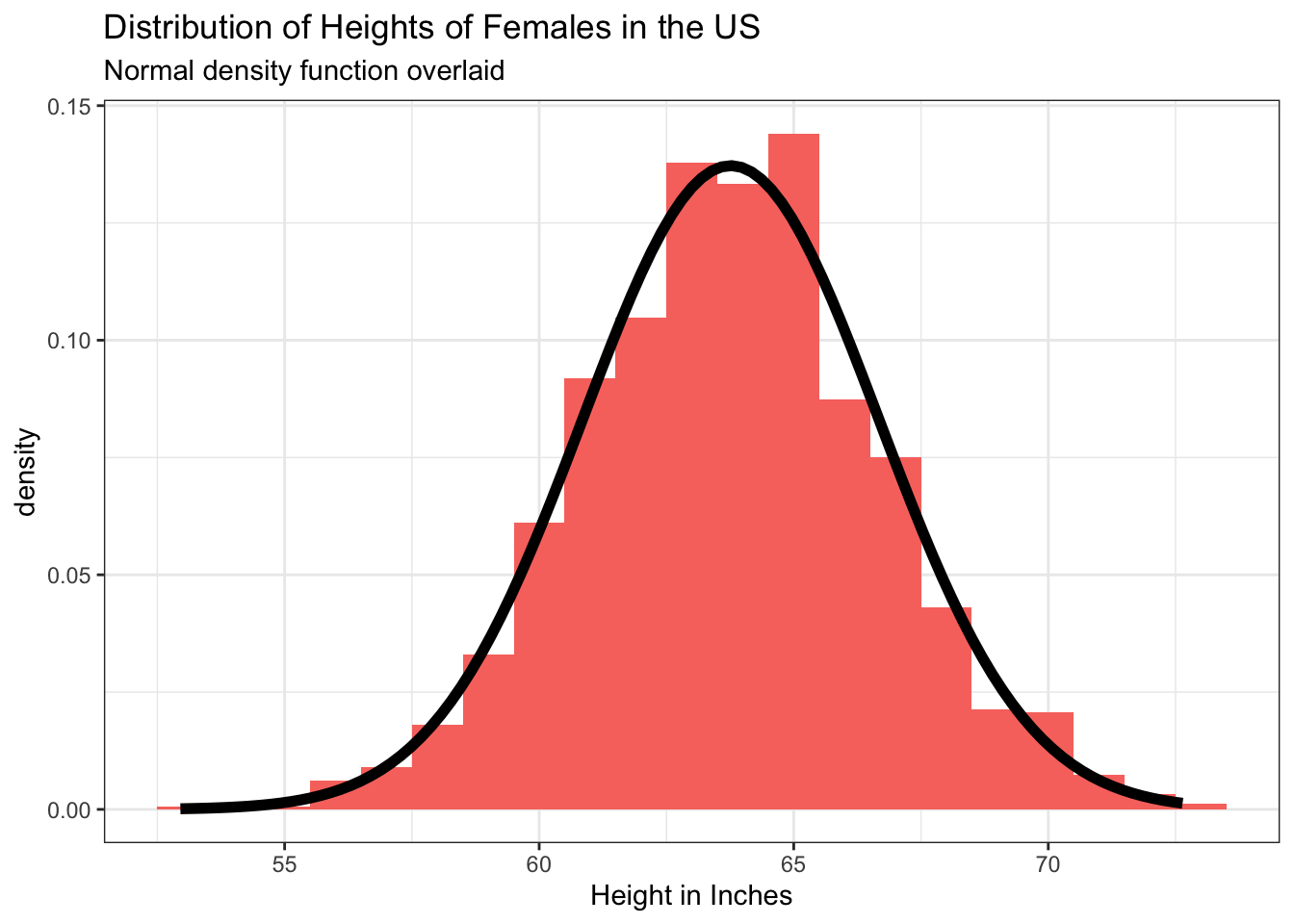
Are heights normally distributed among US adults?
A variable with a Gaussian3 (i.e., bell-shaped) distribution is said to be normally distributed. A normal distribution is a symmetrical distribution. The mean, median and mode are in the same location and at the center of the distribution.
Plotted below are two histograms of height in inches for participants in NHANES — the first for females and the second for males — and overlaid on each is a perfect normal curve. The resulting graphs, shown below, demonstrate that the distribution of heights for females and males is quite close to normal.
Querying the Normal Distribution with the Empirical Rule
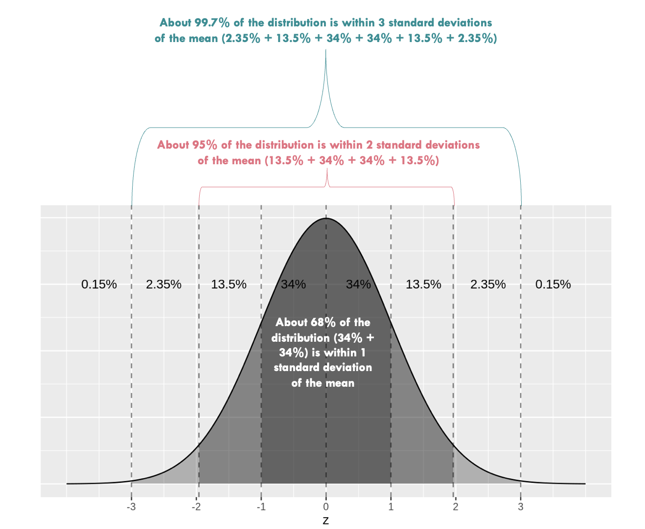
Recall from Module 02 that when a variable is normally distributed, we can use the Empirical Rule to describe it’s spread given the mean and standard deviation. In the graph below, the mean of a variable called \(z\) is 0 and the standard deviation is 1 (denoted on the x-axis). The Empirical Rule states that when a variable is normally distributed, we can except that:
- 68% of the data will fall within about one standard deviation of the mean
- 95% of the data will fall within about two standard deviations of the mean
- Almost all (99.7%) of the data will fall within about three standard deviations of the mean
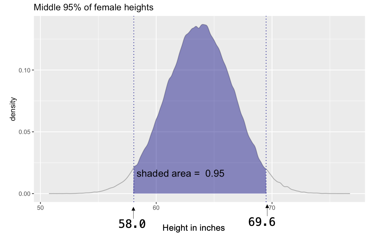
Since we verified that male and female heights are normally distributed, let’s use the Empirical Rule to describe the distribution of female heights.
- The average height of females is 63.8 inches, with a standard deviation of 2.9 inches.
- The Empirical Rule states that 95% of the data will fall within about two standard deviations of the mean.
- Therefore, we expect 95% of all females to be between 58.0 inches and 69.6 inches tall (i.e., 63.8 \(\pm\) 2 \(\times\) 2.9).
- Likewise, only about 2.5% of females are expected to be shorter than 58.0 inches, and only about 2.5% of females are expected to be taller than 69.6 inches.
Important
Take a moment to calculate the same quantities for the males in NHANES.
The PDF and CDF for a Normal Distribution
When a variable is normally distributed, we can answer probability questions without needing raw data. The normal distribution is fully defined by just two parameters: the mean and the standard deviation. Once we know these, we can use the normal distribution to model the behavior of a variable like height.
Instead of calculating cumulative probabilities directly from observed data (as we did using stat_ecdf()), we can turn to the theoretical cumulative distribution function (CDF). This is available through R’s pnorm() function, which uses the mathematical properties of the normal curve to return the probability that a value is less than or equal to a given threshold. Similarly, the qnorm() function works in the opposite direction: it tells us the value (quantile) corresponding to a given cumulative probability.
Behind the scenes, both of these functions rely on the formulas for the mean and variance of a continuous probability distribution that we studied earlier. Even though we’re not computing these integrals ourselves, the functions are doing the work of integrating over the PDF to return meaningful results.
By using the PDF and CDF of the normal distribution, we can make predictions, calculate probabilities, and describe the overall shape of the distribution — all without needing to collect new data. As long as we know the mean and standard deviation, the normal distribution gives us a complete model of how the variable behaves.
The graph below shows a theoretical normal curve for female heights, based on known population parameters. This smooth, continuous model allows us to estimate probabilities and make inferences — much like we did with empirical data — only now with the precision and flexibility of a well-defined distribution.
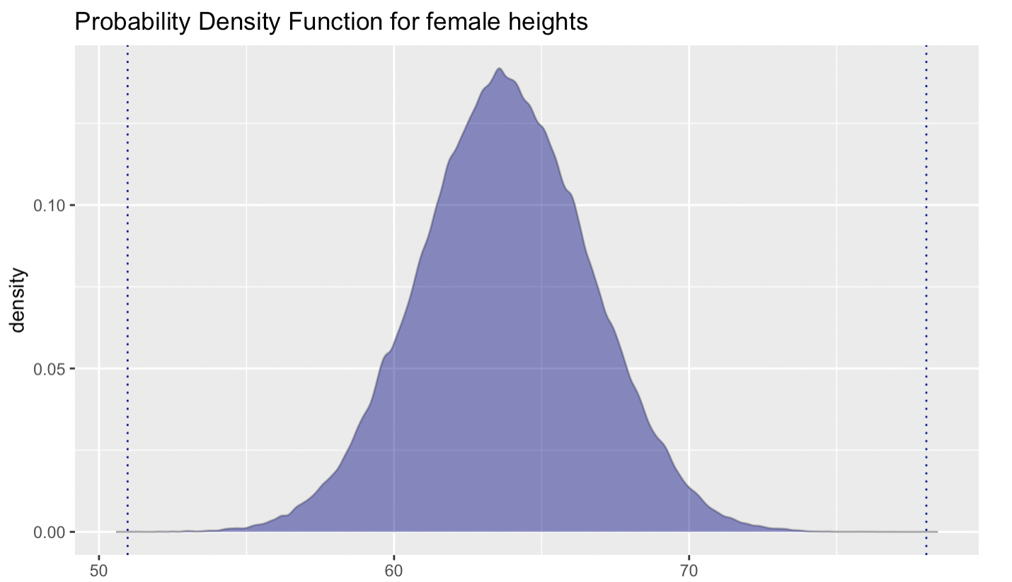
By using the PDF for a normal distribution, we can estimate the probability of a randomly selected adult female falling within a specific height range. This is exactly what we did when applying the Empirical Rule to determine that 95% of all female heights fall between 58.0 and 69.6 inches.
The Empirical Rule gave us a quick estimate of the central 95% of the distribution. But with qnorm() — which stands for the quantile function of the normal distribution — we can go beyond approximations and calculate exact percentile cutoffs for any specified probability.
The graph below provides a detailed view of the normal distribution, showing how values are distributed around the mean. It includes standard deviations, percentages, cumulative probabilities, and percentile ranks, all layered onto a single, bell-shaped curve.
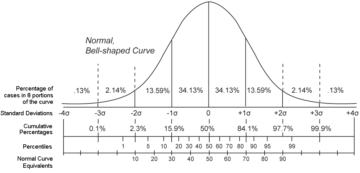
Percentile ranks are commonly used in everyday contexts, like pediatric growth charts or standardized test scores (e.g., the SAT). For instance, at -2 standard deviations, see from the figure that about 2.3% of the distribution falls below that value. While at +2 standard deviations, about 97.7% fall below. That leaves 2.3% above, in the upper tail.
This might raise a question: Why 2.3% and not 2.5%, as suggested by the Empirical Rule?
The reason is that the Empirical Rule is a rough approximation. It rounds to 95% within two standard deviations, but in reality, the true proportion is closer to 95.4%, leaving 4.6% in the tails—2.3% in each. The qnorm() function lets us work with these exact values based on the underlying mathematics of the normal distribution.
The qnorm() function leverages these percentile ranks (which are a type of quantile), using the CDF to find quantiles based on percentile ranks.
For instance, if we want to find the height marking the 2.5th percentile for female heights, we could use the following code.
qnorm(p = 0.025, mean = 63.8, sd = 2.9)[1] 58.1161Please note that 2.5/100 = 0.025, therefore, p = 0.025 in the code signifies that we are seeking the height below which 2.5% of heights fall (and 97.5% exceed). Also, the mean = and sd = in the code represent the mean and standard deviation of our normally distributed variable — female heights in the population. Hence, the code qnorm(p = 0.025, mean = 63.8, sd = 2.9) means we’re looking for the height below which the lowest 2.5% of all heights fall, given the distribution of heights is normal with a mean of 63.8 and standard deviation of 2.9. This application of qnorm() directly leverages the properties of the CDF to compute the desired quantile.
Executing this function yields 58.1, so we expect 2.5% of females to be shorter than 58.1 inches, and 97.5% to be taller than 58.1 inches. This quantity is depicted in the graph below.

Let’s try another. Here, we’ll find the score for height in which 97.5% of scores will fall below.
qnorm(p = 0.975, mean = 63.8, sd = 2.9)[1] 69.4839In this example, we set \(p\) to 0.975 (again 97.5/100 = 0.975). Using the code qnorm(p = 0.975, mean = 63.8, sd = 2.9) means we’re looking for the height below which 97.5% of all heights fall, assuming that the distribution of heights is normal with mean 63.8 and standard deviation 2.9. Note that this also means that 2.5% of the population would be expected to be taller than the desired value, under the same assumptions.
Execution of the function yields 69.5, indicating that we expect 97.5% of females to be shorter than 69.5 inches tall (and 2.5% will be taller). This quantity is depicted in the graph below.
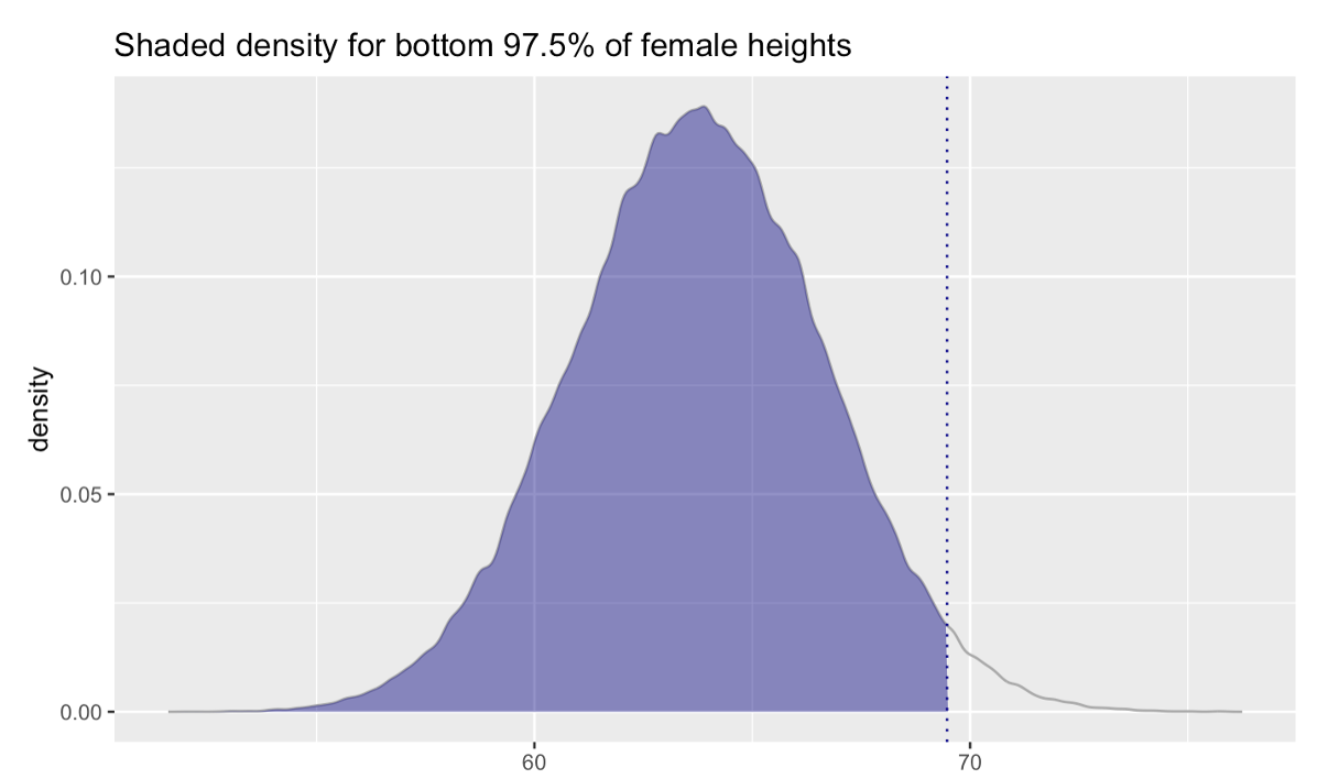
We can compare these to the values we calculated using the Empirical Rule (that is, by computing 63.8 \(\pm\) 2 \(\times\) 2.9). Using the Empirical Rule and calculating the range by hand, we obtained 58.0 for the lower bound and 69.6 for the upper bound. Using qnorm(), we obtained 58.1 for the lower bound and 69.5 for the upper bound.
You can see they match up quite closely — the difference is because qnorm() is more precise. The hand calculations using the Empirical Rule specified that 95% of the distribution falls within 2 standard deviations of the mean. As mentioned earlier, while the Empirical Rule is a useful guideline for understanding the spread of data in a normal distribution, it approximates that 95% of the data falls within 2 standard deviations of the mean. In actuality, the precise value for a standard normal distribution is closer to 1.96 standard deviations away from the mean to capture 95% of the data.
Where does this 1.96 value come from?
Standard Normal Distribution: First, understand that the standard normal distribution is a special case of the normal distribution where the mean is 0 and the standard deviation is 1. Values in this distribution are referred to as z-scores.
Percentiles and Probability: When we talk about capturing the middle 95% of the data in a normal distribution, we’re really saying that we want the boundaries where 2.5% of the data lies below (left tail) and 2.5% lies above (right tail). This leaves 95% of the data in between these two tails.
Introduction to alpha: The term “alpha” (\(\alpha\)) refers to the proportion of the distribution that lies in the tails. For a standard normal distribution, if we want to capture the middle 95%, the remaining 5% is split equally between the two tails, with 2.5% in each tail. So, \(\alpha\) is 0.05 in this case, with 0.025 (2.5%) in each tail.
Finding \(z_{\alpha/2}\): The notation \(z_{\alpha/2}\) is used to denote the z-score that corresponds to the cumulative probability of \(\alpha/2\) in the left tail of the distribution. For \(\alpha = 0.05\), \(\alpha/2\) is 0.025. Using statistical tables (like the z-table for the standard normal distribution) or software functions (like qnorm() in R), we find that the z-score corresponding to the cumulative probability of 0.025 is -1.96. Similarly, the z-score corresponding to the cumulative probability of 0.975 (which is \(1 - 0.025\)) is +1.96. Therefore, \(z_{\alpha/2}\) is 1.96 in this context.
For example, here’s how you can use R to find the appropriate z-scores that denote the middle 95% of a standardized normal distribution (i.e., mean = 0, standard deviation = 1).
qnorm(p = c(0.025, 0.975), mean = 0, sd = 1)[1] -1.959964 1.959964Now, with this in hand, if we use the more precise value for the middle 95% (~1.959964) in our hand calculations, we obtain the same values produced by qnorm().
63.8 \(\pm\) 1.96 \(\times\) 2.9 = (58.1, 69.5).
It’s also important to note that we aren’t limited to finding the middle 95%. For example, we might be interested in finding the middle 99%. For the middle 99%, we substitute 1.96 with 2.58 as 99% of values of a normal distribution fall within ~2.58 standard deviations from the mean.
Here’s a helpful tip — for any desired range, you can find the critical value by which you multiply the standard deviation by using the qnorm()4 function in R.
For 95% coverage — take 1 - 0.95, and then divide by 2 to get middle 95%:
qnorm(p = (1-0.95)/2, lower.tail = FALSE)[1] 1.959964For 99% coverage — take 1 - 0.99, and then divide by 2 to get middle 99%:
qnorm(p = (1-0.99)/2, lower.tail = FALSE)[1] 2.575829For 80% coverage — take 1 - 0.80, and then divide by 2 to get middle 80%:**
qnorm(p = (1-0.80)/2, lower.tail = FALSE)[1] 1.281552We can use qnorm() in this way to calculate any interval that we wish. For example, to get the middle 80% we’d multiply the standard deviation by 1.28 (the value calculated using qnorm() above for 80% coverage) and then add and subtract that value from the mean: 63.8 \(\pm\) 1.28 \(\times\) 2.9 — corresponding to a range of about 60.1 to 67.5
Querying a Normal Distribution
Let’s practice these techniques with a few examples.
Example 1
How tall does a female need to be in order to be taller than 75% of females in the population?
qnorm(p = 0.75, mean = 63.8, sd = 2.9)[1] 65.75602A female needs to be about 65.7 inches tall in order to be taller than 75% of the female population.
Example 2
What range of heights encompasses the middle 50% of females?
We need two values here, the lower and upper bound of the specified interval.
qnorm(p = 0.25, mean = 63.8, sd = 2.9)[1] 61.84398qnorm(p = 0.75, mean = 63.8, sd = 2.9)[1] 65.7560225% of females are shorter than ~61.8 inches, 25% are taller than ~65.7 inches. Thus, the interval for the middle 50% is about 61.8 inches to 65.7 inches tall.
Example 3
We might also be interested in framing a question like this: “What is the probability that a randomly selected female from the population will be shorter than 65 inches tall?” This is a little different than the previous examples. We need a different function to solve this problem — the pnorm() function in R can help us to calculate this. While qnorm() finds the corresponding quantity, pnorm() finds the corresponding probability. To employ the function, supply the value of the variable of interest (65), as well as the mean and the standard deviation (sd) of the variable under study.
pnorm(q = 65, mean = 63.8, sd = 2.9)[1] 0.6604872The probability is 0.66 that a randomly selected female would be less than 65 inches tall. Or, we can expect that about 66% of females are shorter than 65 inches. You could equivalently say that a female who is 65 inches tall is at the 66th percentile for the distribution of female heights.
Example 4
Let’s try one more. Let’s ask the question: “What is the probability that a randomly selected female is taller than 70 inches?” Here, we want the proportion of the distribution above 70, so the upper tail. The default of qnorm() and pnorm() is to calculate the lower tail of the distribution. However, if you desire the upper tail, you simply need to include the argument lower.tail = FALSE, which then provides the upper tail.
pnorm(q = 70, mean = 63.8, sd = 2.9, lower.tail = FALSE)[1] 0.01626117The probability is about 0.016 that a randomly selected female would be taller than 70 inches. Or, we can expect that about 1.6% of females are taller than 70 inches.
Tip
In contrasting qnorm() and pnorm(), we find that:
qnorm() returns the score associated with a given cumulative probability under the normal distribution. For example, you might use it to find the minimum height required to be in the top 10%, by computing the value at the 90th percentile.
pnorm() returns the cumulative probability (area under the curve to the left of a given score). For instance, you can use it to determine the percent of the population shorter than 65 inches.
The Standard Normal Distribution
Recall from Module 02 that z-scores are a standardized version of a variable that has been transformed by first subtracting the mean, and then dividing by the standard deviation. Thus, a z-score has a mean of 0 and a standard deviation of 1. A z-score essentially tells us how many standard deviations away a data point is from the mean. For instance, a z-score of +1.0 indicates a data point that is one standard deviation above the mean, and a z-score of -1.5 denotes a data point that is 1.5 standard deviations below the mean.
A standard normal distribution, also known as the z-distribution, is a special case of the normal distribution. It is a type of normal distribution that has a mean of 0 and a standard deviation of 1. In other words, a standard normal distribution is a distribution of z-scores.
We can apply the concept of z-scores to the NHANES example. Among females, the mean height is 63.0 inches, and the standard deviation is 2.9 inches. Let’s consider a female height of 70 inches:
\[ \text{z-score} = \frac{70 - 63.8}{2.9} = 2.1 \]
This means that a female who is 70 inches tall is 2.1 standard deviations above the mean height for females.
If we’d like to calculate each person’s z-score for height in the NHANES data frame, we can use the code below to convert the raw scores to z-scores. Because we use group_by() first, the sex specific mean and sd is used to form the z-scores for males and females respectively.
zheight <- height |>
  group_by(sex.f) |>
  mutate(zht_inches = (ht_inches - mean(ht_inches))/sd(ht_inches)) |>
  ungroup() |>
  select(sex.f, ht_inches, zht_inches)

zheight |> head()
zheight |> group_by(sex.f) |> skim()| Name | group_by(zheight, sex.f) |
| Number of rows | 3561 |
| Number of columns | 3 |
| _______________________ | |
| Column type frequency: | |
| numeric | 2 |
| ________________________ | |
| Group variables | sex.f |
Variable type: numeric
| skim_variable | sex.f | n_missing | complete_rate | mean | sd | p0 | p25 | p50 | p75 | p100 | hist |
|---|---|---|---|---|---|---|---|---|---|---|---|
| ht_inches | female | 0 | 1 | 63.76 | 2.91 | 52.95 | 61.80 | 63.82 | 65.63 | 72.64 | ▁▂▇▅▁ |
| ht_inches | male | 0 | 1 | 69.19 | 3.01 | 59.88 | 67.32 | 69.02 | 71.06 | 78.90 | ▁▃▇▃▁ |
| zht_inches | female | 0 | 1 | 0.00 | 1.00 | -3.72 | -0.67 | 0.02 | 0.64 | 3.05 | ▁▂▇▅▁ |
| zht_inches | male | 0 | 1 | 0.00 | 1.00 | -3.09 | -0.62 | -0.06 | 0.62 | 3.22 | ▁▃▇▃▁ |
Notice in the skim() output above that the z-score versions of height have a mean of 0 and a standard deviation of 1.
We can use either the unstandardized (raw heights) or standardized (z-scores of heights) scores with qnorm() and pnorm(). For example: “What is the probability that a randomly selected female will be shorter than 70 inches?” In the code below, I am going to be more precise with the mean and standard deviation so that you can see the close match.
pnorm(q = 70, mean = 63.76, sd = 2.91)[1] 0.9839968You can obtain the same answer using z-scores (notice the change to mean and sd — the mean and sd of a z-score is 0 and 1 respectively, and I replaced q = 70 with q = 2.14 — the corresponding z-score for females).
pnorm(q = 2.14, mean = 0, sd = 1)[1] 0.9838226The values are just slightly different because of rounding — if I used even more decimal places to record the precise scores for the raw mean and sd, then the two would match perfectly.
Let’s use the z-scores for a few more examples. “How many standard deviations above the mean does a person need to be so that they are in the top 2.5% of the distribution?”
qnorm(p = 0.975, mean = 0, sd = 1)[1] 1.959964“How many standard deviations below the mean does a person need to be so that they are in the bottom 2.5% of the distribution?”
qnorm(p = 0.025, mean = 0, sd = 1)[1] -1.959964We can map these last two values (-1.96 and +1.96) onto a graph. Notice the similarities with the Empirical Rule.
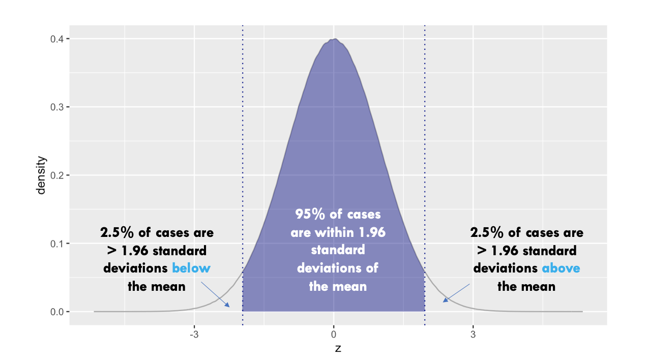 One final note: the default behavior of pnorm() and qnorm() is to use the standard normal distribution (i.e., mean = 0, sd = 1), so it’s not necessary to specify
 mean = 0 and sd = 1 — these are already assumed by default.
For example:
qnorm(p = 0.025, mean = 0, sd = 1)[1] -1.959964is equivalent to:
qnorm(p = 0.025)[1] -1.959964Learning Check
After completing this Module, you should be able to answer the following questions:
- What is the difference between a discrete and a continuous probability distribution?
- How does a probability mass function (PMF) help describe the behavior of a discrete random variable?
- What does a probability density function (PDF) tell us about the distribution of a continuous variable?
- How does the cumulative distribution function (CDF) differ from the PMF or PDF?
- What are the key features of a binomial distribution, and when is it appropriate to use one?
- How can you calculate the probability of getting exactly k successes in n trials using the dbinom() function?
- What happens to the shape of a binomial distribution as n increases and p stays fixed?
- How do you apply the Empirical Rule to a normal distribution to estimate the proportion of values within 1, 2, or 3 standard deviations of the mean?
- How do you calculate probabilities and quantiles using the pnorm() and qnorm() functions in R?
- What does a z-score represent, and how can it help compare values across different distributions?
Credits
- In writing about the basic rules of probability, I drew from the excellent book entitled Advanced Statistics from an Elementary Point of View as well as The Cartoon Guide to Statistics.
Footnotes
In the context of probability and statistics, \(p\) and \(P\) represent different concepts, and their distinction is important:
\(P\): The uppercase \(P\) is typically used to denote a probability function or probability measure. It represents the likelihood of a particular event or set of outcomes occurring. For example, \(P(A)\) denotes the probability of event \(A\) happening. This notation is used for general probabilities and can apply to various events or conditions.
\(p\): The lowercase \(p\), on the other hand, is often used to represent a specific probability value, especially the probability of success in a single trial of a Bernoulli process. In the context of binomial distribution, \(p\) is the parameter that defines the probability of getting a “success” in each of the Bernoulli trials. It’s a fixed value that describes a characteristic of the process being studied, such as the probability of flipping a coin and it landing on heads.
In summary, \(P\) is used as a function or operator to denote the probability of events, while \(p\) represents a specific probability value, often associated with the success of a Bernoulli trial or a similar parameter in statistical distributions.↩︎
The notation \(f(X)\) for the Probability Density Function (PDF) and \(F(X)\) for the Cumulative Distribution Function (CDF) reflects a convention in statistics and probability theory to differentiate between these two fundamental concepts associated with continuous random variables. In the PDF the lowercase \(f\) denotes the density function. In the CDF the uppercase \(F\) signifies the cumulative aspect of the distribution function That is, the uppercase \(F\) highlights the aggregation or summation nature of the function, distinguishing it from the density-focused \(f(X)\).↩︎
The normal distribution is often called the Gaussian distribution in honor of the German mathematician and scientist Johann Carl Friedrich Gauss. Gauss made significant contributions to many fields, including mathematics, statistics, astronomy, and physics.↩︎
The argument
lower.tail = FALSEin the qnorm() function in R is used to specify which tail of the standard normal distribution we are interested in. The qnorm() function returns the quantile (or z-score) associated with a given cumulative probability for the standard normal distribution.Here’s a breakdown of how
lower.tailworks in qnorm():lower.tail = TRUE(default)When you provide a probability p with
lower.tail = TRUE, the function gives you the z-score such that a proportion p of the data is to the left of that z-score (i.e., the lower tail).For instance,
qnorm(0.025)would give the z-score for which 2.5% of the data is to the left (which is approximately -1.96).
lower.tail = FALSEWhen you set
lower.tail = FALSE, the function gives you the z-score such that a proportion (p) of the data is to the right of that z-score (i.e., the upper tail).For example,
qnorm(0.025, lower.tail = FALSE)would give the z-score for which 2.5% of the data is to the right (which is also approximately 1.96).