trans1 <-
  tibble(inches = 1:10) |>
mutate(centimeters = inches*2.54)Modeling Non-Linear Relationships
Module 15

Learning Objectives
By the end of this Module, you should be able to:
- Recognize when a linear model is not sufficient to describe a relationship between variables
- Explain the purpose of using logarithmic transformations and when they are appropriate
- Apply a natural logarithmic transformation to predictors in a regression model using R
- Interpret regression coefficients in models with log-transformed predictors, including percentage change interpretations
- Fit and interpret polynomial regression models, including quadratic and cubic terms
- Compare model fit across linear and non-linear models using \(R^2\) and sigma
- Describe the meaning of the intercept, slope, and vertex in a quadratic model
- Calculate and interpret the changing slope across values of a predictor in a polynomial model
- Visualize and communicate nonlinear relationships using effective data graphics
Overview
In the regression models we’ve built so far, we’ve assumed that the relationship between each predictor and the outcome is linear and constant. That is, a one-unit change in a predictor is always associated with the same change in the outcome — no matter where you are on the scale.
But in real-world data, relationships are sometimes more complicated than that.
Sometimes, a change in one variable has a bigger or smaller effect depending on its level. Sometimes, the relationship is curved, not straight. For example, small increases in income might have a strong impact on happiness at low income levels, but very little impact once basic needs are met. Or healthcare costs might rise slowly in middle age, then skyrocket in older age. In cases like these, a straight line doesn’t fit the data well — and it can lead to biased estimates, poor predictions, or misleading conclusions.
In this Module, we’ll explore two ways to handle non-linear relationships while staying within the familiar framework of linear regression:
- Logarithmic transformations, which are especially useful for right-skewed variables or multiplicative relationships.
- Polynomial regression, which fits curves by adding squared or higher-order terms of the predictor.
Both of these approaches extend the flexibility of linear regression without giving up its interpretability. And both can be implemented using the same lm() function you already know. By learning these techniques, you’ll be able to build better-fitting models, uncover meaningful patterns, and ask richer questions of your data — all while staying grounded in the linear modeling approach.
By the end of the Module, you’ll be equipped to move beyond straight lines and model the curves and complexities that data and theory occassionally demand.
Non-Linear Transformations
In many situations, the relationship between a predictor and an outcome is not a straight line. This poses challenges when using linear regression, which assumes a linear relationship between variables.
One solution is to transform one or more of the variables. These transformations — applied to the predictor, the outcome, or both — can help reveal a more stable, interpretable pattern that is better suited for modeling with linear regression.
When we apply a non-linear transformation, we are changing the scale of a variable. This can make an otherwise complex or curved relationship appear linear on the transformed scale. One of the most widely used and effective tools for this purpose is the logarithmic transformation. It is especially helpful when:
- A variable is highly skewed (e.g., income, population),
- The relationship between variables is multiplicative, or
- The interpretation of percentage changes is more meaningful than raw units.
To understand why this works, let’s start with linear transformations and build from there.
What is a linear transformation?
A linear transformation preserves the spacing and relationships between values. A familiar example is converting inches to centimeters. The conversion involves multiplying by a constant: 1 inch = 2.54 cm.
Let’s create a sequence of measurements in inches and their corresponding values in centimeters:
| inches | centimeters |
|---|---|
| 1 | 2.54 |
| 2 | 5.08 |
| 3 | 7.62 |
| 4 | 10.16 |
| 5 | 12.70 |
| 6 | 15.24 |
| 7 | 17.78 |
| 8 | 20.32 |
| 9 | 22.86 |
| 10 | 25.40 |
We can plot these two variables using a line graph:
This conversion from inches to centimeters is a linear transformation. We know this because the original and transformed values can be joined by a straight line. Linear transformations preserve relative spacing. For example, values that are spaced twice as far apart before transformation (i.e., going from 2 to 4 on the x-axis) remain twice as far apart after transformation (going from 5.08 to 10.16 on the y-axis).
Logarithms: A non-linear transformation
Non-linear transformations are also possible. With a non-linear transformation, the initial and transformed values do not fall on a straight line, and non-linear transformations do not preserve spacing. A logarithm is an example of a non-linear transformation, and it is one of the most common transformations used in statistics.
The logarithm is the power (i.e., the exponent) to which a base must be raised to produce a given number:
\[log_b(x) = c\]
In other words, if we have a logarithm with base “b” and result “c,” it means that “b” raised to the power of “c” gives us the number we are interested in (“x”). Logarithms help simplify calculations involving large or small numbers and have widespread applications in data science. Commonly encountered bases for logarithms include the binary logarithm (with base 2), the common logarithm (with base 10), and the natural logarithm (with base “e”). Let’s explore the binary and natural logarithms.
The binary logarithm
The binary logarithm, written as: \(\log_2(x) = c\), has a base of 2.
Consider the example: \(\log_2(8) = 3\)
This means that \(2\) raised to the power of \(3\) equals \(8\), or: \(2^3 = 8\)
More generally, when we write \(\log_2(x) = c\), we’re asking: “What power do we need to raise \(2\) to in order to get \(x\)?” In this case, the answer is \(3\), since \(2^3 = 8\).
Now let’s create a few values for a variable x and compute the base-2 logarithm for each. In R, this is done using the log2() function:
trans2 <-
  tibble(x = c(2,4,8,16,32)) |>
  mutate(log2x = log2(x))

trans2
This calculates the binary logarithm of each value in x. We’ll then plot x against log2x — just like we did with the inches-to-centimeters example — to visualize the transformation.
| x | log2x |
|---|---|
| 2 | 1 |
| 4 | 2 |
| 8 | 3 |
| 16 | 4 |
| 32 | 5 |
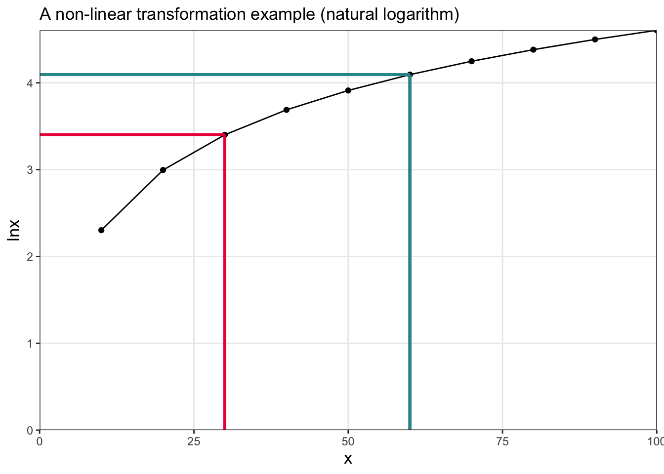
Notice that the initial values of x and the transformed values (log2x) do not fall on a straight line, and the spacing is not preserved — each 1 unit increase in a base-2 logarithm (e.g., going from 3 to 4) represents a doubling of x (e.g., going from 8 to 16).
The natural logarithm
The most often used logarithm in statistics is the natural logarithm, often denoted as ln. This is just a logarithm with a special base — the mathematical constant \(e\), which is approximately equal to 2.718.
Let’s look at how it works: \(\log_e(x) = c\) means that \(e\) raised to the power of \(c\) equals \(x\).
In other words, if \(\ln(x) = c\), then \(e^c = x\).
For example: \(\ln(7.389) = 2\) because \(e^2 \approx 7.389\).
In R, we can compute the natural log of a variable x using the code lnx = log(x). The log() function in R uses base \(e\) by default, so it returns the natural logarithm.
Let’s try this out: we’ll create a few values for a variable x and calculate their natural logs (called lnx).
trans3 <-
  tibble(x = seq(10,100, by = 10)) |>
  mutate(lnx = log(x))

trans3| x | lnx |
|---|---|
| 10 | 2.302585 |
| 20 | 2.995732 |
| 30 | 3.401197 |
| 40 | 3.688879 |
| 50 | 3.912023 |
| 60 | 4.094345 |
| 70 | 4.248495 |
| 80 | 4.382027 |
| 90 | 4.499810 |
| 100 | 4.605170 |
Now, we’ll plot x against lnx to see how the transformation behaves — just like we did with the binary logarithm.
The plot for the natural logarithm looks similar to the plot for the base-2 logarithm, showing that both are examples of non-linear transformations. In fact, logarithms with different bases are mathematically related: a logarithm in one base can be written as a constant multiple of a logarithm in another base. This means that log transformations using different bases are essentially linear transformations of one another. Because of this, analysts can choose whichever base is most useful or conventional for their specific application.
Important
It’s important to note that the logarithm of 0 or a negative number is undefined. This is because logarithms tell us the power to which a base (such as 2 or \(e\)) must be raised to produce a given number. There is no exponent that will produce 0 or a negative value when raising a positive base to a power. As a result, the logarithmic function is only defined for positive numbers.
Applied example
Now that we’ve explored the concept of logarithmic transformations, let’s walk through a real-world example to see how and why these transformations can be useful in regression modeling. In this example, we’ll examine the relationship between a country’s economic status and the health of its population by modeling life expectancy as a function of GDP per capita. We’ll begin with the raw data, fit a simple linear model, and then explore how applying a natural log transformation to GDP per capita can improve the model’s fit and interpretability.
We’ll use data compiled by Our World in Data on gross domestic product (GDP) and life expectancy of residents in 165 countries — focusing on the data for year 2021.
To begin, let’s import and wrangle the data a bit:
gdp_lifeexp <- read_csv(here("data", "gdp_lifeexp.csv")) |>
  janitor::clean_names() |>
  filter(year == 2021)  |>
  filter(entity != "World") |>
  rename(gdp = gdp_per_capita,
         le = period_life_expectancy_at_birth_sex_all_age_0,
         pop = population_historical_estimates
         ) |>
  select(entity, code, gdp, le, pop) |>
  drop_na()

gdp_lifeexp
The variables in the data frame include:
| Variable | Description |
|---|---|
| entity | The country |
| code | An abbreviation of the country name |
| gdp | Average economic output per person in a country or region per year. This data is adjusted for inflation and for differences in living costs between countries. |
| le | The period life expectancy at birth. |
| population | The total population of the country. |
Here’s a skim of the variables:
gdp_lifeexp |>
  select(le, gdp) |>
skim()| Name | select(gdp_lifeexp, le, g… |
| Number of rows | 165 |
| Number of columns | 2 |
| _______________________ | |
| Column type frequency: | |
| numeric | 2 |
| ________________________ | |
| Group variables | None |
Variable type: numeric
| skim_variable | n_missing | complete_rate | mean | sd | p0 | p25 | p50 | p75 | p100 | hist |
|---|---|---|---|---|---|---|---|---|---|---|
| le | 0 | 1 | 71.55 | 7.91 | 52.53 | 65.67 | 72.44 | 77.20 | 85.47 | ▁▅▆▇▅ |
| gdp | 0 | 1 | 19216.92 | 20266.90 | 606.86 | 4684.00 | 12455.92 | 28085.96 | 143468.75 | ▇▂▁▁▁ |
Visualize the relationship
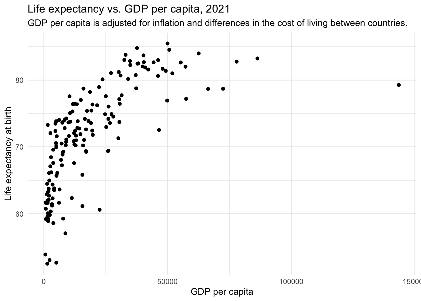
Now, we can create a scatterplot of the raw data.
gdp_lifeexp |>
  ggplot(aes(x = gdp, y = le)) +
  geom_point() +
  theme_minimal() +
  labs(title = "Life expectancy vs. GDP per capita, 2021",
       x = "GDP per capita",
       y = "Life expectancy at birth")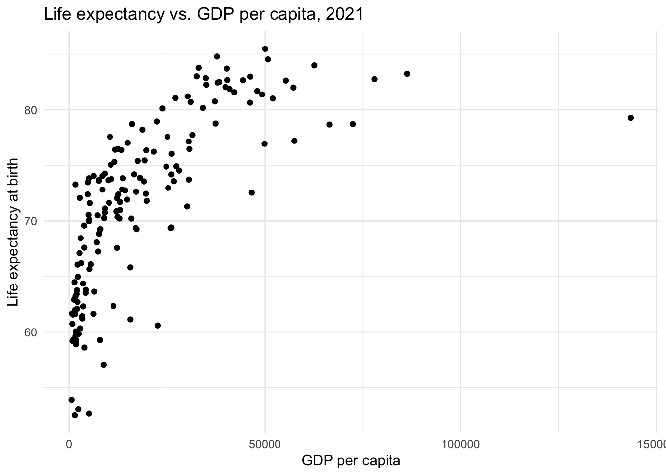
Let’s imagine that we want to fit a model to predict life expectancy from GDP per capita. We might consider a linear model:
gdp_lifeexp |>
  ggplot(aes(x = gdp, y = le)) +
  geom_point() +
  geom_smooth(method = "lm", formula = "y ~ x", color = "#F26B38") +
  theme_minimal() +
  labs(title = "Life expectancy vs. GDP per capita, 2021",
       x = "GDP per capita",
       y = "Life expectancy at birth")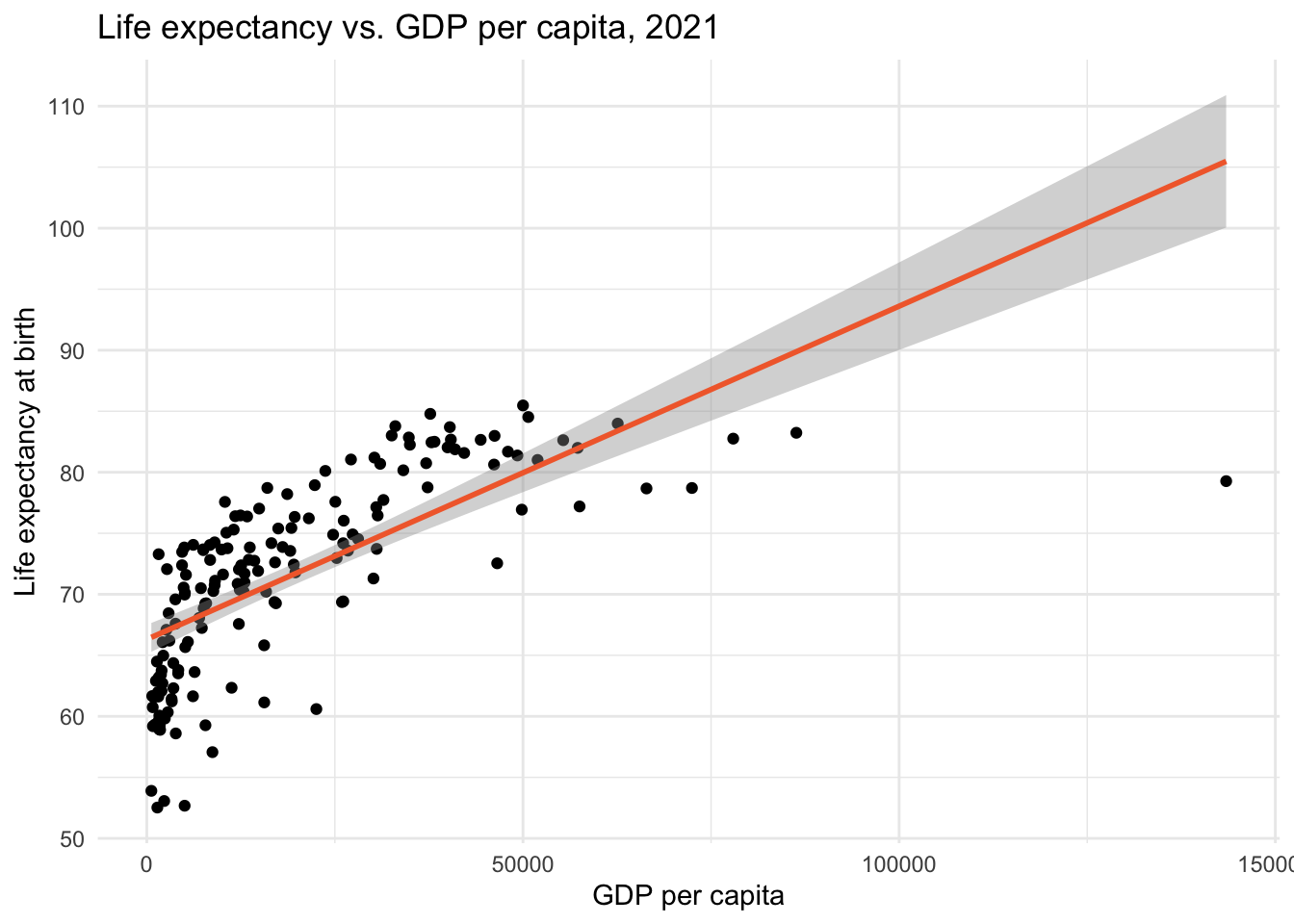
The best-fit line doesn’t run through the center of the data in many parts of the scatterplot. This suggests that the linear model does not capture the central trend of the data across the range of GDP per capita values.
Given our understanding of logarithmic transformations, applying a log transformation to GDP per capita might improve the model fit. Let’s create a new variable, called gdp_ln that applies a natural log transformation to gdp.
gdp_lifeexp <-
  gdp_lifeexp |>
  mutate(gdp_ln = log(gdp))

gdp_lifeexp |>
  select(entity, gdp, gdp_ln)
Let’s examine a density plot of GDP in its raw form, and compare it to a plot of its log-transformed version:
p1 <-
  gdp_lifeexp |>
  ggplot(aes(x = gdp)) +
  geom_density(fill = "azure3") +
  theme_minimal() +
  labs(title = "GDP in its raw metric",
       x = "GDP per capita")

p2 <-
  gdp_lifeexp |>
  ggplot(aes(x = gdp_ln)) +
  geom_density(fill = "azure4") +
  theme_minimal() +
  labs(title = "The natural logarithm of GDP",
       x = "ln(GDP per capita)")

library(patchwork)
p1 + p2 + plot_annotation(title = "GDP per capita in its raw and transformed metric")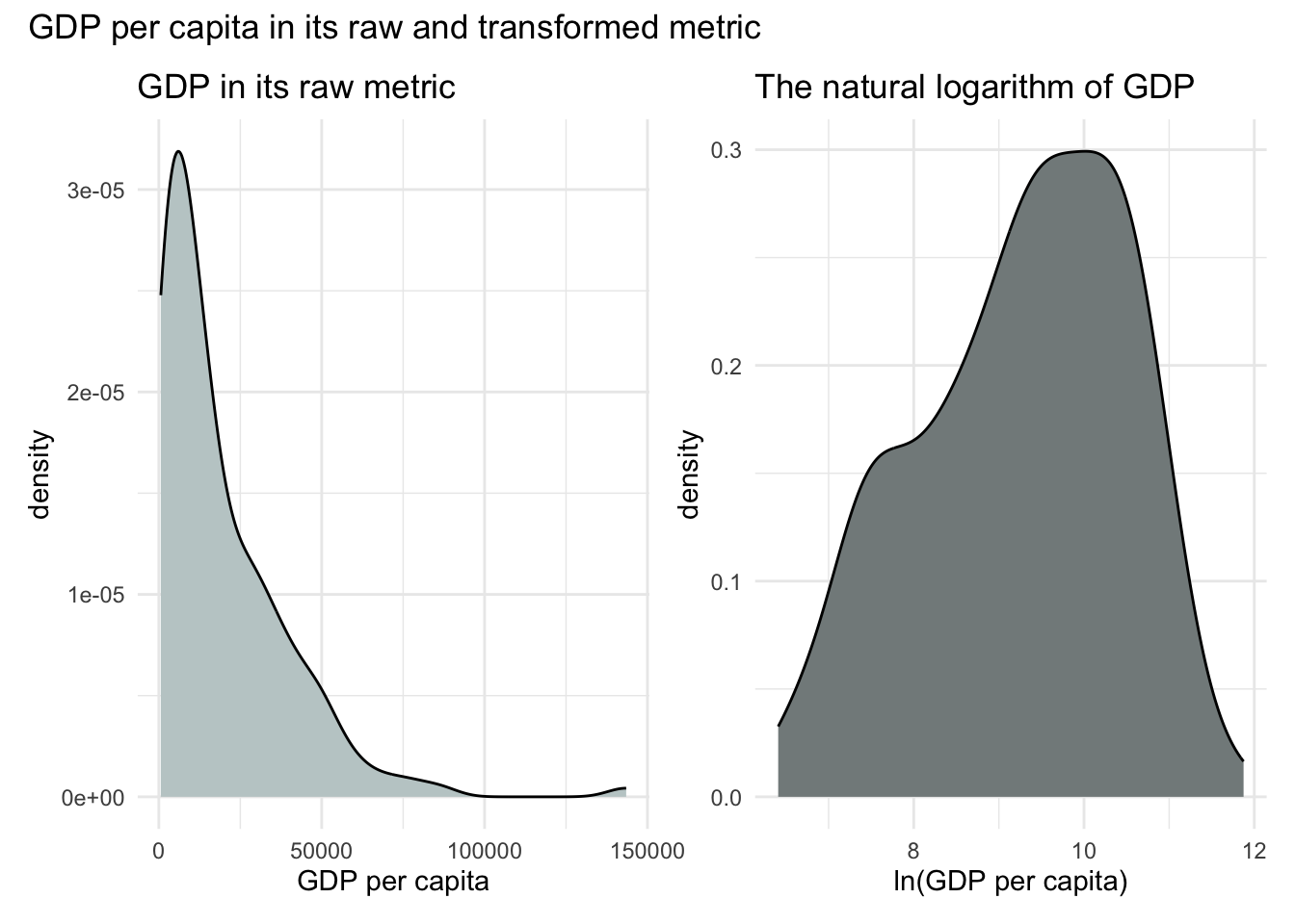
In its raw metric, GDP per capita is highly skewed to the right. While linear regression does not require normally distributed predictors, severe skewness can pose problems — especially when it leads to violations of model assumptions like normally distributed residuals (a topic we’ll return to in Module 17). So it’s encouraging that the log-transformed GDP distribution (i.e., ln(GDP)) looks more symmetric.
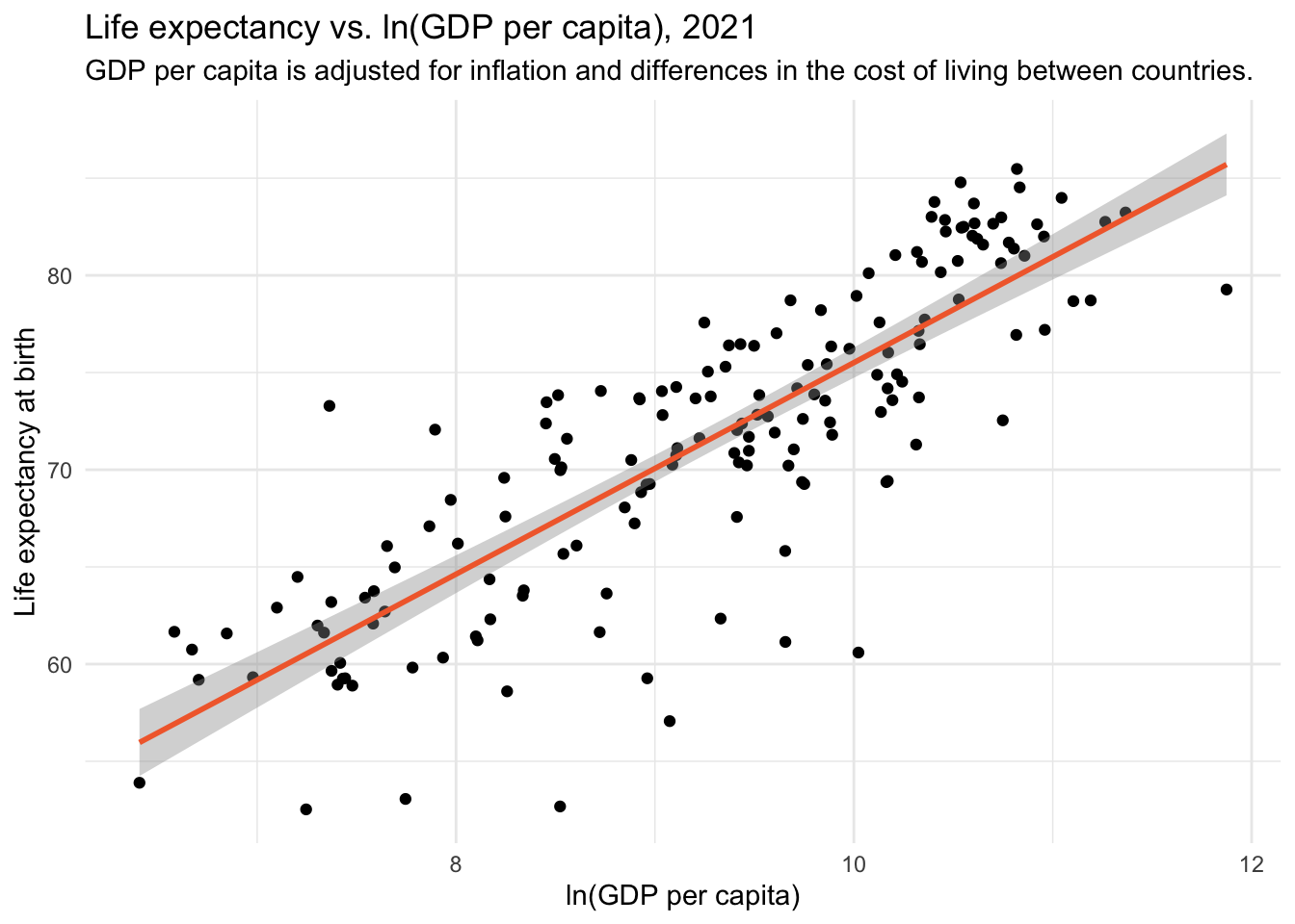
Now, let’s see whether the transformed version of GDP produces a more linear relationship with life expectancy.
gdp_lifeexp |>
  ggplot(aes(x = gdp_ln, y = le)) +
  geom_point() +
  geom_smooth(method = "lm", formula = "y ~ x", color = "#F26B38") +
  theme_minimal() +
  labs(title = "Life expectancy vs. ln(GDP per capita), 2021",
       x = "ln(GDP per capita)",
       y = "Life expectancy at birth")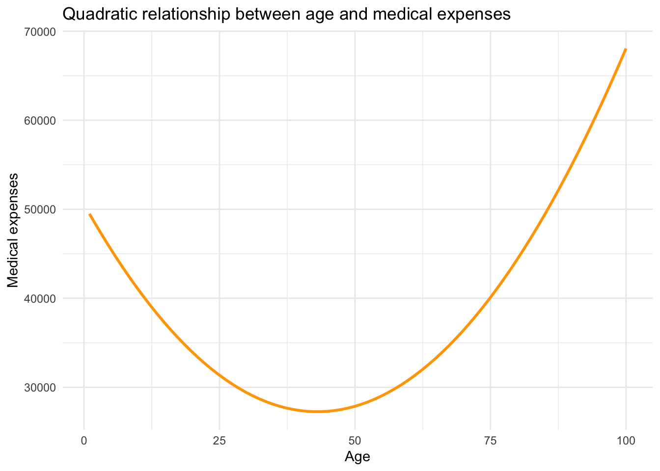
Indeed, the transformed version — ln(GDP) — reveals a more linear pattern with life expectancy. This means we can use our linear regression machinery (i.e., the lm() function) to estimate the relationship between ln(GDP) and life expectancy.
Fit the model
Let’s regress life expectancy on ln(GDP):
lm1 <- lm(le ~ gdp_ln, data = gdp_lifeexp)

lm1 |>
  tidy() |>
  select(term, estimate, std.error)
Interpret the model
What does the intercept represent?
The intercept (21.1) represents the expected life expectancy when gdp_ln equals 0. To interpret this, we apply the inverse of the natural log — a process that reverses the logarithmic transformation by raising \(e\) to the given power.
Here’s the basic idea:
- If \(c = \ln(x)\), then \(x = \exp(c)\)
- Or put another way, \(\exp(c)\) gives you back the original value of \(x\) before it was logged.
- The exp() function in R carries out this exponentiation.
exp(0)[1] 1This tells us that ln(GDP) = 0 corresponds to a GDP of 1. So according to the model, a country with a GDP per capita of $1 would have a life expectancy of 21.1 years. But since no country in our data frame has such a low GDP (the lowest is $607), this intercept has no practical interpretation.
What does the slope represent?
The slope (5.4) tells us that for every one-unit increase in ln(GDP), life expectancy increases by approximately 5.4 years. That’s a strong, positive association.
But what does a one-unit increase in ln(GDP) mean in terms of GDP itself? That’s not easy to interpret directly. Instead, we can reframe the effect in terms of percentage changes in GDP — which is more intuitive. The following custom function converts percentage changes in GDP into predicted changes in life expectancy:
ln.x <- function(slope, x_chg) {
  new_slope <- slope * (log(1 + (x_chg/100)))
  return(new_slope)
}
To estimate the expected change in life expectancy for a 1% increase in GDP per capita, we pass two arguments to the ln.x function:
- The slope estimate from our regression model (5.446485 for our example)
- The percentage change we want to examine (we’ll start with a 1 percent increase)
ln.x(5.446485, 1)[1] 0.05419433This returns approximately 0.054, meaning that a 1% increase in GDP per capita is associated with a 0.054-year increase in life expectancy — or roughly 0.65 months (i.e., \(0.054 \times 12 ≈ 0.65\)).
Let’s also look at a 100% increase — that is, a doubling of GDP. Here we input 100 as the desired percentage change.
ln.x(5.446485, 100)[1] 3.775216This shows that a 100% increase in GDP is associated with an increase of about 3.8 years in life expectancy.
Interpretation in context
When GDP is log-transformed, the slope represents the expected change in life expectancy for a percentage change in GDP. For example, a 100% increase in GDP (doubling it) produces a consistent increase in ln(GDP) — and thus a consistent increase in life expectancy — regardless of where we start.
Let’s compare two countries from the dataset:
Democratic Republic of Congo (DRC): GDP = $817
\(\ln(817) \approx 6.71\)
Doubling GDP gives $1634 → \(\ln(1634) \approx 7.40\)
Change in ln(GDP) = \(7.40 - 6.71 = 0.69\)United States: GDP = $57,523
\(\ln(57{,}523) \approx 10.96\)
Doubling GDP gives $115,046 → \(\ln(115{,}046) \approx 11.65\)
Change in ln(GDP) = \(11.65 - 10.96 = 0.69\)
So a 100% increase in GDP corresponds to a 0.69-unit increase in ln(GDP) for both countries, and the model predicts the same increase in life expectancy:
\[ 0.69 \times 5.44 \approx 3.8 \text{ years} \]
This shows how percentage increases in GDP yield consistent effects in a log-linear model — regardless of the country’s wealth.
In contrast, a unit increase in GDP (e.g., $100) has very different meanings depending on the country. For the DRC, $100 is a major increase. For the U.S., it’s negligible. That’s why modeling GDP on the raw scale results in a poor fit, while the log-transformed version fits much better.
Take a look at the two plots below. The one on the left shows the relationship using raw GDP, while the one on the right uses ln(GDP):
Key takeaways:
The red vertical line represents the GDP (or ln(GDP)) of the Democratic Republic of Congo — a low-income country.
The blue vertical line represents the GDP (or ln(GDP)) of the United States — a high-income country.
In the left panel, you can see that the slope is much steeper at the DRC’s level of GDP. This reflects the fact that a small absolute increase in GDP — say, a few hundred dollars — represents a large percentage gain for low-income countries. As a result, even modest economic growth can have substantial effects on life expectancy in these settings. In contrast, the same dollar increase in a high-income country like the United States represents only a tiny proportional change and has little impact on life expectancy.
In contrast, in the right panel, the slope is constant, because the model is now linear in log-transformed GDP. This reflects the idea that a given percentage increase in GDP (say, doubling) has the same effect on life expectancy, regardless of the country’s initial GDP.
Taking the natural log of GDP allows us to better capture the nonlinear, diminishing returns relationship between income and life expectancy. It also enables us to interpret effects in terms of percentage changes, which are often more meaningful and appropriate than unit changes when dealing with skewed or multiplicative variables. In a multiplicative relationship, the effect of one variable depends on the size of another — meaning that changes are better described in terms of percentages rather than fixed units. For example, a $100 increase in income might mean a lot to someone earning $1,000 (a 10% increase), but very little to someone earning $100,000 (a 0.1% increase). In cases like this, modeling the natural log of a variable helps us capture this kind of proportional or percentage-based relationship.
Polynomial Regression
In a simple linear regression, we assume that the relationship between a predictor \(X\) and an outcome \(Y\) is linear and constant — that is, the effect of \(X\) on \(Y\) doesn’t change depending on the level of \(X\). But what if the effect of \(X\) is stronger at some values and weaker at others? In many cases, relationships between variables are curved or non-linear.
Polynomial regression offers a powerful way to model these curvilinear relationships, all while staying within the familiar framework of linear models.
A primer on polynomials
To illustrate the idea, consider the relationship between age and annual healthcare expenditures. Medical costs tend to be high early in life, lower during much of adulthood, and then rise again in older age. This kind of pattern can be captured by a quadratic function — a special case of polynomial regression — that produces a parabolic (U- or inverted U-shaped) curve.

The curve above demonstrates how the effect of age on medical expenses changes depending on where you are on the age scale. Early in life, each additional year of age reduces medical costs. In older age, each year adds to medical costs. A straight line couldn’t capture this pattern, but a parabola can.
What is polynomial regression?
Polynomial regression extends the linear model by adding powered terms of the predictor (e.g., \(X\)). For example:
- A quadratic model adds \(X^2\) to capture a single curve (like a U or an inverted U).
- A cubic model adds \(X^3\) and can capture two bends.
Each added powered term increases the model’s flexibility to capture the relationship between \(X\) and \(Y\), but also adds complexity and interpretive difficulty. In practice, most applied researchers stop at quadratic terms because they’re easier to interpret and sufficient for many curvilinear patterns.
Applied example
Let’s look at a real-world-inspired scenario: Does more practice lead to a better score on a visual discrimination task?
Participants were randomly assigned a number of practice minutes (ranging from 0 to 14), then took a test. We want to model how test scores vary with the amount of practice.
The experiment revolves around two variables:
practice: the experimentally assigned duration of practice (in minutes)
score: the total correct responses during the test.
Let’s import the data and take a look at the scores:
cogtest <- read_csv(here("data", "cogtest.csv")) |> select(-subject)
cogtest
cogtest |> skim()| Name | cogtest |
| Number of rows | 40 |
| Number of columns | 2 |
| _______________________ | |
| Column type frequency: | |
| numeric | 2 |
| ________________________ | |
| Group variables | None |
Variable type: numeric
| skim_variable | n_missing | complete_rate | mean | sd | p0 | p25 | p50 | p75 | p100 | hist |
|---|---|---|---|---|---|---|---|---|---|---|
| practice | 0 | 1 | 7.00 | 4.64 | 0.00 | 3.50 | 7.00 | 10.50 | 14.00 | ▇▃▇▃▇ |
| score | 0 | 1 | 16.38 | 7.67 | 1.06 | 11.67 | 19.04 | 22.23 | 25.54 | ▂▂▂▃▇ |
The skim() output shows that the mean for the performance score is 16.38, and the standard deviation is 7.67. Minutes of practice (the experimentally manipulated predictor/independent variable) ranges from 0 minutes to 14 minutes.
Visualize the relationship
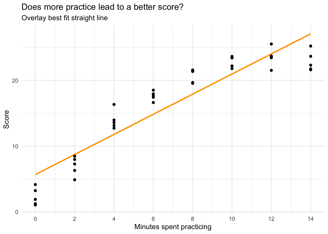
Let’s plot the relationship between minutes spent practicing and performance on the task, and overlay a best fit line using the argument formula = y ~ x on the call to geom_smooth().
cogtest |>
  ggplot(mapping = aes(x = practice, y = score)) +
  geom_smooth(method = "lm", se = FALSE, formula = y ~ x, color = "orange") +
  geom_point() +
  scale_x_continuous(limits = c(0, 14),
                     breaks = seq(0, 14, by = 2)) +
  theme_minimal() +
  labs(title = "Does more practice lead to a better score?",
       subtitle = "Overlay best fit line",
       x = "Minutes spent practicing",
       y = "Score")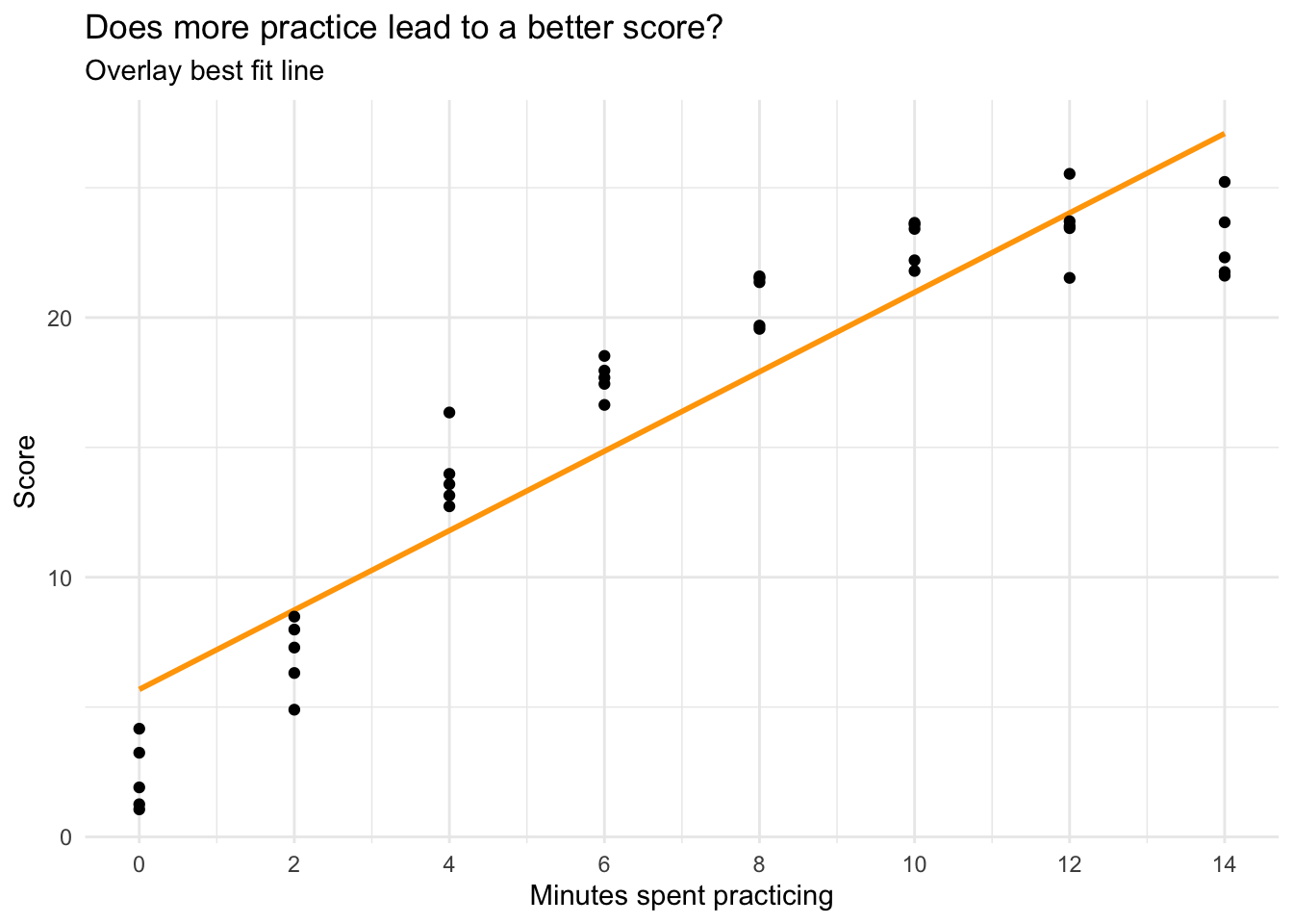
From the graph, we see a clear increasing trend. However, the increasing trend appears to slow down at higher levels of practice. To better capture this pattern, we can change the linear best-fit line to a quadratic curve. This is accomplished by changing formula = y ~ x to formula = y ~ poly(x, 2), where the second argument to poly() specifies the polynomial order (2, or squared, denotes a quadratic relationship).
cogtest |>
  ggplot(mapping = aes(x = practice, y = score)) +
  geom_smooth(method = "lm", se = FALSE, formula = y ~ poly(x, 2), color = "#EC2049") +
  geom_point() +
  scale_x_continuous(limits = c(0, 14),
                     breaks = seq(0, 14, by = 2)) +
  theme_minimal() +
  labs(title = "Does more practice lead to a better score?",
       subtitle = "Overlay quadratic curve",
       x = "Minutes spent practicing",
       y = "Score")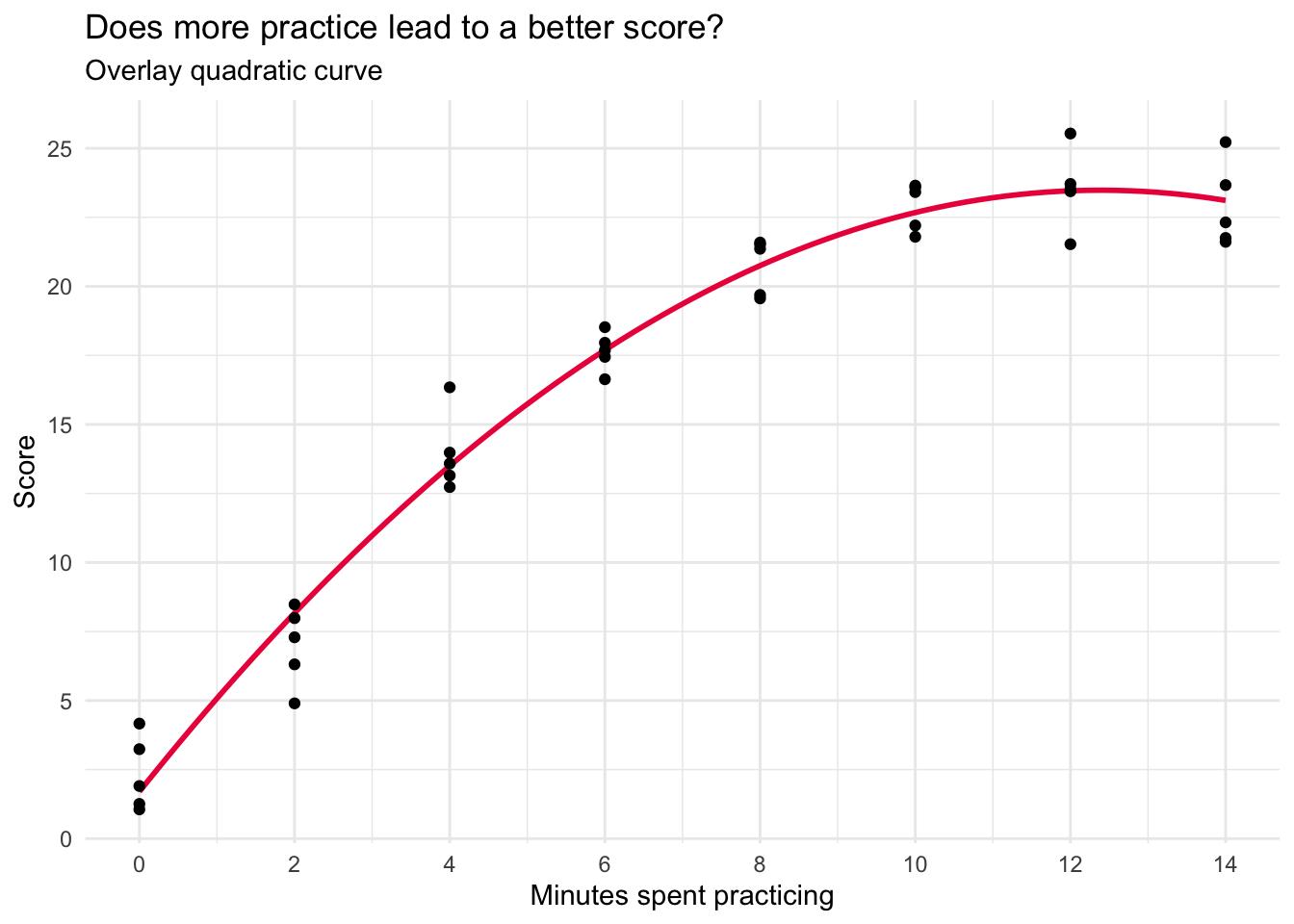
The quadratic function appears to offer a substantially better fit to the data, with the curved line accurately intersecting the data points at each instance of practice.
Prepare to fit a polynomial regression
The gist
Let’s now explore how polynomial regression equips us with the capability to capture this curvilinear relationship between practice duration and performance outcomes.
In building a polynomial regression model, our standard approach involves testing an array of models, each progressively incorporating an additional polynomial term for our predictor (i.e., minutes spent practicing — \(x_i\)). For example:
- Model 1: \(x_i\),
- Model 2: \(x_i + x_i^2\)
- Model 2: \(x_i + x_i^2 + x_i^3\)
We strive to adopt the most parsimonious model, so we begin with the simplest model and continue testing higher-order models until we find that the latest added term no longer noticeably enhances the model’s fit to the data.
At this point, we opt for the previous model, where the highest-order term significantly influenced the model’s ability to capture the curvature in the relationship. Crucially, all lower-order terms are retained in the model if the highest-order term is deemed necessary, regardless of whether the lower terms have a regression parameter estimate close to zero.
Manually created the needed polynomial terms
First, we need to create the polynomial terms, we’ll consider up to 2 bends in this example.
cogtest <-
  cogtest |>
  mutate(practice2 = practice^2, # squared term for one bend
         practice3 = practice^3) # cubed term for two bends

cogtest
Test a series of models
Linear model
Let’s start with the linear model.
lm_lin <- lm(score ~ practice, data = cogtest)
lm_lin |> tidy(conf.int = TRUE, conf.level = 0.95) |> select(term, estimate, conf.low, conf.high)
lm_lin |> glance() |> select(r.squared, sigma) cogtest |>
ggplot(mapping = aes(x = practice, y = score)) +
geom_smooth(method = "lm", se = FALSE, formula = y ~ x, color = "orange") +
geom_point() +
scale_x_continuous(limits = c(0, 14),
breaks = seq(0, 14, by = 2)) +
theme_minimal() +
labs(title = "Does more practice lead to a better score?",
subtitle = "Overlay best fit straight line",
x = "Minutes spent practicing",
y = "Score")
In this simple linear regression, the intercept is the predicted score for someone who receives no practice. The slope is the predicted change in the score for a one unit increase in minutes spent practicing. It is meaningfully different from zero, indicating a positive linear trend — each additional minute spent practicing is associated with a 1.5 unit increase in performance.
However, the graph suggests that the relationship between practice and score is not strictly linear, or in other words, there is not a constant rate of increase. At lower levels of practice, each additional minute matters quite a lot, but at high levels of practice, the increment to performance for each additional minute is smaller.
The \(R^2\) is 0.86 — indicating that about 86% of the variability in performance is predicted by this linear trend. Sigma, which represents the standard deviation of the residuals, is 2.95. The standard deviation of performance is 7.67 — indicating a substantial reduction in variability once the linear trend is accounted for.
Quadratic model
Next, let’s fit the quadratic model.
lm_quad <- lm(score ~ practice + practice2, data = cogtest)
lm_quad |> tidy(conf.int = TRUE, conf.level = 0.95) |> select(term, estimate, conf.low, conf.high)
lm_quad |> glance() |> select(r.squared, sigma) cogtest |>
ggplot(mapping = aes(x = practice, y = score)) +
geom_smooth(method = "lm", se = FALSE, formula = y ~ poly(x, 2), color = "#EC2049") +
geom_point() +
scale_x_continuous(limits = c(0, 14),
breaks = seq(0, 14, by = 2)) +
theme_minimal() +
labs(title = "Does more practice lead to a better score?",
subtitle = "Overlay quadratic curve",
x = "Minutes spent practicing",
y = "Score")
Notice that the estimate for the quadratic term (practice2) is meaningfully different from zero (-0.14, and the 95% CI doesn’t include 0). Moreover, the \(R^2\) increases quite a bit (from 0.86 in the linear model to 0.97 in the quadratic model). In addition, sigma is further reduced. This provides evidence that there is a substantial curve to the relationship. This initial curvature is an important aspect of the relationship between minutes spent practicing and subsequent performance.
Cubic model
Let’s finish with the cubic model.
lm_cubic <- lm(score ~ practice + practice2 + practice3, data = cogtest)
lm_cubic |> tidy(conf.int = TRUE, conf.level = 0.95) |> select(term, estimate, conf.low, conf.high)
lm_cubic |> glance() |> select(r.squared, sigma)cogtest |>
ggplot(mapping = aes(x = practice, y = score)) +
geom_smooth(method = "lm", se = FALSE, formula = y ~ poly(x, 3), color = "#2F9599") +
geom_point() +
scale_x_continuous(limits = c(0, 14),
breaks = seq(0, 14, by = 2)) +
theme_minimal() +
labs(title = "Does more practice lead to a better score?",
subtitle = "Overlay cubic curve",
x = "Minutes spent practicing",
y = "Score")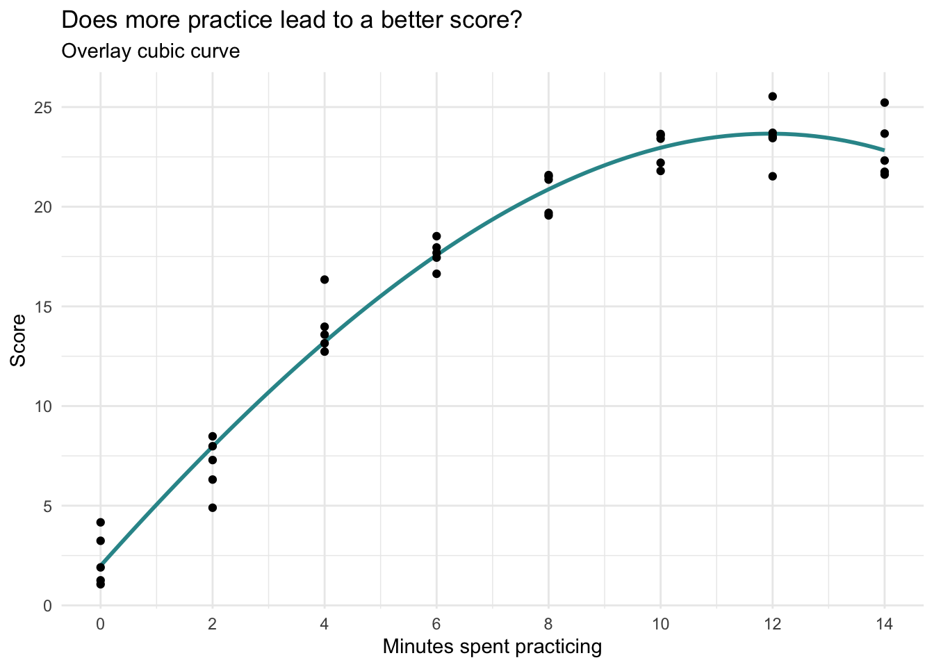
The estimate for the cubic term (practice3) is very small (-.003, and the 95% CI includes 0), the \(R^2\) and sigma barely budged as compared to the quadratic model. This provides evidence that there is not a second bend to the relationship. In addition, the cubic graph doesn’t seem to add anything over the quadratic graph. Therefore, the quadratic model seems to be the best fit for these data. Thus, we will move forward with the quadratic model.
How do we describe the effects?
Interpretation of polynomial regression models requires extra care. Let’s break down the elements for a quadratic model. For convenience, here are the results of the quadratic model that we determined was the best fit for the data. Also, as I refer to effects in the results below, I will refer to the following equation:
\[ \hat{y_i} = {b_0} + ({b_1}\times{x_i}) + ({b_2}\times{x^2_i}) \]
Where \({x_i}\) refers to practice and \({x^2_i}\) refers to practice2.
lm_quad |> tidy(conf.int = TRUE, conf.level = 0.95) |> select(term, estimate, conf.low, conf.high)Intercept
The estimate for the intercept (\({b_0}\)) is the predicted test score for people who practice 0 minutes (i.e., practice equals 0). That is, if someone doesn’t practice, we predict they will score 1.7 points on the test.
Shape of the parabola
The graph of a quadratic regression model is the shape of a parabola. This shape can take two common forms:
- A bowl-shaped curve (a U-shape) is referred to as convex.
- A mound-shaped curve (an inverted U-shape) is referred to as concave.
In our example, the curve is concave (mound-shaped), meaning that performance increases with more practice at first, but then levels off and slightly declines at the highest levels of practice.
The sign of the squared term (i.e., \({b_2}\) in the equation or the estimate for practice2, which is –0.14 in our example) determines the shape:
- If the estimate of the squared term is positive, the parabola is convex (U-shaped).
- If the estimate of the squared term is negative, the parabola is concave (inverted U-shaped).
Changing slope
The slope of a line drawn tangent to the parabola at a certain value of \(x_i\) is estimated by:
\[ {b_1} + (2\times{b_2}\times{x_i}) \]
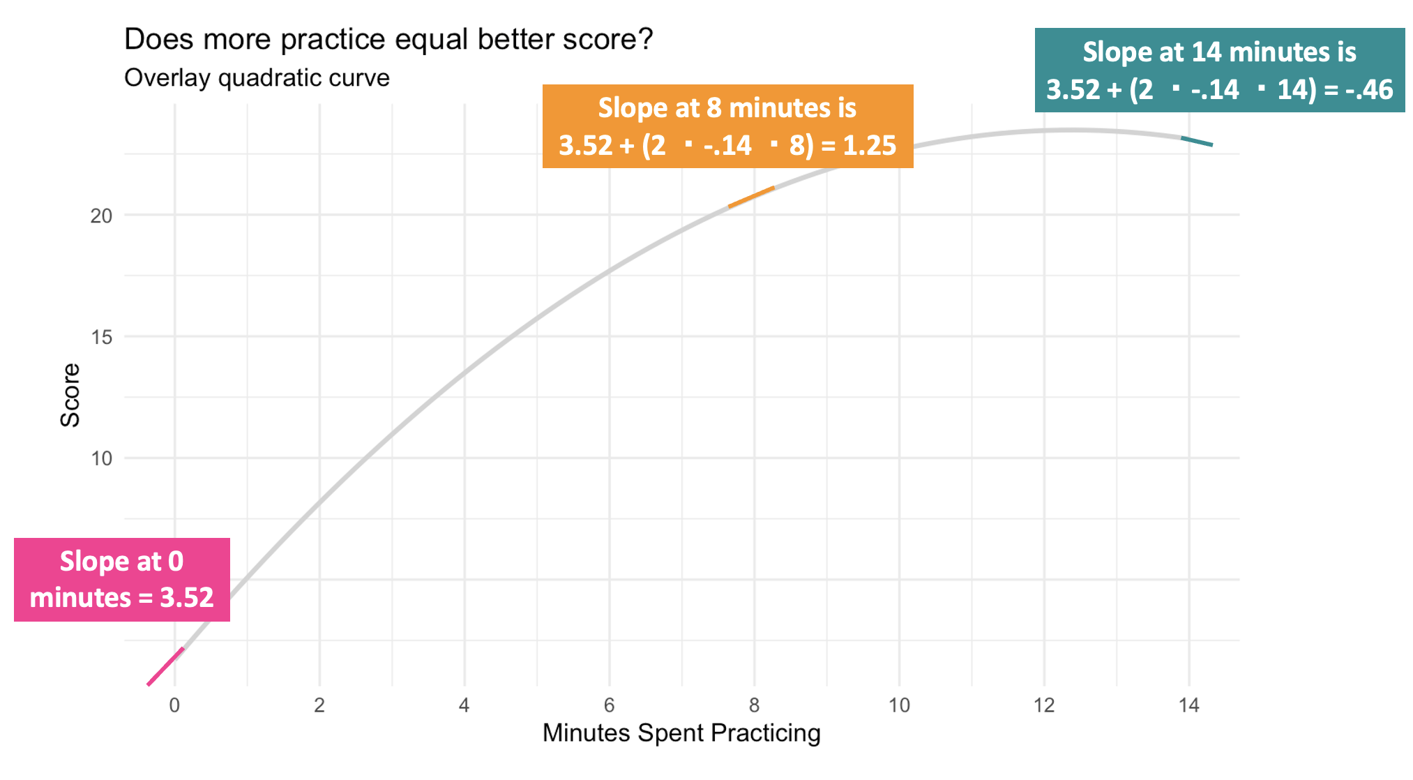
We can calculate the slope drawn tangent to the line at any desired level of \(x_i\) (i.e., minutes of practice). In other words, the slope at different minutes of practice shows how the predicted score changes for each additional minute of practice. Here’s how we can calculate this at various points:
For example:
When practice equals 0 the slope is: \(3.517 + (2\times-0.142\times0) = 3.52\)
When practice equals 8 the slope is: \(3.517 + (2\times-0.142\times8) = 1.25\)
When practice equals 12 the slope is: \(3.517 + (2\times-0.142\times12) = 0.11\)
When practice equals 14 the slope is: \(3.517 + (2\times-0.142\times14) = -0.46\)
This means that at 0 minutes of practice time, one additional minute of practice is predicted to increase the test score by about 3.52 points (i.e., we predict they’ll get more than 3 additional problems correct). But at 8 minutes, one additional minute of practice is predicted to increase the test score by about 1.25 points. By the time we get to 12 minutes of practice time, the beneficial effect of additional time spent practicing is nearly gone, and by 14 minutes, each additional minute appears to be detrimental (indicated by the negative slope). These changing slopes for 0, 8, 12, and 14 minutes are marked on the graph below.
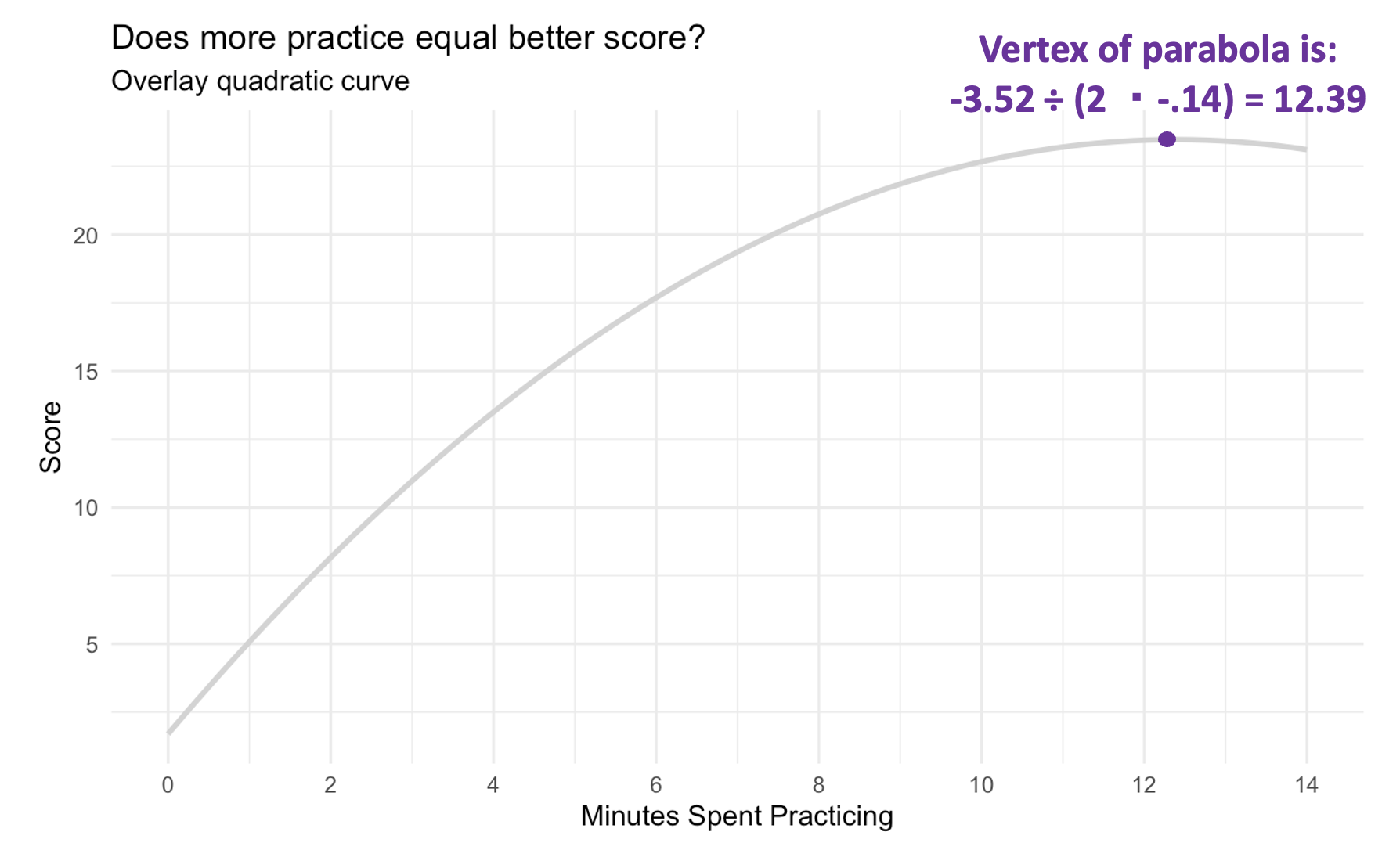
Vertex
There is a value of \(x_i\) along the curve when the slope drawn tangent to the line is 0. In other words, this is the point at which the predicted value of \(y_i\) (i.e., score) takes a maximum value if the parabola is a mound shape or a minimum value if the parabola is a bowl shape. This point is called the vertex and the x-coordinate of the vertex can be estimated with the following formula:
\[ {-b_1} \div (2\times{b_2}) \]
In our case, the vertex represents the practice time at which the predicted score is maximized. For our example, this is \(-3.517 \div (2\times{-.142}) = 12.4\). This is the point where the effect of practicing goes from positive to negative, and this indicates that there is no need to practice more than about 12.4 minutes. At this point, there is no additional benefit (i.e., no increment to the test score), and it would seem that any longer will begin to deteriorate the participant’s score.
In any regression model, we should not extrapolate beyond the range of our observed data, so we wouldn’t want to speculate what will happen beyond 14 minutes. If we want to know, we’d need to conduct a new study with a wider range of practice time.
The graph below depicts the vertex for our example.
Polynomial regression is an extension of linear regression that models non-linear relationships between the predictor variable (\(X\)) and the response variable (\(Y\)). It does this by including polynomial terms of the predictor, such as quadratic, cubic, and higher powers. This method allows for more flexibility in fitting curves to the data.
Why polynomial regression is useseful
Captures Non-Linear Relationships: While linear regression assumes a straight-line relationship, polynomial regression can model more complex, curvilinear relationships between variables. This is particularly useful in real-world scenarios where the effect of a predictor on the outcome changes at different levels of the predictor.
Increased Model Flexibility: By adding polynomial terms, the model can better fit data that deviates from a straight line. For example, a quadratic model can capture a single bend in the data, and a cubic model can capture two bends, providing a more accurate fit for certain datasets.
Improved Predictive Performance: For datasets where the relationship between variables is inherently non-linear, polynomial regression can provide better predictions and a higher \(R^2\) value, indicating a better fit compared to linear models.
Practical Applications: Polynomial regression is widely used in fields (including Psychology and Public Health) where relationships between variables are often non-linear. For instance, it can model the progression of disease, the effects of aging, or the diminishing returns of investment.
Key considerations
Avoiding Overfitting: While adding higher-order terms can improve the model fit to the sample data, it also increases the risk of overfitting, where the model captures noise rather than the underlying trend. It is crucial to balance model complexity with generalizability.
Interpretability: Higher-order polynomial terms can make the model harder to interpret. Typically, polynomial terms beyond the second order are less commonly used in practice due to this reason.
In summary, polynomial regression is a powerful tool for modeling non-linear relationships, offering increased flexibility and better fit for complex datasets. However, it requires careful application to avoid overfitting and to maintain interpretability.
Summary of Modeling Approaches
Linear regression is a powerful and intuitive starting point for modeling relationships between variables — but real-world data often contain patterns that a straight line can’t fully capture. Tools like logarithmic transformations and polynomial regression help us flexibly model relationships that are curved, nonlinear, or multiplicative in nature. By applying these techniques, we can improve model fit, reveal meaningful patterns, and generate more accurate and interpretable predictions — all while staying within the familiar framework of linear models.
Learning Check
After completing this Module, you should be able to answer the following questions:
- When is a logarithmic transformation useful in regression modeling?
- What is the difference between a linear transformation and a logarithmic transformation?
- How does applying a log transformation to GDP per capita improve model fit and interpretation?
- What does the slope coefficient mean in a regression model where the predictor is log-transformed?
- How can you interpret the effect of a 1% or 100% increase in a log-transformed predictor using the regression slope?
- What is a polynomial regression, and how does it differ from simple linear regression?
- How does a quadratic term (e.g., \(x^2\)) affect the shape of a regression model?
- How do you determine the vertex of a quadratic regression model, and what does it represent?
- How do you compute the slope at a specific value of the predictor in a quadratic regression model?
- What are the benefits and limitations of using higher-order polynomial terms in regression analysis?