library(skimr)
library(here)
library(infer)
library(tidyverse)Quantifying Uncertainty in Descriptive Statistics
Module 8

Learning Objectives
By the end of this Module, you should be able to:
- Differentiate between a population parameter and a sample statistic
- Explain the purpose of inferential statistics and how it builds on descriptive statistics
- Simulate random sampling from a population and observe sample-to-sample variability
- Define and interpret a sampling distribution
- Describe how the Central Limit Theorem (CLT) explains the shape of a sampling distribution
- Quantify uncertainty using the standard error of an estimate
- Assess how sample size affects the precision of parameter estimates
- Distinguish between accuracy and precision in the context of repeated sampling
- Visualize the distribution of sample statistics across many samples and interpret key features
Overview
In Psychology and many other fields, we often want to answer big questions — like how common depression is among U.S. teens, or how a parent’s socioeconomic status influences the future socioeconomic outcomes of their children across different counties in the U.S. But we almost never collect data from everyone in the population (for example, all U.S. teenagers or all parent–child pairs in every county). Instead, we collect data from a sample — a smaller group that represents the larger population we care about.
To understand the data from that sample, we start with descriptive statistics. These help us summarize what we see: for example, the average depression score in the sample, how much those scores vary, or whether two variables seem related.
But descriptive statistics only tell us about the sample itself. What if we want to go further and say something about the whole population — not just the people we happened to study?
That’s where inferential statistics come in. Inferential statistics help us make educated guesses about the population based on what we see in the sample. They allow us to test ideas (hypotheses), make predictions, and estimate how much trust we can place in our conclusions.
In earlier Modules, we focused on describing a sample — for instance, what percentage of teens in the sample experienced depression last year. In this Module, we take the next step and ask:
What can our sample tell us about all adolescents in the U.S.?
To answer that question, we need to understand:
How random sampling works
Why sample size matters
And how tools like the Central Limit Theorem help us understand what to expect when we sample from a population
These are the core ideas behind inferential statistics — and they’re essential for using data to answer real-world questions.
Introduction to the Data
In Module 07, we explored data from the National Survey on Drug Use and Health (NSDUH) — a large national study that helps us understand trends in substance use and mental health across the U.S. We focused on a random sample of adolescents and described:
The percentage who experienced a major depressive episode (MDE) in the past year
How severe those episodes were
Our focus in that Module was description: what the data looked like in the sample.
Now, we shift from describing the sample to inferring what’s likely true in the broader population. To make this idea more concrete, we’re going to zoom in on a smaller, local example: the Poudre School District in Fort Collins, Colorado.
Imagine we have data on all 2,028 eighth-grade students in the district’s 14 middle schools. That’s our entire population of interest.
In this Module, we’ll simulate the process of drawing a random sample from a population. Our goal is not just to describe the sample, but to use it to estimate what’s happening in the entire population — specifically, the proportion of students who experienced a major depressive episode (MDE) and the average depression severity score among those students. Along the way, you’ll learn:
Why different random samples give slightly different results
How to quantify uncertainty using simulations
And how the Central Limit Theorem helps us make sense of it all
Before we begin, let’s load the R packages we’ll need. You’ll see a new one infer — which is designed to help you explore inference through hands-on simulation.
The variables for this simulation include:
| Variable | Description |
|---|---|
| school_id | The school ID code |
| student_id | The student ID code |
| sex | The biological sex of the student (male, female) |
| mde_status | Binary indicator of Major Depressive Episode in the past year (1 = MDE, 0 = no MDE) |
| severity_scale | The severity of depression among students with MDE == 1 |
| selection_propensity | A variable that represents the probability that the student would volunteer for the study |
Let’s import the data — it’s a simulated dataset called psdsim_data.Rds, which represents all 2,028 eighth-grade students in the Poudre School District. In other words, this dataset stands in for the entire population we’re interested in. Let’s take a look at the first few rows.
psdsim_population <- read_rds(here("data", "psdsim_data.Rds"))
psdsim_population |> head()
Let’s obtain some population descriptive statistics for mde_status and severity_scale with skim(). For simplicity — we’ll ignore sex for now. Here are the descriptives for the whole population.
psdsim_population |>
  select(mde_status, severity_scale) |>
skim()| Name | select(psdsim_population,… |
| Number of rows | 2028 |
| Number of columns | 2 |
| _______________________ | |
| Column type frequency: | |
| numeric | 2 |
| ________________________ | |
| Group variables | None |
Variable type: numeric
| skim_variable | n_missing | complete_rate | mean | sd | p0 | p25 | p50 | p75 | p100 | hist |
|---|---|---|---|---|---|---|---|---|---|---|
| mde_status | 0 | 1.00 | 0.15 | 0.36 | 0.00 | 0.00 | 0.00 | 0.00 | 1.00 | ▇▁▁▁▂ |
| severity_scale | 1720 | 0.15 | 5.98 | 1.82 | 0.88 | 4.76 | 6.04 | 7.15 | 12.25 | ▁▆▇▃▁ |
Note that 15% of the population is positive for past-year MDE (i.e., see mean for mde_status), and among those with a past-year MDE the average severity of depression score is 5.98 (SD = 1.82)
Sampling from a Population
Let’s imagine that, given the constraints of resources, we decide to study a sample of 500 adolescents from this population. To simulate the sampling of 500 adolescents from the population, we will make use of the slice_sample() function from the dplyr package, specifying n = 500 to randomly select 500 students. Setting a seed ensures that we can replicate this random sample selection process for consistency (i.e., if we ran the code again, we’d pull the same 500 adolescents).
set.seed(411)

psdsim_sample <-
  psdsim_population |>
  slice_sample(n = 500)

psdsim_sample |> glimpse()
Rows: 500
Columns: 6
$ school_id <chr> "scl5", "scl2", "scl13", "scl2", "scl14", "scl12"…
$ student_id <int> 614, 396, 1672, 335, 1846, 1567, 848, 1841, 1814,…
$ sex <chr> "female", "female", "female", "male", "female", "…
$ mde_status <int> 1, 0, 0, 0, 0, 0, 0, 0, 0, 0, 1, 1, 0, 0, 0, 0, 0…
$ severity_scale <dbl> 6.516884, NA, NA, NA, NA, NA, NA, NA, NA, NA, 4.3…
$ selection_propensity <dbl> -1.6275896, -0.7939635, -0.3308061, 1.7188304, 1.…This process of defining a population, and then drawing a random sample from it, is a critical component of inferential statistics. Through this single random sample, our goal is to ensure that our findings are reflective of the wider population. This process underscores the distinction between descriptive and inferential statistics, guiding us in making broader inferences from our sample data to infer to the whole population.
Sample statistics
Let’s proceed by examining the descriptive statistics for prevalence of a past-year MDE (mde_status) and severity of depression (severity_scale) among adolescents with a past-year MDE within our sample of 500 students. The goal is to estimate the proportion of students who have experienced an MDE in the past year and to gauge the average severity of depression among those affected.
psdsim_sample |>
  select(mde_status, severity_scale) |>
skim()| Name | select(psdsim_sample, mde… |
| Number of rows | 500 |
| Number of columns | 2 |
| _______________________ | |
| Column type frequency: | |
| numeric | 2 |
| ________________________ | |
| Group variables | None |
Variable type: numeric
| skim_variable | n_missing | complete_rate | mean | sd | p0 | p25 | p50 | p75 | p100 | hist |
|---|---|---|---|---|---|---|---|---|---|---|
| mde_status | 0 | 1.00 | 0.16 | 0.37 | 0.00 | 0.00 | 0.00 | 0 | 1.00 | ▇▁▁▁▂ |
| severity_scale | 420 | 0.16 | 5.96 | 1.74 | 2.73 | 4.69 | 5.92 | 7 | 10.81 | ▅▇▇▃▁ |
The skim() output reveals that 16% of students (i.e., 80 students) in the random sample experienced a MDE in the past year. Additionally, the average severity of depression among these 80 students is 5.96.
Population Parameters and Sample Statistics
The true value of interest in the population is called a population parameter. In this example, the population parameters of interest are the proportion of adolescents with a past-year MDE, and the average severity score for depression among students with a past-year MDE. Population parameters are generally unknown. Using statistics, we estimate the population parameters using our random sample — these estimates that we garner from our sample are called parameter estimates (sometimes they are also referred to as sample statistics or point estimates). If we carefully conduct our study — then these sample statistics are likely to be good estimates of the unknown population parameter.
In our example here, we see that to be true. The population parameters that we first estimated based on all 2,028 students in the population are very similar to the parameter estimates garnered from our random sample of 500 adolescents drawn from the population.
The Ultimate Goal of Inferential Statistics
In this hypothetical example, we’re in a rare and special position: we have access to data for the entire population of eighth graders in the School District, as well as a random sample drawn from that population. This gives us a powerful opportunity to see how close our sample estimate comes to the true population value. In real-world research, we almost never get to see the full population — we only work with samples. But this simulated setup helps us understand how inferential statistics work behind the scenes.
At the heart of inferential statistics is this question:
How well does our sample represent the population?
Let’s say we use our sample to estimate the proportion of students who experienced a major depressive episode (MDE) in the past year. That estimate is just the starting point. The next (and more important) step is to ask,
How accurate is this estimate likely to be?
That’s where inference comes in. Inferential statistics help us quantify the uncertainty that comes with using a sample to estimate a population parameter. Instead of giving a single number and stopping there, we use tools like confidence intervals and sampling distributions to describe a range of plausible values for the true population parameter.
Even though uncertainty is unavoidable, understanding it makes our conclusions stronger, not weaker. It allows us to communicate clearly about what we know — and what we don’t — with transparency and confidence. By the end of this Module, you’ll begin to see how inference gives us the tools to generalize responsibly and make evidence-based decisions from sample data.
Simulate Sampling from the Population
Earlier we drew one random sample from the population, and from that random sample we were able to estimate two parameters of interest — the proportion of students with a past-year MDE and the severity of depression among students with a past year MDE.
As we delve deeper into the principles of statistical inference, it’s critical to recognize that the single random sample of 500 students we selected from the population is just one of many possible samples we could have drawn. To simulate this, instead of one random sample, let’s see how our parameter estimates of interest vary across many random samples that could be drawn from the population.
The infer package has a function called rep_slice_sample() that extends the slice_sample() function that we used earlier — rep_slice_sample() allows you to repeatedly draw many random samples. By adding the argument reps = 25, we tell the function to repeat the process of drawing a sample of 500 people, 25 times.
samples_25 <-
  psdsim_population |>
  select(school_id, student_id, sex, mde_status, severity_scale) |>
  rep_slice_sample(n = 500, reps = 25)

samples_25 |> glimpse()
Rows: 12,500
Columns: 6
Groups: replicate [25]
$ replicate <int> 1, 1, 1, 1, 1, 1, 1, 1, 1, 1, 1, 1, 1, 1, 1, 1, 1, 1, 1…
$ school_id <chr> "scl7", "scl1", "scl12", "scl9", "scl13", "scl12", "scl…
$ student_id <int> 863, 57, 1525, 1184, 1756, 1531, 1298, 437, 1830, 486, …
$ sex <chr> "male", "male", "male", "female", "female", "male", "fe…
$ mde_status <int> 0, 0, 0, 1, 0, 0, 0, 0, 0, 0, 1, 0, 1, 0, 0, 0, 0, 1, 0…
$ severity_scale <dbl> NA, NA, NA, 4.102871, NA, NA, NA, NA, NA, NA, 5.606167,…In the outputted data frame, samples_25, there is a new variable that has been generated — replicate. This variable indicates which sample the individual belongs to.
Sample to sample variability in past-year MDE prevalence
Let’s examine how the proportion of students with a past year MDE varies across these 25 random samples (i.e., replicates).
samples_25 |>
  select(replicate, mde_status) |>
  group_by(replicate) |>
skim()| Name | group_by(select(samples_2… |
| Number of rows | 12500 |
| Number of columns | 2 |
| _______________________ | |
| Column type frequency: | |
| numeric | 1 |
| ________________________ | |
| Group variables | replicate |
Variable type: numeric
| skim_variable | replicate | n_missing | complete_rate | mean | sd | p0 | p25 | p50 | p75 | p100 | hist |
|---|---|---|---|---|---|---|---|---|---|---|---|
| mde_status | 1 | 0 | 1 | 0.16 | 0.37 | 0 | 0 | 0 | 0 | 1 | ▇▁▁▁▂ |
| mde_status | 2 | 0 | 1 | 0.14 | 0.35 | 0 | 0 | 0 | 0 | 1 | ▇▁▁▁▁ |
| mde_status | 3 | 0 | 1 | 0.14 | 0.35 | 0 | 0 | 0 | 0 | 1 | ▇▁▁▁▁ |
| mde_status | 4 | 0 | 1 | 0.15 | 0.36 | 0 | 0 | 0 | 0 | 1 | ▇▁▁▁▂ |
| mde_status | 5 | 0 | 1 | 0.15 | 0.36 | 0 | 0 | 0 | 0 | 1 | ▇▁▁▁▂ |
| mde_status | 6 | 0 | 1 | 0.15 | 0.36 | 0 | 0 | 0 | 0 | 1 | ▇▁▁▁▂ |
| mde_status | 7 | 0 | 1 | 0.13 | 0.33 | 0 | 0 | 0 | 0 | 1 | ▇▁▁▁▁ |
| mde_status | 8 | 0 | 1 | 0.15 | 0.36 | 0 | 0 | 0 | 0 | 1 | ▇▁▁▁▂ |
| mde_status | 9 | 0 | 1 | 0.13 | 0.34 | 0 | 0 | 0 | 0 | 1 | ▇▁▁▁▁ |
| mde_status | 10 | 0 | 1 | 0.13 | 0.33 | 0 | 0 | 0 | 0 | 1 | ▇▁▁▁▁ |
| mde_status | 11 | 0 | 1 | 0.16 | 0.37 | 0 | 0 | 0 | 0 | 1 | ▇▁▁▁▂ |
| mde_status | 12 | 0 | 1 | 0.13 | 0.34 | 0 | 0 | 0 | 0 | 1 | ▇▁▁▁▁ |
| mde_status | 13 | 0 | 1 | 0.16 | 0.37 | 0 | 0 | 0 | 0 | 1 | ▇▁▁▁▂ |
| mde_status | 14 | 0 | 1 | 0.18 | 0.38 | 0 | 0 | 0 | 0 | 1 | ▇▁▁▁▂ |
| mde_status | 15 | 0 | 1 | 0.15 | 0.36 | 0 | 0 | 0 | 0 | 1 | ▇▁▁▁▂ |
| mde_status | 16 | 0 | 1 | 0.15 | 0.36 | 0 | 0 | 0 | 0 | 1 | ▇▁▁▁▂ |
| mde_status | 17 | 0 | 1 | 0.14 | 0.35 | 0 | 0 | 0 | 0 | 1 | ▇▁▁▁▁ |
| mde_status | 18 | 0 | 1 | 0.16 | 0.36 | 0 | 0 | 0 | 0 | 1 | ▇▁▁▁▂ |
| mde_status | 19 | 0 | 1 | 0.18 | 0.38 | 0 | 0 | 0 | 0 | 1 | ▇▁▁▁▂ |
| mde_status | 20 | 0 | 1 | 0.17 | 0.37 | 0 | 0 | 0 | 0 | 1 | ▇▁▁▁▂ |
| mde_status | 21 | 0 | 1 | 0.18 | 0.38 | 0 | 0 | 0 | 0 | 1 | ▇▁▁▁▂ |
| mde_status | 22 | 0 | 1 | 0.15 | 0.36 | 0 | 0 | 0 | 0 | 1 | ▇▁▁▁▂ |
| mde_status | 23 | 0 | 1 | 0.15 | 0.36 | 0 | 0 | 0 | 0 | 1 | ▇▁▁▁▂ |
| mde_status | 24 | 0 | 1 | 0.15 | 0.36 | 0 | 0 | 0 | 0 | 1 | ▇▁▁▁▂ |
| mde_status | 25 | 0 | 1 | 0.16 | 0.37 | 0 | 0 | 0 | 0 | 1 | ▇▁▁▁▂ |
The table above includes one row of information for each of the 25 random samples that we just drew. You can see that in each random sample, the proportion with MDE is a bit different (see the column under mean). For example, in replicate 7, the estimated proportion with past-year MDE is 0.13. In replicate 20, the proportion with past-year MDE is 0.17.
Sample to sample variability in depression severity
We can also examine how the depression severity score among students with a past-year MDE varies across these 25 replicates.
samples_25 |>
  select(replicate, severity_scale) |>
  group_by(replicate) |>
skim()| Name | group_by(select(samples_2… |
| Number of rows | 12500 |
| Number of columns | 2 |
| _______________________ | |
| Column type frequency: | |
| numeric | 1 |
| ________________________ | |
| Group variables | replicate |
Variable type: numeric
| skim_variable | replicate | n_missing | complete_rate | mean | sd | p0 | p25 | p50 | p75 | p100 | hist |
|---|---|---|---|---|---|---|---|---|---|---|---|
| severity_scale | 1 | 421 | 0.16 | 5.81 | 1.79 | 2.02 | 4.65 | 5.94 | 6.77 | 10.37 | ▂▅▇▂▁ |
| severity_scale | 2 | 429 | 0.14 | 6.04 | 1.81 | 2.02 | 4.99 | 6.05 | 7.16 | 9.91 | ▂▅▇▆▂ |
| severity_scale | 3 | 431 | 0.14 | 6.19 | 1.78 | 2.09 | 5.16 | 6.18 | 7.32 | 10.12 | ▂▅▇▃▃ |
| severity_scale | 4 | 425 | 0.15 | 5.79 | 2.03 | 0.88 | 4.40 | 5.83 | 7.37 | 10.37 | ▂▅▇▅▂ |
| severity_scale | 5 | 425 | 0.15 | 6.11 | 1.66 | 2.07 | 5.00 | 6.29 | 6.98 | 10.12 | ▂▅▇▃▂ |
| severity_scale | 6 | 424 | 0.15 | 5.77 | 1.64 | 2.36 | 4.57 | 5.58 | 7.17 | 9.19 | ▂▇▆▅▃ |
| severity_scale | 7 | 436 | 0.13 | 5.95 | 1.76 | 1.80 | 4.85 | 6.14 | 7.02 | 9.57 | ▂▅▇▆▃ |
| severity_scale | 8 | 423 | 0.15 | 6.00 | 1.91 | 1.80 | 4.91 | 5.70 | 7.13 | 12.25 | ▂▇▅▂▁ |
| severity_scale | 9 | 434 | 0.13 | 5.79 | 1.95 | 0.88 | 4.55 | 5.82 | 7.29 | 9.02 | ▂▃▇▇▆ |
| severity_scale | 10 | 436 | 0.13 | 6.14 | 1.91 | 2.07 | 4.80 | 6.34 | 7.48 | 9.57 | ▃▅▇▇▅ |
| severity_scale | 11 | 419 | 0.16 | 5.78 | 1.71 | 2.39 | 4.61 | 5.83 | 6.71 | 10.12 | ▃▆▇▂▂ |
| severity_scale | 12 | 434 | 0.13 | 5.84 | 1.94 | 2.02 | 4.36 | 6.10 | 6.99 | 10.81 | ▃▅▇▃▁ |
| severity_scale | 13 | 419 | 0.16 | 6.11 | 1.77 | 1.80 | 4.78 | 6.18 | 7.43 | 10.37 | ▂▇▇▆▂ |
| severity_scale | 14 | 411 | 0.18 | 5.95 | 1.86 | 1.80 | 4.64 | 6.12 | 7.02 | 10.37 | ▂▆▇▅▂ |
| severity_scale | 15 | 426 | 0.15 | 5.36 | 1.66 | 2.07 | 4.54 | 5.28 | 6.40 | 9.57 | ▃▅▇▃▁ |
| severity_scale | 16 | 424 | 0.15 | 6.16 | 1.76 | 2.07 | 4.81 | 6.29 | 7.05 | 10.12 | ▂▆▇▅▃ |
| severity_scale | 17 | 430 | 0.14 | 6.16 | 1.86 | 1.80 | 4.97 | 6.26 | 7.29 | 12.25 | ▃▆▇▃▁ |
| severity_scale | 18 | 422 | 0.16 | 5.85 | 1.80 | 2.07 | 4.72 | 5.96 | 6.85 | 10.81 | ▃▆▇▃▁ |
| severity_scale | 19 | 412 | 0.18 | 6.03 | 1.80 | 1.80 | 4.88 | 6.11 | 7.34 | 10.12 | ▂▆▇▆▂ |
| severity_scale | 20 | 417 | 0.17 | 6.08 | 1.85 | 1.80 | 4.84 | 6.21 | 7.14 | 12.25 | ▂▃▇▂▁ |
| severity_scale | 21 | 412 | 0.18 | 5.96 | 1.94 | 2.02 | 4.77 | 6.05 | 7.10 | 12.25 | ▃▇▇▂▁ |
| severity_scale | 22 | 424 | 0.15 | 5.89 | 1.95 | 2.19 | 4.75 | 5.78 | 7.06 | 12.25 | ▅▇▆▂▁ |
| severity_scale | 23 | 425 | 0.15 | 6.17 | 1.83 | 3.22 | 4.76 | 6.10 | 7.05 | 12.25 | ▆▇▃▂▁ |
| severity_scale | 24 | 426 | 0.15 | 5.89 | 1.85 | 2.02 | 4.84 | 6.03 | 7.37 | 9.57 | ▃▃▇▅▃ |
| severity_scale | 25 | 419 | 0.16 | 6.01 | 1.85 | 1.80 | 4.82 | 6.20 | 7.01 | 12.25 | ▂▅▇▁▁ |
You can see that in each random sample, the average severity score is a bit different. For example, in replicate 7, the estimated mean is 5.95. In replicate 20, the estimated mean is 6.08. Take a look at the histograms of depression severity in each of the 25 samples. All of them are relatively similar, but clearly each has a slightly different distribution.
Each potential sample represents a unique iteration, a distinct snapshot of the larger population, offering its own insights into the prevalence and severity of MDE and severity of depression among those students. This perspective is foundational in understanding the concept of sampling variability — that is, the idea that different samples drawn from the same population under identical conditions will yield different estimates of our parameters of interest.
This variability is not a flaw in our methodology but rather an inherent characteristic of random sampling. It underscores the importance of quantifying uncertainty in our estimates, as it reminds us that our current findings are subject to the specificities of the sample we happened to draw. In essence, if we were to repeat the sampling process multiple times, each sample of 500 students would provide slightly different estimates of the proportion of students with a past-year MDE and the severity of their depression.
The Sampling Distribution
Acknowledging this sample to sample variability, we are ready to study the concept of the sampling distribution. The sampling distribution is a theoretical distribution of a statistic (such as the mean or proportion) that we would observe if we could take an infinite number of samples of the same size from our population. For example, we just simulated 25 estimates of the proportion of students with a past-year MDE based on our 25 random samples. The sampling distribution is akin to this — but rather than 25 random samples, we consider all possible random samples that could be drawn.
The Central Limit Theorem (CLT), a fundamental principle in statistics, assures us that for large enough samples, the sampling distribution of the sample mean (or proportion) will be approximately normal, regardless of the population’s distribution. This normality allows us to use statistical methods to estimate the probability of observing a range of outcomes, thereby quantifying the uncertainty of our estimates through confidence intervals (the business of Module 09) and hypothesis tests (the business of Module 16).
To examine the sampling distribution, let’s go really big and perform the multiple sampling again, but this time we’ll draw 5000 random samples of size 500 in an attempt to approach the idea of “all possible random samples.”
set.seed(11223344)

samples_5000 <-
  psdsim_population |>
  select(school_id, student_id, sex, mde_status, severity_scale) |>
  rep_slice_sample(n = 500, reps = 5000)

samples_5000 |> glimpse()
Rows: 2,500,000
Columns: 6
Groups: replicate [5,000]
$ replicate <int> 1, 1, 1, 1, 1, 1, 1, 1, 1, 1, 1, 1, 1, 1, 1, 1, 1, 1, 1…
$ school_id <chr> "scl4", "scl13", "scl6", "scl7", "scl2", "scl5", "scl12…
$ student_id <int> 490, 1778, 830, 935, 330, 628, 1379, 1623, 302, 1262, 1…
$ sex <chr> "female", "female", "female", "male", "female", "female…
$ mde_status <int> 1, 0, 0, 1, 1, 1, 0, 0, 0, 0, 0, 0, 0, 0, 0, 0, 1, 1, 1…
$ severity_scale <dbl> 6.423173, NA, NA, 6.293936, 4.740820, 5.105867, NA, NA,…Rather than printing out the parameter estimates for mde_status and severity_scale in all 5000 samples, let’s plot them in a histogram. This mimics the sampling distribution.
The sampling distribution for past-year MDE prevalence
First, let’s create the simulated sampling distribution for past-year MDE:
mean_samples_5000 <-
  samples_5000 |>
  group_by(replicate) |>
  summarize(mean.mde_status = mean(mde_status))

mean_samples_5000 |>
  ggplot(mapping = aes(x = mean.mde_status)) +
  geom_histogram(binwidth = 0.001, fill = "azure2") +
  theme_bw() +
  labs(title = "Proportion of students with a past year MDE across 5000 random samples",
       x = "Proportion of students with a past year MDE in the sample",
       y = "Number of samples")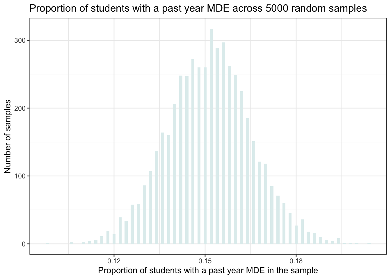
This is a histogram of the proportion of students with a past-year MDE across the 5000 random samples. Note that the cases in this data frame aren’t people, but rather our 5000 random samples (i.e., our 5000 replicates).
On the x-axis is the proportion of students with a past-year MDE in the sample, and along the y-axis is the number of samples that produces a proportion of this size. For example, a little more than 250 samples produces a proportion of 0.15 (see the top of the bar associated with a proportion of 0.15).
The histogram shows us that in our simulation, the proportion in most of the samples was around 0.15 (15% of the students). But there are a few samples that produced a substantially lower proportion (~0.11) and some that produced a substantially higher proportion (~0.20) — to see this, check out the range of proportions across the samples as printed on the x-axis.
The sampling distribution for depression severity
Now, let’s create the simulated sampling distribution for the depression severity scores.
mean_samples_5000 <-
  samples_5000 |>
  filter(mde_status == 1) |>
  group_by(replicate) |>
  summarize(mean.severity_scale = mean(severity_scale))

mean_samples_5000 |>
  ggplot(mapping = aes(x = mean.severity_scale)) +
  geom_histogram(binwidth = 0.01, fill = "azure3") +
  theme_bw() +
  labs(title = "Average depression severity score across 5000 random samples",
       x = "Average depression severity score in the sample",
       y = "Number of samples")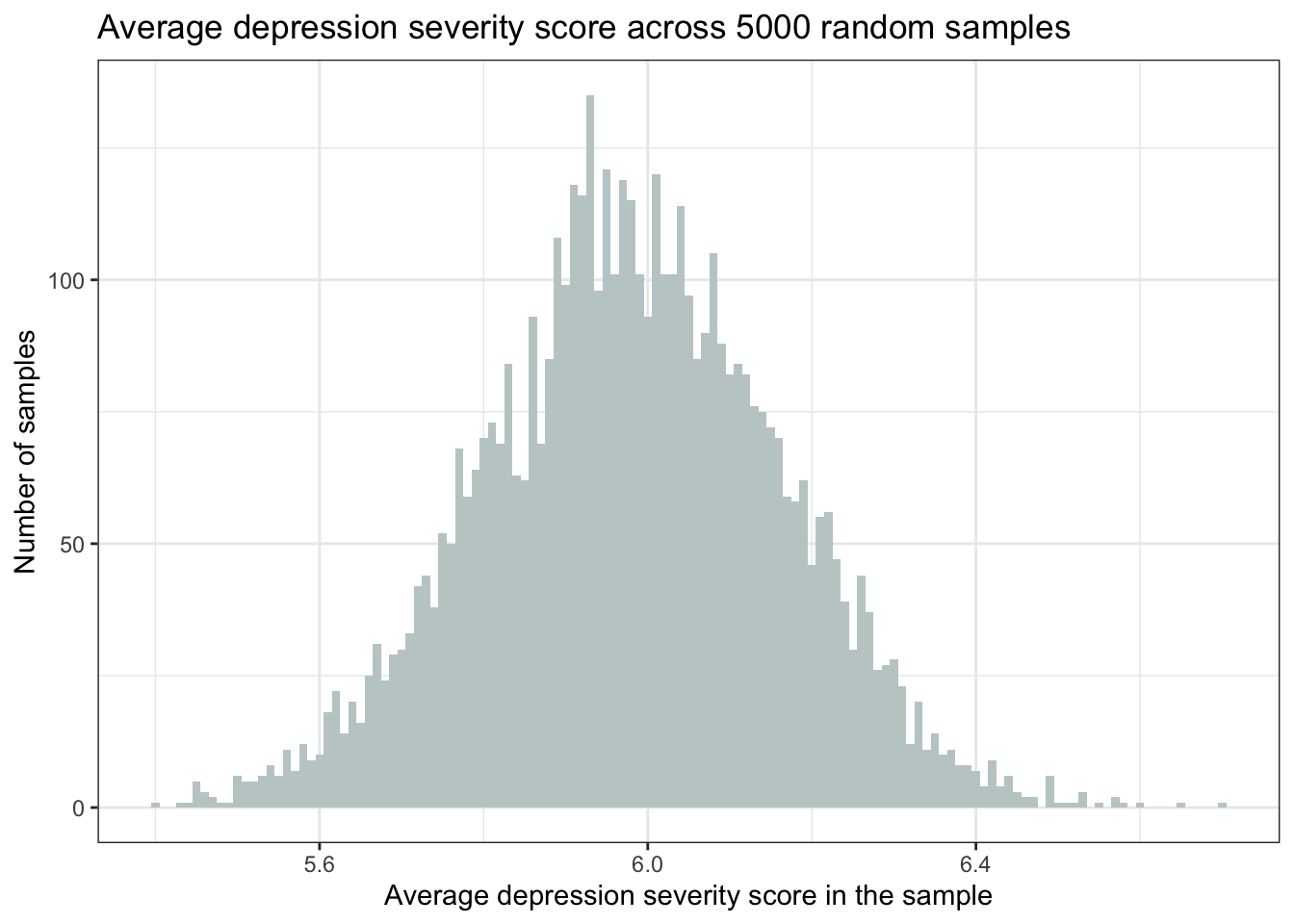
This is a histogram of the average severity of depression score across the 5000 random samples. Note again that the cases in this data frame aren’t people, but rather our 5000 random samples (i.e., our 5000 replicates). The histogram shows us that in our simulation, the average depression score in most of the samples was around 6.0. But there are a few samples that produced a substantially lower average (e.g., <5.5) and some that produced a substantially higher average (e.g., >6.5).
This is a very important observation. When we conduct a research study, we typically draw one random sample and estimate some quantity of interest. As such, we get to see one single estimate of the parameter (e.g., proportion or mean) from one random sample from our population. But this simulation illustrates that the parameter estimates differ for each of the possible random samples that could be drawn from the population.
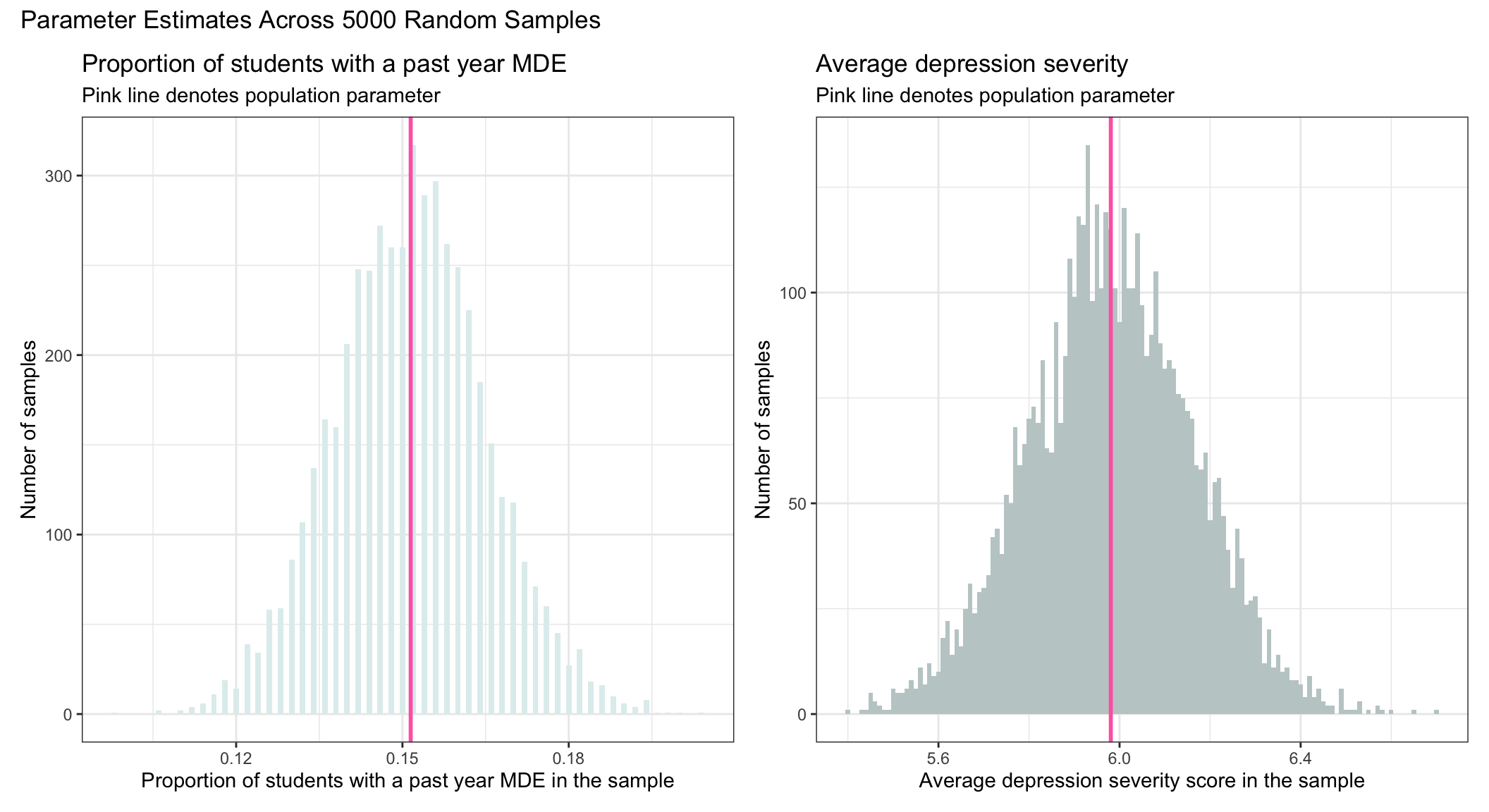
Key idea for the sampling distribution
These two histograms illustrate the sampling distribution for proportion of students with a past-year MDE and depression severity respectively. The sampling distribution is the distribution of a statistic of interest across all possible random samples. It describes how the statistic differs across the many, many random samples that could have been drawn from the population.
The sampling distribution has two important properties.
First, the sampling distribution is centered around the true population value (e.g., the proportion of students in the population with a past-year MDE, or the average severity of depression among students in the population with a past-year MDE).
Second, the sampling distribution is normally distributed.
To demonstrate this, I overlaid (in pink) the population values that we estimated earlier onto our sampling distributions.
The standard error
The standard deviation of the sampling distribution is called the standard error of the statistic of interest. See the column labeled “sd” (i.e., standard deviation) for mean.mde_status and mean.severity_scale in the output below. This standard error (i.e., the standard deviation of the sampling distribution) shows the degree of spread across the random samples and indicates the precision of our estimated statistic.
A larger standard error relative to the mean indicates less precision (more variability across the random samples).
A smaller standard error relative to the mean indicates more precision (less variability across the random samples).
mean_samples_5000 <-
  samples_5000 |>
  group_by(replicate) |>
  summarize(mean.severity_scale = mean(severity_scale, na.rm = TRUE),
            mean.mde_status = mean(mde_status))

mean_samples_5000 |> select(mean.mde_status, mean.severity_scale) |> skim()| Name | select(mean_samples_5000,… |
| Number of rows | 5000 |
| Number of columns | 2 |
| _______________________ | |
| Column type frequency: | |
| numeric | 2 |
| ________________________ | |
| Group variables | None |
Variable type: numeric
| skim_variable | n_missing | complete_rate | mean | sd | p0 | p25 | p50 | p75 | p100 | hist |
|---|---|---|---|---|---|---|---|---|---|---|
| mean.mde_status | 0 | 1 | 0.15 | 0.01 | 0.10 | 0.14 | 0.15 | 0.16 | 0.20 | ▁▃▇▃▁ |
| mean.severity_scale | 0 | 1 | 5.98 | 0.18 | 5.43 | 5.86 | 5.98 | 6.10 | 6.63 | ▁▅▇▂▁ |
Based on the output, we see that the standard deviation of the sampling distribution for the proportion of students with a past year MDE is 0.01, while the standard deviation of the sampling distribution of the mean severity score is 0.18. The estimates are termed standard errors.
Interpretation of the standard error
Recall that the Empirical Rule tells us that about 68% of the scores from a normal distribution will fall within plus or minus one standard deviation of the mean. Since the sampling distribution is indeed a normal distribution (as stated by the Central Limit Theorem) — and because the standard error is the standard deviation of the sampling distribution — then by taking the mean of each sampling distribution and adding and subtracting the standard deviation, we can get a sense of the middle 68% of the sampling distribution of each parameter estimate. The middle 68% is recorded in the graphs below, which you can calculate on your own using the estimates of the mean and standard deviation in the table above (i.e., \(mean \pm sd\))
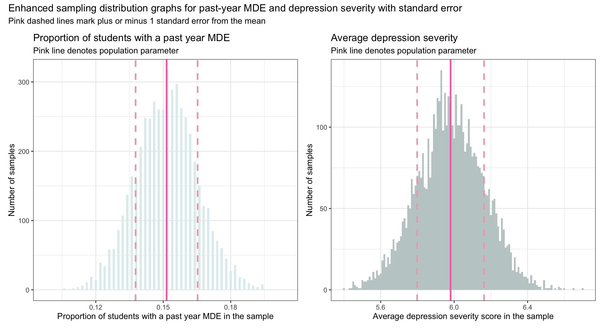
So, for example, we expect 68% of the random samples drawn from the population to produce a proportion for students with a past-year MDE between about 0.14 and 0.16. Additionally, we expect 68% of random samples drawn from the population to produce a mean depression severity score between about 5.8 and 6.2. The pink dashed lines in the graphs above show these ranges.
Sample Size and Precision
Let’s explore the concept of precision in statistical inference. The degree of spread across the random samples in our sampling distribution indicates the precision of our estimated statistic. In the last section we defined the standard error as the standard deviation of the sampling distribution.
In our simulated example, we decided to randomly select 500 students, but we might be interested in knowing how the sampling distribution would differ if we chose a smaller or a larger sample size. Let’s test three different sample sizes — 25 students, 100 students, and 1500 students to see how the sampling distribution changes. In each scenario, we’ll draw 1000 random samples of the specified sample size.
Let’s focus on past-year MDE. The code below takes the same process we just studied, but applies it to consider these three new sample sizes.
# Scenario 1: sample size = 25 ------------------------------
# 1.a) Draw 1000 samples
virtual_samples_size25 <- psdsim_population |>
  rep_slice_sample(n = 25, reps = 1000)

# 1.b) Compute mean in each of the 1000 samples
means_across_samples_size25 <- virtual_samples_size25 |>
  group_by(replicate) |>
  summarize(mean.mde_status = mean(mde_status)) |>
  mutate(sample_size = "sample n = 25")


# Scenario 2: sample size = 100 ------------------------------
# 2.a) Draw 1000 samples
virtual_samples_size100 <- psdsim_population |>
  rep_slice_sample(n = 100, reps = 1000)

# 2.b) Compute mean in each of the 1000 samples
means_across_samples_size100 <- virtual_samples_size100 |>
  group_by(replicate) |>
  summarize(mean.mde_status = mean(mde_status)) |>
  mutate(sample_size = "sample n = 100")


# Scenario 3: sample size = 1500 ------------------------------
# 3.a) Draw 1000 samples
virtual_samples_size1500 <- psdsim_population |>
  rep_slice_sample(n = 1500, reps = 1000)

# 3.b) Compute mean in each of the 1000 samples
means_across_samples_size1500 <- virtual_samples_size1500 |>
  group_by(replicate) |>
  summarize(mean.mde_status = mean(mde_status)) |>
  mutate(sample_size = "sample n = 1500")
Once our samples of varying size are created, we can plot them to build our intuition about the role that sample size plays in determining the precision of our estimates.
First, let’s take a look at the mean and standard deviation (sd) of the sampling distribution for each sample size. We can estimate these with the skim() function, see the output below.
all_means <- bind_rows(means_across_samples_size25,
                       means_across_samples_size100,
                       means_across_samples_size1500) |>
  mutate(sample_size = factor(sample_size,
                              levels = c("sample n = 25",
                                         "sample n = 100",
                                         "sample n = 1500")))

all_means |>
  group_by(sample_size) |>
  select(sample_size, mean.mde_status) |>
skim()| Name | select(group_by(all_means… |
| Number of rows | 3000 |
| Number of columns | 2 |
| _______________________ | |
| Column type frequency: | |
| numeric | 1 |
| ________________________ | |
| Group variables | sample_size |
Variable type: numeric
| skim_variable | sample_size | n_missing | complete_rate | mean | sd | p0 | p25 | p50 | p75 | p100 | hist |
|---|---|---|---|---|---|---|---|---|---|---|---|
| mean.mde_status | sample n = 25 | 0 | 1 | 0.15 | 0.07 | 0.00 | 0.12 | 0.16 | 0.20 | 0.40 | ▅▇▅▁▁ |
| mean.mde_status | sample n = 100 | 0 | 1 | 0.15 | 0.03 | 0.05 | 0.13 | 0.15 | 0.17 | 0.26 | ▁▅▇▃▁ |
| mean.mde_status | sample n = 1500 | 0 | 1 | 0.15 | 0.00 | 0.14 | 0.15 | 0.15 | 0.16 | 0.17 | ▁▅▇▅▁ |
Notice that the means are very similar (see the column labeled mean in the table above) — across all three sample sizes, the estimated proportion of adolescents with a past-year MDE is about 0.15. However, the standard deviations differ quite a lot (see the column labeled sd in the table above).
As sample size increases, the standard deviation of the sampling distribution decreases. That is:
When we have only 25 people in the sample the standard deviation of the sampling distribution (i.e., which is also called the standard error) is quite large.
When we have 1500 people in the sample the standard error is quite small. This means that we can estimate our parameters with more precision as the sample size increases.
Now, let’s plot the simulated data to visualize the phenomenon.
# Calculate means for each sample size
means_by_sample_size <- all_means  |>
  group_by(sample_size)  |>
  summarise(mean_mde_status = mean(mean.mde_status))

# Merge this summary back with the original data to ensure each row has the corresponding group mean
all_means <- all_means  |>
  left_join(means_by_sample_size, by = "sample_size")

# Now plotting
all_means  |>
  mutate(sample_size = factor(sample_size,
                              levels = c("sample n = 25", "sample n = 100", "sample n = 1500")))  |>
  ggplot(mapping = aes(x = mean.mde_status)) +
  geom_histogram(binwidth = 0.005) +
  geom_vline(data = means_by_sample_size, aes(xintercept = mean_mde_status), lwd = 1, color = "hotpink") +
  labs(x = "Proportion of students with a past-year MDE across 1000 samples",
       title = "Sampling distribution as a function of sample size",
       subtitle = "Pink line denotes the mean of the simulated sampling distribution") +
  theme_minimal() +
  facet_wrap(~sample_size, ncol = 1)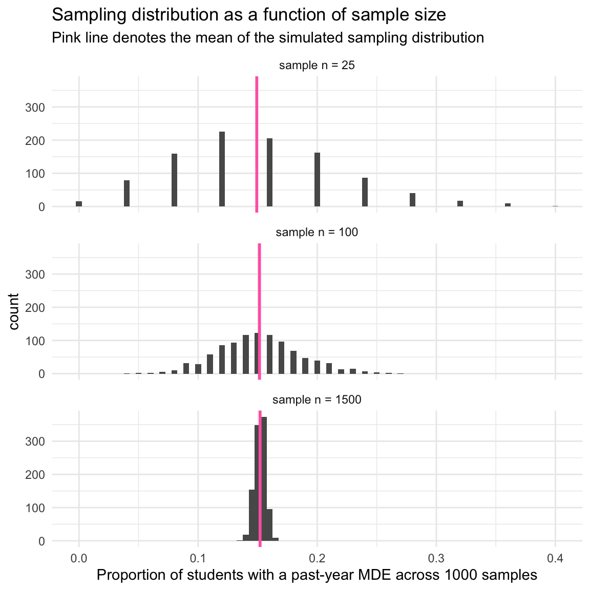
Notice in the graph that the mean of the sampling distribution is about the same (the pink vertical line), regardless of sample size. All three produce a proportion that is very close to the population proportion (0.15 or ~15% of students) — and thus, all three are highly accurate in reproducing the population proportion.
However, the standard error (i.e., the standard deviation of the sampling distribution) differs a lot as we compare the three different sample sizes.
When the sample size is very small (i.e., 25) the variability in the estimated proportion across random samples is highly variable. Notice the very large spread of the bars for a sample size of 25.
However, when the sample size is large (i.e., 1500) the variability in the estimated proportions across the many random samples is much smaller.
This demonstrates that we can estimate the true population parameter with more precision as our sample size increases. In other words, we can expect less sample to sample variability in our estimates with larger sample sizes.
Accuracy versus precision
The key ideas that we have studied in this Module are well illustrated in the following figure from Modern Dive — one of my favorite introductory books on statistics with R.
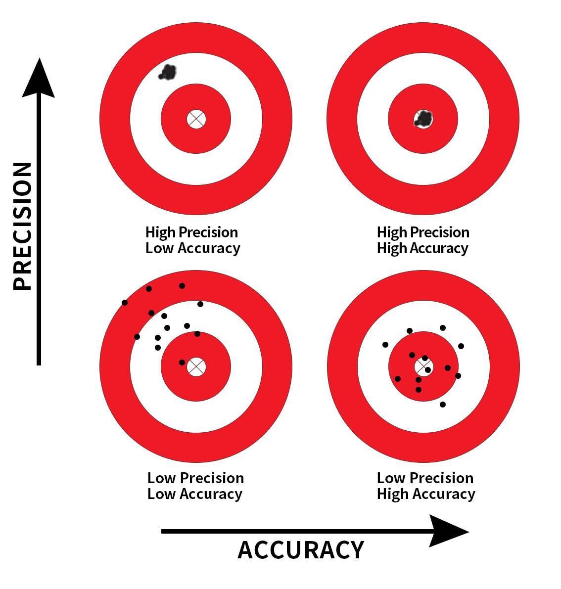
This image provides a visual metaphor to help understand two important concepts in statistics: precision and accuracy. It uses the idea of aiming at a target to represent how well our sample-based estimates (like a sample mean or proportion) reflect the true population value. The bullseye represents the true population parameter (e.g., the actual proportion of students with depression in the entire population). The dots (or shots) represent sample estimates from repeated samples.
Accuracy refers to how close a measurement or estimate is to the true value.
Precision refers to how consistent repeated measurements or estimates are with each other, regardless of whether they are close to the true value.
The image includes four scenarios:
High Precision, Low Accuracy (Top Left)
The shots are clustered closely together, indicating high precision, but they are far from the bullseye, indicating low accuracy.
Context: In a sampling distribution, this represents samples that are consistently providing similar estimates (low variability) but those estimates are systematically biased, missing the true population parameter.
High Precision, High Accuracy (Top Right)
The shots are tightly clustered and centered around the bullseye, indicating both high precision and high accuracy.
Context: This represents the ideal scenario in a sampling distribution where the samples are not only consistent (low variability) but also unbiased, with the sample statistics accurately reflecting the population parameter.
Low Precision, Low Accuracy (Bottom Left)
The shots are widely scattered and far from the bullseye, indicating both low precision and low accuracy.
Context: This represents a poor sampling process where the sample estimates are both highly variable (low precision) and biased (low accuracy), making reliable inference about the population very difficult.
Low Precision, High Accuracy (Bottom Right)
The shots are widely scattered but the average position is close to the bullseye, indicating low precision but high accuracy.
Context: In a sampling distribution, this represents a scenario where the sample estimates vary widely (high variability) but are unbiased on average. While individual sample estimates may be off, the average of many samples would approximate the true population parameter.
When we draw a random sample from a population and aim to use that sample to make inferences about the population, we must be cognizant of two critical dimensions of inferential statistics — accuracy and precision. Accuracy is achieved by carefully drawing a random sample so that the sample statistic (i.e., the proportion of students with a past-year MDE) is likely to be close to the population parameter. Precision is achieved by having an adequately large sample size so as to minimize variability in the sample statistic across random samples.
The Central Limit Theorem
To close out this Module, let’s revisit the Central Limit Theorem (CLT).
The CLT helps explain why we can use a sample to learn about a population. It tells us that if we take many random samples from a population, and compute a statistic (like a sample mean or proportion) for each one, then the distribution of those statistics will form a bell-shaped curve — even if the original population isn’t normally distributed. This is especially true when the sample size is reasonably large.
Why does this matter? Because this smooth, predictable shape — the sampling distribution — allows us to:
Estimate how much our sample statistic is likely to vary
Quantify uncertainty with confidence intervals
Test hypotheses about the population
Everything you explored in this Module — drawing a sample, comparing it to the population, repeating the process — builds the foundation for understanding the CLT. It shows us that while individual samples may differ, there’s a consistent pattern to how sample statistics behave.
In the next Modules, we’ll build on this insight to make informed inferences about population parameters. Thanks to the CLT, we can do this with confidence and clarity, knowing how sample-based estimates tend to behave across many possible samples.
Learning Check
After completing this Module, you should be able to answer the following questions:
- What is the difference between a population parameter and a sample statistic?
- How do inferential statistics allow us to draw conclusions about a population from a sample?
- Why do estimates from different random samples vary, even when drawn from the same population?
- What is a sampling distribution, and how is it different from a distribution of a variable in a sample?
- What does the Central Limit Theorem (CLT) tell us about the shape of a sampling distribution?
- What does the standard error represent in the context of a sampling distribution?
- How does increasing the sample size influence the spread of the sampling distribution?
- How do accuracy and precision differ when evaluating statistical estimates?
- What role does simulation play in helping us understand sampling variability?
- How can we use visualizations to evaluate the reliability of our estimates across many samples?
Credits
I drew from the excellent Modern Dive e-book to develop this module.