Quantifying Uncertainty in Linear Regression Models
Module 12

Learning Objectives
By the end of this Module, you should be able to:
- Explain what uncertainty means in a linear regression context and why it arises
- Describe how sample-to-sample variability affects regression intercepts, slopes, and fit statistics (e.g., \(R^2\), \(\sigma\))
- Compute and interpret the standard error of regression coefficients
- Construct and interpret confidence intervals (CIs) for the slope, intercept, fitted means, and future observations
- Implement bootstrap resampling to approximate the sampling distribution of regression parameters and derive SEs and CIs
- Apply theory-based (parametric) formulas to obtain SEs and CIs when model assumptions hold
- Differentiate a confidence interval for the mean response from a prediction interval for a new response
- Compare frequentist and Bayesian frameworks for quantifying regression uncertainty, including the use of credible intervals
- Visualize Bayesian uncertainty with tools such as confidence/credible bands, histograms, half-eye plots, and posterior-predictive lines
Overview
In the last two Modules, you learned how to fit a linear regression model and interpret its coefficients. But here’s a critical question: How confident should you be in those estimates?
Regression models are built using sample data — and every sample is just one of many possible samples you could have drawn. This means your estimated slopes and intercepts will vary from sample to sample. That’s where the concept of uncertainty comes in.
In this Module, you’ll explore how to quantify and interpret uncertainty in regression models. You’ll learn how tools like bootstrapping, standard errors, and confidence intervals help us understand the stability of our estimates. You’ll also get a taste of Bayesian methods, which offer an alternative way to express uncertainty.
By the end of this module, you’ll be better equipped to answer questions like:
“How much could this slope vary if I collected new data?”
“How confident am I that this predictor actually matters?”
“What does my confidence interval estimate for the effect of a key predictor really mean?”
Understanding uncertainty doesn’t just make you a better data analyst — it helps you draw more honest, thoughtful conclusions from your models.
Introduction to the Data
In this Module we will study the impact of weather conditions on bicycle usage in New York City. To begin, we will start with data from 2023. The data were compiled from two sources:
Bicycle Count Data: This dataset, from the NYC Open Data portal’s “Bicycle Counts” frame, includes daily bike counts from 32 counters across the city. These counters track cycling trends to support infrastructure planning and safety efforts, as well as to promote biking. The map below shows the locations of the counters.
Weather Data: Weather data was collected using the openmeteo R package, which accesses historical data from Open-Meteo. Key variables include daily high and low temperatures, apparent temperature, precipitation, and wind speed — all useful for examining how weather affects cycling behavior.
We can pull in the weather data using the following code:
library(openmeteo)

nyc_weather_2023 <-
    weather_history("NYC",
    start = "2023-01-01",
    end = "2023-12-31",
    daily = c("temperature_2m_max",
              "temperature_2m_min",
              "apparent_temperature_max",
              "apparent_temperature_min",
              "precipitation_sum",
              "precipitation_hours",
              "wind_speed_10m_max")
    )
`geocode()` has matched "NYC" to:
New York in New York, United States
Population: 8804190
Co-ordinates: c(40.71427, -74.00597)I used these two data sources to compile a data frame for this Module, it’s called nyc_bikes_2023.Rds. Each row of data represents one day in 2023. The following variables are included:
| Variable | Description |
|---|---|
| date | Date for observation |
| total_counts | Total number of bikes recorded by 32 bike counters dispersed throughout New York City |
| daily_temperature_2m_max | Maximum daily air temperature (Celsius) at 2 meters above ground |
| daily_temperature_2m_min | Minimum daily air temperature (Celsius) at 2 meters above ground |
| daily_apparent_temperature_max | Maximum daily apparent temperature (Celsius) |
| daily_apparent_temperature_min | Minimum daily apparent temperature (Celsius |
| daily_precipitation_sum | Sum (millimeters) of daily precipitation (including rain, showers and snowfall) |
| daily_precipitation_hours | The number of hours with rain |
| daily_wind_speed_10m_max | Maximum wind speed (in km/hr) on a day |
Let’s load the packages that we will need in this Module.
library(broom)
library(broom.mixed)
library(gtsummary)
library(gt)
library(brms)
library(tidybayes)
library(bayesrules)
library(skimr)
library(here)
library(tidyverse)
Now, we can import the data frame, called nyc_bikes_2023.Rds.
nyc_bikes_2023 <- read_rds(here("data", "nyc_bikes_2023.Rds"))
nyc_bikes_2023 |> head()
Visualize the Data
We’ll begin with a quick exploratory look: a scatterplot of total_counts versus daily_temperature_2m_max, overlaid with a best-fit line to reveal the underlying trend between temperature and bike volume.
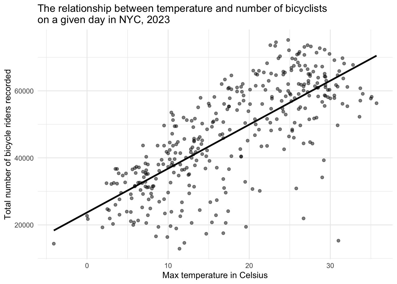
The scatterplot above shows the relationship between the maximum daily temperature (in Celsius) and the total number of bicycle riders recorded on that day in New York City in 2023. Each point represents one day of the year. A clear positive trend is visible: as temperatures rise, more people tend to ride bicycles. The superimposed best-fit line helps highlight this upward trend.
In this Module, we’ll use this relationship as a working example. You’ll learn how to quantify the uncertainty in the estimated slope and intercept of the regression line and explore tools — like standard errors, confidence intervals, and bootstrapping — that help us answer a critical question in applied regression:
How confident can we be in the parameters estimated from our sample data?
A Simple Linear Regression Model
The equation
A SLR model attempts to explain the relationship between two variables through a linear equation of the form:
\[ {y_i} = b_0 + b_1x_i + e_i \]
Where:
\(y_i\) is the dependent variable/outcome (in this case, total_counts), which we are trying to predict or explain.
\(x_i\) is the independent variable/predictor (here, daily_temperature_2m_max) that we believe might predict \(y_i\).
\(b_0\) is the intercept — the expected value of \(y_i\) when \(x_i = 0\).
\(b_1\) is the slope — the expected change in \(y_i\) for a one-unit increase in \(x_i\).
\(e_i\) represents the residual, accounting for the variation in the \(y_i\) scores not explained by the \(x_i\) scores.
Fit the model
We can fit the model using the lm() function:
slr <- lm(total_counts ~ daily_temperature_2m_max, data = nyc_bikes_2023)Interpretation of the intercept and slope
Now, let’s take a look at the regression coefficients using tidy().
slr |>
  tidy() |>
  select(term, estimate)
Important
Take a moment to interpret the intercept and slope and then check your answers below.
The estimate for the intercept (23712) represents the expected number of bikes recorded (total_counts) when the maximum daily temperature (daily_temperature_2m_max) is 0 degrees Celsius. In practical terms, this can be thought of as the baseline number of bicycles counted on a cold day with 0°C (which is 32°F) as the maximum temperature.
The estimate for the slope (1310) indicates that, on average, for each 1°C increase in the maximum daily temperature, the total number of bikes counted increases by approximately 1310 bikes. This positive coefficient suggests that warmer temperatures are associated with higher bicycle usage, possibly due to more people choosing to bike under comfortable weather conditions.
Interpretation of overall model fit
The results of glance() provide some additional information about the overall model fit.
slr |> glance() |> select(r.squared, sigma)
Important
Take a moment to interpret the \(R^2\) and sigma, then check your answers below.
The \(R^2\), labeled r.squared in the output, is 0.556 and measures the proportion of the variance in the outcome/dependent variable (total_counts) that is predictable from the predictor/independent variable (daily_temperature_2m_max). In this example, approximately 56% of the variation in daily bike counts can be explained by the variation in maximum daily temperature. This is a substantial proportion, indicating that the maximum daily temperature is a good predictor of bike usage in New York City, though there is still a considerable amount of variation that is not predicted by this model alone (i.e., ~ 44%).
The residual standard error (labeled sigma) gives an estimate of the standard deviation of the residuals, which are the differences between observed values and the values predicted by the model. In this context, a sigma of ~10260 means that the typical prediction for the total bike counts deviates from the actual bike counts by about 10,260 bikes, on average. This provides a measure of the accuracy of the predictions made by the model; a lower sigma would indicate more precise predictions.
Use the model to make predictions
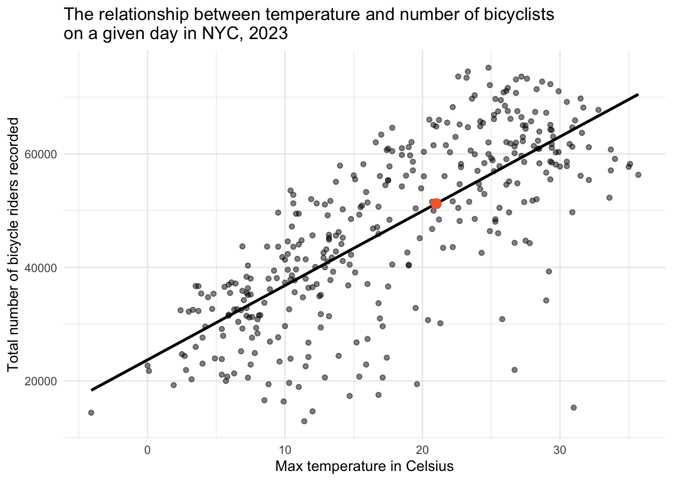
We can also use the fitted model to predict outcomes based on specific values of predictors. For instance, in our analysis of bicycle ridership, we might be interested in forecasting the number of riders on a day when the maximum temperature is 21°C (approximately 70°F).
Important
Use the results of tidy() to compute the predicted number of riders on a 21°C day, then check your answer below.
To facilitate this, we can employ the predict() function in R:
# Create a data frame with the desired predictor values
new_data <- data.frame(daily_temperature_2m_max = 21)

# Utilize the linear model to predict outcomes based on new data
slr |> predict(newdata = new_data)
1
51229.46 Of course, we can easily do this manually (using the tidy() output) as follows:
23711.546 + (1310.377 * 21)[1] 51229.46Our computation suggests that, on a day where the maximum temperature is 21°C, we anticipate around 51,229 bicycle riders. This value is depicted by the orange circle in the graph below.
Understanding Sample-to-Sample Variability
When we conduct a study using sample data, we are essentially capturing a snapshot of the real world under specific conditions and at a specific time. In the case of our bike counts and temperature study, the data for 2023 represents one possible realization of many that could occur. Our ultimate goal is to understand the underlying relationship in the broader population — the true connection between temperature and cycling activity — but we only have access to a sample. Various factors contribute to sample-to-sample variability in this context. For example:
Weather Variability: Weather conditions can vary significantly from year to year, including temperature patterns, precipitation, and extreme weather events. Since our study focuses on the relationship between bike counts and maximum daily temperature, different weather conditions in other random samples (e.g., different years) could lead to different observations and, consequently, different estimates of the effect of temperature on bike usage.
Changes in City Infrastructure and Policies: Over time, New York City might implement new bike lanes, bike-sharing programs, or policies affecting transportation. Such changes can influence people’s willingness to bike and could affect the relationship between temperature and biking behavior observed in different samples.
Population Changes and Cultural Shifts: The population of a city is not static; people move in and out, and cultural attitudes towards biking and outdoor activities can shift. These changes can influence the number of people who choose to bike under various weather conditions, adding to the variability between different samples that could have been collated.
Variability in Data Collection Locations: The placement of bike counters throughout the city is a critical factor in measuring bike usage. If these counters were positioned at slightly different locations, perhaps capturing areas with different traffic patterns or proximities to popular destinations, the recorded bike counts could vary. For instance, counters placed closer to parks or bike paths might record more activity on warm days compared to those placed in more industrial areas with less recreational cycling.
Precision in Temperature Measurement: The accuracy and precision with which temperature and other weather conditions are measured can also influence the observed relationship between temperature and bike usage. Variations in the placement of temperature sensors, their calibration, or the model of the sensors used can lead to slight differences in recorded temperatures, potentially affecting the estimated impact of temperature on biking behavior.
Influence of Unmeasured Environmental and Social Factors: Beyond the placement of counters and the precision of temperature measurements, other environmental and social factors that aren’t captured in the dataset can contribute to variability. These might include temporary road closures, construction work, special events that either encourage or deter biking, and even shifts in public transportation availability.
The implications of variability
Every dataset is only one of many possible random samples we could have drawn. If we collected the same information next year — or even next week — the fitted slope, intercept, and \(R^2\) would shift slightly. That built-in wobble is sample-to-sample variability.
Recognising this fact changes how we think:
Point estimates are not enough. A single slope or intercept tells us the best guess for this sample, but says nothing about how far those numbers might drift in a new sample.
Intervals and standard errors are essential. They translate the invisible sampling variation into concrete margins of error, letting us judge whether an apparent effect is rock-solid or could easily vanish with different data.
Inference, not just description. By attaching measures of uncertainty, we move from “what happened in this one sample?” to “what’s plausible for the population?” — the real goal of statistical modelling.
In short, embracing sample-to-sample variability pushes us to quantify uncertainty and leads to conclusions that remain trustworthy even when the data (inevitably) change.
Intuition for uncertainty in a SLR
When fitting a linear regression model, we are interested in estimating the population parameters of the linear regression model (i.e., the intercept, slope(s), and \(R^2\)) using our sample data.
The population equation represents the idealized, true relationship between the predictor(s) and the outcome across the entire population of interest. This equation is often what we aim to estimate through statistical modeling, but it remains unknown and must be inferred from sample data that we collect.
The population equation that relates a predictor variable (X) to an outcome variable (Y) may be written as follows:
\[ Y_i = \beta_0 + \beta_1X_i + \epsilon_i \]
Here:
- \(Y_i\) is the value of the response variable for the \(i^{th}\) case in the population.
- \(\beta_0\) is the true intercept of the population regression line, representing the expected value of \(Y\) when \(X = 0\).
- \(\beta_1\) is the true slope of the population regression line, indicating how much \(Y\) is expected to change with a one-unit increase in \(X\).
- \(X_i\) is the value of the predictor variable for the \(i^{th}\) case in the population.
- \(\epsilon_i\) represents the error term for the \(i^{th}\) case, capturing all other factors affecting \(Y\) besides \(X\) and inherently includes the variability in \(Y\) not explained by \(X\). The error term, \(\epsilon_i\), follows a normal distribution with a mean of 0 and a standard deviation of \(\sigma\), denoted as \(\epsilon_i \sim N(0, \sigma^2)\). This represents the randomness or noise in the relationship between \(X\) and \(Y\).
Consider a hypothetical scenario where we magically know the true relationship between the daily maximum temperature (\(X_i\)) and the number of bike riders (\(Y_i\)) in New York City.
\[Y_i = 21000 + 1450X_i + \epsilon_i\]
This equation asserts that if the daily maximum temperature is 0°C, the predicted number of bicycle riders recorded by counters is 21,000 for a particularly day. And, that for each 1°C increase in max daily temperature, we expect that the counters will record 1450 additional riders for the day.
In practice, we don’t know the true values of \(\beta_0\), \(\beta_1\), or \(\epsilon_i\), so we estimate them using sample data. The sample equation is formulated as:
\[ \hat{y_i} = b_0 + b_1x_i + e_i \]
- \(\hat{y_i}\) is the predicted value of the response variable for the \(i^{th}\) case in the sample.
- \(b_0\) and \(b_1\) are the estimates of the intercept and slope, respectively, obtained from the sample.
- \(x_i\) is the observed value of the predictor variable for the \(i^{th}\) case in the sample.
- \(e_i\) is the residual for the \(i^{th}\) case, representing the difference between the observed value and the predicted value of the response variable: \(e_i = y_i - \hat{y_i}\).
Contrasting population and sample equations
When we build a regression model, it’s helpful to distinguish between these two versions of the equation: one for the population and one for the sample.
Parameters vs. Estimates
In the population equation, the values for the intercept and slope — written as \(\beta_0\) and \(\beta_1\) — are called parameters. These represent the true relationship between the variables in the entire population. But we don’t know their exact values because we rarely have access to ALL of the data in the defined population.
In the sample equation, we use data from a sample to estimate those parameters. We call these estimates \(b_0\) and \(b_1\). These are our best guesses for what \(\beta_0\) and \(\beta_1\) are, based on the sample we collected.
Error Terms: \(\epsilon_i\) vs. \(e_i\)
In the population equation, the error term \(\epsilon_i\) represents the unknown factors that cause a case’s actual score to differ from the true prediction. These errors are part of the natural variability in the population, and we can’t directly observe them.
In the sample equation, we work with residuals, written as \(e_i\). A residual is the difference between a case’s actual score and the predicted score from our sample-based model. These are observable because they come directly from our data.
In summary, the population equation reflects the true relationship we’re trying to understand, while the sample equation gives us the best approximation of that truth based on our data. By analyzing sample data carefully, we’re able to learn about the broader population — even though we never see it directly.
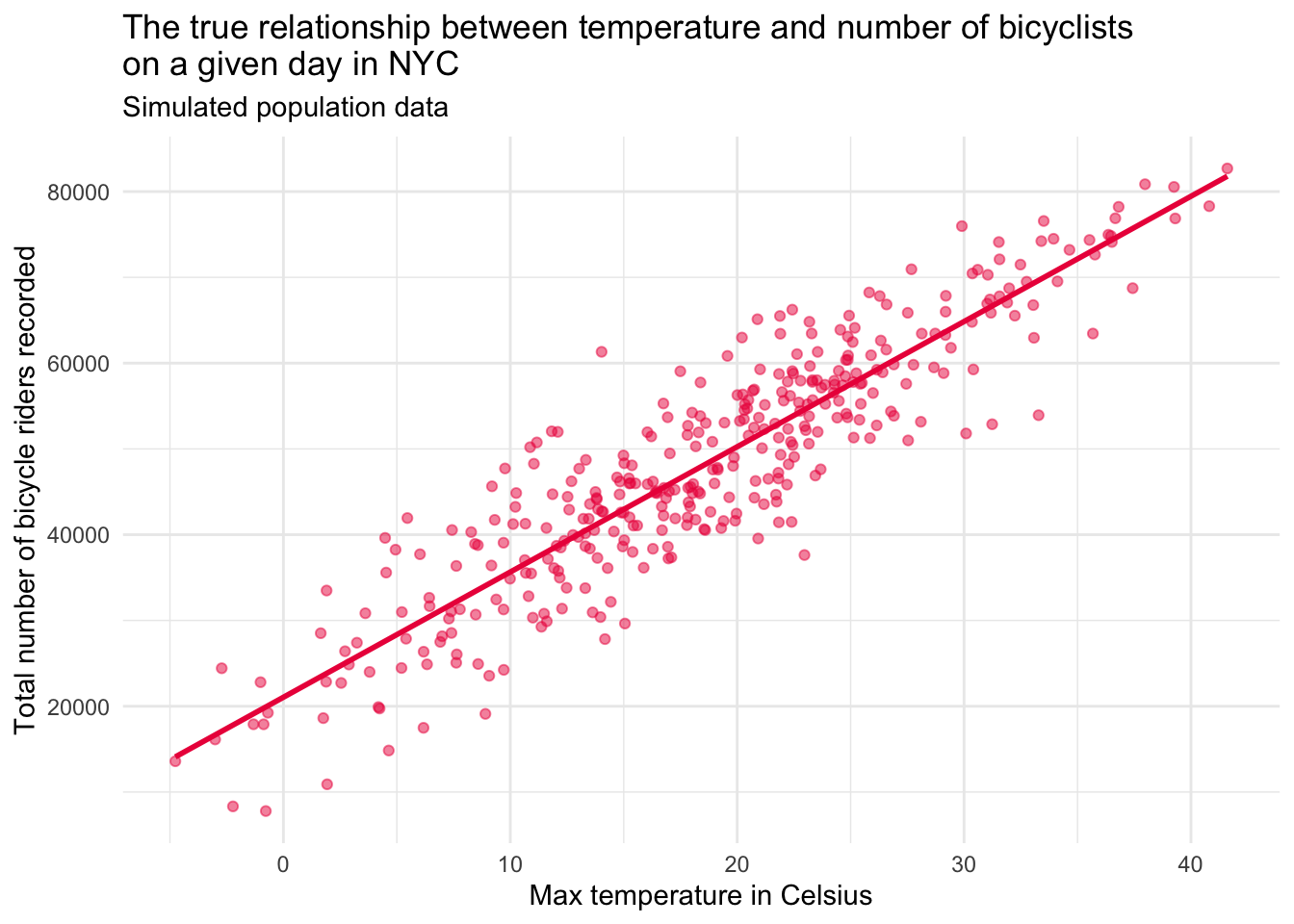
Let’s play make-believe
Let’s imagine that we had the true population data. The graph below depicts this simulated population.
Contrast the population and sample data
Now, let’s enhance this graph to include both the simulated population data (in pink), and the real sample data collected in 2023 (in grey).
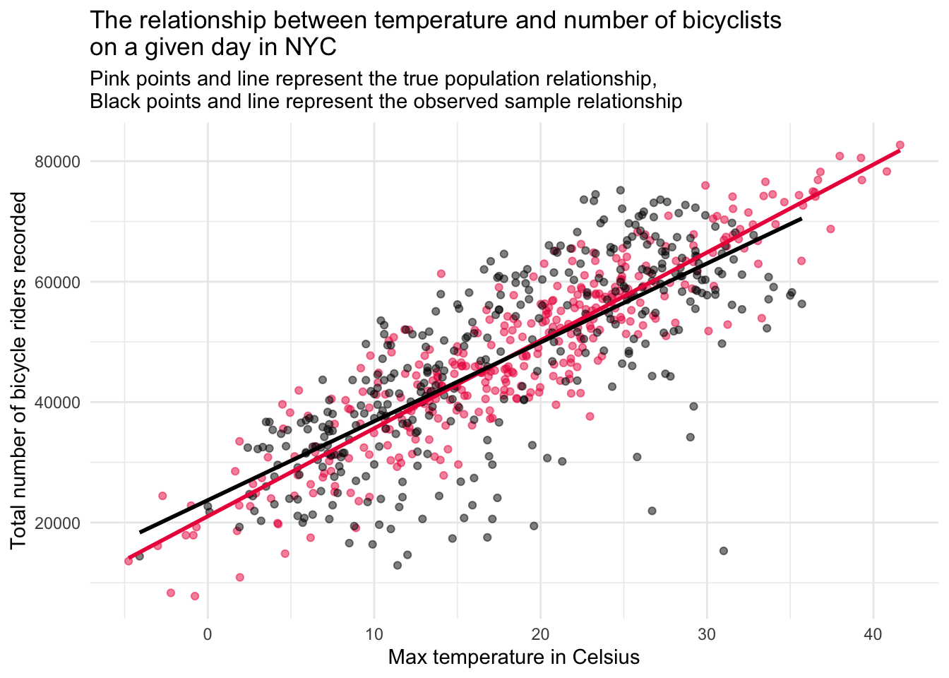
Interpreting the two‐line plot
The figure overlays:
Pink points & line: Asimulated “true” population relationship between daily maximum temperature and bike counts.
Grey points & line: The relationship we actually observed in the 2023 sample.
These two overlays reveal two separate kinds of error:
Sampling error (grey vs. pink line)
Even if our model is perfectly specified, the grey regression line rarely lands exactly on the pink one.
That gap is sampling error — the random discrepancy between a finite sample’s estimates and the true population relationship. It arises because the observations we happened to record (one particular year, set of days, and set of conditions) are just one of many equally plausible draws; a different sample would include a different mix of hot, cold, rainy, or holiday days and would trace out a slightly different regression line.
It reminds us that a new sample would produce a slightly different slope and intercept.
Prediction (residual) error (vertical spread around either line)
Both the pink and grey lines miss many points; those vertical deviations are residuals.
Residual error comes from measurement noise, day-to-day quirks (holidays, parades, rain bursts), and any model misspecification (e.g., omitted variables or a non-linear pattern).
Even with the true regression line in hand, we would still see scatter because temperature is not the only driver of bike use.
Why we care
Sampling error → motivates tools that quantify estimation uncertainty (standard errors, confidence/credible intervals, bootstrapping).
Prediction error → motivates better models (additional predictors, non-linear terms) and alerts us to the limits of forecasting individual outcomes.
Together, these errors highlight why point estimates alone are never enough: we must report — and interpret — the uncertainty that surrounds them.
Uncertainty in Regression Models
In Modules 08 and 09, we explored how sample statistics (like means and proportions) can vary from one sample to the next — and how we can measure that uncertainty using standard errors, confidence intervals, bootstrapping, and even Bayesian methods.
Now we’re bringing those same ideas into the world of regression.
When we fit a SLR model, we’re estimating two key parameters that define the best fit line: the intercept and the slope. But just like a sample mean, these numbers aren’t exact — they’re estimates based on one sample. If we collected a different sample, we’d likely get slightly different results.
That’s where standard errors come in. They help us understand how much the intercept and slope might vary from sample to sample. A small standard error means our estimate is likely pretty stable across different samples. A large standard error means there’s more uncertainty — the data are more scattered, and the slope could change a lot depending on which cases we happened to sample.
In this Module, you’ll learn how to apply everything you’ve already practiced to quantify uncertainty — bootstrapping, theory-based methods, and Bayesian thinking — to understand how sure we are about the regression line we’ve fit.
Understanding uncertainty the frequentist way
Back in Module 09, you learned two different frequentist ways to estimate uncertainty when working with sample statistics — like a proportion (e.g., the proportion of adolescents with a past-year Major Depressive Episode) or a mean (e.g., the average severity of depression symptoms). These two approaches were:
Bootstrapping: Which uses resampling to estimate variability directly from our data, without needing strong assumptions, and
Theory-based (parametric): Which uses mathematical formulas and assumptions about the data (like assuming it’s normally distributed).
In this section, you’ll see how we apply those same two ideas to estimate uncertainty in regression coefficients.
Bootstrapping: A simulation-based approach to uncertainty
The bootstrap lets us approximate how much our regression estimates (like the slope) might vary from sample to sample — without needing complicated math or strong assumptions about how the data are distributed.
Instead of relying on formulas, bootstrapping uses your actual dataset as a stand-in for the population. Here’s the basic idea:
We randomly draw a new sample with replacement from our original data — this is called a bootstrap resample.
Each resample is the same size as the original (in our case, 365 days), but because we’re sampling with replacement, some days might show up more than once, and others not at all.
We then fit our regression model to this new resample and record the regression parameter estimates.
By repeating this process many times, we build a simulated sampling distribution for each regression parameter estimate — which tells us how much those estimates tend to vary from sample to sample.
This gives us a practical way to compute standard errors and build confidence intervals — just like we did for means and proportions in earlier Modules, but now applied to regression estimates.
A single bootstrap resample
Let’s walk through how to generate one bootstrap resample using the nyc_bikes_2023 data frame. This will give you a hands-on feel for how bootstrapping works in the context of regression. The code chunk below accomplishes this task:
set.seed(12345)
resample1 <-
nyc_bikes_2023 |>
select(date, total_counts, daily_temperature_2m_max) |>
slice_sample(n = 365, replace = TRUE) |>
arrange(date)
resample1 |> head(n = 30)We can fit the regression model using this single bootstrap resample — then obtain the parameter estimates and the overall model fit using tidy() and glance().
lm1_resample <- lm(total_counts ~ daily_temperature_2m_max, data = resample1)
lm1_resample |>
tidy() |>
select(term, estimate)lm1_resample |>
glance() |> select(r.squared, sigma)We can also create a scatterplot of the resampled data. Taken together, the paramater estimates and the plot are reasonably similar to what we found with the full sample estimated earlier.
lm1_resample |>
ggplot(mapping = aes(x = daily_temperature_2m_max, y = total_counts)) +
geom_point(color = "#8DD3C7", alpha = 0.5) +
theme_minimal() +
geom_smooth(method = "lm", se = FALSE, formula = y ~ x, color = "#8DD3C7") +
labs(title = "Temperature vs. daily bike ridership in NYC",
subtitle = "Bootstrap #1",
x = "Max temperature (°C)",
y = "Total riders recorded")Warning: `fortify(<lm>)` was deprecated in ggplot2 4.0.0.
ℹ Please use `broom::augment(<lm>)` instead.
ℹ The deprecated feature was likely used in the ggplot2 package.
Please report the issue at <https://github.com/tidyverse/ggplot2/issues>.
A collection of bootstrap resamples
Instead of creating one bootstrap resample — we can repeat the process multiple times. As an example, let’s look at the results for 9 bootstrap resamples. The table below presents the intercept, slope, \(R^2\), and sigma produced when the linear model is fit to each resample.
| Regression estimates for 9 bootstrap resamples | ||||
|---|---|---|---|---|
| resample | intercept | slope | r.squared | sigma |
| 1 | 23949.45 | 1307.152 | 0.5666796 | 9561.591 |
| 2 | 23403.70 | 1339.634 | 0.5543797 | 10333.302 |
| 3 | 23375.82 | 1352.952 | 0.5924992 | 9811.788 |
| 4 | 23653.76 | 1325.031 | 0.5802832 | 9957.217 |
| 5 | 26075.18 | 1189.872 | 0.5136135 | 10411.938 |
| 6 | 23273.36 | 1327.877 | 0.5412949 | 10533.370 |
| 7 | 23426.31 | 1315.231 | 0.5794856 | 9986.892 |
| 8 | 23205.02 | 1330.360 | 0.5945514 | 9449.718 |
| 9 | 25125.02 | 1237.323 | 0.5445161 | 10270.019 |
It is also informative to look at a scatterplot produced from each of the 9 bootstrap resamples.

In looking at the table of the 9 bootstrap resamples, we can see that the estimates of all parameters vary slightly, but are relatively similar. Likewise, the 9 scatterplots are each slightly different, as expected, but all show the same pattern — as temperature increases, more riders are recorded.
Rather than faceting by resample, we can put the best fit line for the 9 resamples on a single graph:
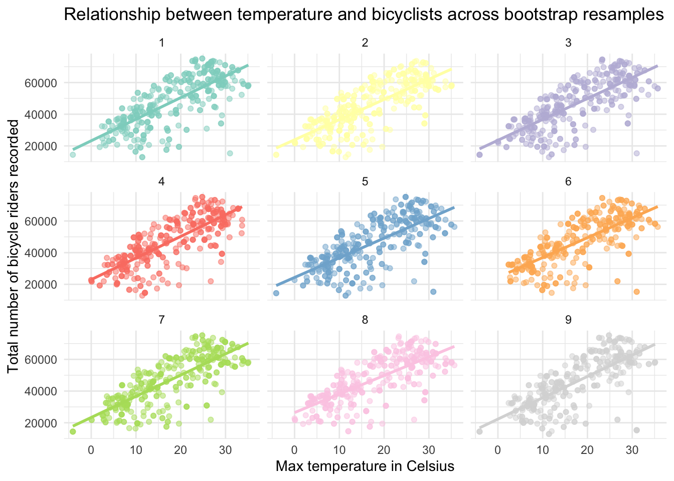
With just these 9 resamples, we can already get a sense of the variability from resample to resample — which helps us to visualize the uncertainty in our regression parameter estimates. For example, on the graph above we can see clearly see the variability in:
The intercept of each line (the predicted number of riders when temperature = 0), as well as
The effect of temperature on riders as illustrated by the varying slopes of the best fit lines.
Sufficient bootstrap resamples to simulate the sampling distribution
Recall from Module 9 that reliable estimates of bootstrapped parameters requires many more than just a few resamples. For example, many thousand resamples are typically used. Let’s take a look at a function that will repeat the process of creating bootstrap resamples, so that we can create 5000 resamples, fit the regression model in each resample, and then summarize across the resamples to quantify uncertainty.
# Create a function to carry out the bootstrap resampling and fit model
bootstrap_lm <- function(data) {
size <- nrow(data)
resample <- data |>
slice_sample(n = size, replace = TRUE) |>
arrange(date)
lm_model <- lm(total_counts ~ daily_temperature_2m_max, data = resample)
tidy_model <- tidy(lm_model)
glance_model <- glance(lm_model)
return(list(tidy = tidy_model, glance = glance_model))
}
# Perform the bootstrap resampling and model fitting using the bootstrap_lm() function
set.seed(12345) # For reproducibility
bootstrap_results <- map(1:5000, ~bootstrap_lm(nyc_bikes_2023))
# Extract and preparing the data for graphing and summary
model_summaries <-
map2(bootstrap_results, 1:5000, ~mutate(.x$glance, resample = .y)) |>
bind_rows() |> # takes 5000 outputs and combines them into one larger data frame.
select(resample, r.squared, sigma) |>
pivot_longer(-resample, names_to = "term", values_to = "estimate")
# Work now with the regression parameter estimates from tidy()
coefficients <-
map2(bootstrap_results, 1:5000, ~mutate(.x$tidy, resample = .y)) |>
bind_rows() |>
select(resample, term, estimate)
# Create one data frame that combines all estimates
bootstrap_distributions <-
bind_rows(coefficients, model_summaries) |>
arrange(resample)
# Calculate the summary statistics for intercept, slope, r-squared, and sigma
bootstrap_summary <-
bootstrap_distributions |>
filter(term %in% c("(Intercept)", "daily_temperature_2m_max", "r.squared", "sigma")) |>
group_by(term) |>
summarise(mean_estimate = mean(estimate),
sd_estimate = sd(estimate))
Tip
Detailed code explanation for the curious
I don’t expect you to understand every bit of this now — but, if you’re interested in a detailed code explanation, please read the summary below.
Libraries
- purrr: This package it used for its functional programming tools, particularly map() functions to apply operations across elements in a list or vector.
Bootstrap Function
A custom function bootstrap_lm() is defined to perform bootstrap resampling and fit a linear regression model to each resample. This function:
Calculates the sample size of the provided data fame.
Performs resampling with replacement, maintaining the data frame size but allowing for repeated observations, to mimic drawing from the population.
Fits a linear regression model (called lm_model) to the resampled data, predicting total_counts from daily_temperature_2m_max.
Extracts and returns detailed model summaries (tidy_model for coefficients and glance_model for overall model metrics) in a list.
Bootstrap Resampling Execution
The bootstrap_lm() function is executed 5000 times using map(), each time on the nyc_bikes_2023 data frame, to generate a wide array of model fits. This simulates drawing from the underlying population distribution to assess the variability in model estimates.
set.seed(12345)ensures reproducibility of the results by setting a fixed starting point for random number generation used in resampling. This isn’t necessary unless you need to reproduce the exact same estimates from the random process.
Data Extraction and Preparation
The script extracts model summaries and coefficients from each bootstrap resample.
Model Summaries: Extracts the model summary values and does some reformatting to facilitate merging with coefficients later.
Coefficients: Similar extraction process for regression coefficients (intercept and slope), including the resample identifier.
Combining Estimates
- Merges the coefficients and model summaries into a single data frame, bootstrap_distributions, arranging them by resample identifier. This unified structure facilitates subsequent analysis.
Summary Statistics
- Calculates mean and standard deviation for each parameter estimate across all bootstrap resamples, summarizing the estimated distribution for relevant statistics and stores this information in a data frame called bootstrap_summary.
The output from this process is a table that presents the mean and standard deviation of each parameter estimate (i.e., intercept and slopes), the \(R^2\), and sigma (i.e., \(\sigma\)).
The values under mean_estimate in the table below are simply the average estimate across the 5000 bootstrap resamples.
The values under sd_estimate are the standard deviations of each estimate across the 5000 bootstrap resamples. The mutate() function in the code below rounds the numbers to the nearest thousandth for easier viewing.
bootstrap_summary |>
mutate(across(where(is.numeric), ~format(round(.x, digits = 3), scientific = FALSE)))Since the bootstrap resampling is mimicking the sampling distribution, and the standard deviation of the sampling distribution is the standard error — then this summary provides the quantification of uncertainty that we seek. The sd_estimate values quantify the variability of each parameter across the 5000 bootstrap resamples. As usual larger standard errors indicate more sample-to-sample variability, while smaller standard errors indicate less sample-to sample variability.
We can create a histogram of the estimates of the intercept, slope, sigma, and r.squared across our bootstrap resamples to visualize this variability. These estimates are stored in the file we created in the last code chunk — called bootstrap_distributions. In this file, the estimates of the intercept, slope (for daily_temperature_2m_max), r.squared, and sigma are recorded for all 5000 bootstrap resamples, indexed by resample number, as illustrated in the table below. That is, for each resample, there are four rows of data — one for each of the four parameter estimates of interest.
bootstrap_distributions |>
select(resample, term, estimate) |>
mutate(across(where(is.numeric), ~format(round(.x, digits = 3), scientific = FALSE))) |>
head(n = 30) To visualize the variability in these estimates across the bootstrap resamples, we can create a set of histograms.
bootstrap_distributions |>
select(term, estimate) |>
filter(term %in% c("(Intercept)", "daily_temperature_2m_max", "r.squared", "sigma")) |>
ggplot(mapping = aes(x = estimate, fill = term)) +
geom_histogram(bins = 50, alpha = 0.5) +
facet_wrap(~term, ncol = 4, scales = "free_x") +
theme_minimal() +
labs(x = "Estimate in bootstrap resample",
y = "Number of bootstrap resamples with the estimate",
title = "Estimates across 5000 bootstrap resamples") +
theme(legend.position = "none") 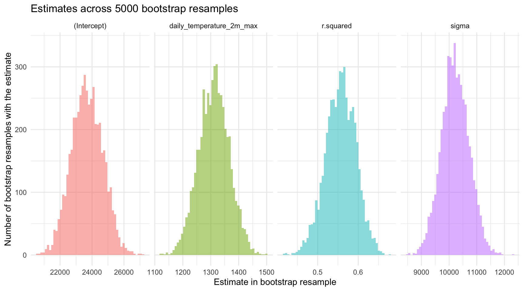
Important
Please take a moment to study the histograms to note the approximate minimum and maximum values for the estimates, as well as the placement of the peak (i.e., the most common value).
Using estimates from each bootstrap resample, we may also plot the corresponding fitted regression lines to visually assess the variability of our model’s predictions. This visualization is achieved with the geom_abline() function, a ggplot2 function that draws straight lines specified by an intercept and slope. In our case, we’re using the intercept and slope produced by each bootstrap resample to draw the implied line — and then plot all 5000 implied lines on one graph.
# Calculate means for each term
means <- bootstrap_distributions |>
group_by(term) |>
summarise(mean_estimate = mean(estimate))
mean_int <-
means |>
filter(term == "(Intercept)") |>
pull(mean_estimate)
mean_slope <-
means |>
filter(term == "daily_temperature_2m_max") |>
pull(mean_estimate)
# Reshape the data frame to have intercepts and slopes on the same row for each bootstrap sample
bootstrap_line <-
bootstrap_distributions |>
filter(term %in% c("(Intercept)", "daily_temperature_2m_max")) |>
select(term, estimate) |>
mutate(sample_id = rep(1:(n()/2), each = 2)) |> # Create an ID for each pair of intercept and slope
pivot_wider(id_cols = sample_id, names_from = term, values_from = estimate)
# Now plot using geom_abline
nyc_bikes_2023 |>
ggplot(mapping = aes(x = daily_temperature_2m_max, y = total_counts)) +
geom_point(alpha = 0.3, color = "lightgrey") +
geom_abline(data = bootstrap_line, aes(intercept = `(Intercept)`, slope = daily_temperature_2m_max), color = "darkgrey") +
geom_abline(intercept = mean_int, slope = mean_slope, color = "black") +
scale_color_manual(values = colors) + # Apply the defined color palette
theme_minimal() +
labs(title = "Temperature vs. daily bike ridership in NYC",
subtitle = "Best fit line for 5000 bootstrap resamples",
x = "Max temperature (°C)",
y = "Total riders recorded") +
guides(color = "none") 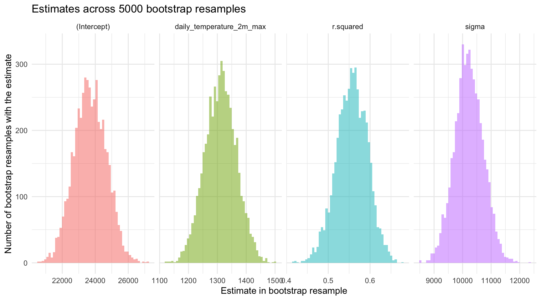
Due to the high number of resamples (5000), these lines collectively resemble a thick confidence band, effectively illustrating the range of plausible regression lines given the sampling variability. Additionally, a prominent black line represents the regression line defined by the mean intercept and slope calculated across all bootstrap resamples. This average line serves as a central tendency marker amidst the bootstrap lines, highlighting the overall direction and strength of the relationship modeled in the resampling process.
It’s also interesting to use the graph above to examine the span of the predicted scores (predicted bike count) at any given temperature. For example, for cold days (e.g., -5°C) and very hot days (35°C), the vertical distance between the largest and smallest predicted score is large — but for average days (e.g., around 15°C), the vertical distance between the largest and smallest predicted score is smaller. This indicates that we have more precision to predict the outcome when the predictor is toward the average score in the sample, and less precision as we move toward the tails of the distribution of the predictor. This is an important characteristic of all fitted regression models.
Confidence intervals for the parameter estimates
In addition to quantifying uncertainty in the estimates via the standard error, we may calculate confidence intervals based on the bootstrap resamples. Recall from Module 9 that we used the quantile() function to find the lower and upper bound of our desired confidence interval (CI) based on the distribution of the bootstrap estimates. Let’s calculate a 95% CI for the estimates using this percentile method applied to our bootstrap resamples.
95% CI for the intercept
bootstrap_distributions |>
filter(term == "(Intercept)") |>
summarize(lower = quantile(estimate, probs = 0.025),
upper = quantile(estimate, probs = 0.975))95% CI for the slope
bootstrap_distributions |>
filter(term == "daily_temperature_2m_max") |>
summarize(lower = quantile(estimate, probs = 0.025),
upper = quantile(estimate, probs = 0.975))95% CI for \(R^2\)
bootstrap_distributions |>
filter(term == "r.squared") |>
summarize(lower = quantile(estimate, probs = 0.025),
upper = quantile(estimate, probs = 0.975))95% CI for sigma
bootstrap_distributions |>
filter(term == "sigma") |>
summarize(lower = quantile(estimate, probs = 0.025),
upper = quantile(estimate, probs = 0.975))The calculated 95% CIs — based on 5000 bootstrap resamples — give us insight into the uncertainty of these estimates under a frequentist framework. The CIs imply that if we were to repeat our study numerous times, and estimate a 95% CI for each parameter estimate, we would expect 95% of those intervals to capture the true parameter in the population. Thus, we can think of these intervals as providing a range of plausible values.
Using the same information, we can add the CIs to the histograms of the sampling distributions plotted earlier. In the updated plot below, the mean across the bootstrap resamples is recorded as a solid line in the middle of the histogram, and the middle 95% of each distribution is marked with dashed vertical lines.
# Calculate 95% CI for each term
cis <-
bootstrap_distributions |>
group_by(term) |>
summarise(lower = quantile(estimate, probs = 0.025),
upper = quantile(estimate, probs = 0.975))
# Join means and CIs for easier plotting
means_cis <- left_join(means, cis, by = "term")
# Plotting
bootstrap_distributions |>
select(term, estimate) |>
ggplot(mapping = aes(x = estimate, fill = term)) +
geom_histogram(bins = 50, alpha = 0.5) +
geom_vline(data = means_cis, aes(xintercept = mean_estimate, color = term), linetype = "solid") +
geom_vline(data = means_cis, aes(xintercept = lower, color = term), linetype = "dashed") +
geom_vline(data = means_cis, aes(xintercept = upper, color = term), linetype = "dashed") +
facet_wrap(~term, ncol = 4, scales = "free_x") + # Adjusted ncol to 2 for better layout
theme_minimal() +
labs(x = "Bootstrap distributions of regression coefficients for NYC bicycling model",
y = "Number of bootstrap resamples with the estimate",
title = "Estimates across 5000 bootstrap resamples",
subtitle = "Solid line represents the mean, dashed lines represent the middle 95% CI for each distribution") +
theme(legend.position = "none") 
Confidence intervals for model predictions
When we use our simple linear regression model to predict the number of bicyclists on a day with a maximum temperature of 21°C, we get a point estimate — for example, 51,229 riders. But no prediction is exact. What we need to know is: How certain are we about that number?
That’s where confidence intervals for model predictions come in. They give us a range of plausible values for predicted scores based on our model, helping us understand the uncertainty around our prediction. Importantly, there are two types of intervals, depending on what question we want to have answered:
Uncertainty Around the Average Outcome:
- What it tells you: Where the average number of riders is likely to fall on days with this temperature.
- Why it matters: Helps answer questions like, “What is the typical number of riders we can expect on a 21°C day?”
- What it’s called: This is a confidence interval (CI) for the predicted mean.
- Use case: Great for long-term planning and estimating trends.
Uncertainty Around Individual Predictions:
- What it tells you: Where the actual number of riders might fall on any given 21°C day.
- Why it matters: Helps answer questions like, “What could the rider count be on one particular day with this temperature?”
- What it’s called: This is a prediction interval (PI) for an individual value.
- Use case: Useful when preparing for a specific day — like planning safety measures for an event.
By distinguishing between these uncertainties, we can better understand both the variability in average predictions and the variability of individual predictions. Confidence intervals tell us where the average ridership for 21°C days likely falls, while prediction intervals show the range we’d expect for a single 21°C day.
Let’s take a look how we can calculate these two types of intervals for a predicted outcome.
First, we need to calculate the predicted scores for each bootstrap resample where daily_temperature_2m_max equals 21. We’ll call this new variable yhat.
predicted_scores <-
bootstrap_distributions |>
filter(term %in% c("(Intercept)", "daily_temperature_2m_max", "sigma")) |>
pivot_wider(names_from = term, values_from = estimate) |>
mutate(yhat = `(Intercept)` + daily_temperature_2m_max * 21)
predicted_scores |> head()Next, we calculate the CI and PI for the predicted score.
95% CI for mean of y when x = 21
Calculating the CI is very simple, and mimics the CI for the intercept in our fitted model. In fact, if you centered the daily_temperature_2m_max at 21 and refit the bootstraps using the centered version of temperature, the 95% CI for the new intercept would be equal to the 95% CI that we’ll calculate below.
# Calculate the 95% CI for the predicted scores
predicted_scores |>
select(yhat) |>
summarize(lower = quantile(yhat, probs = 0.025),
upper = quantile(yhat, probs = 0.975))The 95% CI for the mean number of bicycle riders at 21°C, ranging from 50,043 to 52,395, provides a range of plausible values for the average outcome based on our linear regression model.
In practice, we can interpret this as follows:
“Based on our model and bootstrap resampling, we are 95% confident that the true average daily ridership on 21 °C days lies between 50,043 and 52,395 cyclists.”
This interval refers to the mean over many 21 °C days, not to the count on any single day (which can vary much more).
95% PI for a new y when x = 21
Calculating the PI involves accounting for both the uncertainty in the estimated mean and the individual variability around that mean. Essentially, the PI provides a range of plausible values for individual predicted outcomes, considering both model uncertainty and the inherent individual variability in the data.
The process for computing a PI is a bit more involved, as demonstrated in the code below. To the predicted scores, we add a unique random value based on the standard deviation (sigma) for that specific bootstrap resample (thus the use of rowwise()), reflecting the individual variability. That is, the syntax mutate(adjusted_yhat = yhat + rnorm(1, mean = 0, sd = sigma)) adds a random value (drawn from a normal distribution with a mean of 0 and a standard deviation of sigma) to each predicted score (yhat). This accounts for the individual variability in predictions.
set.seed(123) # For reproducibility
# Add a residual to yhat to account for individual variability
adjusted_predictions <-
predicted_scores |>
rowwise() |>
mutate(adjusted_yhat = yhat + rnorm(1, mean = 0, sd = sigma)) |>
ungroup()
# Calculate the 95% CI for the predicted scores
adjusted_predictions |>
select(adjusted_yhat) |>
summarize(lower = quantile(adjusted_yhat, probs = 0.025),
upper = quantile(adjusted_yhat, probs = 0.975))The 95% PI for the number of bicycle riders at 21°C, ranging from 31,041 to 71,240, provides a range of plausible values for predicted number of riders on a specific day.
In practice, we can interpret this as follows:
Based on our model and bootstrap resampling, we are 95% confident that an individual 21 °C day would see ridership somewhere between 31,041 and 71,240 cyclists.
Unlike the confidence interval (which targets the average over many such days), this 95% prediction interval captures both:
Model (estimation) uncertainty – we don’t know the true regression line exactly; and
Day-to-day residual variability – even if we did know the line, any single day can sit well above or below it.
Hence the prediction interval is much wider, reflecting the full range of plausible outcomes for one future day at 21 °C.
Tip
Why the distinction between a CI and PI for a predicted score matters.
Imagine you’re a city planner:
If you’re planning long-term budgets for bike lane maintenance, you care about the average number of riders. Use the CI — e.g., “We expect an average of 18,000 to 22,000 riders per day at this temperature.”
But if you’re planning for a specific event day (like a parade or festival), you care about how high or low the number could realistically be. Use the PI — e.g., “We might see anywhere from 15,000 to 25,000 riders, depending on the day.”
Plotting the CI and PI
Take a look at the graph below which contrasts the CI and the PI.
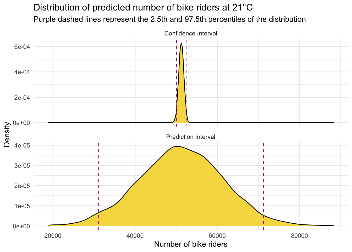
We can clearly see here that when estimating the number of bicycles recorded on a 21°C day in NYC, our estimates exhibit different levels of precision depending on whether we are predicting the average number of riders (for CI) or the number of riders on a specific day (for PI). The CI for the mean prediction is much narrower compared to the PI for an individual prediction. This distinction highlights a key concept in statistical modeling.
This should be intuitive: estimating the average number of riders across many days is inherently more precise than predicting the number of riders on any single day. The average smooths out the day-to-day fluctuations and anomalies, leading to a more stable estimate, whereas individual days can vary significantly due to numerous unpredictable factors such as weather fluctuations, special events, or random variations in daily commuting patterns.
Theory-based (i.e., parametric) estimation of standard errors and CIs
Besides bootstrapping, we can obtain standard errors and confidence intervals for the regression intercept and slope directly from closed-form formulas — that is, exact mathematical equations that give a result in a single step without needing iterative procedures or simulations.
These formulas work when the classical linear-model assumptions are met:
The errors are independent and have constant variance1.
The errors (the unobserved deviations from the true regression line) are assumed to be either (a) normally distributed, or (b) from some other distribution with finite variance, where in large samples, the Central Limit Theorem ensures the sampling distribution of the coefficient estimates is approximately normal.
Under those conditions the recipe is:
- Fit the model and record the residual mean-square; this is our estimate of the error variance, \(\hat\sigma^{2}\).
- Compute the standard error for each coefficient (your software does the algebra).
- Build a \((1-\alpha)\,\)% confidence interval with
\(\hat\beta_j \; \pm \; t_{\alpha/2,\; df}\,\text{SE}(\hat\beta_j)\),
where \(t_{\alpha/2,\; df}\) is the critical value from the \(t\) distribution and
\(df = n - p - 1\) (sample size minus number of predictors minus the intercept).
In short, when the assumptions hold these formulas give you instant uncertainty estimates — no resampling required.
SE for intercept and slope
In SLR, the precision of the estimated intercept (\(b_0\)) and slope (\(b_1\)) is quantified by their standard errors (SEs). These standard errors reflect how much the estimates would vary from sample to sample.
The standard error of the slope, \(SE_{b_1}\), is calculated using the formula:
\[ SE_{b_1} = \sqrt{ \frac{ \text{SSE} / (n - 2) }{ \sum_{i=1}^{n} (x_i - \bar{x})^2 } } \]
where:
- \(SSE = \sum_{i=1}^{n} (y_i - \hat{y}_i)^2\) is the residual sum of squares,
- \(n\) is the sample size,
- \(x_i\) are the values of the predictor variable, and
- \(\bar{x}\) is the mean of the predictor variable.
The standard error of the intercept, \(SE_{b_0}\), is given by:
\[ SE_{b_0} = \sqrt{ \left( \frac{1}{n} + \frac{\bar{x}^2}{\sum_{i=1}^{n} (x_i - \bar{x})^2} \right) \cdot \frac{ \text{SSE} }{ n - 2 } } \]
This formula incorporates both the residual variability (how much the actual \(y_i\) values deviate from the regression line) and the variability in the predictor \(x\).
The term
\[
\left( \frac{1}{n} + \frac{\bar{x}^2}{\sum (x_i - \bar{x})^2} \right)
\]
reflects how far the predictor’s mean \(\bar{x}\) is from zero. The further \(\bar{x}\) is from 0, the larger this quantity becomes, increasing the standard error of the intercept.
This means the precision of the intercept estimate depends on where the predictor is centered: when \(\bar{x}\) is near 0 (i.e., the predictor is centered), the standard error of the intercept is smaller; when \(\bar{x}\) is far from 0, the standard error is larger.
The standard errors provide a measure of the variability or uncertainty around our estimated regression parameters. Recall that these SEs are estimates of the standard deviation of the sampling distribution for each respective parameter. For example:
Standard Error of the Slope (\(SE_{b_1}\)): This measures the variability of the estimated slope (which represents the change in the outcome variable for a one-unit change in the predictor variable) across many random samples drawn from the population. Essentially, it tells us how much the estimated slope is expected to fluctuate due to random sampling variability, with a smaller value implying greater reliability of the slope estimate.
Standard Error of the Intercept (\(SE_{b_0}\)): This measures the variability of the estimated intercept (which represents the expected value of the outcome variable when the predictor variable is zero) across many random samples drawn from the population. Essentially, it tells us how much the estimated intercept is expected to fluctuate due to random sampling variability, with a smaller value implying greater reliability of the intercept estimate.
In practice, statistical software like R simplifies these calculations for us. To see the standard errors for the intercept and slope, we just add std.error to the list of terms produced by tidy() that we’d like to display.
slr <- lm(total_counts ~ daily_temperature_2m_max, data = nyc_bikes_2023)
slr |> tidy() |> select(term, estimate, std.error)The values listed under std.error provide the estimated standard errors for \(SE_{b_0}\) and \(SE_{b_1}\), denoting the precision with which we can estimate the intercept and slope of the regression model. These standard errors are crucial for constructing confidence intervals and conducting hypothesis tests about the regression parameters (which we will tackle in Module 16), helping us understand and quantify the uncertainty in our estimates.
Confidence intervals for the parameter estimates
To calculate CIs for the intercept and slope(s) using a theory-based (i.e., parametric approach), we take the estimate plus the critical values of t times the standard error (std.error). Recall from Module 09 that to calculate the appropriate critical value of t, we need the degrees of freedom (df) for the model.
For a regression model, the appropriate df for computing the critical values of t for the intercept and the slope(s) is calculated as n - 1 - p, where n is the sample size, and p is the number of predictors (we lose one df for estimating the intercept and an additional df for estimating the effect of each predictor).
Since we only have 1 predictor in this regression model, the correct df is 365 - 1 - 1 = 363.
Thus, if we desire to calculate a 95% CI, the appropriate critical values of t are:
qt(c(0.025, 0.975), df = 363)[1] -1.966521 1.966521Plugging in the parameter estimates, standard error, and critical value of t, we can compute each CI:
95% CI for the intercept:
\[ CI = b_0 \pm t_{n-2, \alpha/2} \times SE_{b_0} \]
\[ 95\% \text{ CI } = 23711.546 \pm (1.967\times1212.994) \]
95% CI for the slope:
\[ CI = b_1 \pm t_{n-2, \alpha/2} \times SE_{b_1} \]
\[ 95\% \text{ CI } = 1310.377 \pm (1.967\times61.511) \]
CI’s with tidy()
There’s no need to calculate confidence intervals by hand — the tidy() function can do it for us. By setting conf.int = TRUE, we can extract confidence intervals for each model coefficient directly from the output for whatever confidence level we desire:
slr |>
tidy(conf.int = TRUE, conf.level = 0.95) |>
select(term, estimate, std.error, conf.low, conf.high)What do the CIs capture in this context?
In the long run, if we were to repeatedly draw new samples and calculate a 95% confidence interval from each, about 95% of those intervals would contain the true population slope.
For our study, the 95% CI for the effect of temperature on the number of bicycle riders is approximately 1189 to 1431. This means that, based on our sample, we can say we are 95% confident that the true slope — the expected increase in riders for each 1°C rise in temperature — lies between 1189 and 1431.
On the other hand, the 95% CI for the intercept ranges from about 21,326 to 26,097. With 95% confidence, we can say that the average number of riders on a day with a maximum temperature of 0°C falls between those values.
Confidence band for regression line
Let’s recreate the scatterplot with the best fit line overlaid, but now we will request standard errors (se = TRUE within the geom_smooth() function call). The shaded area in the figure below provides an assessment of the precision of our estimated best fit line. Though our single sample provides an intercept and slope for the best fit line in the sample (the thick black line), the shaded grey area provides a range of plausible areas where the best fit line in the population may fall. The default is a 95% confidence band — but this can be modified with the addition of an argument to geom_smooth() — namely by adding level = 0.99 after se = TRUE. In this way, our regression model provides us with the best fit line in our sample, but also provides us with an understanding of the precision of our estimates and how much we can expect them to vary from sample-to-sample.
nyc_bikes_2023 |>
ggplot(mapping = aes(x = daily_temperature_2m_max, y = total_counts)) +
geom_point() +
geom_smooth(method = "lm", se = TRUE, formula = y ~ x, color = "black") +
theme_minimal() +
labs(title = "Scatterplot of max daily temperature and bicycle riders with best fit line",
subtitle = "Confidence interval for regression line in gray shaded area",
x = "Max temperature (°C)",
y = "Total riders recorded") 
Confidence intervals for model predictions
Earlier we used the predict() function to calculate the predicted score for the outcome at a certain value of \(x_i\) by using the following code:
# Creating a data frame with the desired predictor values
new_data <- data.frame(daily_temperature_2m_max = 21)
# Utilizing the linear model to predict outcomes based on new data
predicted_riders <- slr |> predict(newdata = new_data) 95% CI for mean of y when x = 21
We can augment the predict()2 function code to calculate a CI for the predicted count of bicycles when the temperature equals 21°C by specifying interval = "confidence":
slr |> predict(newdata = new_data, interval = "confidence", level = 0.95) fit lwr upr
1 51229.46 50099.72 52359.21The values under lwr and upr provide the lower and upper bound for the interval respectively.
95% PI for a new y when x = 21
We just need a simple change to the prior code for the CI to obtain a PI instead, namely, we need to change the interval type from "confidence" to "prediction":
slr |> predict(newdata = new_data, interval = "prediction", level = 0.95) fit lwr upr
1 51229.46 31021.89 71437.04Plotting the CI and PI
Let’s take a look at one last visualization to further study the difference between a CI and a PI for a predicted score. Error bar plots are a powerful visual tool designed to express this uncertainty, providing a clear representation of the precision and reliability of statistical estimates. Error bar plots are graphical representations that utilize points to signify central estimates, like means or predicted values, and bars, known as “error bars,” to span a range that reflects variability or uncertainty. These bars can depict different statistical measures of dispersion, such as standard deviations, standard errors, or more specifically for our discussion, CIs and PIs.
# Create a data frame with the point estimates and the CI and PI when x = 21
results <- data.frame(
  type = c("CI", "PI"),
  estimate = c(51229.46, 51229.46),  # Assuming the same point estimate for both CI and PI
  lower = c(50099.72, 31021.89),  # CI lower bound, PI lower bound
  upper = c(52359.21, 71437.04)   # CI upper bound, PI upper bound
)

# Create the ggplot
results |>
  ggplot(mapping = aes(x = type, y = estimate, ymin = lower, ymax = upper)) +
  geom_errorbar(width = 0.05, color = "skyblue3") +
  geom_point(size = 2, color = "skyblue4") +
  scale_x_discrete(labels = c("CI" = "Confidence Interval", "PI" = "Prediction Interval")) +
  labs(title = "Error bar plot for predicted riders at 21°C",
       x = "", y = "Predicted number of riders") +
theme_minimal() 
The plot distinctly illustrates that estimating a 95% CI for the average number of riders on days with a maximum temperature of 21°C is relatively precise. This precision is evident in the narrow range of the CI, indicating a high level of confidence in where the true average likely falls. In contrast, the 95% PI, which forecasts the expected range of riders for any single day at 21°C, exhibits significantly less precision. The broader span of the PI underscores the inherent variability in daily rider counts, reflecting both the uncertainty in estimating the mean and the natural fluctuation of individual observations around that mean.
Bayesian approach to quantification of uncertainty
In Module 09 we studied a Bayesian approach to estimating and visualizing uncertainty for descriptive statistics (i.e., a proportion and a mean). In this section, we’ll use the same machinery to estimate and visualize uncertainty for linear regression parameter estimates.
In Bayesian regression, the approach to understanding population parameters — including the intercept (\(\beta_0\)), the slope (\(\beta_1\)), and sigma (\(\sigma\)) — fundamentally diverges from the frequentist perspective. Rather than treating these parameters as fixed yet unknown quantities that we aim to estimate directly from the sample data, the Bayesian method views them as random variables endowed with their own probability distributions. This shift in perspective enables the incorporation of existing knowledge or beliefs into the analysis through the specification of prior distributions.
A new data frame to apply a Bayesian framework
In this section, we will continue to explore the relationship between temperature (daily_temperature_2m_max) and the number of bicycle riders (total_counts) in NYC on a particular day. Instead of refitting the model using the 2023 data, we will leverage our knowledge from the 2023 data as prior information. This prior information will be used to examine the relationship between temperature (daily_temperature_2m_max) and the number of bicycle riders (total_counts) for the 2020 data.
The data frame, which includes all of the same variables as in the 2023 data frame, is hosted in a file called nyc_bikes_2020.Rds. Let’s begin by importing the data.
nyc_bikes_2020 <- read_rds(here("data", "nyc_bikes_2020.Rds"))
nyc_bikes_2020 |> head()
When conducting Bayesian model building, it’s best to go step-by-step:
Identify the Nature of \(Y\): The first step involves discerning whether the outcome variable is discrete or continuous. This distinction guides us in selecting the most appropriate model structure for the data. In our example, we’ll use a Normal/Gaussian distribution for modeling the number of bicycle riders.
Modeling the Outcome: We express the mean of the \(y_i\) scores as a function of the predictor(s) (e.g., \(\hat{y} = b_0 + b_1 x_i\) for a SLR).
Identifying Unknown Parameters: Every model comes with parameters that need to be estimated — such as the intercept (\(\beta_0\)), slope (\(\beta_1\)), and the standard deviation of the residuals (sigma — that is, \(\sigma\)). Identifying these parameters is key for model formulation. Each of the parameters are hyperparameters (i.e., a hyperparameter is a parameter of a prior distribution) that can be adjusted based on prior knowledge or beliefs.
Choosing Prior Distributions: The essence of Bayesian modeling lies in selecting prior distributions for these unknown parameters. For the intercept (\(\beta_0\)) and slope (\(\beta_1\)), which can span the entire real line, Normal distributions serve as intuitive choices given their flexibility. Choosing a prior distribution for \(\sigma\) can be more challenging. \(\sigma\) represents a standard deviation and cannot be negative, so we want to exclude the possibility of negative values in our prior information.
Defining the priors
In the first part of this Module, we studied the linear model that relates temperature to the count of bike riders in NYC based on the 2023 data. We will make use of the bootstrap distributions of the model parameters derived from the 2023 data to specify the priors for the 2020 data.
As described in Module 09, Bayesian models use Markov Chain Monte Carlo (MCMC) algorithms to estimate the parameters of the model, and for this type of estimation, it’s recommended to center the predictor(s) toward the middle of the data so the intercept of the regression model has a good deal of data available to estimate the parameter. This can help convergence of the models.
Therefore, instead of using the temperature variable expressed in it’s natural metric (where 0 represents 0°C), we’ll create a new version of the temperature variable — called temp.21 — which is centered at 21°C. This temperature, which equates to about 70°F, is more firmly in the middle of the distribution. I also picked this value since we explored this particular temperature earlier in the Module when calculating predicted bicycle counts based on the fitted model.
Since we’ll use the 2023 data as prior information, I refit the bootstrap models that we studied above using this centered version of temperature. The table below presents the the mean and standard deviation of the three parameters that we need to specify priors for — i.e., the intercept, the slope for temperature, and sigma, based on the centered version of temperature (temp.21) for the 2023 data. Because of the recentering of the predictor — the estimate and standard error for the intercept has shifted (as compared to our prior bootstrap results).
It’s also useful to visualize what the distribution of these parameters looks like across our bootstrap resamples using the 2023 data. The plots below show the distribution of each of the parameters across the 5000 bootstrap resamples.
Important
Please take a moment to look at these — noting the middle of the distribution, as well as the minimum and maximum scores.

The mean, standard deviation, minimum, and maximum estimates derived from the bootstrap distributions of the 2023 data provide a foundation for specifying our priors for the 2020 data.
Based on the 2023 information, we could choose to set our priors for the 2020 data as follows:
Intercept (\(\beta_0\)) Prior: Given the nature of the intercept, a Normal distribution is an appropriate choice for the prior, set as \(\beta_0 \sim N(51224, 612)\) (i.e., the intercept is assumed to follow a Normal distribution with a mean of 51224 and a standard deviation of 612).
Slope (\(\beta_1\)) Prior: For \(\beta_1\), reflecting how much the outcome variable changes with a one-unit increase in the predictor, a Normal prior based on the bootstrap estimates is utilized: \(\beta_1 \sim N(1311, 55)\).
Residual Standard Deviation (\(\sigma\)) Prior: Specifying a prior for \(\sigma\) can be challenging because it represents a standard deviation (which is a bit less intuitive than the intercept and slope) and cannot be negative3. The bootstrap distributions for \(\sigma\) based on the 2023 data is relatively normal in our histogram. Thus, a Normal prior for \(\sigma\) based on the 2023 data is as follows: \(\sigma \sim N(10221, 500)\).
Bayesian modeling offers a way for scientists to formally incorporate expert knowledge into their analysis. While data from 2023 likely provide a strong foundation for understanding typical bike ridership patterns, we should be cautious when applying these patterns to earlier years like 2020. During 2020, COVID-19 lockdowns and shifts in public behavior likely altered biking habits in ways that differ from more recent, post-pandemic patterns.
As a result, while our priors based on 2023 data provide a strong empirical foundation, we could consider modifications that reflect potential differences expected in 2020. For instance, overall ridership levels might have been different (perhaps lower or higher) or exhibited different sensitivities to temperature due to reduced commuting or recreational activities during various phases of pandemic-related restrictions. Thus, in setting our priors, we could:
Widen the Prior Distributions: Adjusting the standard deviations of our Normal priors can offer greater flexibility, acknowledging the increased uncertainty and potential for variation in ridership patterns during 2020. This approach helps ensure our priors are informative yet not overly restrictive, allowing the 2020 data to significantly inform the posterior distributions.
Consider Prior Predictive Checks: Conducting prior predictive checks can be invaluable. This involves simulating data from our model using only the priors and examining whether these simulated data outcomes seem reasonable within the context of 2020. If the simulated outcomes are excessively unrealistic (e.g., predicting higher ridership than plausible during lock down periods), this signals a need to adjust the priors to better reflect the expected conditions of that year.
Embrace the Bayesian Philosophy: The essence of Bayesian analysis lies in its iterative process of updating beliefs with new evidence. By starting with priors informed by 2023 data but adjusted for the anticipated differences of 2020, we embrace a balanced approach. This allows the data from 2020 to “speak” more emphatically, particularly when it presents new patterns or trends not observed in the 2023 dataset. Our analysis, therefore, remains rooted in empirical knowledge while being receptive to the unique insights the 2020 data may reveal.
In summary, by thoughtfully calibrating our priors to account for the peculiarities of 2020 without making them overly constrictive, we enable a nuanced analysis that respects both our prior knowledge and the distinctiveness of the data at hand. This balanced approach underscores the Bayesian commitment to learning from data, ensuring that our model is both informed by past insights and adaptable to uncover new understandings.
Following the second recommendation above (Consider Prior Predictive Checks), we can check that the prior distributions that we’ve selected fit what we imagine for the 2020 data by using the following code, which allows for the visualization of the priors. The function plot_normal() is a function from the bayes_rules package — which is a companion package to the highly recommended Bayes’ Rules e-book.
see_prior_intercept <-
  plot_normal(mean = 51224, sd = 612) +
  theme_minimal() +
  labs(x = "intercept", y = "probability density function")

see_prior_slope <-
  plot_normal(mean = 1311, sd = 55) +
  theme_minimal() +
  labs(x = "slope", y = "probability density function")

see_prior_sigma <-
  plot_normal(mean = 10221, sd = 500) +
  theme_minimal() +
  labs(x = "sigma", y = "probability density function")

library(patchwork)
p <- see_prior_intercept | see_prior_slope | see_prior_sigma
p + plot_annotation(title = "Implied density plots for specified priors")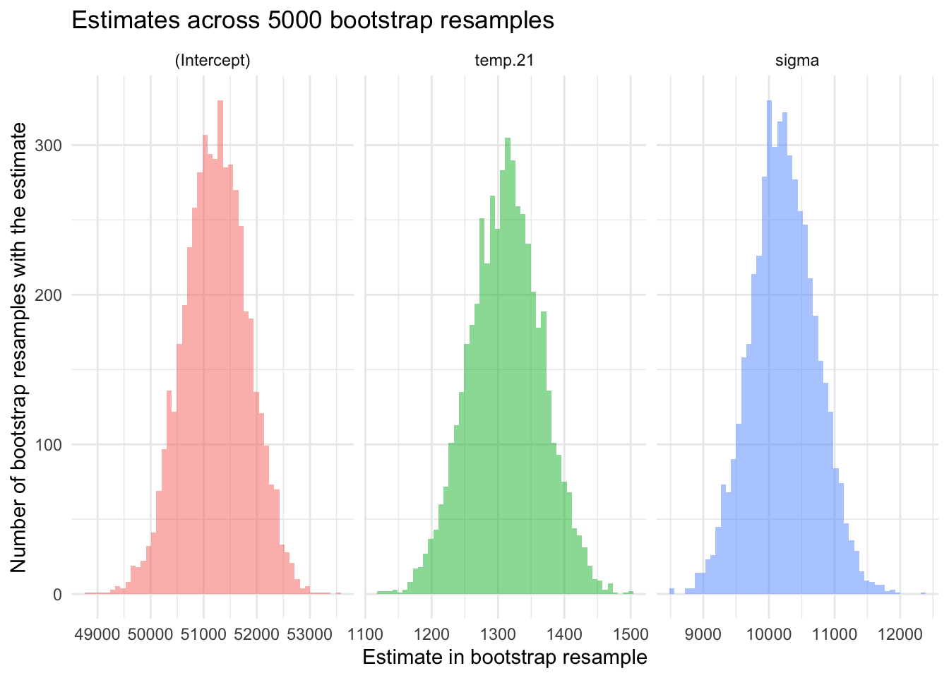
These density plots show the implied probability distributions for each parameter estimate based on our 2023 data. We can check these to see if the priors appropriately capture the variability and range we expect for the 2020 data. For example, noting the center of the distribution and the spread of each distribution (e.g., the minimum and maximum scores for each parameter). This visualization helps us verify that our priors are reasonable and aligned with our empirical knowledge.
After looking at the implied probability distributions based on our initial ideas for the prior information, we can proceed as follows:
Interpret the Plots: Assess whether the peaks (modes) of the distributions are centered around the mean estimates. Check the spread of the distributions to ensure they encompass the variability seen in the 2023 data.
Adjust Priors if Necessary: If the density plots indicate that the priors are too narrow or too broad, adjust the standard deviations accordingly. Re-evaluate the choice of distribution (e.g., considering heavier-tailed distributions for sigma if needed).
Validate Assumptions: Cross-verify the empirical knowledge and assumptions underlying the priors. Ensure that any domain-specific insights are reflected in the chosen distributions.
By thoroughly examining these density plots based on our 2023 priors, we can ensure that our priors are not only informed by the empirical data from 2023 but also appropriately flexible to capture the variability and uncertainties expected in the 2020 data.
Going hand in hand with the inspection of the implied distributions for each parameter estimate based on our chosen priors, we can also simulate data based on our prior distribution specifications. This step allows us to verify that the priors capture the variability and range we expect for the 2020 data.
We can accomplish this type of simulation via the brms package. We specify the equation for the model we seek to estimate: formula = total_counts ~ temp.21). Additionally, for predictive checking we add the argument sample_prior = "only"4, which instructs the brm() function to sample exclusively from the prior distribution, ignoring the observed data. This is useful for visualizing and understanding the prior predictive distribution, which shows the range of outcomes that the priors alone would predict.
The code to carry out this task is in the code chunk below:
# Create centered version of temperature in the 2020 data frame
nyc_bikes_2020 <-
  nyc_bikes_2020 |>
  mutate(temp.21 = daily_temperature_2m_max - 21)


# Define our priors
priors <- c(
  prior(normal(51224, 612), class = Intercept),
  prior(normal(1311, 55), class = b, coef = 'temp.21'),
  prior(normal(10221, 500), class = sigma)
)

# Visualize implied distributions
sim_based_on_priors <- brm(
    formula = total_counts ~ temp.21,
    data = nyc_bikes_2020,
    family = gaussian(),
    prior = priors,
    sample_prior = "only",
    chains = 4,
    warmup = 5000,
    iter = 20000,
   )
Once the data is simulated based on the priors, we can create plots to determine if the output seems reasonable. To do so we use the add_epred_draws() function from the tidybayes package. Let’s take a look at the code to obtain 100 estimates of the best fit line based on our priors, then break down how the code works.
draws_priors <- tibble(
  temp.21 = seq(-21, 15)) |>
  add_epred_draws(sim_based_on_priors, ndraws = 100)

draws_priors |>
  ggplot(mapping = aes(x = temp.21, y = .epred)) +
  geom_line(mapping = aes(group = .draw), alpha = 0.2) +
  theme_minimal() +
  labs(title = "100 best fit lines simulated from the prior distribution",
       x = "Max daily temperature in Celsius (centered at 21°C)",
       y = "Total riders recorded")
Code breakdown:
Temperature Sequence Creation: The tibble draws_priors is created with a sequence of temperature values from -21 to 15. These temperatures are the input values for which predictions will be generated, ranging from a very cold temperature to a quite hot temperature. Recall that we centered the temperature variable at 21°C — so this range must reflect the centered range of the variable to work properly
Generate Predicted Values: The add_epred_draws() function is used to generate 100 sets of predicted values for the number of bicycle riders (total_counts) based on the model sim_based_on_priors specified earlier.
Combine Predictions with Input Data: The resulting tibble, draws_priors, now contains the original temperature values along with the corresponding predicted values for each of the 100 draws. Each draw implies a possible “best fit line” for the relationship between temperature and the number of bicycle riders, as informed by the prior distributions that we specified.
Plot the best fit lines: Using the temperature scores and the corresponding predictions for number of bicycle riders (total_counts), we can create a line plot using ggplot() — which effectively shows the 100 fitted lines from the 100 draws of the data.
The purpose of this process is to visualize the prior predictive distribution. By plotting these 100 best fit lines, we can assess whether the prior distributions are reasonable and whether they introduce sufficient variability to account for the uncertainty likely present in the actual data. If the lines appear too similar, it may indicate that the priors are too restrictive and need to be adjusted to better capture the possible range of outcomes.
Here’s the output from this process:

Do the plots suggest we’re in good shape? Upon careful review of the prior predictive checks performed with our initial priors — derived from the 2023 data — it is evident that these priors might be too conservative for applying to new data, particularly for 2020, a year markedly impacted by the COVID-19 pandemic. Specifically, the prior standard deviations for the intercept and slope, along with the prior for sigma (\(\sigma\)), yield a predictive distribution with less variability than is likely prudent. For example, there seems to be too little variability in the intercept and slope estimates (as illustrated by the fitted lines across 100 simulated samples). This limited variability suggests that our priors might unduly influence the model’s estimation when applied to the new data from 2020.
Given the unprecedented circumstances of 2020, it’s reasonable to anticipate greater uncertainty in the parameter estimates. To account for this increased uncertainty and ensure our model can adequately capture the potential range of outcomes, it’s likely prudent to widen the variance of the standard deviations for both the intercept and slope, and similarly, to widen the expected variance for \(\sigma\).
Based on this rationale, we will adjust our priors by tripling the standard deviation estimate for the intercept, slope, and \(\sigma\). Then we can take another look at the implied density graphs and simulated data based on the updated, wider priors:
# Density plots with wider priors
see_prior_intercept <-
  plot_normal(mean = 51224, sd = (612*3)) +
  theme_minimal() +
  labs(x = "intercept", y = "probability density function")

see_prior_slope <-
  plot_normal(mean = 1311, sd = (55*3)) +
  theme_minimal() +
  labs(x = "slope", y = "probability density function")

see_prior_sigma <-
  plot_normal(mean = (10221), sd = (500*3)) +
  theme_minimal() +
  labs(x = "sigma", y = "probability density function")

library(patchwork)
p <- see_prior_intercept | see_prior_slope | see_prior_sigma
p + plot_annotation(title = "Implied density plots for specified wider priors")
# Set wider priors
wider_priors <- c(
  prior(normal(51224, 1836), class = Intercept),
  prior(normal(1311, 165), class = b, coef = 'temp.21'),
  prior(normal(10221, 1500), class = sigma)
)

sim_based_on_wider_priors <-
  brm(
    formula = total_counts ~ temp.21,
    data = nyc_bikes_2020,
    family = gaussian(),
    prior = wider_priors,
    sample_prior = "only",
    chains = 4,
    warmup = 5000,
    iter = 20000
    )

# Visualize the prior predictive distribution (100 best fit lines)
draws_wider_priors <- tibble(
  temp.21 = seq(-23,15)) |>
  add_epred_draws(sim_based_on_wider_priors, ndraws = 100)

draws_wider_priors |>
  ggplot(mapping = aes(x = temp.21, y = .epred)) +
  geom_line(mapping = aes(group = .draw), alpha = 0.2) +
  theme_minimal() +
  theme_minimal() +
  labs(title = "100 best fit lines simulated from the prior distribution",
       subtitle = "Updated wider priors",
       x = "Max daily temperature in Celsius (centered at 21°C)",
y = "Total riders recorded") 
Comparing these visualizations to the earlier visualizations with narrower priors, we can see that more uncertainty is attained. To see this, compare the range of scores on the x-axis in the density plots for the initial priors and the wider priors. Additionally, take note of the increased variability in the 100 fitted regression lines based on the wider priors. The increased variability across simulated samples indicates that our model is now better equipped to account for the heightened variability and unpredictability associated with the 2020 data.
Fit the Bayesian model to the 2020 data
With our priors selected, we’re ready to fit the Bayesian SLR model. The code to carry out this task is below, and builds directly on our Bayesian model for a mean from Module 09. The primary difference is that we are now fitting a regression model (formula = total_counts ~ temp.21), and our priors require inputs for the intercept, slope, and sigma — as we discussed earlier.
# Priors to be used
wider_priors <- c(
  prior(normal(51224, 1836), class = Intercept),
  prior(normal(1311, 165), class = b, coef = 'temp.21'),
  prior(normal(10221, 1500), class = sigma)
)

# Specify the final Bayesian linear regression model
bayesian2020 <- brm(
  formula = total_counts ~ temp.21,
  data = nyc_bikes_2020,
  family = gaussian(),
  prior = wider_priors,
  warmup = 5000,
  iter = 20000,
  chains = 4
)
The fitted model, named bayesian2020, will contain the posterior samples and other relevant information needed for inference and prediction.
Diagnostics
Before interpreting the parameter estimates, we must thoroughly inspect the model. Model checking ensures that the model accurately represents the underlying data and that the assumptions made during the modeling process are valid. This involves assessing the goodness-of-fit, checking for convergence of the MCMC samples, and evaluating the posterior predictive distributions. Without proper model checking, there is a risk of drawing incorrect or misleading conclusions from the parameter estimates, as the model might be overfitting, underfitting, or failing to capture essential patterns in the data.
R-hat
R-hat assesses the quality and reliability of MCMC simulations. R-hat assesses whether the MCMC chains have converged. It does this by comparing the variation within each chain to the variation across all chains. A R-hat value close to 1 indicates that the chains have mixed well and are likely sampling from the same posterior distribution. If R-hat is greater than 1.05, it suggests that the chains haven’t converged, meaning our results might not be reliable.
We can request R-hat for our fitted model as follows:
bayesian2020 |> rhat() b_Intercept b_temp.21 sigma Intercept lprior lp__
1.000065 1.000032 1.000043 1.000078 1.000103 1.000161 The R-hat values for all estimated parameters (b_intercept, b_temp.21, and sigma) are very close to 1, this means the chains have adequately explored the posterior distribution and converged to a stable solution.
Trace plots
Trace plots evaluate the behavior of MCMC simulations. Each trace plot visualizes the sampled values of a parameter across iterations within each chain, providing insights into the convergence and mixing of the MCMC chains. Here’s how to interpret trace plots:
Identifying Convergence: Converged chains should converge to the same distribution, meaning they should fluctuate around the same value or within a consistent range across the plot. This indicates that regardless of the starting values, the chains are exploring the same posterior landscape. Unconverged chains appear to explore different parts of the parameter space without overlapping, it suggests a lack of convergence. This could mean that the chains have not yet explored the full posterior distribution, and more iterations may be necessary.
Assessing Mixing: Good mixing displays a “hairy caterpillar sitting on the floor” appearance, where the samples densely cover a consistent range and resemble random noise around a value. This indicates that the chain is efficiently exploring the posterior distribution. Poor mixing may exhibit visible patterns, such as trends, cyclic behavior, or long periods where the chain gets “stuck” at certain values. This suggests autocorrelation within the chain, where successive samples are too similar to each other, reducing the chain’s effective sample size.
Evaluating Stationarity: Stationary looks like the chain oscillating within a stable range throughout the simulation without trending upwards or downwards. Non-stationary may be indicated by a visible trend in the trace plot, where the parameter values systematically increase or decrease over iterations. This can suggest that the chain has not yet reached its equilibrium distribution.
Spotting Autocorrelation: While trace plots primarily show convergence and mixing, patterns observed can also hint at autocorrelation. For instance, a slowly meandering trace plot (showing gradual shifts from high to low values or vice versa) suggests that consecutive samples are highly correlated, indicating that the sampler is not efficiently exploring the parameter space.
Let’s take a look at the trace plots for our example:
bayesian2020 |>
  gather_draws(b_Intercept, b_temp.21, sigma) |>
  ggplot(mapping = aes(x = .iteration, y = .value, color = as.factor(.chain))) +
  geom_line(linewidth = 0.05) +
  labs(color = "Chain") +
  facet_wrap(vars(.variable), scales = "free_y") +
  theme(legend.position = "bottom")
How do our trace plots look?
Randomness and Mixing: The trace plots for all three parameters appear to exhibit randomness and good mixing. There are no obvious patterns, trends, or drifts over the iterations, indicating that the chains are well-mixed.
Convergence: The fact that the trace plots for each parameter oscillate around a stable mean suggests that the model has likely converged. The chains are not showing any systematic drift which is a good sign.
Scale and Variability: The variability within each chain seems consistent across iterations, which is another positive sign indicating that the sampling process is stable.
Overall, the trace plots look good. They suggest that the chains have converged and are well-mixed. This implies that the posterior estimates for the parameters are reliable.
What should you do if these diagnostics don’t conform to the desired description provided above?
Run Longer Chains: If convergence or stationarity is not achieved, consider running your MCMC simulations for more iterations.
Increase Burn-in: Discard more initial samples at warm up to ensure the analysis is conducted on samples after the chains have reached stationarity.
Density plots
Density plots generated from the posterior distributions offer diagnostics for posterior estimation and convergence. When we generate these plots for each parameter (such as b_Intercept, b_temp.21, and sigma) and color-code by chain, we can interpret several key aspects of our Bayesian analysis:
Distribution Shape and Central Tendency: The peak of the density plot represents the most probable value(s) of the parameter. A symmetric density plot suggests that the parameter values are equally likely to lie above or below the central tendency, indicating no bias in one direction.
Variability and Uncertainty: The spread of the density plot reflects the uncertainty associated with the parameter estimate. A wider plot indicates greater uncertainty (or higher variance) in the parameter’s estimated value, while a narrower plot suggests more precise estimates.
Comparison Across Chains: The density plots for each parameter should ideally show good overlap among the different chains, suggesting that all chains are sampling from the same posterior distribution. This overlap is a visual indicator of convergence across chains. Variations in the shapes or peaks of the density plots across chains might suggest issues with convergence or that the chains are exploring different parts of the parameter space. This could warrant further investigation or more iterations to ensure convergence.
Let’s take a look at the density plots from our fitted Bayesian model:
bayesian2020 |>
  gather_draws(b_Intercept, b_temp.21, sigma) |>
  ggplot(mapping = aes(x = .value, color = factor(.chain))) +
  geom_density() +
  labs(color = "Chain") +
  facet_wrap(vars(.variable), scales = "free") +
  theme_minimal() +
  theme(legend.position = "bottom")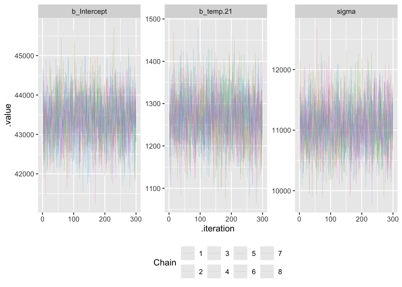
The density plots for all three parameters look good, and adhere to the desired results described above.
Interpret the results
Once we feel confident that the Bayesian model reached convergence and produced stable, reliable estimates, we can interpret the model.
Parameter estimates
To begin, let’s take a look at the parameter estimates — including the estimates of the intercept, slope, sigma, and \(R^2\).
bayesian2020 |>
  tidy(conf.int = TRUE, conf.level = 0.95) |>
  select(-c(effect, component, group))
bayesian2020 |>
bayes_R2(probs = c(0.025, 0.975)) Estimate Est.Error Q2.5 Q97.5
R2 0.5195999 0.02336181 0.4705135 0.5616565Here, let’s focus on the point estimates (labeled estimate). The intercept represents the predicted number of riders when the temperature is 21°C (i.e., temp.21 equals 0), and the slope represents the expected change in the number of riders for each 1°C increase in maximum temperature. The \(R^2\) is 0.520 — suggesting that the model explains about 52% of the variability in the outcome.
The table also provides the 95% credible interval for each estimate (see conf.low and conf.high). Credible intervals provide a range within which the parameter values are likely to lie, given the data and the specified priors. In a Bayesian framework, a 95% credible interval means that there is a 95% probability that the parameter value lies within this range, given the model and the data.
For example, the 95% credible interval for the slope ranges from 1151 to 1385, meaning that — given the data and the model — there is a 95% probability that the true value of the slope lies within this range.
Graphical display of parameter estimates
While the numerical estimates are useful, it is common to utilize a type of graph called a Half-eye to visualize the interval. Half-eye plots are an effective way to visualize the posterior distributions and credible intervals of model parameters. The plots are produced via the stat_half_eye() function from the ggdist package.
bayesian2020 |>
  gather_draws(b_Intercept, b_temp.21, sigma) |>
  ggplot(mapping = aes(x = .value, fill = .variable)) +
  stat_halfeye(normalize = "xy", .width = c(.95)) +
  facet_wrap(vars(.variable), scales = "free_x") +
  labs(title = "Half-eye plots for the posterior distributions of each parameter",
       y = "Density",
       x = "Parameter posterior distribution",
       fill = "Parameter") +
  theme(legend.position = "bottom") +
  theme_minimal()
In a a Half-eye plot, the shaded area represents the kernel density estimation of the posterior distribution for each parameter. This visually conveys the shape of the distribution, highlighting the central tendency and variability for each parameter estimate. Superimposed on each density plot is the 95% credible interval. These intervals convey the range within which the parameter values likely lie with a certain probability (e.g., 95% credible intervals), given the model and the data. With these plots, we can clearly see which values are most probable, providing a more intuitive understanding of the parameter estimates in the context of our Bayesian model.
Fitted draws from the posterior
To visualize the range of predictions our Bayesian model makes, we can plot the observed data alongside 2,000 regression lines drawn from the model’s posterior distribution. Using add_linpred_draws(), we generate linear predictions (i.e., expected number of riders) for each temperature value based on the fitted model (bayesian2020).
This type of plot — often called a posterior predictive plot — helps illustrate model fit and uncertainty. The cloud of lines shows the range of plausible relationships between temperature and bike counts, based on what the model has learned from the data.
nyc_bikes_2020 |>
  add_linpred_draws(bayesian2020, ndraws = 2000) |>
  ggplot(mapping = aes(x = temp.21, y = total_counts)) +
  geom_point(data = nyc_bikes_2020, size = 0.5, alpha = 0.1) +
  geom_line(mapping = aes(y = .linpred, group = .draw), alpha = 0.2, linewidth = 0.5) +
  labs(title = "Relationship between temperature and bicyclists in NYC across 2000 \ndraws from the posterior distribution",
       subtitle = "Bayesian model fitted to 2020 data",
       x = "Max daily temperature in Celsius (centered at 21°C)",
       y = "Total riders recorded") +
  guides(color = "none") +
  theme_minimal()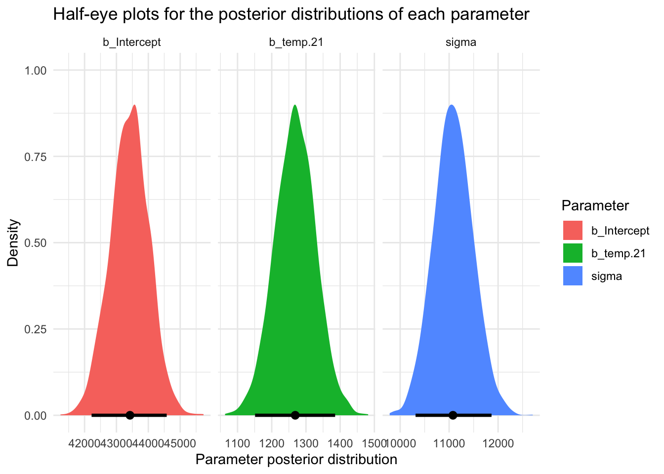
The multiple lines in the plot represent 2,000 samples from the posterior distribution of the linear predictor in the Bayesian model. Together, they show the range of plausible regression lines given the uncertainty in the model parameters.
The density of these lines at each temperature value visually communicates the model’s uncertainty: where the lines are tightly packed, the predicted number of riders is more certain (higher posterior probability); where the lines are more spread out, predictions are more uncertain. This serves as a visual analog to a credible interval, helping us understand not just the model’s average prediction but also the uncertainty around it.
Confidence for model predictions
Next, let’s compute credible intervals for the mean of y (counted riders) at 21°C (which corresponds to the intercept given our centering) as well as prediction intervals for a new observation at 21°C. Note that temp.21 == 0 is equivalent to a 21°C day.
Calculate a Credible Interval for a 21°C day
First, we calculate the credible interval for the mean of y at 21°C. The credible interval reflects the range within which the true mean number of riders is likely to fall with 95% probability.
ci_data <- bayesian2020 |>
  linpred_draws(newdata = tibble(temp.21 = 0)) |>
  summarise(lower = quantile(.linpred, probs = 0.025),
            upper = quantile(.linpred, probs = 0.975),
            .groups = "drop")

ci_data |> knitr::kable()| temp.21 | .row | lower | upper |
|---|---|---|---|
| 0 | 1 | 42231.46 | 44610.14 |
This interval indicates that there is a 95% probability that the true mean number of riders at 21°C lies between the values presented under lower and upper respectively in the table above. In Bayesian terms, given our prior beliefs and the observed data, the posterior distribution suggests that the mean number of riders is most likely within this range.
Calculating a Prediction Interval for a 21°C day
We can also calculate a prediction interval. A prediction interval provides a range within which a new observation is likely to fall with a certain probability (95% for our example). Akin to the frequentist approach, the prediciton interval will be wider than the credible interval because it accounts for both the uncertainty in the mean prediction (the model uncertainty) and the individual variability in the data (the residual error).
# For a new observation of y
pi_data <- bayesian2020 |>
  predicted_draws(newdata = tibble(temp.21 = 0)) |>
  summarise(lower = quantile(.prediction, probs = 0.025),
            upper = quantile(.prediction, probs = 0.975),
            .groups = "drop")

pi_data |> knitr::kable()| temp.21 | .row | lower | upper |
|---|---|---|---|
| 0 | 1 | 21744.57 | 65142.12 |
The resulting 95% prediction interval represents the range within which the actual number of riders is likely to fall on a new 21°C day, given what we’ve learned from the model and data.
Visualize the intervals
The code below presents these two intervals as Half-eye plots:
p1 <- bayesian2020 |>
  linpred_draws(newdata = tibble(temp.21 = 0)) |>
  ggplot(mapping = aes(x = .linpred)) +
  stat_halfeye(.width = c(.95), fill = "#2F9599") +
  xlim(0, 100000) +
  theme_minimal() +
  labs(title = "Predicted riders at 21˚C",
       subtitle = "Credible interval for mean of y",
       x = "Predicted riders", y = NULL)

p2 <- bayesian2020 |>
  predicted_draws(newdata = tibble(temp.21 = 0)) |>
  ggplot(mapping = aes(x = .prediction)) +
  stat_halfeye(.width = c(.95), fill = "#A7226E") +
  xlim(0, 100000) +
  theme_minimal() +
  labs(title = "Predicted riders at 21˚C",
       subtitle = "Prediction interval for a new y",
       x = "Predicted number of riders", y = NULL)

library(patchwork)
p <- p1 / p2
p + plot_annotation(title = "Comparison of the credible interval and prediction interval for a 21˚C day")
We can also take a look at these quantities — the credible interval and prediction interval — in the context of the full dataset. In the graphs below, I plot the observed 2020 rider counts as a scatterplot, overlay the best-fitting regression line from the Bayesian model (in black), and highlight the predicted number of riders for a 21°C day. The left panel shows the 95% credible interval, representing our uncertainty about the mean number of riders on a 21°C day. The right panel shows the 95% prediction interval, representing the likely range of individual rider counts on a future 21°C day. Both intervals are visualized as vertical lines positioned at 21°C.
# Pull intervals
ci_lower <- ci_data$lower
ci_upper <- ci_data$upper

pi_lower <- pi_data$lower
pi_upper <- pi_data$upper

# Create a sequence of temperature values for prediction
newdata_grid <- tibble(temp.21 = seq(min(nyc_bikes_2020$temp.21),
                                     max(nyc_bikes_2020$temp.21),
                                     length.out = 100))

# Get mean predictions from the posterior draws
line_data <- bayesian2020 |>
  epred_draws(newdata = newdata_grid) |>
  group_by(temp.21) |>
  summarise(mean_pred = mean(.epred), .groups = "drop")

# CI graph
p1 <- ggplot(nyc_bikes_2020, aes(x = temp.21, y = total_counts)) +
  geom_point(alpha = 0.1) +
  geom_errorbar(mapping = aes(x = 0, ymin = ci_lower, ymax = ci_upper), color = "#2F9599", width = 2) +
  geom_line(data = line_data, aes(x = temp.21, y = mean_pred), color = "darkgrey", linewidth = 1) +
  labs(title = "CI for Predicted Riders at 21°C",
       x = "Temperature (centered at 21°C)",
       y = "Predicted number of riders") +
  theme_minimal()

# PI graph
p2 <- ggplot(nyc_bikes_2020, aes(x = temp.21, y = total_counts)) +
  geom_point(alpha = 0.1) +
  geom_errorbar(mapping = aes(x = 0, ymin = pi_lower, ymax = pi_upper), color = "#A7226E", width = 1) +
  geom_line(data = line_data, aes(x = temp.21, y = mean_pred), color = "darkgrey", linewidth = 1) +
  labs(title = "PI for Predicted Riders at 21°C",
       x = "Temperature (centered at 21°C)",
       y = "Predicted number of riders") +
  theme_minimal()

# Combine plots side by side
p <- p1 | p2
p + plot_annotation(title = "The credible interval and prediction interval for a 21˚C day in context")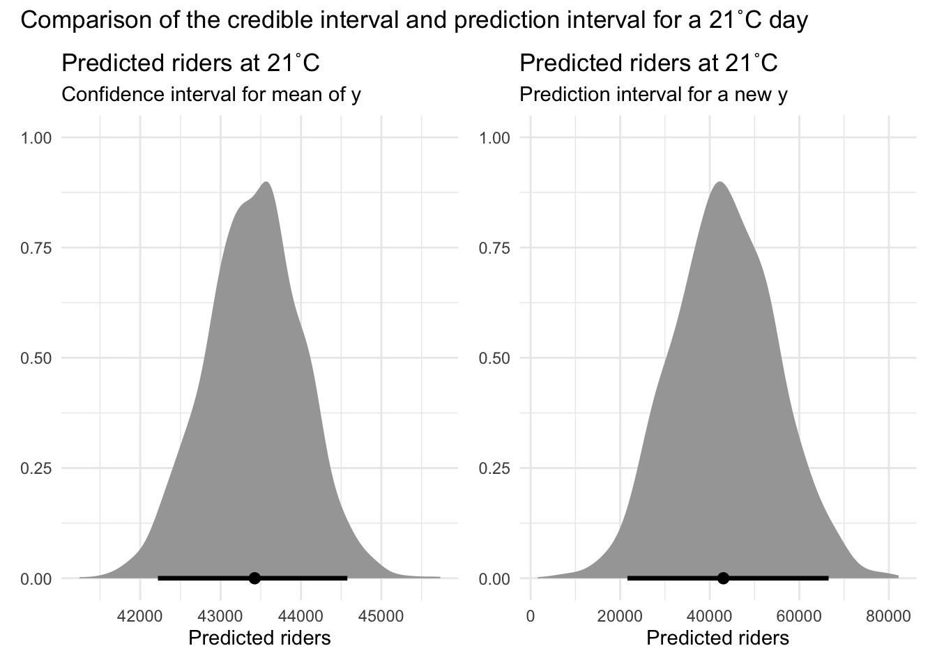
These plots provide a visual representation of the credible and prediction intervals, helping to contextualize the range of expected values for the number of riders at 21°C. The credible interval provides insight into the mean number of riders, while the prediction interval offers a range for where new observations are likely to fall.
Next steps
In this Module, we considered a very simple model to predict the number of bicyclists. We did this for instructive reasons. But, of course, while temperature is an important factor influencing bicycle ridership, a more accurate and realistic prediction model would include several other predictors that capture meaningful variation in daily counts. Key variables to consider include:
Day of the week: Ridership typically differs between weekdays and weekends due to commuting patterns and recreational use.
Precipitation: Rain or snow can significantly reduce the number of cyclists on any given day.
Public health restrictions: In 2020, COVID-19 stay-at-home orders, phased reopenings, and public transportation use may have affected biking behavior.
Holiday indicators: National holidays often disrupt normal routines and may lead to spikes or drops in ridership.
Air quality: Poor air quality may discourage outdoor activities like biking.
Bike infrastructure availability: Construction, closures, or new bike lane installations may influence ridership on specific days or routes.
COVID-19 case counts or policy stages: Specific to 2020, changes in COVID-19 trends or policies could strongly impact day-to-day behavior.
Including these variables would help capture more of the complexity in the data and improves the predictive accuracy of the model.
Learning Check
After completing this Module, you should be able to answer the following questions:
- What causes regression coefficients to differ from one sample to the next?
- In your own words, what does a standard error of 42 for a slope estimate convey?
- How does the bootstrap estimate a standard error without relying on normal-error assumptions?
- Give two situations where a theory-based SE for a slope might be unreliable, and explain why.
- Contrast a 95 % CI for the mean at (x = 10) with a 95 % prediction interval for a single new observation at (x = 10).
- Using tidy() output from lm(), outline the steps to build a 95 % CI for a slope.
- Define a credible interval and list one key difference from a confidence interval.
- In MCMC diagnostics, what does an R-hat much greater than 1 imply, and how should you respond?
- When inspecting a bootstrap histogram for the slope, what does a narrow vs. wide spread indicate about estimator precision?
- Why do prediction intervals often widen as the predictor value moves toward the tails of its distribution?
Credits
- I relied on two excellent resources in compiling this Module: Gelman and colleague’s Regression and Other Stories and Johnson and colleague’s Bayes Rules!.
Resources
For an excellent repository of materials to help you learn more about Bayesian modeling, check out this website.
Footnotes
When we say “the errors are independent and have constant variance,” we mean two things:
Independent errors: The prediction errors (residuals) for each observation don’t influence each other. For example, knowing that we underpredicted the number of bike riders on one day doesn’t tell us anything about the error we made on another day.
Constant variance (homoscedasticity): The size of the prediction errors stays roughly the same across all values of the predictor. That is, the model is just as accurate on cold days as it is on warm days. If the prediction errors got bigger or smaller as temperature changed, we’d say the variance is not constant (that’s called heteroscedasticity).
We’ll study these conditions more thoroughly in Module 17.↩︎
The predict() function in R, when used with linear regression models, calculates both confidence intervals (CIs) and prediction intervals (PIs) for the predicted values. These intervals are based on the standard error (SE) of the prediction, which differs depending on whether we desire a CI or a PI.
For a CI, the formula for the SE is as follows:
\[ SE_{\hat{y}} = \sqrt{MSE \cdot \left(\frac{1}{n} + \frac{(x - \bar{x})^2}{\sum (x_i - \bar{x})^2}\right)} \]
Where:
\(MSE\) is the mean squared error of the regression model, calculated as: \(MSE = \frac{1}{n} \sum_{i=1}^{n} (y_i -\hat{y_i})^2\)
\(n\) is the sample size
\(x\) is the value of the predictor for which the prediction is made
\(\bar{x}\) is the mean of the predictor variable
\(x_i\) are the individual observed values of the predictor
For a PI, the SE includes one additional term:
\[ SE_{\text{new y}} = \sqrt{MSE \cdot \left(1 + \frac{1}{n} + \frac{(x - \bar{x})^2}{\sum (x_i - \bar{x})^2}\right)} \]
The key difference between the CI and PI calculations lies in the standard error component. For CIs, the SE reflects the uncertainty in estimating the mean response for given \(x_i\) values. For PIs, the SE also incorporates the variability (MSE) of individual observations around the regression line, leading to wider intervals. These calculations enable the predict() function to provide estimates that account for the precision of model predictions (CI) and the expected range of variability in new data points (PI).↩︎
If this introduction to Bayesian modeling piques your interest, and you want to learn more, there are many excellent books and resources — some of which I’ll put in the Resources section at the end of this Module. For the challenging topic of selecting priors — this Stan blog post is helpful.↩︎
What is the purpose of
sample_prior = "only"?Prior Predictive Checks: By sampling only from the prior, we can perform prior predictive checks to ensure that our priors are reasonable and cover a plausible range of values for the outcome variable.
Model Validation: It helps in validating the priors to see if they reflect our domain knowledge and assumptions before fitting the model to the actual data.
Understanding Priors: It allows us to visualize the implications of our priors independently of the data, which can help in refining the priors if they seem too restrictive or too vague.