| variable_name | label | notes |
|---|---|---|
| id | inmate ID | NA |
| years | sentence length in years | NA |
| black | race (1 = black, 0 = white) | NA |
| afro | rating for afrocentric features | inmate photo rated by ~35 CU undergraduate students; raters assigned a single, global assessment of the degree to which each face had features that are typical of African Americans, using a scale from 1 (not at all) to 9 (very much) |
| primlev | seriousness of primary offense | based on Florida’s rating system, higher numbers indicate more serious felonies |
| seclev | seriousness of secondary offense | based on Florida’s rating system, higher numbers indicate more serious felonies |
| nsecond | number of secondary offenses | NA |
| anysec | indicator for any secondary offenses (1 = yes, 0 = no) | NA |
| priorlev | seriousness of prior offenses | based on Florida’s rating system, higher numbers indicate more serious felonies |
| nprior | number of prior offenses | NA |
| anyprior | indicator for any prior offenses (1 = yes, 0 = no) | NA |
| attract | rating for attractiveness | inmate photo rated by ~35 CU undergraduate students |
| babyface | rating for babyface features | inmate photo rated by ~35 CU undergraduate students |
Checking Assumptions and Remediation Measures
Module 17
Learning Objectives
By the end of this Module, you should be able to:
- Identify the key assumptions of a linear regression model
- Interpret and evaluate diagnostic plots to assess linearity, additivity, homoscedasticity, and normality of residuals
- Detect potential problems such as multicollinearity and influential cases
- Apply strategies to remedy assumption violations, including transformations, adding polynomial or interaction terms, and using robust or resampling methods
- Understand when and why to use bootstrap resampling, robust standard errors, and generalized linear models for inference
- Explain the purpose and interpretation of plots such as the Fitted vs Residuals Plot, Added Variable Plot, and Residuals vs Leverage Plot
Overview
In this Module, you will develop essential skills for evaluating the validity of your linear regression analyses. We begin by outlining the foundational assumptions that must be met for a linear model to produce accurate, interpretable, and generalizable results. Understanding these assumptions is critical — not just for statistical correctness, but for drawing trustworthy conclusions from your data.
Using a real-world example from Blair and colleagues’ influential study on criminal sentencing, you’ll learn how to diagnose assumption violations using intuitive and informative visual tools. From there, we’ll introduce a range of practical strategies to address common issues — such as non-linearity, heteroscedasticity, and influential data points — so that you can confidently refine your models when assumptions are not met.
By the end of this module, you will be better equipped to detect problems, implement remedies, and produce regression models that are both statistically sound and substantively meaningful.
The Core Assumptions
When students first learn linear regression, they are typically introduced to a short list of technical assumptions of a linear regression model — such as linearity, constant variance, and normally distributed errors. While these are important, they are really only part of the picture.
In their book Regression and Other Stories, renowned statisticians Drs. Andrew Gelman, Jennifer Hill, and Aki Vehtari take a more comprehensive and thoughtful approach. They argue that evaluating a regression model’s validity goes far beyond a quick check of residual plots or normality tests. Instead, they outline six key assumptions — presented in decreasing order of importance — that span the full modeling process, from study design to interpretation of results.
This broader framework encourages data analysts to be more deliberate and reflective — not just about how well the model fits the data, but about whether it is appropriate for answering the research question in the first place. Let’s take a look at each of these six assumptions.
1. Validity of the model
The most critical factor in linear regression analysis is ensuring the validity of your model. Your model should correctly reflect the research question you’re trying to answer. The most valuable task a data scientist can undertake is to invest substantial effort in defining (and refining) the question that is being posed so that it is as clear and precise as possible. Once this question is meticulously defined, it paves the way for identifying the correct measures to evaluate the key constructs and devise an appropriate model to answer your question.
2. Representativeness of the sample
Secondly, your sample data should be a good representation of the larger population you want to generalize your results to. As an example, consider a study on the impact of a public health intervention, like a new fitness initiative, on community health. It’s crucial that your sample includes individuals from different age groups, ethnicities, fitness levels, and socioeconomic statuses. If your sample overly represents a specific group, like people who already lead active lifestyles, it could bias your results. This imbalance might lead to an overestimation of the initiative’s effectiveness, as those who are already active may respond differently to the intervention than those who are less active. Thus, ensuring representativeness is a key component in ensuring the validity of your results.
3. Linearity and additivity
Third, linear regression assumes that the relationship between your predictors and the outcome is linear and additive. This means, for instance, if you’re using age and diet to predict heart disease risk, you assume the effect of each predictor on the outcome (adjusting for the other predictors in the model) is linear (i.e., a straight line is a good representation of the relationship). And, you assume that the effect of age on heart disease risk is the same at all levels of diet, and vice versa (this is additivity). If this is not the case, you might need to modify your model by transforming your predictors or outcome (e.g., applying a non-linear transformation), including other methods for accounting for non-linearity (e.g., polynomial terms), including interaction terms between predictors, or choosing a different type of model that provides a better fit to the data.
4. Independence of errors
The fourth assumption is that the errors (or residuals) are independent. This means the error associated with one observation is not related to the error of any other observation. This assumption can be violated in cases where study participants are related to one another or when the data is structured in a particular way that induces dependency. For instance, if you are studying the academic achievement of pre-kindergarten students across 100 different classrooms, the students within each classroom might share similar learning experiences, teaching styles, and educational resources, thus inducing a correlation in their academic achievements.
This clustering effect may result in the violation of the independence assumption as the errors associated with students in the same classroom are likely to be more similar to each other than to students from different classrooms. This situation necessitates the use of more sophisticated statistical methods, like mixed models or multilevel linear models, which account for such intra-group correlation.
5. Equal variance of errors
Next, linear regression assumes that the variance of errors is constant across all levels of your predictors. This is known as homoscedasticity. If the variance changes (i.e., heteroscedasticity), your model might still provide useful predictions, but it might not be as efficient, and the standard errors (and subsequent significance tests) might not be accurate.
6. Normality of errors
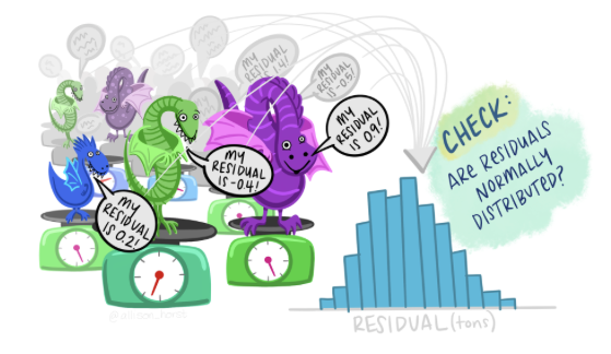
The last assumption is that the residuals (or errors) of your model are normally distributed. This means if you were to plot a histogram of residuals, you would see a normal, bell-shaped curve. The violation of this assumption often has less severe implications compared to the others, and the model can still provide useful predictions.
An Example
Throughout this course, we have worked to replicate the findings presented by Dr. Irene Blair and her colleagues in their paper entitled “The Influence of Afrocentric Facial Features in Criminal Sentencing”. In this Module, we will examine the assumptions underpinning what they regard as their ultimate fitted model — Model 3.

Our focus is on Gelman et al.’s assumptions 3, 5 and 6 — as the first two assumptions should be examined and dealt with prior to conducting the study, and assumption 4 is primarily about the design of one’s study. Assumptions 3, 5, and 6 pertain specifically to checking the adequacy of the fitted model.
The data include the following variables:
We will use the following packages:
library(here)
library(skimr)
library(broom)
library(boot)
library(tidyverse)
Let’s import the data frame.
df <- read_csv(here("data", "sentence.csv"))
df |> head()
And, get some descriptive statistics to refresh our memories about the variables.
df |> skim()| Name | df |
| Number of rows | 216 |
| Number of columns | 13 |
| _______________________ | |
| Column type frequency: | |
| numeric | 13 |
| ________________________ | |
| Group variables | None |
Variable type: numeric
| skim_variable | n_missing | complete_rate | mean | sd | p0 | p25 | p50 | p75 | p100 | hist |
|---|---|---|---|---|---|---|---|---|---|---|
| id | 0 | 1 | 108.50 | 62.50 | 1.00 | 54.75 | 108.50 | 162.25 | 216.00 | ▇▇▇▇▇ |
| years | 0 | 1 | 6.84 | 15.54 | 0.42 | 1.56 | 2.67 | 4.67 | 99.00 | ▇▁▁▁▁ |
| black | 0 | 1 | 0.46 | 0.50 | 0.00 | 0.00 | 0.00 | 1.00 | 1.00 | ▇▁▁▁▇ |
| afro | 0 | 1 | 4.53 | 1.77 | 1.49 | 2.83 | 4.47 | 6.09 | 7.86 | ▇▇▆▇▆ |
| primlev | 0 | 1 | 6.55 | 2.07 | 1.00 | 5.00 | 7.00 | 8.00 | 11.00 | ▁▇▇▆▁ |
| seclev | 0 | 1 | 3.40 | 2.57 | 0.00 | 0.00 | 3.65 | 5.00 | 9.00 | ▇▆▇▃▂ |
| nsecond | 0 | 1 | 2.41 | 3.82 | 0.00 | 1.00 | 1.00 | 3.00 | 41.00 | ▇▁▁▁▁ |
| anysec | 0 | 1 | 0.75 | 0.44 | 0.00 | 0.00 | 1.00 | 1.00 | 1.00 | ▃▁▁▁▇ |
| priorlev | 0 | 1 | 1.43 | 2.29 | 0.00 | 0.00 | 0.00 | 3.00 | 9.00 | ▇▂▂▁▁ |
| nprior | 0 | 1 | 0.95 | 1.90 | 0.00 | 0.00 | 0.00 | 1.00 | 13.00 | ▇▁▁▁▁ |
| anyprior | 0 | 1 | 0.33 | 0.47 | 0.00 | 0.00 | 0.00 | 1.00 | 1.00 | ▇▁▁▁▃ |
| attract | 0 | 1 | 3.21 | 0.91 | 1.43 | 2.57 | 3.16 | 3.71 | 6.51 | ▃▇▅▁▁ |
| babyface | 0 | 1 | 4.04 | 1.10 | 1.66 | 3.18 | 3.91 | 4.82 | 7.09 | ▂▇▇▅▁ |
Prepare the data for analysis
From working with these data in prior activities, you know that there is a bit of data wrangling that is necessary to prepare the data to fit the models. This includes taking the natural log of the outcome, centering the continuous predictors at their mean, forming polynomial terms, and creating an effect code for the indicator for race. The code below accomplishes these tasks.
sentence <-
  df |>
  mutate(lnyears = log(years),
         primlev_m = primlev - mean(primlev),
         primlev2 = primlev_m^2,
         seclev_m = seclev - mean(seclev),
         seclev2 = seclev_m^2,
         priorlev_m = priorlev - mean(priorlev),
         priorlev2 = priorlev_m^2,
         nsecond_m = nsecond - mean(nsecond),
         nprior_m = nprior - mean(nprior),
         afro_m = afro - mean(afro),
         babyface_m = babyface - mean(babyface),
         attract_m = attract - mean(attract)) |>
  mutate(black_m = case_when(black == 0 ~ -1, black == 1 ~ 1)) |>
  select(id,
         years, lnyears,
         primlev_m, primlev2, seclev_m, seclev2, nsecond_m, priorlev_m, priorlev2, nprior_m,
         black, black_m,
         afro, afro_m,
         attract_m, babyface_m)
Fit the model
As outlined in the published paper, in Model 3 the authors test their primary hypothesis of interest. That is, they determine if Afrocentric features predicts log sentence length, holding constant race and all of the criminal record variables. The authors describe this step as follows:
In a third model, we added the degree to which the inmates manifested Afrocentric features as a predictor of sentence length, controlling for the race of the inmates and the seriousness and number of offenses they had committed.
Hypotheses:
The null hypothesis is that, holding constant criminal record and race, Afrocentric features is not related to sentence length.
The alternative hypothesis is that, holding constant criminal record and race, Afrocentric features is related to sentence length.
The authors utilize a two-tailed test, with \(\alpha\) = 0.05.
The code below fits Model 3 from the paper.
mod3 <- lm(lnyears ~ primlev_m + primlev2 + seclev_m + seclev2 + nsecond_m + priorlev_m + priorlev2 + nprior_m +
             black_m +
             afro_m,
           data = sentence)

mod3 |> tidy(conf.int = TRUE, conf.level = 0.95)
Based on Model 3, Blair and colleagues reject the null hypothesis. The coefficient for Afrocentric features (afro_m) is 0.092. The test statistic is 2.306 and the p-value is 0.022. The 95% CI is 0.01 to 0.17. It’s critical to note that the accuracy and validity of this estimate depends on the assumptions of the fitted linear regression model being met. Let’s determine if this is the case.
Create a data frame with the fit statistics
For many of the graphs that we will produce below, we’ll need statistics from the augment() function (part of the broom package). Let’s create a data frame that holds these values. We’ll call this data frame eval. These statistics will be described as we move through the Module.
eval <-
  mod3 |>
  augment(data = sentence) |>
  select(id, years, lnyears, black, afro, afro_m, .fitted, .resid, .std.resid, .hat, .cooksd)

eval |> head()
Evaluate key assumptions of the linear regression model
Before diving into assumption checking, let’s briefly revisit a key idea from Module 10:
Statistical models can be summarized using a simple equation:
Outcome = Systematic Component + Residual
This equation helps us break down the total variation in our outcome into two parts:
The systematic component, explained by the predictors we’ve included in our model, and
The residual, which captures the leftover variation due to omitted variables, measurement error, and individual differences.
We will rely on this fundamental aspect of model fitting as we consider the underlying assumptions.
Linearity and additivity
Fitted values vs residuals plot
To check linearity and additivity, we will begin by examining a scatter plot of the .fitted values (i.e., y-hat or the predicted values) against the .resid values (i.e., the residuals) for our fitted model.
The fitted values (.fitted) represent the predicted values of the outcome variable for each case in the data frame — they’re the model’s best guess for what the outcome should be based on the systematic component of the regression model.
On the other hand, the residuals (.resid) represent the difference between the actual observed values and the predicted values. Ideally, if our model is perfect, these residuals would all be zero because the model’s predictions match perfectly with the observed data. However, in reality, this is never the case and there’s some degree of error present.
Now, when we plot fitted values against residuals, we’re essentially investigating how the residuals are distributed across different levels of our predicted outcome. If the model did an adequate job of using the predictors to explain variability in the outcome, then every way in which the predictors are related to the outcome should be swept up in the systematic part of the model — and therefore, the residuals should be unrelated to the fitted values. If, instead, the residuals are related to the fitted values, then that is a sign of model misspecification.
What are we looking for?
In a well-specified model, we should find:
No systematic pattern between the fitted values and residuals.
The spread or dispersion of the residuals should be constant across the range of fitted values.
Let’s use eval to produce the Fitted Values vs Residuals Plot.
eval |>
  ggplot(mapping = aes(x = .fitted, y = .resid)) +
  geom_point() +
  geom_hline(yintercept = 0, linetype = "dashed", linewidth = 1, color = "#F05676") +
  geom_smooth(method = "loess", formula = y ~ x, se = FALSE, color = "#2F9599") +
  labs(x = "Fitted values", y = "Residuals",
       title = "Fitted Values vs Residuals Plot") +
  theme_bw()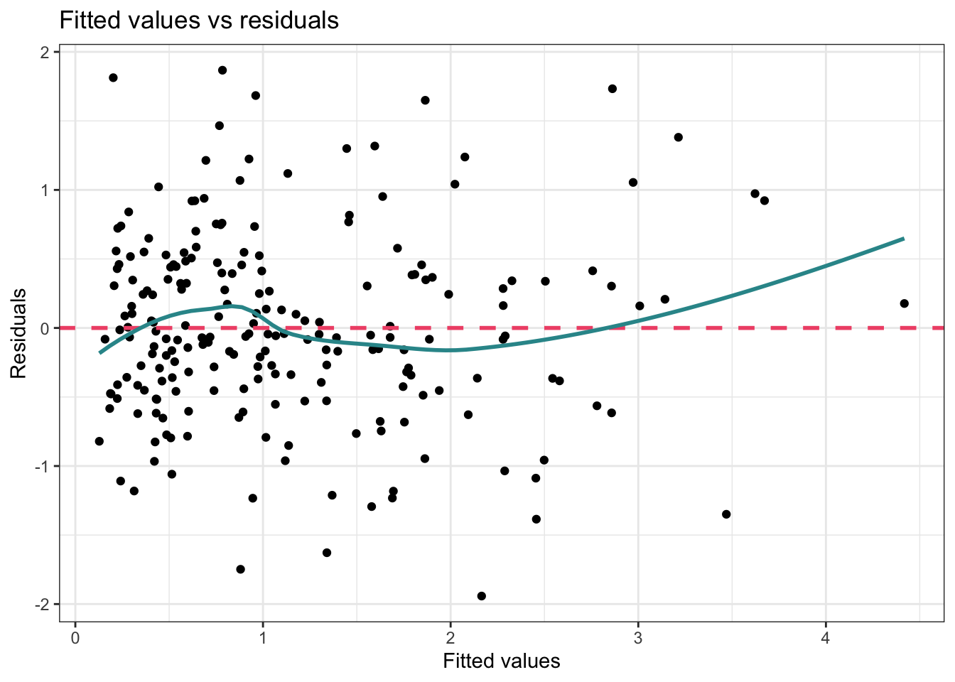
In this graph, the pink dashed line is simply marking the center of the residuals, that is, it’s a reference line representing zero residual error. If there was no error in predicting the outcome (i.e., we perfectly predicted the outcome for each case), then all the points would fall on this line. Of course, that’s not realistic. Instead, we hope to see that the residuals are randomly scattered around this line.
The blue curve produced by the geom_smooth() function is a loess smoother and serves to visually depict any patterns in the residuals. Ideally, this line should be similar to the pink dashed line. If it shows a pronounced curve or wave-like form, this is an indication of non-linearity. In this example, the blue line isn’t exactly on top of the pink dashed line — but the difference is relatively minor. The area of largest departure is for large fitted values (i.e., people for whom our model predicts a long sentence length). There are few people out in the right-hand tail for sentence length, and therefore, the loess smooth curve doesn’t have a lot of data to go on — therefore, it’s typical to see more wobble or variation in the shape of the curve for extreme values, and we shouldn’t read too much into this.
One common reason for a pattern to emerge in this type of plot is that the relationship between the outcome and one or more of the predictors is non-linear (i.e., curvilinear). In this case — the model should be re-specified. The analyst should consider the need for non-linear transformations or for non-linear effects to be specified. The possibility that there are interactions between variables should also be considered if a systematic pattern is observed in the Fitted Values vs Residuals Plot.
Recall that Blair and colleagues implemented a number of techniques for dealing with the possibility of a non-linear relationship. First, noting the severe skew of the outcome — sentence length in years — they applied a non-linear transformation to this variable. That is, they took the natural log of years and then used log sentence length as the outcome in the fitted model. Second, as part of their theory for the manner in which the crime severity variables should be related to sentence length, they included polynomial terms for the severity of crime predictors.
Let’s take a peak at what the Fitted Values vs Residuals Plot would look like had they not taken these actions:
mod3_naive <- lm(years ~ primlev_m + seclev_m + nsecond_m + priorlev_m + nprior_m +
             black_m +
             afro_m,
           data = sentence)

mod3_naive |>
  augment(data = sentence) |>
  ggplot(mapping = aes(x = .fitted, y = .resid)) +
  geom_point() +
  geom_hline(yintercept = 0, linetype = "dashed", linewidth = 1, color = "#F05676") +
  geom_smooth(method = "loess", formula = y ~ x, se = FALSE, color = "#2F9599") +
  labs(x = "Fitted values",
       y = "Residuals",
       title = "Fitted Values vs Residuals Plot") +
  theme_bw()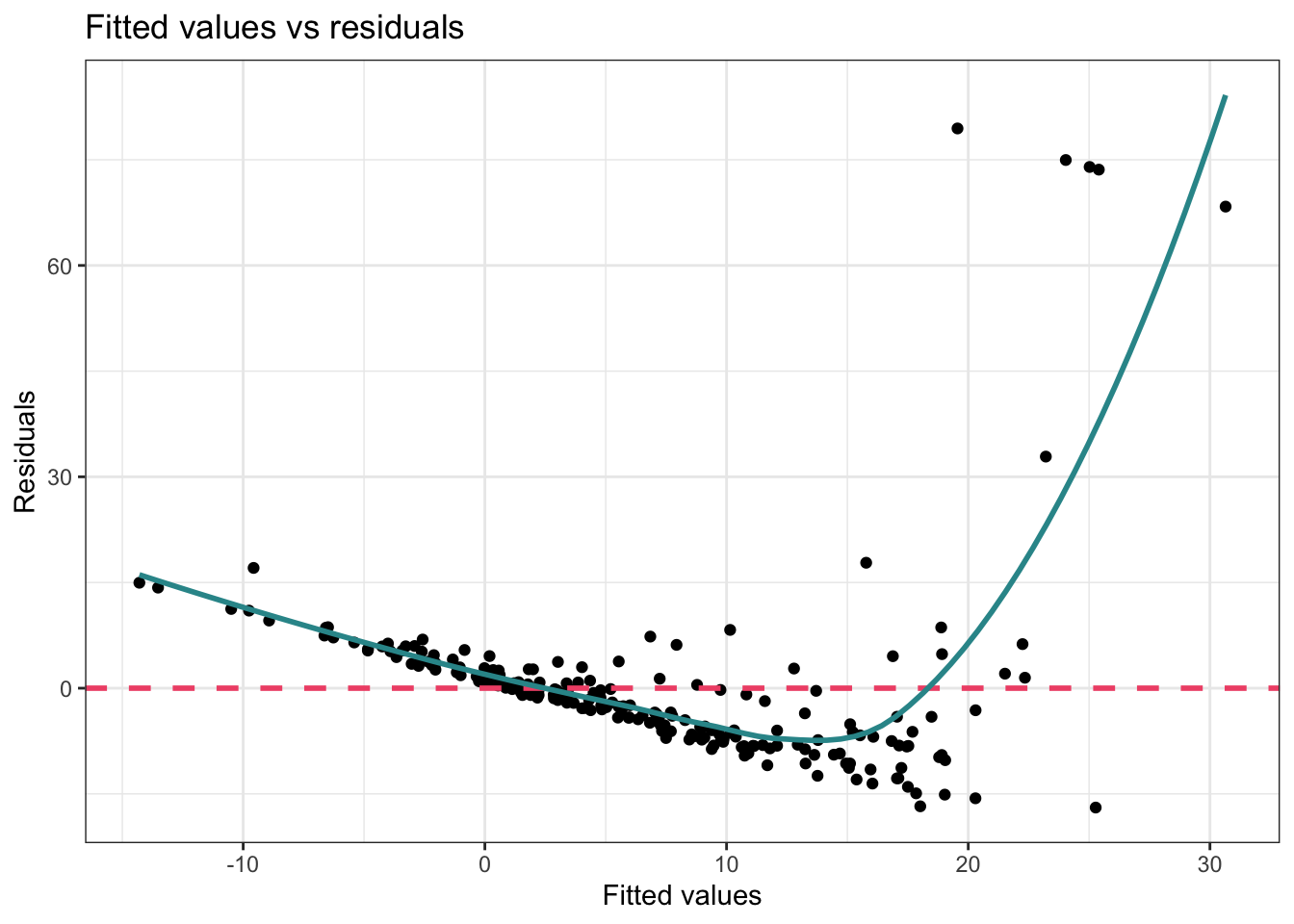
In this version of the graph — you can clearly see that the data points are not evenly distributed around the pink dashed line — and the blue line clearly shows a systematic relationship with the residuals. Therefore, the authors’ strategy to apply the non-linear transformation to the outcome, and to include polynomial terms to allow for a curvilinear effect of severity of crimes on log sentence length was effective.
Added variable plot
Besides just looking at the Fitted Values vs Residuals Plot, it’s also worthwhile to take a look at the Added Variable Plot for our key predictor (Afrocentric features) and the outcome (log sentence length) to ensure that the relationship between these two variables is indeed linear after accounting for the control variables. This is important because the interpretation of the effect of Afrocentric features on log sentence length is assumed to be linear controlling for the covariates — that is, each one unit increase in Afrocentric features should have the same effect on log sentence length whether we consider a difference between 1 and 2, 4 and 5, or 8 and 9.
Let’s take a look at the Added Variable Plot for afro_m and lnyears.
y_resid <- lm(lnyears ~ primlev_m + primlev2 + seclev_m + seclev2 +
                nsecond_m + priorlev_m + priorlev2 + nprior_m +
                black_m,
             data = sentence) |>
  augment(data = sentence) |>
  select(id, .resid) |>
  rename(y_resid = .resid)

x_resid <- lm(afro ~ primlev_m + primlev2 + seclev_m + seclev2 +
                nsecond_m + priorlev_m + priorlev2 + nprior_m +
                black_m,
             data = sentence) |>
  augment(data = sentence) |>
  select(id, .resid) |>
  rename(x_resid = .resid)

check <-
  y_resid |>
  left_join(x_resid, by = "id")

check |>
  ggplot(mapping = aes(y = y_resid, x = x_resid)) +
  geom_point() +
  geom_smooth(method = "lm", formula = y ~ x, se = FALSE, color = "#2F9599") +
  theme_minimal() +
  labs(title = "Added Variable Plot",
       subtitle = "lnyears ~ afro | control variables")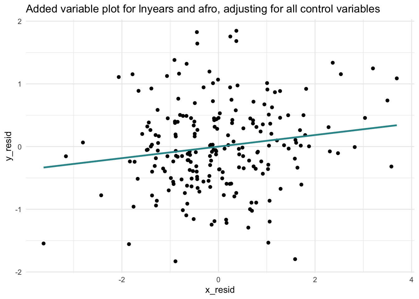
An Added Variable Plot (AVP) allows you to visually assess the linearity, magnitude, and strength of the relationship between your predictor of interest and the outcome, while taking into account the effects of other predictors.
What are we looking for?
In a well-specified model, we should find:
A linear pattern; the points should scatter around a straight line (either positive or negative slope depending on the direction of the relationship — or a horizontal line if there is no relationship between the key predictor and the outcome).
If there is a nonlinear pattern in the scatter, it suggests that the relationship between the predictor and the outcome is not linear and the linearity assumption is violated.
The AVP above provides evidence that the relationship is indeed linear — the best fit line (the blue line) seems to do a good job of capturing the unique relationship between Afrocentric features and log sentence length after adjusting for the control variables.
An AVP plot is also useful for assessing additivity. Additivity refers to the assumption that each predictor contributes to the prediction of the outcome in an additive manner. This assumption will be violated if two (or more) variables interact to predict the outcome.
Recall that Blair and colleagues tested for the possibility that Afrocentric features and race may interact to predict the sentence length (this was Model 4 in their paper). They did not find evidence of an interaction. Still, let’s create a plot that considers the possibility that the effect of Afrocentric features on log sentence length, adjusting for the control variables, could differ by race.
Notice that I’m fitting the same two models as before for the AVP to obtain the y- and x- residuals — but, I’m excluding the predictor black this time. Excluding this variable will facilitate the creation of two AVPs — one for White inmates and one for Black inmates.
y_resid <- lm(lnyears ~ primlev_m + primlev2 + seclev_m + seclev2 +
                nsecond_m + priorlev_m + priorlev2 + nprior_m,
             data = sentence) |>
  augment(data = sentence) |>
  select(id, black, .resid) |>
  rename(y_resid = .resid)

x_resid <- lm(afro ~ primlev_m + primlev2 + seclev_m + seclev2 +
                nsecond_m + priorlev_m + priorlev2 + nprior_m,
             data = sentence) |>
  augment(data = sentence) |>
  select(id, .resid) |>
  rename(x_resid = .resid)

check <-
  y_resid |>
  left_join(x_resid, by = "id")

check |>
  mutate(black.f = case_when(black == 0 ~ "White", black == 1 ~ "Black")) |>
  ggplot(mapping = aes(y = y_resid, x = x_resid)) +
  geom_point() +
  geom_smooth(method = "lm", formula = y ~ x, color = "#2F9599") +
  facet_wrap(~ black.f) +
  theme_minimal() +
  labs(title = "Added Variable Plot",
       subtitle = "lnyears ~ afro | control variables by race")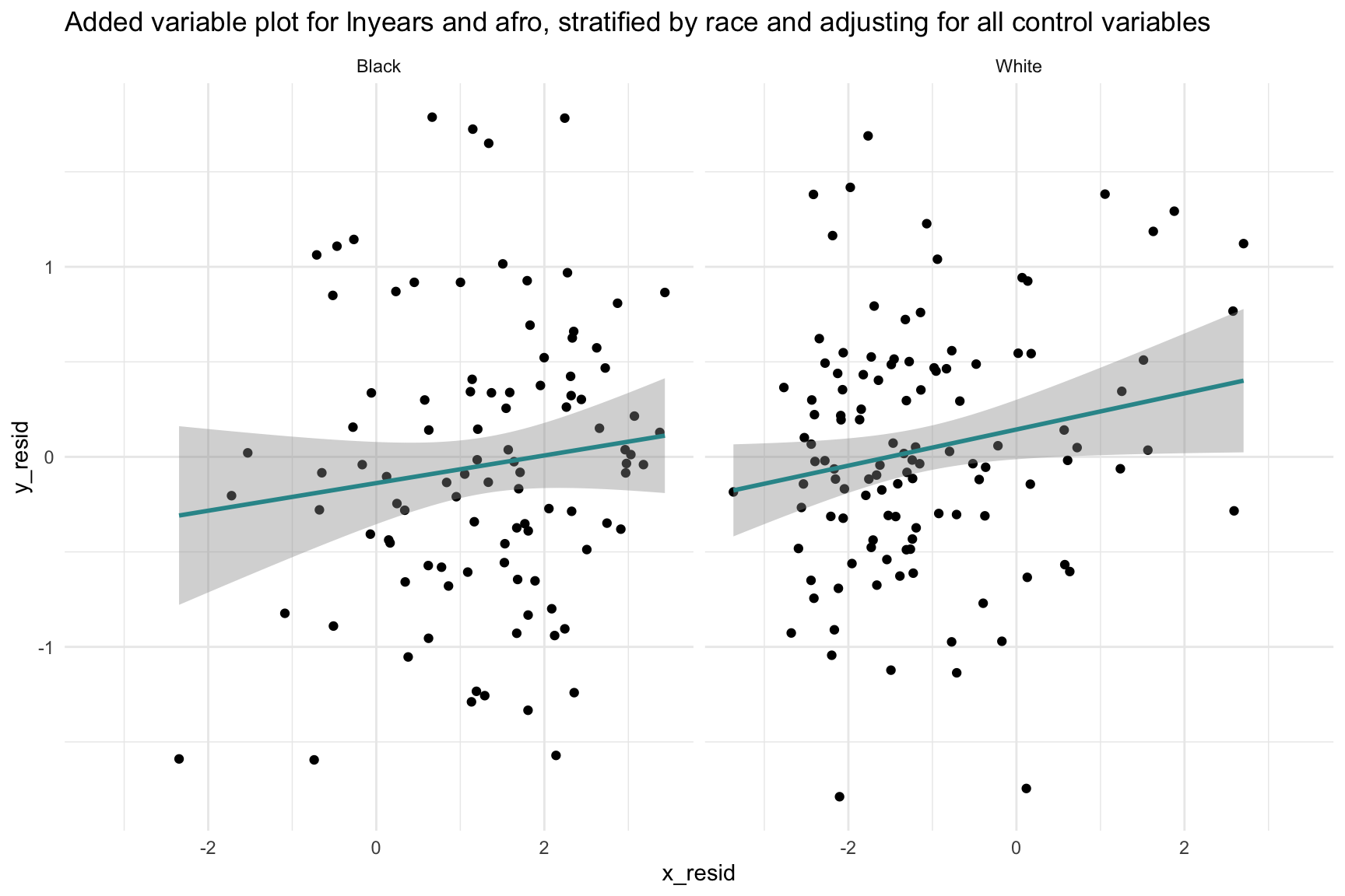
This plot shows that the relationship between Afrocentric features and log sentence length, adjusting for the control variables, is similar for Black and White offenders. If the best fit lines were different from one another (e.g., in one group the relationship was positive, and in another negative) — then that would suggest the need for an interaction between race and Afrocentric features.
In sum, based on our exploration, there is no clear sign of a non-linear pattern nor a non-additive pattern to the plots — suggesting that the assumptions of both linearity and additivity are met in the fitted model.
Remediation efforts
If the assumption of linearity is violated in a regression model, there are several strategies you can consider:
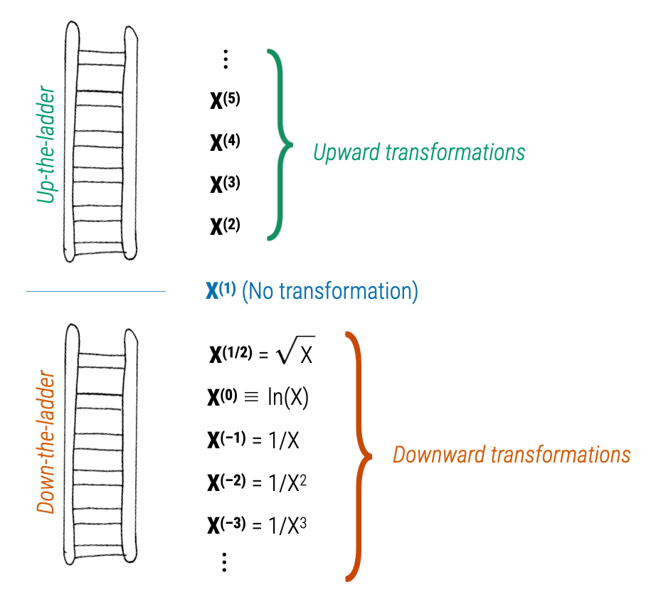
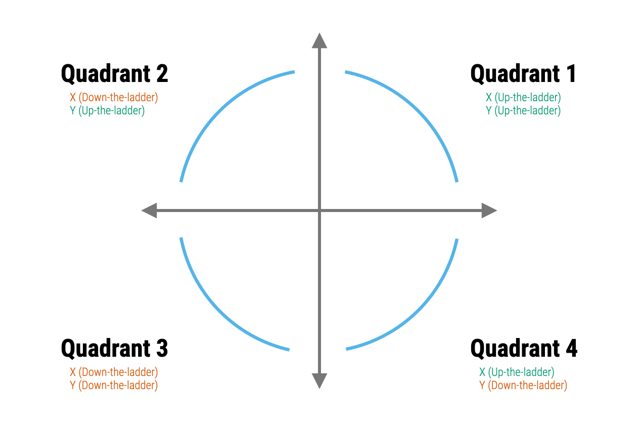
- Data transformation: One common approach is to transform the variables in your model. This can sometimes make the relationship between the predictors and the outcome more linear and can also help to meet the assumption of additivity. Logarithmic, square root, or inverse transformations are commonly used. Mosteller and Tukey’s Rule of the Bulge can help to identify an appropriate transformation. To apply the rule, one plots the data, identifies if there is a “bulge” in the scatter plot — that is, a curvature. Depending on the direction of the bulge, the analyst can then apply a transformation to one or both of the variables. The ladder and graph below depict the Rule. On the right are four different patterns of nonlinearity (i.e., the blue curves). Identify which curve most closely matches the non-linear pattern of the data, then apply one of the suggested transformations (e.g., up in x, down in x, up in y, or down in y). The ladder figure to the left offers suggestions for the up and down transformations. For example, a square is an up transformation (it makes the values larger), while a log is a down transformation (it makes the values smaller). The approach is to apply the transformations suggested, re-plot the data with the transformed variable(s), and repeat until the scatter plot looks more linear.
- Polynomial regression: You can add polynomial terms of your predictors to capture non-linear effects. For example, if the plot of residuals versus the fitted values shows a U-shaped pattern, this could be addressed by adding a squared term of the predictor to the model.
If the assumption of additivity is violated — that is, if the effect of one predictor depends on the level of another — then your model needs to explicitly account for those interactions.
Homoscedasticity
Homoscedasticity is a key assumption in regression analysis that refers to the constant variance of residuals (error terms) across all levels of the predicted values or predictor variables. In simpler terms, the spread of the residuals should remain roughly the same no matter what the predicted value is.
When this assumption holds, the model is considered well-specified in terms of error variance, which helps ensure that statistical inferences — such as hypothesis tests and confidence intervals — are valid and trustworthy.
A violation of this assumption is called heteroscedasticity, which occurs when the variability of the residuals changes across different levels of a predictor or fitted value. For instance, you might observe a fan-shaped pattern in a residual plot, where the spread of residuals increases or decreases systematically as fitted values increase. Heteroscedasticity can cause issues for the standard errors of your coefficients, which can in turn lead to incorrect conclusions about your results.
Fitted values vs residuals plot
To examine this assumption the Fitted Values vs Residuals Plot that we created when assessing the linearity assumption can be used. Let’s take another look at this plot.
eval |>
  ggplot(mapping = aes(x = .fitted, y = .resid)) +
  geom_point() +
  geom_hline(yintercept = 0, linetype = "dashed", linewidth = 1, color = "#F05676") +
  geom_smooth(method = "loess", formula = y ~ x, se = FALSE, color = "#2F9599") +
  labs(x = "Fitted values", y = "Residuals",
       title = "Fitted Values vs Residuals Plot") +
  theme_bw()
If the assumption of homoscedasticity is met in your regression model, the scatter plot of residuals versus fitted values will exhibit a random scattering of points around zero, forming a sort of cloud that is spread evenly across all levels of the fitted values. This means the variability in residuals stays roughly the same as you move along the range of fitted values. Plotting the residuals against the fitted values provides a “global” look at homoscedasticity — but you can also plot the residuals against each of your individual predictors. In all cases, you should find that the residuals are evenly spread across the range of scores for your predictor.
In our example to test Blair’s Model 3 the scatter plot of residuals versus fitted values exhibits a random scattering of points around zero, forming a cloud that is spread evenly across all levels of the fitted values. Therefore, we have evidence that the assumption of homoscedasticity is met.
If the assumption of homoscedasticity is violated, you’ll see patterns in the scatter plot that indicate heteroscedasticity. Here are a few typical forms this could take:
Funnel Shape or Cone Shape: The scatter of points widens or narrows as you move along the x-axis. This could mean that the variability of the residuals is increasing or decreasing as the value of the predictor increases. The funnel could open either way — it could be narrow at the bottom and wide at the top, or vice versa.
U-Shape or Inverted U-Shape: The residuals spread wider in the middle of the fitted values range or at the extremes. This is often a sign that a quadratic (i.e, polynomial) term might be missing from your model.
Wave-like or Curvy Patterns: Systematic wave-like patterns in residuals suggest non-linear relationships between predictors and the outcome.
Remediation efforts
If heteroscedasticity is detected in your data, there are several strategies to address it:
Data Transformation: The simplest way to deal with heteroscedasticity is to transform your outcome variable. Common transformations include taking the log, square root, or reciprocal of the outcome variable. However, it’s important to note that these transformations also alter the interpretation of your model.
Weighted Least Squares: If you have some idea about the nature or structure of the heteroscedasticity, you might be able to use this information to give more weight to the observations with smaller error variances in your model. This is the idea behind weighted least squares (WLS). The challenge here is accurately specifying the weights. Click here for a tutorial on how to conduct WLS in R if interested.
Heteroscedasticity-Consistent Standard Errors: If the main concern is the reliability of inference (e.g., hypothesis tests or confidence intervals), another common approach is to calculate heteroscedasticity-consistent standard errors, often known as “robust standard errors”. This method does not transform the data or the model but instead adjusts the standard errors of the coefficients to account for heteroscedasticity. Click here if you are interested in directions on fitting this type of model in R.
Bootstrap Resampling: Bootstrapping confidence intervals is another option to consider when dealing with heteroscedasticity. The bootstrap is a resampling method that can be used to obtain robust estimates of standard errors and confidence intervals. This method does not require any assumptions about the form or nature of the heteroscedasticity, which can make it a good option in many cases. You’ve had a few opportunities to learn about bootstrapping in this course. Additionally, there is an example of a bootstrap regression model at the end of this Module.
Adding explanatory variables or interaction terms: In some cases, heteroscedasticity may be a symptom of omitted variables or interaction terms in the model. If some subgroups have more variance than others, or if the variance is related to the value of one of the predictors, adding the right variables or terms to your model may help.
Each method has its own strengths and weaknesses, and the best choice often depends on the specifics of the data frame and the research question. If multiple methods seem feasible, it’s not a bad idea to try several and see if the results are sensitive to the choice of method. In many cases, the most important thing is to be transparent and thoughtful about the issue, rather than simply ignoring it.
Normally-distributed residuals
The assumption of normality of residuals in a linear regression model is the idea that the residuals, or error terms, follow a normal distribution. This assumption is important because many of the inferential statistics associated with linear regression, such as the t-statistic for significance of coefficients, are based on the assumption of normality. These statistics may not have a valid interpretation if the residuals are not normally distributed.
Histogram of residuals
To check this assumption, we can create a histogram of the residuals:
eval |>
  ggplot(mapping = (mapping = aes(x = .resid))) +
  geom_histogram(bins = 30) +
  theme_minimal() +
  labs("A check of the normality of the residuals from the fitted model")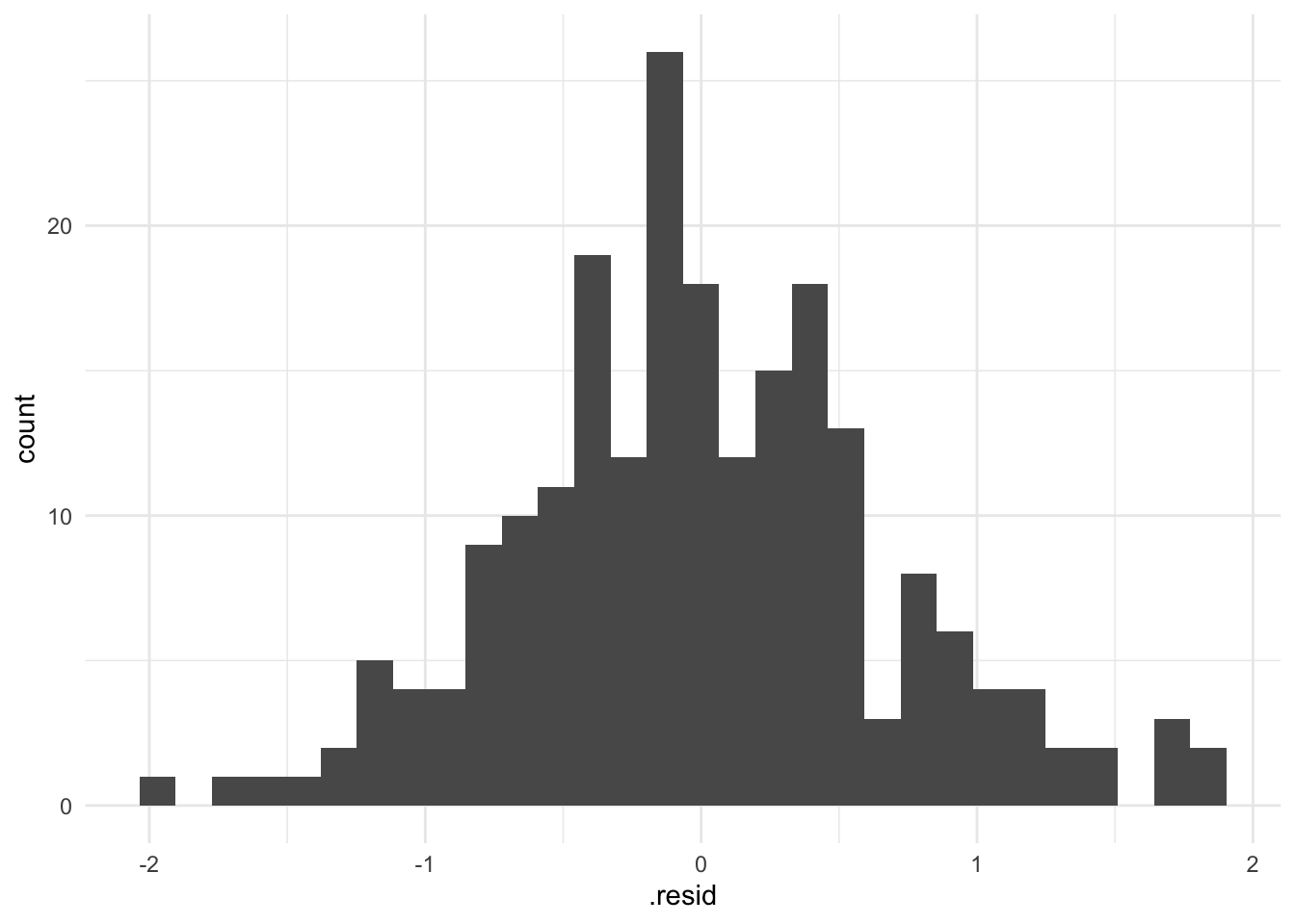
This plot looks reasonably normally distributed. A plot with clear skew in one direction or the other or with extreme scores far from the others, would be a sign of a potential problem.
Remediation efforts
If the normality assumption is violated, there are a few strategies you can consider:
Data transformation: For example, if your outcome variable has a skewed distribution, applying a logarithm, square root, or inverse transformation might help to make the residuals more normally distributed.
Non-linear models: If the relationship between your predictors and outcome is not linear, and transformations do not work, then linear regression might not be the best modeling choice. This means that the assumption of a straight-line relationship between the predictors and the outcome does not hold true. In such cases, a linear model will not adequately capture the underlying patterns in the data, leading to poor predictions and potentially misleading conclusions. Depending on your specific research question and data, a generalized linear model (GLM) might be more appropriate than a general linear model (i.e., the model we fit with the lm()). GLMs extend linear models to allow for response variables that have error distribution models other than a normal distribution. For instance:
Logistic Regression: If your outcome variable is binary (e.g., success/failure, yes/no), logistic regression is a type of GLM that models the probability of the outcome as a function of the predictors. This is commonly used in medical research to model the presence or absence of a disease based on various risk factors.
Poisson Regression: If your outcome variable represents count data (e.g., the number of times an event occurs), Poisson regression is suitable. This is often used in fields like epidemiology to model the number of occurrences of a disease or condition within a specific period.
Exponential Regression: When modeling time-to-event data (e.g., survival analysis), exponential regression can be used to model the relationship between predictors and the time until an event occurs.
In summary, if non-linear transformations of your predictors do not result in a linear relationship with the outcome, you should consider generalized linear models that are more suited to the nature of your data and research question.
Robust methods: There are a number of statistical methods that are robust to violations of the normality assumption. These include non-parametric tests, bootstrap methods, and robust regression methods.
The assumption of normality applies to the residuals, not the variables themselves. There is a common misconception that the variables (predictors and outcomes) must be normally distributed — but that is not the case. Moreover, the Central Limit Theorem assures us that, with a large sample size, the sampling distribution of the residuals will be approximately normally distributed, regardless of the distribution of the residuals in the sample. Therefore, in large samples, minor violations of the normality assumption are often not a major concern.
Evaluate other potential issues
Influential cases
In regression analysis, it’s important to identify influential observations or cases that could unduly affect the model’s estimates and predictions. These cases can significantly skew the direction and strength of the relationships between predictors and the outcome variable. Influential cases may arise due to various reasons such as outliers in the predictor or outcome variables (i.e., extreme scores), data entry errors, or a small subset of the data that doesn’t align well with the overall pattern.
By identifying these influential cases, you can decide how to handle them and better understand the robustness of your model. For instance, you might investigate the data further to identify potential errors or unique aspects about these cases that warrant additional consideration. In some instances, these influential cases might lead you to modify your model or reevaluate its assumptions.
A Residuals vs Leverage Plot, is a diagnostic tool that helps us detect observations that might be unduly influencing the fitted model, also known as influential observations.
Let’s create the plot, then learn how to interpret it. All of the values needed for this plot are created with the augment() function results.
p <- length(coef(mod3))
n <- nrow(sentence)

eval |>
  ggplot(mapping = aes(x = .hat, y = .std.resid)) +
  geom_point(mapping = aes(size = .cooksd)) +
  geom_hline(yintercept = c(-2, 2), linetype = "dashed") +
  geom_vline(xintercept = 2*(p/n), linetype = "dashed") +
  labs(x = "Leverage", y = "Standardized residuals",
       title = "Residuals vs leverage") +
  theme_bw()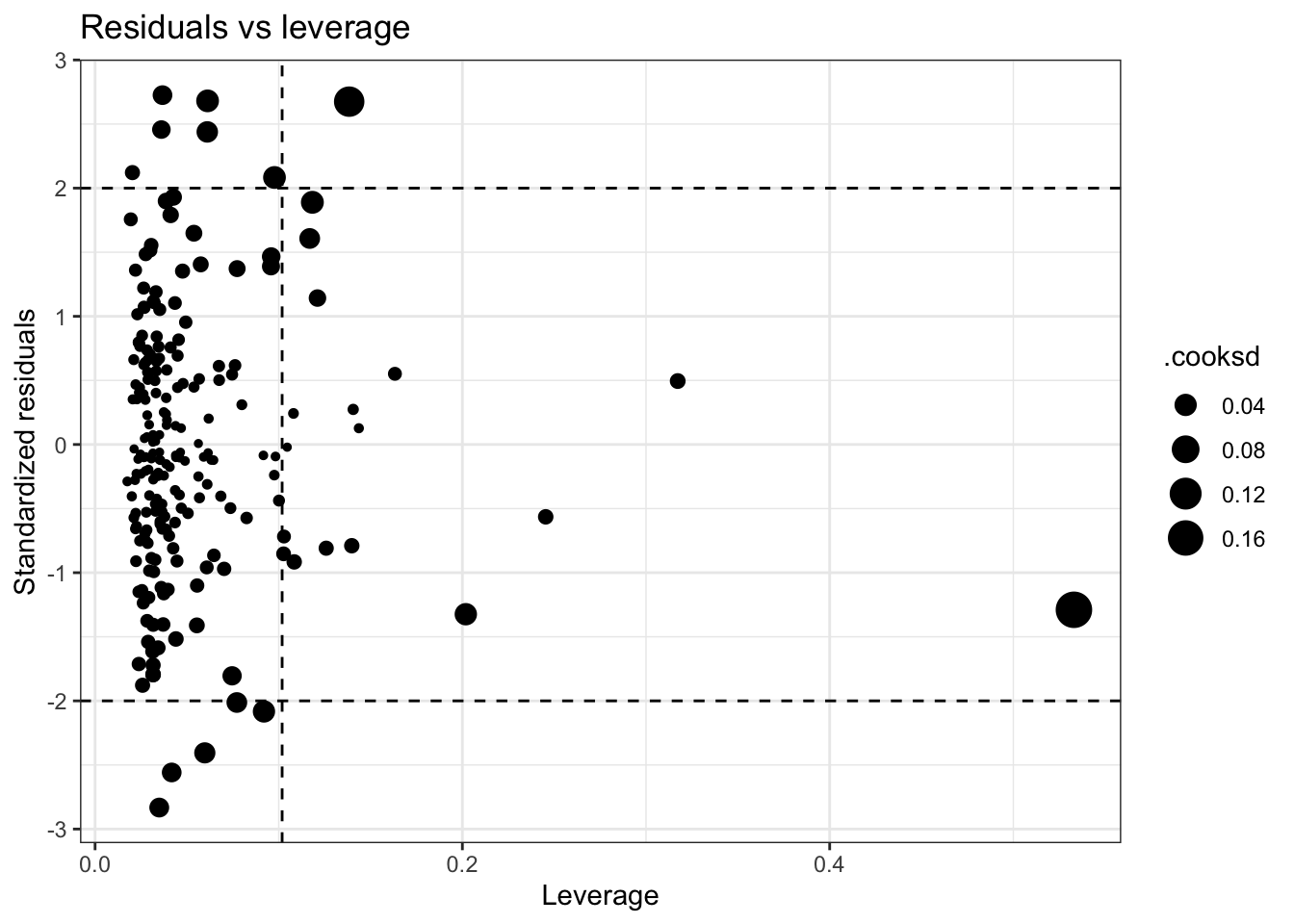
On the x-axis, we have leverage (called .hat in the augment() output), which measures how far the values of the predictor variables for an observation are from the mean of the predictor variables. The vertical dashed line marks the point of high leverage (which is 2*(p+1)/n; where p is the number of parameters (intercept + predictors) and n is the sample size). Observations located to the right of this line are considered as having high leverage.
On the y-axis, we have standardized residuals — called std.resid in the augment() output. This shows the distance between the actual and predicted values for each observation, but standardized to a mean of 0 and a standard deviation of 1 (i.e., a z-score). The horizontal dashed lines represent a cut-off of -2 and 2 standard deviations. Residuals falling outside this range can be considered as large residuals — though remember from the Empirical Rule that we expect about 5% of cases in a normal distribution to have a score outside of plus or minus 2 standard deviations from the mean. So, some points are fine — too many may be a problem.
The size of the points represents Cook’s distance (called .cooksd in augment()), which is a measure of the influence of each observation. Large values of Cook’s distance identify cases that could have a substantial impact on the location of the regression line. As a rule of thumb, a Cook’s distance larger than 1 is considered influential — but any value that is unusually large for the data frame should be inspected.
Together, the plot gives us a way to visualize the impact of each observation on the model. Observations that are in the top right or bottom right of the plot (i.e., cases with high leverage and a large residual) can be particularly influential in the regression analysis, and thus should be examined closely. Observations with large Cook’s distance (large points) are also worthy of further investigation.
In looking at our plot, there is one case that stands out as having a very large leverage and a large Cook’s distance. Let’s refit our plot and label the points by their ID.
p <- length(coef(mod3))
n <- nrow(sentence)

eval |>
  ggplot(mapping = aes(x = .hat, y = .std.resid)) +
  geom_point(mapping = aes(size = .cooksd)) +
  geom_hline(yintercept = c(-2, 2), linetype = "dashed") +
  geom_vline(xintercept = 2*(p/n), linetype = "dashed") +
  ggrepel::geom_label_repel(mapping = aes(label = id),
                            color = "grey35", fill = "white", size = 2, box.padding =  0.4,
                            label.padding = 0.1) +
  labs(x = "Leverage", y = "Standardized residuals",
       title = "Residuals vs leverage") +
  theme_bw()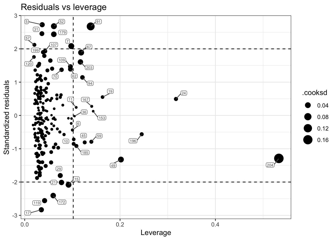
The case with ID 204 is the influential case. Let’s take a closer look at their data:
df |> filter(id == 204)Scanning through this individual’s raw data, you should see something that stands out. They have an unusually large score for nsecond (i.e., the number of secondary offenses). As we saw in our skim table earlier, the mean for this variable is 2.4, and the median is 1. Therefore, this person’s score is highly unusual. If this was our own study — we would want to check this case to ensure that there wasn’t a data entry error. If it’s a real, accurate value — then transforming the nsecond variable might be a viable choice. That is, given it’s extremely skewed distribution, taking a log transformation (like was done for sentence length) could be a prudent choice.
It’s important to note that identifying an observation as influential doesn’t mean it should be removed — it might be a correct and important part of your data. But it does mean you should check these points carefully for data errors, and consider the impact they are having on your results.
Multicollinearity
Multicollinearity occurs when two or more predictor variables in a multiple regression model are highly correlated, meaning that one predictor can be linearly predicted from a combination of the others with substantial accuracy.
This condition doesn’t bias the overall model fit or predictions, but it can cause several problems related to estimation and interpretation:
Unstable coefficient estimates: When predictors are highly correlated, the model struggles to separate their individual effects. This can lead to large standard errors for regression coefficients, making them sensitive to small changes in the data or model specification.
Misleading significance tests: Inflated standard errors reduce the size of the t-statistics, which can lead to failing to reject the null hypothesis even when a predictor is meaningfully related to the outcome.
Interpretation difficulties: Correlated predictors share explanatory power. This makes it harder to isolate the unique contribution of each predictor. In some cases — such as adjusting for a confounder — this is desirable. In others, it can obscure your understanding of how individual variables affect the outcome.
Risk of overfitting: Including multiple correlated predictors can result in a model that fits your data well but performs poorly on new data, reducing generalizability.
Despite its effects on coefficient estimates, multicollinearity is not necessarily a problem if your primary goal is prediction rather than interpretation. Predictive models can still perform well even when predictors are highly correlated, because multicollinearity does not affect the model’s overall fit or its ability to predict new outcomes—only the individual coefficient estimates and their standard errors.
During the planning stage of your analysis, it’s good practice to inspect the correlation matrix among your predictor variables (not between predictors and the outcome). If you find very high correlations (e.g., above 0.9) between predictors, you may consider removing or combining them, as they are likely redundant and could inflate standard errors or introduce numerical instability into the model.
Once you fit the model, you can check the Variance Inflation Factor (VIF) for each predictor. The VIF can be calculated for each predictor by regressing the predictor on all the other predictors. The VIF is then calculated using the \(R^2\) from the resulting model with the following formula:
\[\text{VIF} = \frac{1}{1-R^2}\]
Larger VIFs indicate higher multicollinearity.
For example, if only 1% of the variability in X1 could be predicted by the other predictors, \(R^2 = 0.01\), then the VIF would be \(\frac{1}{1-0.01} \approx 1.01\).
If 80% of the variability in X1 could be predicted by the other predictors \(R^2 = 0.80\), then the VIF would be \(\frac{1}{1-0.80} = 5\).
There are many rules of thumb for interpreting VIF values. Most commonly, a VIF of 5 is considered potentially problematic, and a VIF larger than 10 indicates serious multicollinearity issues. However, some experts set a lower threshold, such as 2.5, to indicate potential problems.
The performance package has a function called check_collinearity() that will calculate the VIFs.
mod3 |> performance::check_collinearity() |> select(Term, VIF) |> arrange(VIF)In our example, nearly all of the VIFs are low (not of concern). The two that reach a moderate level are the polynomial terms of the severity of the prior offense. The VIF is inflated when polynomial terms are included in a regression model. This is because polynomial terms (like \(x_i\) and \(x_i^2\)) are correlated with each other by their very nature. The same goes for interaction terms, which are essentially the product of two or more variables. So the multicollinearity in these instances doesn’t have adverse consequences. Another instance where VIF may be high, but not of concern, is for dummy-coded variables.
If multicollinearity is found to be a problem, you should go back to the correlation matrix and determine if there are very highly correlated predictors that you can exclude without eroding your theory or conceptual model.
Bootstrap resampling
As you’ve learned throughout this course, bootstrap resampling is a powerful, non-parametric tool that helps address certain violations of regression model assumptions — particularly when assumptions like homoscedasticity or normality of residuals are in doubt. Unlike traditional parametric methods, bootstrapping relies less on theoretical distributions and more on the data at hand.
By repeatedly resampling from the observed data and refitting the model, bootstrapping generates an empirical sampling distribution of the regression coefficients. This makes it especially effective for estimating uncertainty — such as standard errors and confidence intervals — even under non-ideal conditions. In short, bootstrapping provides a robust and flexible way to draw valid inferences without relying heavily on strict model assumptions.
However, it’s important to note that bootstrapping does not correct violations of linearity or additivity. These assumptions relate to the fundamental structure of the model, and violations suggest that the form of the model may be misspecified.
The code below demonstrates how to use bootstrap resampling to construct confidence intervals for Model 3 from the Blair and colleagues study.
# Define a function to calculate the statistics you want on each bootstrap sample
boot_fn <- function(data, indices) {
  sample <- data[indices, ]
  fit <- lm(lnyears ~ primlev_m + primlev2 + seclev_m + seclev2 + nsecond_m + priorlev_m + priorlev2 + nprior_m +
             black_m +
             afro_m,
            data = sample)
  coef(fit)  # returns a data frame with the coefficients and other model info
}

# Use the boot() function to perform the bootstrap resampling
set.seed(123)  # for reproducibility
boot_results <- boot(data = sentence, statistic = boot_fn, R = 5000)

# Calculate bootstrap confidence intervals using the boot.ci() function.
boot.ci(boot.out = boot_results, type = "bca", index = 11) # regression estimate for afro_m
BOOTSTRAP CONFIDENCE INTERVAL CALCULATIONS
Based on 5000 bootstrap replicates
CALL :
boot.ci(boot.out = boot_results, type = "bca", index = 11)
Intervals :
Level BCa
95% ( 0.0127, 0.1716 )
Calculations and Intervals on Original ScaleIf you compare the 95% CI for afro_m produced here via bootstrap resamples (0.01, 0.17) to the CI produced using the traditional method — you’ll find that they are nearly identical to one another — indicating that the key assumptions for inference are likely met here.
Learning Check
After completing this Module, you should be able to answer the following questions:
- What are the six key assumptions underlying a linear regression model, and which are most critical?
- How do fitted values vs. residuals plots help check for linearity, additivity, and homoscedasticity?
- What is an Added Variable Plot, and what does it tell us about the unique linear relationship between a predictor and outcome?
- How can data transformations and polynomial terms be used to address violations of the linearity or additivity assumptions?
- What does heteroscedasticity look like in a residual plot, and why is it a problem for inference?
- How can bootstrap resampling help when assumptions of homoscedasticity or normality are in doubt?
- What is multicollinearity, and how can it affect the interpretation of regression coefficients?
- How is the Variance Inflation Factor (VIF) calculated, and what values are considered problematic?
- How can you identify influential observations using the Residuals vs Leverage Plot, and what role does Cook’s Distance play?
Credits
I drew from the excellent book called Regression and Other Stories by Drs. Andrew Gelman, Jennifer Hill, and Aki Vehtari to create this Module, particularly Chapter 11 on assumptions, diagnostics, and model evaluation.