| Variable | Description | Type |
|---|---|---|
| age | Age of respondent | interval |
| marital_status | Marital status of respondent (only acertained for age >= 20). | nominal |
| education | Highest level of education completed (only ascertained for age >= 20) | ordinal |
| SBP | Systolic Blood Pressure in mm Hg (only measured for age >= 8) | ratio |
A No-Code Introduction to Describing Data
Module 2
Learning Objectives
By the end of this Module, you should be able to:
- Identify whether a variable is categorical or numeric
- Summarize categorical variables using counts and proportions
- Summarize numeric variables using mean, median, and standard deviation
- Describe the distribution of a numeric variable in terms of center, spread, and shape
- Compute standardized scores (i.e., z-scores)
Overview
This Module introduces the foundational concepts of descriptive statistics — the tools we use to summarize and describe data. These tools help us make sense of raw information by highlighting key patterns and trends. To begin, we’ll focus on developing your conceptual understanding of these ideas, without requiring any code, to provide a strong foundation for the rest of the course.
But before we can summarize data, we need to think carefully about where that data comes from. Every set of data is built on decisions about what to measure and how to measure it — choices that directly affect what our summaries mean. The quality and usefulness of any statistical summary depends on the quality of the underlying data.
That’s why we begin with measurement. Understanding how variables are defined and measured helps us interpret descriptive statistics more thoughtfully and critically.
Measurement
In this course, we’ll work with a variety of data frames drawn from topics in the social and behavioral sciences. Each data frame includes variables that represent key constructs of interest. While our primary focus will be on exploring and analyzing these variables, it’s important to remember that every variable reflects prior decisions about what to measure and how to measure it.
The way we assign numbers or labels to observations — our measurement choices — directly affects the reliability, validity, and interpretability of our findings. By examining how variables are measured, we can better understand their strengths and limitations, and be more alert to potential sources of bias.
So what do we mean by measurement? Measurement is the process of assigning numbers or labels to characteristics of people, objects, or events. Here are a few simple examples of measurements:
- “My height is 70 inches.” (numeric)
- “I am married.” (label)
- “I have 0 children.” (numeric)
- “I am employed full time.” (label)
- “I average 8 hours of sleep per night.” (numeric)
These are fairly straightforward to measure, using either a finite set of labels or numeric values. But many of the concepts we study in the social and behavioral sciences are more complex. For example:
- An Industrial-Organizational Psychologist might be interested in work-life balance.
- A Clinical Psychologist might study recovery from a traumatic event.
- A Cognitive Psychologist might investigate information processing bias.
How do we measure such abstract concepts in a meaningful and rigorous way?
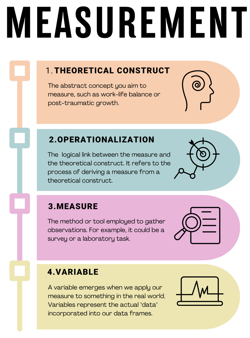
Operationalization of our concepts
When researchers measure complex concepts, they rely on a process known as operationalization—transforming abstract ideas into clearly defined and measurable variables. Take, for example, the concept of anxiety. While anxiety is intuitively meaningful to us, it can be vague or ambiguous in a research context unless we clearly specify how we plan to measure it. Operationalization involves three critical steps:
Precisely defining what is being studied: First, we clearly define the concept we want to measure. For example, if studying anxiety among college students, we must specify what “anxiety” means in this context — perhaps as persistent worry, physical tension, or nervousness about academic performance.
Determining the measurement method: Next, we choose how we’ll gather information about the defined concept. For anxiety, we could use self-report surveys (e.g., asking students to rate their feelings of nervousness or worry over the past month), observational methods (e.g., trained observers rating visible signs of anxiety during exams), or physiological measurements (e.g., recording heart rate or cortisol levels).
Establishing the set of allowable values for the measurement: Finally, we must define what responses or values are possible and meaningful. In a self-report survey measuring anxiety, participants might select from options on a scale from “Never” to “Always” when asked how frequently they experience certain feelings. Alternatively, for categorical measurement, we might classify students into groups such as “low anxiety,” “moderate anxiety,” and “high anxiety” based on their survey scores.
Understanding measurement in research involves recognizing the connections among four key concepts. The visual guide below illustrates the steps from conceptualizing abstract ideas, like work-life balance, through operationalizing these concepts into measurable forms, selecting appropriate methods to capture observations, and finally, creating the variables that represent our actual data.
Measuring with confidence: Validity and Reliability
When we collect data about psychological concepts, it’s crucial that our measurements are accurate (validity) and consistent (reliability). These two properties help ensure that our findings are trustworthy and meaningful.
Validity: Are we measuring what we think we’re measuring?
Measurement validity refers to whether a measurement accurately captures the concept it is supposed to measure. Valid measurements lead to meaningful results. Let’s continue using anxiety among college students as an example to illustrate different types of validity:
Content Validity:
Does the measure cover all important aspects of the concept?
Example: An anxiety questionnaire with strong content validity would include various anxiety symptoms, such as worry, tension, sleep issues, and concentration problems. Missing key symptoms would reduce content validity.Construct Validity:
Does the measure behave as expected based on theory?
Example: An anxiety questionnaire should correlate strongly with other established anxiety scales (convergent validity) but show weaker correlations with unrelated measures, like optimism (discriminant validity).Criterion Validity:
Does the measure match an established standard or predict relevant outcomes?Concurrent Validity:
Does the measure distinguish between groups who currently differ in anxiety?
Example: Students diagnosed with anxiety disorders should score higher than students without anxiety disorders on your measure.Predictive Validity:
Can the measure predict future outcomes associated with anxiety?
Example: Higher anxiety scores might predict poorer academic performance or greater use of mental health services.
Cultural and Contextual Validity:
Is the measure meaningful and appropriate for diverse groups and contexts?
Example: Anxiety symptoms might look different across cultures, so surveys must be clear, culturally relevant, and understandable to diverse groups of college students.
By carefully considering these aspects of validity, researchers ensure their measures accurately capture the concepts they’re studying.
Reliability: Can we trust our measures to be consistent?
Measurement reliability means the measure gives consistent results when used repeatedly under similar conditions. Reliable measurements ensure that differences we observe in scores reflect real differences, not random error.
Let’s use our anxiety example again to illustrate different kinds of reliability:
Test-Retest Reliability:
Does the measure give consistent results when used multiple times with the same people under similar conditions?
Example: Students who complete an anxiety survey twice in a short time (e.g., one week apart) should have similar scores if their anxiety level hasn’t changed. Strong agreement between the two sets of scores indicates high test-retest reliability.Internal Consistency Reliability:
Do items on a survey consistently measure the same underlying concept?
Example: A good anxiety questionnaire should have items (questions) that all consistently reflect anxiety. Researchers often use statistics (like Cronbach’s alpha) to check internal consistency — high internal consistency means the items reliably capture the concept of anxiety.Inter-Rater Reliability:
Do different observers or raters consistently agree on their ratings?
Example: If anxiety is measured by observers rating students’ behaviors during stressful tasks (e.g., exams), multiple trained observers should provide similar scores for the same students.Parallel Forms Reliability (Alternate Forms Reliability):
Do two different versions of a measure provide similar results?
Example: Two slightly different anxiety surveys that measure the same symptoms should produce similar results when given to the same students.
Reliability gives researchers confidence in their measurement results. However, reliability alone isn’t enough — measures must also be valid to be truly useful. A good measurement tool must consistently and accurately capture the concept it’s intended to measure.
Types of Variables
Types of Variables
In data science and in your own research, you’ll encounter different types of variables. Understanding these distinctions is essential for proper data exploration and analysis.
Scales of Measurement
Variables are categorized according to their scale of measurement. These scales help clarify how to appropriately analyze and interpret different types of data.
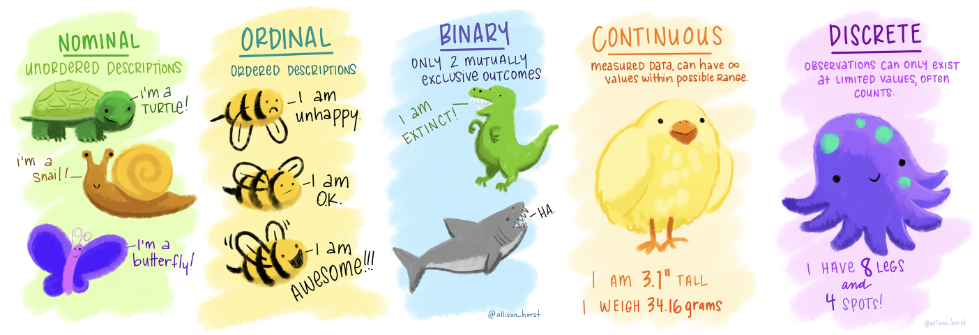
Nominal Variables
Nominal variables are categorical variables representing distinct groups or categories that don’t have a natural order or ranking. Because they represent qualitative differences, nominal variables are also called qualitative or categorical variables.
Examples:
Gender (e.g., man, woman, non-binary)
Ethnicity (e.g., Asian, African American, Hispanic)
Political affiliation (e.g., Democrat, Republican, Independent)
Ordinal Variables
Ordinal variables are categorical variables with categories that have a clear, meaningful order or ranking. Unlike nominal variables, ordinal categories show a progression, though the differences between categories aren’t necessarily equal or quantifiable.
Examples:
Education level (e.g., high school, bachelor’s degree, master’s degree)
Satisfaction ratings (e.g., very satisfied, somewhat satisfied, neutral, somewhat dissatisfied, very dissatisfied)
Continuous Variables
Continuous (or quantitative) variables are numeric variables that can take on an unlimited number of values within a given range. They allow researchers to capture very precise differences between individuals or observations.
Continuous variables are usually classified into two types: interval and ratio. The key difference is whether the variable has a meaningful zero point.
Interval Variables: Interval variables have meaningful differences between values, but they do not have a true zero point. Zero is arbitrary and doesn’t represent an absence of the attribute being measured.
Example: Temperature in Celsius or Fahrenheit. The difference between 20°C and 30°C is the same as between 30°C and 40°C. However, 0°C doesn’t mean an absence of temperature, so it’s not meaningful to say that 20°C is twice as hot as 10°C.
Ratio Variables: Ratio variables have meaningful differences between values and a true, meaningful zero point, indicating an absence of the attribute being measured. This means ratios (e.g., twice or half) are meaningful.
Example: Weight. A weight of 0 kg genuinely means “no weight,” so an object weighing 6 kg is indeed twice as heavy as one weighing 3 kg.
In practice, interval and ratio variables are often analyzed similarly, particularly in social and behavioral sciences. However, the distinction is important in contexts involving multiplication or division. For example, reaction time measured in milliseconds (a ratio variable) allows us to say one participant’s reaction is twice as fast as another’s. Conversely, a self-report stress scale from 0 to 100 (likely interval) doesn’t let us meaningfully claim that someone scoring 80 experiences twice as much stress as someone scoring 40, since the zero point isn’t absolute.
Common Examples of Continuous Variables:
- Height, weight, time, temperature
Additional Variable Distinctions
In addition to the primary scales described above, you’ll frequently encounter the following special types:
Binary Variables
Binary (or dichotomous) variables are a special kind of nominal variable with exactly two categories. These categories represent mutually exclusive options like “yes/no,” “true/false,” or “present/absent.”
When using binary variables in statistical analyses, they are often coded numerically as 0 and 1. This numeric coding is purely for convenience — it doesn’t imply any quantitative difference between categories.
Examples:
Pass/fail
Employed/unemployed
Treatment/control
Discrete Variables
Discrete variables are numeric variables that can only take on specific, countable values. They typically represent counts of items or occurrences. A key characteristic is that discrete variables can’t take on fractional or intermediate values.
Examples:
Number of children (0, 1, 2, 3…)
Number of visits to a website
Number of anxiety episodes in a week
Discrete variables differ from continuous variables, which can take on any value within a given range. While discrete variables represent distinct counts, continuous variables represent measurements that can be infinitely precise, such as height, weight, or time.
Introduction to the Data
Now that we’ve reviewed the basics of measurement and variables, we’re ready to explore some real-world data.
We will use data from the National Health and Nutrition Examination Study (NHANES). This national study is conducted by the Centers for Disease Control and Prevention, and is one of their surveillance initiatives to monitor the health and morbidity of people living in the US.

Note
Public health surveillance programs like the NHANES are essential for multiple reasons, as they play a critical role in understanding, monitoring, and improving population health.
Data Collection and Analysis: NHANES collects data through interviews and physical examinations to assess the health and nutritional status of adults and children in the United States. This data is vital for understanding various health conditions, dietary habits, and risk factors within the population.
Identifying Trends and Patterns: Surveillance programs help identify emerging health trends and patterns over time. For example, through NHANES, it is possible to observe changes in obesity rates, dietary intake, or prevalence of chronic diseases such as diabetes or hypertension. Recognizing these trends is crucial for public health planning and resource allocation.
Informing Policy and Programs: The data gathered through surveillance programs like NHANES is essential in informing public health policies and programs. Policymakers can use this data to understand which health issues need prioritization and to create evidence-based policies and interventions that address the identified needs.
Evaluating Interventions: Surveillance data is not only useful for informing policies and programs but also for evaluating their effectiveness. Through continuous monitoring, it is possible to assess whether implemented interventions are having the desired impact on population health and make necessary adjustments.
Identifying Health Disparities: NHANES and similar programs often collect data on various demographic groups, which is crucial in identifying and understanding health disparities among different populations. This information is vital for developing targeted interventions to address health inequalities.
Responding to Health Emergencies: Surveillance programs are crucial in identifying and responding to health emergencies such as outbreaks, epidemics, or other public health crises. For instance, monitoring trends in infectious diseases can help public health officials detect outbreaks early and respond more effectively.
Educating the Public and Health Professionals: The findings from NHANES and similar programs are often disseminated through various channels and used to educate both the public and health professionals about important health issues. This education is critical for promoting preventive health behaviors and informed decision-making.
Global Health Comparisons: Data from national surveillance programs like NHANES can be used in international comparisons to help understand how the health of the population in one country compares to others. This can be useful for global health initiatives and collaborations.
In conclusion, public health surveillance programs like NHANES are fundamental components of a robust public health system. They provide the necessary information and tools for public health officials, policymakers, healthcare professionals, and the general public to make informed decisions and take actions that promote and protect the health of populations.
In this Module, we will use NHANES data collected during 2011-20121. NHANES data are publicly available for download.
We’ll consider several variables from NHANES:
Here is a glimpse of the data. Notice that age and SBP are listed as R data type “double” - <dbl>, while marital status and education are listed as R data type “factor” - <fct>.
Rows: 5,000
Columns: 4
$ age            <dbl> 14, 43, 80, 80, 5, 34, 80, 35, 17, 15, 57, 57, 57, 57, …
$ marital_status <fct> NA, Single, Married, Married, NA, Married, Widowed, Mar…
$ education      <fct> NA, High School Graduate or GED, College Graduate, Coll…
$ SBP            <dbl> 107, 103, 97, 97, NA, 107, 121, 107, 108, 113, 110, 110…
Here are the first few rows of data for you to review. Notice that some people have an NA listed instead of an actual score or response. NA is R’s way of indicating a missing or unknown value. Why might values be missing?
In some cases, data are missing by design, meaning the researchers intentionally did not collect certain information from specific groups. For instance, NHANES researchers decided not to ask marital status or education questions to participants under 20 years old, because those questions weren’t relevant for children and adolescents. Similarly, they did not measure blood pressure in young children under age 8, as it’s not typically meaningful or practical for that age group.
In other situations, however, data may be missing for reasons outside the researchers’ control — these data are not missing by design. For example, a participant might refuse to answer certain questions, skip parts of a survey, or decline to undergo physical measurements. This type of missingness could follow certain patterns. For instance, if people who recently experienced a divorce are more likely to skip a marital status question, the missing data is linked to the underlying marital status itself.
The reason why data is missing matters greatly for analysis. We call this reason or pattern the missing data mechanism. If the missingness is random — unrelated to the underlying characteristics or values — then it’s usually easier to handle without biasing results. But if data is missing because of something related to the values being measured (like the divorced individuals not answering marital status questions), ignoring this pattern could bias our findings and lead to inaccurate conclusions. That’s why it’s important to carefully consider and understand why data is missing, and handle it appropriately in our analysis.
Describing Qualitative Data
When describing qualitative data (nominal and ordinal scales) the emphasis is on summarizing and presenting the distribution and characteristics of the different categories or ranks within the data. For example, among the 3,587 adults in the NHANES sample (i.e., age >= 20), a question pertaining to marital status (a nominal variable) and education (an ordinal variable) were ascertained.
We can describe the number (and percentage) of adults falling into each category for these variables. The table below accomplishes this.
| Characteristic | N = 3,5871 |
|---|---|
| Marital status | |
| Divorced | 352 (9.8%) |
| Live with Partner | 294 (8.2%) |
| Married | 1,896 (53%) |
| Single | 737 (21%) |
| Separated | 84 (2.3%) |
| Widowed | 222 (6.2%) |
| Unknown | 2 |
| Highest level of eduation achieved | |
| 8th Grade or Less | 212 (5.9%) |
| 9 - 11th Grade | 405 (11%) |
| High School Graduate or GED | 679 (19%) |
| Some College | 1,160 (32%) |
| College Graduate | 1,128 (31%) |
| Unknown | 3 |
| 1 n (%) | |
For example, 352 of the 3,587 NHANES adults were divorced. The percentage displayed in this table provides the percentage of divorced adults based on the number of people who responded to this question — which is 3,587 minus the 2 unknown (i.e., missing) cases or 3,585. To replicate the percentage, we take the number of people divorced divided by the number of people observed for marital status — that is 352/3,585 = 0.098, then we multiply this proportion by 100 to arrive at the percentage. That is, 9.8% of adults reported being divorced at the time of the study.
We might alternatively describe these data in a graph — for example a pie-chart is often used to describe nominal variables. The pie-chart below describes the data for marital status — again, among those with observed/known/non-missing (all terms for the same idea) data.
Describing Quantitative Data
When working with quantitative data — measured on interval or ratio scales — we have a wide range of descriptive statistics at our disposal. These allow us to summarize and explore patterns in the data more thoroughly than with categorical variables.
In this section, we’ll focus on data describing systolic blood pressure (SBP), which is the top number in a blood pressure reading. SBP reflects the pressure in the arteries when the heart contracts and pumps blood through the body. It’s a key indicator of cardiovascular health. Elevated SBP, known as systolic hypertension, is associated with increased risk of heart disease, stroke, kidney damage, and other serious health conditions.
A total of 4,281 participants have SBP observed in the data frame. The SBP of participants is expressed in the units of mm Hg (millimeters of mercury) — and is considered a continuous or quantitative variable.
A practical approach to summarizing SBP is to construct a frequency table, which efficiently organizes the data into intervals or bins. This method is particularly useful for quantitative variables like SBP, allowing us to categorize individuals based on their blood pressure readings.
For this exercise, we’ll categorize SBP into bins with a width of 5 mm Hg, starting from the minimum observed value of 79 mm Hg. Each bin represents an interval width of 5 mm Hg, grouping individuals whose SBP falls within that range. The table below includes three key pieces of information for each bin:
The bin (labelled SBP_bin): This column lists the bin range. Brackets [ ] indicate inclusive bounds, and parentheses ( ) indicate exclusive bounds. For example,
[79,84), means that the interval starts at 79 and goes up to, but does not include, 84. The last interval[219,224]is slightly different in that both endpoints are included, as indicated by the square brackets on both ends. This means all values from 219 up to and including 224 are part of this interval.Frequency (labelled frequency): This column indicates the total number of individuals whose SBP falls within a specific bin. For instance, if the bin spans from 79 to 84 mm Hg, and we have 14 individuals in this range, it means these 14 people have SBP values between 79 and 84 mm Hg.
Relative Frequency (labelled relative_frequency): This represents the proportion of the total sample found within each bin. To illustrate, if there are 14 individuals in the first bin and the total sample size is 4,281, then the relative frequency for this bin is \(\frac{14}{4281} = 0.0033\). Converting this proportion to a percentage provides a clearer picture: \(0.0033 \times 100 = 0.33\%\). Thus, 0.33% of the sample has an SBP within the range of 79 to 84 mm Hg.
By organizing SBP into bins and analyzing the frequencies and relative frequencies, we can easily visualize the distribution of SBP across the population.
While frequency tables are helpful, bar graphs provide a visual summary of the same information and make it easier to spot patterns in the distribution. Let’s take a look at two bar graphs to describe the data in the frequency table — one for the frequency and one for the relative frequency.
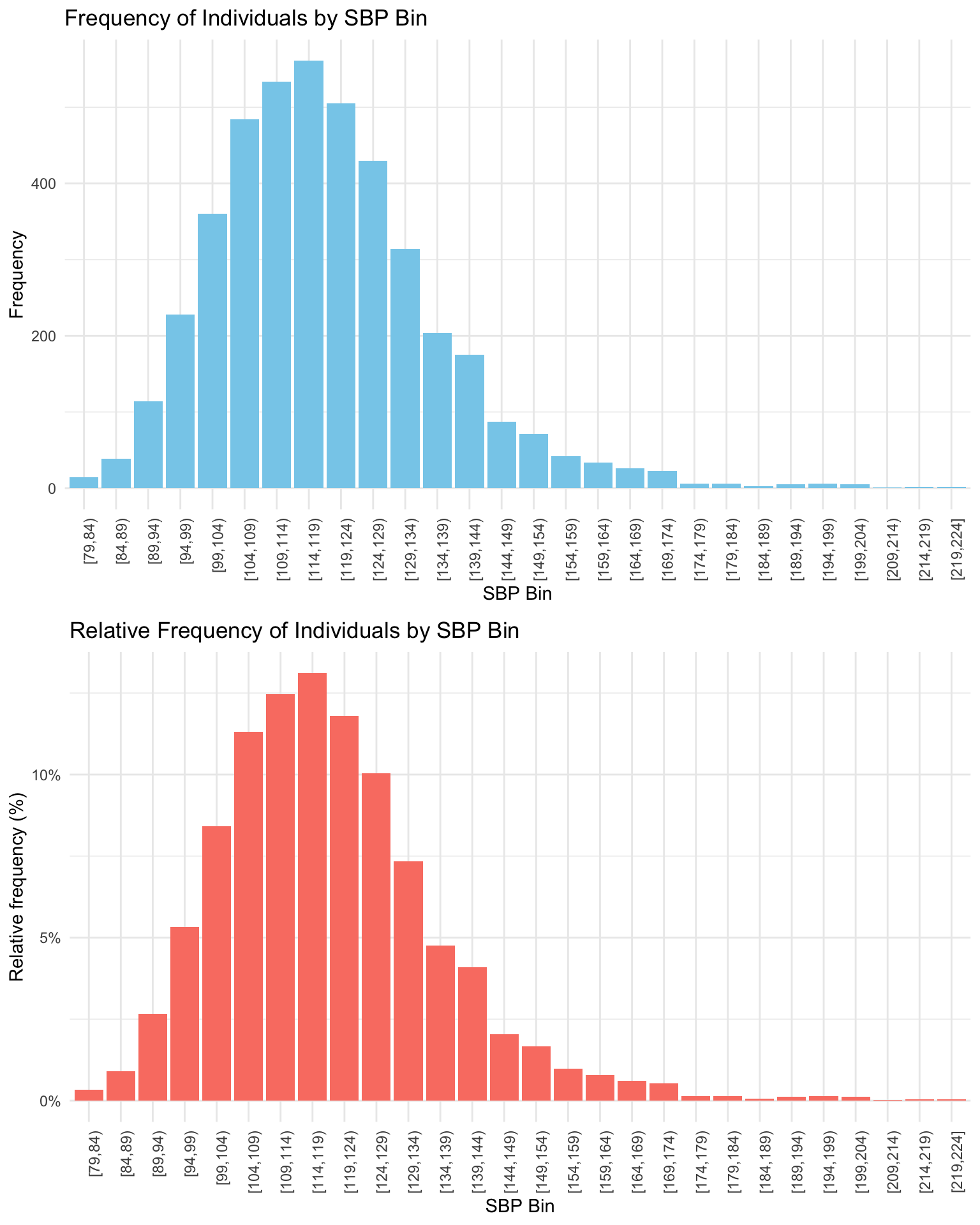
Notice that the height of each bar records the corresponding value in the table. The top graph puts frequency on the y-axis (also called the vertical axis), while the bottom graph puts relative frequency on the y-axis. Notice that the two graphs look the same except for the y-axis/vertical scale. For example, for the first group, [79,84) — the height of the bar in the top graph is 14 on the y-axis, indicating 14 people are in this bin. The height of the bar in the bottom graph is 0.33%, indicating 0.33% of the 4,281 study participants are in this bin.
Some notation
Before we explore the common statistical measures used to describe quantitative variables, it’s beneficial to establish some basic notation. Consider a dataset composed of a series of observations, such as SBP readings from the NHANES study. Assuming there are n observations for variable \(X\) (i.e., SBP) in total, we can represent these observations as follows:
\(x_1, x_2, x_3, ... x_n\)
Here, \(x_1\) is the SBP score for the first person in the dataset, and \(x_n\) is the SBP score for the last person in the dataset. This concise mathematical formulation allows us to succinctly refer to any individual observation within the dataset of SBP scores.
In statistical and mathematical contexts, it is quite common to use uppercase letters to denote variables that represent a whole dataset (i.e., the variable that represents all of the SBP scores for the participants — \(X\)) or a series of values, and lowercase letters to denote individual elements or observations (\(x_i\)) within that dataset (i.e., the \(i_\text{th}\) person’s score is denoted as \(x_i\), in other words, the first person’s score for SBP is referred to as \(x_1\)).
Measures of central tendency
Measures of central tendency summarize a variable using a single value that represents what is typical or common in the data. For example, if you have SBP readings from the NHANES participants, it helps to describe the dataset with one number that captures the general trend.
The term “central tendency” refers to this idea of identifying a central or representative value — the point around which the data tend to cluster. These measures help condense a large volume of information into a more interpretable summary.
The three most common measures of central tendency are:
Mode: the most frequently occurring value
Median: the middle value when the data are ordered
Mean: the arithmetic average
Each measure provides a slightly different perspective on what is “typical,” and choosing the right one depends on the nature and distribution of your data. Let’s explore how each is calculated and when to use them.
Mode: The popular choice
The mode is the simplest measure of central tendency. It’s the number that shows up most frequently. To find the mode, you just need to count how many times each number appears and the one that occurs the most is the mode.
For example, consider the following 10 scores of SBP:
| SBP |
|---|
| 120 |
| 135 |
| 125 |
| 150 |
| 125 |
| 130 |
| 160 |
| 160 |
| 125 |
| 115 |
We can calculate the number of times (labeled n in the table below) that each SBP score occurred in this collection of 10 individuals.
| SBP | n |
|---|---|
| 115 | 1 |
| 120 | 1 |
| 125 | 3 |
| 130 | 1 |
| 135 | 1 |
| 150 | 1 |
| 160 | 2 |
In this example, 125 is the mode since it appears three times, more than any other value.
But what if two numbers tie for the most appearances? For example, consider the following set of SBP scores:
| SBP | n |
|---|---|
| 100 | 1 |
| 115 | 3 |
| 120 | 3 |
| 125 | 1 |
| 130 | 1 |
| 184 | 1 |
Here, both 115 and 120 appear three times, so the variable has two modes: 115 and 120.
The mode tells us about the most common scores for a variable. It’s important to keep in mind however, that the mode might not always represent the center of the distribution. For instance, consider the following set of scores:
| SBP | n |
|---|---|
| 100 | 1 |
| 105 | 1 |
| 115 | 1 |
| 120 | 1 |
| 125 | 1 |
| 130 | 1 |
| 135 | 1 |
| 138 | 1 |
| 190 | 2 |
In this set of data points, the mode is 190, but the majority of data points are not close to 190.
Median: The middle ground
The median represents the middle score for the variable. To find the median, first, arrange the numbers from smallest to largest and then identify the number that has an equal count of scores above and below it. Let’s consider these 9 scores.
| SBP |
|---|
| 120 |
| 135 |
| 128 |
| 152 |
| 180 |
| 140 |
| 138 |
| 122 |
| 158 |
Let’s take a look at the scores arranged from smallest to largest:
| SBP |
|---|
| 120 |
| 122 |
| 128 |
| 135 |
| 138 |
| 140 |
| 152 |
| 158 |
| 180 |
The median is 138 for these 9 scores, as there are four scores below it and four scores above it.
What if there’s an even number of data points? Consider these 8 scores arranged from smallest to largest.
| SBP |
|---|
| 120 |
| 122 |
| 128 |
| 135 |
| 138 |
| 152 |
| 158 |
| 180 |
Here, there’s no single middle score, so the median is calculated as the average of the two middle numbers, \((135 + 138) / 2 = 136.5\).
Unlike the mode, the median will always represent the middle of the variable’s distribution.
Mean: The balancing point
The mean, or average, is calculated by adding all the scores for a variable and then dividing by the number of data points. Here’s the formula:
\[ \text{Mean} = \frac{\text{Sum of all scores}}{\text{Total number of scores}} \]
We can also write it in more formal statistical notation:
The mean, often denoted as \(\bar{x}\), of a series of observations \(x_1, x_2, x_3, \ldots, x_n\) is given by:
\[\bar{x} = \frac{1}{n}\sum_{i=1}^{n} x_i\]
where:
\(n\) is the total number of observations.
\(x_i\) represents the \(i^{th}\) observation in the dataset.
\(\sum_{i=1}^{n}\) denotes the sum of all observations from \(1\) to \(n\).
Now, let’s calculate the mean. For example, consider the following set of 10 scores:
| SBP |
|---|
| 140 |
| 115 |
| 125 |
| 132 |
| 118 |
| 142 |
| 129 |
| 148 |
| 130 |
| 115 |
\[\bar{SBP} = \frac{1}{10}\sum_{i=1}^{n} SBP_i = \frac{1294}{10} = 129.4\]
The mean, or average, can be seen as the “balance point” of a set of scores. However, it is critical to recognize a major drawback of the mean — outliers (scores that are substantially different from the other scores) can significantly influence the mean, making a mean calculated with outliers potentially unrepresentative of the center of the data. For example, what if we add a person with an extremely high SBP?
| SBP |
|---|
| 140 |
| 115 |
| 125 |
| 132 |
| 118 |
| 142 |
| 129 |
| 148 |
| 130 |
| 115 |
| 220 |
Now, the mean \(= 1514 / 11 = 137.6.\) The mean is highly influenced by one person with a very high score.
Pulling it all together
To summarize, let’s consider all of the individuals in the NHANES sample. For all unique SBP scores, we can count how many people have the corresponding score for SBP, here’s a listing of the 114 unique scores for SBP observed in the data frame and the number of people with each of those unique scores in the sample:
We can create a graph that show this same information. Here, on the x-axis (the bottom of the graph) all of the observed scores of SBP are displayed. On the y-axis (the left side of the graph) the number of people with the corresponding score for SBP are displayed.
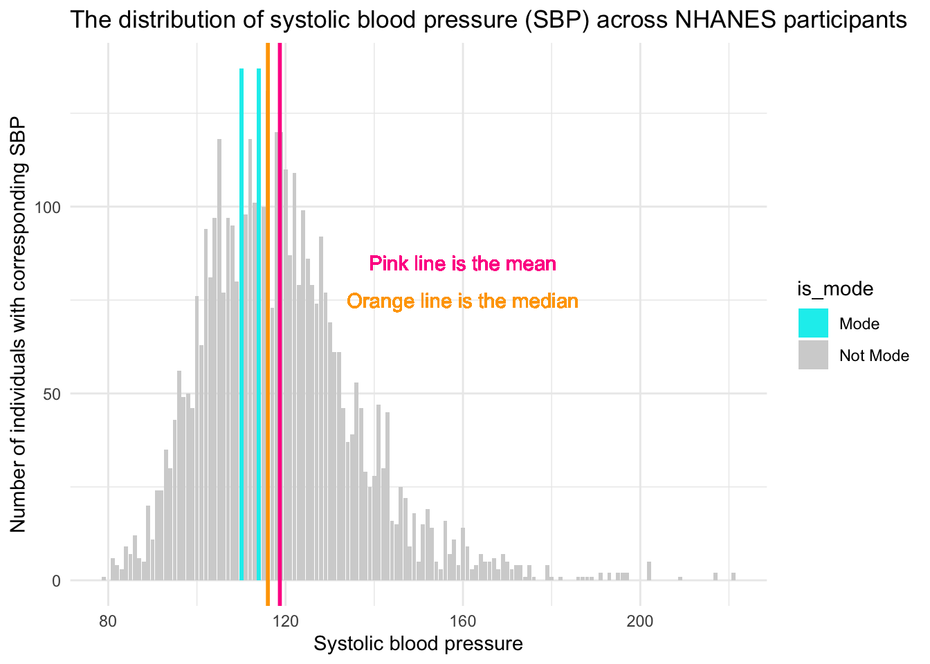
There are two modes for SBP — scores of 110 and 114. For each of these SBP scores, 137 people had this score for their SBP. These are the highest two bars on the graph (denoted in blue). The median, the middle score, is 116. The mean, the average score, is just slightly higher at 119. Notice that there are more extreme scores for SBP on the higher end of the distribution (i.e., there are a few people way out in the right tail of the distribution, with SBP scores over 200). Because the mean is highly influenced by extreme scores, the mean is pulled toward that tail, and is therefore larger than the median. This is a sign of right skew, where a few very high values stretch the distribution and raise the mean. In such cases, the median is a better indicator of central tendency than the mean.
To summarize, the Mode, Median, and Mean are measures of central tendency that summarize a set of scores (data points) by identifying a central or typical value within that dataset.
- Mode is the value that appears most frequently in a dataset.
- Median is the middle value when the data are ordered from smallest to largest.
- Mean (arithmetic average) is the sum of all the values divided by the number of values.
Computing mean, median and mode from a summary table
In the examples thus far, we computed these estimates using the full data frame. But, we can accomplish the same task with a summary of the data. Suppose we have a summarized dataset of SBP from a group of individuals, rather than individual data points. The table below provides summarized data from 15 people. The first column provides 5 levels of SBP observed among the 15 people, and the second column provides the number of people with the corresponding SBP (often referred to as a weight). For example, among these 15 people, 2 of them have a SBP of 110.
| Systolic Blood Pressure (mm Hg) | Number of People |
|---|---|
| 110 | 2 |
| 120 | 5 |
| 130 | 3 |
| 140 | 4 |
| 150 | 1 |
Using this table, let’s calcuate the mode, median and mean.
Calculating Mode
In this dataset, the weighted mode is straightforward: it’s the blood pressure reading with the highest frequency (number of people), which is 120 mm Hg (5 people).
Calculating Median
To find the weighted median, we need to understand that there are a total of 15 observations (110, 110, 120, 120, 120, 120, 120, 130, 130, 130, 140, 140, 140, 140, 150). The median is the middle value, so we need the 8th value when all observations are ordered. Using the counts, we see:
- The first 2 values are 110.
- The next 5 values are 120, bringing us to the 7th value.
- That means the 8th value — the median — falls in the next group (130 mm Hg).
Thus, the median SBP, considering the weights, is 130 mm Hg.
Calculating Mean
To calculate the weighted mean:
- Multiply each blood pressure value by the number of people with that reading
- Sum these products
- Divide by the total number of people
Mathematically, this looks like:
\[ \text{Mean} = \frac{(110 \times 2) + (120 \times 5) + (130 \times 3) + (140 \times 4) + (150 \times 1)}{2 + 5 + 3 + 4 + 1} \]
Expanding and simplifying the calculation:
\[ \text{Mean} = \frac{(220) + (600) + (390) + (560) + (150)}{15} \]
Finally, calculating the value:
\[ \text{Mean} = \frac{1920}{15} = 128 \]
Thus, the mean SBP calculated from this frequency distribution is 128 mm Hg. This is a type of weighted mean, where each unique value is multiplied by the number of times it occurs. If you were to compute the mean using all 15 individual scores directly—by adding them up and dividing by 15—you would arrive at the same result: 128 mm Hg. This demonstrates that calculating the mean from a frequency distribution yields the same summary statistic as computing it from the full list of individual values, as long as the frequencies are accurately accounted for.
This example illustrates how to compute the mode, median, and mean from a summarized (or grouped) dataset by incorporating the concept of weighting by frequency. This approach is especially useful when individual data points are unavailable, but aggregated counts are. It allows for accurate calculation of central tendency measures using only summary data — a strategy that will be important throughout the course.
To finish up our review of measures of central tendency, please watch the following video by Crash Course Statistics.
Measures of variability, dispersion, and spread
While measures of central tendency identify typical values in a dataset, they don’t convey how data points are distributed around that center. Measures of variability — also known as dispersion or spread — quantify this distribution, providing insight into the consistency or diversity within the data.
Range
The range is the difference between the highest and the lowest scores of a variable. Building on the SBP example — the lowest score for the NHANES participants was 79 and the highest score was 221 — so the range is 221 - 79 = 142.
Percentile distribution
Earlier we defined the median as the middle point of the distribution of data, when the data were ordered from smallest to largest. In this way, with the data ordered from smallest to largest, we can also define the median as the 50th percentile score.
Imagine we had SBP scores for exactly 100 people, and we lined them up from the lowest SBP (79) to the highest SBP (221). Imagine the median score for these 100 people is 116. Percentiles are like checkpoints along this line that tell you what SBP value a certain percentage of people fall below. For example, if we talk about the 50th percentile (i.e., the median) of SBP for the NHANES sample, it’s like saying “50% of the people have a SBP at or below 116”.
Sometimes it is useful to consider the full distribution of percentile scores — not just the 50th percentile. For example, the 0th percentile is the lowest score — that’s a SBP of 79 in the NHANES sample, and the 100th percentile is the highest score — that’s a SBP of 221 in the NHANES sample.
Other common percentiles of interest are:
The 25th percentile, also known as the first quartile (Q1), marks the value below which 25% of the data fall. Quartiles divide a rank-ordered dataset into four equal parts, and the values that separate these parts are called the quartiles. In the NHANES sample, a SBP of 107 mm Hg represents the 25th percentile — meaning that 25% of participants have an SBP of 107 or lower.
The 75th percentile, or third quartile (Q3), is the value below which 75% of the data fall. In the NHANES sample, a SBP of 128 mm Hg corresponds to the 75th percentile — indicating that 75% of participants have an SBP of 128 or lower.
A quartile (as described above) is a type of quantile. A quantile is a statistical term that refers to dividing a probability distribution into continuous intervals with equal probabilities, or dividing a variable into several parts of equal volume. In essence, if you have a variable and you want to split it into groups, each group being a certain percentage of the total, each group represents a quantile. For example, if you were to divide a variable into two equal parts, the point that separates the groups is the median. The data points below the median make up the first half, and the data points above the median make up the second half. Here are few types of quantiles you might come across:
Quartiles: These split the data into four equal parts, so each part contains 25% of the data.
Quintiles splite the data into five equal parts, so each part contains 20% of the data.
Deciles: These split the data into ten equal parts, so each part contains 10% of the data.
In medical studies, percentiles are quite useful. For example, doctors might say that if your blood pressure is higher than the 90th percentile for people your age, you might be at a higher risk for certain health issues. So, in the context of this example, percentiles are essentially a way to understand where an individual’s SBP stacks up compared to the rest of the population.
Interquartile Range (IQR)
Related to these percentiles, another form of range is often of interest — that is, a range called the interquartile range or IQR. The traditional range (defined above) is the difference between the 100th percentile and the 0th percentile. The IQR is the difference between the 75th percentile and the 25th percentile. This range shows you where the middle 50% of the scores fall. In the NHANES sample, the IQR for SBP is 128 - 107 = 21.
Mean absolute deviation
So far, we’ve covered two measures of spread — the range and the interquartile range — both of which rely on percentiles. Another approach is to measure how far each data point is from a meaningful reference point, such as the mean or median. A useful measure of this type is the mean absolute deviation, which calculates the average distance of each data point from the mean.
The mean absolute deviation helps us figure out how much the scores of a variable tend to stray from the average value. Let’s break down the steps to calculate it:
Find the Mean: First things first, calculate the average score. For example, the average SBP for the NHANES sample is 119.
Absolute Differences from the Mean: Now, for each data point (i.e., person in the sample), calculate how far it is from the mean. Don’t worry about whether it’s above or below; just look at the raw distance (which means you’ll take the absolute value of the differences). So for example, for a person who has a SBP of 140, their absolute difference from the mean in the sample is 21, that is: \(|119 - 140| = 21\).2
Find the Mean of the Absolute Differences: Finally, find the mean of these absolute differences. This resultant value is the mean absolute deviation.
Formally, the mean absolute deviation around the mean, \(\bar{x}\), for a series of observations \(x_1, x_2, x_3, \ldots, x_n\) is given by:
\[MAD = \frac{1}{n}\sum_{i=1}^{n} |x_i - \bar{x}|\]
where:
\(n\) is the total number of observations.
\(x_i\) represents the \(i^{th}\) observation in the dataset.
\(\bar{x}\) is the mean of the observations.
\(|x_i - \bar{x}|\) denotes the absolute value of the deviation of each observation from the mean.
The mean absolute deviation gives you a sense of how far, on average, each data point is from the mean. A larger mean absolute deviation indicates the data points are more spread out around the mean, while a smaller value shows they’re clustered more closely together.
Here’s a small example of calculating the absolute deviation from the overall mean (119) for 10 of the people in our data frame. Can you solve for each of these difference scores: diff_SBP = |SBP - 119|?
| SBP | diff_SBP |
|---|---|
| 114 | 5 |
| 105 | 14 |
| 104 | 15 |
| 99 | 20 |
| 114 | 5 |
| 110 | 9 |
| 107 | 12 |
| 110 | 9 |
| 132 | 13 |
| 123 | 4 |
The first person has a SBP of 114 — the difference between 114 and 119 (the mean in the NHANES full sample) is 5. The last person listed has a systolic blood pressure of 123 — the difference between 123 and 119 is 4. Notice that we record the absolute difference — that is, it doesn’t matter if the person’s score is above or below the mean.
The mean of these 10 differences is about 11.
\((5 + 14 + 15 + 20 + 5 + 9 + 12 + 9 + 13 + 4) / 10 = 10.6\)
Therefore, the average absolute deviation for the 10 people listed above is 11 (based on the overall mean in the sample of 119).
If we calculate the mean absolute deviation for the whole NHANES sample using this same technique — we get 13.
Instead of the mean absolute deviation — you will sometimes come across the median absolute deviation. The basic idea behind median absolute deviation is very similar to the idea behind the mean absolute deviation . The difference is that you use the median in each step, instead of the mean. The median absolute deviation tells us the median of the absolute differences between each data point and the overall median.
Variance
Closely related to the mean absolute deviation is the variance. The variance is calculated in a very similar way, but rather than taking the average of the absolute deviations, we take the average of the squared deviations.
The variance, often denoted as \(s^2\), for a series of observations \(x_1, x_2, x_3, \ldots, x_n\) with mean \(\bar{x}\), is given by:
\[s^2 = \frac{1}{n-1}\sum_{i=1}^{n} (x_i - \bar{x})^2\]
where:
\(n\) is the total number of observations.
\(x_i\) represents the \(i^{th}\) observation in the dataset.
\(\bar{x}\) is the mean of the observations.
\((x_i - \bar{x})^2\) denotes the squared deviation of each observation from the mean.
The division by \(n-1\) (instead of \(n\)) makes \(s^2\) an unbiased estimator of the variance if the observations come from a normally distributed population (we’ll cover this in more detail later in the semester).
The table below shows the squared absolute deviations for 10 people in the NHANES data frame (the same 10 selected earlier when calculating the mean absolute deviation). For example, we previously calculated the first person to have a absolute deviation of 5 — squaring that value (i.e., \(5 \times 5\) or \(125^2\)) yields 25.
| SBP | diff_SBP | squared_diff_SBP |
|---|---|---|
| 114 | 5 | 25 |
| 105 | 14 | 196 |
| 104 | 15 | 225 |
| 99 | 20 | 400 |
| 114 | 5 | 25 |
| 110 | 9 | 81 |
| 107 | 12 | 144 |
| 110 | 9 | 81 |
| 132 | 13 | 169 |
| 123 | 4 | 16 |
If we take the average squared deviation for the 10 people in the table above, and divide by n - 1 (i.e., 9) we get the following:
\((25 + 196 + 225 + 400 + 25 + 81 + 144 + 81 + 169 + 16) / 9 = 151.33\)
If we calculate the squared deviation for all people in the NHANES data frame, and then average the squared differences for all participants, we get ~302 — this is the variance for SBP in the NHANES study.
So we have the calculated variance, but what does this number represent? You might find the variance a bit puzzling because it’s not on the same scale as your original data. This is due to squaring the differences before averaging them. How can we make better sense of this?
If the thought of taking the square root crossed your mind, then bingo! You’re on the right track. Taking the square root is the reverse process of squaring, which brings the numbers back to their original scale. In this case, taking the square root of 302 yields approximately 17. This is a more meaningful number that is easier to relate to the original data points, and this is a perfect segwey to our final measure of spread — the standard deviation.
Standard deviation
The standard deviation (often abbreviated as \(s\)) is a number that tells us how spread out the values in a dataset are. It gives us a sense of how much individual data points tend to differ from the mean (average). As you saw in the last section, the standard deviation is the square root of the variance — which means it reflects the average distance from the mean.
\[ s = \sqrt{ \frac{1}{n-1} \sum_{i=1}^{n} (x_i - \bar{x})^2 } \]
One important feature of the standard deviation is that it’s expressed in the same units as the original variable. So if we’re measuring systolic blood pressure (SBP) in millimeters of mercury (mm Hg), the standard deviation is also in mm Hg.
When the standard deviation is small, most values are close to the mean. When it’s large, the values are more spread out. But keep in mind that “small” and “large” are relative — what counts as a large standard deviation depends on the scale of the variable and the context of the data.
In our SBP example, the standard deviation is 17 mm Hg. This tells us that, on average, individuals’ systolic blood pressures differ from the mean by about 17 mm Hg. So if the mean SBP is 128 mm Hg, most people in the sample have SBP values roughly between 111 and 145 mm Hg (about one standard deviation below and above the mean). This gives us a concrete sense of how tightly (or loosely) the data are clustered around the average.
Empirical Rule
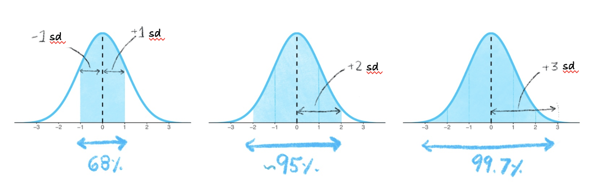
The concept of standard deviation can be a bit tricky to grasp at first because it’s rooted in the variance, which itself is somewhat abstract. However, there’s a handy guideline that can help you make sense of standard deviation in practice. This rule is effective if the distribution of the variable that you are considering is bell-shaped (i.e., a symmetric curve). It’s known as the Empirical Rule or the 68-95-99 Rule.
The Empirical Rule states that:
About 68% of the scores will be within 1 standard deviation (sd) from the mean. So if you look at the range defined by (mean - 1 standard deviation) to (mean + 1 standard deviation), approximately 68% of the scores should be within this range.
Approximately 95% of the scores will be within 2 standard deviations from the mean. This is the range from (mean - 2 standard deviations) to (mean + 2 standard deviations).
Almost all (around 99.7%) of the scores will be within 3 standard deviations from the mean. This is the range from (mean - 3 standard deviations) to (mean + 3 standard deviations).
The figure below depicts this information. The shaded blue areas in the graphs shows that in the first graph, 68% of the distribution is within 1 standard deviation (sd) of the mean. In the second graph, 95% of the distribution is within 2 standard deviations of the mean. In the third graph, 99.7% (nearly all!) of the distribution is within 3 standard deviations of the mean.
Recall that the Empirical Rule can be used if the distribution of scores is symmetric and bell-shaped. In a symmetric bell-shaped curve, the highest point, or peak, of the curve is located at the center, and the curve tapers off gradually in both directions. The left and right sides of the curve are mirror images of each other, reflecting the symmetry of the data. This means that the mean, median, and mode of the distribution coincide at the center of the curve.
Can we use the Empirical Rule for our blood pressure example? Plotted below, you can see the distribution of the SBP scores.
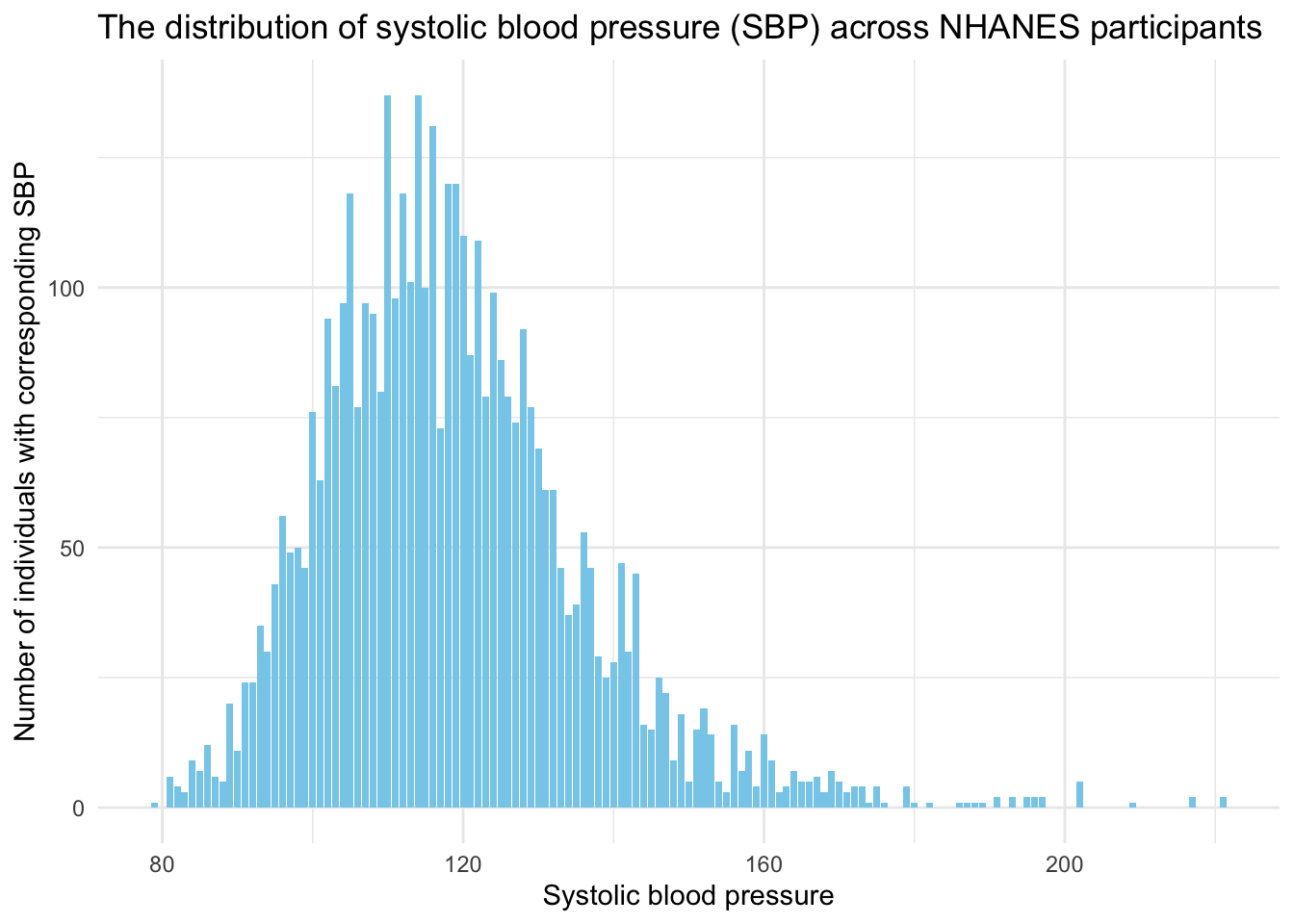
Systolic blood pressure loosely follows a bell-shaped curve — although we do see a long right-hand tail. This is largely because as people age, there is greater variability in SBP scores, and much higher SBP scores are more likely to be observed.
To explore this a bit, let’s take a look at the distribution of SBP across age groups. We’ll consider the following age groups:
- Ages 16 to 25
- Ages 26 to 35
- Ages 36 to 45
- Ages 46 to 55
- Ages 56 to 65
- Ages 65 and older
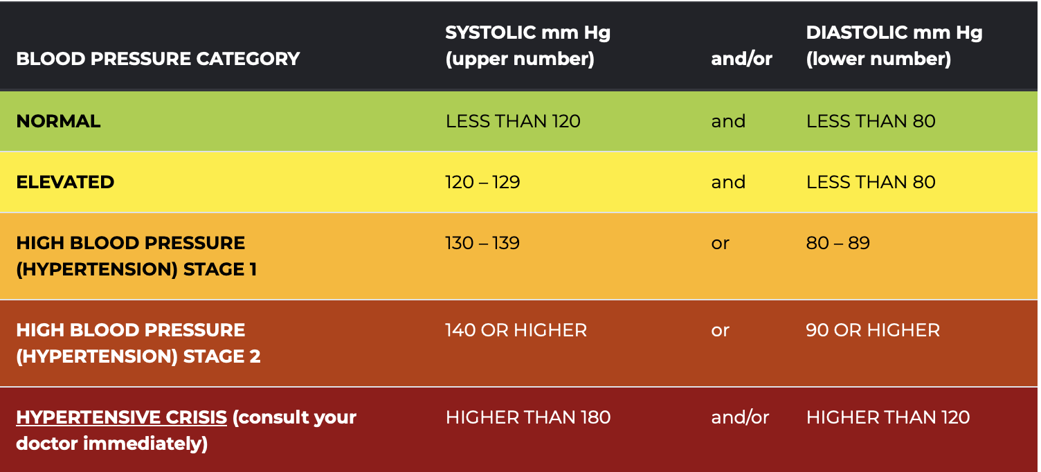
In looking at the distribution of SBP in each age group, I’ll color the parts of the distribution in accordance with the SBP classifications presented in the American Heart Association Chart below. For example, I will color the bars green if the SBP is less than 120, indicating a normal (i.e., healthy) score. Since we’re only considering systolic, and not diastolic, blood pressure now — we’ll ignore the contribution of diastolic blood pressure to the classifications.
Healthy and Unhealthy Blood Pressure Ranges from the American Heart Association
The graph below shows the distribution of systolic blood pressure (SBP) across the six age groups. Each subplot displays a histogram of SBP values, with green indicating normal values, yellow for elevated, orange for Stage 1 hypertension, and red for Stage 2 hypertension and above.

Our chart shows that the mean and median of SBP becomes larger as people age. Moreover, the distribution of SBP exhibits a noticeable increase in variability as people age, and the right tail of the distribution becomes more drawn out as we move to older age groups. This changing central tendency and variability is a result of physiological and lifestyle changes that are more pronounced in older age groups.
A Substantive Take
As individuals age, the diversity in health profiles escalates due to factors such as varied disease processes, differing responses to medications, lifestyle alterations, and the accumulation of environmental exposures. These differences contribute to a broader distribution of SBP values among older individuals. Additionally, conditions like hypertension, which yield higher SBP values, are more common among older populations. Hence, in older populations, the SBP distribution is more shifted to the higher pressures, is wider, and has a longer right-hand tail — making readings classified as hypertensive more likely to be observed in these groups.
While it’s true that older adults may face higher risks of elevated SBP, it’s important to notice that there are many individuals in each of the older groups who maintain healthy blood pressure levels (the green parts of the distribution). Maintaining a healthy SBP is not simply a factor of aging, but often the result of deliberate lifestyle choices and effective medical management. Regular physical activity, a balanced diet low in sodium and high in fruits and vegetables, maintaining a healthy weight, avoiding too much stress, reducing alcohol intake, and avoiding tobacco are all proactive measures individuals can take to support cardiovascular health. Furthermore, regular health check-ups and timely management of other health conditions such as diabetes can greatly assist in keeping blood pressure within healthy limits. The advances in medical science also provide us with effective blood pressure-lowering medications when necessary. In other words, aging does not inevitably equate to high SBP. With appropriate lifestyle modifications, regular monitoring, and proactive healthcare, it’s entirely possible for older adults to sustain a healthy SBP well into advanced age.
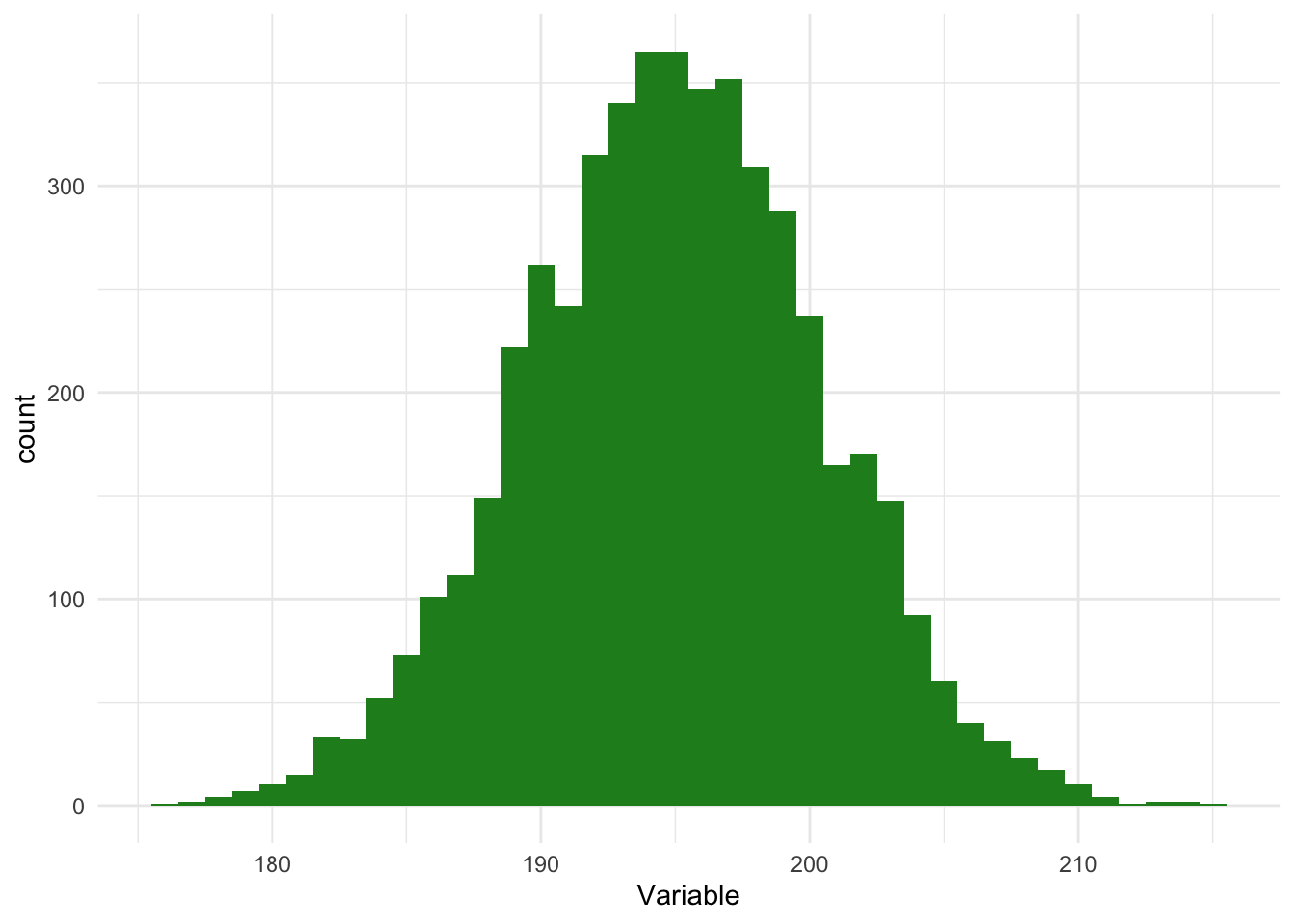
So — based on these graphs — we can see that the distribution of SBP for some of the age groups is quite close to a bell-shaped curve. For example, if we limit our data frame to only participants between the ages of 16 and 25 (the first age group), then the distribution of SBP appears bell-shaped and symmetric. Take a look at the histogram below of individuals age 16 to 25 — with a perfect bell-shaped curve overlayed. In this subsample of participants, the mean SBP = 112, the median SBP = 112, and the standard deviation of SBP = 12.
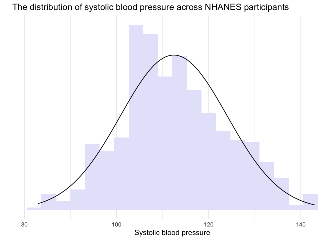
Since the distribution for this age group is approximately normal, we can apply the Empirical Rule to interpret the data. Let’s use it to analyze the SBP values of NHANES participants aged 16 to 25.
The Empirical Rule states that:
- About 68% of the scores will be within 1 standard deviation of the mean. Therefore, if you look at the range defined by (mean - 1 standard deviation) to (mean + 1 standard deviation), approximately 68% of the scores should be within this range.
In our subsample of NHANES participants aged 16 to 25, that means that about 68% of young adults will have a systolic blood pressure that is between 100 and 124, that is, \(112 \pm 12\).
- Approximately 95% of the scores will be within 2 standard deviations of the mean. This is the range from (mean - 2 standard deviations) to (mean + 2 standard deviations).
In our subsample, that means that about 95% of young adults will have a systolic blood pressure that is between 88 and 136, that is, \(112 \pm (2 \times 12)\).
- Almost all (around 99.7%) of the scores will be within 3 standard deviations of the mean. This is the range from (mean - 3 standard deviations) to (mean + 3 standard deviations).
In our subsample, that means that about 99.7% of all young adults will have a systolic blood pressure that is between 76 and 148, that is, \(112 \pm (3 \times 12)\).
The image below summarizes these values:
Examples of normal, and not so normal, distributions
Keep in mind that the Empirical Rule is a rough guide and is based on the assumption that the data is distributed in a bell-shaped curve, which is symmetric. As we’ll study later in the course — this is referred to as a normal distribution. In a normal distribution, the mean, median and mode are all the same. For example — here is an example of a normal distribution.

For some variables, you will find that their distribution is skewed to the left or skewed to the right, as demonstrated in the graphs below.
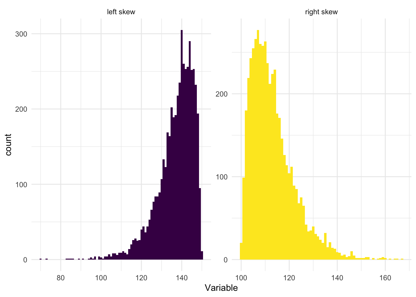
When a distribution is skewed to the left (also called left-skewed or negatively skewed), the tail extends toward the lower (left) values on the number line, while the majority of the data is concentrated on the higher (right) side. The presence of extremely low values in the left tail pulls the mean downward. As a result, the mean is less than the median.
Conversely, when a distribution is skewed to the right (also known as right-skewed or positively skewed), the tail extends toward higher (right) values, while most of the data lies on the lower (left) side. In this case, extreme high values in the right tail pull the mean upward. Therefore, the mean is greater than the median.
The standard deviation can still be a meaningful statistic in skewed distributions. It accurately represents the spread of the data points from the mean, just as it is supposed to do. But interpreting the standard deviation (and the mean) can be challenging in skewed distributions, because these measures are being influenced by the skewness. In these cases it is likely more insightful to use additional or alternative measures, like the median (a measure of central tendency that is less sensitive to outliers and skewness) and the interquartile range (a measure of spread that is also less sensitive to outliers and skewness), rather than (or in addition to) the mean and the standard deviation.
To wrap up our discussion of dispersion — please watch the following two videos below from Crash Course Statistics on Measures of Spread and Distributions.
Standardized Scores
Standardized scores, or z-scores, are a useful concept in statistics. They provide a way to understand an individual observation in the context of a distribution of data. A z-score tells us how many standard deviations an observation is from the mean of a distribution, providing a measure of relative location.
To calculate a z-score, we subtract the mean of the variable from an individual data point (which gives us the deviation of the data point from the mean), and then divide that by the standard deviation of the variable. The formula for calculating a z-score is:
\[z_{i} = \frac{x_{i} - \bar{x}}{s_{x}}\]
Where:
\(z_{i}\) is the calculated z-score for each case (i.e., individual in the study).
\(x_{i}\) is the score of the variable of interest (i.e., SBP) for each case.
\(\bar{x}\) is the mean of the scores in the sample (i.e., mean SBP).
\(s_{x}\) is the standard deviation of the scores in the sample (i.e., sd of SBP).
Let’s use SBP as an example. In the full NHANES sample, the mean SBP is 119 mm Hg and the standard deviation is 17 mm Hg.
If someone has a SBP of 102, then their z-score is: \(z = \frac{102 - 119}{17} = -1\). That is, their SBP is 1 standard deviation below the mean.
Let’s try another. If someone has a SBP of 153, then their z-score is: \(z = \frac{153 - 119}{17} = 2\). That is, their SBP is 2 standard deviations above the mean.
One last example. If someone has a SBP of 119, then their z-score is: \(z = \frac{119 - 119}{17} = 0\). That is, their SBP is at the mean.
z-scores are particularly useful because they are unitless and thus allow for direct comparison between different types of data. They also form the basis of many statistical tests and procedures (which we’ll learn about later in the course). However, it’s important to note that z-scores are most meaningful when the data follows a normal distribution. If the data is not normally distributed, the z-score may not provide a accurate picture of an observation’s relative location.
Please watch the video below from Crash Course Statistics on z-scores and percentiles that further explains these concepts.
Learning Check
After completing this Module, you should be able to answer the following:
- What is the difference between a categorical and a numeric variable?
- How do we typically summarize a categorical variable?
- What summary statistics are useful for numeric variables?
- What do the mean and standard deviation tell us about a numeric variable?
- How can you describe the distribution of a numeric variable using center, spread, and shape?
Credits
- The Measurement section of this Module drew from the excellent commentary on this subject by Dr. Danielle Navarro in her book entitled Learning Statistics with R.
Footnotes
The 5,000 individuals from NHANES that are considered in this Module are resampled from the full NHANES study to mimic a simple random sample of the US population.↩︎
- Vertical bars around a number or an equation denote the absolute value. The absolute value of a real number is its distance from zero on the number line, regardless of the direction. Therefore, for example, \(|-5| = 5\) and \(|5| = 5\).