| Layer | Description | Example |
|---|---|---|
| Data | The data to be plotted. | Data compiled by the CDC |
| Aesthetics | The mapping of variables to elements of the plot. | OSI index is mapped to x-axis, Cumulative mortaility is mapped to y-axis, Population size is mapped to size of the points, Date mortality threshold was reached is mapped to the color of the points, Country abbreviations are mapped as text to the points. |
| Geometry | The visual elements to display the data — e.g., bar graph, scatterplot. | Scatterplot |
| Facets | Plotting of small groupings within the plot area — i.e., subplots. | There are no facets in this example — there is just a single plot. |
| Statistics and Transformations | Additional statistics imposed onto plot or numerical transformations of variables to aid interpretation. | A best fit line (the black line running through the points), corresponding confidence interval (the grayed area around the best fit line) |
| Coordinate | The space on which the data are plotted — e.g., Cartesian coordinate system (x and y-axis), polar coordinates (pie chart). | Cartesian coordinate system |
| Themes | All non-data elements — e.g., background color, labels. | Axis labels for x and y-axis |
Data Visualization
Module 3
Learning Objectives
By the end of this Module, you should be able to:
- Describe the seven graphical layers of a ggplot2 plot
- Identify key ggplot2 functions and arguments
- Create basic graphs (e.g., bar chart, scatterplot, histogram) in R
- Apply graphs to explore, summarize, and communicate insights
- Explain how ggplot2 reflects the grammar of graphics
Overview
Understanding data begins with seeing the stories it tells — and few tools are more powerful for that than data visualization. By turning complex, often overwhelming data into clear and engaging visuals, we open the door to insight, discovery, and communication.
Data visualization is essential for exploring your data. It helps you spot outliers, detect unusual patterns, and uncover trends you might otherwise miss. These early visual insights guide important decisions about how to clean your data, which models to try, and how to interpret your results.
But visualization isn’t just for exploration — it’s also one of the best ways to communicate your findings. A well-crafted graph can bridge the gap between technical work and non-technical audiences. Whether you’re sharing results with colleagues, mentors, or the public, visuals make your message more accessible and persuasive.
In short, data visualization is both a lens for discovery and a language for explanation. In this Module, you’ll get hands-on practice using visualization to better understand your data and to tell its story effectively — an essential skill for any data scientist.
Why start with data visualization?
As we begin learning R, I like to start with data visualization — and there are some compelling reasons for doing so.
First, visualization offers an immediate and engaging way to connect with data. Rather than working through abstract concepts right away, you’ll write a few lines of code and instantly see the results as clear, meaningful graphics. This quick feedback loop is both satisfying and motivating — it gives you a sense of progress early on and helps build confidence.
But beyond the fun of making attractive plots, data visualization is one of the most powerful tools a data scientist can use. It helps you explore messy datasets, spot patterns and trends, and see relationships that might be hidden in a table of numbers. It also builds your intuition for thinking analytically about data—an essential foundation for everything from modeling to communicating findings.
Finally, starting with ggplot2, the R package we’ll use for graphing, helps build your coding skills in a meaningful way. ggplot2 is part of the tidyverse, a family of R packages designed for data science. As you learn to layer components in a plot — adjusting aesthetics, adding labels, tweaking themes — you’ll also be learning how to write clean, logical code. These habits transfer directly to other areas of data science, like data wrangling and model building. In short, learning data visualization with ggplot2 gives you both a creative entry point and a solid coding foundation as you grow into a skilled data analyst.
The utility of data visualization
Before we begin creating beautiful and meaningful graphics with R, please watch the two following introductory videos from Crash Course Statistics on data visualization that will introduce you to the usefulness of graphs and give an overview of different types of graphs.
Creating Graphs in R
The ggplot2 package provides a robust and flexible platform for creating visualizations. You’ll learn the basics of creating graphs using the ggplot() in this Module — but there are many wonderful resources to help you along your journey. I strongly encourage the use of the R-graph library, an extensive repository filled with R graph examples complete with their code. This resource will inspire you and guide you in your journey to create compelling visualizations. In addition, the ggplot2 cheat sheet is a concise yet comprehensive guide that succinctly describes the wealth of options available within ggplot2. This resource will serve as a quick reference to ensure you can maximize the package’s potential.
New R users often find it helpful to start by searching for an example graph—such as those in the R Graph Gallery—copying the code, and then modifying it to suit their own data and goals. While the number of available arguments can feel overwhelming at first, working from examples makes it easier to explore and understand how each element of the code contributes to the final visualization. By exploring what different options do, you will slowly build your knowledge base and skill level. I encourage you to experiment — change options (e.g., the size of elements, colors, legend placement, etc.) to see what effects they have on the graph. This will help you gain a deeper understanding of the inner workings of ggplot2 — and will also help you build your experience in creating graphs that display the pertinent information in the best way possible and produce aesthetically-pleasing graphs.
Introduction to ggplot2
ggplot2 is a package that was developed to implement the graphing framework put forth by Dr. Leland Wilkinson in his book entitled The Grammar of Graphics. The Grammar of Graphics and ggplot2 are built around the 7 layers of a graph. These are listed in the table below. The primary ggplot2 function for creating a graph is called ggplot(). Each layer added to the ggplot() function provides an element of the graph — and when they come together they can tell the complete story of the data.
The layers of a ggplot2 graph
Data: This layer is the starting point and includes the data you want to visualize. The data is usually provided in the form of a data frame (i.e., dataset).
Aesthetics (aes): Aesthetics map the data variables to visual properties of the graph. For example,
aes(x = var1, y = var2, color = var3)maps var1 to the x-axis, var2 to the y-axis, and var3 to the color of the points or lines in the plot.Geometries (Geoms): Geometries define the type of plot. Common geoms include geom_point() for scatter plots, geom_line() for line plots, geom_bar() for bar charts, and geom_histogram() for histograms. Each geom function adds a layer to the plot representing a specific type of geometry.
Facets: Facets allow you to create multiple plots based on a factor variable. For example,
facet_wrap(~ var4)will create a series of plots, each showing a subset of the data corresponding to the levels of var4.Statistics and Transformations: This layer can include statistical summaries or transformations, such as stat_smooth() to add a regression line. Transformations can also include scaling data or computing aggregates.
Coordinates: The coordinate system defines how data points are placed on the plot. The default is Cartesian coordinates, but you can also use coord_polar() for circular plots or coord_flip() to swap the x- and y-axes.
Themes: Themes control the overall appearance of the plot. This includes elements like font size, font family, colors, and the presence of grid lines. The theme() function and pre-built themes like theme_minimal() or theme_bw() help customize the look and feel of the plot.
By understanding and utilizing these layers, you can create complex and informative visualizations that effectively communicate your data’s story. Each layer can be customized and combined to produce a wide variety of plots tailored to your specific needs.
An application of the layers
Let’s apply the grammar of graphics to the plot below, which appeared in a 2020 issue of the Center for Disease Control and Prevention’s Morbidity and Mortality Weekly Report (MMWR).

The scientists aimed to determine whether the early adoption of more COVID-19 mitigation policies was associated with fewer deaths in European countries through the end of June 2020. The graphic below presents their findings.
Early policy stringency and cumulative mortality† from COVID-19 — 37 European countries, January 23–June 30, 2020

Plot footnotes:
Abbreviations: ALB = Albania; AUT = Austria; BEL = Belgium; BGR = Bulgaria; BIH = Bosnia and Herzegovina; BLR = Belarus; CHE = Switzerland; CI = confidence interval; COVID-19 = coronavirus disease 2019; CYP = Cyprus; CZE = Czechia; DEU = Germany; DNK = Denmark; ESP = Spain; EST = Estonia; FIN = Finland; FRA = France; GBR = United Kingdom; GRC = Greece; HRV = Croatia; HUN = Hungary; IRL = Ireland; ISL = Iceland; ITA = Italy; LTU = Lithuania; LUX = Luxembourg; LVA = Latvia; MDA = Moldova; NLD = Netherlands; NOR = Norway; POL = Poland; PRT = Portugal; ROU = Romania; SRB = Serbia; SVK = Slovakia; SVN = Slovenia; SWE = Sweden; TUR = Turkey; UKR = Ukraine.
Based on the Oxford Stringency Index (OSI) on the date the country reached the mortality threshold. The OSI is a composite index ranging from 0–100, based on the following nine mitigation policies: 1) cancellation of public events, 2) school closures, 3) gathering restrictions, 4) workplace closures, 5) border closures, 6) internal movement restrictions, 7) public transport closure, 8) stay-at-home recommendations, and 9) stay-at-home orders. The mortality threshold is the first date that each country reached a daily rate of 0.02 new COVID-19 deaths per 100,000 population, based on a 7-day moving average of the daily death rate. The color gradient represents the calendar date that each country reached the mortality threshold.
† Deaths per 100,000 population.
This MMWR graph includes multiple layers which correspond with the Grammar of Graphics. Please watch this video that further describes how the layers of the graph are displayed in this CDC graph.
To summarize, in the table below, I list each of the possible layers of a graph, describe them, and then indicate if and how the layer is represented in the example graph above.
Important
Please take a moment to match up each layer with the corresponding element of the MMWR graph, then check your understanding with the answers in the table below.
The layers of a ggplot2 graphic — mapped to the example MMWR plot
With this introduction to graphing in our pocket, let’s begin our journey to learn about data visualization and the power of ggplot2!
The Substantive Topic for this Module
All of the graphs in this Module focus on income inequality and its impact on society. Income inequality refers to the large gap in income and wealth between different social and economic groups. In other words, some individuals or families earn and own far more than others, often leaving lower-income groups with limited resources and opportunities.
This growing gap matters. When wealth is concentrated among a small group, it can make it harder for others to move up economically, increase poverty, and deepen social divides. Income inequality also affects broader issues — like the strength of the economy, access to healthcare and education, and the overall well-being of communities.
By studying income inequality through data visualization, we can better understand its causes, consequences, and potential solutions — and begin to think critically about how to create a fairer and more inclusive society.
To set the stage for digging into these data examples, please watch the following video:
The General Structure of Code for a ggplot2 Graph
Before we begin creating and interpreting graphs, let’s take a moment to get familiar with the code structure for ggplot2. Every ggplot2 graph must have three components:
- Data
- A set of aesthetic1 mappings between variables in the data and visual properties
- At least one layer which describes how to display the graph — this is typically the geometry. All geometries in ggplot2 start with
geom_— followed by the type of geometry desired. For example,geom_point()creates a point/scatter plot,geom_histogram()creates a histogram,geom_line()creates a line plot.
Here’s a simple example that we’ll build on in the next section, which uses a data frame called real_time_ineq_2022, to create a bar graph of the share of income attributed to six different income groups.
real_time_ineq_2022 |>
  ggplot(mapping = aes(x = group.f, y = factor_income_share)) +
  geom_col()
Before we break down the specifics of the of the code, let’s revisit the basic structure of R code (as discussed in Module 01). In R, a function is like a little machine that does something for you. It always ends with parentheses — like this: glimpse() or skim() or ggplot(). Inside the parentheses, we provide arguments, which are extra instructions that tell the function exactly what to do.
For example, when we use the function ggplot(), one of the arguments we can give it is mapping, which tells ggplot() how to connect variables to elements of the graph — such as what goes on the x-axis and y-axis. Here’s how that looks:
ggplot(mapping = aes(x = group.f, y = factor_income_share))
In this line:
mapping = is the argument passed to ggplot(), and it defines how variables will be mapped to elements of the plot.
The function aes() — short for “aesthetic” — is itself used as an argument inside ggplot(). That’s right: functions can serve as arguments to other functions. Inside aes(), we specify that the variable group.f should go on the x-axis (with the argument x =) and factor_income_share should go on the y-axis (with the argument y =).
This layered structure — functions with arguments, and even functions as arguments — is a powerful and common feature in R. Don’t worry if it feels a bit tricky at first. With practice, it will start to feel much more natural.
Now, let’s break down each element in the code to create a basic graph with ggplot2.
- Start with the name of the data frame, real_time_ineq_income_2022, and use the pipe operator,
|>, to feed the data into the ggplot() function. - Use the ggplot() function to initialize a ggplot object.
- Inside the ggplot() function map the aesthetics. Here we assign the variable group.f to the x-axis and the variable factor_income_share to the y-axis using the aes() function.
- This initial line to initiate the ggplot is followed with the plus (+) sign/operator to indicate the next layer of the ggplot. Note the + operator must be included at the end of each line if you wish to add an additional layer to the graph. That is, the + operator is used to combine or add different layers to a plot. Each layer can include different elements like geometries (geom), aesthetic mappings (aes), scales (scale), and themes (theme).
- Define the geometry of the graph — geom_col() is ggplot2’s name for a bar graph2. Note that _col stands for column.
Now that we’ve covered the basics, we’re ready to dive in and start creating clear, compelling graphics that bring data to life.
Create a Series of Graph Types
Recall from Module 01 that we need to load the packages needed for our session using the library() function. We will need the here package (to refer to the data frames that will be read in) and the tidyverse package (which includes ggplot2 — the package used to plot data). By loading these two packages (i.e., writing and then running the code) — we will pull the tools we need into our work space (i.e., session).
library(here)
library(tidyverse)Bar graph
A bar graph presents categorical data (nominal or ordinal) with rectangular bars proportional to the values they represent. In a vertical bar plot, categories are typically displayed along the horizontal axis (x-axis), while corresponding values are plotted on the vertical axis (y-axis). Conversely, in a horizontal bar plot, categories are shown on the y-axis, and their values extend along the x-axis.
For example, notice the difference between the vertical bar graph on the left, and the horizontal bar graph on the right in the set below.
Bar graphs can be used for comparing individual categories, displaying frequency distributions, or showing trends among groups. They can be displayed in a simple format with a single set of bars, or they can be more complex, featuring grouped or stacked bars to represent multiple sub-categories within each main category.
Let’s begin by creating a bar graph that depicts the degree of income inequality in the United States in 2022. We’ll use data compiled by Drs. Thomas Blanchet, Emmanuel Saez, and Gabriel Zucman of the Department of Economics, University of California, Berkeley. The data are hosted on a webpage called Realtime Inequality — an organization that delivers premier up-to-date statistics revealing the distribution of economic growth among different groups. The data highlight the benefits experienced by every income and wealth segment. A paper describing the methodology can be found here.
The data we will consider is in a data frame called real_time_ineq_2022.Rds — hosted in the data folder of our project. The data were downloaded from the Realtime Inequality website in May of 2023. The following variables are included in the data frame:
| Variable | Description |
|---|---|
| group.f | Mutually exclusive income groups based on total income for 2022 for all U.S. adults. The groups include: 1. The bottom 50% of income earners (0th to the 50th percentile), 2. The middle 40% of income earners (50th percentile to the 90th percentile), 3. The top 10% (excluding the top 1%), 4. The top 1% (excluding the top 0.1%), 5. The top 0.1% (excluding the top 0.01%), and 6. The top 0.01% |
| population | The total number of people in the group. |
| factor_income_share | The proportion of total income that belongs to the group. Income can come from several sources, such as wages, salaries, interests, dividends, and rents. For this study it includes all labor and capital income before taxes. |
| wealth_share | The proportion of total wealth that belongs to the group. Wealth includes all assets individuals own, such as houses, cars, savings, retirement accounts, and investments, minus their debts like mortgages and student loans. Wealth, therefore, represents the accumulation of resources over time and is more related to long-term financial security and opportunity. For this study wealth includes all financial and non-financial assets owned by households, net of all debts. Assets include all funded pensions (IRAs, 401(k)s, and funded defined benefits pensions). Vehicles and unfunded pensions (such as promises of future Social Security benefits and other unfunded defined benefits pensions) are excluded. |
Let’s import the data frame and create a table of the data that we will consider here.
real_time_ineq_2022 <- read_rds(here("data", "real_time_ineq_2022.Rds"))
real_time_ineq_2022How should we interpret the values in this table?
Let’s break it down in two parts: first by understanding how the income groups were defined, and then by explaining what the income and wealth shares mean.
Understanding the Income Groups (group.f)
Imagine lining up every adult in the U.S. in 2022, from the person who earned the least (the 0th percentile of the distribution) to the person who earned the most (the 100th percentile of the distribution). At one end of the line, someone might have made just $100 in the year. At the other end, someone might have made close to a billion dollars.
Halfway along that line — the 50th percentile — is the median income earner. In 2022, this person earned around $45,000.
Everyone below that point (earning less than $45K) falls into the “Bottom 50%” group in the table. On average, people in this group earned about $18,000.
Next, we define the “Middle 40%” — the group of adults earning between the 50th and 90th percentile of the income distribution. People in this group earned about $90,000 on average.
At the top of the line are the highest income groups. For instance, the Top 0.01% — just about 25,000 individuals — had an average income around $45 million in 2022.
So the group.f variable is based on how people rank by income earned in 2022.
Understanding Income and Wealth Shares
Now, think of a giant pie chart representing all the income earned by U.S. adults in 2022 — roughly $21 trillion in total. Imagine that we sliced that pie based on how much income went to each group. The variable factor_income_share tells us how big a slice of total income each group received.
Similarly, wealth_income_share tells us how much of all wealth (estimated at $131 trillion in 2022) each group owns.
What do we see?
The Bottom 50% of adults — over 125 million people — received only 10.4% of all income and held less than 1% of the country’s wealth.
In contrast, the Top 0.01% — a tiny group of about 25,000 people — earned 4.7% of all income and controlled 9.5% of all wealth.
This table gives us a powerful, data-driven look at economic inequality — showing not just who earns more, but how income and wealth are distributed across the population. It also illustrates why percentiles and proportions are such important tools in applied statistics when interpreting real-world data.
We can further understand these data by creating graphics. We will begin with a very simple version of the graph — this is the code displayed and described earlier in the Module which uses a bar plot to display the share of income belonging to each group.
real_time_ineq_2022 |>
  ggplot(mapping = aes(x = group.f, y = factor_income_share)) +
geom_col() 
This very basic graph sets the main structure — but it’s not very informative or appealing. Let’s add additional layers to improve the graph.
Fix the x-axis labels: First, note that in the initial graph, the labels that define the graph are difficult to read because they print over one another. To fix this we can use the scale_x_discrete() function to force the x-axis labels for a discrete variable to wrap around after hitting a certain width.
real_time_ineq_2022 |> ggplot(mapping = aes(x = group.f, y = factor_income_share)) + geom_col() + scale_x_discrete(labels = scales::wrap_format(10))
This piece of code,
scale_x_discrete(labels = scales::wrap_format(10))customizes the x-axis labels of the plot. The function scale_x_discrete() is used to format the x-axis for a discrete (categorical) variable. The labels argument within scale_x_discrete() specifies how the labels on the x-axis should be displayed. Here,scales::wrap_format()is a function from the scales package that wraps text to a specified width, in this case, 10 characters. Recall from Module 01 that the::operator inscales::percent_format()is used to specifically access a function from a package without the need to load the entire package with the library() function. Putting it all together, this line of code is saying: “Take the text of the labels for the variable mapped to the x-axis (i.e., group.f) and wrap them so that each line is no more than 10 characters wide.”Display the y-axis as a percentage and specify the range of values for it: Note that the variable mapped to the y-axis — factor_income_share — is expressed as a proportion. Let’s ask ggplot2 to instead display it as a percentage, and let’s also specify the range for the y-axis that we desire (rather than relying on the default). We use the scale_y_continuous() function to modify the continuous variable mapped to the y-axis. Inside this function we use the label argument in conjunction with the percent_format() function from the scales package to indicate that we want the value displayed as a percentage. Also, we use the limits argument to indicate that we want the y-axis to display values from 0 to 0.5 (note that you must refer to the scale of the original variable here — which is expressed as a proportion — so 0 to 0.5 will cause the y-axis to range from 0 to 50%).
real_time_ineq_2022 |> ggplot(mapping = aes(x = group.f, y = factor_income_share)) + geom_col() + scale_x_discrete(labels = scales::wrap_format(10)) + scale_y_continuous(label = scales::percent_format(), limits = c(0, 0.5))
The graph is looking better — let’s keep improving on it though.
Display the percentage for each group above the bar: Let’s request that the percentage for each group be displayed at the top of the corresponding bar. For this, we need to add an additional geometry to the plot — namely a text geometry, which is added using the function geom_text(). Here we map the variable factor_income_share to the label aesthetic, which determines the text that is displayed as a label above the bar. The percent() function from the scales package is used here to convert factor_income_share into a percentage format for display (rather than a proportion — as it is recorded in the data frame). Notice the other argument to geom_text() — that is,
vjust = -0.5: This adjusts the vertical justification of the text. The value -0.5 positions the text slightly above the top of the bar. Justification refers to the alignment of the text. A value of 0 would align the text with the bottom of the bar, 1 would align it with the top, and values outside of this range will position the text outside the bar. You can experiment with different values to find a position that you like best.real_time_ineq_2022 |> ggplot(mapping = aes(x = group.f, y = factor_income_share)) + geom_col() + scale_x_discrete(labels = scales::wrap_format(10)) + scale_y_continuous(label = scales::percent_format(), limits = c(0,0.5)) + geom_text(mapping = aes(label = scales::percent(factor_income_share)), vjust = -0.5)
Add a title, labels, and a caption: Moving on, let’s now add a title, a caption to acknowledge the data source, and axis labels. We use the labs() function to accomplish this.
real_time_ineq_2022 |> ggplot(mapping = aes(x = group.f, y = factor_income_share)) + geom_col() + scale_x_discrete(labels = scales::wrap_format(10)) + scale_y_continuous(label = scales::percent_format(), limits = c(0,0.5)) + geom_text(mapping = aes(label = scales::percent(factor_income_share)), vjust = -0.5) + labs(title = "Share of income belonging to each income group", subtitle = "2022 income data from U.S. adults", caption = "Data retrieved from Realtime Inequality (https://realtimeinequality.org)", x = "", y = "% of total income belonging to each group")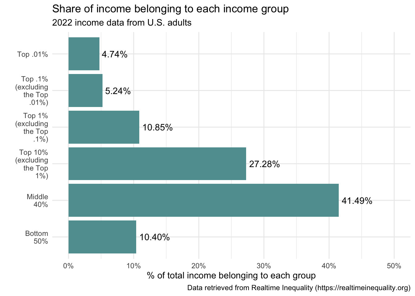
Notice that the x-axis label states
x = ""— denoting to leave it blank. An alternative would be to include:x = "Income Group"— however, the title already points the reader to this and the group labels are sufficient for the reader to understand. The graph looks less cluttered without the label.Style the graph: Let’s make a few stylistic changes. In the code below. Notice that a different theme is specified that changes the background — theme_minimal() is one that I like. You can explore many different themes here. The color of the bars is changed to a shade of blue — “cadetblue”. We’ll explore additional color options later. One thing to note here, see that in the geom_col() function,
fill = "cadetblue"is specified without any aesthetic mapping. This causes all bars to be filled with the same color. If instead, the code read:geom_col(mapping = aes(fill = group.f))then each group’s bar would be a different color (i.e., a variable would be aesthetically mapped to an element of the graph).real_time_ineq_2022 |> ggplot(mapping = aes(x = group.f, y = factor_income_share)) + geom_col(fill = "cadetblue") + scale_x_discrete(labels = scales::wrap_format(10)) + scale_y_continuous(label = scales::percent_format(), limits = c(0,0.5)) + geom_text(mapping = aes(label = scales::percent(factor_income_share)), vjust = -0.5) + labs(title = "Share of income belonging to each income group", subtitle = "2022 income data from U.S. adults", caption = "Data retrieved from Realtime Inequality (https://realtimeinequality.org)", x = "", y = "% of total income belonging to each group") + theme_minimal()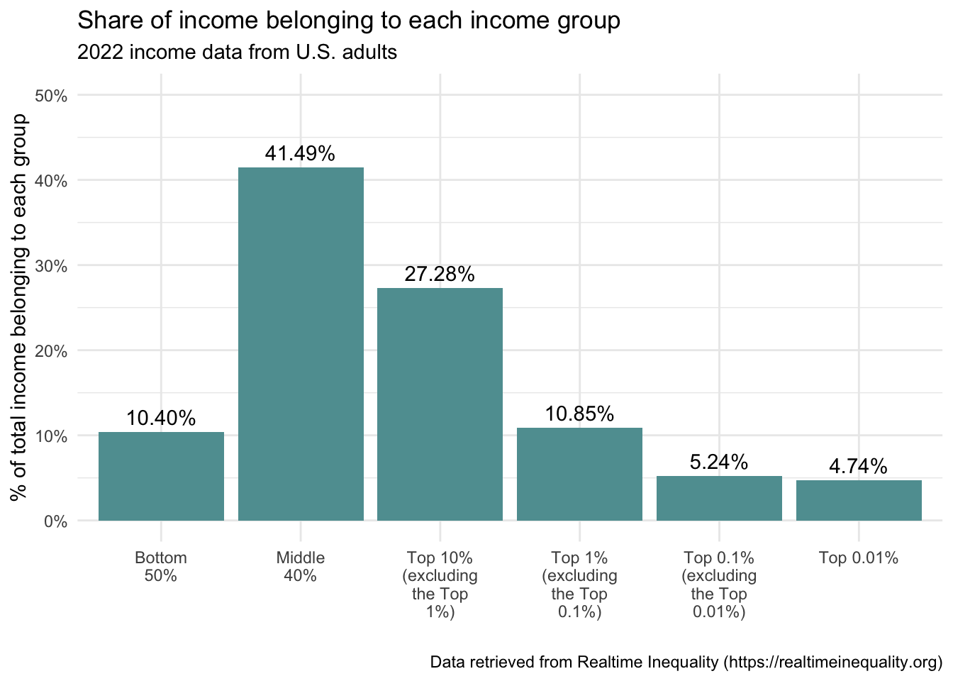
Earlier I showed you two versions of a bar graph, a vertical bar graph and a horizontal bar graph. We’ve been working with the vertical version. How can we change the code to create a horizontal version? It’s easy — we just add a layer using the coord_flip() function.
In addition, because we are using geom_text() to add the corresponding percentage of each bar — it is necessary to change vjust to hjust to accommodate the horizontal bar graph. I also adjust the value a bit — a value of -0.1 puts the number just slightly to the right of the bar.
Which version of the graph do you prefer — vertical or horizontal?
real_time_ineq_2022 |>
  ggplot(mapping = aes(x = group.f, y = factor_income_share)) +
  geom_col(fill = "cadetblue") +
  scale_x_discrete(labels = scales::wrap_format(10)) +
  scale_y_continuous(label = scales::percent_format(), limits = c(0,0.5)) +
  coord_flip() +
  geom_text(mapping = aes(label = scales::percent(factor_income_share)), hjust = -0.1) +
  labs(title = "Share of income belonging to each income group",
       subtitle = "2022 income data from U.S. adults",
       caption = "Data retrieved from Realtime Inequality (https://realtimeinequality.org)",
       x = "",
       y = "% of total income belonging to each group") +
  theme_minimal()
In summary, the graph provides us with important information about economic inequality in the United States. Half of the population (i.e., the bottom 50%, which comprises about 125 million people), received just over 10% of the income. In particular, this indicates a significant income disparity, as half of the population holds a very small fraction of the total income. On the other end of the spectrum, the share of the top 1% can be ascertained by summing the shares for the top three groups. For income share that is 10.85 + 5.24 + 4.74 or 20.83, meaning that the top 1% received nearly 21% of the income in 2022. The figure paints a clear picture of substantial income inequality in the United States, with a significant concentration of income in the hands of the top 1%, and especially in the top 0.1%, and 0.01%. This is a key aspect of ongoing discussions around economic policy, tax reform, and social equity. In the next section, we’ll take a closer look at the top 1%.
Tip
It’s completely normal to feel a bit overwhelmed — that was a lot of code right out of the gate. Don’t worry if it doesn’t all make sense yet. You don’t need to master everything right now. With regular practice, you’ll gradually get the hang of R, one step at a time.
Line graph
A line graph displays how a quantity changes over time3. It uses lines to connect individual data points, each representing a value measured at a specific time point (an interval or ratio variable). Line graphs are especially useful for showing trends across intervals such as days, months, or years.
The graph includes a horizontal axis (x-axis), which typically represents time, and a vertical axis (y-axis), which shows the quantity being measured. Each point corresponds to a value at a particular time, and connecting these points with lines reveals trends — such as increases, decreases, or fluctuations in the data.
Line graphs can include one or more lines.
A line graph with one group
In the prior graph we saw that in 2022, about 21% of the total income in the US went to the top 1%. Now, let’s use a line graph to examine how this percentage has changed over the past century.
We will use data from the World Inequality Database to create our graph.
There are just two variables in the data frame:
| Variable | Description |
|---|---|
| year | The year the data come from |
| share_top_1pct | The proportion of income belonging to the top 1 percent of the US adult population |
Let’s import the data frame and take a look at the first 20 rows of data:
us_ineq_past_century <- read_rds(here("data", "us_ineq_past_century.Rds"))
us_ineq_past_century |> head(n = 20)
Now, let’s use the data to create a line graph.
us_ineq_past_century |>
  ggplot(mapping = aes(x = year, y = share_top_1pct)) +
  geom_line() +
  scale_x_continuous(breaks = seq(from = 1910, to = 2025, by = 10)) +
  scale_y_continuous(label = scales::percent_format()) +
  labs(title = "Share of wealth belonging to the top 1 percent",
       subtitle = "Years 1913 to 2021",
       caption = "Data retrieved from World Inequality Database (https://wid.world/country/usa/)",
       x = "",
       y = "% of total pre-tax national income belonging to the top 1 percent") +
theme_minimal()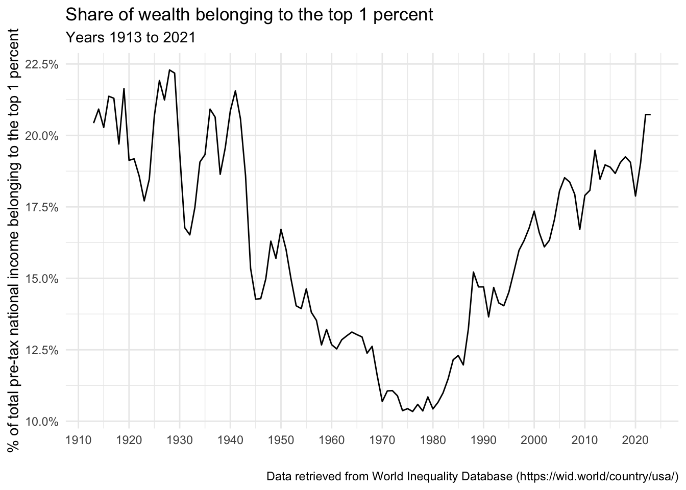
Let’s walk through the code (please carefully match the code above with the description below).
year is mapped to the x-axis, and share_top_1pct is mapped to the y-axis.
The geom_line() geometry is used to create a line graph.
The scale_x_continuous() function controls the scaling of the x-axis variable (year — which is a continuous variable, thus we use scale_x_continuous() rather than scale_x_discrete() as in the bar graph example above where the variable on the x-axis was discrete). This function call sets the breaks on the x-axis to be every 10 years, from 1910 to 2025.
Similar to the bar graph example, the scale_y_continuous() function is used to modify the continuous variable mapped to the y-axis. Inside this function the label argument is used in conjunction with the percent_format() function to indicate that the value should be displayed as a percentage.
What does this graph tell us? In the early part of the 20th century, during the era known as the “Gilded Age,” income inequality was very high, with the top 1% controlling a large share of the nation’s income. The share of income going to the top 1% reached its peak in the late 1920s, just before the Great Depression. During the mid-20th century, from the 1930s to the 1970s, the share of income going to the top 1% decreased significantly. This period, sometimes referred to as “The Great Compression,” saw policies such as progressive taxation and the strengthening of labor unions, which led to a more equitable distribution of income. However, from the 1980s onwards, the trend reversed, and the income share of the top 1% started increasing again. This period, referred to as the “Great Divergence” or the “New Gilded Age,” saw significant increases in income inequality. By the early 21st century, the share of income going to the top 1% had returned to Gilded Age levels. Income inequality continues to grow today.
A line graph with multiple groups
Let’s now return to the data collected by Realtime Inequality — but instead of just looking at 2022 as we did with the bar graph, we’ll take a longer term assessment of the six identified income groups. In addition, we’ll look at income growth over time instead of share of income belonging to the group. Income growth is is calculated from dollar figures that have been annualized and adjusted for price inflation to March 2023 dollars4.
Variables in the data frame include:
| Variable | Description |
|---|---|
| year | Year of data. |
| group.f | Mutually exclusive income groups based on total income for 2022 for all U.S. adults. |
| real_factor_income_per_unit | Average income (including all labor and capital income before taxes) per adult (in March 2023 dollars). |
| real_factor_income_per_unit_growth | Growth in income (including all labor and capital income before taxes) since base year per adult (in March 2023 dollars). |
Let’s read in the data frame, called real_time_ineq_income_growth. The table below presents the the first few rows of data.
real_time_ineq_income_growth <- read_rds(here("data", "real_time_ineq_income_growth.Rds"))
real_time_ineq_income_growth |> head(n = 20)
The graph is then fit with the following code:
real_time_ineq_income_growth |>
  ggplot(mapping = aes(x = year, y = real_factor_income_per_unit_growth, group = group.f, color = group.f)) +
  geom_line() +
  theme_minimal() +
  scale_y_continuous(label = scales::percent_format()) +
  labs(title = "Cumulative percent change in income since 1976 by income group",
       subtitle = "Income growth is calculated from dollar figures that have been annualized and adjusted for price inflation to March 2023 dollars.",
       y = "Cumulative percent change in income",
       x = "",
       caption = "Data retrieved from Realtime Inequality (https://realtimeinequality.org)",
       color = "Income group")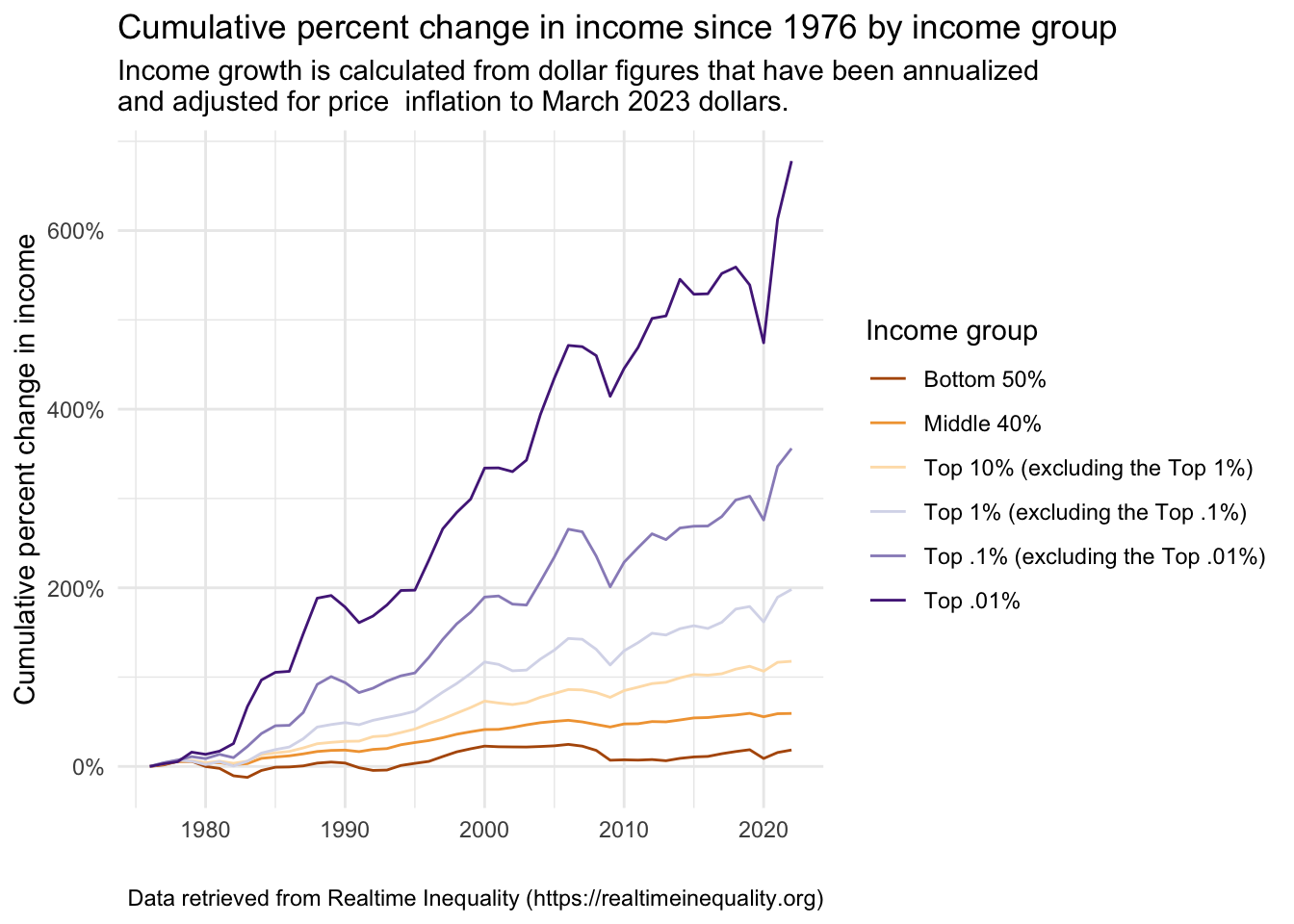
Much of the code to create this graph should be familiar to you. Let’s focus in on the parts that are new.
First, notice that in the part where the aesthetic mappings occur, in addition to mapping the desired variables to the x- and y-axis, we also now indicate that the variable group.f (which denotes our income groups) is a grouping variable and that we want to map group.f to the color (specifically — line color )5. ggplot2 automatically creates a legend. In the labs() function, we indicate color = "Income group" to provide a name for the legend (ggplot2 defaults to labeling the legend with the variable name — e.g., “group.f”, which isn’t very informative). The placement of the legend can be moved from the default (i.e., to the right of the graph) — click here to learn about how to change this as desired.
Let’s make a few modifications to enhance this graph.
First and foremost, notice that the subtitle is cut off. We can force a return by adding the characters
\nwhere a return is desired (here is it placed before the “and” in the subtitle). The\ncharacter is a special character in R (and many other programming languages) that represents a new line. This means that it tells R to start a new line at that point in the text. In the context of ggplot2, you can use\nin titles, labels, or text annotations to break the text into separate lines. This can be useful when you have long titles or labels and you want to format them in a more readable way. Check the code below to see this addition, and then observe how the graph looks with this fixed title.real_time_ineq_income_growth |> ggplot(mapping = aes(x = year, y = real_factor_income_per_unit_growth, group = group.f, color = group.f)) + geom_line() + theme_minimal() + scale_y_continuous(label = scales::percent_format()) + labs(title = "Cumulative percent change in income since 1976 by income group", subtitle = "Income growth is calculated from dollar figures that have been annualized \nand adjusted for price inflation to March 2023 dollars.", y = "Cumulative percent change in income", x = "", caption = "Data retrieved from Realtime Inequality (https://realtimeinequality.org)", color = "Income group")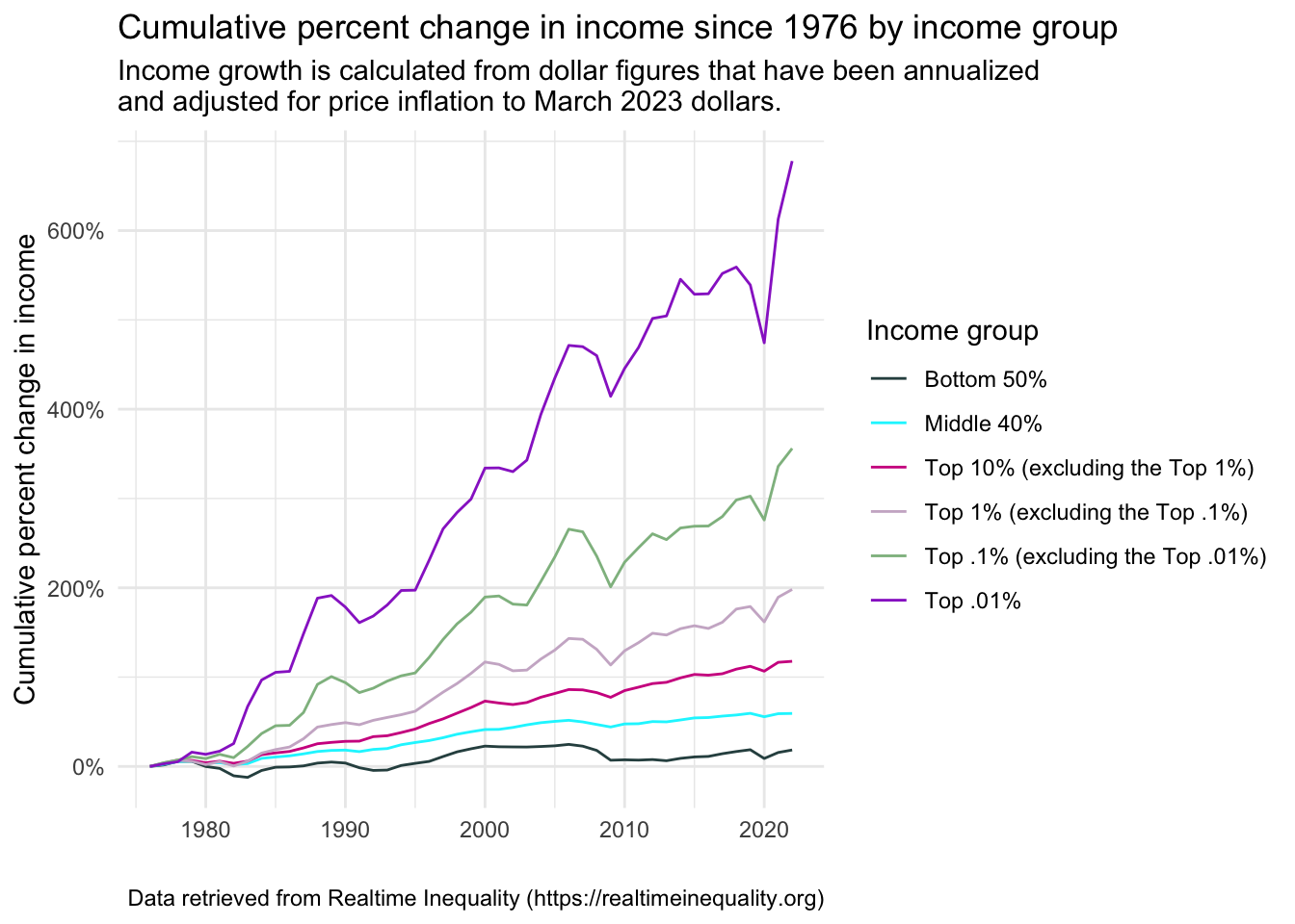
Second, we can change the colors. I think the colors in this graph are perfectly fine — these are the default colors of ggplot2. However, we can change them to any other color desired. Let’s take a moment to learn about how to create custom colors. First, we can use one of the many pre-defined color packages for R. Here, I’ll show you color palettes from the RColorBrewer package. In the figure below, the set of letters on the left names the corresponding color palette. To use one of these palettes (let’s pick PuOr), we add:
scale_color_brewer(palette = "PuOr")to our graph code.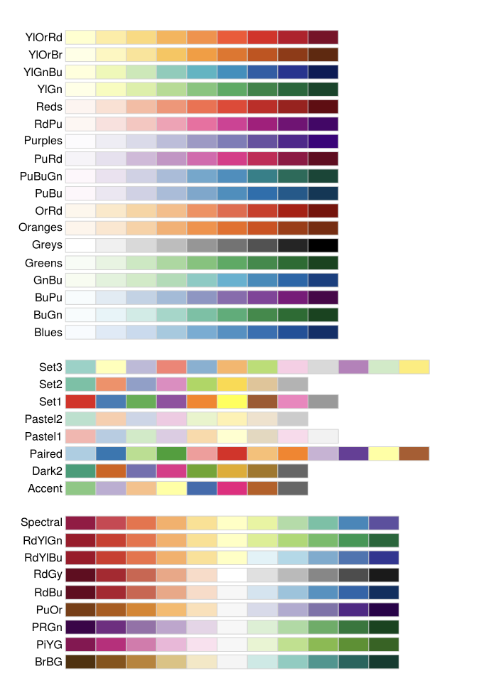
real_time_ineq_income_growth |>
  ggplot(mapping = aes(x = year, y = real_factor_income_per_unit_growth, group = group.f, color = group.f)) +
  geom_line() +
  theme_minimal() +
  scale_y_continuous(label = scales::percent_format()) +
  scale_color_brewer(palette = "PuOr") +
  labs(title = "Cumulative percent change in income since 1976 by income group",
       subtitle = "Income growth is calculated from dollar figures that have been annualized \nand adjusted for price  inflation to March 2023 dollars.",
       y = "Cumulative percent change in income",
       x = "",
       caption = "Data retrieved from Realtime Inequality (https://realtimeinequality.org)",color = "Income group")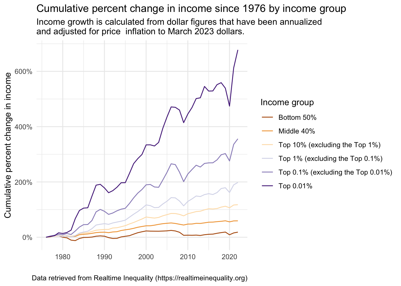
There are many R packages that offer attractive color palettes. Another package that is very easy to integrate with ggplot2 is viridis — which focuses on color blind-friendly colors. Alternatively, you can manually assign a color to each group. Click here to choose the colors that you like — noting either the color name or the HEX color code (I’ll show both options below). You can also search for colors and obtain HEX color codes here. Once your desired colors are selected then define a R object that assigns each level of the group (i.e., group.f) to a color. Then, add:
scale_color_manual(values = group.colors1)to the graph code, this will tell R that you’d like to color the lines based on the colors you assigned to each group in the group.colors object.# These two lines define the same colors, one with names, one with corresponding HEX values. group.colors1 <- c("Bottom 50%" = "darkslategrey", "Middle 40%" = "turquoise1", "Top 10% (excluding the Top 1%)" = "violetred", "Top 1% (excluding the Top 0.1%)" = "thistle3", "Top 0.1% (excluding the Top 0.01%)" = "darkseagreen", "Top 0.01%" = "darkorchid") group.colors2 <- c("Bottom 50%" = "#2F4F4F", "Middle 40%" = "#00F5FF", "Top 10% (excluding the Top 1%)" = "#D02090", "Top 1% (excluding the Top 0.1%)" = "#CDB5CD", "Top 0.1% (excluding the Top 0.01%)" = "#8FBC8F", "Top 0.01%" = "#9932CC") real_time_ineq_income_growth |> ggplot(mapping = aes(x = year, y = real_factor_income_per_unit_growth, group = group.f, color = group.f)) + geom_line() + theme_minimal() + scale_y_continuous(label = scales::percent_format()) + scale_color_manual(values = group.colors1) + labs(title = "Cumulative percent change in income since 1976 by income group", subtitle = "Income growth is calculated from dollar figures that have been annualized \nand adjusted for price inflation to March 2023 dollars.", y = "Cumulative percent change in income", x = "", caption = "Data retrieved from Realtime Inequality (https://realtimeinequality.org)", color = "Income group")
Substantively, how should we interpret this graph? To help you better understand, I constructed the table below. It shows the income in 1976 and 2022 (in 2023 dollars) for each income group. Consider the bottom 50%. Their income went from an average of 15,588 USD to 18,455 USD — a growth of about 18.4%. For the top 0.01%, their income went from an average of 5,414,213 USD to 42,115,401 USD — a growth of about 678%. This vast difference in income growth rates reveals staggering income inequality that continues to grow at an alarming rate in the U.S. These data underscore the need for policies that promote more equitable income and wealth distribution and economic opportunities for all strata of society.
Scatterplot
A scatterplot shows the relationship between two numerical variables (measured on interval or ratio scales). Each point on the plot represents one observation from the dataset, with its position determined by the values of two variables — one on the x-axis (horizontal) and one on the y-axis (vertical).
Scatterplots are often used to explore whether a pattern or association exists between the two variables. For example, you might observe a positive trend (points rising from left to right) if both variables tend to increase together. Alternatively, a negative trend (points falling from left to right) may appear if one variable decreases as the other increases.
The strength and direction of the relationship can be summarized using a statistic called correlation. Correlation coefficients range from -1 to +1:
A correlation of +1 indicates a perfect positive linear relationship: as one variable increases, so does the other.
A correlation of -1 indicates a perfect negative linear relationship: as one variable increases, the other decreases.
A correlation close to 0 suggests little to no linear relationship, with points scattered widely around the plot.
The following plots illustrate different strengths and directions of correlation between two variables, helping to visualize this key concept in statistics.
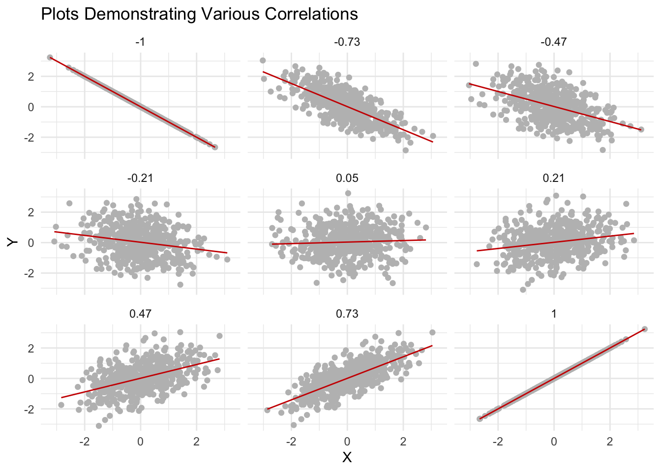
Scatterplots are useful because they give us a simple, visual way to see how two variables are related. You can quickly see whether higher values on one variable tend to go along with higher (or lower) values on the other, whether the relationship looks strong or weak, or if there’s no clear pattern at all. Scatterplots make it easy to spot trends, clusters, or outliers that might be hard to notice just by looking at numbers in a table.
So far in this Module, we examined graphs that depict the degree of economic inequality in the United States. In this example, let’s expand beyond the U.S. to consider economic inequality across countries and the extent to which economic inequality is related to social mobility. Social mobility refers to the ability of individuals or families to move up or down the social and economic ladder within a society — here, we focus on the ability for children born into poor families to move up in social class as they reach adulthood.
We’ll consider the Gatsby Curve, a concept in economics that illustrates the relationship between income inequality and social mobility across generations. The term was coined by economist Dr. Alan Krueger in 2012 and was inspired by the book The Great Gatsby, which offers a poignant depiction of the economic and social disparities within the American upper class during the Gilded Age.
The image below depicts the Gatsby Curve.
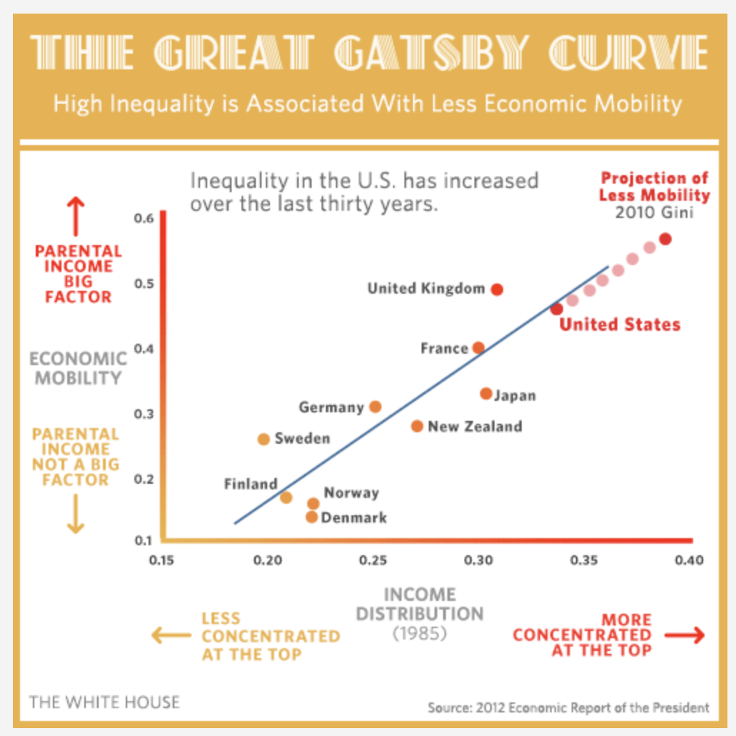
Click here to view a dynamic version of the image. And, please watch the video below by Dr. Miles Corak which further describes the Gatsby Curve and discusses its implications.
The Gatsby Curve demonstrates that in societies with high income inequality, there is less opportunity for social mobility. In other words, it’s harder for children from low-income families to move up the income ladder as adults, thereby perpetuating economic disparities across generations. The greater the income inequality in a society, the steeper the Gatsby Curve, indicating reduced social mobility. This relationship depicted in the Gatsby Curve raises significant concerns about fairness, social cohesion, and economic stability, as it suggests that the “American Dream” — the idea that everyone has an equal opportunity to succeed — could be harder to achieve for those born into lower-income households in highly unequal societies.
Let’s now create a scatterplot that depicts the Gatsby Curve. To create our version of the Gatsby Curve, we’ll consider two variables for a set of countries.
The first variable is a measure of economic inequality called the Gini Coefficient. It is a statistical measure used to represent the income or wealth distribution of a nation’s residents. Named after the Italian statistician Corrado Gini who developed it in 1912, it is a popular tool for quantifying income inequality within a population. The Gini Coefficient ranges between 0 and 100. A Gini Coefficient of 0 represents perfect equality, where everyone has the same income or wealth. On the other hand, a Gini Coefficient of 100 signifies perfect inequality, where one person has all the income or wealth, and everyone else has none. In practice, most countries have a Gini Coefficient between 25 and 60. High income inequality countries, like South Africa and Brazil, tend to have a Gini Coefficient over 50, while more egalitarian countries like those in Scandinavia tend to have a Gini Coefficient under 30.
The second variable is intergenerational earnings elasticity (IEE). It is a measure used in economics to quantify the extent to which a person’s income is determined by the income of their parents. It’s a crucial indicator of social mobility. IEE is coded so that a score of 0 means that a person’s income is not related at all to their parents’ income, signifying perfect social mobility — that is, everyone has an equal chance to land anywhere on the income scale, regardless of their starting point. On the other hand, a score of 1 means that a person’s income is entirely determined by their parents’ income, indicating zero social mobility — in this scenario, if you’re born into a low-income family, you’re destined to remain in that income bracket, and the same holds true for those born into wealth.
The data frame that we’ll use includes three variables:
| Variable | Description |
|---|---|
| country | The name of the country |
| iee | Intergenerational earnings elasticity |
| gini | The Gini Coefficient |
The data frame is called gatsby.Rds. Let’s import the data frame and take a look at the contents.
gatsby <- read_rds(here("data", "gatsby.Rds"))
gatsby
We can use the following code to create the scatterplot.
gatsby |>
  ggplot(mapping = aes(x = gini, y = iee)) +
  geom_point() +
  ggrepel::geom_label_repel(mapping = aes(label = country),
                            color = "grey35", fill = "white", size = 2, box.padding =  0.4,
                            label.padding = 0.1) +
  theme_minimal() +
  labs(title = "The Great Gatsby Curve",
       subtitle = "High inequality tends to mean intergenerational economic immobility",
       x = "Gini Coefficient",
y = "Intergenerational Earnings Elasticity") 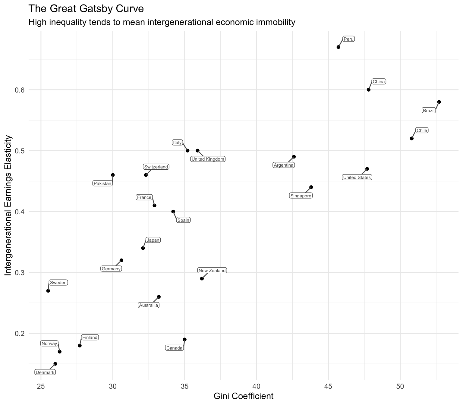
Most of the code here should look familiar to you. A new element is the use of the ggrepel package’s geom_label_repel() function to label the data points. In this graph, it provides the name of the country for each point. If you’d like to learn more about all the options of the geom_label_repel() call in this graph, please read the Advanced Tip below.
Tip
Advanced Tip for the Curious
Full documentation for the following code snippet: ggrepel::geom_label_repel(mapping = aes(label = country), color = "grey35", fill = "white", size = 2, box.padding = 0.4, label.padding = 0.1) +
- mapping: This argument specifies the mapping for the label annotations. In this case, it is using the aesthetic mapping aes() function to map the “country” variable to the label parameter. This means that the label annotations will display the values of the “country” variable.
- color: This argument determines the color of the label text. It is set to “grey35”, which is a shade of gray.
- fill: This argument determines the fill color of the label background. It is set to “white”, indicating a white background.
- size: This argument determines the size of the label text. It is set to 2, indicating a font size of 2 units.
- box.padding: This argument controls the padding around the label background box. It is set to 0.4, specifying a padding of 0.4 units.
- label.padding: This argument determines the padding between the label text and the label background box. It is set to 0.1, indicating a padding of 0.1 units.
NOTE: Another option would be to replace this code snippet with the following: geom_text(mapping = aes(label = country), vjust = -0.1, hjust = -0.1, size = 3, nudge_x = 0.1, check_overlap = TRUE)
This uses the geom_text() geometry native to ggplot2. However, I prefer the way ggrepel adds labels to data points in a scatterplot.
Let’s enhance this graph by adding a best fit line through the scatter of points. Adding a best fit line, or a trend line, to a scatterplot can be highly useful in understanding the relationship between two numerical variables. The line essentially condenses the overall pattern of the scattered points into a single, clear trajectory, making it easier to interpret the relationship. We can add this with one additional line of code, calling a new geometry with the geom_smooth() function: geom_smooth(method = "lm", formula = y ~ x, se = FALSE, color = "darkorange"). method = "lm" specifies a linear model. We’ll dive into linear modeling later in the course and you’ll have a chance to explore how the best fit linear model is calculated. se = FALSE specifies that we don’t want the standard error to be displayed (we’ll also further explore this option later in the course when we begin studying statistical inference). color = "darkorange" is there just for appearances — the default line color is blue.
Here’s the updated code with these enhancements:
gatsby |>
  ggplot(mapping = aes(x = gini, y = iee)) +
  geom_point() +
  geom_smooth(method = "lm", formula = y ~ x, se = FALSE, color = "darkorange") +
  theme_minimal() +
  labs(title = "The Great Gatsby Curve",
       subtitle = "High inequality tends to mean intergenerational economic immobility",
       x = "Gini Coefficient",
y = "Intergenerational Earnings Elasticity") 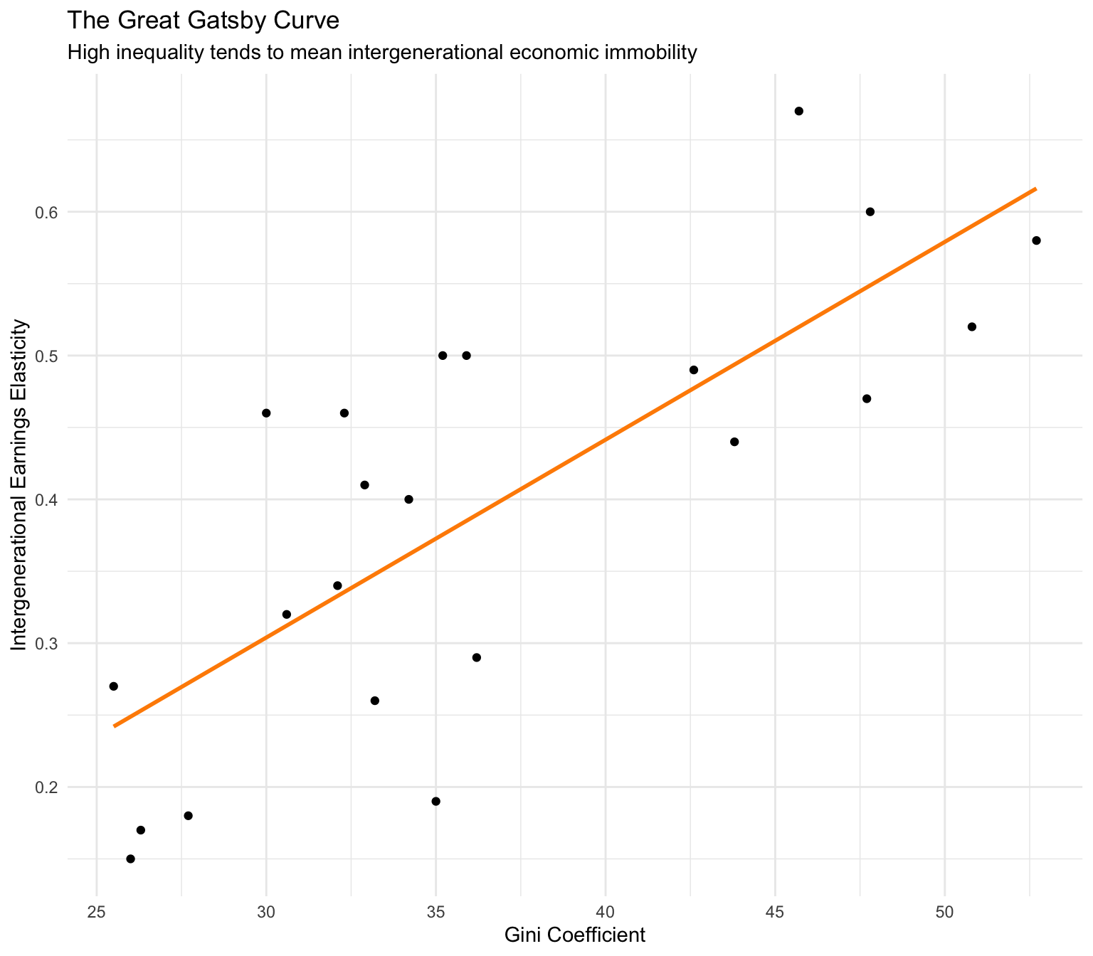
What are the substantive findings depicted in this graph? Countries with higher income inequality, such as Peru, China, and Brazil (higher Gini Coefficients), tend to have more intergenerational economic immobility. While countries with lower income inequality, such as Denmark, Norway, and Finland (lower Gini Coefficients), tend to have low economic immobility.
This suggests a positive relationship between income inequality and the intergenerational earnings elasticity, indicating that higher income inequality is associated with greater intergenerational economic immobility. This is the primary assertion of the Gatsby curve and underscores the argument that addressing income inequality is essential for enhancing opportunities for all children to succeed, regardless of their family background.
Histogram
A histogram organizes a group of data points into specified intervals. It is an effective tool for displaying the frequency or proportion of data within different intervals, and it is commonly used in statistics to visually represent the distribution and variability of numerical (i.e., interval and ratio scales) data.
A histogram consists of rectangles, where the area of each rectangle is proportional to the frequency of a variable within the range, also known as a bin. The x-axis shows these bins, while the y-axis reflects the frequency (how many cases (e.g., people) are in the bin). For instance, in a histogram representing the ages of people in a sample, each bin could represent a decade of life. The height of the bar corresponding to each bin would indicate the number of individuals whose age falls within that decade. Histograms allow us to grasp the overall shape and distribution of a variable.
In this section, we will consider data from a study conducted by Raj Chetty, Ph.D. and colleagues. The academic paper describing the study we’ll consider can be downloaded here.
Please watch the following Ted talk by Dr. Chetty that gives a nice overview of the example we’ll consider.
Briefly, Chetty and colleagues compiled administrative records on the incomes of more than 40 million children and their parents to quantify social mobility across areas within the U.S. — called commuting zones. One of the key findings of the study is the substantial variability in social mobility across the U.S. For example, the authors found that the likelihood that a child reaches the top quintile6 (i.e., the top 20%) of the national income distribution starting from a family in the bottom quintile (i.e., the bottom 20%) is 4.4% in Charlotte, NC but 12.9% in San Jose, CA. The map below depicts how this likelihood of intergenerational social mobility varies across the U.S.
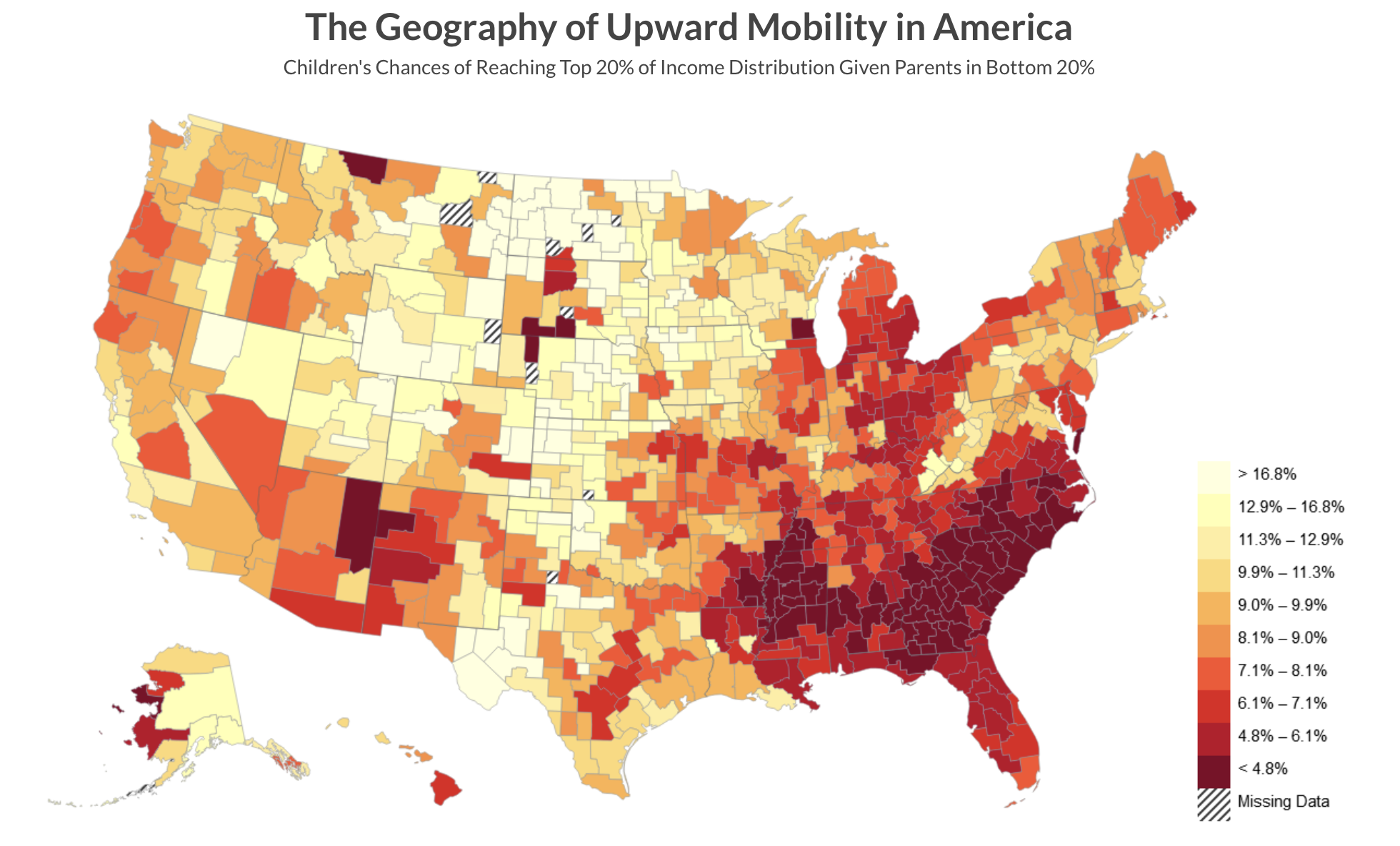
The map shows that the degree of social mobility is lowest for individuals raised in the Southeast, while it’s highest in the regions of the Mountain West and rural Midwest. There are certain commuting zones (CZs) in the U.S. that display levels of social mobility on par with countries known for their high mobility, like Canada and Denmark. On the other hand, some zones show mobility rates that are lower than those recorded in any other developed country for which data is accessible.
The data frame, called chetty_mobility.Rds, includes data on 709 commuting zones and includes the following variables:
| Variable | Description |
|---|---|
| cz_name | The name of the commuting zone |
| state | The state the commuting zone belongs to |
| p_bottom_to_top | The likelihood of the child getting to the top income quintile given their parents were in the bottom income quintile |
| abs_up_mobility | The mean income rank of children with parents in the bottom half of the income distribution |
| gini | The Gini Coefficient |
| gini_rank.f | The Gini Coefficient binned into 5 equal parts (i.e., quintiles) |
Let’s import the data and take a peek at the head of the data frame.
chetty <- read_rds(here("data", "chetty_mobility.Rds"))
chetty |> head(n = 12)
Let’s begin by creating a histogram of absolute upward mobility (i.e., the variable abs_up_mobility).
chetty |>
  ggplot(mapping = aes(x = abs_up_mobility)) +
  geom_histogram(binwidth = 1, fill = "grey") +
  theme_minimal() +
  labs(title = "The distribution of absolute upward mobility across commuting zones",
       x = "Absolute upward mobility",
       y = "Frequency")
The new line of code here is geom_histogram(), the geometry for a histogram in ggplot2. Notice the argument binwidth = 1. The bin width is the range of values that each bar in the histogram represents, so a bin width of 1 means that each bar represents a range of 1 unit of absolute upward mobility (e.g., commuting zones with an abs_up_mobility score between 40 and 41). An alternative to binwidth is the bins argument. Instead of specifying the width of the bins, you can specify the number of bins you want in the histogram, for example, bins = 20 would create 20 bins of equal width. This means that the range of the data is split into 20 intervals, and the height of each bar in the histogram represents the number of data points that fall into each interval.
In looking at the graph, we find that a large concentration of commmuting zones have an upward mobility score that is between about 40 and 45. We also find a large range — with some commuting zones having a very low upward mobility score (i.e., less than 30) and some having a quite high upward mobility score (i.e., above 60).
Let’s enhance the histogram — and consider how the the distribution of the variable of interest abs_up_mobility differs across Gini quintiles. Let’s use facet_wrap() to produce one histogram per Gini Coefficient group. The arguments for facet_wrap() are the variable to facet by, and the number of columns and/or rows that you desire (i.e., ncol for columns, and nrow for rows). In our example, we’ll create 1 column of subplots.
chetty |>
  ggplot(mapping = aes(x = abs_up_mobility)) +
  geom_histogram(binwidth = 1, fill = "lightskyblue4") +
  theme_minimal() +
  labs(title = "Differences in the distribution of absolute upward mobility across commuting zones",
       subtitle = "Facetted by Gini Coefficient Quintile",
       x = "Absolute upward mobility",
       y = "Frequency",
       fill = "Quintile of the Gini Coefficient") +
  facet_wrap(~gini_rank.f, ncol = 1)
It’s clear to see that as the Gini Coefficient of the commuting zone increases (i.e., meaning the commuting zone has more inequality), the distribution of upward mobility shifts to the left. This means there tends to be less upward mobility in high inequality commuting zones. In other words, areas in the U.S. that have more inequality tend to provide less opportunity for children from poorer families to move up the income ladder as they become adults.
Density plot
A density plot presents the distribution of a continuous (i.e, quantitative) variable (interval and ratio scales). It’s similar to a histogram but provides a smoothed curve rather than bars. A density plot can also help us to understand the shape of the data distribution and the degree of variability/spread/dispersion. Here’s a simple example that is similar to the first histogram we created.
chetty |>
  ggplot(mapping = aes(x = abs_up_mobility)) +
  geom_density(fill = "grey") +
  theme_minimal() +
  labs(title = "The distribution of absolute upward mobility across commuting zones",
       x = "Absolute upward mobility",
       y = "Frequency")
Notice that instead of geom_histogram(), geom_density() is used.
In a density plot, the y-axis represents the estimated density of the data at different values of the variable plotted on the x-axis. It’s important to note that the values on the y-axis are not probabilities, but rather, density values. The density values give you an idea of how closely packed or spread out the data points are around specific values.
In our example, we can see that the highest concentration of upward mobility scores are between 40 and 45 — of course, this corresonds with the histogram of the same variable produced earlier.
Please watch the video below, which describes the differences between histograms and density plots — and builds up intuition for understanding each of them.
The y-axis in a density plot can be tricky to interpret at first because it doesn’t show counts or probabilities directly. Here are some key ideas to help you make sense of it:
Higher Values Indicate Greater Density: A higher value on the y-axis indicates that more data points are concentrated around the corresponding value on the x-axis.
Area Under the Curve: The total area under the density curve is equal to 1. This is akin to saying that the probability of a data point falling somewhere along the x-axis is 100%.
Comparing Densities: By comparing the heights of different regions of the curve, you can make inferences about the relative densities of data points. For example, if one part of the curve is higher than another, it means that data points are more densely packed around that value of the x-axis compared to where the curve is lower.
Units: The units of the y-axis are not in terms of counts or probabilities, but in terms of density, which is derived as a count per unit of the x-axis. This sometimes causes confusion, as the values on the y-axis can be higher than 1, especially if the range of X is small.
Peaks and Troughs: Peaks in the density plot indicate modes or clusters within the data, whereas troughs indicate regions where there are fewer data points.
Understanding the y-axis in density plots helps in analyzing the distribution of data, identifying the range of values where the data points are concentrated, and observing patterns such as skewness, multimodality, and spread. They are often considered alongside histograms — where each have benefits. Histograms are more straightforward and easier to interpret, especially for those not well-versed in statistics. The bars represent raw counts or frequencies, which are intuitive to understand. Density plots use smoothing to create a continuous curve, which can be more appropriate for continuous data. This makes it easier to observe the underlying distribution and detect patterns. Importantly, when comparing multiple groups that differ in size, density plots have a particular advantage because they normalize the data (i.e., density plots are normalized so that the area under the curve sums to 1), allowing for a better comparison of the shapes of the distributions regardless of the size of each group. We’ll see an example of this benefit of density plots versus histograms later in the course.
Let’s enhance the density graph to explore options. First, let’s change the color of the density graph. In the code chunk below, notice that I set colors for both the line of the density plot (specified as color = "azure3") and the fill of the density plot (specified as fill = "azure2").
chetty |>
  ggplot(mapping = aes(x = abs_up_mobility)) +
  geom_density(color = "azure3", fill = "azure2") +
  theme_minimal() +
  labs(title = "The distribution of absolute upward mobility across commuting zones",
       x = "Absolute upward mobility",
       y = "Density")
Now, let’s modify the histogram to create multiple curves by Gini quintile — doing so makes use of the facet_wrap() function.
chetty |>
  ggplot(mapping = aes(x = abs_up_mobility, fill = gini_rank.f)) +
  geom_density() +
  theme_minimal() +
  facet_wrap(~ gini_rank.f) +
  labs(title = "The distribution of absolute upward mobility across commuting zones",
       x = "Absolute upward mobility",
       y = "Density",
       fill = "Gini Coefficient Quintile")
Alternatively, we can put all 5 density plots onto one graph as follows:
chetty |>
  ggplot(mapping = aes(x = abs_up_mobility, fill = gini_rank.f)) +
  geom_density(alpha = 0.5) +
  theme_minimal() +
  labs(title = "The distribution of absolute upward mobility across commuting zones",
       x = "Absolute upward mobility",
       y = "Density",
       fill = "Gini Coefficient Quintile")
By stating fill = gini_rank.f in the aesthetics call, we tell R to group by gini_rank.f, and color the plots by this grouping variable. Note here that I added an argument to geom_density() called alpha — which refers to the opacity of the selected geometry. Alpha ranges from 0 to 1, with lower values corresponding to more transparent colors. You can play around with changing alpha to 0.2 or 0.8, for example, to see what looks best.
Boxplot
A box plot, also known as a box-and-whisker plot, displays the distribution of a continuous variable (interval or ratio scale), often across levels of a grouping variable (nominal or ordinal scale). Like histograms and density plots, box plots also display variability/spread/dispersion of the variable — but instead of the full range — box plots highlight the interquartile range. The geometry for a box plot in ggplot2 is geom_boxplot().
Here is an example of a box plot — in which we again consider absolute upward mobility across commuting zones and how it differs across Gini quintiles.
chetty |>
  ggplot(mapping = aes(x = gini_rank.f, y = abs_up_mobility)) +
  geom_boxplot(fill = "yellow") +
  theme_minimal() +
  labs(title = "A boxplot of absolute upward mobility across Gini Coefficient rankings",
       x = "Quintiles of the Gini Coefficient",
       y = "Absolute upward mobility")
How should we interpret the elements of a box plot?
Box: The main part of the plot is a box, which represents the interquartile range (IQR) — that is, the range within which the middle 50% of the data falls. The bottom of the box represents the first quartile (Q1, or the 25th percentile), and the top of the box represents the third quartile (Q3, or the 75th percentile).
Line inside the Box: There is a horizontal line inside the box which represents the median (Q2 or the 50th percentile) of the variable. This line divides the data into two halves.
Whiskers: Extending from the top and bottom of the box, there are lines known as “whiskers”. These whiskers extend from the edges of the box to the maximum and minimum values within a defined range, for ggplot2 that is Q3 + 1.5 times the IQR and Q1 - 1.5 times the IQR respectively.
Outliers: Data points that are beyond the ends of the whiskers are often considered outliers and are usually plotted as individual points. These are data points that are outside the range of the whiskers.
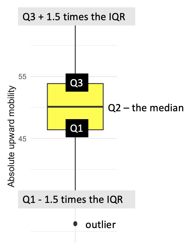
Box plots are widely used because they are a concise way to visualize the distribution and variability of a variable. They are particularly useful for comparing distributions across multiple groups or categories at once, and for identifying outliers. This plot displays similar information to the histogram that we created earlier — the one that also included the gini_rank.f as a grouping variable. This is simply a different way of examining the distribution of absolute upward mobility across the Gini Coefficient groups. Which one do you prefer?
Specialty plots (bonus material)
In this last section, I would like to introduce you to some specialty plots that require more advanced features of ggplot2 or additional R packages. As you embark on your journey of learning R, the immediate necessity of these specific types of graphs may not be apparent. However, with time, as you delve deeper into data visualization in your own work, you’ll likely find these visual representations increasingly valuable.
Scatterplot matrix
The GGally package has a function called ggpairs() that creates a scatterplot matrix. A scatterplot matrix is useful when a scatterplot of three or more variables is desired. For example, in the final aim of the Chetty and colleague’s study described earlier, the authors examined factors correlated with upward mobility. They found that high upward mobility areas have (1) less residential segregation, (2) less income inequality, (3) better primary schools, (4) greater social capital, and (5) greater family stability.
Let’s use the ggpairs() function to create a scatterplot matrix that relates our outcome of interest (absolute upward mobility) to several variables from their data frame. The data frame is called chetty_cov.Rds, it includes data on 709 commuting zones:
| Variable | Description |
|---|---|
| cz_name | The name of the commuting zone. |
| state | The state the commuting zone belongs to. |
| abs_up_mobility | The mean income rank of children with parents in the bottom half of the income distribution. |
| seg_racial | The Thiel index of racial segregation (a higher score means more segregation). |
| gini | The Gini Coefficient. |
| test_scores_incadj | Income adjusted standardized test scores for students in grades 3 through 8. |
| social_capital_index | A computed index comprised of voter turnout rates, the fraction of people who return their census forms, and various measures of participation in community organizations. |
| frac_singlemother | The proportion of households headed by a single mother. |
Let’s import the data, and examine the first few rows:
chetty_cov <- read_rds(here("data", "chetty_cov.Rds"))
chetty_cov |> head()
To create the scatterplot matrix, we feed our data frame into the ggpairs() function. By default, the function will include all of the variables in the data frame — if you want a subset of these, you can specify those with the columns argument. The c() argument here stands for concatenate or combine. For this function, you must put the variable names in quotations. There is a second argument that I like to include — progress = FALSE. ggpairs() prints out a lot of unnecessary information about the progress towards completing the scatterplot — progress = FALSE suppresses this information.
chetty_cov |>
  GGally::ggpairs(columns = c("abs_up_mobility", "seg_racial", "gini", "test_scores_incadj", "social_capital_index", "frac_singlemother"),
progress = FALSE) 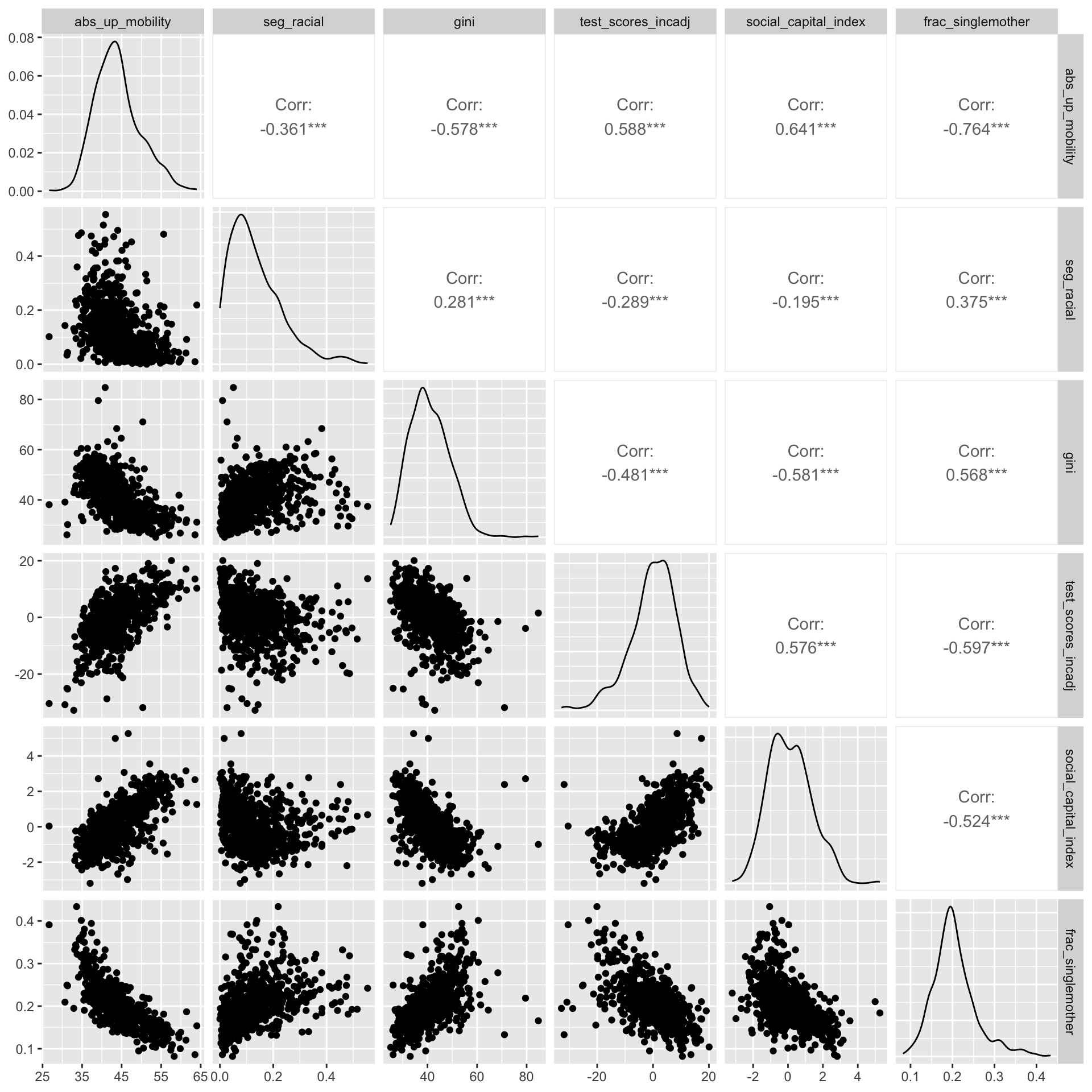
With the default settings, ggpairs() produces the plot above — which is a grid of plots that allows you to visualize relationships between multiple variables at once. The diagonal running from the top-left to the bottom-right shows density plots of each variable. This gives you an idea of the distribution of each variable. Below the diagonal, you’ll find scatterplots, each of which represents the relationship between two of the variables. For instance, the plot in the ith row and jth column shows how the variable represented in the ith row is related to the variable in the jth column. Can you locate the scatterplot of abs_up_mobility and gini? Above the diagonal are the correlation coefficients that quantify the relationship between the variables. For example, the correlation between abs_up_mobility and gini is -0.578.
Pie chart
A pie chart is a circular graphic that divides a whole into slices, with each slice representing a proportion of the total. The size of each slice is proportional to the value it represents in the data, making it easy to compare parts of a whole. The entire circle represents the total sum, and each slice shows how much of that total is contributed by a particular category.
To demonstrate, let’s re-create a pie chart produced by the Pew Research Center, an independent, nonpartisan research organization that serves as a “fact tank,” focusing on providing data-driven insights to the public about key issues, attitudes, and trends that are shaping the world. Part of their mission it to conduct the American Trends Panel, a nationwide survey of Americans on relevant topics of concern. In 2019, one of their surveys focused heavily on income inequality. A report of their findings can be found here, we’ll utilize some of the data from this survey in the remainder of this Module. Let’s begin by replicating the data from the pie chart below, which is featured in their report:
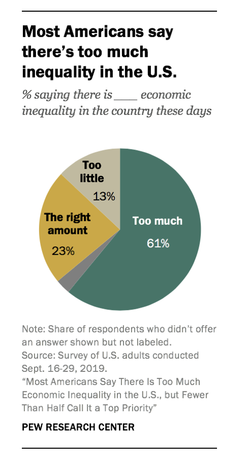
The data needed to replicate this pie chart is stored in a data frame called pew_too_much_ineq.Rds. The variable named category represents the name of the slice, and percentage corresponds to the percentage displayed in the slice.
pew_too_much_ineq <- read_rds(here("data", "pew_too_much_ineq.Rds"))
pew_too_much_ineq
The highcharter package offers an easy to create pie chart. Let’s load the package into our workspace — and then create a pie chart of the data.
library(highcharter)

pew_too_much_ineq |>
  hchart(type = "pie",
         hcaes(x = category, y = percentage, drilldown = category),
         name = "Inequality") |>
  hc_tooltip(enabled = TRUE) |>
  hc_title(text="Most American say there's too much inequality in the U.S.") |>
  hc_subtitle(text = "% saying there is ___ economic inequality in the country these days")
There are options to modify the colors and other features of the chart — which you can explore at the highcharter link provided above. One nice feature of the package is that it’s interactive — hover over the categories and it will show you the percentage in each group.
Stacked bar chart for Likert and Likert-type items
Likert items are statements used in surveys and questionnaires that allow respondents to indicate their level of agreement or disagreement on a scale. They are named after the psychologist Rensis Likert, who developed this approach as a way to measure attitudes and opinions.
Likert items typically present respondents with a statement, and respondents are asked to indicate their level of agreement with that statement on a scale. The scale usually includes a neutral or middle option, and an equal number of agreement and disagreement options on either side.
A common example of a Likert item scale is a 5-point scale, such as:
- Strongly disagree
- Disagree
- Neither agree nor disagree (Neutral)
- Agree
- Strongly agree
Other variations include 7-point scales or other ranges. The options might be labeled differently, such as:
- Very unhappy
- Unhappy
- Somewhat unhappy
- Neither unhappy nor happy
- Somewhat happy
- Happy
- Very happy
Likert and Likert-type items are widely used in social sciences.
The Pew Research Center American Trends Panel conducted in September of 2019 (Wave 54) focused on issues of economic inequality, we’ll explore these data with the next couple graphs.
One of the question sets presented respondents with a set of issues facing the country:
- Making health care more affordable
- Reducing illegal immigration
- Reducing economic inequality
- Addressing climate change
- Dealing with terrorism
- Reducing gun violence
For each of these issues — respondents were asked: How much of a priority should each of the following be for the federal government to address?
In responding to each issue, respondents selected from one of 4 choices:
- A top priority
- Important, but lower priority
- Not too important
- Should not be done
For the graph that we will create, “Not too important” and “Should not be done” were combined.
The variables for the stacked bar chart that we will create include:
| Layer | Description |
|---|---|
| issue | The name of the issue. |
| level | The level of importance of the issue. |
| n | The number of people selecting the level for the corresponding issue. |
| percentage | The percentage of people who selected the level for the corresponding issue. |
Let’s read in the data frame, called pew_priorities_tally.Rds, and examine it.
pew_priorities_tally <- read_rds(here("data", "pew_priorities_tally.Rds"))
pew_priorities_tally
Here is the code to create the graph:
group.colors <- c("A top priority" = "mediumseagreen",
                  "Important, but lower priority" = "khaki",
                  "Not too important/Should not be done" = "tomato")

pew_priorities_tally |>
  ggplot(mapping = aes(x = issue, y = percentage, fill = level)) +
  geom_col(position = "stack", color = "black") +
  scale_fill_manual(values = group.colors) +
  labs(
    title = "Despite saying there is too much economic inequality, \nrelatively few people choose it as a top policy priority",
    x = NULL,
    y = "Percentage",
    fill = NULL
  ) +
  theme_minimal() +
  theme(legend.position = "right") +
coord_flip() 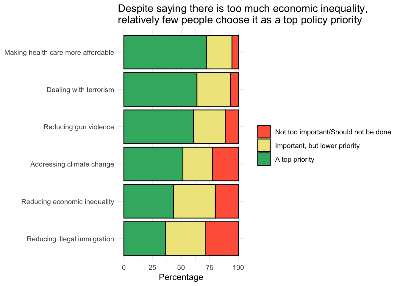
Let’s break down the unfamiliar parts of the code:
The data frame pew_priorities_tally is passed to the ggplot() function. The variable issue is aesthetically mapped to the x-axis and the variable percentage is aesthetically mapped to the y-axis. The fill aesthetic (which determines the color of the bars) is mapped to the variable called level.
The geometry is a bar chart — specified using geom_col(). The
position = "stack"argument indicates that the bars should be stacked on top of each other. Thecolor = "black"argument sets the border color of the bars to black.The code
theme(legend.position = "right")positions the legend on the right of the plot.
Substantively, what does this mean? In the pie chart that we created earlier, we saw that approximately 60% of adults in the U.S. believe that there is too much economic inequality in the nation. Nevertheless, when compared to other concerns, enacting policy to reduce economic inequality is not a foremost concern that the public wants the federal government to focus on. Some 43% consider this should be a top priority, which is considerably less than other issues — like making healthcare more affordable (72%), addressing terrorism (64%), or curbing gun violence (61%).
Dumbbell plot
A dumbbell plot compares the values of two data points for each category or group. Each category or group is represented by a pair of dots connected by a line. The position of the dots represents the values of the two data points for each category, and the line connecting them helps to visualize the magnitude and direction of the change. Dumbbell plots are particularly useful for:
- Tracking changes over time within categories
- Comparing pre- and post-intervention data
- Highlighting the differences between two groups or conditions
- Making it easy to see which categories experienced growth or decline and by how much
In essence, dumbbell plots provide an alternative to paired bar charts or line graphs for displaying differences in values across two points (e.g., time, condition, group), while giving a clear view of the magnitude of the differences.
To demonstrate a dumbbell plot we’ll use data from the September 2019, Wave 54 American Trends Panel conducted by the Pew Research Center (and described earlier). As part of the survey, respondents were asked:
How much, if at all, do you think each of the following contributes to economic inequality in this country?
The following contributors were displayed:
- The different life choices people make
- Some people work harder than others
- The growing number of legal immigrants working in the US
- Discrimination against racial and ethnic minorities
- Not enough regulation of major corporations
- Some people start out with more opportunities than others
- The tax system
- Problems with educational system
For each contributor, respondents selected from one of 4 choices:
- Contributes a great deal
- Contributes a fair amount
- Contributes not too much
- Contributes not at all
The respondents taking the survey identified their political party affiliation — here, we will consider those who identified as 1.) Republican or 2.) Democrat.
The data are tabulated to calculate the percentage of Republicans and Democrats who indicated that the contributor contributes a great deal.
The variables for the dumbbell chart that we will create include:
| Layer | Description |
|---|---|
| contributor | The contibutor |
| reps | The percentage of Republicans who indicated the contributor contributes a great deal. |
| dems | The percentage of Democrats who indicated the contributor contributes a great deal. |
The data frame is called pew_ineq_contributors.Rds.
pew_contrib <- read_rds(here("data", "pew_ineq_contributors.Rds"))
pew_contrib
To create a dumbbell chart the ggalt package is used for the geom_dumbbell() geometry, which is specifically designed to create dumbbell plots. We will also make use of the ggtext package, which will allow us to do something spiffy with the title.
library(ggalt)
library(ggtext)

pew_contrib |>
  ggplot(mapping = aes(y = contributor, x = reps, xend = dems)) +
  geom_dumbbell(colour = "lightgrey",
                colour_x = "firebrick2", colour_xend = "dodgerblue",
                size_x = 3, size_xend = 3,
                dot_guide = FALSE) +
  labs(
    x = NULL, y = NULL,
    title = "Reasons for income inequality as perceived  \nby <span style = 'color:firebrick2'>Republicans</span> and <span style = 'color:dodgerblue'>Democrats</span>"
  ) +
  theme_minimal() +
  theme(plot.title = element_markdown())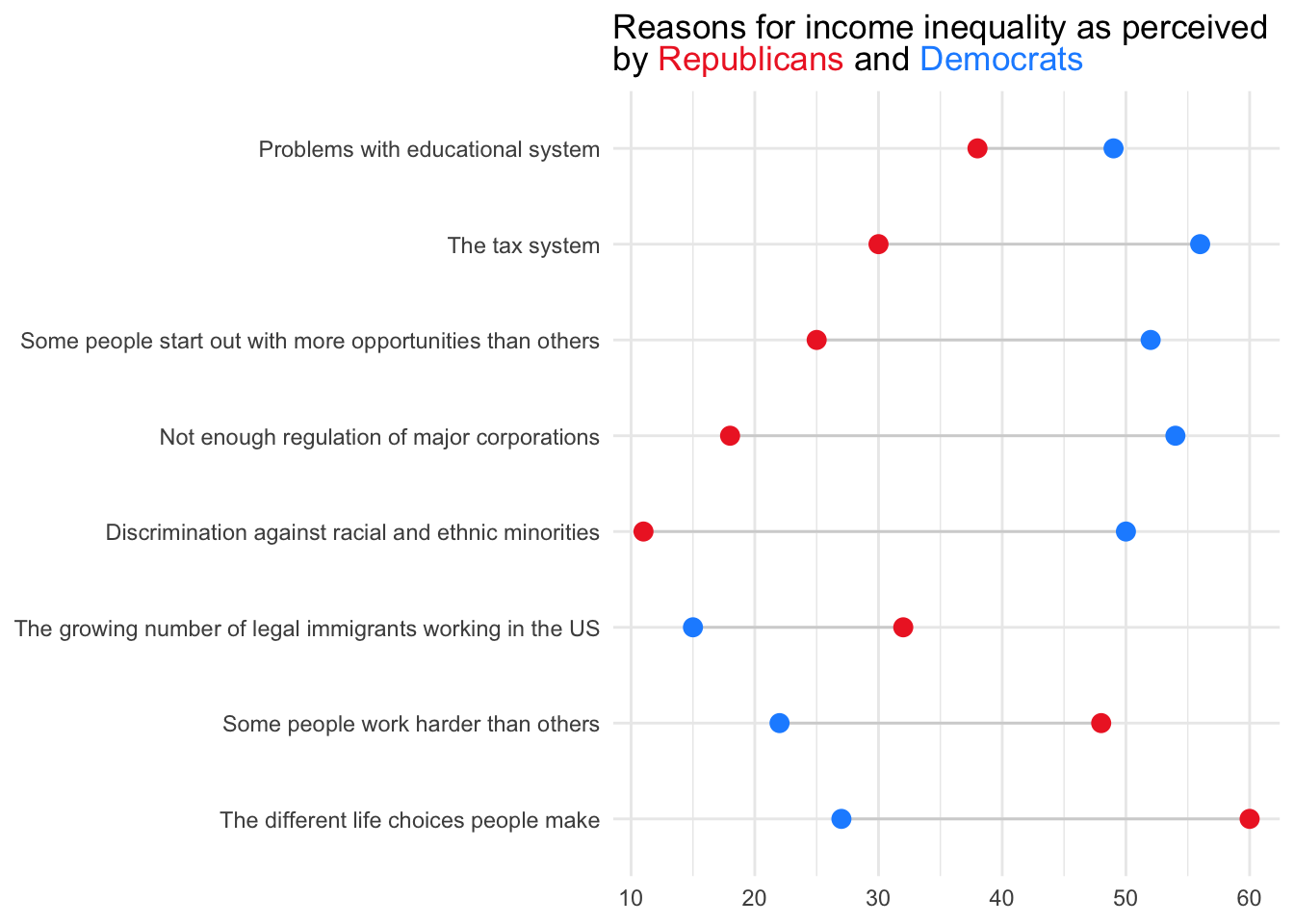
Let’s break down the code step by step since much of this is new:
- The data fame is piped into ggplot() to initialize a ggplot object. In the aes() function, the y-axis is mapped to a variable called contributor, while the x-axis has two variables: reps for Republicans and dems for Democrats. The
xandxendarguments are used to specify the positions of the two points that are being compared for each category on the y-axis. - The geom_dumbbell() line adds the dumbbell geometry. Here,
linewidthspecifies the size of the dumbbell line connecting the points,colourspecifies the color of the line connecting the dumbbell points,colour_xandcolour_xendset the colors of the points for Republicans and Democrats, respectively, andsize_xandsize_xendset the dot size. - The x- and y-axes labels are set to NULL, indicating that they will not be displayed since they are not needed in this type of graph.
- The title is set with HTML content to include colors matching the data points for Republicans and Democrats. The code line
theme(plot.title = element_markdown())enables the processing of markdown elements in the title. This is necessary because the title includes HTML tags for styling — in this case it colors certain words to correspond with the graph.
How should we interpret this graph? According to the Pew Research Center report, Democrats are more likely than Republicans to point to systemic causes of economic inequality — 56% cite the tax system and 49% the education system, compared to 30% and 38% of Republicans, respectively. In contrast, Republicans are more likely to emphasize individual choices and effort, with 60% citing life decisions and 48% work ethic, compared to just 27% and 22% of Democrats.
These contrasting views shape how each group approaches solutions: Democrats may support reforms in taxation and education, while Republicans tend to favor policies that emphasize personal responsibility. Such divergence complicates policymaking, potentially stalling progress or producing solutions that fail to address the full complexity of inequality. Bridging these perspectives — by acknowledging both structural and individual factors — may lead to more balanced, broadly supported policies.
Maps
As a final graph — I’d like to show you an example of a choropleth map created by ggplot2 via the geom_polygon() geometry. Choropleth maps display divided geographical areas or regions that are colored, shaded, or patterned in relation to a variable. This provides a way to visualize how a measurement varies across a geographic area.
These applications are quite advanced, and so here, I will just demonstrate what’s possible so you can get a feel for the capability. In the code below I use data from the Chetty study described above — but this time the absolute upward mobility score is calculated at the county level, rather than the commuting zone. The produced map shows how the absolute upward mobility scores vary across counties, and gives us a sense of regions in the US that have higher upward mobility. Here we see that the Mountain West and rural Midwest regions seem to offer the best environments for supporting upward economic mobility.
chetty_map <- read_rds(here::here("data", "chetty_counties.Rds"))

chetty_map |>
  ggplot(mapping = aes(x = long, y = lat, group = group, fill = abs_up_mobility)) +
  geom_polygon() +
  coord_map(projection = "albers", lat0 = 39, lat1 = 45) +
  ggthemes::theme_map() +
  viridis::scale_fill_viridis(option = "turbo") +
  labs(title = "Absolute upward mobility across US counties",
       subtitle = "Data from Opportunity Insights: https://opportunityinsights.org/",
       fill = "Absolute upward mobility",
       caption = "Greyed areas have insufficient data"
       )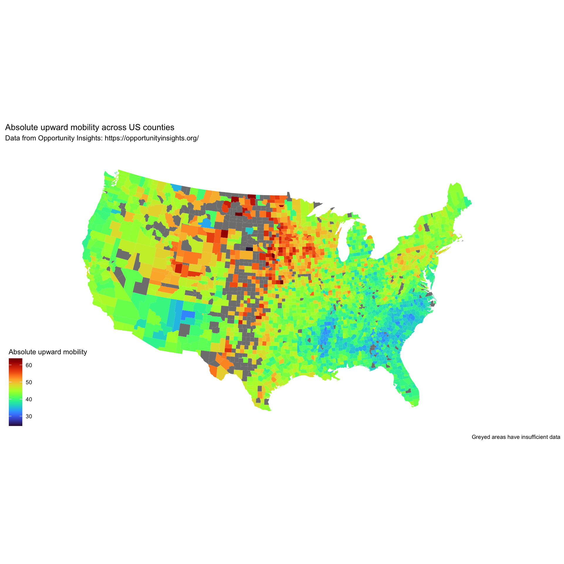
Saving your Creations
Once you create a graph, you may be happy to print it out as a graph inside your Quarto analysis notebook. Other times, you may want to just save the graph. In this instance, the ggsave() function is your solution. There are many options for saving your graph, I will demonstrate some basic options below.
chetty |>
  ggplot(mapping = aes(x = abs_up_mobility, fill = gini_rank.f)) +
  geom_density(alpha = 0.5) +
  theme_minimal() +
  labs(title = "The distribution of absolute upward mobility across commuting zones",
       x = "Absolute upward mobility",
       y = "Density",
       fill = "Gini Coefficient Quintile")

ggsave(filename = "my_graph.png", width = 20, height = 20, units = "cm")
Here’s a breakdown of how ggsave() works. First, note that it will save the last graph produced. Use the filename argument to indicate what you want to call the file. Here, “my_graph.png” is the name of the file that will be saved. It specifies that the plot should be saved in PNG format (see the .png extension). You can specify other formats by changing the file extension (e.g., my_graph.jpeg for JPEG). Note that it will by default save the graph where the .qmd file lives (i.e., your Quarto analysis notebook), you can change that save location using the here() function. The arguments width = 20 and height = 20 set the dimensions of the saved plot. In this example, both the width and height are set to 20. In addition, units = "cm" specifies the units for the width and height. In this example, the units are centimeters. Other options include “in” for inches and “mm” for millimeters.
Learning Check
After completing this Module, you should be able to answer the following:
- What are the seven layers of a ggplot2 graph, and what role does each layer play?
- How does the grammar of graphics support a structured approach to graph creation in R?
- What is an aesthetic in ggplot2?
- What is a geometry in ggplot2?
- Can you think of examples from your own work where a line graph, a scatterplot, and a histogram would each be useful?
- Which ggplot2 functions are used to create common plots like bar charts and scatterplots?
- How can visualizations help in the data analysis pipeline (e.g., wrangling, modeling, communicating)?
Resources
There are several excellent open source books and resources that will help you continue to grow your graphing skills:
- Dr. Hadley Wickham’s ggplot2: Elegant Graphics for Data Analysis
- Dr. Kieran Healy’s Data Visualization: A Practical Introduction
- Dr. Claus Wilke’s Fundamentals of Data Visualization.
- Here is a nice resource on general principles for creating scientific graphs.
Footnotes
The term “aesthetics” in ggplot2 is borrowed from the field of visual design and art, where it refers to the characteristics of an object that make it visually appealing or distinctive. These characteristics might include attributes such as color, shape, size, or texture, all of which are aspects that we can also control in a data visualization. In ggplot2, “aesthetics” are used to describe how variables in the data are mapped to visual properties in the plot. These visual properties can include position (x and y coordinates), color, shape, size, and others.↩︎
There are two geometries that create bar charts in ggplot2: geom_bar() and geom_col(). The difference between the two lies in how they treat the y-values. By default, geom_bar() uses
stat = "count", which makes the height of the bar equal to the number of cases in each group (or if the weight aesthetic is supplied, the sum of the weights). In other words, it is useful for creating histogram-like plots where you’re counting the number of observations. If you want to plot pre-computed values, you have to supplystat = "identity". Callinggeom_col()is equivalent togeom_bar(stat = "identity"). It makes the height of the bar equal to the value in the data. It is useful when you have your data aggregated and you want to visualize it.↩︎Line graphs that put a categorical variable on one of the axes can be quite useful in some circumstances. For example, consider the chart below in Alberto Cairo’s The Functional Art: An introduction to infromation graphics and visualization book (Figure 5.17).
↩︎
You might wonder – what does “Income growth is calculated from dollar figures that have been annualized and adjusted for price inflation to March 2023 dollars” really mean ? This conveys that the calculation for income growth takes into account several factors to make the data more comparable and meaningful over time. Here’s the breakdown. Calculated from dollar figures means that the raw data used for the calculation is in terms of monetary values, likely representing incomes. Annualized implies that the income data, which may have been originally recorded on a different time scale (e.g., weekly, monthly, quarterly), has been converted to an annual rate. This is important for consistency and comparability, especially when examining trends over time. Adjusted for price inflation indicates that the dollar figures have been corrected for the effects of inflation. Inflation reduces the purchasing power of money over time, so 100 USD in the year 2000, for example, could buy more than 100 USD in 2023. Adjusting for inflation means converting all the dollar amounts into constant dollars of a specific year (in this case, March 2023) to account for changes in purchasing power. This process is known as converting nominal values into real values. To March 2023 dollars specifies the reference point in time to which the dollar figures are adjusted for inflation. By adjusting all the dollar figures to what they would be equivalent to in March 2023, it allows for a fair comparison of incomes across different years by removing the effects of inflation. In summary, this statement means that the income growth has been calculated in a way that ensures the data is on an annual basis and that it reflects the real value of income in March 2023 dollars, making it possible to accurately analyze trends and changes in income over time without the distortion caused by inflation.↩︎
There is an equivalent alternative to including this information. Rather than placing it on the primary ggplot() call — one could include it in the geom_line() call itself. To accomplish this, replace the
geom_line() +call in the code chunk with:geom_line(mapping = aes(color = group.f)) +. The result will be the same.↩︎A quintile is a statistical term referring to dividing a set of data into five equal parts. Each quintile contains 20% of the data points. Quintiles are often used in economics. For example, when discussing income distribution, the data can be divided into quintiles to understand how income is distributed among the population. The first quintile represents the bottom 20% of the income distribution (the 20% of people with the lowest incomes), while the fifth quintile represents the top 20% (the 20% of people with the highest incomes). In a more technical sense, quintiles are the four cut points that divide a data frame into five equal groups. These cut points are the 20th, 40th, 60th, and 80th percentiles.↩︎