library(nhanesA)
library(gt)
library(skimr)
library(broom)
library(janitor)
library(marginaleffects)
library(tidyverse)Linear Regression with Categorical Predictors
Module 13

Learning Objectives
By the end of this Module, you should be able to:
- Describe how categorical predictors are incorporated into a linear regression model
- Explain the concept of dummy coding and its purpose in regression
- Construct dummy-coded variables for a categorical variable with two or more categories
- Interpret the intercept and slopes in a regression model that includes dummy-coded predictors
- Implement regression models in R using both manually coded indicators and factor variables
- Compare unadjusted and adjusted group means using regression output
- Apply model-based methods to obtain predicted means and confidence intervals
- Differentiate between within-group and between-group variability in continuous outcomes
- Compute and interpret sum of squares components to understand variance explained
- Evaluate how well group membership explains variation in the outcome using \(R^2\)
Overview
Regression helps us see how changes in predictors relate to an outcome. When the predictor is continuous (e.g., age, income), its meaning is straightforward: each one-unit increase has a direct numeric interpretation. Categorical variables, however, describe membership in distinct groups — gender, marital status, experimental condition — and have no built-in numerical scale. To include these variables in a regression, we must first translate their categories into numbers the model can work with.
The most common translation is dummy coding (one-hot encoding):
- Create a 0/1 indicator for every category except one.
- With two categories (employed vs. unemployed) we need 1 dummy variable.
- With four categories (blood types A, B, AB, O) we need 3 dummies.
- With two categories (employed vs. unemployed) we need 1 dummy variable.
- Choose a reference group—the category left out.
- The reference group is coded 0 on every dummy.
- Each coefficient now answers: “How much does the outcome differ from the reference group when this indicator equals 1?”
- The reference group is coded 0 on every dummy.
Why not keep all \(k\) categories? Doing so would make the indicators perfectly collinear — the model couldn’t separate their effects (this is the “dummy-variable trap”). Using \(k - 1\) indicators avoids that and frames every comparison relative to the reference group.
After creating the dummy variables, we fit the regression exactly as we would with continuous predictors:
\[ \text{Outcome} = b_0 + b_1(\text{Dummy}_1) + b_2(\text{Dummy}_2) + \dots \]
- Intercept \(b_0\) = predicted outcome for the reference group.
- Slope \(b_j\) = difference between category \(j\) and the reference group.
With this setup we can tackle questions such as:
- “Do symptom levels differ across treatment groups?”
- “After holding parental income constant, how does average earnings vary by education level?”
Dummy coding is the gateway to working with categorical data in regression. Master it first; later you can explore alternative schemes (e.g., effect coding, Helmert coding) for specialized analyses.
Introduction to the Data
In this Module we will use National Health and Nutrition Examination Survey (NHANES) data. Rather than working with a pre-constructed data frame, we will pull data using the nhanesA R package. This useful package is designed to help researchers with data retrieval and analysis of NHANES data. The nhanes() function from the package is used to pull data frames of interest from the NHANES data respository.
The NHANES survey data is grouped into five primary data categories:
- Demographics
- Dietary
- Examination
- Laboratory
- Questionnaire
We will examine the extent to which systolic blood pressure (SBP) differs as a function of sex and race/ethnicity among older adults.
This CDC website provides more information about what these categories include, and for which years they are available. By looking at the website, you can identify the name of the data frame that contains the data you desire. For example, we will pull the 2017-2018 demographic variables from the Demographics category and blood pressure data from the Examination category. The demographics data are stored in a data frame named DEMO_J and the blood pressure data are stored in a data frame called BPX_J. The screenshots below provide an example of what the website looks like — with the two data frames that we’ll use in this Module displayed.


Let’s begin by loading the packages we will need.
To pull a certain data frame into our R session, we can use the nhanes() function. For example, the code below pulls in the demographic and blood pressure files and names them as data frames (demo2018 and bmx2018) in our session.
demo2018 <- nhanes("DEMO_J")
bmx2018  <- nhanes("BPX_J")
Here’s a peek at the head of each data frame:
bmx2018 |> head()demo2018 |> head()Once the data frames of interest are pulled into the R session, we can work with them as we would any other data frame. The codebooks included on the CDC website that correspond with the data frame name provide information about what each variable represents and how it is coded. These aren’t needed for our simple examples here — but if you have an interest in the NHANES data, you can peruse them on your own.
Let’s now prepare the data for our analysis.
nhanes2018 <-
  demo2018 |>
  left_join(bmx2018, by = "SEQN") |>
  janitor::clean_names() |>
  mutate(SBP = rowMeans(pick(bpxsy1, bpxsy2, bpxsy3), na.rm = TRUE)) |>
  rename(sex = riagendr) |>
  rename(ethnic = ridreth1) |>
  rename(age = ridageyr) |>
  select(seqn,
         age, sex, ethnic,
         SBP) |>
  filter(age >= 50)
This code chunk accomplishes quite a lot, all of which should be familiar to you from the prior Modules — can you read through and figure out what’s happening in each step?
Let’s take a glimpse() of the constructed data frame, please make note of the variable types.
nhanes2018 |> glimpse()Rows: 3,069
Columns: 5
$ seqn <dbl> 93705, 93708, 93709, 93711, 93713, 93714, 93715, 93716, 93721, …
$ age <dbl> 66, 66, 75, 56, 67, 54, 71, 61, 60, 60, 64, 67, 70, 53, 57, 72,…
$ sex <fct> Female, Female, Female, Male, Male, Female, Male, Male, Female,…
$ ethnic <fct> Non-Hispanic Black, Other Race - Including Multi-Racial, Non-Hi…
$ SBP <dbl> 202.0000, 141.0000, 118.6667, 101.3333, 104.6667, 164.0000, 114…We’re going to primarily work with two categorical variables — both of which are already specified as factors:
sex represents the biological sex of the respondent (with levels “Male”, “Female”)
ethnic represents the race/ethnicity of the respondent (with levels “Mexican American”, “Other Hispanic”, “Non-Hispanic White”, “Non-Hispanic Black”, and “Other Race - Including Multi-Racial”).
Let’s take a look at the number of people (labeled n) in each category of these two variables:
nhanes2018 |> count(sex) nhanes2018 |> count(ethnic)Dummy-Code Examples
Categorical variable with two categories
Does systolic blood pressure (SBP) differ between male and female adults aged 50 and older?
Exploratory data analysis
The variable SBP represents each participant’s systolic blood pressure, averaged across three readings.
Let’s begin with a simple comparison: we’ll compute the average SBP separately for males and females.
nhanes2018_sex <-
  nhanes2018 |>
  select(SBP, sex) |>
  drop_na()

nhanes2018_sex |>
  group_by(sex) |>
skim()| Name | group_by(nhanes2018_sex, … |
| Number of rows | 2762 |
| Number of columns | 2 |
| _______________________ | |
| Column type frequency: | |
| numeric | 1 |
| ________________________ | |
| Group variables | sex |
Variable type: numeric
| skim_variable | sex | n_missing | complete_rate | mean | sd | p0 | p25 | p50 | p75 | p100 | hist |
|---|---|---|---|---|---|---|---|---|---|---|---|
| SBP | Male | 0 | 1 | 133.30 | 19.94 | 72.67 | 119.33 | 130.67 | 144.00 | 234 | ▁▇▅▁▁ |
| SBP | Female | 0 | 1 | 136.27 | 21.65 | 88.00 | 121.33 | 133.33 | 149.33 | 238 | ▃▇▃▁▁ |
The output indicates that the average SBP for females (136.3) is slightly higher than the average SBP for males (133.3). The median (labeled P50) is also slightly higher for females. Studying the distribution of SBP for males and females will help us to further understand these data. Let’s produce a density plot to compare the distribution of SBP for males and females.
# set color palette for sex
levels <- c("Male", "Female")
colors <- c("#2F9599", "#F7DB4F")
my_colors_sex <- setNames(colors, levels)

nhanes2018_sex |>
  ggplot(mapping = aes(x = SBP, fill = sex)) +
  geom_density(alpha = 0.75) +
  scale_fill_manual(values = my_colors_sex) +
  theme_minimal() +
  labs(title = "Does SBP differ by sex?",
       x = "Systolic Blood Pressure (mmHg)",
       y = "Density",
       fill = "Sex")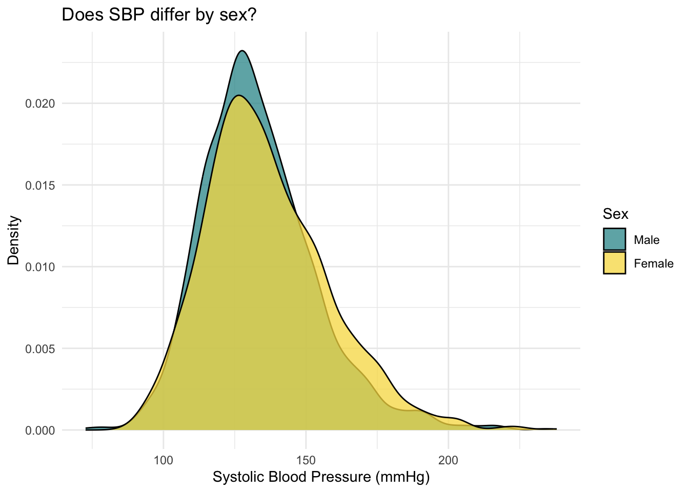
The distribution of SBP is slightly further to the right for females compared to males — this is in line with the means/medians just examined. Both distributions show a slight right skew.
To further explore, let’s create a jittered scatter plot to take an additional look at the distribution of SBP as a function of sex.
nhanes2018_sex |>
  ggplot(mapping = aes(x = sex, y = SBP, color = sex)) +
  geom_jitter(width = 0.1, show.legend = FALSE) +
  theme_minimal() +
  scale_color_manual(values = my_colors_sex) +
  stat_summary(fun = base::mean, geom = "point", color = "black", size = 3) +
  labs(title = "Does SBP differ as a function of sex?",
       subtitle = "Mean of each group is marked with a black circle",
       x = "",
       y = "Systolic Blood Pressure (mmHg)")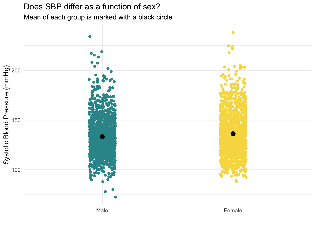
This jittered plot shows the distribution of each individual data point (jittered from left to right in each group so we can see the density of points in each section) — and includes the mean of SBP for each group overlaid with a black circle. We can see that the black circle for females is slightly higher (by about 3.0 mmHg) than for males.
Create a dummy indicator
On our way to use a categorical variable as a predictor in a regression model, our first step is to turn the categorical variable into a set of dummy-coded indicators. Recall that for a categorical variable with \(k\) categories, \(k - 1\) dummy-coded indicators are needed. In this first simple example, our categorical variable, sex, has 2 categories, therefore only one dummy indicator is needed: \((k - 1) = (2 - 1) = 1\).
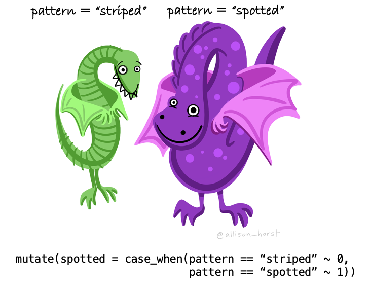
Let’s create a dummy indicator to represent sex — we’ll call this new variable female, and code female participants as 1, and male participants as 0. As a result, males will serve as the reference group. To create the dummy-coded indicator, the case_when() function inside of the mutate() function is used.
nhanes2018_sex <-
  nhanes2018_sex |>
  mutate(female = case_when(
    sex == "Male" ~ 0,
    sex == "Female" ~ 1)
    )

nhanes2018_sex |>
  select(sex, female) |>
  head(n = 25)
Notice that when sex equals Female, the dummy-coded indicator (female) is equal to 1. Otherwise, when sex equals Male, the dummy-coded indicator (female) is equal to 0.
Add a dummy indicator to a regression model
Once the dummy indicator is created, then we can enter it into a linear regression model as follows:
lm_sex <- lm(SBP ~ female, data = nhanes2018_sex)

lm_sex |>
  tidy(conf.int = TRUE, conf.level = 0.95) |>
  select(term, estimate, std.error, conf.low, conf.high)
How should the model results be interpreted?
Let’s focus on the columns labeled term and estimate.
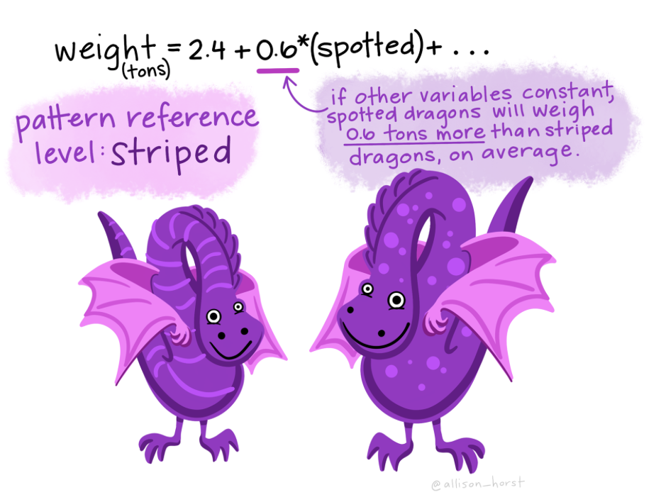
The intercept of the regression model is, as usual, the predicted score when \(x_i\) = 0, that is, the predicted SBP for males (recall that female is equal to 0 for males). In other words, the average SBP for males in the sample is 133.3 (notice that this is precisely the mean we computed earlier using skim()).
The slope of the regression model (i.e., the estimate for the female dummy indicator) is, as usual, the predicted change in the outcome (i.e., SBP) for a one-unit increase in the predictor (i.e., female). Therefore, we can interpret this as the expected difference in SBP for females as compared to males. An increase of one unit for the female dummy indicator means contrasting a female (1) to a male (0). This means that the average SBP for females is 3.0 units higher than the average SBP for males.
The equation from the fitted regression model is written as follows:
\[\hat{y_i} = b_{0}+(b_{1}\times {female_i})\] Plugging in our estimates from the fitted regression model yields:
\[\hat{y_i} = 133.3+(3.0\times {female_i})\]
Further, we can solve for the predicted (i.e., average) SBP for each group by plugging in a 1 for female for female participants and a 0 for female for male participants.
- For males: \(\bar{y} = 133.3+(3.0\times 0) = 133.3\)
- For females: \(\bar{y} = 133.3+(3.0\times 1) = 136.3\)
Let’s map all of this onto the jitter plot that we created earlier. The dots marking the group means are in the same place, but I’ve removed the individual data points for clarity. I also colored what was a black circle for the means to the designated color for each sex. Note that the slope of the line, defined as the rise (3.0 mmHg for females compared to males) over the run (1, because we’re contrasting 0 for males and 1 for females for the dummy-coded indicator) is 3.0.

Notice from the tidy() output that the 95% confidence interval for the slope of the female dummy indicator does not include 0. This suggests that there is likely a meaningful difference in SBP between the sexes, with females having a substantially higher SBP than males. If 0 were included in the 95% CI, that would suggest that 0 is a plausible value for the difference in SBP between males and females — and that there may be no reliable difference between the groups.
Note
Women tend to have higher blood pressure than men in later life due to several factors, including hormonal changes. Menopause significantly impacts blood pressure in women. Estrogen, a hormone that helps protect the cardiovascular system, decreases after menopause. This reduction in estrogen can lead to an increase in blood pressure. Click here for more information on this topic if interested.
Add sex as a factor to the regression model
When regressing an outcome on a factor variable like sex, R has the capacity to conveniently manage the encoding process for you. By default, R transforms the factor into dummy indicators, using the first specified level as the reference group. This automatic handling simplifies the modeling process by allowing us to directly interpret the effects of each non-reference category relative to the reference category.
First, let’s check how R has the levels of sex stored.
nhanes2018_sex |> pull(sex) |> levels() [1] "Male" "Female"Since the first level listed is “Male” — then males will serve as the reference group. This is the same reference group we selected in our manual dummy code. Therefore, the results will be identical.
Let’s take a look at the fitted model, notice that I replaced female with sex in the code below:
lm_sex_f1 <- lm(SBP ~ sex, data = nhanes2018_sex)

lm_sex_f1 |>
  tidy(conf.int = TRUE, conf.level = 0.95) |>
  select(term, estimate, std.error, conf.low, conf.high)
R has essentially created a dummy indicator called sexFemale (though it doesn’t actually get added to our data frame), where males are treated as the reference category (coded as 0) and females are coded as 1.
Can I change the reference group when using a factor?
It is common to want or need to specify a different level as the reference group to align better with specific research questions or prior analyses. To adjust the reference group in R, you can use the relevel() function. Here’s how you can set “Female” as the reference group for sex, and then refit the regression model.
nhanes2018_sex <-
  nhanes2018_sex |>
  mutate(sex = relevel(sex, ref = "Female"))

lm_sex_f2 <- lm(SBP ~ sex, data = nhanes2018_sex)

lm_sex_f2 |>
  tidy(conf.int = TRUE, conf.level = 0.95) |>
  select(term, estimate, std.error, conf.low, conf.high)
The output of the regression model includes an intercept term and a coefficient for sexMale. The intercept term represents the average SBP for female participants, which is estimated to be 136.3. The coefficient for sexMale is -3.0, indicating that the average SBP for male participants is 3.0 units lower than the average for female participants. Please note that the overall model is the same, even though the reference group has been rotated — and we can recover the exact same predicted values for mean SBP for each group:
- For the males: \(\bar{y} = 136.3 + (-3.0\times 1) = 133.3\)
- For the females: \(\bar{y} = 136.3 + (-3.0\times 0) = 136.3\)
Categorical variable with more than two categories
Does systolic blood pressure (SBP) differ by race/ethnicity among adults aged 50 and older?
Exploratory data analysis
To begin, we’ll use skim() to summarize the mean SBP for each group:
nhanes2018_eth <-
  nhanes2018 |>
  select(SBP, ethnic, age) |>
  drop_na()

nhanes2018_eth |>
  group_by(ethnic) |>
skim(SBP)| Name | group_by(nhanes2018_eth, … |
| Number of rows | 2762 |
| Number of columns | 3 |
| _______________________ | |
| Column type frequency: | |
| numeric | 1 |
| ________________________ | |
| Group variables | ethnic |
Variable type: numeric
| skim_variable | ethnic | n_missing | complete_rate | mean | sd | p0 | p25 | p50 | p75 | p100 | hist |
|---|---|---|---|---|---|---|---|---|---|---|---|
| SBP | Mexican American | 0 | 1 | 133.52 | 19.13 | 78.00 | 122.17 | 131.33 | 142.92 | 208.00 | ▁▇▇▂▁ |
| SBP | Other Hispanic | 0 | 1 | 132.92 | 21.43 | 89.33 | 116.67 | 130.00 | 146.67 | 207.33 | ▃▇▅▂▁ |
| SBP | Non-Hispanic White | 0 | 1 | 132.90 | 19.91 | 88.00 | 118.67 | 130.00 | 145.33 | 238.00 | ▃▇▃▁▁ |
| SBP | Non-Hispanic Black | 0 | 1 | 140.21 | 22.51 | 92.67 | 124.00 | 136.67 | 152.00 | 224.67 | ▂▇▅▁▁ |
| SBP | Other Race - Including Multi-Racial | 0 | 1 | 133.34 | 20.13 | 72.67 | 120.67 | 130.67 | 144.00 | 215.33 | ▁▇▇▂▁ |
We can see that the means for all groups except Non-Hispanic Black participants is around 133/134. Non-Hispanic Black participants have a mean SBP that is about 7 points higher than the other groups.
Next, let’s construct a density plot of SBP, one for each group.
# set color palette for ethnic
levels <- c("Mexican American", "Other Hispanic", "Non-Hispanic White", "Non-Hispanic Black", "Other Race - Including Multi-Racial")
colors <- c("#FFB600", "#44A9CC", "#EB563A", "#F4B998", "#50BCB9")
my_colors_eth <- setNames(colors, levels)

nhanes2018_eth |>
  ggplot(mapping = aes(x = SBP, fill = ethnic)) +
  geom_density(alpha = 0.5) +
  scale_fill_manual(values = my_colors_eth) +
  theme_minimal() +
  theme(legend.position = "right") +
  labs(title = "Does systolic blood pressure differ as a function of race/ethnicity?",
       x = "Systolic Blood Pressure (mmHg)",
       y = "Density",
fill = "Race/Ethnic Group") 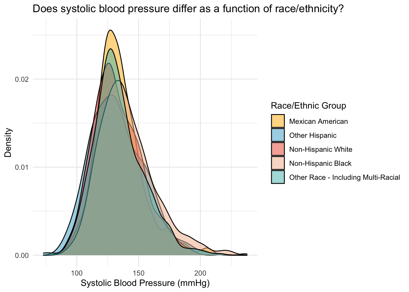
The same pattern is observed in the density plots, we can see that the density plot for Non-Hispanic Black individuals is pushed slightly to the right of the graph.
Let’s create one last plot, a jittered point plot of SBP, with race/ethnicity as a grouping variable. As we did with the sex example, we’ll overlay the mean of each group with a black dot.
nhanes2018_eth |>
  ggplot(mapping = aes(x = ethnic, y = SBP, color = ethnic)) +
  geom_jitter(width = 0.1, show.legend = FALSE, alpha = 0.4) +
  stat_summary(fun = base::mean, size = 3, geom = "point", colour = "black", show.legend = FALSE) +
  scale_color_manual(values = my_colors_eth) +
  theme_minimal() +
  labs(title = "Does systolic blood pressure differ as a function of race/ethnicity?",
       subtitle = "Mean of each group is depicted with a black circle",
       x = "",
       y = "Systolic Blood Pressure (mmHg)") +
scale_x_discrete(labels = function(x) str_wrap(x, width = 10)) 
Create the dummy indicators
Before fitting the linear regression model, we need to create a set of dummy-coded indicators to represent race/ethnic group. There are five levels to the race/ethnicity variable; therefore, we need four dummy-coded indicators to represent it. We’ll make Mexican Americans the reference group for race/ethnicity, and create 4 dummy-coded variables to denote the other four race/ethnic groups.
nhanes2018_eth <-
  nhanes2018_eth |>
  mutate(
    other.hisp = case_when(ethnic == "Other Hispanic" ~ 1, TRUE ~ 0),
    nh.white = case_when(ethnic == "Non-Hispanic White" ~ 1, TRUE ~ 0),
    nh.black = case_when(ethnic == "Non-Hispanic Black" ~ 1, TRUE ~ 0),
    other.race = case_when(ethnic == "Other Race - Including Multi-Racial" ~ 1, TRUE ~ 0)
    )
It’s always smart to double check that your code works as intended. Here’s a summary of how each group is coded for this set of dummy indicators:
nhanes2018_eth |>
  select(ethnic, other.hisp, nh.white, nh.black, other.race) |>
  distinct() |>
  arrange(ethnic)
Everything looks good here — notice that for the selected reference group (Mexican Americans) all dummy indicators are coded as 0. And, for the other dummy indicators, a score of 1 is coded for the corresponding group represented by the dummy indicator, and a 0 is recorded otherwise.
Add the dummy indicators to a regression model
Now, we can fit the linear regression model with the dummy-coded indicators. The following equation represents the model we will fit.
\[ \hat{y} = b_{0} + (b_{1} \times \text{other.hisp}) + (b_{2} \times \text{nh.white}) + (b_{3} \times \text{nh.black}) + (b_{4} \times \text{other.race}) \]
lm_eth <- lm(SBP ~ other.hisp + nh.white + nh.black + other.race, data = nhanes2018_eth)
lm_eth |>
  tidy(conf.int = TRUE, conf.level = 0.95) |>
  select(term, estimate, std.error, conf.low, conf.high)
Let’s focus on the columns labeled term and estimate.
The intercept of the regression model is the predicted score when all predictor variables equal 0. In this example, that is the predicted (i.e., average) SBP in the reference group. Mexican American older adults serve as the reference group in this model. Note that the intercept estimate is precisely the mean for Mexican Americans that we computed earlier with skim().
The four slopes compare each of the other groups to Mexican Americans.
The estimate for other.hisp indicates that the mean SBP for other Hispanic individuals is 0.6 mmHG lower than the mean for Mexican Americans.
The estimate for nh.white indicates that the mean SBP for non-Hispanic White individuals is 0.6 mmHG lower than the mean for Mexican Americans.
The estimate for nh.black indicates that the mean SBP for non-Hispanic Black individuals is 6.7 mmHG higher than the mean for Mexican Americans.
The estimate for other.race indicates that the mean SBP for individuals who identify as some other race/ethnic group or multi-racial is 0.2 mmHG lower than the mean for Mexican Americans.
The equation from the fitted regression models is written as follows:
\[\hat{y} = 133.5 + (-0.6 \times \text{other.hisp}) + (-0.6 \times \text{nh.white}) + (6.7 \times \text{nh.black}) + (-0.2 \times \text{other.race})\]
We can recover the mean for each group by using this equation:
For Mexican Americans: \(\bar{y} = 133.5 + (-0.6 \times 0) + (-0.6 \times 0) + (6.7 \times 0) + (-0.2 \times 0) = 133.5\)
For other Hispanic: \(\hat{y} = 133.5 + (-0.6 \times 1) + (-0.6 \times 0) + (6.7 \times 0) + (-0.2 \times 0) = 132.9\)
For non-Hispanic White: \(\bar{y} = 133.5 + (-0.6 \times 0) + (-0.6 \times 1) + (6.7 \times 0) + (-0.2 \times 0) = 132.9\)
For non-Hispanic Black: \(\bar{y} = 133.5 + (-0.6 \times 0) + (-0.6 \times 0) + (6.7 \times 1) + (-0.2 \times 0) = 140.2\)
For other groups: \(\bar{y} = 133.5 + (-0.6 \times 0) + (-0.6 \times 0) + (6.7 \times 0) + (-0.2 \times 1) = 133.3\)
Notice that these computed means are identical to the means from skim() that we estimated earlier.
Let’s map all of this onto our earlier plot.
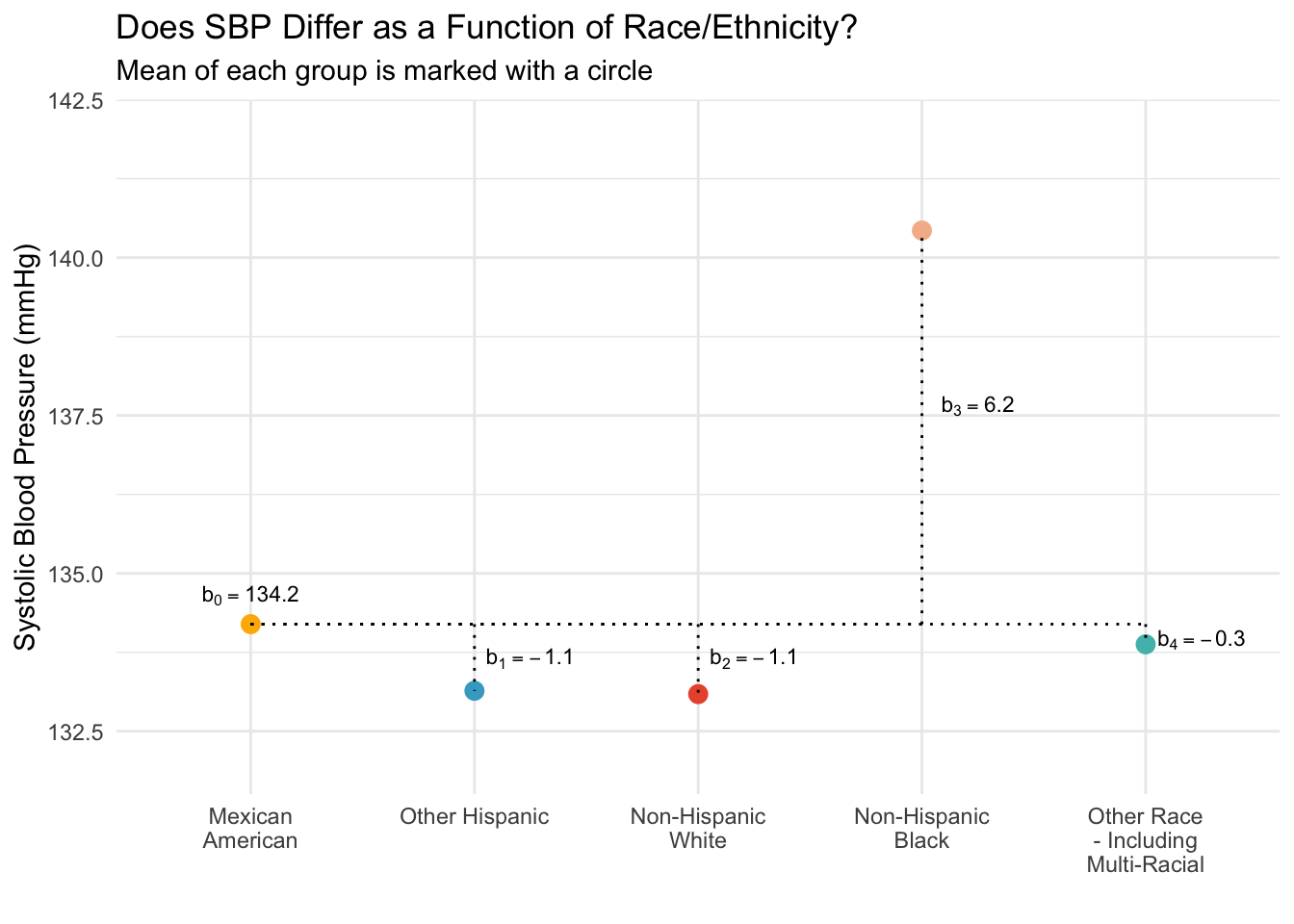
You can see how the intercept and slopes of the regression model line up with the graph. The intercept is just the mean for the reference group (Mexican American adults), the slope for the Other Hispanic dummy-code is the difference between Other Hispanic adults and Mexican American adults (Other Hispanic adults have an average SBP that is 0.6 mmHg lower than the average for Mexican American adults). Similarly the other slopes represent the difference between each respective group and Mexican Americans. That is, with each comparison, we compare back to the reference group — which is Mexican American participants in our set up. Of course, we could choose a different reference group and create the corresponding dummy-coded indicators if we wish.
Take a moment now to examine the 95% CIs for the four slopes (as displayed in the tidy output).
Notice that only one of the CIs, the CI for comparing non-Hispanic Black participants to Mexican American participants, doesn’t include 0. This indicates that, of the four comparisons made in this model, the only reliable difference in SBP is between non-Hispanic Black individuals and Mexican American individuals — with the former having substantially higher SBP than the latter.
Note
High blood pressure is the leading preventable risk factor for mortality in the United States. Black older adults experience significantly higher rates of hypertension than their White counterparts — contributing to a cardiovascular disease (CVD) mortality rate that is approximately four times higher. These disparities are deeply rooted in social determinants of health (SDOH), including socioeconomic and environmental conditions such as housing, neighborhood poverty, food insecurity, limited access to healthcare, segregation, structural racism, and chronic stress. Click here for more information on this topic.
Add ethnicity as a factor to the regression model
Just as we did for the sex example, we can have R create the dummy-coded indicators for us. Because “Mexican American” is the first level of the factor, the results are identical to our manual model:
nhanes2018_eth |> pull(ethnic) |> levels()[1] "Mexican American" "Other Hispanic"
[3] "Non-Hispanic White" "Non-Hispanic Black"
[5] "Other Race - Including Multi-Racial"lm_eth <- lm(SBP ~ ethnic, data = nhanes2018_eth)
lm_eth |>
tidy(conf.int = TRUE, conf.level = 0.95) |>
select(term, estimate, std.error, conf.low, conf.high)Of course, the relevel() function can be used to choose a different reference group.
Obtain model predicted means
Once the model is fitted, we can use the predictions() function from the marginaleffects package to compute the predicted means and 95% CIs for each group. This magnificent package is worth mastering because it offers many very useful functions for model interpretation — particularly as you move to more advanced models.
We’ll use the marginaleffects package in the next few Modules, here we start with a very simple application to compute the mean and 95% CI of SBP for each group based on our model. Here’s an exerpt from the marginaleffects documentation about it’s key purpose:
The parameters of a statistical model can sometimes be difficult to interpret substantively, especially when that model includes non-linear components, interactions, or transformations. Analysts who fit such complex models often seek to transform raw parameter estimates into quantities that are easier for domain experts and stakeholders to understand, such as predictions, contrasts, risk differences, ratios, odds, lift, slopes, and so on. Unfortunately, computing these quantities—along with associated standard errors—can be a tedious and error-prone task. This problem is compounded by the fact that modeling packages in R and Python produce objects with varied structures, which hold different information. This means that end-users often have to write customized code to interpret the estimates obtained by fitting Linear, GLM, GAM, Bayesian, Mixed Effects, and other model types. This can lead to wasted effort, confusion, and mistakes, and it can hinder the implementation of best practices.
marginaleffects solves all of these problems!
Let’s take a look at the code needed to accomplish the task at hand, with a more detailed explanation following the code:
unadjusted_means <-
  lm_eth |>
  predictions(
    df = insight::get_df(lm_eth),
    conf.level = 0.95,
    newdata = datagrid(
    ethnic = unique
    )) |>
  select(ethnic, estimate, std.error, conf.low, conf.high) |>
  mutate(type = "unadjusted") |>
  as_tibble()

unadjusted_means
This code chunk computes the predicted means and their confidence intervals (a 95% CI as specified by conf.level = 0.95) for each level of the ethnic factor using the predictions() function.
It pulls out the appropriate degrees of freedom (df) needed for the CI by using the argument
insight::get_df(lm_eth), which utilizes a handy function called get_df() from a package called insight. The correct degrees of freedom for this instance is n - 1 - p, where p is the number of predictors. For a categorical variable, this refers to the number of dummy codes necessary to represent the categorical variable. Thus, the degrees of freedom is 2762 - 1 - 4 = 2757.The datagrid() function (also from marginaleffects) is used to create a data frame representing all unique combinations of the factor levels in the variable ethnic. This useful function generates a data grid of user-specified values for use in the
newdataargument. In particular, it generates a data grid of each unique race/ethnic group.The predictions are then extracted and formatted, creating a predicted score for SBP for each race/ethnic group in the created data grid.
I also added a variable called “unadjusted” to denote that these are unadjusted means (we’ll calculate something called adjusted means in the next section).
The function as_tibble() is used to define the output as a tibble — which is just a tidy data frame.
Obtain adjusted predicted means
To deepen our understanding, we’ll now refine the model by adding age as a covariate. Including age allows us to adjust for its influence, so we can assess differences in SBP across race and ethnic groups while holding age constant. This is a critical adjustment because age is a strong predictor of blood pressure and could confound the associations we’re examining. By controlling for age, we isolate the effect of race and ethnicity on SBP, helping us determine whether observed differences are likely due to group membership rather than age-related variation. This leads to a clearer, more meaningful interpretation of the results.
Note
Age adjustment is especially important in public health because age distributions often differ across population groups. Without adjusting for age, we might mistakenly attribute differences in outcomes like SBP to race or ethnicity, when in fact they may reflect differences in age structure. By holding age constant, we isolate the effect of race/ethnicity on SBP, helping us determine whether observed differences are likely due to group membership rather than age-related variation. This leads to a clearer, more meaningful interpretation of the results and supports more equitable and informed health policy decisions.
First, since age in this subsample of adults doesn’t have a meaningful 0 point, we will center age at the mean. Then we will refit our ethnicity model, adding centered age as a control variable.
# Get the mean age
nhanes2018_eth |> select(age) |> summarize(mean(age))
# Add centered age
nhanes2018_eth <-
nhanes2018_eth |>
mutate(age.c = age - mean(age))
lm_eth_adj <- lm(SBP ~ ethnic + age.c, data = nhanes2018_eth)
lm_eth_adj |>
tidy(conf.int = TRUE, conf.level = 0.95) |>
select(term, estimate, conf.low, conf.high) How do we interpret age-adjusted differences?
Intercept (135.1 mmHg): Now reflects the estimated mean SBP for Mexican Americans at the average age in the subsample (i.e., age.c = 0).
Other Hispanic: The slightly increased estimate (-0.9 mmHg) for this slope compared to the unadjusted model compares Other Hispanic adults to Mexican American adults, holding age constant. In other words, if we compared two groups of people, all of which were the same age, but the people in one group identified as Mexican American and people in the other group identified as Other Hispanic, we would expect the Other Hispanic adults to have a SBP that is 0.9 mmHg lower. However, note that the 95% CI still contains 0 — suggesting that 0 (i.e., no difference) is a plausible difference in SBP between the two groups.
Non-Hispanic White: There is a notable change here from our adjusted model for this slope; the non-Hispanic White group now shows a larger difference as compared to Mexican Americans (-4.0 mmHg), with a confidence interval that does not include zero (-6.5 to -1.4 mmHg).
Non-Hispanic Black: This slope comparing non-Hispanic Black adults to Mexican American adults continues to show a higher SBP (5.5 mmHg) after adjusting for age, but the increase is slightly lower than in the unadjusted model. This CI continues to not include 0 (2.8 to 8.2 mmHg).
Other Race - Including Multi-Racial: Similar to the unadjusted model, this slope shows a very small difference (-0.4 mmHg) with a confidence interval (-3.2 to 2.5 mmHg) that includes zero.
Age: Holding constant race/ethnic group (i.e., comparing two individuals who are from the same race/ethnic group), each one unit increase in age is associated with a substantial increase in SBP (0.6 mmHg per year), with a confidence interval (0.5 to 0.6 mmHg) that is well away from zero. For example, if we compared two people from the same race/ethnic group — but one was 60 and one was 70 — we’d expect the older person to have a SBP that was ~6 mmHg higher (\(0.6 \times 10 = 6\)).
Adding age as a control variable affects the impacts of ethnicity on SBP, particularly accentuating the effects where age plays a significant confounding role. For Non-Hispanic Whites, controlling for age reveals a meaningful decrease in SBP compared to Mexican Americans, while for Non-Hispanic Blacks, the increase in SBP is slightly attenuated. These results underscore the importance of considering age in analyses of SBP across different racial groups and ethnicities.
Recall that earlier in the semester, you used a weighting approach to compute adjusted means by hand based on a standard population. This current approach of directly controlling for age via a statistical model provides an alternative method to obtain adjusted means.
We can use the predictions() function again with the new age-adjusted model to obtain the predicted mean SBP for each group, holding age constant at the mean in the subsample of adults (~65 years). Note that grid_type = "mean_or_mode" specifies that any predictor not mentioned should be held at the mean (for continuous variables) or the mode (for categorical variables) when computing the predicted scores.1
adjusted_means <-
  lm_eth_adj |>
  predictions(
    df = insight::get_df(lm_eth_adj),
    newdata = datagrid(
      ethnic = unique,
      grid_type = "mean_or_mode")) |>
  select(ethnic, estimate, std.error, conf.low, conf.high) |>
  mutate(type = "adjusted") |>
  as_tibble()

adjusted_means
Create a summary table
Let’s merge the unadjusted means that we computed earlier with the adjusted means from our model with age as a control variable.
combine <- bind_rows(unadjusted_means, adjusted_means)
combine
With some formatting2, we can create a nice table that presents the unadjusted SBP for each race/ethnic group, alongside the adjusted SBP for each group, holding age constant at the mean in the sample.
# Pivot data frame to wide for side by side table
combine_wide <-
  combine |>
  pivot_wider(names_from = type, values_from = c(estimate, std.error, conf.low, conf.high), names_glue = "{.value}_{type}")

# Use the gt package to create a nice-looking table of the results
combine_wide |>
  gt() |>
  tab_header(
    title = "Comparison of unadjusted and age-adjusted estimates of systolic blood pressure among adults 50 and older by race/ethnicity"
  ) |>
  cols_label(
    ethnic = "Ethnicity",
    estimate_unadjusted = "Mean",
    std.error_unadjusted = "SE",
    conf.low_unadjusted = "95% CI",
    estimate_adjusted = "Mean",
    std.error_adjusted = "SE",
    conf.low_adjusted = "95% CI"
  ) |>
  fmt_number(
    columns = everything(),
    decimals = 2
  ) |>
  cols_merge(
    columns = c(conf.low_unadjusted, conf.high_unadjusted),
    pattern = "({1}, {2})"
  ) |>
  cols_merge(
    columns = c(conf.low_adjusted, conf.high_adjusted),
    pattern = "({1}, {2})"
  ) |>
  cols_hide(c(conf.high_unadjusted, conf.high_adjusted)) |>
  tab_spanner(
    label = "Unadjusted",
    columns = c(estimate_unadjusted, std.error_unadjusted, conf.low_unadjusted)
  ) |>
  tab_spanner(
    label = "Age-Adjusted (held constant at 65 years)",
    columns = c(estimate_adjusted, std.error_adjusted, conf.low_adjusted)
  ) |>
  cols_align(
    align = "center",
    columns = everything()
  ) |>
  tab_footnote(
    footnote = "SE denotes Standard Error.",
    locations = cells_column_labels(columns = c(std.error_unadjusted, std.error_adjusted))
  ) |>
  tab_footnote(
    footnote = "CI denotes Confidence Interval.",
    locations = cells_column_labels(columns = c(conf.low_unadjusted, conf.low_adjusted))
) | Comparison of unadjusted and age-adjusted estimates of systolic blood pressure among adults 50 and older by race/ethnicity | ||||||
|---|---|---|---|---|---|---|
| Ethnicity |
Unadjusted
|
Age-Adjusted (held constant at 65 years)
|
||||
| Mean | SE1 | 95% CI2 | Mean | SE1 | 95% CI2 | |
| Non-Hispanic Black | 140.21 | 0.80 | (138.63, 141.78) | 140.62 | 0.78 | (139.09, 142.15) |
| Other Race - Including Multi-Racial | 133.34 | 0.95 | (131.48, 135.19) | 134.75 | 0.92 | (132.94, 136.57) |
| Non-Hispanic White | 132.90 | 0.64 | (131.65, 134.16) | 131.17 | 0.63 | (129.92, 132.41) |
| Mexican American | 133.52 | 1.17 | (131.23, 135.81) | 135.13 | 1.14 | (132.90, 137.36) |
| Other Hispanic | 132.92 | 1.27 | (130.44, 135.41) | 134.27 | 1.23 | (131.85, 136.68) |
| 1 SE denotes Standard Error. | ||||||
| 2 CI denotes Confidence Interval. | ||||||
Alternatively, we could present the same results in a plot.
combine |>
  mutate(type = factor(type, levels = c("unadjusted", "adjusted"))) |>
  ggplot(mapping = aes(x = ethnic, y = estimate, ymin = conf.low, ymax = conf.high, color = ethnic)) +
  coord_flip() +
  geom_pointrange() +
  geom_errorbar(width = 0.2) +
  facet_grid(~ type,
             labeller = labeller(type = c(unadjusted = "Unadjusted Estimates", adjusted = "Age-Adjusted Estimates"))) +
  labs(
    title = "Comparison of unadjusted and age-adjusted estimates of systolic blood pressure",
    subtitle = "Among adults 50 and older by race/ethnicity, age is held constant at the mean for adjusted estimates",
    caption = "Whiskers show 95% CI",
    x = "",
    y = "Systolic Blood Pressure (mmHg)",
    color = "Estimate Type"
  ) +
  scale_color_manual(values = my_colors_eth) +
  theme_bw() +
  theme(
    axis.text.x = element_text(angle = 45, hjust = 1),
    plot.title = element_text(size = 14, face = "bold"),
    plot.subtitle = element_text(size = 12),
    legend.position = "none"
) 
Both the table and the graph depict the differences in unadjusted and age-adjusted SBP across race/ethnic groups, providing an intuitive way to understand race/ethnic disparities and how SBP differences are affected when accounting for age.
🎓 Tutorial: Converting a Character Variable to a Factor in R
Let’s say we have a simple dataset where we’re comparing test scores across different teaching methods.
Simulate data
# Simulate data
toy_data <- tibble(
  score = c(rnorm(10, mean = 80, sd = 5),   # Group A
            rnorm(10, mean = 85, sd = 5),   # Group B
            rnorm(10, mean = 90, sd = 5)),  # Group C
  method = rep(c("B", "A", "C"), each = 10)  # A, B, and C are character values
)

toy_data |> glimpse()
Rows: 30
Columns: 2
$ score <dbl> 82.26304, 81.82849, 72.93155, 87.08956, 77.39038, 76.53316, 80.…
$ method <chr> "B", "B", "B", "B", "B", "B", "B", "B", "B", "B", "A", "A", "A"…Convert method to a factor
We want to compare other groups relative to Group A, so let’s make method a factor with “A” as the reference group.
toy_data <-
  toy_data |>
  mutate(method = factor(method,
                         levels = c("A", "B", "C"),
                         labels = c("Method A", "Method B", "Method C")))

# Check the levels
levels(toy_data$method)
[1] "Method A" "Method B" "Method C"Since “Method A” is the first level of the factor, it will be treated as the reference group in any regression model.
Fit a linear regression model with the factor
model <- lm(score ~ method, data = toy_data)
model |> tidy()
Digging into Within Group and Between Group Variability
Overview of the data
To wrap up this Module on incorporating categorical variables in regression models, we’ll turn our attention to a key concept in understanding group differences: the distinction between within-group and between-group variability in a continuous outcome (such as systolic blood pressure or physical activity minutes).
Let’s consider a practical example drawn from public health research. Imagine you’re part of a research team studying ways to increase physical activity among older adults living in urban affordable housing communities. For your upcoming intervention study, you want to objectively measure physical activity using a wearable device, rather than relying on potentially biased self-report.
You’re evaluating two devices:
Device A is considered the gold standard but is prohibitively expensive.
Device B is a more affordable, newer option that has not yet been thoroughly validated.
Your goal is to determine whether Device B performs as accurately as Device A in measuring minutes spent in moderate physical activity (MPA). To do this, you design a lab-based validation study.
Each participant will walk on a treadmill for 60 minutes, during which time the treadmill program controls the duration of MPA by adjusting speed and incline to maintain target heart rates. You create three experimental conditions:
Condition 1: 15 minutes of MPA
Condition 2: 30 minutes of MPA
Condition 3: 45 minutes of MPA
You recruit 45 older adults from your target population and randomly assign 15 participants to each condition. All participants wear both devices simultaneously while completing the treadmill session. This design allows you to compare the recorded MPA minutes across devices and across conditions — and to examine both between-group differences (e.g., do MPA minutes increase across conditions?) and within-group variability (e.g., is there a lot of variation in recorded MPA among people in the same condition?) for each of the devices.
The resulting data are in the data frame called activity.Rds. The following variables are included:
| Variable | Description |
|---|---|
| pid | Unique ID for participant |
| condition | The condition randomly assigned — 15 minutes, 30 minutes, 45 minutes of MPA |
| DevA_MPA | The recorded minutes of MPA from Device A |
| DevB_MPA | The recorded minutes of MPA from Device B |
Let’s read in the data frame.
activity <- read_rds(here("data", "activity.Rds"))
activity
Here’s a glimpse of the data frame.
activity |> glimpse()Rows: 45
Columns: 4
$ pid <fct> 1, 2, 3, 4, 5, 6, 7, 8, 9, 10, 11, 12, 13, 14, 15, 16, 17, 1…
$ condition <chr> "15 minutes", "15 minutes", "15 minutes", "15 minutes", "15 …
$ DevA_MPA <dbl> 15.7, 12.0, 14.7, 14.7, 16.0, 14.1, 14.0, 14.6, 15.4, 15.3, …
$ DevB_MPA <dbl> 18.0, 27.4, 25.6, 6.7, 17.5, 16.8, 6.9, 19.1, 25.1, 20.1, 10…Let’s also produce descriptive statistics for DevA_MPA and DevB_MPA by condition.
activity |>
  select(-pid) |>
  group_by(condition) |>
skim()| Name | group_by(select(activity,… |
| Number of rows | 45 |
| Number of columns | 3 |
| _______________________ | |
| Column type frequency: | |
| numeric | 2 |
| ________________________ | |
| Group variables | condition |
Variable type: numeric
| skim_variable | condition | n_missing | complete_rate | mean | sd | p0 | p25 | p50 | p75 | p100 | hist |
|---|---|---|---|---|---|---|---|---|---|---|---|
| DevA_MPA | 15 minutes | 0 | 1 | 14.68 | 1.31 | 11.6 | 14.35 | 15.3 | 15.55 | 16.0 | ▂▁▂▃▇ |
| DevA_MPA | 30 minutes | 0 | 1 | 29.81 | 0.72 | 28.3 | 29.50 | 30.0 | 30.35 | 30.5 | ▂▂▁▅▇ |
| DevA_MPA | 45 minutes | 0 | 1 | 44.96 | 1.04 | 43.3 | 44.20 | 45.0 | 45.70 | 46.9 | ▃▇▅▅▃ |
| DevB_MPA | 15 minutes | 0 | 1 | 16.39 | 7.97 | 1.4 | 9.80 | 17.5 | 22.60 | 27.4 | ▂▇▃▇▇ |
| DevB_MPA | 30 minutes | 0 | 1 | 31.52 | 8.12 | 16.0 | 25.85 | 32.0 | 37.05 | 45.5 | ▃▆▇▇▃ |
| DevB_MPA | 45 minutes | 0 | 1 | 46.68 | 8.00 | 30.2 | 41.00 | 47.9 | 51.45 | 61.4 | ▂▅▇▆▃ |
Notice the mean of minutes in MPA measured by each device seems quite close to the values dictated by condition. For example, for Device A the average MPA (DevA_MPA) is 14.7 minutes for the 15-minute condition, 29.8 minutes for the 30-minute condition, and 45.0 minutes for the 45-minute condition. And, a similar pattern with regard to the means is observed for Device B.
Let’s visualize the data with a jittered point plot by condition (along the x axis) and facet by measurement device. Notice that in this section I use pivot_longer() to pivot the data from a wide to long data frame for aid in creation of the plot. I also create a factor for the newly created device variable.
activity_long <- activity |>
  pivot_longer(cols = c("DevA_MPA", "DevB_MPA"), names_to = "device",  values_to = "MPA") |>
  mutate(device = factor(device, levels = c("DevA_MPA", "DevB_MPA"), labels = c("Device A", "Device B")))

activity_long |> head(n = 20)
activity_long |>
ggplot(mapping = aes(x = condition, y = MPA, color = condition)) +
geom_jitter(width = 0.1, size = 3, show.legend = FALSE, alpha = 0.35) + # Increase data point size
geom_hline(yintercept = 45, color = "#00A5E3", linetype = "dashed") +
geom_hline(yintercept = 30, color = "#8DD7BF", linetype = "dashed") +
geom_hline(yintercept = 15, color = "#FF96C5", linetype = "dashed") +
theme_bw() +
stat_summary(fun = base::mean, size = 5, shape = 4, geom = "point", colour = "black", stroke = 1.5, show.legend = FALSE) +
labs(title = "Variability in MPA by experimental condition and measurement device",
subtitle = "Mean within each condition is marked with an X, dashed colored lines correspond to condition specifications",
x = "Condition",
y = "Minutes of Moderate Physical Activity") +
facet_wrap(~device) +
theme(
plot.title = element_text(size = 20), # Increase title size
plot.subtitle = element_text(size = 15), # Increase subtitle size
axis.title.x = element_text(size = 14), # Increase x-axis title size
axis.title.y = element_text(size = 14), # Increase y-axis title size
axis.text.x = element_text(size = 12), # Increase x-axis text size
axis.text.y = element_text(size = 12), # Increase y-axis text size
strip.text = element_text(size = 14) # Increase facet text size
)
This plot displays the data collected in the measurement study. The panel on the left shows results for Device A, and the panel on the right shows results for Device B. The x-axis represents the experimental condition (15, 30, or 45 minutes of prescribed moderate physical activity), and the y-axis shows the number of minutes of moderate physical activity (MPA) recorded by each device.
Three dashed horizontal lines have been added to indicate the target number of minutes of MPA for each condition — the amount of activity participants were expected to accumulate based on the treadmill program. For example, in Condition 3, participants were assigned 45 minutes of MPA, so the dashed line at 45 marks the ideal value a perfectly accurate device should report.
The X marks represent the mean value recorded by each device in each condition. Both devices show sample means that align reasonably well with the intended targets. However, Device B tends to slightly overestimate MPA across conditions (its means lie just above the dashed lines), while Device A shows means that are very close to the expected values.
Where the two devices differ most is in consistency. The spread of individual data points (the dots) around the group mean is much tighter for Device A, indicating it gives reliable and consistent measurements across participants. In contrast, the measurements from Device B are more variable, showing a much wider spread around the mean in each condition. This suggests that while Device B may capture the general trend, it lacks the precision of Device A and may not produce reliable individual-level measurements.
Partitioning variance
Within group variability
We can partition the total variability in MPA into two components — within group variation and between group variation, where the groups are conditions in our example (i.e., 15 minutes, 30 minutes, or 45 minutes of MPA).
The within group variation captures the extent to which each individual differs from their group’s mean.
To begin, let’s focus only on the results from Device A.

Consider the 15-minute condition. There are 15 people in this condition. To quantify the within group variation, we can compute the difference between each person’s MPA score and the average MPA score for their group, square these differences, and then sum these squared differences across all people in the group.
ex15min <- activity |>
  filter(condition == "15 minutes") |>
  select(pid, DevA_MPA) |>
  mutate(grp_mean_DevA = mean(DevA_MPA),
         wg_diff_DevA = DevA_MPA - grp_mean_DevA,
         sq_wg_diff_DevA = wg_diff_DevA^2)

ex15min
ex15min |> summarize(SSwithin_grp = sum(sq_wg_diff_DevA)) Here’s a visualization of this process for the 15-minute group:

We can do the same thing for the 30-minute condition and the 45-minute condition. Rather than writing the code three times, we can use the group_by() function to perform the calculations by condition. Doing so yields three sum of squares — one for each group.
activity |>
  select(pid, condition, DevA_MPA) |>
  group_by(condition) |>
  mutate(grp_mean_DevA = mean(DevA_MPA),
         wg_diff_DevA = DevA_MPA - grp_mean_DevA,
         sq_wg_diff_DevA = wg_diff_DevA^2) |>
  summarize(SSwithin_grp = sum(sq_wg_diff_DevA))
Once the three sum of squares are calculated, we sum the sum of squared differences for each group (in our example, that means summing three values — one for each condition).
activity |>
  select(pid, condition, DevA_MPA) |>
  group_by(condition) |>
  mutate(grp_mean_DevA = mean(DevA_MPA),
         wg_diff_DevA = DevA_MPA - grp_mean_DevA,
         sq_wg_diff_DevA = wg_diff_DevA^2) |>
  summarize(SSwithin_grp = sum(sq_wg_diff_DevA)) |>
  ungroup() |>
  summarize(SSwithin = sum(SSwithin_grp))
This value (46.7) represents a quantity officially called the Within Groups Sum of Squares. When analyzing variance across groups in an experiment (where people are randomly assigned to groups) — this part of the variance is referred to as the error as this is variation in the scores that is not due to the experimental condition or treatment. That is, to the extent that people differ within a group, then that variability is clearly not due to experimental condition as they all received the same manipulation/treatment. For example, within each of our groups, all people were assigned to the same treadmill program. This quantity is also called the Sum of Squares Error (SSE) or, sometimes, the Sum of Squares Residual.
Between group variability
The between groups variation captures the extent to which groups differ from one another. In this case, that is, the degree to which our three experimental conditions differ. To obtain the between groups variation, we compute the difference between each group’s average MPA score and the overall average MPA (i.e., the average score for all 45 people in the experiment), square these differences, and then sum these squared differences across all groups.
For example, the average minutes of MPA across the three conditions is 29.8 minutes.
activity |>
  select(DevA_MPA) |>
  summarize(mean = mean(DevA_MPA))
And, the average MPA for the 15 minute condition is 14.7 minutes.
activity |>
  filter(condition == "15 minutes") |>
  select(DevA_MPA) |>
  summarize(mean = mean(DevA_MPA))
We compute the difference between the 15 minute group’s average MPA score and the overall average MPA as 14.7 minutes - 29.8 minutes — which equals about -15.1. Then, -15.1 squared equals ~229. Since there are 15 people in the group, we sum this value across the 15 people — which equals \(229 \times 15 = 3436\) (the actual number without any rounding).
Here’s a visualization of this process for the 15-minute group:

We then do this same work for the 30 minute group and the 45 minute group. Finally, we sum these three sum of squares across the three groups. This value (6876.6) represents the Between Groups Sum of Squares. The code chunk below does all of this work.
activity |>
  select(pid, condition, DevA_MPA) |>
  mutate(total_mean_DevA = mean(DevA_MPA)) |>
  group_by(condition) |>
  mutate(grp_mean_DevA = mean(DevA_MPA),
         bg_diff_DevA = grp_mean_DevA - total_mean_DevA,
         sq_bg_diff_DevA = bg_diff_DevA^2) |>
  summarize(SSbetween_grp = sum(sq_bg_diff_DevA)) |>
  ungroup() |>
  summarize(SSbetween = sum(SSbetween_grp))
When analyzing variance across groups in an experiment (where people are randomly assigned to groups), this part of the variability is due to experimental condition. That is, to the extent that group means differ from one another, then that variability is due to the experimental condition or treatment. This quantity is also called the Model Sum of Squares or Sum of Squares Regression (SSR).
Contrasting within group and between groups variability
By contrasting the within groups and between groups variability we gain a sense of which component encompasses more of the variability. For Device A, the Between Groups Sum of Squares is very large (~6877) and the Within Groups Sum of Squares is comparatively much smaller (~47). This tells us that most of the variability in MPA scores for Device A are due to the different conditions people were assigned to (i.e., 15 minutes, 30 minutes, or 45 minutes), with very little variability within condition. As we saw in the jittered point plot of the data, the mean MPA is extremely close to the designated minutes of MPA for the condition (corresponding dashed line), denoting a high degree of accuracy of Device A. Furthermore, there is little person to person variability within condition, denoting a high degree of precision.
We don’t need to compute Within Groups and Between Groups Sum of Squares on our own. Instead, the aov() function will do this work for us. Note that the value under Sum Sq for condition is 6877 — matching with our manual calculation of the Between Groups Sum of Squares, and the value for Residuals is 47 — matching with our manual calculation of Within Groups Sum of Squares.
lm_A <- lm(DevA_MPA ~ condition, data = activity)

aovA <-
  anova(lm_A) |>
  tidy() |>
  select(term, sumsq)

aovA
Now, let’s assess these same values for Device B. Recall from our plot of the data, that Device B had much greater within group variability.
lm_B <- lm(DevB_MPA ~ condition, data = activity)

aovB <-
  anova(lm_B) |>
  tidy() |>
  select(term, sumsq)

aovB
The value under Sum Sq for condition is 6883, representing the Between-Groups Sum of Squares for Device B. This is very close to the value for Device A, suggesting that the group means differ similarly across conditions for both devices. However, the value for Residuals is 2708 — the Within-Groups Sum of Squares for Device B — which is substantially larger than the value for Device A.
Thus, the ratio of between-group to within-group variability is much higher for Device A, indicating clearer group differences and less noise.
For Device B, the within-group variability dominates, meaning that individuals in the same condition show a lot of variation in their MPA scores. In practice, this makes it much harder to detect meaningful differences between groups because the noise within each group blurs the signal between groups.
Even if the true group means are different (as they are across the 15, 30, and 45 minute conditions), it’s hard to be confident about those differences when the data points within each group are all over the place.
In contrast, for Device A, the measurements are tightly clustered within each group, which makes the group differences much clearer and easier to detect.
I augmented the graph below with the Between Groups variability divided by the Total Variability to present a measure of the total variability attributed to condition differences. This is the same as \(R^2\) in a regression context. For our example, this indicates that for Device A about 99% of the variability in MPA is due to condition, while for Device B about 72% of the variability in MPA is due to condition. Which device would you choose for your study?
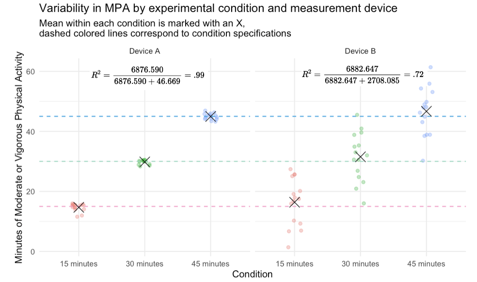
When comparing groups, it’s important to understand where variability in the data comes from. Between-group variability tells us how much groups differ from each other, while within-group variability tells us how much individuals in the same group differ. In our example, Device A showed high between-group and low within-group variability, meaning it was both accurate and precise. Device B had similar group averages but much more within-group noise, making it less reliable. The more variability that’s explained by group differences (and not random error), the more confident we can be that our experimental manipulation — not other factors — caused the observed effects.
Application to our NHANES example
Now that we’ve built an understanding of within-group and between-group variability, let’s return to our NHANES example examining systolic blood pressure (SBP). Specifically, we’ll revisit the regression model where SBP is predicted by ethnic, which captures race/ethnic group membership. Recall that the results of this model are stored in the object lm_eth.
# Get the ANOVA table
aov_eth <-
  anova(lm_eth) |>
  tidy() |>
  select(term, sumsq)

aov_eth
The table below augments the resulting table with some descriptors, and adds the Sum of Squares Total — which is the sum of the Within Groups and Between Groups variability.
For purposes of comparison, let’s also print out the \(R^2\) from the regression model output.
# request r-square via glance
lm_eth |> glance() |> select(r.squared)
The Between Groups Sum of Squares is 25543.5, which represents the variability in SBP attributable to differences across racial and ethnic groups. Conversely, the Within Groups Sum of Squares amounts to 1176792.8, indicating the variability in SBP that cannot be explained by racial or ethnic differences as it captures the variability within these groups.
By summing these two values we obtain the Total Sum of Squares: 1202336.3. This figure represents the overall variability in systolic blood pressure across all observations. From these values, we can compute the \(R^2\), which is the proportion of variability in systolic blood pressure explained by racial and ethnic differences:
\[ R^2 = \frac{25543.5}{1202336.3} \approx 0.02 \]
This calculation suggests that approximately 2% of the variability in systolic blood pressure can be attributed to differences among racial and ethnic groups. This \(R^2\) value is consistent with what is reported by the glance() function, where it is labeled as r.squared.
While there are some differences in average SBP across race/ethnic groups, those differences explain only a small portion of the overall variation in systolic blood pressure. Most of the variability in SBP occurs within each group—that is, among individuals who share the same race/ethnic classification. This suggests that other factors beyond race/ethnicity may be driving much of the individual-level variation in blood pressure.
For example, within each racial or ethnic group, SBP could vary substantially based on age, body mass index (BMI), smoking status, physical activity, stress levels, dietary patterns, or access to healthcare. These are all variables that operate at the individual level and could help explain why some people within the same group have high blood pressure while others do not. Exploring these within-group predictors can give us a clearer picture of the underlying risk factors and may be more actionable for designing effective interventions.
Learning Check
After completing this Module, you should be able to answer the following questions:
- What is dummy coding, and why is it necessary when including categorical variables in regression?
- How many dummy variables are needed to represent a categorical variable with \(k\) levels?
- In a regression with a binary dummy-coded variable, what does the intercept represent?
- How do you interpret the slope of a dummy-coded predictor?
- What happens when you use a factor variable in R as a predictor without manually coding it?
- How can you change the reference group of a factor variable in R?
- What is the difference between unadjusted and adjusted predicted means?
- Why might you want to control for a continuous covariate, like age, when comparing groups?
- What is the difference between within-group and between-group variability?
- How do you calculate and interpret \(R^2\) in a regression model with categorical predictors?
Footnotes
If instead, you desired to hold age constant at a particular value (for example, at the mean, 10 years below the mean, and 10 years above the mean) — you could specify that using the code chunk below.
↩︎lm_eth_adj |> predictions( df = insight::get_df(lm_eth_adj), newdata = datagrid(ethnic = unique, age.c = c(-10,0,10))) |> select(ethnic, age.c, estimate, std.error, conf.low, conf.high) |> mutate(type = "adjusted") |> as_tibble()This code is a bit complex, and I don’t expect you to know what’s happening in every section, but it showcases the power of the wonderful gt package. Click here for a great introduction to more advanced capabilities — and here for the winners of a Posit Cloud gt contest for some inspiring ideas of what you can do with this package.↩︎