| Variable | Description |
|---|---|
| record_id | Unique ID for participant |
| year | Survey year |
| sex | Biological sex of respondent |
| age | Age of respondent |
| raceeth | Race/ethnicity of respondent |
| mde_past_year | Did the respondent meet criteria for a major depressive episode in the past-year? negative = did not meet criteria, positive = did meet criteria. |
| mde_lifetime | Did the respondent meet criteria for a major depressive episode in their lifetime? negative = did not meet criteria, positive = did meet criteria. |
| mh_sawprof | Did the respondent see a mental health care professional in the past-year? Response options include did not receive care, received care. |
| severity_chores | If mde_pastyear is positive, how severely did depression interfere with doing home chores? |
| severity_work | If mde_pastyear is positive, how severely did depression interfere with school/work? |
| severity_family | If mde_lifetime is positive, how severely did depression interfere with family relationships? |
| severity_chores | If mde_pastyear is positive, how severely did depression interfere with social life? |
| mde_lifetime_severe | If mde_pastyear is positive, was the MDE classified as severe? |
| substance_disorder | Did the respondent meet criteria for a past-year substance use disorder (alcohol or drug)? — available for 2019 data only — negative = did not meet criteria, positive = did meet criteria. |
| adol_weight | Sampling weight - from sampling protocol |
| vestr | Stratum — from sampling protocol |
| verep | Primary sampling unit — from sampling protocol |
Confidence Intervals for Descriptive Statistics
Module 9

Learning Objectives
By the end of this Module, you should be able to:
- Explain what a confidence interval (CI) is and what it represents in the context of estimating population parameters
- Distinguish between bootstrap, parametric (theory-based), and Bayesian approaches to constructing CIs
- Implement bootstrap resampling to estimate uncertainty and construct percentile confidence intervals
- Calculate theory-based CIs for sample proportions and means using standard error formulas and the Central Limit Theorem
- Use the z-distribution and t-distribution appropriately when constructing theory-based CIs
- Define the key assumptions underlying theory-based confidence intervals
- Interpret a bootstrap confidence interval and a frequentist CI correctly, avoiding common misstatements
- Describe how Bayesian inference uses prior beliefs and posterior distributions to construct credible intervals
- Contrast the interpretation of Bayesian credible intervals and frequentist confidence intervals
- Visualize and interpret CIs and posterior distributions using R tools
Overview
In Module 08, we explored the concept of a sampling distribution — a key idea in inferential statistics. By simulating the process of drawing many random samples from a population, we saw how estimates like the proportion of students with a past-year Major Depressive Episode (MDE) or their average depression severity naturally vary from sample to sample. That variation, which we measured using the standard error, gave us our first real understanding of uncertainty in statistical estimates.
But, we can’t actually draw thousands of random samples in real-world research. We typically only get one sample to work with. So how can we quantify uncertainty using just the data we have?
That’s the focus of this Module.
Moving Toward Confidence
Moving Toward Confidence
In this Module, we’ll take the next step in learning how to reason from data: quantifying uncertainty. When we compute an estimate — like the proportion of adolescents who experienced a past-year Major Depressive Episode (MDE) — we want to understand how precise that estimate is, and how much uncertainty surrounds it.
To do this, we’ll introduce a core idea in inferential statistics: the confidence interval (CI). A confidence interval gives us a range of values that are plausible for the true population parameter, based on the data in our sample. It reflects the idea that if we had drawn a different random sample, we might have gotten a slightly different estimate — and our interval helps account for that.
There are two major frameworks for expressing this kind of statistical uncertainty:
The frequentist approach, which interprets probability in terms of long-run frequencies across many hypothetical repetitions of the same study
The Bayesian approach, which interprets probability as a degree of belief, and uses prior knowledge alongside the data to update our understanding of the parameter
In this Module, you’ll learn both approaches. We’ll begin with the frequentist framework, using methods like bootstrap resampling and theory-based formulas to construct and interpret confidence intervals. Then, we’ll explore the Bayesian perspective, which offers a different — and often more intuitive — way to express uncertainty through credible intervals.
Along the way, you’ll see how factors like sample size and confidence level (e.g., 90%, 95%, 99%) influence the width and interpretation of the interval, and how these tools can help you move from a single estimate to a broader understanding of what’s likely true in the population.
We’ll also revisit the ideas of precision and sample-to-sample variability, and see how factors like sample size and the level of confidence (e.g., 95% vs. 99%) affect the width of the interval.
Introduction to the Data
In Module 07, we explored data from the National Survey on Drug Use and Health (NSDUH) — a large national study that helps us understand trends in substance use and mental health across the U.S. In this Module, we’ll revist the same data frame — called NSDUH_adol_depression.Rds.
The NSDUH targets individuals aged 12 and older in the civilian, noninstitutionalized population of the United States, including all 50 states and the District of Columbia. Each year, a new random sample is drawn from this population to create the annual NSDUH sample.
The data frame includes the following variables:
Let’s load the packages that we will need for this Module.
library(here)
library(infer)
library(tidyverse)
Let’s import the data and do a bit of wrangling:
We’ll subset the data frame to select just year 2019 — the focus of this Module.
Later in the Module, we will calculate the proportion of adolescents with a past-year MDE. Since the current indicator of past-year MDE (mde_pastyear) is a character variable (i.e., “positive” for MDE, versus “negative” for MDE), we won’t be able to take the mean of this variable to quantify the proportion of positive cases. Therefore we’ll create a new version of the variable called mde_status where an individual is coded 1 if they experienced a past-year MDE and a 0 otherwise.
We’ll drop cases missing on the MDE indicator. Once done, this leave us with 12,950 adolescents in the nsduh_2019 data frame.
Finally, we will form the depression severity scale (in the same way we formed it in Module 07).
nsduh_20092019 <- read_rds(here("data", "NSDUH_adol_depression.Rds"))

nsduh_2019 <-
  nsduh_20092019 |>
  filter(year == 2019 & !is.na(mde_pastyear)) |>
  mutate(mde_status = case_when(mde_pastyear == "positive" ~ 1,
                                mde_pastyear == "negative" ~ 0)) |>
  drop_na(mde_status) |>
  mutate(severity_scale = rowMeans(pick(starts_with("severity_"))))

nsduh_2019 |> glimpse()
Rows: 12,950
Columns: 19
$ record_id <chr> "2019_58786143", "2019_76127143", "2019_19108143",…
$ year <dbl> 2019, 2019, 2019, 2019, 2019, 2019, 2019, 2019, 20…
$ sex <chr> "male", "male", "female", "male", "male", "female"…
$ age <dbl> 16, 16, 16, 14, 17, 17, 17, 12, 15, 16, 17, 14, 13…
$ raceeth <chr> "Non-hispanic White", "Non-hispanic White", "Black…
$ mde_lifetime <chr> "negative", "negative", "negative", "negative", "n…
$ mde_pastyear <chr> "negative", "negative", "negative", "negative", "n…
$ mde_pastyear_severe <chr> "negative", "negative", "negative", "negative", "n…
$ mh_sawprof <chr> NA, NA, NA, NA, NA, NA, "did not receive care", NA…
$ severity_chores <dbl> NA, NA, NA, NA, NA, NA, NA, NA, NA, NA, NA, NA, 5,…
$ severity_work <dbl> NA, NA, NA, NA, NA, NA, NA, NA, NA, NA, 3, NA, 5, …
$ severity_family <dbl> NA, NA, NA, NA, NA, NA, NA, NA, NA, NA, 2, NA, 4, …
$ severity_social <dbl> NA, NA, NA, NA, NA, NA, NA, NA, NA, NA, 3, NA, 7, …
$ substance_disorder <chr> "negative", "negative", "negative", "negative", "n…
$ adol_weight <dbl> 1453.7924, 1734.7987, 1107.9873, 839.4021, 711.593…
$ vestr <dbl> 40002, 40002, 40002, 40047, 40044, 40007, 40041, 4…
$ verep <dbl> 1, 2, 2, 2, 2, 2, 1, 1, 2, 2, 2, 1, 1, 1, 1, 1, 2,…
$ mde_status <dbl> 0, 0, 0, 0, 0, 0, 0, 0, 0, 0, 1, 0, 1, 0, 1, 0, 0,…
$ severity_scale <dbl> NA, NA, NA, NA, NA, NA, NA, NA, NA, NA, NA, NA, 5.…Introduction to Bootstrap Resampling
To begin learning about quantifying uncertainty in statistical estimates, we’ll learn a technique called bootstrap resampling, which builds directly on the simulation-based logic you developed in Module 08. Rather than imagining repeated samples from the population, bootstrapping involves repeatedly drawing resamples (with replacement) from the one sample we do have. Each time, we re-estimate our parameter of interest — such as the proportion of adolescents reporting a past-year MDE or their average depression severity.
This process allows us to approximate the sampling distribution using only our observed data — and to build a bootstrap confidence interval around our estimate.
Draw one boostrap resample
Let’s initiate our analysis by creating a single bootstrap resample. In doing so, we will match the size of our observed sample — 12,950 participants. This process involves randomly selecting participants with replacement.
What does drawing with replacement entail? Each time we select a participant, we note their inclusion in the resample and then return them to the original pool, making them eligible for reselection. Consequently, within any given resample, it’s possible for some participants to be chosen multiple times, while others from the original sample may not be selected at all. This method ensures every draw is independent, preserving the integrity of the bootstrap approach and enabling us to effectively simulate the sampling variability.
Choosing a bootstrap resample of the same size as our original data frame — 12,950 participants — is crucial for maintaining the statistical properties of the original sample. By matching the resample size to the original, we ensure that the variability and distribution in the resample closely mirror those in the full data frame. This fidelity is essential for accurately estimating the sampling distribution of statistics calculated from the resamples.
The code below draws one bootstrap resample, and calls the resampled data frame resample1.
set.seed(12345)

resample1 <-
  nsduh_2019 |>
  select(record_id, mde_pastyear, mde_status, severity_scale) |>
  slice_sample(n = 12950, replace = TRUE) |>
  arrange(record_id)

resample1 |> glimpse()
Rows: 12,950
Columns: 4
$ record_id <chr> "2019_10011546", "2019_10011546", "2019_10016379", "201…
$ mde_pastyear <chr> "negative", "negative", "positive", "positive", "negati…
$ mde_status <dbl> 0, 0, 1, 1, 0, 0, 1, 0, 0, 0, 0, 0, 0, 0, 0, 0, 0, 0, 0…
$ severity_scale <dbl> NA, NA, 3.50, 3.50, NA, NA, 6.50, NA, NA, NA, NA, NA, N…The table below presents the the first 100 rows of data. Please scan down the list and notice that many people (indexed by record_id) were drawn several times in this resample.
Estimate the statistic
Let’s compare the distribution of mde_status (incidence of past-year MDE) in the full observed sample and our drawn resample. For the original data frame and the bootstrap resample, we compute the proportion of adolescents who met the criteria for a past year MDE (named prop_positive in the code below). Based on the results below, we find that in the full sample 16% of the adolescents had a past year MDE. And, this estimate is very close for the bootstrap resample.
Proportion of students with a past-year MDE in full sample
nsduh_2019 |> select(mde_status) |> summarize(prop_positive = mean(mde_status))Proportion of students with a past-year MDE in bootstrap resample
resample1 |> select(mde_status) |> summarize(prop_positive = mean(mde_status))Draw and analyze 30 bootstrap resamples
Now, instead of drawing one resample, let’s draw 30 resamples — and then compute the proportion of adolescents with a past-year MDE in each of the 30 resamples. The table below presents the proportions (indexed by the variable replicate). Please scan through and notice that, although each resample produces a slightly different proportion, they are all quite similar.
resamples_30 <-
  nsduh_2019 |>
  select(record_id, mde_pastyear, mde_status) |>
  rep_slice_sample(n = 12950, replace = TRUE, reps = 30) |>
  arrange(record_id)

resamples_30 |>
  group_by(replicate) |>
  summarize(prop_positive = mean(mde_status))
Draw and analyze 5000 bootstrap resamples
Now, let’s go really big and draw 5000 resamples, and again estimate the proportion of adolescents with a past-year MDE in each one. Given the large number of resamples, we won’t print out the proportion of students who experienced a past-year MDE in each resample, but rather, we’ll create a histogram of these resampled proportions.
set.seed(12345)

resamples_5000proportions <-
  nsduh_2019 |>
  select(record_id, mde_pastyear, mde_status) |>
  rep_slice_sample(n = 12950, replace = TRUE, reps = 5000) |>
  group_by(replicate) |>
  summarize(prop_positive = mean(mde_status))

resamples_5000proportions |>
  ggplot(mapping = aes(x = prop_positive)) +
  geom_histogram(binwidth = 0.001, fill = "azure2") +
  theme_minimal() +
  labs(title = "Proportion of students with a past year MDE across 5000 bootstrap resamples",
       x = "Proportion of students with a past year MDE in the resample",
       y = "Number of resamples")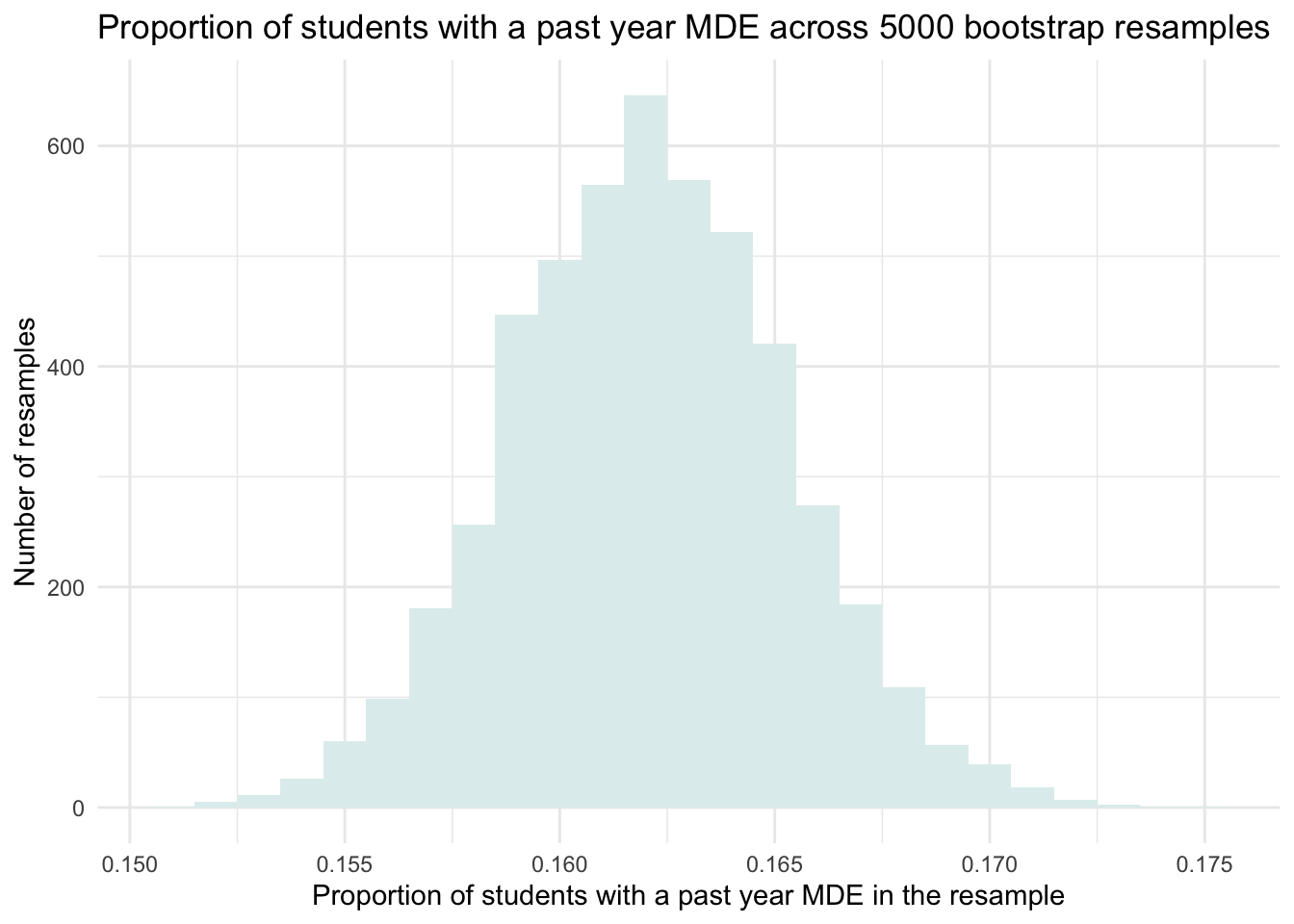
This distribution of the estimated proportion of adolescents with a past-year MDE across our 5000 bootstrap resamples mimics the sampling distribution that we studied in Module 08. But, we created it without having to pretend that we have access to the entire population. We created it simply with our single observed sample via the bootstrap procedure.
Introduction to a Confidence Interval (CI)
Now that we’ve built a bootstrap sampling distribution, we can use it to understand the sampling variability of our estimate — in this case, the proportion of adolescents who experienced a past-year Major Depressive Episode (MDE).
Looking at the histogram of the 5,000 bootstrap resamples, we can see that most estimates fall between about 0.150 and 0.175 (15% to 17.5%), with the highest concentration near 0.162 — the same as the proportion we observed in the full 2019 NSDUH sample. This spread gives us a visual sense of the range of plausible values for the true population proportion.
More specifically, we can see that about 95% of the bootstrap estimates fall between approximately 0.155 and 0.170. This middle 95% gives us a range of plausible values for the true population proportion based on our sample. When we use the bootstrap method to define this range, it’s called a bootstrap percentile confidence interval (CI).
A CI is a statistical tool used to express uncertainty about a population parameter. For example, a 95% CI means that if we repeated the study process many times — drawing new random samples from the population, calculating an estimate each time, and constructing a 95% CI — then about 95% of those intervals would contain the true population value, while about 5% would not.
This 5% represents the probability, denoted by \(\alpha\), that a confidence interval does not contain the true population parameter — in other words, the proportion of times we’d expect our interval to miss the true value if the study were repeated many times.
Correct and incorrect interpretations of a frequentist CI
It’s important to be precise about what a confidence interval means. A 95% CI does not mean there’s a 95% chance that the true population parameter lies within the specific interval we just calculated.
In frequentist statistics (the type we are considering now), the population parameter is fixed — it doesn’t change from sample to sample. What varies is the confidence interval, because it is calculated from a sample, and samples vary due to random chance.
So once we compute a 95% confidence interval from a sample, that interval is either covering the true parameter or it isn’t. There’s no probability involved anymore — the parameter is a fixed (but unknown) quantity, and our specific interval is a fixed range derived from our data.
Instead, the 95% refers to the long-run success rate of the method.
The correct interpretation is:
If we repeated the sampling process an infinite number of times, and calculated a 95% CI from each sample using the same method, then 95% of those intervals would contain the true population parameter.
So, the 95% reflects the reliability of the method, not the probability of the parameter being inside a single interval.
The two ends of the CI are called the bounds—the lower bound and upper bound — and they define the range of plausible values for the population parameter based on our resampling.
If we want more confidence, we can construct a 99% CI instead. This interval will be wider, which reflects the tradeoff between precision and confidence: we’re more likely to capture the true population value across many repeated samples, but at the cost of a less precise estimate.
At this point, we’ve been “eyeballing” the histogram to get a rough sense of the interval. While that’s a helpful starting point, we can do better. We’ll now learn two principled methods for calculating CIs from our bootstrap distribution:
The percentile method
The standard error method
Let’s walk through each of these approaches and learn how to compute them in R.
Construct a bootstrap CI
Percentile bootstrap method
The most common method to define the CI in this setting is to use the middle 95% of values from the distribution of parameter estimates across our bootstrap resamples. To do this, we simply find the 2.5th and 97.5th percentiles of our distribution — that will allow 2.5% of parameter estimates to fall below our 95% CI and 2.5% to fall above our 95% CI. This is quite similar to the activity we did in Module 06 to determine a range of plausible values of height that would encompass the middle 95% of female adults based on the normal distribution.
Calculate a 95% confidence interval
We can use the quantile() function to calculate this range across the bootstrap resamples for us — it takes the corresponding proportion/probability rather than percentile, so we need to divide our percentiles by 100 — for example, 2.5/100 = 0.025 for the lower bound and 97.5/100 = 0.975 for the upper bound. We then plug these values into the code below, where the argument probs = provides the desired percentiles.
resamples_5000proportions |>
  summarize(lower = quantile(prop_positive, probs = 0.025),
            upper = quantile(prop_positive, probs = 0.975))
The two values in the table above give us the lower and upper bound of our CI. That is, our 95% CI for the proportion of adolescents with a past-year MDE is 0.156 to 0.169. In other words, the estimated 95% CI for the proportion of adolescents with a past-year MDE is 15.6% to 16.9%.
Let’s plot our bootstrap sampling distribution, and overlay this calculated 95% CI.
resamples_5000proportions |>
  ggplot(mapping = aes(x = prop_positive)) +
  geom_histogram(binwidth = 0.001, fill = "azure2") +
  geom_vline(xintercept = 0.1557811, lwd = 1, color = "pink2", linetype = "dashed") +
  geom_vline(xintercept = 0.1685452, lwd = 1, color = "pink2", linetype = "dashed") +
  theme_minimal() +
  labs(title = "Proportion of students with a past year MDE across 5000 bootstrap resamples",
       subtitle = "Pink lines represent lower and upper bounds of the 95% CI",
       x = "Proportion of students with a past year MDE in the resample",
       y = "Number of resamples")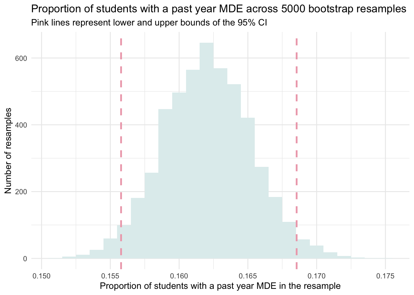
Calculate a 90% confidence interval
Finding the middle 95% of scores as we just did corresponds to a 95% CI. This is a very common interval, but we certainly aren’t tied to this. We could choose the middle 90% of scores, for example. For the middle 90%, we’d use the same method, but plug in 0.05 (for the 5th percentile) and 0.95 (for the 95th percentile) — allowing 90% of the distribution to be in the middle and 10% in the tails (with 5% in the lower tail and 5% in the upper tail of the distribution).
resamples_5000proportions |>
  summarize(lower = quantile(prop_positive, probs = 0.05),
            upper = quantile(prop_positive, probs = 0.95))
Calculate a 99% confidence interval
Or, we can find a 99% CI, which will be the widest of all that we’ve constructed so far since it is set to contain all but 1% of the full distribution of parameter estimates.
In this example, we want 1% in the tails — 1% divided by two equals 0.5% in each tail. This equates to the 0.5th and 99.5th percentiles.
resamples_5000proportions |>
  summarize(lower = quantile(prop_positive, probs = 0.005),
            upper = quantile(prop_positive, probs = 0.995))
Confidence Level and Interval Width
The confidence level you choose affects the width of the confidence interval. Higher confidence requires a wider interval:
A 90% CI is narrower (more precise), but captures the true value less often — about 9 out of 10 times.
A 95% CI is the most common choice and strikes a good balance between precision and confidence.
A 99% CI gives the most confidence that the interval includes the true value, but at the cost of being wider (less precise).
For example, based on our data:
90% CI: 0.157 to 0.166
95% CI: 0.156 to 0.169
99% CI: 0.154 to 0.171
These ranges all give plausible values for the population proportion, but with varying levels of certainty and precision. The choice of confidence level depends on the context of your research, how cautious you want to be, and the consequences of being wrong.
Standard error bootstrap method
When a sampling distribution is approximately normal (bell-shaped), we can use the Empirical Rule to construct the 95% CI — which tells us that about 95% of values lie within two standard deviations (or 1.96 to be more precise) of the mean. In the context of bootstrapping, we estimate the standard error (SE) of our statistic by computing the standard deviation of the bootstrap distribution.
If our bootstrap distribution of the sample proportion is roughly normal, we can use the standard error method to construct a 95% CI using this formula:
\(CI = \hat{p} \pm 1.96 \times SE\)
Here, \(\hat{p}\) is the original estimate from the sample (e.g., 0.162), and SE is the standard deviation of the 5,000 bootstrap estimates. This approach assumes the bootstrap distribution is reasonably symmetric and bell-shaped, which is often — but not always — the case.
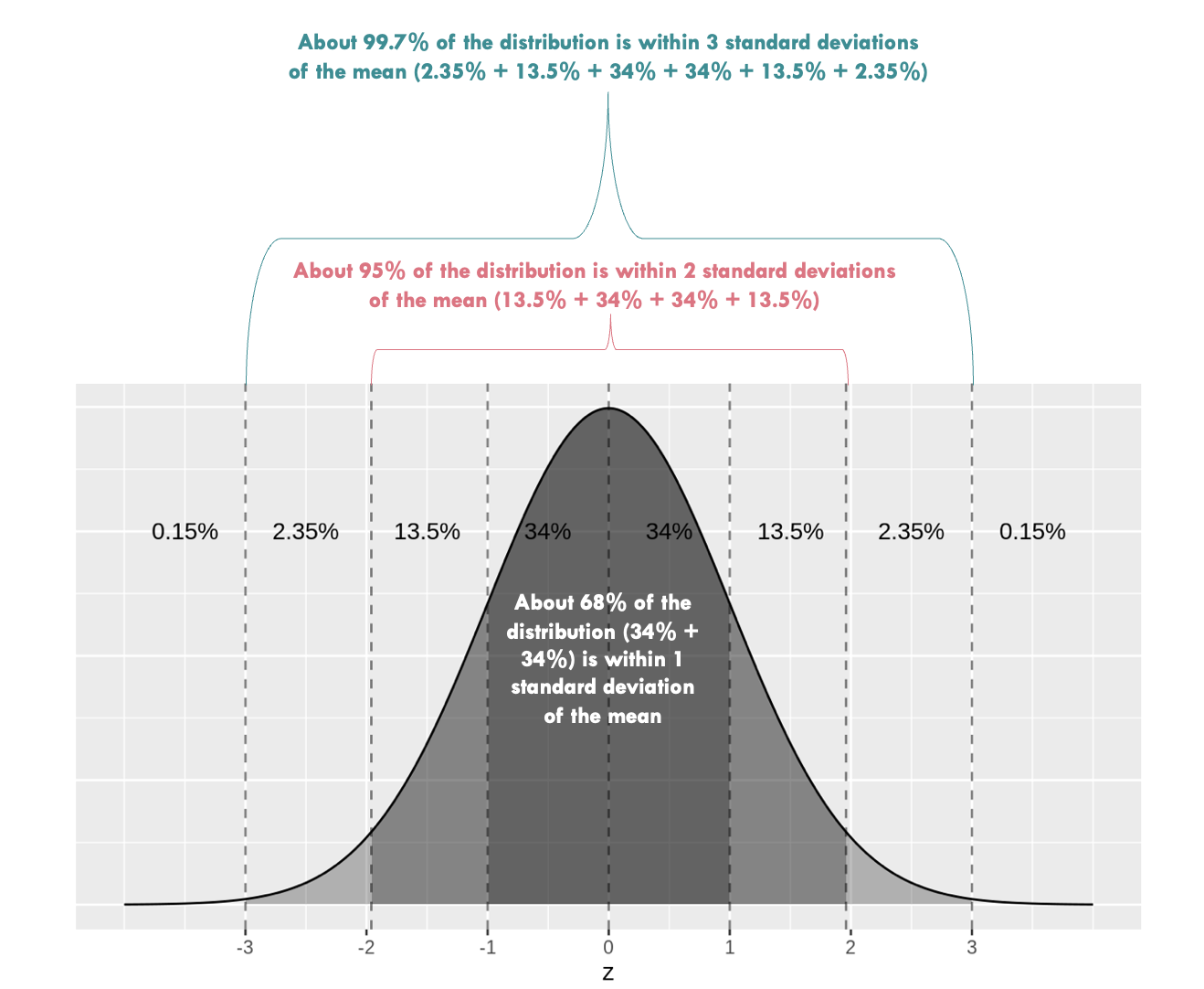
To use this method, we simply calculate the mean and standard deviation of our proportions across the 5000 bootstrap resamples.
resamples_5000proportions |>
  select(prop_positive) |>
  summarize(mean_prop_positive = mean(prop_positive),
            sd_prop_positive = sd(prop_positive))
Here, we find the average proportion is 0.162 and the standard deviation is 0.003. Recall from Module 08 that the standard deviation of a sampling distribution (i.e., our distribution of bootstrap resamples) is called a standard error. Therefore, we can expect 95% of scores to fall within ~1.96 standard errors of the mean. That is \(0.162 \pm1.96\times0.003\). This corresponds to a range of the proportion of students with a past-year MDE between 0.156 (lower bound) and 0.168 (upper bound). This estimate is very close to our 95% CI that we calculated using the percentile method.
Important
For a 99% CI, we substitute 1.96 with 2.58 as 99% of values of a normal distribution fall within ~2.58 standard errors from the mean. Please take a moment to calculate the 99% CI yourself and compare it to the 99% CI calculated using the percentile method.
Summary of bootstrap methods
Bootstrap resampling offers a powerful and versatile method for estimating standard errors and constructing CIs across a wide range of contexts, particularly when traditional parametric assumptions are not met. One of the most significant benefits of bootstrap methods is their ability to apply to virtually any statistic, whether it’s a mean, median, variance, or more complex measures like a regression coefficient (which we’ll study in later Modules).
For example, here’s a modification of our prior code to consider the severity of depression (among students with a past-year MDE). It creates a 95% CI for the mean using the percentile method. Note that there are 1,821 students in the data frame who reported a past-year MDE and who have observed data for the depression severity scale.
resamples_5000means <-
  nsduh_2019 |>
  filter(mde_status == 1) |>
  select(severity_scale) |>
  drop_na() |>
  rep_slice_sample(n = 1821, replace = TRUE, reps = 5000) |>
  group_by(replicate) |>
  summarize(mean_severity_scale = mean(severity_scale))

resamples_5000means |>
  ggplot(mapping = aes(x = mean_severity_scale)) +
  geom_histogram(binwidth = 0.001, fill = "azure3") +
  theme_minimal() +
  labs(title = "Distribution of the mean depression severity scale across 5000 \nbootstrap resamples",
       x = "Mean depression severity in the resample",
       y = "Number of resamples")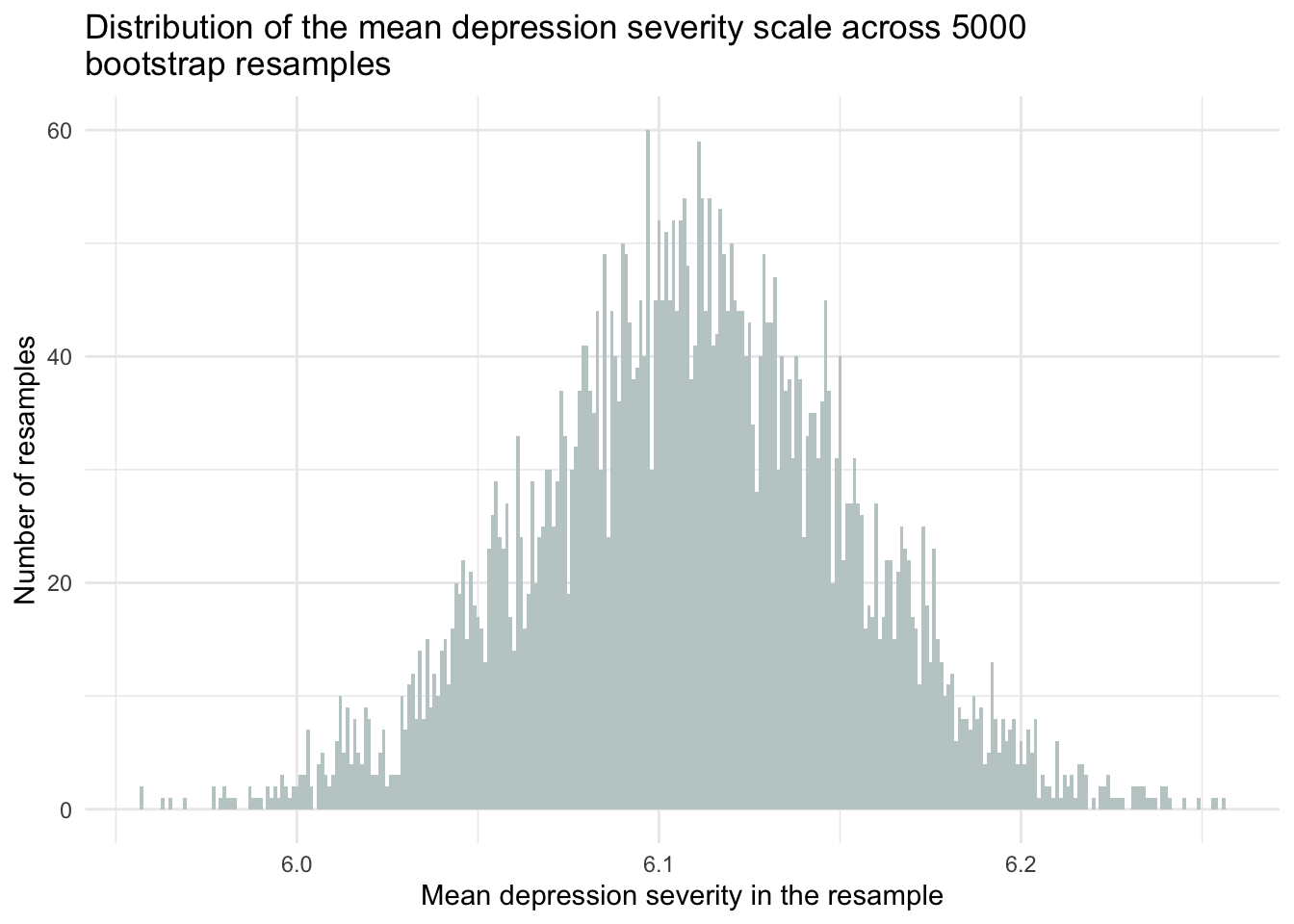
resamples_5000means |>
  summarize(lower = quantile(mean_severity_scale, probs = 0.025),
            upper = quantile(mean_severity_scale, probs = 0.975))
To interpret this CI — we can say:
“95% of the 95% CIs that we could construct across an infinite number of random samples will include the true population mean.”
You can roughly think of this as giving us a range of values that are plausible for the true mean depression severity score in the population (i.e., 6.02, 6.19), based on the sample data.
This flexibility in bootstrap resampling to apply to any statistic of interest arises because the method does not rely on specific distributional assumptions about the data. Instead, it generates numerous resamples by randomly sampling with replacement from the original data frame, allowing for the estimation of the sampling distribution of almost any statistic directly from the data. As a result, it can provide more accurate and robust CIs, especially in situations where the underlying distribution of the data is unknown or complicated. Furthermore, the bootstrap approach is relatively straightforward to implement with modern computing resources, making it accessible for a wide range of applications.
Introduction to Theory-Based Quantification of Uncertainty
Now, let’s explore a different approach directly rooted in frequentist statistics. Unlike bootstrapping, which generates many resamples to simulate variability, the frequentist methods we will study here use theoretical formulas to calculate uncertainty based on the original sample. This approach relies on established theories about how data behaves over many repetitions of the same experiment.
In frequentist statistics, probability is defined as the long-run frequency of events. This means we look at what happens over many trials or samples to understand likely outcomes. A key principle in frequentist statistics is the Central Limit Theorem (CLT). This theorem explains that if we take a large enough sample (commonly, more than 30 data points are adequate), the estimates we calculate from these samples will form a normal distribution (shaped like a bell curve), regardless of the original distribution of data in the population. This predictable pattern allows us to use specific formulas to calculate standard errors and CIs.
Because the CLT suggests that our sample estimates will approximate a normal distribution, we can use it to directly calculate the standard error and confidence intervals without needing to simulate multiple samples, as we did with bootstrapping. This makes the frequentist approach efficient, especially when assumptions about the data are met.
Whether we’re estimating the proportion of students experiencing a MDE in the past year, or the average severity of depression among those students, the CLT provides two crucial insights:
Convergence of Sample Estimates: As our sample size gets larger, our sample averages (or proportions) get closer to the true average (or proportion) in the whole population.
Calculating Uncertainty: The standard error (SE), which measures how much we expect our estimate to vary from sample to sample, can be derived directly from our sample data without resampling by applying a parametric formula.
The SE formula for means/averages is a follows:
\[ SE = \frac{s}{\sqrt{n}} \]
where \(s\) is the sample standard deviation for the variable of interest (e.g., depression severity) and \(n\) is the sample size.
For proportions, the SE formula adjusts to account for the binary nature of the data:
\[ SE = \sqrt{\frac{p(1-p)}{n}} \]
where \(p\) is the sample proportion for the variable of interest (e.g., proportion with a past-year MDE), and \(n\) is the sample size.
These formulas are considered parametric, meaning they rely on certain assumptions about the underlying distribution of the data. For example, they often assume that the population follows a normal distribution, or that the sampling distribution will approximate normality as sample size increases. These assumptions allow us to use mathematical equations to estimate key quantities — like means, proportions, standard errors, and confidence intervals — without simulation.
When parametric assumptions hold, this approach provides a powerful and practical framework for making inferences about a population from a single sample. However, the validity of our conclusions depends on how well the data meet those assumptions.
Key assumptions of theory-based (parametric) CIs
To confidently use the Central Limit Theorem (CLT) and parametric formulas to calculate standard errors and confidence intervals, several key conditions must be met:
Large Sample Size: Theory-based formulas work best with sufficiently large samples — commonly at least 30 observations. Even if the population distribution isn’t normal, the CLT ensures that the sampling distribution of the sample mean or proportion will be approximately normal as the sample size increases.
Random Sampling: The sample should be randomly drawn from the population, so that every member has an equal chance of being selected. This helps ensure that the sample is representative and reduces bias.
Distribution Shape (Normality or Symmetry): For smaller samples, theory-based methods assume that the population is normally distributed. For larger samples, this assumption becomes less critical, but extreme skewness or outliers can still distort results. The more symmetric and well-behaved the distribution, the more accurate the estimates.
Independence of Observations: Each observation should be independent of the others. If data points are related — such as measurements from the same person over time, students within the same classroom, or sibling pairs — then this assumption is violated. In such cases, more advanced techniques (like multilevel modeling) are needed, but these are beyond the scope of this course.
By ensuring that these assumptions are reasonably satisfied, we can confidently apply theory-based (parametric) formulas to calculate standard errors and confidence intervals. The Central Limit Theorem gives us the theoretical foundation we need to justify this approach and make accurate, reliable inferences from our sample to the larger population.
Before we take a look at the procedure for calculating the CI using a theory-based approach, please watch the video below from Crash Course Statistics on Confidence Intervals.
The procedure for a proportion
Let’s walk through how to use the theory-based (parametric) method to calculate a CI for the proportion of students with a past-year MDE.
Step 1: Compute the Standard Error
As described earlier, for a sample proportion, the standard error (SE) is calculated using the formula:
\[ SE = \sqrt{\frac{p(1-p)}{n}} \]
For example, based on the 2019 NSDUH data:
\[ SE = \sqrt{\frac{0.162(1-0.162)}{12950}}=0.003 \]
This tells us how much we would expect our estimate to vary across repeated random samples.
Step 2: Choose a Confidence Level
Next, we choose a confidence level — commonly 95% in psychological research. This means we want the middle 95% of the sampling distribution — assuming it is a standard normal distribution.
To find the corresponding z-scores that mark the 2.5th and 97.5th percentiles of the standard normal distribution, we can use the qnorm() function:
qnorm(p = c(0.025, 0.975))[1] -1.959964 1.959964Here’s a visualization of the standard normal distribution with the 2.5th and 97.5th percentiles marked:

Step 3: Compute the Confidence Interval
Now we can calculate the 95% confidence interval using the formula:
\[ CI = \hat{p} \pm (z_{\alpha/2} \times SE_{\hat{p}}) \]
Where:
\(\hat{p}\) is the estimated sample proportion
\(n\) is the sample size
\(z_{\alpha/2}\) is the z-score from the z-distribution (standard normal distribution). The z-score corresponds to the desired confidence level. For a 95% confidence interval, \(\alpha\) is 0.05, and \(\alpha/2\) is 0.025, indicating the area in each tail.
Using R, we can compute this directly using the summarize() function. Notice the line that starts with se — here we compute the standard error using the formula stated above. We then multiply the z-scores marking the bounds of our desired confidence level (i.e., the lower_boundCI marks the 2.5th percentile and the upper_boundCI marks the 97.5th percentile).
nsduh_2019 |>
  select(mde_status) |>
  drop_na() |>
  summarize(
    proportion = mean(mde_status),
    sample_size = n(),
    se = sqrt(proportion * (1 - proportion) / sample_size),
    lower_boundCI = proportion - 1.959964 * se,
    upper_boundCI = proportion + 1.959964 * se
  )
Putting the pieces together:
\[ 95\% \text{ CI } = 0.162 \pm (1.96 \times 0.003) = 0.156, 0.168 \]
This theory-based (parametric) CI is nearly identical to the one we obtained using the bootstrap method earlier. Both approaches aim to capture the range of plausible values for the true population proportion, though they rely on different logic and assumptions.
It’s essential to remember: this 95% confidence interval does not mean there’s a 95% chance that the true population value falls within this specific interval. Instead, it means that if we repeated this process many times, 95% of the intervals constructed this way would contain the true value.
The procedure for a mean
Let’s now use the theory-based/parametric method for calculating the CI of the average depression severity score among students with a past-year MDE.
Step 1: Compute the Standard Error
As described earlier, for a sample mean, the standard error (SE) is calculated using the formula:
\[ SE = \frac{s}{\sqrt{n}} \]
For example, based on the 2019 NSDUH data:
\[ SE = \frac{1.908}{\sqrt{1821}} = 0.045 \]
This tells us how much we would expect our estimate to vary across repeated random samples.
Step 2: Determine the Degrees of Freedom
Next, we need to calculate the degrees of freedom for our estimate. Rather than the standard normal (i.e., z) distribution that we’ve worked with so far, we need to use an alternative distribution — namely the t-distribution1. The t-distribution, also called the Student’s t-distribution, is a probability distribution that is similar to the standard normal distribution but has heavier tails. It was introduced by William Sealy Gosset under the pseudonym “Student” in 1908. Like the standard normal distribution, the t-distribution is symmetrical and bell-shaped, but its tails are thicker, meaning it’s more prone to producing values that fall far from its mean. That is, as compared to the z-distribution, we expect more cases in the tails of the distribution.
The Student’s t-distribution
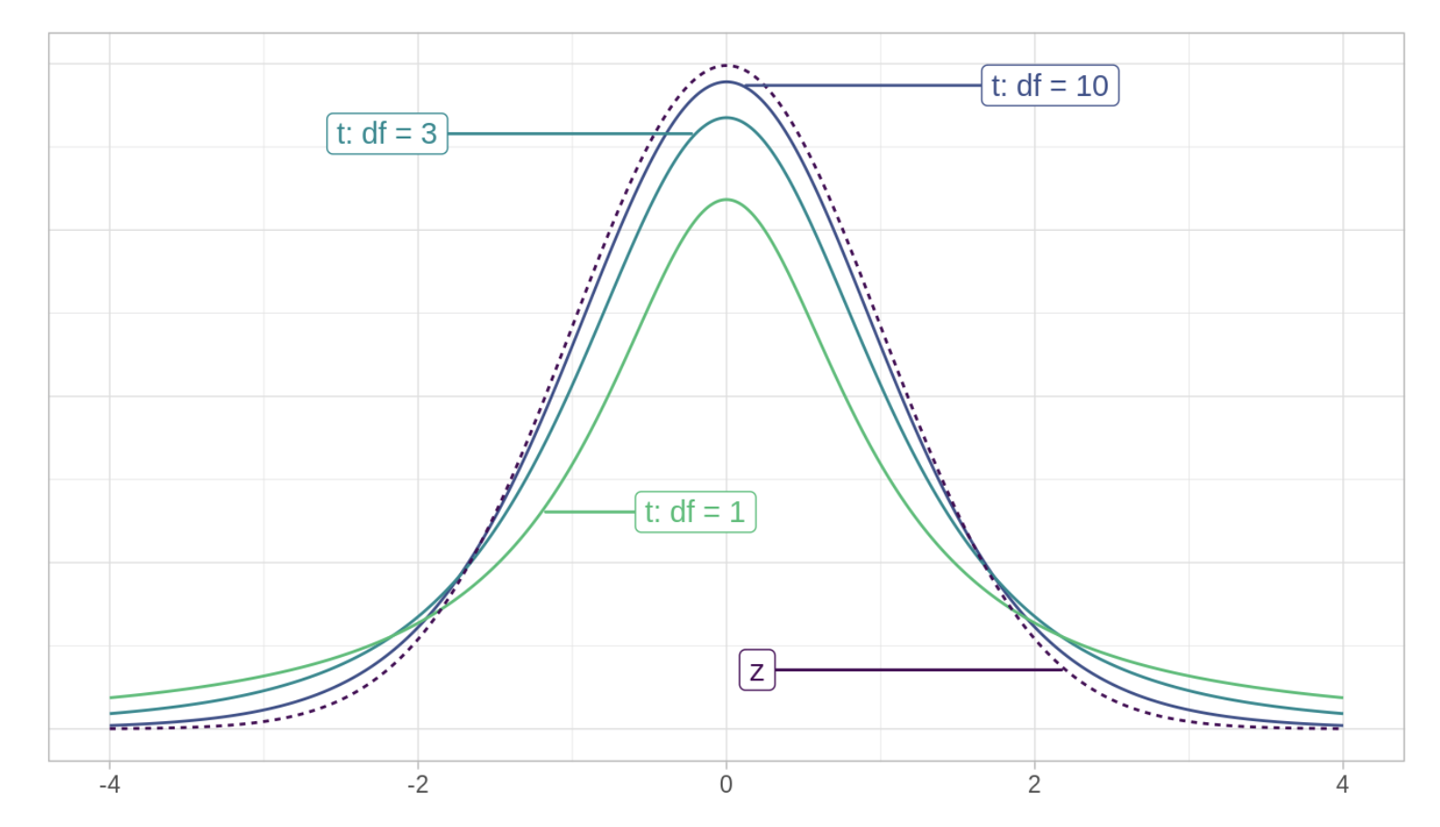
The exact shape of the t-distribution depends on a parameter called the degrees of freedom (df). Here’s an intuitive way to think about df. Imagine we have a variable measured for five people randomly selected from the population — for example, the depression severity score for five people in our study. Before estimating anything, each person’s depression score is free to take on any value. Now, imagine we want to use these five people to estimate the mean depression severity score. You now have a constraint — the estimation of the mean. That is, once the mean is estimated, four of the five values are free to vary, but one is not. That is, if we know the mean depression severity score for the five people, and the depression severity score for four of the individual people, then the value of the depression severity score for the fifth person is also known and, therefore, not free to vary. The df provide a heuristic for quantifying how much unique information we have available.
With each CI that we construct, there will be a formula for calculating the df. When estimating a population mean, the formula for the df is simply \(n\) - 1, where \(n\) is the sample size. In our example, \(n\) = 1,821 (the number of people where mde_status equals 1 and the severity_scale is not missing), so if we desire to use our sample to estimate the mean in the population, then we have 1,820 df left.
Notice in the figure above (i.e., The Student’s t-distribution) that as the df increase, the t-distribution gets closer to a standard normal distribution (labeled z in the figure). With infinite df, the t-distribution is equivalent to the standard normal distribution.
Why do we need a different distribution? When estimating a CI for the population mean, we typically do not know the population standard deviation (which of course is needed to estimate the standard error used for the CI). Instead, we must estimate it from the sample data. This introduces additional uncertainty because the sample standard deviation also varies from sample to sample. Due to this additional uncertainty, the sampling distribution of the sample mean does not perfectly follow a normal distribution. Instead, it follows a t-distribution, which accounts for the extra variability introduced by estimating the population standard deviation from the sample.
Step 3: Choose the Confidence Level
Next, we need to decide on a confidence level — that is, the proportion of the t-distribution (which approximates our sampling distribution) that we want our confidence interval to capture.
We can use the qt() function in R to find the t-score that corresponds to our desired confidence level and df. The qt() function in R is used to obtain the quantiles of the Student’s t-distribution. It stands for “quantile of t”, and is similar to the qnorm() function that we used earlier for a standard normal distribution (i.e., for finding z-scores of the standard normal distribution).
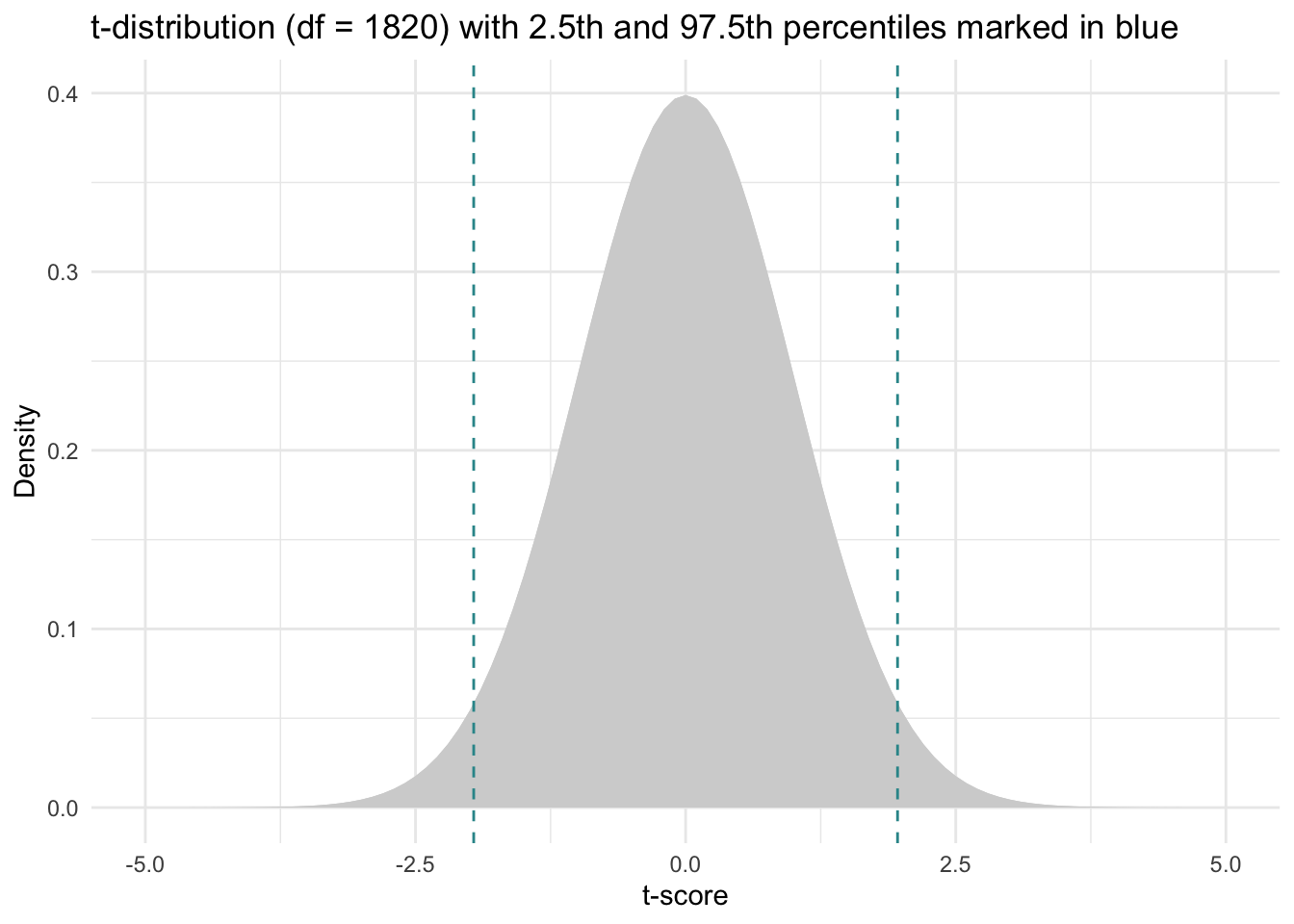
For example, for our problem, we will calculate a 95% CI, and we have 1,820 df, therefore, we input the following information into the qt() function to find the t-scores associated with the middle 95% of the distribution.
qt(p = c(0.025, 0.975), df = 1820)[1] -1.961268 1.961268Here’s a depiction of the Student’s t-distribution with 1,820 \(df\) with the selected t-scores for the 2.5th and 97.5th percentiles overlaid (since our sample is quite large, the Student’s t-distribution is nearly identical to the standard normal distribution.
Step 4: Compute the Confidence Interval
Now we’re ready to construct the CI. Once we have the SE and the t-scores, we can construct the CI for the population mean as follows:
\[ CI = \bar{y} \pm (t_{n-1, \alpha/2} \times SE_{\bar{y}}) \]
Where:
- \(\bar{y}\) is the sample mean for variable \(y\) — which is severity_scale in this example
- \(t_{n-1, \alpha/2}\) is the t-score from the t-distribution. The t-score corresponds to the desired confidence level. For a 95% confidence interval, \(\alpha\) is 0.05, and \(\alpha/2\) is 0.025, indicating the area in each tail. The t-score also depends on the degrees of freedom (df), which is calculated as the sample size minus one (n−1) when estimating a mean.
- \(SE_{\bar{y}}\) is the standard error of \(\bar{y}\)
We can calculate the CI using the summarize() function as follows. Notice the line that starts with se — here, we take the standard deviation of severity_scale in our sample and divide it by the square root of n. We then multiply this value by the t-scores marking the bounds of our desired confidence level (i.e., a 95% CI) — these t-scores correspond to the values we just calculated using the qt() function.
nsduh_2019 |>
  filter(mde_status == 1) |>
  select(severity_scale) |>
  drop_na() |>
  summarize(mean = mean(severity_scale),
            std = sd(severity_scale),
            sample_size = n(),
            se = std/sqrt(sample_size),
            lower_boundCI = mean - 1.961268*se,
            upper_boundCI = mean + 1.961268*se)
\[ 95\% \text{ CI } = 6.11 \pm (1.96 \times 0.045) = 6.02, 6.20 \]
Here, we see that the 95% CI calculated using a theory-based approach is 6.02 to 6.20. This theory-based (or parametric) method yields an interval that is quite close to the 95% CI we calculated using the bootstrap method for the mean severity score. Like the bootstrap CI, this interval provides a range of plausible valuesfor the true population mean, based on our sample data.
In more precise terms: if we were to repeat this study process many times — drawing new random samples and constructing a 95% CI each time — we would expect 95% of those intervals to contain the true population parameter (i.e., the mean depression severity score among adolescents with a past-year MDE).
Whether this particular interval contains the true mean is unknown — but we know we used a method that works 95% of the time in the long run.
Interpretation of frequentist-based confidence intervals
In our analysis, we observed that both bootstrap CIs and parametric (theory-based) CIs provided similar estimates for the proportion of adolescents with a MDE and the average severity of depression among these individuals. These CIs are interpreted in the same way, but they differ in their calculation methods and assumptions.
Parametric (Theory-Based) CIs
Calculation: Easier to calculate using formulas based on statistical theories.
Assumptions: Rely on key assumptions about the data, such as normality of the sampling distribution, which can be difficult to verify.
Example: To calculate the CI for a mean, we use the sample mean, the standard error (SE) calculated using the standard formula, and the t-score corresponding to our desired confidence level.
Bootstrap CIs
Calculation: Involves a resampling method, where we repeatedly draw samples from the data and recalculate the statistic of interest.
Assumptions: Do not rely on strict assumptions about the data’s distribution, making them more flexible and robust.
Example: We create many resamples of our data, calculate the statistic for each resample to mimic the sampling distribution, and then use this distribution of the statistic across the resamples to determine the CI.
Intuition for CIs
A crucial aspect of confidence intervals is understanding what the confidence level means:
- Confidence Level (e.g., 95%): This does not mean that there is a 95% probability that the true population parameter lies within the calculated interval. It does mean that if we were to take many random samples from the population and calculate a CI for each, about 95% of those intervals would contain the true population parameter.
Visualization example
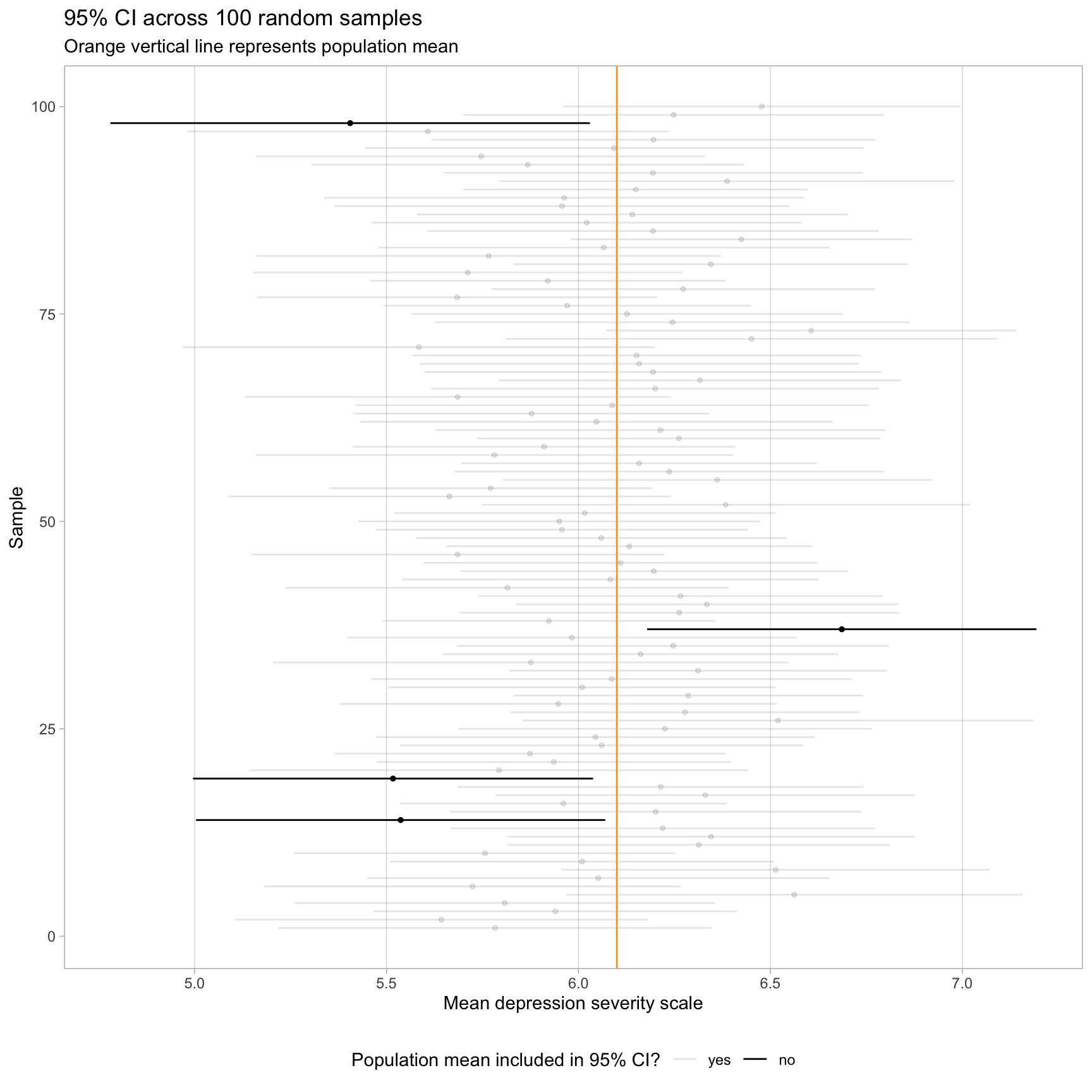
Consider a hypothetical simulation where we construct a 95% CI for the average depression severity of adolescents across 100 random samples of size 50 from a population. In the visualization presented below, the population mean is marked by an orange vertical line. The majority of the CIs (96 out of 100, shaded in gray) include the population mean, aligning with our expectations. However, a small fraction (4 out of 100, shown in black) do not contain the population mean. This outcome illustrates the inherent uncertainty: without knowing which sample we have in reality, we cannot be certain whether our specific CI includes the true parameter.
Introduction to a Bayesian Approach to Uncertainty
For much of its history, the field of statistics has been dominated by the frequentist approach. This perspective is based on the idea of long-run frequencies. Imagine repeating the same study — like estimating the average depression severity score among adolescents with a past-year Major Depressive Episode — over and over under the same conditions. In the frequentist world, we treat each sample as one of many possible random samples from a larger population, and we assume the true population value is fixed but unknown.
From this view, probability refers to how often an outcome would occur in the long run. So when a frequentist calculates a confidence interval, they’re saying:
“If we repeated this experiment many times, 95% of the intervals we compute would contain the true population parameter.”
This idea is very different from how we usually talk about probability in everyday life. Frequentist probabilities are not about the chance of a single event, but about patterns across many repetitions of the same experiment.
Now let’s turn to a different framework: Bayesian statistics.
The Bayesian approach offers a fundamentally different way of thinking about probability and uncertainty. Rather than imagining an infinite number of repeated samples, Bayesian statistics focuses on the data we have right now and asks:
“Given this data, how confident are we that the true value lies in a certain range?”
In Bayesian thinking, probability represents a degree of belief — a way to express how confident we are in different possible outcomes. For example, if the depression severity scale ranges from 1 to 10, and our current data suggests a mean score around 6.1, we might be quite confident the true mean is near 6, less confident that it’s 4 or 8, and very doubtful it’s as extreme as 1.5 or 9.5. This range of belief can be expressed mathematically using a Bayesian credible interval.
At the heart of Bayesian analysis is a process called Bayesian updating. We start with a prior belief — what we already know or assume about a parameter (from past studies, theory, or expert opinion). Then we collect new data and use Bayes’ theorem to update that belief. The result is a posterior distribution, which reflects our updated understanding after combining the prior with the observed data.
You can think of it like this:
Imagine you’re a clinician with years of experience treating depression. Before you even see the latest study, you have an informed idea about what typical severity scores might be. That’s your prior. Once new data is collected, you don’t discard what you knew — you update your beliefs, arriving at a more informed conclusion. That’s the posterior.
Why it matters
What makes Bayesian methods especially compelling is their interpretability. Unlike frequentist confidence intervals, which describe what would happen over many hypothetical repetitions, a Bayesian credible interval answers the question most people actually care about:
“Given what we know, what is the probability that the true value lies within this range?”
This direct interpretation of probability — as a degree of belief — can make statistical inference more intuitive and more aligned with real-world decision-making.
Contrasting the frequentist and Bayesian approach
Frequentist inference is based on the idea of repeated sampling. The population parameter is fixed, and probability describes long-run frequencies of sample-based outcomes.
Bayesian inference incorporates prior knowledge, updates it with new data, and provides a posterior distribution that reflects our updated beliefs.
A Bayesian credible interval shows the range within which the parameter lies with a certain level of confidence — based on both prior information and the observed data.
In the next section, we’ll explore how to calculate a Bayesian credible interval and see how this approach complements the methods you’ve already learned.
Understanding the mechanics
In the next section of this Module, we’ll explore how to use a Bayesian approach to estimate the average depression severity score among adolescents who experienced a MDE in the past year. We’ll work with data from the 2021 National Survey on Drug Use and Health (NSDUH), using what we’ve learned from the 2019 data as our prior information.
Establishing prior beliefs
In a Bayesian analysis, the first step is to define our prior beliefs about the parameter we’re interested in — in this case, the average depression severity score. These priors reflect what we already know before seeing the current data. They might come from previous research, expert opinion, or other reliable sources.
For this example, our prior is informed by findings from the 2019 NSDUH, which suggested a typical depression severity score around 6.1 for adolescents with a past-year MDE. We will express this prior belief quantitatively by assuming a normal distribution centered around that 2019 value.
This distribution does two things:
The mean reflects our best guess based on past data.
The spread (standard deviation) reflects how confident we are in that guess — how tightly or loosely we believe the true value might vary around it.
By setting a prior in this way, we lay the foundation for Bayesian inference, allowing us to combine this prior knowledge with new data to arrive at an updated estimate in the next step of the analysis.
Fitting the model
We will use the brm() function from the brms package to fit our Bayesian model. brms stands for Bayesian Regression Models using Stan, and the package is designed to make the power of Bayesian analysis accessible without requiring users to write complex Stan code (the premiere programming language used for statistical modeling and high-performance statistical computation in a Bayesian framework). Let’s start with a high-level overview of the process — and then carry out the analyses.
First, we need to load some additional packages to conduct our Bayesian analysis: (brms, bayesplot, tidybayes, and broom.mixed).
library(brms)
library(bayesplot)
library(tidybayes)
library(broom.mixed)
Combining prior knowledge with data
In Bayesian analysis, we combine prior beliefs with new data using Bayes’ Theorem. In this case, our prior beliefs are based on the 2019 NSDUH data, and the new data come from a 2021 sample. Bayes’ Theorem provides a formal way to update our understanding by blending what we previously believed with what we’ve just observed. The result is the posterior distribution, which represents our updated beliefs about the true population mean for depression severity in 2021.
This posterior distribution reflects a range of plausible values for the 2021 mean, with some values more probable than others based on both the prior knowledge and the new data. Importantly, while our 2021 data provide an estimate from one sample, we are ultimately trying to learn about the true population parameter — the average depression severity score for all adolescents with a past-year MDE in 2021.
For example, the mean severity score in 2019 was 6.1. Based on that, we might reasonably expect the 2021 mean to be similar. However, we must also account for potential changes over time — like sampling variability, year-to-year fluctuations, or major events such as the COVID-19 pandemic. These sources of uncertainty make it important to avoid assuming the 2021 value is exactly the same as in 2019.
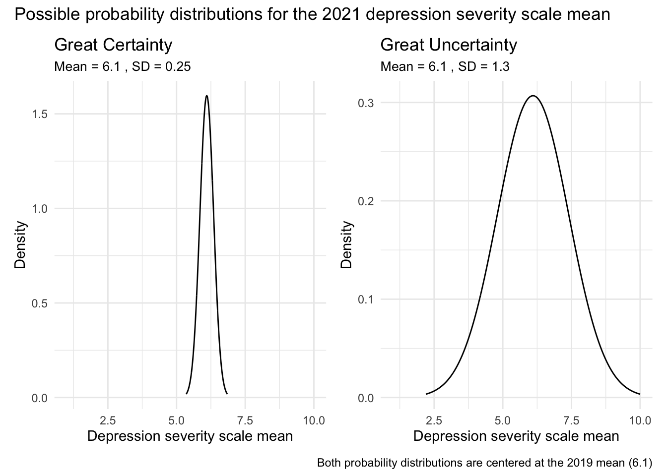
To illustrate this, consider the two graphs below. Both display probability density functions for possible values of the 2021 mean depression severity score, with the x-axis ranging from 1 to 10 (the full scale of the measure):
The left-hand graph reflects a high degree of certainty: it assigns very high probability to values close to 6.1 and very low probability to values more than 1 point away. This would represent a strong prior belief that the mean hasn’t changed much from 2019.
The right-hand graph reflects greater uncertainty: while it still suggests the mean is likely somewhere near 6.1, it allows for a wider range of plausible values — from as low as 2.5 to as high as 9.5 — though values further from 6.1 are considered less probable.
This example shows how Bayesian methods allow us to express and visualize our prior uncertainty about a parameter. Rather than assuming a single value, the prior distribution assigns varying degrees of plausibility to a range of potential values, reflecting what we believe before seeing the new data.
Sampling from the posterior
In Bayesian analysis, we often work with posterior distributions that do not have a simple, closed-form expression. This means we can’t easily write down or compute the exact shape of the distribution using standard mathematical formulas. Instead, we turn to computational techniques, such as Markov Chain Monte Carlo (MCMC), which allow us to approximate the posterior by generating samples from it.
A helpful analogy
Imagine you’re hiking through a mountainous landscape at night with only a flashlight. You can’t see the whole terrain, but you can decide where to step next based on your current location and what your flashlight shows. Your goal isn’t to find the single highest peak, but to explore the entire terrain, spending more time in the higher (more probable) areas.
In MCMC:
The landscape = the posterior distribution
The height of the terrain = how probable a value is
Your steps = proposed samples based only on your current position (this is the Markov property)
Over time, you take enough steps to build up a good picture of the terrain—the posterior
How Bayesian estimation works
In Bayesian estimation, we’re not imagining repeated experiments or collecting new samples of cases (i.e., adolescents) — we’re working with the single dataset we already have. Our goal is to better understand the parameter we’re estimating (like the average depression severity score in 2021) by combining that data with our prior beliefs.
Here’s what happens behind the scenes:
We start with an initial guess for the parameter’s value — this is just the starting point for our algorithm.
We take many small steps through the space of possible values for the parameter. Each new step is chosen based on how likely the new value is, given the posterior distribution (which combines our prior and the data).
Each step produces a simulated value for the parameter. These simulated values are called samples from the posterior distribution. They are not people or observations — they are possible values the parameter could plausibly take.
After thousands of steps, we build up a large collection of these simulated values. This collection of values gives us an approximation of the full posterior distribution — a picture of all the plausible values for the parameter, and how confident we are in each one.
The role of the prior
Before we even start sampling, we specify our prior beliefs about the parameter (e.g., the average depression score). This prior helps shape the terrain we’re navigating — it determines which regions are initially more likely and where the algorithm begins its search.
Interpreting the results
MCMC doesn’t give us a single answer — it gives us a collection of possible answers that reflect the uncertainty in our estimate. From these samples, we can calculate summary statistics (like the mean or median) and construct credible intervals that directly answer questions like:
“Given the 2021 sample data and our prior information, what’s the probability that the mean depression severity score among adolescents in the population in 2021 is between 6.2 and 6.4?”
For example, consider the graph below showing the posterior distribution for the mean depression severity score among adolescents in 2021.
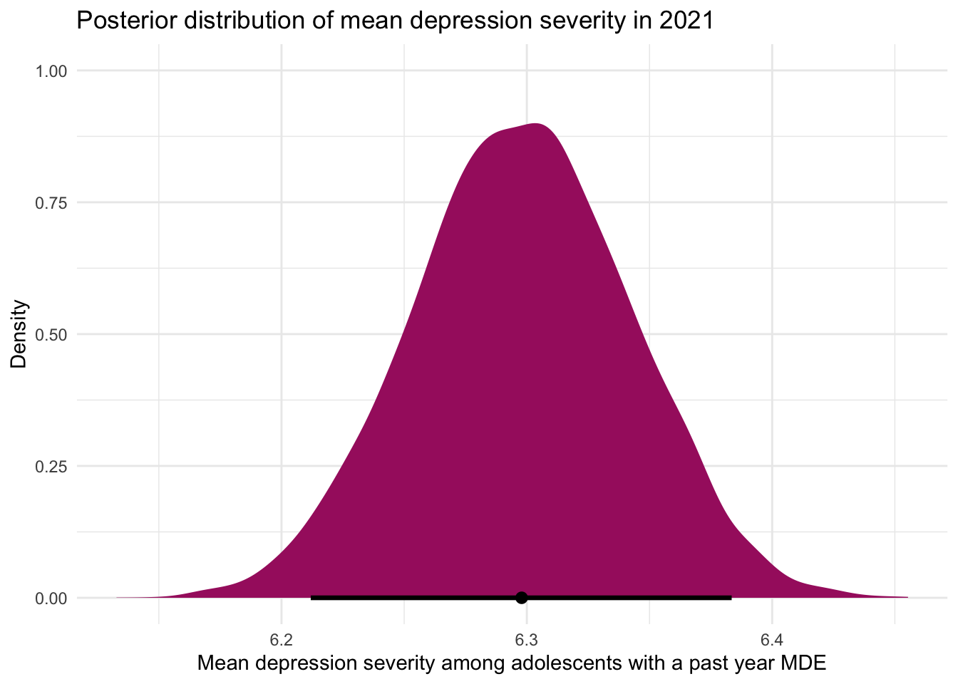
What are the important elements to observe in this density graph:
The x-axis represents possible values for the mean depression severity score, while the y-axis represents the relative likelihood (or density) of each value, given the model.
The shape of the distribution reflects our updated beliefs after combining the prior information (based on 2019 data) with the new data from 2021. The curve peaks just below 6.3, indicating that this is the most likely value for the mean severity score based on the data and prior knowledge. The dot near 6.3 along the x-axis marks this most likely value as well.
The horizontal line at the bottom marks the 95% credible interval — the range within which we believe, with 95% certainty, the true mean lies. Unlike a frequentist confidence interval, this Bayesian credible interval allows for a direct and intuitive interpretation:
“Given the data and our prior, we are 95% confident that the true mean depression severity score in 2021 is between 6.2 and 6.4.”
The width of the distribution communicates uncertainty: values closer to the peak are more plausible, while values farther from the peak are less likely, though still possible. This visual summary allows us to see both our best estimate and the uncertainty surrounding it in one view.
A worked example
With that high-level overview in our pocket, let’s take a look at how a Bayesian analysis is carried out using the NSDUH example.
First, let’s import and prepare the NSDUH 2021 data (the data file is called nsduh_2021.Rds) and create the variables that we will need. The variables are identical to those from 2019.
df_2021 <- readRDS(here::here("data", "nsduh_2021.Rds"))

df_2021 <-
  df_2021 |>
  select(sex, mde_pastyear, starts_with("severity_")) |>
  mutate(mde_status = case_when(mde_pastyear == "positive" ~ 1,
                                mde_pastyear == "negative" ~ 0)) |>
  mutate(severity_scale = rowMeans(pick(starts_with("severity_")))) |>
  select(severity_scale) |>
  drop_na()
Estimate the mean using Bayesian priors
Now, we’re ready to estimate the mean depression severity score among the 2021 adolescents with a past-year MDE. There are a series of steps that we must take.
Selection of priors
Before fitting the Bayesian model, we must select our priors. In this simple example, there are three pieces of prior information needed:
The mean that we expect (i.e., the average depression severity score among adolescents with a past-year MDE).
The standard deviation for this expected mean (i.e., how uncertain are we about where the mean might be).
The expected distribution of the estimated parameter.
For the first parameter, we will specify that the average (or mean) depression severity score should be around 6.1, a value derived from our analysis of the 2019 NSDUH data. For the third parameter, we specify a normal distribution for these scores, reflecting our expectation that, while a 2021 mean that is close to the 2019 mean is most probable, there’s surely variability in either direction.
The second parameter, the standard deviation, is usually the most difficult to choose. Given the depression severity scale ranges from 1 to 10, scores outside this range are not feasible. Thus, in contemplating this model, we seek to choose a prior distribution that stays within these bounds but remains broad to acknowledge the inherent uncertainty and variability in depression severity scores from one year to the next. When selecting the prior for the standard deviation, it is useful to set up a graph to consider various possibilities to help make a decision. For example, take a look at the graph below that depicts a prior distribution that is specified as normal, with a mean of 6.1 and standard deviation of 1.3.
# Parameters for the Gaussian distribution
mean <- 6.1
std_dev <- 1.3

# Generate points on the x axis
x <- seq(mean - 3*std_dev, mean + 3*std_dev, length.out = 1000)

# Calculate the y values for the Gaussian probability density function (PDF)
y <- dnorm(x, mean = mean, sd = std_dev)

# Create a data frame for plotting
data <- data.frame(x, y)

# Plotting
ggplot(data, aes(x = x, y = y)) +
  geom_line() +
  labs(title = "Gaussian probability distribution",
       subtitle = paste('Mean =', mean, ', SD =', std_dev),
       x = 'Depression severity scale mean',
       y = 'Density') +
  theme_minimal() +
  theme(plot.subtitle = element_text(size = 10))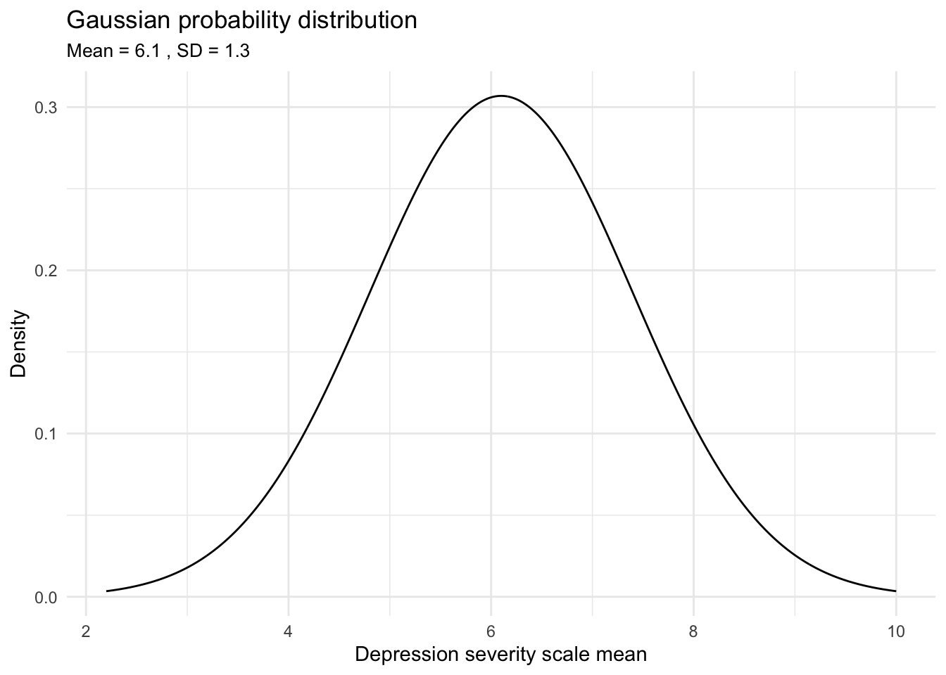
This graph visualizes our specified prior probability distribution for average depression severity in 2021. By choosing a normal distribution centered around 6.1 with an appropriate standard deviation (as suggested by the range between 5 and 7 being ‘highly likely’), our belief that the population mean is most likely around 6.1 is reflected. This prior reflects our expectation before analyzing the new data: means near 6.1 are deemed more probable, with the likelihood gradually decreasing for scores farther from this central value. Consequently, extreme means — such as those less than 2.5 or greater than 9.5 — are considered very unlikely under this prior distribution.
In summary, after visualizing different probability distributions and assessing how they align with expectations given the 2019 data, a mean of 6.1 and a standard deviation of 1.3 helps to create a distribution that’s wide enough to capture the range of possible average scores without being overly restrictive. This width is crucial, especially considering the unique circumstances surrounding the 2021 study year, such as the potential impacts of COVID-19. It’s reasonable to anticipate increased uncertainty in these scores due to such external factors. It’s probably quite unlikely that the mean would be much less, or much greater, than the 2019 mean of 6.1, but this proposed prior distribution allows for that small possibility.
Fit the Bayesian model
To specify the Bayesian model, we use the following code:
model <- brm(
  formula = severity_scale ~ 1,
  data = df_2021,
  prior = prior(normal(6.1, 1.3), class = "Intercept"),
  family = gaussian(),
  warmup = 1000,
  iter = 4000,
  chains = 4
  )
Let’s break down the code:
brm(): This function is the powerhouse for the brms package to fit Bayesian regression models. Even though we’re not fitting a traditional regression model (i.e., with predictors) in this scenario, the setup and rationale behind using brm() follow similar principles, and we’ll be able to build on this example later in the course when we’re ready to start adding predictors to our model, rather than just estimating the mean.
formula = severity_scale ~ 1: This argument specifies the model within the brm() function. Here, severity_scale represents the continuous outcome variable we’re interested in analyzing — in this case, the depression severity score among adolescents. The~ 1part of the formula indicates that we are modeling the severity_scale as a function of an intercept only, without including any predictor variables. It’s a simple model that aims to capture the central tendency (mean) of the depression severity scores. This specification will become more clear as we begin learning about linear regression models later in the course.data = df_2021: This argument specifies the data frame to be analyzed.prior = prior(normal(6.1, 1.3), class = "Intercept"): In our Bayesian model, we specify our initial beliefs or knowledge about the average depression severity scores using a normal prior distribution. This argument sets these priors. Through the function normal(), the first argument (6.1) sets the mean of the proposed prior distribution and the second argument (1.3) sets the standard deviation of the proposed prior distribution).family = gaussian(): This argument specifies a normal distribution for modeling the outcome in the 2021 data.iter = 4000,warmup = 1000: These arguments specify the number of iterations, and the warm-up period for the Markov Chain Monte Carlo (MCMC) algorithm2.chains = 4: This argument sets the number of chains to run in parallel, helping to assess convergence3.
Check model convergence
Before we interpret the results of our Bayesian model, we need to check whether the Markov Chain Monte Carlo (MCMC) sampling process has converged. Recall that MCMC is the algorithm we use to explore the posterior distribution — generating many simulated values (samples) for our parameter based on both our prior beliefs and the observed data.
But in order for those samples to give us a reliable picture of the posterior, the MCMC process must have thoroughly explored the full range of plausible values. This is what is meant by convergence.
Why Is convergence important?
Imagine again that we’re exploring a mountainous landscape at night with a flashlight — our earlier analogy for sampling from a complex distribution. If we only wander through one small area of the terrain, we’ll get a skewed understanding of the overall shape of the landscape. But if we’ve moved widely enough and allowed time to explore all the important areas, we’ll have a much more accurate mental map.
In the context of Bayesian modeling, convergence means that the MCMC chains have moved through the posterior distribution thoroughly and representatively. Without convergence, our inferences might be misleading, because our samples could reflect only a narrow slice of the distribution.
How do we check for convergence?
Trace plots
One simple and intuitive method is to use trace plots, which show how each MCMC chain moves across iterations. For a model like ours, we’re interested in two main parameters:
the intercept (i.e., the estimated mean depression severity score, labeled
b_Interceptinbrms), andsigma (the estimated standard deviation of the outcome, representing variability across individuals).
We can use the mcmc_trace() function to generate trace plots and visually assess convergence.
Here’s how to request these:
# trace plot to check convergence
model |> mcmc_trace(pars = "b_Intercept")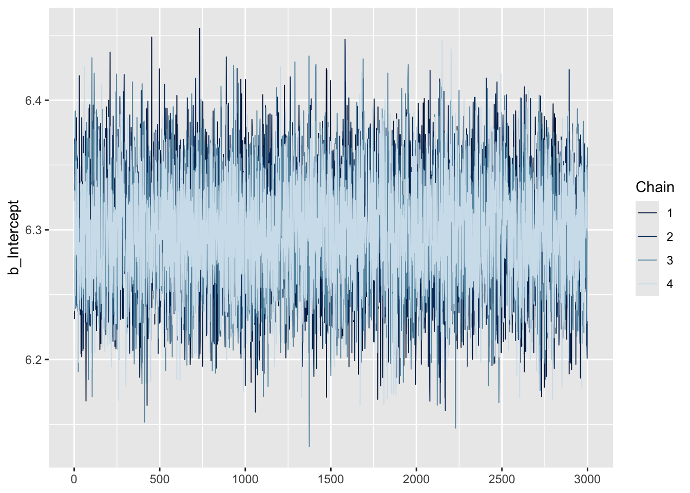
model |> mcmc_trace(pars = "sigma")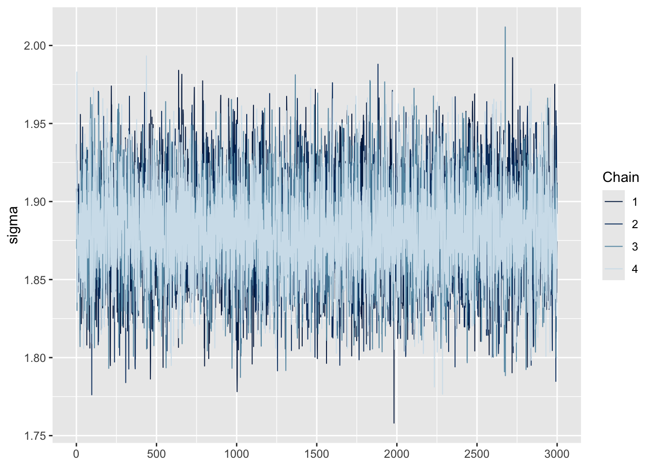
These plots display the sampled values at each iteration for every chain. For a model that has converged, the trace plot of each chain should resemble a hairy caterpillar sitting on the ground, filling the plot space evenly without clear patterns, drifts, or separations between chains. This indicates that the chains are exploring the posterior distribution effectively and consistently. If you can conceptually fit a rectangle around the bulk of the traces without including large excursions, your model is likely well-converged. Conversely, a trace plot showing chains that do not overlap well or exhibit trends (snaking or undulating patterns) may indicate a lack of convergence. Indeed, our trace plots looks like a fuzzy caterpillar, and no trending is apparent. This indicates model convergence.
Posterior predictive checks
Additionally, we can request a posterior predictive check. The pp_check() function generates posterior predictive checks for a fitted model.
# posterior plot check
model |> pp_check(ndraws = 100, type = "dens_overlay")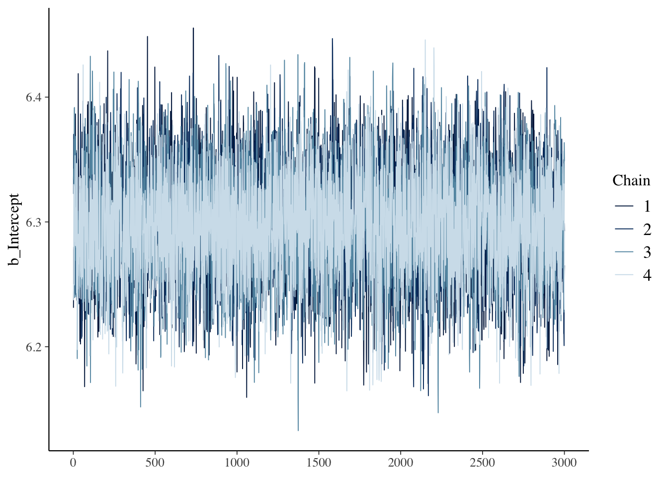
Posterior predictive checks (PPCs) are a valuable diagnostic tool in Bayesian analysis used to evaluate how well a model’s predictions match the observed data. The idea is simple: we use the fitted model to simulate new data based on the posterior distribution of the estimated parameters. In other words, we ask:
“If this model were true, what kind of data would we expect to see?”
PPCs work by generating predicted outcomes for each observation in the original data frame — that is, each person or row in the data. These predictions are drawn from the posterior distribution of the model parameters. We can then use these simulated outcomes to evaluate whether the model reproduces key features of the observed data.
The PPC above compares the distribution of predicted values to the distribution of observed values — helping us assess whether the model captures overall characteristics like center, spread, and shape.
Importantly, a good fit in a PPC doesn’t prove your model is correct, but a bad fit is often a red flag. Systematic mismatches between the predicted and observed data can indicate problems with model specification, such as inappropriate priors, missing covariates, or an overly simple model structure (we’ll explore these issues more deeply later in the semester).
In our example, the output looks quite good. The navy blue distribution represents the observed depression severity scores, and the lighter blue curves show the predicted distributions from 100 posterior draws. Because the predicted distributions closely match the observed data, we have no immediate reason for concern. If, instead, the model consistently predicted values that were too high or too low — or missed important features of the observed distribution — that would signal the need to revise or improve the model.
Extract the estimated mean and credible interval
After fitting the Bayesian model and ensuring convergence, we can extract the estimates of interest. This can be done by applying the tidy() function from the broom.mixed package to the output of our Bayesian model.
model |> tidy() |> filter(effect == "fixed")The value under estimate corresponds to the posterior mean of the depression severity scale — in this case, 6.3.
The value under std.error represents the standard deviation of the posterior distribution for that parameter. This quantity reflects our uncertainty about the parameter estimate, given the data and the prior. While it plays a similar role to the standard error in a frequentist model, in a Bayesian model it is not derived from a sampling distribution but from the posterior distribution itself.
Our 95% credible interval, represented by conf.low (lower bound) and conf.high (upper bound), is roughly 6.2 to 6.4. These bounds are the 2.5th and 97.5th percentiles of the posterior distribution, akin to how we calculated the middle 95% of the simulated sampling distribution using bootstrapping. This interval reflects our degree of belief, based on the observed data and prior assumptions, that the true population mean falls within these limits. In other words, given our model and prior assumptions, we are 95% confident that the true population mean for depression severity among adolescents in 2021 lies between roughly 6.2 and 6.4.
Unlike a frequentist confidence interval, which would be interpreted in terms of long-run frequencies of containing the true parameter if the experiment were repeated many times, the Bayesian credible interval directly reflects the probability of the parameter lying within the specified range, given the current data and prior knowledge. This makes the Bayesian interval a more intuitive measure of uncertainty for many people, as it aligns more closely with how we naturally think about probabilities and uncertainty in our everyday lives.
Visualize the results
Last, we can create a visualization of the posterior draws and the 95% credible interval.
# Create a dummy dataframe to designate the mean/intercept
newdata <- data.frame(Intercept = 1)

# Draw predicted scores from the posterior distribution
draws <-
  model |>
  epred_draws(newdata = newdata)

# Plot the results
draws |>
  ggplot(mapping = aes(x = .epred)) +
  stat_halfeye(
    point_interval = "mean_qi",
    .width = 0.95,
    fill = "#A7226E") +
  theme_minimal() +
  labs(
    title = "What we believe about mean depression severity after seeing the data",
    subtitle = "Data from adolescents participating in the 2021 NSDUH",
    y = "Density",
    x = "Mean depression severity")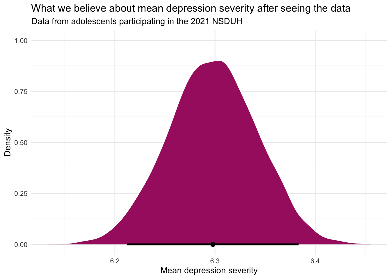
Let’s break down this code:
newdata <- data.frame(Intercept = 1): This line creates a dummy data frame named newdata with a single column named Intercept.epred_draws(newdata = newdata): The epred_draws() function from the tidybayes package is used to generate draws of predicted scores from the posterior distribution of the model. Here, we’re using it to obtain predictions for the dummy data frame newdata, which allows us to focus on the aggregate predictions, i.e., the overall mean severity score, rather than individual-level predictions.ggplot(mapping = aes(x = .epred)): This starts the plot creation process. It sets up a plot object, specifying that the x-axis should represent the predicted scores extracted by epred_draws(), which are named .epred. The function stat_halfeye() adds a half-eye plot to the ggplot object, which is a way of visualizing the distribution of predicted scores. The half-eye plot includes both a density plot and an interval plot, giving a clear visual representation of the distribution’s shape and the credible interval around the predictions..width = 0.95: This argument in stat_halfeye() sets the width of the credible interval to 95%, indicating that the interval covers 95% of the predicted values, centered around the mean. This can be changed if you’d prefer some other credible interval — for example 90%.
This visualization step is crucial as it not only provides a clear picture of the model’s predictions but also illustrates the uncertainty surrounding these predictions through the distribution and credible intervals. This approach gives a more nuanced understanding of the model’s outputs, highlighting both the central tendency (mean or median) and the variability (uncertainty) of the predictions.
Learning Check
After completing this Module, you should be able to answer the following questions:
- What does a confidence interval tell us about a population parameter?
- How do bootstrap resampling methods approximate a sampling distribution?
- What is a bootstrap percentile CI, and how is it constructed?
- What are the advantages of bootstrap methods, especially when traditional assumptions may not hold?
- How is a standard error calculated for a proportion and for a mean in a theory-based framework?
- When should we use the z-distribution vs. the t-distribution when constructing a CI?
- What are the key assumptions for theory-based CIs to be valid?
- How do we correctly interpret a 95% confidence interval in the frequentist framework?
- What is the difference between a confidence interval and a credible interval?
- How does a Bayesian analysis combine prior knowledge with new data to form a posterior distribution?
- What does a Bayesian credible interval represent, and how is it interpreted differently from a frequentist CI?
Credits
I drew from the excellent Modern Dive and Bayes Rules e-books to develop this Module.
Footnotes
You might wonder why we didn’t use a t-distribution for calculation of the CI for the proportion using the parametric/theory-based method. When calculating a CI for a proportion using a parametric approach, the z-distribution is typically used. This is because the calculation of a CI for a proportion relies on the normal approximation to the binomial distribution.↩︎
You don’t have to worry to much about this now, you’ll get more practice as we progress through the semester. Deciding on the appropriate number of iterations and the warm-up period for Markov Chain Monte Carlo (MCMC) simulations in Bayesian analysis involves a balance between computational efficiency and the accuracy of the estimated posterior distribution. Here are some guidelines to help choose these parameters:
Number of Iterations
Start with a Default: Starting with the defaults can be a reasonable first step — here just removing the
iterargument would kick in the default.Consider Model Complexity: More complex models, with more parameters or more complicated likelihoods, may require more iterations to explore the parameter space thoroughly.
Assess Convergence: Use diagnostic tools (e.g., trace plots, R-hat statistics) to check if the chains have converged to the stationary distribution. If diagnostics indicate that the chains have not converged, increasing the number of iterations can help.
Evaluate Precision of Estimates: More iterations can lead to more precise estimates of posterior summaries (mean, median, credible intervals). If the posterior summaries change significantly with additional iterations, it may indicate that more iterations are needed.
Warm-Up Period
Purpose: The warm-up (or “burn-in”) period is used to allow the MCMC algorithm to “settle” into the stationary distribution, especially if starting from values far from the posterior mode. Samples from this period are typically discarded.
Proportion of Iterations: A common practice is to set the warm-up period to be about half or at least a quarter of the total iterations, but this can vary based on the specific model and data.
Adjust Based on Diagnostics: Use MCMC diagnostics to assess whether the chosen warm-up period is sufficient. Look at trace plots to see if the initial part of each chain shows signs of convergence. If the chains appear to have not stabilized after the warm-up period, consider increasing it.
Iterative Approach: It may be necessary to run the MCMC algorithm multiple times with different warm-up lengths to find an appropriate value. The goal is to discard the initial samples where the algorithm has not yet reached the region of the posterior distribution of interest.
Deciding on the number of chains to run in parallel for Markov Chain Monte Carlo (MCMC) simulations involves considerations of convergence diagnostics and computational resources. Running multiple chains is crucial for assessing the convergence of the MCMC algorithm to the target posterior distribution. Relying on the defaults as a beginner is perfectly fine, here, you could remove the
chainsargument and the default for your model will be specified.↩︎