| Variable | Description |
|---|---|
| year | Presidential election year |
| vote | Percentage share of the two-party vote received by the incumbent party’s candidate |
| growth | The quarter-on-quarter percentage rate of growth of per capita real disposable personal income expressed at annual rates |
| fatalities | The cumulative number of American military fatalities per million of the US population |
| wars | A list of the wars of the term if fatalities > 0 |
| inc_party_candidate | The name of the incumbent party candidate |
| other_party_candidate | The name of the other party candidate |
| inc_party | An indicator of the incumbent party (D = Democrat, R = Republican) |
Multiple Linear Regression
Module 11
Learning Objectives
By the end of this Module, you should be able to:
- Explain the benefits of including multiple predictors in a regression model
- Write and interpret the multiple linear regression (MLR) equation
- Fit and summarize MLR models using lm(), tidy(), and glance() in R
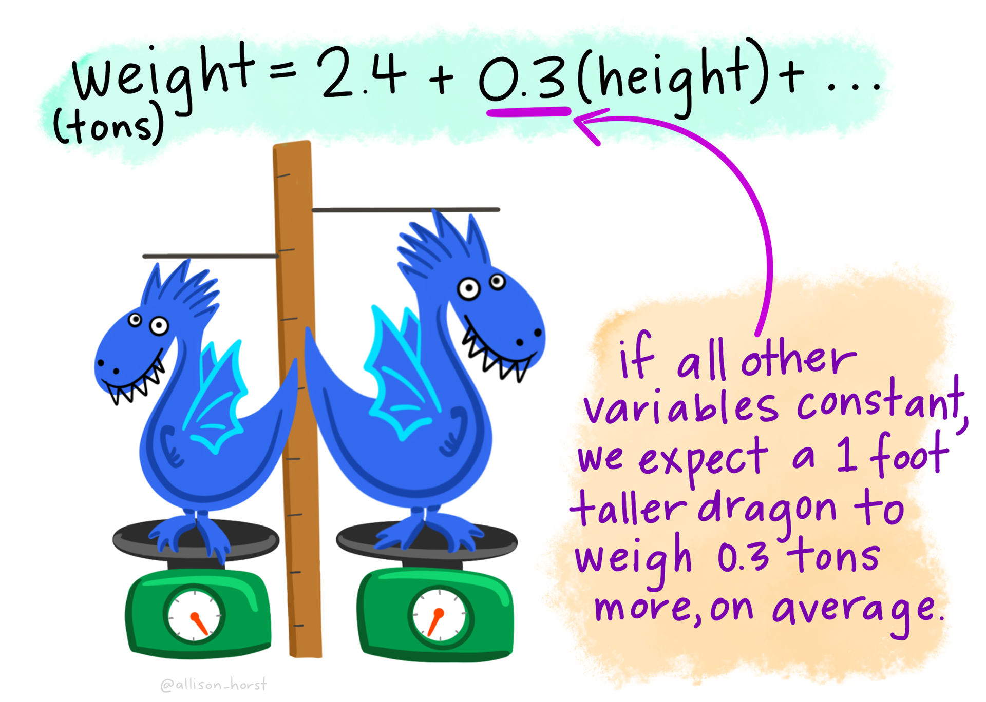
- Interpret the meaning of intercept and slopes in an MLR model, including the idea of holding other variables constant
- Use augment() to extract and interpret predicted values and residuals from a regression model
- Compare models using \(R^2\) and adjusted-\(R^2\) to assess model fit
- Visualize and assess the linearity assumption using Added Variable Plots and Residual-Fitted Plots
Overview
Building on the foundational knowledge of Simple Linear Regression (SLR) from Module 10, this Module introduces a powerful extension: Multiple Linear Regression (MLR). While SLR helps us understand how a single predictor variable relates to an outcome, MLR allows us to examine the influence of two or more predictors simultaneously.
In the social and behavioral sciences, outcomes are rarely driven by just one factor. Human behavior, decision-making, and societal trends are shaped by a web of interrelated influences. MLR gives us the tools to explore these more realistic, complex relationships. With MLR, we can:
Account for multiple influences on an outcome,
Control for confounding variables that might otherwise distort our conclusions,
Compare the relative strength of different predictors, and
Improve the accuracy of our predictions by incorporating more relevant information.
To ground our learning, we’ll return to a familiar example: Hibbs’ Bread and Peace Model of U.S. presidential elections. In Module 10, we used a SLR to examine how economic growth during a presidential term — the “bread” component — relates to the incumbent party’s share of the two-party vote. But Hibbs’ full model includes a second critical predictor: the number of U.S. military fatalities in foreign conflicts — the “peace” component.
In this Module, we’ll extend the model to include both predictors — income growth and fatalities — using multiple linear regression. This will allow us to assess how each factor contributes to election outcomes when considered together, and how the presence of a second predictor can change our interpretation of the first. Along the way, we’ll explore the meaning of regression coefficients in an MLR context, learn how to interpret partial effects, and develop a deeper understanding of how to model real-world data with multiple predictors.
Recap of the data
The data frame for this Module, compiled by Drew Thomas (2020), is called bread_peace.Rds. Each row of data considers a US presidential election. The following variables are in the data frame:
To get started, we need to load the following packages:
library(gtsummary)
library(skimr)
library(here)
library(broom)
library(tidyverse)
Now, we can import the data called bread_peace.Rds.
bp <- read_rds(here("data", "bread_peace.Rds"))
bp
Each row of the data frame represents a different presidential election — starting in 1952 and ending in 2016. There are 17 elections in total to consider.
Let’s obtain some additional descriptive statistics with skim().
bp |> skim()| Name | bp |
| Number of rows | 17 |
| Number of columns | 8 |
| _______________________ | |
| Column type frequency: | |
| character | 4 |
| numeric | 4 |
| ________________________ | |
| Group variables | None |
Variable type: character
| skim_variable | n_missing | complete_rate | min | max | empty | n_unique | whitespace |
|---|---|---|---|---|---|---|---|
| wars | 0 | 1 | 4 | 18 | 0 | 6 | 0 |
| inc_party_candidate | 0 | 1 | 4 | 11 | 0 | 15 | 0 |
| other_party_candidate | 0 | 1 | 4 | 11 | 0 | 17 | 0 |
| inc_party | 0 | 1 | 1 | 1 | 0 | 2 | 0 |
Variable type: numeric
| skim_variable | n_missing | complete_rate | mean | sd | p0 | p25 | p50 | p75 | p100 | hist |
|---|---|---|---|---|---|---|---|---|---|---|
| year | 0 | 1 | 1984.00 | 20.20 | 1952.00 | 1968.00 | 1984.00 | 2000.00 | 2016.00 | ▇▆▆▆▇ |
| vote | 0 | 1 | 51.99 | 5.44 | 44.55 | 48.95 | 51.11 | 54.74 | 61.79 | ▅▇▃▁▃ |
| growth | 0 | 1 | 2.34 | 1.28 | 0.17 | 1.43 | 2.19 | 3.26 | 4.39 | ▆▆▇▇▆ |
| fatalities | 0 | 1 | 23.64 | 62.89 | 0.00 | 0.00 | 0.00 | 4.30 | 205.60 | ▇▁▁▁▁ |
The new variable for this Module is fatalities. It represents the number of U.S. troops who died in war during each presidential term. These counts are adjusted for population size by calculating the number of fatalities per million people in the U.S., so that comparisons across years are more meaningful. Overall, this variable captures the toll of war during each presidential term and serves as an important part of the Bread and Peace model.
Bread and Peace Model 1 — A simple linear regression
Let’s take a moment to revisit the model and results that we fit in Module 10, which we called bp_mod1. In this model, vote was regressed on growth via a SLR.
# Fit model
bp_mod1 <- lm(vote ~ growth, data = bp)

# Obtain parameter estimates
bp_mod1 |>
  tidy() |>
  select(term, estimate)
# Obtain model summaries
bp_mod1 |>
glance() |>
select(r.squared, sigma)# Create a scatterplot
bp |>
ggplot(mapping = aes(x = growth, y = vote)) +
geom_point() +
geom_smooth(method = "lm", formula = y ~ x, se = FALSE, color = "#2F9599") +
theme_minimal() +
labs(title = "Bread and Peace Voting in US Presidential Elections 1952 - 2016",
"Annualized per capita real income growth over the term (%)",
x = "Annualized per capita real income growth over the term (%)",
y = "Incumbent party share of two-party vote (%)")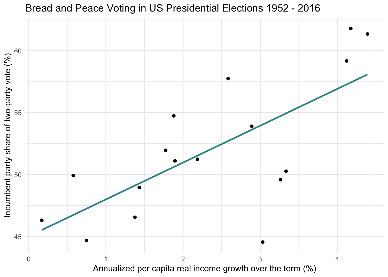
The model using only income growth explains approximately 49% of the variability in the incumbent party’s vote share. That’s a substantial amount of explained variance — but there may be room to improve our model’s predictive power by incorporating an additional factor from the Bread and Peace model — i.e., war-related fatalities.
Building a MLR for Bread and Peace
Let’s begin our exploration by taking a look at the plot below. I’ve changed a couple of things from the scatterplot of vote and growth that we just observed. First, I added an additional aesthetic by mapping the number of war-related fatalities (per million US population) to the size of the points (the variable is called fatalities). The larger the point, the more fatalities. For years in which fatalities was greater than 0, I also labeled the point with the corresponding war(s).
bp |>
  mutate(big = case_when(year %in% c(1952, 1968) ~ "yes", TRUE ~ "no")) |>
  ggplot(mapping = aes(x = growth, y = vote)) +
  geom_point(aes(size = fatalities, color = big)) +
  geom_smooth(method = 'lm',formula = y ~ x,  se = FALSE, color = "#2F9599") +
  ggrepel::geom_label_repel(aes(label = wars),
                            color = "grey35", fill = "white", size = 2,
                            box.padding =  0.4,
                            label.padding = 0.1) +
  scale_color_manual(values = c("yes" = "#F7DB4F", "no" = "black")) +
  guides(color = "none") +
  theme_bw() +
  theme(legend.position = "bottom") +
  labs(title = "Bread and Peace Voting in US Presedential Elections 1952 - 2016",
       "Annualized per capita real income growth over the term (%)",
       subtitle = "Points are labeled with war(s) that took place during the term if fatalities > 0",
       size = "War-related fatalities per millions of US population",
       x = "Annualized per capita real income growth over the term (%)",
       y = "Incumbent party share of two-party vote (%)")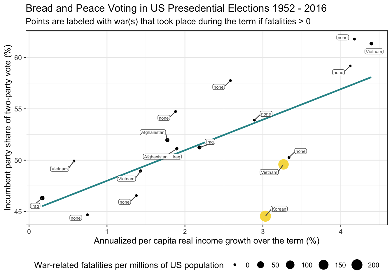
It’s helpful to evaluate this updated model in the context of what we observed in our initial regression model — the one that used only growth in income as a predictor (referred to as bp_mod1). In the code below, we use the augment() function to extract predicted values and residuals from bp_mod1, then sort the results by the size of the residuals to better understand where the model struggled.
pts <- bp_mod1 |>
  augment(data = bp)

pts |>
  select(year, vote, growth, fatalities, wars, .resid) |>
  arrange(.resid)
As a reminder, the residual is the difference between a case’s observed score and its predicted score.
\[ e_i = y_i - \hat{y}_i \]
A residual of zero means the model perfectly predicted the outcome. The further the residual is from zero (in either direction), the greater the gap between what the model predicted and what actually occurred.
Take a look at the two largest residuals in the table above: 1952 and 1968. Both residuals are negative, indicating that our SLR model overestimated the incumbent party’s vote share in those elections. These points are highlighted in yellow in the plot above.
What do these two years have in common? In both elections, the U.S. had experienced substantial war-related fatalities in the prior term — due to the Korean War in 1952 and the Vietnam War in 1968. These losses aren’t accounted for in our initial model, which only considers economic growth.
According to Hibbs’ Bread and Peace Model, high wartime casualties reduce support for the incumbent party. This highlights the importance of including both economic and military factors in our analysis.
To do that, we’ll now expand our SLR model (bp_mod1) by adding a second predictor: fatalities. We’ll call this new model bp_mod2. To facilitate comparisons between the two models, we’ll extract the predicted values and residuals from bp_mod1 and save them in a new data frame named bp_mod1_pred, renaming the relevant columns to make it clear they come from the first model.
bp_mod1_pred <-
  bp_mod1 |>
  augment(data = bp) |>
  rename(.fitted_mod1 = .fitted, .resid_mod1 = .resid) |>
  select(year, .fitted_mod1, .resid_mod1)

bp_mod1_pred
Bread and Peace Model 2 — A multiple linear regression
Now, let’s fit a second model that adds fatalities to the regression model as an additional predictor. Adding fatalities to our regression model changes our equation. The equations for Model 1 (without fatalities), and Model 2 (with fatalities) are presented below, where \(x_1\) is growth and \(x_2\) is fatalities.
Model 1: \(\hat{y_i} = b_{0} + b_{1}x_{1i}\)
Model 2: \(\hat{y_i} = b_{0} + b_{1}x_{1i} + b_{2}x_{2i}\)
Notice that in Model 2 we now have two predictors \(x_1\) and \(x_2\) — representing growth and fatalities respectively. Therefore, Model 2 has three regression parameter estimates:
- \(b_{0}\) is the intercept — the predicted value of Y when all X variables equal 0 (i.e., both growth and fatalities)
- \(b_{1}\) is the fitted slope coefficient for the first predictor, growth
- \(b_{2}\) is the fitted slope coefficient for the second predictor, fatalities
Fit a multiple linear regression model
In order to add an additional predictor to our lm() model in R, we just list the new predictor after the first with a + sign in between. Note that the ordering of the predictors does not matter.
bp_mod2 <- lm(vote ~ growth + fatalities, data = bp)Obtain the overall model summary
To begin interpretation of the output, let’s examine the \(R^2\), printed in the glance() output. Recall that the \(R^2\) indicates the proportion of the variability in the outcome that is explained by the predictors in the model.
bp_mod2 |>
  glance() |>
  select(r.squared, sigma)
Notice that in comparing the SLR model (bp_mod1) to the MLR model (bp_mod2), the \(R^2\) has increased substantially with the addition of fatalities, going from about 49% in the SLR model to about 77% in the MLR model. That is, the model with fatalities explains quite a bit more of the variability in the vote shares than growth in income alone.
Another way to see that the model has improved is by looking at sigma (\(\sigma\)), which represents the typical size of the residuals — that is, how far off our predictions tend to be from the actual values. For the SLR model (bp_mod1), \(\sigma\) is approximately 4.01, meaning our vote share predictions were off by about 4 percentage points on average. In the MLR (bp_mod2), \(\sigma\) drops to 2.78, indicating that our predictions are now much closer to the observed values. This reduction in \(\sigma\), along with the increase in \(R^2\), provides evidence that including fatalities as a second predictor makes the model substantially more accurate and better at explaining variation in election outcomes.
Obtain the regression parameter estimates
Now, let’s take a look at the estimates of the intercept and slopes for Model 2.
bp_mod2 |>
  tidy() |>
  select(term, estimate)
With one predictor, our SLR model produces a regression line, defined by an intercept and a slope. When we move to two predictors, our MLR model produces a regression plane instead of a line. Each case has a score on both predictor variables, and the model uses both predictors simultaneously to estimate the outcome. This allows us to account for the combined and unique contributions of each predictor when making predictions.

This image shows what a multiple linear regression model looks like in 3D when we use two predictors, \(x_1\) and \(x_2\), to predict an outcome, \(y\). Note that this is not a depiction of the Bread and Peace model — just a general example. The blue plane represents the model’s predicted values (\(\hat{y}\)) across all combinations of \(x_1\) and \(x_2\). Each observed data point is shown as either a red dot (a point above the plane — the model underpredicted) or an open circle (a point below the plane — the model overpredicted). The vertical black lines show the residuals — the distance between the observed \(y\) and the predicted \(\hat{y}\). The two slopes of the regression model — \(b_1\) and \(b_2\) — are shown as dashed right triangles at the edges of the plane. \(b_1\) represents the slope of the plane in the \(x_1\) direction: if you move one unit along \(x_1\) (while keeping \(x_2\) constant), the height of the plane (\(\hat{y}\)) increases by \(b_1\) units. Similarly, \(b_2\) represents the slope in the \(x_2\) direction: a one-unit increase in \(x_2\) (holding \(x_1\) constant) increases \(\hat{y}\) by \(b_2\) units. These two directional slopes shape the overall tilt of the plane, allowing it to capture how each predictor independently contributes to changes in the outcome.
Here’s a 3D plot of our actual Bread and Peace model that I created using plotly.
We can express the multiple linear regression equation as:
\[ \hat{y_i} = b_{0} + b_{1} \text{growth}_{i} + b_{2} \text{fatalities}_{i} \]
Substituting in the estimated coefficients from our fitted MLR model:
\[ \hat{y_i} = 44.952 + (3.477 \times \text{growth}_{i}) + (-.047 \times \text{fatalities}_{i}) \]
The intercept (44.952) represents the predicted vote share for the incumbent party when both predictors are zero — that is, when there was no income growth and no war-related fatalities during the preceding term. In that scenario, the model predicts that the incumbent party would receive 44.95% of the vote.
When a regression model includes multiple predictors, each slope represents the estimated effect of that predictor on the outcome, while holding the other predictor(s) constant. This is a key distinction from simple linear regression (SLR), where only one predictor is considered.
For example, in a model where \(y_i\) is regressed on \(x_{1i}\) and \(x_{2i}\):
- The regression coefficient for \(x_{1i}\) represents the expected change in \(y_i\) for a one-unit increase in \(x_{1i}\), holding \(x_{2i}\) constant.
- The regression coefficient for \(x_{2i}\) represents the expected change in \(y_i\) for a one-unit increase in \(x_{2i}\), holding \(x_{1i}\) constant.
Returning to our example, let’s first consider the slope for growth. Holding fatalities constant (i.e., comparing elections with similar levels of war-related deaths), a one-unit increase in income growth is associated with a 3.477 unit increase in the incumbent party’s vote share. In our earlier model with only growth as a predictor, the slope was 2.974. The higher slope in this model suggests that once we account for war-related fatalities, the impact of economic growth on vote share becomes larger in magnitude.
Now consider the slope for fatalities. Holding income growth constant, a one-unit increase in war-related fatalities is associated with a 0.047 unit decrease in vote share. In other words, when economic conditions are held steady, higher wartime casualties tend to reduce support for the incumbent party — consistent with the “peace” component of the Bread and Peace Model.
Obtain the predicted values and residuals
We can also examine the predicted values and residuals to see how they shift when fatalities are added to the model. As we did with Model 1, we’ll extract these values from Model 2 and rename the columns to make it clear they come from the new model—using a _mod2 suffix — and store them in a data frame called bp_mod2_pred.
bp_mod2_pred <-
  bp_mod2 |>
  augment(data = bp) |>
  rename(.fitted_mod2 = .fitted, .resid_mod2 = .resid) |>
  select(year, .fitted_mod2, .resid_mod2)
The predicted value (i.e., .fitted_mod2) is calculated by plugging a case’s values for both predictors into the regression equation. For example, for the year 1952, where growth = 3.03 and fatalities = 205.6, the predicted vote share is:
\[ \hat{y_i} = 44.952 + (3.477\times3.03) + (-.047\times205.6) = 45.85 \]
As with SLR, the residual in a MLR is the difference between the observed and predicted values. For 1952, this is:
\[ 44.55 - 45.85 = -1.30. \]
Important
To reinforce your understanding, try calculating the predicted values and residuals for a few other years by hand.
Now that we have saved the predicted and residual values for both models, we can merge them into a single data frame. The first column shows the observed vote share, and the last four columns display the predicted and residual values from each model (with _mod1 and _mod2 suffixes to distinguish between them):
compare_bp <-
  bp |>
  left_join(bp_mod1_pred, by = "year") |>
  left_join(bp_mod2_pred, by = "year") |>
  select(year, vote, .fitted_mod1, .fitted_mod2, .resid_mod1, .resid_mod2)

compare_bp
Take a closer look at 1952 and 1968, the two elections with the largest residuals in Model 1. In both cases, the predictions from Model 2 are much closer to the observed vote share, and the residuals are substantially smaller:
1952: Residual reduced from -9.49 to -1.30
1968: Residual reduced from -5.14 to 1.46
These improvements suggest that adding fatalities to the model meaningfully enhances predictive accuracy. This comparison strongly supports the inclusion of both economic growth and military fatalities when modeling the vote share received by the incumbent party in U.S. presidential elections.
Consider adjusted \(R^2\)
The \(R^2\) value in a MLR model is interpreted the same way as in SLR, as introduced in Module 10. It represents the proportion of variance in the outcome variable that is explained by the model.
One way to calculate \(R^2\) is by squaring the correlation between the observed outcome values (vote) and the predicted values (.fitted):
compare_bp |>
  select(vote, .fitted_mod2) |>
  corrr::correlate()
In this case, the correlation between the observed and predicted values is approximately 0.88, and squaring it yields an \(R^2\) of about 0.77 — matching the value reported by glance() for Model 2:
\[R^2 = 0.88^2 = 0.77\]
Why is the correlation between \(\hat{y}\) and \(y\) the multiple correlation \(R\)?
In multiple linear regression, we use the predictors (e.g., \(x_1\), \(x_2\)) to compute predicted values of the outcome — \(\hat{y}_i\). These predicted values are the model’s best guess for what each \(y_i\) should be, based on the linear combination of predictors.
Now, if our model is doing a good job, then \(\hat{y}\) and \(y\) should move closely together — that is, when the predicted value is high, the actual outcome tends to be high, and vice versa. So, it makes sense to measure the correlation between \(\hat{y}\) and \(y\) as a way of judging how well the model’s predictions match the actual outcomes.
That correlation — between the predicted values \(\hat{y}\) and the actual values \(y\) — is called the multiple correlation, and we denote it as \(R\).
Why does squaring \(R\) give us \(R^2\)?
The coefficient of determination, \(R^2\), is defined as the proportion of the variance in \(y\) that is explained by the model — in other words, how much of the variation in the outcome can be captured by the predictors.
Mathematically, \(R^2\) is:
\[ R^2 = \frac{\text{Var}(\hat{y})}{\text{Var}(y)} \]
But in statistics, when you take the correlation between two variables and square it, you’re asking: How much of the variability in one variable can be linearly accounted for by the other?
So when we square the correlation between \(\hat{y}\) and \(y\), we get the proportion of variability in \(y\) that can be explained by the linear model — which is exactly what \(R^2\) tells us.
Intuition
- Think of \(\hat{y}\) as a proxy for \(y\) built from your predictors.
- The stronger the correlation between \(\hat{y}\) and \(y\), the closer the model’s predictions are to the real outcomes.
- Squaring that correlation gives you a clean, interpretable number: the percentage of variance in \(y\) that’s explained by the model.
In MLR, there’s another useful metric provided by glance() — Adjusted-\(R^2\):
bp_mod2 |>
  glance() |>
select(r.squared, adj.r.squared)Adjusted-\(R^2\) refines the original \(R^2\) statistic by taking into account the number of predictors in the model. It is calculated using the following formula:
\[ Adjusted-R^2 = 1 - [((1 - R^2) \times (n - 1)) / (n - k - 1)] \]
Where
n is the sample size
k is the number of predictors in the model
While \(R^2\) always increases (or stays the same) as more predictors are added, even if those predictors are not useful, Adjusted-\(R^2\) includes a penalty for adding unnecessary predictors. This makes it a more reliable measure of model quality, especially when you’re comparing models with different numbers of predictors.
If a new predictor genuinely improves the model, Adjusted-\(R^2\) will increase. But if a predictor adds little explanatory power, Adjusted-\(R^2\) may stay the same or even decrease, signaling that the predictor might not be meaningful.
Two important caveats:
Adjusted-\(R^2\) is not a direct measure of variance explained, like \(R^2\). It’s a model comparison tool that balances fit and complexity.
It may be unstable in small samples, such as the dataset used in this example. Always interpret Adjusted-\(R^2\) with caution in small datasets.
Substantive interpretation (fit with the theory)
Returning to the core idea behind the Bread and Peace Model, we see that our fitted regression model aligns well with its theoretical expectations. According to the model, the incumbent party’s success in a U.S. presidential election depends on two key factors from the preceding term:
Economic growth, which increases support for the incumbent party (the “bread” component), and
War-related fatalities, which decrease support (the “peace” component).
Our regression results reflect this pattern: higher income growth is associated with higher vote share, while greater military fatalities are associated with lower vote share. This suggests that the statistical model not only fits the data well but also captures the substantive mechanisms proposed by the theory.
Create a publication-ready table of results
We can use the tbl_regression() function from the gtsummary package to present the results of our model in a publication-ready table. I’m mostly using the defaults here, but there are a few changes that I specify in the code below. First, I request intercept = TRUE, which prints the intercept of the model (the default is to suppress it from the output). Second, I use the modify_header() function to update two items — I change the label of terms in the model to “Term” (the default is “Characteristic”) and I change the header for the regression estimate to “Estimate” (the default is “Beta”). As we progress through the next few Modules, you’ll learn about Confidence Intervals (CI) and p-values — for now, we’ll ignore those aspects of the table.
bp_mod2 |> tbl_regression(
  intercept = TRUE,
  label = list(growth ~ "Per capita income growth",
               fatalities ~ "Military fatalities per million US population")) |>
  modify_header(label ~ "**Term**", estimate ~ "**Estimate**") |>
  as_gt() |>
  tab_header(
    title = md("Table 1. Fitted regression model to predict percent of votes going to incumbent candidate in US presidential elections (1952-2016)")
)| Table 1. Fitted regression model to predict percent of votes going to incumbent candidate in US presidential elections (1952-2016) | |||
|---|---|---|---|
| Term | Estimate | 95% CI | p-value |
| (Intercept) | 45 | 42, 48 | <0.001 |
| Per capita income growth | 3.5 | 2.3, 4.7 | <0.001 |
| Military fatalities per million US population | -0.05 | -0.07, -0.02 | 0.001 |
| Abbreviation: CI = Confidence Interval | |||
Consider linearity in a MLR
A core assumption of linear regression — whether simple or multiple — is linearity: the idea that there is a straight-line relationship between each predictor and the outcome variable. This assumption underlies how the model estimates parameters, makes predictions, and allows for meaningful interpretation. If the assumption of linearity is violated, the model’s estimates may be biased or inefficient, leading to poor predictions and misleading conclusions.
In SLR, assessing linearity is straightforward — we can simply create a scatterplot of the predictor against the outcome and visually inspect whether a straight line adequately represents the relationship.
In MLR, however, the situation becomes more complex. With multiple predictors, we’re working in a multi-dimensional space that can’t be fully visualized in a single plot. Nevertheless, the linearity assumption still applies — just not in the form of a single 2D relationship. In MLR, we assume that each predictor has a linear relationship with the outcome, holding all other predictors constant. This is sometimes referred to as linearity in the parameters.
Added Variable Plot
One useful tool for assessing this in MLR is the Added Variable Plot (also known as a partial regression plot). This plot helps us visualize the relationship between the outcome (Y — vote in our example) and one predictor (e.g., growth), while controlling for the effects of the other predictor(s) (e.g., fatalities).
Here’s how it works conceptually:
Regress \(Y\) on \(X_2\) (e.g., regress vote on fatalities) and save the residuals. The residuals represent the part of \(Y\) not explained by \(X_2\). We’ll call these y_resid (i.e., \(Y\) | \(X_2\) — which means “\(Y\) given \(X_2\)”).
Regress \(X_1\) on \(X_2\) (e.g., regress growth on fatalities) and save the residuals. The residuals represent the part of \(X_1\) not explained by \(X_2\). We’ll call these x1_resid (i.e., \(X_1\) | \(X_2\)).
Plot y_resid against x1_resid. If the assumption of linearity holds, the points will roughly fall along a straight line.
Why does this work? A residual captures the part of a variable that isn’t accounted for by another. So y_resid is the part of \(Y\) not explained by \(X_2\), and x1_resid is the part of \(X_1\) not explained by \(X_2\). By plotting these two sets of residuals, we isolate the relationship between \(Y\) and \(X_1\) after adjusting for \(X_2\).
Added Variable Plot for vote share and income growth (adjusting for fatalities)
Let’s walk through this process in our Bread and Peace example by creating an Added Variable Plot for the relationship between vote and growth, adjusting for fatalities.
# Create the residuals
y_resid <- lm(vote ~ fatalities, data = bp) |> augment(data = bp) |> select(year, .resid) |> rename(y_resid = .resid)
x_resid <- lm(growth ~ fatalities, data = bp) |> augment(data = bp) |> select(year, .resid) |> rename(x_resid = .resid)

# Join the two sets of residuals
check <-
  y_resid |>
  left_join(x_resid, by = "year")

# Create a scatterplot of the two sets of residuals
check |>
  ggplot(mapping = aes(y = y_resid, x = x_resid)) +
  geom_point() +
  geom_smooth(method = "lm", formula = y ~ x, se = FALSE, color = "#A7226E") +
  theme_minimal() +
  labs(title = "Added Variable Plot for vote and growth controlling for fatalities",
       x = "(growth | fatalities)",
       y = "(vote | fatalities)")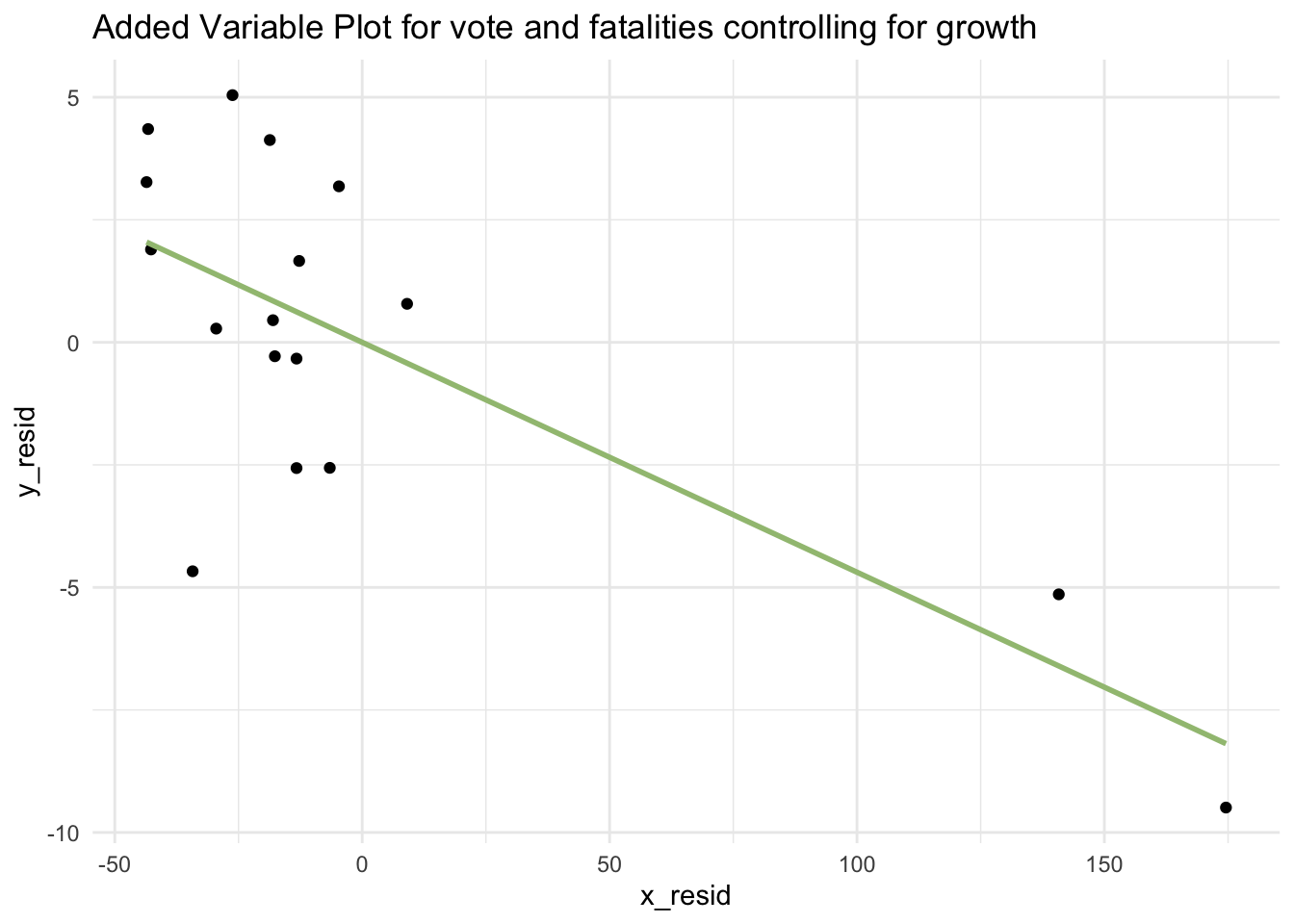
The added variable plot confirms that the linear relationship between vote and growth holds even after controlling for fatalities.
Of interest, if you regress y_resid on x_resid, the slope of that regression is exactly equal to the partial regression coefficient for growth in the MLR model. To see this is the case — take a look at the output below.
First, as a reminder, here is the output from our initial MLR model (i.e., the model called bp_mod2 where vote is regressed on growth and fatalities):
| term | estimate |
|---|---|
| (Intercept) | 44.952 |
| growth | 3.477 |
| fatalities | −0.047 |
Now, let’s fit a SLR where y_resid is regressed on x_resid:
resid_mod2 <- lm(y_resid ~ x_resid, data = check)Here’s the tidy() output from this model:
| term | estimate |
|---|---|
| (Intercept) | 0.000 |
| x_resid | 3.477 |
This correspondence in the slopes (see yellow highlights) is the core idea behind Added Variable Plots:
y_resid represents what’s left of vote after removing the effect of fatalities
x_resid represents what’s left of growth after removing the effect of fatalities
So when we regress y_resid on x_resid, we’re estimating how much of the remaining variation in vote (after controlling for fatalities) can be explained by the remaining variation in growth (also after controlling for fatalities). This slope is identical to the coefficient for growth in the MLR model.
Added Variable Plot for vote share and fatalities (adjusting for income growth)
Now, let’s create an Added Variable Plot for vote and fatalities.
y_resid <- lm(vote ~ growth, data = bp) |> augment(data = bp) |> select(year, .resid) |> rename(y_resid = .resid)
x_resid <- lm(fatalities ~ growth, data = bp) |> augment(data = bp) |> select(year, .resid) |> rename(x_resid = .resid)

check <-
  y_resid |>
  left_join(x_resid, by = "year")

check |>
  ggplot(mapping = aes(y = y_resid, x = x_resid)) +
  geom_point() +
  geom_smooth(method = "lm", formula = y ~ x, se = FALSE, color = "#A1C181") +
  theme_minimal() +
  labs(title = "Added Variable Plot for vote and fatalities controlling for growth")
The Added Variable Plot also confirms that the linear relationship between vote and fatalities holds after controlling for growth. The presence of extreme outliers on fatalities makes assessment of the linearity of this Added Variable Plot a bit more difficult though.
Residual-Fitted Plot
Another helpful way to check the linearity assumption in a MLR is to create a scatterplot of the model’s fitted values versus its residuals — this type of plot is called a Residual-Fitted Plot. Here’s an example using our Bread and Peace model, which includes both predictors:
bp_mod2 |>
  augment(data = bp) |>
  ggplot(mapping = aes(x = .fitted, y = .resid)) +
  geom_point() +
  geom_hline(yintercept = 0, linetype = "dashed", linewidth = 1, color = "#EC2049") +
  labs(x = "Fitted Values", y = "Residuals", title = "Residual-Fitted Plot") +
  theme_bw()
When we plot residuals against fitted values, we’re checking whether the errors left over after fitting the model show any remaining pattern. If the model is appropriate (e.g., linear when the relationship really is linear), then after accounting for the predictors, what’s left (the residuals) should just look like random noise — no pattern, no trend. But if the model misses a key structure in the data (like a curved relationship), that structure will still be visible in the residuals.
Therefore, if the residuals are randomly scattered around the horizontal line at zero — with no clear patterns or curves — this suggests that the linearity assumption is reasonably met. In other words, the model is doing a good job capturing the structure in the data.
However, if the residuals show a systematic pattern, such as a curve or funnel shape, this would indicate a potential nonlinear relationship or model misspecification. In such cases, a transformation or nonlinear modeling approach may be more appropriate.
In our Bread and Peace MLR model, the residuals have no clear pattern with the fitted values — providing evidence that the linearity assumption is reasonably satisfied.
In summary — the Added Variable Plots as well at the Residual-Fitted Plot provide evidence that the linearity assumption is reasonably satisfied. That is, each predictor appears to have a linear relationship with the outcome when controlling for the other, lending confidence to our fitted MLR model.
Non-linear relationships
If the relationship between variables is not linear — for example, if the data points follow a curved pattern — then a straight line will not accurately capture the relationship. In such cases, fitting a linear model can lead to misleading conclusions and poor predictions. That’s why it’s essential to visually assess the pattern in the data before selecting a model.
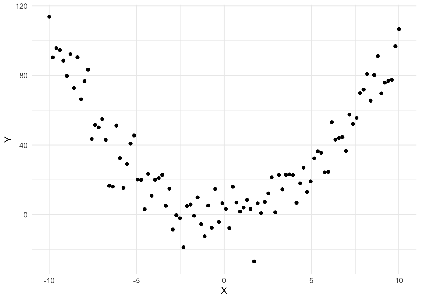
For example, consider the graph below, which illustrates a nonlinear relationship between X and Y:
The best linear fit for these data is depicted in the graph below, with the blue line.
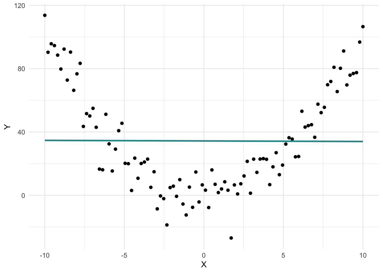
This line suggests there’s no relationship between X and Y — the slope is essentially zero. But clearly, the pattern of the data tells a different story: there is a relationship, just not a linear one.
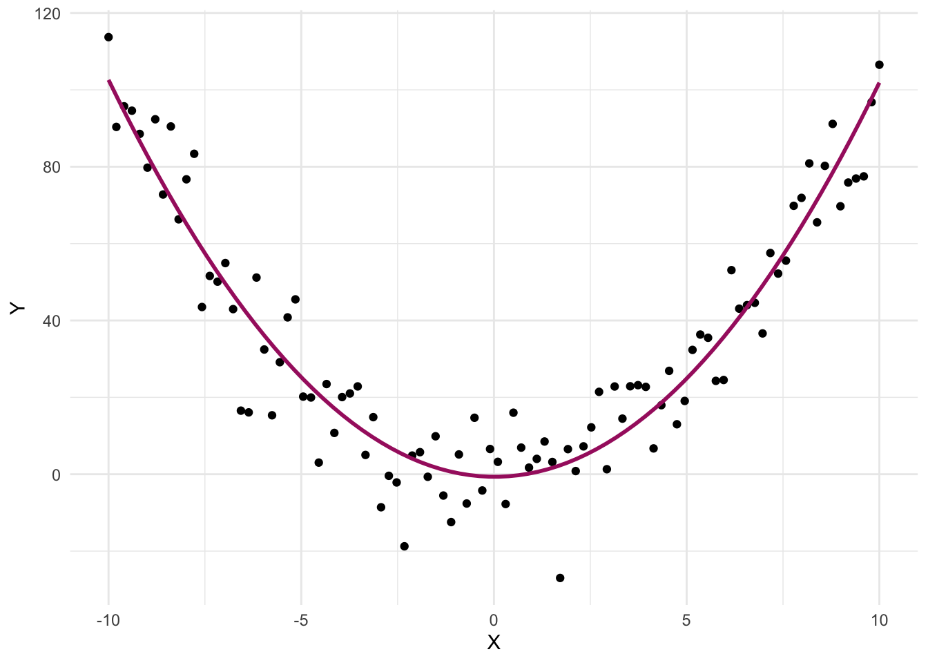
In fact, there’s a strong curvilinear (specifically, quadratic) relationship between X and Y. When we fit a curved line instead of a straight one, the true nature of the relationship becomes clear:
Trying to fit a straight line to data that follow a curve can lead to several problems:
Poor fit: The model doesn’t capture the actual pattern in the data, leading to inaccurate predictions.
Misleading conclusions: A linear model might suggest no relationship when a strong non-linear relationship exists.
Invalid inference: As you’ll learn in later Modules, the accuracy of statistical tests and confidence intervals depends on the model fitting the data well. If the linearity assumption is violated, these results may be unreliable.
Underexplained variability: A poor-fitting linear model may leave much of the outcome’s variability unexplained, weakening the model’s usefulness.
For example, if the true relationship is quadratic, a linear model might incorrectly suggest a steady increase or decrease — or no effect at all — when the actual trend involves a peak or trough.
This is why exploratory data analysis (EDA) is so important. Visualizing your data helps determine the appropriate form of the relationship before fitting a model.
The good news is that nonlinear relationships can still be modeled within the regression framework — with just a few adjustments. We’ll explore these techniques in Module 15.
Prediction vs. Causation
When working with MLR, it’s crucial to distinguish between prediction and causation. Although MLR is a powerful tool for understanding relationships between variables and making predictions, it is essential to understand its limitations regarding causal inferences.
Prediction in MLR
Prediction involves using a statistical model to estimate the future or unknown values of an outcome variable based on known values of predictor variables. The primary goal of prediction is to achieve accuracy in forecasting or estimating these unknown values. In the context of MLR, prediction focuses on developing a model that can reliably predict the outcome variable (Y) using a combination of predictor variables (\(X_1\), \(X_2\), \(X_3\), … \(X_n\)).
- Example: In our Bread and Peace Model, we use economic growth and military fatalities to predict the vote share for the incumbent party in presidential elections. Here, the primary objective is to build a model that can accurately forecast future vote shares based on these predictors.
Causation in MLR
Causation goes beyond prediction to explain why changes in one variable lead to changes in another. Establishing causation requires demonstrating that changes in the predictor variable directly cause changes in the outcome variable. This involves ruling out alternative explanations, such as confounding variables, and demonstrating a consistent and replicable relationship.
- Example: If we wanted to establish that economic growth directly causes changes in the vote share, we would need to conduct a more rigorous analysis to control for other potential confounders and establish a causal link. For example, general public sentiment about the government’s performance could impact both economic growth (through consumer confidence and spending) and vote share. That is, public sentiment may act as a confounder — causing both economic growth and vote share garnered by the incumbent party.
Key differences between prediction and causation
Objective:
Prediction: The goal is to accurately forecast or estimate the outcome variable based on the predictor variables.
Causation: The goal is to determine whether changes in the predictor variable directly cause changes in the outcome variable.
Methodology:
Prediction: Relies on fitting the best possible model to the data to minimize prediction error. It focuses on the model’s predictive power.
Causation: Requires more rigorous analysis, including controlling for confounders, establishing temporal relationships, and often using experimental or quasi-experimental designs to isolate causal effects.
Interpretation:
Prediction: A strong predictive relationship does not imply causation. For instance, if economic growth predicts vote share well, it doesn’t mean economic growth causes changes in vote share.
Causation: Demonstrating causation means providing evidence that changes in the predictor variable directly lead to changes in the outcome variable.
Use Cases:
Prediction: Useful for forecasting and making informed decisions based on anticipated outcomes.
Causation: Crucial for understanding the underlying mechanisms and for making interventions or policy decisions aimed at changing the outcome by manipulating the predictor.
Importance of the distinction
Understanding the distinction between prediction and causation is vital for interpreting the results of MLR models correctly. Misinterpreting predictive relationships as causal can lead to incorrect conclusions and potentially harmful decisions. While MLR can provide valuable insights into how variables are related and help make accurate predictions, establishing causation requires careful and rigorous analysis.
Looking ahead
In Module 18, we will delve deeper into causal inference methods, which are designed to address the challenges of establishing causation. These methods will introduce you to the tools and techniques necessary to make stronger causal claims and understand the true drivers of changes in your outcome variables.
For now, remember that while MLR is a powerful tool for making predictions, caution is needed when interpreting these predictions as causal relationships. By maintaining this distinction, we can make more informed and accurate interpretations of our statistical analyses.
Model Building
What predictors should I include in my model?
Determining the type and number of predictor variables to include in a model requires careful consideration to strike a balance between model complexity and model performance. Including too few predictor variables may lead to an oversimplified model that fails to capture important relationships, while including too many predictor variables may result in overfitting and reduced generalizability. Here are some guidelines to help you with variable selection:
Prior knowledge and theory: Start by considering the theoretical underpinnings of your research and existing knowledge in the field. Identify the variables that are conceptually and theoretically relevant to the phenomenon you are studying. This can provide a foundation for selecting a set of meaningful predictor variables to include in your model.
Purpose of the model: Clarify the specific goals and objectives of your model. Are you aiming for prediction, or are you trying to identify the causal effect of a particular variable? For prediction, you may consider including a broader set of variables that are potentially predictive. We’ll work on an Apply and Practice Activity soon that demonstrates model building for prediction. For identification of a causal effect, very careful consideration of potential confounders that need to be controlled in order to get an unbiased estimate of the causal effect of interest is critical. We’ll consider models for estimation of causal effects in observational studies in Module 18.
Sample size: Consider the size of your data frame. As a general rule, the number of predictor variables should not exceed a certain proportion of the number of observations. A commonly used guideline is to have at least 10 observations per predictor variable to ensure stability and reliable estimation.
Collinearity: Assess the presence of collinearity or multicollinearity among your predictor variables. High correlation between predictors can lead to unstable parameter estimates and make it challenging to interpret the individual effects of each variable. Consider excluding or combining variables that exhibit strong collinearity to avoid redundancy.
Model performance and simplicity: Evaluate the performance of your model using appropriate evaluation metrics such as goodness-of-fit measures, prediction accuracy, or model fit statistics. Strive for a balance between model complexity and simplicity. Adding additional predictor variables should substantially improve the model’s performance or explanatory power, rather than introducing unnecessary noise or complexity.
Practical considerations: Consider the practicality and cost-effectiveness of including additional predictor variables. Are the additional variables easily measurable or obtainable in practice? Including variables that are difficult or expensive to collect may not be practical unless they have a compelling theoretical or practical justification.
Cross-validation and external validation: Validate your model using techniques such as cross-validation or external validation on independent data sets. This can help assess the stability and generalizability of the model’s performance and provide insights into the robustness of the selected predictor variables. You’ll get a chance to practice this in a later Apply and Practice Activity.
Remember that the determination of the best set of predictor variables is not a fixed rule but rather a decision based on careful judgment and considerations specific to your research context. It is advisable to consult with domain experts, statisticians, or research peers to gain additional insights and perspectives on selecting the most reasonable and informative set of predictor variables for your model.
Failed and successful predictions
To finish up this Module, please watch the following two videos from Crash Course Statistics on Prediction.
Learning Check
After completing this Module, you should be able to answer the following questions:
- Why might adding predictors to a regression model improve prediction?
- How do you interpret each slope in a multiple linear regression model?
- What does it mean to hold other variables constant in MLR?
- How do you write the regression equation for a model with two predictors?
- What does the intercept represent in a MLR context?
- What is the difference between \(R^2\) and adjusted-\(R^2\)?
- How do Added Variable Plots help assess the linearity assumption in MLR?