library(broom)
library(marginaleffects)
library(skimr)
library(here)
library(tidyverse)Null Hypothesis Significance Testing
Module 16
Learning Objectives
By the end of this Module, you should be able to:
- Explain the logic and purpose of null hypothesis significance testing (NHST)
- Define and distinguish between the null and alternative hypotheses
- Interpret the meaning of a p-value in context
- Differentiate between Type I and Type II errors and explain their consequences
- Describe how alpha levels relate to statistical significance
- Calculate and interpret the test statistic for a hypothesis test
- Use R to perform hypothesis tests, including t-tests and regression-based tests
- Construct and interpret a confidence interval for the difference in group means
- Quantify the effect size using Cohen’s d
- Evaluate whether a test result supports rejecting the null hypothesis, and explain why
Overview
Every time we collect data, we face the same puzzle: Is the pattern we see in this sample telling us something real about the world, or is it just statistical “noise”? Hypothesis testing is a toolbox we can use to solve that puzzle.
Think of it as the scientific version of asking, “Could this result have happened by luck alone?” Instead of guessing, we translate the question into three building blocks:
Hypotheses
Null (\(H_0\)): the “nothing to see here” position.
Alternative (\(H_A\)): the claim that something interesting is happening.
Measure the evidence
- Compare the sample result to what \(H_0\) predicts, turning that gap into a test statistic and p-value.
- Decide in advance how strong the evidence must be to count as “real” by setting \(\alpha\) (e.g., 0.05).
An error check
- We keep score on the two ways we could be wrong: Type I (false alarm) and Type II (missed signal).
By the end of this Module you’ll be able to:
Frame sharper research questions as testable hypotheses.
Run and interpret hypothesis tests in R with confidence.
Explain your results — limitations and all — without falling into common NHST traps.
In short, you’ll have a solid, intuitive grip on when a finding is signal and when it’s noise, and — just as crucial — how sure you can be.
Introduction to the Data
In this Module, we’ll examine how different ways of visualizing uncertainty can influence people’s perceptions of a treatment’s effectiveness.
We’ll use data from a study by Hofman, Goldstein, and Hullman, which tackles a core challenge in science: how to help people understand the uncertainty in research findings.
The study focuses on two types of uncertainty:
Inferential uncertainty is about our confidence in the accuracy of a summary statistic, like a sample mean. This is what a confidence interval (CI) shows — a range of plausible values for the population mean, based on our sample. We’ve used CIs throughout this course — including to compare differences in group means.
Outcome uncertainty is about how much individual outcomes vary around that mean. This is what a prediction interval (PI) shows — a range where we expect a future individual’s outcome to fall. PIs tend to be wider than CIs because they account for both sampling error and the natural variability in the data.
You saw both of these ideas in Module 12, when we predicted the number of NYC cyclists on a 21°C day:
- The 95% CI for the mean number of cyclists was about 50,000 to 52,500 — reflecting our uncertainty about the average.
- The 95% PI for a new day was about 31,000 to 71,500 — reflecting how much individual outcomes can vary.
In the Module 12 graph presented below , notice how much wider the PI is — this is because it includes uncertainty from both the mean estimate and the scatter of the data.
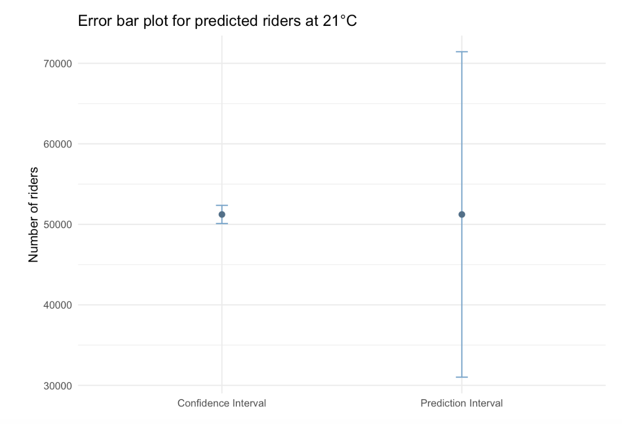
This distinction becomes crucial when communicating findings. A chart displaying a confidence interval (CI) highlights the precision of our estimate, while one showing a prediction interval (PI) demonstrates the potential variability in individual outcomes.
Hofman and colleagues explored how these visualizations shape people’s beliefs, asking the question:
Do viewers think a treatment is more or less effective depending on whether they see a CI or a PI?
To test this, the researchers conducted a large experiment. They randomly assigned over 2,300 people to one of four groups. Each group saw an error-bar plot depicting a treatment effect, with an explanatory caption. The four conditions included:
- CI only, with a caption explaining the CI
- CI, with a caption explaining both CIs and PIs
- PI only, with a caption explaining the PI
- PI, with a caption explaining both PIs and CIs
The authors wanted to learn:
Would people make different judgments about the treatment’s effectivenss depending on the type of uncertainty shown? And could extra explanatory text help them understand both kinds of uncertainty better?
In this Module, we’ll explore the data from this experiment to build intuituion for hypothesis testing.
Study protocol
Participants in the study were recruited through Amazon’s Mechanical Turk (MTurk), an online platform where individuals complete small tasks for pay. To ensure data quality, the researchers only included U.S.-based MTurk workers with approval ratings of 97% or higher. In total, 2,400 people were initially recruited. After removing 49 individuals who had taken part in both the pilot and main study, the final sample included 2,351 participants. Each person was randomly assigned to one of four experimental conditions and was paid $0.75 for completing the task, which involved viewing a data visualization online and answering questions about the perceived treatment’s effectiveness.
To begin the intervention phase, all participants were presented with the following two screens to introduce the study:
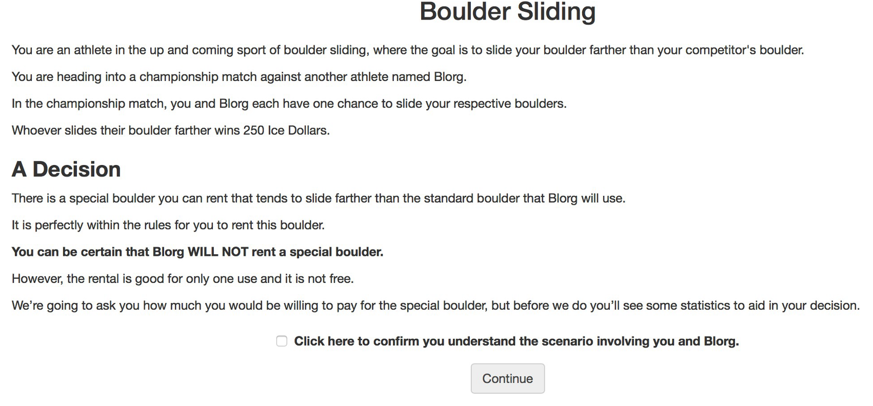

Conditions
Participants were then shown the visualizations corresponding to their randomly assigned condition — and after viewing the visualization — they reported how much they’d be willing to pay for the special boulder.
Click each tab below to view the specific visualization shown for each condition.
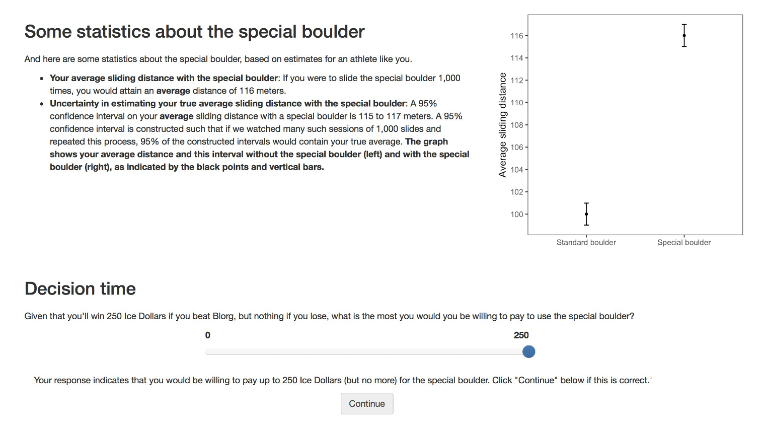
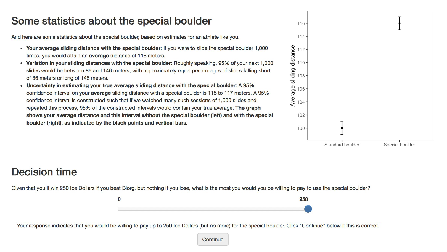
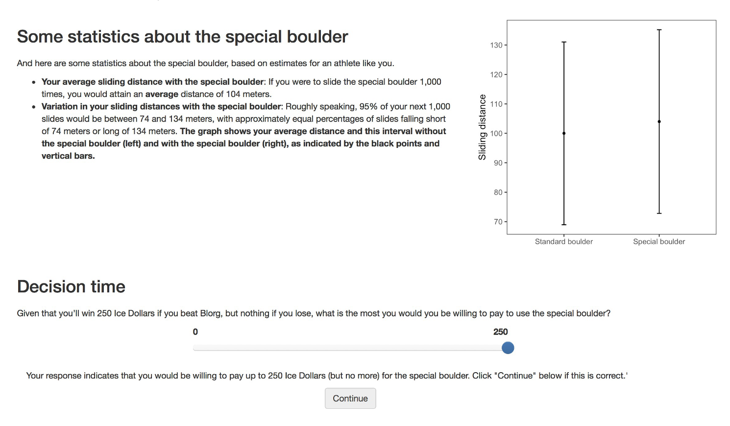
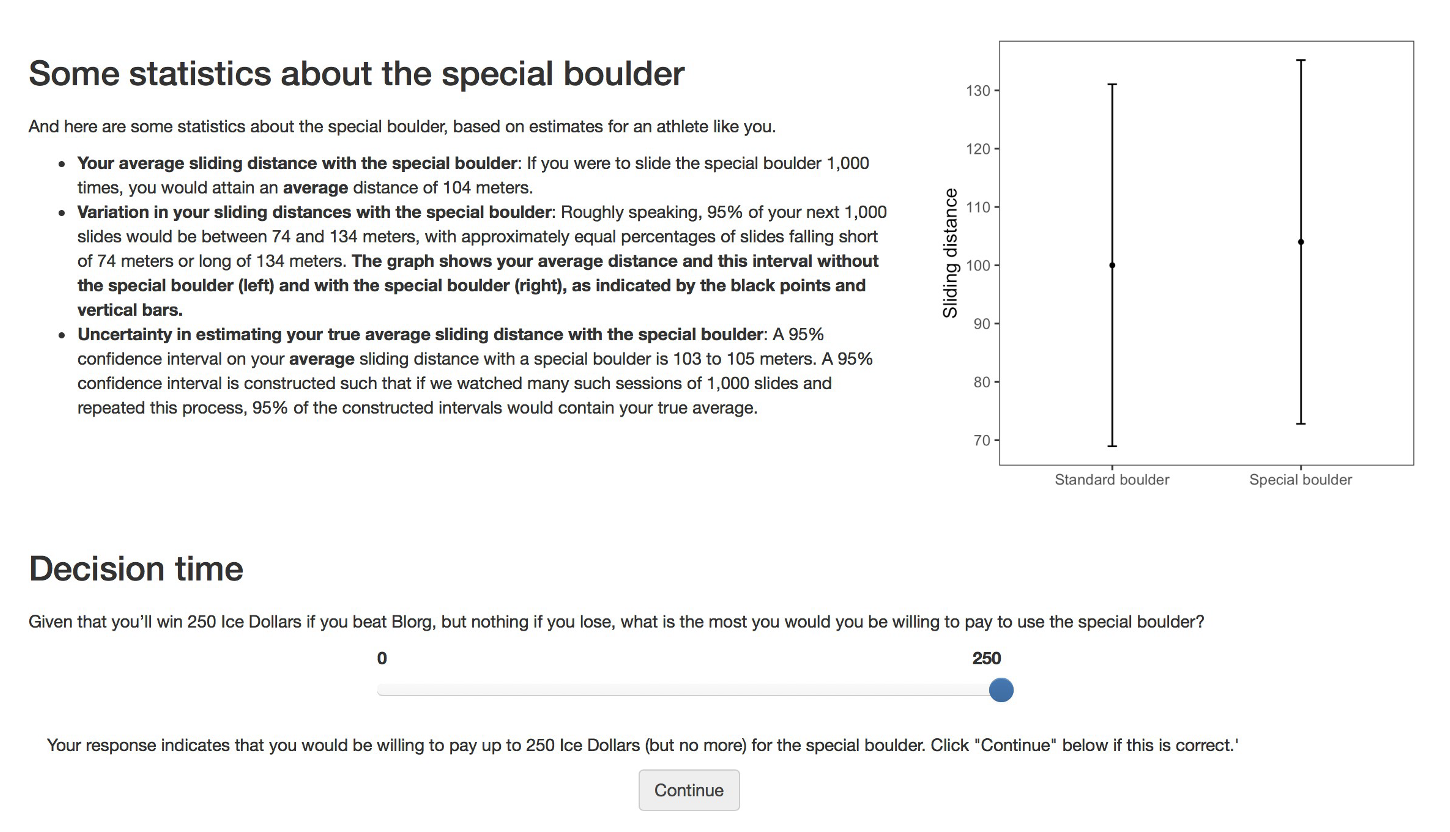
Variables
The independent variable is the condition.
After viewing their assigned graph and text, participants reported their willingness to pay (WTP) in “ice dollars” to rent the special boulder; this self‐reported amount serves as our dependent variable.
An attention check was built into the study to ensure that participants were paying attention. Some 608 participants failed the attention check and were removed from the analysis — leaving a total of 1,743 participants for our analysis.
Import the data
Let’s load the packages needed for this Module.
Let’s take a look at the data from the experiment. The data frame is called hulman_exp1.Rds and includes the following variables:
| Variable | Description |
|---|---|
| worker_id | Participant ID |
| condition.f | Experimental condition |
| interval_CI | A binary indicator comparing CI viz (coded 1) to PI viz (coded 0) |
| text_extra | A binary indicator comparing viz with extra text (coded 1) to viz text only (coded 0) |
| wtp_final | Amount participant was willing to pay for special boulder |
Now, we’re ready to import the data. I’ll display the first few rows of the data frame so you can get a feel for it.
df <- read_rds(here("data", "hulman_exp1.Rds"))
df |> select(-worker_id) |>  head(n = 25)
Describe the Data
Before we dive into the process of hypothesis testing, let’s begin by describing the data.
In this Module, we’ll directly compare Condition 1 (which shows a confidence interval) with Condition 3 (which shows a prediction interval). All other elements — including the caption text — are held identical and limited to the information displayed in each error‐bar plot.
There are 905 people in these two selected conditions — 486 of which saw a PI plot, and 419 of which saw a CI plot.
First, let’s calculate the average WTP in these two selected conditions.
df |>
  filter(condition.f %in% c("1: CI with viz stats only", "3: PI with viz stats only")) |>
  group_by(condition.f) |>
  select(condition.f, wtp_final) |>
skim()| Name | select(…) |
| Number of rows | 905 |
| Number of columns | 2 |
| _______________________ | |
| Column type frequency: | |
| numeric | 1 |
| ________________________ | |
| Group variables | condition.f |
Variable type: numeric
| skim_variable | condition.f | n_missing | complete_rate | mean | sd | p0 | p25 | p50 | p75 | p100 | hist |
|---|---|---|---|---|---|---|---|---|---|---|---|
| wtp_final | 1: CI with viz stats only | 0 | 1 | 79.01 | 53.09 | 0 | 50 | 75.0 | 100 | 249 | ▅▇▇▂▁ |
| wtp_final | 3: PI with viz stats only | 0 | 1 | 49.64 | 49.38 | 0 | 15 | 37.5 | 59 | 249 | ▇▅▂▁▁ |
Here, we see that then mean WTP for people who saw the CI is 79.0 ice dollars, while the mean WTP for people who saw the PI is 49.6 ice dollars. We can create a graph to display this information, let’s take a look at a box plot, with the average WTP for each group overlaid.
df |>
  filter(condition.f %in% c("1: CI with viz stats only", "3: PI with viz stats only")) |>
  ggplot(aes(x = condition.f, y = wtp_final)) +
  geom_boxplot(fill = "azure") +

 # Add a circle for the mean
  stat_summary(fun = base::mean, geom = "point", shape = 21, size = 3, fill = "#F26B38", color = "#F26B38") +

  # Display mean and SD just below the median line of each boxplot
  stat_summary(
    fun.data = function(y) {
      median_y = median(y)
      sd_y = sd(y)
      lower_whisker = quantile(y, probs = 0.25) - 1.5 * IQR(y)
      label_y = max(lower_whisker, median_y - 0.1 * sd_y) # Adjust this for positioning
      list(
        y = label_y,
        label = paste("M =", round(mean(y), 1), ", SD =", round(sd_y, 1))
      )
    },
    geom = "text",
    aes(label = after_stat(label)),
    vjust = 1.25,   # Adjust this for better positioning
    size = 3.5
  ) +

  labs(title = "Distribution of WTP across conditions",
       subtitle = "Orange dot denotes sample mean in each condiiton",
       caption = "M = mean, SD = standard deviation",
       x = "Condition",
       y = "WTP") +
  theme_minimal()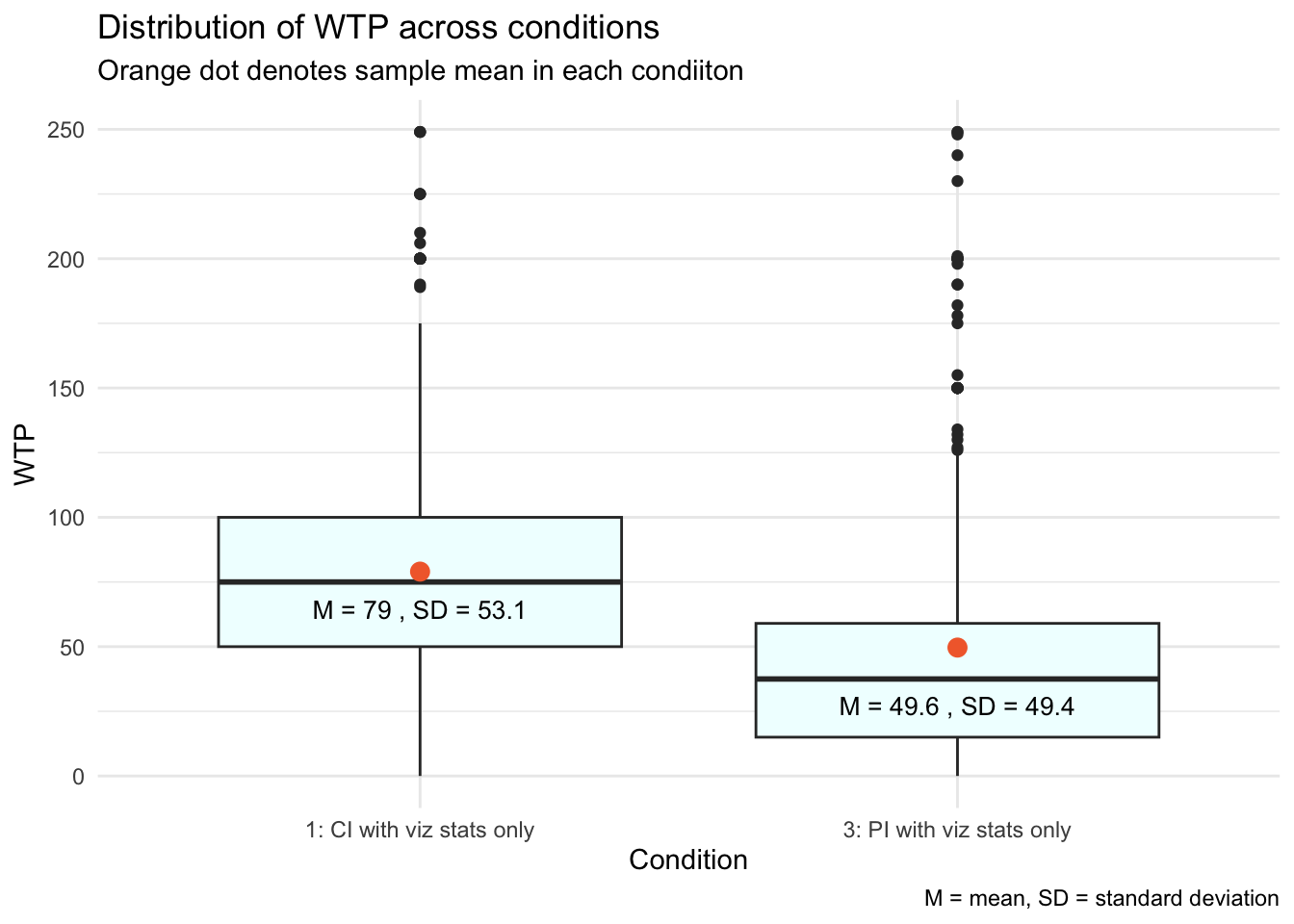
From the two means, we can also calculate the difference in the average WTP across the two conditions.
observed_diff <-
  df |>
  filter(condition.f %in% c("1: CI with viz stats only", "3: PI with viz stats only")) |>
  group_by(condition.f) |>
  select(condition.f, wtp_final) |>
  summarise(mean_value = mean(wtp_final)) |>
  pivot_wider(names_from = condition.f, values_from = mean_value) |>
  mutate(diff = `1: CI with viz stats only` - `3: PI with viz stats only`) |>
  pull(diff)

observed_diff
[1] 29.36551The average WTP was about 29.4 ice dollars higher when individuals saw the visualization with the CI compared to the visualization with the PI. This difference is illustrated by the gap between the two orange dots along the y-axis. Participants who viewed the smaller range of the CI, compared to the PI, likely perceived the expected improvement with the special boulder as more certain, making them believe it was more worthwhile to rent it.
Given this sizable difference, you might wonder why a statistical test is necessary to determine if this mean difference is significantly different from zero. The hypothesis test is necessary for several reasons:
One key concept we’ve studied is “sample-to-sample variability.” This means that results from one random sample might not predict the outcomes of another random sample or the broader population’s trends.
In inferential statistics, our goal is to determine if the observed effect in our sample is representative of the entire population or if it could have arisen by random chance.
In our study, we are asking whether the observed difference in WTP (an average of ~29.4 ice dollars more with the CI visualization) would likely be seen if the entire population were subjected to the experiment. Before we conclude that this is a real effect likely to be observed in the population, we need to verify it statistically.
Please watch the following video from Crash Course Statistics on p-values, which builds on these ideas.
Introduction to Hypothesis Testing
When scientists run a study, they’re rarely interested in the sample just for its own sake — what they really care about is what the sample can tell them about the larger population it represents.
A hypothesis is a thoughtful guess or claim about what might be true in that broader population. For example, a researcher might believe that a new teaching method helps students learn better — that belief becomes a testable hypothesis.
Hypothesis testing is the process we use to evaluate such claims. It’s a formal way of deciding between two possibilities:
The null hypothesis (often written as \(H_0\)), which typically represents no effect, no difference, or no change.
The alternative hypothesis (written as \(H_1\) or \(H_A\)), which represents the presence of an effect, a difference, or a meaningful change.
We use data from our sample to assess which of these two hypotheses is more consistent with the evidence.
Stating the Null and Alternative Hypotheses
To begin our exploration of hypothesis testing, we’ll focus on participants who saw visualizations paired only with matching descriptive text — specifically, those in Condition 1 (confidence interval) and Condition 3 (prediction interval). Our goal is to test whether the type of interval shown — confidence vs. prediction — affects how much participants were willing to pay (WTP) for the special boulder.
This type of question is perfect for hypothesis testing. We start by setting up two competing ideas:
The null hypothesis (\(H_0\)) is the assumption that there’s no difference in the outcome (in this case, WTP) between the two specified conditions. In other words, any observed difference is just due to random variation in the sample, not a real effect. So here, the null hypothesis is that the mean WTP is the same for participants who saw a confidence interval and those who saw a prediction interval.
The alternative hypothesis (\(H_A\)) suggests that there is a difference in WTP depending on which interval participants saw. That is, the type of interval shown (CI vs. PI) does influence how much participants are willing to pay for the special boulder.
Once these hypotheses are clearly stated, we’ll use our sample data to assess which one is better supported by the evidence.
The Gist of Null Hypothesis Significance Testing
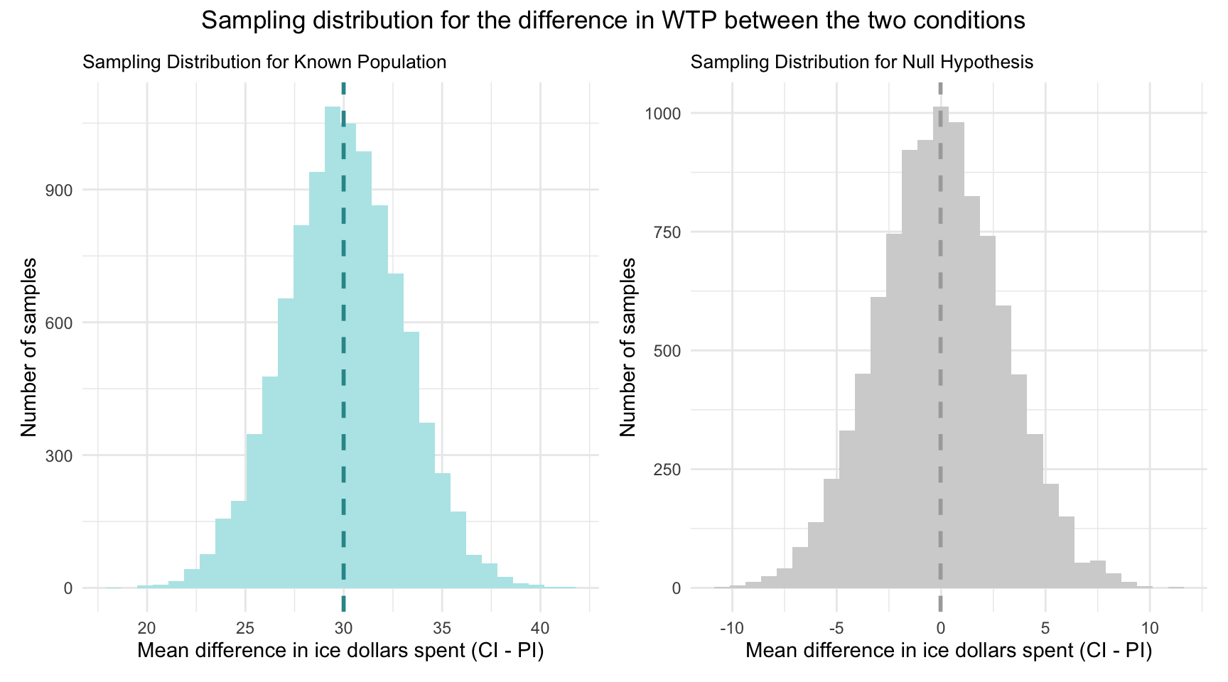
Let’s imagine that we know that the difference in WTP across the two conditions in the population is 30 ice dollars (with people who view a CI having a mean WTP that is 30 ice dollars higher than people who view a PI), and that the standard deviation of the sampling distribution is 3. Recall that we call the standard deviation of the sampling distribution the “standard error.”
The sampling distribution
Using this information, I’ve simulated two sampling distributions.
Under the “known population” scenario, we assume the true CI–PI difference is 30 ice dollars. The left-hand plot shows the sampling distribution for that scenario: the dashed vertical line marks the true mean difference (30) on the x-axis. By the Central Limit Theorem, with a standard error of 3, if we drew many random samples and computed the WTP difference each time, about 95% of those sample means would fall within roughly 30 ± 1.96 × 3 — that is, between roughly 24 and 36 ice dollars.
Under the “null” scenario, we assume the true CI–PI difference is zero. The right‐hand plot shows the sampling distribution for that case: the dashed vertical line at 0 marks the hypothesized mean difference. By the Central Limit Theorem, with a standard error of 3 ice dollars, about 95% of repeated samples would yield a mean difference within 0 ± 1.96 × 3 — that is, between roughly −6 and +6 ice dollars — if the null hypothesis were true.
Thus, with a null hypothesis significance test (NHST), we are asking a fundamental question:
Given the null hypothesis is true — which posits no difference in WTP between the two conditions — how likely is it that we would observe the sample data we have (or something more extreme)?
Recall from Module 05 that conditional probability is concerned with assessing the probability of an event, given that another event has already occurred. Formally, we express this as:
\[ P(\text{Observing our Sample Data} | H_0 \text{ is True}) \]
Now, recall that in the Hofman et al. sample — the mean difference in WTP between conditions was 29.4 ice dollars.
In the context of NHST for our example, we consider the probability that we’d observe a mean difference in WTP between the two conditions of 29.4 or larger given the null hypothesis is true.
To visualize this, take a look at the graph below — which extends the sampling distribution under the null hypothesis that we just studied, by adding our observed difference between conditions. Notice that the pink line represents this mean difference observed in the Hofman et al. sample with respect to the x-axis (i.e., 29.4 ice dollars).
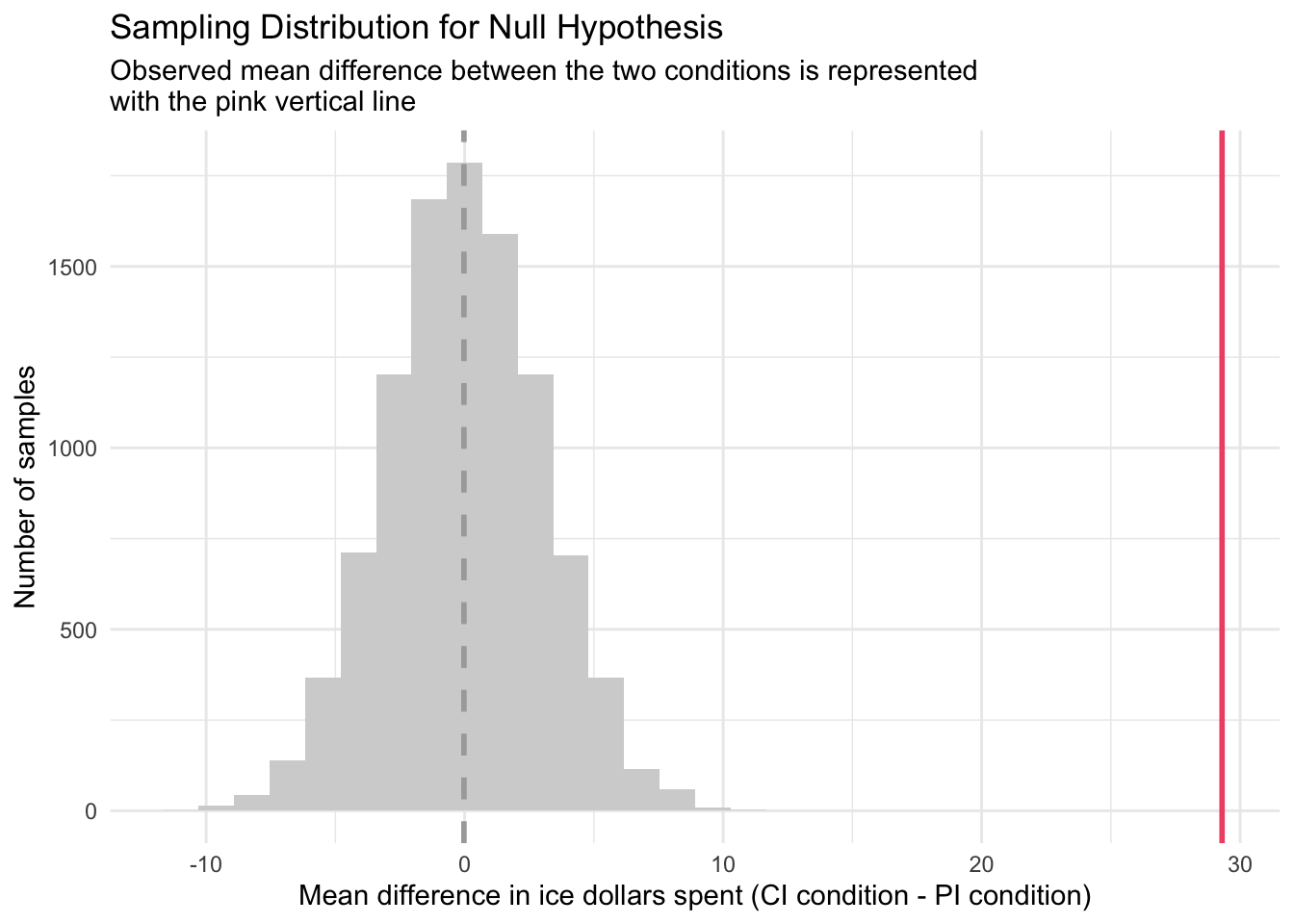
Study the graph above and ponder the following question:
If the null hypothesis is true, how likely is it that we’d observe this sample statistic (or something more extreme)?
Standardizing the null sampling distribution
Before we formally answer this question, let’s refine our graph of the sampling distribution under the null hypothesis by standardizing the mean differences. Instead of showing the actual mean difference in WTP between the two conditions for each sample, we’ll convert these raw difference scores to z-scores.
Recall from Module 02 that a z-score is calculated by subtracting the mean from an observation and then dividing by the standard deviation.
To compare our observed difference directly against what the null world predicts, we will convert every sample’s raw mean difference into a z-score.
For each simulated sample difference, we subtract the null hypothesis value (0) and then divide by the standard error of the mean difference.
This transforms the entire sampling distribution into “units of standard errors,” centering it at zero with a standard deviation of one.
In this standardized view, any observed difference becomes a simple count of how many standard errors it lies from zero — making it easy to judge how extreme (and thus how unlikely) our result is under the null hypothesis.
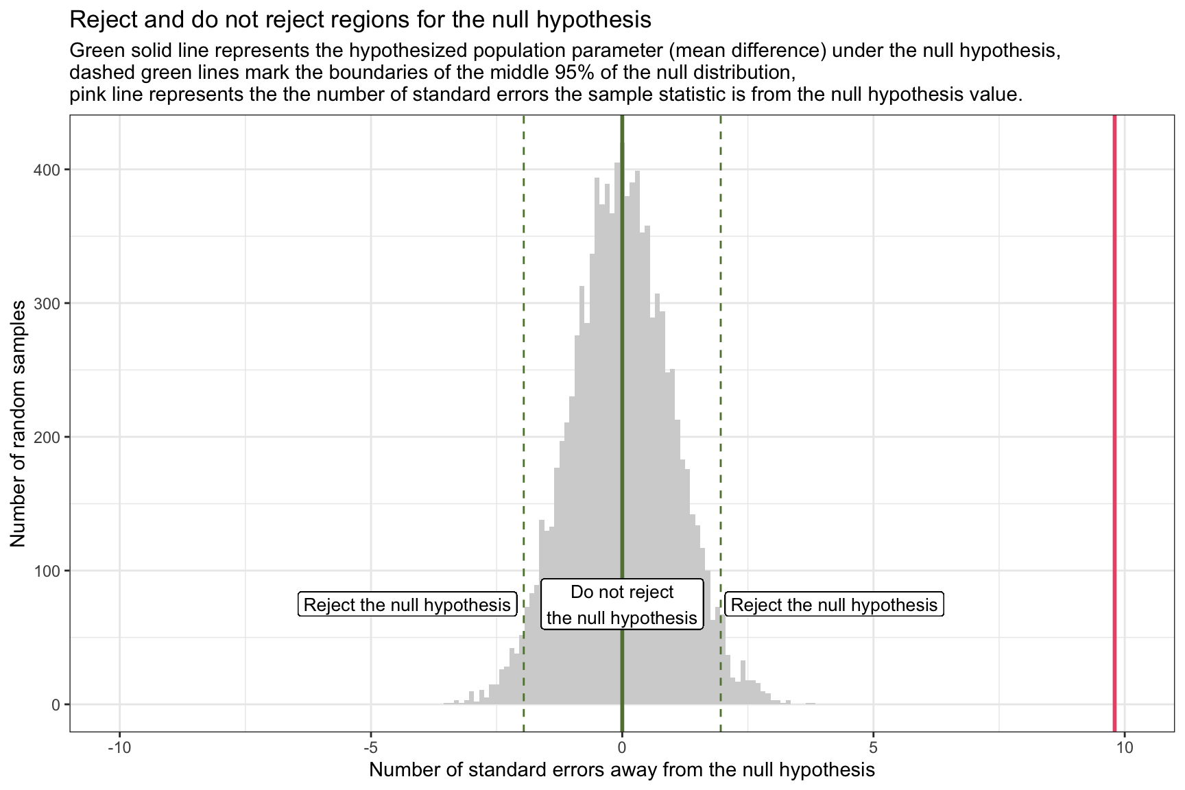
In the Hofman et al. data, the observed sample mean difference in WTP is 29.4 ice dollars. For illustrative purposes, we’re operating under the assumption that the standard deviation of the sampling distribution of the mean difference — known as the standard error — is 3.
Consequently, our observed sample mean difference between the two groups stands at 9.8 standard errors away from the null hypothesis value (which is denoted as the pink line in the graph above).
\[ \frac{29.4 - 0}{3} = 9.8 \]
Using the tools and concepts from Modules 07 and 08, we can compute the probability of obtaining a sample mean difference as extreme as the one we observed (or more extreme), assuming the null hypothesis is true. We’ll delve deeper into the mechanics of this later in the Module.
For now,
Given our null hypothesis that the mean difference between conditions is 0, and
Our sample estimate is 9.8 standard errors away from this null value,
We can consider the sampling distribution under the null hypothesis as a probability density function (PDF) and calculate the probability of observing a mean difference between conditions that is 9.8 standard errors away from the null hypothesis assertion as follows:
pnorm(q = 9.8, lower.tail = FALSE)[1] 5.629282e-23The result is essentially zero (i.e., 0.00000000000000000000005), meaning it’s highly improbable to get such an extreme value if the null hypothesis is true.
When considering the extremity of our observed sample mean difference, ultimately we want to take into account the possibility of observing equally extreme values in the opposite direction since we stated a two-tailed hypothesis (i.e, our alternative hypothesis is that the condition means are different — not that one is higher than the other).
In other words, in our example, while we observed a mean difference that is 9.8 standard errors above the null hypothesis value, we’re equally interested in how unlikely a mean difference that is 9.8 standard errors below the null hypothesis value would be, assuming our null hypothesis is true. In this case, the mean for the PI condition would exceed the mean for the CI condition.
To compute this two-tailed probability, we can sum the probabilities of a z-score above 9.8 or a z-score below -9.8 as follows:
pnorm(q = 9.8, lower.tail = FALSE) + pnorm(q = -9.8) [1] 1.125856e-22This calculation indicates that there’s a near zero probability of observing a sample mean difference in WTP between the two conditions that is 9.8 standard errors or more (in either direction) away from the stated null hypothesis mean difference — if the null hypothesis were true. In other words, such extreme results are highly unlikely to occur by random chance alone if the true population difference in WTP between the two conditions is 0.
This deviation prompts a critical reevaluation of the null hypothesis. In the context of hypothesis testing, such an extreme observation suggests strong evidence against the null hypothesis, nudging us towards considering the alternative hypothesis that there is indeed a meaningful difference in ice dollars spent between the two conditions.
At its core, hypothesis testing asks: assuming the null hypothesis is true, what is the probability of observing a sample mean difference as large (or larger) than the one we actually found?
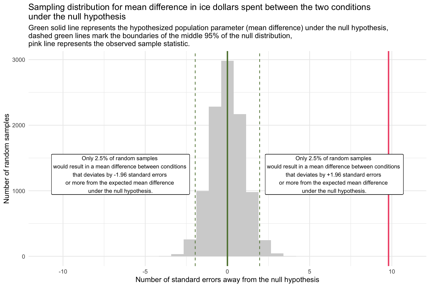
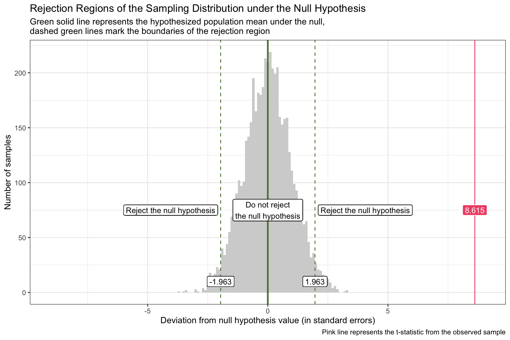
Rejection region for the null hypothesis
Once we’ve standardized our null sampling distribution into z-scores (i.e., units of standard errors), it’s easy to carve out the “reject” and “do not reject” zones for a two-tailed test:
The solid green line at 0 marks the hypothesized mean difference under the null.
The dashed green lines at ±1.96 are the 2.5th and 97.5th percentiles of the null distribution — together they enclose the central 95% “do not reject” region.
Any observed z-score below –1.96 or above +1.96 falls into the outer 5% (2.5% in each tail) and defines the rejection regions for \(\alpha\) = 0.05.
If our observed statistic (in SE units) lands in one of these outer bands, we conclude that such an extreme outcome would be very unlikely if the null were true — and thus we reject the null hypothesis.
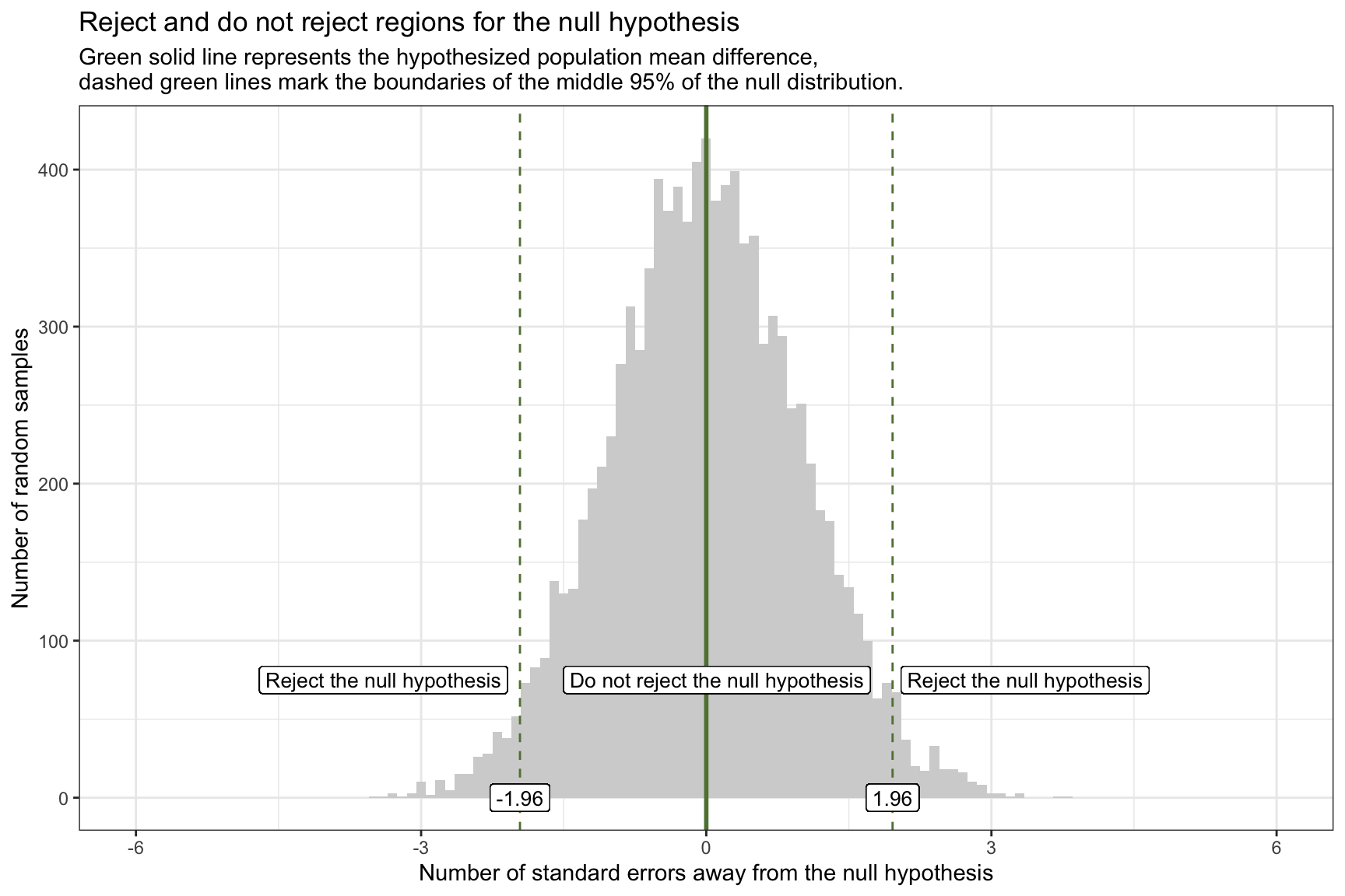
Let’s overlay our observed sample statistic onto the graph of the standardized sampling distribution for the null hypothesis, with the rejection regions marked. Our observed statistic (i.e., the difference in WTP between the two conditions) is 9.8 standard errors away from the null hypothesis and is represented by the pink line on the graph. This observed sample statistic is well outside the threshold for what we’d expect to observe if the null hypothesis is true. Therefore, it is highly unlikely that the true difference in WTP between the two conditions is 0. And thus, the null hypothesis should be rejected.
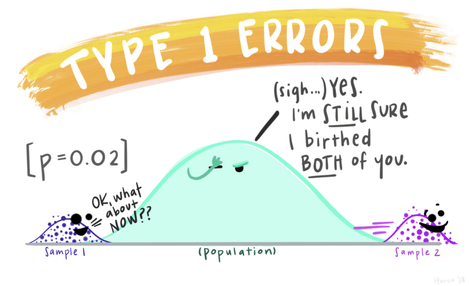
Type I and Type II errors
After stating our null and alternative hypotheses, and then evaluating whether the null hypothesis is probable, there are four possible outcomes, as defined by the matrix below.
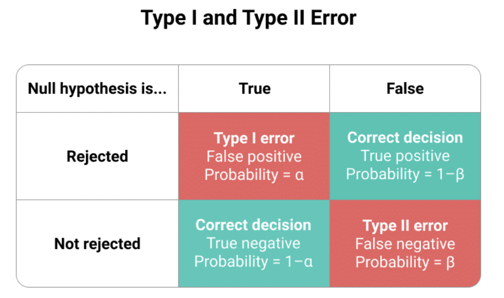
The columns delineate two potential realities:
Left Column (tagged “True”): Signifies a world where the null hypothesis is valid, suggesting that there is no difference in WTP between the two conditions.
Right Column (tagged “False”): Depicts a world where the null hypothesis is invalid, implying that there is a difference in WTP between the two conditions.
The rows of this matrix represent possible study outcomes:
Top Row (tagged “Rejected”): Illustrates when our research dismisses the null hypothesis, indicating it found significant difference in WTP between the conditions.
Bottom Row (tagged “Not rejected”): Shows when our research does not find evidence to reject the null hypothesis, indicating no difference in WTP between the two conditions.
Combining the larger population’s reality with our sample findings, we identify four potential outcomes:
- Correct Conclusions (Aqua Boxes):
Top Aqua Box: Our research detects a difference in WTP, aligning with an actual difference in the population.
Bottom Aqua Box: Our research does not detect a notable difference in WTP, consistent with actual non-difference in the population.
- Incorrect Conclusions (Pink Boxes):
Type I Error (Top Pink Box): Our study rejects the null hypothesis, but in reality, it’s valid. This is like a false alarm; we’ve identified a non-existent difference/effect.
Type II Error (Bottom Pink Box): Our study does not reject the null hypothesis, yet it’s false in the real world. This resembles a missed detection, where we overlook an actual difference/effect.
Type I Error Probability (\(\alpha\) - “alpha”): This represents the likelihood of mistakenly rejecting a true null hypothesis. Similar to setting the confidence level for confidence intervals (e.g., 95%, 99%), we determine our risk threshold for a Type I error beforehand. Frequently in Psychology, the threshold, \(\alpha\), is set at 0.05. While this is conventional, researchers should judiciously decide on \(\alpha\). If set at 0.05, it implies a 5% risk of wrongly rejecting the true null hypothesis — e.g., claiming there is a significant difference in WTP between conditions when really there is not.
Type II Error Probability (\(\beta\) = “beta”): This is the chance of incorrectly failing to reject a false null hypothesis. Its complement, 1-\(\beta\), known as the test’s “power,” reflects our capability to discover a genuine effect.
To further solidify your understanding of these topics, please take a moment to watch this Crash Course Statistics video on Type I and Type II errors.
The General Framework for Conducting a Hypothesis Test
In our previous thought‐experiment, we “knew” the standard error (SE = 3) and used it to standardize our sampling distribution. In real data, the SE is unknown and must be estimated from the sample.
A convenient way to both estimate the SE and conduct a two‐group comparison is via linear regression. Recall from Module 13 that regressing a continuous outcome on a binary indicator is equivalent to a two‐sample mean comparison. Here:
The outcome, wtp_final, is each participant’s willingness to pay.
The predictor, interval_CI, is coded 1 if they saw a CI plot and 0 if they saw a PI plot.
viz_text <-
  df |>
  filter(condition.f %in% c("1: CI with viz stats only", "3: PI with viz stats only"))

interval_diff <- lm(wtp_final ~ interval_CI, data = viz_text)

interval_diff |>
  tidy() |>
  select(term, estimate, std.error)
Intercept (reference-group mean): the fitted value of wtp_final when interval_CI = 0. Because 0 corresponds to the PI condition, the intercept represents the average willingness to pay for participants who viewed the PI plot.
Slope (contrast between conditions): the change in the fitted mean of wtp_final when interval_CI moves from 0 (PI) to 1 (CI). It therefore estimates the mean difference in willingness to pay between the CI and PI conditions. A positive slope indicates higher willingness to pay under the CI visualization; a negative slope would indicate the opposite.
In the next section, we’ll use these estimates for the slope (both the coefficient and its estimated SE) to construct a 95% confidence interval, compute a test statistic, derive a p‐value, and formally assess our null hypothesis using the Hofman et al. data.
Step 1: Define the hypothesis
Before we write formal hypotheses, remember that hypothesis testing is always about the population, not the sample. We therefore express our claims with Greek symbols, which conventionally denote population parameters. Here, \(\mu_{CI}\) and \(\mu_{PI}\) represent the population mean willingness-to-pay (WTP) under the CI and PI visualizations, respectively, while \(\beta_1\) is the population regression slope linking the visualization indicator to WTP. Our task is to use the sample data to decide whether the evidence supports a genuine population difference (\(H_A\)) or whether any observed gap is plausibly due to sampling variability (\(H_0\)).
Null Hypothesis
We can state the null hypothesis in any of these equivalent ways:
- \(\mu_{CI} - \mu_{PI} = 0\) (the population mean difference between the two conditions is equal to 0)
- \(\mu_{CI} = \mu_{PI}\) (the population means are equal)
- \(\beta_1 = 0\) (the regression coefficient for the binary treatment indicator is equal to 0, indicating no effect of viewing the CI (versus the PI) on WTP)
Alternative Hypothesis
We can state the alternative hypothesis in any of the equivalent ways:
- \(\mu_{CI} - \mu_{PI} \neq 0\) (the population mean difference between the two conditions is not equal to 0)
- \(\mu_{CI} \neq \mu_{PI}\) (the population means are not equal)
- \(\beta_1 \neq 0\) (the regression coefficient for the binary treatment indicator is not equal to 0, indicating an effect of viewing the CI (versus the PI) on WTP)
Step 2: Choose the appropriate statistical test
Because we’ve regressed a continuous outcome (wtp_final) on a binary indicator (interval_CI), the natural statistical test is a t-test on the regression slope. Concretely, we test:
\[ H_0: \beta_1 = 0 \quad\text{vs.}\quad H_A: \beta_1 \neq 0 \]
where \(\beta_1\) is the coefficient on interval_CI. The test statistic (i.e., t-statistic) is:
\[ t = \frac{\hat\beta_1 - 0}{\mathrm{SE}(\hat\beta_1)} \]
which tells us how many estimated standard errors the observed slope lies from zero (the stated null hypothesis).
We’ll consider a few common test statistics in this Module. However, the most important task is to understand the gist of hypothesis testing. Once that is well understood, then finding and conducting the right type of test is straight forward1.
Step 3: Define the rejection criteria
Before computing our test statistic, it’s crucial to specify the conditions under which we will reject the null hypothesis. For a two-tailed test, we evaluate both the lower (left) and upper (right) ends of the sampling distribution. We identify regions within each tail where, if our t-statistic lies, we would have sufficient evidence to reject the null hypothesis. These boundaries, which delineate where the t-statistic becomes too extreme under the null hypothesis, are termed critical t-values or critical values of t.
The concepts of alpha (\(\alpha\)) and degrees of freedom (df) are key to determining the rejection region.
The alpha level is the probability of rejecting the null hypothesis when it is true. In other words, it represents the risk of making a Type I error. It’s a pre-defined threshold that researchers set before conducting a hypothesis test. The choice of \(\alpha\) is subjective, but in many fields, an \(\alpha\) of 0.05 is conventional. This means that there’s a 5% chance of rejecting the null hypothesis when it’s true. Other common values are 0.01 and 0.10, but the specific value chosen should be appropriate for the context of the study.
In the context of testing a linear regression coefficient, the df are defined as \(df = n - 1 - p\). Here, \(n\) represents the sample size, 1 represents the one degree of freedom that we lose for estimating the intercept of the regression model, and p represents the number of predictors (i.e., estimated slopes) in our regression model. We reduce the sample size by one df for each parameter that we estimate. In our current example, the n is 905, and p is 1, thus our df is 905 - 1 - 1 = 903.
Given an alpha level of 0.05 and df of 903, we can determine the critical t-values (lower and upper bound) that defines our rejection region for a two-tailed test.
To find the critical values, we use the qt() function. Since it’s a two-tailed test, we split our alpha value, 0.05, into two equal parts, placing one half (0.025) in the lower tail and the other half in the upper tail — thus we need to find the 2.5th and 97.5th percentiles of the sampling distribution under the null.
The following R code calculates the critical t-values for our example:
qt(p = c(0.025, 0.975), df = 903)[1] -1.962595 1.962595Here’s a visual representation of the rejection criteria:
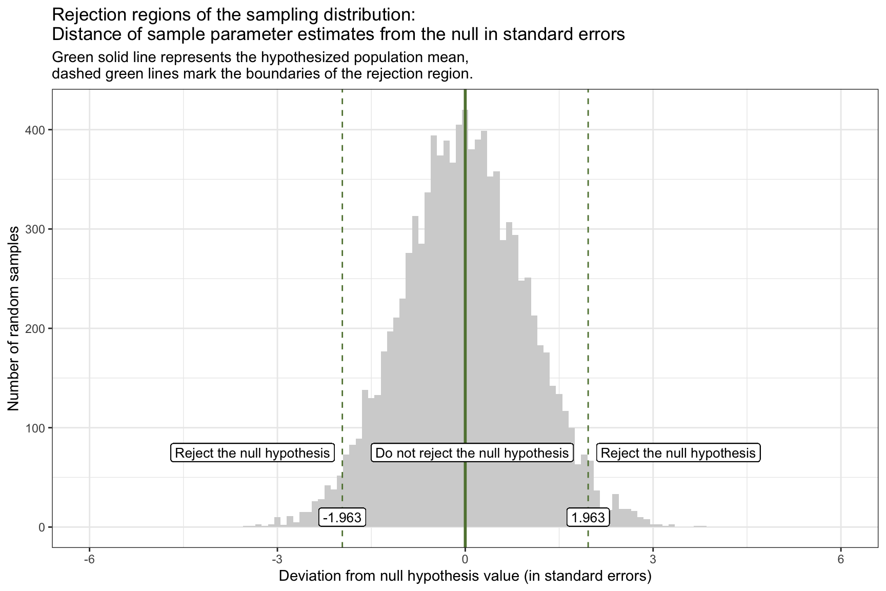
If our calculated t-statistic is between -1.963 and 1.963, then we will NOT REJECT the null hypothesis. However, if the calculated t-statistic is outside of this range (either greater than 1.963 or less than -1.963), then WE WILL REJECT the null hypothesis.
Before we delve into the next step, which is to calculate the test statistic, please watch the following two Crash Course Statistics videos on the two topics just discussed — Test Statistics and Degrees of Freedom.
Step 4: Estimate the standard error
Recall from Module 12, that we considered two frequentist methods for estimating the standard error (SE) of a regression slope — bootstrapping and theory-based (i.e., parametric) formulas.
Bootstrap estimation of the standard error
The bootstrap method is a robust, non-parametric technique used to estimate the standard error of a regression slope by resampling data. This approach approximates the sampling distribution of a statistic without relying on strict parametric assumptions.
The following code demonstrates how to use the bootstrap method to estimate the standard error for our example, specifically calculating the mean difference in WTP between the two conditions. This involves generating 5000 bootstrap resamples to simulate the sampling distribution, resulting in an estimated mean difference and its associated standard deviation.
# Define the number of bootstrap resamples
n_bootstrap <- 5000

# Generate bootstrap resamples and compute the coefficient for interval_CI
bootstrap_distributions <- map_dfr(1:n_bootstrap, ~ {
  # Resample the data with replacement
  resampled_data <- viz_text |> sample_n(n(), replace = TRUE)

  # Fit the model to the resampled data
  bootstrap_model <- lm(wtp_final ~ interval_CI, data = resampled_data)

  # Extract the coefficient for interval_CI
  tidy(bootstrap_model) %>% filter(term == "interval_CI")
}) |>
  rename(bootstrap_estimate = estimate) # Rename the estimate column for clarity

# Create a data frame to hold the estimated slopes across the bootstrap resamples
bootstrap_estimates_for_slope <- bootstrap_distributions |> as_tibble()

# Calculate the standard deviation of the bootstrapped standard deviation as an estimate of the standard error
bootstrap_results <-
  bootstrap_distributions |>
  summarise(mean_estimate = mean(bootstrap_estimate), sd_estimate = sd(bootstrap_estimate))

bootstrap_results
Using the bootstrap approach, we find that the estimate of the mean difference in WTP between the two conditions is 29.3, and the standard deviation is 3.4. Recall that the standard deviation of the bootstrap distribution of our statistic provides an estimate of the statistic’s standard error (SE).
Parametric (i.e., theory-based) estimation of the standard error
The parametric approach to estimating the standard error of a regression slope relies on assumptions about the distribution of the error terms in the linear regression model. Provided these are met, then we can use this simplified version of estimating the mean difference in WTP and the associated standard error. The code below applies the parametric/theory-based method to obtain the SE for the slope (which is labeled std.error in the output):
interval_diff <- lm(wtp_final ~ interval_CI, data = viz_text)
interval_diff |> tidy() |> filter(term == "interval_CI") |> select(term, estimate, std.error)
Using the parametric approach, we find that the estimate of the mean difference in WTP between the two conditions is 29.4, and the standard deviation is 3.4.
Comparison of SE across methods
The SE values obtained from both the bootstrap and parametric approaches are quite similar, and each represent estimates of the uncertainty or variability in the regression slope that quantifies the effect of the independent variable (condition) on the WTP, measured in ice dollars. These SE values provide a quantitative measure of how much the estimated slope, or the predicted difference in WTP contrasting the CI condition to the PI condition, might vary if we were to repeat the study with new samples from the same population.
This means, in a practical sense, that the true slope value is expected to fall within ±3.4 ice dollars of our calculated slope estimate in about 68% of random samples (assuming a normal distribution of slope estimates, as per the Empirical Rule). This variation underscores the precision of our estimate. The closer this SE is to zero, the less variability we expect in slope estimates across different samples, indicating a more precise estimate of the true slope. Conversely, a larger SE would signify greater variability and less precision, suggesting that our estimate might fluctuate more significantly with different samples.
Step 5: Calculate the test statistic
Now, we’re ready to calculate the test statistic. Recall that the test statistic is just simply the estimate divided by the standard error.
For the bootstrap estimation
bootstrap_results |> mutate(statistic = mean_estimate/sd_estimate)\[ t = \frac{\hat{\beta}_1 - 0}{SE(\hat{\beta}_1)} = \frac{29.32459 - 0}{3.394314} = 8.6 \]
Thus, our estimate of the regression slope (which captures the mean difference in WTP between the CI condition and the PI condition) is ~29.32, the standard error for this estimate is ~3.39, and by dividing the estimate by the standard error we compute the test statistic, ~8.64, which provides us with the number of standard errors are sample estimate is away from the null hypothesis value (0).
For the theory-based estimation
interval_diff <- lm(wtp_final ~ interval_CI, data = viz_text)
interval_diff |> tidy() |> select(term, estimate, std.error, statistic)
\[ t = \frac{\hat{\beta}_1 - 0}{SE(\hat{\beta}_1)} = \frac{29.36551 - 0}{3.408571} = 8.6 \]
Using the estimates from tidy(), we divide the estimate by the standard error to compute the test statistic, ~8.6, which provides us with the number of standard errors are sample estimate is away from the null hypothesis value (0). Note that the tidy() function computes this for us, it’s labeled statistic in the output.
Comparison of test-statistic across methods
In this instance, we find that the test statistic when using the bootstrap and parametric/theory-based approach is nearly the same. In both cases the sample estimate is about 8.6 standard errors away from the null hypothesis value of 0. Therefore, for this study, both methods for computing the SE lead to the same result.
Step 6: Determine if the calculated test-statistic is in the null hypothesis rejection region and draw a conclusion
Our test statistic of ~8.6 indicates that our sample produces a mean difference in WTP between conditions that is 8.6 standard errors away from the null hypothesis value of 0. Observing the critical values of our rejection criteria, it is evident that our t-statistic falls within the rejection range (i.e., it’s in the right tail and greater than 1.963).
The corresponding p-value (see p.value in the output below) from the tidy output provides the probability of encountering a t-statistic as extreme as ours (or even more so) under the presumption that the null hypothesis istrue.
interval_diff |> tidy() |> select(term, estimate, std.error, statistic, p.value)For our test, this p-value is minuscule, approximated at 0 (observed as p < 3.084582e-17, which translates to 0.00000000000000003084582). If the p-value is lesser than our chosen alpha level, we proceed to reject the null hypothesis. Consistent with our rejection criteria, a t-statistic residing within the rejection region invariably yields a p-value below alpha. That is, the rejection criterion and p-value are two ways of performing the same evaluation.
If we like, we can use the pt() function to calculate the p-value ourselves:
pt(q = 8.615, df = 903, lower.tail = FALSE) +
  pt(q = -8.615, df = 903)
[1] 3.089531e-17Please note that this is the same method used by lm(), the calculated p-value differs just slightly due to rounding. You can then use this same approach to calculate a p-value using the test statistic garnered from the bootstrap approach.
Because the observed t-statistic exceeds the critical value, it lies inside the rejection region, so we reject \(H_0\). In other words, if the true population difference were really zero, the chance of seeing a gap this large (or larger) is practically nil.
Practical implication: the data give strong evidence that visualization style matters: presenting a CI plot, rather than a PI plot, raises participants’ average willingness to pay by roughly 29 ice-dollars. This is not just a statistical artifact—it suggests a meaningful shift in perceived value that decision-makers should take into account.
Step 7: Calculate confidence intervals
We’ve studied the calculation of CIs for our parameter estimates in many examples — so now you should feel comfortable with these. Let’s calucate the 95% CI for the slope, which corresonds with an \(\alpha\) of 0.05.
For the bootstrap estimation
Recall from Modules 9 and 12 that we can calculate a CI based on the estimated parameters across the bootstrap resamples by taking the 2.5th and 97.5th percentiles of the distribution.
bootstrap_estimates_for_slope |>
  summarize(lower = quantile(bootstrap_estimate, probs = 0.025),
            upper = quantile(bootstrap_estimate, probs = 0.975))
Here, we see that the 95% CI for the difference in WTP between the two conditions, based on the bootstrap resamples, is 22.7, 36.0.
For the theory-based estimation
As you already know, the tidy() output from a lm() object also provides the 95% CI.
interval_diff |> tidy(conf.int = TRUE, conf.level = 0.95)Here, we see that the 95% CI for the difference in WTP between the two conditions is 22.7, 36.1. This is calculated as the estimate for the slope plus/minus the critical t-value times the standard error. We use the same critical t-value used to calculate the rejection region for the hypothesis test. For example, the 95% confidence interval is calculated as follows:
\[ 29.36551 \pm 1.962595 \times3.408571 \]
Summary of CIs
The CI provides more information than a simple test of statistical significance because it offers a range of values that are consistent with the observed data, giving insight into the estimate’s precision.
Relating confidence intervals to hypothesis testing, a key point is that if the 95% CI for the difference between two group means does not include zero, this suggests a statistically significant difference between the groups at the 5% significance level (i.e., alpha). The exclusion of zero from the interval indicates that the observed difference is unlikely to be due to sampling variability alone. In other words, 0 is not a plausible estimate for the difference in the outcome (e.g., WTP) between groups, and we have evidence against the null hypothesis.
Using a parametric approach, these three things will always coincide given a certain \(\alpha\).
- A t-statistic that is in the rejection region,
- A confidence interval (CI) that does not include the null value (e.g., zero for no difference),
- A p-value that is smaller than the alpha level.
This is because all three metrics — t-statistic, confidence interval, and p-value — are derived from the same underlying statistical theory and data.
Step 8: Quantify the effect size
Effect size is an important component of hypothesis testing, providing a quantitative measure of the magnitude of a phenomenon. While statistical significance can tell us if an effect exists, the effect size tells us how large that effect is.
Cohen’s d is a widely used measure of effect size. It quantifies the difference between two group means in terms of standard deviations, offering a standardized metric of difference that is not influenced by the scale of the measurements.
The formula for Cohen’s d is:
\[ d = \frac{M_1 - M_2}{SD_{pooled}} \]
Where:
- \(M_1\) and \(M_2\) are the mean of \(y_i\) of the two groups being compared.
- \(SD_{pooled}\) is the pooled standard deviation of \(y_i\) of the two groups, calculated as:
\[ SD_{pooled} = \sqrt{\frac{(n_1 - 1) \times SD_1^2 + (n_2 - 1) \times SD_2^2}{n_1 + n_2 - 2}} \]
In this equation:
- \(n_1\) and \(n_2\) are the sample sizes of the two groups.
- \(SD_1\) and \(SD_2\) are the standard deviations of the two groups.
The effectsize package in R simplifies the process of calculating various effect sizes, including Cohen’s d. The cohens_d() function calculates Cohen’s d.
Before calling the function we must recode our grouping variable so that Cohen’s d matches the direction of our regression slope. By default, interval_CI is numeric (0 = PI, 1 = CI), so cohens_d() treats PI as Group 1 and CI as Group 2 — yielding a negative effect size when our linear model showed a positive CI–PI difference.
To fix this, convert interval_CI into a factor with levels ordered as c("CI viz", "PI viz"). Now cohens_d(interval_CI.f, wtp_final) will yield a positive d consistent with our model.
library(effectsize)

viz_text <-
  viz_text |>
  mutate(interval_CI.f = factor(interval_CI,
                                levels = c(1,0), labels = c("CI viz", "PI viz")))

cohens_d(wtp_final ~ interval_CI.f, ci = 0.95, data = viz_text)
The Cohen’s d value is 0.57, with a 95% CI ranging from 0.44 to 0.71. This indicates that the mean WTP in the CI condition is 0.57 standard deviations higher than in the PI condition.
Cohen’s conventions for interpreting the size of d suggest that a value of 0.2 to 0.5 represents a small effect, around 0.5 to around 0.8 a medium effect, and 0.8 or greater a large effect. Therefore, a Cohen’s d of 0.57 would be considered a moderate effect size, indicating a meaningful difference between the two conditions that is likely to have practical significance.
Step 9: Check model assumptions
An essential aspect of conducting reliable statistical analyses, particularly when employing models such as linear regression, involves verifying that the assumptions underlying these statistical tests are met. These key assumptions include:
- Linearity of relationships
- Independence of observations
- Homoscedasticity (equal variances) of errors
- Normality of error terms
Each of these assumptions plays a critical role in ensuring the validity of the test results and the accuracy of the conclusions drawn from them. Failing to meet these assumptions can lead to biased estimates, incorrect inferences, and ultimately misleading conclusions. Recognizing the significance of this step, the next Module (i.e., Module 17) for this course will be dedicated to exploring these assumptions in detail. We will delve into methods for assessing the validity of each assumption, strategies for diagnosing potential issues, and techniques for making corrections when necessary.
A Word of Caution
Null Hypothesis Significance Testing (NHST) has long been a cornerstone of statistical analysis in research, offering a framework to evaluate the probability that observed data would occur under a specific null hypothesis.
However, NHST is not without its criticisms and limitations:
One of the primary criticisms of NHST is its binary nature, classifying results strictly as “significant” or “not significant” based on a pre-defined alpha level, typically set at 0.05. This arbitrary cutoff does not account for the magnitude of the effect, the precision of the estimate, or the practical significance of the findings. As a result, important but smaller effects may be dismissed, while statistically significant findings may be emphasized without consideration of their real-world relevance.
Moreover, the reliance on p-values as the sole metric for statistical significance can be misleading. While p-values are a fundamental part of statistical hypothesis testing, they should be used and interpreted with caution. A p-value is not a measure of the magnitude or importance of an effect, nor does it provide direct information about the null hypothesis being true. Rather, it tells us the probability of observing an effect as large or larger than the one we observed in our sample, given that the null hypothesis is true.
Furthermore, a p-value is susceptible to sample size: with large samples, small and perhaps unimportant differences can be detected as statistically significant, while with small samples, even large and potentially important effects may not be detected as significant.
A p-value doesn’t consider the possibility of data errors or biases in the study design.
For a more complete understanding of the data, p-values should be used in conjunction with other statistical measures and tools, such as confidence intervals, and with a careful consideration of the research context and design. Alternatively, researchers can take a Bayesian approach, which offers a probabilistic framework that incorporates prior knowledge and provides a more comprehensive interpretation of the results.
Connecting Bayes’ Theorem to Null‐Hypothesis Significance Testing
Module 05 showed how Bayes’ Theorem updates a probability after new evidence (e.g., the chance of cancer after a positive mammogram).
Here we apply the same logic to ask:
If a test is statistically significant, what is the probability that the alternative hypothesis \(H_A\) is actually true?
Bayes’ Theorem for a “Positive” Finding
Let a “positive” (\(\text{pos}\)) be a statistically significant result (p ≤ \(\alpha\)).
Bayes’ rule gives
\[ P(H_A \mid \text{pos}) \;=\; \frac{P(\text{pos}\mid H_A)\,P(H_A)} {P(\text{pos})}, \]
where
- \(P(H_A \mid \text{pos})\) = posterior probability the alternative is true after the significant result.
- \(P(\text{pos}\mid H_A)\) = test power.
- \(P(H_A)\) = prior (base‐rate) probability that \(H_A\) is true.
- \(P(\text{pos})\) = overall probability of obtaining a significant result.
The denominator expands to
\[ P(\text{pos}) = P(\text{pos}\mid H_A)P(H_A) \;+\; P(\text{pos}\mid H_0)P(H_0), \]
with \(P(H_0)=1-P(H_A)\).
Worked Example
Assume:
- Power \(P(\text{pos}\mid H_A)=0.95\)
- Type I error rate \(P(\text{pos}\mid H_0)=\alpha=0.05\)
- Base rate of true alternatives \(P(H_A)=0.01\)
Compute the marginal probability of a positive:
\[ P(\text{pos}) \;=\; (0.95)(0.01) + (0.05)(0.99) = 0.0095 + 0.0495 = 0.059. \]
Update the probability the hypothesis is true:
\[ P(H_A \mid \text{pos}) = \frac{(0.95)(0.01)}{0.059} \approx 0.16. \]
Interpretation
Even with high power and the conventional \(\alpha = 0.05\), a significant result implies only a 16% chance that the alternative is actually correct when its prior plausibility is 1%. In domains with many low‐prior hypotheses, most “significant” findings will be false positives.
Practical Takeaways
- Increase prior plausibility — design studies around strong theory and replication.
- Lower the false‐positive rate — use stricter \(\alpha\), better measurement, and transparent analysis.
- Report more than a p‐value — include prior justification, effect sizes, and full uncertainty.
Bayes’ Theorem reminds us that statistical significance alone is not enough.
Please watch the following video on the potential problems that we can encounter with p-values.
Hypotheses Tests for the Overall Model
When we analyze data using linear regression, our primary goal is often to understand how well our set of explanatory variables can predict or explain the variation in the outcome variable. One intuitive measure for assessing this is the \(R^2\) value, which you’ve already studied. \(R^2\) represents the proportion of the variance in the outcome variable that’s predictable from the predictors. In simple terms, it tells us how much of the change in our outcome variable can be explained by changes in our predictor variables. However, while \(R^2\) gives us a good indication of the model’s explanatory power, it doesn’t tell us whether the observed relationship between our predictors and the outcome is statistically significant.
To assess whether our model is meaningfully better than a model with no predictors at all, we turn to the \(F\)-test, which provides a formal hypothesis test for the overall regression model.
The \(F\)-test evaluates the following hypotheses:
Null hypothesis (\(H_0\)): None of the predictors are associated with the outcome. In other words, all regression coefficients (except the intercept) are equal to zero:
\[ H_0: \beta_1 = \beta_2 = \cdots = \beta_p = 0 \]Alternative hypothesis (\(H_A\)): At least one predictor is associated with the outcome:
\[ H_A: \text{At least one } \beta_j \ne 0 \text{ for } j = 1, 2, \dots, p \]
If we reject the null hypothesis, we conclude that the model as a whole explains a statistically significant amount of variation in the outcome.
It turns out that the \(F\)-test compares two models:
- A restricted model that includes only the intercept (i.e., it predicts the mean of the outcome for all cases)
- An unrestricted model that includes the predictors
This helps us answer:
Are the relationships we observe between the predictors and the outcome variable just due to chance, or do these predictors truly explain a meaningful amount of the variation in the outcome?
Without the \(F\)-test, even a promising \(R^2\) could be misleading — it might reflect random noise, especially with small samples or many predictors. The \(F\)-test addresses this by producing a \(p\)-value, which tells us whether the amount of variance explained by the model is more than we’d expect by chance alone.
Note
In a simple linear regression (SLR) with one predictor, the overall F-test and the t-test for the slope are mathematically identical. Both tests evaluate the same null hypothesis — that the slope (\(\beta_1\)) equals zero. Because they are equivalent, squaring the t-statistic gives the corresponding F-statistic:
\[ F = t^2 \]
This relationship holds because, in SLR, the numerator and denominator of the F-ratio each have 1 degree of freedom in the numerator and \((n - 2)\) degrees of freedom in the denominator — the same denominator used for the t-test. Thus, the F-statistic reported in glance() for a simple regression is exactly the square of the t-statistic for the slope shown in tidy(). As a result, evaluating the F-statistic in a SLR offers no additional information beyond the t-statistic for the slope.
An example
Let’s consider an example. Recall that in the Hofman and colleagues experiment that we’ve been considering (experiment 1 from the paper), there are actually two experimental factors.
- The type of interval seen in the visualization (CI versus PI)
- Whether the visualization included text that only discussed the type of interval in the assigned visualization or if the text described both types of intervals.
The variable interval_CI is coded 1 if the visualization presented a CI and 0 if the visualization presented a PI, and text_extra is coded 1 if the visualization included extra/supplemental information about both types of intervals and 0 if it only included information about the type of interval presented in the visualization.
With this model, the total n, since we’re now considering all four conditions, is 1,743.
Model 1
To assess the individual and combined influence of these factors on WTP, we may construct a linear regression model where wtp_final (the amount participants were willing to pay) is regressed on both of the condition indicators: interval_CI and text_extra.
model1 <- lm(wtp_final ~ interval_CI + text_extra, data = df)

model1 |>
  tidy(conf.int = TRUE, conf.level = 0.95)
model1 |>
glance() Let’s begin with the tidy() output:
The intercept, estimated at 52.1 ice dollars, represents the average WTP for participants in the reference group—those who viewed a prediction interval (PI) without additional explanatory text (since both interval_CI and text_extra are coded 0 for this group). This value serves as a baseline against which the effects of the experimental conditions are compared.
The slope for interval_CI, estimated at 24.1, indicates a significant positive effect of viewing a confidence interval (CI) versus a prediction interval (PI) on WTP, holding the presence of extra text constant. Specifically, on average, participants exposed to a CI visualization were willing to pay approximately 24.1 ice dollars more for the special boulder than those who viewed a PI visualization. This substantial increase, with a very small p-value, provides evidence that the type of interval presented significantly affects participants’ valuation.
Conversely, the slope for text_extra, estimated at -0.7, suggests a negligible and non-significant effect of including additional explanatory text on WTP, holding the type of interval constant. The negative sign indicates a slight decrease in WTP associated with extra text, but the effect is not statistically significant (p-value ≈ 0.79), suggesting that the presence of additional textual information about intervals does not meaningfully influence participants’ WTP.
Turning to the glance() output, which offers a comprehensive summary of the model’s performance and overall significance:
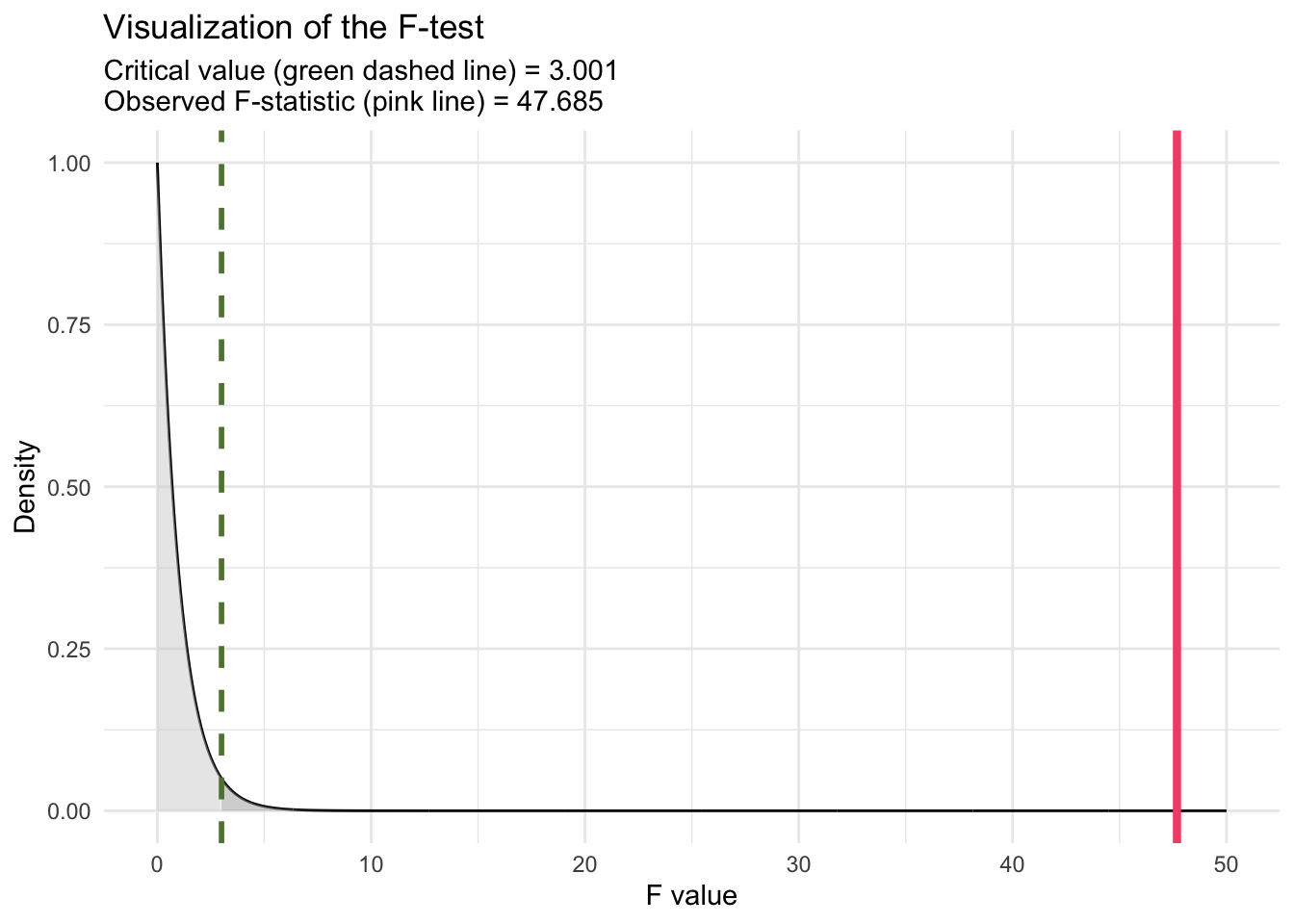
The \(R^2\) value of 0.0519627 indicates that approximately 5.2% of the variance in WTP is explained by the model. While this suggests the additive effects of these two predictors can explain a portion of the variability in WTP, a substantial amount of variance remains unexplained.
The F-statistic of 47.68541 (labeled statistic in the glance() output) and its associated p-value of approximately \(6.89 \times 10^{-21}\) test the null hypothesis that none of the predictors in the model have an effect on WTP. The extremely low p-value leads us to reject this null hypothesis, concluding that the model, as a whole, significantly explains variance in WTP beyond what would be expected by chance. This finding underscores the combined contribution of interval_CI and text_extra to predict WTP, despite the latter’s individual non-significance. In discussing the F-statistic of 47.68541 for the model, which includes two predictors (interval_CI and text_extra) with a sample size of n = 1743, it’s insightful to understand how the critical value of F is determined for conducting the F-test (akin to the critical value of t and the t-statistic that we used to determine statistical significance for the regression slopes). The critical value is a threshold used to decide whether the observed F-statistic is large enough to reject the null hypothesis at a given significance level, typically denoted by alpha. This value is obtained from the F-distribution, which depends on the df of the model (number of predictors) and the degrees of freedom of the error/residuals (n - 1 - p). For our model (called model1), with two predictors and n = 1,743, the df for the numerator of the F-test is 2 and the df for the denominator of the F-test is 1,740. These df values are listed in the glance() output as df and df.residual respectively. To find the critical value for the F-test, we can use the qf() function. For alpha = 0.05, we compute:
qf(0.95, df1 = 2, df2 = 1740)[1] 3.000896This function returns the critical value from the F-distribution such that 95% of the distribution lies below it. If the calculated F-statistic from our regression model exceeds this critical value, we reject the null hypothesis. This indicates that at least one predictor in the model explains a significant amount of variability in the outcome variable, beyond what would be expected by chance.
For our model (model1), with an F-statistic of 47.68541, comparing this value to the critical value obtained from qf() determines the statistical significance of the model predictors collectively. Our calculated F-statistic of 47.68541 clearly exceeds the critical value of F (3.000896), Thus, it is evident without specific calculation that our F-statistic far exceeds the critical threshold, leading to rejection of the null hypothesis. This confirms that the predictors, as a whole, significantly explain variance in WTP beyond what would be expected by chance.
To calculate the p-value for an F-test manually using R, we can utilize the pf() function, which gives the cumulative distribution function (CDF) for the F-distribution. This function is useful for determining the probability of observing an F-statistic as extreme as, or more extreme than, the one calculated from our data, under the null hypothesis.
pf(q = 47.68541, df1 = 2, df2 = 1740, lower.tail = FALSE)[1] 6.88843e-21This is the same p-value printed for the F-test in the glance() output (with a slight difference due to rounding).
We can visualize the test as follows:
Note
The overall F-statistic reported in the glance() output tests whether the regression model as a whole explains a significant amount of variance in the outcome. It can be computed in two equivalent ways: from the model’s \(R^2\) value or from the ANOVA sums of squares.
(1) Using \(R^2\):
\[ F = \frac{(R^2 / p)}{((1 - R^2) / (n - p - 1))} \]
where
- \(R^2\) = proportion of variance explained by the model,
- \(p\) = number of predictors,
- \(n\) = sample size.
For model1, \(R^2 = 0.05196\), \(p = 2\), and \(n = 1743\):
R2 <- 0.0519627
p <- 2
n  <- 1743

F_R2 <- (R2 / p) / ((1 - R2) / (n - p - 1))
F_R2
[1] 47.68541✅ Output: 47.68541 — identical to the overall F-statistic in the glance() output.
(2) Using sums of squares (from ANOVA):
The ANOVA table partitions total variability into:
Regression (Model) Sum of Squares (SSR) — variability explained by the predictors, and
Residual (Error) Sum of Squares (SSE) — unexplained variability.
\[ F = \frac{(SSR / p)}{(SSE / (n - p - 1))} \]
We can get the ANOVA output with:
model1 |> anova()Then,
SSR <- 251880.0909 + 186.4854   # Sum of squares for both predictors
SSE <- 4598847.0978 # Residual sum of squares
p <- 2
n <- 1743

F_SS <- (SSR / p) / (SSE / (n - p - 1))
F_SS
[1] 47.68541Interpretation:
Both methods show that the model explains significantly more variance in WTP than would be expected by chance (F(2, 1740) = 47.69, p < .001). This test of the model’s \(R^2\) confirms that at least one of the predictors — interval_CI or text_extra — contributes meaningfully to explaining participants’ willingness to pay.
Model 2
Next, we explore an alternative specification of our regression model to deepen our understanding of the experimental effects. Rather than treating the two experimental condition indicators — interval_CI and text_extra — as having independent effects on the outcome variable (wtp_final), we introduce an interaction term between these predictors. This approach allows us to investigate whether the impact of one experimental condition on participants’ willingness to pay for the special boulder depends on the level of the other condition. This is a common type of model fit for a 2 by 2 factorial design.
Incorporating an interaction term into the regression model acknowledges the possibility of a synergistic or conditional relationship between viewing confidence intervals (CI) versus prediction intervals (PI) and the presence of additional explanatory text.
To fit the model with the interaction, we modify our Model 1 code to fit a second model as follows:
model2 <- lm(wtp_final ~ interval_CI*text_extra, data = df)

model2 |>
  tidy(conf.int = TRUE, conf.level = 0.95)
model2 |>
glance() Let’s begin with the tidy() output:
The estimated intercept is 49.6 ice dollars. This represents the baseline average WTP for participants who were exposed to the Prediction Interval (PI) visualization without any additional explanatory text, as both interval_CI and text_extra are coded as 0 for this group.
The coefficient for interval_CI is significantly positive at 29.4 ice dollars. This indicates that, among participants who saw just the standard text (i.e., text_extra == 0), participants viewing a CI visualization, as opposed to a PI visualization, were willing to pay an additional 29.4 ice dollars for the special boulder. The significance of this coefficient (p-value ≈ \(2.10 \times 10^{-17}\)) strongly suggests that the type of statistical interval presented has a meaningful impact on participants’ valuation when no extra/supplementary text is provided.
The coefficient for text_extra is 4.8 ice dollars, suggesting a positive but non-significant effect of including additional explanatory text alongside the visualization on WTP among people who saw the PI visualization (i.e., interval_CI == 0). However, given its p-value (≈ 0.17), this increase does not reach statistical significance.
The interaction term has an estimated coefficient of -11.0 ice dollars, significant at the p-value of ≈ 0.026. This finding indicates that the effect of presenting a CI visualization is moderated by the addition of extra text. Specifically, this coefficient represents the difference in the effect of seeing a CI versus a PI for people who saw extra text as compared to just the standard text. Since the estimate of 29.4 for interval_CI represents the effect of seeing a CI as opposed to a PI if the text included only information about the visualization (i.e., text_extra = 0), then to calculate the estimated slope for the effect of CI if the text included information about both types of intervals (i.e., text_extra = 1), we compute 29.365514 + -10.963395 = 18.4. Thus the boost in WTP obtained by presenting a CI vs. a PI is attenuated if the text included with the visualization contains information about both CIs and PIs. That is, the optimism that participants gain by seeing a CI can be attenuated if the text provides information about CIs and PIs to put the CI in context.
We can use the marginaleffects package to perform these simple slope calculations for us via the slopes() function that we learned about in Module 14. The table below provides us with the effect of type of interval on WTP when the participant received only the visualization text and when the participant received the extra text. Notice the estimate matches what we calculated by hand above, with the added benefit here that we also get a standard error for the simple slopes as well as a 95% CI.
slopes(model2,
       variables = "interval_CI", by = "text_extra", conf_level = 0.95, df = "residual") |>
  as_tibble() |>
  select(term, text_extra, estimate, std.error, conf.low, conf.high)
Overall model summary
Turning to the glance() output, which offers a comprehensive summary of the model’s performance and overall significance, we find that:
With a \(R^2\) value of 0.05464827, the model explains approximately 5.5% of the variance in WTP. This modest value indicates that while our model captures a certain amount of variability in WTP, there remains a significant portion of variance unaccounted for. Recall that the \(R^2\) for the model without the interaction was 0.05196, thus, the increase in \(R^2\) is quite small.
The F-statistic of 33.50899, with an accompanying p-value of ≈ \(4.72 × 10 − 21\), provides strong evidence against the null hypothesis that the model with predictors (including the interaction term) does not improve the explanation of variance in WTP over a model with no predictors. This result underscores the statistical significance of the model as a whole, indicating that the predictors, collectively, have a meaningful effect on WTP.
Compare the two fitted models
We can compare two nested linear models via a partial F-test. To do so, we use the anova() function. Two models are considered nested when one model (the simpler or reduced model) is a special case of the other model (the more complex or full model) because it contains a subset of the predictors used in the more complex model. In other words, the simpler model can be obtained by constraining some of the parameters (e.g., coefficients of predictors) in the more complex model to be zero.
The anova() function performs a hypothesis test to determine if the more complex model (with more predictors, including interaction terms) provides a significantly better fit to the data than the simpler model.
The null hypothesis in this setting is that the two models are equivalent, and the alternative hypothesis is that the fuller model fits significantly better than the simpler model. Because Model 1 is nested within Model 2 in our example, we can compare them using a partial F-test. The partial F-test is particularly useful for testing the significance of one or more variables added to a model.
The df for the partial F-test are calculated a bit different than for a tradition F-test. The df for the numerator (\(df_{1}\)) of the F-statistic correspond to the difference in the number of parameters estimated between the more complex model and the simpler model.
- Formula: \(df_{1} = p_{complex} - p_{simple}\)
- Where:
- \(p_{complex}\) is the number of parameters (including the intercept) in the more complex model.
- \(p_{simple}\) is the number of parameters (including the intercept) in the simpler model.
For example, Model 1 has 3 parameters (intercept and two slopes) and the more complex model has 4 parameters (intercept and three slopes), therefore, \(df_{1} = 4 - 3 = 1\).
The degrees of freedom for the denominator (\(df_{2}\)) relate to the residual error in the more complex model. It reflects the amount of data available after accounting for the estimated parameters.
- Formula: \(df_{2} = n - p_{complex}\)
- Where:
- \(n\) is the total number of observations in the data.
- \(p_{complex}\) is the number of parameters in the more complex model.
For example, we have 1,743 observations and the more complex model has 4 parameters, therefore, \(df_{2} = 1743 - 4 = 1739\).
The calculated \(df_{1}\) and \(df_{2}\) are used to determine the critical value of the F-distribution for the significance level of the test (e.g., \(\alpha = 0.05\)). For our partial F-test, the numerator df is 1, and the denominator df is 1739, thus our critical value of F is:
qf(0.95, df1 = 1, df2 = 1739)[1] 3.846812If our partial F-test exceeds this value, then we will reject the null hypothesis that the two models are equivalent.
Given our two models, model1 (simpler model without interaction terms) and model2 (more complex model with interaction terms), the partial F-test can be conducted as follows:
anova(model1, model2)This command compares the two models, model1 and model2, where model1 is nested within model2 because model2 includes all the predictors in model1 plus additional terms (e.g., the interaction between interval_CI and text_extra). The anova() function will output a table that includes the F-statistic and the associated p-value for the comparison.
Interpreting the Results:
- F-statistic: This value measures the ratio of the mean squared error (MSE) reduction per additional parameter in the more complex model to the MSE of the simpler model. A higher F-statistic indicates that the additional parameters in the more complex model provide a significant improvement in explaining the variability in the response variable. The F-statistic (4.940184) exceeds the critical value of F (3.846812), thus we can reject the null hypothesis — the model with the interaction term fits significantly better than the model without the interaction term.
- p-value: The p-value of 0.02636741 indicates that the improvement in model fit due to adding the interaction term is statistically significant at the 5% significance level (i.e., alpha = 0.05). This suggests that the interaction between the two variables has a meaningful impact on the outcome.
It is of interest to note that the Partial F-test in this example essentially tests the same hypothesis as the t-test for the interaction term coefficient in Model 2. The equivalence of these tests is evident in the matching p-value of 0.02637 for both the interaction term’s significance in Model 2 and the partial F-test comparing Model 1 and Model 2. Furthermore, squaring the t-statistic for the interaction term in Model 2 yields the F-statistic observed in the partial F-test (i.e., \(-2.222653^2 = 4.940184\)), reinforcing their conceptual similarity and the direct relationship between these statistics in testing the importance of the interaction term.
This analysis underscores the value of including interaction terms in regression models when hypothesizing that the effect of one predictor on the outcome variable may depend on the level of another predictor. The significant p-value associated with the interaction term, mirrored by the partial F-test, indicates that the effect of viewing a CI, rather than a PI, on WTP is indeed moderated by whether or not the figure has additional text to describe both types of intervals, offering nuanced insights into how these factors jointly influence participants’ WTP.
We can use the marginaleffects package to plot the results.
# --- Get predicted means for all combos of interval_CI and text_extra ---
pred <- predictions(
  model2,
  by = c("interval_CI", "text_extra")   # balanced 0/1 combos
)

# --- Clean labels for plotting (coerce 0/1 to factors for nice legends/axes) ---
pred_plot <- pred |>
  mutate(
    interval_CI = factor(interval_CI, levels = c(0, 1), labels = c("No", "Yes")),
    text_extra  = factor(text_extra,  levels = c(0, 1), labels = c("No", "Yes"))
  )

# --- Plot: points + lines + 95% CIs ---
pred_plot |>
  ggplot(mapping = aes(x = interval_CI, y = estimate, group = text_extra, color = text_extra)) +
  geom_point(position = position_dodge(width = 0.2), size = 3) +
  geom_line(position = position_dodge(width = 0.2), linewidth = 0.7) +
  geom_errorbar(aes(ymin = conf.low, ymax = conf.high),
                width = 0.08,
                position = position_dodge(width = 0.2)) +
  theme_minimal() +
  labs(
    title = "Differential effect of viewing a CI (versus a PI) when\nextra/supplemental text is offered",
    x = "Saw a CI",
    y = "Willingness to pay (ice dollars)",
    color = "Saw extra text"
  ) +
  theme(legend.position = "bottom")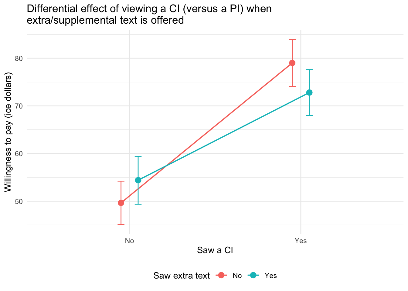
The type of plot participants viewed (CI vs. PI) had a clear impact on their willingness to pay: those who saw a CI plot were more willing to pay than those who saw a PI plot.
However, this effect was moderated by the presence of extra explanatory text. Specifically:
When participants did not receive extra text, the effect of seeing a CI (versus a PI) was strongest — willingness to pay increased substantially.
When participants did receive extra text, the difference between the CI and PI groups was still present but less pronounced.
This pattern suggests that extra text may reduce the persuasive power of CI plots or narrow the gap between how people respond to CI versus PI visualizations. In this way, extra text acts as a moderator, softening the influence of interval type on willingness to pay.
Recap of these ideas
To recap these ideas, please take a moment to watch the following two Crash Course Statistics videos — one that focuses on ANOVA and the other that considers group interactions.
Learning Check
After completing this Module, you should be able to answer the following questions:
- What is the difference between the null hypothesis and the alternative hypothesis?
- How do we interpret a p-value in the context of a hypothesis test?
- What does it mean to reject the null hypothesis? What does it mean to fail to reject it?
- What are Type I and Type II errors, and how are they related to alpha and power?
- How do we choose the appropriate test statistic for a hypothesis test?
- What is the role of the critical value and rejection region in a hypothesis test?
- How can we estimate the standard error using bootstrap and parametric methods?
- What does the confidence interval tell us about the parameter we are estimating?
- How does Cohen’s d help us interpret the magnitude of a group difference?
- How do we interpret the F-statistic for the overall model and compare nested models using a partial F-test?
Credits
I drew on the excellent books Statistical Inference via Data Science A ModernDive into R and the Tidyverse by Drs. Chester Ismay, Albert Kim and Arturo Valdivia and Statistical Rethinking by Dr. Richard McElreath to create this Module.