A webR tutorial
The Comeback Kids — Part II

Import the data
Before we begin, please press Run Code on the code chunk below to import the data.
The scenario
You are a scientist who studies intergenerational health. You are interested in exploring similarities and differences between mothers and daughters. Right now, you are studying similarity in a rather mundane variable — height. You have a data frame of 5524 mother-daughter pairs.The data frame is called mom_daughter_heights. The height of moms is stored in a variable called mother_height and the height of the daughters is stored in a variable called daughter_height. Both are recorded in inches.
To begin, create a scatter plot of mom and daughter heights — put mom’s height on the x-axis and daughter’s height on the y-axis. Rather than using geom_point(), please use geom_jitter(). This function adds random noise (jitter) to the points in a scatter plot to reduce overplotting, which occurs when multiple points have the same or very similar coordinates and overlap each other. This is helpful in this instance because heights in the data frame were rounded to the .5 inch. Also add a best fit line.
Important
Without fitting the regression model — what is your best guess for the regression slope?
Fit model
Now, let’s fit the regression model — regress daughter_height on mother_height. Since a score for 0 makes no sense for the predictor, let’s center BOTH mother_height and daughter_height at the mean first. Then, use these centered versions of the variables to fit the regression model. Request the tidy() output.
Important
Take a moment to interpret the intercept and slope here. Jot down your interpretation and share your answer with your neighbor.
Model interpretation
Intercept:
- The estimate for the intercept is effectively 0. This makes sense because both the mother’s and daughter’s heights were centered at the mean. When both variables are centered, the intercept represents the expected value of the daughter’s height when the mother’s height is at its mean (which is 0 after centering).
Slope for mother’s height:
The coefficient for mother’s height (centered) is 0.545. This means that for each one-inch increase in the mother’s height above the mean, the daughter’s height is expected to increase by 0.545 inches.
In other words, there is a positive relationship between the mother’s and daughter’s heights: on average, a 1-inch increase in the mother’s height corresponds to an expected 0.545-inch increase in the daughter’s height.
For example, if a mother is 2 inches taller than the average mother, her daughter’s expected height would be:
Predicted increase = 0.545 × 2 = 1.09
So, the daughter would be expected to be about 1.09 inches taller than the average daughter.
A Puzzling Scenario
At first glance, the regression slope of 0.545 might seem puzzling. If tall mothers have daughters who are somewhat tall, and short mothers have daughters who are somewhat short, does that mean daughters are always more “average” than their mothers? If that pattern continued over generations, wouldn’t everyone eventually converge toward the same height?
For example, a mother who is 8 inches taller than average is predicted to have a daughter only about 4 inches taller than average. Her granddaughter would be predicted to be only about 2 inches taller than average, and so on — getting closer to the mean with each generation.
But that’s not what we see in reality. These data were collected by Karl Pearson and published in 1903, and people’s heights remain just as variable as ever.
The key insight is that regression toward the mean applies to the predicted value, not to actual individuals across generations. While the predicted daughter height is closer to the average than the mother’s height, the actual daughter’s height still varies because of random error (unexplained variation). This natural variability prevents the population from collapsing toward a single average.
In short:
Predictions regress toward the mean.
But real-world variability keeps the overall spread of heights stable over time.
Mother’s at the extremes
To build intuition, let’s consider mothers at the extreme for height.
The mean height for mothers in the data set is 62.5 inches. Let’s consider very short mothers (52.5 inches, or a centered score of -10), and very tall mothers (72.5 inches, or a centered score of +10).
First, consider a mother who is 10 inches shorter than the mean. What is the predicted height (centered at the mean) for her daughter?
\[ \text{Predicted Daughter’s Height (centered)} = 0.00 + (0.545 \times -10) = -5.45 \]
This means that the daughter is predicted to be 5.45 inches shorter than the average daughter’s height.
We observe regression to the mean here: the daughter of a very short mother (10 inches below the mean) is predicted to be shorter than average, but not by as much as her mother. The daughter is predicted to be only 5.45 inches shorter than average, rather than 10 inches, indicating a pull toward the mean height.
Now, consider a mother who is 10 inches taller than the mean. What is the predicted height (centered at the mean) for her daughter?
\[ \text{Predicted Daughter’s Height (centered)} = 0.00 + (0.545 \times 10) = 5.45 \]
This means that the daughter is predicted to be 5.45 inches taller than the average daughter’s height.
We observe regression to the mean here as well: the daughter of a very tall mother (10 inches above the mean) is predicted to be taller than average, but not by as much as her mother. The daughter is predicted to be only 5.45 inches taller than average, rather than 10 inches, again showing a pull toward the mean height.
The Regression Fallacy
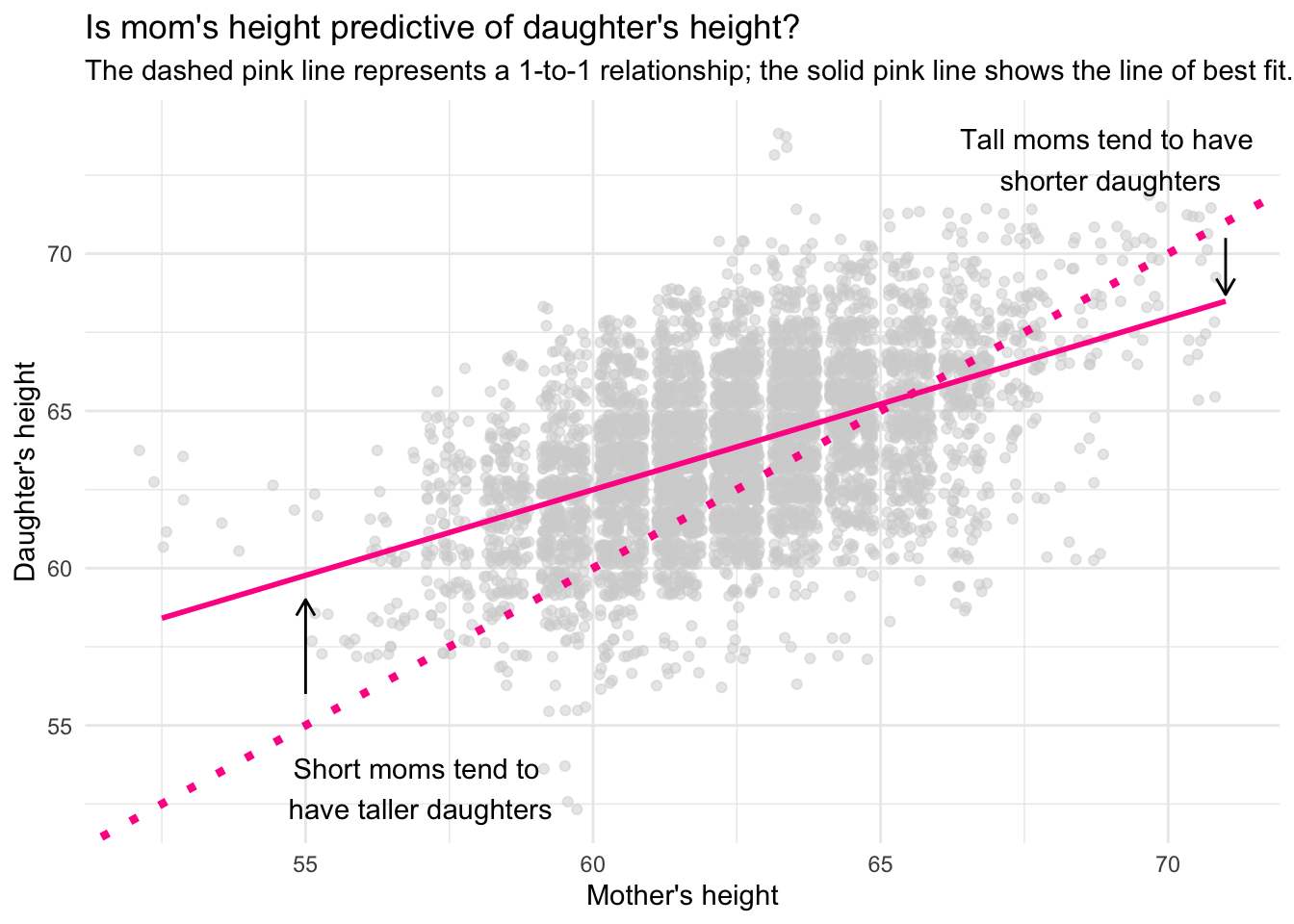
The phenomena that we have observed here, regression to the mean, is depicted in the graph below:
Graph Explanation
In the graph, we’re looking at the relationship between mothers’ and daughters’ heights. On the x-axis, we have the mother’s height, and on the y-axis, we have the daughter’s height. The gray points represent individual mother-daughter pairs, showing their respective heights.
I’ve plotted two important lines on the graph:
Dashed pink line: This is a 1-to-1 line. If a point fell directly on this line, it would mean that the daughter’s height is exactly the same as the mother’s height. For instance, a mother who is 70 inches tall would have a daughter who is also 70 inches tall.
Solid pink line: This is the regression line, or the line of best fit, which summarizes the general trend in the data. It represents the average predicted relationship between the mother’s and daughter’s heights based on the data.
Regression to the Mean
Now, let’s talk about the key concept we’re demonstrating here: regression to the mean. This is an important idea in statistics, and it explains why the daughters of very tall mothers tend to be somewhat shorter than their mothers, and why the daughters of very short mothers tend to be somewhat taller than their mothers.
In the graph, we see that the slope of the regression line is less than 1, specifically around 0.54. This slope tells us that for every additional inch of height a mother has above the average, the daughter’s predicted height increases by only about 0.54 inches, not the full inch.
Likewise, for every inch a mother is below the average height, the daughter’s predicted height decreases by only 0.54 inches, not the full inch. In other words, extreme values (very tall or very short mothers) tend to have daughters whose heights are closer to the population mean — that is, they regress toward the mean.
What does this mean in simple terms?
Tall mothers tend to have shorter daughters: If a mother is much taller than the average (let’s say 72 inches), the daughter is likely to be tall too, but not as tall as her mother. Instead of inheriting the full extra height of her mother, she’s predicted to be about half an inch shorter for every inch her mother exceeds the average. This is why the solid pink line is below the dashed 1-to-1 line for tall mothers — daughters of tall mothers are “pulled” back toward the average height.
Short mothers tend to have taller daughters: Similarly, if a mother is much shorter than average (let’s say 58 inches), her daughter is predicted to be taller than her mother, but not as tall as average. Again, the daughter’s height is pulled toward the mean, so while she’s still shorter than most people, she’s predicted to be taller than her very short mother. This explains why the solid pink line is above the 1-to-1 line for shorter mothers — daughters of short mothers are “pulled” upwards, closer to the average height.
Why does this happen?
The reason this happens lies in the concept of regression to the mean. Extreme values (like very tall or very short heights) are likely influenced not only by genetic factors but also by random variation or environmental influences. Over time, these extreme traits tend to “regress” toward the average in subsequent generations, meaning that the extreme height of a parent doesn’t fully carry over to the child.
The 0.54 slope reflects this pull towards the mean. If the slope were exactly 1, there would be no regression to the mean, and daughters’ heights would be identical to their mothers’. However, because the slope is less than 1, the daughters’ heights are predicted to be less extreme than their mothers’ heights — closer to the average height of the population.
Whenever predictions are less than perfect in a stable environment, a statistical phenomenon called regression to the mean naturally occurs. This happens because random variability causes extreme observations to be less extreme when measured or predicted again. This effect is not due to any substantive change in the underlying process but is a result of the random errors in predictions. When extreme values are observed, they are likely due in part to randomness, and on subsequent measurements or predictions, these values tend to “regress” or move toward the population mean. Regression to the mean underscores the importance of accounting for randomness in data analysis and should not be misinterpreted as a meaningful change or causal relationship.