| Variable | Description |
|---|---|
| id | Inmate ID |
| years | Sentence length in years. |
| black | A binary indicator of race (Black = 1, White = 0). |
| primlev | A rating of the seriousness of the primary offense resulting in arrest. |
A webR tutorial
Categorical Predictors and Interaction Terms in MLR Models

Import the data
Before we begin, please press Run Code on the code chunk below to import the data.
A bit about the study
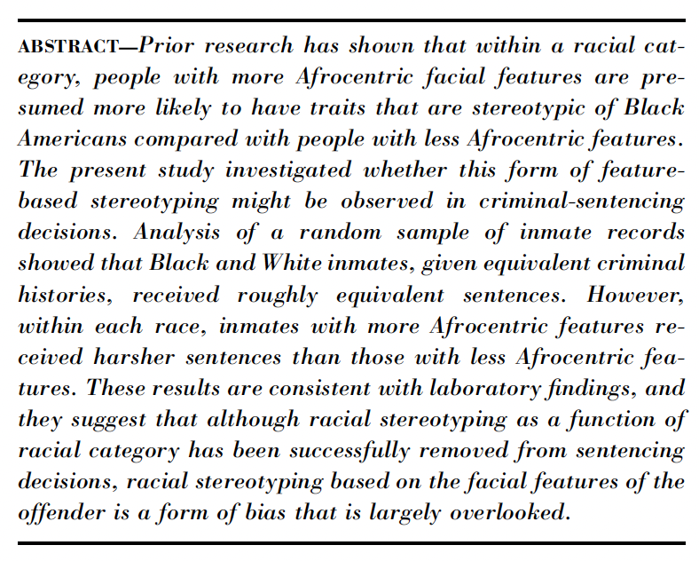
In this activity, we will use data from the study titled “The Influence of Afrocentric Facial Features in Criminal Sentencing” by Irene Blair and colleagues.


Here, we’ll use the data to explore the inclusion of categorical predictors in regression models, as well as the inclusion of interaction terms between predictors in a multiple linear regression model.
We’ll consider the following variables in this WebR activity:
Along the way, we will explore the question: Is there a difference in sentence length by race?
Part I: Visuzalize the data
Explore the distribution of the outcome
To begin, let’s take a look at the outcome variable in the Blair et al. study — sentence length in years. The variable is called years. Please create a density plot of years in the code chunk below. Be sure to include a title and axis labels.
You can see that the distribution has a very long right hand tail (i.e., skewed to the right or positive skew). Over the coming weeks we will work with the Blair et al. data — carefully exploring various elements of the analyses that the authors conducted in their paper. One important element that we’ll study in Module 15 is the need to apply a non-linear transformation to years. For now, we’ll transform the variable and use the transformed version in our analysis — but we won’t worry about the details of why just yet.
Please press Run Code on the code chunk below — which creates a new variable called lnyears. This new variable is the natural log of years1.
Then, below the code to create the transformed variable, produce a new version of the density plot. Put lnyears on the x-axis (you can copy and paste your code from the last code chunk and change the variable on the x-axis if you like).
Take notice of how the distribution of sentence length, as well as the range of the variable on the x-axis, has changed from the original variable to the transformed variable.
Create a factor for race
For our exploration of categorical predictors, we need a factor version of the race variable for our analysis. In the code chunk below, please create a new variable called black.f, based on the variable called black (recall that for this variable 0 = “White” and 1 = “Black”).
When creating the black.f variable, you’ll need to transform the numeric variable black into a factor, which is R’s way of dealing with categorical data. To do this:
Use mutate() to add or modify variables in the dataset.
Use the factor() function to convert the numeric values into categorical values.
Set the
levels =argument to correspond to the numeric codes (e.g., 0 and 1) — e.g.,levels = c(0,1).Assign meaningful labels (e.g., “White” for 0 and “Black” for 1) using the
labels =argument — e.g.,labels = c("White", "Black").
Basically, you’re telling R: “Hey, this isn’t just a 0 and 1 anymore — these numbers mean something!”
Examine the distribution of lnyears by race
Now, we’re ready to create a density plot grouped by race. In the code chunk below, create a plot that shows the distribution of lnyears as a function of race. Use your new factor variable called black.f. To accomplish this task, to the density graph last created, add fill = black.f as an argument to the aes() function. Also, add alpha = 0.5 as an argument to geom_density(). Write your code in the code chunk below and press Run Code to see the result.
An alternative view
For an alternative look at the data, please press Run Code on the code chunk below to create a jittered plot of lnyears by race. I also marked the mean of each group with a black circle using the useful stat_summary() function.
Compute the mean and sd of lnyears by race
As a final step in this section, please compute the mean and standard deviation of lnyears by race.
To summarize the data by the factor variable black.f, use group_by() to split the dataset by each level of the factor and summarize() to compute summary statistics. In this case, calculate the mean and standard deviation of lnyears for each group.
Take a moment to study the jittered version of the graph, and map the means just computed onto the graph. Confer with your neighbor. Without actually fitting the model, give some thought to what a SLR equation would look like to relate lnyears to the dummy-coded version of black. That is, using the means from the output — can you determine the intercept and slope for a model where lnyears is regressed on black?
Part II: Fit a SLR
Now that we’ve visualized the data, let’s fit some models.
Use the dummy-coded version of race
First, fit a simple linear regression (SLR) model to examine the difference in lnyears as a function of race. Use the dummy-coded version as a predictor, black. Call the model lm_dummy. Request the tidy() output — request the 95% CI for the estimates. Also, request the glance() output.
Use the factor version
Now, replace black with the factor version of the variable: black.f. Call the model lm_factor.
Rotate the reference group
Finally, for our last SLR, create a new version of the factor which changes the reference group from White inmates to Black inmates (call the new version white.f). You can use the following code to do this: mutate(white.f = relevel(black.f, ref = "Black")). Then, refit the model with the releveled factor. Call the model lm_factor_rotate.
Study the three outputs and notice what remains the same and what changes. Discuss what you notice with your neighbor.
Part III: Unadjusted and adjusted means
Unadjusted means
For this section, we’ll build on the SLR that utilizes black.f as the predictor. Recall from Module 13 that we can use the marginaleffects package to compute means, standard errors, and confidence intervals for model predictions. Study the set up for computing the unadjusted means for lnyears for White and Black inmates using our fitted model. Then press Run Code to obtain the results.
This code computes unadjusted means for each race group based on the linear model lm_factor, which predicts log sentence length (lnyears) using race (black.f) as a predictor. Here’s how the code works step by step:
Extracting Degrees of Freedom: The use of insight::get_df() is critical for ensuring that the correct degrees of freedom are applied when calculating the confidence intervals for the predicted means.
Generating Predictions: The predictions() function generates the predicted lnyears for each race group. The
newdataargument is set using datagrid(), which specifies that predictions should be computed for both levels of black.f (i.e., unique levels of the factor) —"White"and"Black". This means we are computing the predicted mean log sentence length for each group based on the model’s coefficients, without adjusting for any other variables.Confidence Intervals: The
conf.levelis set to 0.95 to generate 95% confidence intervals around the predicted means. The width of these intervals depends on the critical value of t associated with the proper degrees of freedom, which, as mentioned earlier, are handled by extracting the value from get_df(). This ensures that the intervals reflect the uncertainty associated with the model’s predictions given the sample size and the number of estimated parameters.Create a Tibble of the Results: as_tibble() converts the results into a tibble (a tidyverse-friendly data frame). By converting the output into a tibble, we ensure that the results are neatly formatted and easier to work with if we need to manipulate them (e.g., merge with other data or use them to compute other statistics).
Notice that we’ve simply reproduced the means that we obtained earlier.
Adjusted means
Now, let’s build on the lm_factor model. In this model, we will add an additional predictor — severity of the primary offense (primlev). In the code chunk below, please center primlev at the mean in the sample and call the new variable primlev.c. Then fit a new model that adds primlev.c as an additional predictor. Call the new model lm_factor_primlev. Try to do this on your own, but you can get a hint if needed.
Study the model output and jot down your thoughts on how the parameter estimates should be interpreted. Then, compare notes with your neighbor.
After fitting the model, copy and paste the code to create the unadjusted means based on the model called lm_factor in the code chunk below. We now want to use our new model, lm_factor_primlev, to obtain adjusted means — namely, the means for lnyears for Black and White inmates holding constant the severity of the primary offense at the mean. To accomplish this, we need to change a few things.
First, change unadjusted_means to adjusted_means. Also, change the inputted model from lm_factor to lm_factor_primlev.
Additionally, we need to indicate at what level we want to hold primlev.c when computing the adjusted means. We’ll use the mean. To accomplish this, after black.f = unique, put a comma then return and add: grid_type = "mean_or_mode". The option tells datagrid() how to handle other predictor variables in the model. By specifying = "mean_or_mode", we tell the predictions() function to hold all other variables at the mean (if continuous) or at the mode (if categorical).
Try to do this on your own, but you can get a hint if needed.
Study the unadjusted and adjusted means and note any changes.
Plot of adjusted model
As a final step for this section, please study the code below, which uses the plot_predictions() function from the marginaleffects package to plot results of the fitted model (lm_factor_primlev). Press Run Code on the code chunk below to accomplish this task.
The code starts by using plot_predictions() to generate a plot based on the linear model lm_factor_primlev. The function is designed to visualize the predicted relationship between the predictor variables and the outcome variable from the fitted model.
The argument condition = list(primlev.c = seq(-5.5, 4.5), black.f = unique) specifies the conditions for which the predictions will be plotted:
- For primlev.c, the function will plot predictions across its entire range (from the minimum (~-5.5) to the maximum severity of the offense (~4.5)).
- For black.f, it will plot predictions for each unique race group, “White” and “Black”, allowing us to visualize the relationship between offense severity and log sentence length for each race group.
Additionally, the code uses geom_point() to add the raw data points to the plot. This visualizes the actual observed data alongside the fitted predictions.
With your neighbor, map the estimates from the MLR model to the plot you just created. How does the intercept and the two slopes show up on the plot?
Part IV: Non-parallel slopes
In the model that we just fit, we made the assumption that the slope for the effect of severity of the primary offense on log sentence length are the same for White and Black Inmates. We can allow for the possibility that the slopes are non parallel by adding an interaction term between the variables black.f and primlev.c. You learned about this in Module 14.
Fit the model
In the code chunk below, please fit the moderation model to allow the effect of primlev.c on lnyears to vary by black.f. Call this new model lm_inter. Recall that you simply need to add an asterisk between the two predictors to denote an interaction: lm(lnyears ~ black.f*primlev.c, data = df). Be sure to request the tidy() (with 95% CI) and glance() output.
Take a moment to study the output, and jot down your thoughts on how to interpret these effects. This model is very similar to the WIF and zygosity model that you studied in Module 14.
Create a plot of the fitted model
After fitting the model with the interaction term, copy and paste the code to create the parallel slopes graph that we created under the heading “Plot of adjusted model” into the code chunk below. Swap out the name of the regression model object being fed into plot_predictions() to lm_inter. Also, add a subtitle to this graph, for example, subtitle = "Is the effect of severity of crime the same for Black and White inmates?".
Take a moment to study the graph. Does it appear that the slopes are different?
Compute the slopes for each group
Last, let’s use the slopes() function from the marginaleffects package to compute the slopes for each group. You learned about this function in Module 14.
Study the code, and then click Run Code to obtain the results.
The slopes() function from the marginaleffects package is used to compute slopes of interest from a fitted regression model. The arguments variables and by in the context of the slopes() function have specific roles:
variables: This argument specifies the predictor(s) for which you want to calculate the slope(s). In this case, primlev.c. The slope represents the rate of change in the outcome variable per unit change in this predictor. By passing primlev.c, we are requesting the slope estimates for this particular predictor.
by: This argument defines the grouping variable, typically a factor, by which you want to stratify the slope calculations. The function will calculate separate slopes for primlev.c within each level of black.f. This allows us to explore how the relationship between primlev.c and the outcome differs across different groups defined by black.f.
Take a moment to study the output and jot down your thoughts. Compare notes with your neighbor. Then, map the estimates from the MLR model to the plot you created for the model with the interaction term. How does the intercept and the three slopes show up on the plot?
Footnotes
I named this variable lnyears because ln is an abbreviation of natural log.↩︎