A webR tutorial
Explore adult social media users and where they get news
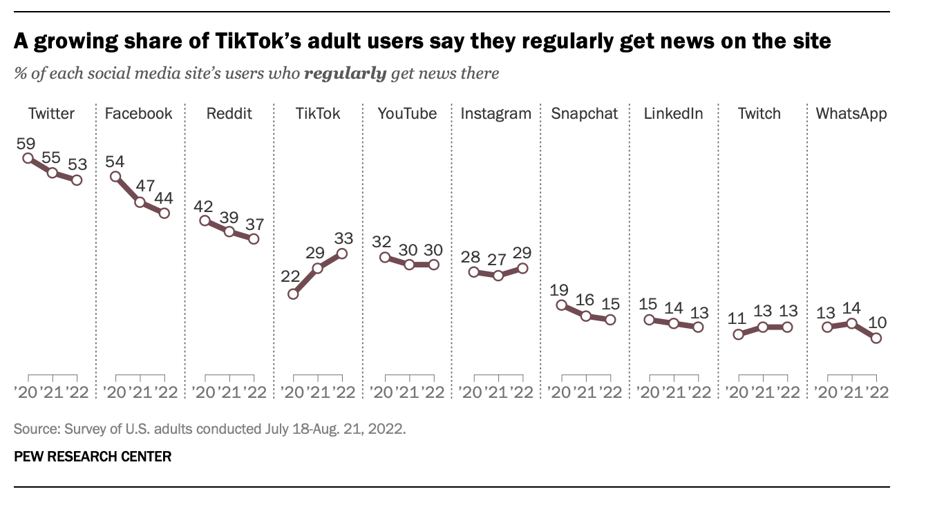
In this tutorial we will recreate the following graph from the Pew Research Center. But, to keep things simple, we’ll consider just Twitter, Facebook, TikTok, and Instagram.

Create data frame
To begin, we need to create a data frame that includes the data needed to reproduce the graph. We’ll copy this from the original graph. We can create a vector that contains the percent of people who get their news from each platform. A vector in R is a basic data structure that holds a sequence of values, all of which must be of the same type (such as numeric, character, or logical). Think of a vector as a list of items that are all of the same kind. The c() function in R is used to combine or concatenate values into a vector.
Please consider this example:
twitter <- c(59, 55, 53)
In this code, c(59, 55, 53) takes the numbers 59, 55, and 53 and combines them into a single vector named twitter. Recall the <- is the assignment operator for R — so this means that we’re assigning the numbers 59, 55, and 53 to an object (i.e., a vector) named twitter.
The vector for twitter is finished below. Please finish facebook, tiktok, and instagram, then click Run Code to create the vectors.
Once all of the vectors are created, we can combine them into a data frame as follows. Please click Run Code to create the data frame.
If you’re curious, here’s a detailed breakdown of this code:
Creating a Data Frame:
- The code is creating a new data frame named pew_data using the tibble() function. A tibble is a modern version of a data frame provided by the tibble package, which is part of the tidyverse suite of packages. Tibbles are designed to be more user-friendly and efficient than traditional data frames.
Defining Columns:
The data frame pew_data is structured with multiple columns, each corresponding to a different social media platform (e.g., twitter, facebook, etc.).
The first column, year, is explicitly created within the tibble() call, with the values
c(20, 21, 22)representing the years 2020, 2021, and 2022.
Assigning Values to Columns:
The columns for each social media platform are assigned values that come from vectors you previously defined.
Each vector contains the percentages of users who regularly get news from that platform for the years 2020, 2021, and 2022.
For example:
twitter = twitterassigns the vector twitter to the twitter column in the data frame.
Combining Everything Together:
- The tibble() function combines these vectors into a single data frame (pew_data) where each column represents a social media platform, and each row represents a year.
Reshape the data frame from wide to long
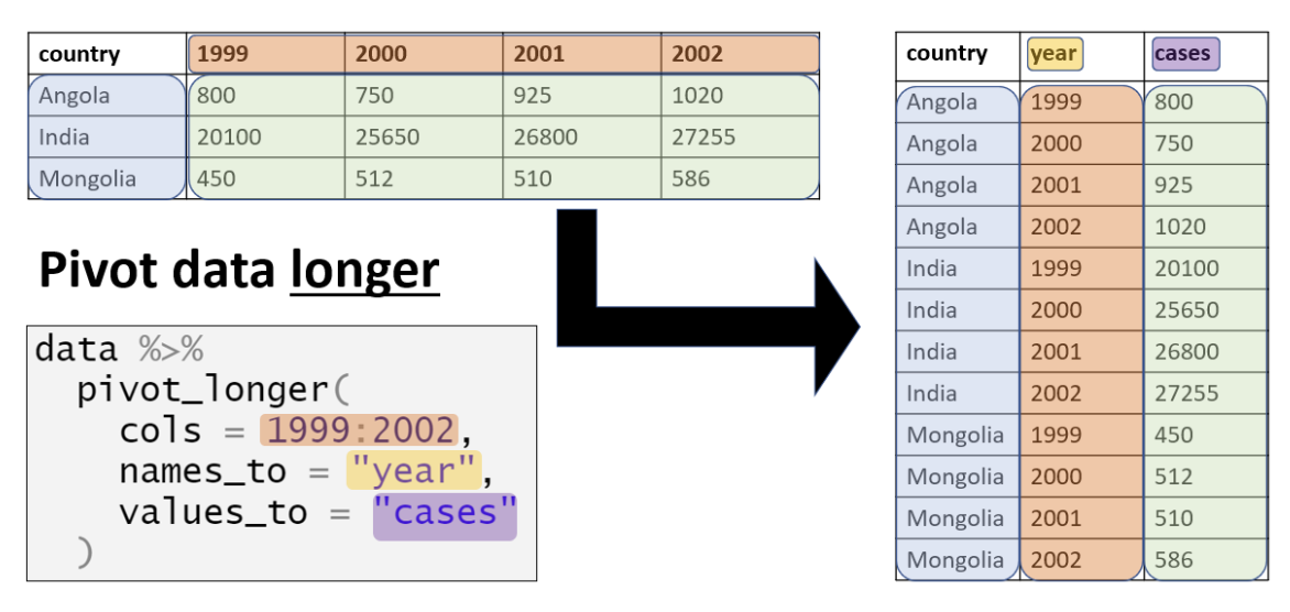
In Module 4 (Data Wrangling), you learned how to pivot data from wide to long format. Currently, our data is in a wide format, with one column for each platform. To recreate the Pew plot, we need to transform it into a long format with three columns: year to indicate the year, platform to represent the platform, and percentage to show the percentage of users who received news from each platform in the corresponding year. Please write the code to convert the wide version of the pew_data data frame into a long format data frame, naming it pew_data_long.
Here are some hints to help you carry out this task:
Identify the Columns to Transform: Look at which columns currently represent different variables (platforms) and need to be condensed into a single column. In this case, the columns for twitter, facebook, tiktok, and instagram should be combined into a single column that identifies the platform. These columns can be identified with
cols = c("twitter", "facebook", "tiktok", "instagram").Name the New Columns: Think about what names would make sense for the new columns in the long format. You want one column to represent the platform and another to represent the percentage of people who use the platform for news, so those would be good names to use for the new columns (i.e., platform and percentage).
Use pivot_longer(): The function you’ll use to pivot the data frame from wide to long is pivot_longer(). You’ll need to specify which columns to pivot, the names of the new names_to column (i.e., the one that will hold the platform names), and the values_to column (i.e., the one that will hold the percentages — that is, the percentage of users for each year for each platform).
Naming the Arguments: When using pivot_longer(), you’ll need to use arguments like
cols,names_to, andvalues_toto specify which columns to pivot, what to name the new column that holds the names of the original columns, and what to name the new column that holds the corresponding values.
Here’s a nice template you can follow to construct your code from the The Epidemiologist R Handbook.

Take a moment to study the wide and long data frames to be sure you understand what has happened and how the percentages are indexed now by year and platform.
Turn platform and year into factors
Let’s convert the platform and year variables into factors to facilitate plotting. By turning platform into a factor, we can ensure that the platforms are displayed in the same order as shown in the Pew graph, and it will also allow us to use properly formatted names (e.g., “TikTok” instead of “tiktok”). Converting year into a factor will enable ggplot() to treat the years as discrete categories on the x-axis, accurately representing each year (20, 21, 22) rather than interpreting them as continuous numerical values. From the standpoint of ggplot(), if year is treated as continuous, it will be interpreted as numeric, which may result in intermediate values like 20.5, suggesting half-year intervals. By using factors, we avoid this issue and maintain a clear representation of distinct years.
I created the code below to convert platform to a factor. Please finish the code chunk to convert year to a factor.
Once complete, please press Run Code.
Notice that platform and year are now listed as type factor (<fct>).
Create the plot
Now, we are ready to create the ggplot() code to produce a graph that presents the line graph for the four platforms we selected.
Try to write the code yourself, if you’re stuck you can get a hint — but, a little bit of struggling is natural and helpful. Once you’re done — you can also check out the last tab — which includes some additional options to make the graph look more similar to the original Pew graphic.